British designer and artist Brian Bysouth is responsible for some of the most iconic film posters ever printed. In a career lasting over forty years he lent his considerable talents to a wide range of design projects, including product and service adverts, editorial, TV storyboards, VHS and DVD covers and hundreds of fantastic film posters. Over the past year I’ve been lucky to get to spend time with Brian discussing his work and career and I’m very proud to present the following interview article that details his life from his beginnings as a fledgling artist through to his retirement in 2002. It features many images of his brilliant work, including early sketches and the original artwork for several posters. There are also a handful of unused designs and concepts, many of which have never been seen before online.
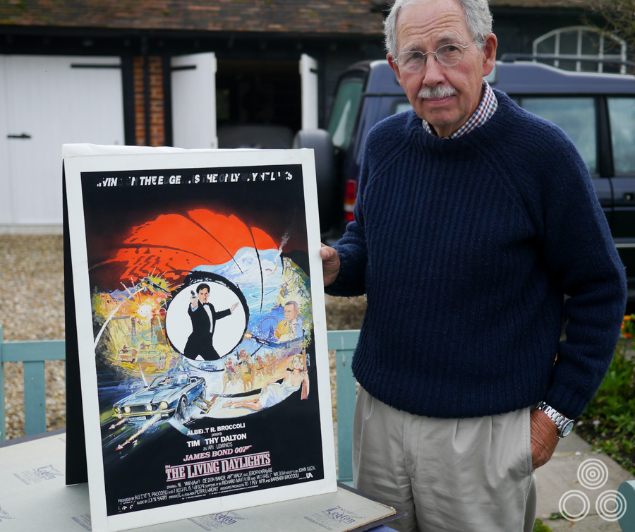
The artist Brian Bysouth with the original sketch for The Living Daylights poster, 2012
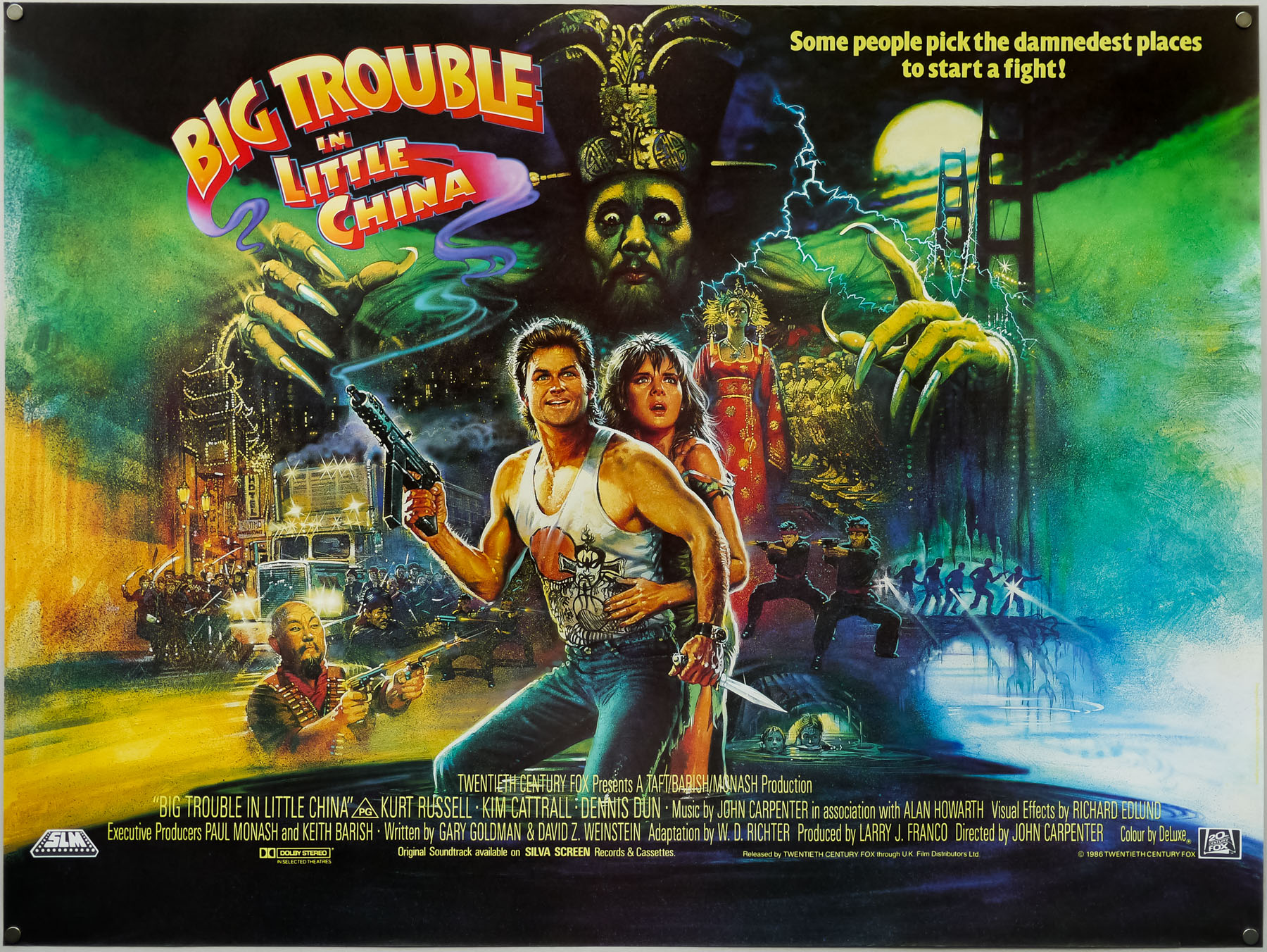
The British quad for John Carpenter’s Big Trouble in Little China, painted by Brian Bysouth in 1986
I’ve split the interview into seven parts and you can use the links below to jump quickly to each section if you wish.
Part 1 – Origins
Part 2 – Starting out – Downtons
Part 3 – Rapier Arts and then a return to Downtons
Part 4 – Going freelance
Part 5 – Bysouth and Hayer Associates
Part 6 – FEREF
Part 7 – The end at FEREF and retirement
Part 1 – Origins
I’d like to start with your origins and I understand you were born in October 1936 in London. Your mother was a fashion artist?
Yes, I remember when I was very young seeing some of her work and, looking back, I think it was pretty good. She worked for a firm just off Oxford Street in London, which was the capital of the rag trade then. This would have been whilst my father was away during the war. She always encouraged me to draw and often gave me paints and paper. Most of my time was spent sketching or drawing something.
I had an old watercolour box that a relative had given me and sometimes at the weekends I would fetch some paper and sit up in bed to draw and paint instead of getting up. I really enjoyed it and it absorbed most of my time.
Incidentally, when my mother died a couple of years ago we were clearing out her things and we found one of my old paintings that she had kept. When I was about seven she took me to see the film Snow White and the Seven Dwarves and afterwards I painted a picture of the dwarves’ mine. It was studded with great gobs of paint, which were meant to represent the jewels.
You’d spend every moment you could sketching and painting when you weren’t at school?
I suppose I did, but I was out with my friends playing cricket and football and later on getting into mischief. I think painting in my spare time subsided a bit in my early teens, but I was encouraged at school by our art teacher, a Mr. Thompson, who was a very nice man. He’d been in the RAF during the war and had a huge military moustache. I think he liked some of the lads in the class that he judged to be talented. He would sometimes pick out our work and say to the class, ‘this is how you should do it.’
Eventually the Eleven-plus came around and I didn’t do very well. I suppose I was reasonably good academically until about the age of nine or ten, but I remember when my father came back from serving in the war it was quite a traumatic time. He’d gone away in 1939 when I was three, and had been involved at Dunkirk. When he came back my mother persuaded him to apply for a commission and he was posted to India, then to West Africa and I didn’t see him until the end of the war. By that time I didn’t really know him and he didn’t know me. After he came home my two sisters were born and my parents were so occupied with them I was allowed freedom to neglect my schoolwork.
You’d been the only child up until that point?
Yes, I’d been alone with my mother until then, and had become thoroughly spoilt of course! I think when he came back my father felt I’d been let go a bit and that I needed some discipline. I realised later that this had an effect on my performance at school, which only began to revive after I failed the Eleven-plus.
After that disappointment, there was the opportunity to take an art scholarship which was offered in those days. I was the only one from my school, Mora Road in Cricklewood, fortunate enough to win a scholarship. There was an initial exam at my own school, then I had to attend the art school to sit another and this required completing a painting and a drawing exam. That proved to be satisfactory so a few days later I had to return for an interview. There were only about twenty-four candidates who were successful in gaining the scholarship, which covered most of Middlesex.
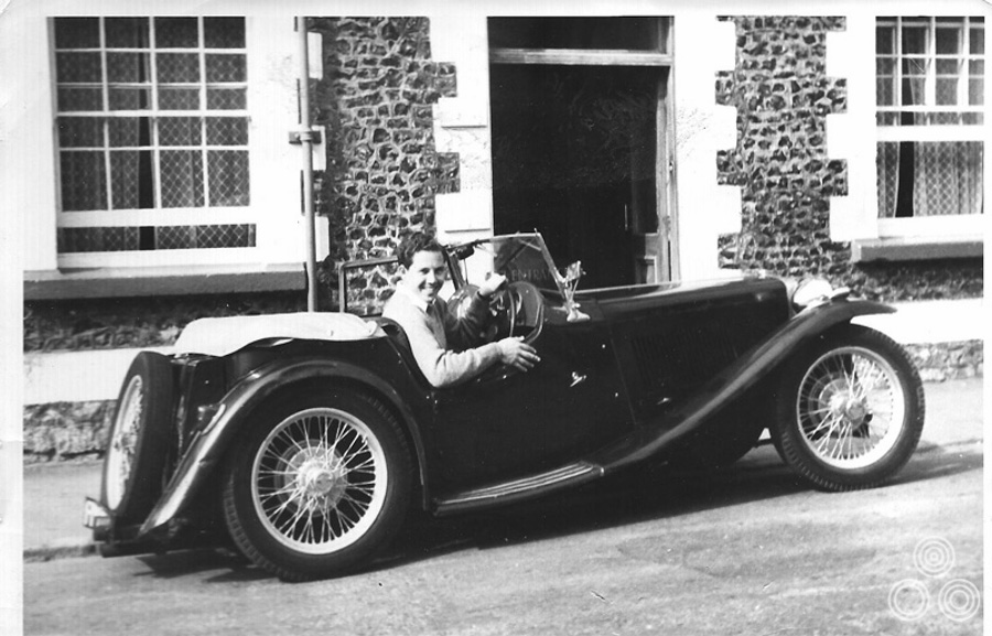
Brian: ‘This is a holiday snap of me enjoying my 1940 MG TB, outside the Dolphin Hotel in Beer Devon. The MG was bought for £275 when working for Eric Pulford and Ron Hornsby at Downtons Fleet St. I wish I still owned it. – Copyright Brian Bysouth
What was the name of the art school?
It was the Willesden School of Art, the Principal was Jacob Drew who was a recognised British painter. I began in the Junior Art Department, which was from aged twelve to fifteen. Our teacher Frank Moor was also an established British painter. In the mornings we had general education taught by Miss Chumley who schooled us in English, maths, history and geography to O-level (GCE) standard. In the afternoons we studied art and as we became older there was an evening class as well.
At the end of that course there was an exam after which most of the pupils left, but some of us decided to stay on to study for what was then called The Intermediate Examination in Art. It was a very thorough, traditional, art school education, which comprised life-drawing, painting, still-life, anatomy, architecture, lithography, modelling and sculpture, as well as the history of art. Each subject had a whole day and was followed by an evening class from 7-9 pm, usually every night.
Were there any of those subjects that you particularly loved or didn’t like?
The subjects were all fine but I particularly enjoyed modelling and sculpture, which was taught by Philip Turner. Years later I began the degree course but recognised it was not a wise choice for my career. Some teachers were more gifted than others. One was the senior lecture, William Brooker, a very successful British Painter, and another teacher, Ivor Fox, a fine draughtsman who concerned himself mainly with abstract art. Brooker was a very clever painter and I really liked him. He taught us to admire the work of Sickert, Vuillard, and Bonnard. He painted in that tradition himself and exhibited in a West End gallery every year where he’d sell all his stuff.
He was somebody you really respected at the school?
Yes, although I can’t really remember being taught a lot about how to handle the paint by him. He and Ivor Fox used to appear when we were in the painting room and they would hover over your shoulder and would sometimes offer advice, but often they’d keep quiet. The only piece of advice I remember getting from William Brooker was how to make black blacker. He told me to add a bit of alizarin crimson to the black paint and it did seem to work and make it more intense.
We also learned to create lithographs which were printed from stone tablets. There was also etching and mezzotint and so we had a very good grounding in several skills. Most of the teachers were highly capable graduates from the Royal College of Art.
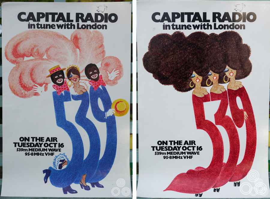
Two advertisements for the launch of Capital Radio that were designed and painted by Brian Bysouth, 1973
What about fellow pupils?
In the year above there was a chap called Gerald Whybrow who was a gifted water-colourist and he had one of his paintings accepted by the Royal Academy whilst he was still a student. That caused quite a bit of a stir as you can imagine. In my class there were some very talented individuals: Michael Browett, Gerald Duff, John May, and Michael Grannell. I’ve since been very curious about how they’ve got on in their careers. I googled their names recently without any success.
Another talented fellow who I was very friendly with, I’d say he was my best friend, was Michael Sherlock. He was into jazz and we put together a little band and made lots of noise. I was the bass player with a tea chest and it was all very primitive but we had lots of fun. Mike became a teacher, I believe. Many years later, in about 1986, the four of us had a reunion and walked down memory lane together. We agreed we should meet up again but we never did.
I left art school five months after I turned eighteen to do my National Service. Many of the other students stayed on but Michael Granell and John May went off to the Army for two years and I decided to join the RAF.
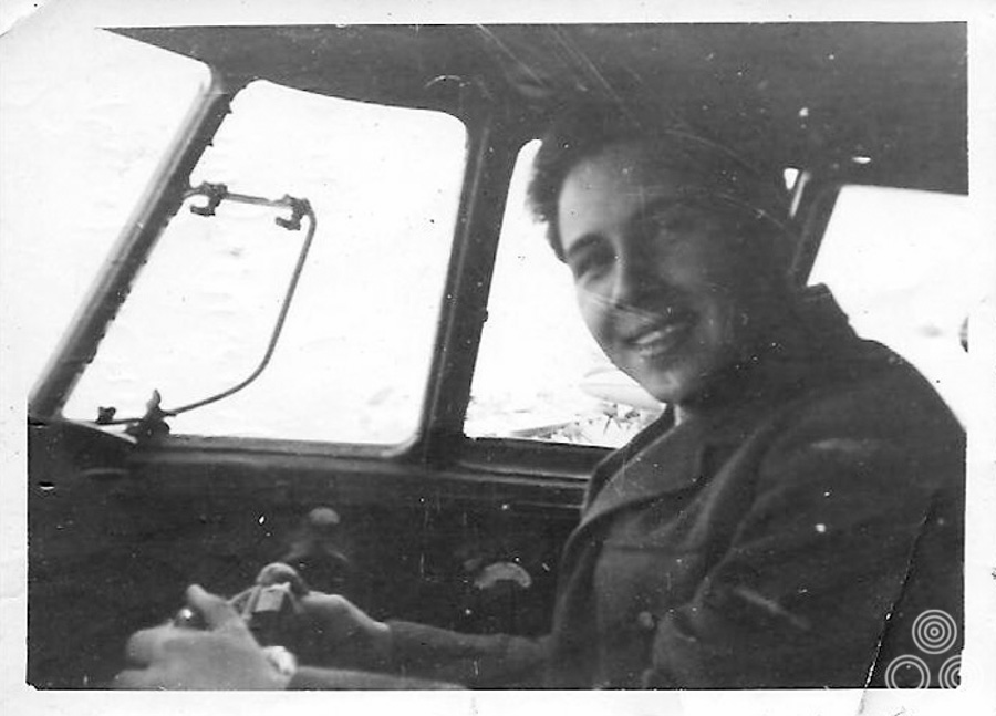
Brian Bysouth at the controls of a Hastings aircraft whilst serving with No.70 Squadron, RAF Nicosia
Until then you’d been living at home?
Yep, I’d been living at home, had passed the Intermediate Exam and then filled the time waiting to be called up by starting the National Diploma in Design, which today is the equivalent of a degree course, I decided to specialise in sculpture but changed to painting, and then I was called up and went off to do my National Service.
Once that was over I was able to return to the school to complete the course. Shortly after I got back I decided that painting wasn’t going to be the right course, even though I’d trained in it until entering the RAF. I recognised that the only way to make a living was to become a commercial artist.
I was able to swap over to an illustration course, which was run by William Brooker, and Clifford Wilkinson the lithography teacher. I was pretty much left to my own devices; they would set subjects and I’d get on with it. There was only myself and one other chap, George Rowe on the course. Later on he became a successful freelance artist working for Artist Partners. I was still living at home with my parents; I could not get a grant or anything like that, so they were taking care of the financial side of things. I found a Saturday job and also worked during the vacations.
I was at a garage where I started out washing cars, and then later on I learned how to service them. As soon as I was able I bought my first car, which was a Wolseley Hornet, six-cylinder, which never really went very well. It spent most of the time on a friend’s drive around the corner!
Later, I bought an old London taxi for £25, which was a lot of fun and I used to drive my friends at the art school around. It was one of the old style cabs so the driver’s side was open to the elements. It did about zero miles to the gallon and had bald tyres, but it went along well and luckily I never had an accident!
Anyway, it became clear that I had to concentrate fully on illustration as it was realistically the only way for me to make some money. The prospect was either that or become a teacher, and I didn’t fancy another three years studying for a degree at the Royal College of Art, and then doing the Art Teachers Diploma. I just took the pragmatic view and started to look for a job in commercial art.
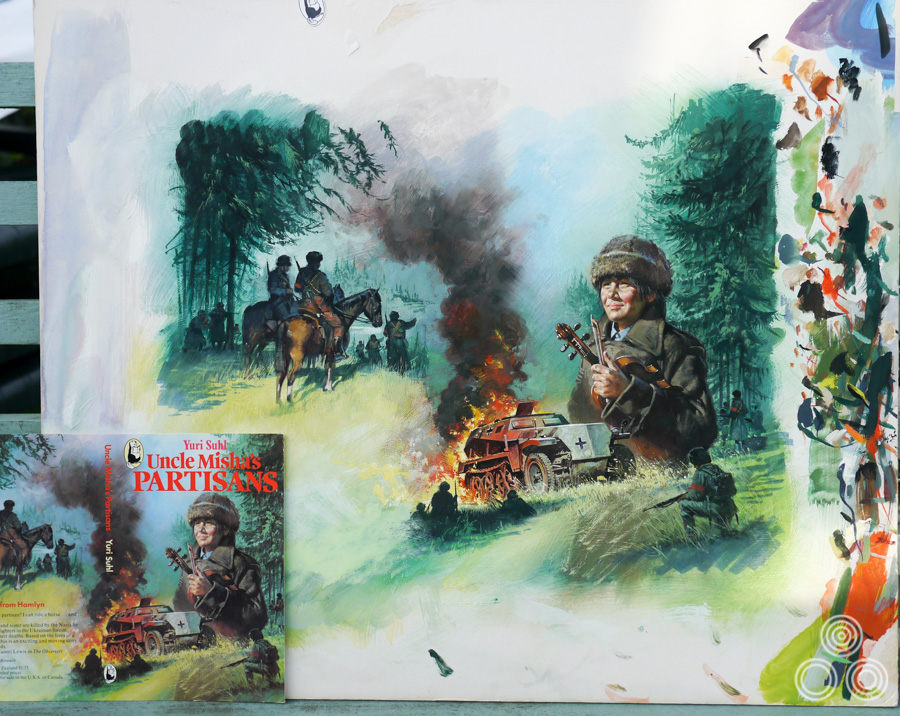
The original artwork for Uncle Misha’s Partisans, painted by Brian Bysouth with the final printed cover in the bottom left, 1979
Did the two years away in the RAF have an impact on you?
Well, there were trades in the service that would have been suited to me with the training I’d received at art school, but none were offered because I was a National Serviceman. It was evident the service wouldn’t bother with you if you weren’t going into it as a career. I was drafted as a storeman and after six months of training in Hereford we were posted straight overseas. At that time Britain was evacuating the Suez Canal zone and I was posted to RAF Fayid, which was near Port Said. All day we were packing crates of equipment to ship back to Britain or to Cyprus where there were new bases being built to replace the ones we were losing in Egypt.
Fayid was an airfield and wonderful aircraft used to come in there, such as the beautiful Super Constellation, which as an artist I really loved; the lines seemed to owe more to styling than aerodynamic efficiency. After six months the packing was finished and I was posted to Cyprus at RAF Nicosia and was employed in the storeroom of a squadron of Handley Page Hastings aircraft. I spent a year there running the store which was situated beside the main runway. The constant landing and taking-off of aircraft was fascinating, but I remember feeling very bored at the end and, despite making some good friends, I was looking forward to being de-mobbed.
Were you drawing whilst you were out there?
Yes, I had my sketchbook with me and I did a few drawings of the area. I remember joining an evening art class that started in the education centre, I was slightly embarrassed when the Officer teacher in charge said to me ‘I don’t think you need my help very much!’ So instead, I got involved in the station’s jazz band and took up the bass again. It was traditional jazz, Dixieland stuff. Eventually we became good enough to be asked to play gigs at other bases. We weren’t paid anything for it but it was a lot of fun and it meant we got out and about. It was the only bit of amusement for us really. Cyprus at that time was very troubled and there were very few opportunities for servicemen to see the beauty of the place.
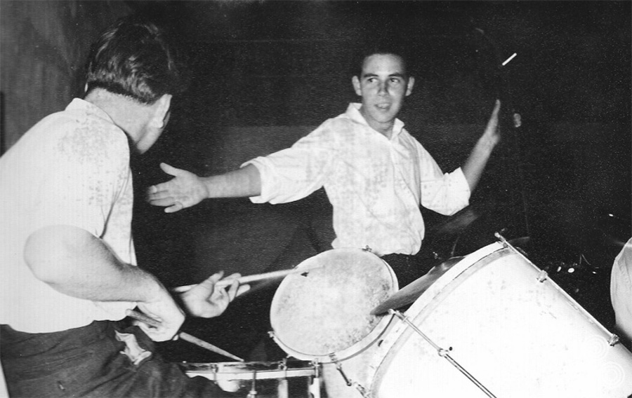
Brian: Me with Pete, the drummer in the middle of a solo during a performance by the ‘Ala Keefeg Stompers’ (band name in Arabic, probably incorrect spelling), in the NAAFI at RAF Nicosia Cyprus
You were a minor celebrity of sorts then?
Hardly! It was the year when Lonnie Donegan recorded Rock Island Line, so part of our performance featured a skiffle group. We used to get calls for that song all the time and often ended up playing several repeats.
After we returned to the UK some of the band members got together again and carried on playing. We used to rehearse at a pub in Stoke Newington and I was also asked to play bass in various clubs, although I wasn’t very good, but bassists in those days were in short supply. Once I was asked to sit in with the Humphrey Lyttleton band, which was the pinnacle of my short-lived musical career! I gave that up when I landed a job in 1958 and decided to sell my bass.
So you returned from Cyprus and went straight back to art school?
Yes, I used my time in the illustration course to create some specimens that would hopefully help me get a job. I used to drop in on the commercial art course, which was run by a teacher named Houvenirs who was a successful poster artist himself. I told him I wanted to get a job in commercial art and asked for advice. He told me that I needed to show I could do lettering and that I could design and paint a poster. I spent some time doing lettering but mostly did a lot of drawing.
I put together a portfolio and then started telephoning agencies asking for a job as a figure artist. The description ‘illustrator’ is an American term that hadn’t come into use at that time. Back then you were either a figure artist, which meant you drew characters or situations for advertising, or you were a lettering or paste-up artist.
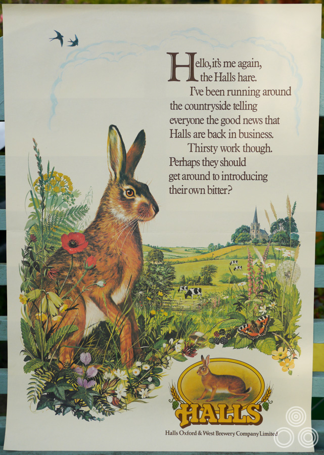
An advert for Halls Brewery painted by Brian Bysouth, 1979
Part 2 – Starting out – Downtons
I eventually landed a job at an agency called Downtons and I was taken on by one of the directors, Ron Hornsby. He liked my folio and I remember him asking if it was all my work, and when I replied that it was he asked me if I’d start out with some freelance work as a test. Later, I realised they were trying to get the Nescafe account as he gave me a week to draw people enjoying drinking coffee. I was very nervous but I thanked him and went away.
The agency was quite large and they had clients such as Petrofina, Mercedes, as well as the film studios Rank and United Artists too, so it was an important opportunity. I went away and I did a series of pencil drawings of people drinking coffee. I was so nervous I could hardly draw! I went back a week later and Ron liked the drawings and said he would pay me £6 for them. He then asked me when I’d like to start and I told him I could begin any time, so the following Monday I turned up at the agency to start work.
The offices were fairly crowded and to start with the only spare desk was in the lettering studio down the corridor. There was a very small room where three figure artists had their desks, one of whom was Bill Wiggins the now famous film poster artist. The others were Derek Stowe and John Kaye who also did film poster artwork. When I saw their illustrations I realised that I had a long way to go to reach such a high standard.
So it was never that you had actively wanted to do work for film posters?
No, I was lucky, I just fell on my feet, but having a painting background helped me. The film work was being taken care of by Eric Pulford who controlled the sister agency that worked with Downtons called Pulford Publicity. Together with Bert his brother, Eric was commissioning work from Studio Favali in Italy, so I was able to see art from the likes of Renato Fratini, Arnaldo Putzu, Angelo Cesselon and Pino Dell’Orco. It was inspiring and I remember being dazzled by their paintings. I realised that this was the kind of work I wanted to do.
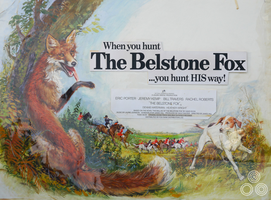
The original artwork for The Belstone Fox with transparent overlay showing position of the copy, painted by Brian Bysouth, 1973
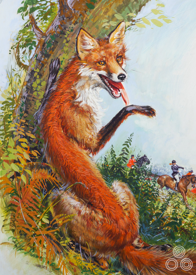
Close up detail of the original artwork for The Belstone Fox by Brian Bysouth, 1974
Initially you weren’t working on film posters?
I wasn’t asked to do any film posters. I was a junior artist and was expected to do all kinds of things, mostly small pen drawings for film press adverts. The larger adverts used a photograph of the campaign poster, but the smaller ads featured pen line drawings based on elements of the poster because these reproduced better in newsprint. I also did work for other clients such as Petrofina, Mercedes and the South Eastern Electricity Board.
I didn’t always have a lot to do and I remember once getting caught reading a newspaper. Ron Hornsby came in and asked me what I was doing. I replied “nothing, sir”, and I remember him saying “I can see that!” He then told me, “you will be no good to me and no good to yourself unless you get on and practice”. Some time after that, he spotted me learning how to use a Conté pencil and I was drawing a mechanic refuelling a car at a Fina pump. He liked it and eventually used the drawing for the front cover of the Petrofina house magazine.
He was quite a stern boss at times then?
Well he’d been a Major in the army and he spoke in a clipped military voice. He was a dapper man with a formidable upright bearing, and I think he enjoyed frightening the juniors but he definitely pushed me in the right direction.
The studio was asked to work on a campaign for a film called Tiger Bay. I’d seen the roughs that had come through from Italy and decided that I’d have a go at doing my take on it. I went through to speak to Colin Holloway, who was Eric’s assistant, and asked him if I could see the film stills that had been sent by the film studio. I painted up a rough design and when Colin came up the following day he asked me if Eric had seen my sketch. I told him that he hadn’t, so Colin took it away, returning later to say that Eric liked it. I heard nothing more, but a couple of weeks later a whole bunch of illustrations came in from Italy, one of which had followed my original rough!
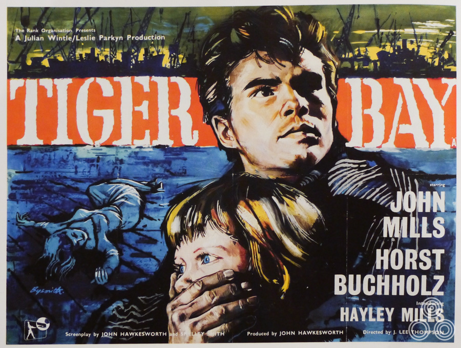
The quad for Tiger Bay, with artwork by Brian Bysouth, 1959
Luckily for me, Rank, who was the client, said that they preferred the raw style of my painting and the decision was taken to print my original as the final poster. After that initial success I was asked by Ron to design posters for his client, Metropolitan Hotels. It involved large silkscreen posters illustrating the group’s three main hotels.
Another film came in to the studio, which was Ferry to Hong Kong. I looked through the stills and painted a portrait of Curt Jurgens in front of the busy scene of Hong Kong harbour. Again, Colin took it to show Eric and I found out that it was submitted with other roughs. Later it was approved by Rank for the poster and Eric asked me to add portraits of Orson Welles and Sylvia Syms. He told me to copy the heads from a Pino Dell’Orco illustration. I was never happy copying other artists’ work and I didn’t like the heads. If you examine the poster you’ll see that the portraits aren’t that good.
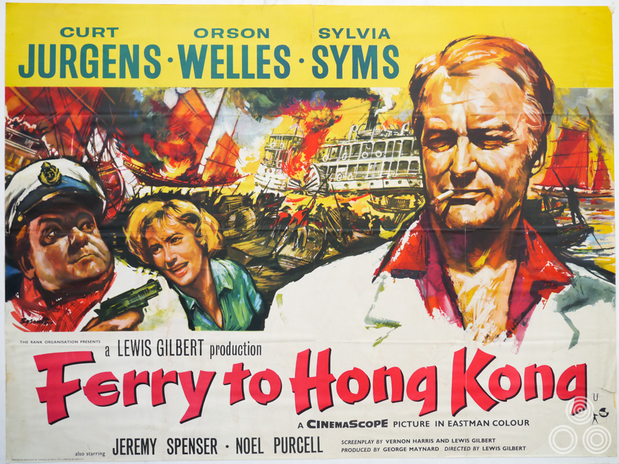
The British quad for Ferry to Hong Kong with artwork by Brian Bysouth, 1959
Eric didn’t like them either. I was called to his office and I remember him saying “let me show you what you’ve done wrong”. He wetted a brush and started altering the painting and unfortunately he made it worse! He then said, “Take it away and finish it”. By this time it had become a muddy mess but I carried it away and was just about able to salvage the painting without it being completely ruined. I told Colin what had happened and that I didn’t want to show it to Eric. In the end it got printed, so I’m not sure if Eric ever saw it again!
What was life like as a junior?
We started at nine and finished at five thirty. Shortly before I arrived there the Downtons studio used to work Saturday mornings, which was very unpopular, as you can imagine. Somehow they negotiated a deal where they would work an extra hour on Friday and thus didn’t have to come in on the weekend. Eventually, of course, that became a farce because at half past five everyone would be downstairs in the Joe Lyons cafe having a cup of tea, then we’d be back up at our desks in time to wrap up for half six. If you had work of course you had to do it, but being an employee is a lot different from being a freelance. I was amazed at what you could get away with as an employee! I had been very diligent after that telling off from Ron Hornsby, but it was always a relief not to have to stay back to complete any urgent work.
Were there some characters that had been there for years and were well practiced in the fine art of being an employee?
Yes, most of the artists had been there for a long time and I came to realise that Pulfords was a happy place to work. There was no backbiting and everyone got on very well. It was not unusual to socialise out of working hours and I made some lifelong friendships whilst there, including of course Bill Wiggins, whom I mentioned earlier. He was the highest paid member of staff; he received forty pounds a week and as a junior I’d started on six. It was rude to ask your colleagues what they were earning, but Bill’s wage became common knowledge because he had asked for a rise. He’d been doing a lot of film posters and in fact he could knock out a film poster in a day or two. He was doing two or three a week at that time and Eric was making a lot of money out of his ability.
Bill asked for a rise and threatened to leave. The story was that Eric doubled his money from twenty to forty pounds a week, which was a huge amount. After I’d done those first two film posters I went to see Ron Hornsby to ask for a rise, something that I found nerve-wracking. He said “I’ll speak to Eric, I think you’ll find he’s not ungenerous”, but weeks went by and nothing happened. We’d get our wage packets at the end of each week, but no raise appeared in mine, so I went back to see Ron again. I believe they initially upped me from six to eight pounds a week, which I felt was derisory. Eventually, after weeks of trying I managed to get up to nine pounds.
Of course, the pay rise meant I was no longer a beginner and I was expected to work quickly and not make any mistakes. I was still very inexperienced, and found it difficult to paint and draw stuff on demand, often there was no reference material available. You had an illustration to do, and were expected to be able to draw from your imagination. If there was no photographic material to reference, I’d have to go off and find my own material, or ask people if they would pose for me, which made the job a little easier.
Despite my initial success I lacked confidence in my own ability and always found it a great strain to be able to produce a piece of finished illustration of any kind. Often I would scrap what I had done and begin again. Sometimes colleagues, when seeing me in doubt, would say, ‘you don’t need to start again, that’s good enough’, but I would tell them that it wasn’t, and that I’d never get it past Eric. Sometimes illustrations just seemed to fall from the brush, such as the images for Tiger Bay and Ferry to Hong Kong, but my heart was always in my mouth when painting; I was frightened of making a mistake. Somehow those first two came off very quickly; I think because the spontaneity had worked. Usually though, I felt lacking in confidence, nervous, and knew I had to try very hard.
Part 3 – Rapier Arts and then a return to Downtons
I left Downtons in 1959, after eighteen months, unhappy with the wages. I was getting married and needed more money. I looked in Advertisers Weekly, the trade paper of the time, and saw a job vacancy for a figure artist at a studio in Farringdon called Rapier Arts. A chap called John Ind ran the studio and I took my specimens to show him. By that time I had the printed work behind me, which he really liked, and he was very keen to get me to join his studio. I nervously said that I wanted twenty pounds a week. He offered to start me at eighteen, rising to twenty-four after a three months trial period, which of course I was very happy with.
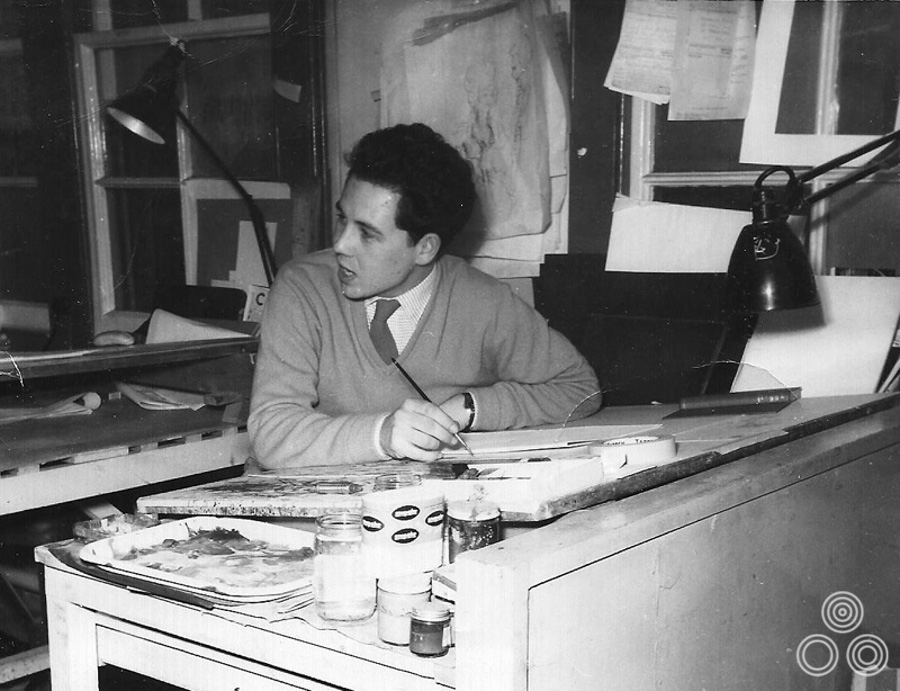
Brian Bysouth working at his desk in the Rapier Arts office, circa 1959
I had my nose to the grindstone there because they wanted to get their money’s worth. There was one other illustrator, some lettering and general artists but it was a much smaller studio. They were affiliated with an Advertising Agency in Holborn and eventually we moved to Red Lion Street to be nearer to them. After arriving there, more staff were taken on; a still-life artist, a re-toucher, a female fashion artist and a young improver. We all shared a new office and got on reasonably well, but I was never really happy there. I always felt under pressure and eventually, just before I left, a second illustrator named Jim Tate was employed. He was a very good artist, certainly better than me, I thought. He had done a lot of fine work as a story illustrator for women’s magazines.
One day an illustration job came in from Woman’s Own magazine and for some reason John Ind gave it to me. I couldn’t understand why he’d not given it to Jim Tate, but I didn’t say anything as you couldn’t really refuse a job in those days. I think it bred some resentment in Jim. He could see that I was struggling, and wasn’t enjoying the job because it wasn’t my kind of thing at all. I think that it led to a bit of a bad feeling between us, certainly from his point of view, and things became a bit standoffish.
What kind of work were you typically doing at Rapier?
It was mostly general illustration. One interesting commission came to me from Aston Martin for two large oil paintings of two of their current models. They were to be hung in The Riverside Club where David Brown, the owner of the company, was a member. John did try to get me some film work, but it was a struggle because film companies were already tied in with their own agencies. Eventually a commission came in and I was required to create a poster for the ABC cinema chain, the title of which I can’t recall, but it starred Charlie Drake (likely to be Sands of the Desert, 1960). I can’t remember if my art was ever printed.
After that there was another poster for a film with George Sanders [likely to be Five Golden Hours], which I had to design and paint. It was a different genre of film to those that I had become accustomed to. I had a bit of a struggle and was not happy with the final result.
After a couple of years at Rapier I received a call from Ted Aylward, the studio manager at Downton’s, who told me that there was a vacancy for a figure artist and wondered whether I’d be interested in coming back. I didn’t want to appear over eager at first, but was really overjoyed to be asked. Still, I feigned disinterest with the hope of being able to improve my wages. Ted asked me what I wanted and I replied that I’d be happy with thirty pounds a week. He said he would speak to Eric Pulford. Later, when he called back he said Eric had pushed that down to £27 with the possibility of a raise if things worked out. I wasn’t too disappointed because I was glad to leave Rapier Arts.
It was great to return and see all my old chums who were still working there and it felt like going back home. There was a film creative department in Downtons that was situated at the end of a long corridor. Inside the room there was Eddie Paul, Fred Atkins and a chap called Eddie Garlick. They were working exclusively on film posters and press ads and I took every opportunity to go down there and see what they were up to, which I always found fascinating.
When you re-joined the company did you go back to working exclusively on film projects?
No, I was doing general illustration but there was the occasional film poster for me to do as well. I was put in an attic room together with Bill Wiggins and it had a fantastic view over the River Thames. We were the only illustrators as the others had left. We were starting to be called illustrators by then, as opposed to figure artists. Bill always worked in watercolour paint and was very fast. I used to marvel at the way he painted flesh tones and hair and his likenesses were always good.
I asked him if he’d been to art school and he just said ‘nope’, so I asked him how he’d learned to paint and he told me that he’d got a job in a studio that specialised in doing cinema front-of-house displays. Back then there would always be a large billboard over the top of the cinema canopy, which would feature artwork for the film (or films) that were currently showing. He described how, in a small workshop, they would hand-paint a facsimile of the official poster, so large they were unable to see their work in it’s entirety until it was put up. I was impressed and full of admiration that Bill had begun his career by painting these displays.
He told me that he’d shared the workshop with another artist who had taught him a lot whilst they were working on these huge paintings. Some were twenty four by twelve feet and they’d have to paint them in sections and ensure that each panel matched up; incredibly skilful work. Bill was very easy going and we were well suited and became good friends, working together for more than twelve years. Our techniques and styles were different but we complimented each other well.
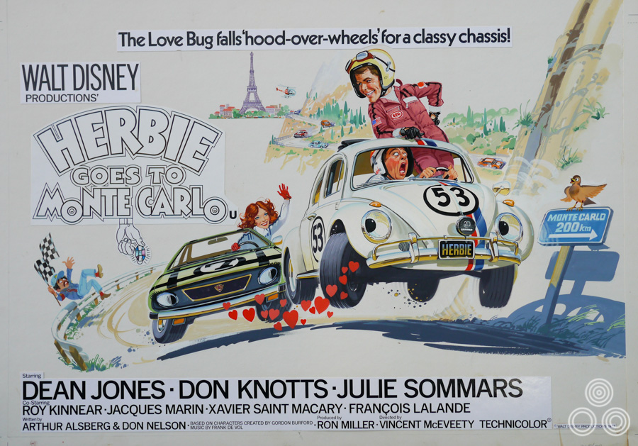
The original artwork for Herbie Goes to Monte Carlo, designed and painted by Brian Bysouth, 1977
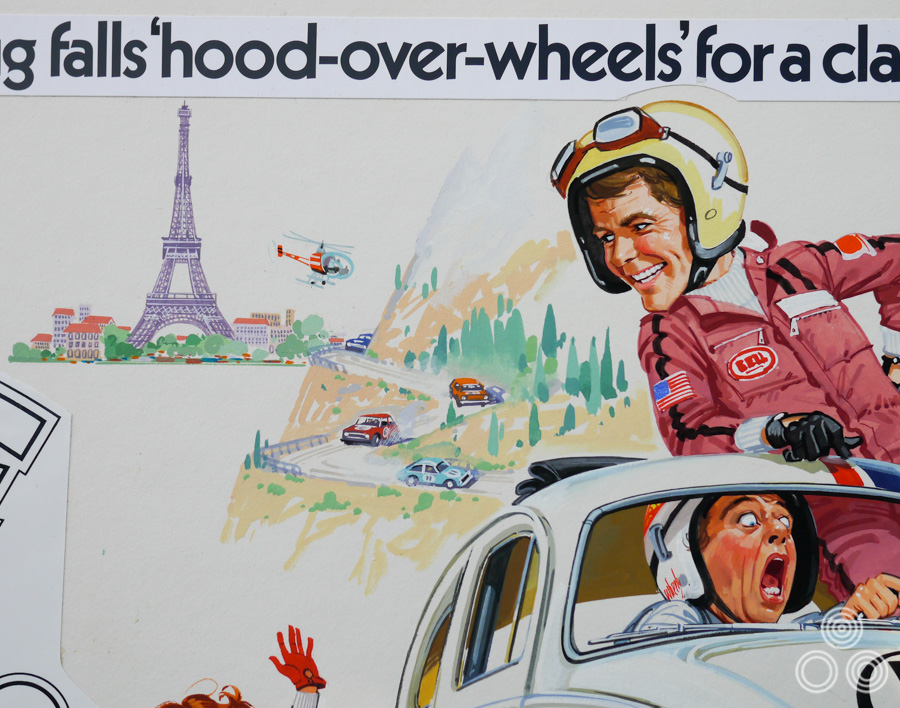
A close up of the artwork for Herbie Goes to Monte Carlo by Brian Bysouth
What was the atmosphere like on your return to Downtons?
Nothing had changed and it was still a happy place. Well, as mentioned, Bill and I worked on various illustration projects. I remember working on the campaigns for both Dr. No and From Russia With Love. I painted a one sheet for the latter but never saw it printed, so I’m not sure what happened there. I suspect that the quad illustration that Renato Fratini painted was so well liked that they didn’t need the alternative one sheet art.
How did it work with certain film campaigns – did they often have three or four designs to choose from?
Yes, lots of rough designs were created but Eric never asked either Bill or myself to do any design work; it was only ever the painted artwork that was wanted. I have a view that Eric didn’t want any other designs to compete with those that he had created, which at that time were sent to the Italian artists to illustrate. I suppose in a way, and this might be doing him a disservice, I think that he was concerned he’d have to pay more money if he asked me to design or perhaps, in spite of my earlier successes, he just didn’t think that I was capable of designing.
I rarely had the spare time to do my own designs but occasionally I created roughs and I used to give them to Colin Holloway to see what he thought. I remember going down to his office once and I found some of my artwork tucked behind a cupboard. I asked what had happened and Colin explained that Eric hadn’t wanted to take them to show the client. I think he had wanted to spare my feelings so I asked if I could have them back and Colin agreed. I had them up in my studio until a couple of years ago and then I had a clear out of these old roughs and burned them. I got fed up with seeing the reminders of rejected work and wanted rid of them, which I regret a bit now.
A couple of years after my return to Fleet Street Eric did a business deal where he merged Downtons, which I think he now wholly controlled, with Dixons and another outfit called, Waddicor & Clark Wilkinson. The new name (‘Downton-Dixon-Waddicor-Clark-Wilkinson’) was a bit of a mouthful but that’s what often happened with advertising agencies when all the partners wanted their name in there. We moved into a brand new building, Metropolis House, which was at number 100 on Tottenham Court Road. The new studio was located on the tenth floor and it was just a massive open space with windows all the way around. There were rows of desks all set up and we were told to choose a couple of desks, which Bill and I duly did.
So you’d gone from your own small room to this large open plan space?
Yes, and we really didn’t like it but we eventually got our own room, which we shared with two other artists from Dixons. The new business partnership didn’t last very long and eventually several of the directors disappeared, with the exception of the Dixons director, Arthur Bennett. He was a creative man who worked closely with the designers and artists, among whom were Vic Fair and John Stockle. Arthur was a very good designer and became a close colleague of Eric, a working arrangement that seemed harmonious and lasted until Arthur retired.
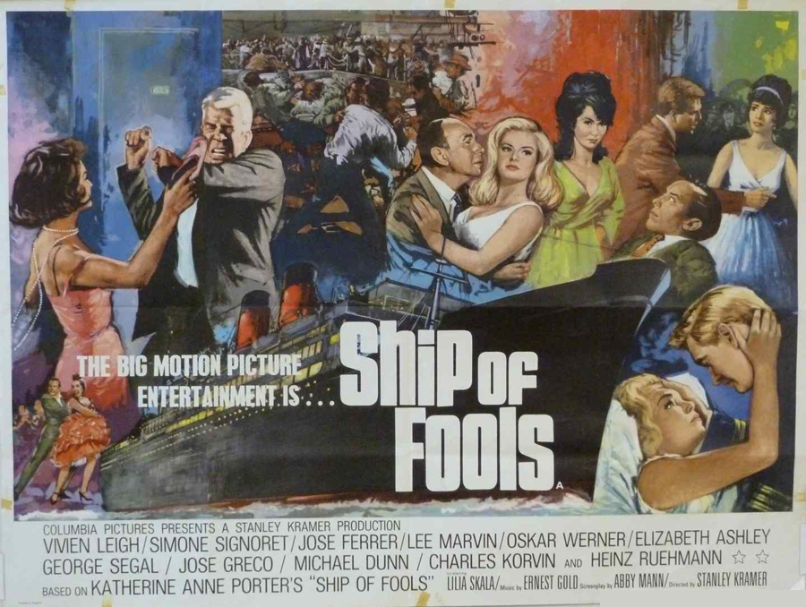
The UK quad for Ship of Fools, painted by Brian Bysouth, 1965. Image taken from here.
I painted a couple of film posters whilst at Metropolis House. One was for a film called Ship of Fools and was painted from a design by John Stockle, who was very particular about certain aspects of the painting. I remember he kept on fussing over a couple of elements in the poster and this resulted in my having to work late, and I ending up making a mess of it. You can easily overwork something. I became very fed-up and in annoyance I remember just folding the thing in half, taking it into his office, leaving it on his desk and going home.
Of course, the next day I was very nervous, wondering what was going to happen and thinking I might get fired. I arrived at the office and John asked me to join him in his room and there on his desk was my artwork unfolded and mounted on a new piece of board. He said ‘I’ve managed to save this, what you’ve done is perfectly okay’. He asked me to touch up where the paint had cracked off. I was amazed and, looking back, I now realise it was a watershed moment between John and I.
Before then the relationship was a bit terse between you?
Yes, initially I found him a difficult bloke to work with. I know that Vic Fair found the same thing, and we often felt that he could have a bit of a brash manner about him. As the years passed, and after I went freelance, I got to know him better and our relationship improved. We became friends, playing the occasional game of golf together.

The UK quad for Cromwell (1970) that was painted by Brian Bysouth
Vic was a different character entirely. The first poster I remember illustrating for him was probably Cromwell around 1970. There were probably others but that’s one that sticks in my mind. Vic always used to take a huge amount of care with his designs. He’d made his own reference for the main image, a mock-up of a helmet of the period. He then photographed it being held high by a gauntleted hand.
I would often spend a lot of time on my painting, as did Vic with his designs. Sometimes I would go over passages in the painting trying to improve certain aspects. Unfortunately, on occasions I realised that I was overworking something and had lost the initial spontaneity of the piece. The tendency to do that to my work was an enduring fault that I was never really able to overcome.
I think that attention to detail is one of my favourite aspects to your work. As Sim Branaghan says in his book, you can get up close to your paintings and still see a lot of detail, whereas some of the posters by Italian artists only work at a distance.
My earlier work was a lot more like theirs. I remember doing a poster for a film called Lord Jim (1965), starring Peter O’Toole. In the background there was a jungle scene with a fort being attacked. I just knocked it in with just an impression of detail. I recall John Stockle was very pleased with that and I remember him saying, “it’s good how you can suggest detail without needing to spend time on it”. Of course, that was how artists like Renato Fratini were working all the time. At first it came naturally to me, but later more detailed work was required and that was something I had to work hard to achieve.
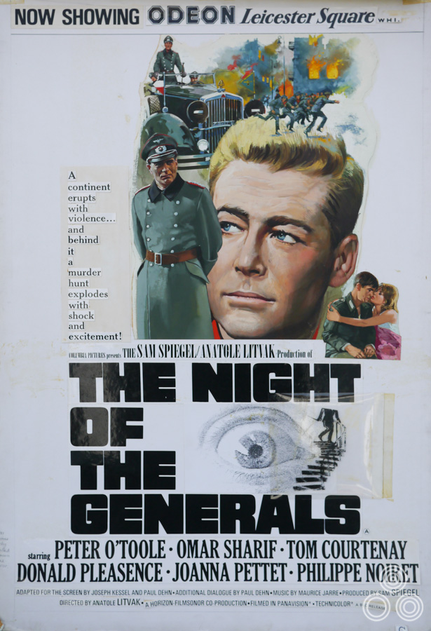
The original artwork for The Night of the Generals, with the layout of the title and copy stuck over the top ready for printing, by Brian Bysouth, 1967
By the mid 1960s what were you typically using to paint with?
It was mostly gouache. There was a cupboard full in the secretaries’ office. You could go there and raid it for tubes of colour and there were many different types of white paint in pots. I used acrylics for the Cromwell artwork, which I had bought myself, but it was a new experience and I always found them a bit difficult. They would dry too quickly for me, which wasn’t a problem if you painted quickly, but once it was dry you couldn’t change it by blending the colours.
How did it work in terms of presenting your work?
Well, you could use any medium that would look best, it was our choice, but Bill and I preferred using gouache. John or Vic would be given a film job and work on a design before tasking one of us, as illustrators, to produce the finished art. You’d hand in the finished work, it would be taken away for the lettering to be added, and the next thing you’d see would be the final printed poster proofs turning up in the office.
What was your first impression of Vic Fair and how did you get on with him?
At Metropolis house it was a while before I able to work with Vic, as I was mostly with John Stockle. Later on, when they’d finished sorting out the layout of the offices, Bill Wiggins and I ended up sharing a room with Vic and another designer, Mike Greenslade, a very talented chap who had been at the previous Downtons office in Fleet Street. We all got on well and I was able to see the way Vic went about designing. He had a very beautiful pencil style and would do most of his work in pencil or pastel. Later magic markers became available and we all started using them. There was a pleasant friendly atmosphere between all four of us.
Whilst sharing that room, I remember doing a poster for Night of the Generals (1965) with Peter O’Toole, and another called Matt Helm (AKA The Silencers, 1966) with Dean Martin where I depicted him sitting astride the barrel of a gun with girls riding the other end of it; something of a phallic symbol! I can’t remember who designed the poster but perhaps it was John Stockle. Those are the only two interesting posters I remember working on while the four of us were sharing a room together.
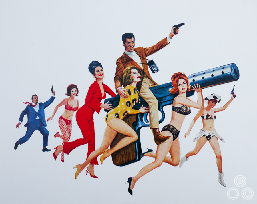
The artwork for Matt Helm by Brian Bysouth, 1966
So how did the working situation at Metropolis House eventually wind up?
After that initial confrontation with John Stockle everything was harmony, although some of his designs could be tricky to accomplish. I began to think he often designed believing the illustrators were gifted with more ability than they actually had. Mostly though, we had a good time, were successful, and did a lot of good work together. Vic, Mike and I began to socialise and we used to go to parties together. We used to really enjoy ourselves.
As time passed we found out that Eric had realised that the merger had included some dead wood; a small number of the directors and owners didn’t actually contribute a lot. We suspected that Eric persuaded them to leave, or bought their shares, and we ended up with a much slimmer and more streamlined outfit.
After about two years we were merged again with a company called Garland Compton, and we moved to their offices in Charlotte Street. The studio area was a huge gloomy floor with movable partitions dividing it up. There were also two smaller offices, one of which Vic shared with John Stockle, and I think Colin Holloway. The other was for the studio managers. Bill and I were placed in the main studio though, which we didn’t like.
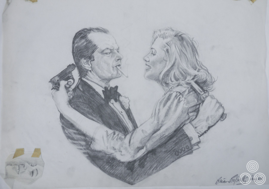
The original sketch for the design of the Prizzi’s Honor quad by Brian Bysouth, 1985. Note the alternative face at the bottom left.
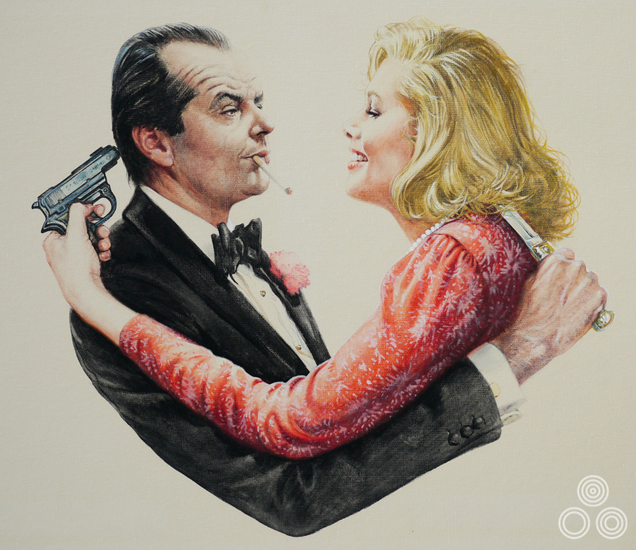
The final painted artwork for Prizzi’s Honor by Brian Bysouth, 1985
Again you started out with a working situation that wasn’t ideal?
Yeah, we’d often have folks come past our desks. They’d stop and stand over our shoulders watching us paint, making the odd silly remark, which we found very annoying. I asked the studio manager if we could move to a room of our own. He was sympathetic but said there was nowhere suitable.
We scouted about and found a small, odd-shaped room that was designated as a store cupboard. It was North-facing which was ideal. We insisted it would make a good studio and were happy to be allowed to build-in a long bench under the large window, where we could sit side by side and work in natural light. The bench was only thirty inches front to back and just big enough to fit a drawing board on.
Unfortunately, there was a coffee machine outside our door that became something of a meeting point so there was a constant clatter of noise. People would often come in uninvited to look at our work, remarking, ‘Oh, that’s great! It doesn’t look much like him though…’ and other comments like that. You can imagine that there was some ripe language being used after a while!
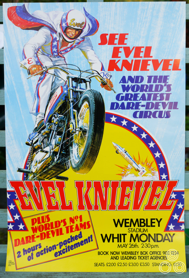
An advert for an Evel Knievel live show, painted by Brian Bysouth,
As a result of the merger we found ourselves working for various different departments of the agency, which was pretty big and was spread over five floors. After a while we got involved in creating storyboards for TV commercials. The agency art directors were accustomed to drawing their own stickmen sketches but soon realised that they had acquired two resident illustrators who could help them flesh-out their ideas better.
Storyboards were difficult to begin with but we soon got used to it. You’d read the copy lines, the brief for the project, and draw each frame using magic markers. They’d then take the completed storyboards to a film production studio and use them as guides to create the commercial.
It must have been quite a thrill to see your work realised on TV?
We never really thought that much about it but it was interesting to make a creative contribution. Eventually the advertising folks became more confident in our ability and this meant they’d give us more freedom; sometimes we’d just get the script and be told to visualise it how we wanted. Some of the ads were for the cinema and a handful ended up on TV.
Do you have any particular highlights in your work during that period?
I was happy with the poster for Alistair Maclean’s When Eight Bells Toll (1971). It was a large poster to work on and awkward to fit onto the bench in our little room. In addition to Cromwell, there was Hannibal Brooks (1969) with Oliver Reed and a poster for In Cold Blood (1967), which I was pleased with. There was also Rough Night in Jericho (1967), Southwest to Sonora (1966) and Living Free (1972), as well as a fair few Disney posters, including some for the Herbie films.
The original artwork for Rough Night in Jericho (1967) painted by Brian Bysouth. Note that the artwork was printed with the portrait of Jeans Simmons blanked out.
Part 4 – Going freelance
The second stint at Downtons was nearly thirteen years long and then you decided to go freelance. What was the motivation behind leaving again?
Well, if I’m being honest, it was about money again. I had been asking for a rise without success because the cost of living was soaring and each month I would end up with an overdraft. I knew that I would have to leave and find a better-paid job. It was a difficult decision but I was forced to confront the fact that, once again, Eric was reluctant to give me an increase. I began to realise that I’d be much better off on my own.
So your wages hadn’t risen a lot during your time at Downtons?
I’d received the raise to £30 a week shortly after returning and there was the occasional increase each year. In think by 1973 I was receiving about fifty pounds a week, not a lot when one remembers that inflation was rampant. Also, after all that time Bill was still on £40 a week! He’d got that one big raise, and despite being overlooked he didn’t chase after more money again.
We were aware of the Italians earning very well; folks like Renato Fratini and later Arnaldo Putzu were making excellent money. Whilst we were still in Fleet Street Fratini had done a poster for The Fall of the Roman Empire, which was a marvellous bit of painting. It looked like it had been done in acrylics. We found he’d been given £100 for that one painting, which was a very big sum, particularly when considering someone like Bill was on £40 per week. Years later, just before I left, Bill did eventually manage to get a £9 rise. He was being interviewed by the agency Creative Director David Bernstein who had realised that, disgracefully, Bill had been on the same wage since 1960.
Detail of the original artwork for March or Die by Brian Bysouth, 1977
Today it’s common practice that designers move on every couple of years, as it’s the only way to increase your pay, really.
Absolutely, I think that had always been the case in advertising. When I realised Downtons weren’t going to offer me the increase I needed I began to cast around looking for a possible move. I spoke to a recruitment agent and took specimens of my work to show her. It was she that first advised me I would be better off going freelance and she promised to arrange some appointments.
I had my first interview with Ken Paul, at U.K. Advertising. He would later become M.D. of the FEREF agency. Then I had an interview with Ken Hayter who was the studio director of an artists agency called David Judd Associates, and he really liked my work. The agency was well known as being a studio that served the advertising industry, with various specialists working there. David Judd himself was a very accomplished designer and illustrator and I met him on my second interview. He liked my work and offered me a freelance position asking, “How much do you want?” I had not expected to be asked that and can’t remember my reply, but he then offered to start me on a minimum guaranteed sum of £600 a month. I could hardly believe my luck as it seemed like a fortune! I was nervous and explained that because their studio was mainly an open plan space I wouldn’t be able to work well like that and I asked if I could have my own room. David agreed and I was relieved that when I arrived for my first day it was almost ready for me.
When I handed in my notice at Downtons all hell broke loose, because by 1973 I was pretty much doing most of the key illustration projects. Bill’s work had become a little old-fashioned and he was nearing retirement. Eric Pulford hadn’t been giving him much to do and this had been causing a bit of a friction between us. I could see that the always good natured Bill was becoming a little resentful and it was very embarrassing because there wasn’t much I could say or do to ease the situation. He usually had enough work to keep him occupied but it wasn’t film-related.
The original artwork for Legend of the Lawman by Brian Bysouth, 1975
Close up detail of the artwork for Legend of the Lawman, painted by Brian Bysouth, 1975
Without my realising it, being given most of the poster work had made my position stronger. When I told them I was leaving the studio manager went up to tell Eric the news. He never spoke to me directly about it so I ended up chatting with the studio director, a nice bloke called Arthur Kitcher, who was an agency man that had been put in charge of the studio. He called me into his office to tell me they didn’t want me to leave and said that they’d worked out a package that would equal the offer David Judd had made, with a regular review to make sure it was kept at the right level. He told me they were planning to employ a new representative to go around to the other agencies finding work to ensure I was always fully employed.
Unused artwork for the poster for Living Free, painted by Brian Bysouth, 1972
I quickly realised that it sounded very much like a sweatshop-type situation where I’d be having to work ridiculously hard, not only for my new wage, but my efforts would have to pay the wages of the new representative as well. I expected to work hard at David Judd Associates but at least I wouldn’t be the only illustrator; there were others to share the load.
I also realised that the wage increase at Downtons would have made me one of the highest paid employees, higher even than many of the managers. Obviously it had the potential to create a very awkward situation with some of the senior people there. Arthur Kitcher really understood and confided that he thought the right decision was for me to resign. I realised too that by going freelance I’d be free to take the kind of work that I actually wanted to do.
So you said your goodbyes and made the move to David Judd Associates in 1973?
That’s right. The office was at 105 Euston Street, very near Euston Station, and was always like a beehive. The partners, including David’s brother John, were always out on the road representing the company and bringing in work for us.
As soon as I began I had lots of work on my plate. Ken had already been out and secured the Ideal Toys account; so there was illustration work ready waiting for me from day one. It was mainly packaging illustration for their various products but I did other advertising material for them, including brochures and the like.
The 7th Voyage of Sinbad – original artwork painted for a UK one sheet and also used on a double-bill quad – copyright Brian Bysouth
I was also illustrating for recruitment advertising. Back then the adverts would be accompanied with a drawing, rather than the photographs you might see today. I was really happy doing that kind of work and would use it as an opportunity to try out different techniques. With so much work being brought to me I had started to use a planner that I pinned to my desk. It was usual to have at least two weeks work booked ahead and I’d use the planner to work out how long each illustration would take. I’d then let the account handlers know when I would be available to do the next job.
Crucially I imagine you knew how long a piece of illustration work was going to take you?
Eventually, but to start with I was a bit slow and I found that to complete a job I had to work longer than the time allotted. I was told exactly how long I could spend on each job, which I quickly came to realise was not enough. I’d have to work through until 7.30 to 8.30pm every night just to keep up and that became very tiring.
Despite being kept very busy there was always the worry that I wouldn’t have any work to do, which would of course mean no money. In spite of this though, I asked to cancel the guaranteed arrangement with David Judd. I had calculated that my efforts were making around £600 a week for the studio, the same amount that I was being paid for a whole month’s work. Judd was happy to change the arrangement and from then on I invoiced each job separately. They would then add their mark up, which was around 25%. Although I was taking a chance, I’d gained more confidence as an illustrator and was getting a lot quicker by that point. It was a good arrangement, which took the constant time pressure off me and I was much happier.
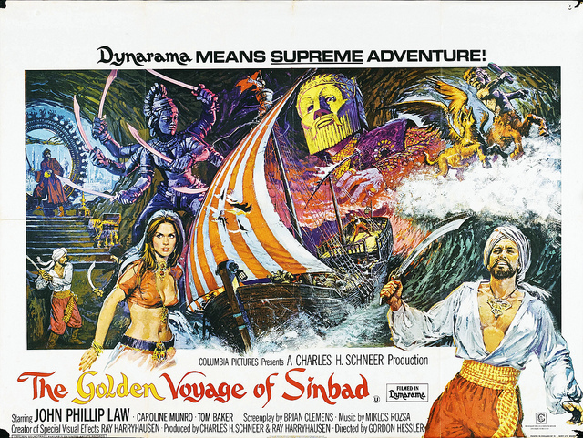
The Golden Voyage of Sinbad quad poster, designed by Eric Pulford and painted by Brian Bysouth, 1974
After I’d been there six months the first film poster came in for me to work on, which was a quad for The Golden Voyage of Sinbad (1973) for Downtons. I think Colin Holloway phoned up and asked me to pop over to look at the rough that Eric Pulford had worked on. I suggested a few changes and then got to work illustrating the final artwork. I sent it back and later heard that Eric was really happy with what I’d done. I found out that Ken Hayter had charged Downtons an astonishing fee of £300 for my finished work, which was the catalyst that made me re-negotiate my payment arrangement with David Judd.
I began to realise about that time that I was probably the only freelance film poster illustrator who was easily available to agencies like Downtons. Arnaldo Putzu had gone to work at FEREF and, although he was still used by Eric, he was kept very busy, and for a while was pretty much out of the loop. Renato Fratini had sadly died by that point and Pino Dell’Orco was doing magazines and book jackets, so I found myself getting quite a lot of poster commissions.
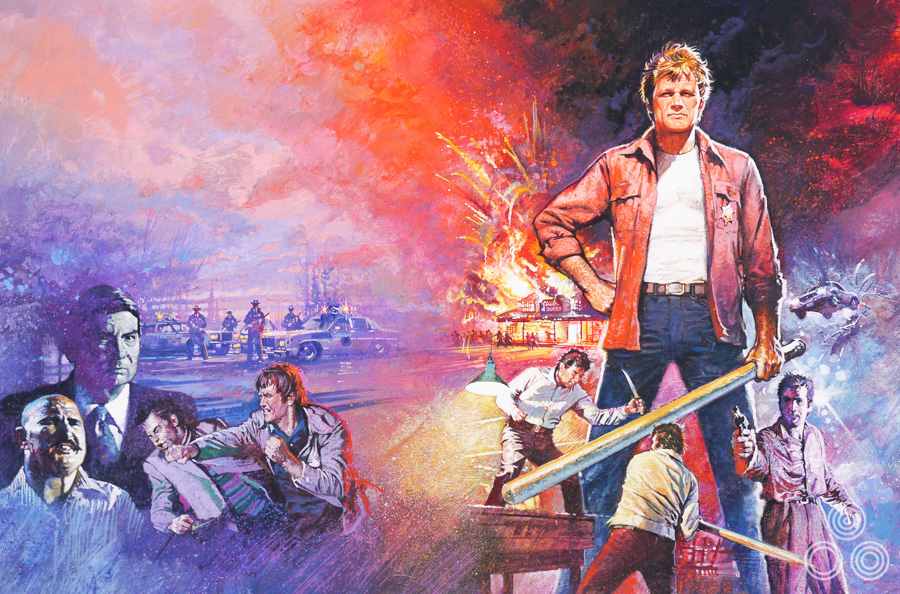
The original artwork for Walking Tall by Brian Bysouth, 1973
What about Vic Fair?
Well he wasn’t really doing that much finished illustration. Vic told me once that he didn’t really like doing the finished artwork and that he enjoyed designing much more. He often worked on concepts for posters that would probably be better if someone like me illustrated them. Of course, he did illustrate several outstanding posters such as The Man Who Fell to Earth and Castaway, where his beautiful pastel and magic-marker drawings were so good that they ended up being used on the final poster.
Of course, there were other artists, apart from those I have mentioned, producing film work at that time because new illustrated posters were appearing every month. I’m afraid I can’t think of any names in particular.
The thing about the Sinbad quad was that Eric Pulford probably thought my style was suited to the action montage that he had designed for the poster. After that first success I started to get a regular supply of work from Downtons.
I used to love it when Vic would phone up to ask me to do a poster. He’d say ‘I need it urgently’, and I would reply ‘You always do!’, promising to fit it in as soon as possible. They’d often wait for me to become available, which was nice. There were titles such as Bite the Bullet (1975), March or Die (1977), Nickleodeon (1976) and the Disney poster Pete’s Dragon (1977). The last three featured beautiful designs by Vic.
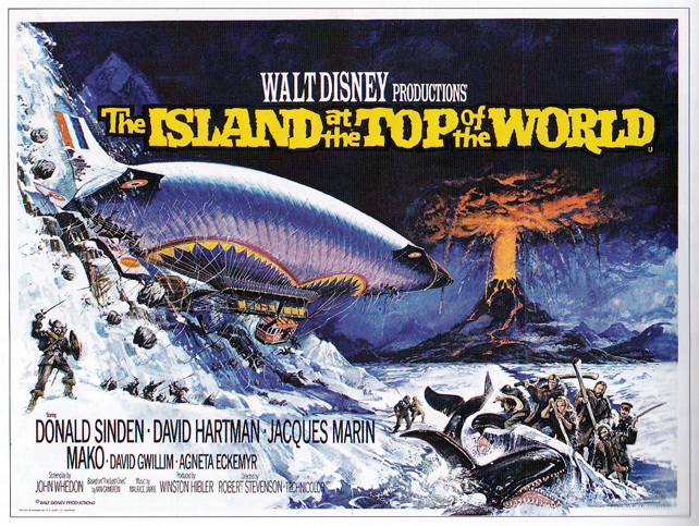
The Island at the Top of the World – quad poster with artwork by Brian Bysouth from a design by Eric Pulford.
The poster for the Disney film The Island at the Top of the World is one of my favourite posters by you.
Oh yes, I’ve got a story to tell about that poster. Eric Pulford had designed and produced a big magic marker rough. Although an exciting prospect, with the huge airship dominating the design, he’d captured the drama but not correctly depicted the perspective of the ship or the group of figures in the foreground. I don’t think Eric was ever too concerned about that; he was more interested in getting the idea across. On close examination everything looked odd and I found I had to spend a long time redrawing much of the thing to make the perspective appear convincing.
Years later I found out that the poster had won an award in America and Eric had claimed it as all his own work, even though, as I say, I’d started again from scratch and the final poster was all my work. Only the concept was his. He’d actually travelled to America to accept the award as his own without ever mentioning it to me. I really liked and admired Eric but I found that pretty mean-spirited of him.
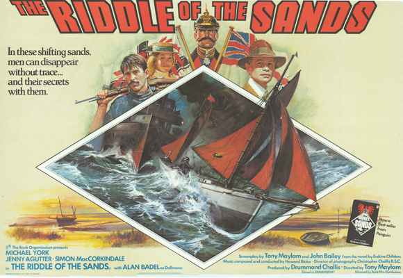
The Riddle of the Sands – quad poster, painted by Brian Bysouth, 1978
He was very rarely complimentary about my work in all of the years that we worked together, which I used to find quite odd. There was one exception that I can recall; it was when I’d done the artwork for a film called The Riddle of the Sands (1979). Eric’s design featured an illustration of a sailing cutter that was racing towards you out of the poster. I took the finished illustration into his office and was expecting him to stay stony silent, or perhaps suggest an element that could be better, but he just said, “That’s bloody marvelous that is, that boat is really moving through the water!” I was so surprised and thought it was the ultimate accolade from Eric. I think after that our relationship became a little more relaxed.
What other work did you do whilst you were at David Judd Associates?
The studio was used by all the leading advertising agencies in London, so there were a wide variety of jobs coming in. I worked on posters for British Airways, Yorkie Bar and a huge supersize poster to depict Frances Chichester’s Yacht returning from the Solo Around the World Voyage. I also did a moorland painting for Great Northern Brewery, a series of posters and calendars for Halls Brewery and pack-backs for Quaker, as well as many Dog and Cat portraits for pet food packaging, which was David Judd’s own account.
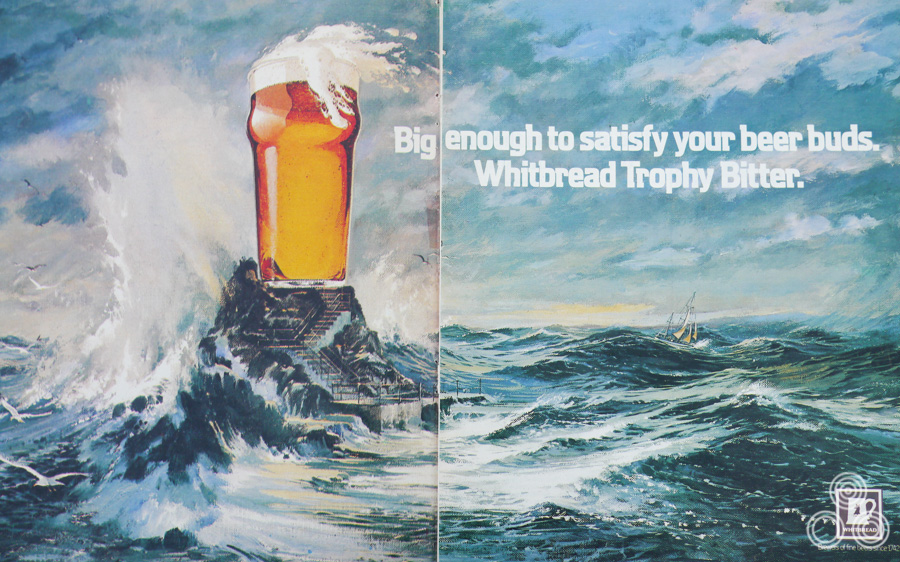
A double-spread advert for Whitbread Bitter for the Around the World yacht race by Brian Bysouth (this was designed to also function as a 48-sheet poster), 1977
Often there were jobs where I’d be asked to illustrate in the style of something, or someone else. It might be the case where an art director would have torn something out of a magazine and would simply ask me to copy that particular style. I found it almost impossible sometimes but I knew it was necessary to work as closely as I could to what they wanted.
Before leaving Downtons I had become friendly with a studio artist called Karl Pitwon who told me of his ambition to become an illustrator. He would come and visit Bill and I, ask questions, and quietly watch us work. When I left and went to Judd’s we kept in touch and I mentioned him to Ken Hayter who asked Karl in for an interview. Ken liked his work and offered him a job in the studio and I was happy about that because we got on well together and Judds was a good opportunity for him to progress.
Part 5 – Bysouth and Hayter Associates
After five years with David Judd I began to get a bit ambitious and decided I’d like to try setting up my own artists agency. One day I had a chat with David and asked him how he’d achieved his success. He told me that he’d concluded that he wasn’t going to make much money as a freelance illustrator and that he’d be better off with his own outfit. I remember him saying, “It’s taken 10 years”, then he gestured around him saying, “Now I own this whole place”. Judds office was a large three-story building. He said, “When the time comes, I can sell this place and retire”. That’s when I realised that being a freelance, whilst profitable, didn’t compare to running your own agency, which seemed like a more secure way forward.
I spoke to a few people about the idea, including Ken Hayter. It was my view that I’d be happy to carry on doing design and illustration but didn’t want to be constantly out and about bringing work in. Ken was interested and said that he’d be happy to do that part of it. During our earlier conversation David Judd had warned me that if I was successful the workload would increase and that, eventually, I might regret having to stop painting to take up more of a managerial role. I recall thinking at the time that the idea of not having to pick up a brush was quite appealing.
The original artwork for The Sword and the Sorceror by Brian Bysouth, 1977
After Ken and I discussing the idea for some time I made up my mind to leave. Ken said that he’d decided to join me but when it came nearer to the date that we were both to leave I found out that he hadn’t handed in his notice to David Judd. I asked him why and he explained that he’d had second thoughts about leaving secure employment. I told him that I was disappointed but was quite confident to go ahead on my own. I fully understood his reluctance and asked if he would consider joining as an employee with a regular salary and left it at that.
I suppose I had anticipated Ken might be nervous about making such a serious move; he’d been a senior figure at Judds for many years. I knew that success depended on a steady flow of work so I had taken the precaution of approaching a young representative at Judds with my proposal for setting up a new Agency. He was enthusiastic and expressed a keen interest at the prospect of being involved and being responsible for securing work for the new company.
Surprisingly, the following morning Ken told me he’d changed his mind and would join on the basis that we were equal partners. That’s how Bysouth & Hayter Associates began. We went off and found premises in Great Portland Street and, at my invitation, Karl Pitwon came with us as an illustrator. We interviewed more artists and ended up hiring a young chap straight from college in Norfolk called Mike Braybrook. He was a really good still life artist. After six months we moved to Grey’s Inn Road where we had two really nice large rooms at the front of the building and two smaller ones at the back. We shared this space together with another studio outfit called Keith Woods and Partners, and a freelance friend of Ken’s called Dave Hancock who was a very talented illustrator.
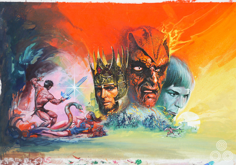
The US one sheet for Lion of the Desert with artwork by Brian Bysouth, 1981. The artists paintings have been used around the globe to advertise films.
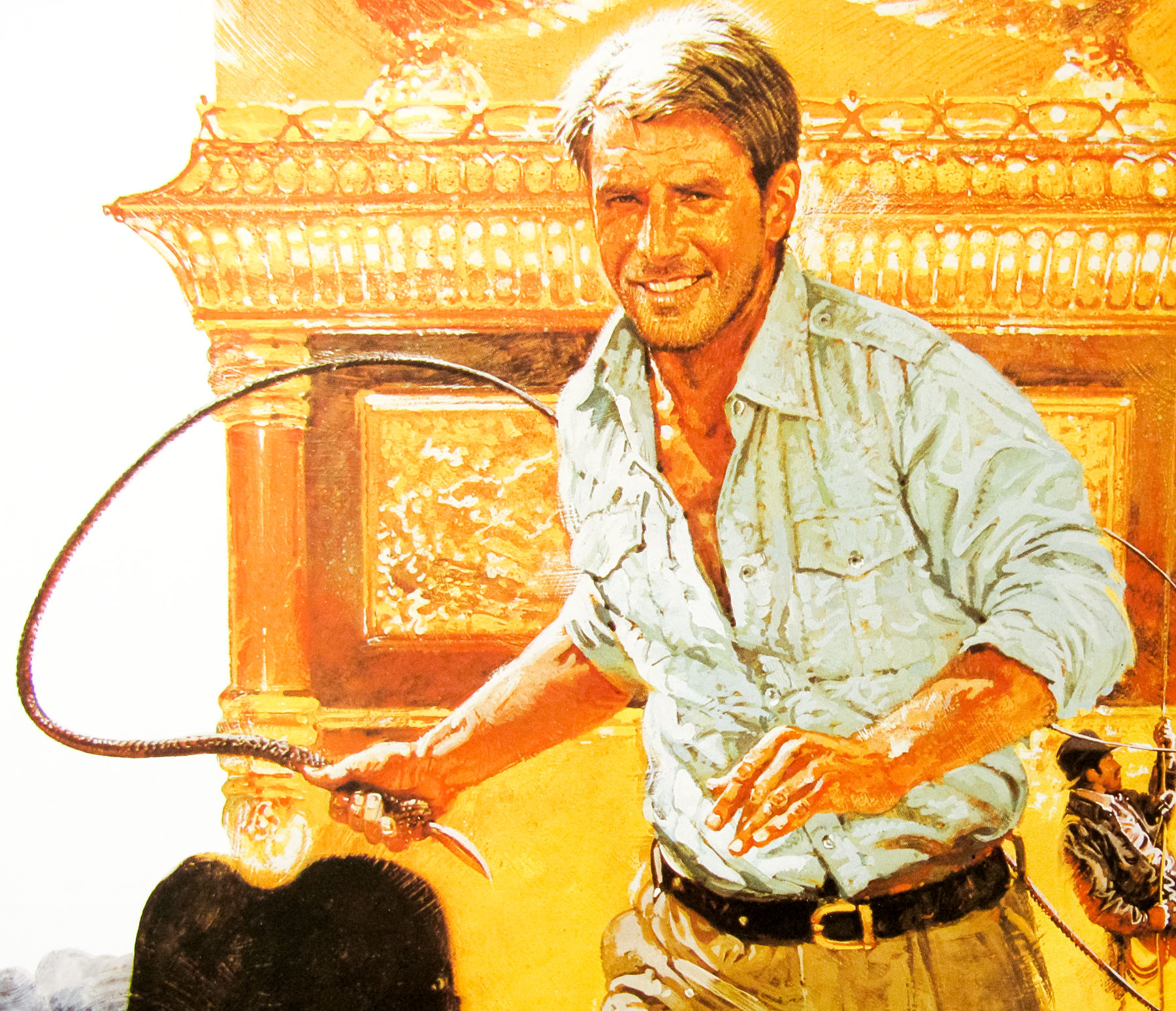
It was a good set up and I did several of my best posters during this period, including Raiders of the Lost Ark, Lion of the Desert (1981) and For Your Eyes Only. The studio ran for five years but eventually I could no longer see eye to eye with Ken Hayter. Our relationship gradually deteriorated and managing the studio was also becoming a headache.
The problem was that Ken would be out a lot of the time, visiting agencies and potential clients. I managed the studio and answered the phone. Calls would come in to say that such and such a piece of work was ready to pick up, or that a job needed delivering. When Ken arrived back at the office I’d relay the messages and the various things that needed attention. This began to annoy him and he would get into a temper saying that that he’d “just been near there, couldn’t I have contacted him”, and saying he didn’t want to have to go out again. I became very apprehensive of these recurring confrontations in front of the staff, and I resented being talked down to.
It ended up that I was telephoning around these agencies and client offices trying to catch him either before he arrived or before he had departed. Much of my time was being wasted. The constant interruptions and trying to manage the rest of the studio slowed my work down. Of course, there wouldn’t have been a problem if mobile phones were available back then!
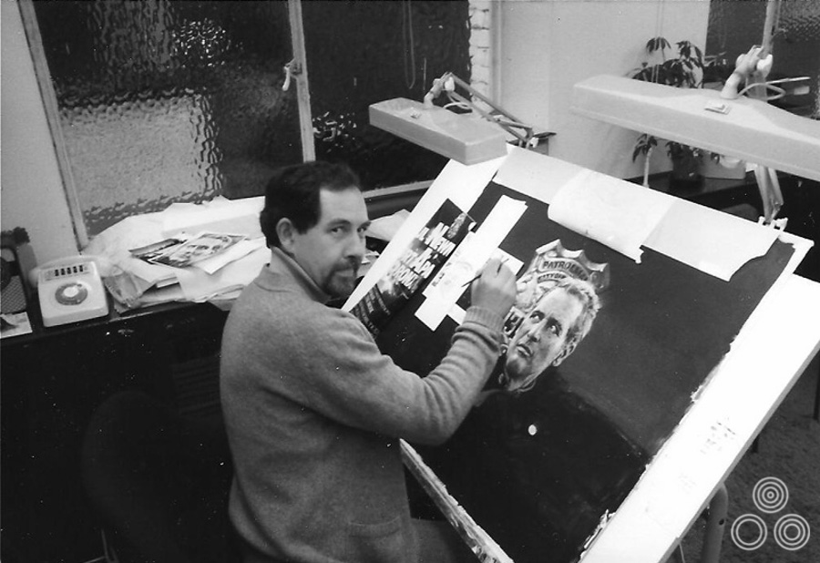
Brian Bysouth painting the artwork for ‘Fort Apache the Bronx’ at his desk in the FEREF studio, 1981
My workload was becoming difficult to manage because, in addition to illustrating, I was coaching our young artists. To catch up it became usual to work until 8 or even 10pm every evening and I was getting home very late every night, five days a week. I hadn’t realised it but I was on the verge of a nervous breakdown, so one day I simply went into Ken’s office and told him I was resigning and that he could have my shares in the company. As soon as I had made the decision to leave the pressure started to lift. Ken was mystified and a little upset but I reassured him that he’d be fine because there was plenty of work coming in and the studio was getting very well known.
Whilst I was working at David Judd Associates I’d begun to do a lot of freelance film poster work for a group of old friends who had started an agency called FEREF. I had built up a strong relationship with Eddie Paul and Frank Hillary over the years during my time at Downtons.
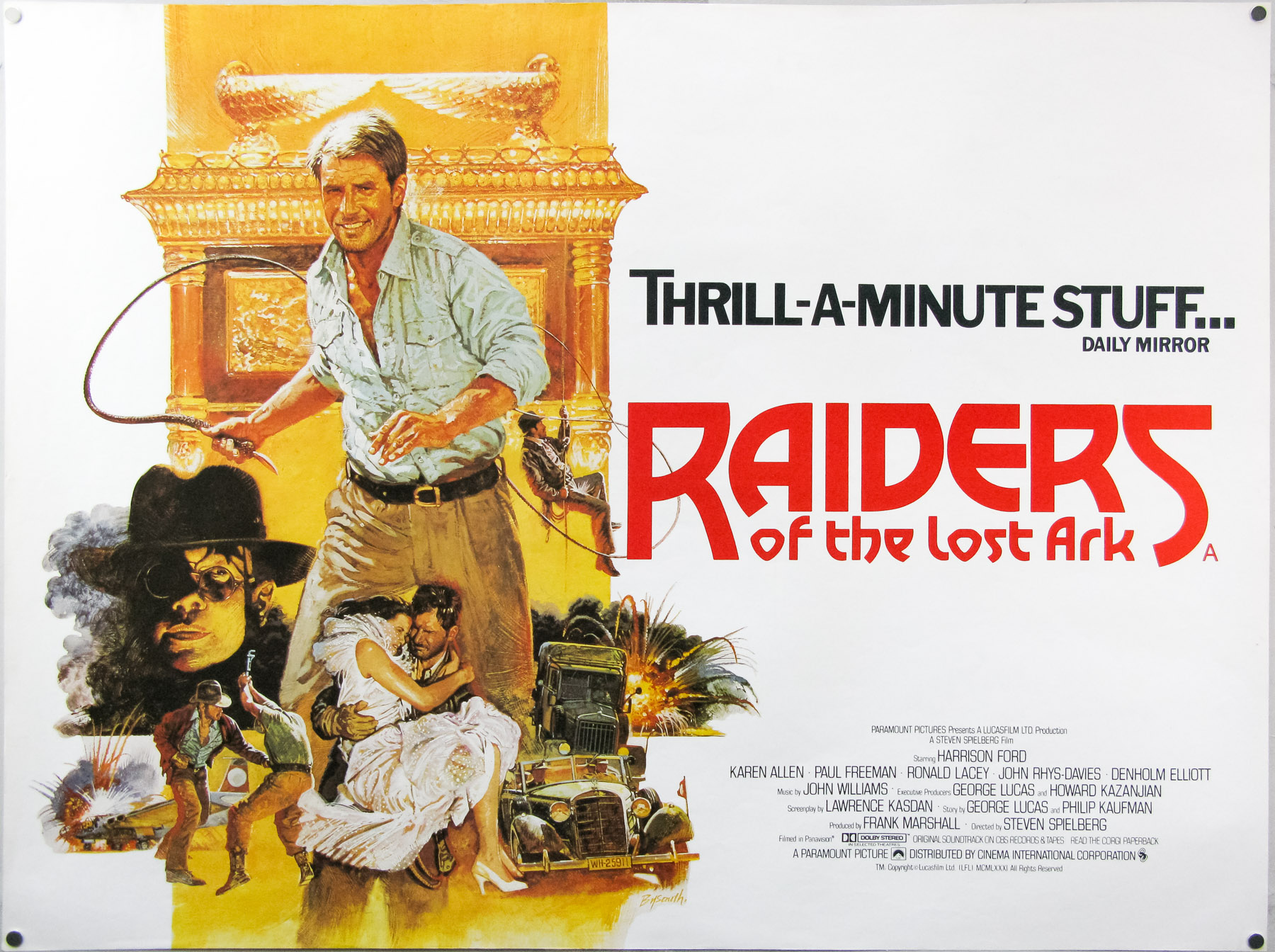
The style B quad for Raiders of the Lost Ark, with artwork by Brian Bysouth. This version was commissioned after the studio felt the first version, with artwork by Richard Amsel, wasn’t exciting enough, 1981
What about the Raiders of the Lost Ark quad? You must have done that whilst still with Ken?
Yes, that was done for the Lonsdale Advertising agency. They showed me their revised pencil visual and the first poster that had been done by Richard Amsel. They said that they didn’t like it because it didn’t show anything of what the film was about; it was a very dark poster, and the film isn’t like that, is it? It’s an absolutely classic, boys-own thriller and a very colourful film. Whilst the Amsel version is a great piece of art I think my painting does a better job of showing what the film is really about.
Were you given any directions for the re-design?
No. I knew I had to make it more exciting and if you look at the poster you’ll notice that the free brushwork helps to give it movement. I had to paint it quickly because the first quad was already up on the Underground and all over the country. Lonsdales wanted the new poster to replace the Amsel one as quickly as possible.
One thing that people often remark about in your Raiders quad is that Indy is missing his Fedora and leather jacket, which later became his trademarks.
I was given a headshot of Harrison Ford with no body reference to paint from. I struck the likeness from the reference I was given. I didn’t think the original reference photo was the best image of Harrison Ford but I did my best with what I was given. At that time the jacket and fedora had not become iconic and were not considered a requirement.
Close up detail of the style B Raiders of the Lost Art quad with artwork by Brian Bysouth, 1981
Years later a similar thing happened with the poster for Heat and Dust. I’d been given a still of Julie Christie that was not a typical likeness. I painted the portrait of her and everyone at FEREF studio liked it but the people at Merchant Ivory [the production company] weren’t happy and complained it didn’t look like her. The problem was that I was working to exactly what they’d given me and I couldn’t improve upon a still that wasn’t the best likeness of the star.
After some discussion, they agreed that my painting looked like the still but that the still didn’t look like her. The solution was to ask them to choose a photo that they did like. I re-painted the head but it came back with requests for changes, so I decided that I wasn’t going to get caught out again. Without telling them I used a photograph of her head printed on airmail paper, which is very thin and without strong contrast. I pasted this down onto my artwork and painted over it. The client did not spot the patch, the likeness was passed, and off it went to be printed. It wasn’t as well painted as the previous head that was underneath. Later, annoyingly, my art was given to Merchant Ivory without my knowledge.
Part 6 – FEREF
For folks who don’t know, could you explain who FEREF were?
When we’d moved to Chitty Street with Downtons there were a group of five people who had become dissatisfied with the management and the lack of pay increases. They decided to leave to form their own company. They were Fred Atkins, Eddie Paul, Ray Clay, Eddie Garlick and Frank Hillary. Their first initials spelled out the name of the agency they set up. Eddie Paul was the managing director and they would hire freelance illustrators to work on the film stuff.
Folks from FEREF: top left: Ray Clay – bottom left: Fred Atkins – right: Brian Bysouth and Frank Hillary
I was still at employed at Downtons and when they left I was disappointed that they hadn’t asked me to join them, but I realised that the overhead of retaining a full-time illustrator was probably a step too far. It allowed them to keep their options open as to which illustrator they were going to use depending on the job at hand. They’d got the backing of Colin Hankins, who was the advertising director at 20th Century Fox here in London. He was very supportive and had guaranteed them a steady amount of work on a retainer basis.
They started out on Poland Street and moved a couple of times before ending up on Great Pulteney Street in Soho. The office had a photographic department and a retouching team. They were using a variety of illustrators, including Arnaldo Putzu, Frank Langford and me. The relationship with the partners grew stronger and eventually they asked me to join them in 1983.
The original artwork for the poster for Thunder by Brian Bysouth, 1983
They were a friendly, easy-going and incredibly multi-talented lot, and they had maintained the happy atmosphere that they’d enjoyed through the various mergers and changes at Downtons. There was this jollity and friendliness that never left them and it was an absolute joy to be there, exactly as it was back in 1958. It was largely centered on the calm and easy-going personality of Eddie Paul, the outgoing and rumbustious character of Frank Hillary, and the way Fred Atkins just loved everybody and laughed and joked all day long.
I joined after Arnaldo Putzu had left to go back to Italy and was given the office that had been his. The work just started to flow straight away, including a lot of video covers because it was at the time that the format was really taking off. Fred and Eddie were designing covers and I’d be illustrating them. Many were re-releases of course, and we couldn’t just re-use the quad artwork, so new designs had to be created. I used to get about £300 for a cover, which was okay.
Artwork for the cover of the VHS re-release of The Brotherhood of Satan (1971) by Brian Bysouth, 1983
You really enjoyed your time at FEREF then?
Absolutely, it was just a lovely place to work. The studio continued to grow and we did get some work from Warner Brothers as well, but eventually our biggest account became UIP [United International Pictures], which was a company that managed the advertising for three film studios; Universal, Paramount and MGM.
You were at there for 19 years and by the end you were designing and illustrating posters. Were you pretty much being left to your own devices?
Yes, but not all the time. I usually worked closely with Robin Behling who was the Creative Director. Eddie was responsible for the majority of the film design work before he passed away. He was really good at creating colour roughs, often using wax crayons as well as magic-markers. He did a really beautiful design for a film called Ladyhawke starring Rutger Hauer. I was very glad that he gave me the enjoyable job of painting the finished art and everyone liked it. Unfortunately, the decision was made to take the poster to a focus group for market research and afterwards the report came back saying that the participants didn’t understand what the film was about. We had to take the key elements of Eddie’s design and turn it into a triptych thing with big pictures of the stars. It looked very ordinary.
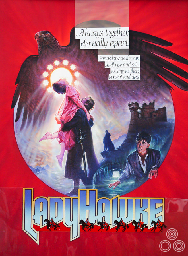
An unused design for Ladyhawke, painted by Brian Bysouth and ultimately rejected for an alternative layout. 1985
I also painted a quad for Supergirl and the title needed to be illustrated which I really didn’t want the bother of doing. Frank Hillary illustrated the glass-like title design on clearfilm, which we overlaid, allowing the painting to show through. They’d asked us to do a design that mirrored the one for the original Superman poster that Bob Peak had worked on. We were quite pleased with the result but then the client had a committee meeting that decided they wanted the main monster included, which I added, but the amendments diminished the power of the original and the poster ended up a bit of a mess.
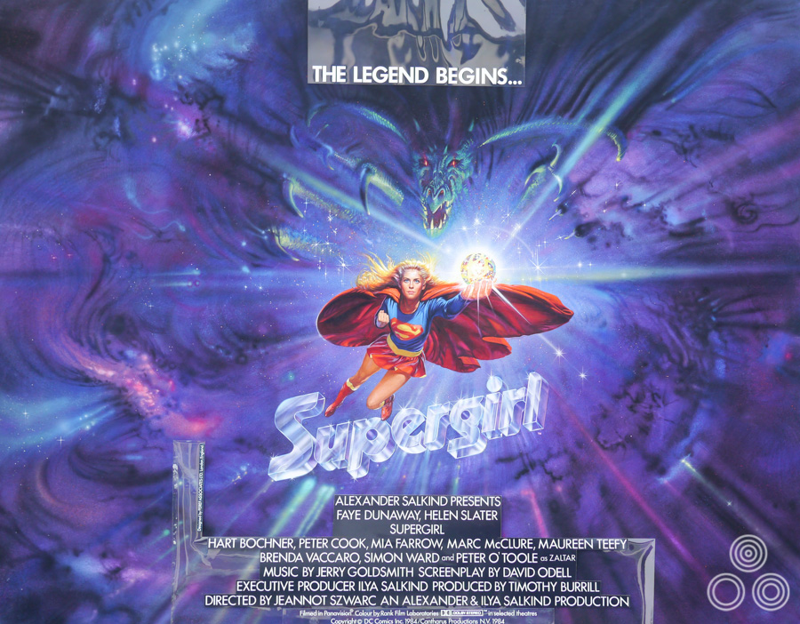
The original artwork for Supergirl by Brian Bysouth, 1984
There was a Mel Smith film called Morons From Outer Space, which Eddie Paul designed and I did some work on. Josh Kirby was asked to paint the final poster. Also, there was Eddie’s design for Return of the Jedi, which he asked if I could do. This was whilst I was still with Ken and I had to turn it down because I had a couple of week’s work in hand that I couldn’t delay. Again Kirby ended up doing the illustration. Looking back now, had I known how iconic it was to become I would somehow have made the time to do it!
I would have loved to have seen your version of it! What other things did you work on at FEREF?
A lot of video covers and film campaign books, and the run up to the Cannes Film Festival was always a busy time, producing promotional items for production companies that were our clients. In later years, when FEREF was trying to diversify, we acquired a variety of non-film clients, which involved me illustrating in a more commercial way. Sometimes the budgets were modest but whatever it was I always tried to paint without thinking about the money, doing my best with the material I had.
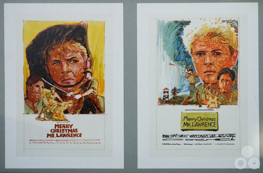
Unused roughs for Merry Christmas Mr Lawrence that depict David Bowie, the main star of the film, drawn by Brian Bysouth, 1983. Brian would also design and paint a UK one sheet for the film that was printed and distributed to cinemas.
That philosophy saw me right through my career and it became rooted in me during the period when I was being given a lot of work and Bill Wiggins was being overlooked.
I’d often throw a painting away if I wasn’t happy and start again and that always puzzled Bill. His attitude was to be happy if it was ‘good enough’, and he wasn’t bothered if it wasn’t his very best illustration. He used to tell me that I didn’t need to strive to do perfect work all the time. My reply was that if I had the time I would do the best job I could, and that I didn’t mind starting again to get it right.
The original artwork for the British quad for The Challenge, painted by Brian Bysouth, 1982, from a design by Vic Fair
A still life artist that I’d met at Rapier Arts said some wise words to me. He was a great admirer of Chinese water-colourists and he had quite a collection of them. He told me that the artists sit and think about what they’re going to do before they even pick up a paintbrush. They think every brush stroke through, often over a day or more; he maintained you could see evidence of that in the final paintings. He told me a lesson worth remembering, which is always try to think illustrations through before you pick up your tools. It’s better to sit and plan for an hour instead of smashing straight into something.
It was a lesson I really took to heart and from then on I tried to spend time visualising the painting in my head before picking up a brush. Curiously, I’d often find myself starting this ‘mind’ painting again if I couldn’t see how it was going to turn out.
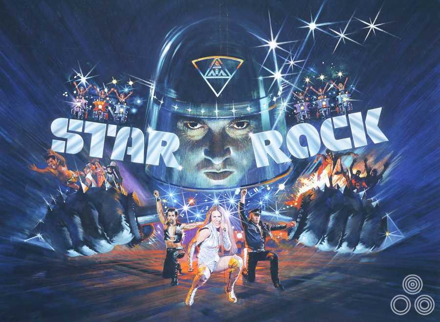
The original artwork for Star Rock (released as The Apple), designed and painted by Brian Bysouth, 1980
Computers as an art tool came in during the time you were at FEREF. What was it like making that transition? Was it easy for the company?
Yes, luckily Steve Laws, the studio manager at the time and also a good designer, managed to persuade the upper management that desktop publishing was coming and that we had to embrace it. I can’t remember exactly when this was, but it was clear that the Apple Macintosh was the best computer. At that time they were very expensive but gradually the studio was equipped with the new technology.
Unfortunately, the computers replaced the jobs of paste up artists and it soon became apparent that unless they were capable of making the transition they were no longer needed. One machine and an operator could add all the text and details to an advert or illustration, ready for it to be sent to the printer. To keep their jobs our paste up artists had to learn how to use a Mac.
In the beginning the computers couldn’t handle very large files so things went very slowly, especially with complex designs. But when Macs started to get a lot faster the way forward was firmly established and we began to recruit skilled computer designers and operators.
The original artwork for Bronx Warriors 2 (AKA Escape 2000) by Brian Bysouth, 1983
I realised when my illustration work was drying up that I needed to become more of an art director. I was interested in helping out the Mac designers and I was able to use my experience to help them. I always found it easy to suggest ways to improve a design, which they came to appreciate; gradually it became usual for me to be asked to help if a design was proving troublesome. I wasn’t as quick on the Macs as the operators but I realised that I had to learn Photoshop to enable me to art direct them properly. Learning the correct commands was essential, so I read the manual of Photoshop 3, (which I think was the version at that time), and learned the various key-commands and technical terms.
Eventually I asked for a Mac of my own and I was given use of one that had become surplus. When I wasn’t painting I was practicing. Looking back now, it was instrumental in helping me when I was asked to work on the Star Trek DVD covers.
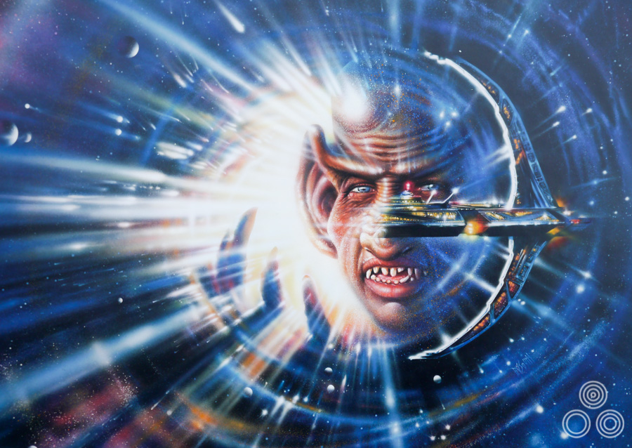
Original artwork for a Star Trek Deep Space Nine VHS cover ‘The Cardassian’ by Brian Bysouth
Ah yes, you worked on a series of covers for Star Trek videos (and later DVDs) at FEREF?
After a prolonged effort we were successful in winning the Star Trek business from Paramount. There was not much picture material supplied that could be scanned and tweaked on the Mac, so it was necessary to illustrate nearly everything. I had a printer that could take stills from a VHS tape, frame by frame, and I used those as reference to design and illustrate each cover. There were a lot of spaceship paintings required and the only stills provided by Paramount would be of the characters without any pictorial reference of the hardware seen in the series.
It was a challenging project, but very satisfying to work on, especially because our clients at Paramount liked the work that we produced.
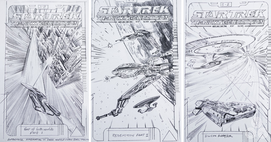
Sketches for VHS covers for Star Trek Next Generation by Brian Bysouth
The covers are definitely iconic and I remember them very well, particularly those for Deep Space Nine and The Next Generation.
For both of these series I illustrated seven volumes, each usually comprising thirteen covers, so it was a lot of work and lasted probably nearly two years. Then, later on, Paramount decided to re-issue them all again on DVD. We were commissioned to work on a box set to hold the volumes and we redesigned everything, even though there wasn’t much new material. Very little was forthcoming from Paramount since it had all been dealt with years before, and we assumed it was lost in the archives.
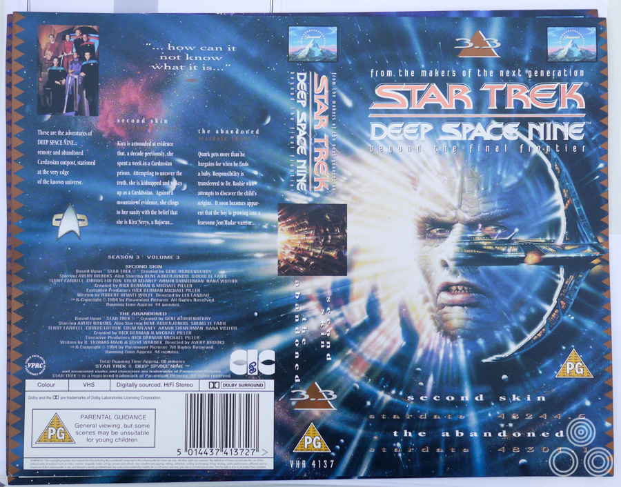
A printed cover for Star Trek Deep Space Nine, designed and illustrated by Brian Bysouth
There was a new young designer at FEREF called Richard Jones and he and I worked together on the release. We discussed some ideas, and eventually were enthusiastic that the appearance of the new box should resemble the styling of the interior fittings in the Starship Enterprise. He did some sketches of the box concept that we all liked. Paramount were also very enthusiastic and we were given the go-ahead to produce some mock-ups
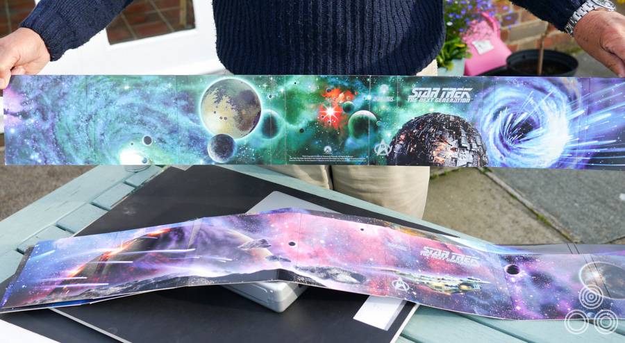
Detail of the packaging for a Star Trek Next Generation DVD set designed and painted by Brian Bysouth
The silver box held the digipack of DVDs, which was a fold out design, and this presented me with multiple panels to work on, each one an illustration of a space scene that spread across the seven volumes. The idea was to encourage fans to buy the full set and by joining them end to end they could see the whole painting! That kept me busy for my last two years at FEREF.
The newly issued DVD box sets were very well received and as a result of this success we were asked to produce a second box design. This was to be slightly different from the first so I suggested that it should include subtle styling cues to echo the decorative designs that the Romulans used on their hardware.
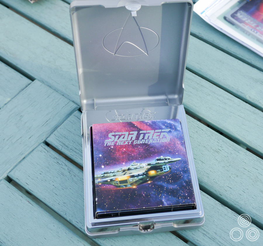
The box that houses the Star Trek Next Generation DVD set, designed by Richard Jones and Brian Bysouth
When presented with the problem of scarcity of reference material, it occurred to me that I could scan and re-illustrate some of my earlier paintings from the VHS covers since they were still obviously relevant and suited some of the designs perfectly.
You started to work on a lot more computer-designed posters too I guess?
Yes, I helped on many, including posters for Bond films; The World is Not Enough, License to Kill and others. The problem with those commissions is they invariably ended up in front of an approval committee, which inevitably resulted in the power of some of our concepts becoming weakened by alterations to accommodate the modifications requested.
Brian Bysouth with the final painted figure of Timothy Dalton from The Living Daylights quad (1987), painted by the artist. Photo, 2012
The last painting I did was for The Living Daylights (1987). There were a number of us involved with the initial design ideas for that poster, including Bernie Goddard, a freelance designer who often worked with FEREF. Mike Bell also produced some concept roughs. Using the original Bond spiral gun barrel idea was a concept that featured on some of the designs and Bernie submitted one using it. The final concept was an amalgamation of ideas and I was tasked with composing the montage that became the poster. I produced the final colour rough that was sent to the client and we were all very glad when it was approved and I was able to start the finished painting.
I came across the rough a little while ago and it’s in reasonable condition considering it’s age.
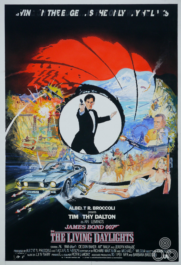
The original coloured sketch for The Living Daylights poster by Brian Bysouth, 1987
That design ended up being used around the world and, as Sim Branaghan disclosed in his book, you were paid the highest fee ever given to a British film poster artist for that.
[Laughs] I probably shouldn’t have told Sim that! I don’t know if it was the highest fee ever paid, as I have no idea what other artists in Britain were getting for their work. But later I read somewhere that Bob Peak was being paid up to $50,000 for one poster at the beginning of the 1980s, and other artists such as Drew Struzan were perceived as being extremely well rewarded. I used to charge a day rate and always felt there was a downward pressure on the fees I charged. I was aware that as a director of the company I felt obliged not to inflate my prices, always making allowance for the company mark-up. With the wisdom of hindsight, maybe I was wrong and I should have charged more. Anyway, I remember being content at the time.
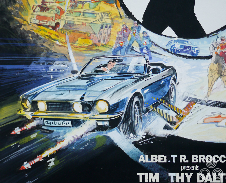
Detail of the original sketch for The Living Daylights poster by Brian Bysouth, 1987
I never knew how much FEREF were charging the client and I never thought to enquire. I decided that I was going to charge £3000 for my work on The Living Daylights because I had been working on the campaign for weeks. The fee was agreed and that was fine. Looking back in retrospect at an illustration that was used around the world to market a James Bond film do you really think that was a lot of money? It’s peanuts! Especially in comparison to the enormous budget the studio would have allotted to the marketing in total. Finally, I hope I am right in believing the client thought well of FEREF because we didn’t ridiculously inflate the price of the work we did for them. We sincerely believed we were the best at what we did, and it was upmost in our minds that we had to be competitive with our charges.
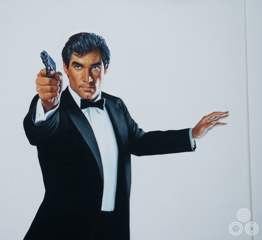
Close up of the final painted portrait of Timothy Dalton for The Living Daylights poster by Brian Bysouth, 1987
It obviously worked since FEREF ended up doing several more Bond posters?
Yes, we were lucky because there was what could be described as agency loyalty, which managing director Ken Paul fervently believed in. His aim was to maintain a very friendly relationship with various executives at places like Fox and UIP. He would lunch with them on a regular basis to keep that bond strong. His philosophy was to draw the clients in and he told me he wanted FEREF and the clients to be close; it shouldn’t be that the agency is just working for the client, but that we’re friends working together to get the best result that we can both be happy with. The film company made money, we were well rewarded and hopefully kept the business.
There was a genuine friendship between Ken and some of the clients and he considered it perfectly acceptable to invite some of them to his wedding. I do think it made a difference to the company, especially in the early days of FEREF.
Later on, when budgets became tighter, the studios began trying other agencies and about this time I think it was becoming usual practice to be asked to do a creative campaign for a flat fee that was agreed up-front. So we found ourselves having to pitch for the work. I think we’d be offered as little as £1500 for a series of presentation designs for a film that might not even see us win the job. It was usual to begin by submitting sometimes a dozen pencil designs and eventually, if any stills or transparencies were given to us, we started using those to print-out more finished looking roughs produced through the Mac. These helped the client to easily visualise how the concepts being presented would look as the poster.
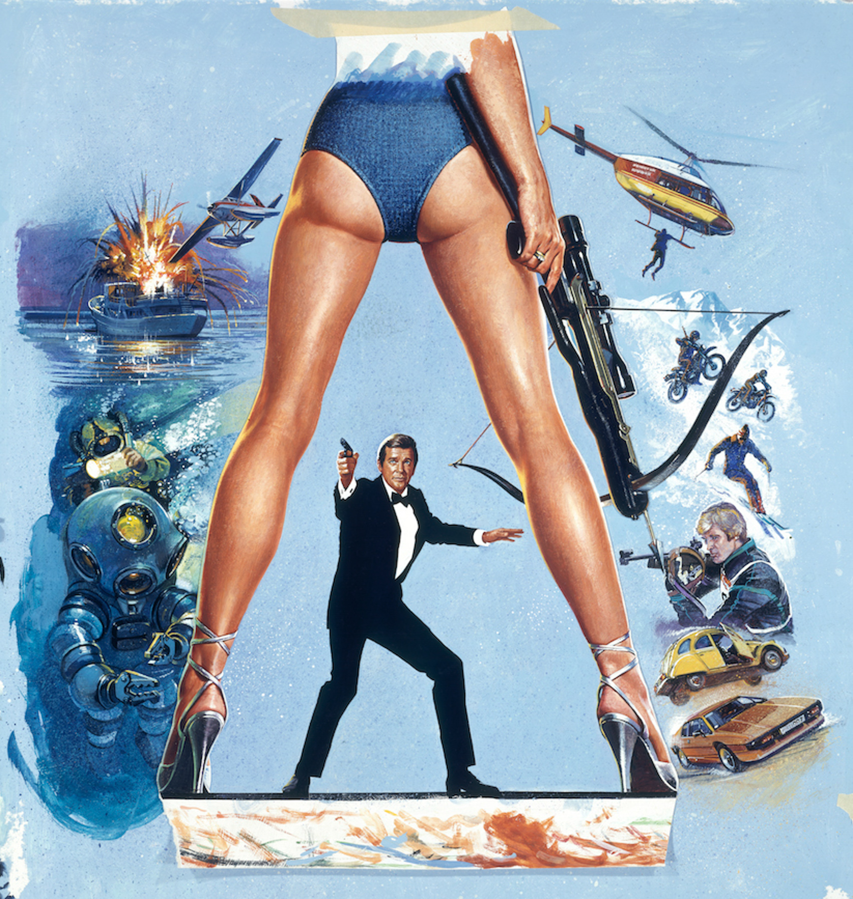
The original artwork for For Your Eyes Only (1981) painted by Brian Bysouth. This is an image of the 8×10 inch transparency that would have been used by the studio (FEREF) to have the poster printed. Brian painted the legs and the character of Bond separately from the surrounding montage, which is why you can see the rough tape at the top and bottom holding the parts in place. This image comes from the private archive of Thomas Nixdorf, Germany
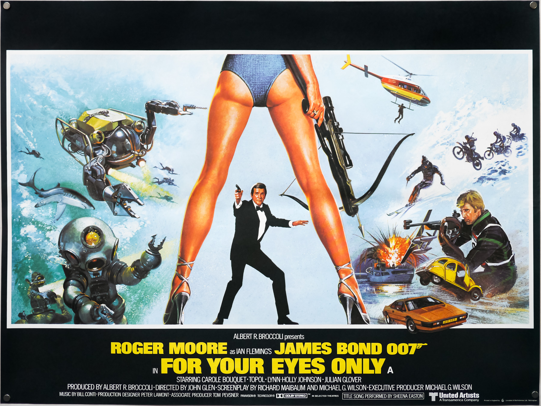
The UK quad for For Your Eyes Only, designed by Eric Pulford and painted by Brian Bysouth, 1981
One Bond poster you worked on is the quad for For Your Eyes Only. It had the Bill Gold designed element of the long legs, but you modified the montage when doing the finished illustration?
Eric Pulford created the U.K. poster design that was approved. The inclusion of the very iconic Bill Gold legs concept was a must in any design that was submitted, so I suppose the scope for fresh designs was limited. In my opinion Eric’s original montage was not his best work and, although I tried to re-arrange some of the elements, the reference material supplied was not very exciting and I think the surrounding montage looks rather ordinary.
A similar difficulty arose with the design Eric had done for The Bounty (1984). His atmospheric colour rough was exciting, but when I began to sketch out the finished painting I realised the perspective of the ship was flawed. Eric’s exciting random montage of characters had initially disguised the shortcoming. I spent a day redrawing the ship and rigging to ensure it was reasonably correct, and then moved the characters to try to improve the composition. I was pleased with the final painting but was never happy with the montage, which I really thought needed recomposing. I didn’t think a confrontation with Eric was in my best interest.
Some weeks later I asked for the return of my painting only to be told, ‘it could not be found’. Obviously, a light-fingered person took a fancy to it. Much of my work has been lost to me in that way, including my teaser art for A View to a Kill. Presently I am engaged in monitoring Film Memorabilia auction sales in order to reclaim art being offered for sale that legally belongs to me. I am glad to have been successful in recovering quite a number of paintings. One case involving poster art I did for 20th. Century Fox is still ongoing as I speak.
The UK quad for The Bounty, painted by Brian Bysouth, 1984
Another favourite of mine is your painting for 48 Hrs, which features Eddie Murphy raising his middle finger. Was that from your design?
No, I can’t recall who designed that. I need to check my invoice books to confirm, as I’d always write who briefed me to do the painting. Sorry, but I never really liked that design. I’d been given poor reference material and I think Nick Nolte’s likeness is fairly dire. I spent a while on it because of that difficulty but really didn’t like the painting because I never liked the design.
I like it because of the amount of detail you can see, much like your painting for Highlander.
Thank you, I was pleased with that one. It was an enjoyable job and, fortunately, when asked to do a design for that type of film I was usually quick to identify what the key image should be. Phil Howard-Jones, the advertising director at EMI, who I did the work for, liked it very much and eventually he kindly returned it to me.
The original artwork for the Highlander poster with artwork by Brian Bysouth, 1986
Phil also liked the poster I’d painted for A Passage to India (1984) and framed it for his office wall. I remember the brief for that one being, ‘we don’t want to see any elephants, nothing to do with India, just sell it as a love story.’ The artwork was a montage of a young English girl and a young Indian boy framed together with an ancient temple sculpture of two lovers. Everyone was pleased but it was never printed here because its initial release in America was a huge success.
The American one sheet came in for adaptation but because of this success it was decided not to change to the campaign we had created. We were annoyed because, guess what, the American poster had a bloody elephant on it! It was often the case that when a poster had been a success in America, there was no need to spend more money re-designing the poster for the UK quad. A few years later Phil returned my original, which I now have hanging in my house.
The original artwork for the poster for Link by Brian Bysouth, 1986
There are two specific collaborations you had with Vic Fair that I’d like to talk about. There was the UK one sheet for A View to a Kill, which you mentioned, and before I read Sim’s book I had no idea that it was one of yours. It’s quite different to others you’d worked on before then.
Ah yes, that poster was painted with a different technique than the one I’d typically work with. It has a very smooth look mostly done with an airbrush. The clients had started to require illustrations to have a less painted look and they were asking for much more photo-realistic illustrations. This requirement was because of falling sales in the video market. The clients had concluded that the paying public had become more discerning and distrustful of what was portrayed on the video sleeves, and to some extent on film posters. The public had begun to realise that an exciting illustration could flatter what in reality would be a truly awful film. So illustration had to take on a new, more highly-finished look, but this only worked for a short while before the use of photographs and the versatility of the computer took over completely.
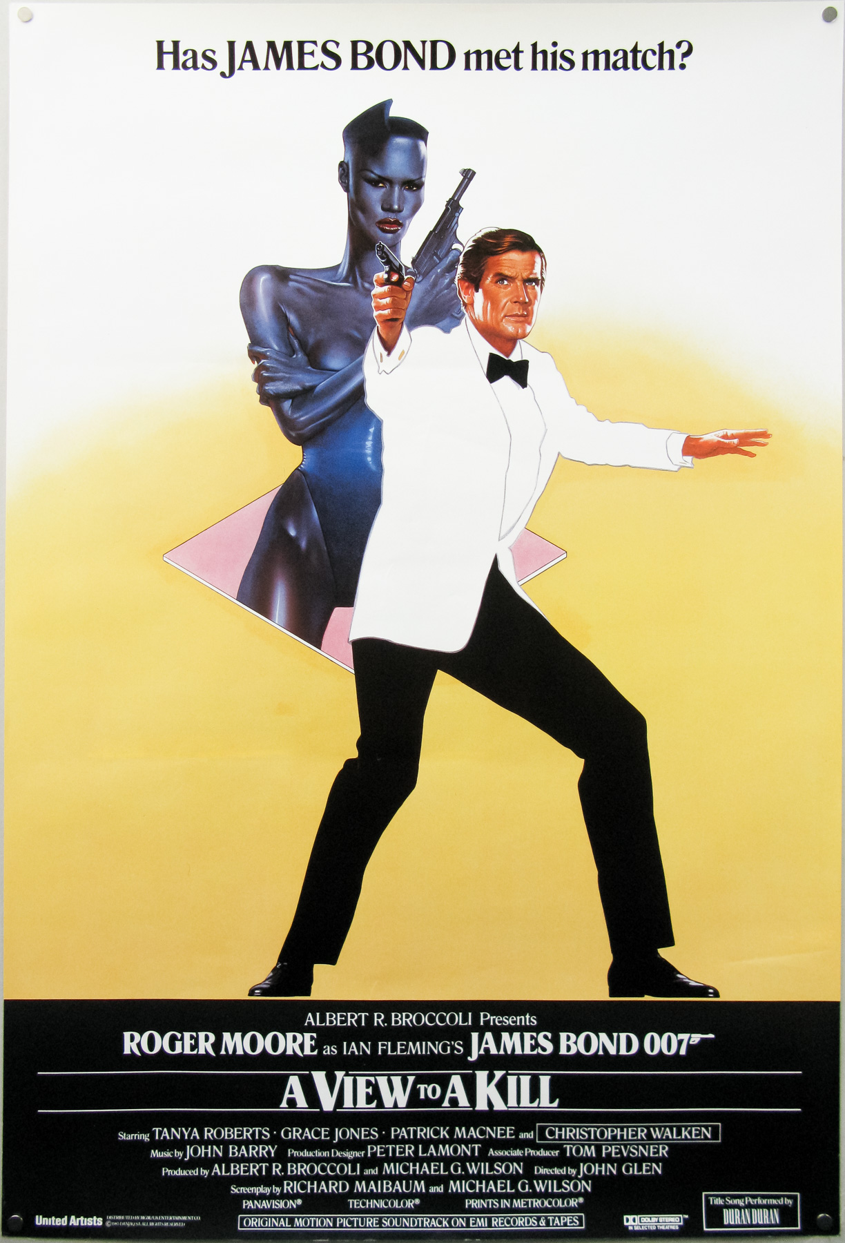
The final UK one sheet poster for A View to a Kill. Designed by Vic Fair and painted by Brian Bysouth, 1985. The poster was rejected by the Bond producers because they felt that the spy would never be seen wearing a white tuxedo. Despite this, several hundred copies of the poster were printed and made it onto the collectors’ market.
Anyway, to continue, Vic asked me if I’d like to do the finished painting based on his rough; it was a really excellent and novel design, which required me to execute the painting in two stages. The first stage would be used as a teaser poster and this was just the image of Grace Jones and Bond contained within a diamond motif. All I had to do was get the airbrush out and work up his design. I remember spending a while on the Grace Jones image, polishing and improving her look, as well as the pose of Bond. It went away to be printed but later we were disappointed to learn that it was going to be withdrawn because the clients were not happy with the legendary spy being portrayed in a white tuxedo; that being considered not very Bond-like!
For the second stage, Vic’s design included an exciting montage to fit either side of the central icon of the two characters. The preliminary painting was returned to me for completion and I continued by adding the montage of scenes from the film onto the artwork in a semi-drawn style, which I was experimenting with at the time. I was very pleased with the final results and Vic liked it too. That went off for approval but, for reasons unknown to me, the printing didn’t go ahead. I never saw the artwork again and pathetically, because it was not approved, I don’t even think a transparency was made. I entertain hopes that one day it will eventually re-appear and I will be able to establish my claim to ownership.
Another one you both worked on that I love is the poster for The Emerald Forest, which has a great device of the leaves dividing the two faces
That’s another superb design from Vic. The textured effects were created by using an old toothbrush to splatter the paint on quickly, and then I’d use an airbrush to finish it off. I really enjoyed painting the two figures running through the water. Being asked to do the finished illustration for such an outstanding design remains a deeply satisfying experience.
The original artwork for The Emerald Forest by Brian Bysouth
Years later, I asked Mike Wheeler, the advertising director at Rank, if he could return the artwork to me and I was astonished when it arrived by messenger the very next day. I always got on well with Mike but that kind act secured an enduring friendship.
One poster that I recently discovered had your input is the quad for The Castle, which is that small independent Australian film that came out in the 1990s. You modelled the wall plaque that’s featured on it, right? How did that come about?
We went to a screening of the film and afterwards had a meeting to discuss what we all thought was a unique and challenging film to create a poster for. Later I sat down with Steve Laws, the studio manager and a leading creative, and we thrashed out some ideas, but inspiration was lacking. The following day an excited Steve came into my office and explained his idea for making something ‘that the dad in the film would be happy to have in his poolroom’ (a famous quote from the film).
A concept sketch for a poster for The Castle by Brian Bysouth, 1998
Steve’s idea was that we should create something that you could easily imagine hanging in the poolroom amongst all of the other bric-a-brac. We decided to imitate those bass-relief plaster plaques that you see in kitsch-filled shops. So we went out and bought some Plasticine and a very large plate to base the model on, and I set to work. I modeled the characters and the airplane taking off over the bungalow. The title was cut out of Plasticine and included around the base. I remember thinking that my art school training in sculpture was a real help.
Steve and I enjoyed a good laugh as we watched the thing develop, and a series of transparencies were made to show the client how it was progressing. When it was finished I painted it with poster colour then sprayed it with varnish to protect the delicate surface, and that was that. For the background of the poster we wanted to reproduce the wallpaper of the poolroom but couldn’t find anything we liked, so we ended up using a macro close-up of one of the FEREF account executive’s silk ties!
The UK quad for The Castle, designed by Steve Laws and Brian Bysouth, 1997. Brian designed and sculpted an actual plate that was then photographed for the poster.
Part 7 – The end at FEREF and retirement
How did things end up for you at FEREF?
Well for me, film commissions were beginning to dry up and there wasn’t enough coming in to keep me busy all the time. It was getting to the point where I could barely make enough money to continue paying my pension contributions each month. My fellow directors were aware of my difficulty and agreed to give me a monthly retainer, which really helped and ensured my continued presence at FEREF. This coincided with a period of economic downturn at the beginning of the 1990s, the implications of which meant we had to modify what we could charge for our work. There was still work to do but it just wasn’t as well paid as it had been.
In order to keep busy I joined an artists agency called Meiklejohn. I met the brothers who controlled the agency and they liked the specimens that I showed and assured me that they would be able to get me plenty of work. My first commission was to paint a facsimile of the original Thunderball poster that was to be used to promote the launch of a new, limited edition James Bond toy action figure. My main illustration was the large underwater scene from the film; this together with other well-remembered action images were to feature on the packaging. An interesting element of the promotion was the inclusion in each box of a 35mm frame cut from a print of the original film. The client had asked for me because of my association with the other Bond films.
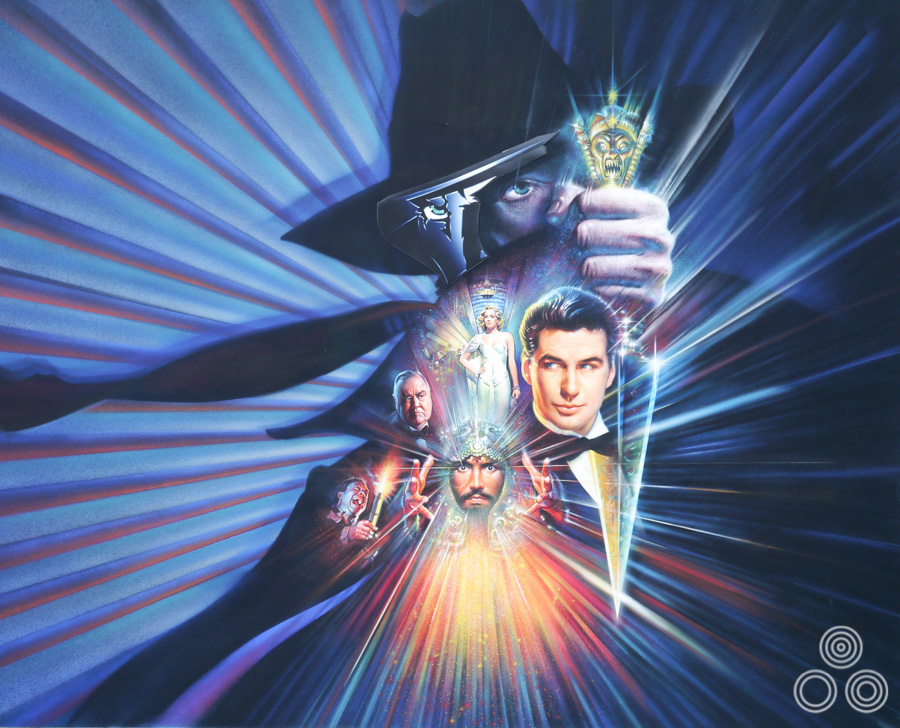
The artwork for The Shadow, designed and painted by Brian Bysouth, 1994. This was one of the artist’s final quad posters.
Luckily, it was then that the Star Trek DVD Box Set work came into FEREF and that kept me very busy until I retired. It was an interesting few years working on those covers, made particularly enjoyable because I was learning my way around the Mac and working closely with the talented young designers who helped with the many different images we had to create. I actually ended up staying on well past my retirement date because I was still in the middle of working on the last of the box sets and I wanted to stay and see them finished.
Were you continuing to work five days a week then?
Oh yes, I travelled to the office every day and actually I’d lost half of my office towards the end so that we could make room for another designer. I was late in discovering that I was eligible for a senior railcard. It required travelling after 9.30am in the morning when the rush hour was over but it saved buying a monthly season ticket. It was a fast service and I arrived at the office about quarter past ten. I recognised that perhaps my ‘flexi-time’ caused a little resentment from some of the others and my reply was to point out that I never took a lunch break and was always still working at my board well after most of the staff had left for the evening. There was plenty to do and with the added benefit that it was easier to concentrate because the phone stopped ringing.
When Eddie Paul and Frank Hillary passed away, and later on when Fred Atkins retired, there was still the occasional job that required hand-retouching work. Previously this had been handled by Frank. Fortunately, over the years I seen how skilful he was with his airbrushing jobs, and learned a little about his technique for retouching and colouring-up large photo-prints, which was a great help when this type of work fell to me.
A piece of unused concept artwork for Judge Dredd, 1995, by Brian Bysouth
I think that’s what sets you apart from a lot of people who worked in the industry; you continued to learn new techniques and adapt to technology and didn’t just stick to working in the medium you were used to.
Well it was the way forward for me because I wasn’t ready to retire. Even though I worked for years I didn’t make as much money as you’d probably imagine and just couldn’t afford to finish up early. Learning the new techniques was vital to being employable and to stay in touch with what was happening in the industry.
When did you finally retire?
Once the final Star Trek The Next Generation Box Set was complete, FEREF were asked to start work putting together new-look packaging for the release of The Original Series, with William Shatner and co. I realised then I didn’t have my heart in it any more. I remember one day the chairman, Peter Andrews, called me into his office and said, “Look Brian; you’ve done a lot of good work over the years. You should step back now. Why don’t you call it a day?” I went away, thought about it and realised Peter was absolutely right. The prospect of not having to endure the commute to London anymore began to look very inviting, so I packed up my paints and retired.
I was just past my sixty-sixth birthday at that time but enjoyed continuing as director and shareholder for about a further six months, attending monthly meetings with the other directors. Some time previously, Peter had confided in me that he also wanted to retire and shortly afterwards we both resigned from FEREF, and Robin Behling, the Creative Partner, took over the Company.
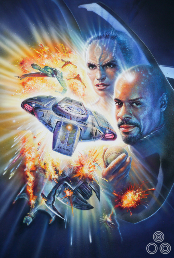
Original Star Trek Deep Space Nine packaging artwork by Brian Bysouth
There’s a line in Sim Branaghan’s book where you’re quoted as saying, “I’d be happy if I never have to pick up a paintbrush again”. Have you done so since?
No, I haven’t. My friends constantly remind me of my background and occasionally will say to me ‘why don’t you do some painting?’ I tell them I can’t raise any enthusiasm for it. I think the thing is that quite frankly I was never really a truly committed artist in the true sense of the word. Someone like Van Gogh or any great painter is compelled and obsessed with their craft and they have to express themselves. While I admit to really enjoying creating drawings or paintings, I suppose now the need to express myself in that way all the time has gradually subsided.
I realise now that a lot of my original ideas were knocked out of me and I didn’t have time to realise them as a creative artist. I was constantly being directed or working to a tight brief, especially in the early days, and always being controlled by very demanding art directors. I did go on a few painting holidays before I retired. I would go to a different location each day; a place of interest like a lake, a harbour view or whatever, and I’d sit there with an easel and paint away.
Very often I wouldn’t know for a few minutes where or how to begin. I had to learn again to think of the subject in terms of how it pleased me and how I wanted it to be depicted, rather than ‘how do they want it to look?’ It took a few failures before I realised it was totally up to me. I was so accustomed to being directed.
A Christmas card depicting Fred Atkins as FEREF’s own Father Christmas, painted by Brian Bysouth
What do you enjoy doing now?
I started out playing golf three or four times a week, as well as gardening and tinkering about with the old car. Then, surprisingly, my back began to be very painful. I say surprisingly because one could hardly say that it had done years of manual work; all I ever did was to sit behind a drawing board. My doctor gave me some good painkillers and I cut down the golf to once a week. There are lots of things I need to do around the house so that’ll get me ‘painting’ again.
Recently, however, the thought of sitting at an easel has grown more appealing. It’ll be a challenge to be productive again in a few years time and I enjoy painting subjects such as boats and the sea so, looking forward, that will probably occupy more of my time. A few weeks ago I went to West Mersea and took a lot of photographs of the yachts and fishing boats and I’ll probably use those as a starting point for the paintings.
That’s brilliant Brian, thank you so much for your time.
You’re welcome, thank you.
_________________________________________________________________
To see the other posters I’ve collected by Brian click here.
What a great interview with such a brilliant artist, for which we will never see the light of again. From Cromwell to James Bond truly amazing. I am the very proud of owner of Brian’s first poster Tiger Bay which was purchased from his very own private collection. The poster comes complete with his signature and the dealer who sold it to me on his behalf. Brian you can rest assured Tiger Bay has gone to a really good home as I have been a collector of posters for British films since the early 1980s. Last September I done an article with my local paper The Banbury Guardian about the collection, which still is online today. I also have The Belstone Stone Fox which I described as stunning in the article. Many thanks to all those who put the interview in place with Brian a great trip down memory lane
Great article.
Do you know who owns the original paintings for the Star Trek Deep Space Nine VHS character Covers or where I might obtain some?, please.
What an incredible artist and touching interview. His work continues to evoke and inspire me as a young filmmaker.
Posters have become a part of film language forever. What a legend.
I believe I have four paintings/prints by Brian Bysouth and would like confirmation they are his – they are a little different from his norm.
Thankyou Brian for mentioning my Dads name – Eddie Garlick, one of the founder members of FEREF. Its lovely to see his name there and still getting recognition for the Company and work. Though he is no longer with us, his art work is still around, just wish I could afford it!
Brian is an absolute genius, I never knew he painted so many of my childhood classics! I wish there was a book with all his illustrations in it, and wish someone would write one.
I had the pleasure of working alongside Brian as a trainee Illustrator for many years. I owe everything I ever learnt to Brian, he was a kind, patient, and enthusiastic teacher.
I arrived at my first job in advertising, straight from art school at Garland Comptons way back in in 1970, our studio was adjacent to Downtons where Brian was working. When nobody was about I walked in to their studio to look at the artwork for the film poster ” Tell them Willie Boy is Here “.
This was the first bit of original Illustration I had ever seen, I looked at it with amazement , I could not believe anyone could paint like this.
After seeing Brian’s artwork, I knew what I wanted to do and made it known that I wanted to work alongside him and Bill.
Brian saw to it that I was given the chance to do this and I was grateful for it. I kept my head down and learnt everything I could from him.
He has remained a great friend to me to this day. I am so glad he’s getting the rewards ( should be awards ) for his years in Illustration. When he packed it all in it was regrettably the end of an era in illustration, it is good news to hear that he might take up painting from the easel….. I hope he does.
Thanks for everything Brian
Karl
Gentlemen, thanks so much for your kind comments on the article and for sharing your memories of working with Brian. You can rest assured that I will make sure he’s aware of these and I’m sure he will appreciate you taking the time to add your thoughts. All the best, Eddie
The best thing about Brian…he never minded you just watching as he worked….. and learning. The man’s a genius and one of the reasons I’ve remained so attached to the industry. The other reasons: Fred Atkins, PH-J to name but a few. Good memories and a great article. Thank you.
It’s so great to see Brian getting some recognition at last. As far as I concerned he deserves an Oscar for his contribution to the film industry.
This is a man who made the hairs on the back of my neck stand to attention countless times when I stood behind him and watched him at work. One time in particular was when he was working on the poster image for ‘A Passage to India’ (see above)… I asked if he could put a highlight on Judy Davis’s eye… He sat back, considered calmly, sucked his fine brush and with a magical flick added the perfect sparkle; a gem of flourish! Sorry about the elephants Brian. We were hacked off too. It was an epic fim and an epic getting the poster created.
And it hurt in a very nice way giving back the artwork!
Brian created so many other images for me including the wonderful ‘Highlander’ image – (I have a photocopy of the original quad concept sketch which I will post later)… ‘Link’ (see above) was indeed a case of the poster art trumping the actual film. However, I would like to apologise for one commission – ‘The Adventures of Milo and Otis’ . How could I have done that to such a fine artist? Simple… It was a job and at the time it had to be done well by the only person I knew who could pull it off… Brian.
I hope our paths cross again..and the sooner the better.
Phil Howard-Jones
Thanks for this excellent interview Eddie, and long overdue for one of the industry’s greatest talents. I too met and worked closely with Brian as a designer and marker visualiser at Feref from 1988-97 and he (along with the rest of the old guard there) taught me more about the business than anyone else I’ve met. I’m still in touch with Brian who’s as humble about his achievements now as he’s always been. Thanks again, this has really made my day and brought back many fantastic memories. I shared your link on Facebook and quite a few more old Feref contemporaries of Brian’s have been in touch to say how much they still admire him and his legendary work! Well done for this.
I was fortunate enough to work with Brian for for 12 years. I remember the moment I first met him, I looked at his work and thought, what an inspiration, hes work is on a different planet, mayb this design work is not for me after all! A true gent too
Excellent content especially the artwork featured. Brian oozes skill, uses colour brilliantly and has the ability to adapt different styles. British poster artists still have yet to receive enough recognition for their input, recognition and talent, so well done Eddie for making this interview happen. I have no doubt this article will be read and appreciated by many now and in the years to come.
Thanks Richard. You’re very lucky to have worked with Brian and I can only imagine how much fun it was designing the Star Trek packaging and covers.
Great interview!
A big thanks to Brian for mentioning me in our ‘Star Trek’ days together. He was the best art teacher a designer could ever have.
Good times.
Very informative and entertaining interview ! I love Brian’s movie art -especially his Bond paintings ! Thomas Nixdorf
Thanks for all of your comments.
Leslie: There’s no reason for Casaro’s name being omitted other than it just didn’t come up during the interview; there’s no bad blood. I’m a massive fan of him myself as I’m guessing you are too?
Wonderful interview and a very compelling look into that world. Just picked up his UK Quad of Willow and had to come on here and read more about this great artist. Also loved his work on The Mosquito Coast which I greatly prefer to the US 1 sheet.
Was a bit surprised however that Renato Casaro was never mentioned even while citing his contemporaries. Bad blood there or I am reading too much into it?
Thanks for this great article. I had the pleasure of working with Brian during his later FEREF years, sharing an office with him for part of it. A great creative, artist and gentleman. Plus still cutting a debonair dash judging from the recent pic!
I just had to say, when i was a college studying graphic design with a huge passion for film posters, I managed to get a meeting with Brian and he couldn’t have been more accommodating and inviting. Not only did he tell me the processes and techniques he used but he’d pulled out so much original artwork i thought I’d died and gone to heaven, and the grand finale was seeing the original artwork for Highlander. It was monumentally immense and exciting and he is a true inspiration and his name belongs amongst the greats (Even though it does already in my eyes). I cant tell you how generous he was with his time and for that I thank him. I still have his thankyou letter to me. A true gent. a true artist.