In the history of British film posters there are few characters as significant and influential as the designer and artist Vic Fair. During a career that spanned close to forty years, many of them spent as part of the same ever-evolving agency, Vic lent his inimitable style to several of the most iconic British posters ever printed. He designed marketing campaigns for most of the big film studios and distributors, including for the likes of Hammer Films and all of the posters for the very British ‘Confessions…’ series of bawdy comedies. Over the years, Vic also developed a strong working relationship with many of the British film industry’s leading directors, including Nic Roeg, Terry Gilliam and Michael Winner.
One of the things that really set Vic apart from his contemporaries were his skills at developing concepts that were unique and stood out from what was often a sea of other ideas, depending on how many design agencies a distributor might have been working with. He had a natural talent for concepts that used ingenious juxtaposition of elements to create surprising layouts and he wasn’t one to shy away from risqué concepts, many of which unfortunately never made it onto a printing press. Many of these designs did, however, proceed through to the end of the process and clearly demonstrate his cheeky sense of humour.
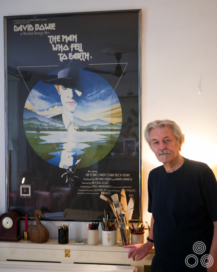
Vic Fair stands next to the large format (40″ x 60″) poster for The Man Who Fell to Earth, which he both designed and painted in 1976. Photo taken in 2013.
Over the past couple of years I’ve been fortunate enough to befriend and spend several occasions with Vic where we discussed his life and career. We also took a look at the hundreds of concept roughs (sketches), original artwork and printed posters that he has saved and stored over the years. I wanted this interview article to tell the story of his life from his beginnings as a messenger boy in a design office through to his retirement as one of the most prominent designers working for the British film industry. This article features pictures of many never-before-seen concepts, unused artwork and photos of Vic over the years which I hope the reader will enjoy.
Hello Vic, thanks for agreeing to talk to me today. I’d like to start with your origins, if I may? You were born in Chadwell Heath, Essex in March 1938. I understand your father was an industrial designer?
He was, yes. He worked for Ford and designed tractors; the ones with the giant metal wheels without tyres that were in use around then. He would make the models that were used to decide what designs the company would put into production. I have some photographs of some of the ones he worked on and they’re pretty good actually.
He died just before my fifth birthday so I can’t remember much about him, but his name was William and he’d originally come from Stratford in London. He was also a good athlete and a musician with a jazz band. I must have picked up some of his artistic and design skills because I can remember that I was always building something in the back garden, whether it was a fort, a boat, or other vehicles. I was always constructing something and just loved tinkering away.
Because my father worked at Ford we owned a Model C Ten, which was one of the first cars they sold to the public and it was also the first car on our street.
May I ask how he passed away?
It was really bad luck because he’d had blood poisoning and within a year of his death they had found a way to prevent that from being an illness that would usually always kill you.
My mother was incredibly attractive and she looked like a film star. She used to take me to school and the other kids used to think she was my glamorous older sister! I lived with my mother and sister and had become the man of the house, doing repair jobs and keeping the bungalow in good order. The problem was that my mother had become very possessive and was jealous of any girlfriend that I brought back to the house, which was very awkward.
In the end I decided to go and do my National Service to get away from the house. I could have actually escaped doing it because I’d previously had a few illnesses like Tuberculosis, but I realised it was a way of spending time away from the situation I was stuck in at home.
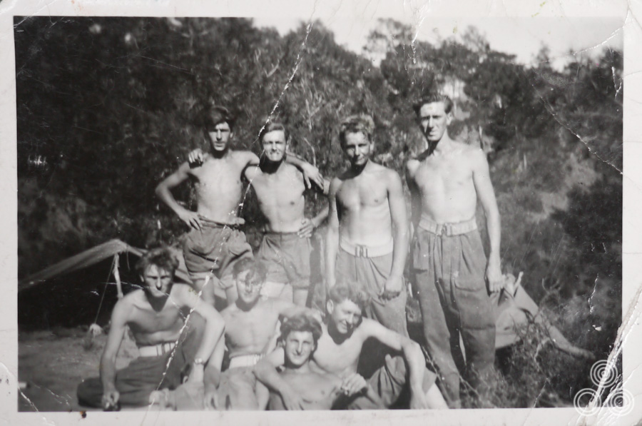
Vic Fair (second left, top row) with fellow National Service enlistees on an Army base in Cyprus, circa 1955.
Had you realised you had a gift for sketching and painting whilst you were at school?
Yes, I was always sketching and I got on really well with the art teacher. I was often asked to do illustrations for the school magazine and the people who ran it were always after the work I was doing during my art classes to put in the next issue. I was also good at carpentry and that was definitely thanks to my father.
I’ve always loved making things and there are actually a few pieces of furniture in my house that I made myself. I’ve still got the tools that I had inherited from my father when he died. Making stuff was definitely an extension of my artistry and I enjoy it just as much as painting. I was always coming up with ideas for things to make and paint and fortunately that served me well when it came to my later career.
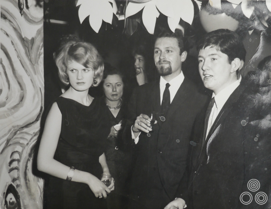
Vic Fair (centre) stands with colleagues, including Richard Vaughan (right) and David Till (behind Vic), at a party, circa 1964.
From Secondary school you went to join an agency in London?
I ended up as one of only two kids from my school that left Chadwell Heath and got a job in London. I secured a job at a design agency called Hector Hughes and it was on Southampton Row in London. I started out doing a lot of messenger work for the company, but the office manager had given me a table on which I could practice designing and illustrating. There were a couple of decent artists who allowed me to watch over their shoulder as they worked.
There was one chap called Philip Happé who was a talented typesetter and was a good friend to me whilst I was there. He actually put a good word in for me when I wanted to move on and he recommended me to someone at the next agency I went to. We later ended up working together again later in our careers.
Whilst you were at Hector Hughes you were also attending evening classes at St Martin’s College?
Yes, I was attending life-drawing classes there for about a year on and off. That helped with some of my painting techniques but I think that I did most of my learning on the job. I stayed at Hector Hughes for just over two years and I’d been commuting every day from Chadwell Heath to central London, which I didn’t mind.
Because of the recommendations from my colleagues I was able to get a job at an agency called Dixons in Savile Row. It was from there that I went to do National Service. None of my friends really wanted to go and do it and everyone was trying to find ways to get out of it but I was keen to give it a go for the reasons I’ve already mentioned.
What was your time in the Service like?
I went to Cyprus and it was a bit scary at times because we’d be walking around these rural villages, often only a few of us at a time. We’d stroll into a bar and line all of the locals up to search them for weapons, which often created a lot of tension, but when it was decided that it was all clear, drinks would be passed around to everyone.
They also kept me busy by asking me to draw and paint for them. I would go into a village with two escort soldiers with rifles in order to investigate and then sketch out the infrastructure of the town, so things like the way the village received its water supply. It was all part of a big intelligence gathering mission for the Army. I’d also paint a lot of the signs for the base and things like that and I remember also working on the symbols on the sides of our trucks.
I was quite friendly with a few of the old boys who had been in the Army for a while. There were also quite a lot of blokes from Essex and London over there whom I enjoyed hanging out with. I don’t regret my time in the Service at all and I feel it was good for me in the end. I’m just glad I didn’t have to shoot anybody!
The agency had kept my job open for me whilst I was away and when I got back there was a new artist that had joined called John Stockle.
What did you think of him?
I remember he used to paint his rough poster sketches on a small pad and he was really neat about everything, whereas I used to paint on these large boards that were often larger than the quad size. He’d be presenting his ideas to the clients and then I’d bring out my sketches, which were often two or three times as big as his. Perhaps the clients preferred my ideas because they were that much larger!
John used to say to people that he’d taught me everything I know, which I found annoying. I never felt threatened by him at all and eventually I took over the design department anyway.
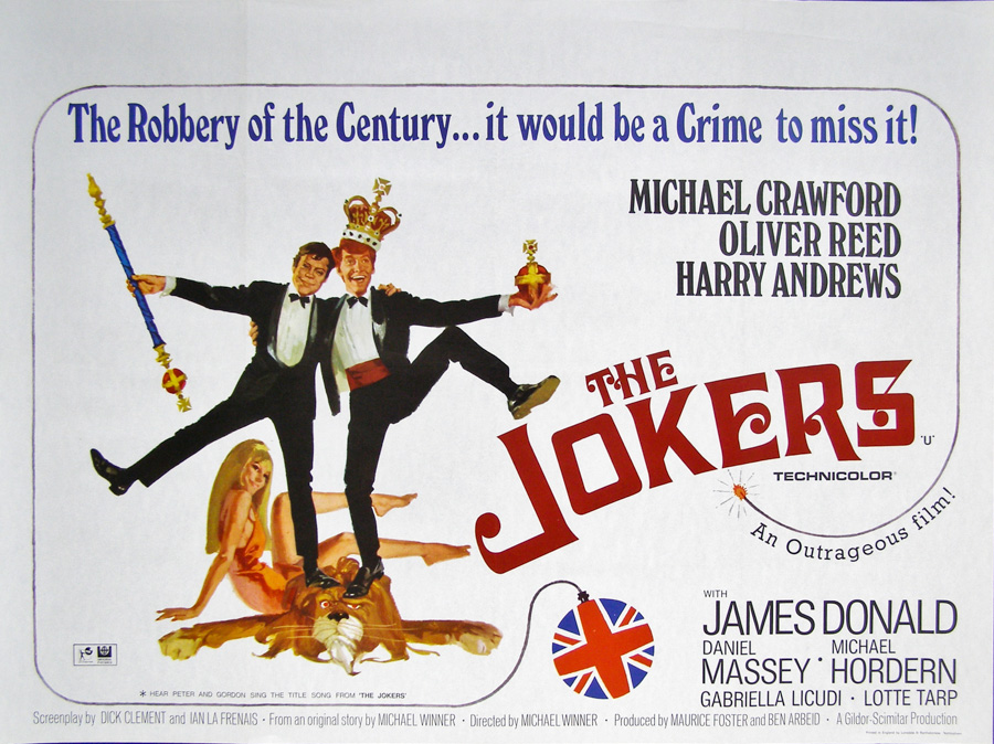
The British quad for The Jokers, which was the resultant poster for which the above reference shot was taken. Photo courtesy of Steve Moore at Moviepostercompany.co.uk
I was regularly playing quite elaborate practical jokes on people. There was another chap in the office that was a bit more senior to me and he was often doing these portraits of people that weren’t particularly good. He’d put an advert in the paper advertising his services and one day I persuaded a female colleague from another part of the office to call him up and pretend to be interested in having her portrait painted.
I found this photograph of a naked glamour model and I covered her body with black paper but left a square over her head indicating that it was just meant to be a facial portrait. I sent it to him via the post and when it arrived he came rushing into the art department all excited saying ‘look, she’s naked! She wants me to paint her!’ It all went a bit wrong because he went out and spent loads of money on new paints and a special canvas. We had to break it to him that it was a bit of a joke and I did feel guilty, but we were still friends after that.
Another practical joke I initiated with a group of colleagues was to carefully mock-up and print a fake newspaper front-cover about Russia sending ships to Cuba laden with rockets. This was shortly after the Cuban Missile Crisis so global tensions were pretty high. We got the old boy who delivered the papers in the morning to leave it on the desk of our creative director and when he read it he totally freaked out. Before we knew it all the advertising agencies in London had heard the news and it almost got completely out of control. Things eventually calmed down when people realised that it was a fake and we survived with our jobs intact, but it was a close call!
When you returned from National Service you became a lot more involved in the design and illustration of the film posters?
That’s right. One of the first posters I worked on was the quad for the film La Verite, which I actually won an advertising award for. That was quite a nice surprise, especially since my art was based on a photograph. The studio had asked for it to be illustrated because of some issue to do with rights. I duly obliged and was rewarded for my efforts.
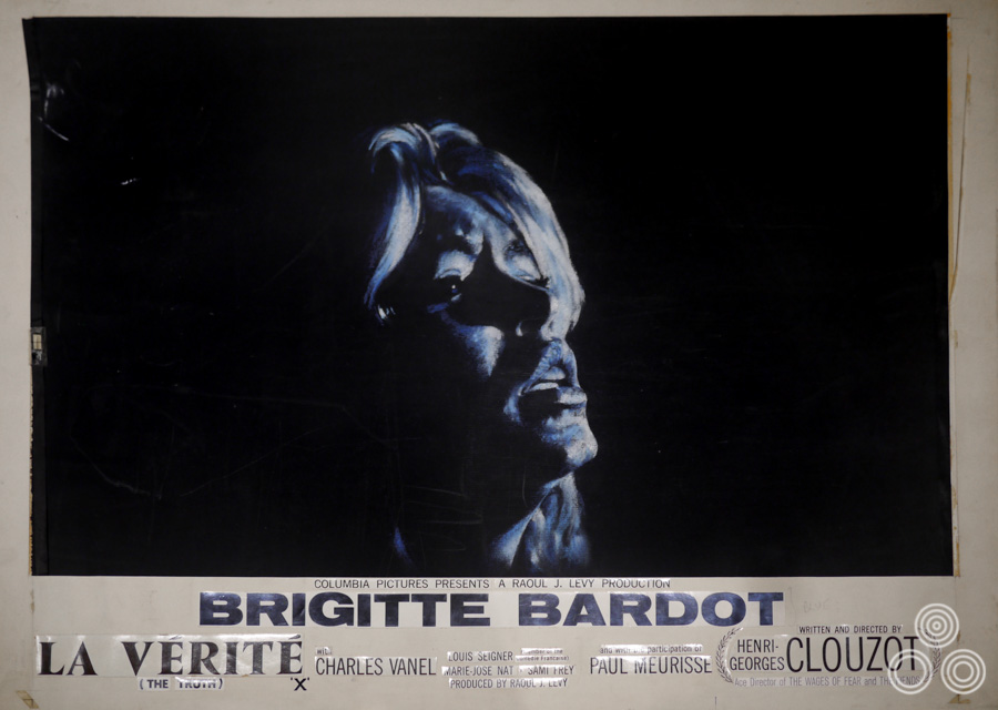
The original quad artwork for La Verite starring Brigitte Bardot, designed and painted by Vic Fair, 1960. This was one of the first posters that the designer worked on and he won an award for his efforts.
Can you talk about your working techniques? You mentioned that you’d often use larger art boards.
Yes, and I’d often work with magic markers but also pastels and a whole mix of other tools. It didn’t matter really as long as I could achieve a good result. The only thing I didn’t ever really use was oil paints. After a while you get to know the tools and working methods that suit you best.
What happened when Dixons was merged with two other agencies in 1965?
Well, that was when I was first introduced to Eric Pulford, the owner of Downtons, which was one of the agencies that were merged [The other was Waddicor Clark Wilkinson]. Eric later told me that he had organised the merger with Dixons just so he could get hold of me, which I found unbelievable but it was very flattering. We moved to a large new office on Tottenham Court Road and that’s when I also met colleagues like Brian Bysouth who had been at Downtons with Eric.
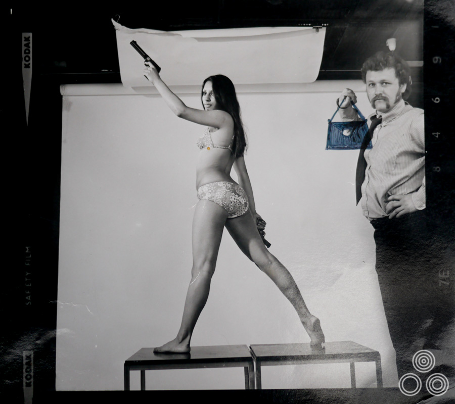
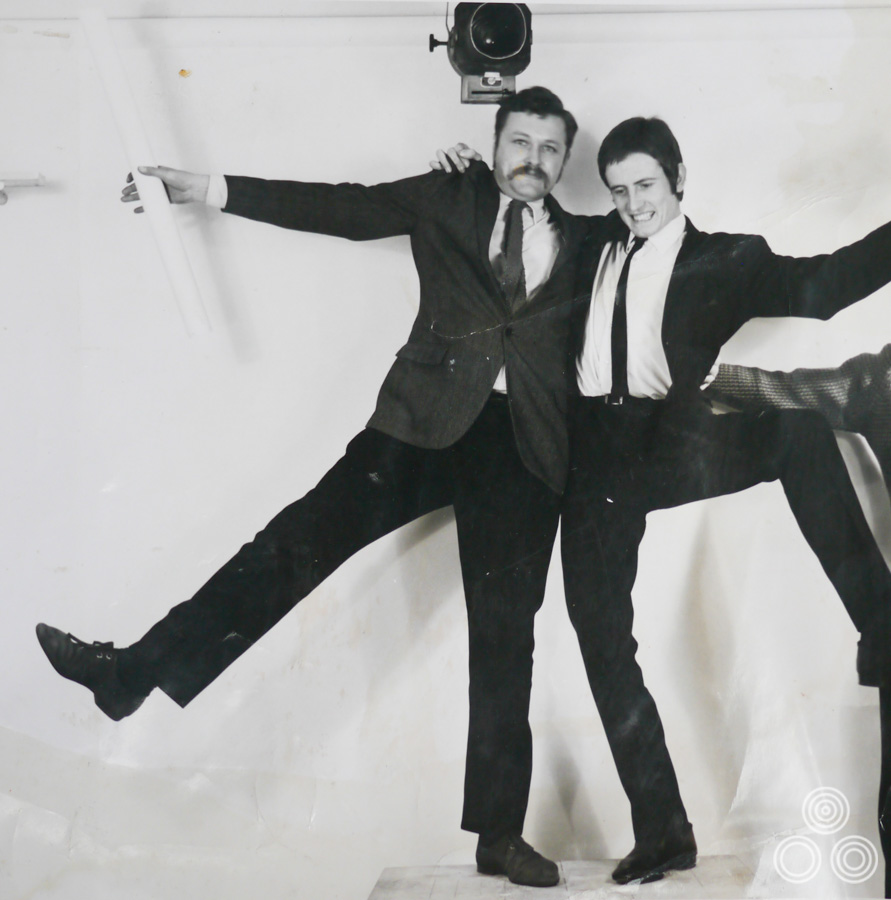
Vic Fair stands next to a model posing for a reference shot for a long-forgotten film, circa 1972. Someone, probably from the agency, later sketched a handbag into Vic’s hand.
What was Eric like to work with?
He could be quite fearsome but he was okay with me because we could both draw and he respected me for that, but I used to tease him quite a bit too. He was quite the taskmaster when he wanted to be and quite liked it when his team worked over night or on the weekend to finish a job. He was a fair boss though and was liked by most people in the company.
Around this time I started to go abroad for jobs quite a bit and Eric would send me to places like New York to deal with clients, which was quite scary to begin with. Later on, we went out to meet this chap who was a big-shot property developer who our executives felt we should try and secure work from.
We went to this remote location in the middle of a beautiful area of Southern America where he’d broken ground on this new retail development. He’d be flying these bankers and investors out every week and giving them a grand tour of the area in a helicopter, to show them where he’d be building everything, including a new road that was needed to reach the location. It turned out that it was a big con and that he had no plans to develop a retail park, but was instead only after planning permission for the road. Once this was secured he then turned around and sold the land for a vastly inflated sum.
Anyway, I was sent out there to work with him and his team on ideas to sell the development. I remember that every time we’d sit down for evening meals no one wanted to be near him because he could be so disagreeable and rude. One night I was late to dinner and ended up being sat right next to him, which was quite an experience!
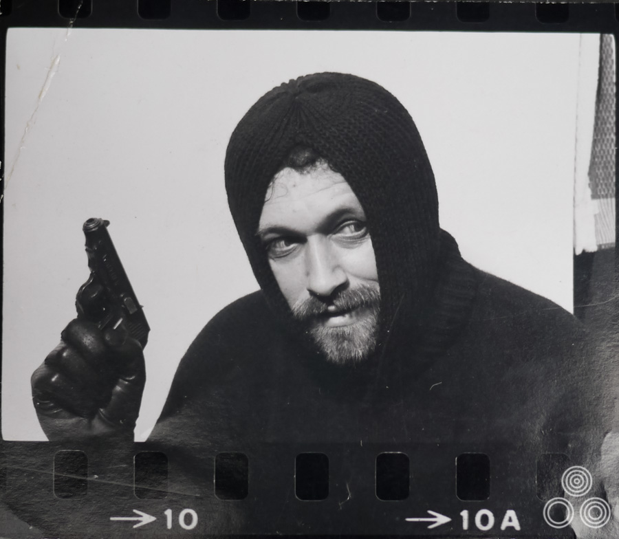
Vic Fair poses as a spy (or perhaps a criminal) in a reference shot for an unknown film, circa 1968.
You weren’t just working on the film projects then?
Well, I was mainly on the film accounts but I was often sent out by Eric on those kinds of trips because I was known by then as being good at coming with ideas and concepts quickly. I felt that I was a bit too young to be working on those kinds of pitches but they didn’t have anyone else so I had to step up.
Was working on the film posters something you’d been really keen to do?
Oh yeah, I’d always loved films and from a very early age I used to go to the cinema every Saturday with my sister and mother and we’d always skip the kids screenings and go to one of the adult films. I remember seeing things like Singing in the Rain and loving that, and going back to see it several times. It was a thrill to get to work on the posters eventually and I never found it a bore.
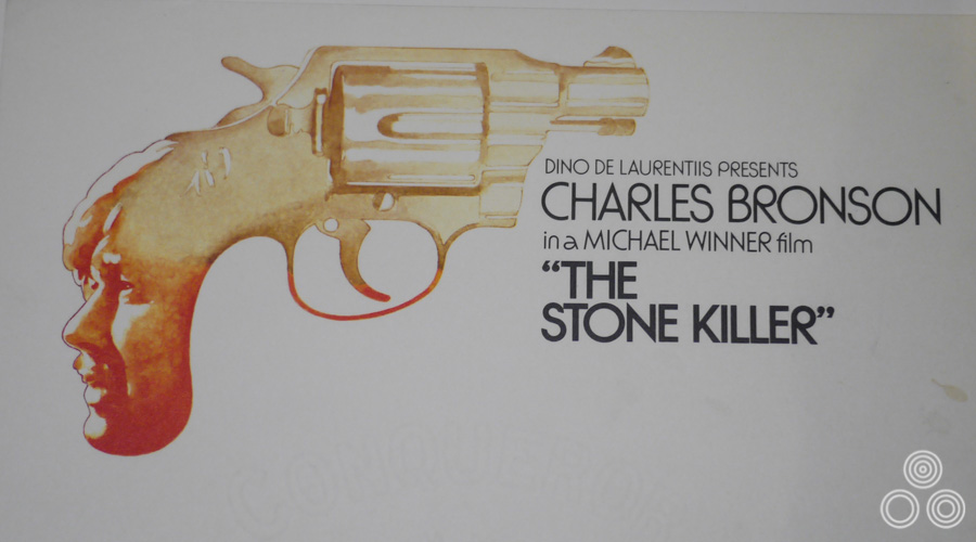
A painted letterhead for the promotion of the release of The Stone Killer, starring Charles Bronson. Design and illustration by Vic Fair, 1973.
What happened with the Garland Compton take over in 1967?
There was a chap that joined as part of that deal called David Bernstein. It quickly became clear that he was planning to make changes and wasn’t afraid to upset people in doing so. Everyone in the office started to fear they’d get the push and I remember one chap coming in in the morning to find everything on his desk packed up in boxes and next to the lift, basically saying to him ‘you’re out’ without actually telling him to his face.
Did you have to deal with Bernstein yourself?
Our creative director Arthur Bennett was scared stiff of him and I remember he used to warn us that David was on the way to our part of the office and then he’d clear off himself – he’d disappear and be nowhere to be seen! I’m not a particularly brave person but I didn’t mind speaking to him. I just thought ‘sod it!’ and went for it. I remember there was this one incident where I’d been offered a pay rise and I decided that it wasn’t enough so I told him to his face. I just remember him shouting ‘get out!’ A week later I found out that he’d accepted my counter-offer so he obviously liked my cheek.
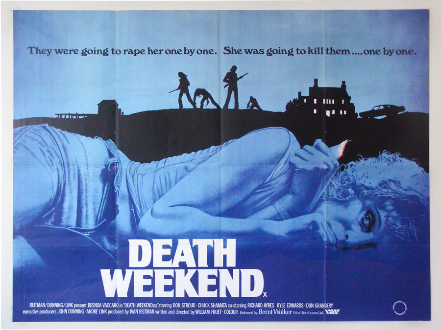
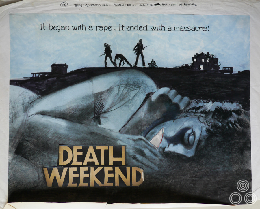
The final printed quad for Death Weekend, by Vic Fair 1976. Note the striking use of colour, including the single dash of red on the weapon in the woman’s hand. Photo courtesy of Steve Moore at Moviepostercompany.co.uk
One of the posters you worked on during that era was for ‘Here We Go Round the Mulberry Bush’ that has the mirrored paper on the face of the main character. Was that a tough thing to persuade the client to go for?
To be honest, I don’t know if it had been done before then but it was quite expensive to do – each mirrored face had to be stuck on by hand. I designed it and the client really took to the idea and was willing to pay the extra for it. It was actually on display in the Victoria and Albert museum for a while, which was nice.
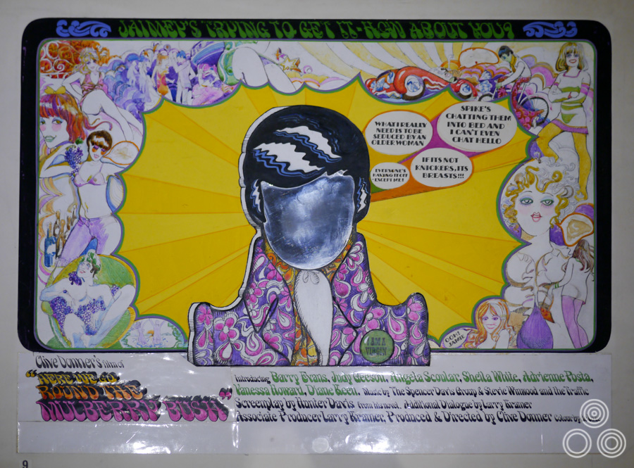
A concept rough (sketch) for Here We Go Round the Mulberry Bush by Vic Fair, 1968. Note the mirrored paper in place of the main character’s face, which was carried through to the final printed quad.
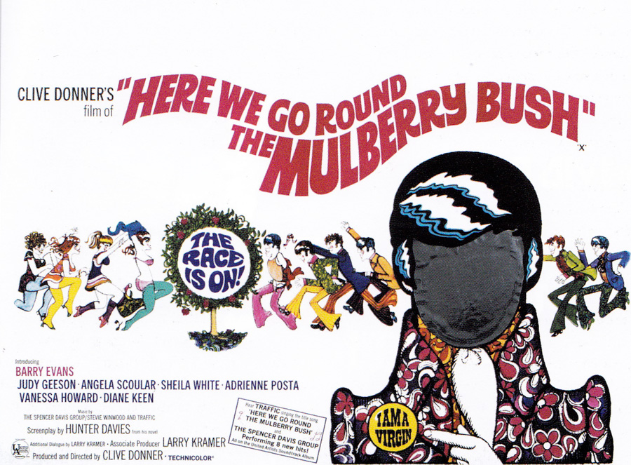
The final printed British quad for Here We Go Round the Mulberry Bush by Vic Fair, 1968. The designer was successful in persuading the distributor to agree to have the main character’s face be covered with mirrored paper so that the cinema-goer might see themselves in his place.
For something like that would you sound out the client as to how much the they’d be willing to pay on the actual printing costs, particularly for extras like that?
I’d always make several roughs beforehand and show those to the client so they knew what options were on the table. I didn’t have to work too hard to get them to go for the mirror on that poster as they recognised it would be a really eye-catching thing to see in the cinema foyer.
In the 1960s you were working with the artist Renato Fratini?
Yes, I got on with him quite well. Eric had gone to Rome for a visit to Studio Favalli to negotiate his move over to work with us and when he finally joined I enjoyed working with him. He had a really nice style to his artwork and he was so incredibly quick at knocking entire designs out.
Fratini was quite a character and I remember he had this place behind Harrods in Knightsbridge and certainly lived the high life! It was just enjoyable to watch him work. Most of the Studio Favalli crew were quick like he was.
You worked with Fratini on a poster for Isadora (1968). What was that process like?
Well, I didn’t sit with him whilst doing the design and he’d then paint it after I was done, but it was great to have that collaboration with him and we were both pleased with the result.
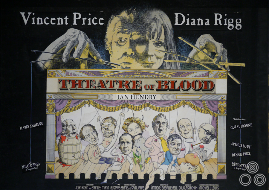
The original artwork for the British poster of Theatre of Blood by Vic Fair, 1973. Note that several actors’ names have dropped off the artwork as the glue holding them in place has started to crumble.
What was daily life like at the agency?
When we later moved to Wardour Street, which was in 1975 following another merger [creating Roe-Downton], I was lucky enough to have my own office on the top floor of the building where I could normally work in peace. I set up my easel there and I would have the account executives coming up to see me to talk about the poster campaigns we were working on. It was nice to have my own space and be allowed to just get on with the work. In the morning we’d usually have at least one screening of a film we were going to be working on over the following weeks, then it was back to the office to talk over ideas and plan how long it was going to take us.
At a certain point you made the transition from doing a lot of the actual artwork into coming up with ideas for the design of the poster. Was that a gradual transition and did you prefer it?
In those days there was a lot of work around and in some cases I would just pass an illustration job over to someone else if I felt that my time was better spent on another project. I worked with a number of artists who I trusted to paint my ideas, but I would always create a rough [sketch] to show the client what I was thinking. Often these would be as large as the final quad and in some cases I spent quite a lot of time on them.
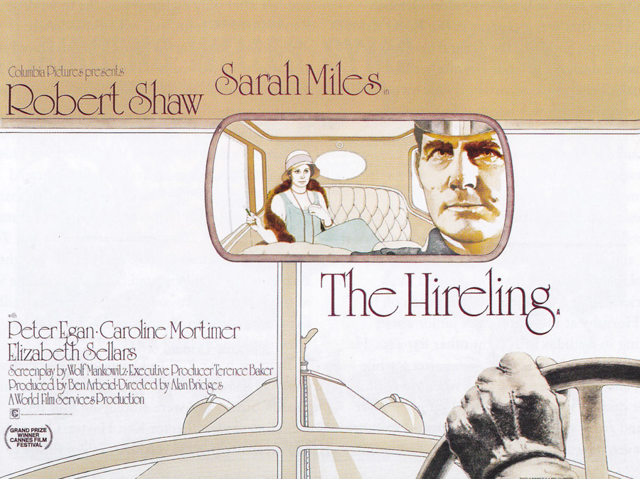
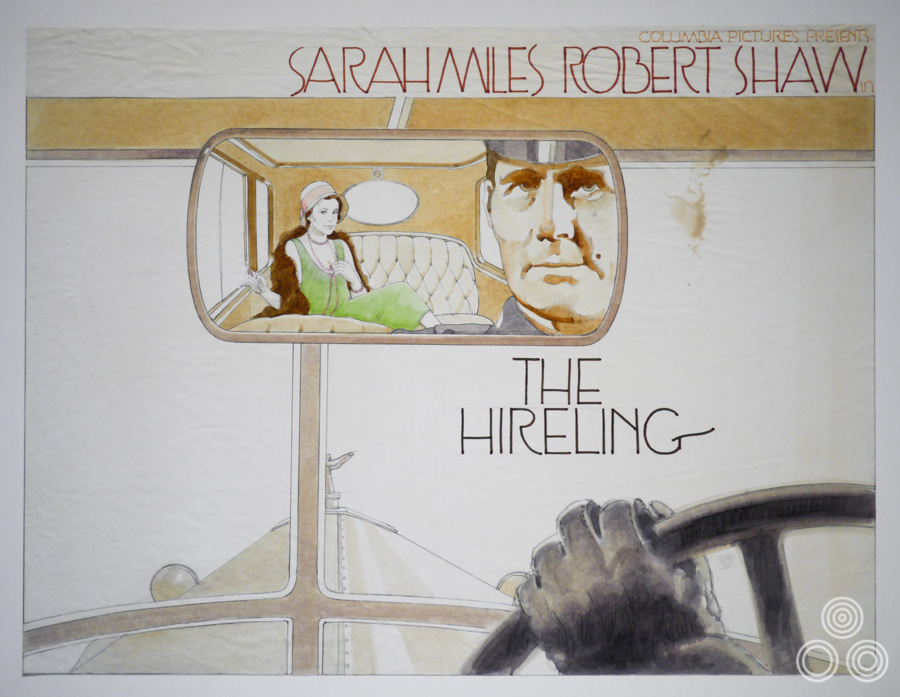
The final printed British quad for The Hireling, designed and illustrated by Vic Fair, 1973. Note how similar it is to the initial sketch above.
There were actually a number of posters where your original design ideas ended up being printed as the final poster.
I know and it was a bit embarrassing to be honest, as I never intended that to happen on purpose. I just used to do the design and give it to an illustrator, like Brian Bysouth, but sometimes the client would ask for my original design to be the one that was printed up. The thing is that the first few ideas and sketches for a particular poster are often a lot more loose in their style and then these are tightened up by the illustrator. Sometimes the client prefers the style of the first sketches, so you can’t win!
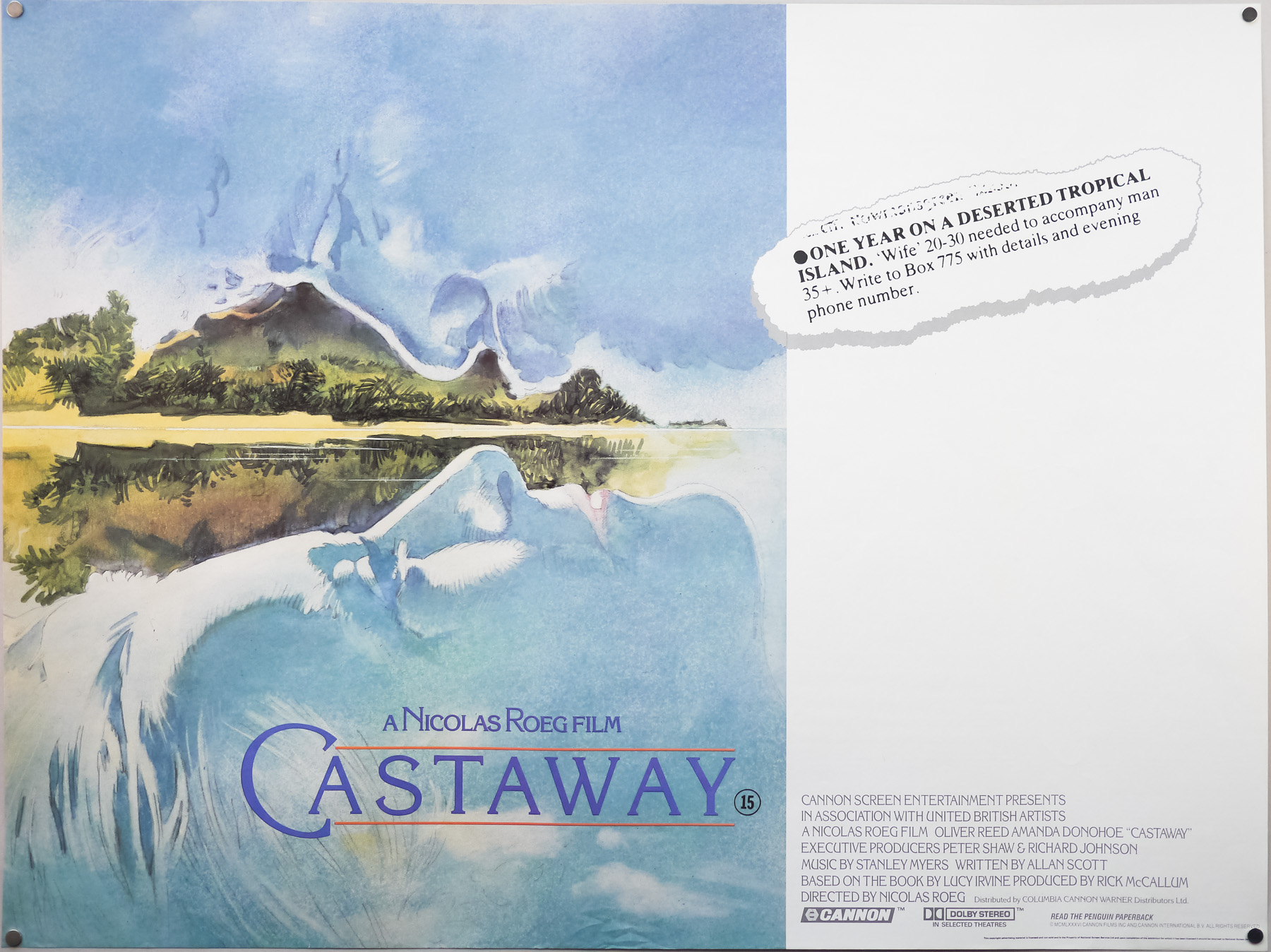
The British quad for Castaway (1986) designed by Vic Fair. His original concept illustration ended up being used after attempts to paint it again, and capture the quality of the original, failed.
One example is my poster for Nic Roeg’s Castaway, which Brian was asked to paint but in the end he felt he couldn’t really improve on my first sketch and it ended up being printed pretty much how I’d done it to begin with. I guess it kind of works but it was a tough thing to balance the sky and the islands so that the juxtaposition worked well.
It says a lot about your skills that you could paint something intended as a rough and have that chosen as the design
Yeah, it was a bit awkward. Most of the time they liked my design and then it would be given to another illustrator to finish. Fratini was one of the few who would actively try to improve on my original ideas with his paintings, and he often succeeded!
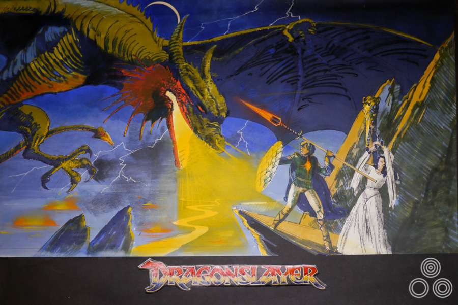
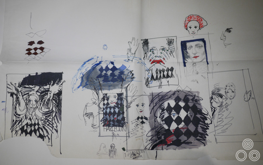
A concept rough (sketch) for Dragonslayer by Vic Fair, 1981. The final printed quad was painted by Brian Bysouth.
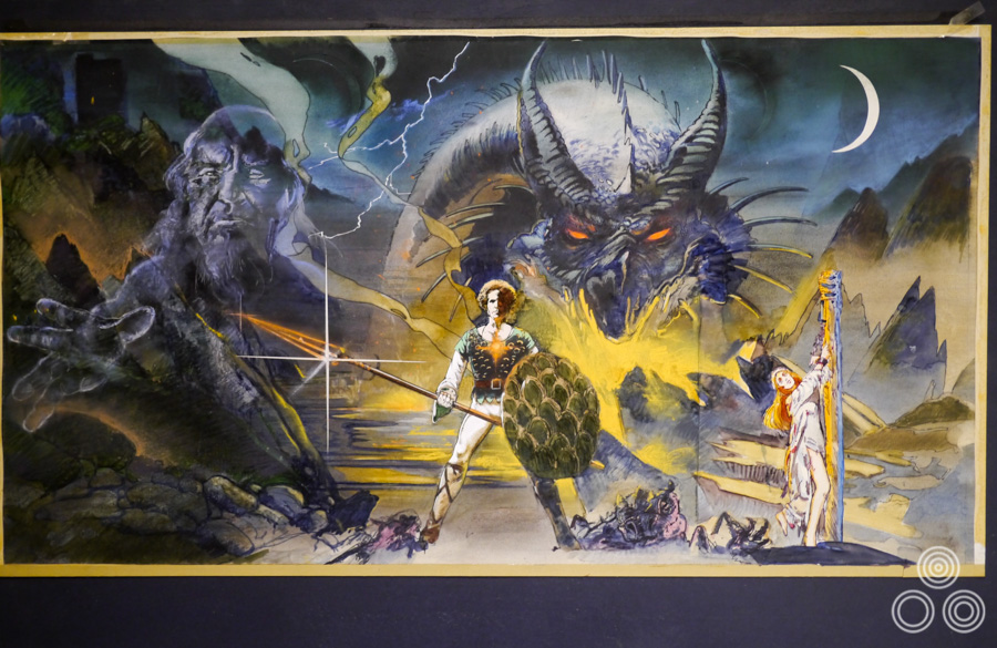
An alternative rough for Dragonslayer, which has more elements in common with the final quad. By Vic Fair, 1981.
As you mention, one of the common themes that would mark out a Vic Fair poster is the careful composition of the image, and particularly the use of juxtaposition of elements. Was that something that developed over time?
I guess so, yes. I think that’s just part of being a designer and figuring out what works for selling a film. Sometimes I just instinctively knew what kind of image would be best, but there were also some posters that weren’t quite as successful! There were often several of us, and even multiple firms, that might pitch ideas for a poster so you always wanted to stand out and hopefully get picked.
One difference between me and other artists, like John Stockle, was that I didn’t want to constrain myself to the dimensions of the poster when creating the roughs. John would take a piece of paper and carefully measure out the exact size of a quad, perhaps scaled down, but he’d paint within that shape. I would take a piece of paper, paint my idea and only when I’d finished would I draw a line marking the quad dimensions. I didn’t want to restrict myself before I’d even started.
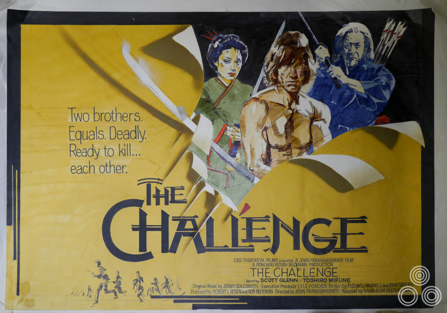
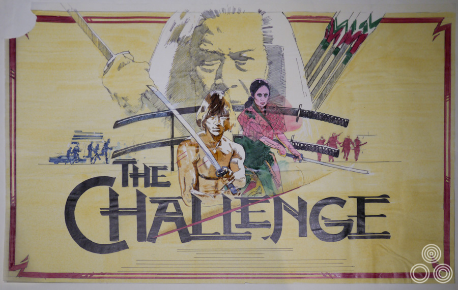
Another concept rough (sketch) for The Challenge by Vic Fair, 1982. The final printed quad was based on this design and was painted by Brian Bysouth.
How many roughs might you do for a film?
Well, it would depend on how quickly I fixed on an idea so sometimes it could be quite a few, say around 10, but other times I might do one design and land on the final idea immediately. I used to try and do some outlandish ideas to really push the clients and see what we could get away with.
I wanted to ask you about the situation in your career where you were offered a role at the then recently opened agency FEREF and decided to turn it down. What made you decide to stay where you were at the agency that was by then known as Downtons?
I just wasn’t sure about it, to be honest. I felt I wasn’t being paid enough at Downtons but the job at FEREF would have been much more of a managerial role, which would have meant much less designing and painting. I just didn’t feel like it was the right decision at the time and I’m glad I never really had to move into purely managing at Downtons.
I did give Eric an ultimatum one day and threatened to leave. He was a bit shocked and didn’t know what to say. Eventually he asked me what I wanted and when I told him he said he’d think about it. That evening when I got home they’d sent a motorcycle courier with a fresh contract that essentially said they would agree to all my terms if I would stay at the agency, so that made my mind up!
I always enjoyed working at Downtons and there was a continuous stream of enjoyable projects to work on so I was never bored. I just felt that I was way overdue a rise in pay and wanted to be on the board of the company so I’d feel more invested in it.
You worked with freelancers quite a bit at this point?
Yes, absolutely. One of them was Brian, who I’d obviously worked with a lot when he was also on Downtons’ payroll. He did well for himself as a freelancer.
You enjoyed working with Brian?
It was a good working relationship and we always got on well together, both when he was a full-time colleague and later when he went freelance. I can’t remember ever having any disagreements or arguments with him. We did quite a lot of designs together and I always trusted Brian to realise my designs properly. I’m still good friends with him to this day.
Did you ever consider going freelance yourself?
No, I suppose it might have been a good idea, but it would have been another thing to worry about; when are you going to get paid? At least with a wage you could guarantee when your money was coming in each month. I did do some bits of freelance whilst still working at the agency, like some record covers for the musician James Galway.
In 1993 there was the threat that we were going to lose the Columbia account because they were considering trying another agency to handle their work. There were a number of agencies that were pitching for the job and the film in focus was the comedy Groundhog Day. We worked hard on it and in the end they chose my design and that meant we secured the account for another three years, which was a nice result!
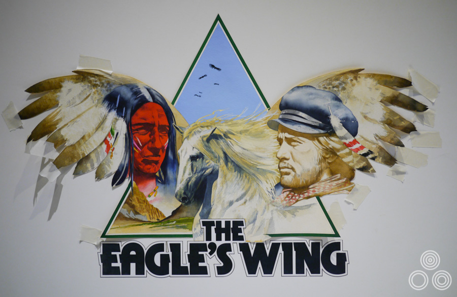
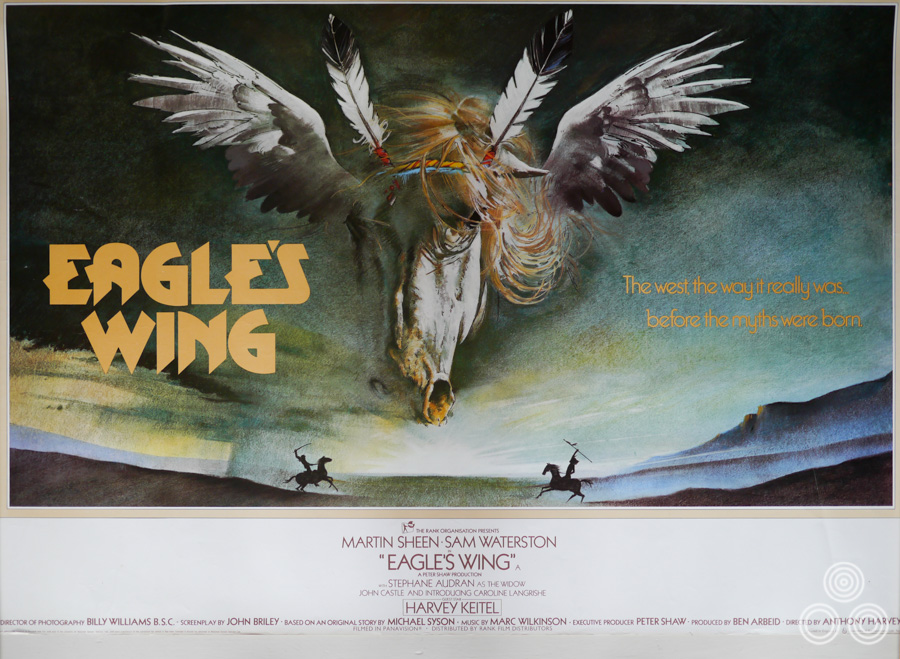
A concept illustration for the British poster of Eagle’s Wing (here The Eagle’s Wing) by Vic Fair, 1979
You worked with the designer Marcus Silversides at the beginning of the 1980s?
Yes, he joined Downtons in 1980 as a young designer and I really enjoyed working with him. I had been asked to train him up but he didn’t really need much of my help, as he was already very good. We collaborated together on a few posters and I remember our working relationship as a good one, but there was always some friendly rivalry between the different artists and designers. We all wanted to get our designs picked by the client so there was always a bit of competition.
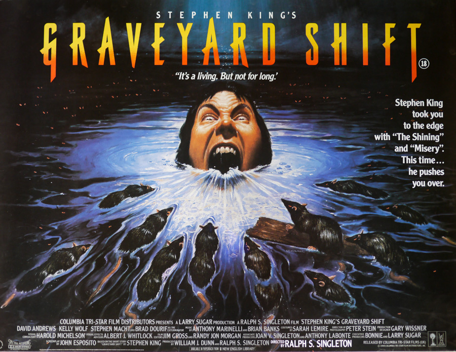
The final printed quad for Graveyard Shift designed by Vic Fair and illustrated by Les Edwards, 1990. The head in the water is actually modelled on that of their fellow designer Marcus Silversides
You worked with the director Nic Roeg quite a bit?
Yeah, I did work on several projects with him. It sounds very conceited but I used to go up to see him with a group of account executives and he’d usually just want to speak to me about the ideas for the poster. The other chaps would have to sit outside in the hall whilst we’d talk about potential designs and what his vision for the marketing was.
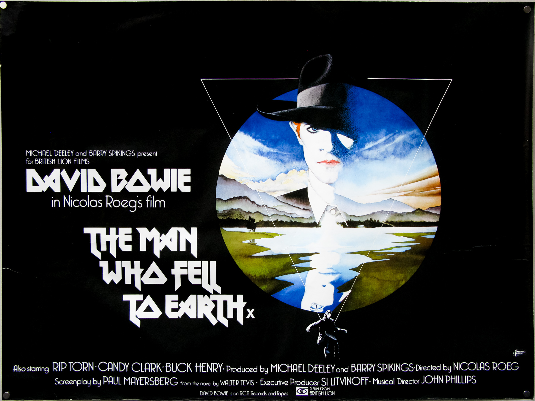
Your poster for The Man Who Fell to Earth is an absolute classic and is arguably one of the greatest British posters of all time. Can you talk about working on it?
I wasn’t given a brief for that one, but I remember working away on it and Eddie Paul, a designer friend who worked at FEREF, saw it and told me that he was working on something very similar – rival agencies would often be asked to work on ideas for the same film – so that made me double my efforts and I actually completed the design in one night! The composition of the shapes was important to me. The only thing I don’t really like about it is the figure that’s dropping down at the bottom and I should have improved on that, really.
The fact that you did the painting in one night is incredible!
Well, I already had a rough sketch that I’d done so it was just a case of improving on that. I am fond of it and like its simplicity. I do see other minor things I should have fixed but that’s always the way with jobs done like that – it’s impossible to be fully satisfied.
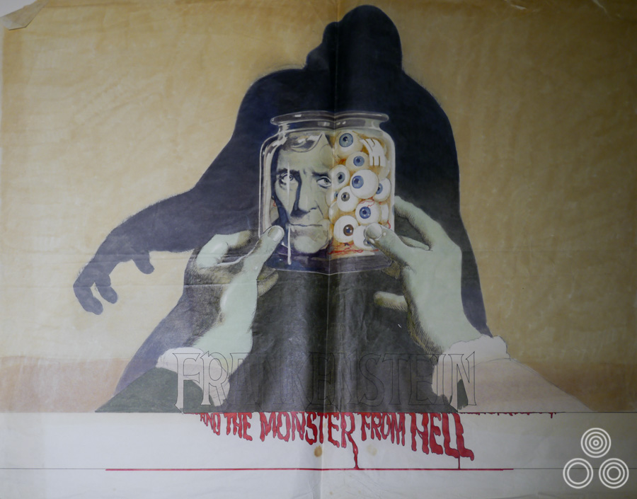
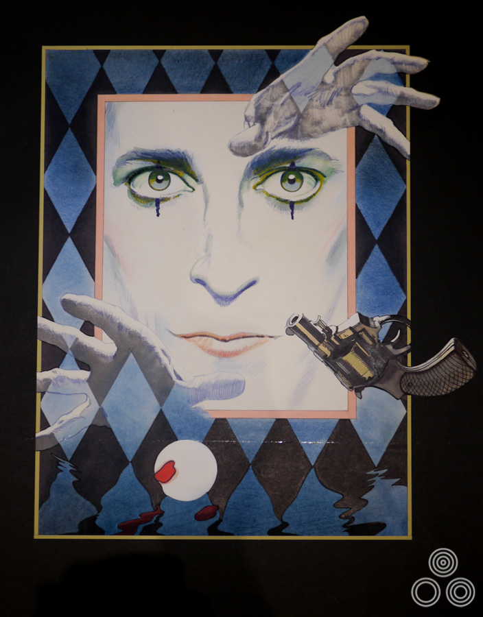
An unused rough (sketch) for Hammer films’ Frankenstein and the Monster From Hell by Vic Fair, 1973. The final British poster was painted by Bill Wiggins.
Did you enjoy working on posters for Hammer?
Yeah, I really did. Other artists and designers often frowned upon horror poster work but I really enjoyed it, especially since I was almost always given complete freedom to come up with my own ideas. Hammer were good at giving us the initial brief and then trusting us to come up with our own take on it. I remember I actually went too far with a few of the concepts and the studio would often request for them to be toned down quite a bit so they’d get past the Advertising Standards Committee.
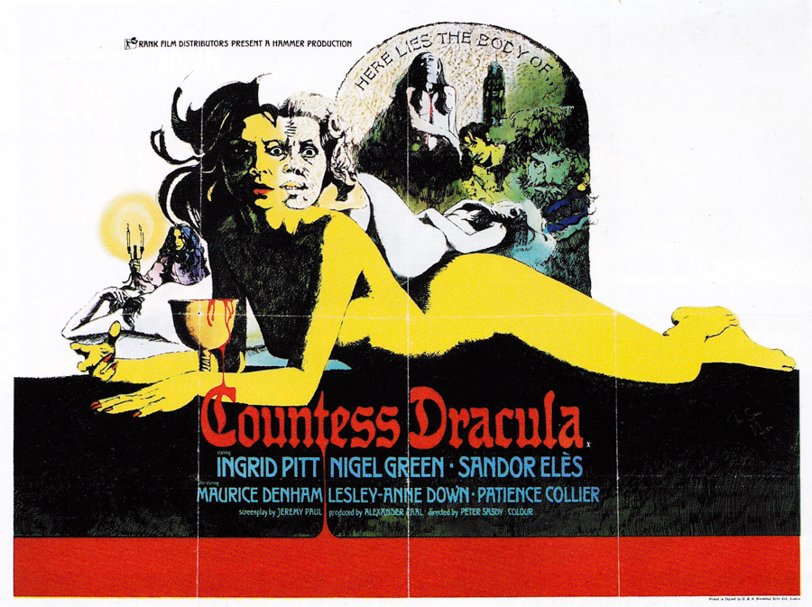
Can you recall working on the quad for Countess Dracula?
Yes, I might have got a bit carried away with the two-faced thing but I think it worked quite well overall. I was lucky with that one in a way as it was one of the others where they just printed my first rough. I guess they must have liked the style of my sketch.
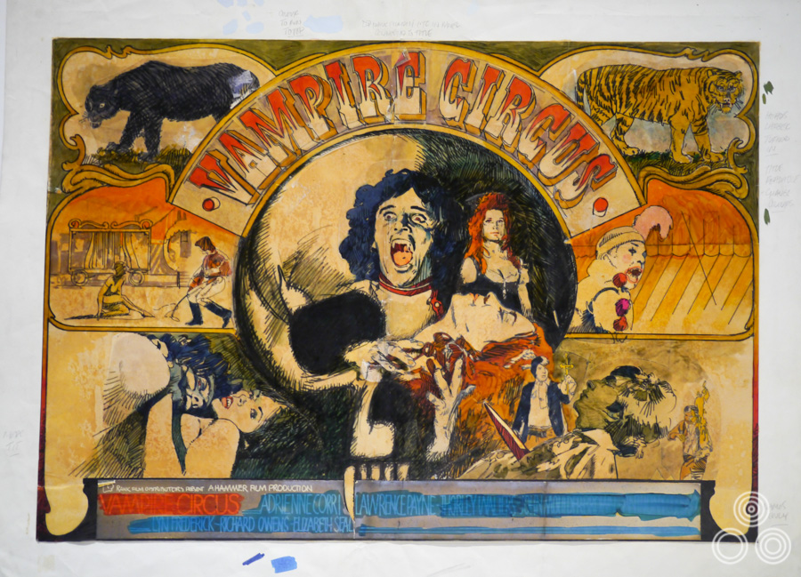
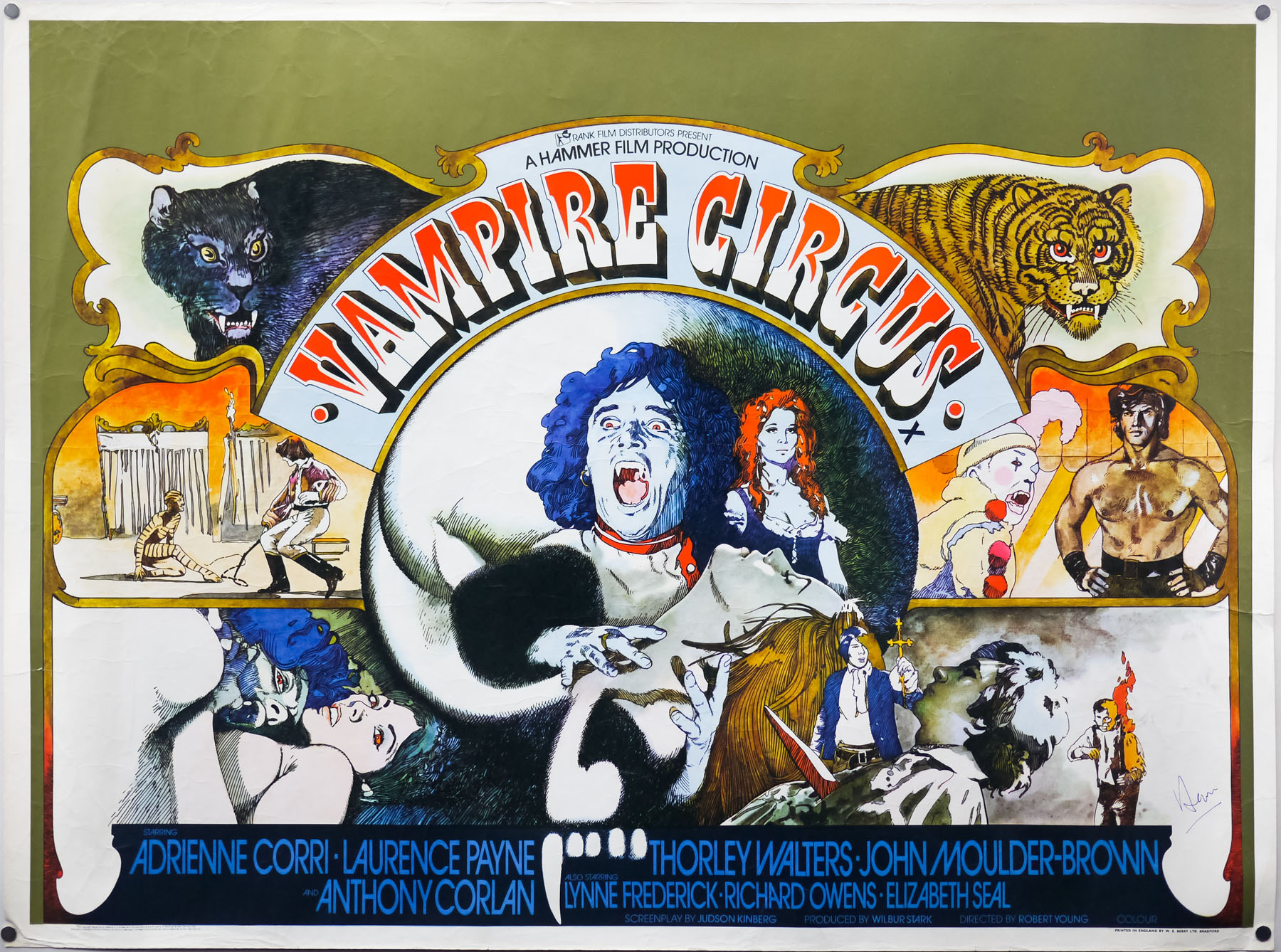
The original concept rough (sketch) for Hammer films’ Vampire Circus by Vic Fair, 1972. You’ll notice that the rough is surrounded by pencil annotations and one to the bottom left simply reads ‘More tit’, indicating that the client, or someone in the agency, suggested they could get away with showing more of the lady on the bottom left.
I enjoyed working on the quad I designed for Vampire Circus. I’d wanted to design something that might have been used to advertise an actual circus. The animals on there were pretty much copied directly from a children’s book, as I really didn’t have that much time to work on it. I thought they looked quite amusing, since they’re not exactly anatomically correct portraits of tigers and lions! I also had fun sneaking in the hidden male members, which was really just meant as a bit of a tease towards certain people behind the scenes. I can’t believe I got away with it really.
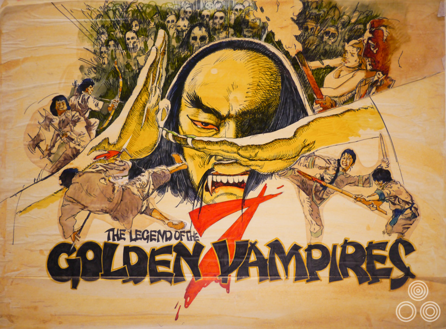
A concept rough (sketch) for the British poster for Hammer’s The Legend of the Seven Golden Vampires by Vic Fair, 1974. The final quad was illustrated by the Italian artist Arnaldo Putzu.
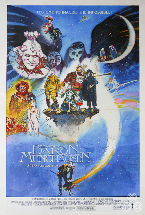
What was it like working with Terry Gilliam?
It could be quite frustrating sometimes as he’d get me to do loads of work and then at the very last minute he’d change his mind and ask someone else to do it. He had this team of artists and designers always on call and often they’d end up taking over, so it often felt like a waste of time.
He was really good at making you feel like you’d solved all his marketing problems though. He used to say things like ‘That’s it! You’ve done it! It’s perfect!’ and he’d kick the bloke off the chair sitting next to him and usher you to take his place at the table. You’d have all these other chaps on his team looking enviously at you, but you knew that it wasn’t over and that there’d be more designs to come. A couple of days later you’d discover that he’d changed his mind and wanted to see some more ideas for the design.
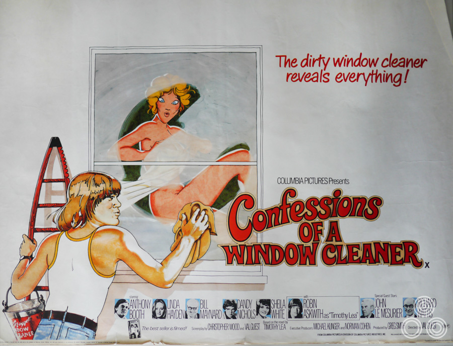
How did you find working on the posters for the ‘Confessions…’ series of films?
Well I always felt my posters were quite cheap looking but I suppose that really suited the films as they were low budget and very tacky. They were what they were. Friends would joke about them with me as they were popular films at the time. I felt I managed quite a decent likeness of Robin Askwith on some of the posters.
One of my favourite collaborations between you and Brian Bysouth is the poster for John Boorman’s Emerald Forest.
I was really pleased with that one and felt the juxtaposition in the image worked well. It was playing on the idea of the tribesmen in the film being these invisible people. That poster is one of my personal favourites too.
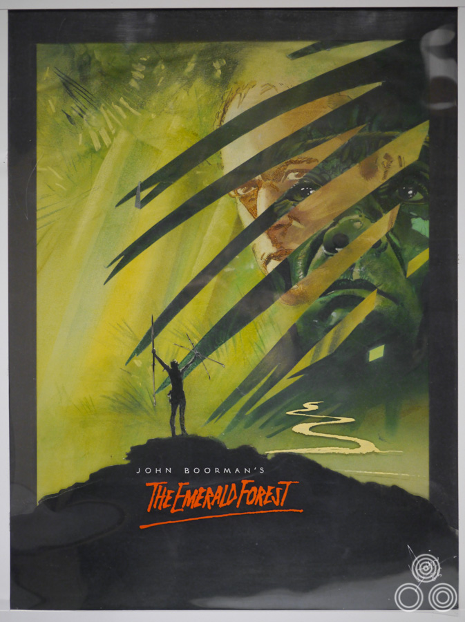
A concept painting for the Emerald Forest British poster by Vic Fair, 1985. The final printed poster was painted by Brian Bysouth.
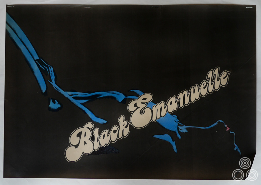
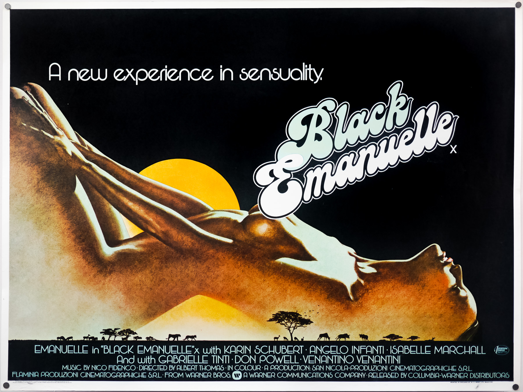
The poster you designed for Black Emanuelle is really striking.
Thanks, I came up with the idea of using the arch of her back as the mountain and the final touch was using the title treatment to cover her modesty. The softcore porn posters were always served quite well by working with pastels.
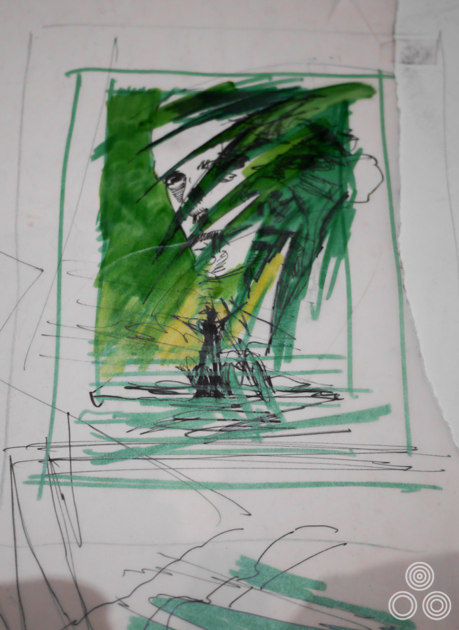
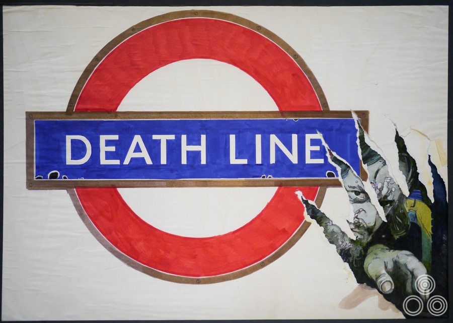
Can you talk about the artwork you painted for the British horror film Death Line? There was an original version that you completed featuring the front of a tube train in the shape of a skull. It ended up being nixed by London Transport because they were concerned it would stop people using the underground.
I was really annoyed about that as I was pleased with how simple but effective the first image was. I think someone from the agency showed it to London Transport representatives and they objected immediately. I had to repaint it and it ended up looking quite a bit messier. I can kind of understand why they were concerned that it would upset tube passengers but it was still frustrating.
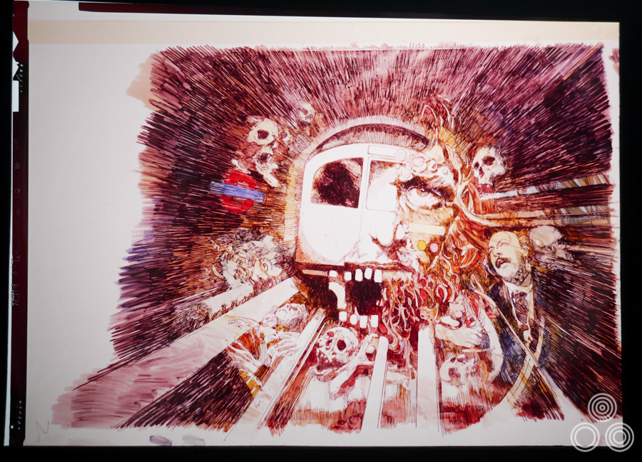
The original concept artwork for Deathline (AKA Raw Meat) by Vic Fair, 1973. This is a transparency of the rough that was ultimately altered on the insistence of London Underground after they objected to the depiction of one of their trains surrounded by gruesome imagery.
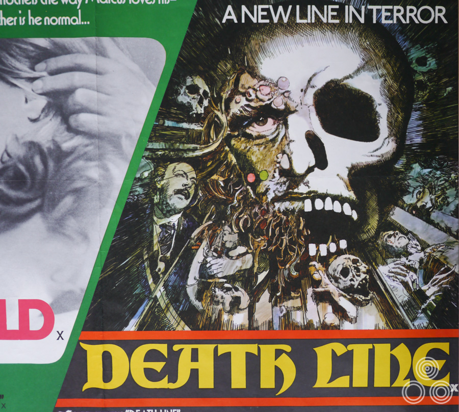
This is how the Deathline artwork appeared on the final printed quad (as part of a double-bill). The train was replaced by a skull in order to appease the people at London Underground. Design and illustration by Vic Fair, 1973
One of your most notable designs is the UK one sheet for A View to a Kill. Can you talk about working on that?
I actually worked on quite a few roughs for that job. I remember moving various elements around a number of times to satisfy requests from the studio and the gun position ended up changing quite a bit by the time of the printing of the poster. Brian painted the final artwork and he tweaked a few elements too but you can see the intended design in my first few sketches.
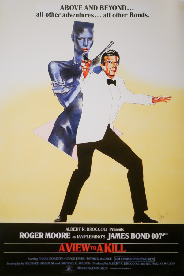
One of the original roughs (sketch) for A View to a Kill by Vic Fair, 1985. This rough was sold at auction in 2011.
Who did you have to deal with for that poster?
I was speaking directly to the marketing team at Danjaq [the Bond production company] and I’d have to show my ideas to several people before they’d be willing to give me sign off. I remember one trip to their offices where we’d progressively work our way up the building meeting increasingly more important people involved in the marketing of the film. Eventually we made it to the top floor and met ‘Mr Big’ who was convinced we were onto a winner with the design, but it all fell apart when the designs were sent over to America.
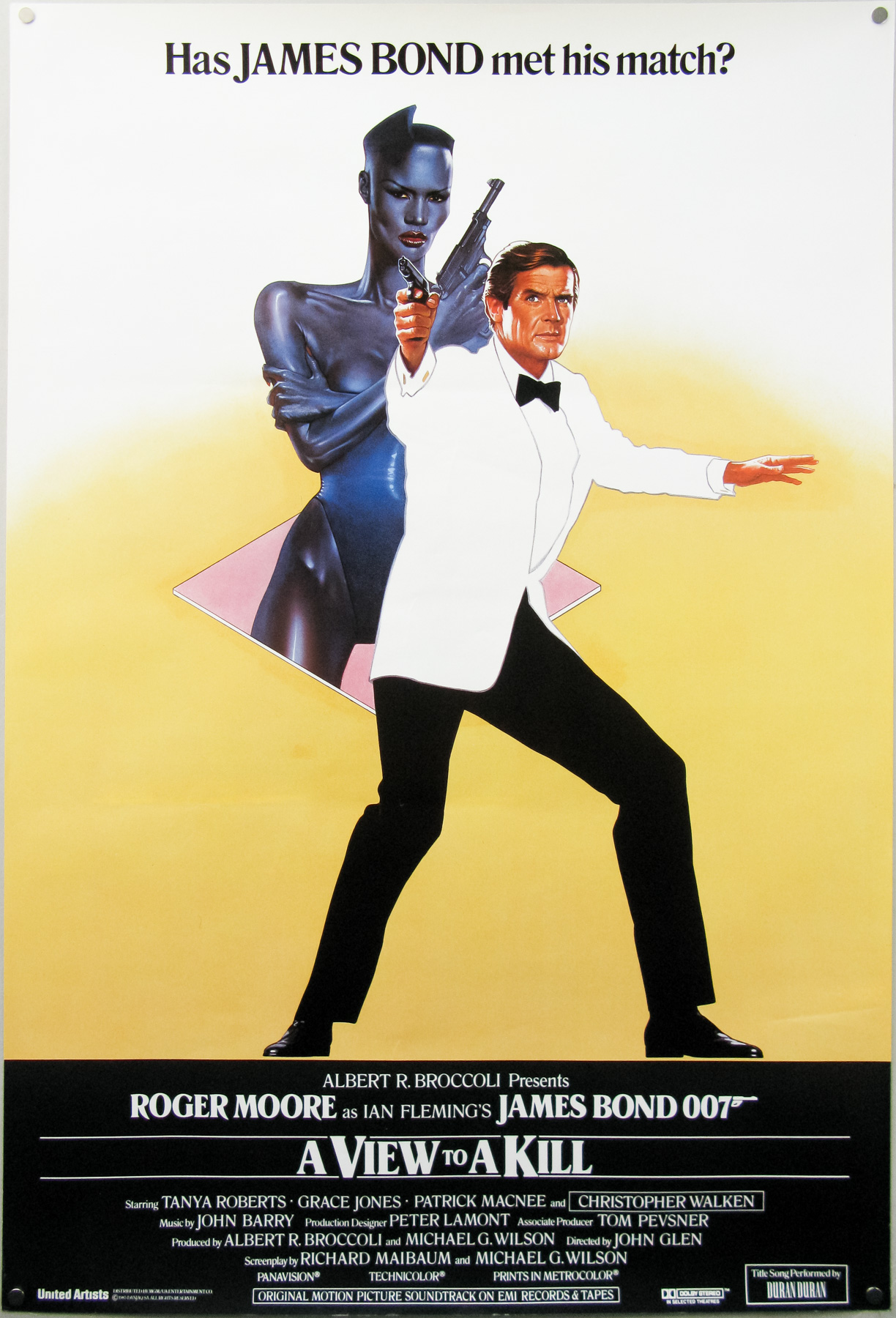
The final UK one sheet poster for A View to a Kill. Designed by Vic Fair and painted by Brian Bysouth, 1985. The poster was rejected by the Bond producers because they felt that the spy would never be seen wearing a white tuxedo. Despite this, several hundred copies of the poster were printed and made it onto the collectors’ market.
In the end the reason they decided not to print it in greater numbers was because it went over to the team in the States and they felt it wasn’t action-packed enough and that ‘Bond would never wear a white tuxedo’. Now most of the posters for the recent Daniel Craig Bond films feature no action at all and are just a photo of him in a suit. The poster wouldn’t have worked as well with a black tuxedo, which is what they wanted. For some reason they still printed a few hundred copies of the poster but it was never sent to cinemas to be displayed.
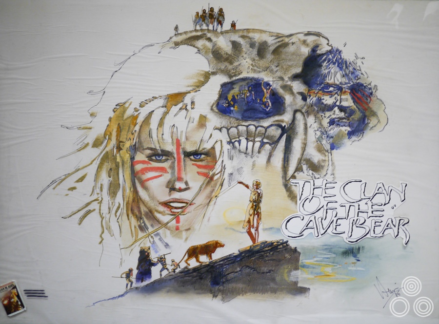
An original concept illustration for the British poster of The Clan of the Cave Bear by Vic Fair, 1986
Did you ever design any of the title treatments for your posters?
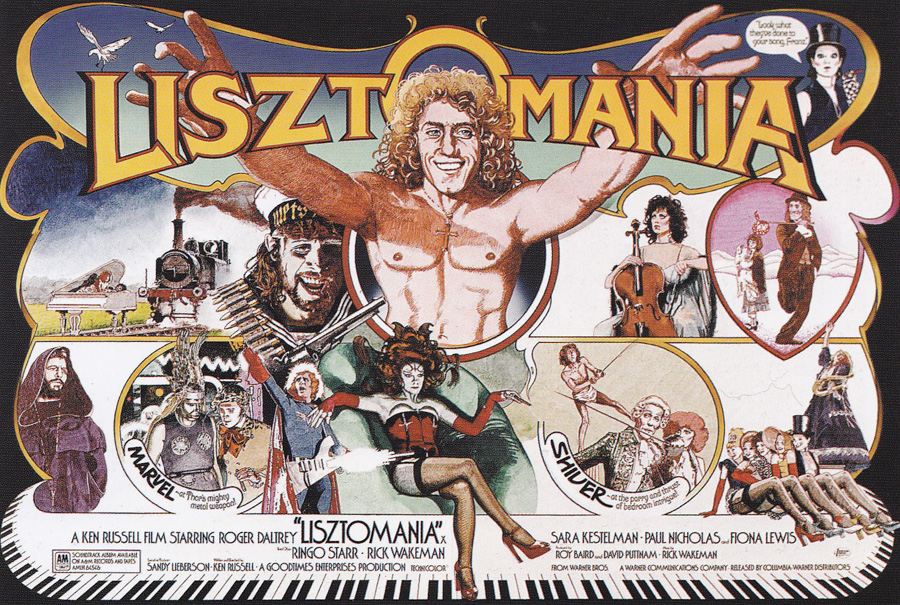
To begin with I left that to some of the other artists we worked with, as there were some really skilled chaps who were able to craft these great titles, but after a while I started to have a go myself. I did all the type on the quad I illustrated for Ken Russell’s Lisztomania, for example.
In the late 1980s you started to do more and more video sleeves. You decided to retire around then?
Yes, because the demand for poster artwork was really starting to dry up and I wasn’t really enjoying doing the video work. In fact most of Downtons began to retire around then. I was at the age where I was ready to finish the standard nine to five life. After I’d handed my notice in I came home and kept myself busy with other projects like working on our home. My wife Kate put me in touch with a friend who lives locally and I did some packaging design for her insect repellent firm, which I enjoyed.
I also enjoyed making furniture, harking back to my early days when I was making models in the garden. I’ve made lots of the furniture in our current house and I really relished designing new items when we moved in here. I don’t particularly miss the painting as I keep myself busy with other types of design work.
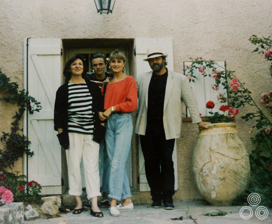
The Fair family on holiday, circa 1986. Vic’s wife Kate stands on the left, with their son Toby next to her and daughter Jo on the left of Vic.
What do you think of modern film posters?
Well, most of them are photographic nowadays and there’s really a limit on what you can create when the poster has to be focused around a handful of photos of the main actors. I haven’t seen anything particularly interesting for a while.
Looking back, is there a poster or achievement you’re most proud of from your career?
I was always flattered how much various people in Downtons sought me out for advice on creating the right kind of campaign for a film we were working on. It was a shock to begin with, particularly when there were lots of guys walking around with suits on, but I suppose they must have respected my ability to create the right design that worked for the studios.
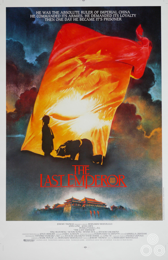
A poster for The Last Emperor, designed and illustrated by Vic Fair, 1987. The artwork was also used on the German poster.
I used to find it a joy to go into a room of people and present my designs to them. I’d often deliberately wait to present my stuff last because that typically worked in my favour, especially when I’d illustrated the roughs on larger bits of paper. Ultimately, the thing I loved the most was coming up with designs that were unique and that people responded to. I realised quite quickly that creating unusual compositions and employing juxtaposition of elements on a poster always led to interesting results. I like to hope that’s what people appreciated about my work.
Thanks so much for your time Vic, I really appreciate it.
You’re very welcome, thank you.
—————————————–
To see the other posters I’ve collected that were designed and/or illustrated by Vic click here.
Hi Eddie. This is a superb interview and I really enjoyed reading it. I’m a documentary filmmaker and am currently in the early stages of putting together background for a documentary on the actress Ingrid Pitt which will hopefully make it into film festivals. I’d like to use Vics poster for countess Dracula and any other posters he designed for films which stared Ingrid. Do you know who holds the copyright for these posters? If you know and have their details that would be amazing. With Kindest Regards. Stuart
Hi Maureen, thanks for your message and I’m glad you enjoyed the interview. I’d certainly be interested in corresponding with your friend if they are interested.
Thank you. I was fascinated to read your interview with Vic Fair it brought back many memories. I came across your piece while googling Arthur S Dixon, Savile Row – I’d joined as a trainee in 1960, and was wondering if there was still anyone around who remembered those Dixon days.
Re film posters – I don’t know how widely you want to take your research, but I have a friend in Manhattan who has been a serious collector for decades.
I have an original one-sheet of The Man Who Fell To Earth proudly sitting above my fireplace (behind museum quality glass!). I agree that it’s one of the best British film posters. Vic is an amazing talent and it’s amazing to finally know it was his work on some really key titles.
I had the privilege to know and work with Vic at Downtons when it merged with KMP to form KHBB. You never knew what he was going to come up with next, fantastic work. The only problem you did have, especially when he shared an office with Marcus Sliversides was the practical jokes, he really loved them.
Thanks for all the memories and good times Vic.
I’ve been sent this message from Vic’s friend and former colleague, David Till, who has asked me to post it for him:
I first met Vic in 1962 when I joined the studio of Dixon’s in Savile Row. I had previously been a junior visualiser and illustrator for Tom Chantrell at Allardyce Palmer in Wardour Street, and had experience of working on film accounts. This was before Vic really had the opportunity to produce the totally original and unique creative designs that would start to appear in the 70’s, in fact a lot of the work we did was a rehash of second rate American artworks, but as at A.P. we were required to submit numerous roughs for the client to reject. A couple that Vic got through at that time were; ‘The War Lover’ with Steve McQueen and ‘La Ronde’ with Jane Fonda (and my title lettering).
As a new addition to the studio I had managed to survive the initiation by Vic’s practical jokes and he and I somehow hit it off and became close friends. I was best man at his and Kate’s wedding a few years later.
After two years I departed from Dixon’s to go freelance but Vic and I met up regularly over the years and I was amazed at how much his work continued to develop and at the quality and invention of his designs – also his use of a variety of media and techniques. During this period he produced a huge amount of poster roughs and finished artworks, (which were far better than the majority of films themselves deserved) and are now seen at auction rooms fetching high prices amongst specialist collectors.
When he retired (early) he moved house to an address very near to me. This was about the time that posters for films were losing the quality of design and illustration that had lifted them out of the largely unimaginative stuff of the 50’s and 60’s. It was now all going over to ‘head shots’ of the stars – but no real design or creativity, so I think Vic decided to leave then as the golden era was obviously coming to an end – and he didn’t want to go where film posters were headed.
For about the last 25 years we have met for snooker, tennis and/or lunch on a regular basis and talked about old films, people and life in general, and had a good laugh about it all. I know he really enjoyed the creative challenge of the work he did then, and felt lucky to have been in the right job at the point where (largely due to him) it all took off.
He admitted that he had a great time and lots of fun doing what he did so well.
I was at his funeral last week where many well deserved tributes were paid to him by ex colleagues, family and friends.
He was a one-off and after 55 years enjoying his company I’ll miss him.
P.S. I am standing behind Vic and Richard in the 1964 pic.
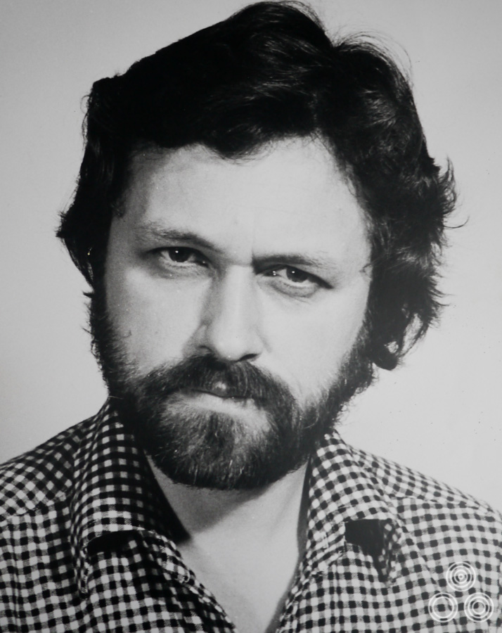
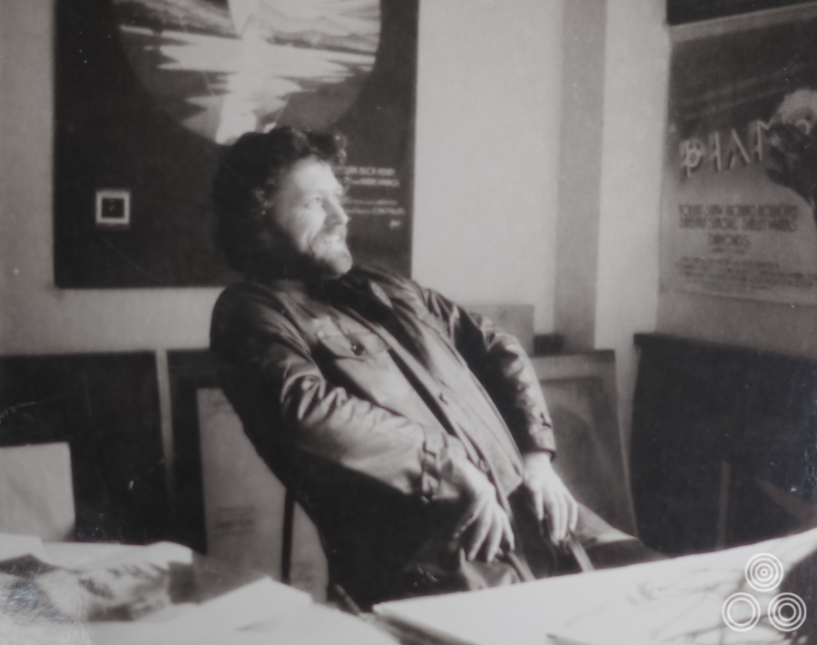
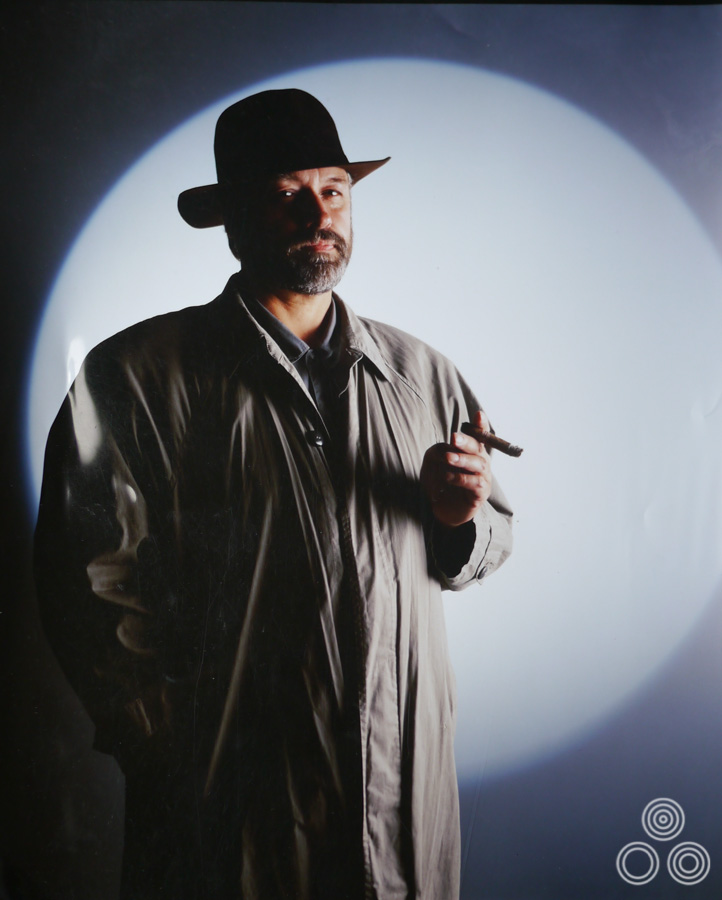
P.S.2 The pic of Vic in trilby and shabby mac. (above) was a ref. shot for ‘Gumshoe’ with Albert Finney 1971.
Excellent interview with the late Vic Fair, thanks for posting this.
I am not a movie poster collector at all- but I recently purchased an original prototype by Vic Fair. I would love to be able to ask him how he conceived the poster, as I really love it.
Ah, thanks for the reply. It’s so great that you’ve asked him about it. I guess the mystery will remain, though, which is a shame. It’s such a distinctive, badass typeface — the person who created it should be basking in cinematic fame and metal glory!
I remember asking Vic about the type and he couldn’t recall who created it but it definitely wasn’t him and I don’t believe it was Steve Harris either! It’s entirely possible it was created by a graphic designer who was around at the time and who allowed it to be used for both things. Another example of this is the font that’s on both the Mad Max UK one sheet and a few other posters of the period, including the Outland UK one sheet – both of these are in the Film on Paper archive if you do a search.
I’ve always wondered about the type for “The Man Who Fell to Earth” poster and its similarity to the Iron Maiden logotype. Do you happen to know if the typeface was something Vic Fair designed himself? Or, was it based on something available commercially at the time? (There’s a font called Metal Lord , but that seems to be a modern creation based on both the Maiden logo and Fair’s poster.) I’ve also read that Iron Maiden’s founder, Steve Harris, designed the logotype himself, but there are no good sources for that claim — it seems doubtful. However, the band was formed and the movie was released at around the same time. So, it’s possible one influenced the other, even if the type style was introduced or popularized back then.
A great interview with a unique artist, I was privileged to work firstly at Downtons and then at AS Dixon as very much a junior alongside Vic. as well as his outstanding talents he had a modesty, style and taste that I never again came across in all my long years in advertising. His stories about Dixon’s are absolutely true not only was he extremely modest but had a great sense of humour. My time working in Film advertising were probably the happiest years of my working life, by the way I’m the chubby young man with my wife in the first photo taken at the A S Dixon Christmas party around 1964.
A fascinating biography of an extremely talented and modest artist. Jane Price
Thanks Adam, your support is appreciated as always. I’m happy with my lot as a designer, but thanks for the encouragement anyway!
VERY informative, interesting and as always, a testament to your hard work, Ed.
Very well done! I will be sure to add this to the new website with your permission once again with full credit given.
Keep it up, Ed … Tell us, why don’t you become an art and design journalist!?