James White is the one man design machine behind the celebrated Signalnoise studio, based in the Canadian city of Dartmouth (Nova Scotia). Having spent 11 years working as a web and print designer for various international companies, and pursuing his own personal projects on the side, James decided to create Signalnoise.com. The site serves as both a personal design blog and a fantastic source of inspiration for other designers, with daily links and galleries of incredible graphic work from all over the world.
Over the years James has cultivated a unique style which reflects on his love of design history and in particular the nostalgic inspiration he continues to draw from the designs he loved whilst growing up in the 1980s. Not only does he showcase finished personal projects on the site, but he regularly shares the processes behind creating the pieces and has also recorded over 60 ‘Broadcasts‘ in which he talks about the work and answers questions from fans of the site and fellow designers. James is also an international speaker on design and has several dates coming up in 2012. To top it all off he’s a genuinely nice chap and is also sickeningly handsome (my wife let out a small whimper when she first saw a picture of him).
Last year James created an unofficial poster for the superb film Drive that was much-heralded and brought him acclaim from film fans and designers alike. The poster perfectly captures the spirit and aesthetics of the film in one image, which is what all film posters should aim to do, and I wasn’t alone in thinking it did a better job than the official US one sheets.
I was lucky enough to be sent one of the small run that James printed soon after the poster was finished but, thanks to a great effort from his agent, Ollie Judge, the poster was recently given the nod from the film’s rights owners. This has resulted in the poster being considered official merchandise and has allowed James to reprint and sell the posters via his website. On the eve of the launch I wanted to share a recent interview I conducted with the man himself in which we discuss the sources of his inspiration, the other film posters and artists he loves and the process behind creating the Drive poster.
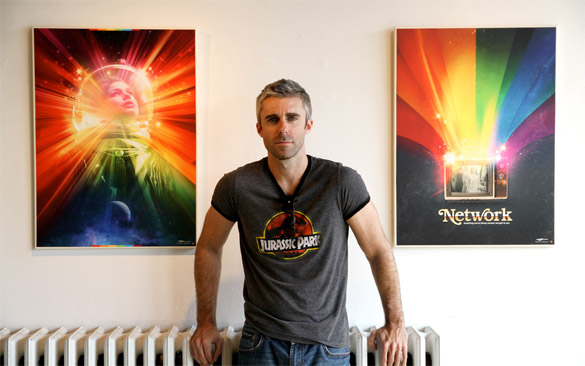
James White – AKA Signalnoise – handsome S.O.B.
Hi James, thanks a lot for taking the time to speak to me. I’d like to begin by asking what it was that inspired you to start out as a graphic designer?
I’ve been drawing my whole life, since I could pick up a pencil at the age of 4. I grew up drawing my favourite characters from a myriad of television shows, comics books, cartoons, movies and even cereal boxes. I lived for art classes in elementary school, when the construction paper and markers started to fly.
I never stopped doodling and drawing all the way through junior high and high school, and upon graduation I was accepted into a 1-year graphic design course at a community college in my hometown. It was pretty bare bones, but I got all the education I needed to really dive into creating a career. This was 1995. That’s when I was introduced to Adobe Photoshop and Illustrator which changed my life forever. Almost immediately I started figuring out how I could take my drawings off the page and use this new weapon, the computer, to move to the next level.
I got scooped up into the web design industry in ’98 when everything was booming. Even though I worked for a variety of agencies in Halifax, Nova Scotia, I never lost touch with that raw creative freedom I had while growing up. I’d work by day, then by night I’d pursue my personal projects like creating comics, animation, character design, painting … whatever I wanted to create. I never stopped.
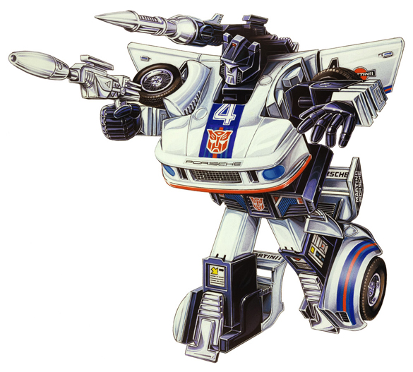
1980s Transformers box art – inspiration on Signalnoise.com – see Botchthecrab.com for more.
You often post nostalgic images of graphic design that you loved when you were growing up and you really get a sense that you’ve had this love for 80s toys and posters going on for a long time. What do these designs mean to you now?
Oh man, I love that stuff so much. My parents are often amazed at the sharp memory I have of my childhood and all the things I loved back then. I can’t remember what I had for breakfast this morning, but I can remember that toy I got out of a box of Shreddies back in ’83. It’s ridiculous.
I was a typical boy in the ’80s. I lived for Star Wars, Transformers, Scooby-doo, He-man, GI Joe, all that rad stuff. I cherished all the toys I had and have vivid memories of every Christmas morning and all the amazing stuff my parents managed to track down for me.
So, fast forward to about four years ago. I was quietly sitting at home contemplating my design career and what I truly wanted to create for myself. Up until that point I had been following trends and art styles that others were doing but nothing really felt like “my own”. What meant the most to ME? What did I want to create out of the sheer joy of creating it? Everything snapped into place when I realized I am the person I am today because of my wonderful childhood, and the excitement I got from all the stuff I was into. I wanted THAT excitement in my art.
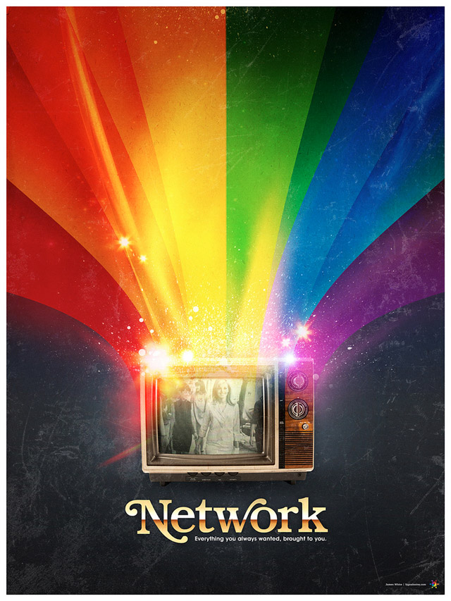
Network – poster designed by Signalnoise in 2009
Can you talk about what it is that you love about the film poster format?
I’ve been a big fan of movie poster art for about as long as I can remember, even long before I appreciated them on an artistic level. Whenever I went to the theatre as a kid to see a movie, I’d always be amazed by the posters for movies I WASN’T going to see, like the crazy horror film my parents wouldn’t take me to, for example. It was wonder, mystery and excitement … maybe they even freaked me out once or twice.
The 80s is when the movie poster as an art form was at it’s peak. Beautifully painted pieces of work that evoked an emotion in the viewer, making us want to see that movie because it looked so awesome, or crazy, or scary. The same goes for VHS covers from back in the day. When the 1990s came about we started seeing a steady decline in quality of movie posters. Beautiful paintings and clever arrangements were being replaced by boring photos and floating heads. My appreciation of design started to grow in the late 90s which is when I started seeing how sad movie poster art was becoming. I was hanging out with my pal Dave Howlett one night, reminiscing about old movie posters when he said “It really is a dying art form.” That hit home … I needed to start designing movie posters just to keep the art form alive in my own world.
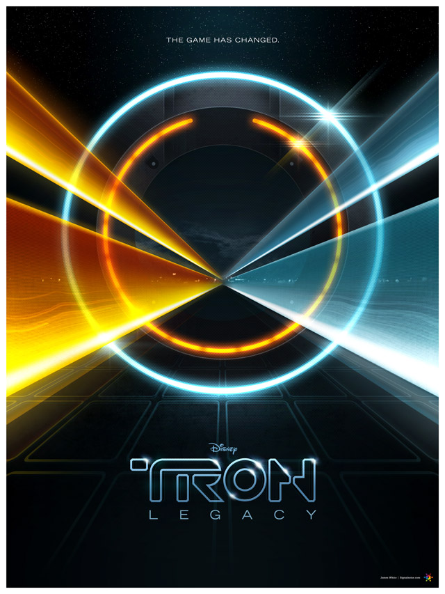
Tron Legacy – self-initiated poster by James White [Signalnoise]
Are there any film posters that particularly stand out or artists that you really admire?
I have so many “favourite” movie posters, but I’ll give you a quick rundown on the ones that really stand out to me.
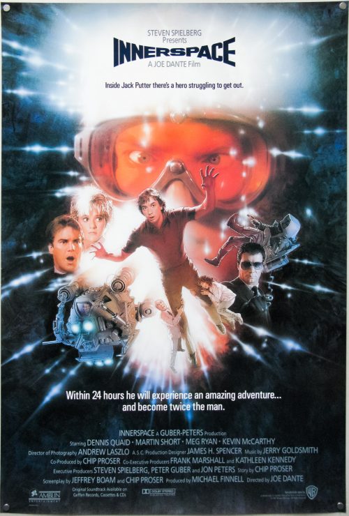
My absolute favourite movie poster is THE THING by Drew Struzan. The fact that Drew had very little time to complete the poster led to a very simplistic take on the project, painting a winter-clad figure with beams of light shooting from his face. He captured perfectly the fear, paranoia and helplessness that the movie evoked. If he had 3 weeks to do the poster, would it have been as well executed? Who knows. Man, love that poster.
Another great one is Bob Peak’s work on STAR TREK: THE MOTION PICTURE. The poster doesn’t necessarily capture the special effects the movie showcased, but that giant rainbow right down the middle is just so captivating. Bright colours, they really suck you in. Sure, the main characters are in there but they are second place to the fantastic palette.
A brilliant bit of execution is the HALLOWEEN poster by Bob Gleason. The hand and knife morphing to the form of the pumpkin is a stroke of genius. I remember seeing that VHS cover when I was a kid and had NO idea what that movie could possibly be about. That was one my parents wouldn’t rent for me.
I’ll wrap this up with one more Struzan piece, his BACK TO THE FUTURE trilogy of posters. That first poster with Marty McFly looking nervously at his watch while climbing into the DeLorean was an instant classic and has been with me my whole life. The colours, composition, logo … everything works in that poster. Then he goes and does it two more times for the sequels. So good.
What was the first movie poster you worked on yourself?
I remember being a little nervous getting into the movie poster design thing years ago, so I started really slowly to get my feet wet. At the time I was experimenting with colourful lines and geometry and I put together a 2001: A SPACE ODYSSEY poster late one night. I had been a fan of the film for quite some time and I wanted to create something a bit different to represent the film.
![2001: A Space Odyssey V1 - design by James White [Signalnoise]](https://www.filmonpaper.com/wp-content/uploads/2012/01/2001_Signalnoise.jpg)
2001: A Space Odyssey V1 – design by James White [Signalnoise]
Even though I’m not very fond of that initial design I put together (and just last year revisited the film for a new design), it was a great stepping stone. I started to pay more attention to the title, tag-lines, credits and making sure the composition benefitted all of those things. It was a great practise piece.
![2001: A Space Odyseey V2 - poster by James White [Signalnoise]](https://www.filmonpaper.com/wp-content/uploads/2012/01/2001_V2_Signalnoise.jpg)
2001: A Space Odyseey V2 – poster by James White [Signalnoise]
You’re good buddies with Jason Eisener (director of Hobo with a Shotgun) and designed a poster for his film – what was that like to work on?
Yeah, I live in Dartmouth, Nova Scotia and Jason Eisener lives about 5 minutes from my place. I enjoy working with Jason and Rob Cotterill on anything they need. They always have a clear vision of the vibe they are going for, but leave the creativity open to experiment with new ideas. They are kids of the 80s like me, so we’re all coming from the same era of inspiration. But the great thing is Jason scours the internet for new awesome stuff, and every time we hang out the laptops open and we just show rad images and art to each other. Really fires me up to work on cool stuff.
![Hobo With a Shotgun - poster by James White [Signalnoise]](https://www.filmonpaper.com/wp-content/uploads/2012/01/HoboWithAShotgun_Signalnoise.jpg)
Hobo With a Shotgun – poster by James White [Signalnoise]
I designed the HOBO WITH A SHOTGUN logo for Jason and the boys back in ’08 (I think) as well as their YER DEAD PRODUCTIONS logo this past year. But the biggest undertaking was the HOBO poster which I worked on for about 2 months. It was the first time I dove head first into digital painting, pouring over the works of Peak, Struzan and Bill Sienkiewicz to learn the science. It was probably the most fun I’ve had on a poster.
![Yer Dead Productions - logo design by James White [Signalnoise]](https://www.filmonpaper.com/wp-content/uploads/2012/01/yerdeadlogo_Signalnoise1.jpg)
Yer Dead Productions – logo design by James White [Signalnoise]
Moving on to the tribute poster for Drive. How did that poster come about?
Little known fact, I created the DRIVE poster the day after I hung out with Jason. As I said, we trade off a lot of art inspiration and he highly recommended I track down a copy of DRIVE to watch. “You’re gonna LOVE it,” he said. And he was right. While watching I was really feeling the urge to create a poster for it. Something that really captures an ’80s vibe that was so heavy in the film, while mixing it with film noir. What might that look like?
![Drive poster - design by James White [Signalnoise]](https://www.filmonpaper.com/wp-content/uploads/2012/01/Drive_Signalnoise.jpg)
Drive poster – design by James White [Signalnoise]
When I finished the movie I jumped online to see what the official posters looked like, and I was shocked to discover they really didn’t represent the film all that well, at least in my opinion. They looked really generic, and didn’t represent the heart and theme of the movie at all. So I decided I wanted to create a DRIVE poster that I’d like to see. I started the day after, first thing in the morning. After 2 days of work it was done.
I’m guessing the ‘cat and mouse’ scene at the beginning had a big impression of you?
Absolutely. What a great way to open the film, huh? It said so much about Ryan Gosling’s character and the world he lived in without hardly saying a thing. There was so little dialogue and full of style and intensity. Great piece of work, I’ve watched that sequence loads of times since that first watch.
There’s one scene where Gosling is across an intersection from a police car. If you watch that scene closely, you’ll see the shot I used as reference for my DRIVE poster.
It’d be great if you could talk about the process you went through to get to the final design. How many versions were there of the poster and what was the development of it like?
Concept
Under normal circumstances I do a lot of sketching at the beginning of a poster project in order to nail down my concept. But the DRIVE poster concept sort of hit me out of nowhere. I knew early on I didn’t want something “clever”, I didn’t want a bunch of stuff from the movie jammed in there. I was sitting quietly in my office pondering the movie and the image of Gosling calmly driving with the world zooming by outside popped into my head. Something calm, maybe a bit lonely. I threw down a very rough doodle and knew that was my concept.
![Drive concept sketches - by James White [Signalnoise]](https://www.filmonpaper.com/wp-content/uploads/2012/01/DriveSketch_Signalnoise.jpg)
Drive concept sketches – by James White [Signalnoise]
Reference
I was never very good at drawing a unique character pose and nailing the likeness, and I knew trying that would be a complete failure. So I started scouring the movie for a scene that might help me with the digital paints. The opening scene we were talking about fit the bill and I discovered the perfect point of reference. You know that scene where Gosling is across the intersection from the cop car? If you look close, you can see the shot that I based the poster on.
Digital studies
Before I started building the digital paints in Photoshop I had to make for damn sure that I knew what I was doing. I knew this would be a very different process then what I’m used to, so I had to learn some techniques before I got to it. I spent some time playing with colours and brush strokes so I could get a decent idea of how to proceed. These were incredibly helpful.
![Drive poster - digital studies - designed by James White [Signalnoise]](https://www.filmonpaper.com/wp-content/uploads/2012/01/Drive_progress_Signalnoise.jpg)
Drive poster – digital studies – designed by James White [Signalnoise]
Digital paints
Head first, man. I remember when I started building the layers of paint in Photoshop and thinking “What on earth have I gotten myself into?”. The thing about painting is that it looks like absolute crap for a LONG time before it starts resembling what you have in your head. For the first … I dunno, 6 hours I was in a rotten mood because it was a big mess. But it was the same with the HOBO poster and I forced myself to stick it out. Sure enough, things started snapping together. I then had a lot of adjusting to do with the palette. There were several colour combinations I was playing with, but eventually landed on the pink/blue combo. It made the most sense.
Texture
After the character form was in place I did a lot of experimenting with paint textures. My Photoshop paints looked way too smooth and perfect and I needed to get in there and mess with them. I have a lot of splattery paint textures onhand so I started adding a bunch in, then taking them out, then adding more, and removing them. I wanted a good balance of clean form with gritty brushes. I needed a good balance. This took hours, but finally it all came together the way I wanted it to. But I’ll be completely honest, this thing was a bit of a jungle.
![Drive - the texture - designed by James White [Signalnoise]](https://www.filmonpaper.com/wp-content/uploads/2012/01/Drive_closeup_Signalnoise.jpg)
Drive – the texture – designed by James White [Signalnoise]
Were there any last-minute tweaks or changes you decided to make?
I had a hard time painting his sleeve, as silly as that sounds. What you see in the final version was my fourth or fifth attempt to get the fabric looking good. My previous attempts were all too detailed, and I was referencing folded silk and all these stupid things. It wasn’t until I looked at Frank Miller’s old Sin City stuff that I realized it was simplicity that would win. He had a great method of creating folds using simple brush strokes.
Most of the last minute things were tiny tweaks to the content areas. I wanted to make sure I had the size of the DRIVE logo right, the spacing of the credit block correct, the line of logos across the bottom had to look good. All of these little elements were heavily scrutinized during the final couple of hours because I needed it to all balance and not take away from the character or composition.
Although this started out as a ‘tribute’ poster, you recently announced that the rights holders to the film are going to let you sell the poster officially, which is great news. For folks that are interested can you talk when it will be available?
Yeah, my agent and all around superhero Ollie Judge at Mystery Box made a tonne of phone calls to movie people and managed to convince them to allow us the rights to sell the poster. It’s an officially licensed DRIVE product, which is really exciting. I think a large part of that goes to the amount of internet buzz the poster got after I unofficially released it. Ollie and I got swamped with emails.
The poster will be available to purchase online on Thursday, January 19 at 1pm EST. The poster will be activated in the Signalnoise Store (http://www.merchline.com/signalnoise/) at that time. I will have 300 copies of the 22″ x 28″ poster for $50 along with a super limited 30 copies of the 24″ x 36″ poster for $90. They’re expected to move pretty quick.
Finally, do you have any other movie posters in the works at the moment. What does 2012 hold in store for Signalnoise when it comes to poster design?
Ollie and I have been scheming over the last few weeks and we have some big plans on the go, most of which revolve around creating original movie posters. I can’t really get into very much at the moment, but this will be a very full year for Signalnoise. Shaking with excitement over here. News will be coming real soon, man.
A huge thanks to James for taking the time to answer my questions and provide us with a glimpse into the making of his awesome Drive print. Check out the links below to see more of his work and I strongly advise following the man on Twitter for daily inspiration and design links.
– Signalnoise Studio: http://www.signalnoise.com/
– Twitter: https://twitter.com/#!/Signalnoise
– Facebook: http://www.facebook.com/signalnoise










![2001: A Space Odyssey V1 - design by James White [Signalnoise]](https://www.filmonpaper.com/wp-content/uploads/2012/01/2001_Signalnoise.jpg)
![2001: A Space Odyseey V2 - poster by James White [Signalnoise]](https://www.filmonpaper.com/wp-content/uploads/2012/01/2001_V2_Signalnoise.jpg)
![Hobo With a Shotgun - poster by James White [Signalnoise]](https://www.filmonpaper.com/wp-content/uploads/2012/01/HoboWithAShotgun_Signalnoise.jpg)
![Yer Dead Productions - logo design by James White [Signalnoise]](https://www.filmonpaper.com/wp-content/uploads/2012/01/yerdeadlogo_Signalnoise1.jpg)
![Drive poster - design by James White [Signalnoise]](https://www.filmonpaper.com/wp-content/uploads/2012/01/Drive_Signalnoise.jpg)
![Drive concept sketches - by James White [Signalnoise]](https://www.filmonpaper.com/wp-content/uploads/2012/01/DriveSketch_Signalnoise.jpg)
![Drive poster - digital studies - designed by James White [Signalnoise]](https://www.filmonpaper.com/wp-content/uploads/2012/01/Drive_progress_Signalnoise.jpg)
![Drive - the texture - designed by James White [Signalnoise]](https://www.filmonpaper.com/wp-content/uploads/2012/01/Drive_closeup_Signalnoise.jpg)