Dune / B2 / artwork style / Japan

07.12.11

PosterPosterPosterPosterPoster
Title
Dune
AKA
Der Wüstenplanet (West Germany)
Year of Film
1984
Director
David Lynch
Starring
Francesca Annis, Kyle MacLachlan, Sting, Max von Sydow, Jose Ferrer
Origin of Film
USA
Genre(s) of Film
Sci-Fi | Drama
Type of Poster
B2
Style of Poster
Artwork
Origin of Poster
Japan
Year of Poster
1985
Designer
Unknown
Artist
Unknown
Size (inches)
20 6/16" x 28 14/16"
SS or DS
SS
Tagline
--

Frank Herbert’s sci-fi classic Dune was always going to be a difficult novel to turn into a sub three-hour film, particularly because of the complex universe, intricate lore and multiple characters it features. The initial novel went onto spawn a Dune franchise, comprising of five more books written by Herbert as well as board games, video games and a series of prequels written after Herbert’s death.

The film that was eventually released in 1984 went through a long gestation, attracting multiple production teams and several directors over a thirteen year period from when the rights were first optioned. Wikipedia has a nice explanation of the various versions (see ‘Production’). In 1975 it looked like legendary director Alejandro Jodorowsky would realise his version of the film with an incredible selection of actors:

In 1975, Jodorowsky planned to film the story as a ten-hour feature, in collaboration with Salvador DalíOrson WellesGloria SwansonDavid CarradineGeraldine ChaplinAlain DelonHervé Villechaize and Mick Jagger.

Even more exciting, in my opinion, was the roster of talent he had assembled behind the camera:

Jodorowsky set up a pre-production unit in Paris consisting of Chris Foss, a British artist who designed covers for science fiction periodicals, Jean Giraud (Moebius), a French illustrator who created and also wrote and drew for Metal Hurlant magazine, and H. R. GigerDan O’Bannon was to head the special effects department.

After a couple of years the project stalled and the financial backing dried up. Frank Herbert traveled to Europe to meet with Jodorowsky and discovered that his script would have resulted in a 14 hour movie.

This website has a great account of Jodorowsky’s version written by the man himself. Earlier this year it was announced that a film was being made that documents this failed version. More info and a trailer can be found here.

The rights were sold to Italian producer Dino de Laurentiis who spent several years trying to get his version of the project off the ground. At one point it looked like Ridley Scott would direct but he eventually left to work on Blade Runner after realising how long Dune would take to bring to screen.

In 1981 De Laurentiis approached director David Lynch after his daughter had seen The Elephant Man and recommended it to her father. Lynch went on to write six drafts of the screenplay before filming commenced in March, 1983. The first cut of the film ran over four hours and, although Lynch was aiming for a preferred length of three hours, the backers (including Universal Pictures) insisted on a two hour film. This meant many scenes were completely excised, new scenes were shot to simplify others and a voice over was added.

All of this resulted in a film that is widely considered as something of a mess, with poor critical reception and box office takings meaning plans for possible sequels were shelved indefinitely. Today, Lynch doesn’t like to talk about the film in interviews and has turned down offers from Universal to reassemble a longer ‘director’s cut’.

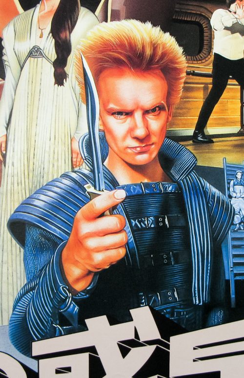
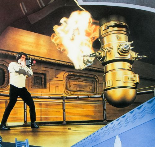
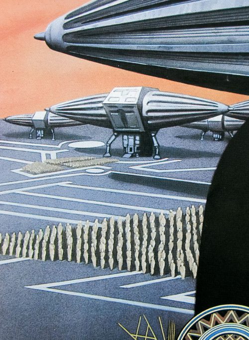
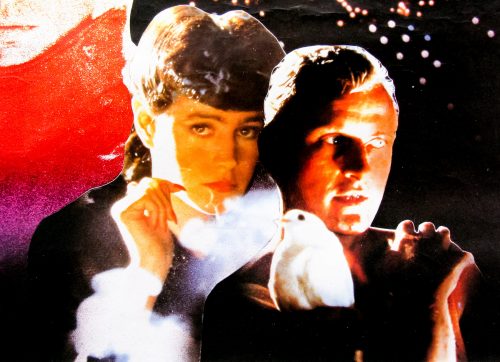
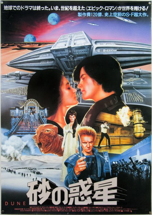
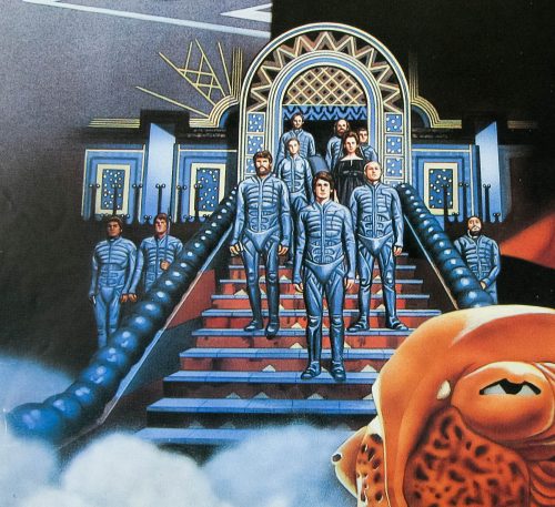
This Japanese poster features unique artwork but is clearly based on some of the images featured on the US advance one sheet that can be seen here. I’m unsure of the artist so please get in touch if you have any ideas.


Hook / one sheet / USA

05.12.11

PosterPosterPosterPosterPoster
Title
Hook
AKA
--
Year of Film
1991
Director
Steven Spielberg
Starring
Dustin Hoffman, Robin Williams, Julia Roberts, Bob Hoskins, Maggie Smith, Caroline Goodall, Charlie Korsmo, Amber Scott, Laurel Cronin, Phil Collins
Origin of Film
USA
Genre(s) of Film
Adventure | Fantasy
Type of Poster
One sheet
Style of Poster
Final
Origin of Poster
USA
Year of Poster
1991
Designer
Unknown
Artist
Drew Struzan
Size (inches)
27" x 41"
SS or DS
DS
NSS #
910128
Tagline
--

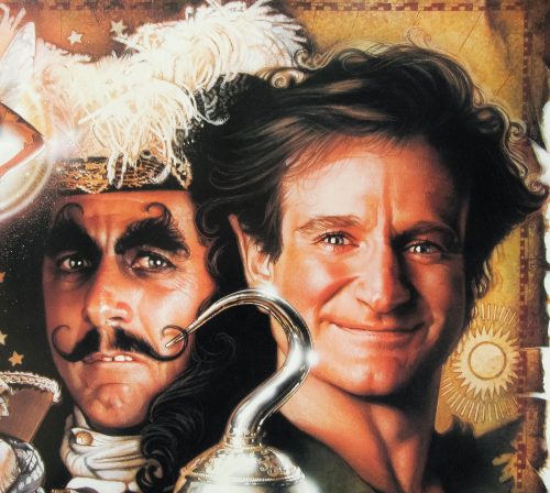
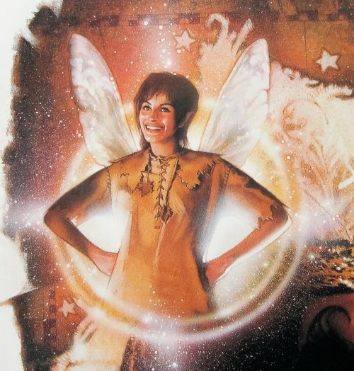
Steven Spielberg’s folllow up to JM Barrie’s classic Peter Pan story featured Robin Williams playing a grown-up Peter Pan, now called Peter Banning and working as a corporate lawyer, who has forgotten his life in Neverland. Whilst visiting England his two children are kidnapped by a mysterious stranger and it’s not long before Tinkerbell [Julia Roberts] appears to return him to the world he once knew so that he can reclaim his youthful spirit and save his family.

The film was roundly panned by critics but was nevertheless considered a box-office success (with worldwide takings over $300 million) and is one of those films that splits audiences in two. Today, Hook continues to have as many fans as it does detractors, with some calling it Spielberg’s worst film and others lauding it as a misunderstood classic.

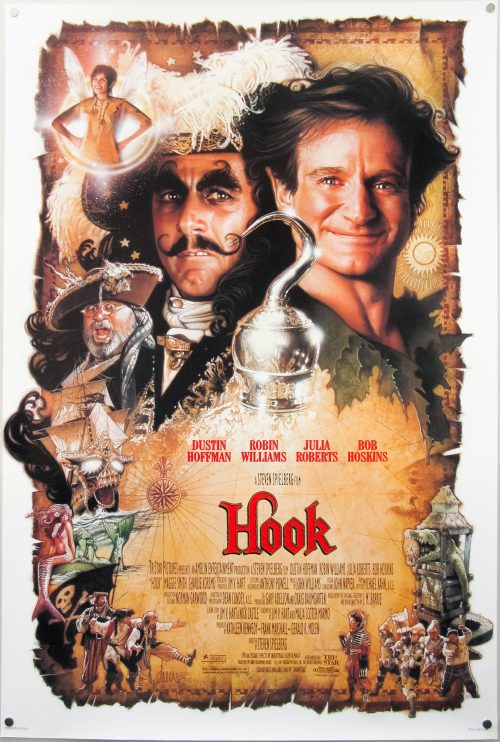
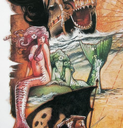
Whatever people thought of the film there’s no question that this final release poster by Drew Struzan was a definite success. It followed a very minimal teaser poster by John Alvin, which doesn’t even feature the name of the film. In his must-have book ‘The Art of Drew Struzan’, the artist talks about the creation of the poster:

‘We had a very long time to work on it, and you know what means: I wound up recombining heads, seemingly forever. ‘Round and ’round, for more than six months; everybody at Sony who needed to stake a reputation had an opinion on what the poster should be.

Nevertheless, Drew used the strong relationship he had built with Spielberg on previous projects to make sure his designs were seen by the director:

(…) I took each group of drawings directly to Steven. The first time, I walked onto the set where they were shooting Peter Pan in the tree stump. Steven stopped everything after he called “cut”, we laid out all the art on this huge table, and he stood there for like half an hour talking with me about it. Now, the cost-per-minute budget on a movie this big is how much? But Steven can do what he wants.

Not everyone was happy with the work in progress, as Drew recalls:

Dustin [Hoffman] said, “It’s not that I don’t like my portrait – it’s beautiful. But I don’t think it’s my character”. He wanted Hook to look “less villainous”. So off I went to Dustin’s house (…) we’re walking and taking and suddenly he goes into Actor Mode to explain what he wants (…) Finally I had to paint out a third of the picture and redesign it. He loved it. They all loved it.

Drew clearly loves the design but he notes that, in a twist of Hollywood madness, the poster wasn’t actually in cinemas until a week after the film opened.

The book (which is also available on Amazon.com and from all good bookshops) features many different versions of the poster before this one was ultimately chosen. Only Drew could have nailed the faces, particularly those of Williams and Hoffman, as well as this.

To see a gallery of the other posters by Drew I’ve collected click here.

The original trailer is on YouTube.

The Mack / 30×40 / USA

02.12.11

PosterPosterPosterPosterPoster
Title
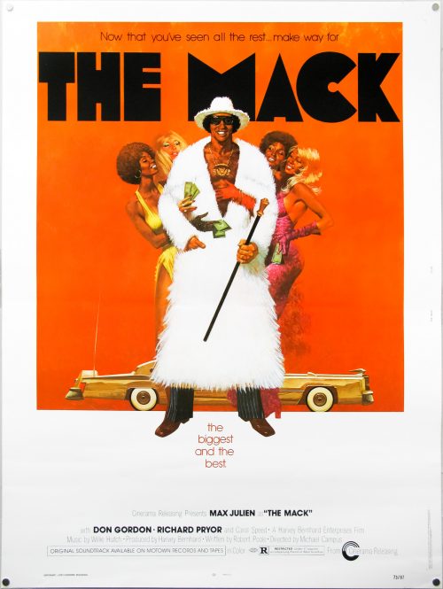
The Mack
AKA
Mack - Il Marciapiede Della Violenza [Mack - The Sidewalk of Violence] (Italy)
Year of Film
1973
Director
Michael Campus
Starring
Max Julien, Don Gordon, Richard Pryor, Carol Speed, Roger E. Mosley, Dick Anthony Williams, William Watson, George Murdock, Juanita Moore
Origin of Film
USA
Genre(s) of Film
Blaxploitation | Crime
Type of Poster
30x40
Style of Poster
--
Origin of Poster
USA
Year of Poster
1973
Designer
Unknown
Artist
Fred Pfeiffer
Size (inches)
30 1/16" x 40"
SS or DS
SS
NSS #
73/87
Tagline
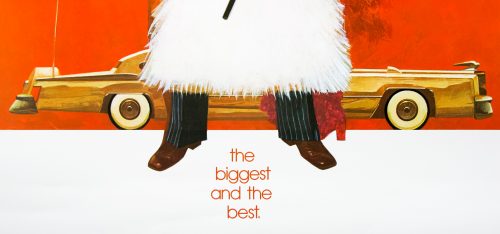
Now that you've seen the rest... make way for... | the biggest and the best

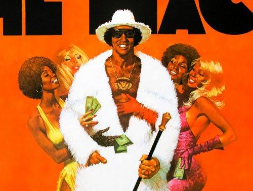
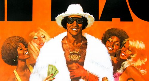
One of the all-time-great pieces of Blaxploitation artwork for this 1973 flick starring Max Julien and Richard Pryor. The film is notorious for the ‘player’s ball’ scene, which birthed the idea of an annual meet-up for pimps in Chicago, Illinois.

I’m unsure who is responsible for the great artwork so please get in touch or leave a comment if you have an idea.

Here’s the original trailer on YouTube.

They Live / B2 / Japan

30.11.11

PosterPosterPosterPosterPoster
Title
They Live
AKA
Invasion Los Angeles (France)
Year of Film
1988
Director
John Carpenter
Starring
Roddy Piper, Keith David, Meg Foster, Raymond St. Jacques, Peter Jason, Sy Richardson, George 'Buck' Flower
Origin of Film
USA
Genre(s) of Film
Action | Sci-Fi
Type of Poster
B2
Style of Poster
--
Origin of Poster
Japan
Year of Poster
1988
Designer
Unknown
Artist
--
Size (inches)
20 6/16" x 28 12/16"
SS or DS
SS
Tagline
BRAIN-WASH HORROR

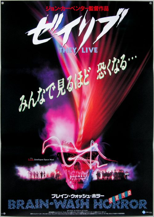
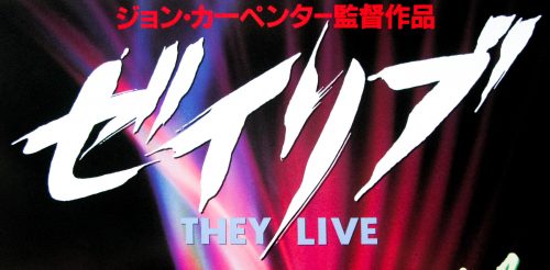
Unique artwork for John Carpenter‘s 1988 sci-fi in which a drifter, played by wrestler Roddy Piper, finds a set of special sunglasses that reveal that aliens have taken over the earth and are subduing the general population through secret messages and signals. The film is famous for being the inspiration behind graphic designer Shephard Fairey‘s famous OBEY street art and clothing label, which is based on the hidden alien slogans only visible when the sunglasses are worn.

The film also features the infamous line “I have come here to chew bubblegum and kick ass…and I’m all out of bubblegum.”, which can be viewed here. There’s also the legendary fight between Nada (Piper) and Armitage (Keith David) that lasts over five minutes and was apparently proposed and choreographed by the two actors.

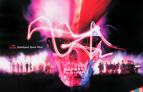
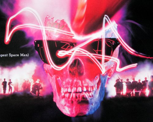
Note that the smashed human skull featured on this Japanese B2 has the word OBEY scrawled on the side. I also like the random ‘Intelligent Space Man’ text next to the skull.

Here’s the great original trailer.

To see the other John Carpenter posters I have collected click here.

Blade Runner / quad / UK

28.11.11

PosterPosterPosterPosterPoster
Title
Blade Runner
AKA
Blade Runner - Metropolis 2020 (Finland)
Year of Film
1982
Director
Ridley Scott
Starring
Harrison Ford, Rutger Hauer, Sean Young, Edward James Olmos, M. Emmet Walsh, Daryl Hannah
Origin of Film
USA | Hong Kong
Genre(s) of Film
Sci-Fi | Drama
Type of Poster
Quad
Style of Poster
--
Origin of Poster
UK
Year of Poster
1982
Designer
Jouineau Bourduge
Artist
Jouineau Bourduge
Size (inches)
29 14/16" x 39 14/16"
SS or DS
SS
NSS #
--
Tagline
A chilling, bold, mesmerizing, futuristic detective thriller.

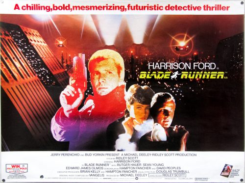
Ridley Scott‘s seminal sci-fi classic needs no introduction and is on many people’s ‘top 10 films of all-time’ list, including my own.

This British quad is based on the French poster credited to Jouineau Bourduge which is the combined surnames of two French poster designers/artists (both with the first name Guy) who were responsible for many classic posters from 1960s through to the 1980s. MoviePostersGallery.com has a gallery of posters by him, as does cinemaffiche.com. I’ve been unable to find anything in the way of a biography online so please get in touch if you have more information.

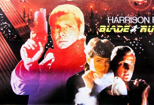
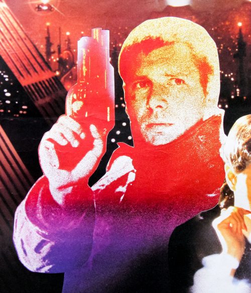
I’ve always found it interesting that Deckard (Harrison Ford) is given a very stylistic representation on the poster whilst the other two characters are displayed using photographs. It’s also slightly bizarre that the studio decided to promote a tie-in to win a Volkswagen Polo – talk about a mismatch of content and product!

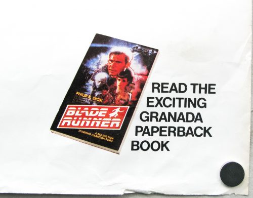
One interesting thing to note is that the book tie-in shown in the bottom right corner features artwork by Drew Struzan. The design was proposed for the American one sheet but the production team ultimately went with John Alvin’s illustration instead. Drew would later be asked to design the poster for the release of the final cut in 2007.

The other Blade Runner posters I have collected can be seen here.

A View To A Kill / one sheet / recalled / UK

25.11.11

PosterPosterPosterPoster
Title
A View To A Kill
AKA
The Beautiful Prey (Japan - English title)
Year of Film
1985
Director
John Glen
Starring
Roger Moore, Christopher Walken, Tanya Roberts, Grace Jones, Patrick Macnee, Patrick Bauchau, David Yip, Fiona Fullerton, Manning Redwood, Alison Doody, Willoughby Gray, Desmond Llewelyn, Robert Brown, Lois Maxwell
Origin of Film
UK
Genre(s) of Film
Action | James Bond
Type of Poster
One sheet
Style of Poster
recalled
Origin of Poster
UK
Year of Poster
1985
Designer
Vic Fair
Artist
Brian Bysouth
Size (inches)
27" x 40"
SS or DS
SS
NSS #
--
Tagline
Has JAMES BOND met his match?

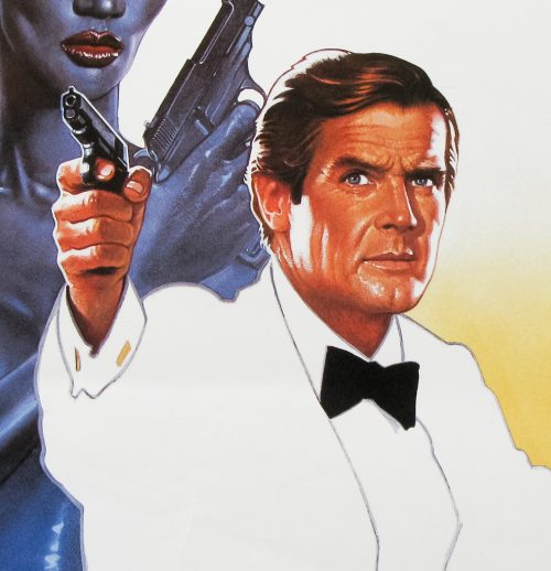
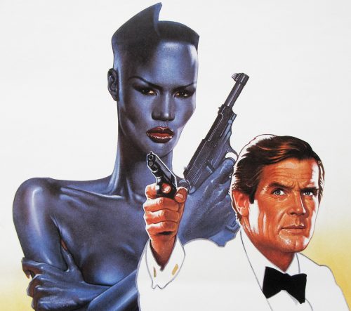
Sir Roger Moore‘s last outing as James Bond, A View to a Kill, was definitely not his finest hour, although it is memorable for a few reasons, including Christopher Walken‘s turn as the truly psychotic bad guy (Max Zorin), Duran Duran’s great title theme and the appearance of the incomparable Grace Jones as Mayday, Zorin’s accomplice. She may not be able to act very well but she’s never anything less than a striking presence and is definitely not a lady to mess with, as British chat show presenter Russell Harty infamously found out.

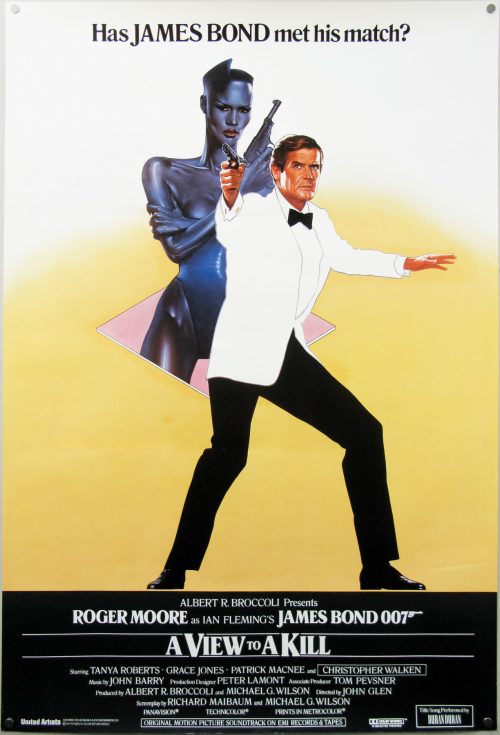
This poster is the UK one sheet that was designed by Vic Fair and illustrated by Brian Bysouth, a not insignificant pairing of two great English talents. Having been commissioned by the studio the poster was apparently then rejected and ultimately never used in cinemas to promote the film. Sim Branaghan, the man behind the must-own book ‘British Film Posters‘, interviewed Vic Fair who recalled that they were looking for a more conventional design, something that often frustrated the designer when working with clients:

‘Not very exciting are they, the Bond posters … always the same thing. So I had this idea of putting him in a white jacket, but they just threw their arms up in horror – “Ooh no, we can’t have that”. It was ridiculous really’

The poster is now known as the ‘recalled’ UK one sheet as, despite the poster having been printed, it was recalled by the studio and most copies were apparently pulped. Obviously, several did manage to escape destruction and made their way into the hands of poster dealers and collectors. I’d like to know a rough figure on how many did survive since it does show up at major auctions and on Ebay occasionally, so it’s certainly more than a tiny handful. If anyone has any more details on this please get in touch or leave a comment.

The artwork did end up being used for other countries, notably a Japanese B2 poster promoting the film.

For more information on Vic Fair and Brian Bysouth I highly recommend picking up a copy of ‘British Film Posters‘ as it features sections on both men. Here are the posters I’ve collected so far by Brian Bysouth and those by Vic Fair (with more to add over the coming months).

In 2012 I met and interviewed Brian Bysouth and this poster was discussed:

There are two specific collaborations you had with Vic Fair that I’d like to talk about. There was the UK one sheet for A View to a Kill, which you mentioned, and before I read Sim’s book I had no idea that it was one of yours. It’s quite different to others you’d worked on before then.
Ah yes, that poster was painted with a different technique than the one I’d typically work with. It has a very smooth look mostly done with an airbrush. The clients had started to require illustrations to have a less painted look and they were asking for much more photo-realistic illustrations. This requirement was because of falling sales in the video market.  The clients had concluded that the paying public had become more discerning and distrustful of what was portrayed on the video sleeves, and to some extent on film posters. The public had begun to realise that an exciting illustration could flatter what in reality would be a truly awful film.  So illustration had to take on a new, more highly-finished look, but this only worked for a short while before the use of photographs and the versatility of the computer took over completely.

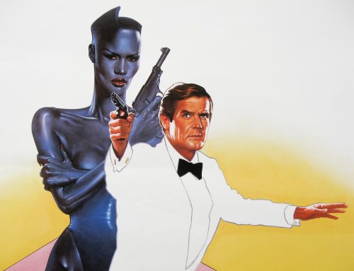
Anyway, to continue, Vic asked me if I’d like to do the finished painting based on his rough; it was a really excellent and novel design, which required me to execute the painting in two stages. The first stage would be used as a teaser poster and this was just the image ofGrace Jones and Bond contained within a diamond motif. All I had to do was get the airbrush out and work up his design. I remember spending a while on the Grace Jones image, polishing and improving her look, as well as the pose of Bond. It went away to be printed but later we were disappointed to learn that it was going to be withdrawn because the clients were not happy with the legendary spy being portrayed in a white tuxedo; that being considered not very Bond-like!

For the second stage, Vic’s design included an exciting montage to fit either side of the central icon of the two characters. The preliminary painting was returned to me for completion and I continued by adding the montage of scenes from the film onto the artwork in a semi-drawn style, which I was experimenting with at the time. I was very pleased with the final results and Vic liked it too. That went off for approval but, for reasons unknown to me, the printing didn’t go ahead. I never saw the artwork again and pathetically, because it was not approved, I don’t even think a transparency was made. I entertain hopes that one day it will eventually re-appear and I will be able to establish my claim to ownership.

Here’s the film’s original trailer.