The Land That Time Forgot / quad / UK

24.10.14

PosterPosterPosterPosterPoster
Title
The Land That Time Forgot
AKA
--
Year of Film
1975
Director
Kevin Connor
Starring
Doug McClure, John McEnery, Susan Penhaligon, Keith Barron, Anthony Ainley, Godfrey James, Bobby Parr
Origin of Film
UK | USA
Genre(s) of Film
Adventure | Fantasy
Type of Poster
Quad
Style of Poster
--
Origin of Poster
UK
Year of Poster
1975
Designer
Tom Chantrell
Artist
Tom Chantrell
Size (inches)
30" x 40"
SS or DS
SS
Tagline
From the author of Tarzan

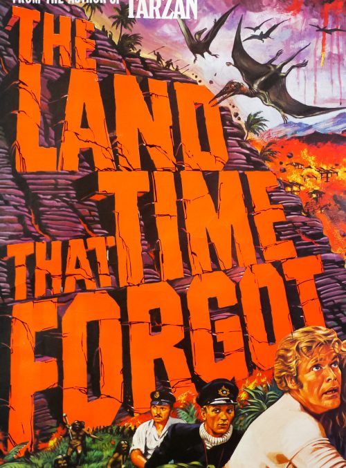
The Land That Time Forgot was the first entry in a series of British sci-fi/fantasy b-movies that were directed by Kevin Connor and starred the prolific American actor Doug McClure, known for his hammy leading man performances (McClure was one of the inspirations for The Simpsons’ Troy ‘You may remember me from…’ McClure). The series continued with At the Earth’s Core (1976) and The People That Time Forgot (1977), and ended with Warlords of Atlantis (1978). The initial three were shepherded through production by Max Rosenberg and Milton Subotsky’s Amicus Productions, which was based at Shepperton studios and is perhaps best remembered for its series of portmanteau horror films. By the time Warlords of Atlantis was released the company was almost defunct and so EMI Films stepped in and produced it, utilising many of the same cast and crew as the previous films.

The Land That Time Forgot starts with the torpedoing of a passenger ship by a German U-boat crew. The few remaining survivors, including Bowen Tyler (McClure) and Lisa Clayton (Penhaligon), manage to overcome the U-boat’s crew when it surfaces and they force the captain to pilot the craft back to allied waters. The crew decide to sabotage their plans and the craft ends up completely lost in unknown waters. They happen across a strange island and find an underwater cave through which they pilot the U-boat. When they surface in the islands interior they are immediately set upon by a dinosaur-like creature that eats one of the crew before Tyler manages to decapitate it. The crew then venture through the strange land and come across more giant beasts and a tribe of primitive cavemen before discovering oil, which they hope will allow them to escape back to civilisation.

The film is never less than entertaining and McClure definitely gives it all he’s got. The creature effects have really dated badly, however, and are definitely not up to the standard set by Ray Harryhausen. There’s one excruciatingly bad sequence where the crew blast away at a pair of T-Rex like creatures and the second one takes an age to fall over unconvincingly (explained away by saying that the creature’s brains are slow to send signals). There are some decent special effects like the U-boat scenes underwater but it’s one film that hasn’t stood the test of time as well as some of its contemporaries.

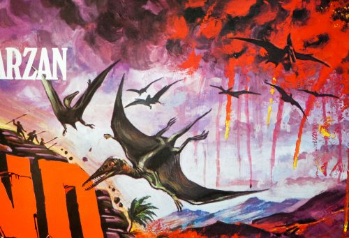
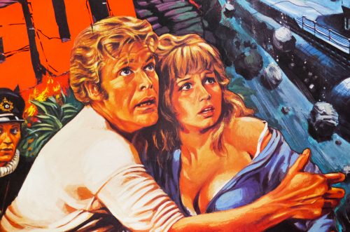
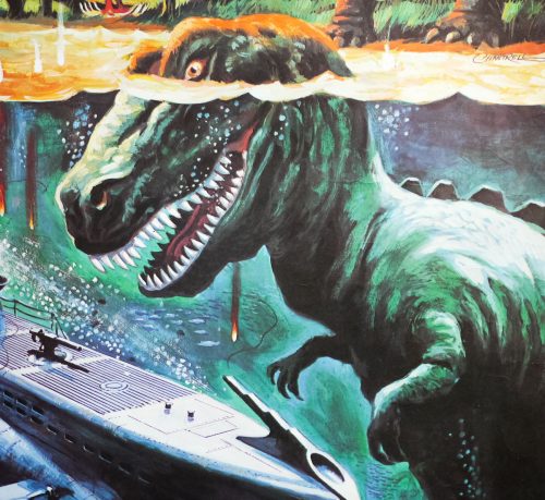
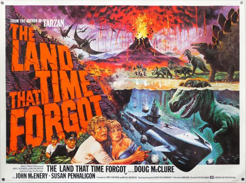
The brilliant artwork on this quad, featuring a cheeky image of a T-Rex underwater (which is definitely not in the film itself), is by Tom Chantrell, the celebrated British artist whose dynamic and colourful work featured on hundreds of posters over a forty year period. His official website features a great biography written by Sim Branaghan, author of the must-own British Film Posters. Chantrell illustrated many classic poster designs, including several Hammer posters such as the brilliant quad for ‘One Million Years B.C.’, and was also responsible for the iconic Star Wars quad, the artwork of which ended up being used around the globe. I have a number of other designs by him on this site.
Lifeforce / B2 / photo style / Japan

22.10.14

PosterPosterPosterPosterPoster
Title
Lifeforce
AKA
Vampires from Outer Space (working title)
Year of Film
1985
Director
Tobe Hooper
Starring
Steve Railsback, Peter Firth, Frank Finlay, Mathilda May, Patrick Stewart
Origin of Film
USA
Genre(s) of Film
Sci-Fi | Horror | Mystery
Type of Poster
B2
Style of Poster
Photo style
Origin of Poster
Japan
Year of Poster
1985
Designer
Unknown
Artist
Unknown
Size (inches)
20 6/16" x 28 14/16"
SS or DS
SS
Tagline
--

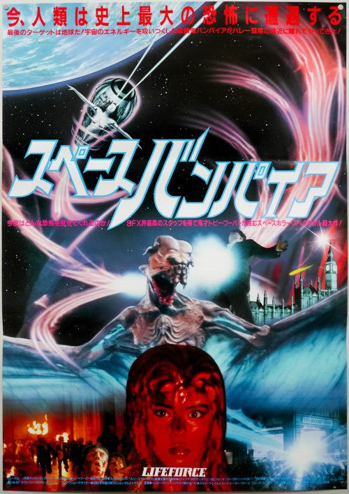
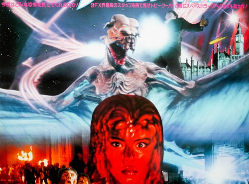
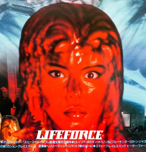
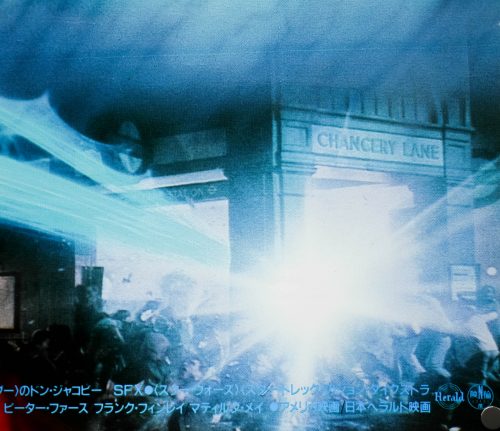
A suitably outlandish design on this Japanese B2 (style B) for the release of Tobe Hooper’s sci-fi curio Lifeforce. Based on the 1976 novel The Space Vampires by Colin Wilson, the film’s screenplay was written by Dan O’Bannon (Alien, Total Recall) and Don Jakoby and was the first in a three film deal that Hooper had agreed with notorious production and distribution company Cannon Films (the others were Invaders from Mars and The Texas Chainsaw Massacre 2). The film begins as the joint US-UK space shuttle Churchill heads towards Halley’s Comet on a research mission. After discovering a large dormant alien ship in the comet’s tail, a small team sets out to investigate and discovers a trio of naked humanoids in transparent stasis pods surrounded by the dried husks of hundreds of bat-like creatures.

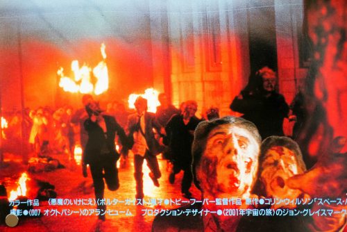
The pods, which contain two males and a female (the stunning Mathilda May) are brought onboard the spaceship. Several weeks later, after losing contact with Churchill’s crew, a rescue team is sent out and finds the shuttle drifting in space having been crippled by a catastrophic fire with all crew presumed dead. The pods are discovered in the hold completely untouched and are returned to earth to the European Space Research Centre in London where Dr. Leonard Bukovsky (the late Michael Gothard) and Dr. Hans Fallada (Frank Finlay) oversee a planned autopsy on the humanoid figures. The female awakens during the procedure and attacks one of the doctors, draining the ‘lifeforce’ from him, leaving just a desiccated husk. She then escapes from the facility and sets in motion a chain of events that eventually sees the city of London besieged by hundreds of newly created space vampires.

The film gets increasingly bonkers as it continues and the acting from Steve Railsback (shuttle captain Carlsen) is absolutely bizarre, ranging from barely audible mumbles to wild-eyed shouting. Frank Finlay is also good value and appears to think he’s starring in a 1960s Hammer horror film. The special effects are notably good and were headed up by award-winning artist John Dykstra. The alien ship scenes are very well done, as are several of the scenes where lifeforce is extracted from victims.

The film rattles from one scene to another and barely manages to stay comprehensible, despite being undeniably enjoyable. Apparently budgetary issues meant several scenes were never shot and production had to be shut down at one point after financing had dried up. All of this clearly had an impact on the final cut and things were made worse for the US release when distributor Tristar decided to trim 12 minutes from the film. Lifeforce was a box-office failure and was unable to recoup its original bloated budget. The UK and other countries at least received the full uncut version and it’s now available for all on blu-ray.

The Terminator / A1 / Czechoslovakia

20.10.14

PosterPosterPosterPosterPoster
Title
The Terminator
AKA
O Exterminador do Futuro (Brazil)
Year of Film
1984
Director
James Cameron
Starring
Arnold Schwarzenegger, Michael Biehn, Linda Hamilton, Paul Winfield, Lance Henriksen, Bess Motta, Earl Boen, Rick Rossovich, Dick Miller, Shawn Schepps, Bruce M. Kerner, Franco Columbu,, Bill Paxton, Brad Rearden, Brian Thompson
Origin of Film
UK | USA
Genre(s) of Film
Sci-Fi | Action
Type of Poster
A1
Style of Poster
--
Origin of Poster
Czechoslovakia
Year of Poster
1990
Designer
Milan Pecák
Artist
Milan Pecák
Size (inches)
22 11/16" x 31 13/16"
SS or DS
SS
Tagline
--

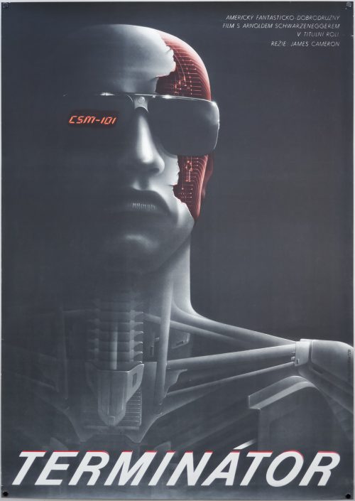
James Cameron’s seminal sci-fi classic The Terminator celebrates its 30th anniversary this year and it cannot be overstated how much of an impact the film has had on cinema and culture in general. The careers of Cameron and star Arnold Schwarzenegger were given stratospheric boosts (not so much poor Michael Biehn) and the concepts of time-travel, and killer cyborgs will forever be tied to what would go on to become the Terminator franchise. The film is also arguably the original 80s action blockbuster and would be followed by a slew of increasingly more muscular, explosive flicks starring the likes of Sylvester Stallone, Bruce Wills and, of course, Arnie.

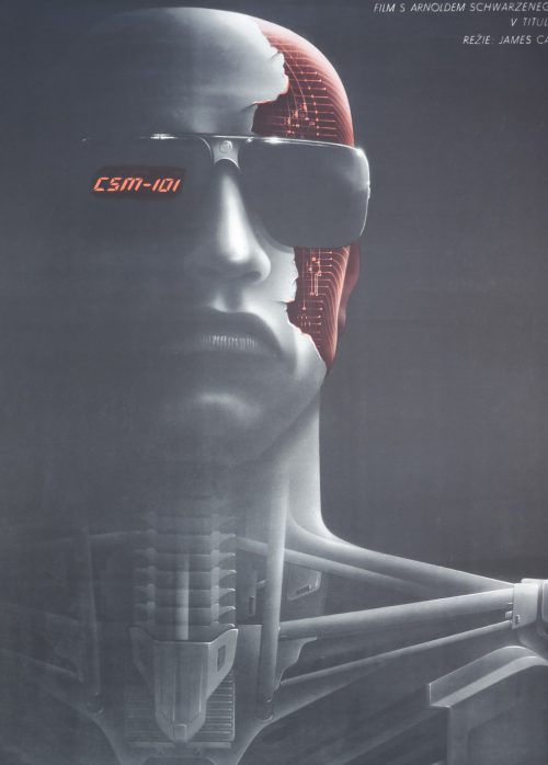
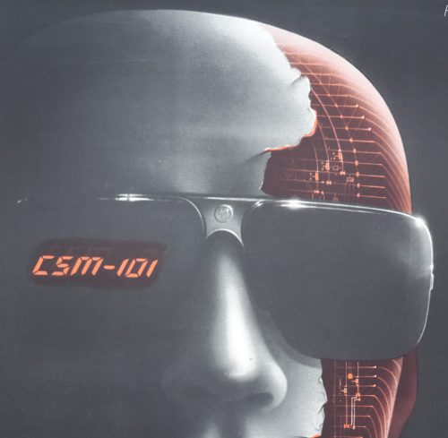
The US poster features an iconic photograph of Arnie alongside a lengthy tagline, whilst the UK quad went for an illustration depicting a battle-damaged Terminator showing the endoskeleton underneath. This poster for the Czechoslovakian release of the film in 1990 (two years before the sequel) features a fantastic illustration depicting the cold steel of the endoskeleton with Arnie’s face above and an exposed cranium with what are clearly intended to be electronic pulses in place of a human brain.

The poster was designed and printed by the Czech artist Milan Pecák. A celebrated designer and artist, Pecák was born in 1962 and studied at the Vaclav Hollar School of Fine Arts in Prague before working as an architect and later as a set designer for several films. It was whilst working on the 1986′ ‘Zastihla Me Noc’ that he was first given the opportunity to work on the film’s poster and from then onwards he was in demand as an artist for posters advertising Czech releases, as well as several American films, including Gorillas in the Mist, Mississippi Burning and Indiana Jones and the Temple of Doom. In addition to film posters, Pecák is also an accomplished book and magazine cover illustrator and in his spare time works on fine art painting as well as digital graphics.

Milan Pecák’s official website can be viewed here and features several galleries of his work as well as a biography.

Jaws / one sheet / USA

17.10.14

PosterPosterPosterPosterPoster
Title
Jaws
AKA
Les dents de la mer [The teeth of the sea] (France)
Year of Film
1975
Director
Steven Spielberg
Starring
Roy Scheider, Robert Shaw, Richard Dreyfuss, Lorraine Gary, Murray Hamilton, Carl Gottlieb, Jeffrey Kramer, Susan Backlinie
Origin of Film
USA
Genre(s) of Film
Horror | Thriller
Type of Poster
One sheet
Style of Poster
--
Origin of Poster
USA
Year of Poster
1975
Designer
Seiniger Advertising | Magidell Agency | Universal in-house design
Artist
Roger Kastel
Size (inches)
27 1/16" x 41"
SS or DS
SS
NSS #
75/155
Tagline
The terrifying motion picture from the terrifying No.1 best seller

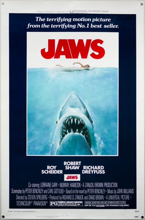
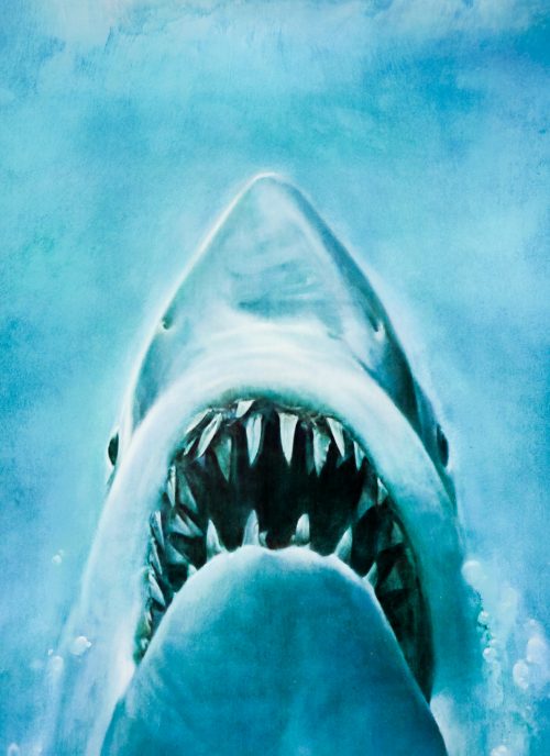
I’ve waited many years to add this iconic one sheet for Steven Spielberg’s masterpiece Jaws to the Film on Paper collection as I wanted to find a rolled copy, which is no meant feat considering the film’s popularity and the fact that it was released in the mid-1970s (rolled posters from this period are rare). I finally won this copy in an auction earlier this year and what’s notable is that when other rolled originals of Jaws appear they almost always have the same NSS information layout at the bottom as this one, which many dealers and collectors believe means they originate from the Cleveland, Ohio NSS office. CineMasterpieces have a number of Jaws one sheets in their inventory (many already sold) and you can compare the different layouts of the NSS information (here’s an example).

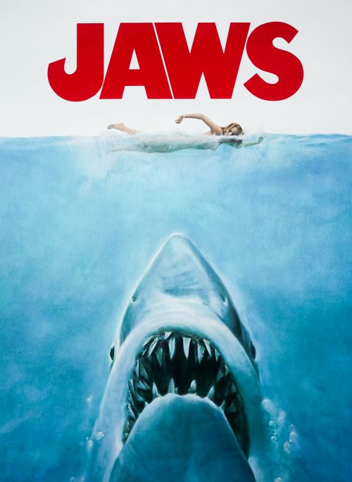
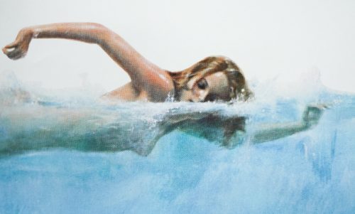
The instantly recognisable image was painted by the American artist Roger Kastel and was originally commissioned for the paperback cover of Peter Benchley’s novel, but when Universal saw the artwork they bought the rights to use it for the poster and following the worldwide success of the film it would go onto become one of the most imitated and parodied images of all time, as well as a merchandising product in its own right.

Collector’s Weekly published a fascinating article about the creation of the poster and the events that led up to Kastel being commissioned to work on the poster. The artist recalls the day the project dropped into his lap:

“I had just delivered a painting to Bantam’s art director, Len Leone,” he says. “Bantam was just loaded with great artists at that time, and Len really gave Bantam its look. I was sitting in Len’s office when Oscar Dystel, Bantam’s publisher, came in. He said, ‘Wait a minute. Don’t leave. I have a great book for you to read’. And he ran out and came back with ‘Jaws.’”

A cover had already been painted by the renowned book cover illustrator for the Doubleday hardback edition of the book but as Kastel remembers it Dystel wasn’t happy with the first cover:

“He wanted me to read the book to pick out a new part to illustrate. But, of course, the best part was the beginning, where Chrissie goes into the water nude.” Turns out the Doubleday concept, if not the execution, was not so bad after all. Kastel did a sketch for Dystel and Leone to critique. “The only direction Oscar and Len gave me was to make the shark bigger, and very realistic.”

Kastel visited his usual go-to source for reference material, the Museum of Natural History in New York, but came up short:

“They didn’t have anything I could use, so I asked if they had a shark exhibit. They said they did but that it was closed for cleaning. It was lunchtime, so I went upstairs anyway, and there were all these different stuffed sharks, just laying on boards. I had my camera with me so I took a few pictures. The shark in my painting developed from there. I just tried to paint a ferocious-looking shark that was still realistic.”

When the book was released the graphic nature of the image saw the paperback banned from shelves in Boston, Massachusetts, and St. Petersburg, Florida, but Bantam didn’t mind the publicity as it greatly boosted sales. The cover also caught the attention of the film studio who were developing the story for the big screen:

“Apparently Universal had tried other poster ideas, but in the end they picked mine. They changed the color of the ‘JAWS’ lettering, added the actor names and other credits, and blurred the girl’s breasts with some foam.”

Kastel is unsure what fate befell the original oil painting (which was approximately 20″ x 30″) and the last time he saw it was when the paperback was first released:

“It was hanging at the Society of Illustrators in New York,” he says. “It was framed because it was on a book tour, and then it went out to Hollywood for the movie. I expected it to come back, but it never did. Either someone has it or it’s lost in storage at Universal. They really should report it as stolen.”

I’ve credited the design of the poster to three parties, although Tony Seiniger (and his agency) is most often cited as the man behind it. This article on Posterwire features comments that also call out another agency called Magidell who apparently had input as well as Universal’s in-house marketing team. Kastel also painted the ‘Gone with the Wind’ style one sheet for The Empire Strikes Back. Check out his official site here.

Freaky Friday / quad / UK

15.10.14

PosterPosterPosterPosterPoster
Title
Freaky Friday
AKA
--
Year of Film
1976
Director
Gary Nelson
Starring
Barbara Harris, Jodie Foster, John Astin, Patsy Kelly, Dick Van Patten, Vicki Schreck, Sorrell Booke, Alan Oppenheimer, Ruth Buzzi, Kaye Ballard, Marc McClure, Marie Windsor
Origin of Film
USA
Genre(s) of Film
Comedy | Family | Fantasy
Type of Poster
Quad
Style of Poster
--
Origin of Poster
UK
Year of Poster
1976
Designer
Brian Bysouth
Artist
Brian Bysouth
Size (inches)
30" x 40 2/16"
SS or DS
SS
Tagline
Annabel and her mother are not quite themselves today - in fact, they're each other!

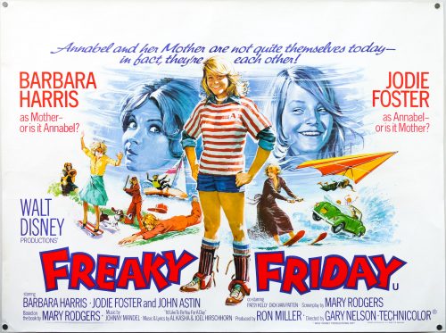
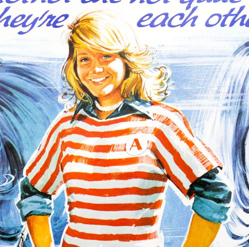
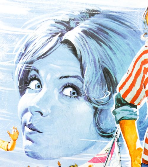
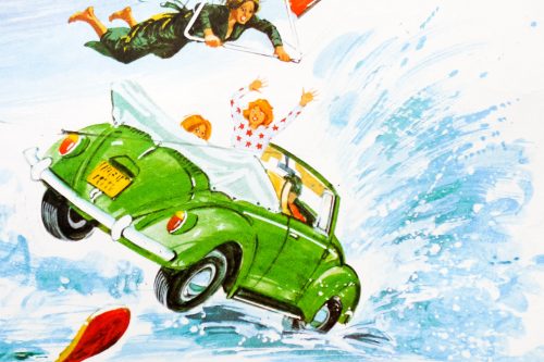
Unique artwork features on this UK quad for the release of the 1976 version of the Disney comedy Freaky Friday. Based on the novel of the same name by Mary Rodgers (who also wrote the screenplay), the film focuses on the Andrews family in which the mother and daughter (played memorably by Barbara Harris and Jodie Foster) are constantly at odds with each other and struggle to understand why they behave the way they do to each other. On Friday the 13th they both happen to say “I wish I could switch places with her for just one day” at the same time and their wishes come true as their minds swap places. The pair then must cope with being in each other’s bodies as they realise the pressures and expectations they both have on them.

Mr Andrews (John Astin) is a real-estate developer preparing for an important launch in which mother and daughter are meant to be playing their different parts and hilarity ensues as the pair attempt to cope with the situation. The film is classic Disney family entertainment and definitely harkens back to a more innocent time. Both Harris and Foster bring a great energy to their parts and it’s easy to see why the latter would go on to catch the eye of many a Hollywood casting director.

This quad was created by the British designer and artist Brian Bysouth who I interviewed for this site in 2012. He is one of my favourite artists and worked on multiple classic posters from the 1960s to the 1980s, including the final painted poster for a James Bond film, The Living Daylights. The other posters I’ve collected by Brian can be seen by clicking here.

Orca / B2 / style B / Japan

13.10.14

PosterPosterPosterPosterPoster
Title
Orca
AKA
Orca: Killer Whale (alt. title) | The Killer Whale (alt. title)
Year of Film
1977
Director
Michael Anderson
Starring
Richard Harris, Charlotte Rampling, Will Sampson, Bo Derek, Keenan Wynn, Robert Carradine, Scott Walker, Peter Hooten, Wayne Heffley
Origin of Film
USA
Genre(s) of Film
Adventure | Drama | Horror | Thriller
Type of Poster
B2
Style of Poster
Style B
Origin of Poster
Japan
Year of Poster
1977
Designer
Unknown
Artist
Unknown
Size (inches)
20 7/16" x 28 14/16"
SS or DS
SS
Tagline
--

A man versus giant killer fish film that was released two years after the original summer blockbuster Jaws, Orca was always going to be compared to Spielberg’s classic even if its lead actor, the late Richard Harris, was apparently angered by the links; ‘I get really offended when people make the comparison’, he is quoted as saying at the time of release. The late Italian producer Dino De Laurentiis was determined to one-up the spectacle of Jaws and tasked the screenwriter Luciano Vincenzoni to “find a fish tougher and more terrible than the great white”, which led them to the killer whale and production on ‘Orca’ began.

Harris plays Nolan, the Irish captain of a fishing boat operating in the waters off the coast of northern Canada who hears of a lucrative contract being offered for the live capture of a killer whale and hopes the bounty will pay off the mortgage on his boat. After Nolan and his crew accidentally spear a pregnant female killer whale they drag it onto the ship where it miscarries, and almost dies, before the male (Orca) attacks the ship, killing one of the crew before the female is cut loose and falls into the water. The next morning the body of the female whale washes up on shore and before long it becomes clear that Orca is out for revenge, as he attacks the fishing village and destroys vital fuel lines. The villagers insist Nolan is responsible and task him with killing Orca so he sets off with the remainder of his crew, plus marine biologist Rachel Bedford (Charlotte Rampling) and a native American killer whale expert (Will Sampson). The whale leads the boat away from the village into frozen, iceberg covered waters and the stage is set for a final confrontation.

Unfortunately for De Laurentiis and all involved the film was critically derided and sank quickly at the box office, particularly since the juggernaut that was Star Wars was already smashing box office records around the world. The idea of a vengeful fish obviously didn’t go down too well with audiences, although the people behind 1987’s awful Jaws: The Revenge must have forgotten this by the time it was decided to make a third Jaws sequel. The practice of hunting and capturing killer whales to feed the demand from aquariums in the 1960s and 70s was sadly all too prevalent, as documented in the recent heartbreaking documentary Blackfish, which also points out that there are no documented cases of humans being killed by the whales in the wild.

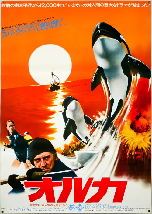
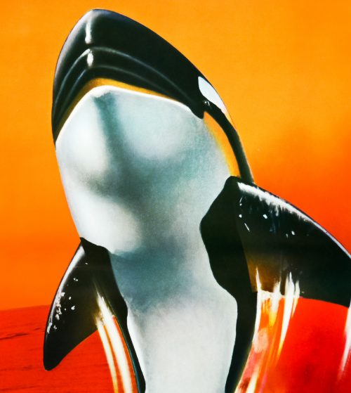
The artwork on the American one sheet was painted by John Berkey who also worked on the poster for the De Laurentiis produced remake of King Kong a year earlier, and the Orca art was also used for the British quad. The Japanese marketing campaign, however, featured at least three B2-sized posters, including this one, that featured artwork apparently unique to the posters and only the B1 format used the Berkey painting. I’ve called this B2 style B and there’s also the style A. I’ve been unable to find out who is responsible for this artwork so if you have any ideas please get in touch.

Check out the bonkers original trailer on YouTube.