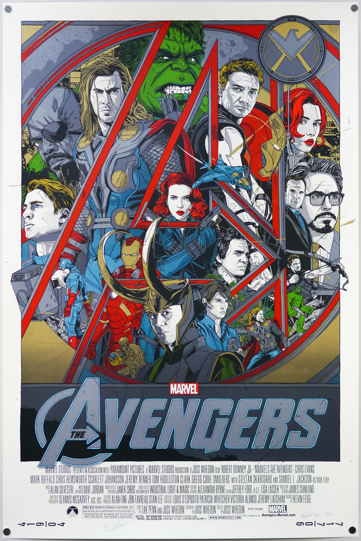
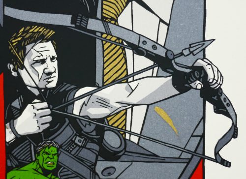
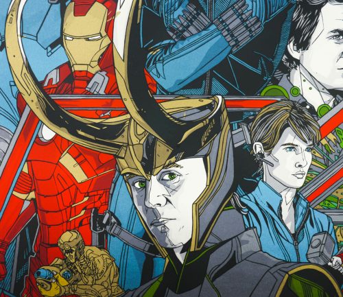
To celebrate the release of 2012’s hugely anticipated superhero team-up The Avengers, Marvel, the studio behind what was unquestionably the biggest cinematic event of the year, once again worked with Austin-based Mondo to release a series of screen prints based on characters from the film. The incomparable Austin-based geek culture outfit has worked on prints for all of the standalone Marvel releases, starting with Iron Man in 2008 and only skipping the same year’s The Incredible Hulk.
The team at Mondo assembled a roster of its most celebrated artists to work on prints for each of the main characters and these were released over the period of a week in April 2012, beginning with Olly Moss‘ portrait of Black Widow and ending with Thor by Martin Ansin and Iron Man by Kevin Tong. A few weeks later, on the eve of the film’s release, Mondo then revealed a print featuring all of the characters that was designed and illustrated by arguably their most popular artist, Tyler Stout.
As usual, the print came in both regular and variant versions and, despite each having relatively high print runs, the poster sold out within seconds of going on sale on Mondo’s site. I was lucky to snag a copy of the print via Tyler’s own lottery, which he now holds on his own site shortly after each print release sells out via Mondo.
Whilst adding the regular version to the Film on Paper collection I wanted to interview the man himself about the creation of the print as I’ve done previously with his work on Akira, Kill Bill and Star Trek II: The Wrath of Khan. The interview can be read in full below:
—————
Hey Tyler, can I start by asking if you were keen to work on a poster for The Avengers after the prints you’d done for Iron Man 2 and Captain America? Did you ask the guys at Mondo if you could get involved?
Well, bear in mind that I did this poster over two years ago so it’s hard for me to remember the exact conversation, but it probably was something similar to the Mondo guys asking me, “Hey do you want to do a poster for Avengers?” and me going “Sure”, and then several emails from them saying “Is it done yet?” then me finishing it at the last minute.
Did you get to see the film before you worked on the print? What did you think?
I didn’t. I don’t know if I’ve ever seen a film before it’s released officially. Actually, Best Worst Movie – I saw that one. For the rest though, if it’s a new film, I don’t usually get into screenings. I really liked The Avengers a lot and it’s my second favourite Marvel film, after the first Iron Man. Since then I would probably add Captain America 2 up there as I really enjoyed that, plus Iron Man 3.
How long were you given to work on the design?
I can’t really say for sure. I’m certain they gave me at least a month’s heads-up, probably more like three months heads-up. Not that it does much good as I’m a last minute man.
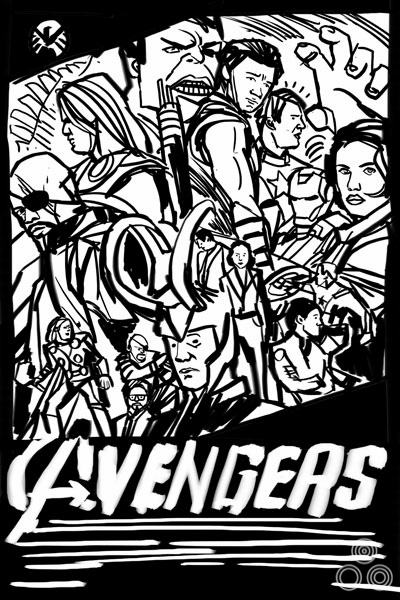
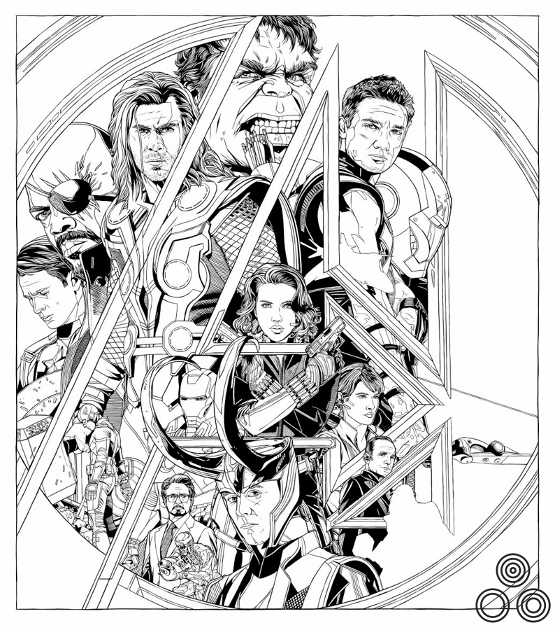
An early thumbnail sketch for the poster that Tyler submitted to Mondo for approval before beginning work.
Can you talk about your initial design ideas for the poster?
We were required to submit a thumbnail sketch of our design ideas early on in the process. As you can see I stuck pretty close to mine and just had to tweak a few colors and voila. Done. It was in my head the entire time.
Were there certain elements or characters you knew had to sit next to each other?
My posters are the very definition of happy accidents. Looking at this one, I think I deliberately made Captain America and Iron Man/Tony Stark smaller and less central to the piece because I’d already done posters for their individual films, so those two characters had already had their day to shine. Having seen the film, I realise now that maybe Hawkeye isn’t as main of a character as Cap or Stark (who’s a huge part of the film), but thats life. I let personal bias get in the way.
What about the idea of having each character with a portrait and an alternative pose?
I like drawing faces up close and I like kinda showing them in action. I just like repeating things for some reason. It gives it the feeling of movement, for me anyway.
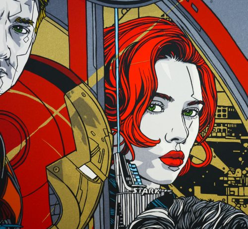
One small note of interest is that, due to a lack of time, I used the city portion of a discarded design for a Drive poster as the background for this print. Later we ended up doing a letterpress of that same Drive design. This is known in the TStout industry as ‘double-dipping’.
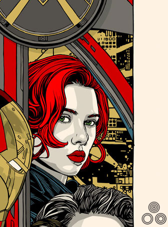
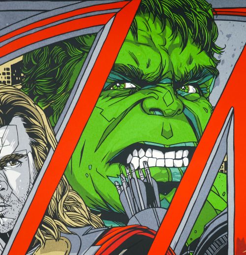
A close-up of an earlier version of the poster, featuring Black Widow and a cityscape ‘borrowed’ from an unused poster for Drive (as detailed above and featured below).
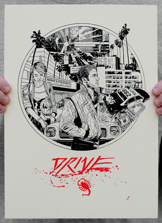
A letterpress of an earlier, unused poster for Drive (2011) that was designed by Tyler and from which he ‘borrowed’ the background cityscape for the Avengers print.
Was the composition and framing using the ‘A’ something you arrived at rapidly?
Having looked back at earlier versions it seems like the A feature was always pretty central to the design, there wasn’t any layout that didn’t involve it actually. So that’s good that I stuck to my guns.
