Street Trash / B2 / Japan

25.06.13

PosterPosterPosterPosterPoster
Title
Street Trash
AKA
Horror in Bowery Street (Italy)
Year of Film
1987
Director
J. Michael Muro
Starring
Mike Lackey, Bill Chepil, Vic Noto, Mark Sferrazza, Jane Arakawa, Nicole Potter, Pat Ryan, Clarenze Jarmon, Bernard Perlman
Origin of Film
USA
Type of Poster
B2
Style of Poster
--
Origin of Poster
Japan
Year of Poster
1987
Designer
Unknown
Artist
--
Size (inches)
20 6/16" x 28 13/16"
SS or DS
SS
Tagline
--

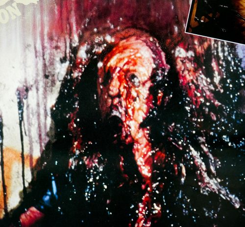
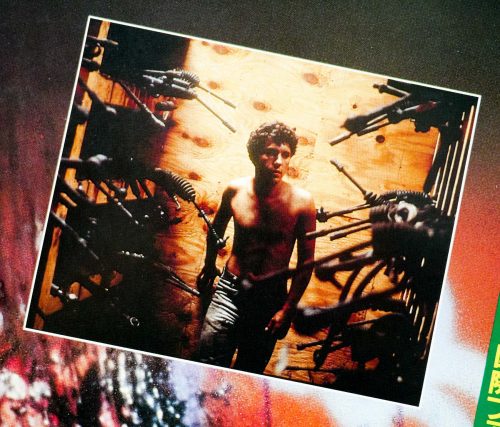
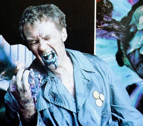
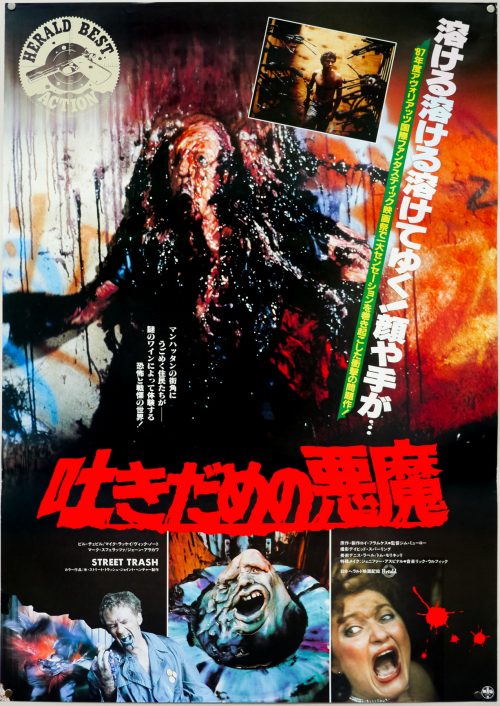
‘The ultimate melt movie’, the classic 1987 splatter-fest Street Trash is as gore-filled and tasteless as this Japanese B2 poster depicts. A sleazy liquor store owner finds a case of old wine labelled ‘Tenafly Viper’ in his basement and, rather than dispose of it, he decides to offload the case to the local homeless population for a dollar a bottle. It soon becomes clear that Viper is really not fit for consumption and the poor hobos are having literal meltdowns after drinking it. An overzealous cop (Bill Chepil) begins to investigate the deaths whilst two homeless brothers, Fred (Mike Lackey) and Kevin (Mark Sferrazza) learn of Viper’s potency and try to warn others whilst dealing with the machinations of the unhinged homeless Vietnam vet Bronson (Vic Noto).

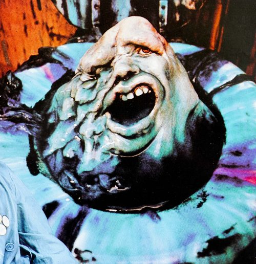
The blue face at the bottom of the poster is what’s left when the first hobo (pictured to the left) succumbs to the effects of the deadly drink and disintegrates into a toilet bowl, as depicted on the superb US one sheet.

The splendid original trailer can be see on YouTube – “It’s easy to find us…. we’re all over the place.”

An interview with Sam Smith, AKA Sam’s Myth

19.06.13

Nashville-based Sam Smith, who works under the moniker Sam’s Myth, is an acclaimed graphic designer and artist who has worked with multiple independent film distributors on official posters for films as diverse as the brilliant 1977 Japanese cult oddity House (for a 2010 re-release) and the sprawling biopic Carlos. In addition, Sam has designed and illustrated screen prints and unofficial posters for film screenings at the likes of Nashville’s celebrated Belcourt Theatre and San Francisco’s famous Castro Theatre.

A true cineaste, Sam’s portfolio overtly reflects his taste in movies since he’ll often elect to work on a poster for a cult, independent or little-seen film of his own choosing, plus he regularly works on packaging and disc menus for the much-loved video label Criterion. On top of this, Sam is an accomplished musician who has drummed for the likes of Ben Folds, Tristen and My So Called Band, and when not working on design projects he can be found on the road with one of these bands. Work on record covers, gig posters and other music-related projects also feature in Sam’s folio.

I first became aware of Sam when I purchased the superb re-release one sheets for House (see below) and Rainer Werner Fassbinder’s sci-fi epic World on a Wire in 2011, and I’ve been following his work ever since then. I wanted to interview Sam for the site at the same time as adding those two posters to my site and the resultant article is below.
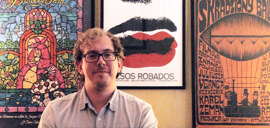
The designer, artist and musician Sam Smith, June 2013

The designer, artist and musician Sam Smith, June 2013

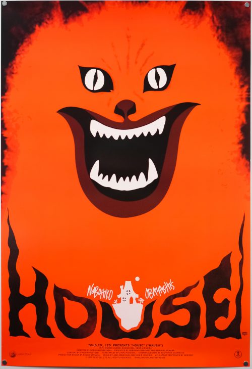
The US one sheet for the 2010 re-release of Nobuhiko Obayashi's House, designed by Sam's Myth

The US one sheet for the 2010 re-release of Nobuhiko Obayashi’s House, designed by Sam’s Myth

I’ve split the interview up into six parts and you can use the links below to jump directly to a section, should you wish.

Part 1 – Origins and starting out
Part 2 – Film and music
Part 3 – 
Working methods
Part 4 – Criterion
Part 5 – Posters in detail
Part 6 – Influences, advice and future plans

Part 1 – Origins and starting out

I’d like to start with your origins, if I may? When and where were you born?
I was born in 1981 in Nashville, TN. I’ve lived in Nashville for the bulk of my life, aside from going to school in New York City and touring around the world off and on for the several years after that.


I understand your father is also a designer? Can you talk about his work?
He was and still is an artist who has worked in different mediums, never as a designer per se, but a painter and woodworker and found object artist… All kinds of things. For a period in the 80’s he worked with airbrush creating large, colorful abstract landscapes, patterns and conceptual imagery. His drawing and illustration style has always had an enormous influence on my art. He fostered my obsession with all things visual. Now he lives in the country and makes furniture and things out of reclaimed wood, writes novels and short stories, and draws from time to time.
Before Sunrise and Before Sunset screen prints by Sam's Myth

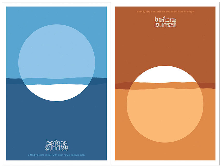
Before Sunrise and Before Sunset screen prints by Sam’s Myth


How did you start out designing? Did you study it at university?
I’ve always just made art on my own, due in large part most likely to my dad and I working on creative projects all the time when I was a child. I would draw all of the characters and things I was obsessed with– Teenage Mutant Ninja Turtles, Batman, Dick Tracy, Roger Rabbit… By the time The Simpsons hit, I had been cartooning and drawing my own comics for several years. In high school, my love for posters began I guess, as I would draw and paste-up posters and flyers for all of my bands’ shows as well as all major school events. I “designed” the album art for my band’s releases, combining art I made, found images and photographs with type, and I found this very enjoyable. I went to New York University for the Cinema Studies program, went on tour after that, and literally stopped making visual art for several years.

What was your first real break into the world of professional design? Was there a first major client?
My first real break was the House poster. After touring for about four years, I had a long break and decided to do something about the fact that I had let my art skills atrophy so severely from not drawing or designing anything for years while I focused on other things. My mom had just built a small art studio in the back yard of the house I grew up in, and I holed up for a week there and forced myself to just crank out some posters. My love for film had grown so much at college, where I earned a degree in writing about film from an academic perspective.
My Neighbor Totoro screen print by Sam's Myth for the Belcourt Theatre, Nashville. 2009

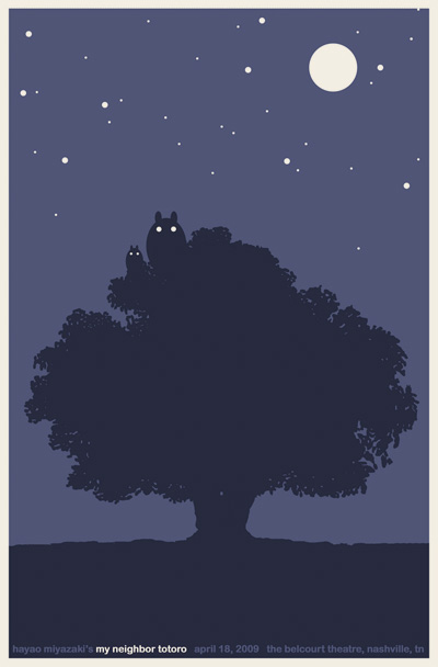
My Neighbor Totoro screen print by Sam’s Myth for the Belcourt Theatre, Nashville. 2009

While touring my writing also declined and I didn’t have a lot of interest in being a film critic. So I figured that making film posters would be a great way to channel my love for films (and for reading and interpreting films) into a visual art project. I made eight to ten designs during those several days that are still some of my favorite things I’ve done. I took them to my friends at the Belcourt Theatre, Nashville’s historic art-house, and showed them what Mondo was doing with collectible movie screen prints in Austin, thinking we could try something similar.

Testing the waters, they agreed to print up some posters for a couple upcoming films– I made screen prints for My Neighbor Totoro and The Human Condition, which was being re-released by Janus Films. Janus also had a digital version of House booked at the Belcourt as a midnight movie and I made a poster. I knew that Janus was supportive of what we were doing at the Belcourt and I’d always dreamed of working with them and with Criterion, their home video wing. My initial goal was to create 25 different posters for HOUSE just to increase my odds of landing on something great that might catch Janus’ attention, but I only made it through a few ideas, and the cat poster was the best. People really responded to it, and the midnight screenings at the Belcourt were a smashing success, so much so that Janus went ahead and planned to strike a new 35mm print and give HOUSE the full run in other theaters.

Janus asked if they could use my poster design as their official one-sheet. That led naturally to a relationship working with Criterion and Janus on an ongoing basis. So I feel I owe everything to the Belcourt and to Janus for giving me that opportunity to see myself as a professional designer of posters.


Have you always been freelance or have you worked in an agency?
I’ve always been freelance. I enjoy the challenge of maintaining a steady stream of professional work but doing so on my own schedule. I do fantasise sometimes about combining powers with other artist friends and forming a sort of collective, all working out of the same studio and sharing gear and tools, helping each other out and, most importantly, playing ping pong. I’ve never really considered working for an agency but wouldn’t rule it out, particularly if it were a movie poster agency which would have its own interesting challenges.

Continue reading
House / one sheet / 2010 re-release / USA

19.06.13

PosterPosterPoster
Title
House
AKA
(Hausu - alt. title)
Year of Film
1977
Director
Nobuhiko Ôbayashi
Starring
Kimiko Ikegami, Miki Jinbo, Kumiko Ohba, Ai Matsubara, Mieko Satô, Eriko Tanaka, Masayo Miyako, Kiyohiko Ozaki, Saho Sasazawa, Asei Kobayashi, Mitsutoshi Ishigami
Origin of Film
Japan
Genre(s) of Film
Comedy | Horror
Type of Poster
One sheet
Style of Poster
Re-release
Origin of Poster
USA
Year of Poster
2010
Designer
Sam Smith AKA Sam's Myth
Artist
Sam Smith AKA Sam's Myth
Size (inches)
27 1/16" x 39.5"
SS or DS
SS
NSS #
--
Tagline
--

A cinematic experience quite unlike any other, Japanese director Nobuhiko Obayashi‘s 1977 masterpiece House is almost impossible to categorize or even describe and simply needs to be seen to be believed. The American distributor Janus Films, who supervised a restoration of the film in 2010, attempt to summarise the film better than I possibly could:

‘How to describe Nobuhiko Obayashi’s 1977 movie House? As a psychedelic ghost tale? A stream-of-consciousness bedtime story? An episode of Scooby Doo as directed by Dario Argento? Any of the above will do for this hallucinatory head trip about a schoolgirl who travels with six classmates to her ailing aunt’s creaky country home, only to come face to face with evil spirits, bloodthirsty pianos, and a demonic housecat. Too absurd to be genuinely terrifying, yet too nightmarish to be merely comic, House seems like it was beamed to Earth from another planet.’

Relatively unknown outside of his native Japan, Obayashi had started his career in the field of experimental filmmaking and quickly forged a reputation as a master visual artist. His skills were soon utilised by advertising agencies and he quickly became a sought-after commercial director, working with Western actors including Sophia Loren and Charles Bronson who were earning lucrative paycheques to hawk various goods. The Japanese studio Toho approached Obayashi and asked him to develop a script for a horror film that would hopefully emulate the great success of Spielberg’s Jaws. The director spoke to his 11-year-old daughter Chigumi to get some inspiration, claiming later that adults “only think about things they understand…everything stays on that boring human level”.
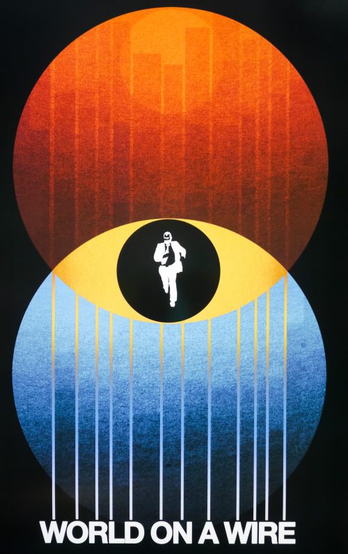
The resultant script, written by Chiho Katsura, included several of Chigumi’s suggestions. Toho green-lit the script and then, after struggling to find a director willing to tackle it, gave the job to Obayashi himself despite him not being a member of the Toho staff. The resultant film is clearly the work of someone who is unafraid to experiment with the medium of film and the director spent two months on Toho’s biggest soundstage shooting the script without storyboards and utilising a whole host of special effects techniques, several of which Obayashi seemingly created especially for this film. House was a huge hit, much to the studio’s surprise, unquestionably helped by the fact that the popular band Godiego providing the best-selling soundtrack, thus cementing the film’s appeal to the youth market.

Despite Japanese success the film wasn’t released outside of the country, that is until Janus Films bought the distribution rights and aided with a digital restoration in preparation for a cinema re-release, and eventually a blu-ray release on their Criterion label in 2010. When the Nashville-based designer and artist Sam Smith (AKA Sam’s Myth) prepared a poster for a preview showing of the film at his local Belcourt Theatre he had no idea that Janus would eventually decide to not only use the image for their official one sheet but also as the cover of the eventual Criterion release. In June 2013 I interviewed Sam and the resultant article can be read here. We discussed the House poster and the following excerpt explains how he arrived at the final design:

How quickly did you arrive at using the image of Blanche the cat as the poster image?
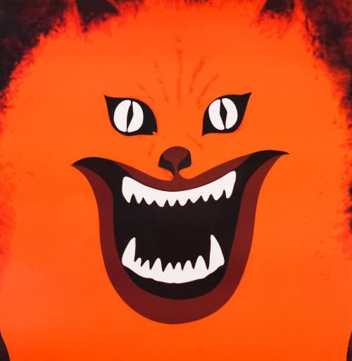
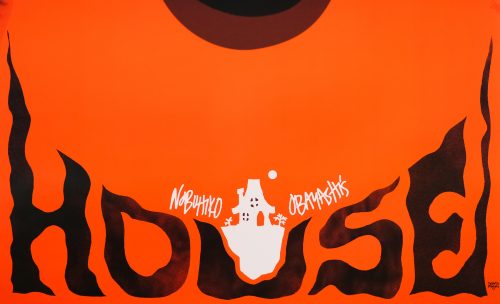
Almost instantly actually. In fact, my friend Zack Hall who is a manager at the Belcourt sent me some images and we were brainstorming at that image of Blanche just jumped out at me and seemed like something I could use. But I wanted to transform it from the screenshot into a graphic piece. The angle of that shot isn’t quite straight on, so I manipulated that, and I gave the cat’s face the entire frame of the poster, removed from the picture frame. I touched the image up and blew it out in black and white, and I just saw this field of red-orange over the whole thing, thinking it could really transform that image into something iconic. The lettering and everything else– the little house illustration– all came very quickly, in a single pass. It’s by far the fastest any poster design has ever come together for me. I didn’t really think much about it and don’t really remember it happening.

Were you surprised at how iconic the Blanche image has ended up being?
A little bit, but I must give credit to Obayashi who came up with this image in the first place. It’s not like I drew it or created it out of my own imagination. I feel that I just plucked it out of the film and tried to transform it graphically into something iconic that represented the insane, exciting, colorful energy of the film, while adding my own touches with the lettering and accoutrements. People loved it though. I suggested making t-shirts and stickers, and I still see people wearing them when I’m at a festival or traveling somewhere. It really taught me that in this day and age, the most important quality of a poster is for its design to feel iconic and eye-catching, above all else. The goal is to get people talking about the film and going to see the film and telling their friends about it, and it’s cool to hear people say “you know, the movie with the poster of the red cat face” and realize you had a role in the film finding its audience.

———————

Sam’s blog has a post about the creation of the House poster and is well worth a read.

World on a Wire / one sheet / 2011 re-release / USA

19.06.13

PosterPosterPosterPoster
Title
World on a Wire
AKA
Welt am Draht (Germany - original title)
Year of Film
1973
Director
Rainer Werner Fassbinder
Starring
Klaus Löwitsch, Barbara Valentin, Mascha Rabben, Karl Heinz Vosgerau, Wolfgang Schenck, Günter Lamprecht, Ulli Lommel, Adrian Hoven, van Desny, Joachim Hansen, Kurt Raab
Origin of Film
West Germany
Genre(s) of Film
Crime | Sci-Fi
Type of Poster
One sheet
Style of Poster
Re-release
Origin of Poster
USA
Year of Poster
2011
Designer
Sam Smith AKA Sam's Myth
Artist
Sam Smith AKA Sam's Myth
Size (inches)
27 1/16" x 39.5"
SS or DS
SS
Tagline
--

German wunderkind Rainer Werner Fassbinder’s dystopian science-fiction epic World on a Wire (Welt am Dracht) was one of 40 films that he directed during his prolific career before his untimely death at the age of 37 (in 1982). Considered a pioneer of the New German Cinema movement, Fassbinder originally prepared World on a Wire, his only sci-fi story, for German television as a two-part miniseries. Based on the 1964 novel Simulacron-3 by the American author Daniel F. Galouye, the film is set in an alternative-reality 1970s in which a supercomputer built by the cybernetics & future science institute (IKZ), and known as the Simulacron, is hosting an advanced simulation program of an artificial world. 9000 so-called ‘identity units’ are living as human beings who are totally unaware that their world is entirely artificial with their every move tracked and followed by the computer in order to help (it is implied) large multinational companies with an advanced form of marketing research.

When the technical director of the program dies in a mysterious incident, his replacement Fred Stiller (Klaus Löwitsch) must unravel the mystery of his demise whilst also investigating the sudden disappearance of the institute’s security adviser, Günther Lause. When Stiller’s colleagues claim to have no recollection of Lause and one of the simulated humans commits suicide, he descends into a twisting conspiracy that leads him to question his very existence. To say the film’s themes were prescient would be an understatement, with most web users readily submitting themselves to online tracking cookies (a form of market research) by the likes of Google, and its influence of films like 1999s The Matrix and even James Cameron’s Avatar cannot be denied.

After airing on German television World on a Wire practically disappeared from reach, with bootleg VHS copies of the original broadcasts being the only way fans could watch it. In 2010 the American distributor Janus Films aided in a digital restoration and  US cinema release of the film, with an eventual 2011 blu-ray release on their Criterion label. The Nashville-based designer and artist Sam Smith (AKA Sam’s Myth) was asked to put together a poster for the cinema release, which would also end up being used for the blu-ray cover. In June 2013 I interviewed Sam and the resultant article can be read here. We discussed the World on a Wire poster and this is the excerpt from the interview:

The World on a Wire cover, which was printed as a poster too, is a fantastic design that had the film’s titles as it’s starting point. The final poster came about thanks to the client suggesting a simple iconic image would be better suited for the film. Can you talk about that project and what it meant to you?
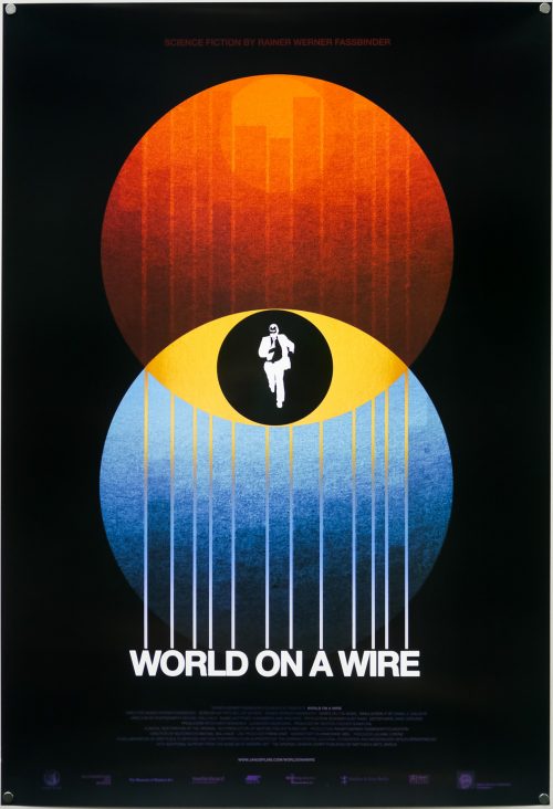
Janus entrusted me with this poster design after we did House and Kuroneko together. I remember being very concerned with topping my previous work and trying to come up with my best poster yet. I was also pursuing a very misguided impulse to try to create something visually complex that could compete with what Mondo artists like Tyler Stout and Ken Taylor were doing. I built some comps around this idea, using my translated and modified version of Fassbinder’s original title treatment as a framing device.

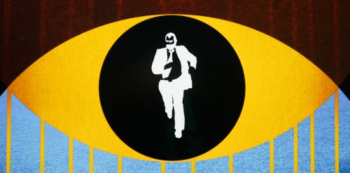
Ultimately Janus suggested that it would be great to see me try something simple and iconic, and they referred to two designs I did for Before Sunrise and Before Sunset where a more minimal arrangement of shape and color suggested something deeply about the film and its themes. This is kind of feedback designers dream about at night! I threw two overlapping circles down and studied them as symbol of the multiple worlds/realities in the film. From there, this poster came together quite quickly too.

————

Sam’s blog features an excellent ‘process’ post on the making of the poster that I strongly urge you to check out.

Race With The Devil / 30×40 / style A / USA

17.06.13

PosterPosterPosterPosterPoster
Title
Race With The Devil
AKA
--
Year of Film
1975
Director
Jack Starrett
Starring
Peter Fonda, Warren Oates, Loretta Swit, Lara Parker, R.G. Armstrong
Origin of Film
USA
Genre(s) of Film
Action | Horror
Type of Poster
30x40
Style of Poster
Style A
Origin of Poster
USA
Year of Poster
1975
Designer
Unknown
Artist
Unknown
Size (inches)
30 1/16" x 40"
SS or DS
SS
NSS #
75/129
Tagline
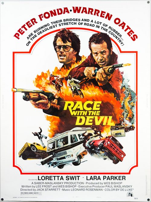
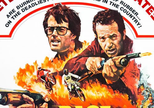
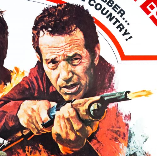
Peter Fonda and Warren Oates are burning their bridges and a lot of rubber... on the deadliest stretch of road in the country!

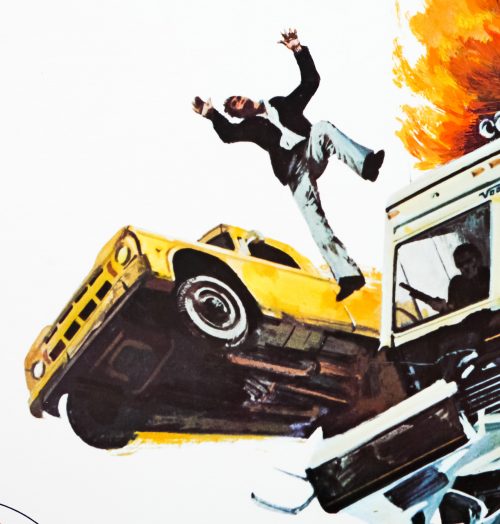
Peter Fonda and Warren Oates are pursued across Texas by a satanist cult who they witness apparently murdering a woman in a sacrificial ritual in Race with the Devil. Following on from the 1974 hit Dirty Mary, Crazy Larry, in which Fonda played a bumbling criminal being hunted by a relentless police force, this film was a mix of the popular car chase genre (Vanishing Point, Gone in 60 Seconds etc) and Hollywood’s interest in films of an occult nature that was burgeoning following the success of The Exorcist (1973). Fonda and Oates play friends who head off on a vacation in an RV with their wives, but when the group pull off the main road and find a remote spot to camp for the night they unwittingly do so near an occult shrine at which the aforementioned sacrifice happens.

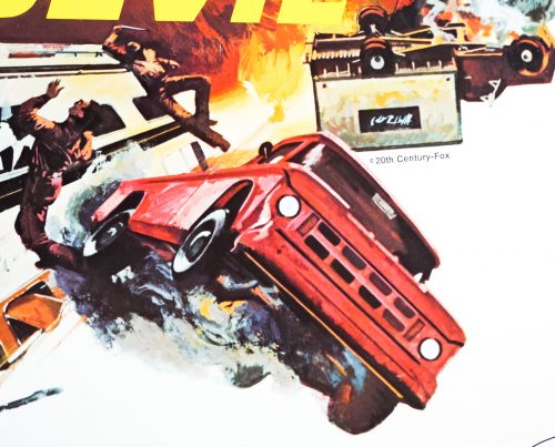
When the group are spotted by the cult their RV is attacked by masked men before they manage to escape to a nearby town. The local sheriff calms the group down and drives the men out to the spot where they witnessed the ritual,  only to discover that the cult have removed (almost) all evidence of their deed. The group decide to carry on with their holiday but it soon becomes clear that the satanists aren’t about to give up their pursuit and that not everyone they meet along the way is who they appear to be. The film has the requisite tension to make it an enjoyable watch and features several well staged car chase scenes, with some very impressive stunt work. The film also features a classic freeze-frame shot at the end.

This US 30×40 boasts excellent explosive artwork and I’ve been frustrated in my attempts to identify the artist, but I suspect it could be the work of John Solie. The American artist usually signs his artwork and this poster features no such signature, but the artwork is certainly rendered in a similar style to his. I intend to contact the artist to see if this poster can be attributed to him. Unusually the artwork itself is actually copyrighted by the studio (see picture 17).

Lone Wolf McQuade / quad / UK

14.06.13

PosterPosterPosterPosterPoster
Title
Lone Wolf McQuade
AKA
Una magnum per McQuade [A magnum for McQuade] (Italy)
Year of Film
1983
Director
Steve Carver
Starring
Chuck Norris, David Carradine, Barbara Carrera, Leon Isaac Kennedy, Robert Beltran, L.Q. Jones, Dana Kimmell, R.G. Armstrong, Jorge Cervera Jr., Sharon Farrell, Daniel Frishman, William Sanderson
Origin of Film
USA
Genre(s) of Film
Action | Adventure
Type of Poster
Quad
Style of Poster
--
Origin of Poster
UK
Year of Poster
1983
Designer
Brian Bysouth
Artist
Brian Bysouth
Size (inches)
30" x 39 14/16"
SS or DS
SS
NSS #
--
Tagline
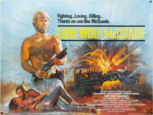
Fighting... loving... killing... There's no-one like McQuade.

Chuck Norris versus David Carradine was always going to be a good match and this is definitely one of Chuck’s better films. His character, a Texas Ranger named J.J. McQuade, was the inspiration behind his successful TV series Walker, Texas Ranger that began 10 years after this was released. In this film, ex-Marine McQuade lives on his own with only a wolf for company and prefers to do things his way. When an army convoy is hijacked and his daughter put in hospital after witnessing the attack, the Texas Ranger reluctantly teams up with an FBI agent (Leon Isaac Kennedy) and ends up facing off against the arms dealer Wilkes (Carradine). The pair go head to head in a series of increasingly violent martial arts and gun battles. The film’s body count is detailed in a YouTube video.

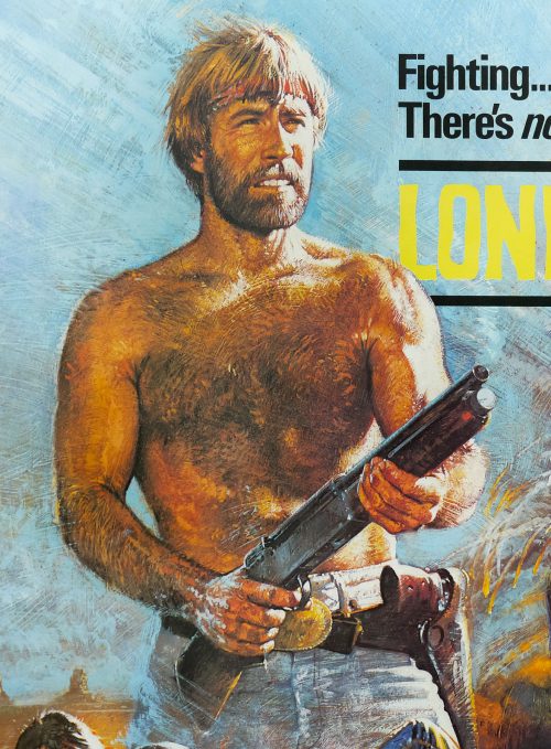
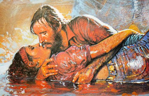
This British quad poster was designed and painted by the British artist Brian Bysouth whilst he was working at the FEREF agency. The artwork is unique to this poster but it has elements that appear on both the Style A and the style B American one sheets. I also have another American one sheet for the film in the collection. In 2012 I interviewed the artist and that article can be found here. Other posters I’ve collected by Brian can be seen by clicking here.

The uncensored trailer can be watched on Youtube. Someone has made a clip called Lone Wolf McQuade in four minutes, which is handy if you never intend to watch the film in full.