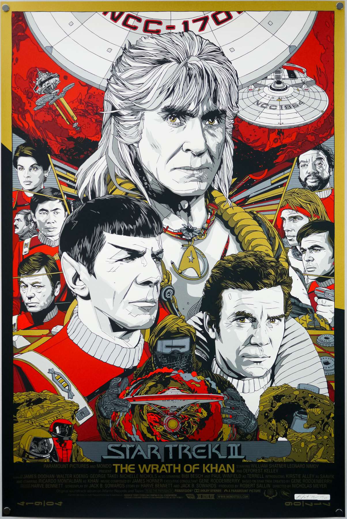
When Mondo, the incomparable limited-edition screen print outfit, announced they were opening a gallery in their hometown of Austin, anticipation quickly reached fever pitch, with fans desperate to see what artwork would be on the walls when the doors opened for the first time. The answer was kept secret until the evening of March the 10th, 2012 when the opening night was held and the theme of their first show was revealed to be that of classic sci-fi. Most of Mondo’s premier artists turned in some incredible pieces for the show, as can be seen on this recap blog post on their website and on this SlashFilm post.
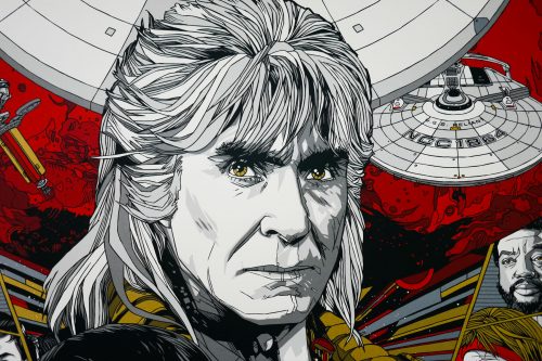
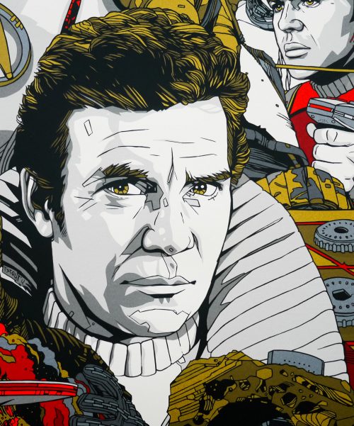
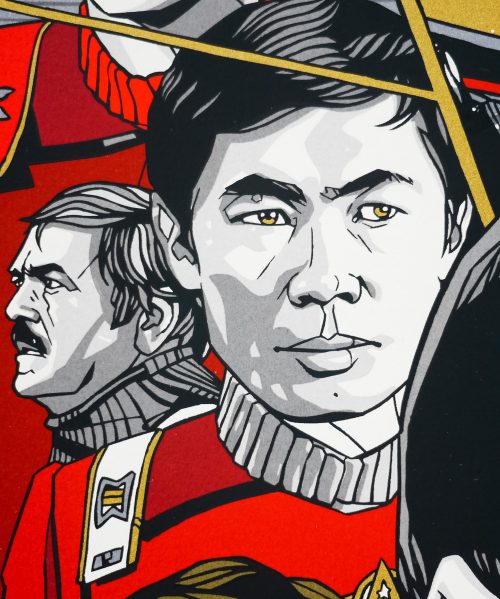
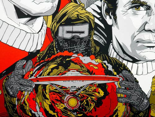
One of the highlights of the show was fan-favourite artist Tyler Stout’s print for arguably the best Star Trek film of all time, 1982’s The Wrath of Khan. A brilliantly composed image featuring Ricardo Montalban‘s unforgettable, titular bad guy, the poster was printed in two flavours; a red and gold regular and a silver and gold variant. Whilst adding the regular version to the Film on Paper collection I wanted to interview the man himself about the creation of the poster.
Tyler, thanks for agreeing to talk about the creation of this fantastic print. Firstly, I wanted to ask if you were you given free rein to choose the film you wanted to work on for Mondo’s gallery opening show?
I’d actually had Wrath of Khan on my schedule for a while and it just takes me forever to do things sometimes. It ended up getting done around the time of that show I think. I could be completely mis-remembering it.
Is The Wrath of Khan your favourite Star Trek film?
I like many of them, including The Voyage Home with the whales and I really liked The Undiscovered Country with Christopher Plummer as a Klingon. I also enjoyed First Contact since I’m a big Next Generation fan.
Can you talk about your initial design ideas for the poster? Did you always intend to have Khan as the most prominent figure?
For me, and probably most people, Ricardo Montalban’s the standout of the film. I believe I started with him and then kinda designed the poster around his portrait.
Was the composition something you arrived at quickly? Were there certain elements or characters you knew had to sit next to each other?
It went through a couple versions, mainly the smaller side figure versions, but the overall look stayed pretty consistent.
