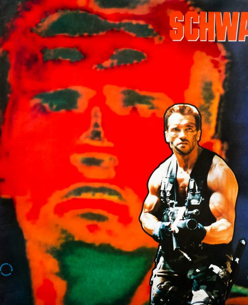
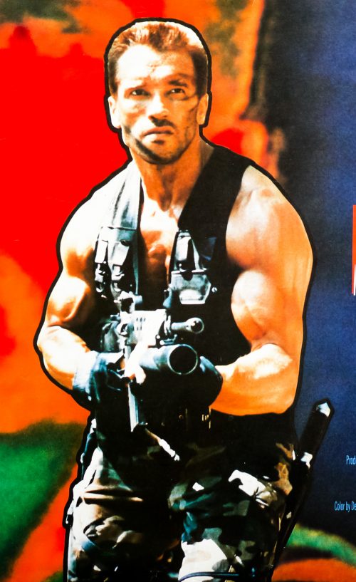
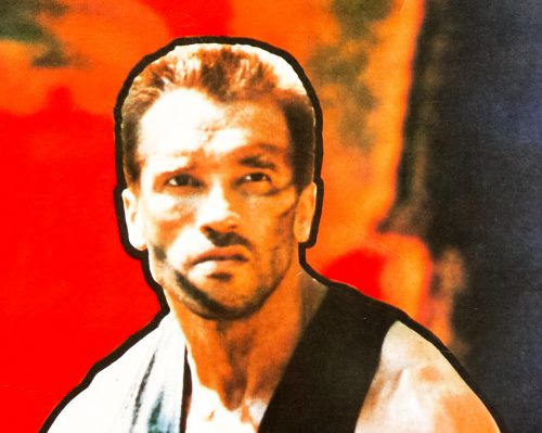
Predator / quad / UK

15.04.13

PosterPosterPosterPosterPoster
Title
Predator
AKA
O Predador (Brazil / Portugal)
Year of Film
1987
Director
John McTiernan
Starring
Arnold Schwarzenegger, Carl Weathers, Elpidia Carrillo, Bill Duke, Jesse Ventura, Kevin Peter Hall, Shane Black, Sonny Landham, Richard Chaves
Origin of Film
USA
Genre(s) of Film
Action | Sci-Fi | Horror
Type of Poster
Quad
Style of Poster
--
Origin of Poster
UK
Year of Poster
1987
Designer
Brian Bysouth, Stephen Laws, Frank Hillary (FEREF)
Artist
--
Size (inches)
30" x 39 13/16"
SS or DS
SS
NSS #
--
Tagline
It hunts for sport. It kills for pleasure. This time it picked the wrong man!

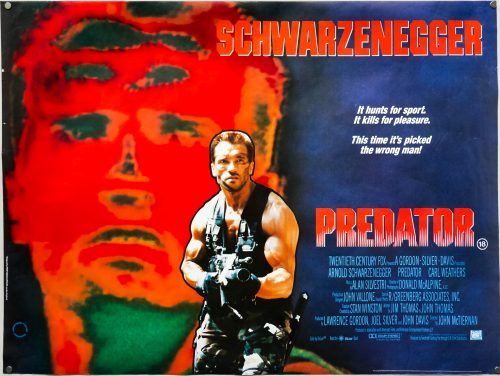
One of the best films of the 1980s and certainly one of the Austrian Oak‘s finest roles, Predator is a film I’ve seen more times than I care to remember. Directed by John McTiernan, who would go on to helm Die Hard the following year (arguably the greatest action movie ever made), the film is an excellent mix of gung-ho action and sci-fi horror with a truly iconic monster that has gone on to appear in several (not so great) sequels and spin-offs.

The story sees Schwarzenegger’s team of single-monikered, rough-neck commandos dropped into a dangerous South-American jungle ostensibly on a rescue mission. When they discover a series of butchered and skinned corpses it soon becomes clear that they’re dealing with more than just a bunch of gun-toting guerrillas and someone, or something, is following them through the jungle. The film features several memorable characters, including Native American Sonny Landham‘s Billy, a man-mountain with much-needed tracking skills and the first one to realise they’re not alone, and Bill Duke‘s Mac who memorably leads the charge with a mini-gun when one of his comrades is killed. Like many of Schwarzenegger’s films, Predator is eminently quotable and features countless memorable lines spoken by several of the characters – ‘If it bleeds, we can kill it!’

This quad was put together by a team at the FEREF design agency, including Stephen Laws, Frank Hillary and artist Brian Bysouth. This was one of the first posters by the artist to have been created with photo composition and not painted, as had been the case with his previous posters. In fact, his iconic painting for The Living Daylights was done the same year as this one. In 2012 I published an interview with Brian and the article can be read in full by clicking here. The other posters I’ve collected by him can be seen by clicking here.
Godzilla vs Mechagodzilla / 1993 version / B1 / Japan

12.04.13

PosterPosterPosterPosterPoster
Title
Godzilla vs. Mechagodzilla
AKA
Godzilla vs. Mechagodzilla II (alternative title) | Gojira VS Mekagojira (Japan - original title)
Year of Film
1993
Director
Takao Okawara
Starring
Masahiro Takashima, Ryoko Sano, Megumi Odaka, Yûsuke Kawazu, Kenji Sahara, Akira Nakao, Kôichi Ueda, Leo Meneghetti, Daijiro Harada, Tadao Takashima
Origin of Film
Japan
Genre(s) of Film
Action | Adventure | Drama | Sci-Fi
Type of Poster
B1
Style of Poster
Artwork
Origin of Poster
Japan
Year of Poster
1993
Designer
Unknown
Artist
Noriyoshi Ohrai
Size (inches)
28 12/16" x 40.5"
SS or DS
SS
Tagline
--

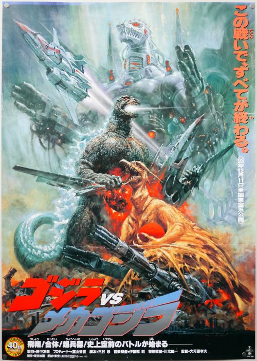
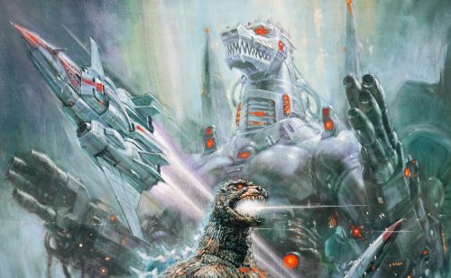
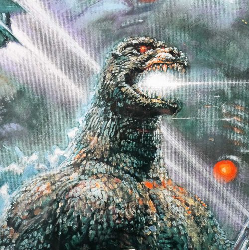
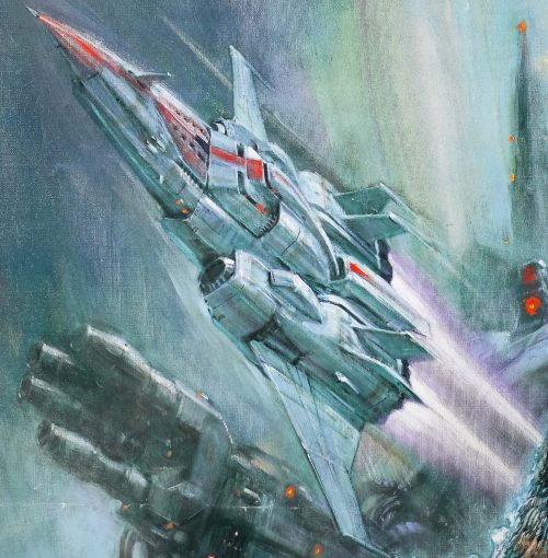
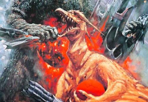
A colourful montage on this Japanese B2 poster for Godzilla vs Mechagodzilla, which was the 2oth film in the series featuring the King of the Kaiju (giant monsters) and was marketed as the 40th anniversary of the series. The film was also the fifth release in the second generation of Godzilla films, which were part of the Heisei era of Japanese monster movies (daikaiju eiga). The monster movie eras are named after the Japanese emperor at the time, so the first generation of Godzilla films were part of the Shōwa era. Despite sharing the same title with a 1974 film, this is neither a remake or a re-imagining of the earlier version.

The story sees the United Nations Godzilla Countermeasures Center (UNGCC) created in order to stop the legendary monster. Two machines are manufactured from the salvaged parts of Mecha-King Ghidorah, a mechanised abomination last seen in 1991s Godzilla vs King Ghidorah; one is a flying gunship called Garuda and the other is the titular Godzilla-like robotic beast. When a mysterious egg is discovered on an island in the Bering sea, both Godzilla and Rodan – the irradiated pteranodon seen in several previous films in the series – appear and battle over it, allowing a team to escape to a research centre in Kyoto. When the egg hatches it is revealed to be Baby Godzilla (AKA Godzilla Junior) and once again the legendary Kaiju is summoned to Japan by its psychic powers. The UNGCC decide to mobilise their new defence weapons and both Rodan and Godzilla are pitched against the metallic foes.

The artwork on the poster is by Noriyoshi Ohrai who is something of an enigma, even in his native Japan. I’ve been unable to find much about him beyond a few pages like this one on the Star Wars Wookiepedia. He’s responsible for a number of Star Wars posters, including this lovely 1982 B2 to celebrate the release of the Japanese dubbed version of the original film and the brilliant design for The Empire Strikes Back.

Ohrai painted a poster for each of the Heisei era of Godzilla films, which were always accompanied by a photographic-style poster. I will be adding more of the Ohrai Godzilla posters over the coming weeks.

The other Ohrai posters I’ve added to the site so far can be seen by clicking here.

Moonraker / one sheet / advance / style A / USA

09.04.13

PosterPosterPosterPosterPoster
Title
Moonraker
AKA
Agente 007, Moonraker: Operazione Spazio [Operation Space] (Italy)
Year of Film
1979
Director
Lewis Gilbert
Starring
Roger Moore, Lois Chiles, Michael Lonsdale, Richard Kiel, Corinne Clery, Bernard Lee, Geoffrey Keen, Desmond Llewelyn, Lois Maxwell, Toshirô Suga, Blanche Ravalec
Origin of Film
UK | France
Genre(s) of Film
Action | James Bond
Type of Poster
One sheet
Style of Poster
Advance - style A
Origin of Poster
USA
Year of Poster
1979
Designer
Unknown
Artist
Dan Goozee
Size (inches)
27 2/16" x 40 14/16"
SS or DS
SS
NSS #
--
Tagline
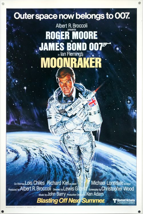
Outer space now belongs to 007

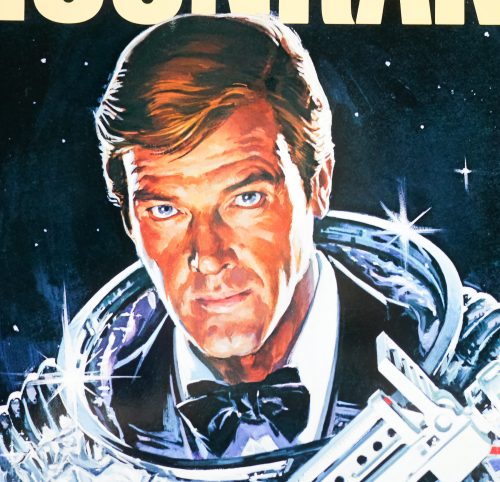
Although considered by most Bond fans to be one of the weakest of the series, I know I’m not the only one to have a soft spot for Moonraker, Roger Moore‘s fifth outing as James Bond. Thanks to endless TV showings during the 1980s and early 1990s I’ve probably seen this more than any other in the series and, like Live and Let Die, it had a huge impression on my young mind.

Looking at it through the cynical fog of adulthood it’s easy to sneer at the camp script, supremely daft action sequences (motorised Gondola anyone?) and painfully obvious attempt to cash in on the success of Star Wars (a very common theme amongst films released in its wake). The film is probably the quintessential outing for Moore as Bond and only he could have pulled it off as well as he did, particularly when it comes to the hokey script and madcap action.

The film features several memorable sequences, including a stunning cable car fight over Rio de Janeiro, and a memorable bad guy in Richard Kiel‘s inimitable ‘Jaws’ who used to scare me senseless as a kid. Also notable is John Barry‘s soundtrack, which marked a departure from his previous Bond work by mainly using strings instead of the typical brass. The film also features one of the most (literally) eyebrow-raising character names in the form of Dr Holly Goodhead (Lois Chiles) and one of the best/worst sign-offs of the entire series:

Sir Frederick Gray, Minister of Defence:  My God, what’s Bond doing?
Q: I think he’s attempting re-entry, sir.

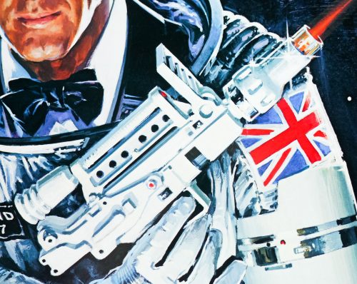
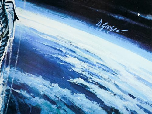
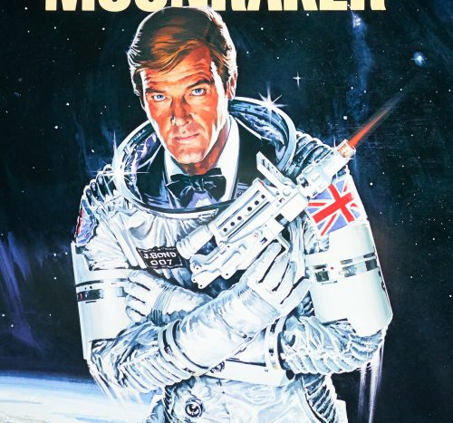
This particular poster is the American advance one sheet with artwork by Dan Goozee who is responsible for several other Bond posters, including the final Moonraker US one sheet and the international advance one sheet. Other posters I’ve collected by him can be seen here.

The original trailer for the film is on YouTube.

An interview with Tom Beauvais

03.04.13

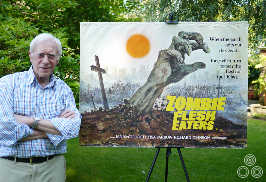
British designer and artist Tom Beauvais is the man behind several classic British posters, including the quads for Fantastic Voyage (1966), Butch Cassidy & the Sundance Kid (1969) and the cult horror film Zombie Flesh Eaters (pictured below). In a career that lasted over forty years, and continued for twenty more after his ‘retirement’, Tom applied his considerable talents to working on marketing for many of the biggest film studios and collaborated directly with filmmakers such as the late, great Stanley Kubrick. In addition, Tom is also a highly skilled architectural illustrator and it’s this area of work that he concentrated on since leaving the design studio that bore his name, Chapman Beauvais Ltd, in 1992.

Last year I was lucky enough to be able to meet and interview the man himself about his life and career and this article is the result. It contains many exclusive images of Tom and his work, including a handful of never-before-seen concept designs for films such as Star Wars and Blade Runner. I have also included images of his detailed architectural illustrations and other relevant photos which I hope the reader will enjoy.

Tom Beauvais stands with the quad poster for Lucio Fulci's Zombie Flesh Eaters, which he both designed and painted in 1979. Photo taken in 2012.

Tom Beauvais stands with the quad poster for Lucio Fulci’s Zombie Flesh Eaters, which he both designed and painted in 1979. Photo taken in 2012.

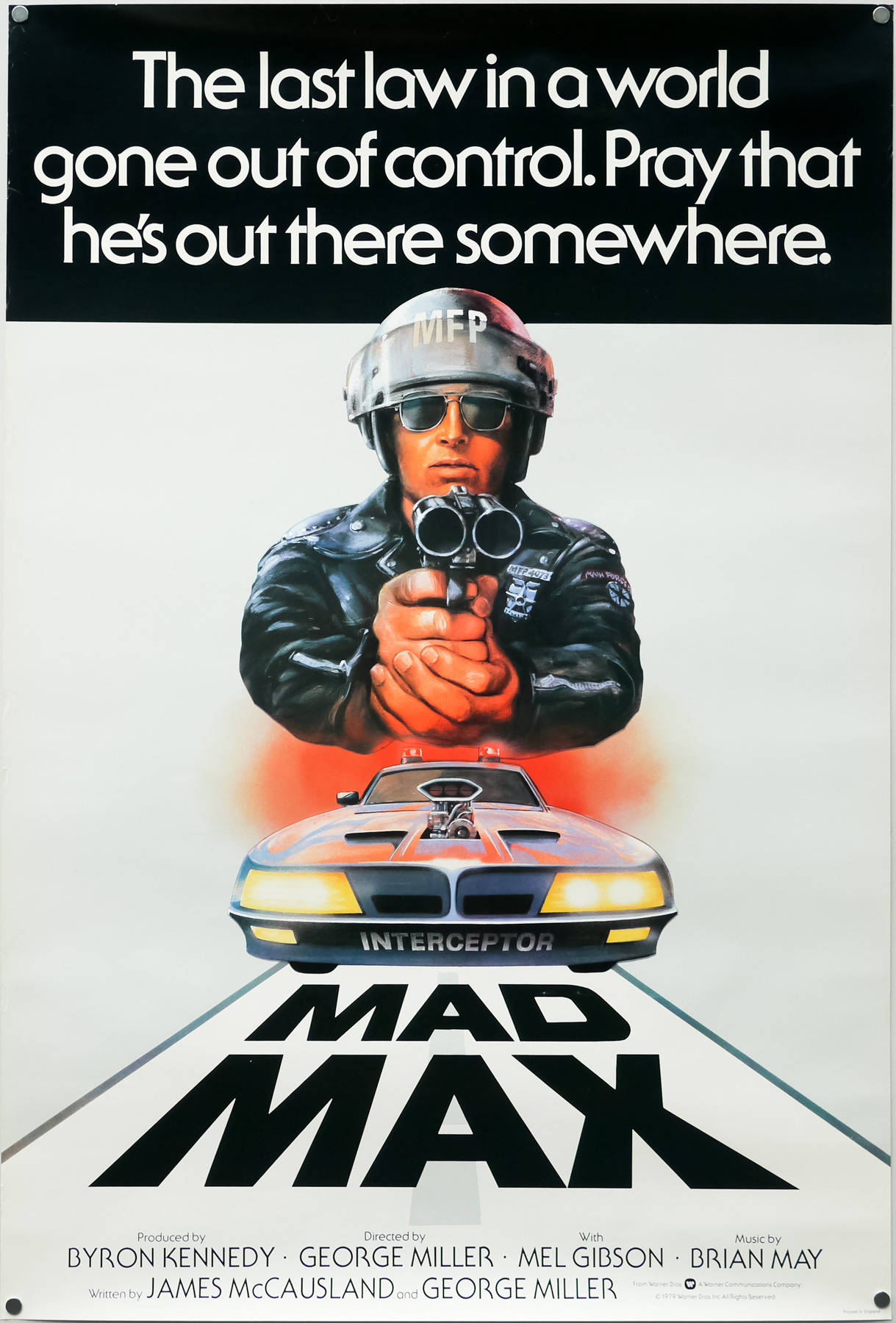
The UK one sheet for Mad Max, designed and illustrated by Tom Beauvais, 1979

The UK one sheet for Mad Max, designed and illustrated by Tom Beauvais, 1979

I’ve split the interview up into seven parts and you can use the links below to jump directly to each part, should you wish.

Part 1 – Origins and starting out at Bateman Artists
Part 2 – The art of film marketing
Part 3 – Time for Change: Chapman Beauvais Ltd.
Part 4 – Working with Stanley Kubrick
Part 5 – Architectural illustration and the genetics of artistry
Part 6 – Iconic posters and unused concepts
Part 7 – A kind of retirement


Part 1 – Origins and starting out at Bateman Artists

To begin, you were born in 1932 in Belsize Park, North London?
Yes, that’s correct. In 1939 I was evacuated with my sister and we went with our school to Hertfordshire for a couple of years to avoid the blitz. After that our family moved to Egham in Surrey, so I came back from the evacuation to join them and that’s where I had my schooling. I was only about 10 at the time and, well, I failed the exam for the secondary school. I blame the war because I’d missed several years of education.

I ended up going to Kingston Technical School and I did an engineering course for a couple of years there, which was not a great help for an artist but it did give me a really good grounding, and I enjoyed a lot of the practical side of it, which included woodwork, metalwork and that sort of thing. I did reasonably well there and when I left I imagined that I’d become a draughtsman.

Is that what you’d hoped to become when you first chose the course?
Yes, well drawing was always my strongest subject but when I left the college my father, who was a commercial artist himself, told me that there was a potential job going in London. Somebody he knew was on the look out for a junior to join a studio called Bateman Artists that was part of the Allardyce Palmer advertising agency. I remember going along there with specimens of my work and meeting the boss, Bill Bateman. I recall him saying that I shouldn’t worry about drawing and illustration as they had ‘plenty of people who can do that.’ He told me I should learn to do lettering, how to work with typography and practice designing layouts for adverts and posters. ‘With those skills…’ he told me ‘you’ll never be without a job,’

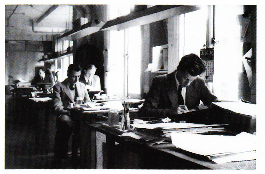
The Allardyce Palmer studio, circa 1955

Tom Beauvais (front) working at his desk in the Bateman Artists studio, circa 1955. Behind him sits Tom Chantrell (left), Sid Townsend (right) and Les Coggins in the far back.

I started the job as an apprentice and in the beginning I was making cups of tea and buying cigarettes, as well as running studio errands all over London. After a while I was given jobs like trimming out bits of artwork and I was learning all the time about the business of creating graphic art. I recall there were about twelve artists working there and before I had started my father had told me that they were a clever crowd. True enough, you’d look over the shoulder of one of them working, perhaps doing some lettering or retouching a photograph, and it’s amazing how quickly you could learn just by following their example.

Continue reading

Mad Max / one sheet / UK

03.04.13

PosterPosterPosterPosterPoster
Title
Mad Max
AKA
Interceptor (Italy)
Year of Film
1979
Director
George Miller
Starring
Mel Gibson, Steve Bisley, Joanne Samuel, Hugh Keays-Byrne, Tim Burns, Geoff Parry
Origin of Film
Australia
Genre(s) of Film
Action | Thriller
Type of Poster
One sheet
Style of Poster
--
Origin of Poster
UK
Year of Poster
1979
Designer
Tom Beauvais
Artist
Tom Beauvais
Size (inches)
27" x 39 15/16"
SS or DS
SS
Tagline
The last law in a world gone out of control. Pray he's out there somewhere.

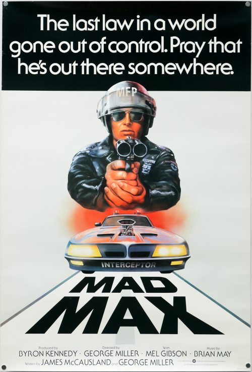
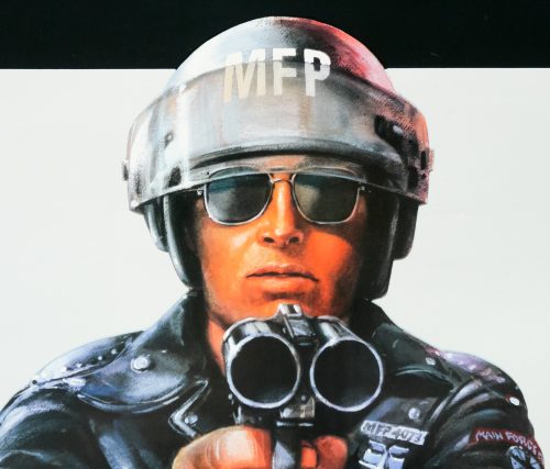
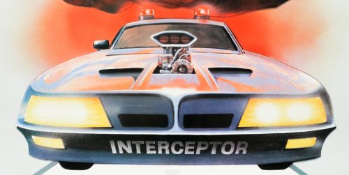
George Miller‘s brilliant vision of an apocalyptic future set in the Australian wastelands follows the battle between vicious outlaw gangs and a group of Main Force Patrol (MFP) pursuit cops who try to keep law and order on the roads. When officer Max Rockatansky (Mel Gibson in his breakout role) kills the ‘Nightrider’, the leader of a motorcycle gang, he sets in motion a chain of events that sees his wife and young son murdered and his partner burned alive. Driven mad by grief, Max commandeers a supercharged black Pursuit Special and sets out to avenge their deaths by whatever means necessary. The film was followed three years later by the superior Mad Max 2 (AKA The Road Warrior).

Because of Gibson’s anonymity to audiences outside Australia his face was not featured on many of the posters designed to sell the film in other territories. The American one sheet features a classic illustration of a leather-clad figure with his face covered by a futuristic visor. This British quad features an MFP figure pointing a shotgun directly at the viewer but it’s not obviously Mel Gibson’s character. The car below the figure is a hybrid between the colourful Interceptor cop vehicles and Max’s black Pursuit.

This UK one sheet was designed and illustrated by Tom Beauvais, a British artist with a lengthy career working in film marketing which saw him design and/or illustrate several notable posters, including the quad for Butch Cassidy and the Sundance Kid and the infamous ‘rotten hand bursting from the ground’ image for Lucio Fulci’s Zombie Flesh Eaters. In 2012 I was lucky enough to meet and interview Tom and the article can be read here. The Mad Max poster was discussed during the meeting:

———

You worked on one of my favourite film posters at the end of the 1970s, which is the one for Mad Max. Could you talk about designing that?
On that one we were working to a brief from Julian Senior at Warner Bros and he told us he wanted a policeman looking down the twin-barrels of a shotgun. I did an initial sketch of the figure with the car below and he responded really well to it. The praise was generous and I think it was probably because it had been his idea originally. I actually think that Mike Sparling, who I mentioned earlier, was used as a reference model for the policeman.

It’s a striking poster and made even more impressive by the fact that the illustration isn’t crowded out by too much text. It’s effective partly because it’s so minimal.

———

As well as this UK one sheet there was a British quad poster printed for the title that was designed by Beauvais and features the same artwork. The quad is also part of the Film on Paper collection and it can be viewed here.

The Harder They Come / quad / 1977 re-release / UK

30.03.13

PosterPosterPosterPosterPoster
Title
The Harder They Come
AKA
--
Year of Film
1972
Director
Perry Henzell
Starring
Jimmy Cliff, Janet Bartley, Carl Bradshaw, Ras Daniel Hartman, Basil Keane, Bob Charlton, Winston Stona, Lucia White, Volair Johnson, Beverly Anderson, Clover Lewis, Elijah Chambers, Prince Buster
Origin of Film
Jamaica
Genre(s) of Film
Crime | Drama | Music
Type of Poster
Quad
Style of Poster
Re-release
Origin of Poster
UK
Year of Poster
1977
Designer
John Bryant
Artist
John Bryant
Size (inches)
30" x 39 15/16"
SS or DS
SS
Tagline
--

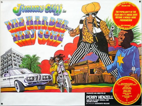
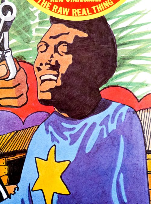
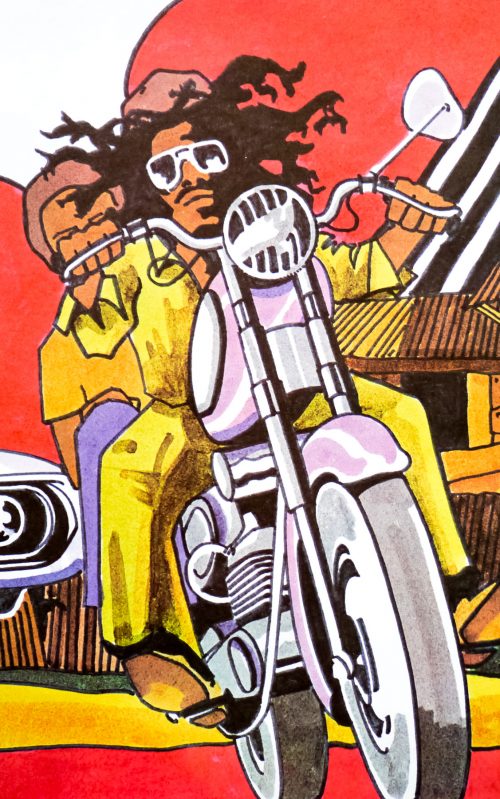
Jamaica’s first feature film They Harder They Come is often credited with introducing the rest of the world to reggae music, released as it was before Jamaican artists like Bob Marley had achieved much recognition outside of the country. The film was directed by Jamaican native Perry Henzell, who also produced and co-wrote the script, and is partially based on the true story of Ivanhoe ‘Rhyging‘ Martin. Often called the ‘original rude boy’, Martin was a Jamaican outlaw who escaped from prison and managed to evade the police for several years with the help of the Jamaican public, before a final showdown on Lime Cay in 1948. The soundtrack to the film is absolutely integral to its success and features tracks from some of Jamaica’s best reggae artists, including Desmond Dekker, Toots & the Maytals and singer Jimmy Cliff. Released on Jamaica’s own Island Records, the album went on to sell millions of copies and continues to be one of the label’s biggest sellers.

Jimmy Cliff stars as Ivan Martin and was chosen for the role after Perry Henzell saw photos of him on the packaging for one of his earlier albums. Ivan is a country boy who travels to Kingston with empty pockets and a dream of becoming a singer. After being taken in by a preacher he meets a ruthless music studio owner who eventually allows him to record a tune (the titular The Harder They Come), but is then persuaded to sign away the rights for a pittance. Realising that his dream may be over, Ivan accepts an offer from a friend to begin dealing marijuana and, although things go smoothly for a while, it’s not long before he is betrayed and set on a path of destruction after killing a policeman sent to arrest him. Ivan ends up as an outlaw on the run, helped by the people he lived amongst, but a failed attempt to escape by boat to Cuba sees him washed up on a sandy beach with the police hard on his tail.
The Harder They Come depicts the kind of life that many Jamaicans experienced in the sprawling migrant settlements of Kingston and it made no attempt to try and romanticise life on the island. In addition, little concession was made to those not used to hearing the unique Jamaican Patois spoken by the majority of the characters in the film and prints were often subtitled when projected in other countries. The film was phenomenally successful in Jamaica with the premiere at the old Carib theatre in Kingston attracting thousands of locals eager to get into the auditorium. Its popularity soon spread to other countries such as the UK and eventually to the USA. The distribution over there was eventually handled by Perry Henzell himself who personally sold the film to cinema managers in several big cities and it apparently ended up playing in one Boston cinema for eight years straight.

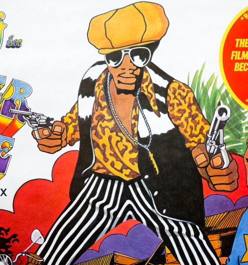
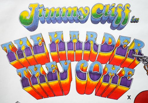
This quad is actually for the 1977 re-release of the film but I have never seen an original 1973 release quad of the film. It features the same artwork as seen on the soundtrack album, which is by a designer and artist called John Bryant about whom I’ve been unable to discover any details. The classic image of Jimmy Cliff with the two guns also features in a great sequence in the film when Ivan has his photo taken to send to newspapers in an attempt to cement his image as a bad boy outlaw. It appears that Bryant himself got in touch with the US auction house emovieposter.com to let them know a bit more about the poster and this information has been included in the auction details when this quad has been sold in the past:

‘Note that the person who originally designed this poster tells us that it was made for the late 1970s re-release of the film (the designer says likely between 1977 and 1979, and the BBFC states 1977) from the original British quad’s design, adding their company logo of “Lagoon” and the tagline at left, “Now-Original Uncut Version.’

The first release quad is unquestionably scarce but, as per the information above, must look almost identical to this poster.