Mad Max / quad / UK

17.12.12

PosterPosterPosterPosterPoster
Title
Mad Max
AKA
Interceptor (Italy)
Year of Film
1979
Director
George Miller
Starring
Mel Gibson, Steve Bisley, Joanne Samuel, Hugh Keays-Byrne, Tim Burns, Geoff Parry
Origin of Film
Australia
Genre(s) of Film
Action | Thriller
Type of Poster
Quad
Style of Poster
--
Origin of Poster
UK
Year of Poster
1979
Designer
Tom Beauvais
Artist
Tom Beauvais
Size (inches)
30" x 39 15/16"
SS or DS
SS
Tagline
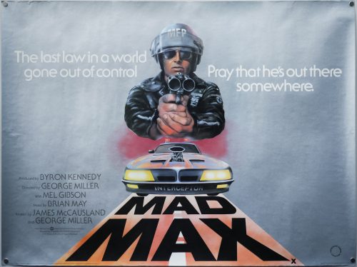
The last law in a world gone out of control. Pray he's out there somewhere.

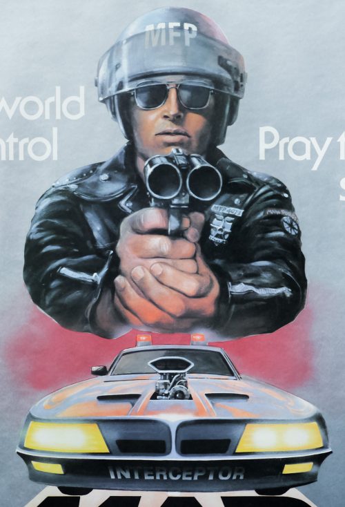
George Miller‘s brilliant vision of an apocalyptic future set in the Australian wastelands follows the battle between vicious outlaw gangs and a group of Main Force Patrol (MFP) pursuit cops who try to keep law and order on the roads. When officer Max Rockatansky (Mel Gibson in his breakout role) kills the ‘Nightrider’, the leader of a motorcycle gang, he sets in motion a chain of events that sees his wife and young son murdered and his partner burned alive. Driven mad by grief, Max commandeers a supercharged black Pursuit Special and sets out to avenge their deaths by whatever means necessary. The film was followed three years later by the superior Mad Max 2 (AKA The Road Warrior).

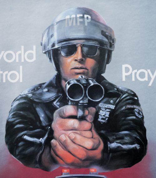
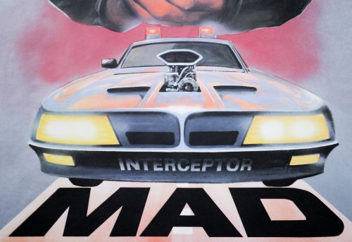
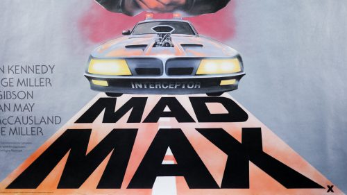
Because of Gibson’s anonymity to audiences outside Australia his face was not featured on many of the posters designed to sell the film in other territories. The American one sheet features a classic illustration of a leather-clad figure with his face covered by a futuristic visor. This British quad features an MFP figure pointing a shotgun directly at the viewer but it’s not obviously Mel Gibson’s character. The car below the figure is a hybrid between the colourful Interceptor cop vehicles and Max’s black Pursuit.

The poster was designed and illustrated by Tom Beauvais, a British artist with a lengthy career working in film marketing which saw him design and/or illustrate several notable posters, including the quad for Butch Cassidy and the Sundance Kid and the infamous ‘rotten hand bursting from the ground’ image for Lucio Fulci’s Zombie Flesh Eaters.

This UK quad was designed and illustrated by Tom Beauvais, a British artist with a lengthy career working in film marketing which saw him design and/or illustrate several notable posters, including the quad for Butch Cassidy and the Sundance Kid and the infamous ‘rotten hand bursting from the ground’ image for Lucio Fulci’s Zombie Flesh Eaters. In 2012 I was lucky enough to meet and interview Tom and the article can be read here. The Mad Max poster was discussed during the meeting:

———

You worked on one of my favourite film posters at the end of the 1970s, which is the one for Mad Max. Could you talk about designing that?
On that one we were working to a brief from Julian Senior at Warner Bros and he told us he wanted a policeman looking down the twin-barrels of a shotgun. I did an initial sketch of the figure with the car below and he responded really well to it. The praise was generous and I think it was probably because it had been his idea originally. I actually think that Mike Sparling, who I mentioned earlier, was used as a reference model for the policeman.

It’s a striking poster and made even more impressive by the fact that the illustration isn’t crowded out by too much text. It’s effective partly because it’s so minimal.

———

The poster is quite difficult to photograph well because it’s printed on a paper with a kind of silver metallic finish and so any reflections or bends in the paper are very obvious. It’s a difficult quad to find rolled and so I was very happy to track this pristine copy down earlier this year.

As well as this quad there was UK one sheet printed for the title that was designed by Beauvais and features the same artwork. The quad is also part of the Film on Paper collection and it can be viewed here.
Romancing the Stone / B1 / Poland

14.12.12

PosterPosterPosterPoster
Title
Romancing the Stone
AKA
Milosc, szmaragd i krokodyl (Poland)
Year of Film
1984
Director
Robert Zemeckis
Starring
Michael Douglas, Kathleen Turner, Danny DeVito, Zack Norman, Alfonso Arau, Manuel Ojeda, Holland Taylor, Mary Ellen Trainor
Origin of Film
Mexico | USA
Genre(s) of Film
Action | Adventure | Comedy | Romance
Type of Poster
B1
Style of Poster
--
Origin of Poster
Poland
Year of Poster
1985
Designer
Jakub Erol
Artist
Jakub Erol
Size (inches)
26 2/16" x 37 15/16"
SS or DS
SS
Tagline
--

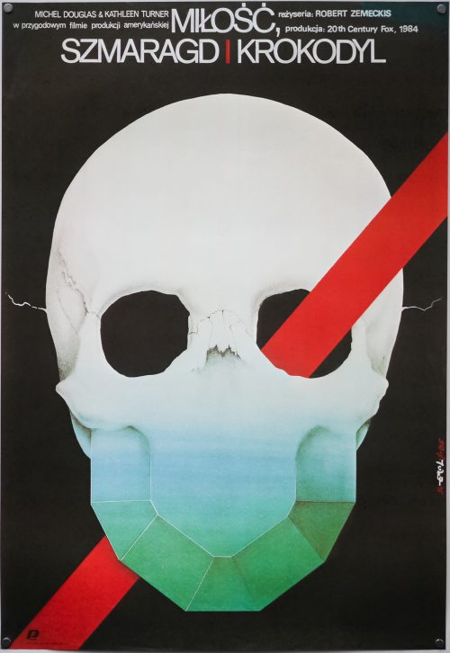
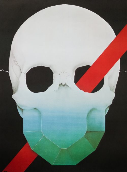
A brilliant design on this Polish poster for Robert Zemeckis‘ 1984 adventure comedy, Romancing the Stone, which starred Michael Douglas and Kathleen Turner. The latter plays Joan Wilder, a romance novelist who discovers that her sister has been kidnapped in Colombia and, after receiving a mysterious treasure map in the mail, she travels to South America to meet the treasure-hunting criminals responsible and make an exchange. After getting lost in the jungle she meets soldier of fortune Jack Colton (Douglas) who offers to lead her to safety and the pair embark on madcap adventure to rescue Joan’s sister. The film was successful enough to warrant a sequel, The Jewel of the Nile, that was released only a year later.

This poster features artwork by a designer and artist called Jakub Erol who was born in Zamość in 1941 and graduated from the Warsaw Academy of Fine Arts in 1968. He worked as a prolific poster artist for over 25 years and designed several iconic images for both Polish and American films. Some of his other poster highlights include the bizarre image he conjured up for Ridley Scott’s Alien, a striking design for James Cameron’s The Terminator and the excellent poster for Raiders of the Lost Ark.

The Polishposter.com website features many of his designs, several which are for sale, and the Polish cinemaposter.com website also features three pages of his work. This list of his designs on the same website gives you an idea of how prolific an artist he was.

Carrie / 30×40 / USA

12.12.12

PosterPosterPosterPoster
Title
Carrie
AKA
Carrie, lo sguardo di Satana [The gaze of Satan] (Italy) | Keri (Serbia)
Year of Film
1976
Director
Brian De Palma
Starring
Sissy Spacek, Piper Laurie, Betty Buckley, Amy Irving, William Katt, Nancy Allen, John Travolta
Origin of Film
USA
Genre(s) of Film
Horror | Drama
Type of Poster
30x40
Style of Poster
--
Origin of Poster
USA
Year of Poster
1976
Designer
Unknown
Artist
--
Size (inches)
20 4/16" x 28 10/16"
SS or DS
SS
NSS #
76/222
Tagline
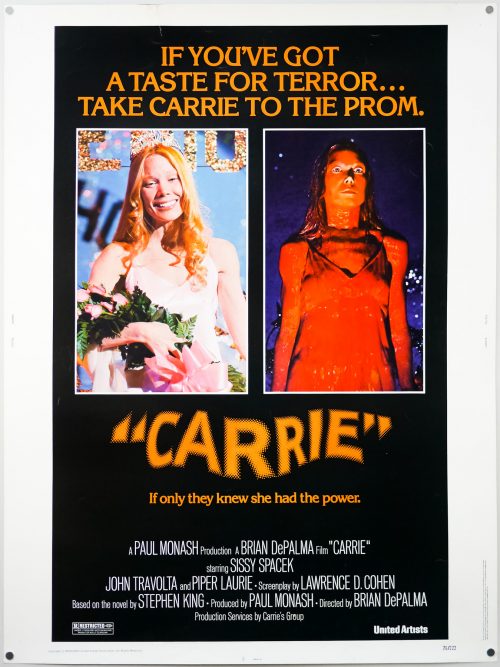
If you've got a taste for terror... take Carrie to the prom. | If only they knew she had the power

Brian De Palma‘s mesmerising Carrie still stands up today as a perfectly paced thriller and a powerful portrait of the torment suffered by a social outcast on the receiving end of a bullying campaign. Sissy Spacek delivers a breakout performance as Carrie White, the teenager who is picked upon by her teachers, peers and her domineering, abusive mother Margaret (played brilliantly by Piper Laurie). What nobody knows is that Carrie has discovered that she has a latent telekinetic power that flares up when she’s upset or angry. The film also features memorable turns from several young actors who were relative unknowns at the time, including John TravoltaNancy Allen and William Katt as Tommy.

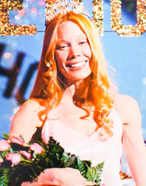
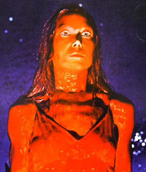
The unforgettable prom night sequence that sees Carrie’s destructive powers fully unleashed was clearly seen as the marketing cornerstone for the film, as evidenced by the images and tagline used on this 30×40 poster. A still from the scene features on the brilliant Japanese B2. The striking image of Sissy Spacek drenched in blood is often used to promote the film and has been used for multiple DVD covers and other marketing materials. A remake is being readied for release in 2013 and the teaser poster depicts star Chloe Moretz in a similarly bloody state.

The Beastmaster / B1 / Japan

10.12.12

PosterPosterPosterPosterPoster
Title
The Beastmaster
AKA
Miraclemaster
Year of Film
1982
Director
Don Coscarelli
Starring
Marc Singer, Tanya Roberts, Rip Torn, John Amos, Josh Milrad, Rod Loomis, Vanna Bonta, Ben Hammer, Ralph Strait, Billy Jacoby, Tony Epper, Paul Reynolds
Origin of Film
USA | West Germany
Genre(s) of Film
Adventure | Fantasy
Type of Poster
B1
Style of Poster
--
Origin of Poster
Japan
Year of Poster
1982
Designer
Unknown
Artist
Noriyoshi Ohrai
Size (inches)
28 11/16" x 40 7/16"
SS or DS
SS
Tagline
--

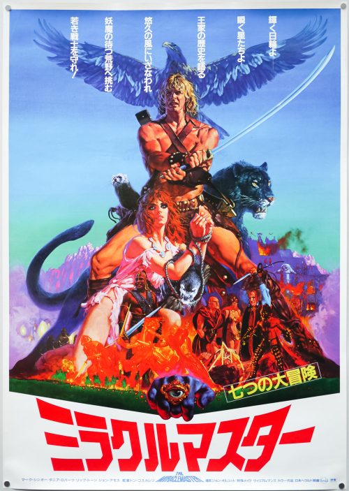
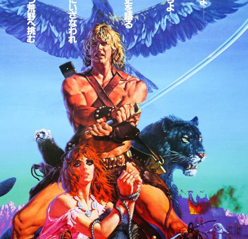
Cult filmmaker Don Coscarelli wrote and directed this 1982 sword and sorcery flick starring Marc Singer as the titular prince and the gorgeous Tanya Roberts as Kiri, his love interest. Dar (Singer) is the son of King Zed (Rod Loomis) who, in a bizarre sequence, is stolen from his mother’s womb and placed inside the belly of an ox on the orders of evil priest Maax (Rip Torn). When born the prince is gifted with the ability to telepathically communicate with animals and after being adopted and raised by a lowly villager, Dar is trained to be a skilled swordsman. One day the village is attacked and burned by the rampaging Jun horde who are under the control of Maax, and the warrior sets on a quest for revenge with his animal friends, including an eagle, two ferrets(!) and a black panther.

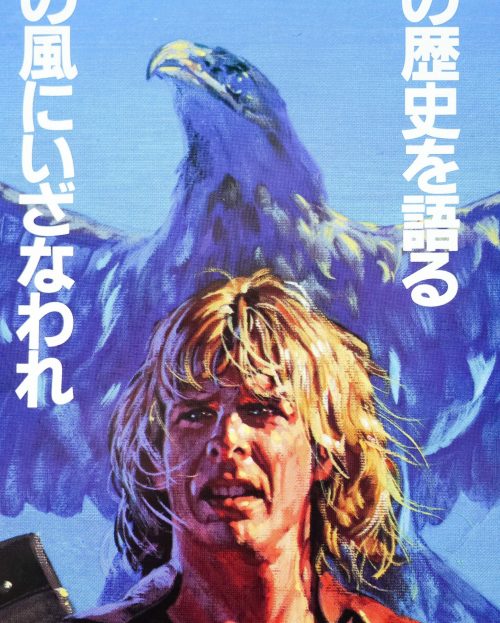
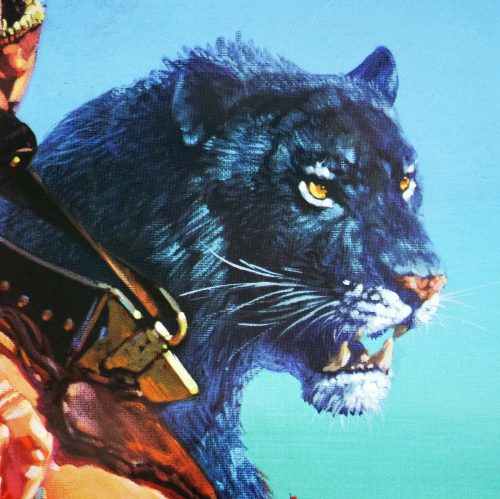
According to the IMDb trivia page for the film, the black panther was actually a tiger with its fur dyed and whenever the animal took a drink the dye would wash off around its mouth, which is noticeable in several scenes. Also, rather brilliantly, the eagle often refused to fly on cue so in order to shoot footage of it in the air it was dropped from a trapdoor in a hot air balloon.

The artwork on the poster is by Noriyoshi Ohrai who is something of an enigma, even in his native Japan. I’ve been unable to find much about him beyond a few pages like this one on the Star Wars Wookiepedia. He’s responsible for a number of Star Wars posters, including this brilliant 1982 B2 to celebrate the release of the Japanese dubbed version of the original film and the excellent design for The Empire Strikes Back. Perhaps his most iconic film work is the series of posters he illustrated for the Heisei era Godzilla films, including this fantastic B1 for Godzilla vs King Ghidorah.

The other Ohrai posters I’ve added to the site so far can be seen by clicking here (note that I also have this poster in B2 size).

Rosemary’s Baby / quad / UK

07.12.12

PosterPosterPosterPosterPoster
Title
Rosemary's Baby
AKA
--
Year of Film
1968
Director
Roman Polanski
Starring
Mia Farrow, John Cassavetes, Ruth Gordon, Sidney Blackmer, Maurice Evans, Ralph Bellamy, Victoria Vetri, Patsy Kelly, Elisha Cook Jr., Emmaline Henry, Charles Grodin
Origin of Film
USA
Genre(s) of Film
Drama | Horror | Mystery
Type of Poster
Quad
Style of Poster
--
Origin of Poster
UK
Year of Poster
1968
Designer
Philip Gips | Richard Danne | Stephen Frankfurt (creative director)
Artist
--
Size (inches)
30 1/16" x 40"
SS or DS
SS
Tagline
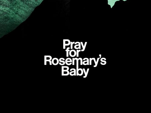
Pray for Rosemary's Baby

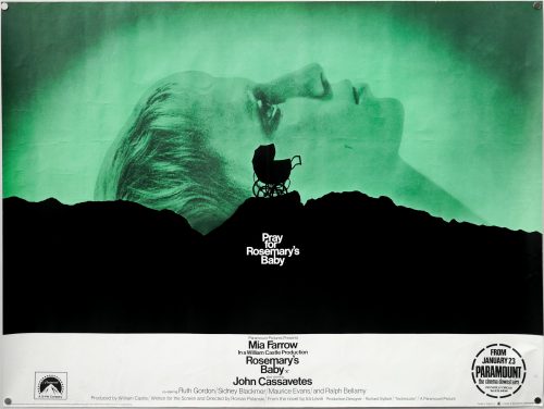
Roman Polanski’s 1968 horror masterpiece Rosemary’s Baby was released with one of the most iconic posters of all time that, like many of the most memorable designs, features a striking image in conjunction with an intriguing tagline. There is a fascinating, newly-filmed documentary on the recently released Criterion blu-ray of the film, which features many of the people involved in its making, including the legendary producer Robert Evans who recounts the story of how this poster came to be:

“When we finished the film the front office [of Paramount], which was in New York at the time, didn’t want to release it. They didn’t know how to sell it. I went to a friend of mine [Stephen Frankfurt] who was president at Young & Rubicam, a very large advertising agency, and I told him my problem; I can’t release the movie because the whole of our advertising team doesn’t know how to sell it, and the picture’s brilliant! He goes to see it and then he said to be ‘Bob, I’m going to tell it you straight; it’s not an easy picture to sell and I’m not going to take one dime from you to give you a whole campaign for it.’ He then said ‘But if you buy what I give you I want one hundred thousand dollars’.

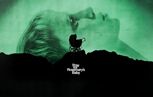
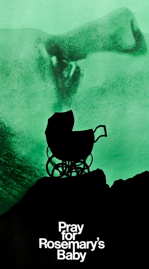
I walked in to the chairman of the board Charles Bluhdorn‘s office and said ‘take a look at this and you tell me if you want to write a cheque for one hundred thousand dollars’ and I turned the artboard around and there it is; there’s a mountain and a carriage and it says ‘Pray for Rosemary’s Baby’, that’s all. And he looks at it and he becomes so pale that he’s as white as these shoes that I’m wearing and he said ‘I have to pay him one hundred thousand dollars for three [four] words?!’ and I said that’s right, and he did! Pray for Rosemary’s Baby became the ad of the year. It made the picture and without that image people wouldn’t know what it is and they still didn’t know but they were intrigued. It opened to the biggest business Paramount had done in years.”

After a bit of research it seems that although Stephen Frankfurt should be credited as the creative director for the poster, it was actually designed by Philip Gips in conjunction with Richard Danne. I’ve been attempting to figure out exactly where each of these designers worked and I have to confess it has left me slightly confused. Stephen Frankfurt is profiled in this excellent piece by Adrian Curry on Mubi.com that details his involvement in several seminal film posters of the 1960s and 70s, including Downhill Racer and the first Emmanuelle movie. He also worked on opening titles (To Kill a Mockingbird) and trailers for several films, including the one for Rosemary’s Baby. According to the article Frankfurt’s thing ‘was to see the packaging of movies as a totality—designing the titles, posters, trailers and ads with one common look and theme.’ The article also notes that the baby carriage on the crag was shot on the outcrops of rocks in Manhattan’s Central Park.

Frankfurt died earlier this year and in this article in Adweek it mentions that he was also a partner in an agency he set up with Philip Gips and Aubrey Balkind (named simply Frankfurt Gips Balkind), where he worked on over 55 film marketing campaigns. It’s not totally clear but I believe that he must have worked on this poster whilst also serving as president at Young and Rubicam, hence the fact that Robert Evans mentions the larger agency in the interview above.

Note that in the comments of that article someone with the username ‘Villafranca’ writes the following:
“In the mid-90’s, I worked for Philip Gips’s the small agency that he started after he left Frankfurt, Gips Balkind. In his office, he had framed prints of both the “Rosemary’s Baby” and “Alien” posters hanging in his office because, well, he designed them. And one other small tidbit: his wife, Barbara, wrote the line “In space no one can hear you scream” (not Stephen Frankfurt). Phil told me this personally.”

Further on in the comments another poster called ‘danagips’ writes:
“This should absolutely be retitled the movie posters of Phil Gips. And my mother did indeed write, ‘In Space No One Can Hear You Scream’ for Alien.”

In addition to this, the website of AIGA (American Institute of Graphic Arts) features a page on the poster that also credits Richard Danne as a co-designer of the poster. Danne appears to have had a lengthy and lauded career in the New York advertising industry and his official website features a biography that indicates he served as president of AIGA as well as a several other organisations. The Rosemary’s Baby poster features on his website where another agency ‘Gips and Danne’ is mentioned (the AIGA website has examples of that agency’s work).

The agency for the poster is credited as Gips and Danne so does that mean that Philip Gips was also working as a partner in a second design firm in addition to the one he founded with Frankurt and Balkind? Was this job given to Gips and Richard Danne’s firm by Frankfurt who was working for Paramount? I intend to contact Richard Danne to try and clarify but I’d appreciate any other information that people may have so I can accurately credit the poster.

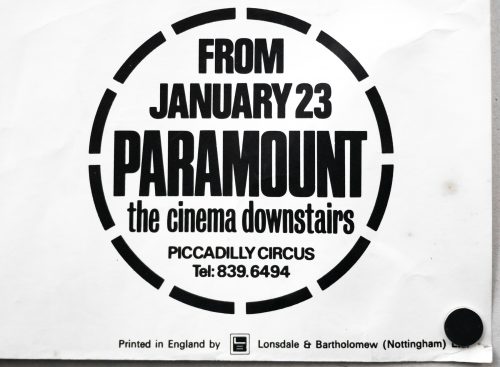
This is the original British quad for the release of the film over here and I was utterly thrilled to find it in excellent, rolled condition. Note the circular snipe in the bottom corner which ties it to the Paramount cinema in London’s Piccadilly Circus. The building was opened in 1921 as the large and luxurious cinema known as the Plaza Theatre that was designed and built for Paramount Pictures to be their showcase venue in London. The Arthur Lloyd ‘music hall and theatre history’ website features a page on the cinema that details its history and has several excellent pictures included. Finally, I’m unsure who will have done the design work to adapt the original portrait one sheet design to the landscape quad format.

Nico / one sheet / international

05.12.12

PosterPosterPosterPosterPoster
Title
Nico
AKA
Above The Law
Year of Film
1988
Director
Andrew Davis
Starring
Steven Seagal, Pam Grier, Sharon Stone, Daniel Faraldo, Henry Silva
Origin of Film
USA | Hong Kong
Genre(s) of Film
Action | Crime
Type of Poster
One sheet
Style of Poster
--
Origin of Poster
International
Year of Poster
1988
Designer
Unknown
Artist
David Grove
Size (inches)
27 1/16" x 40 6/16"
SS or DS
SS
Tagline
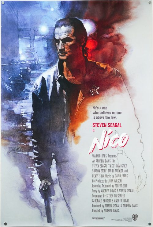
He's a cop who believes no one is above the law.

Nico (AKA Above the Law) was the debut film of the infamous action star Steven Seagal who was apparently persuaded to make the film by talent agent Michael Ovitz, a pupil at the martial arts school in Los Angeles that he ran during the 1980s. Seagal had become the first foreigner to run an aikido dojo in Japan and had reached 7th dan level before returning to America where he began to work as the martial arts coordinator for several Hollywood productions, such as The Challenge and A View to a Kill. After appearing in Nico, Seagal would go on to make several other action films, including Hard to Kill and Marked for Death, before gaining international success with 1992s Under Siege.

Nico sees Seagal’s ex-CIA police detective Nico Toscani uncover information about an illegal arms-deal that implicates a shady figure from his past. His determination to uncover the truth and place the criminals behind bars puts his wife (Sharon Stone) and kids in jeopardy, and Nico must use his martial arts skills to put a stop to the operation before it’s too late.

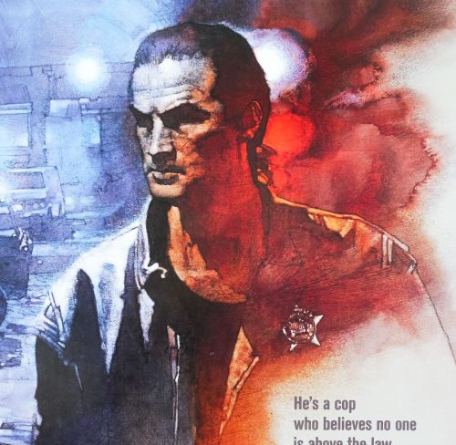
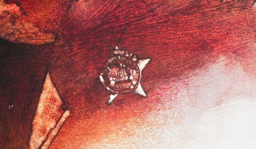
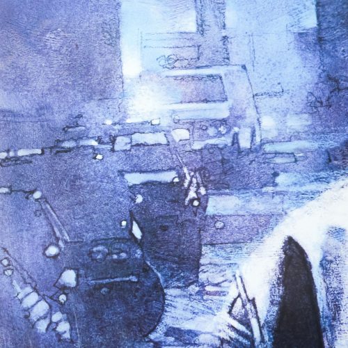
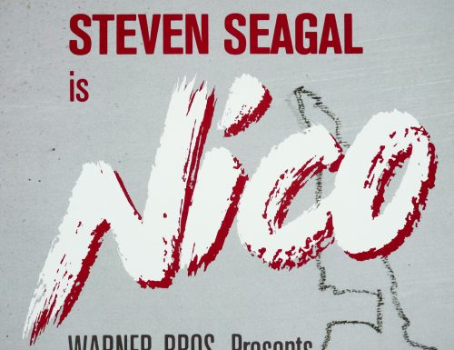
The artwork on this international one sheet is by the American illustrator David Grove who worked on several film posters, including the brilliant international one sheet for Pale Rider and the striking poster for Something Wicked This Way Comes. Grove had an incredible skill at using gouache and acrylic paints to create striking, stylised images of his subjects, which are full of energy and feature brilliant use of colour washes, shading and clever brush strokes.

It appears that the illustrator sadly passed away in October this year and the website of Artist Partners London (where he apparently worked for a while in the 1960s) features a gallery and information on him, including an obituary that was originally printed in the San Francisco Chronicle. Greg Newbold’s Life Needs Art blog features a great piece on Grove, which includes several images of his other film posters.

This is arguably the best Steven Seagal poster ever printed, although the Japanese poster for the film with artwork by Noriyoshi Ohrai comes very close.