

- Title
- Carrie
- AKA
- Carrie, lo sguardo di Satana [The gaze of Satan] (Italy) | Keri (Serbia)
- Year of Film
- 1976
- Director
- Brian De Palma
- Starring
- Sissy Spacek, Piper Laurie, Betty Buckley, Amy Irving, William Katt, Nancy Allen, John Travolta
- Origin of Film
- USA
- Type of Poster
- 30x40
- Style of Poster
- --
- Origin of Poster
- USA
- Year of Poster
- 1976
- Designer
- Unknown
- Artist
- --
- Size (inches)
- 20 4/16" x 28 10/16"
- SS or DS
- SS
- NSS #
- 76/222
- Tagline
- If you've got a taste for terror... take Carrie to the prom. | If only they knew she had the power
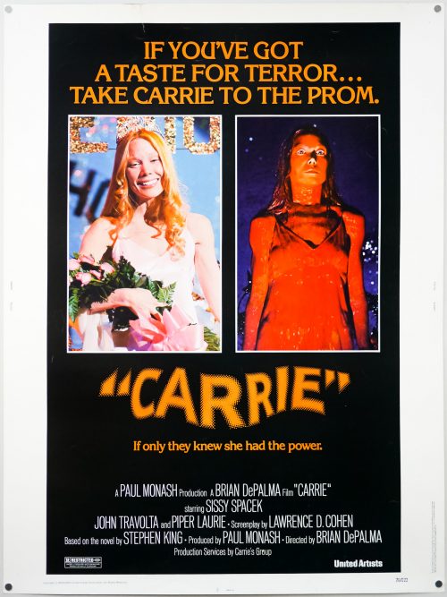
Brian De Palma‘s mesmerising Carrie still stands up today as a perfectly paced thriller and a powerful portrait of the torment suffered by a social outcast on the receiving end of a bullying campaign. Sissy Spacek delivers a breakout performance as Carrie White, the teenager who is picked upon by her teachers, peers and her domineering, abusive mother Margaret (played brilliantly by Piper Laurie). What nobody knows is that Carrie has discovered that she has a latent telekinetic power that flares up when she’s upset or angry. The film also features memorable turns from several young actors who were relative unknowns at the time, including John Travolta, Nancy Allen and William Katt as Tommy.
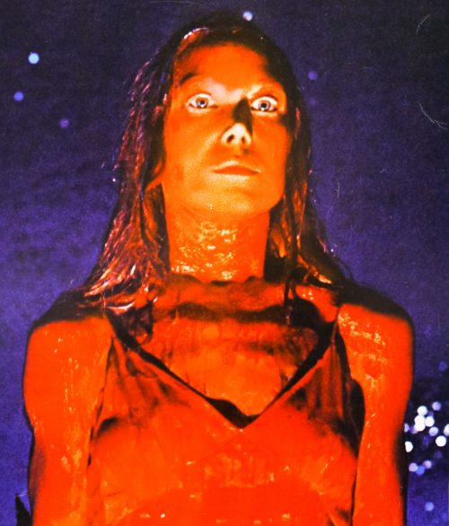
The unforgettable prom night sequence that sees Carrie’s destructive powers fully unleashed was clearly seen as the marketing cornerstone for the film, as evidenced by the images and tagline used on this 30×40 poster. A still from the scene features on the brilliant Japanese B2. The striking image of Sissy Spacek drenched in blood is often used to promote the film and has been used for multiple DVD covers and other marketing materials. A remake is being readied for release in 2013 and the teaser poster depicts star Chloe Moretz in a similarly bloody state.


I’d be interested in your opinions on why the British Quad of “Carrie” used a colour negative of the blood soaked image of Carrie
instead of the normal image
If I had to guess I’d say they ran into trouble with the UK’s Advertising Viewing Committee who used to be like the BBFC of film advertising materials. It could be that they were told the blood soaked dress was too much and the designer came up with a way of getting around the request to change it. Either that or it was just a stylistic choice, but I reckon it’s the former.