

- Title
- Stop Making Sense
- AKA
- --
- Year of Film
- 1984
- Director
- Jonathan Demme
- Starring
- David Byrne, Bernie Worrell, Alex Weir, Steven Scales, Lynn Mabry, Ednah Holt, Tina Weymouth, Jerry Harrison, Chris Frantz
- Origin of Film
- USA
- Genre(s) of Film
- Documentary | Music
- Type of Poster
- One sheet
- Style of Poster
- --
- Origin of Poster
- USA
- Year of Poster
- 1984
- Designer
- Type by Pablo Ferro
- Artist
- Photography by Adelle Lutz
- Size (inches)
- 27 1/16" x 41"
- SS or DS
- SS
- NSS #
- --
- Tagline
- --
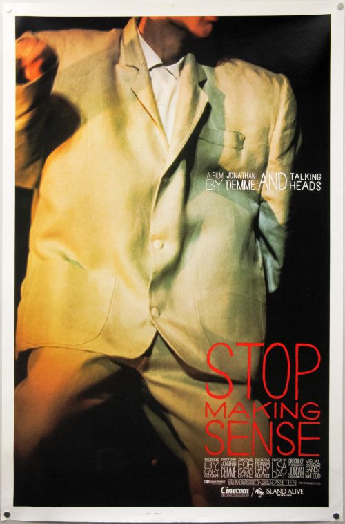
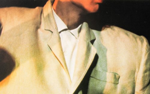
An iconic image depicting David Byrne (Talking Heads) in his ‘big suit’, from Stop Making Sense, a documentary that is considered among the best live concert films ever released. Filmed over three nights by Jonathan Demme (Silence of the Lambs) it was the first film of its type to employ digital audio recording and is also unique in that it shows minimal footage of the audience, instead focusing on Byrne and the rest of the band as they join him on stage and build towards the crescendo at the end of the film.
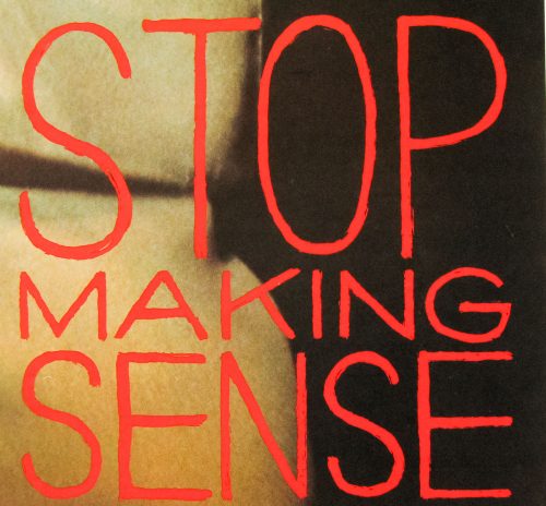
It’s a simple but striking poster with what appears to be hand drawn type for the logo and credit block (if it’s actually a typeface I’ll happily stand corrected).
Update – as per John’s comment below, it’s likely that the text was done by graphic designer Pablo Ferro since it appears in the title sequence and is the same one seen in a number of his other works. Someone has even made a typeface called Pablo Skinny.
The photograph is by Adelle Lutz.
Here’s the (poor quality) original trailer.


Isn’t the lettering by Pablo Ferro?
I knew that he was behind the title sequence but wasn’t sure if he could be accurately credited for the type. Do you know if he was responsible for all aspects of the design?
Come to think of it the type is very similar to the one seen in his work for Dr Strangelove too.