- Title
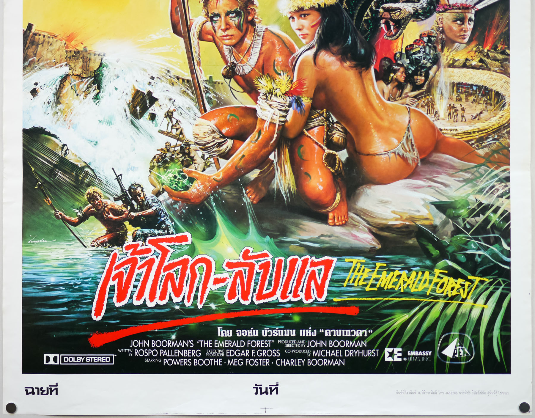
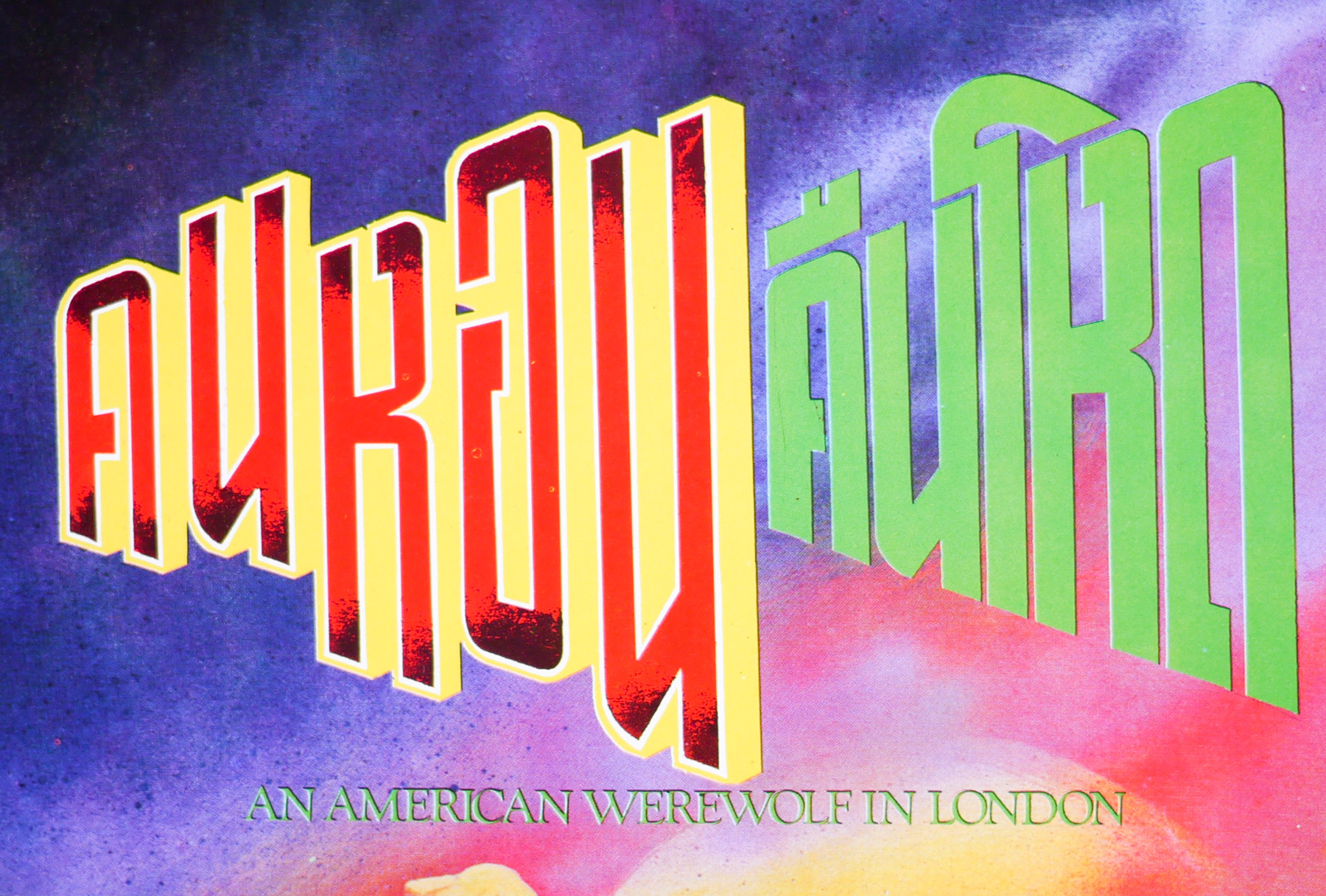
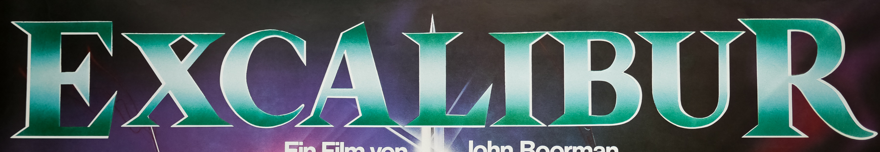
- Excalibur
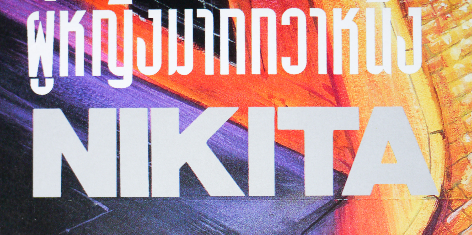
- AKA
- The Knights (USA - working title)
- Year of Film
- 1981
- Director
- John Boorman
- Starring
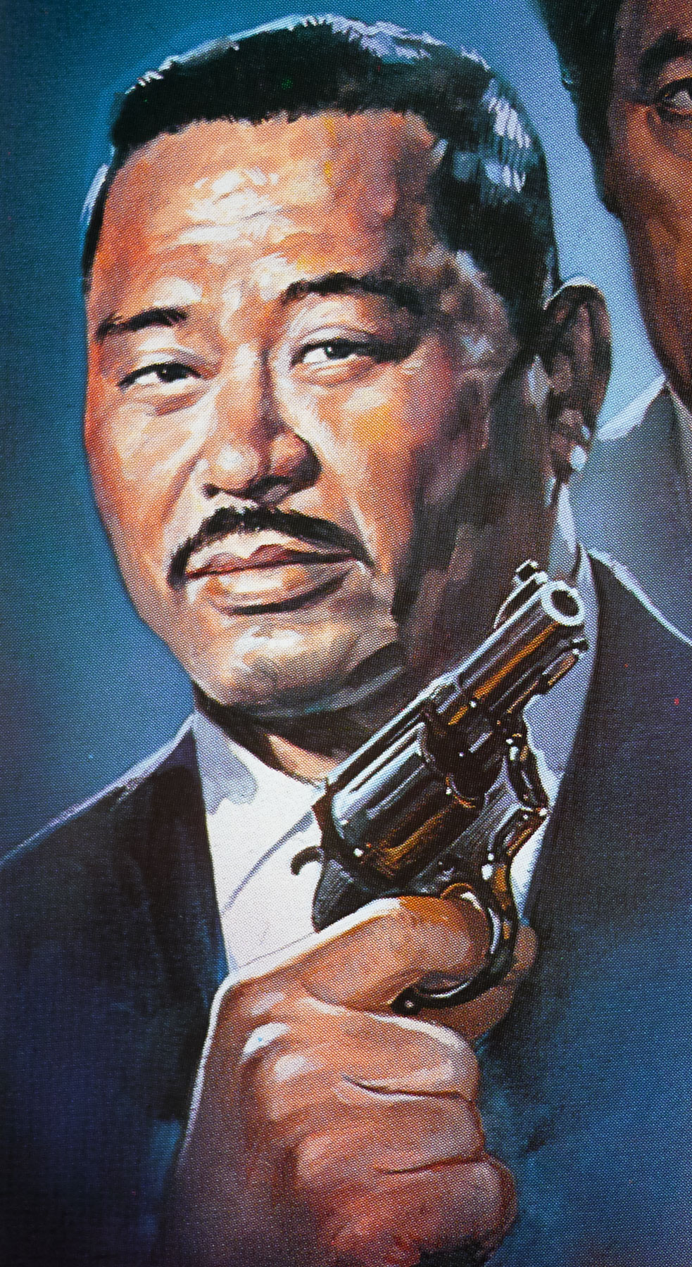
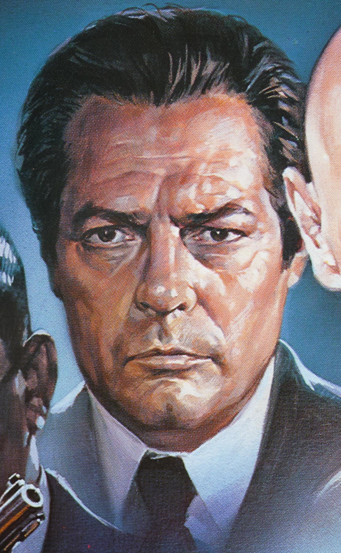
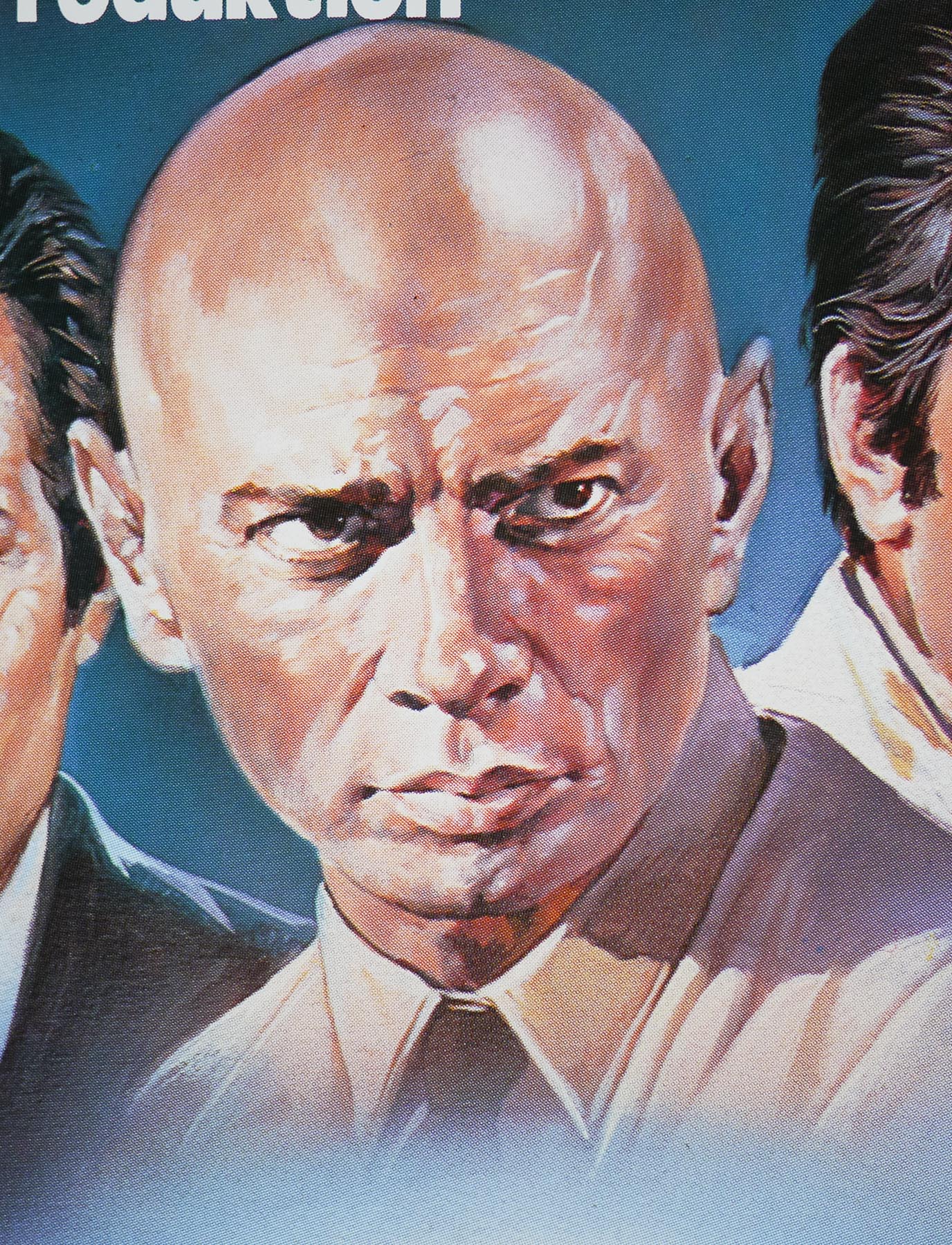
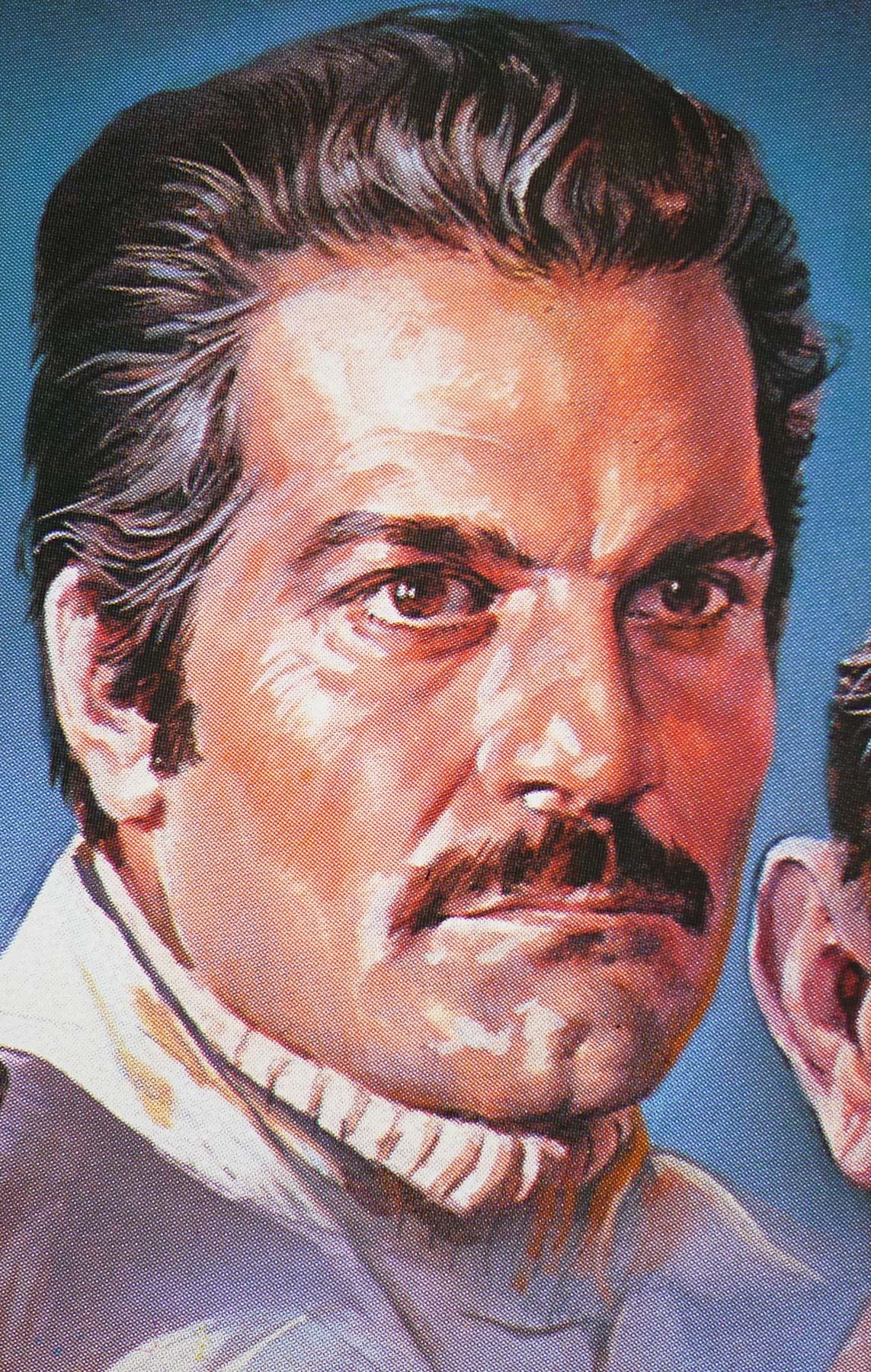
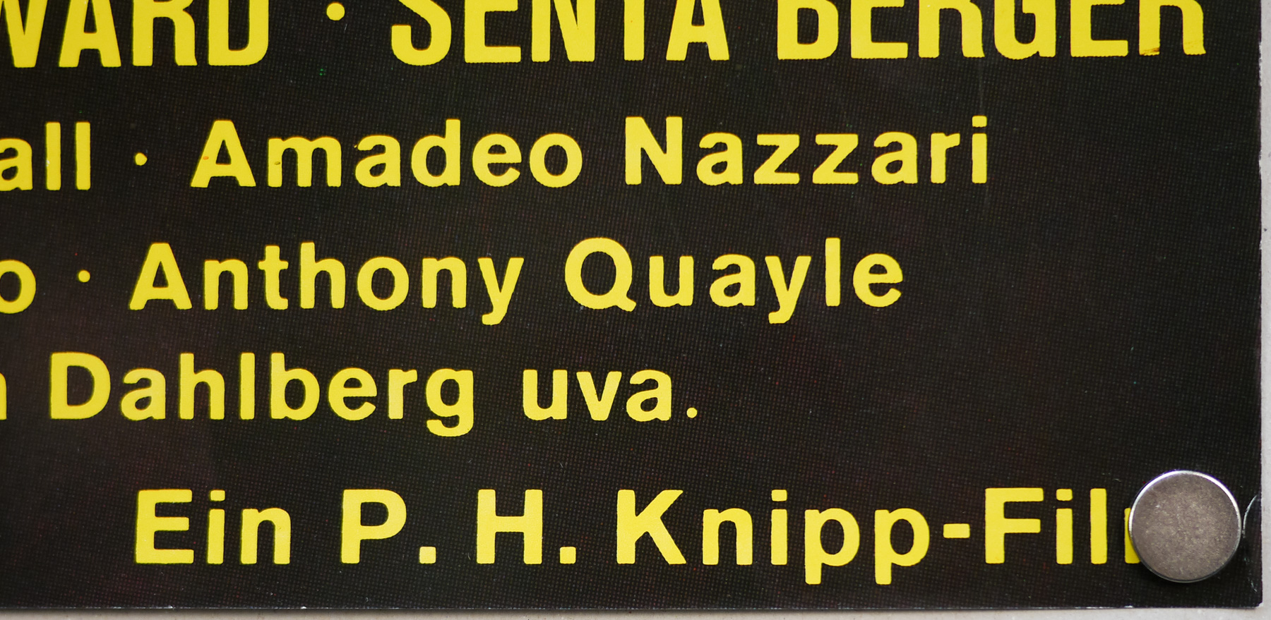
- Nigel Terry, Helen Mirren, Nicol Williamson, Nicholas Clay, Cherie Lunghi, Liam Neeson, Patrick Stewart, Clive Swift, Gabriel Byrne
- Origin of Film
- USA | UK
- Genre(s) of Film
- Nigel Terry, Helen Mirren, Nicol Williamson, Nicholas Clay, Cherie Lunghi, Liam Neeson, Patrick Stewart, Clive Swift, Gabriel Byrne,
- Type of Poster
- A0
- Style of Poster
- --
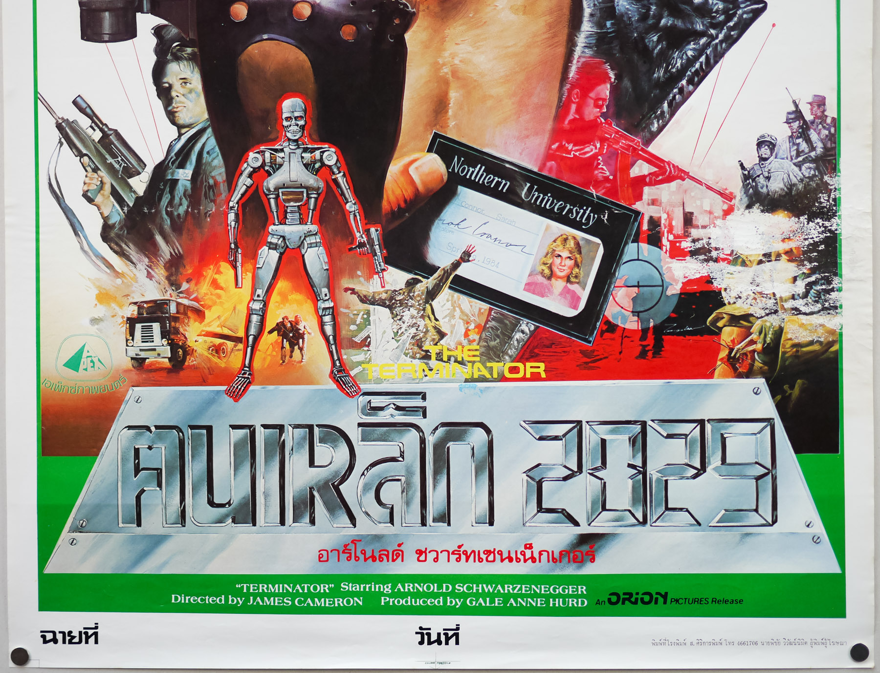
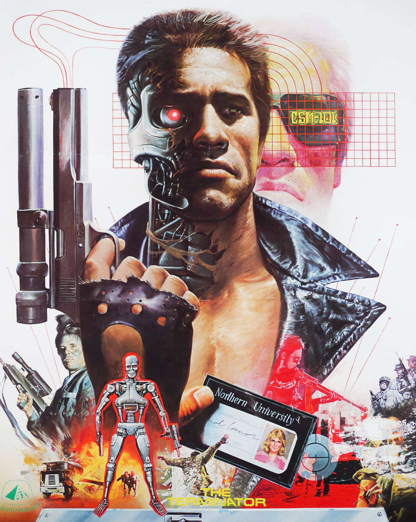
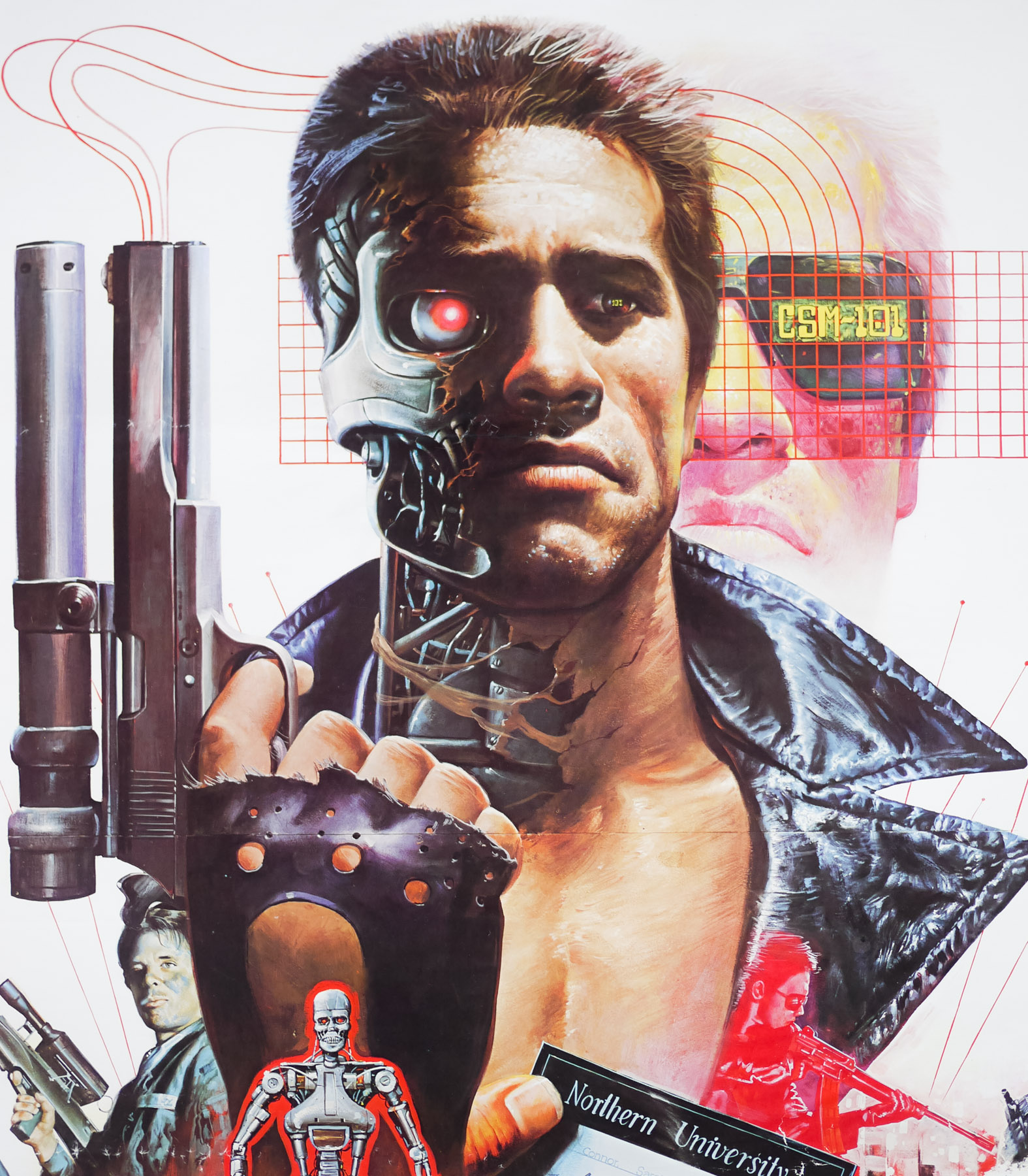
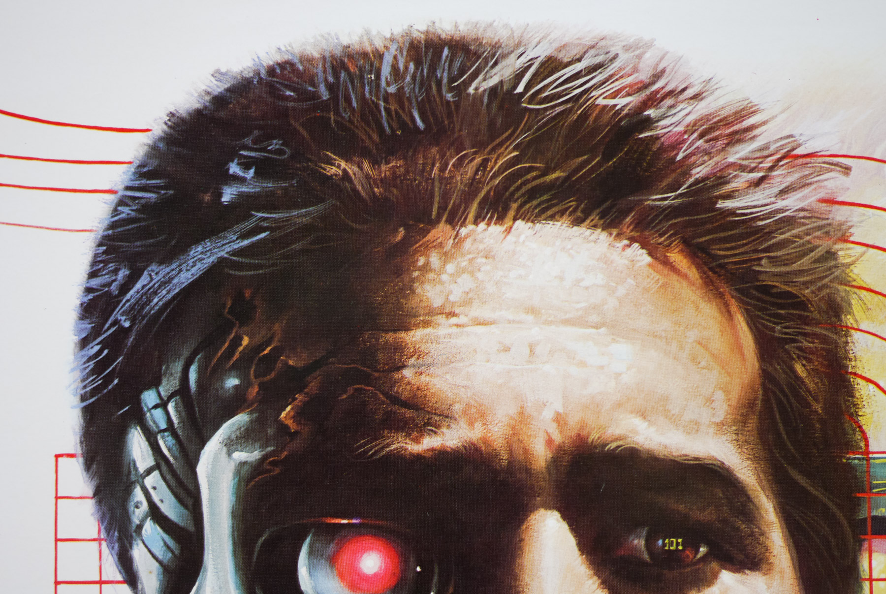
- Origin of Poster
- Germany
- Year of Poster
- 1981
- Designer
- Unknown
- Artist
- Based on Bob Beak artwork
- Size (inches)
- 33" x 46 10/16"
- SS or DS
- SS
- Tagline
- --
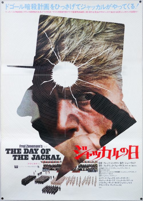
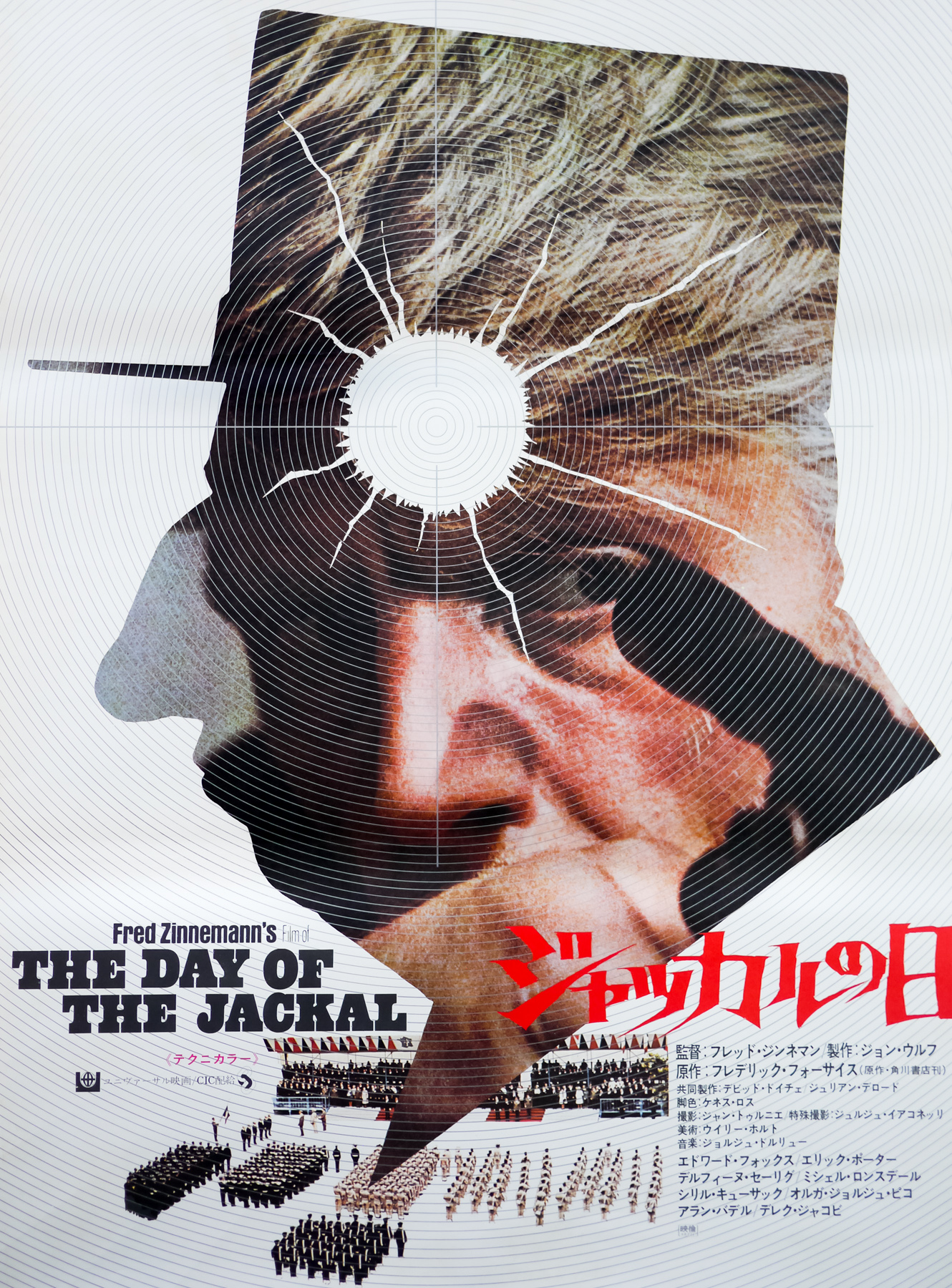
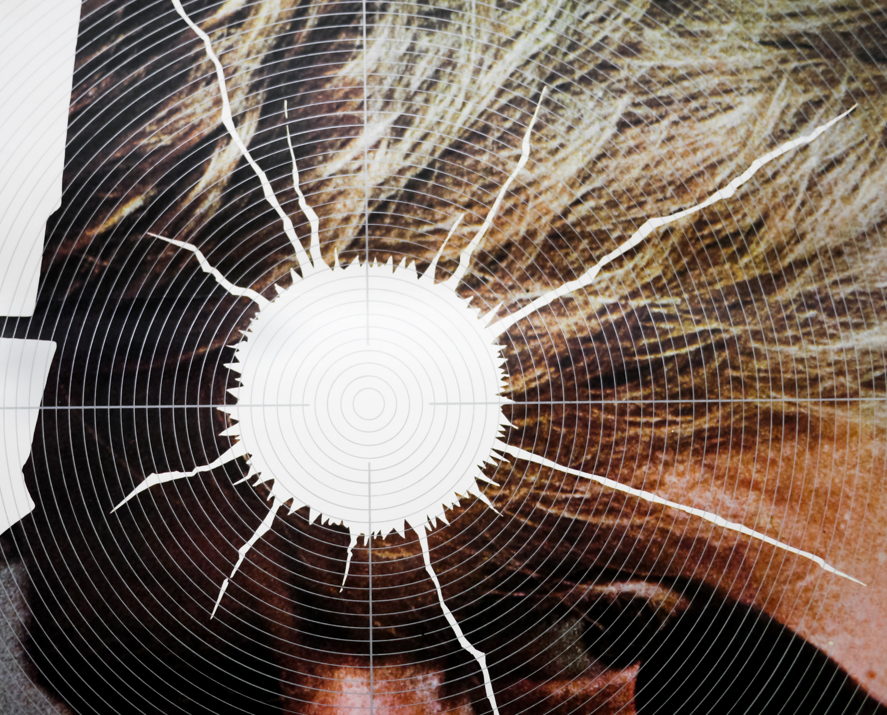
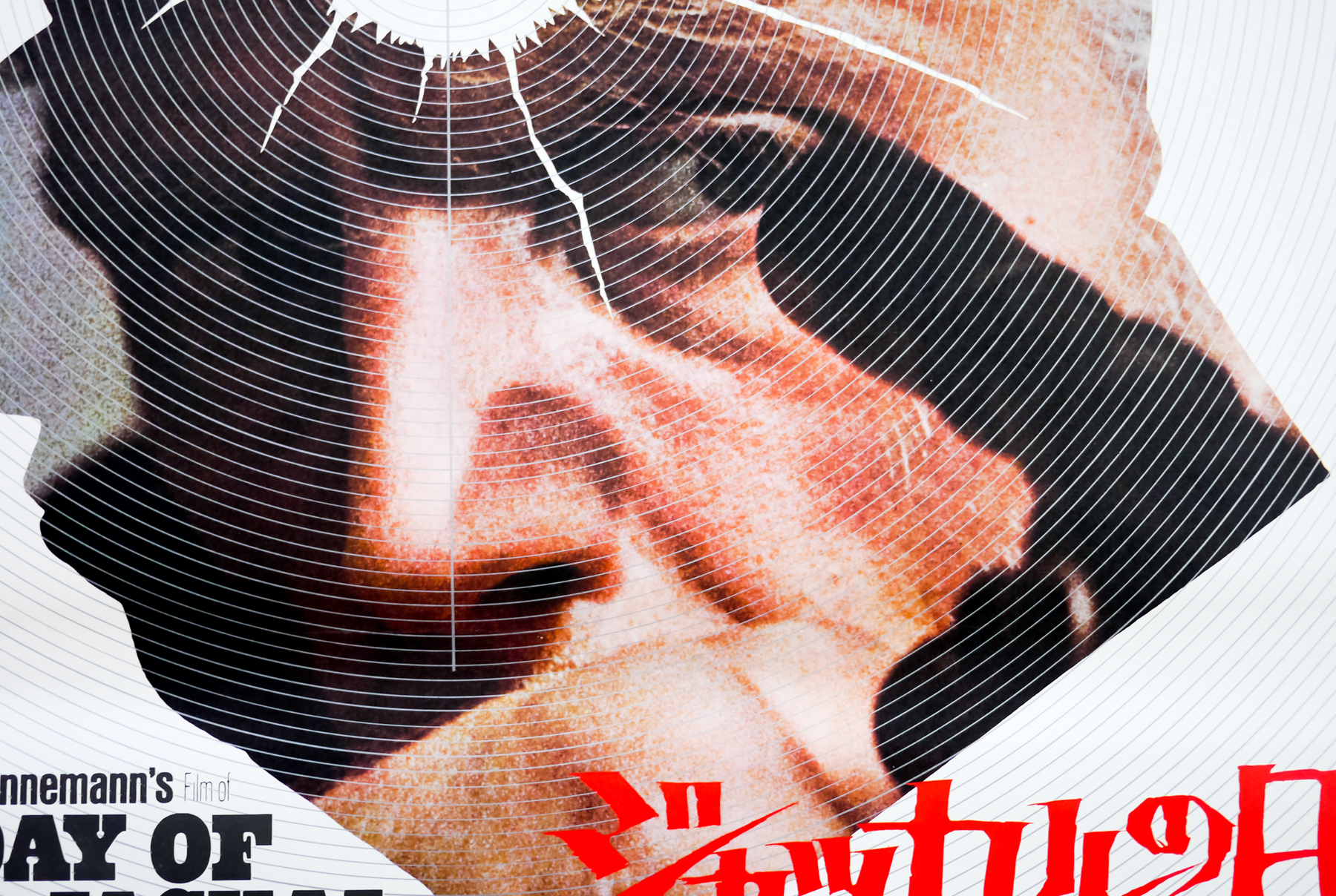
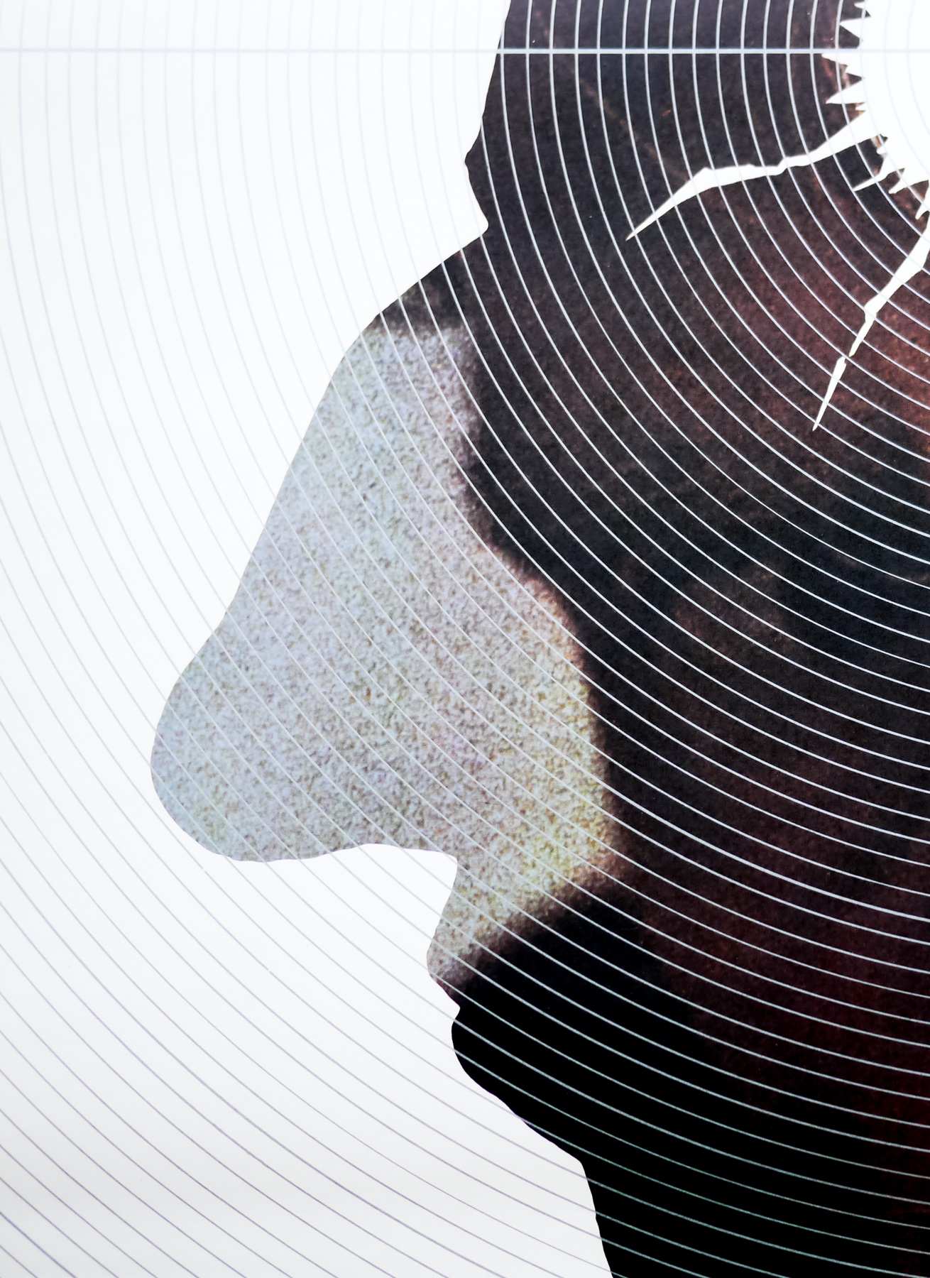
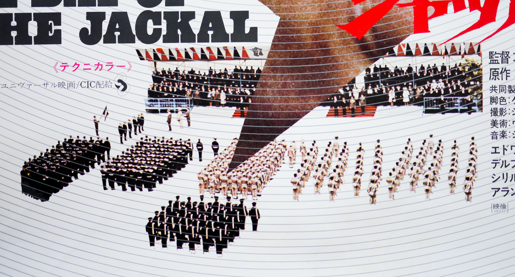
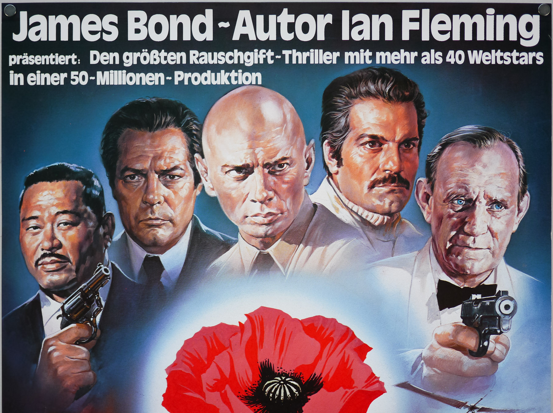
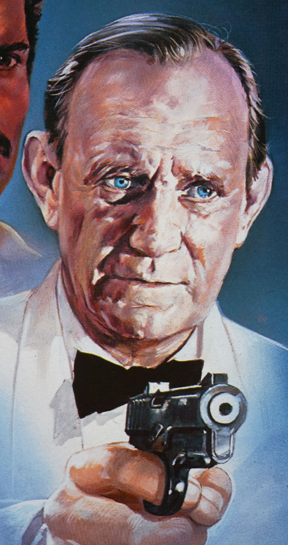
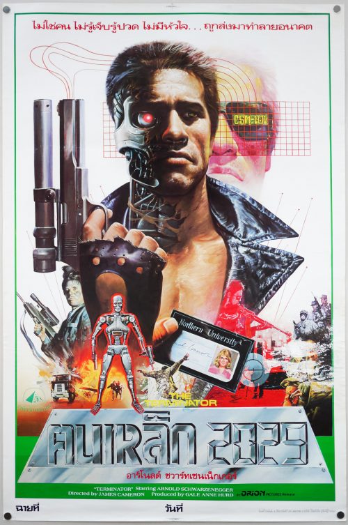
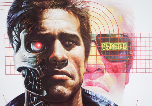
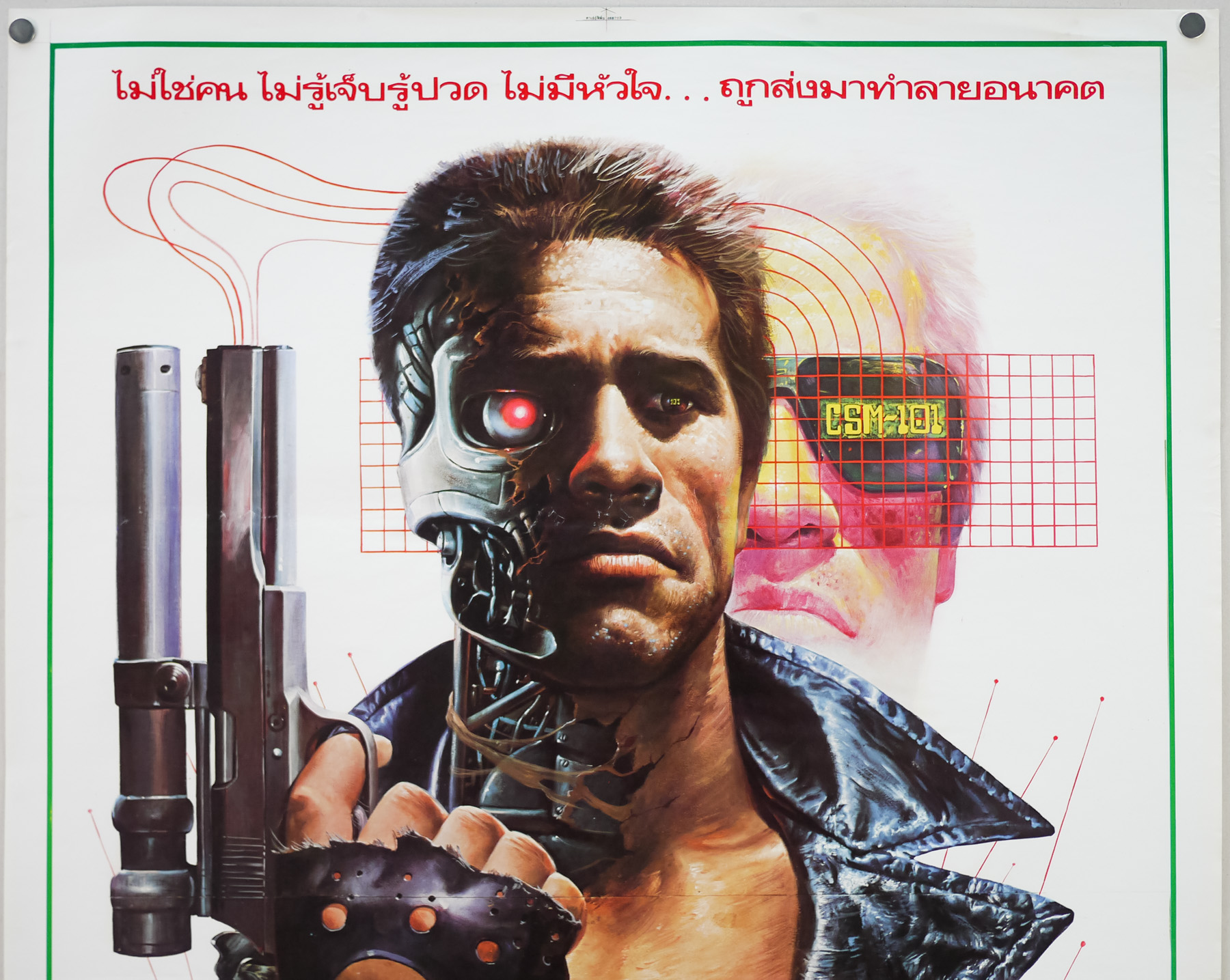
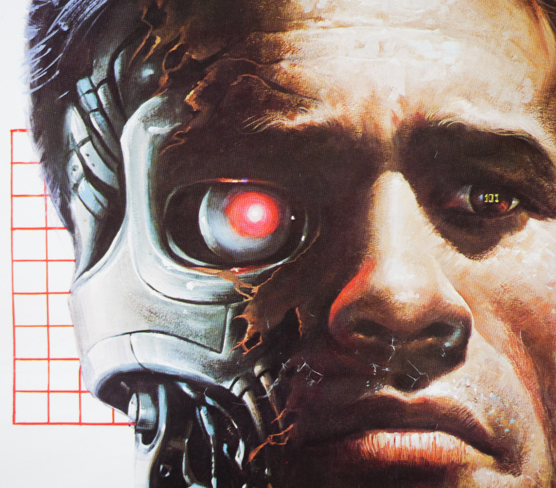
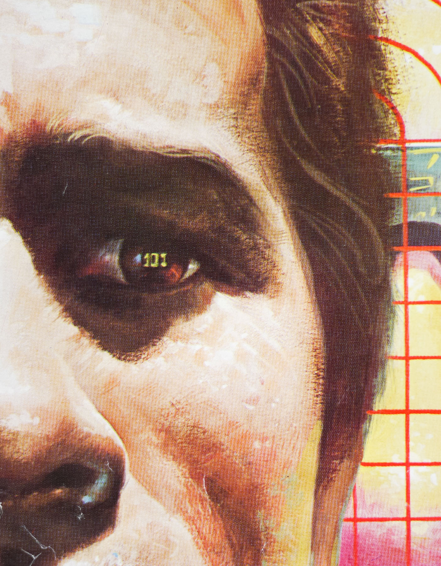
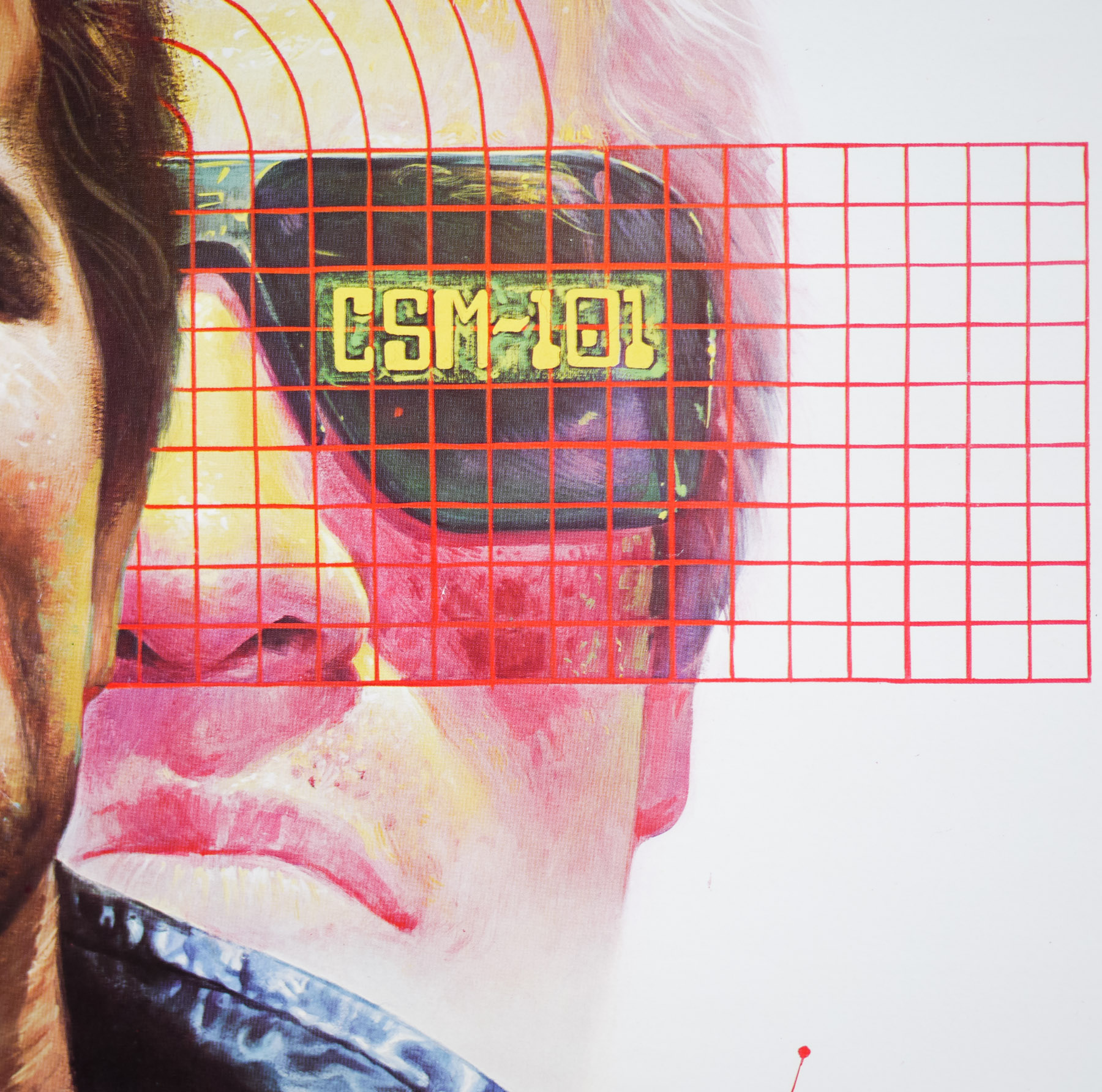
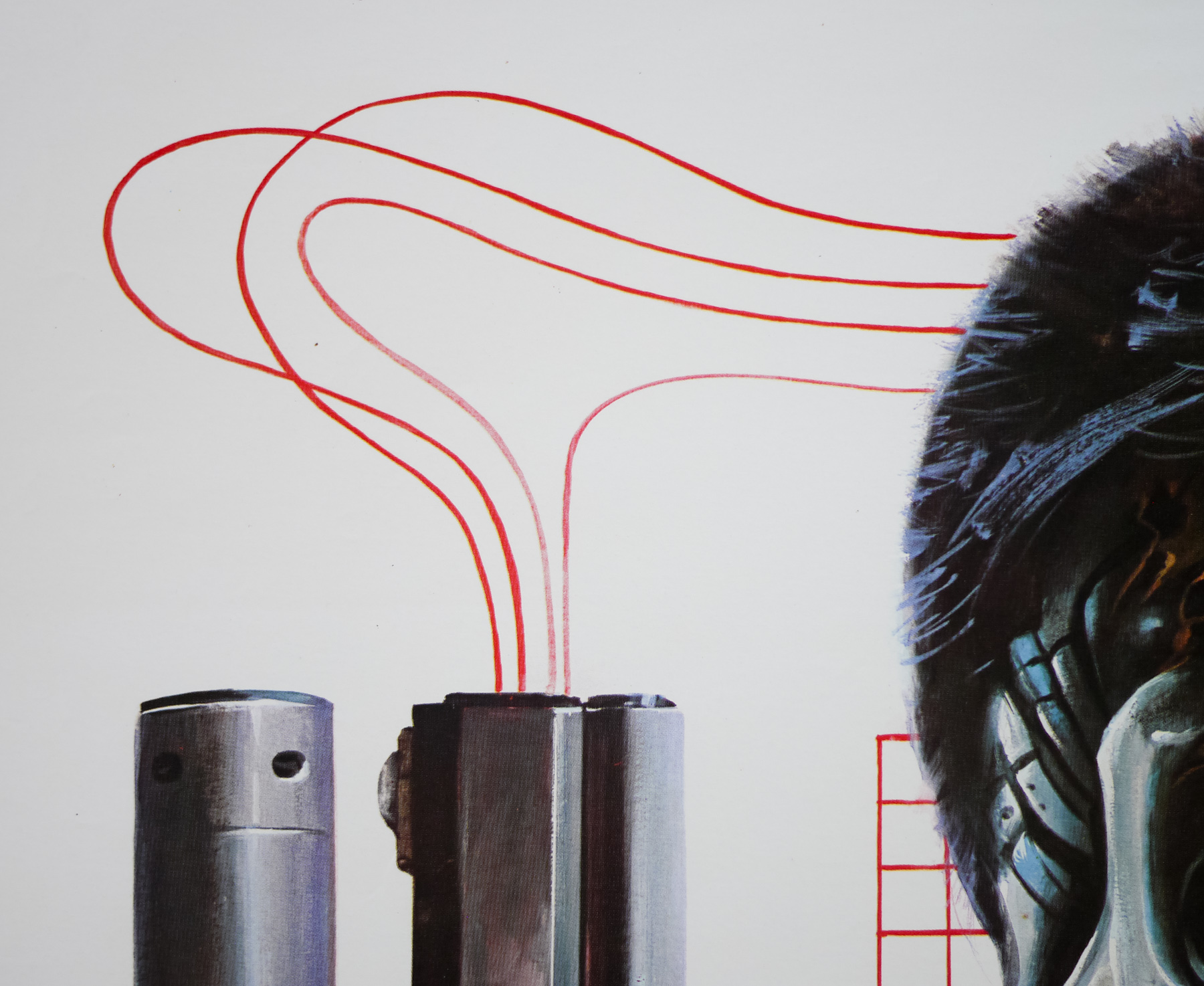
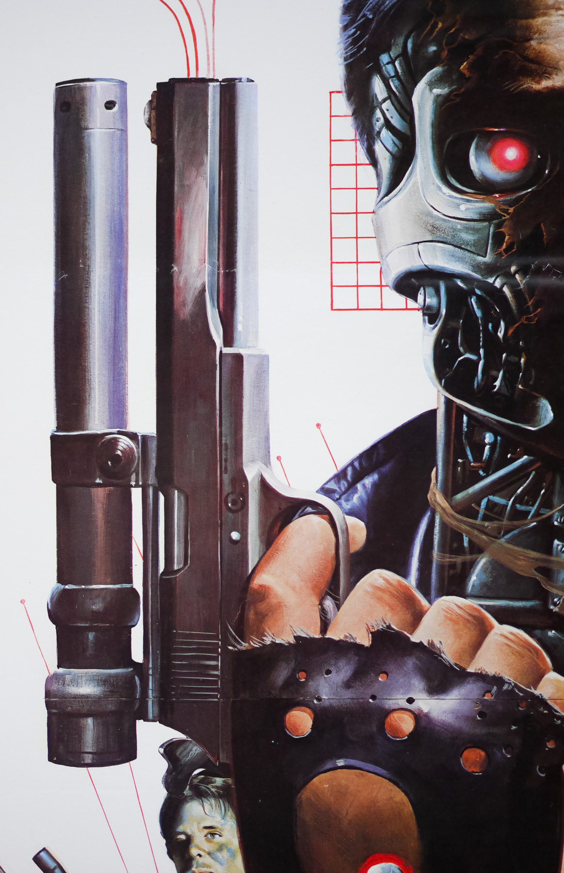
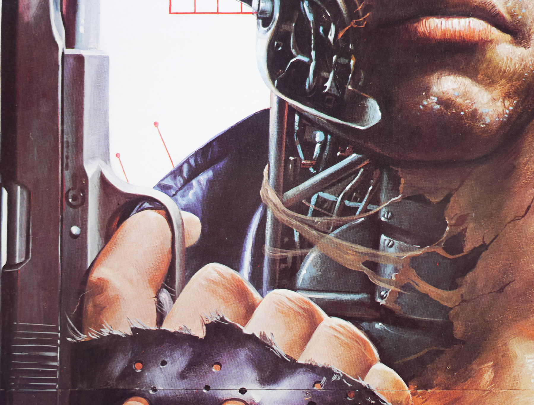
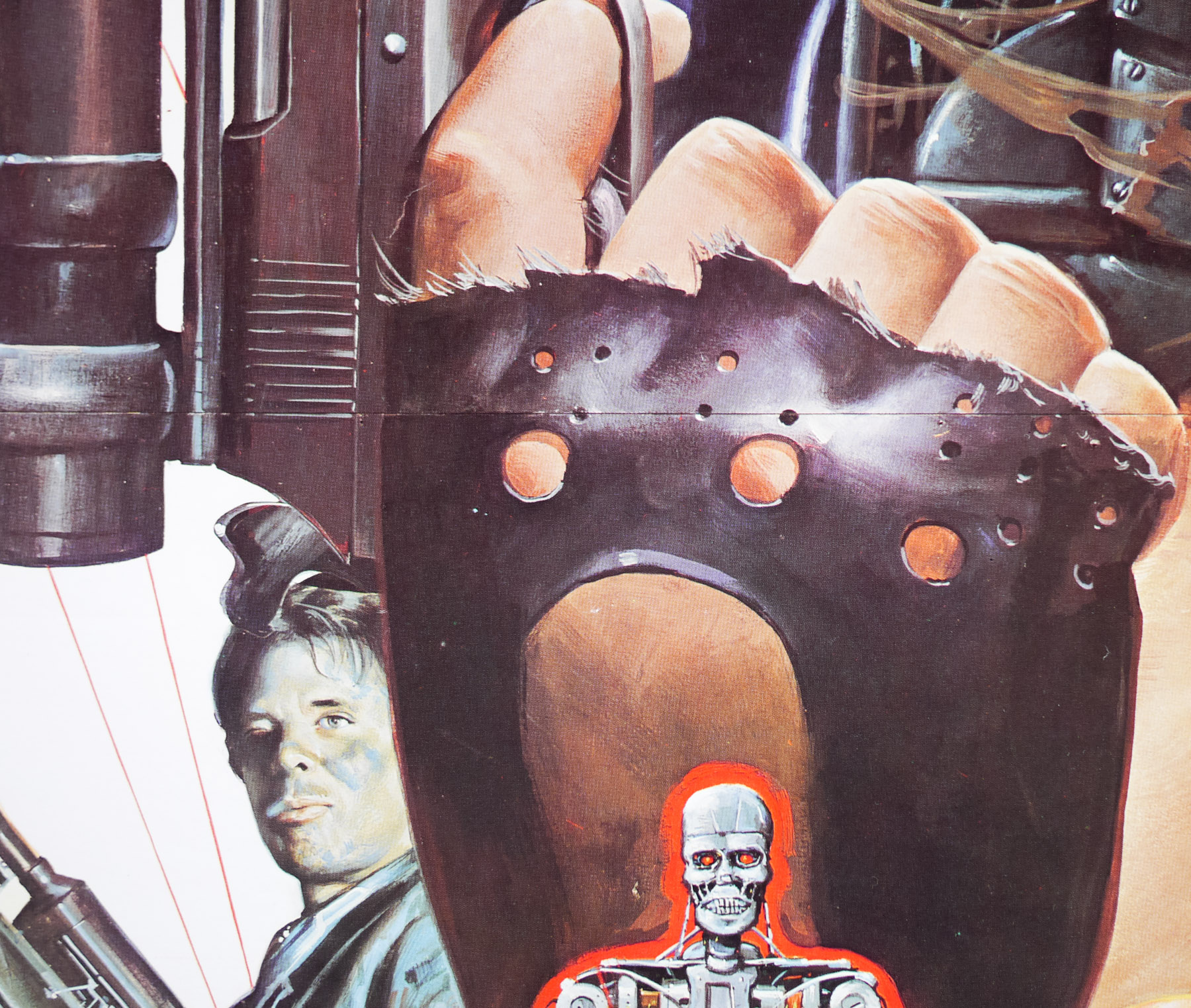
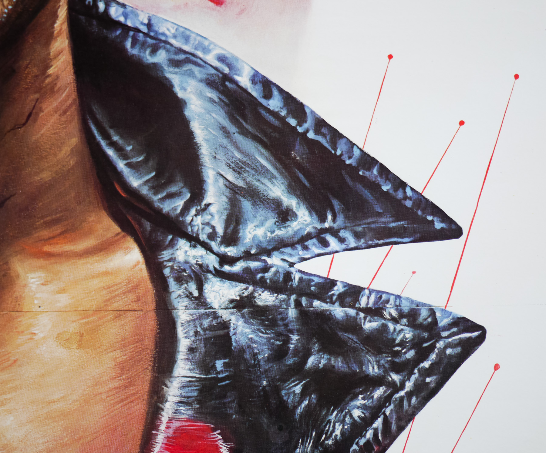
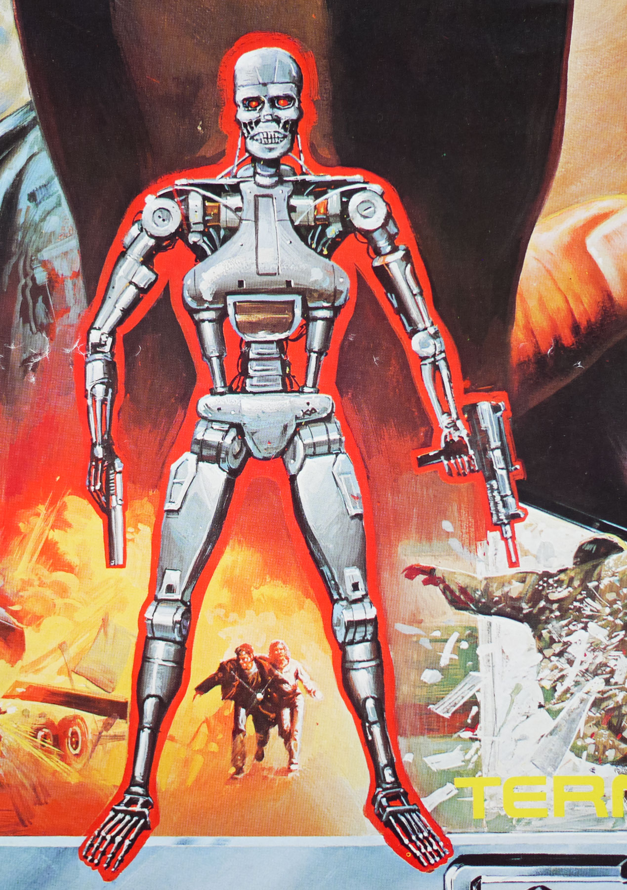
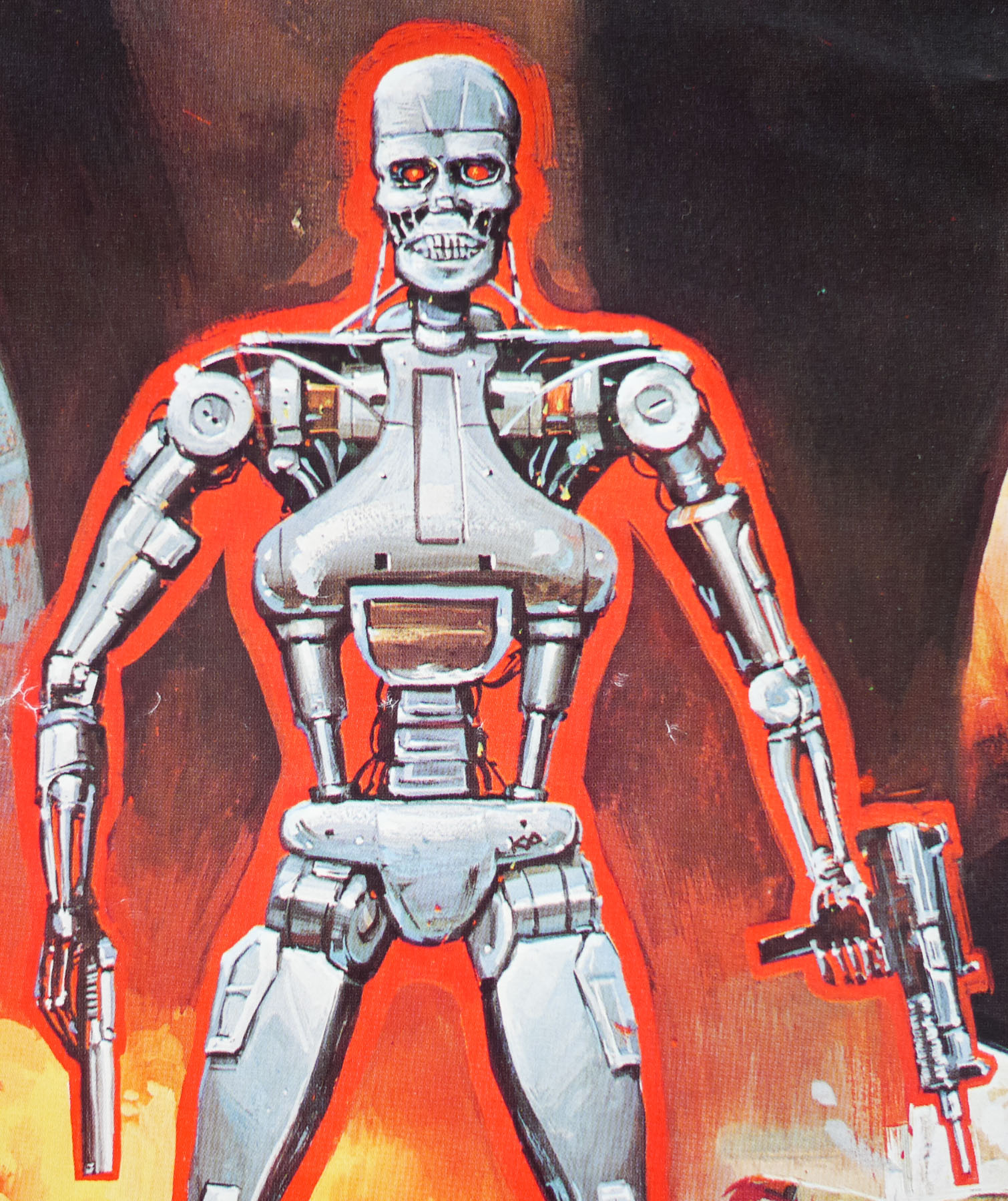
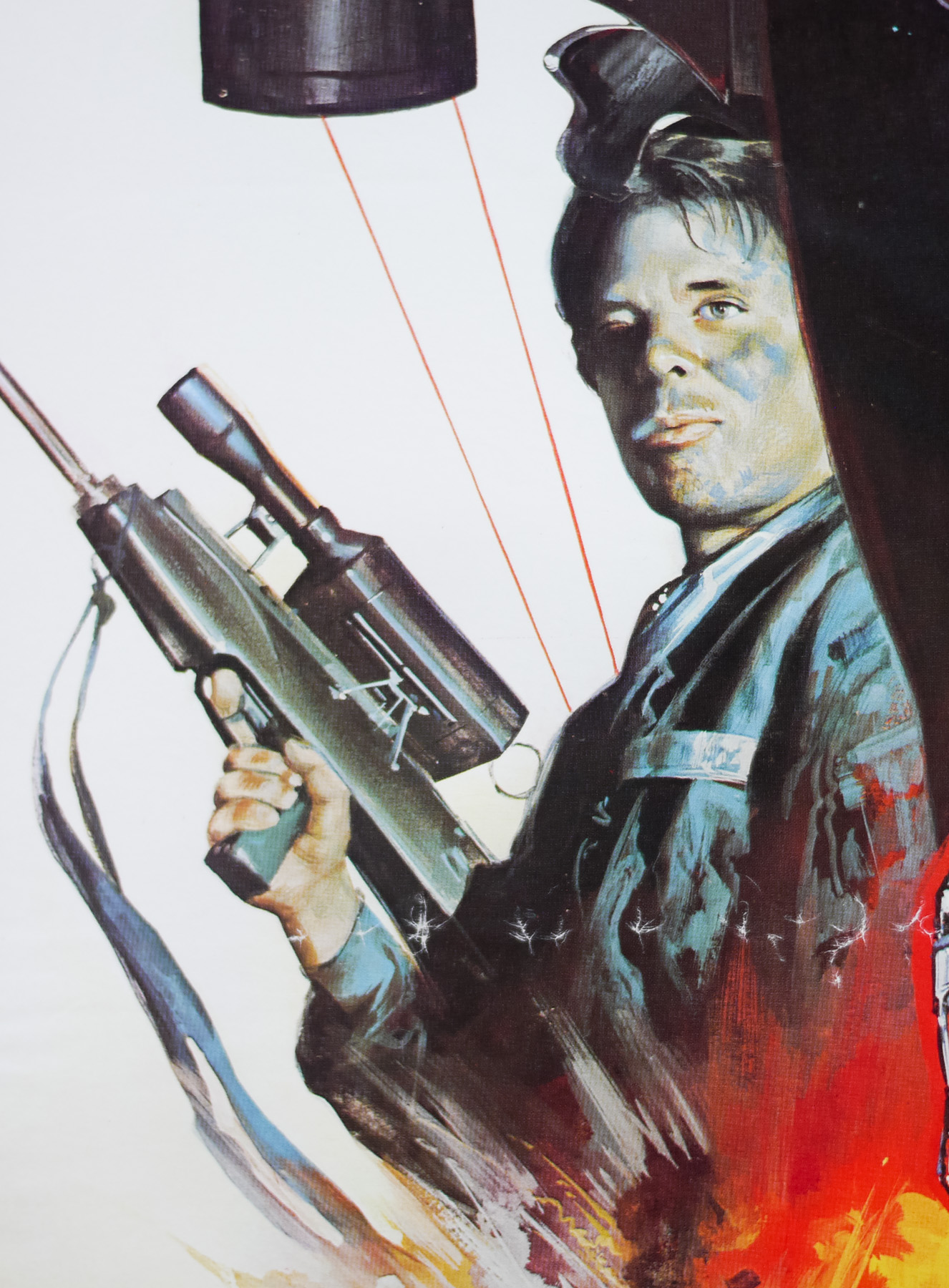
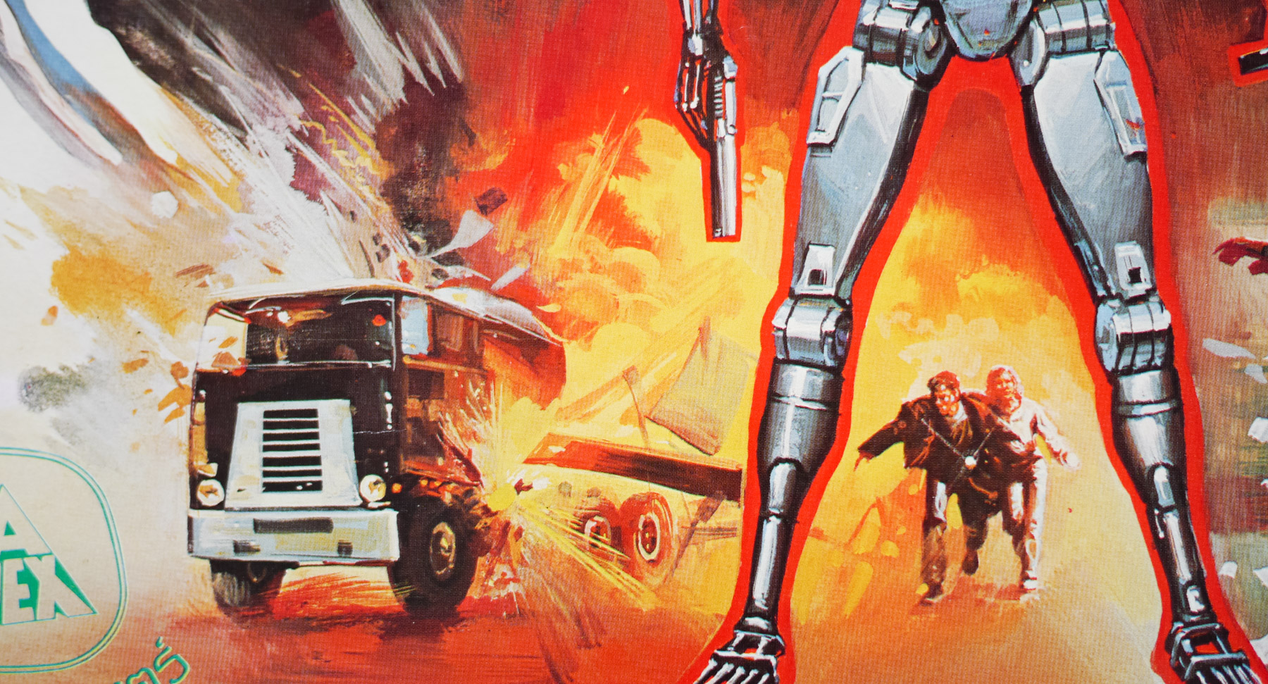
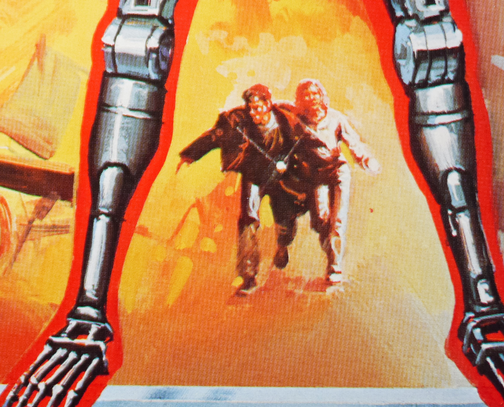
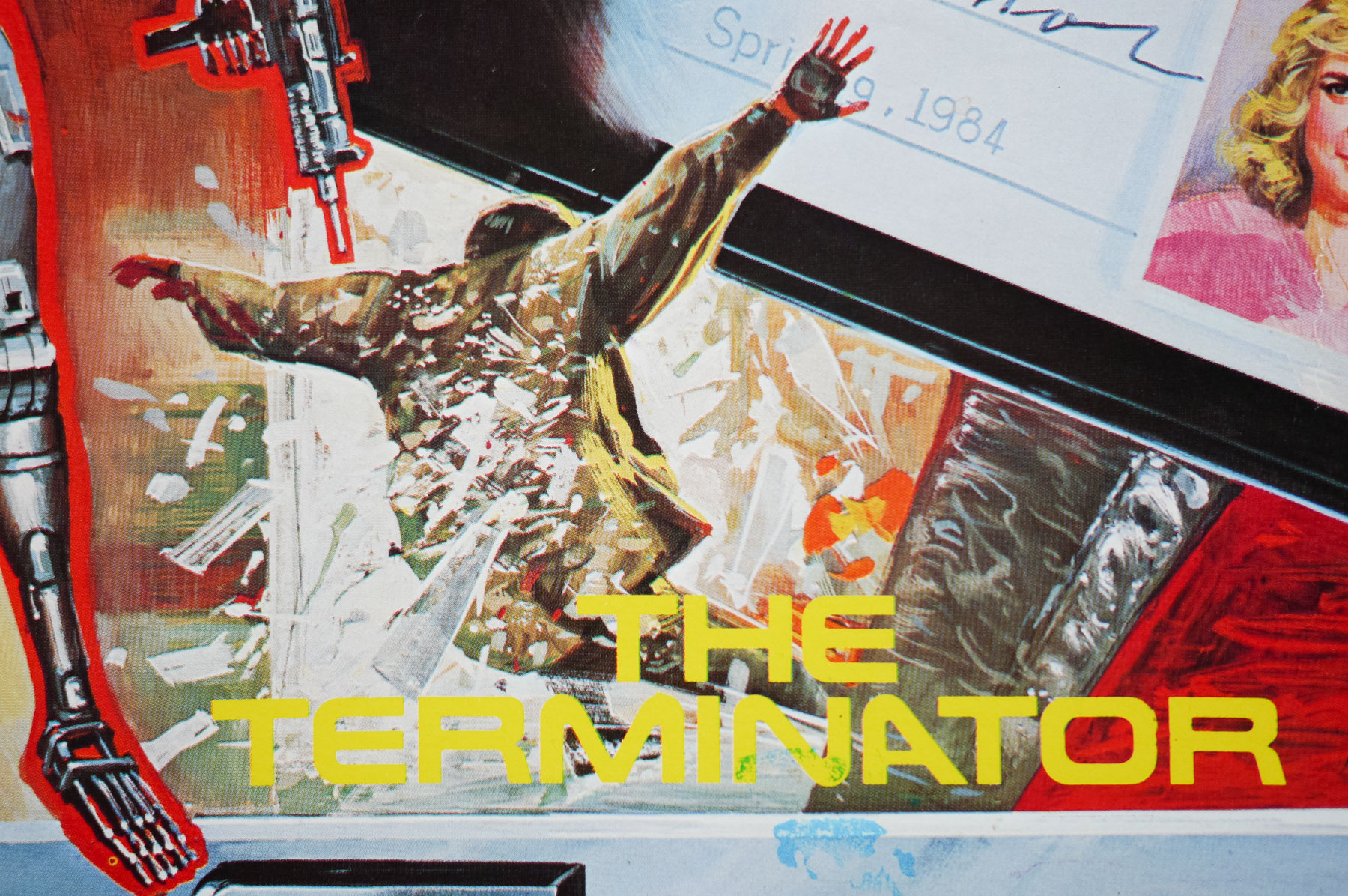
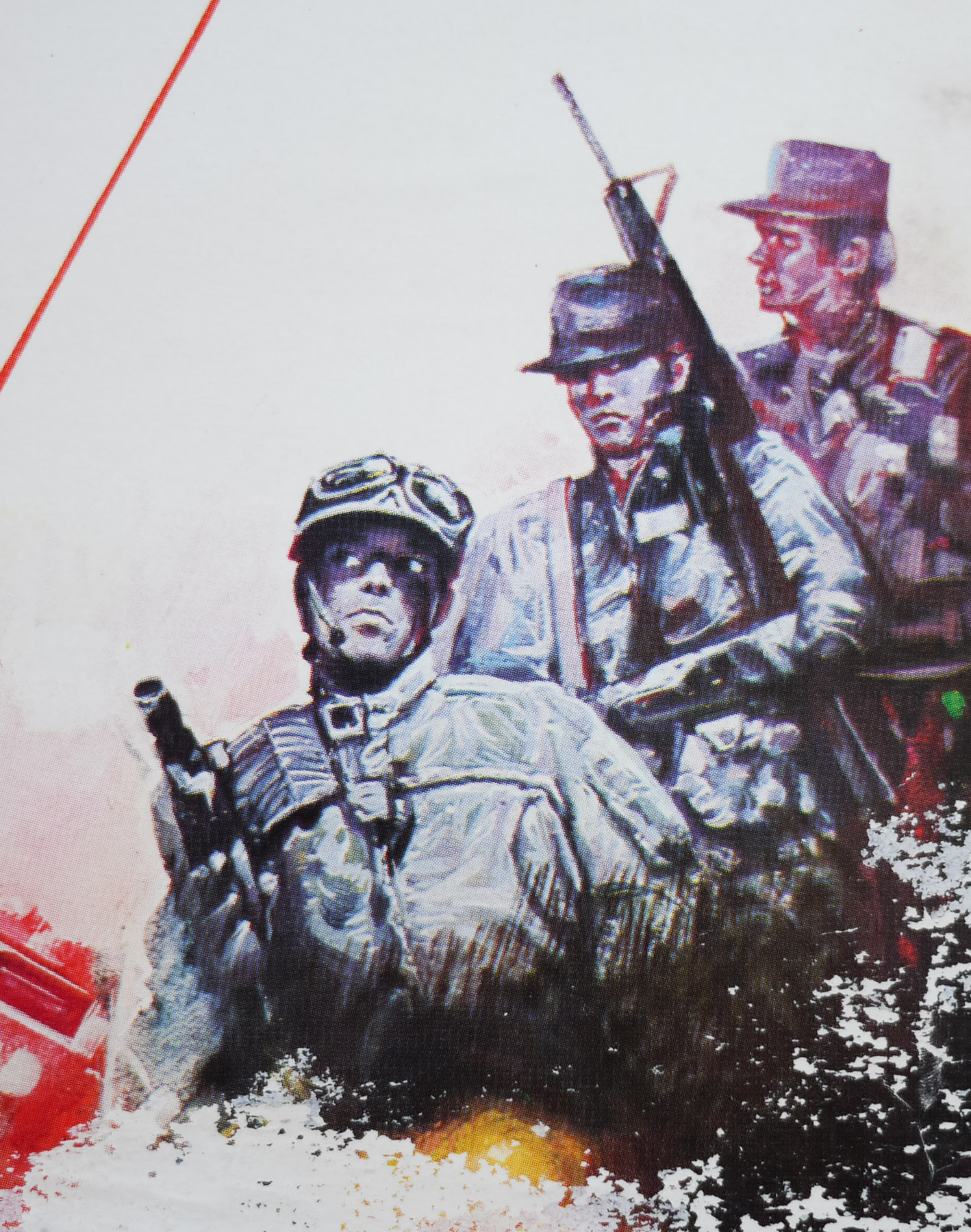
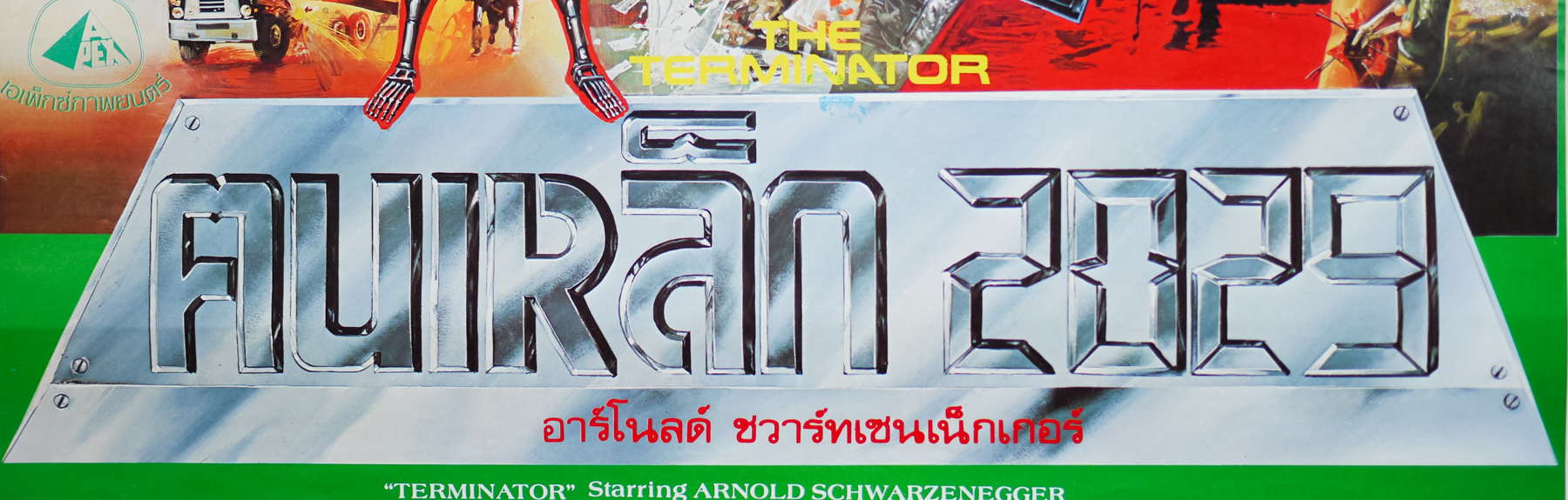
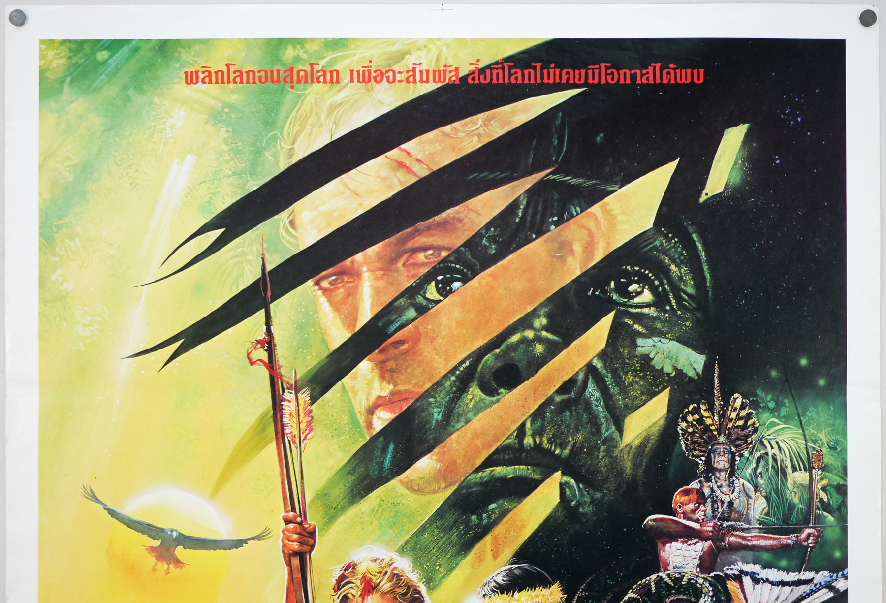
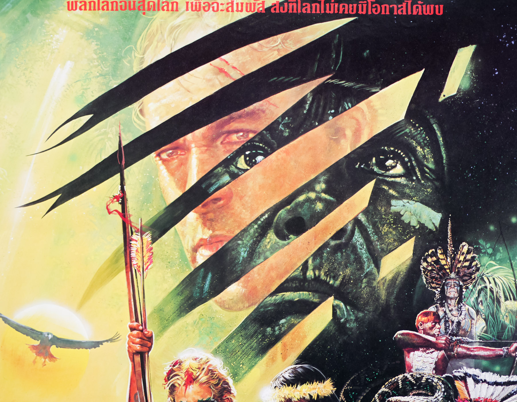
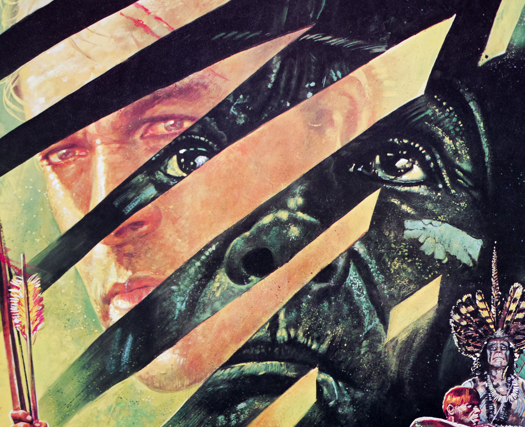
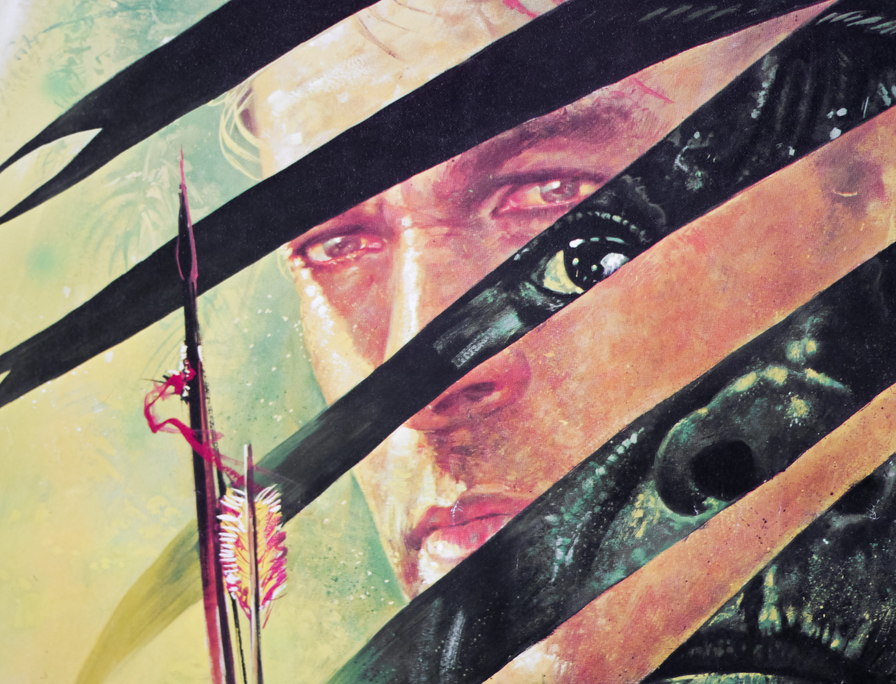
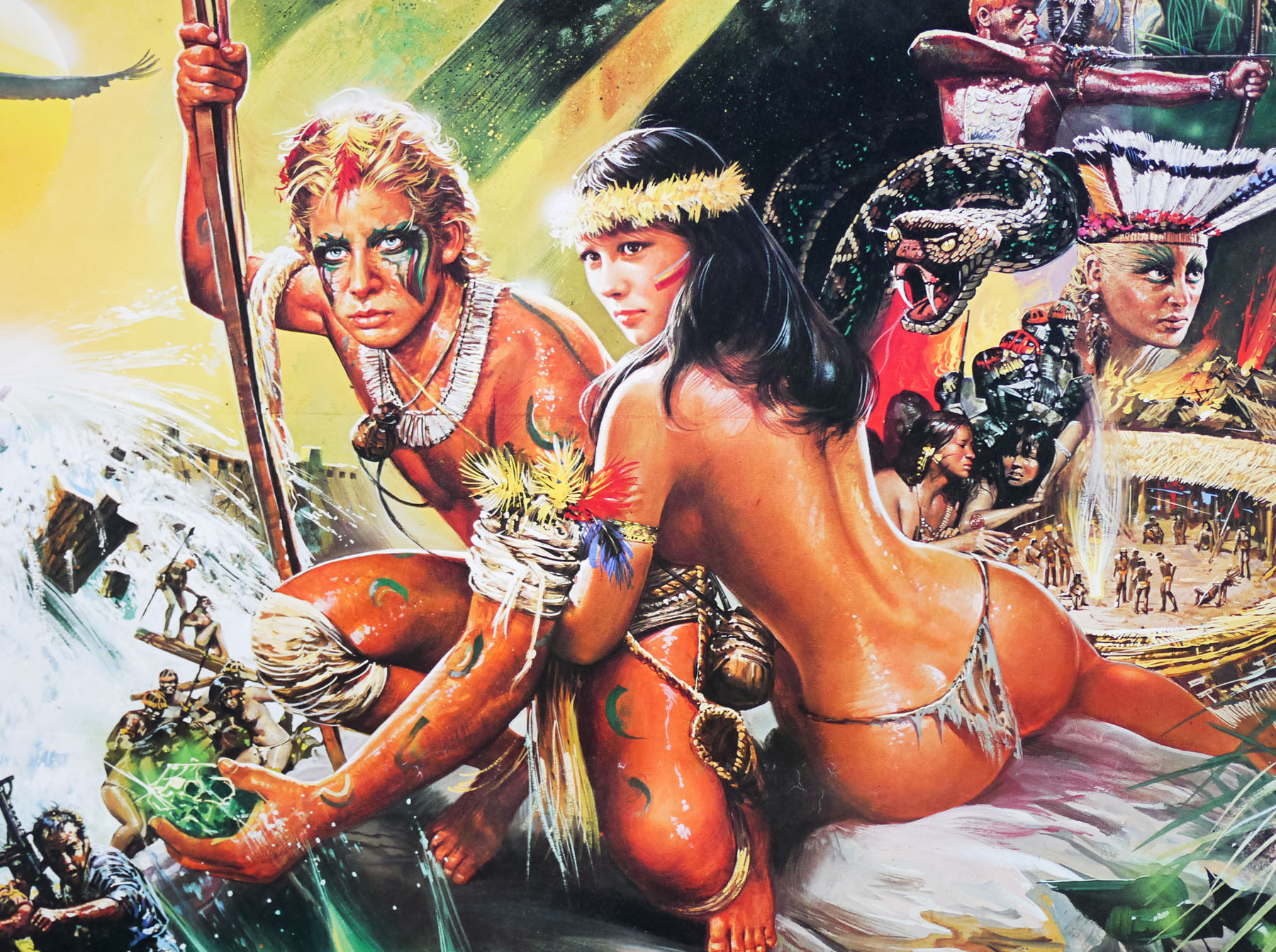
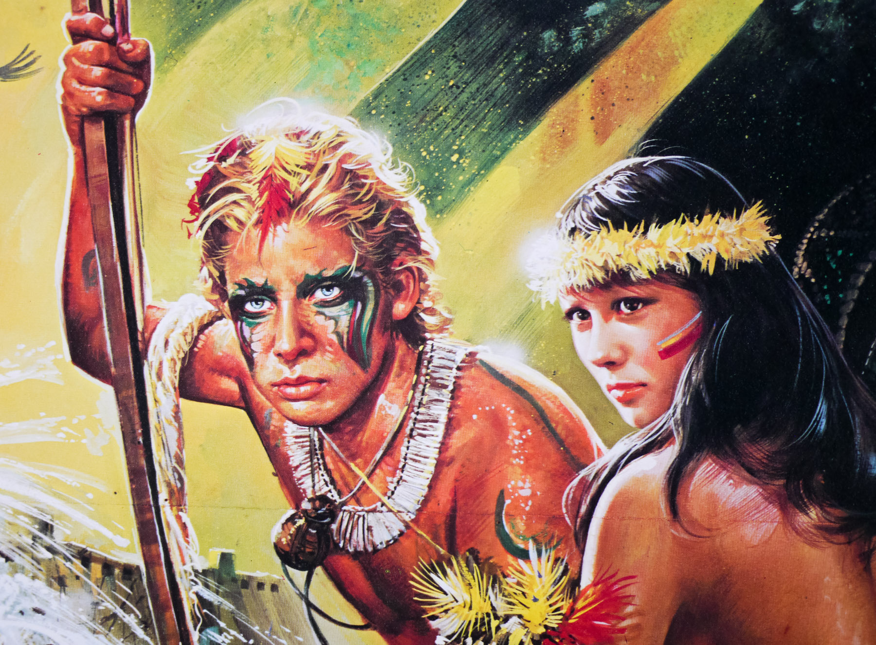
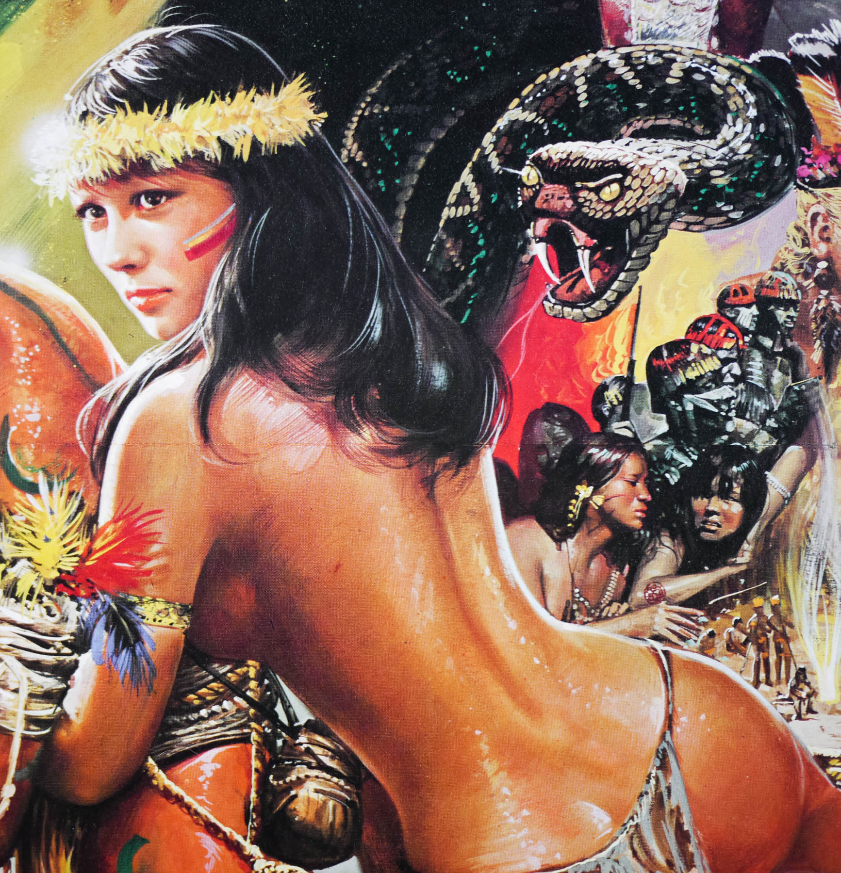
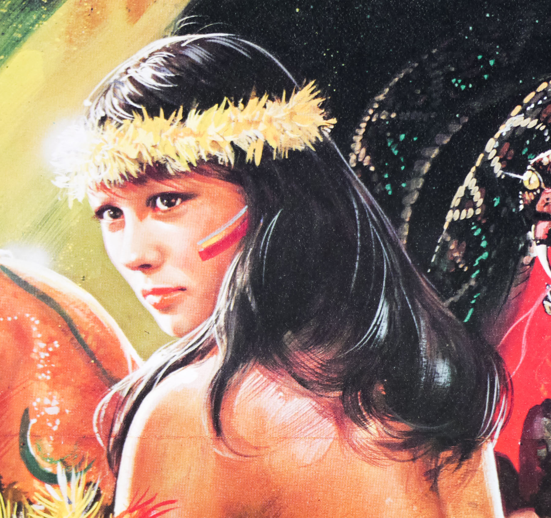
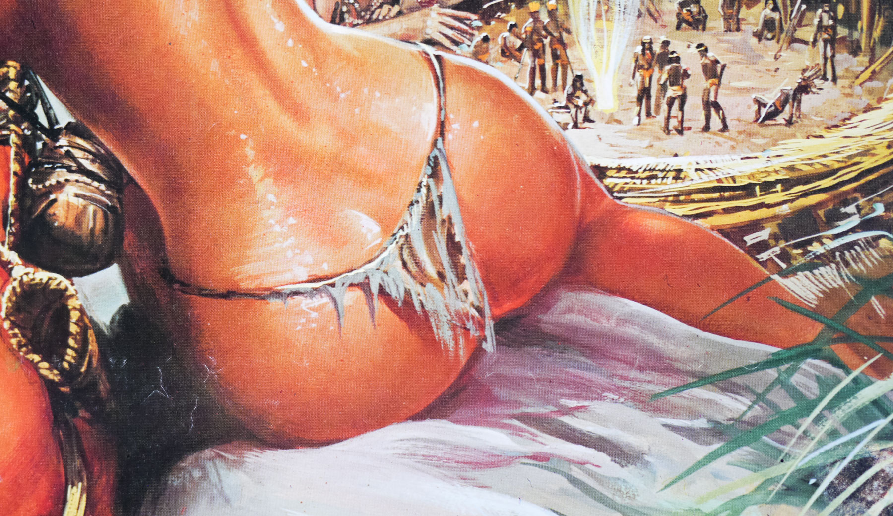
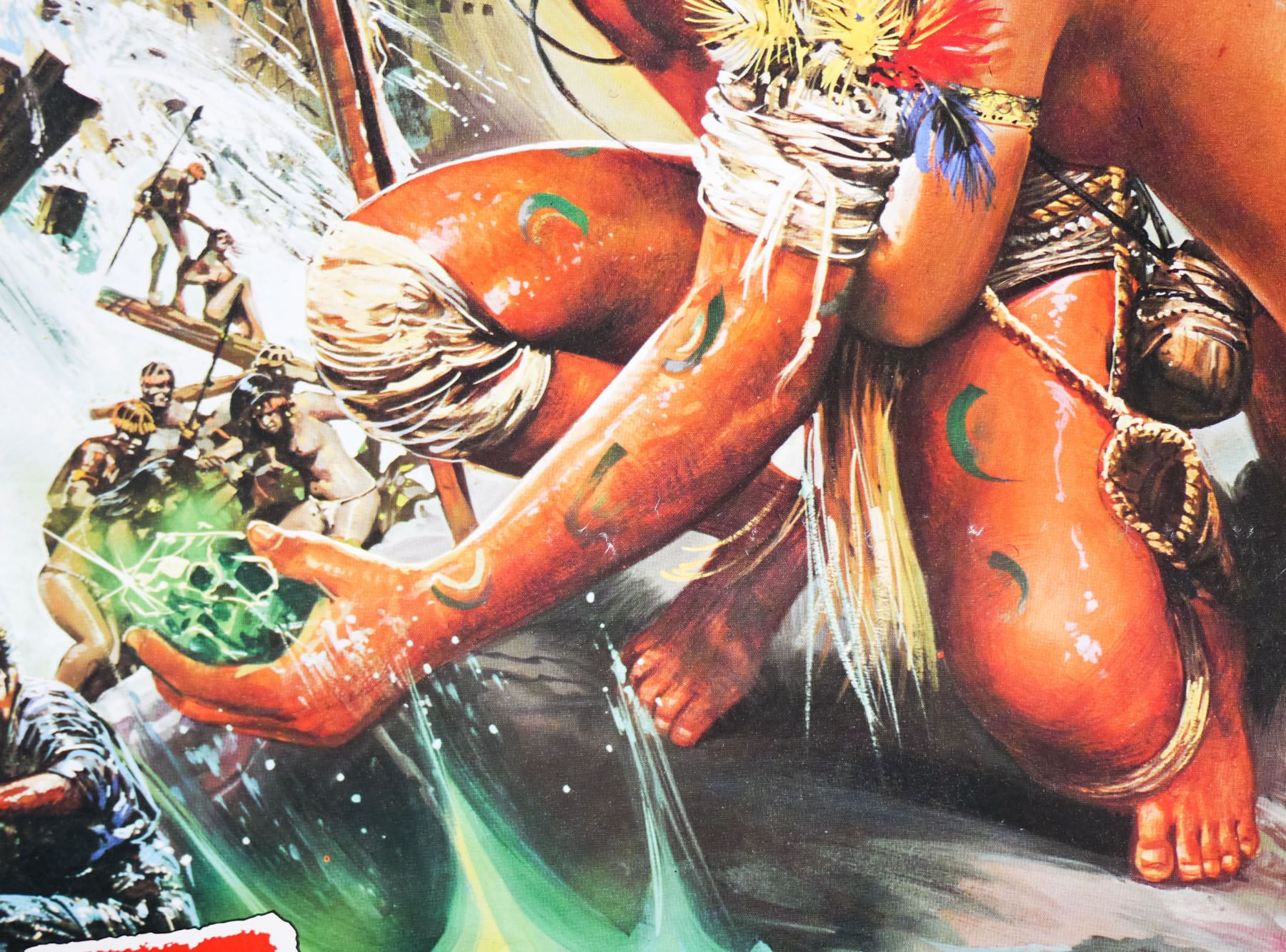
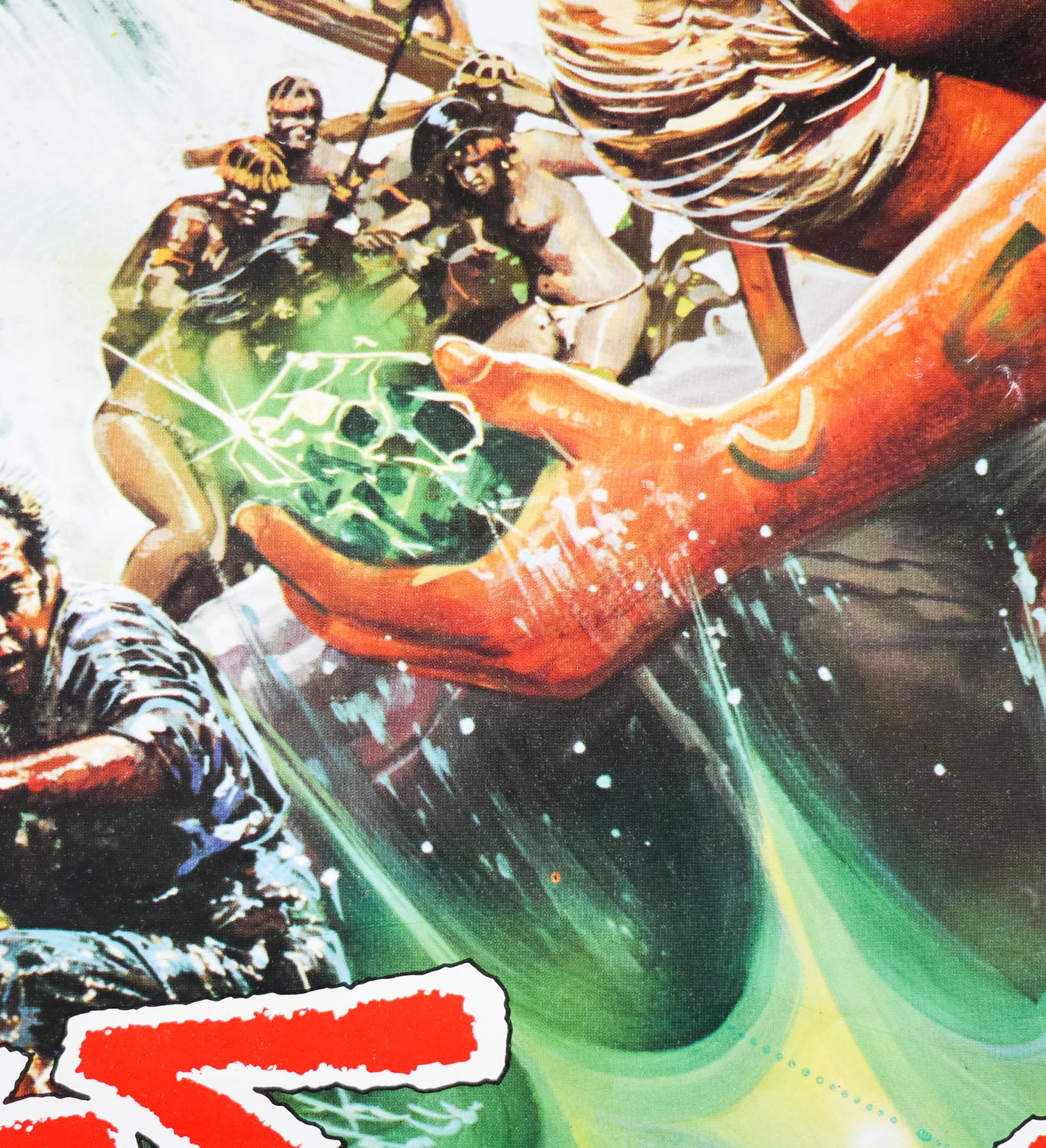
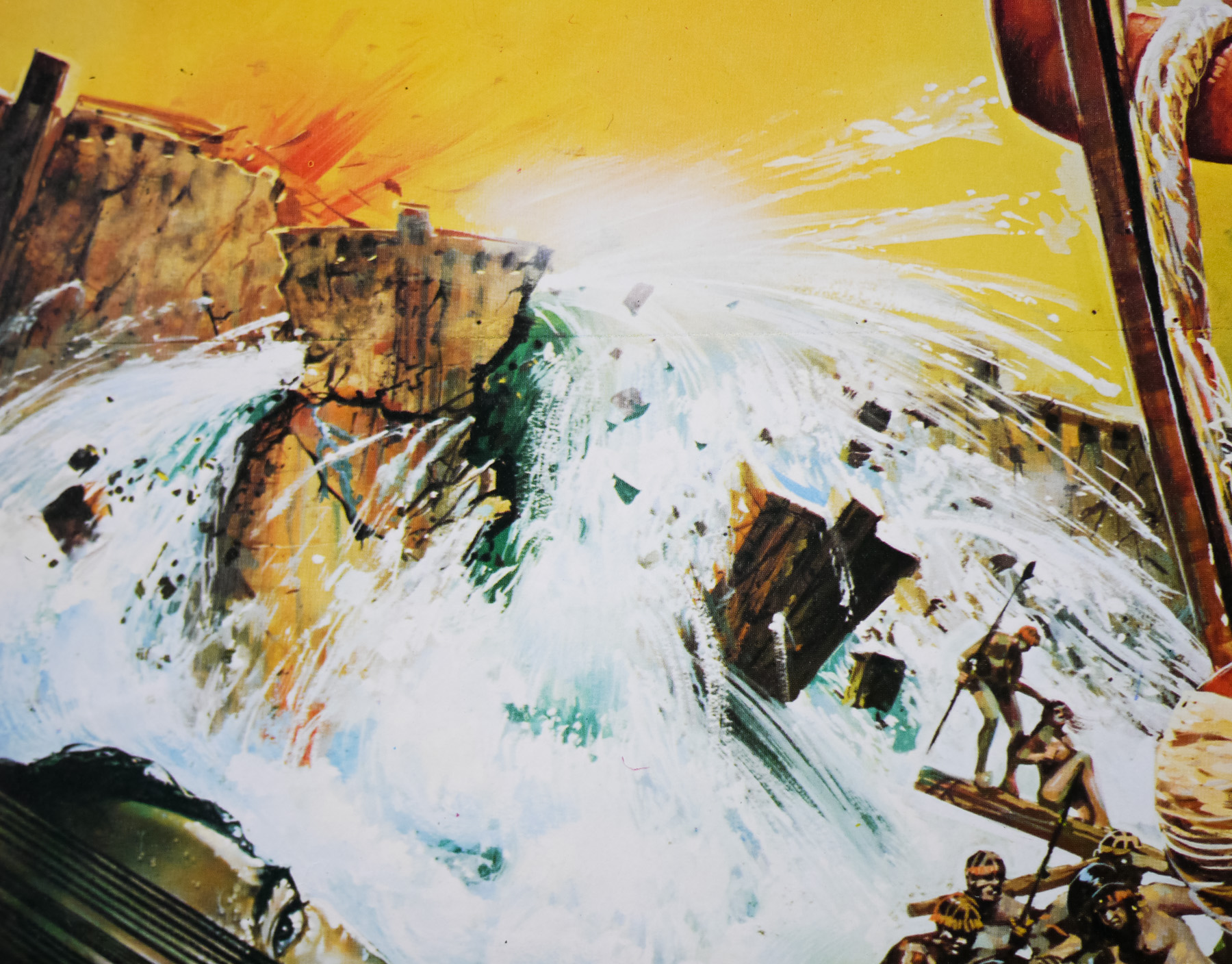
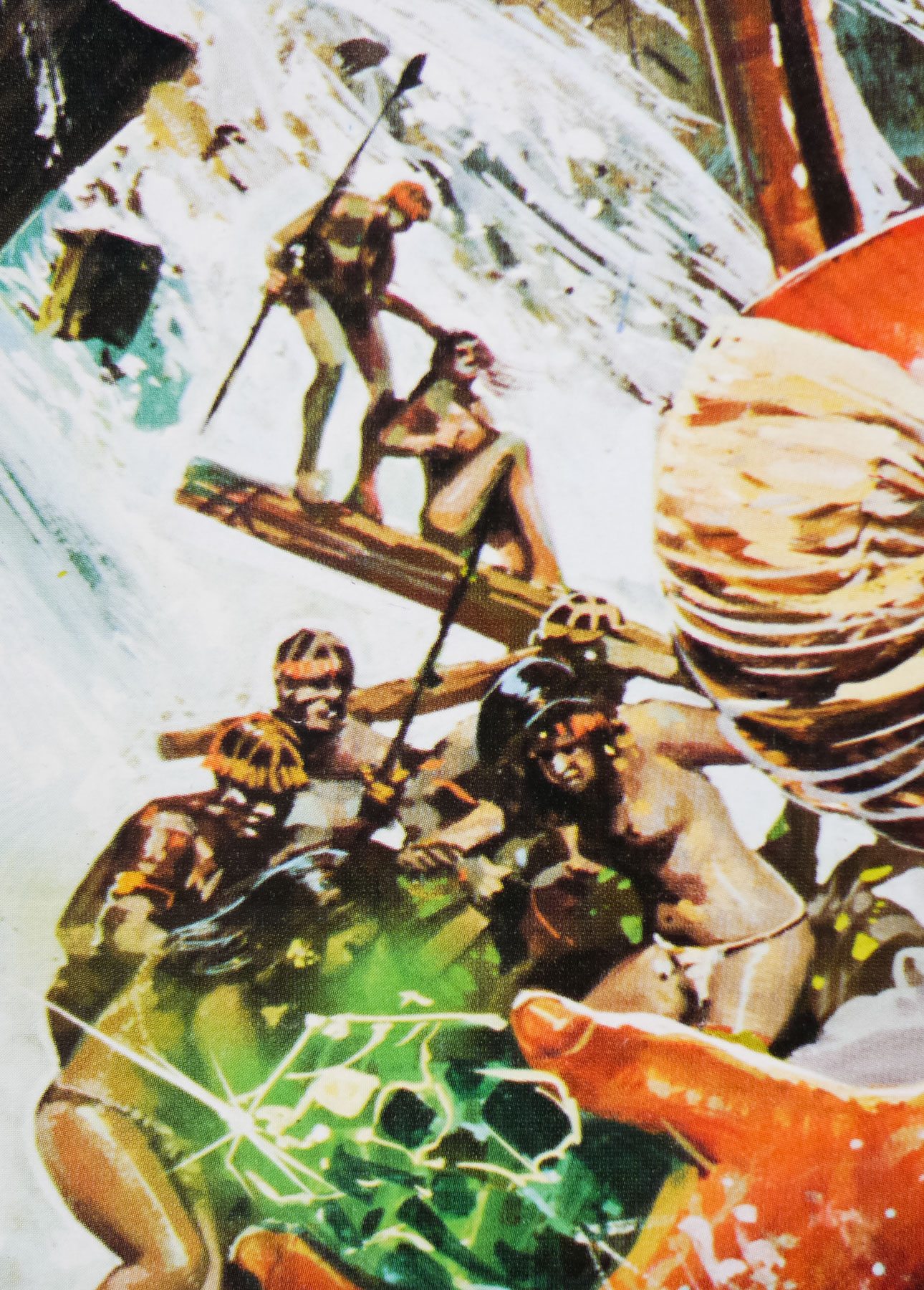
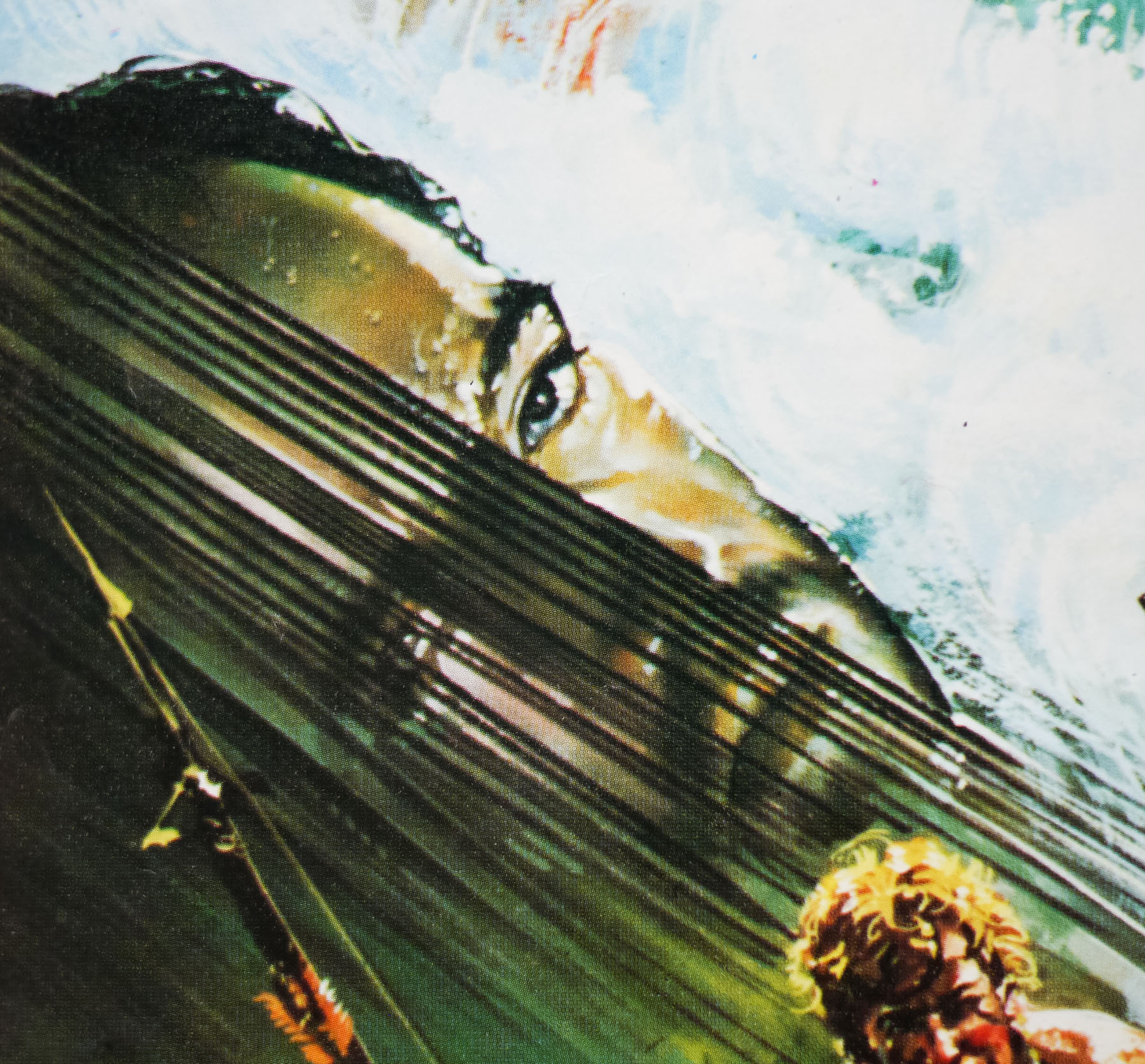
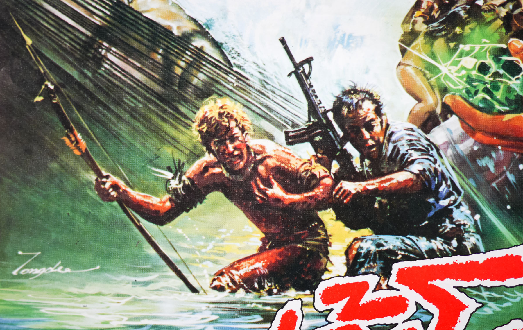
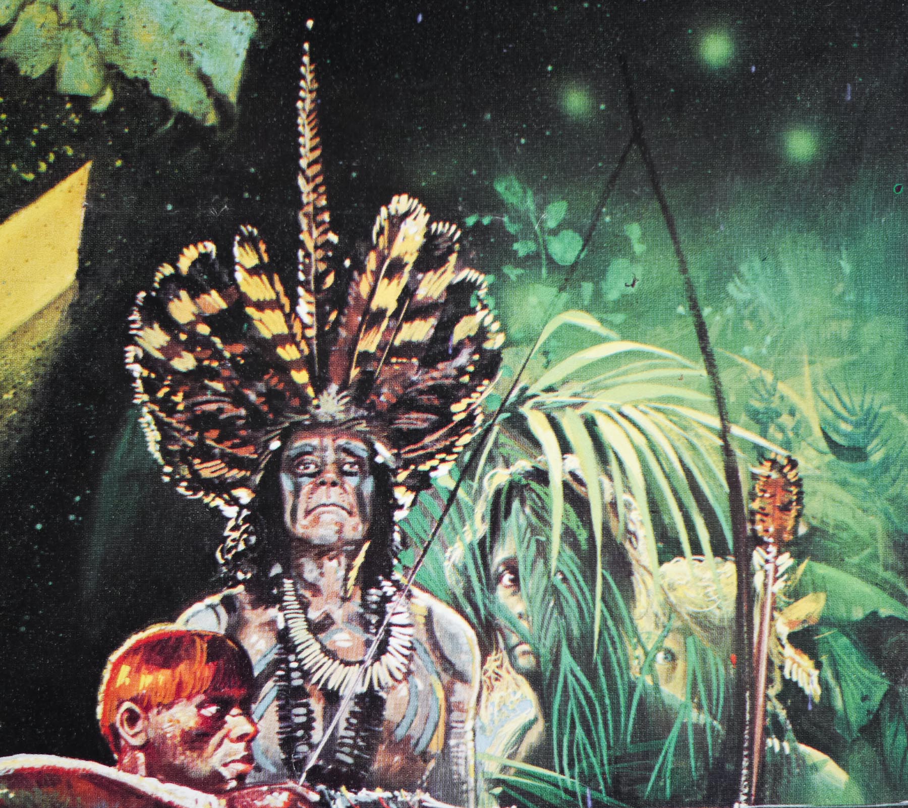
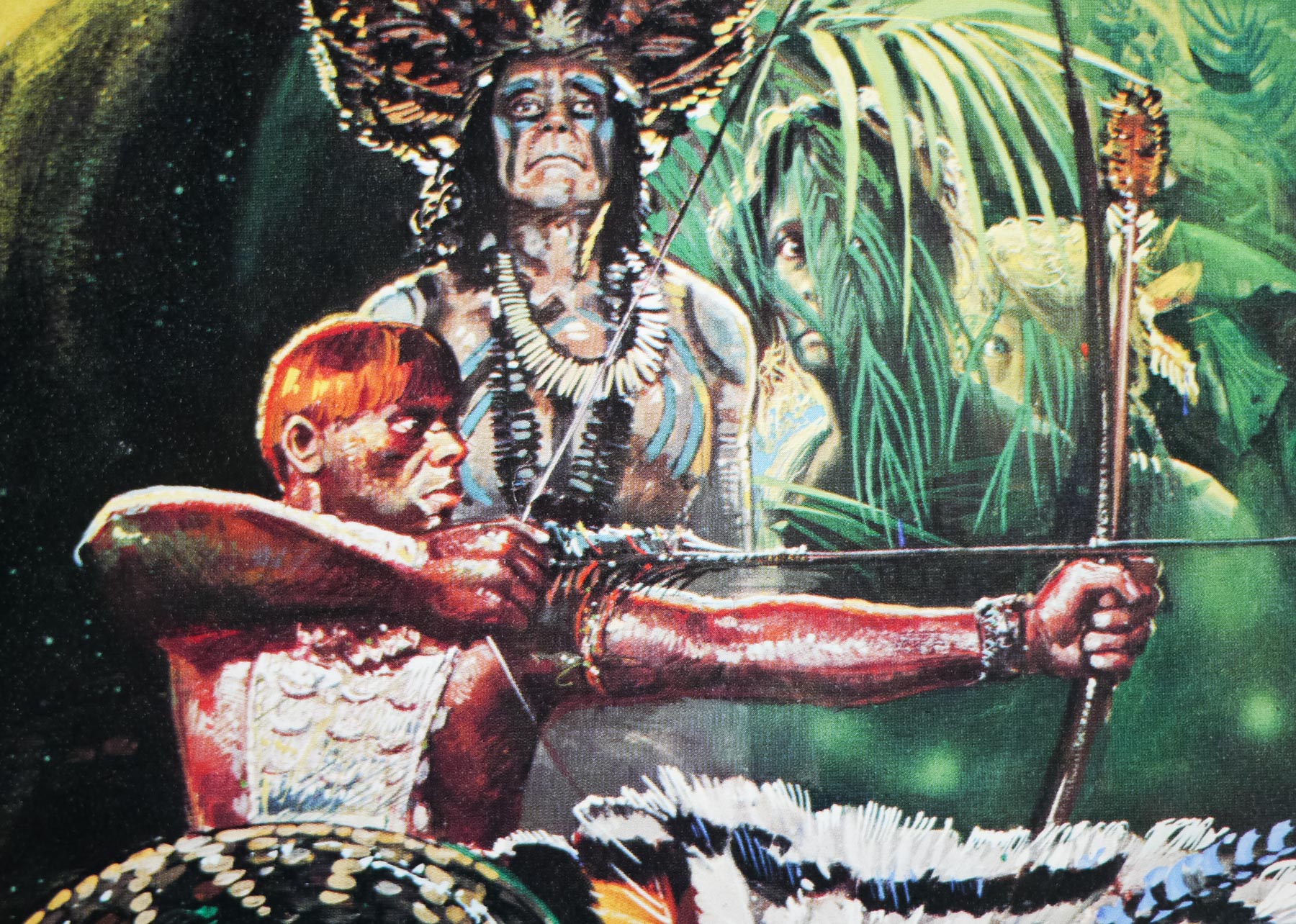
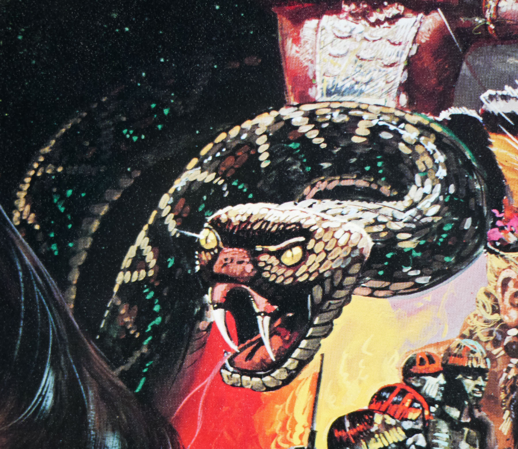
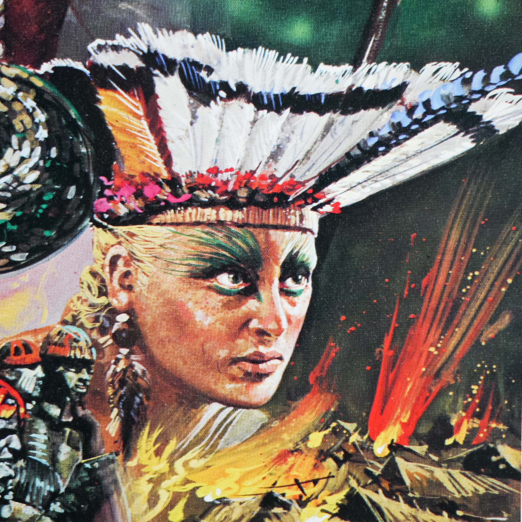
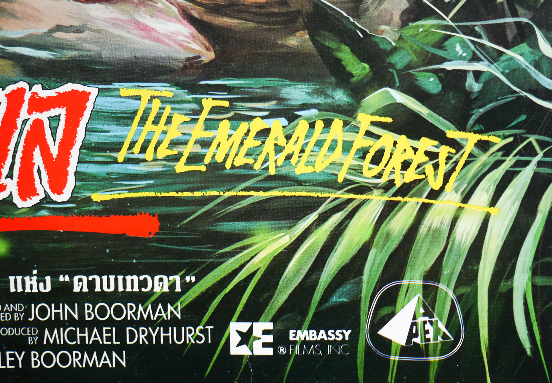
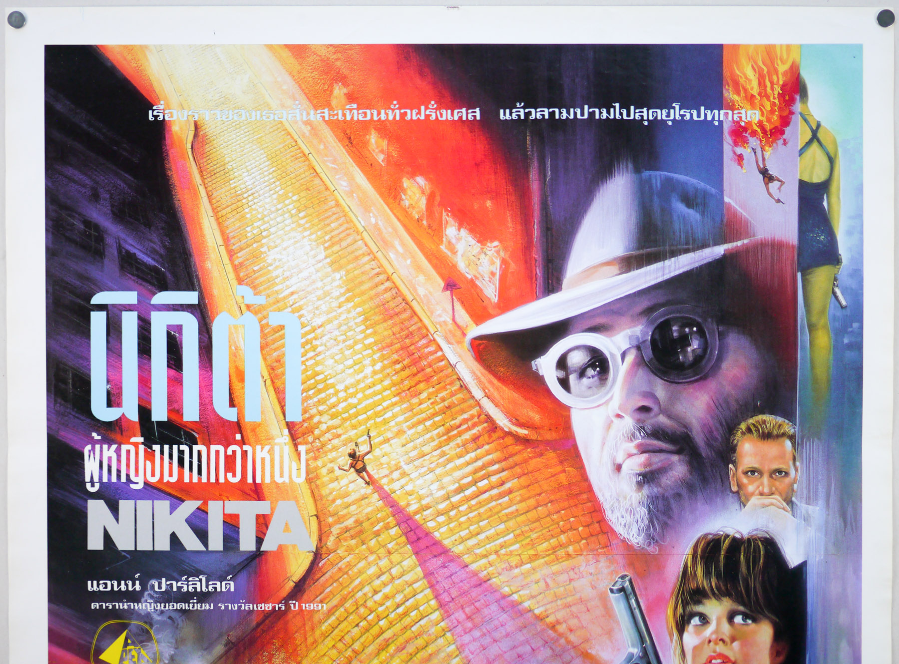
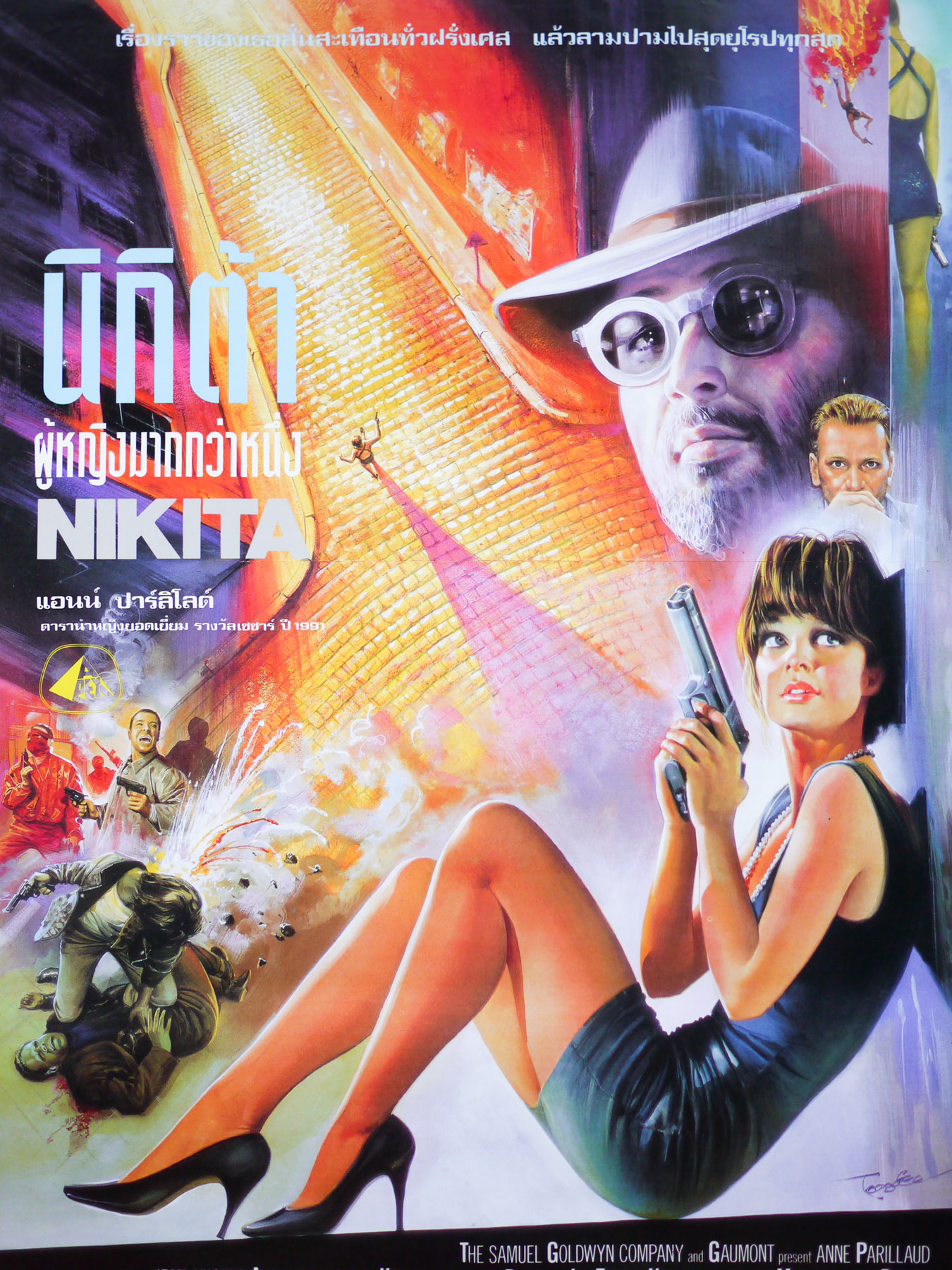
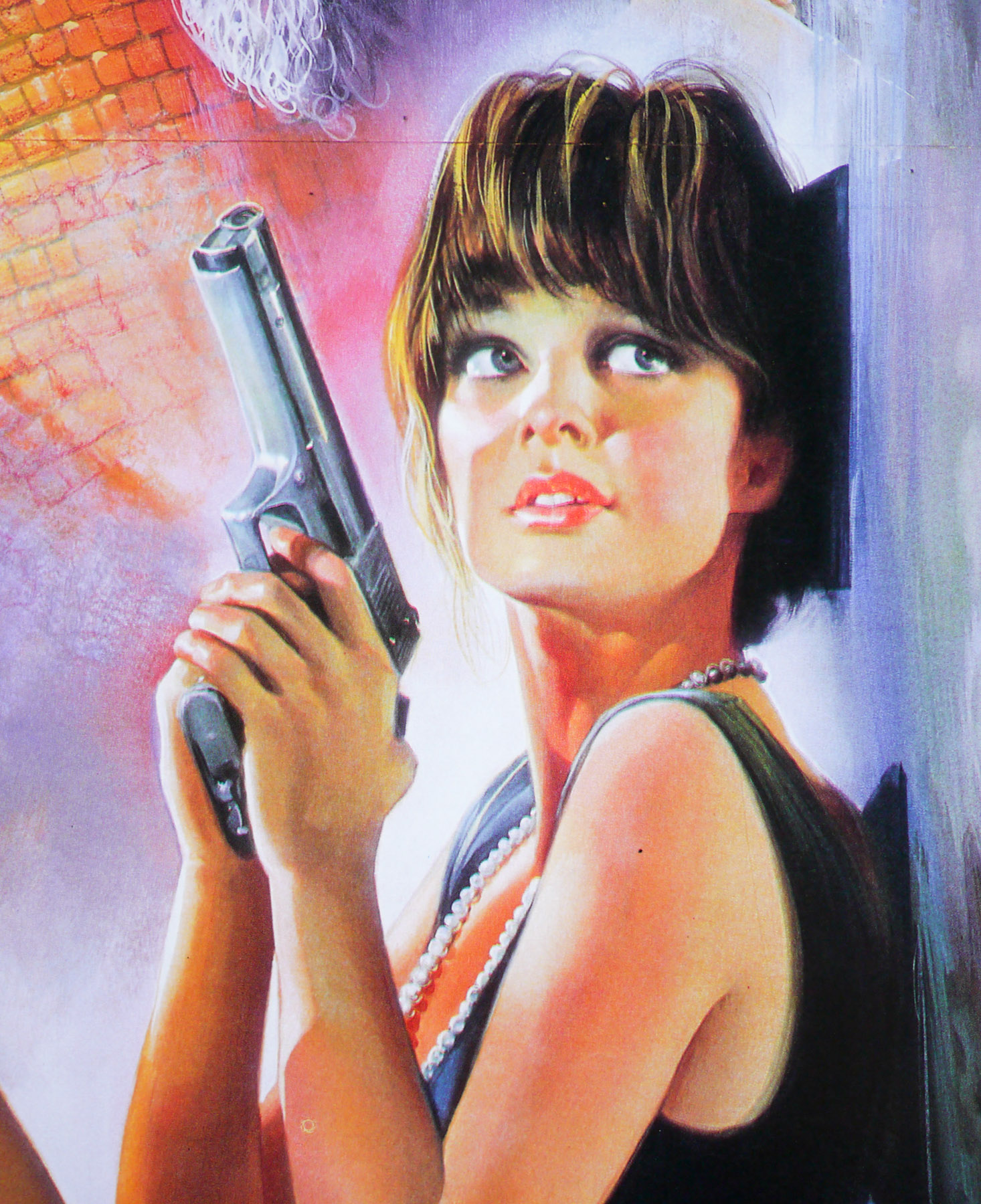
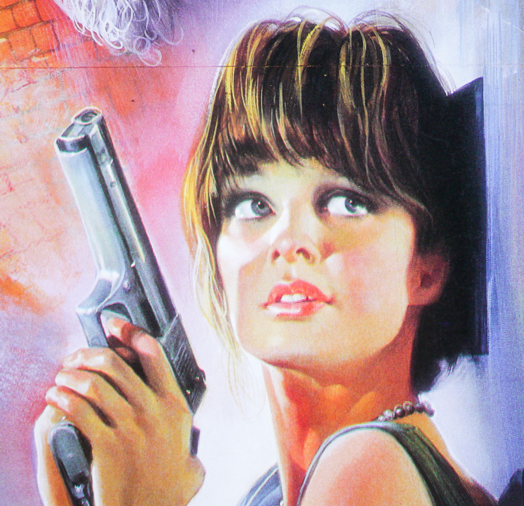
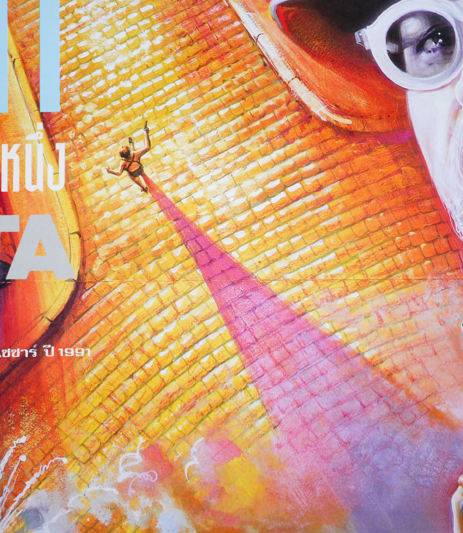
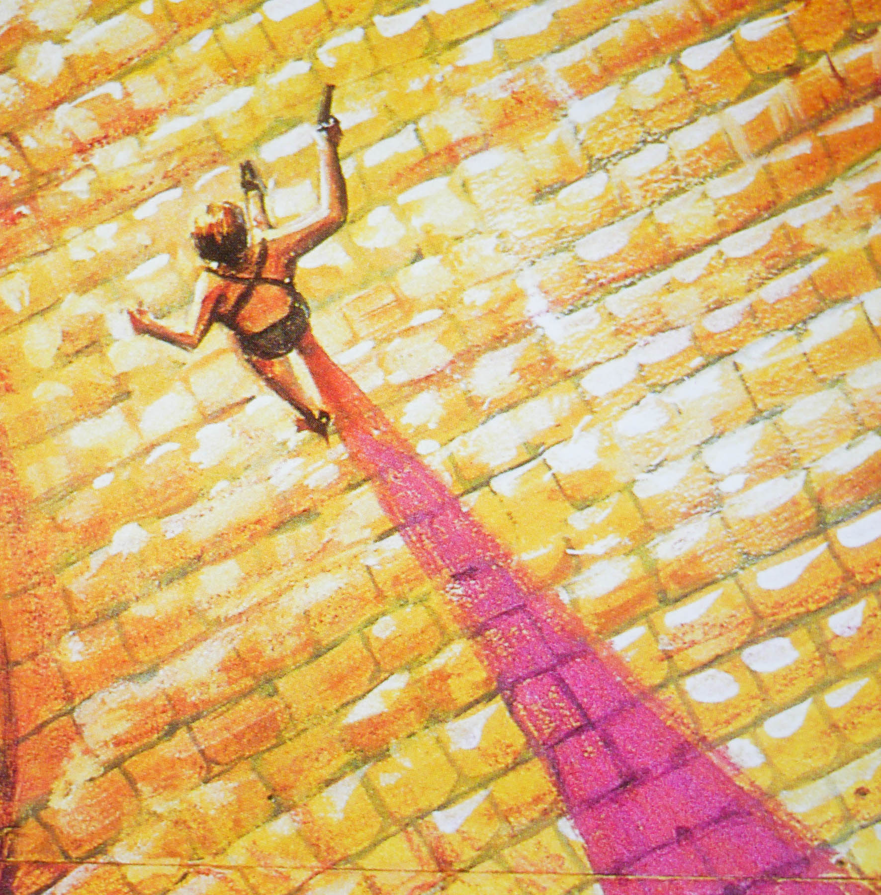
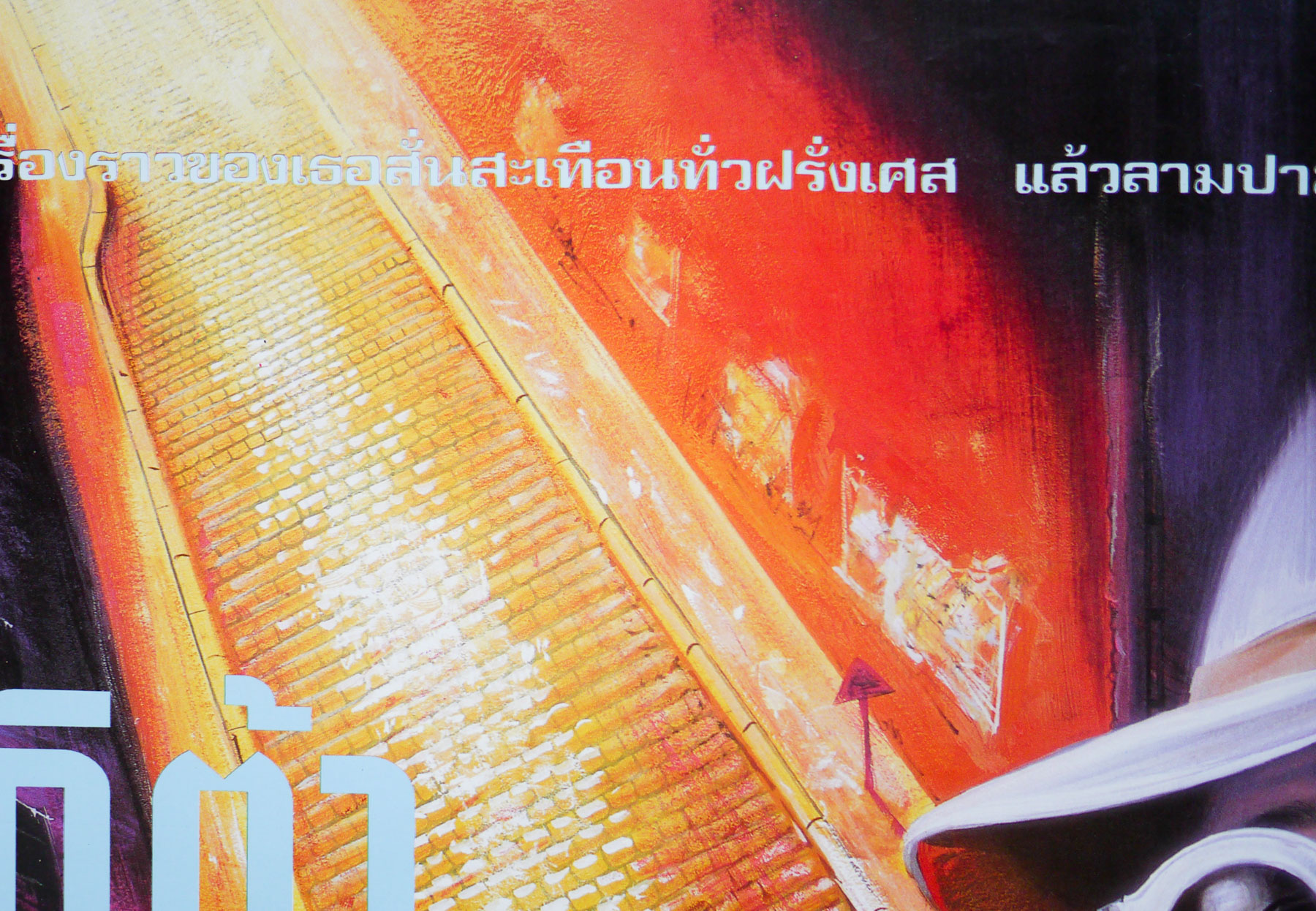
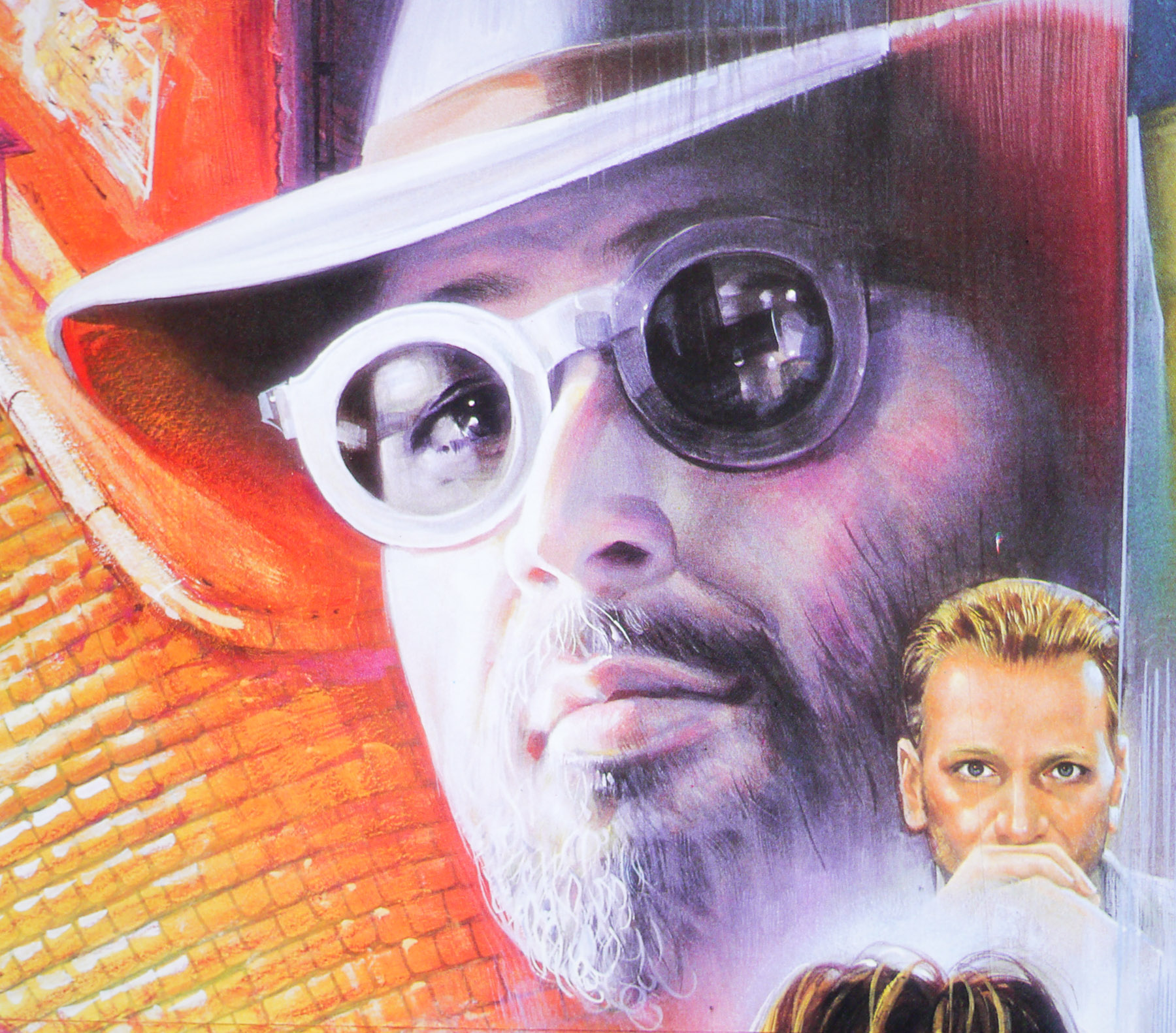
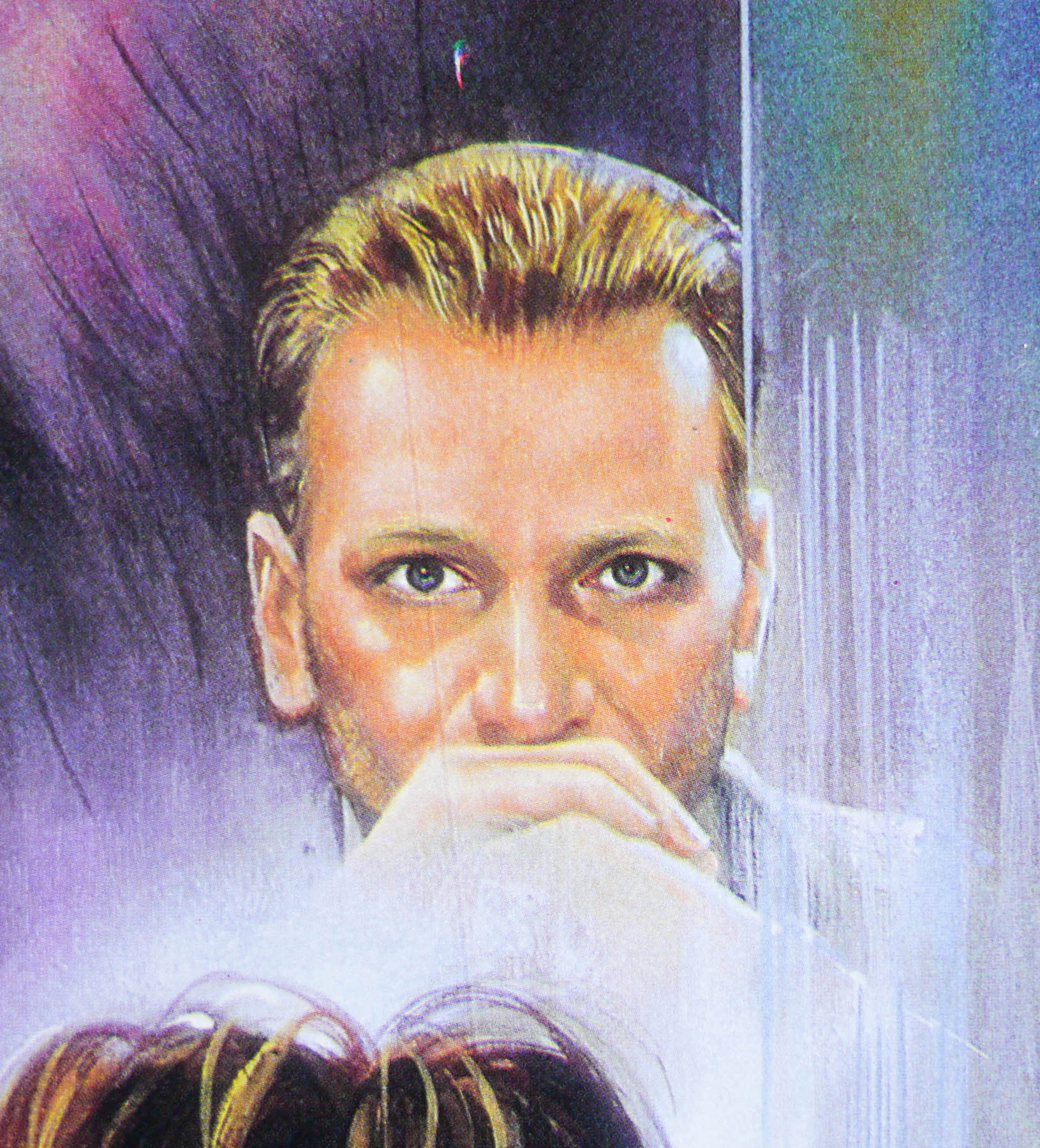
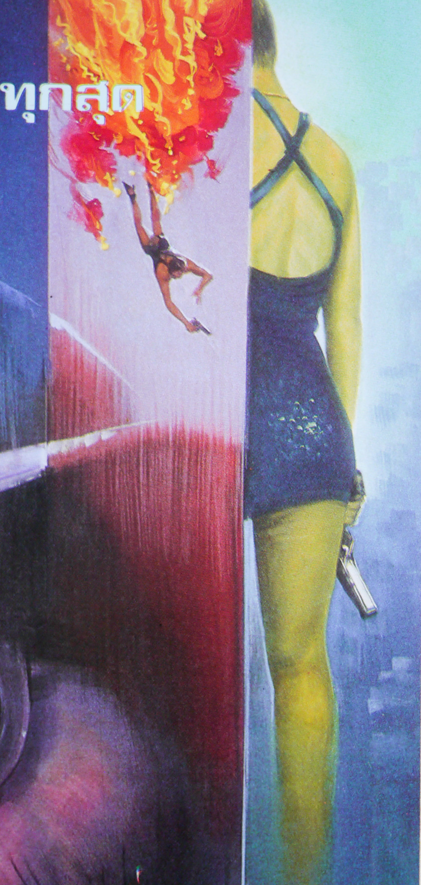
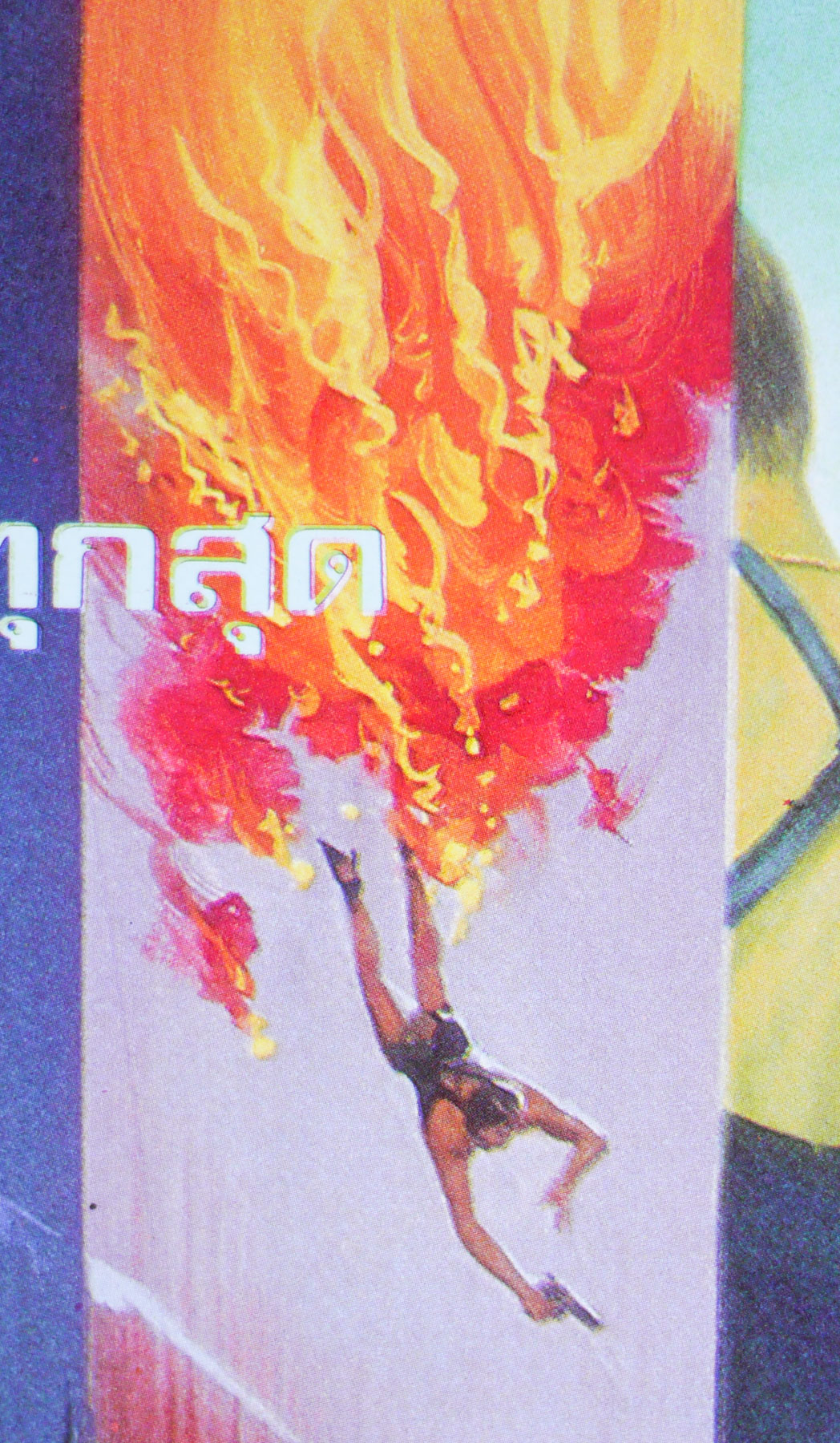
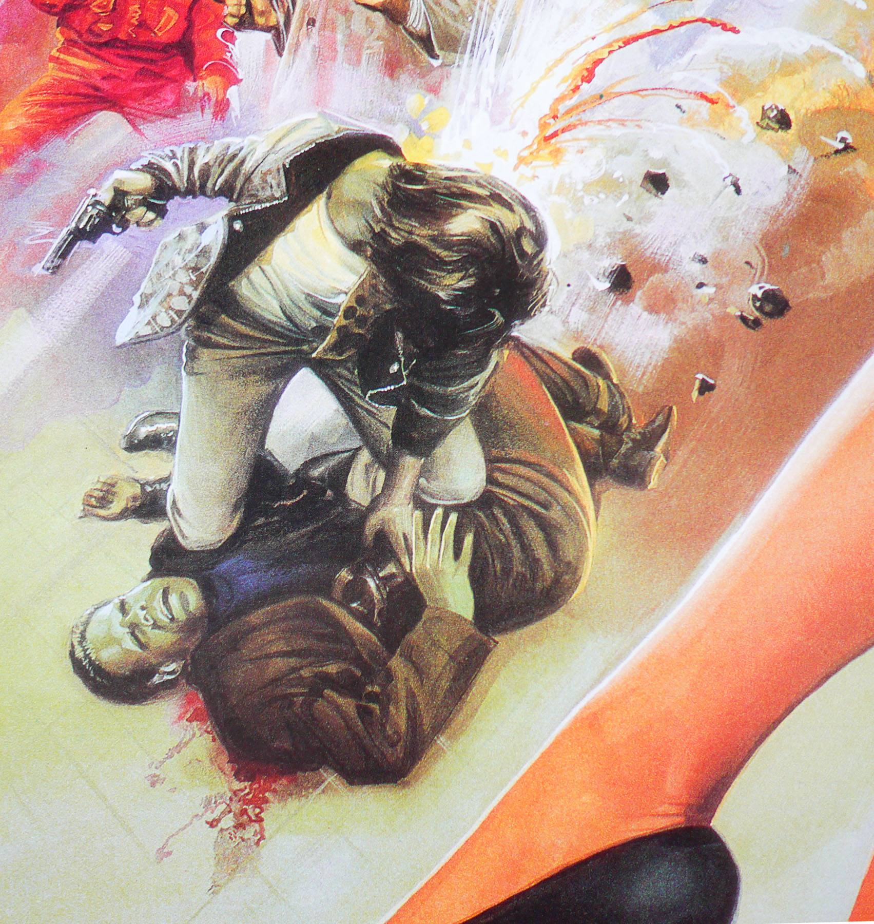
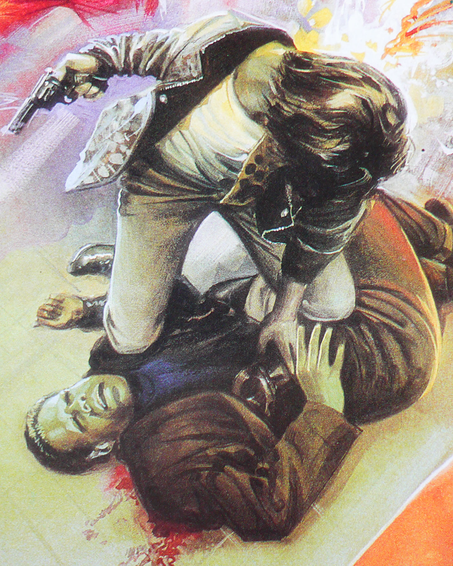
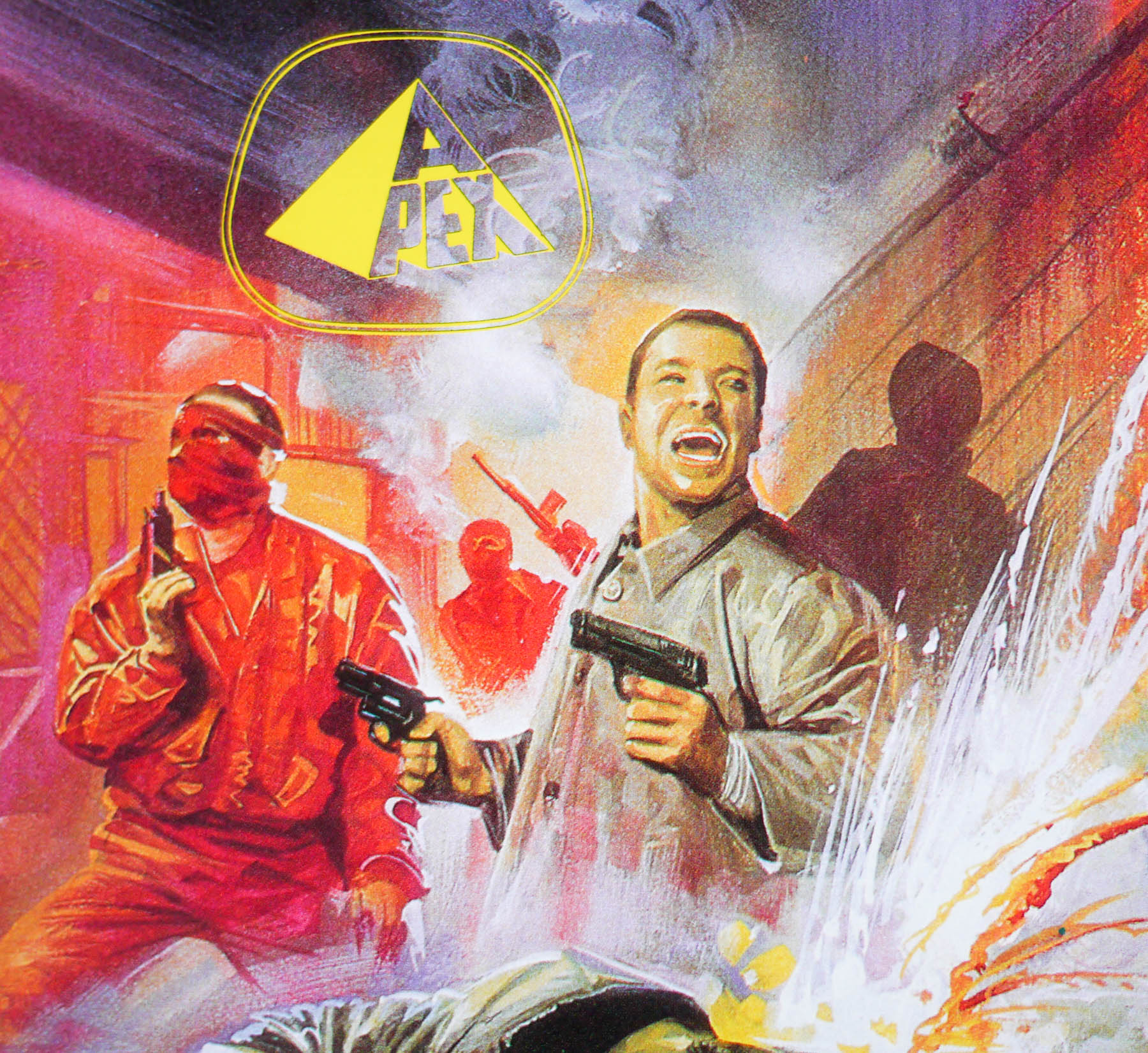
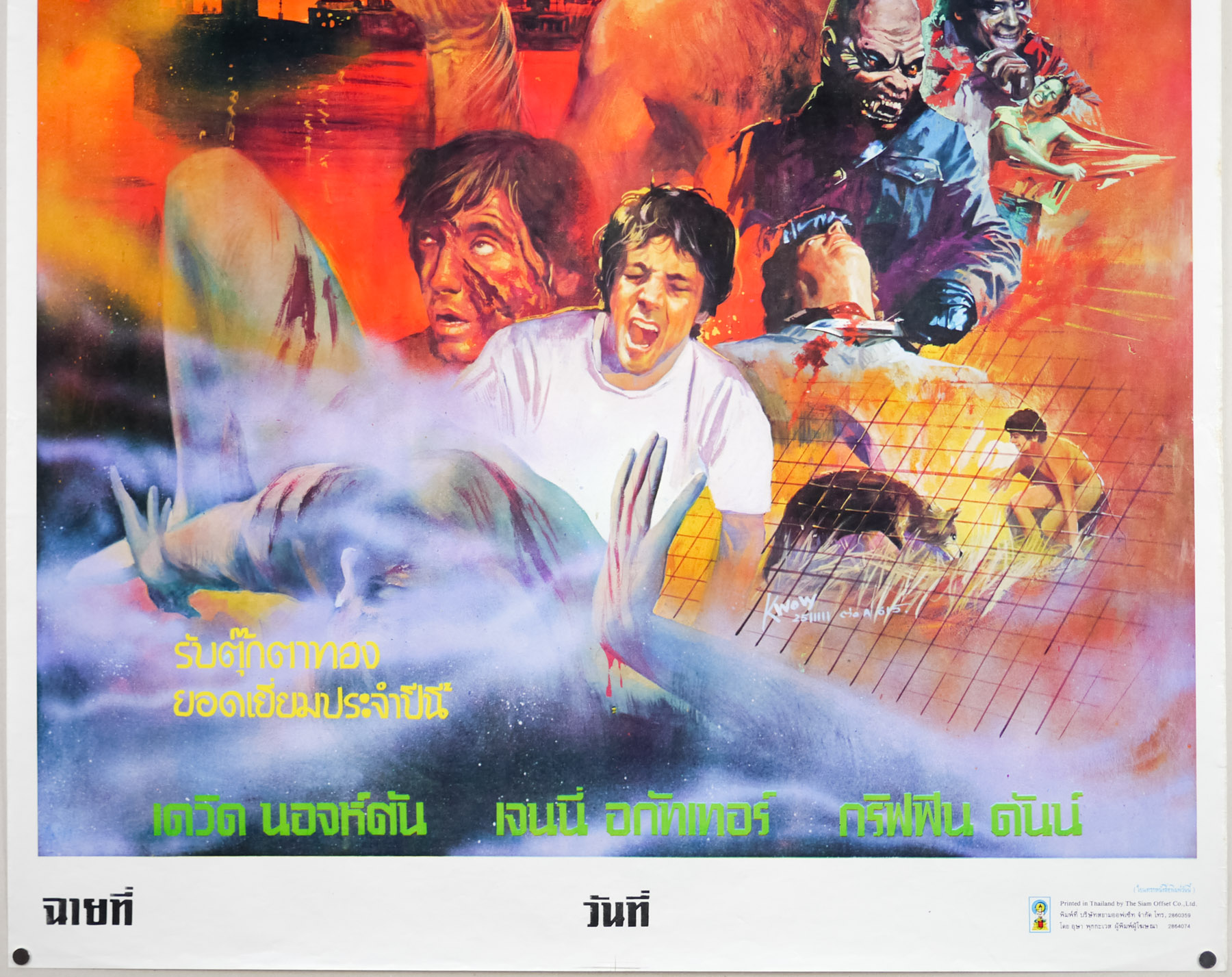
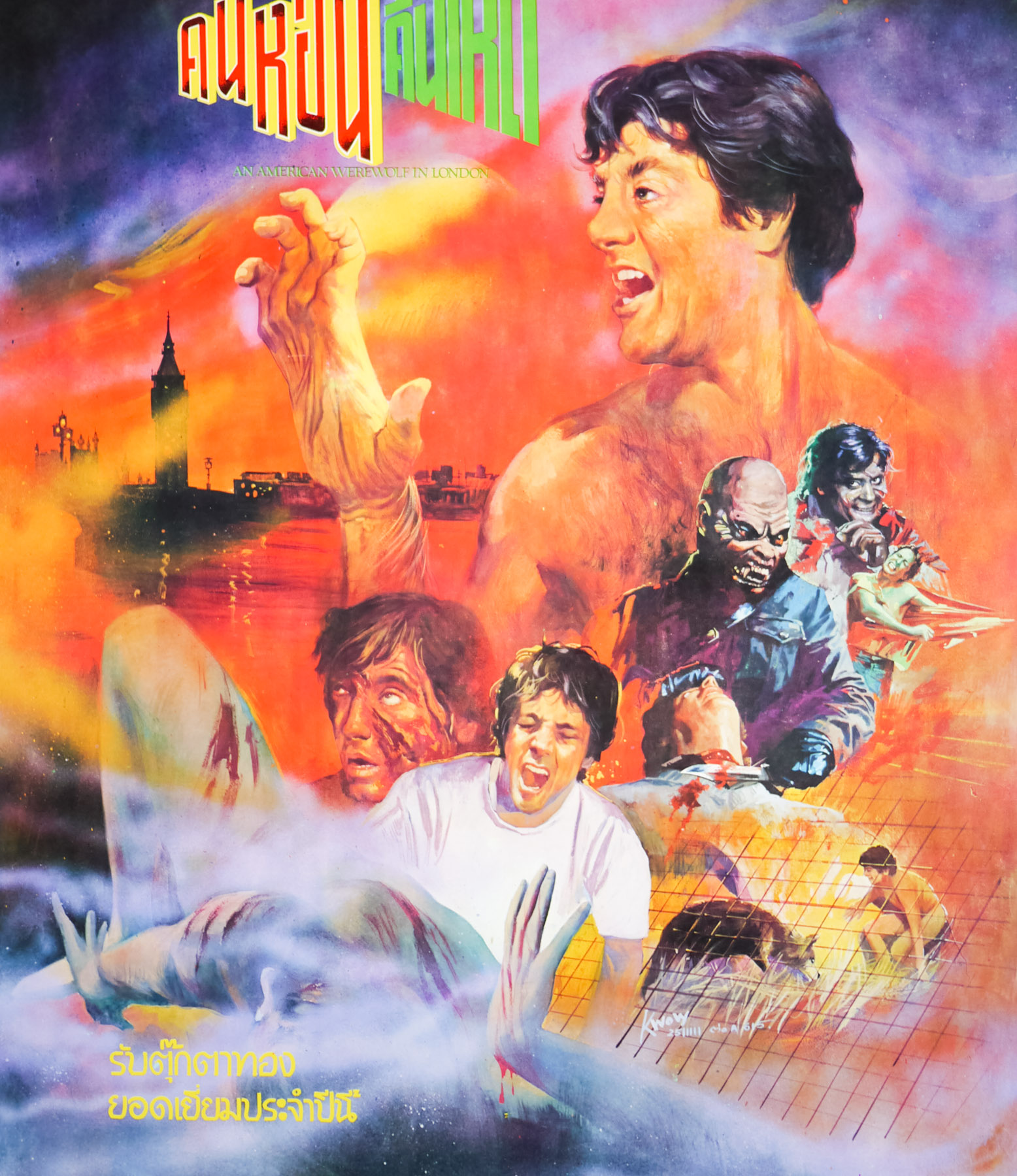
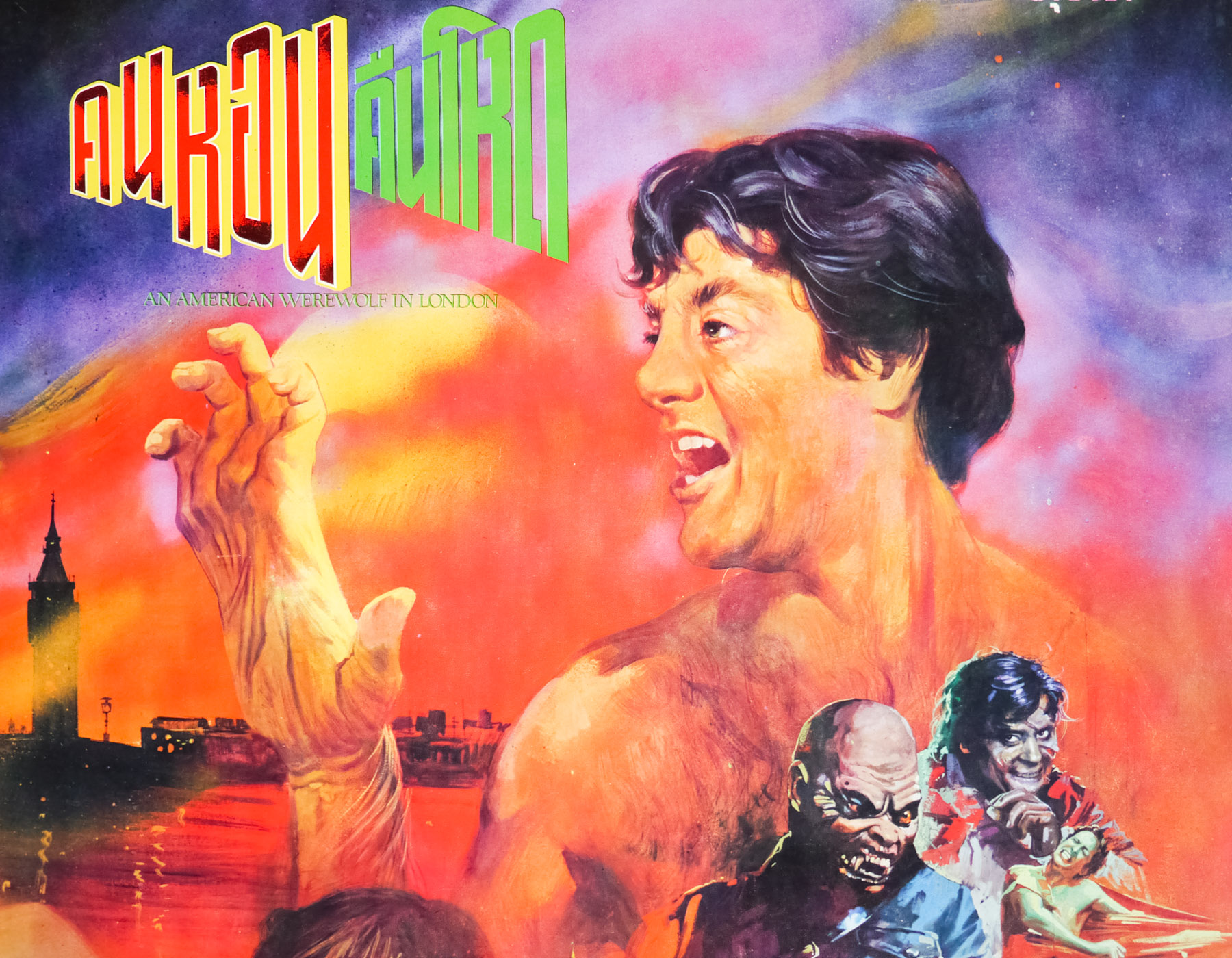
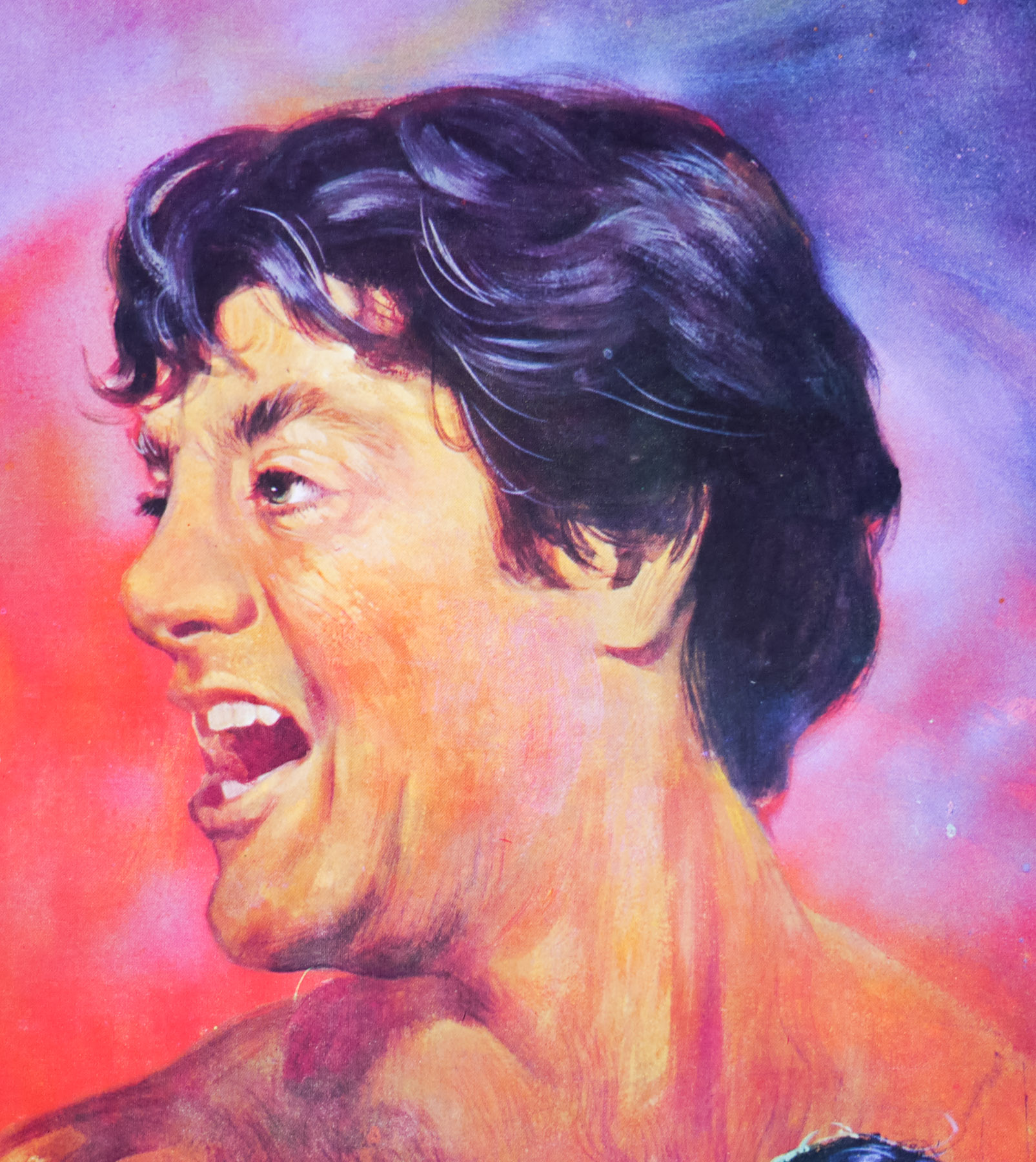
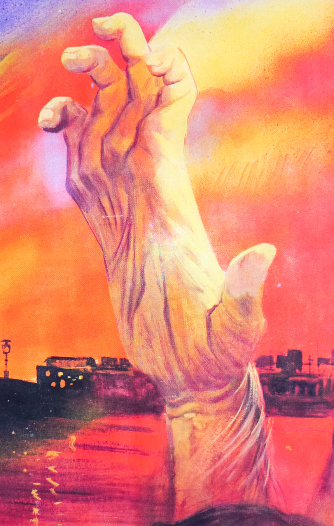
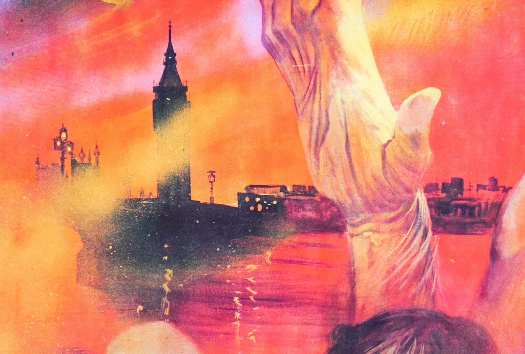
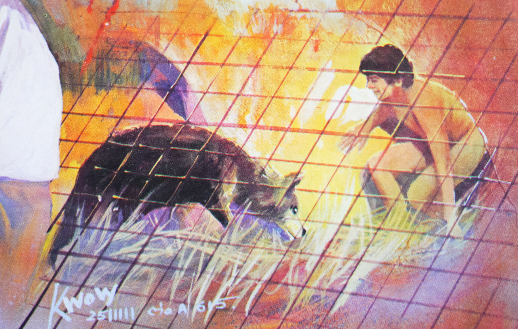
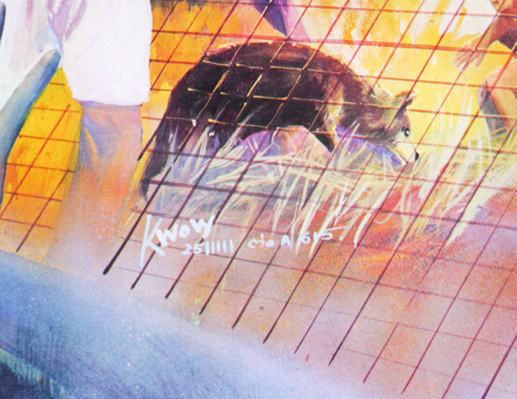
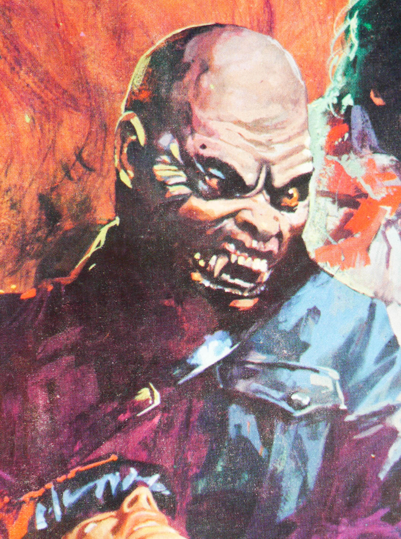
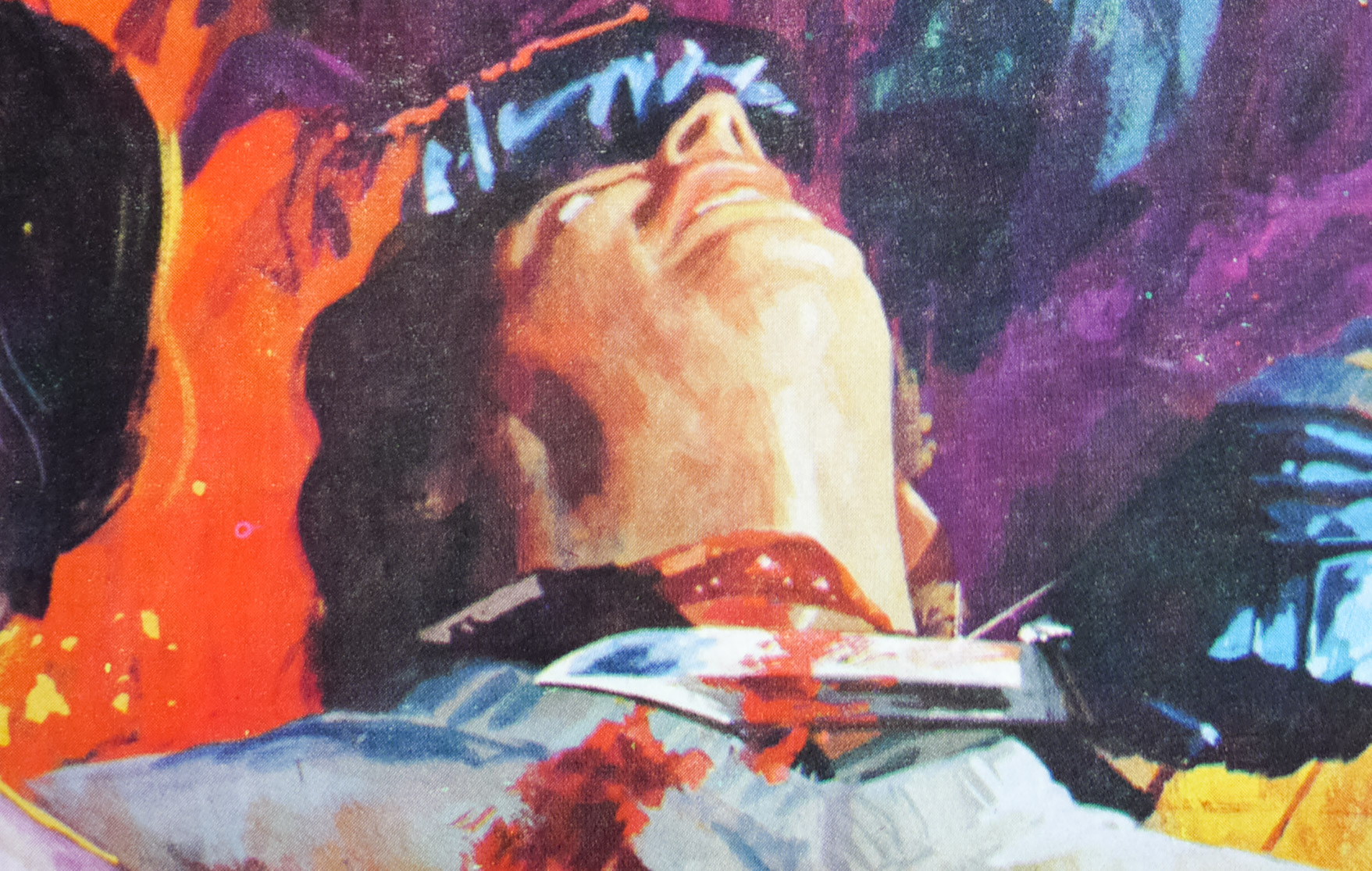
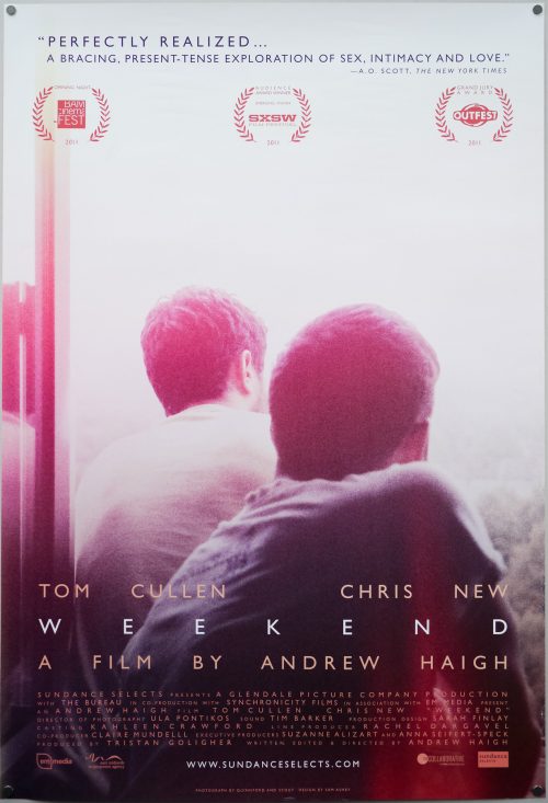
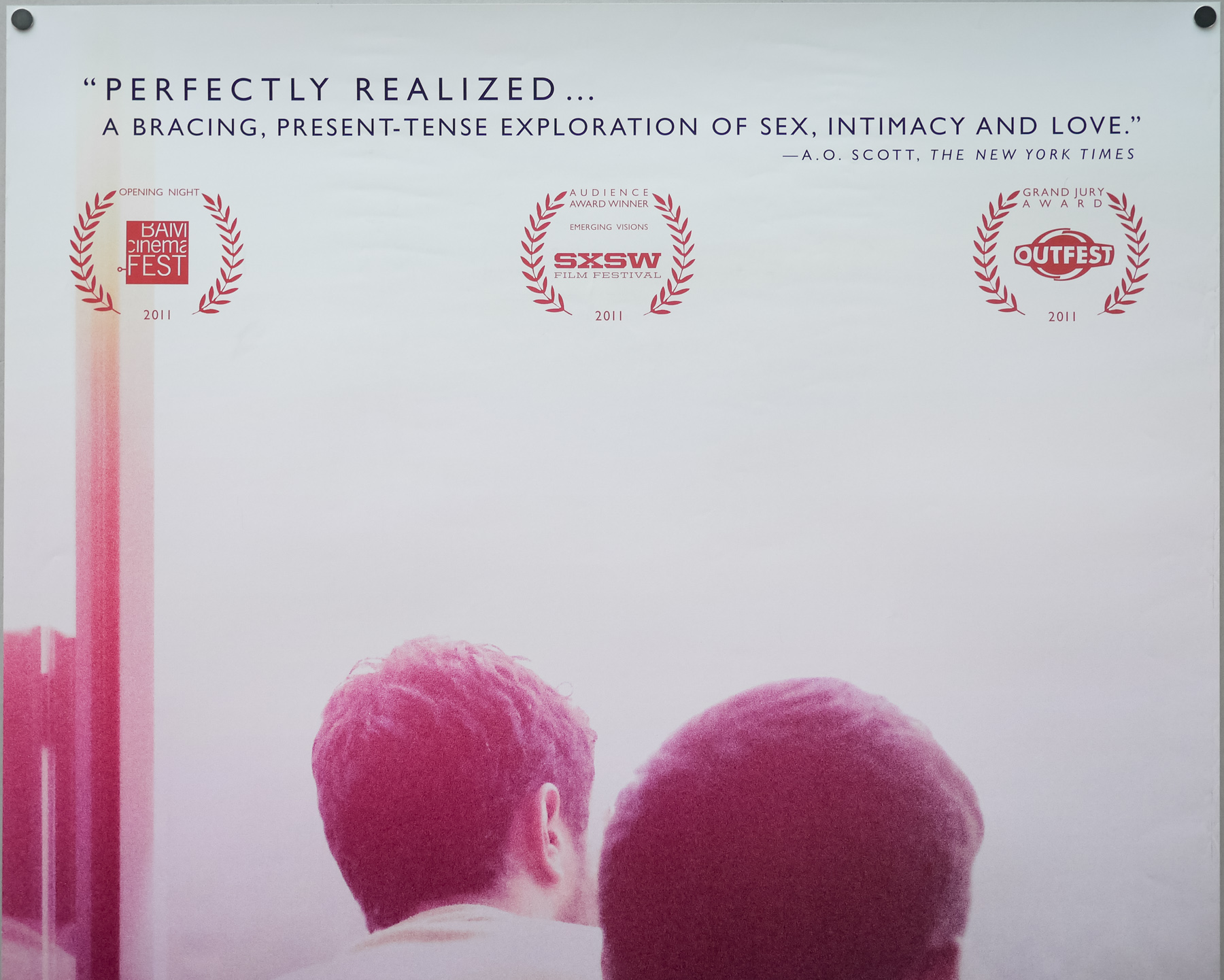
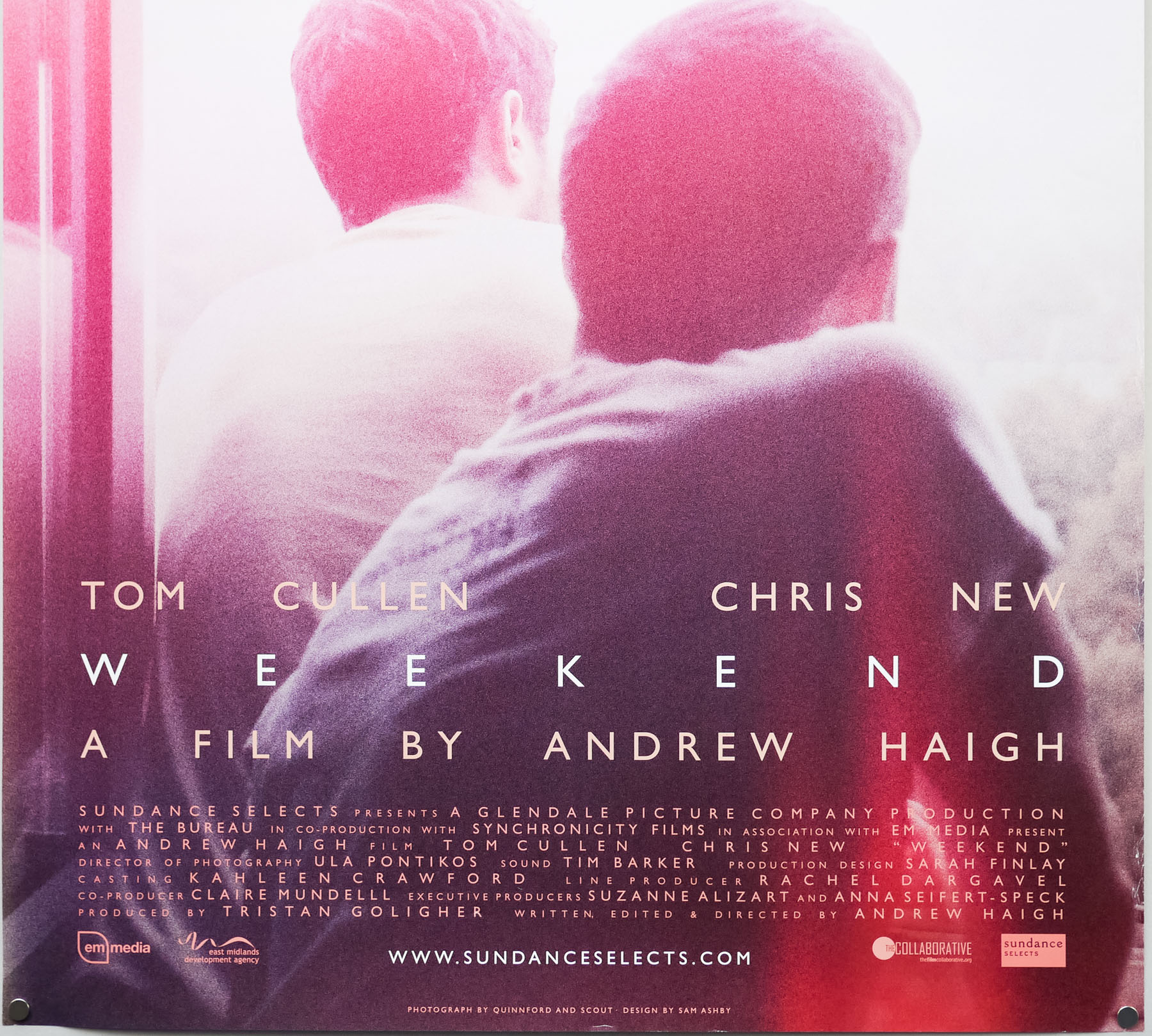
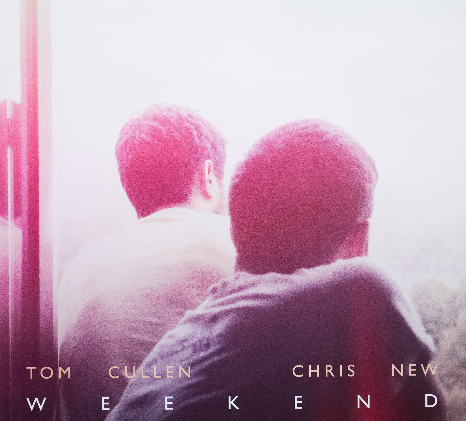
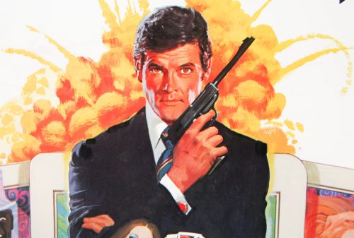
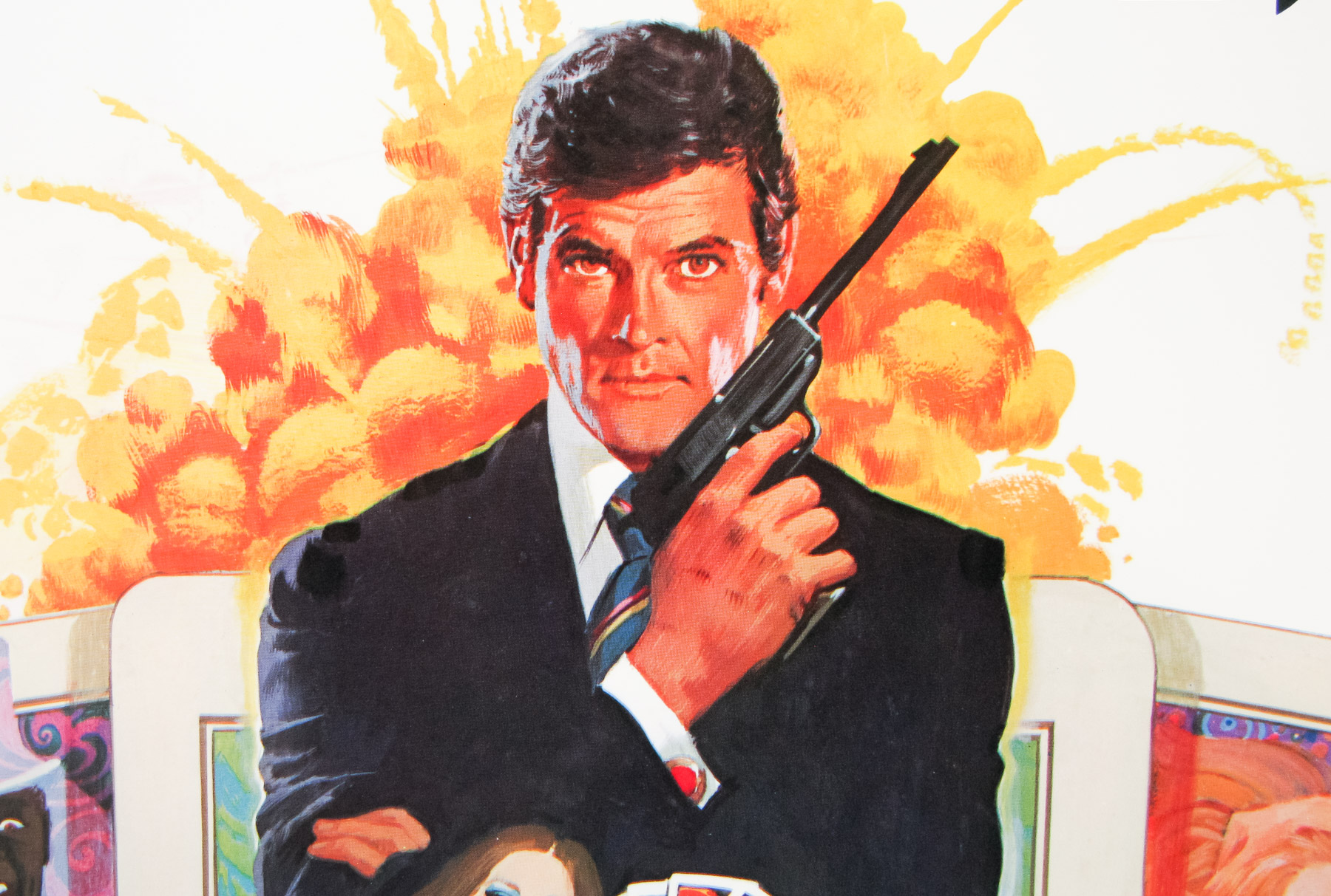
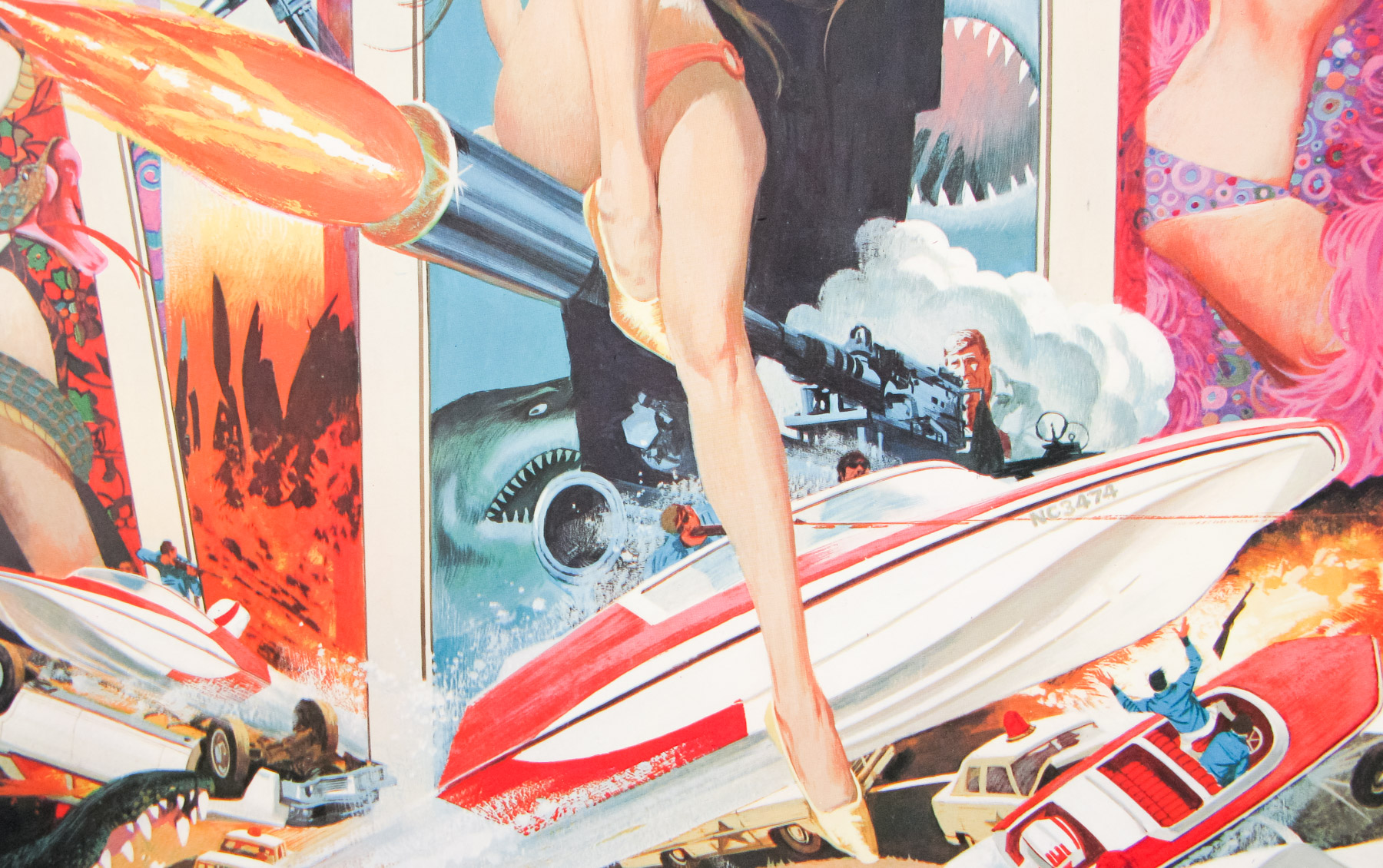
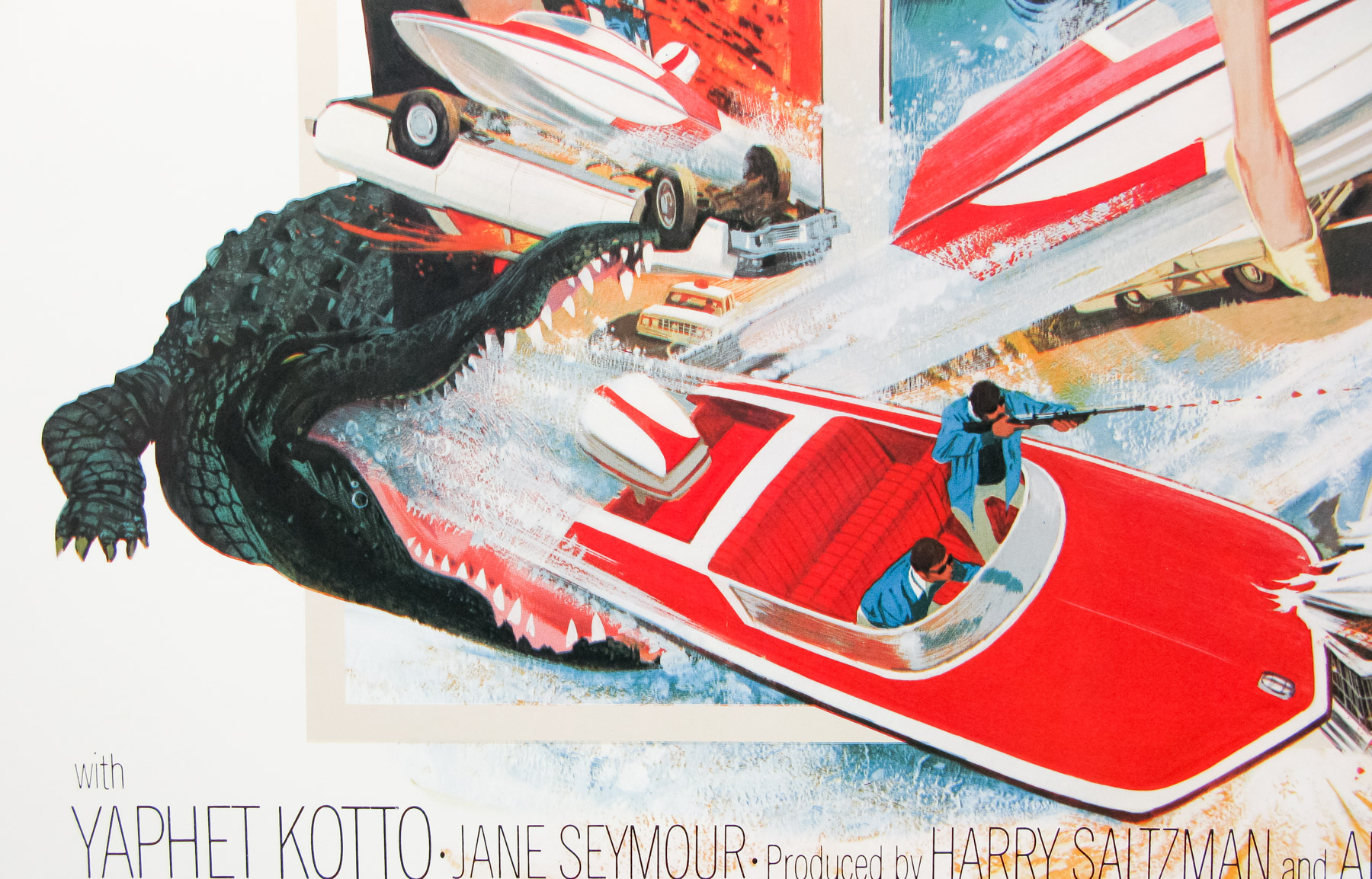
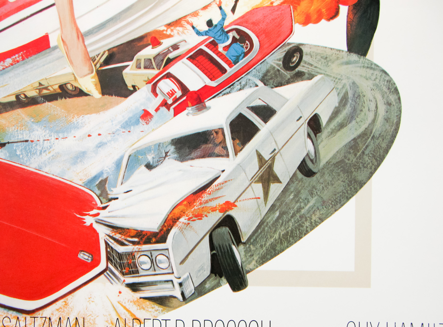
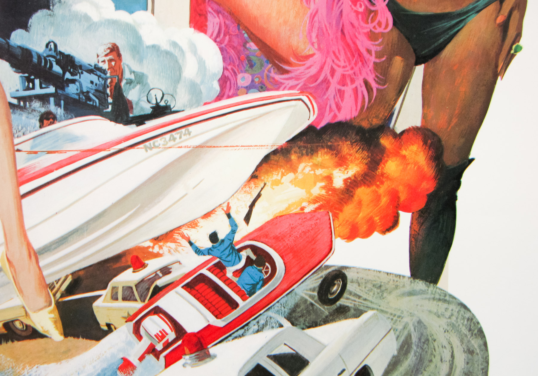
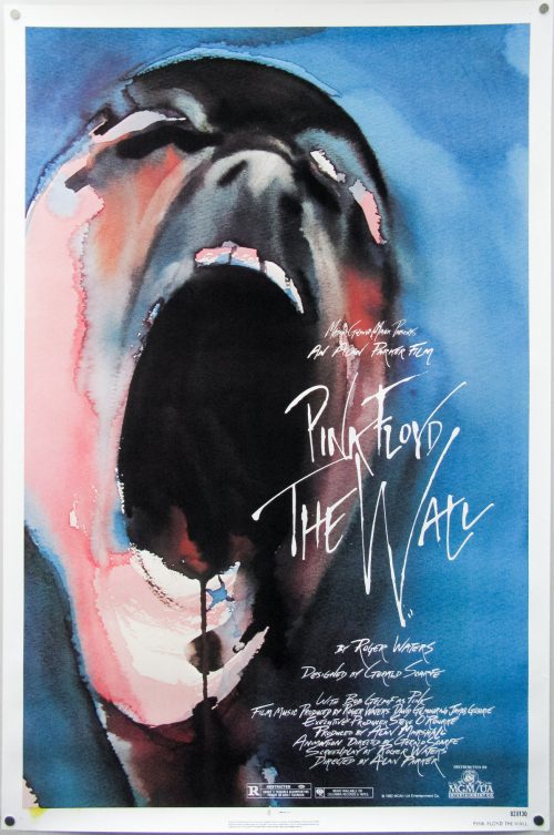
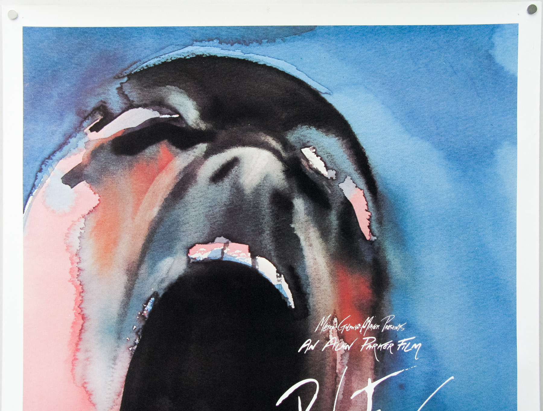
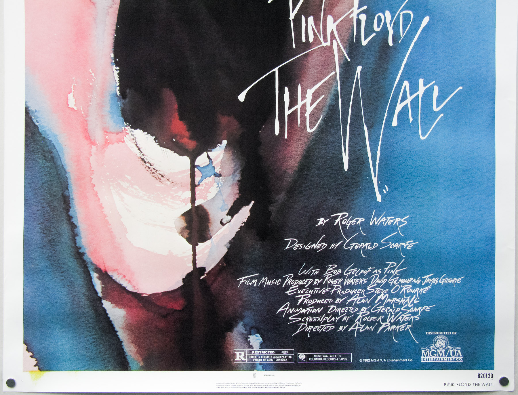
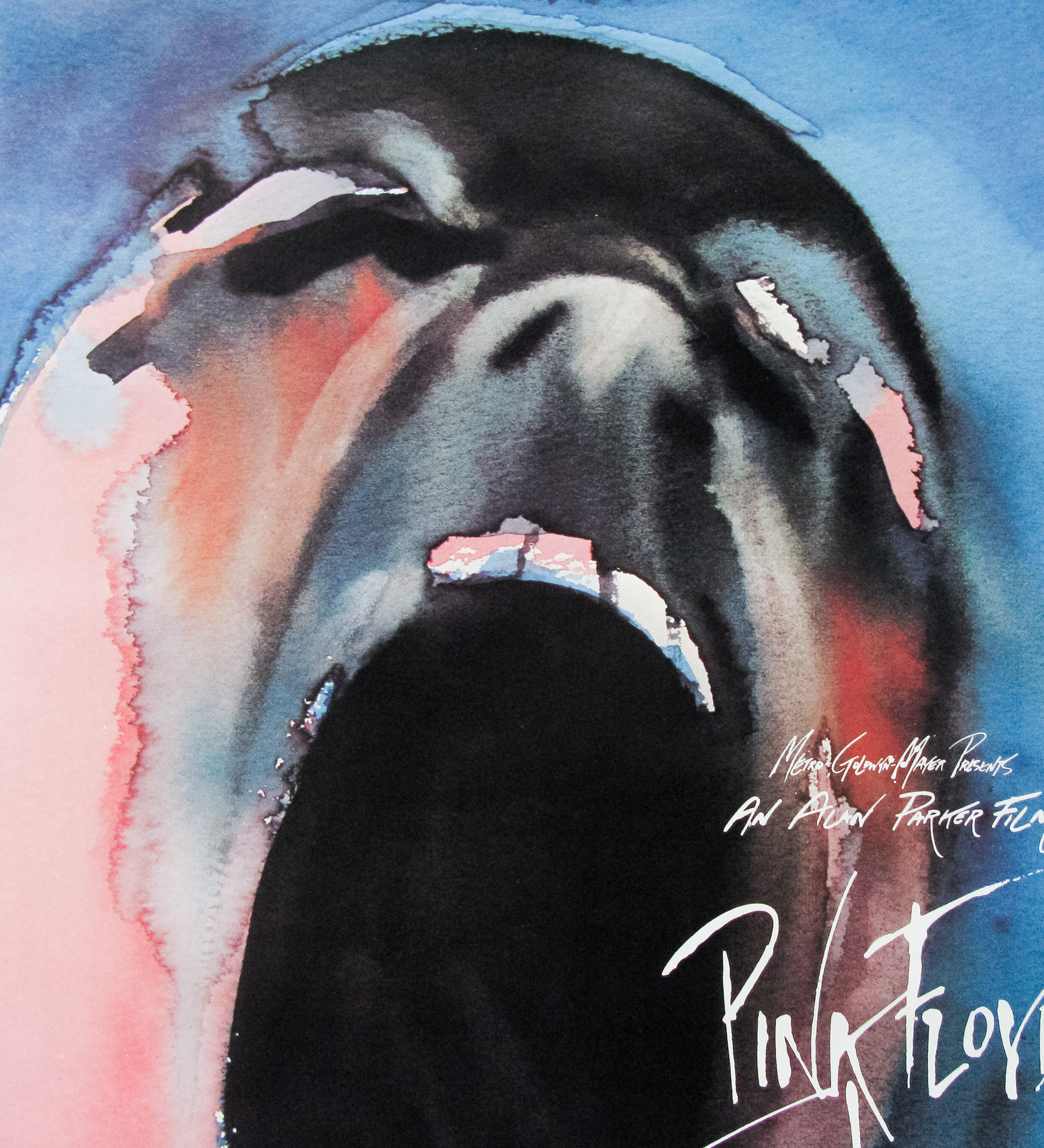
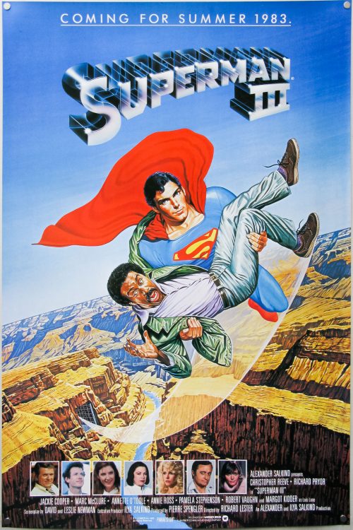
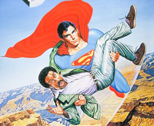
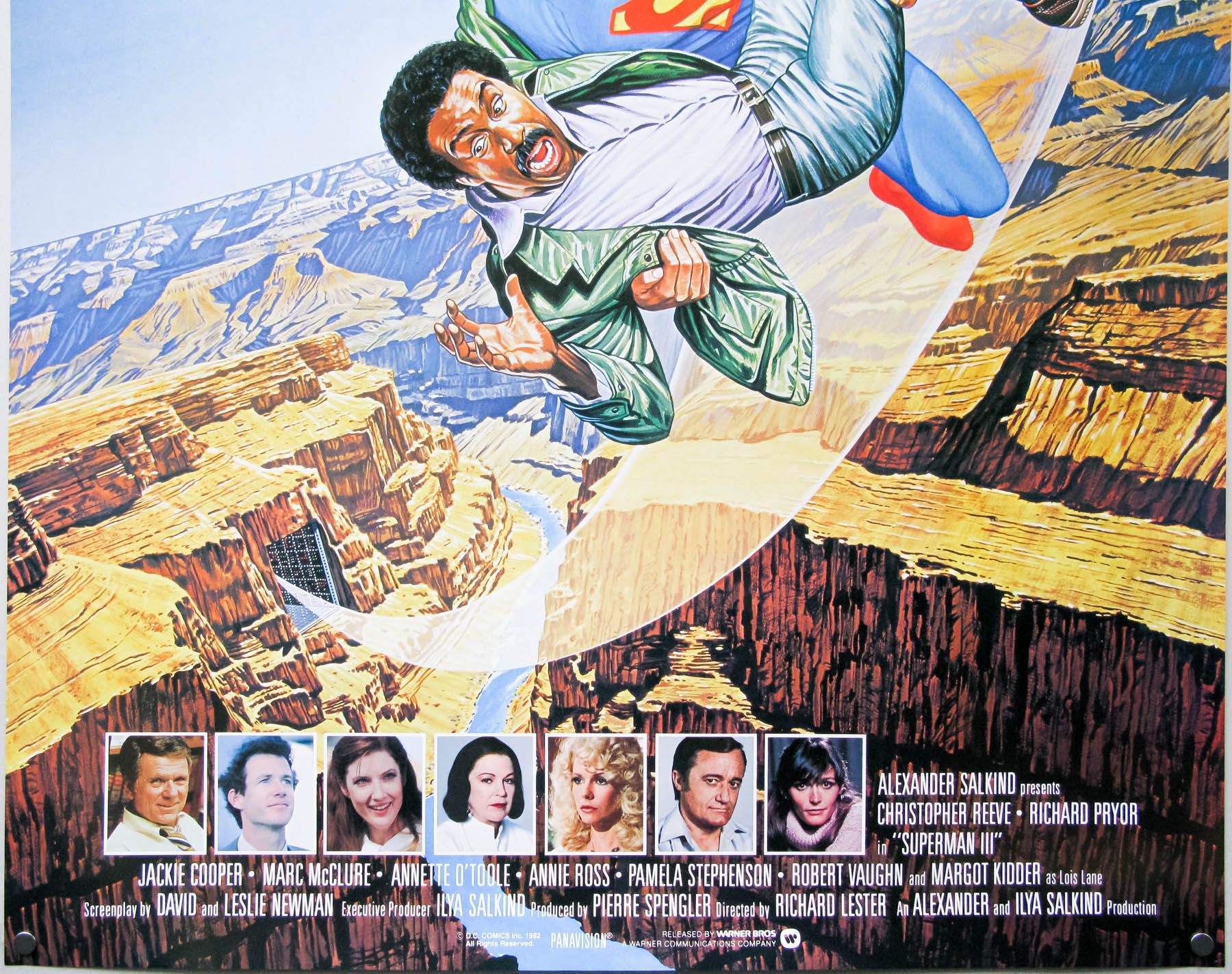
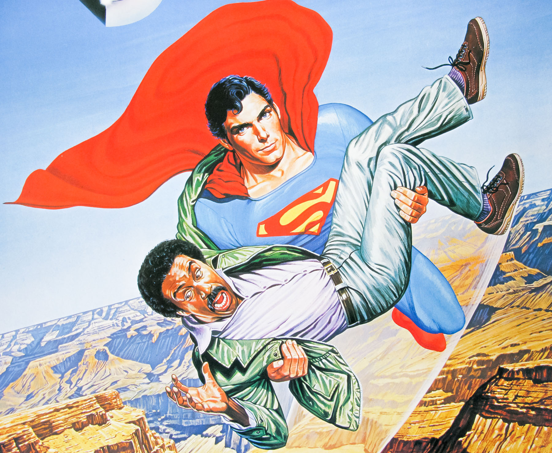
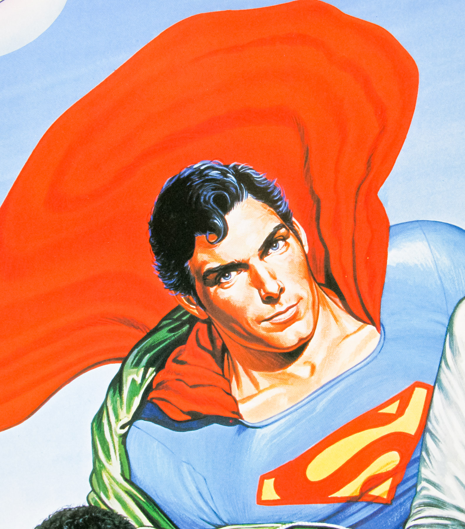
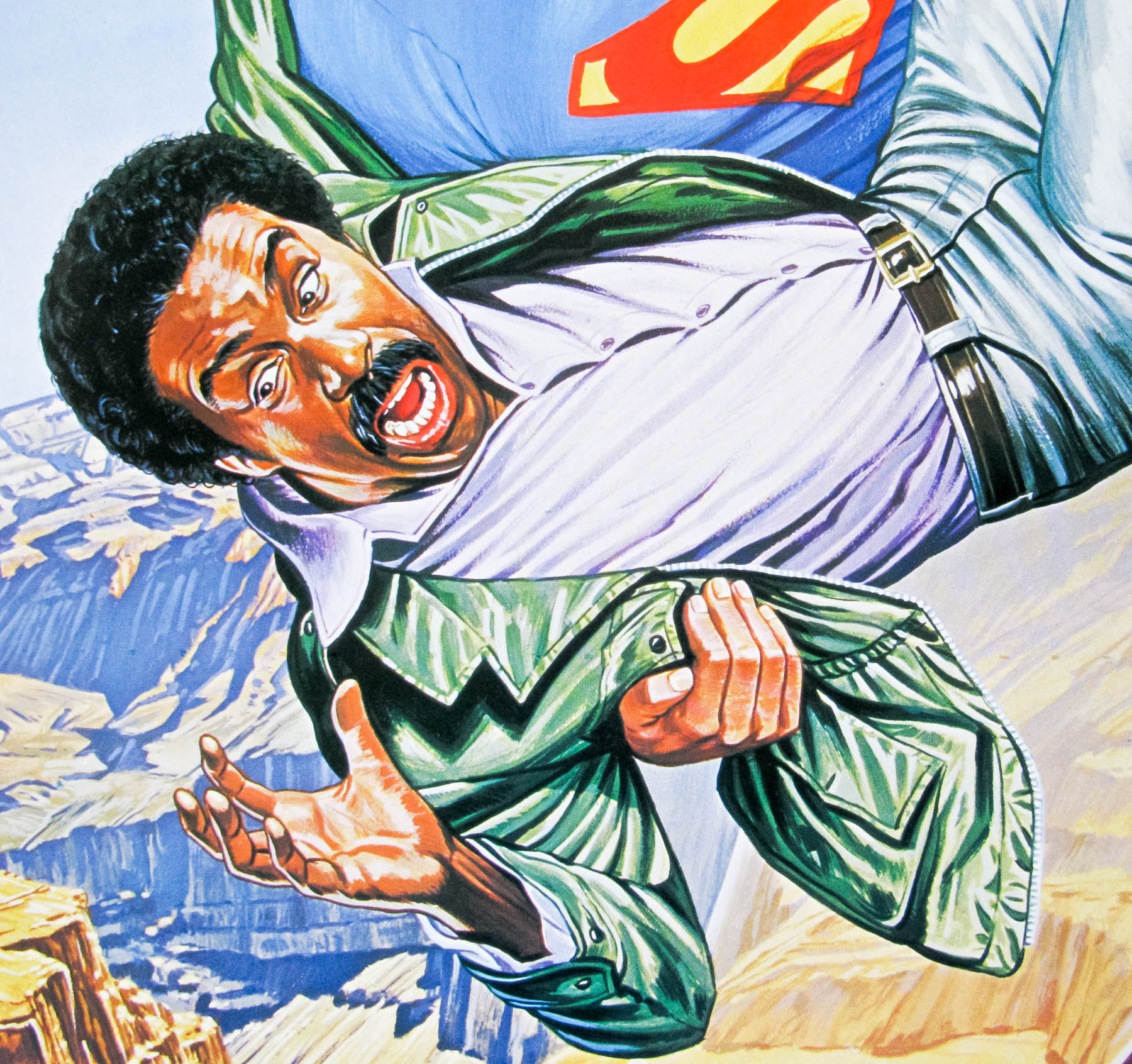
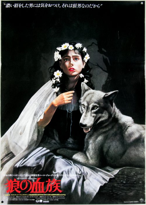
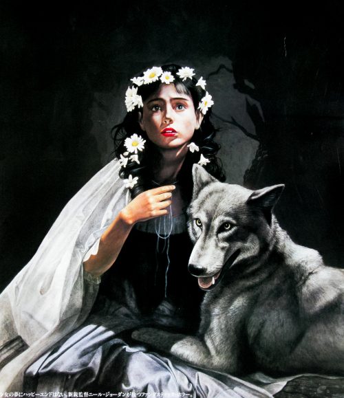
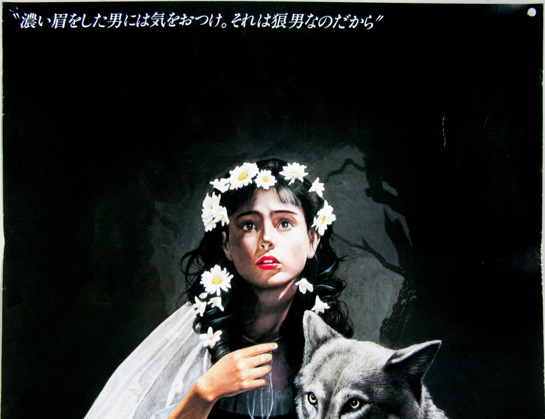
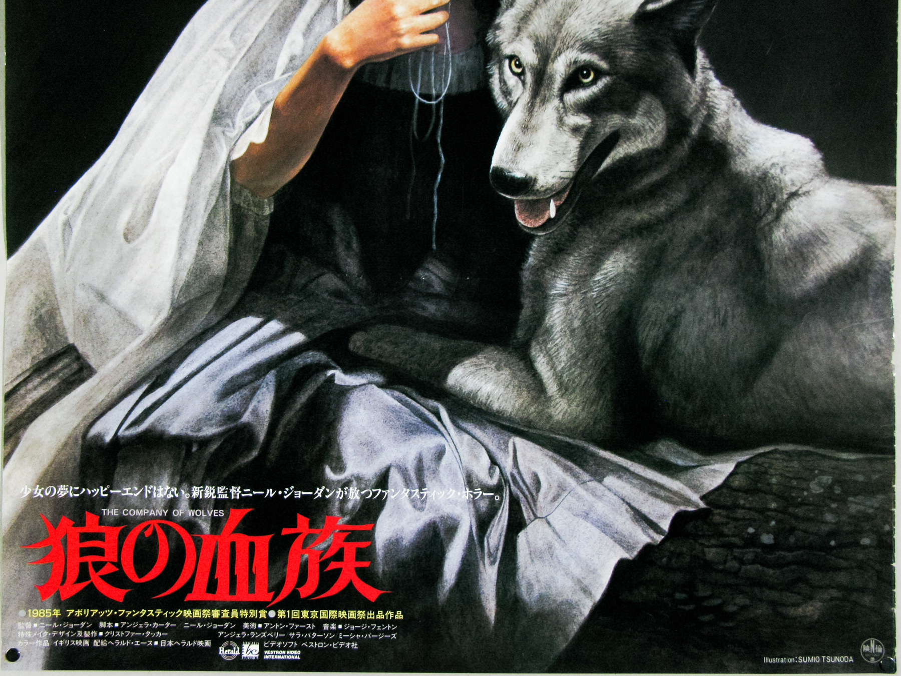
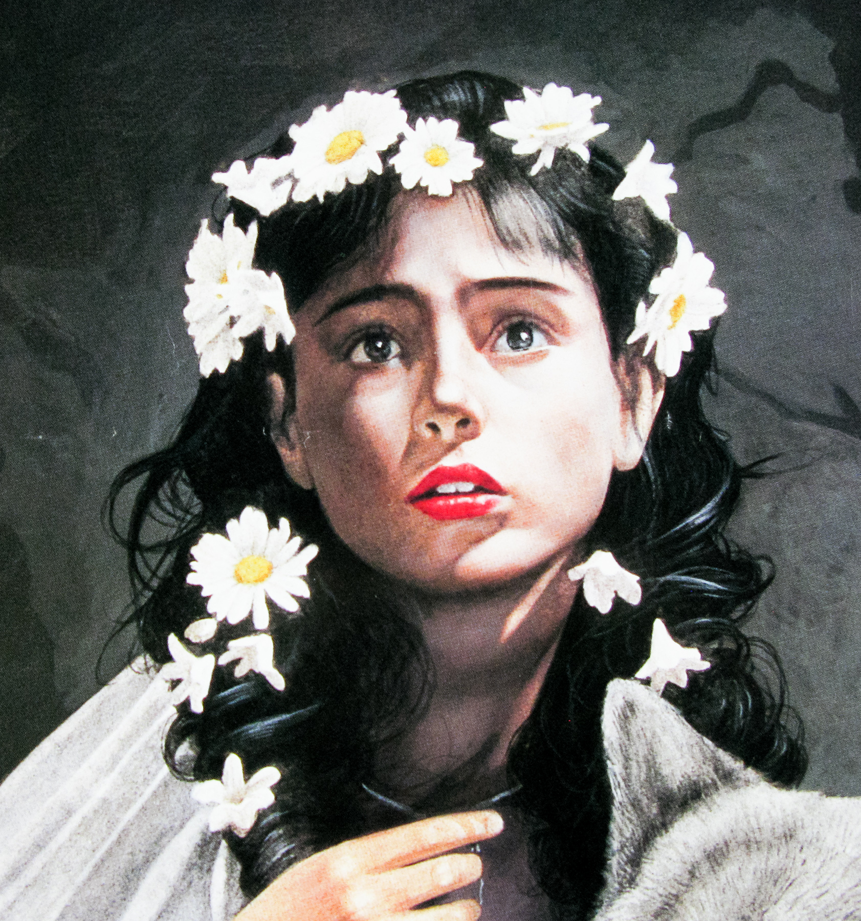
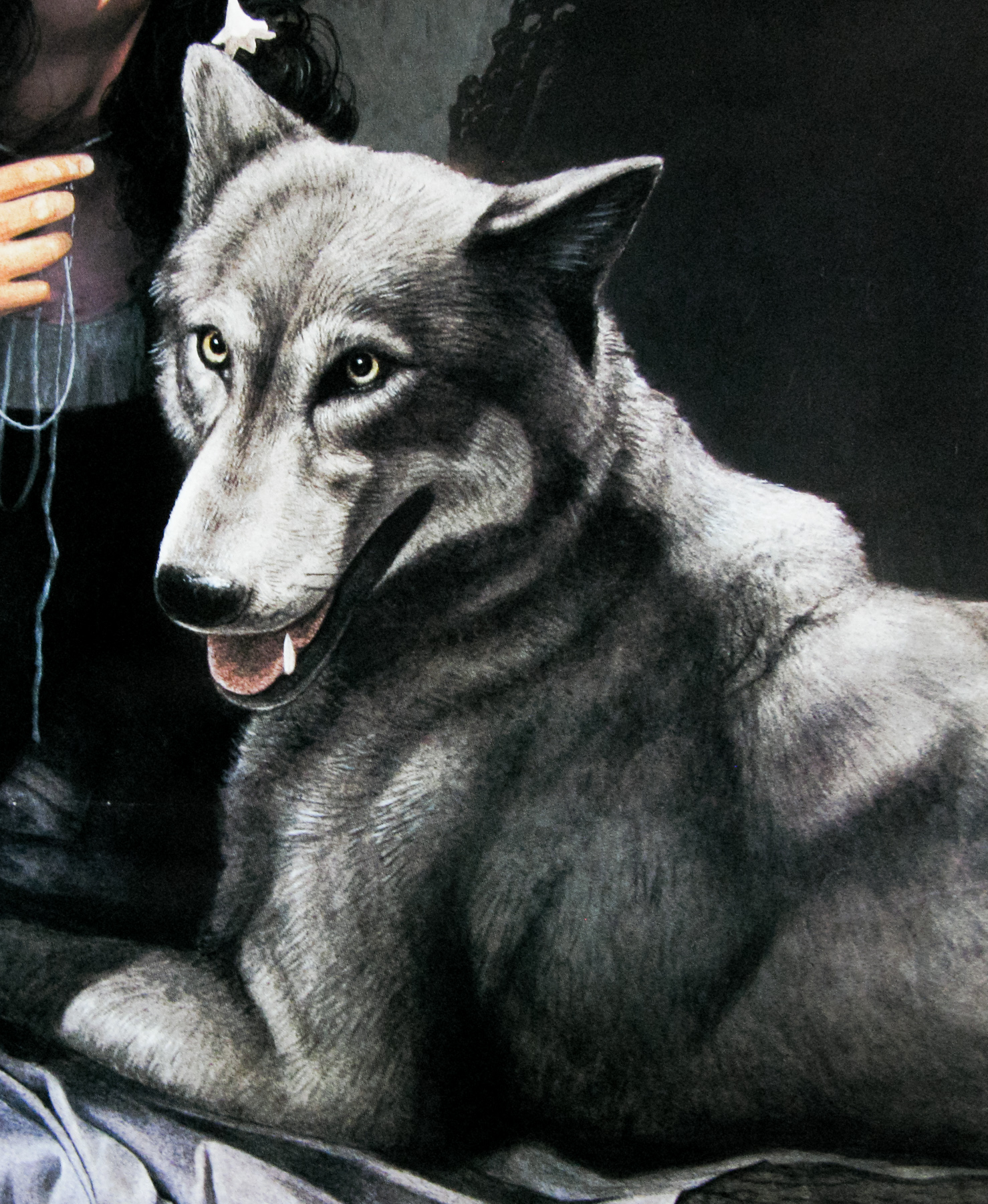
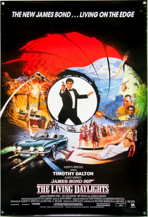
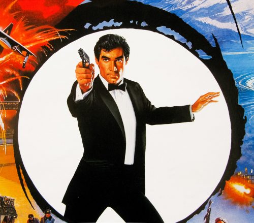
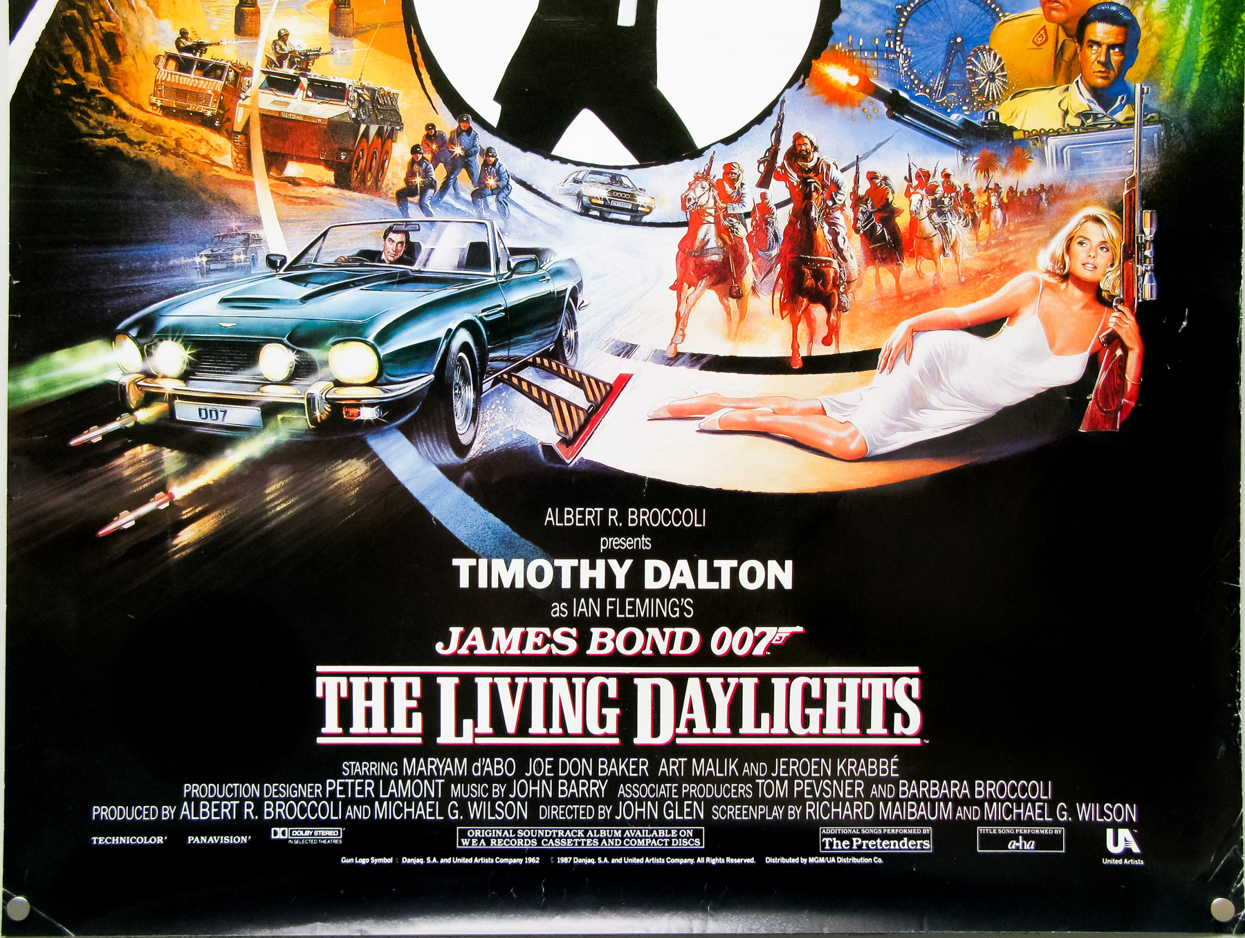
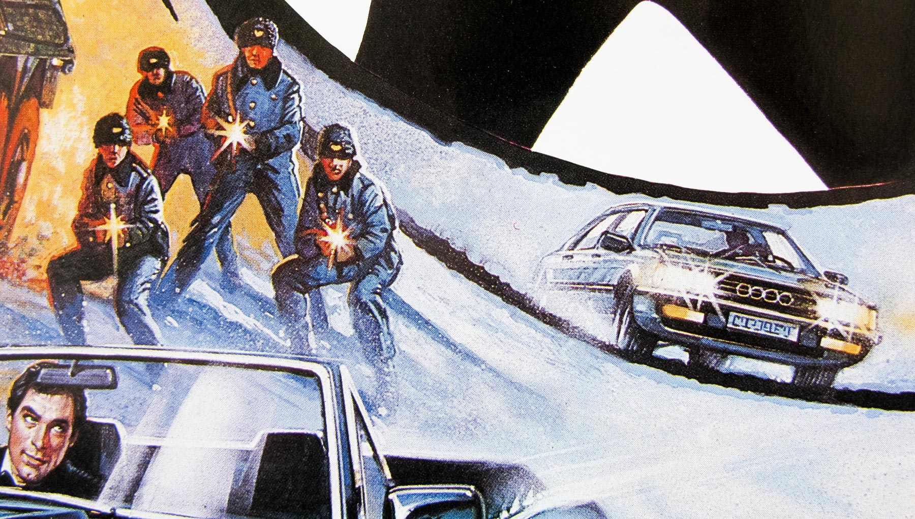
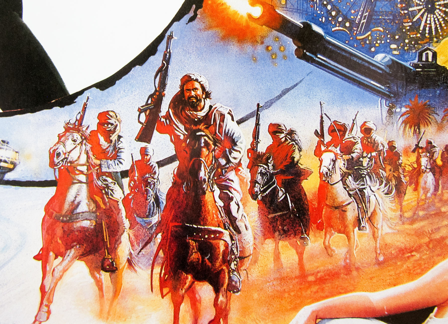
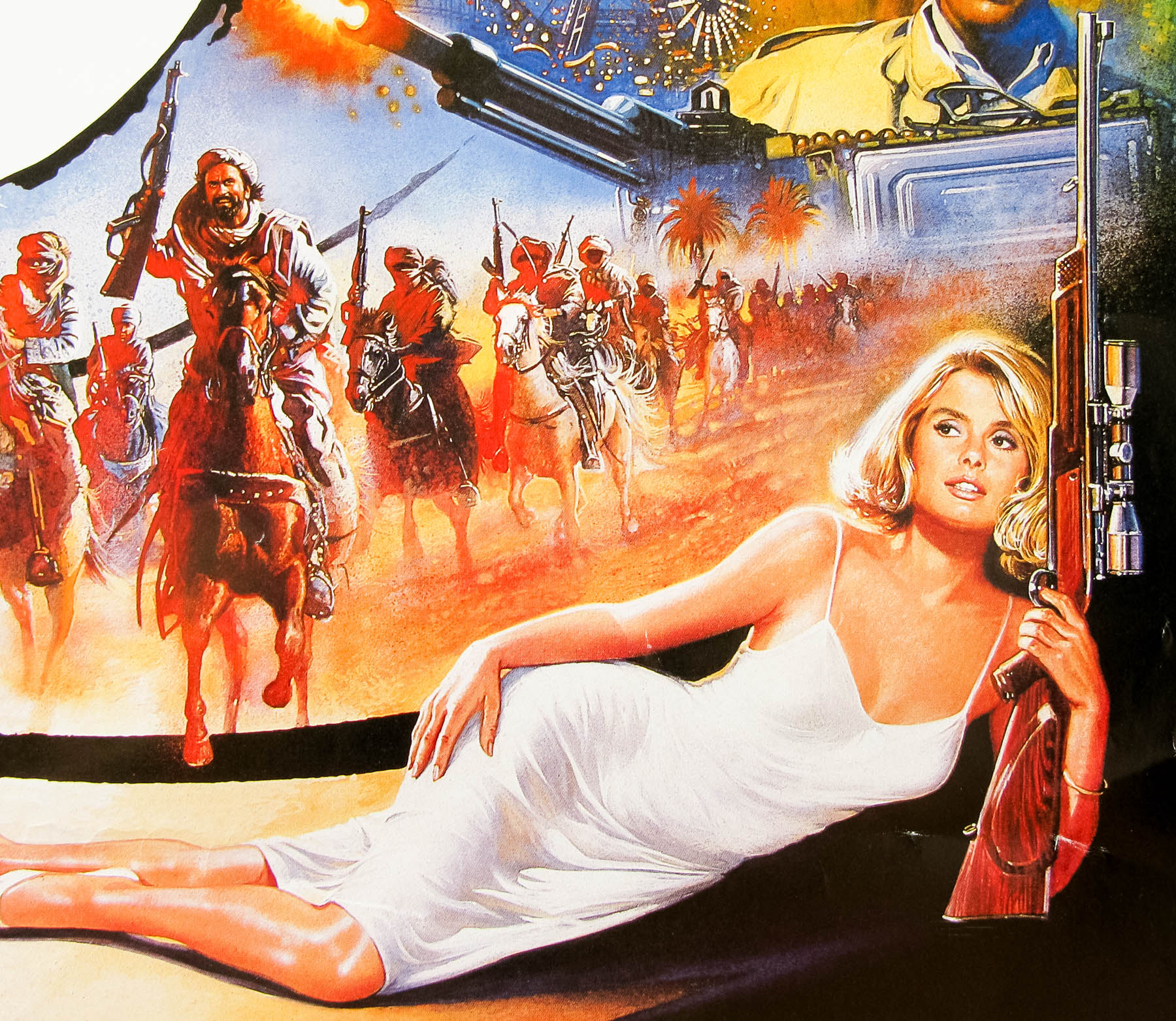
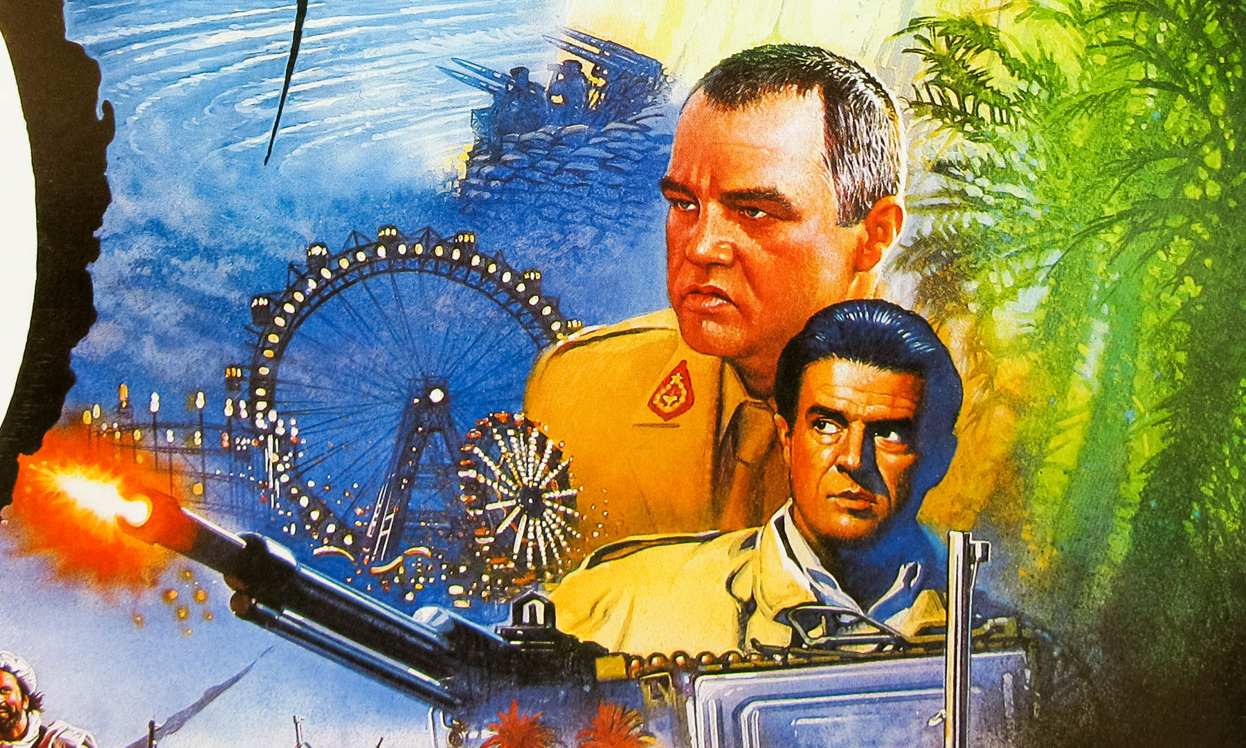
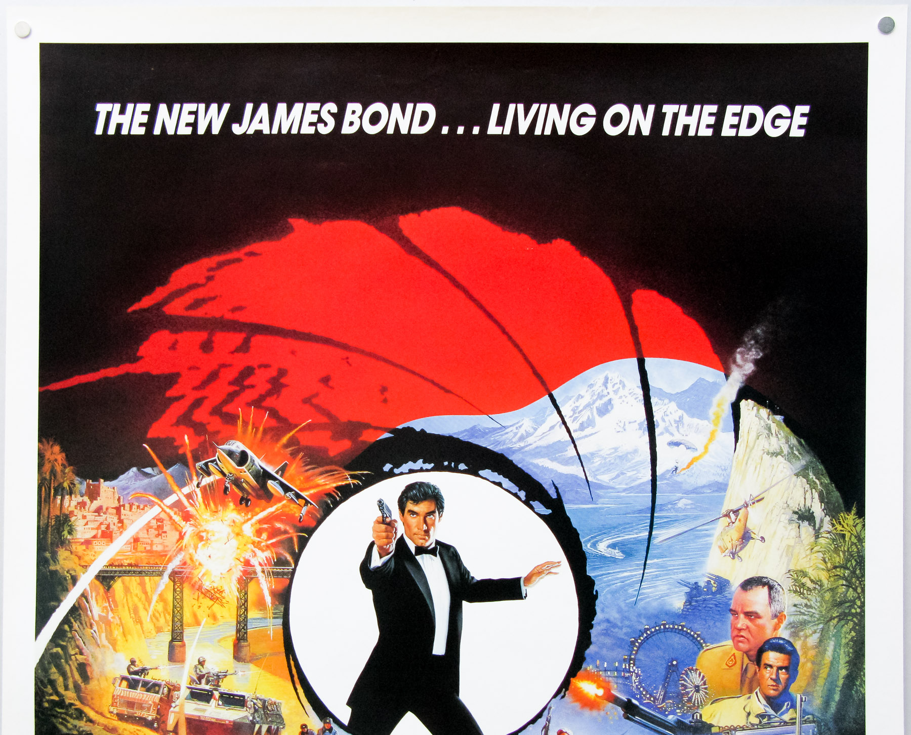
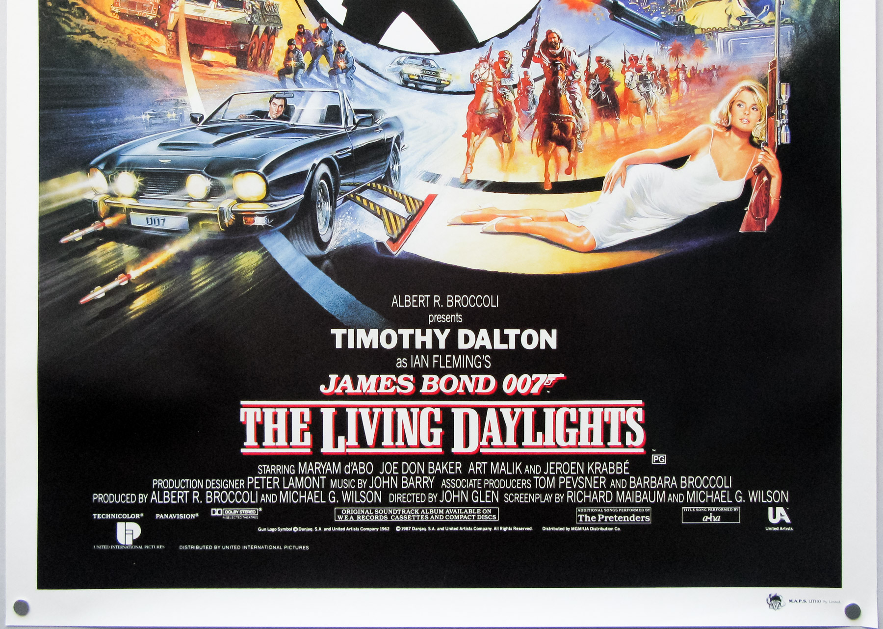
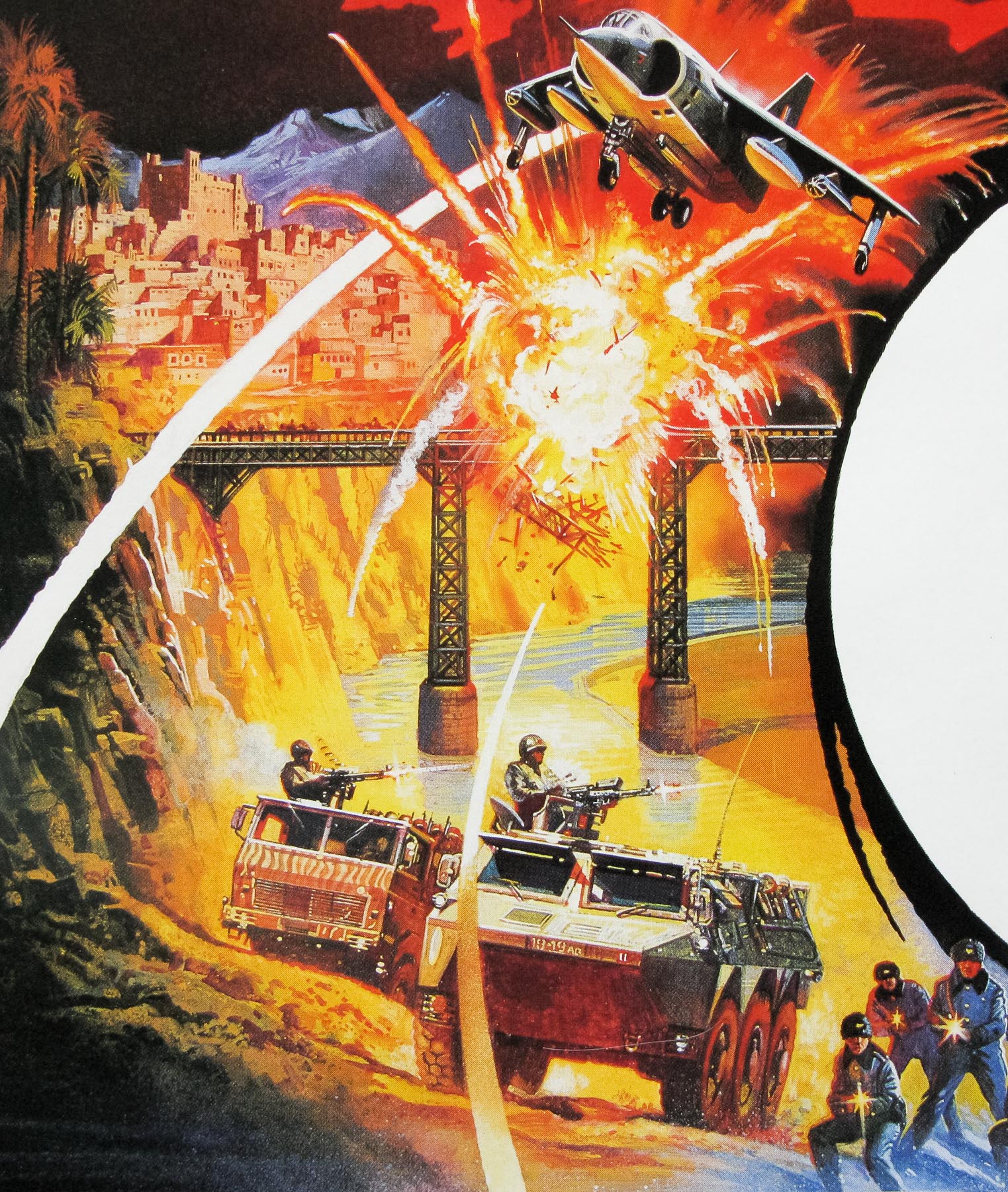
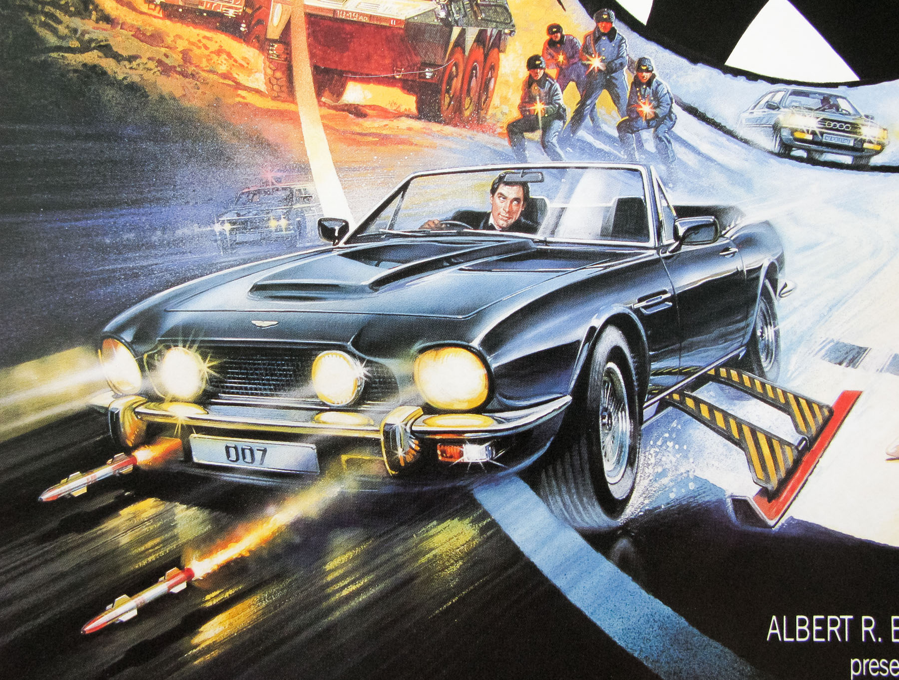
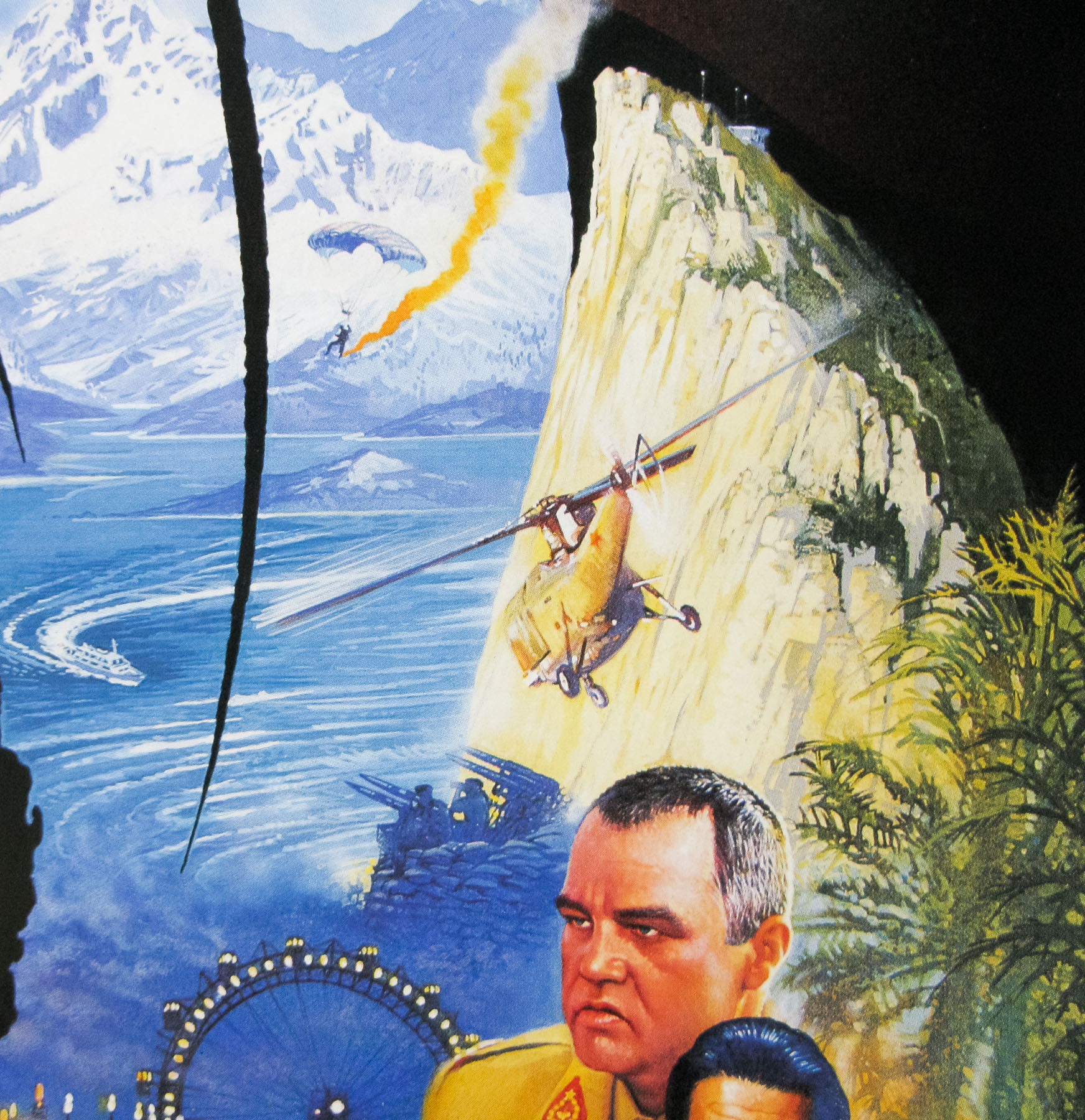
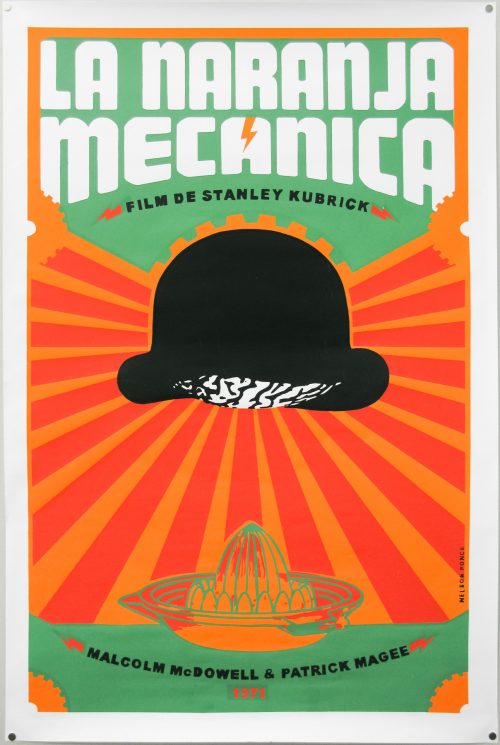
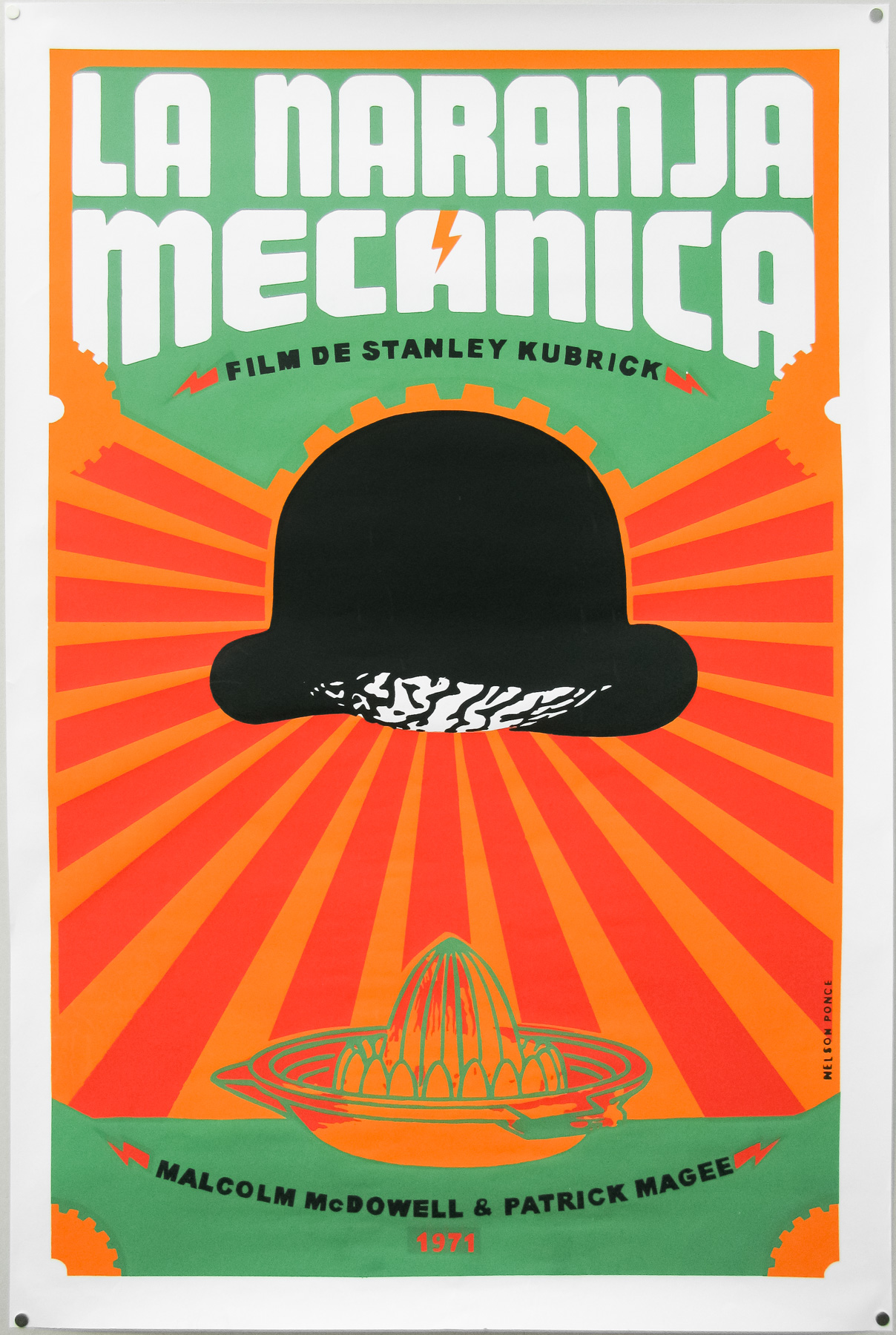
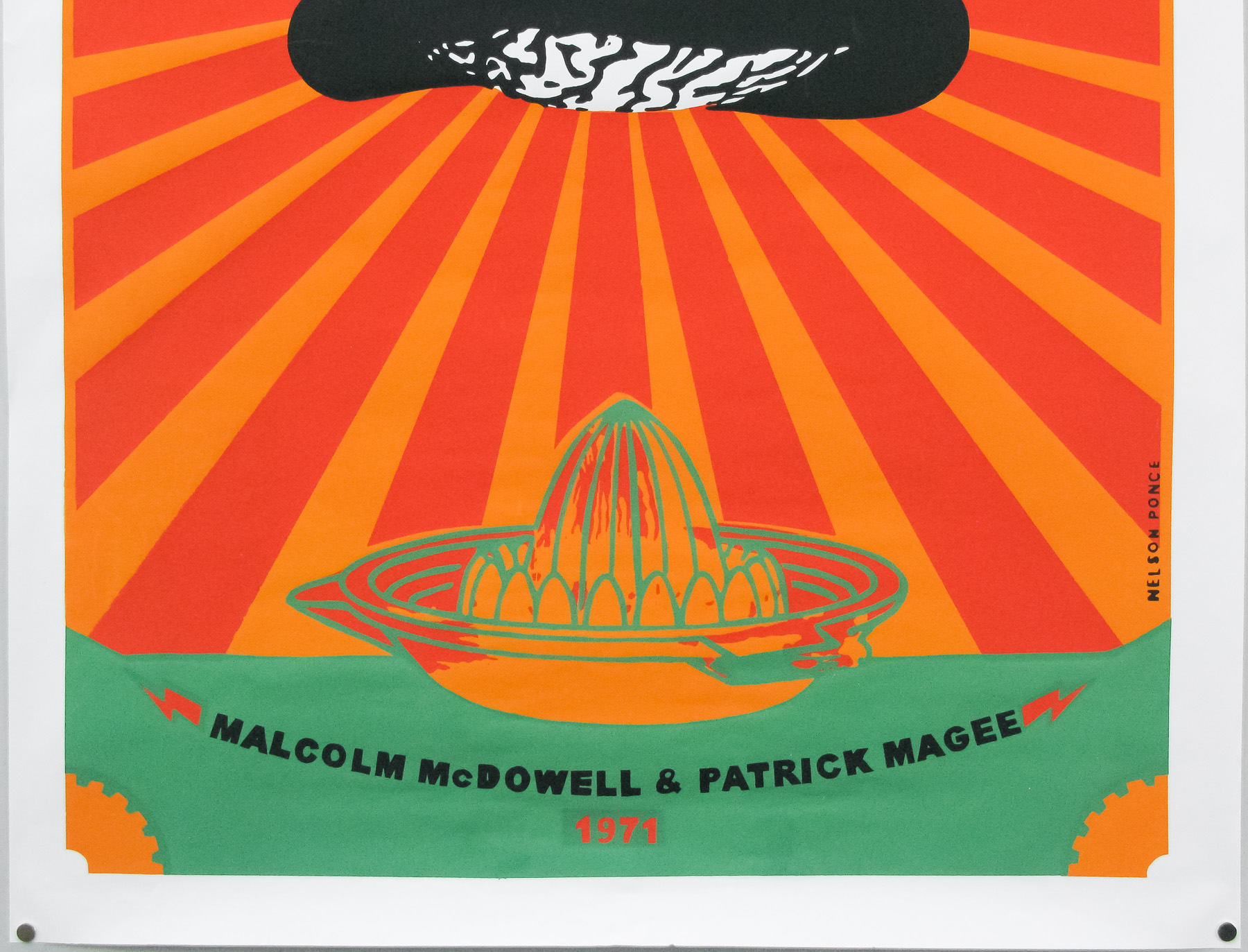
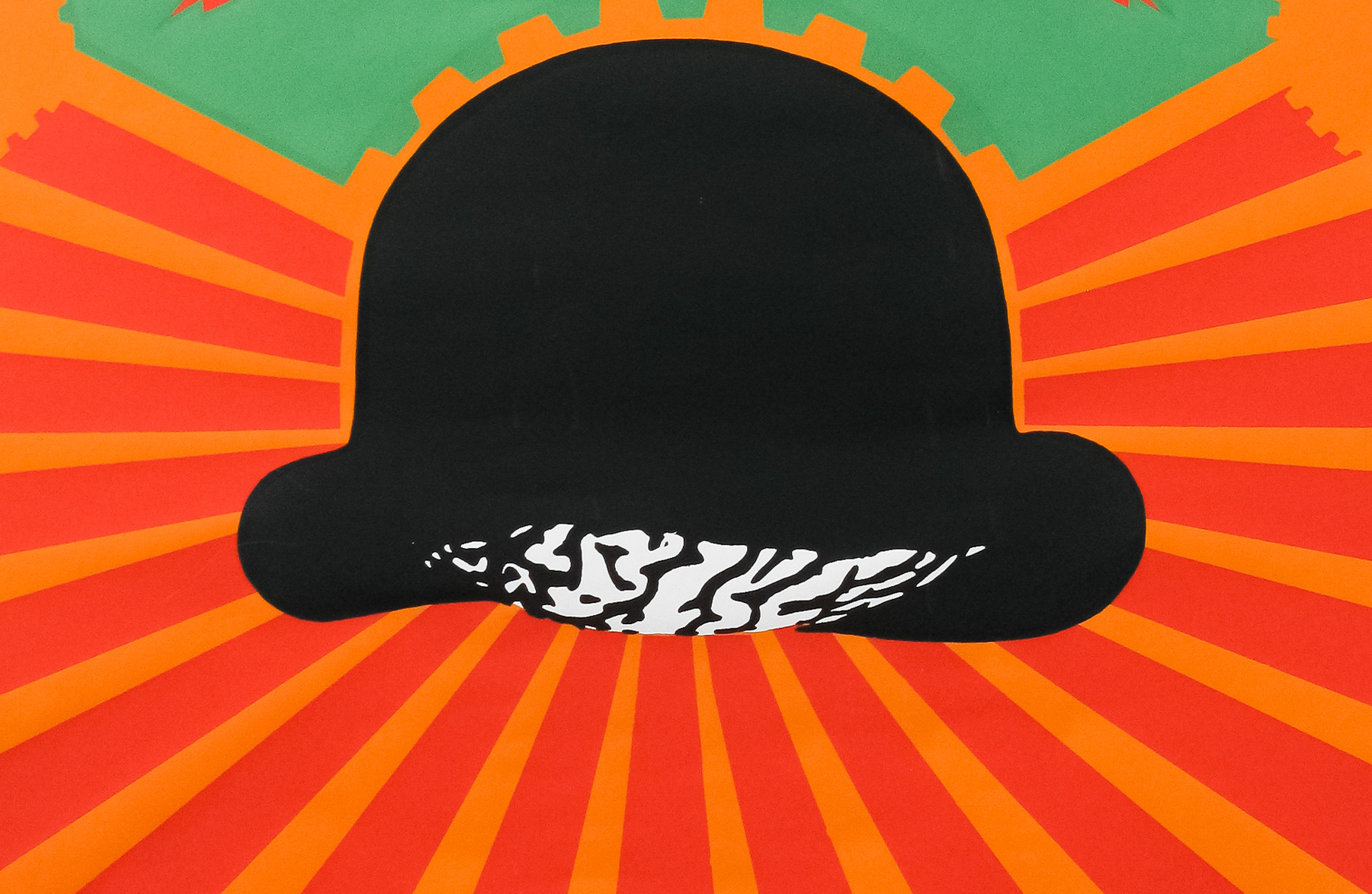
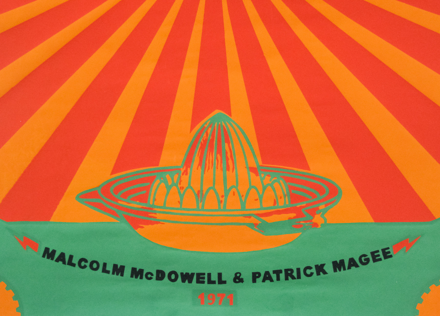
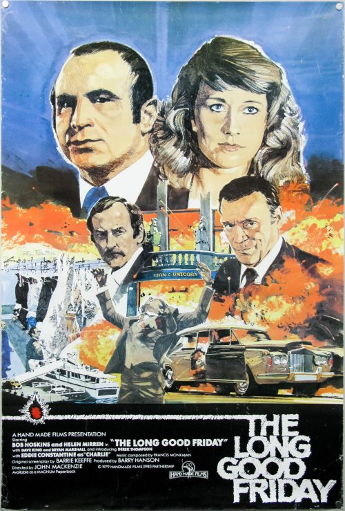
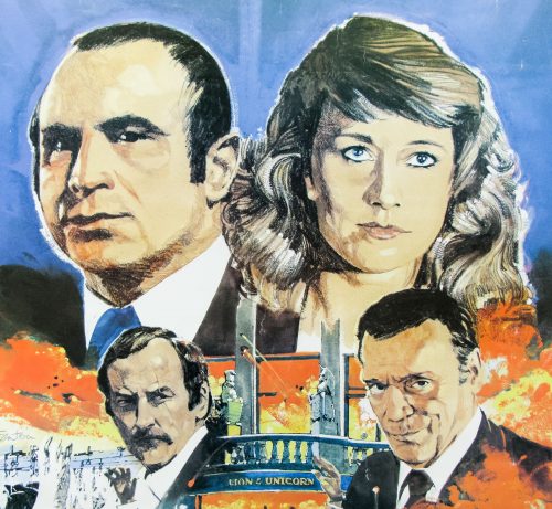
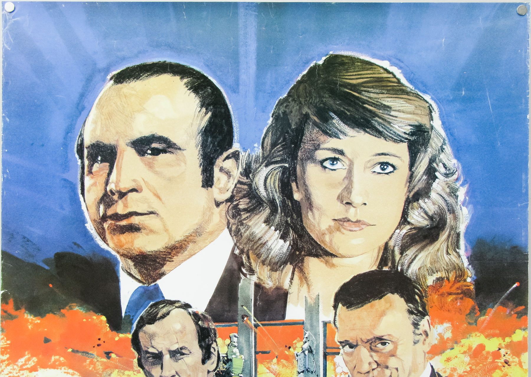
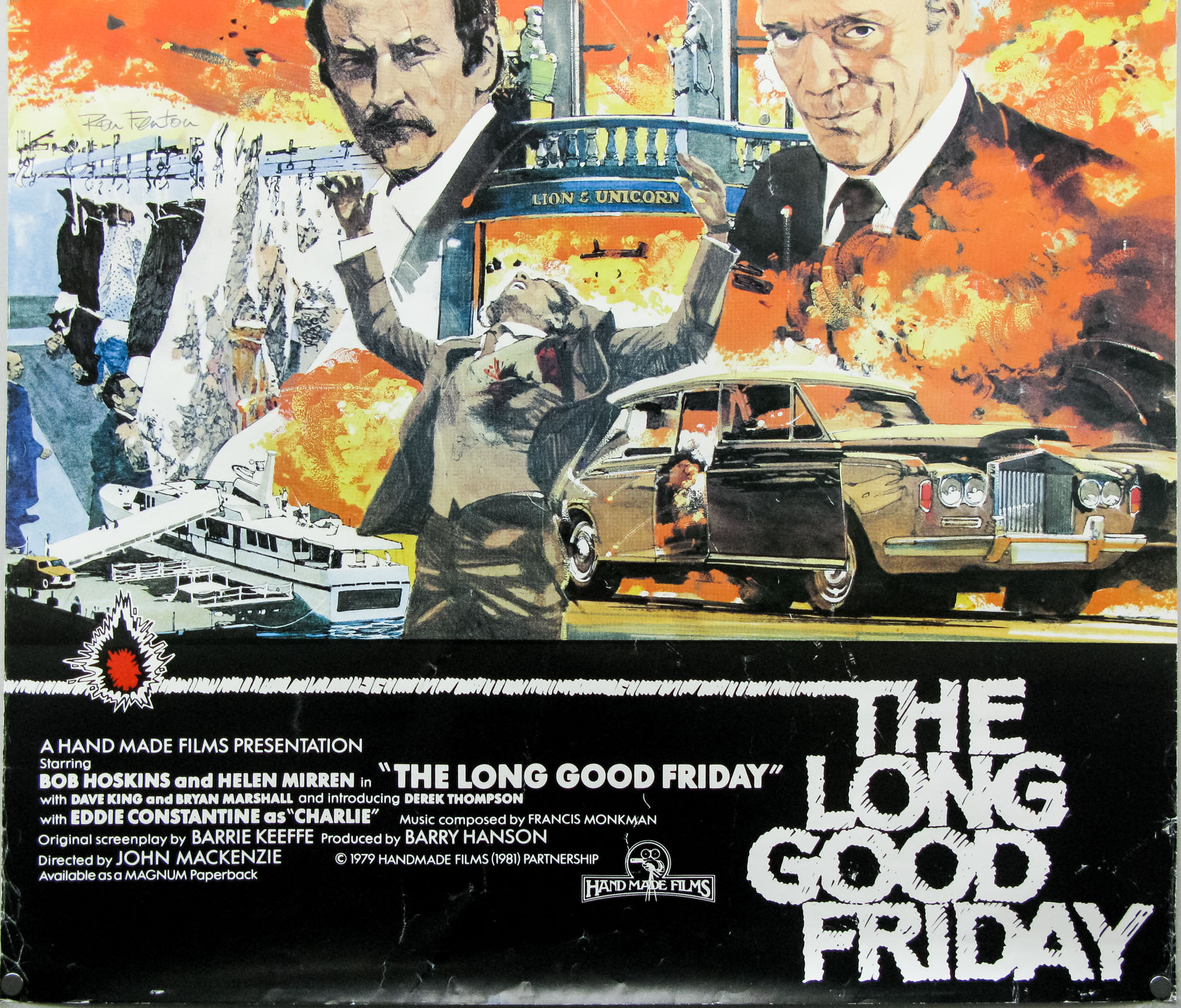
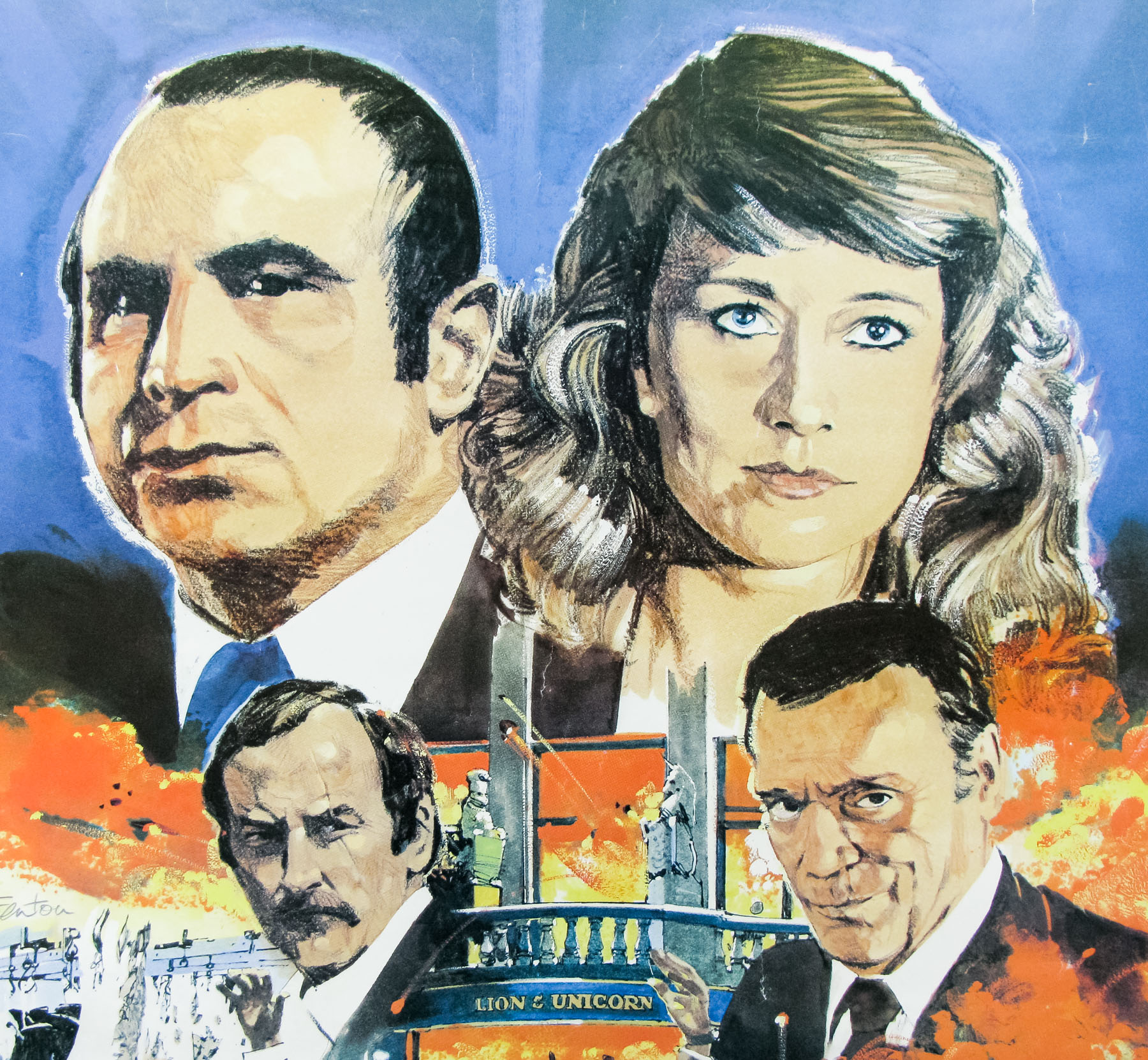
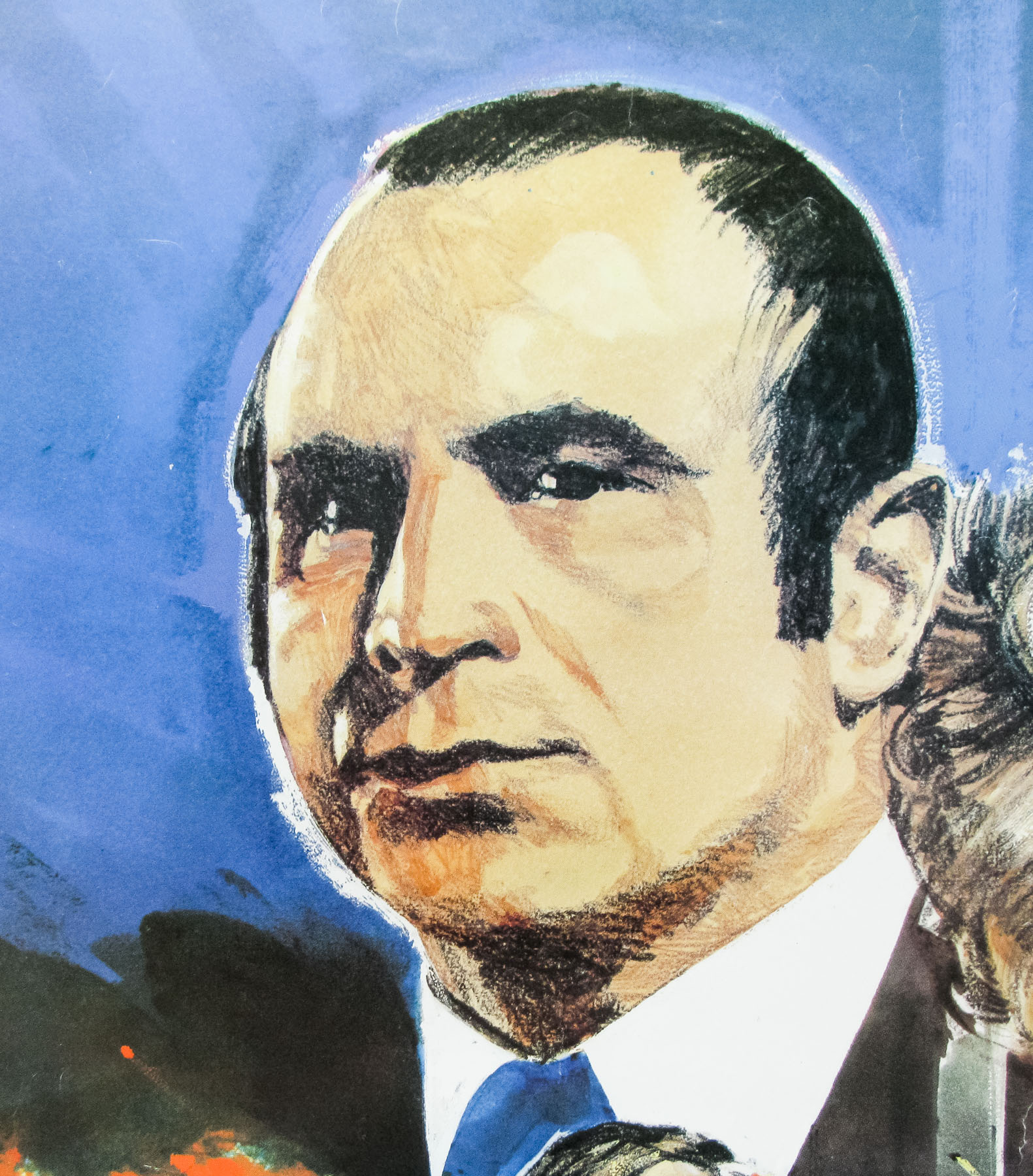
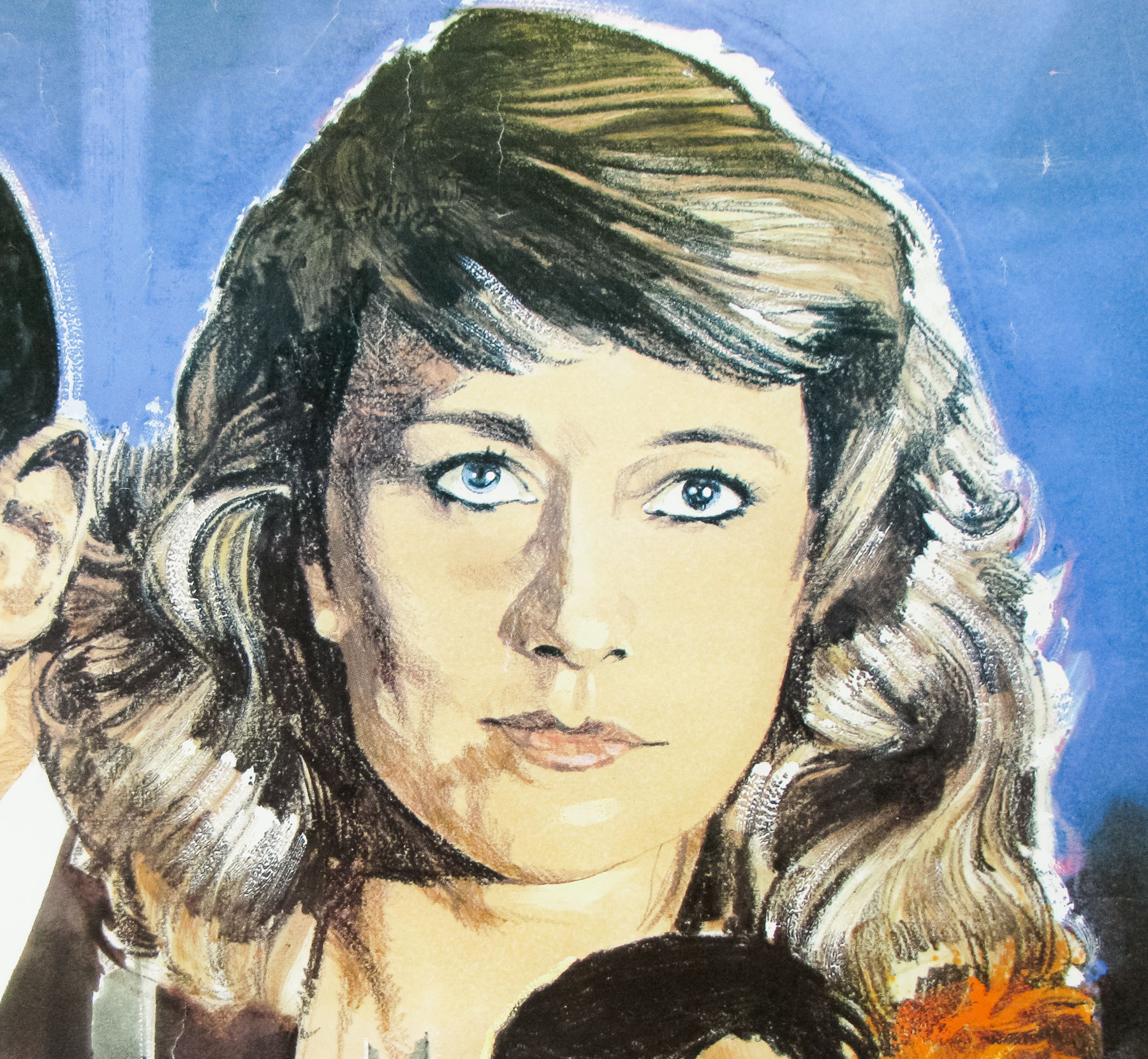
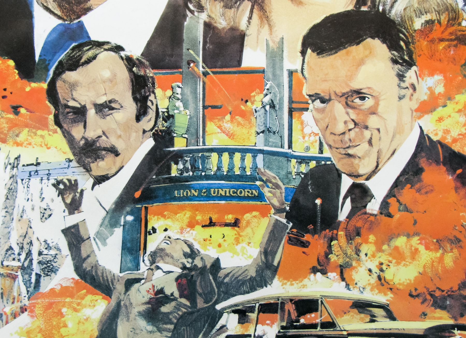
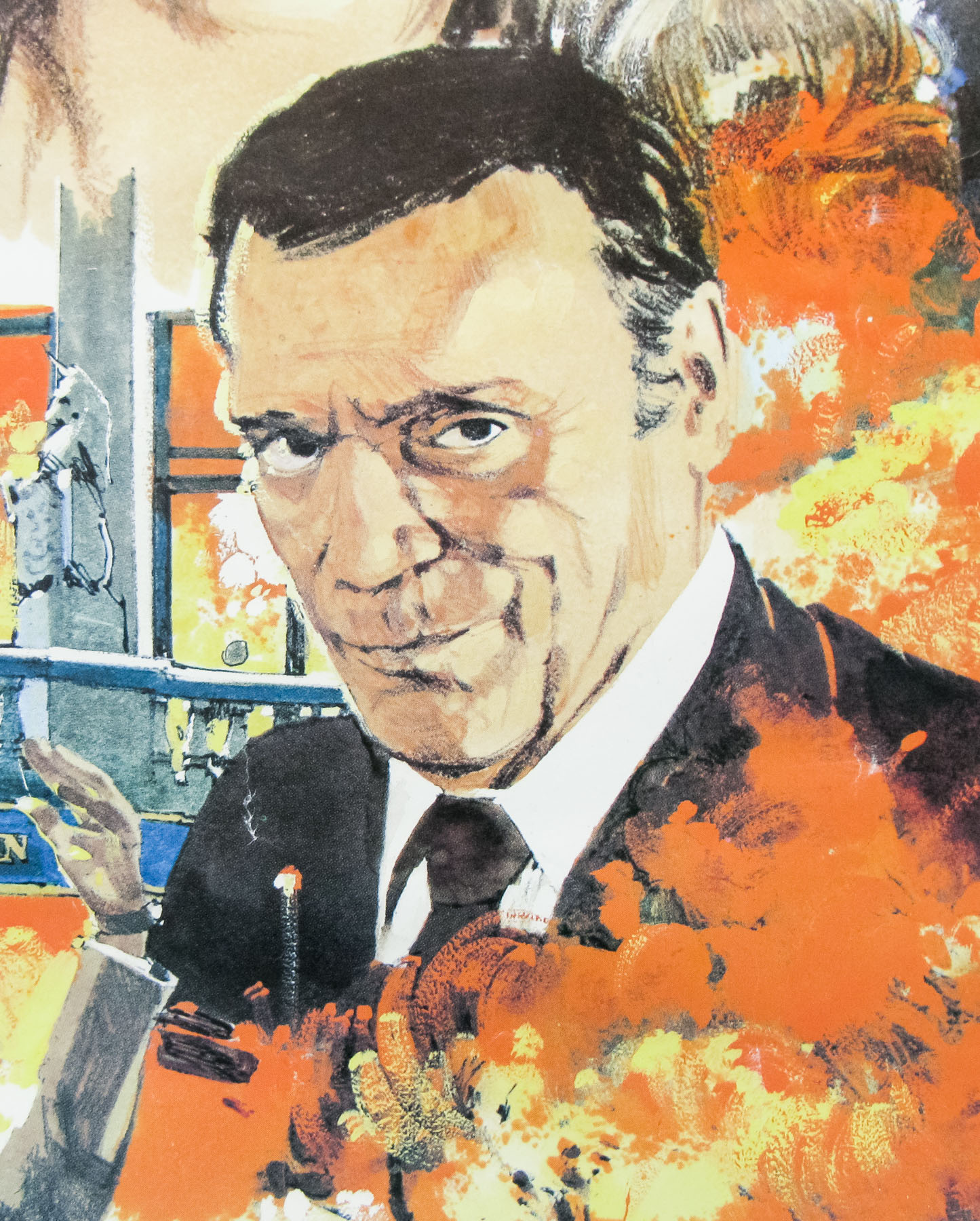
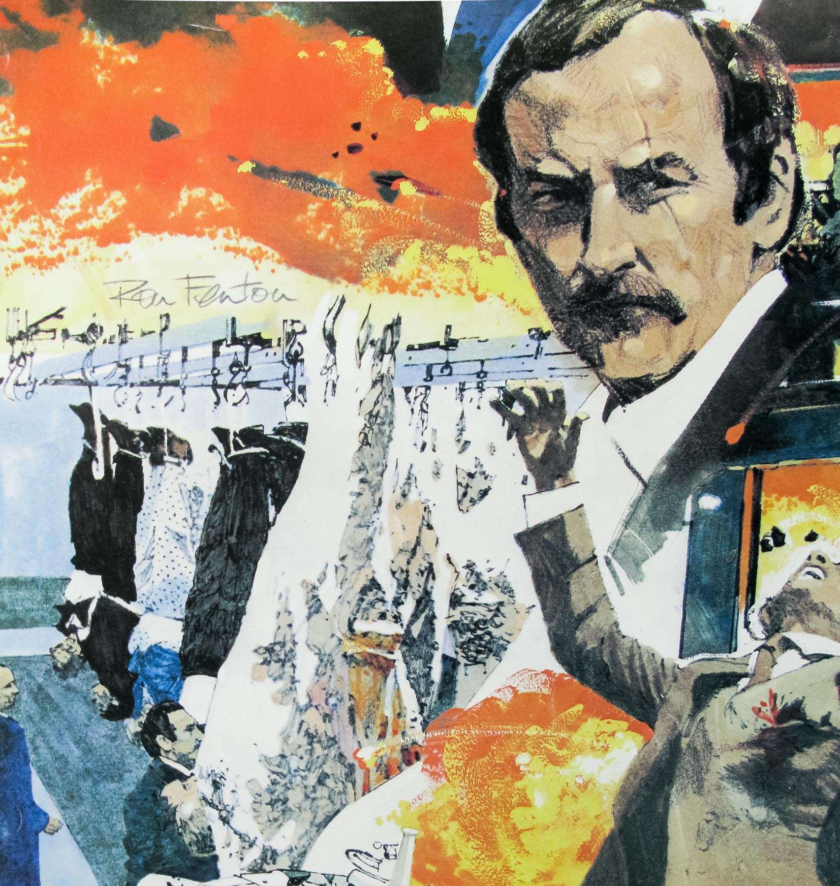
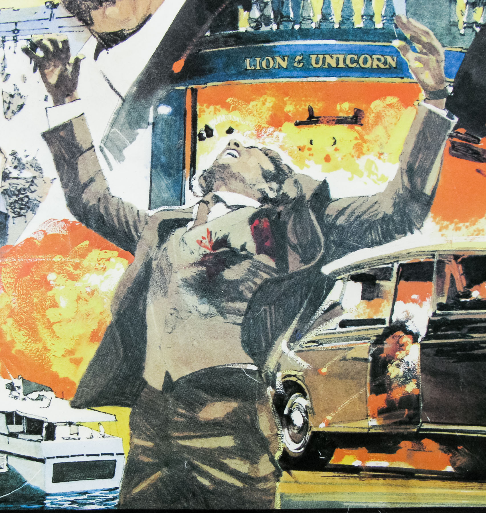
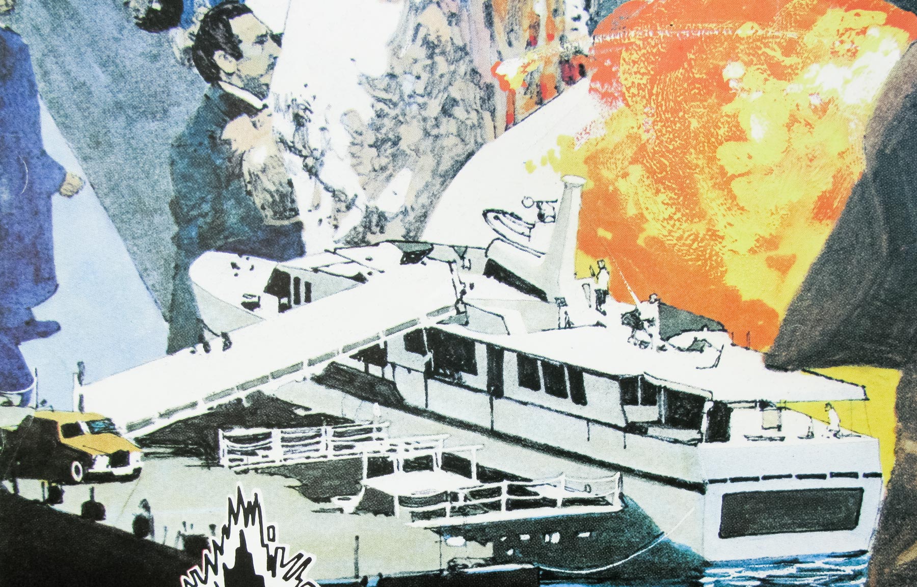
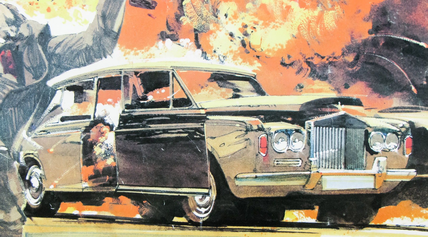
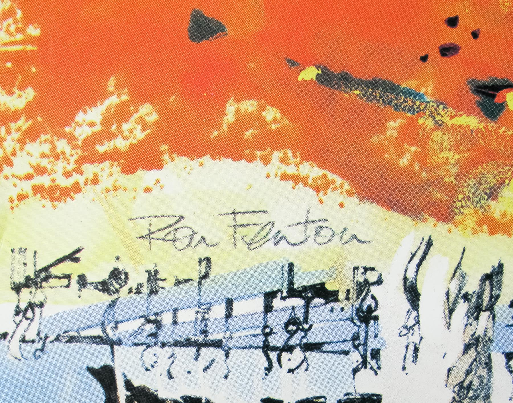
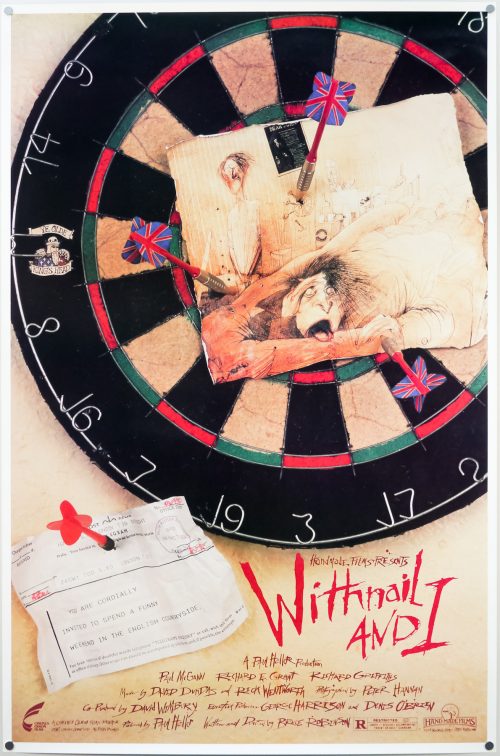
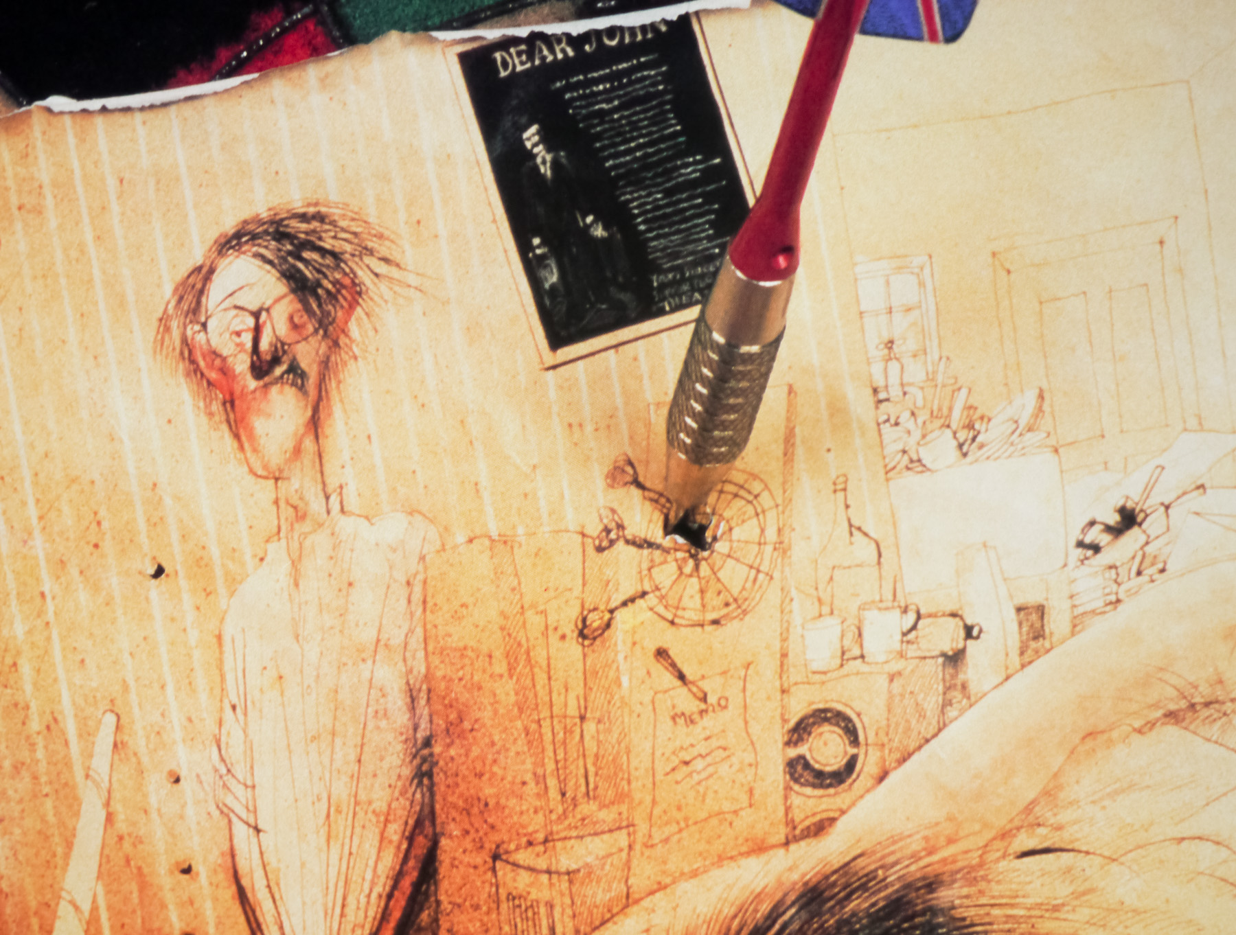
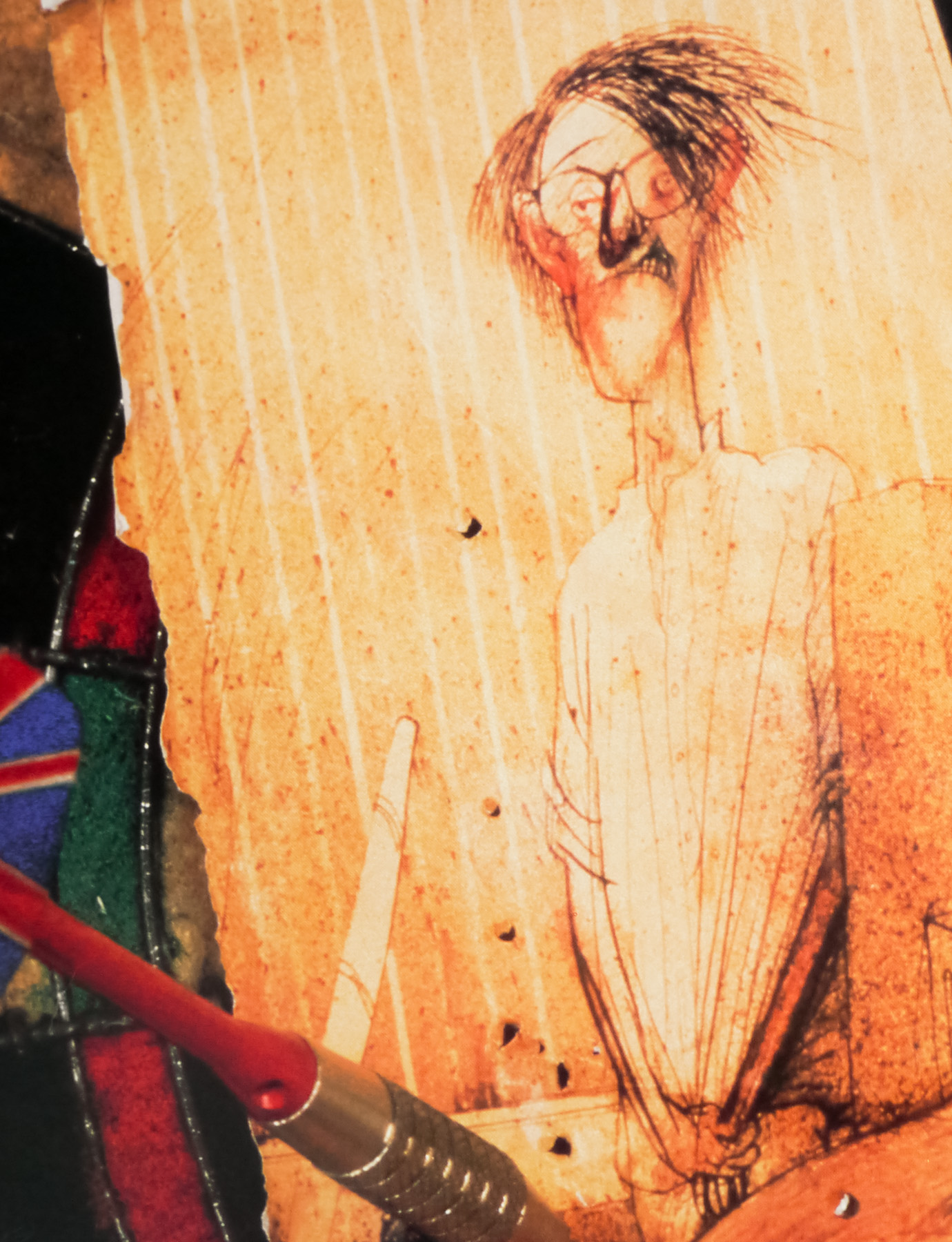
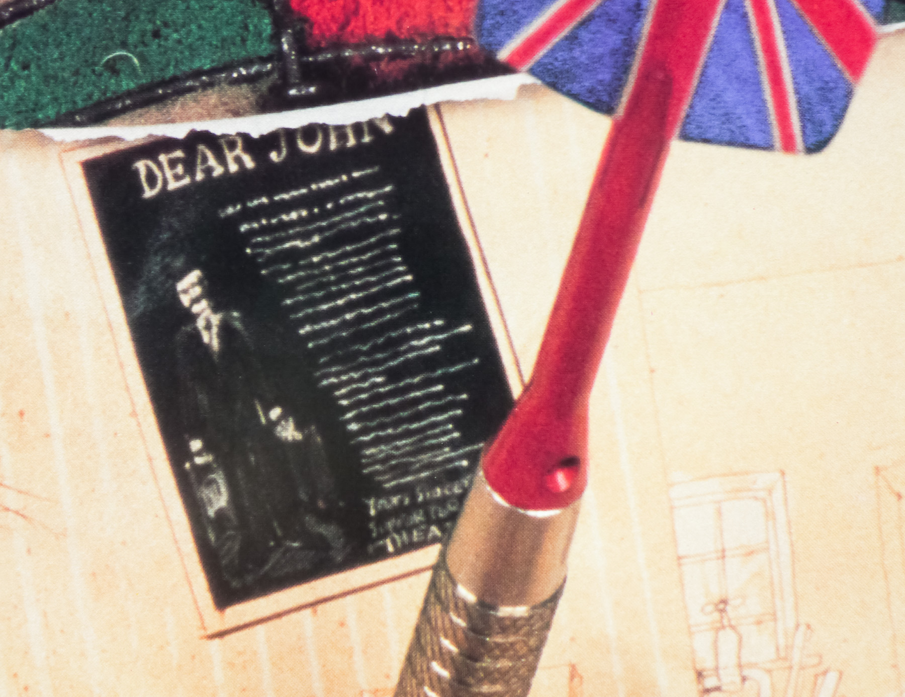
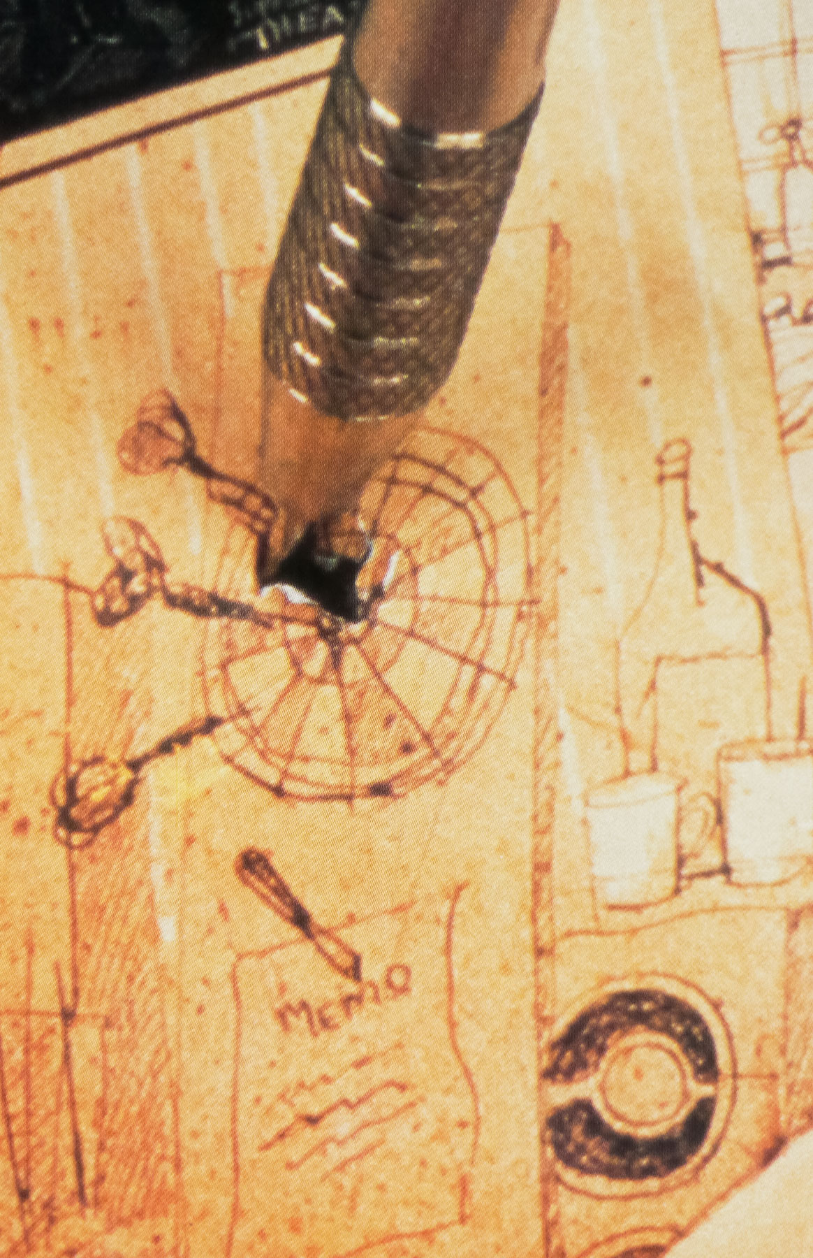
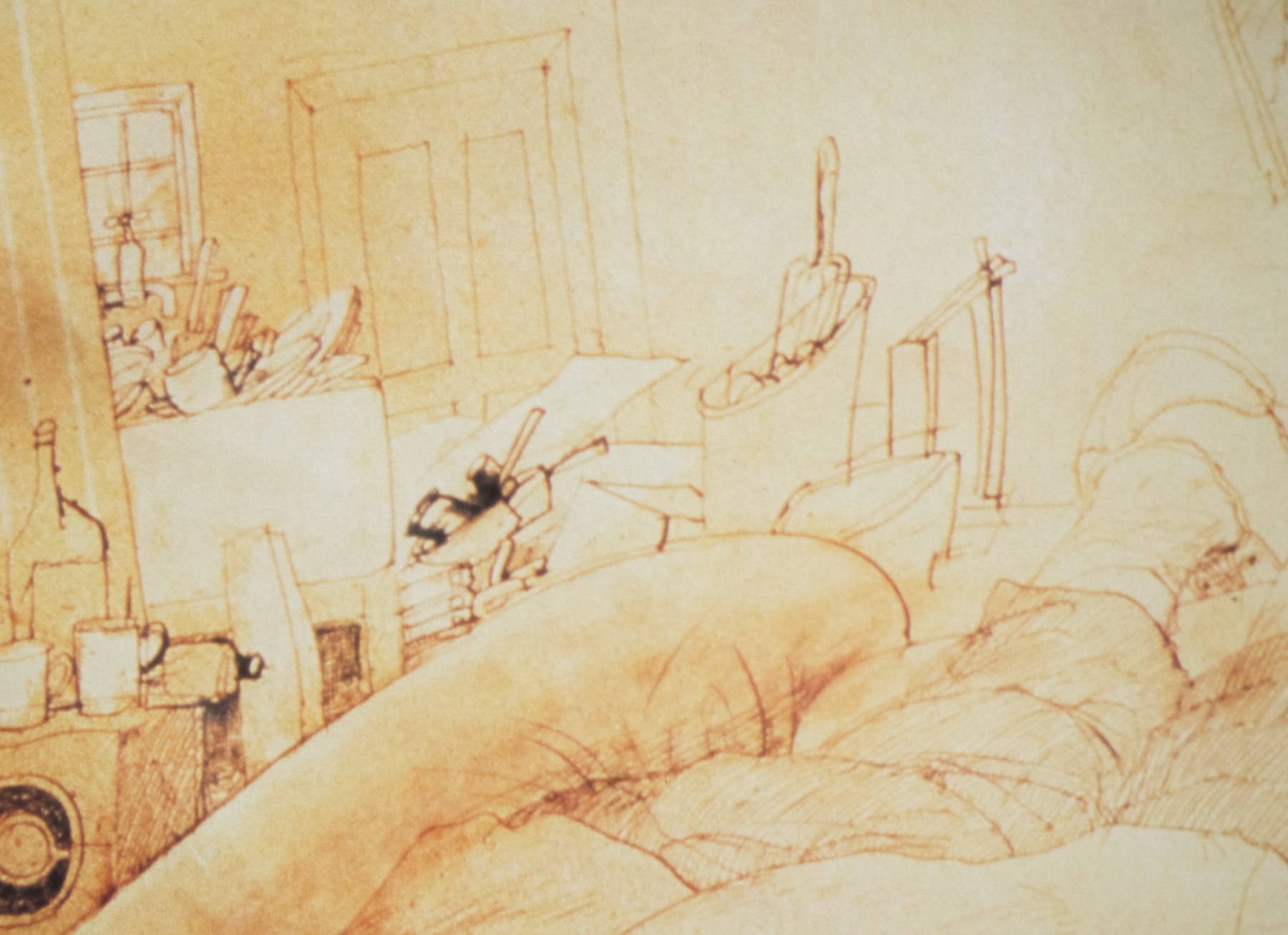
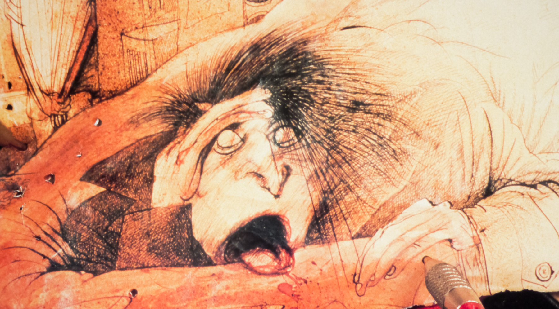
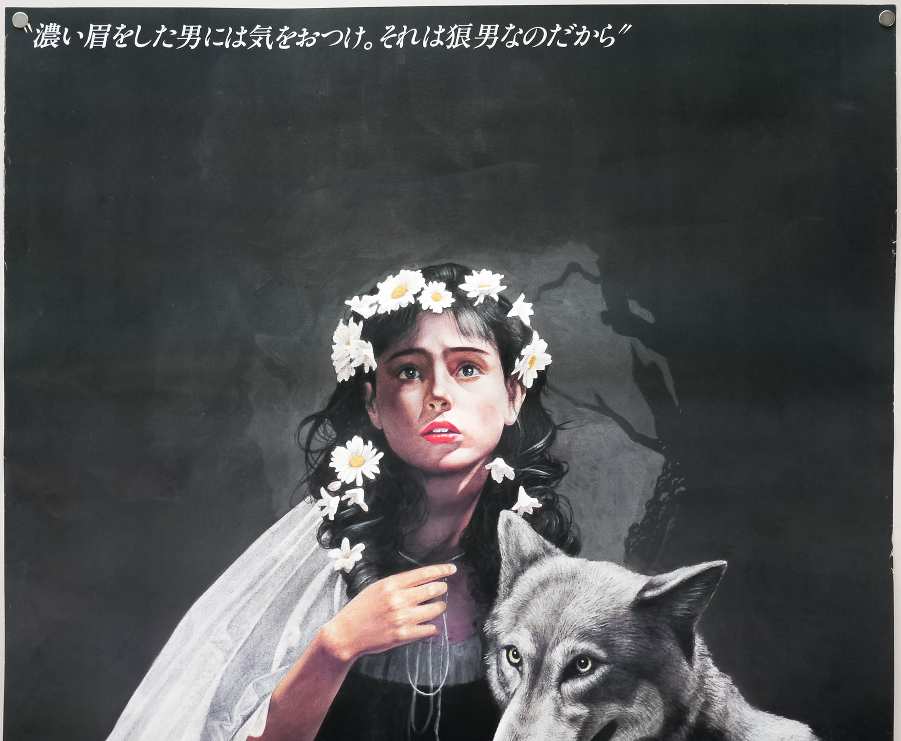
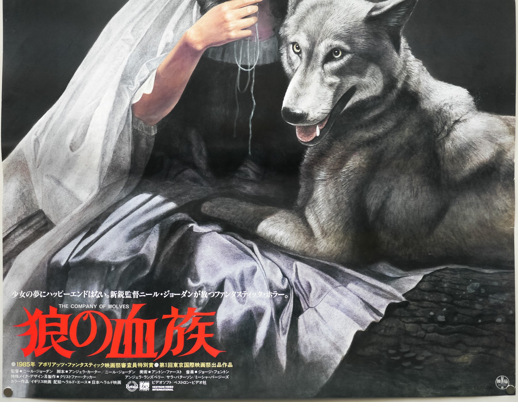
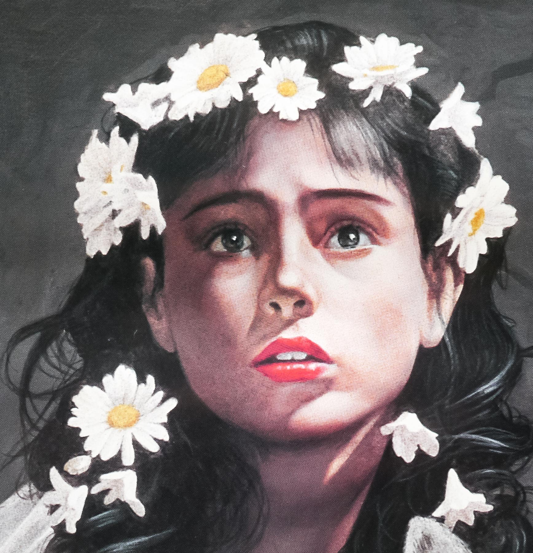
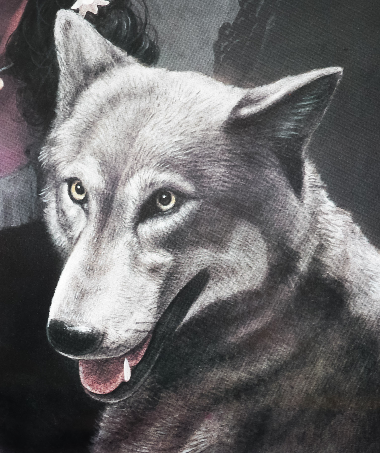
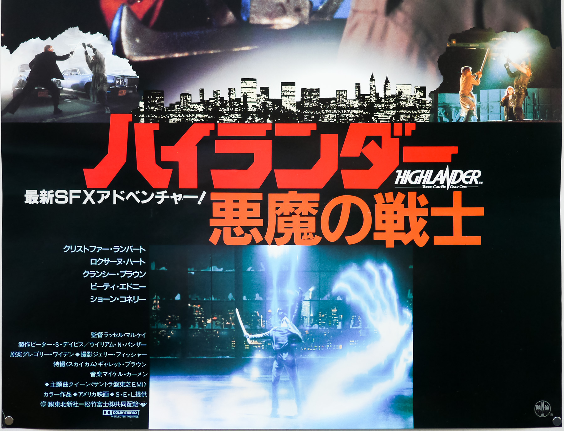
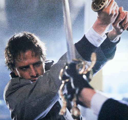
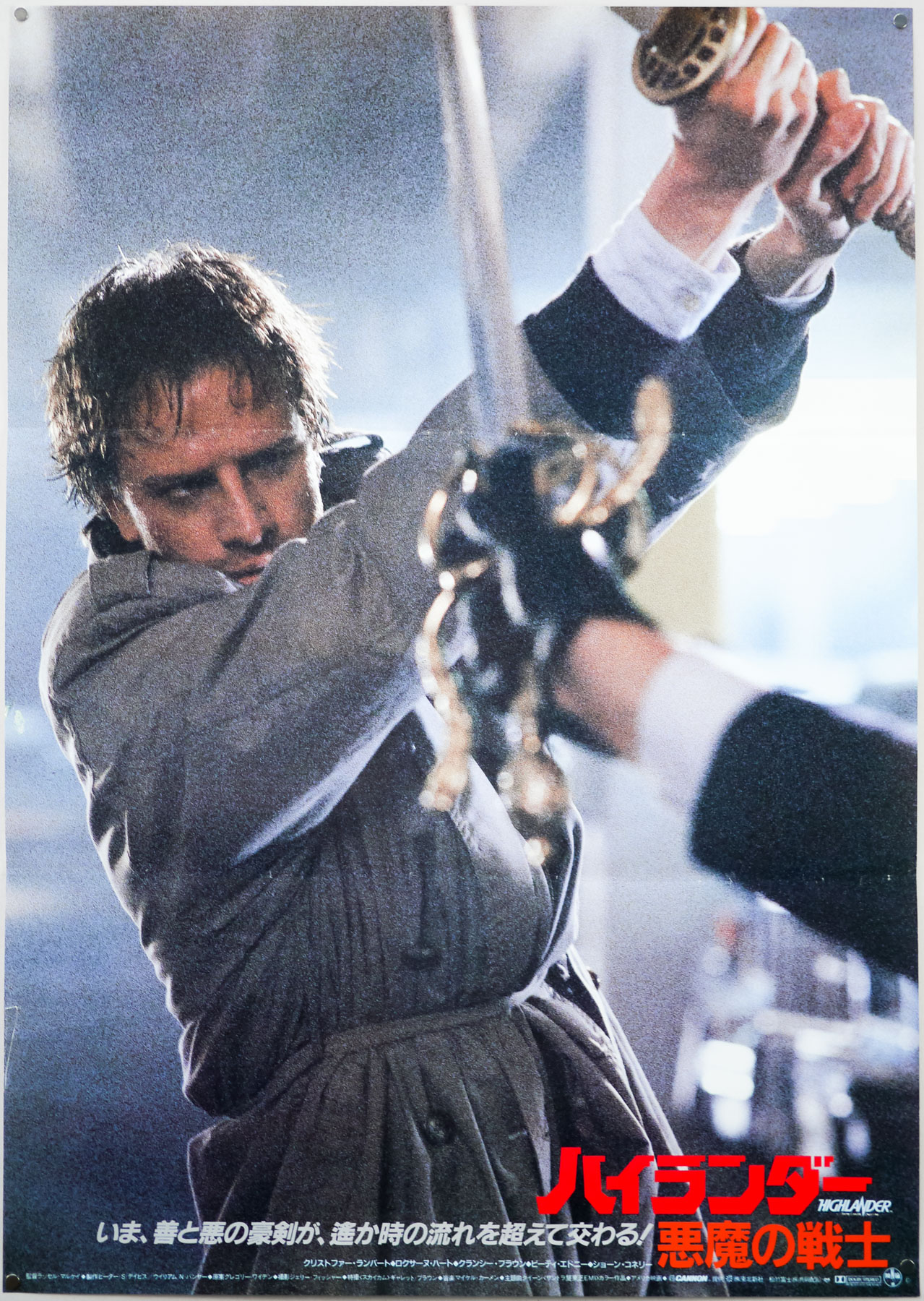
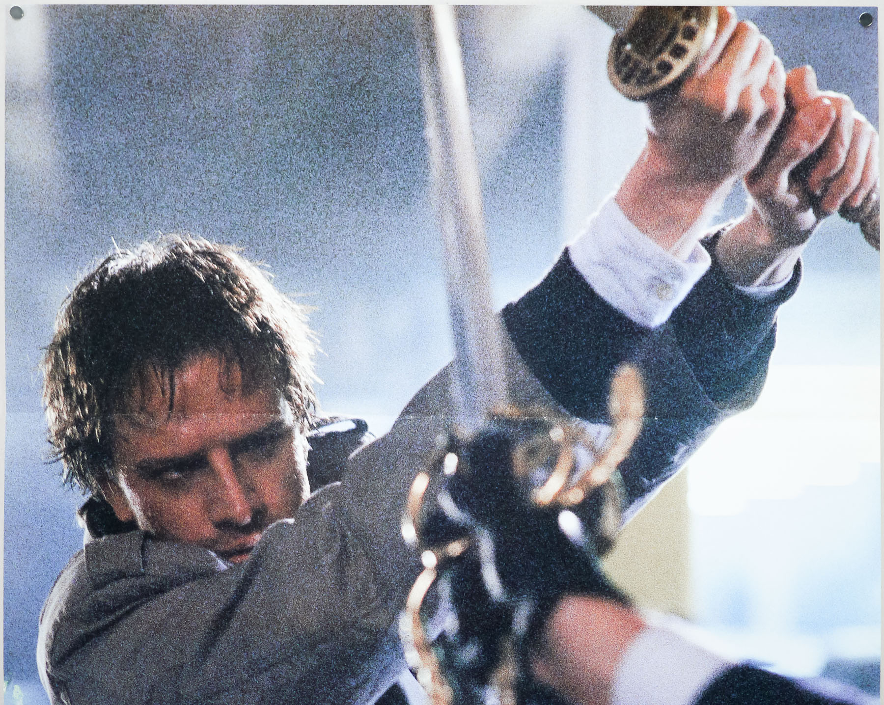
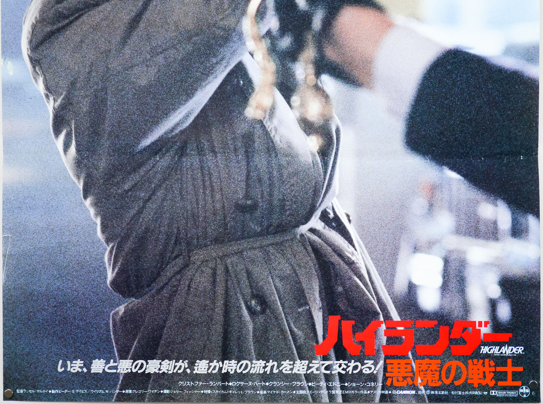
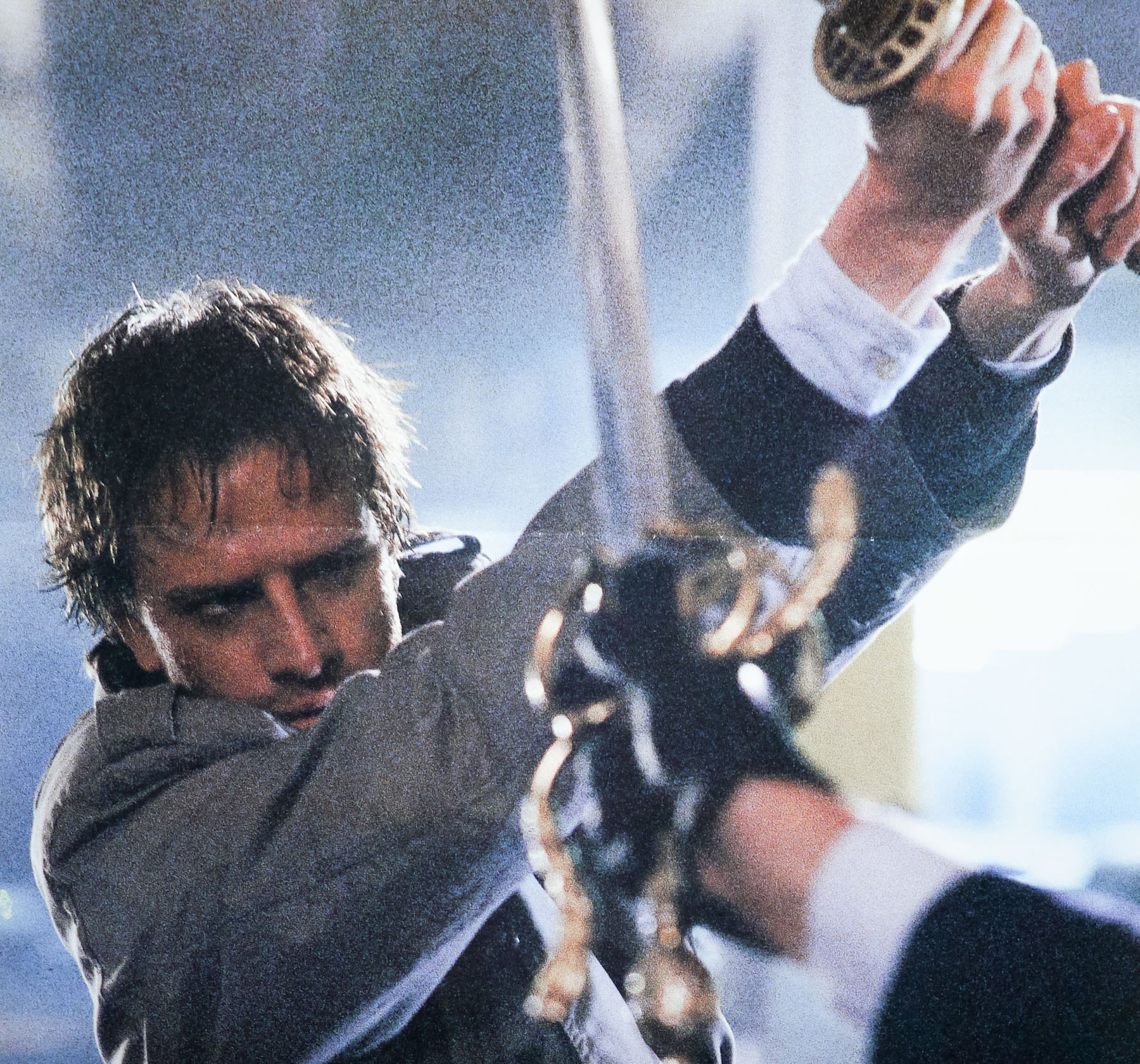
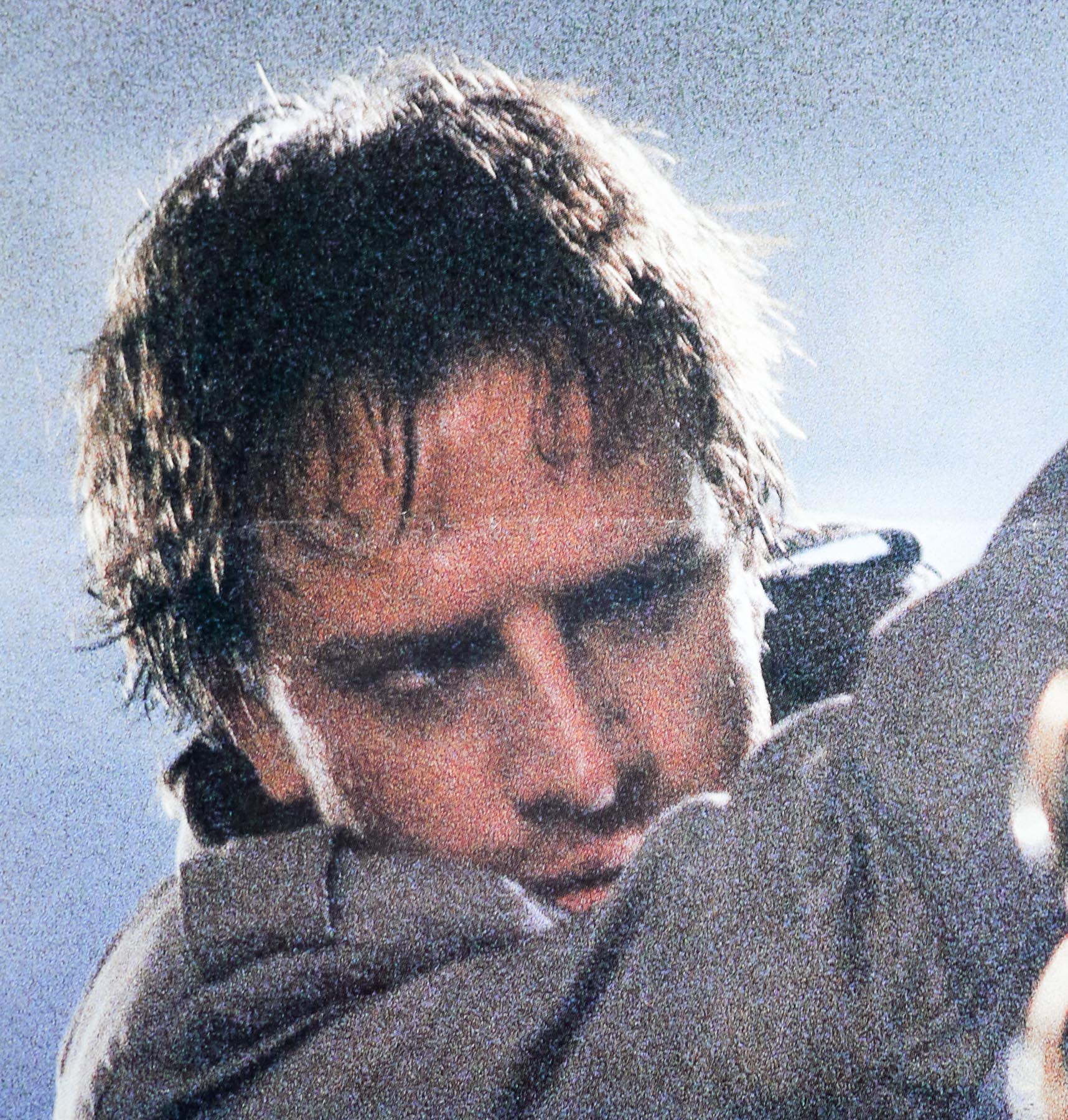
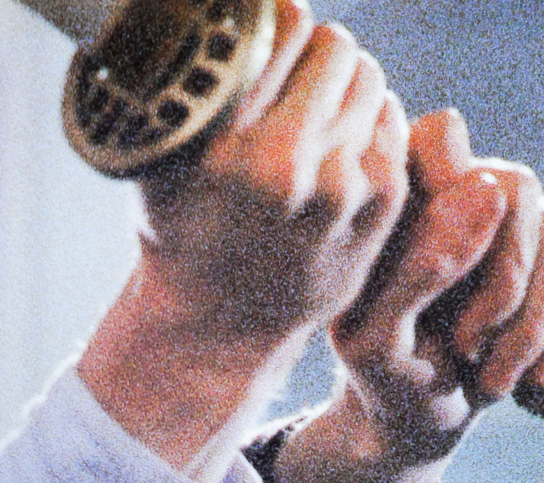
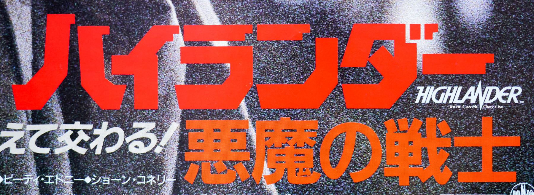
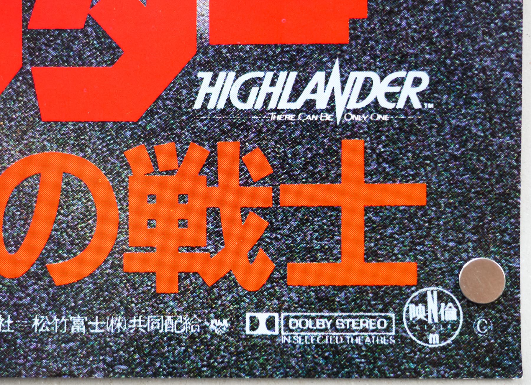
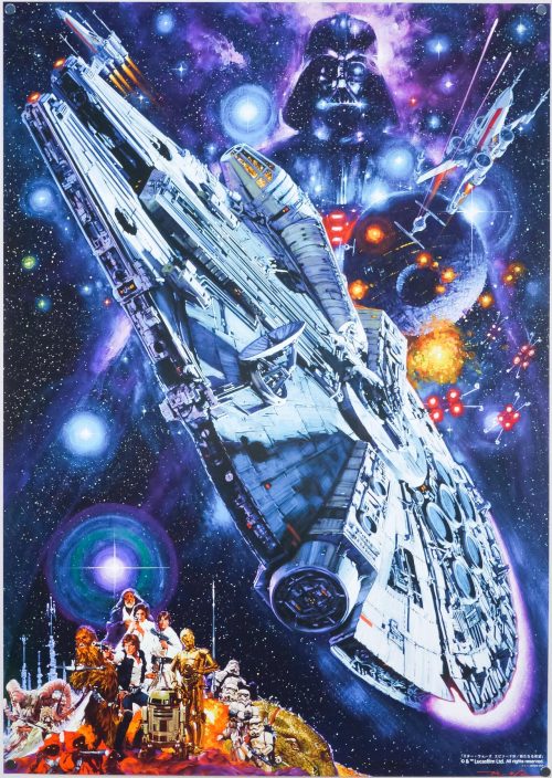
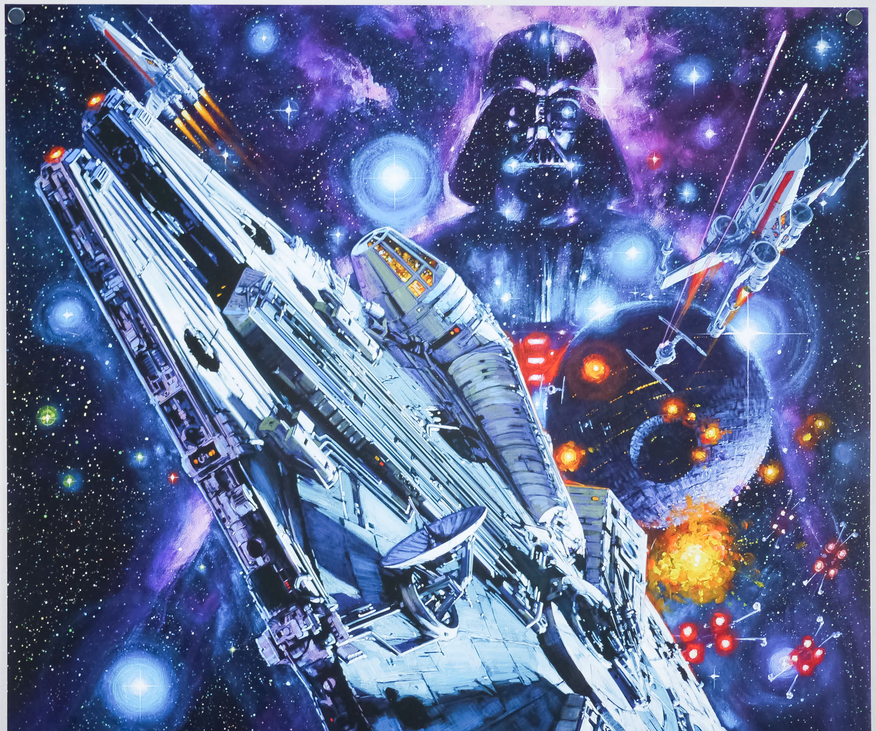
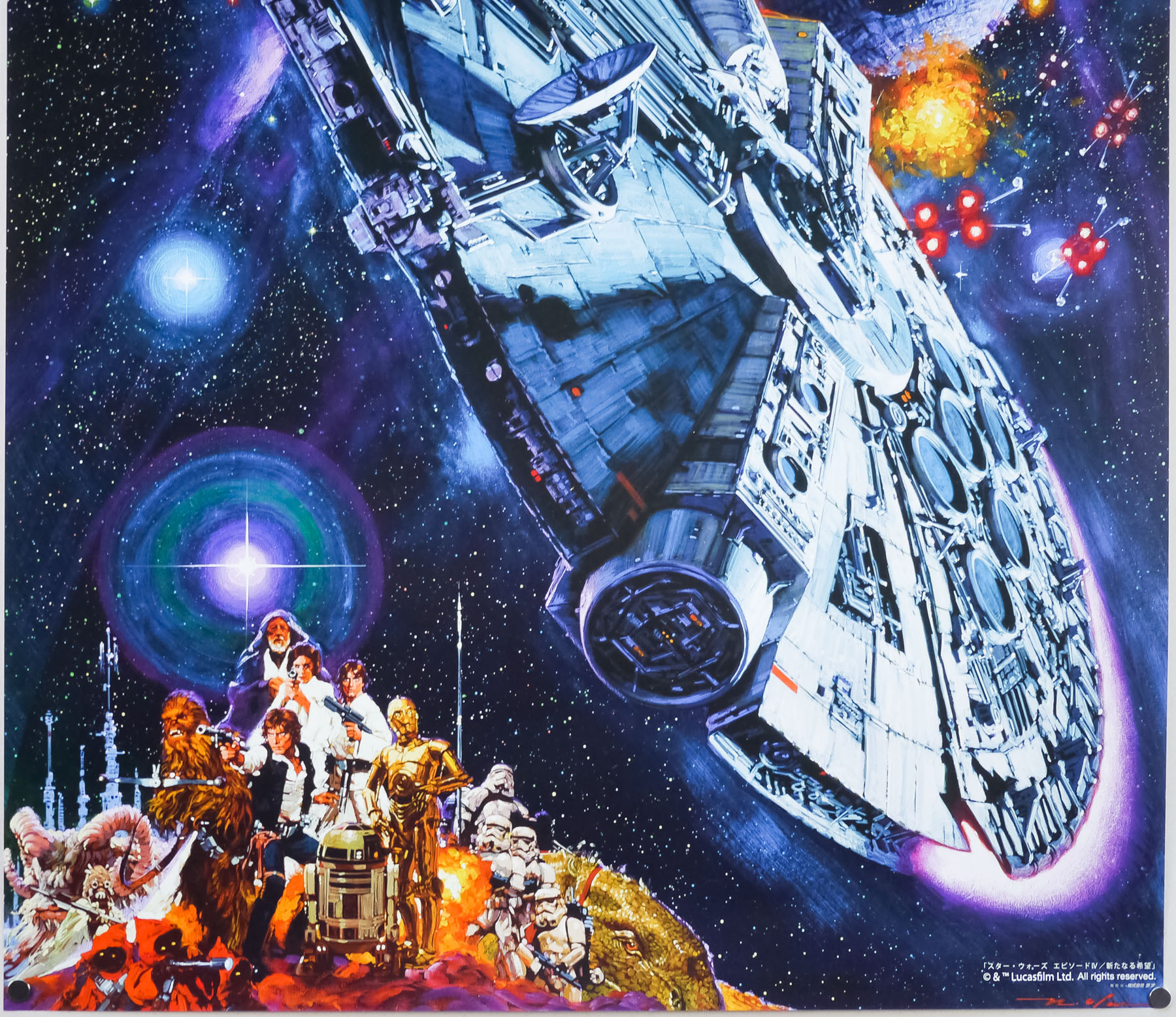
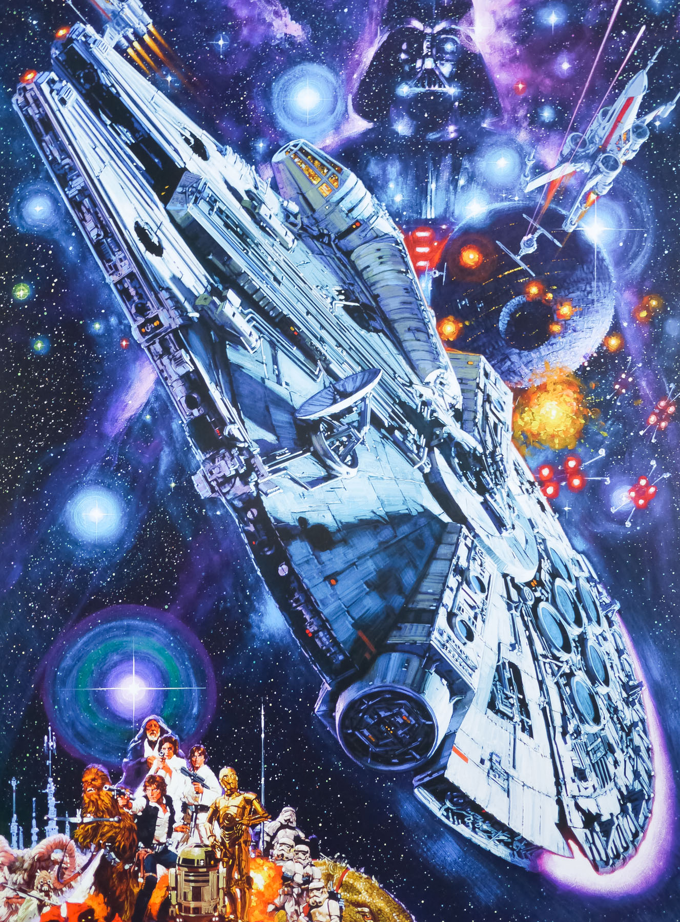
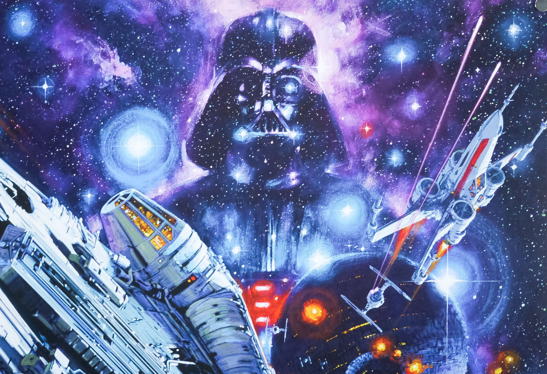
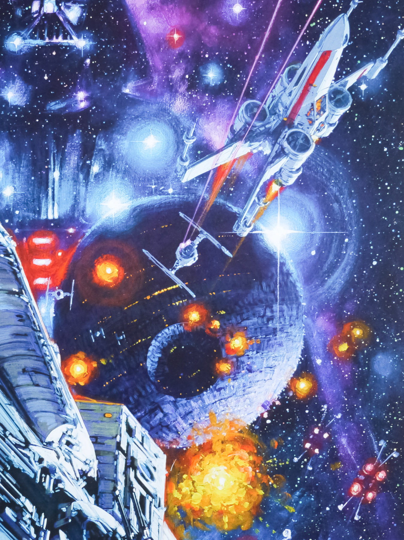
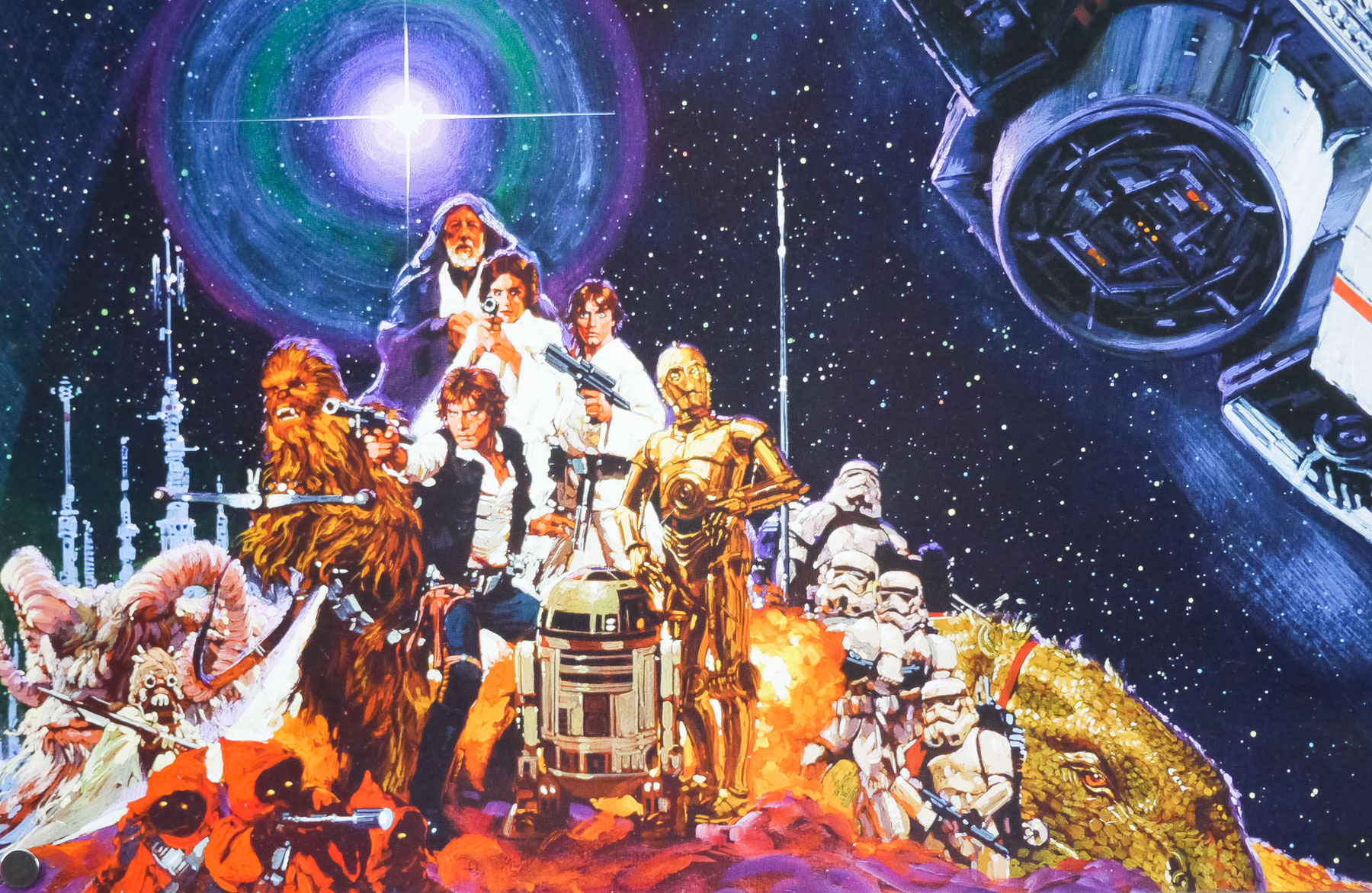
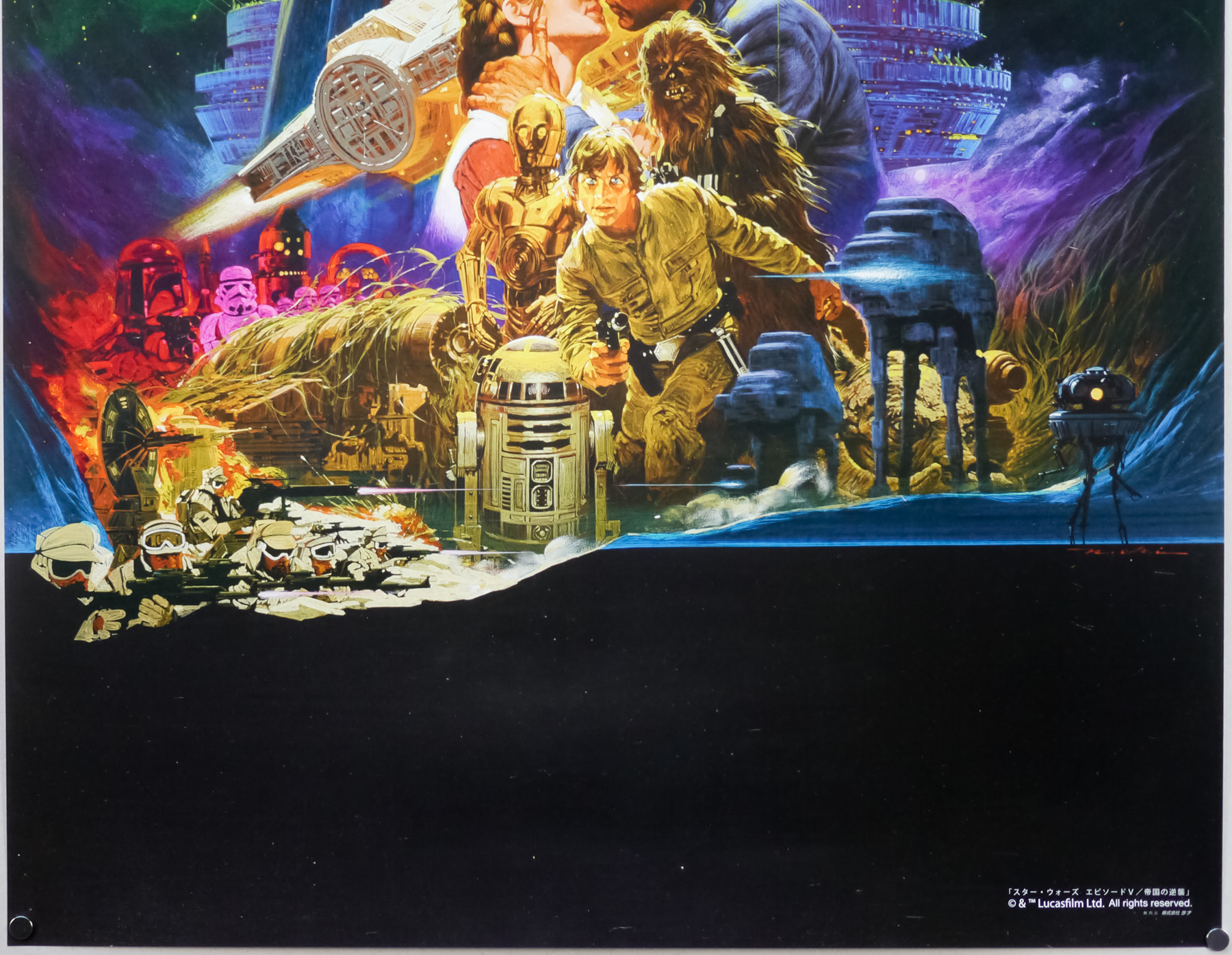
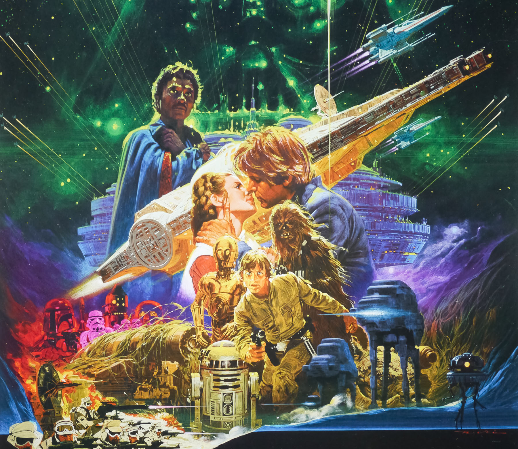
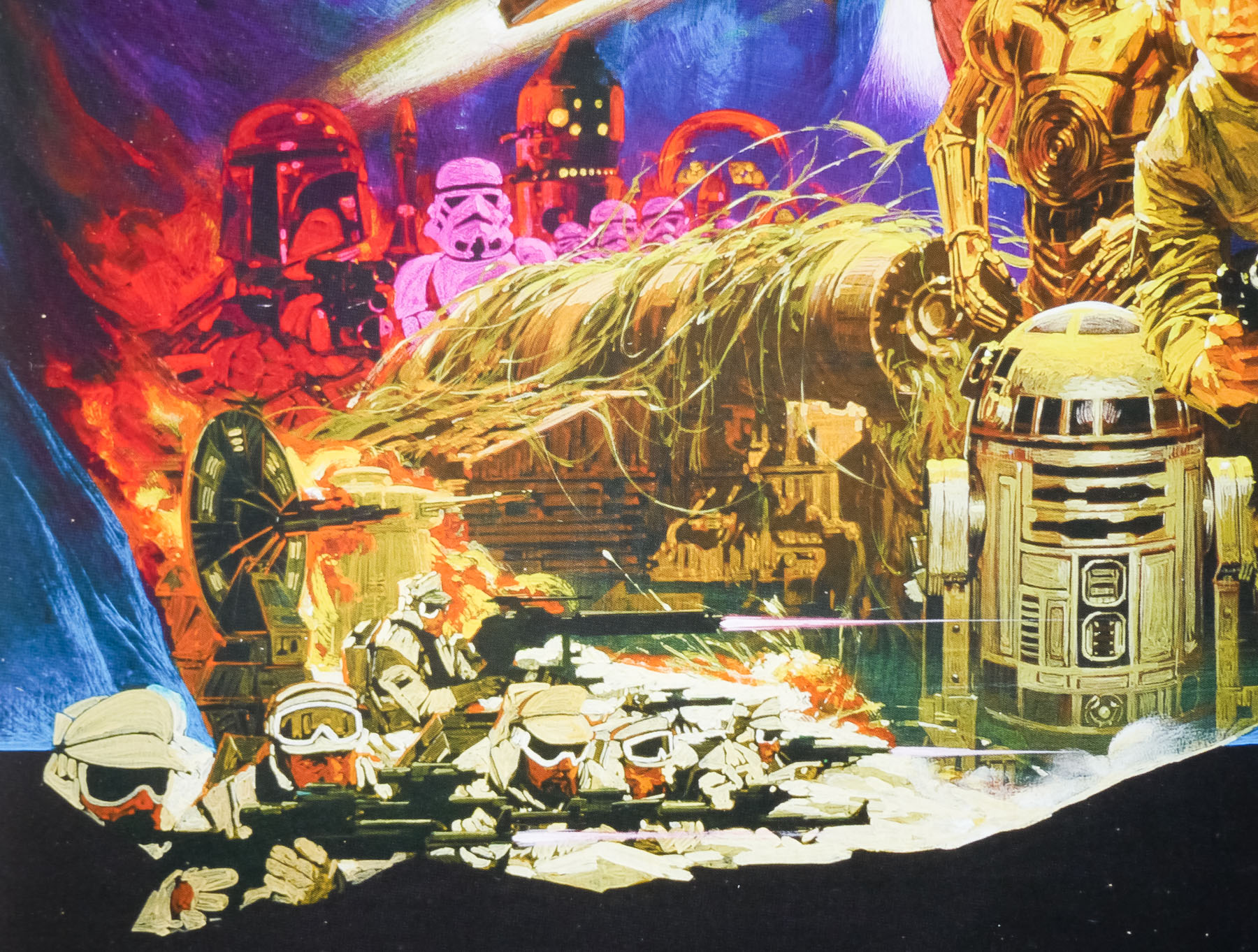
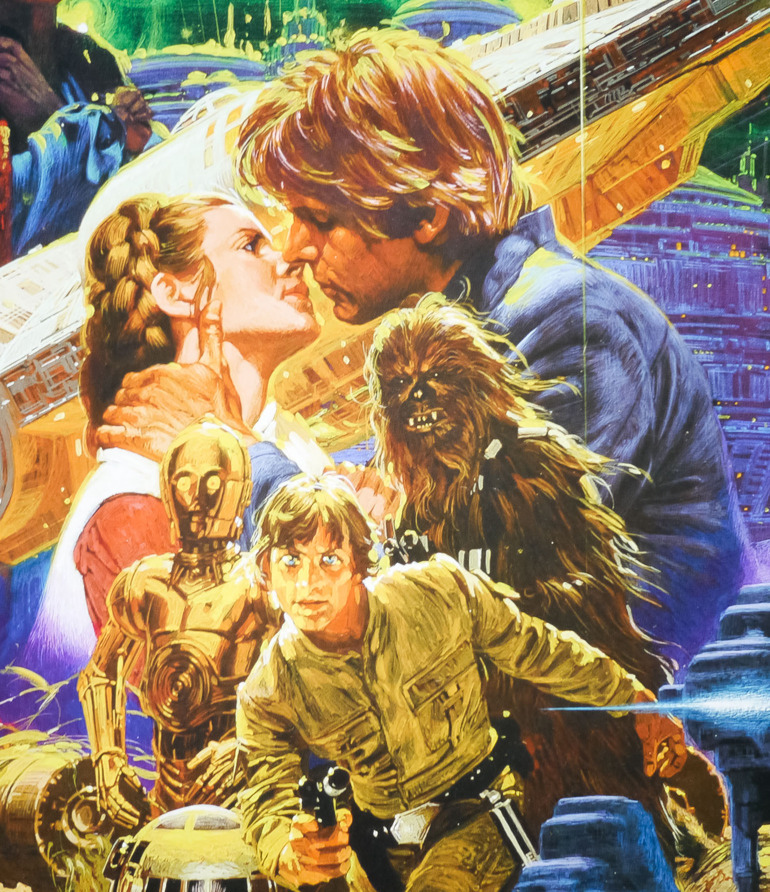
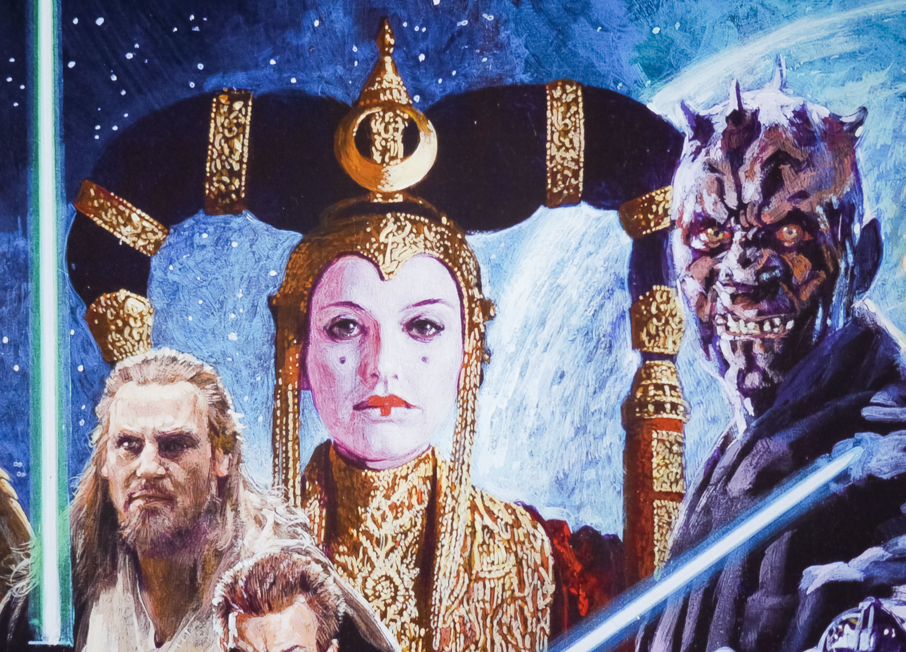
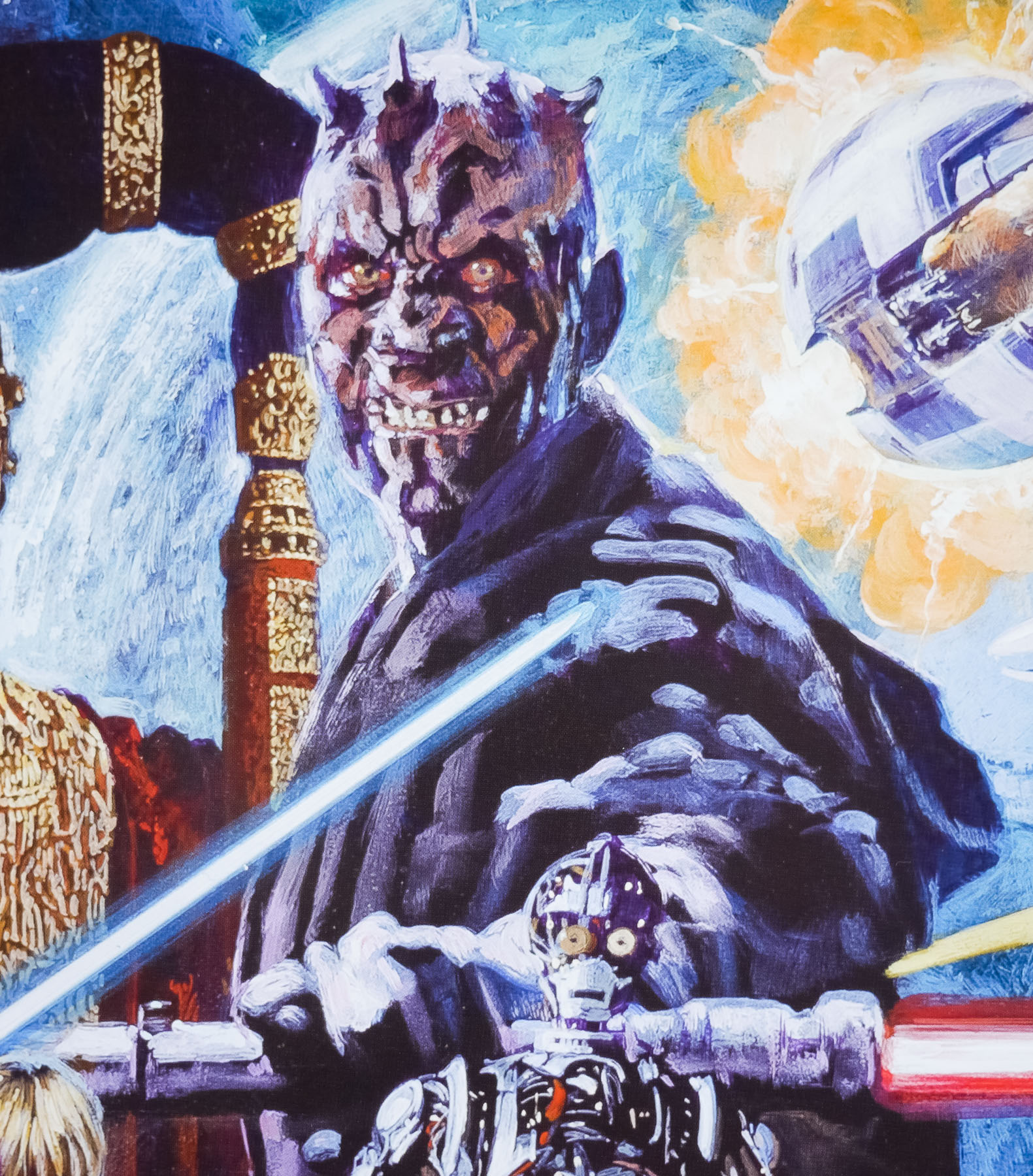
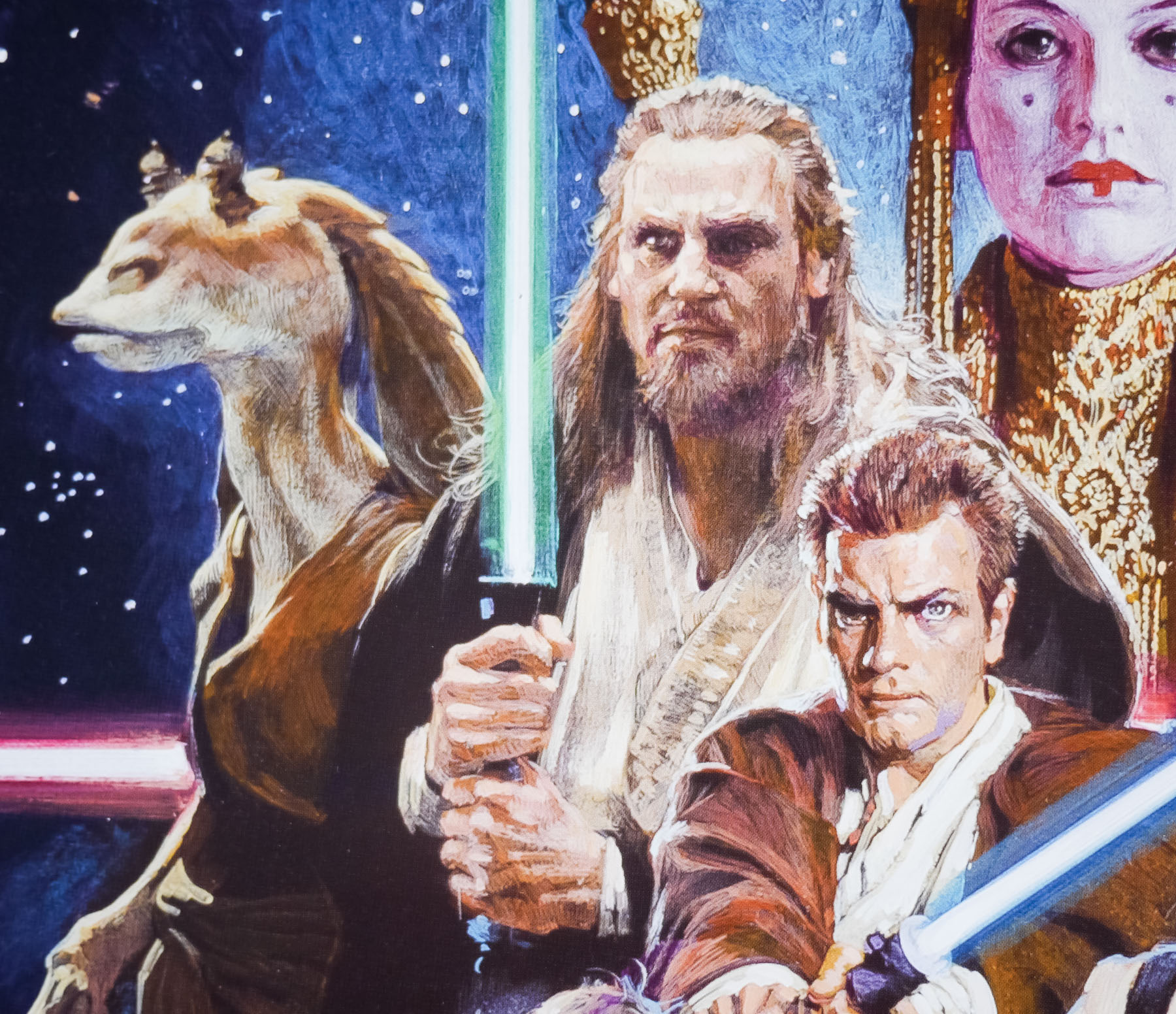
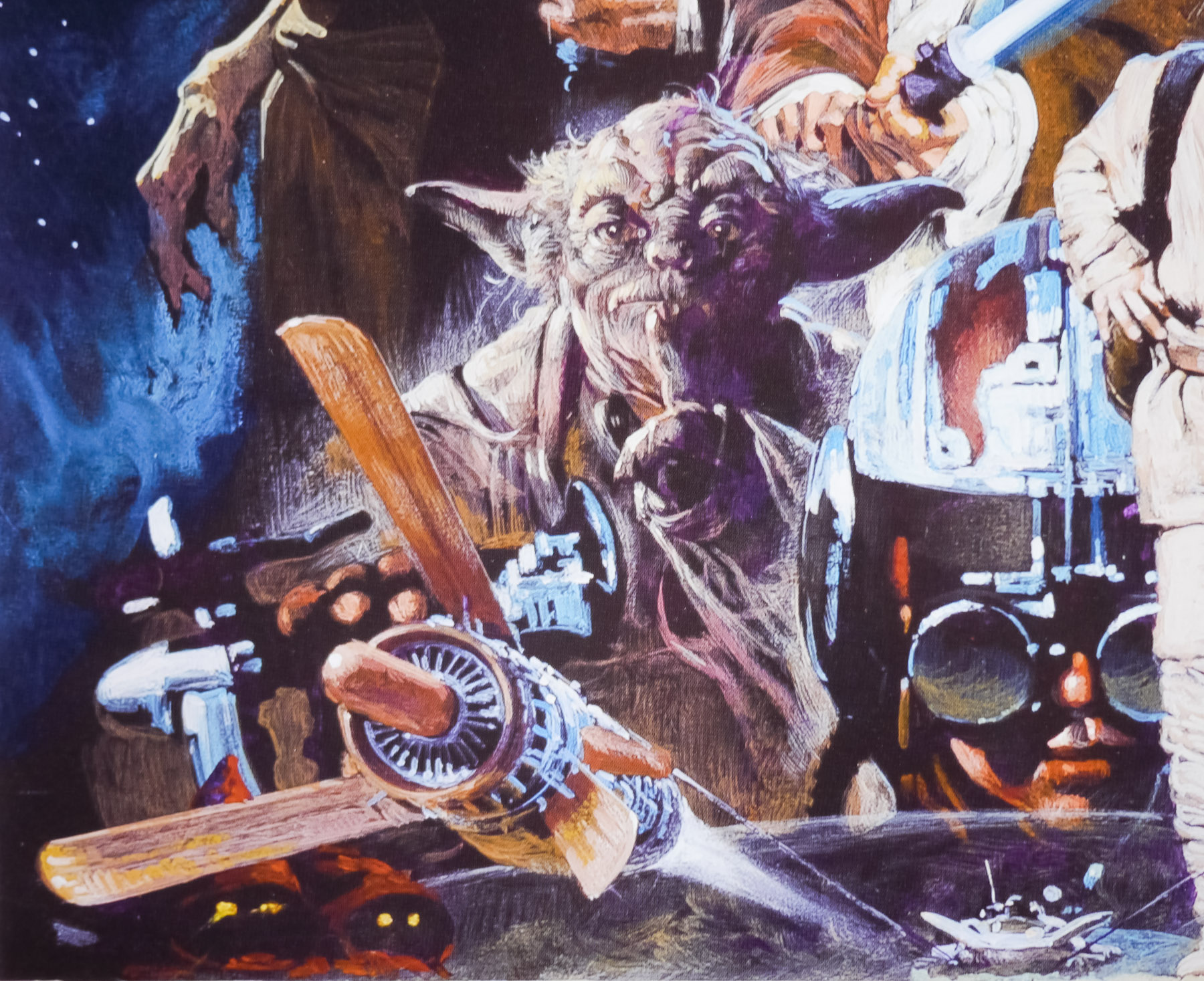
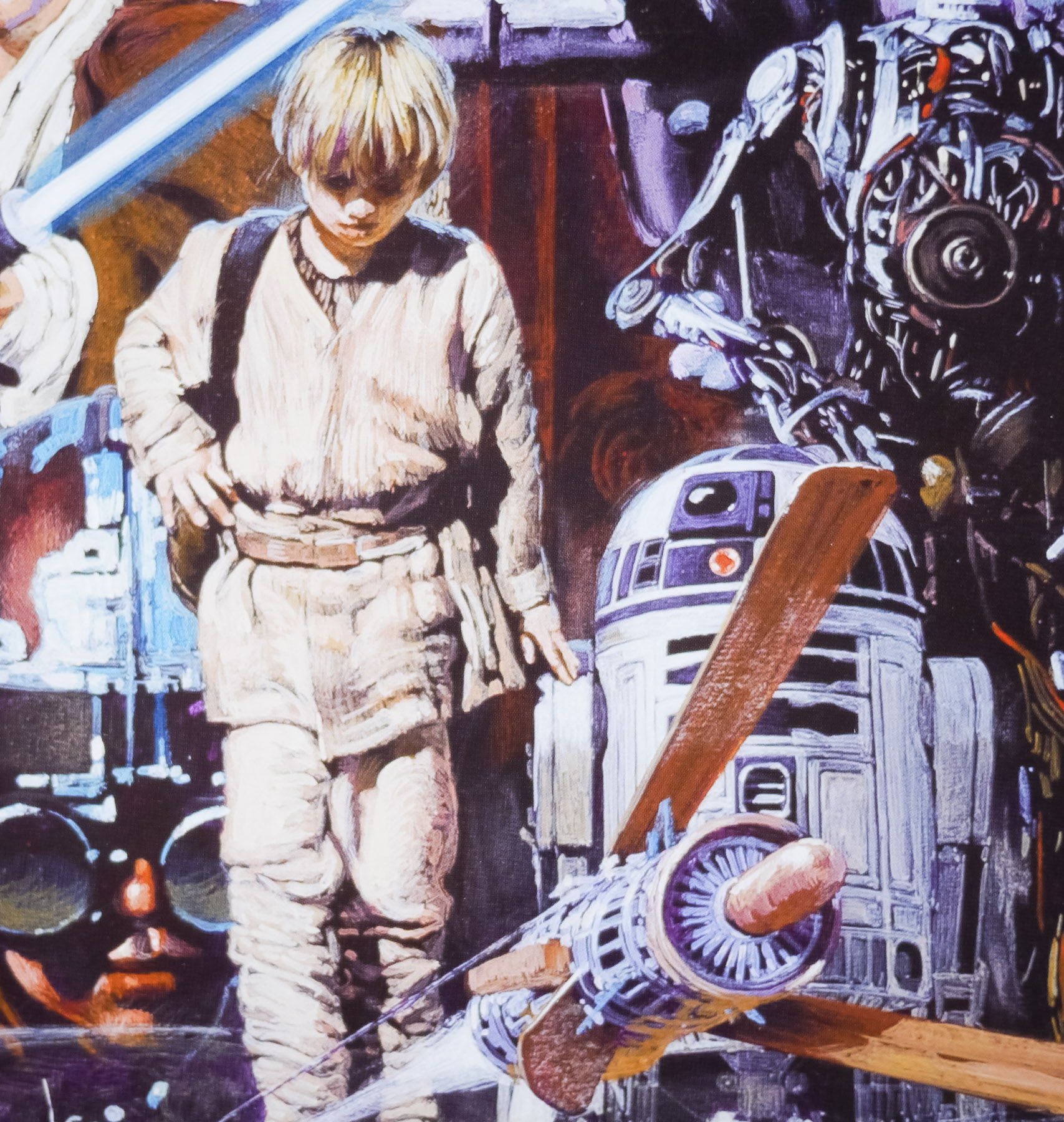
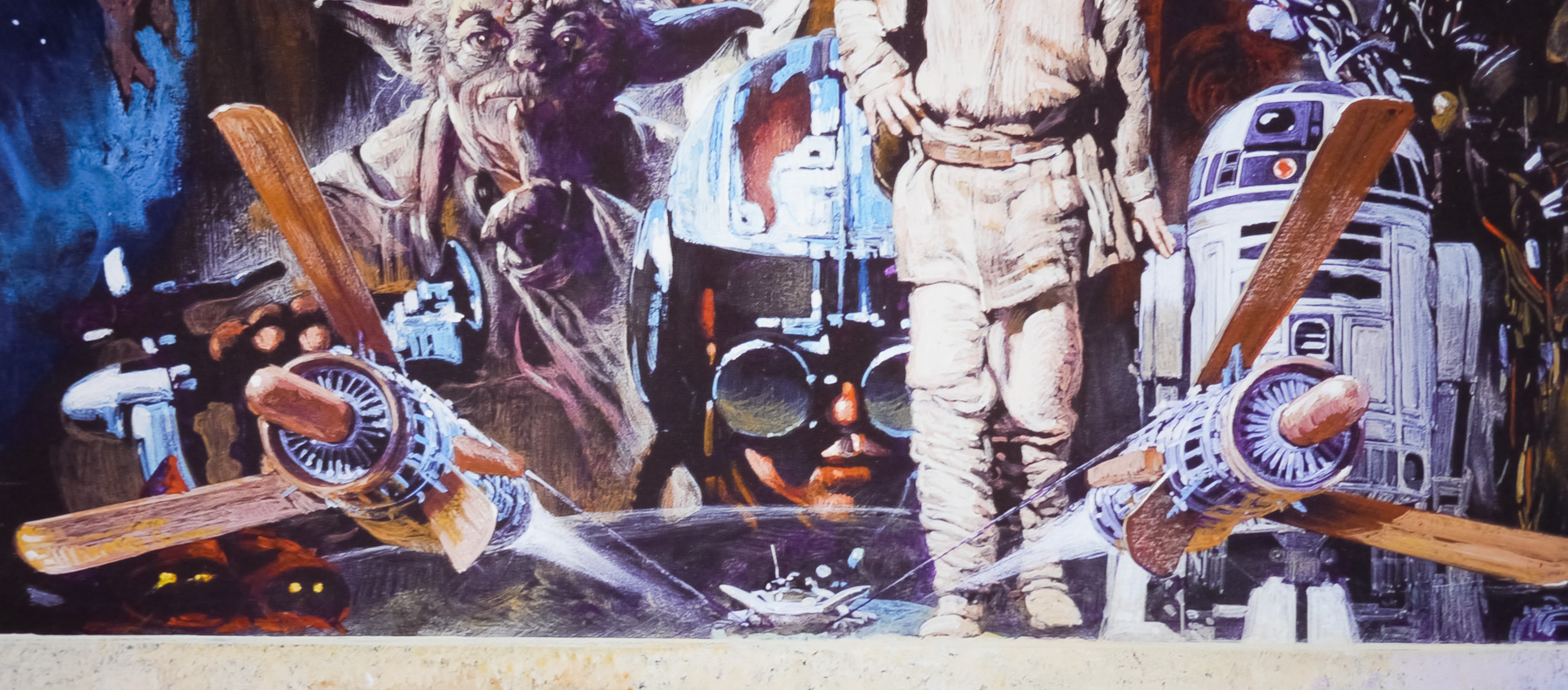
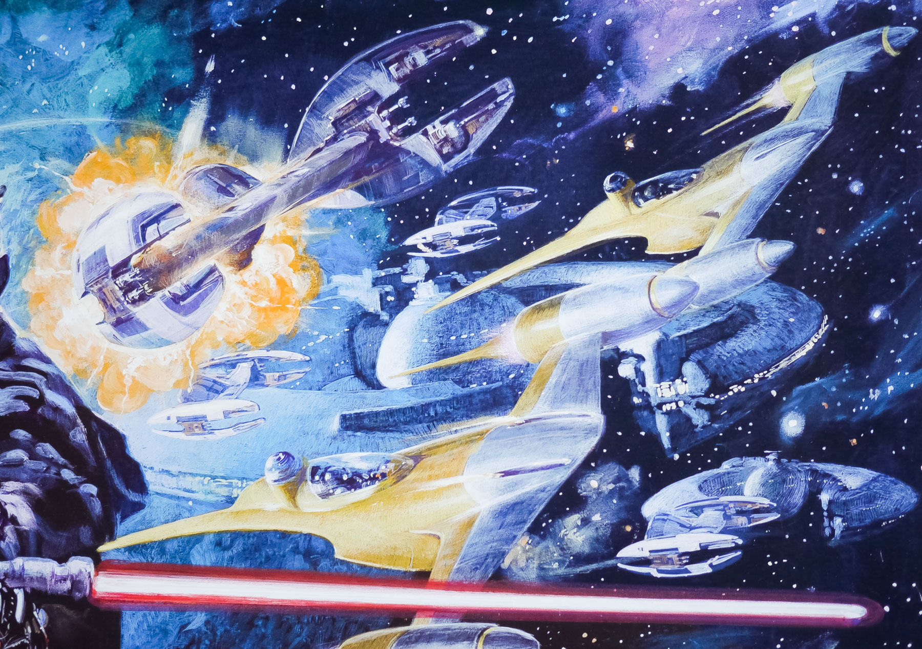
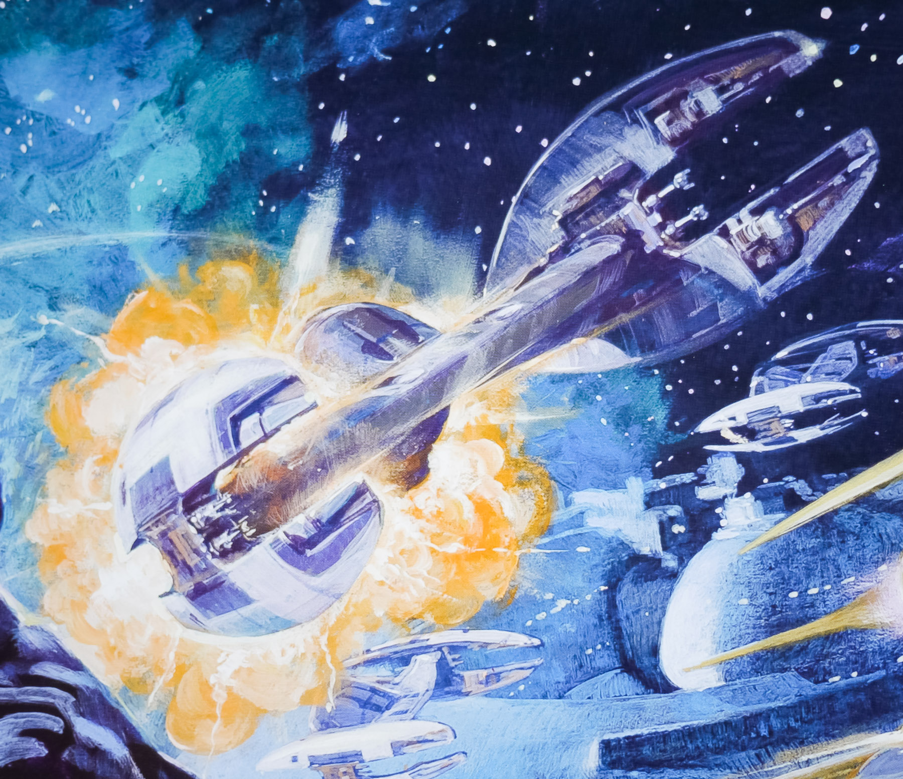
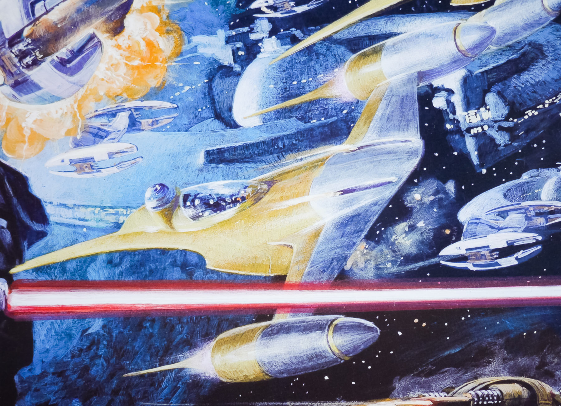
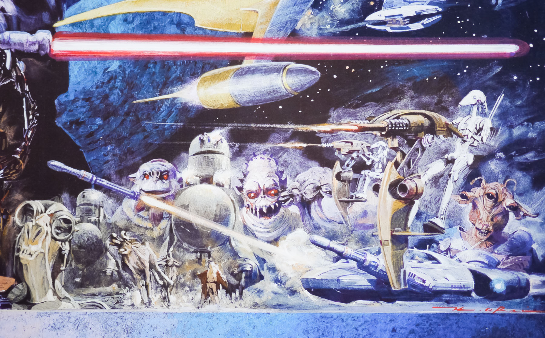
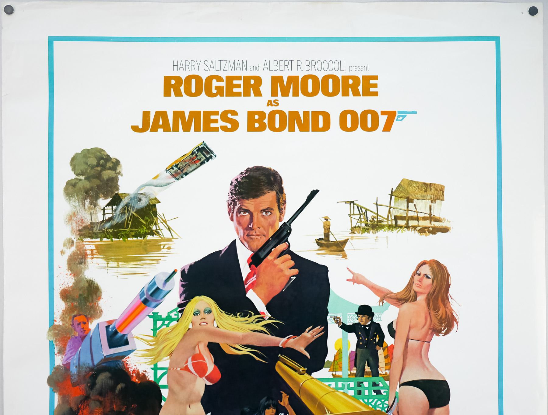
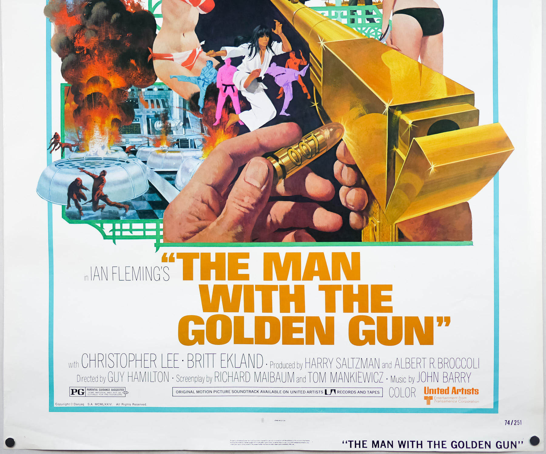
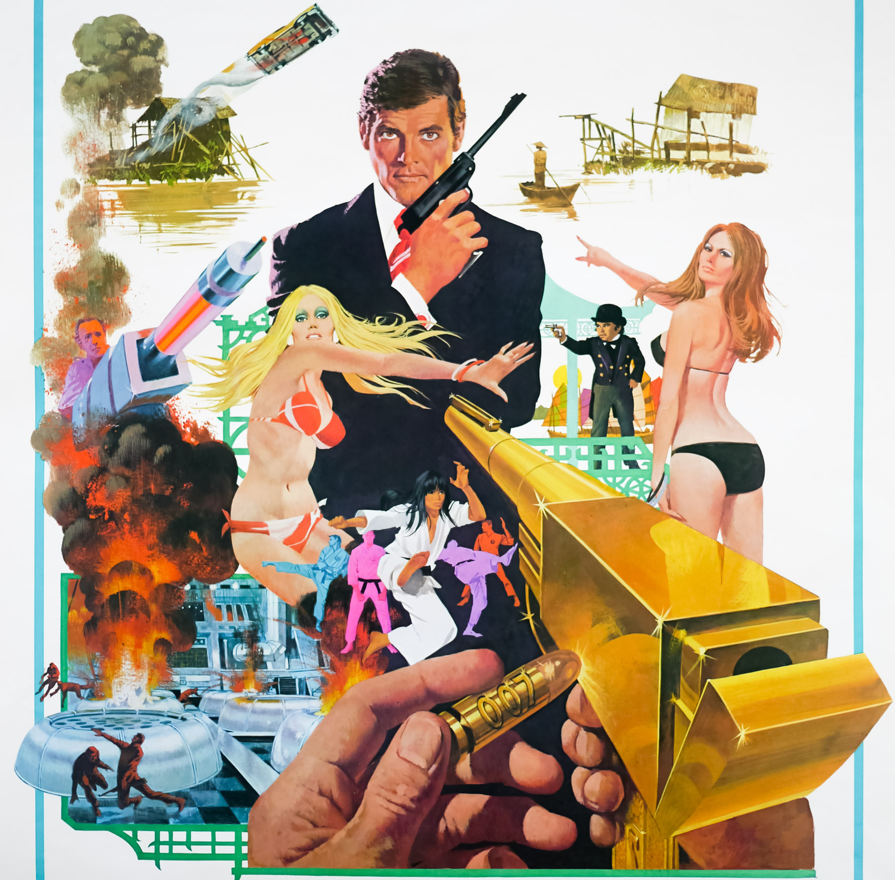
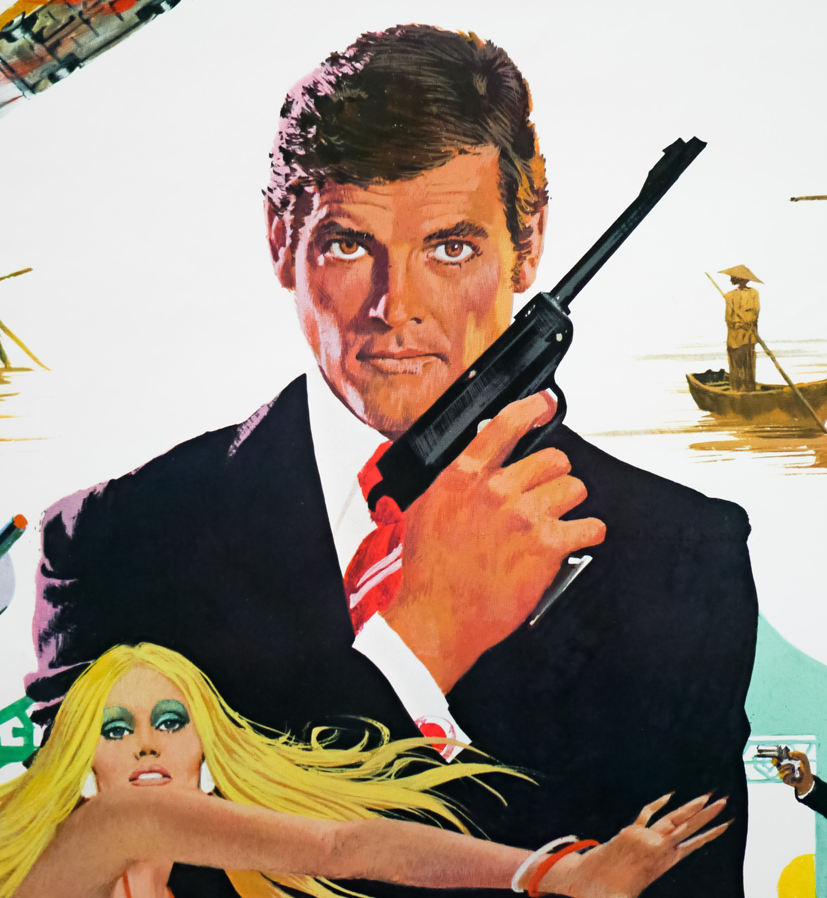
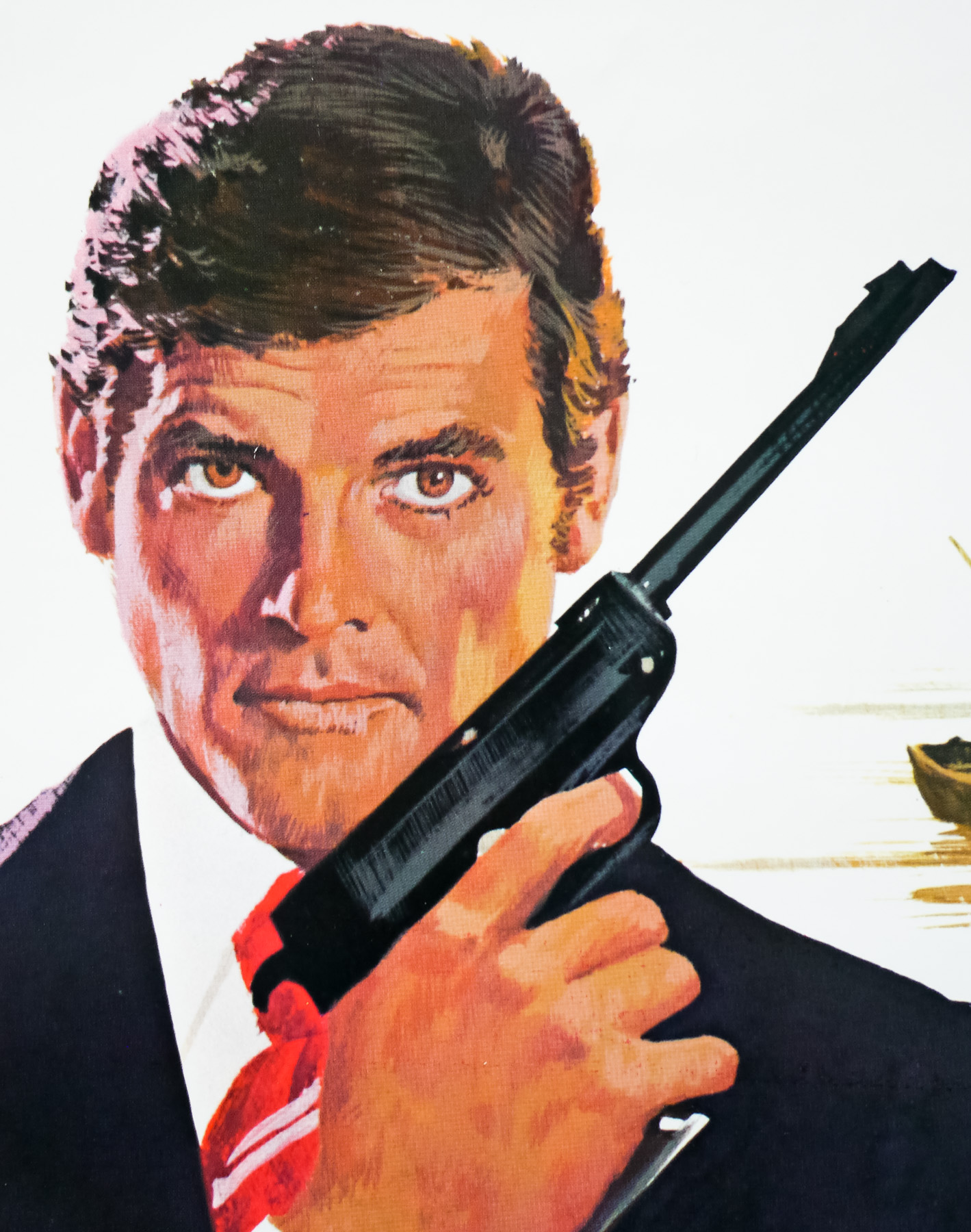
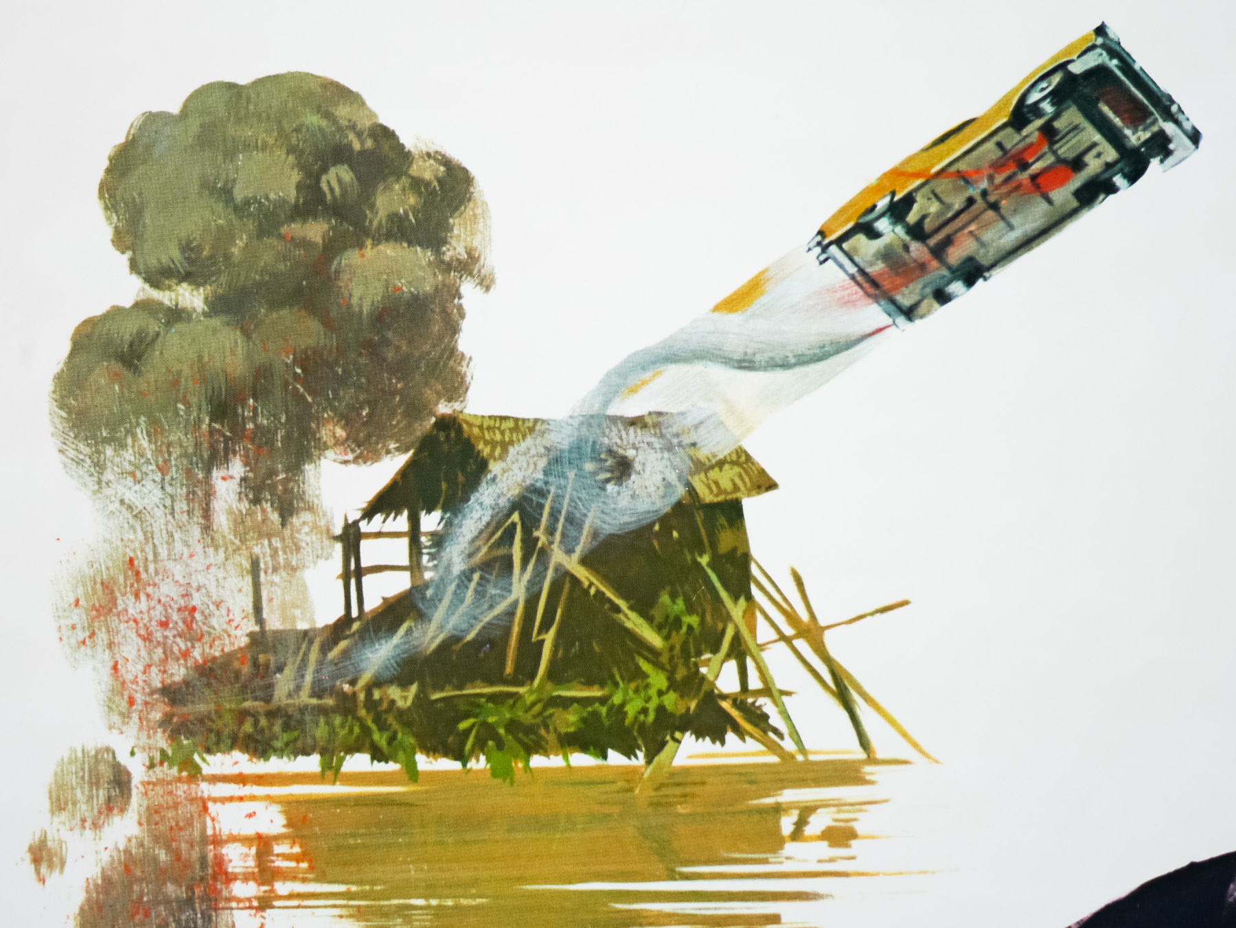
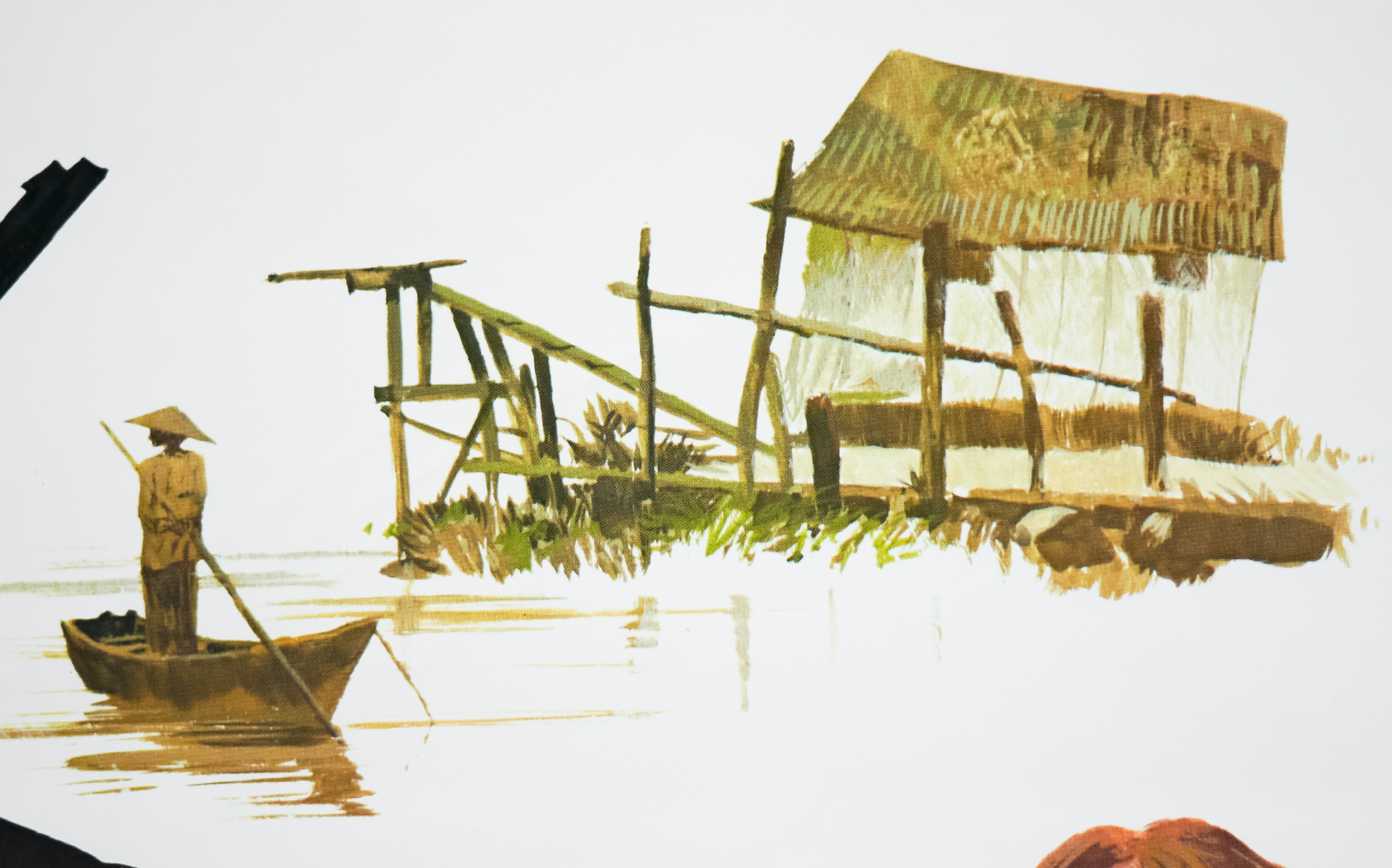
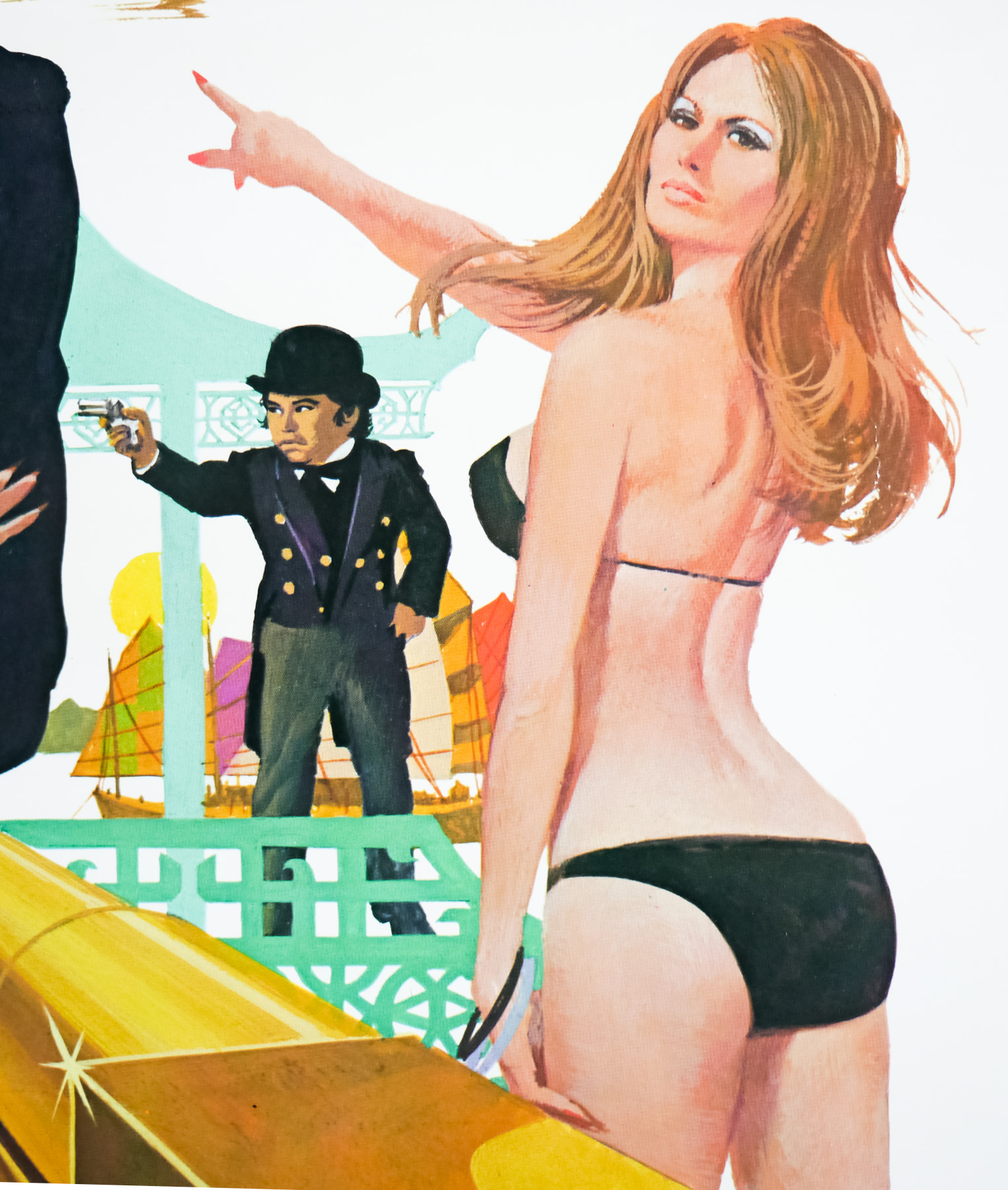
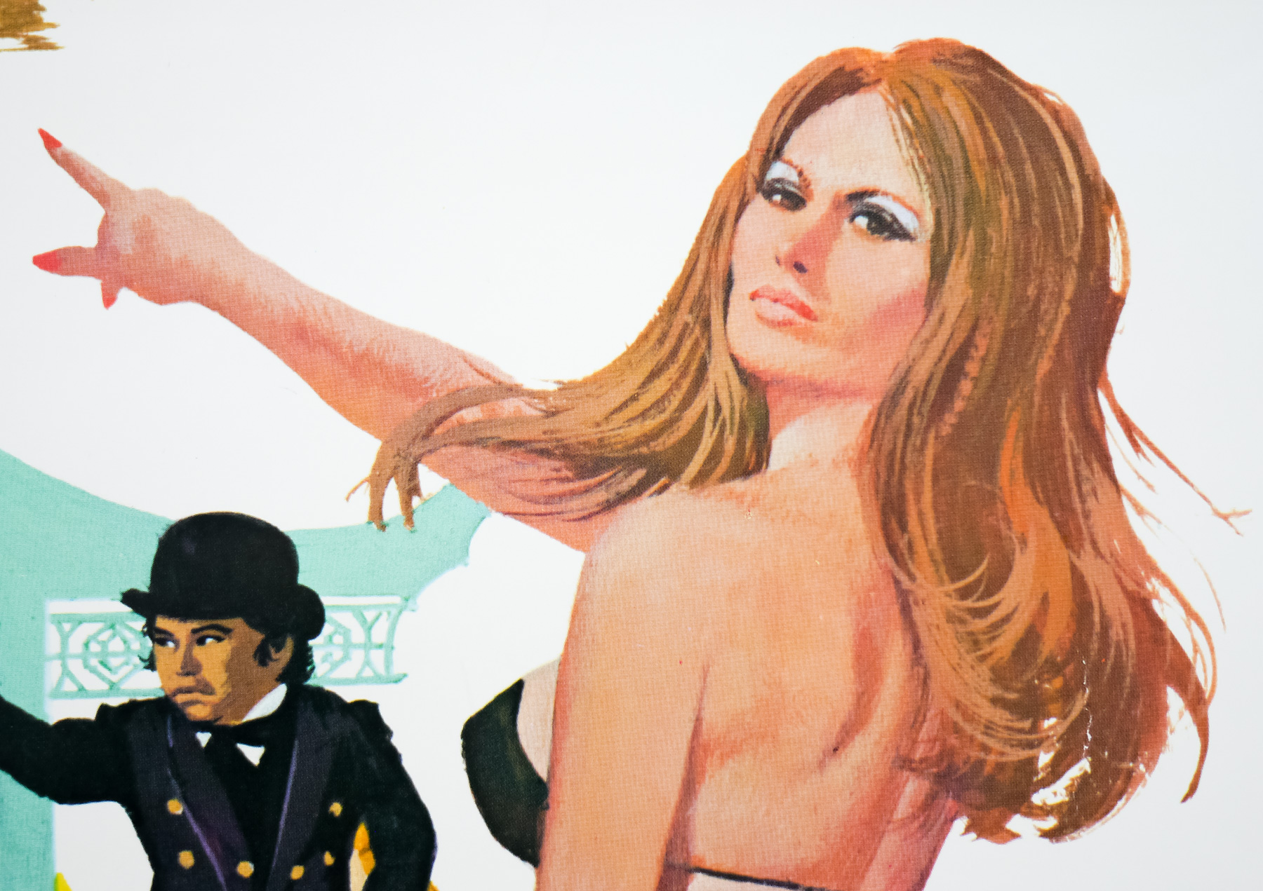
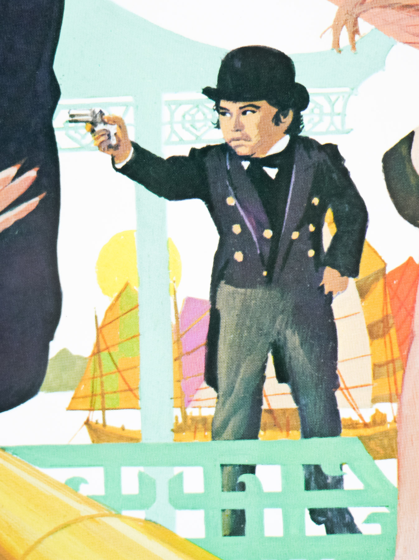
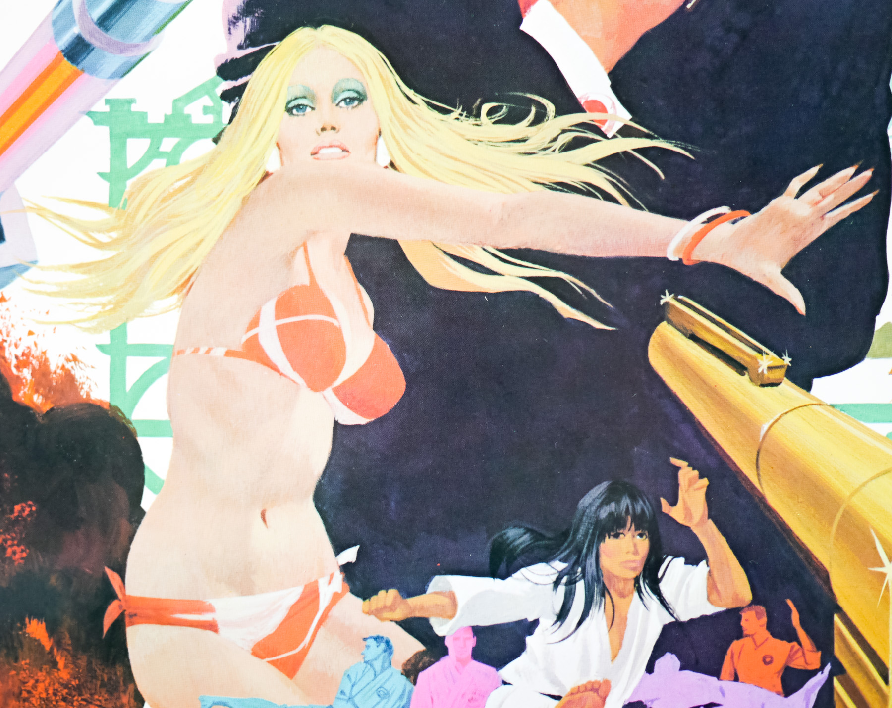
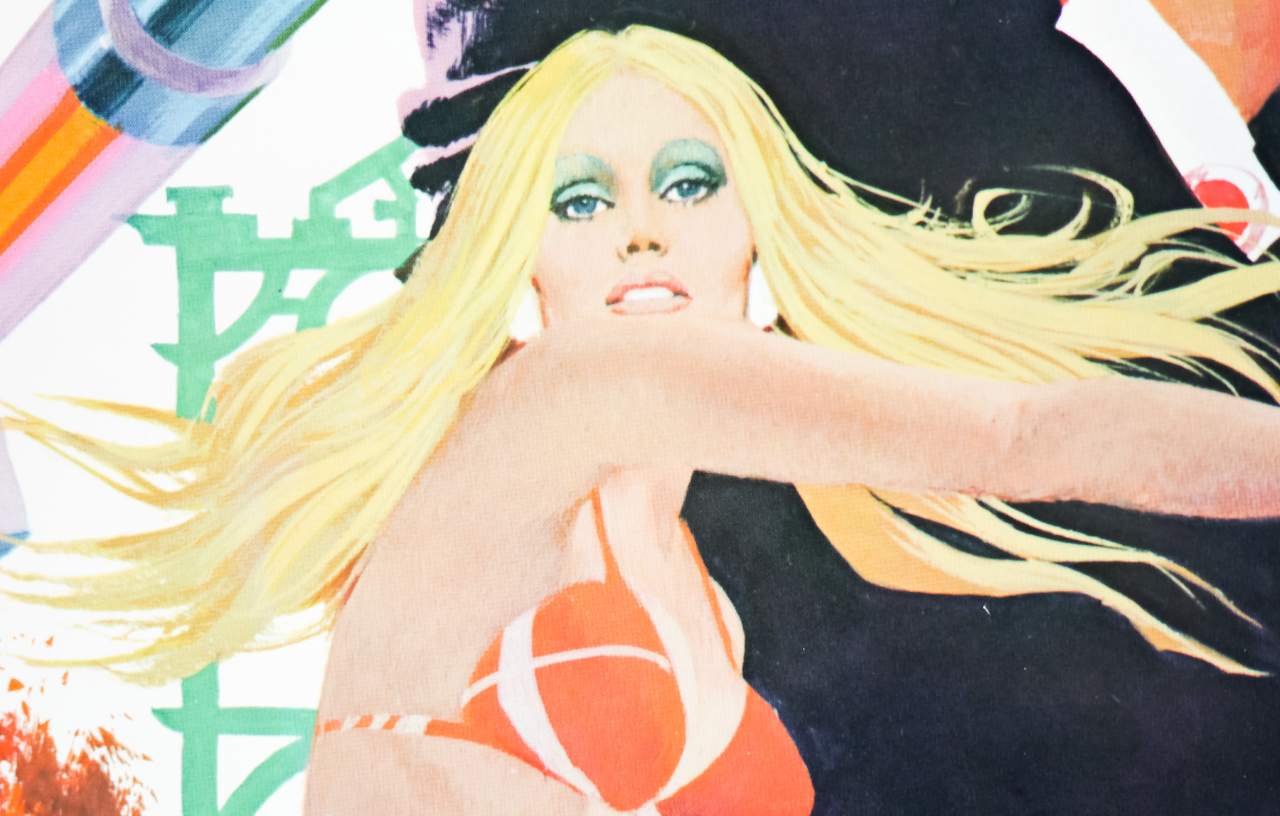
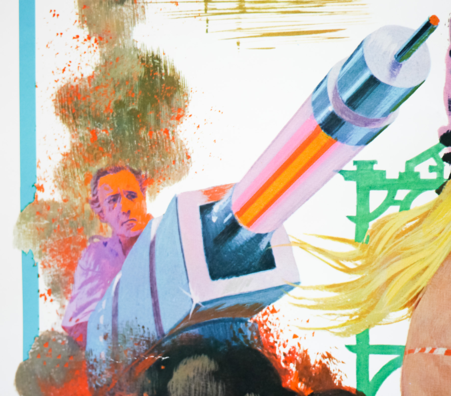
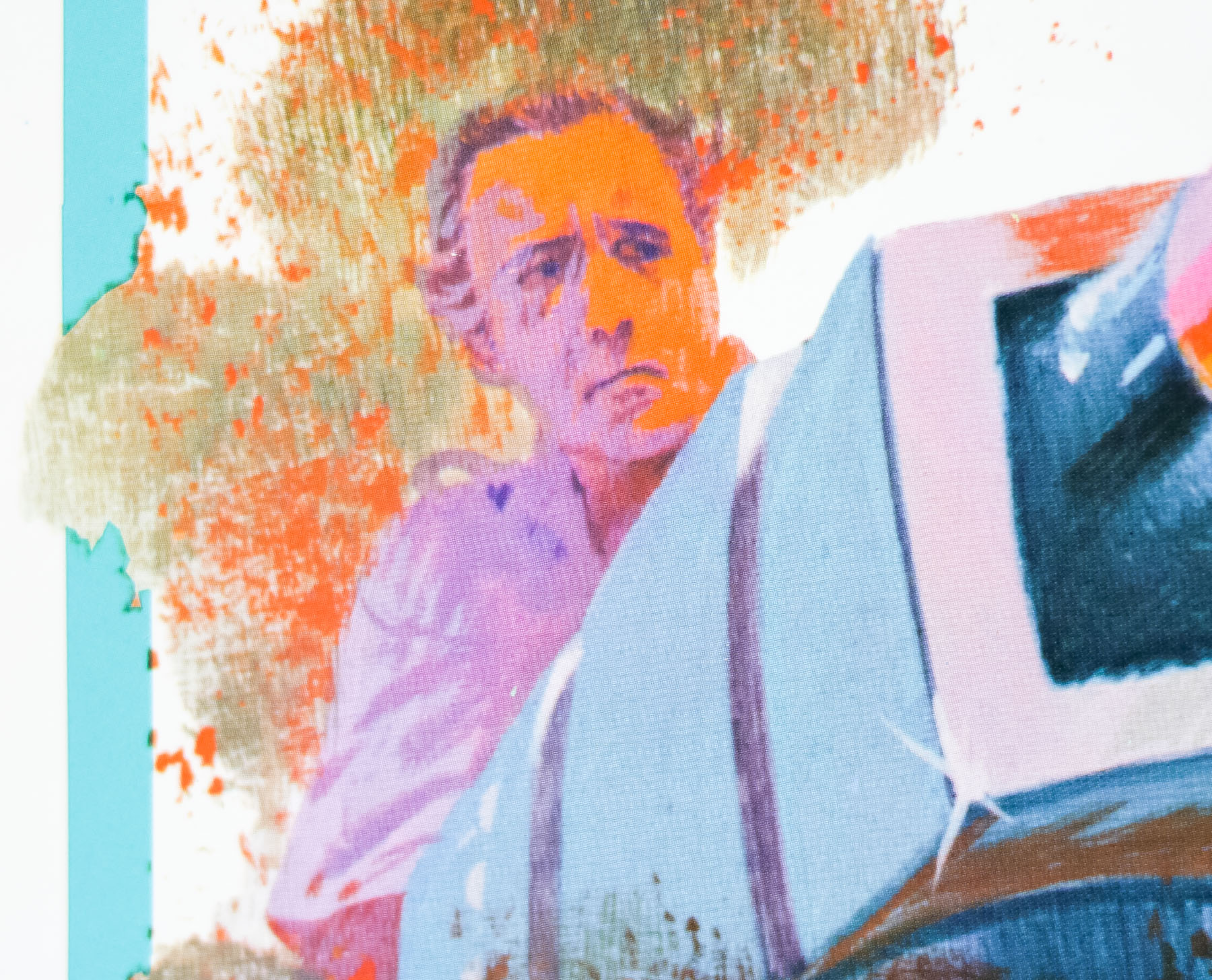
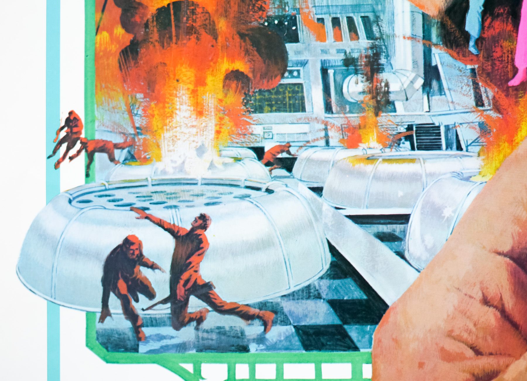
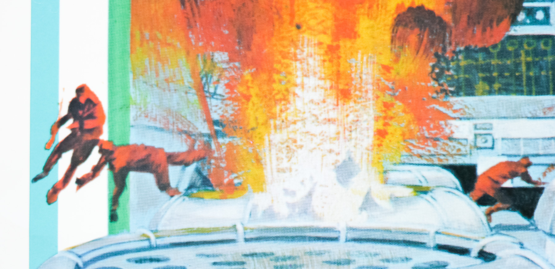
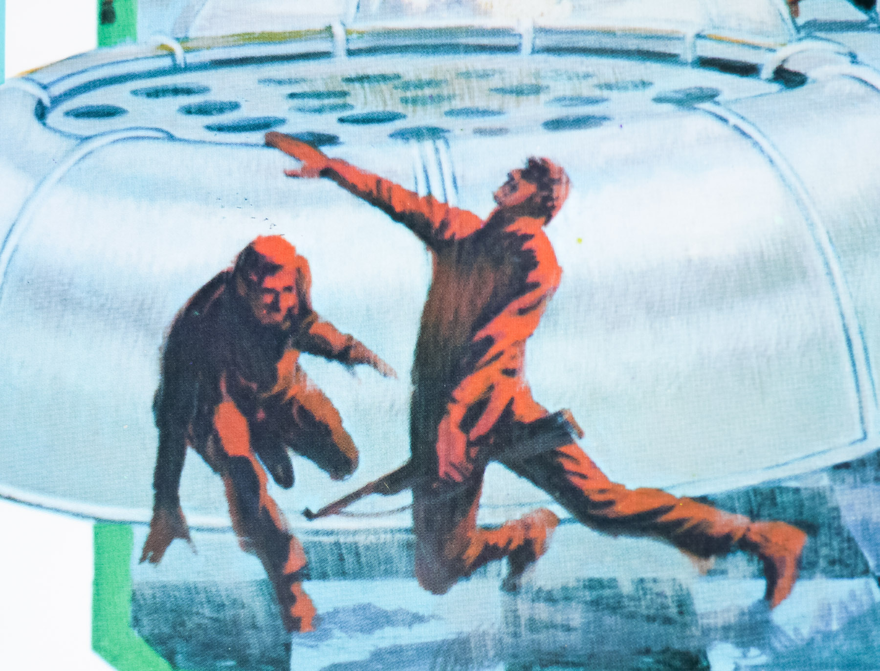
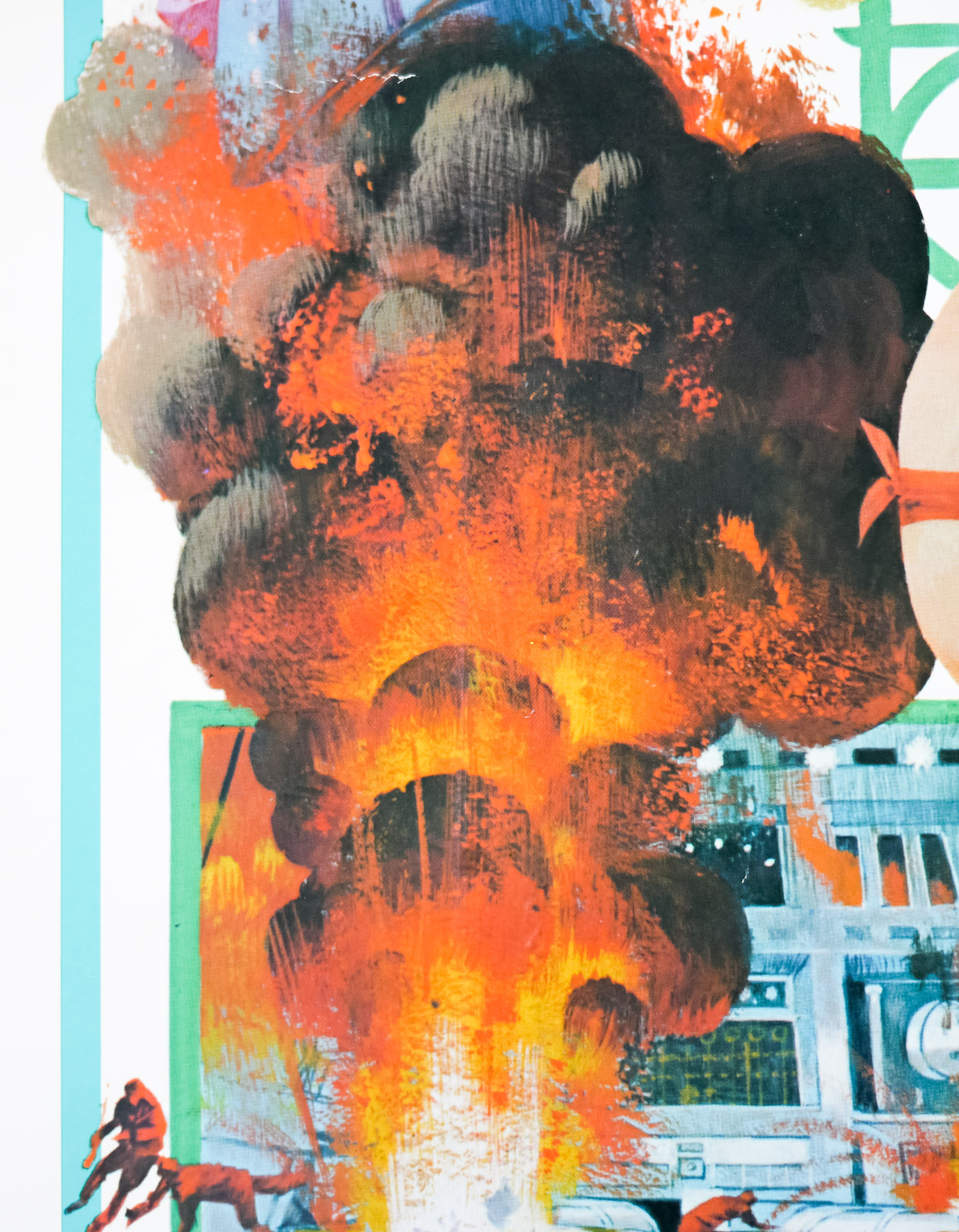
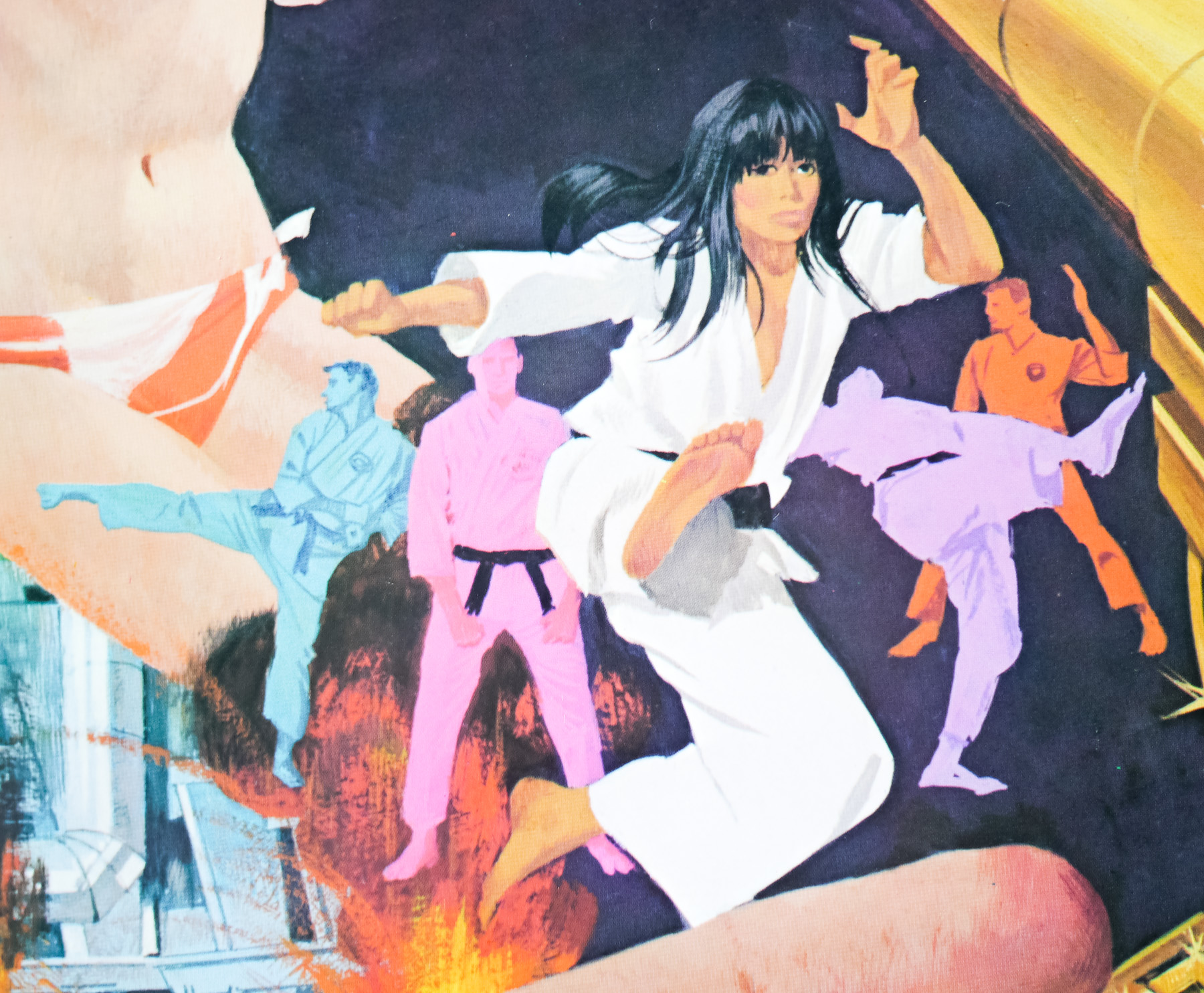
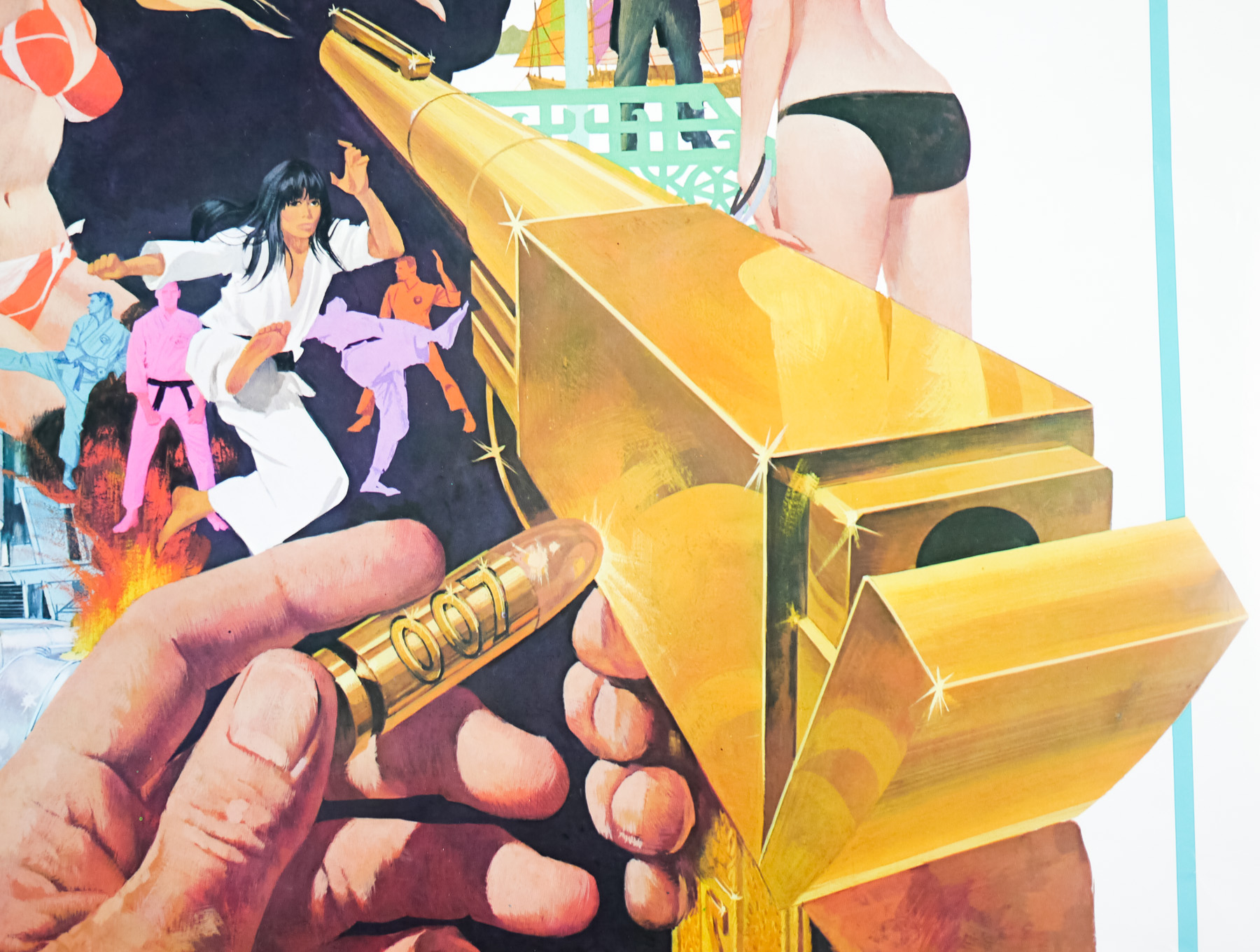
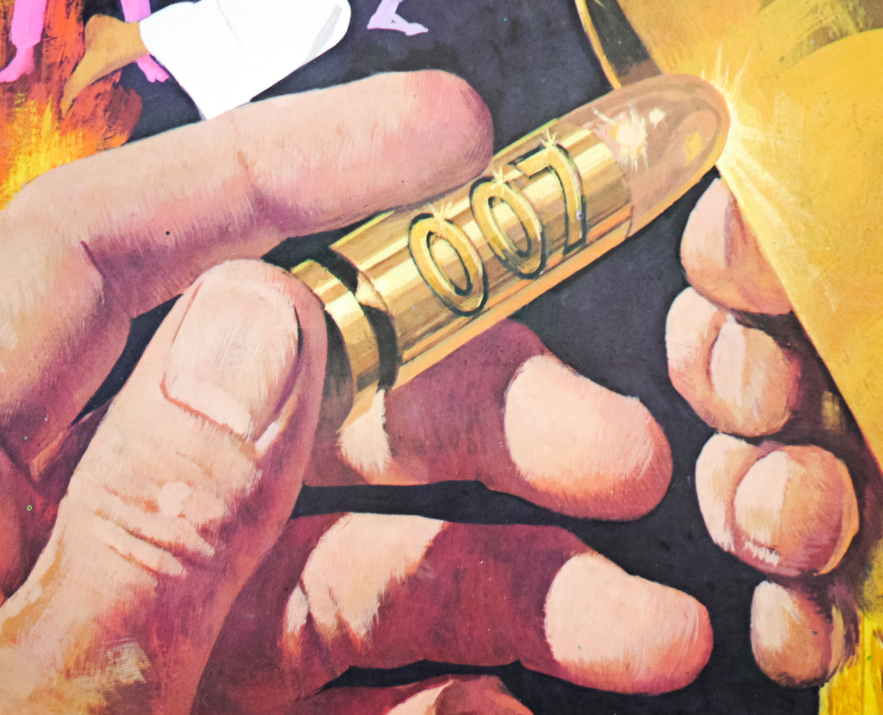
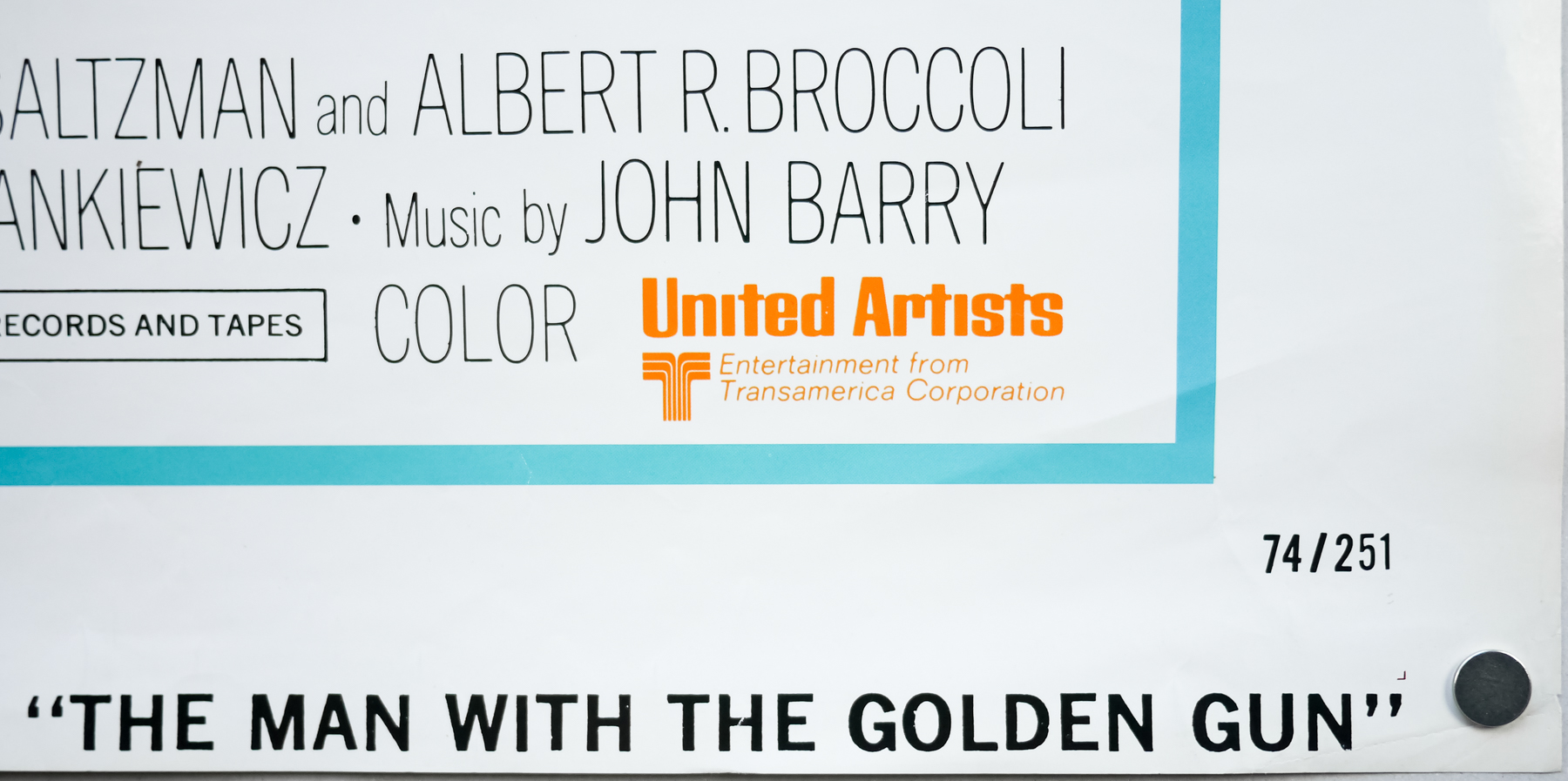
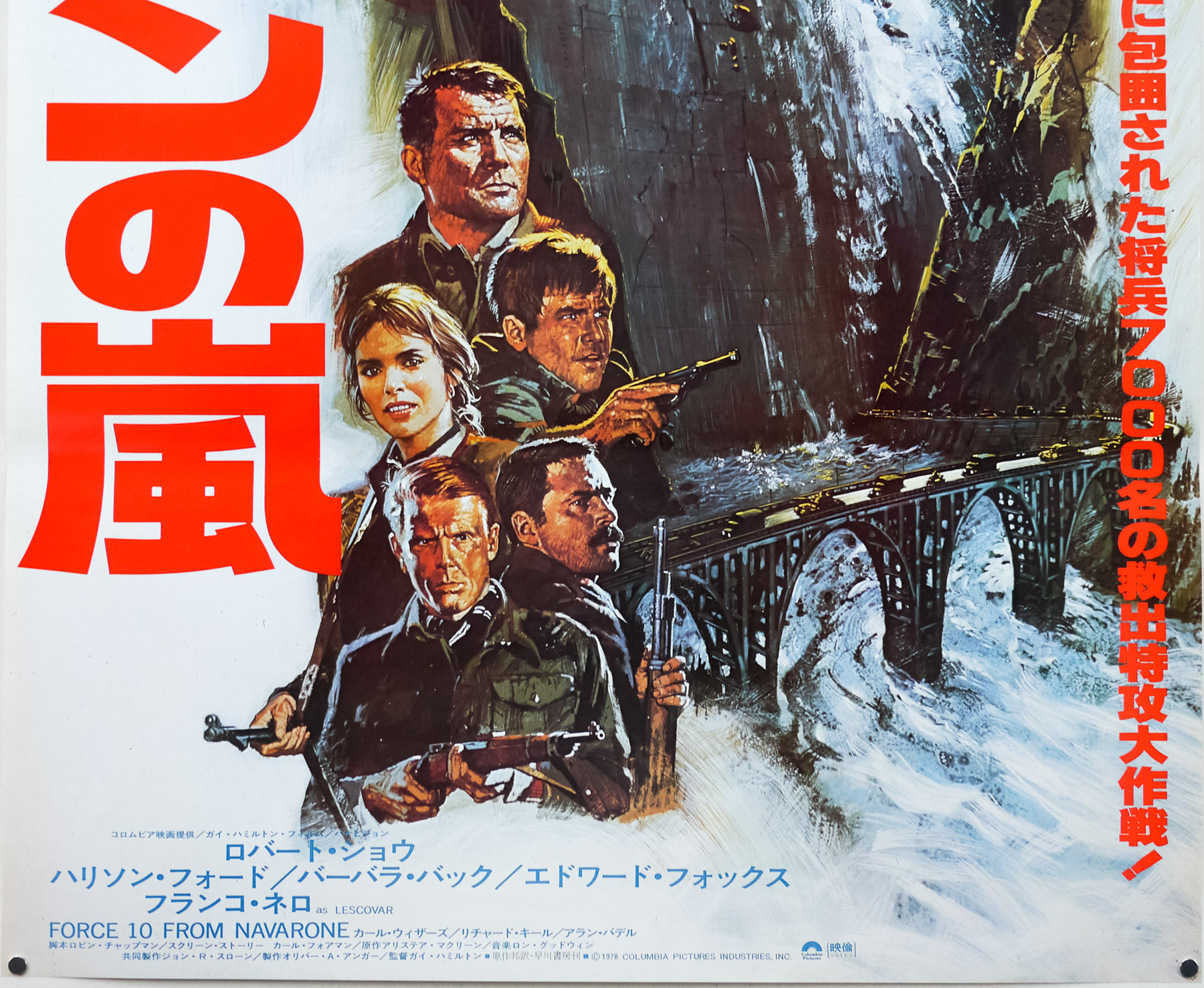
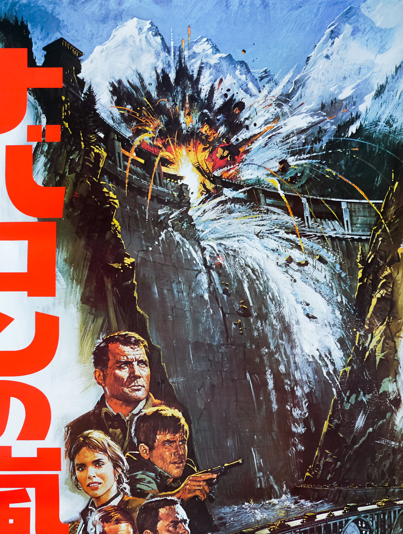
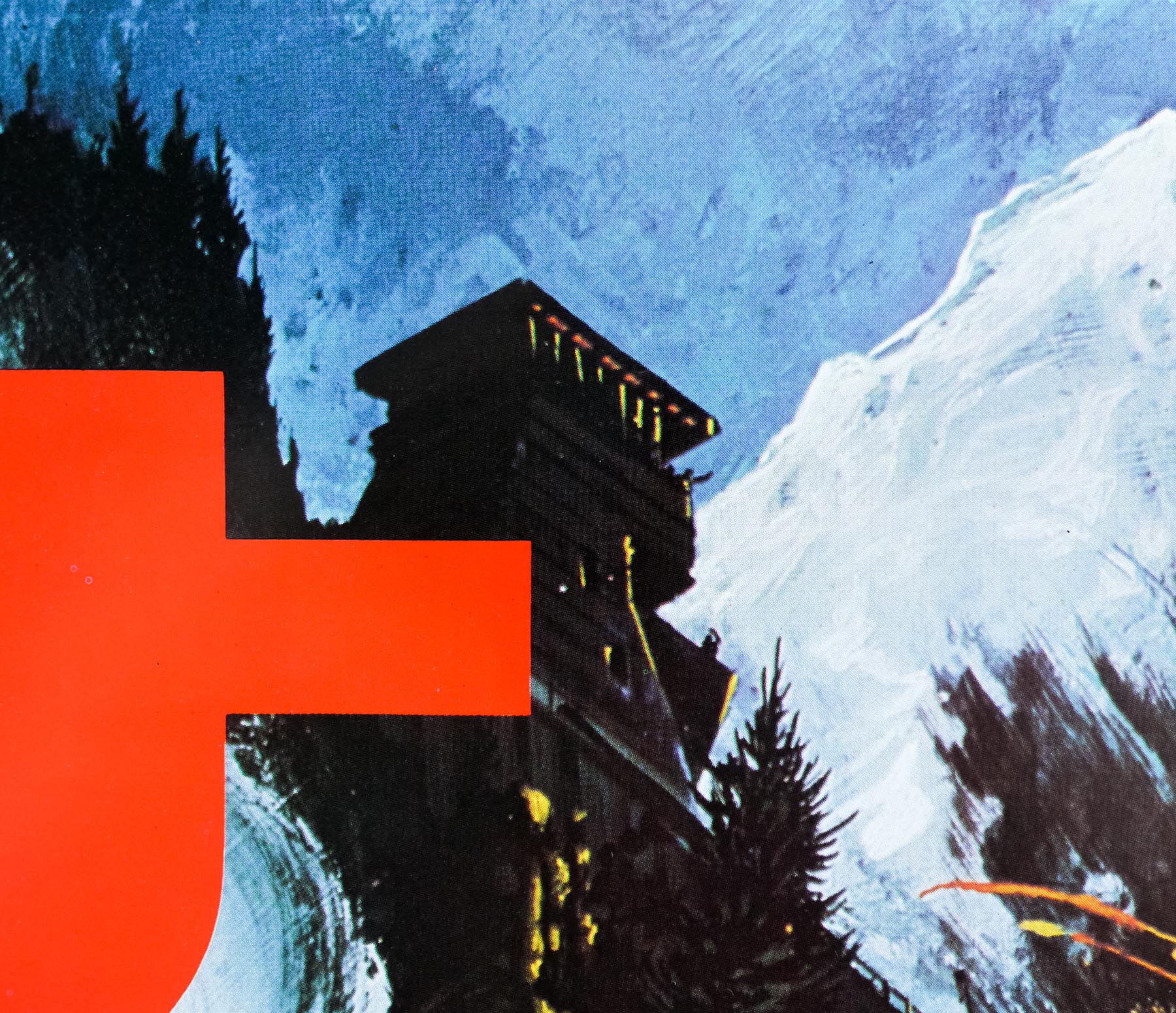
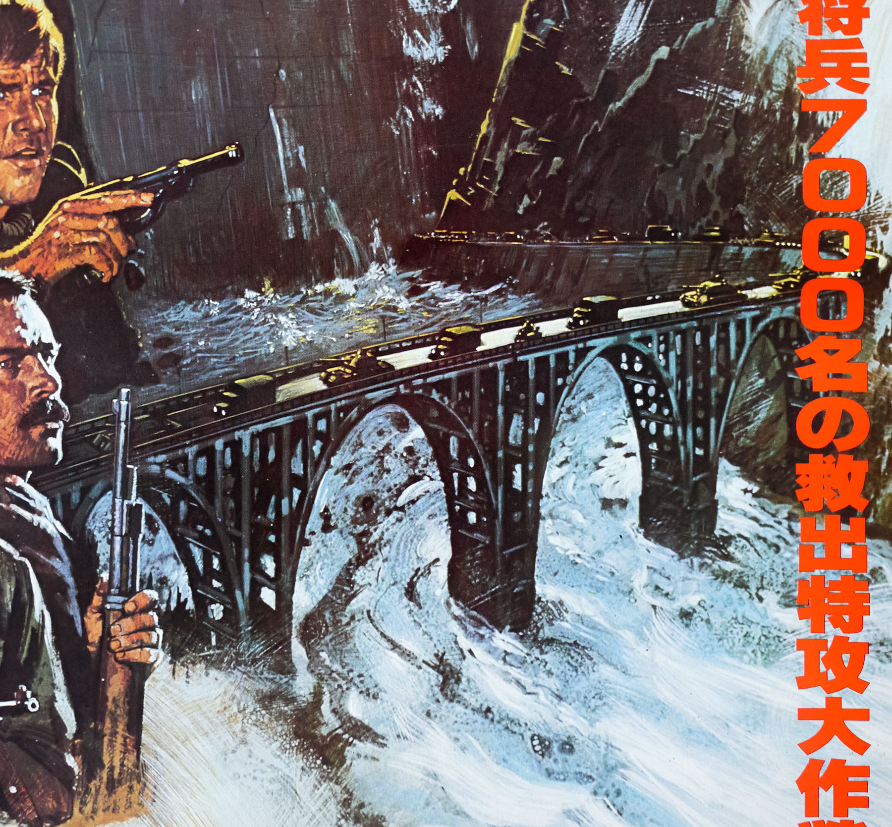
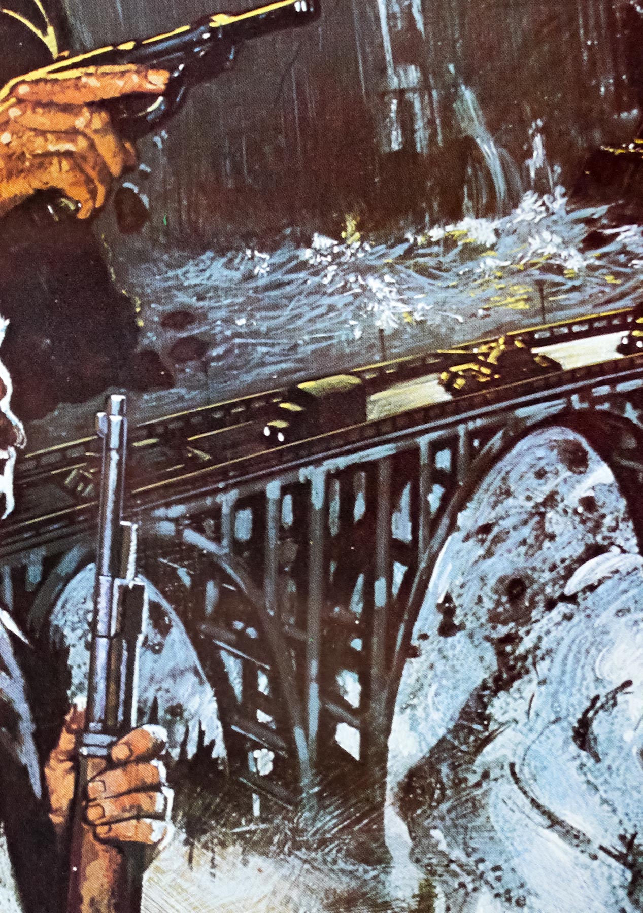
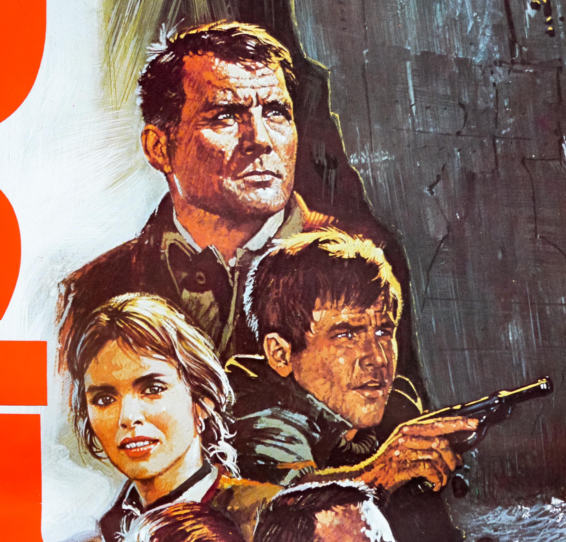
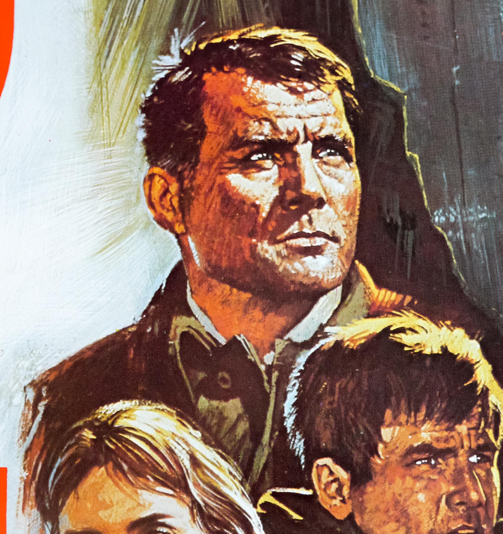
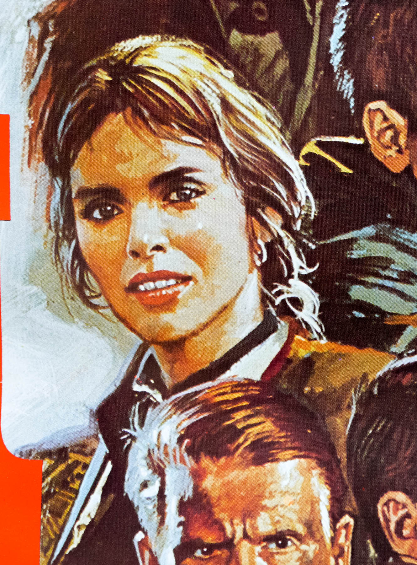
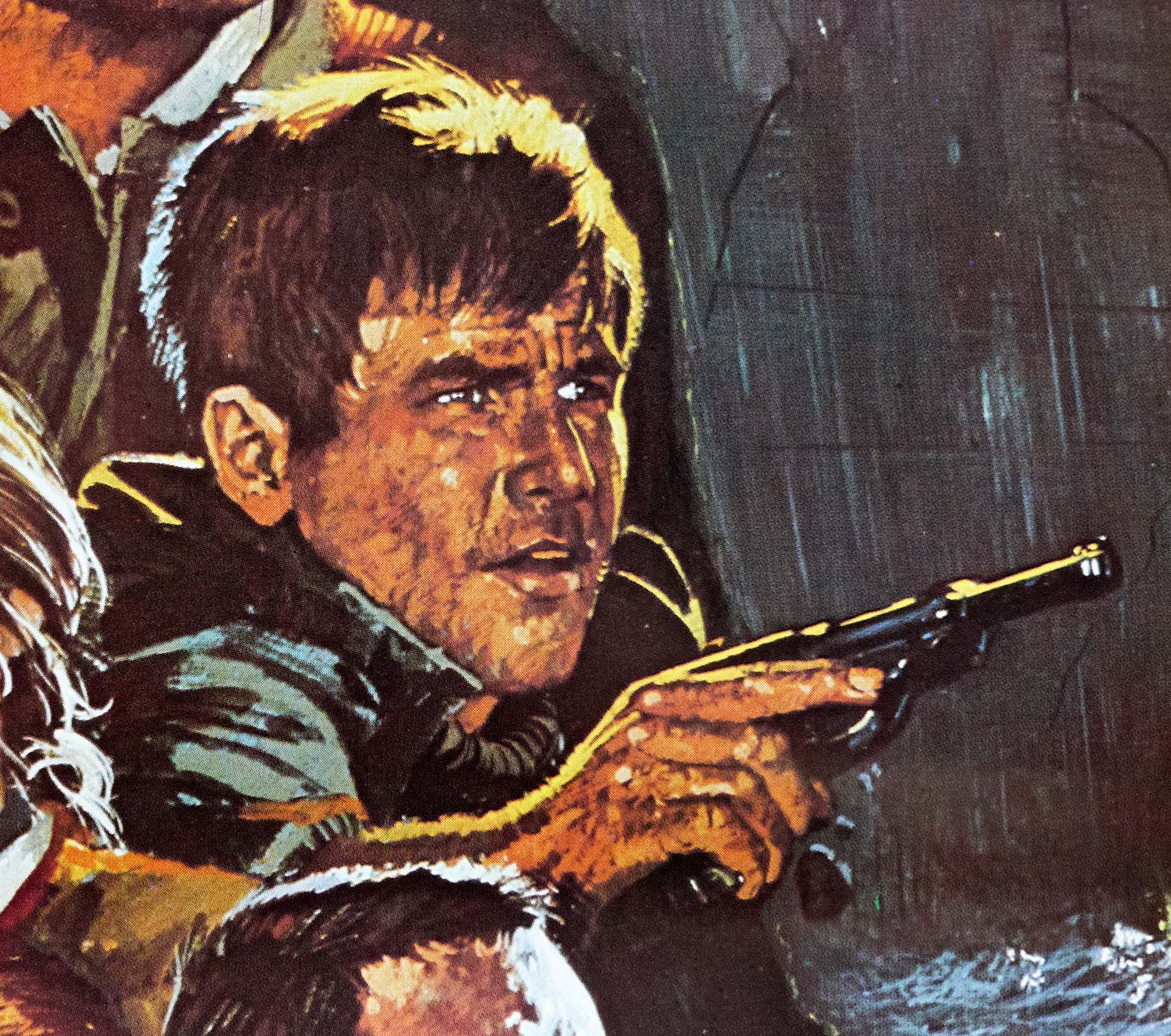
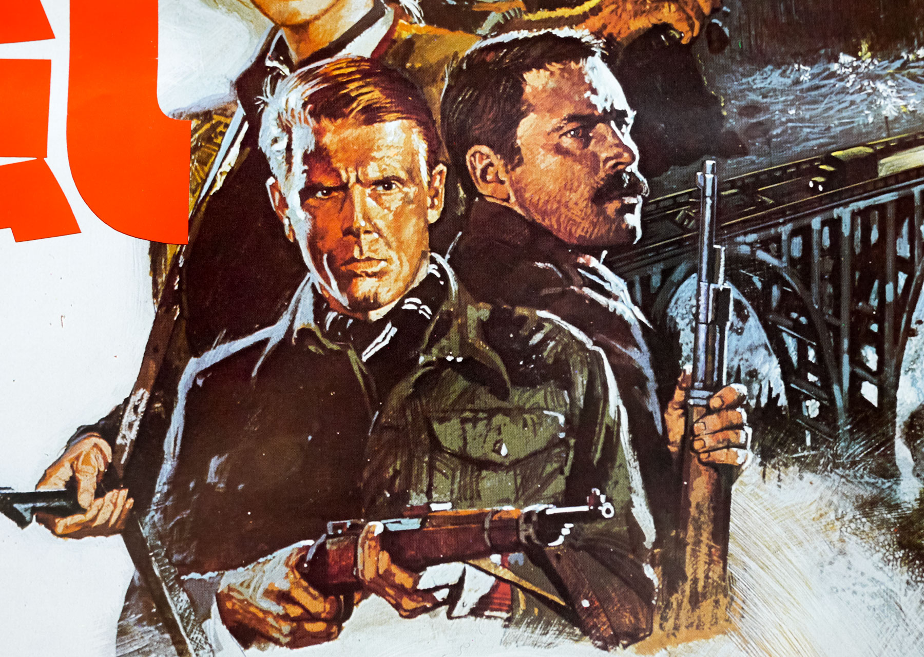
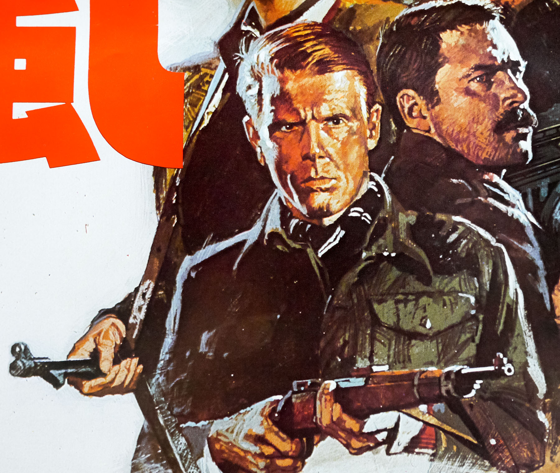
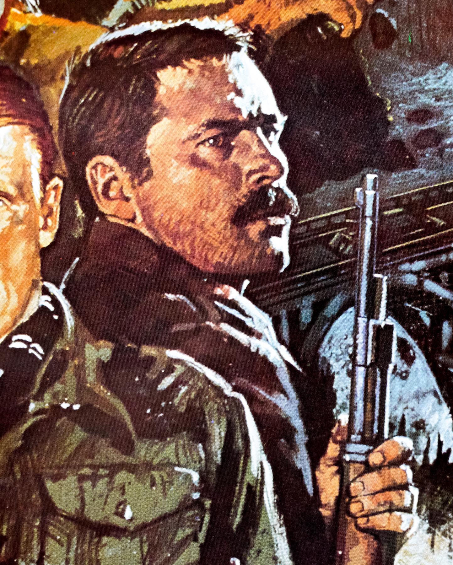
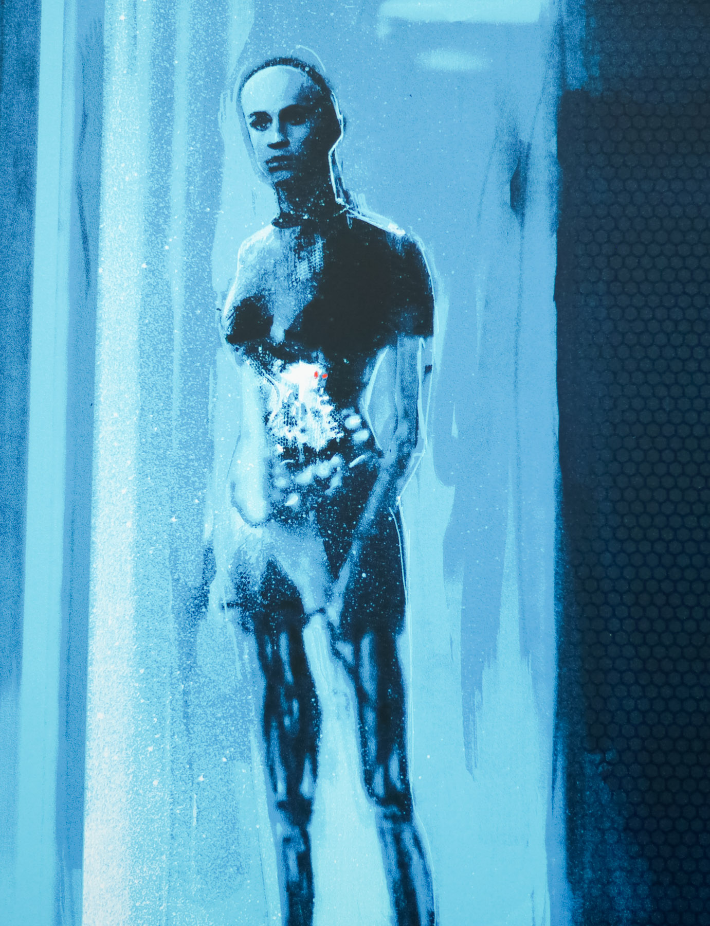
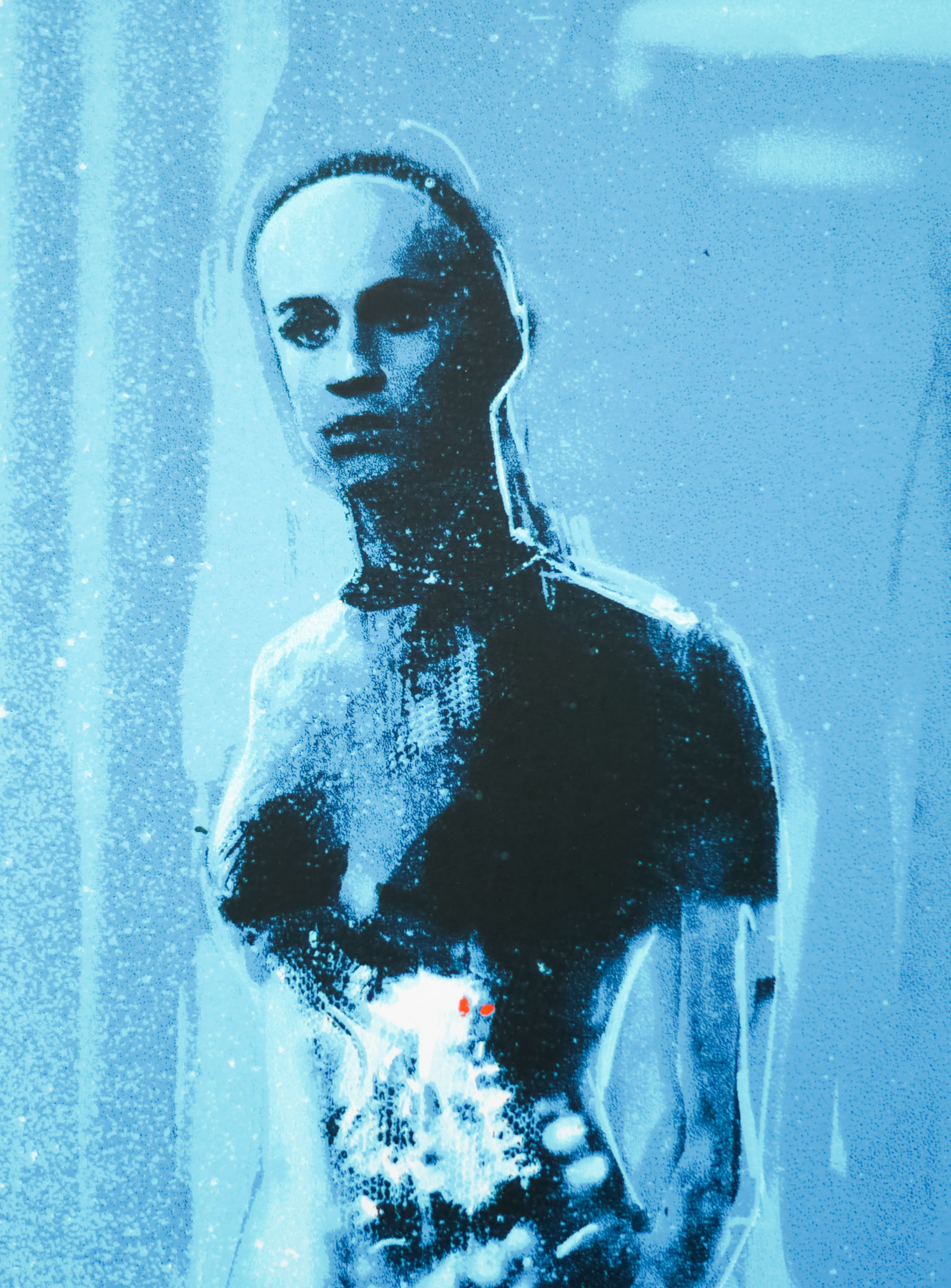
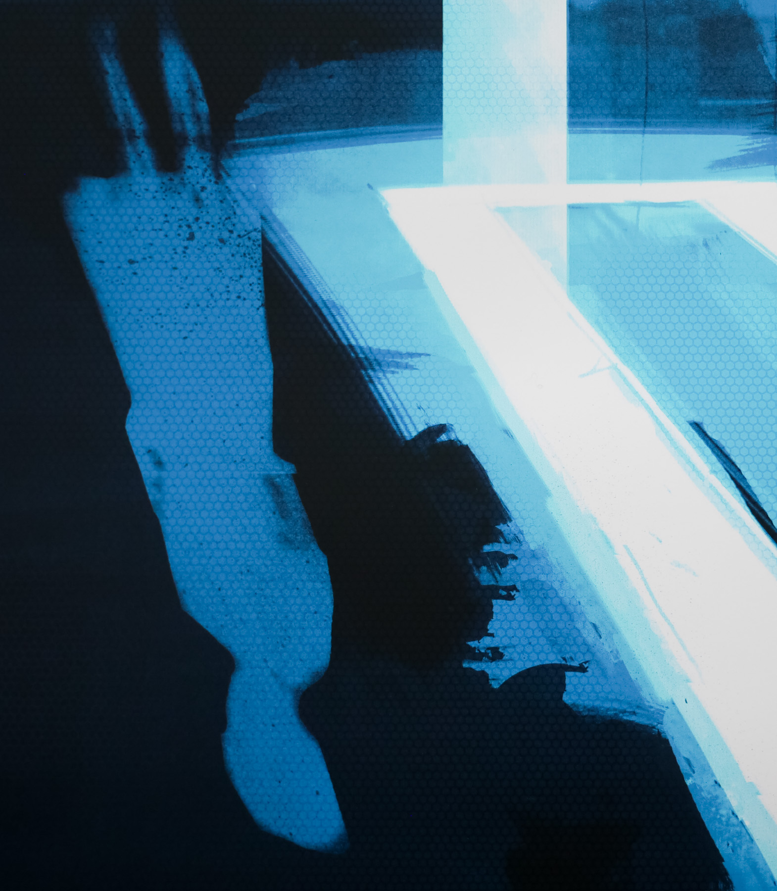
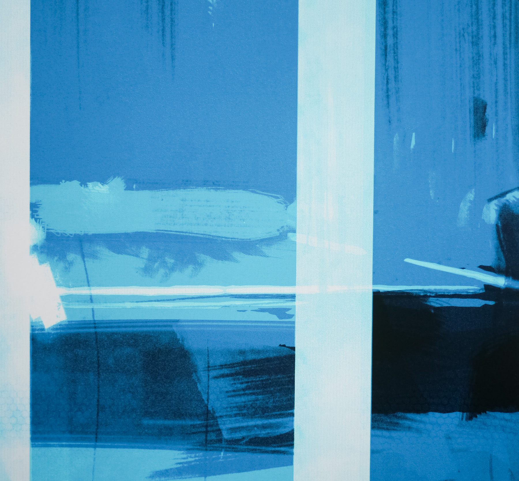
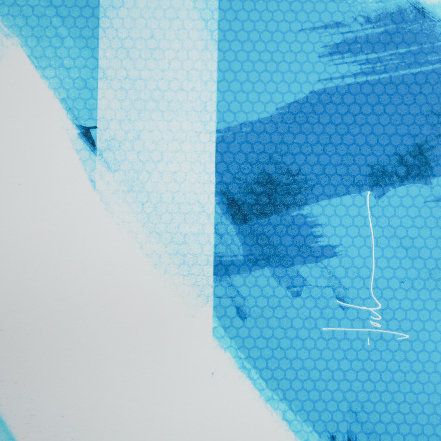
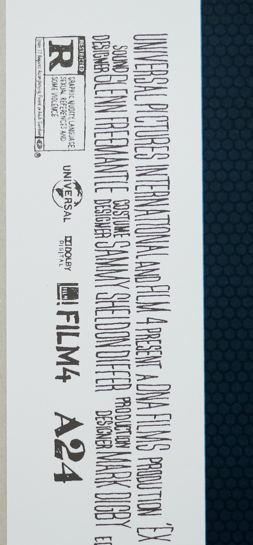
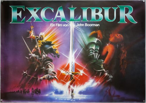
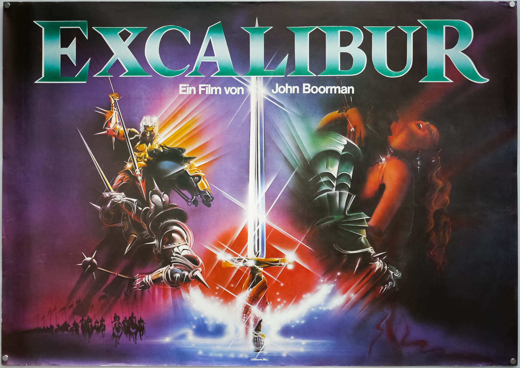
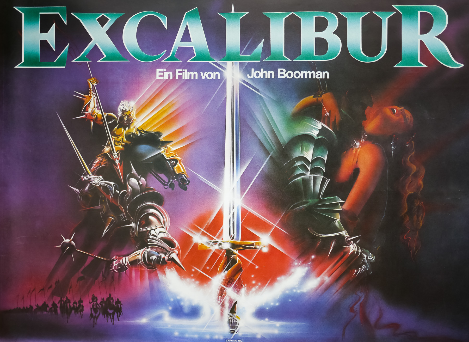
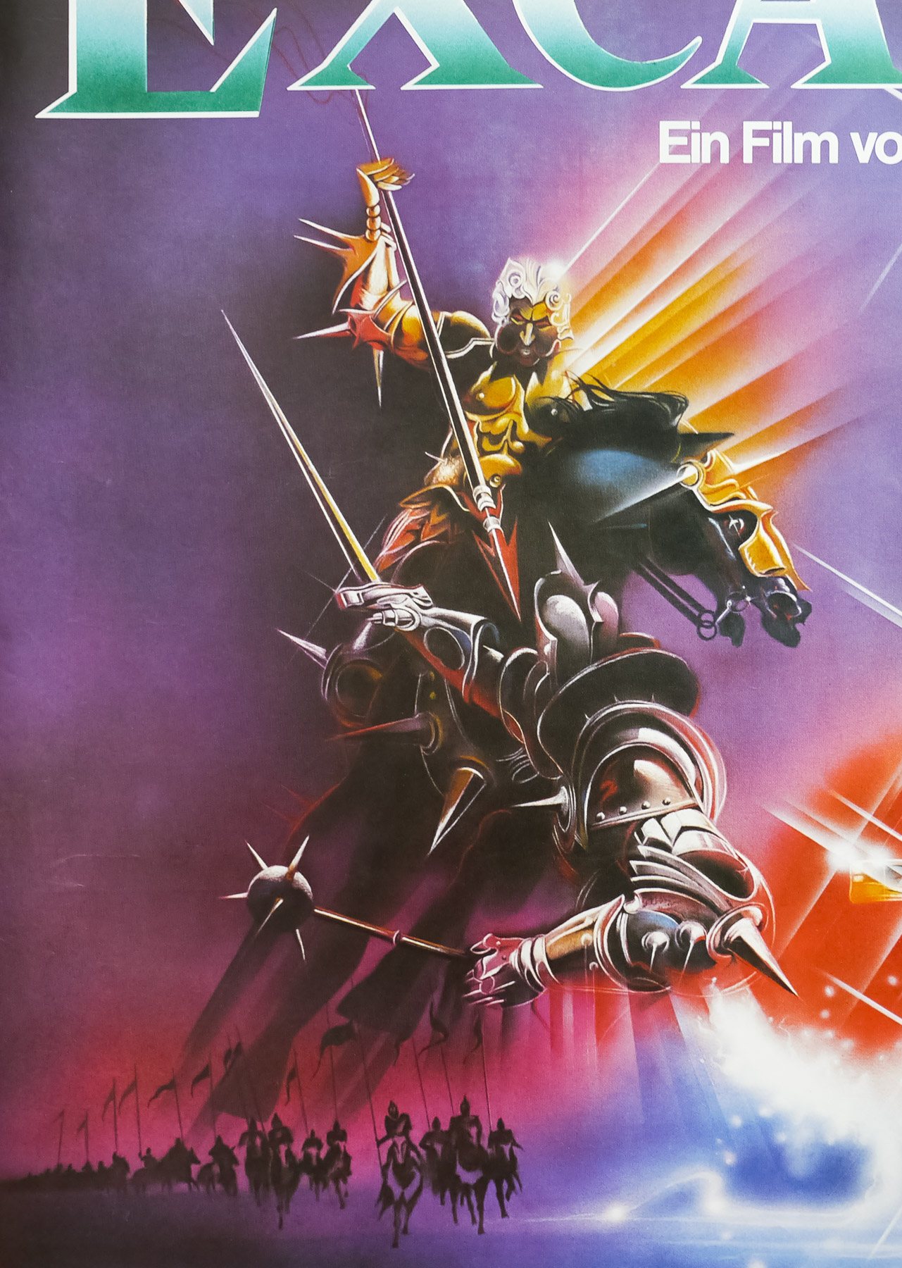
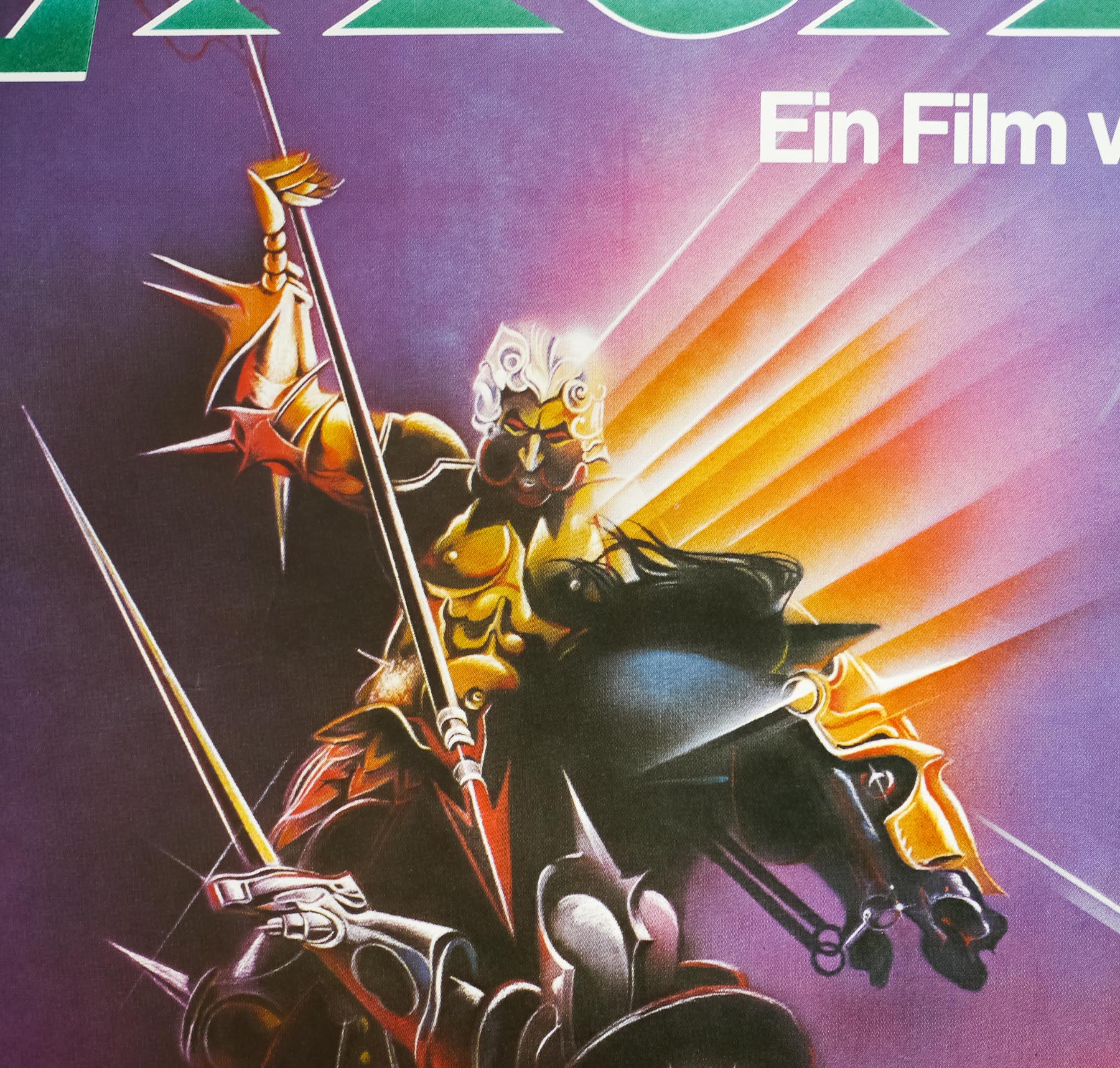
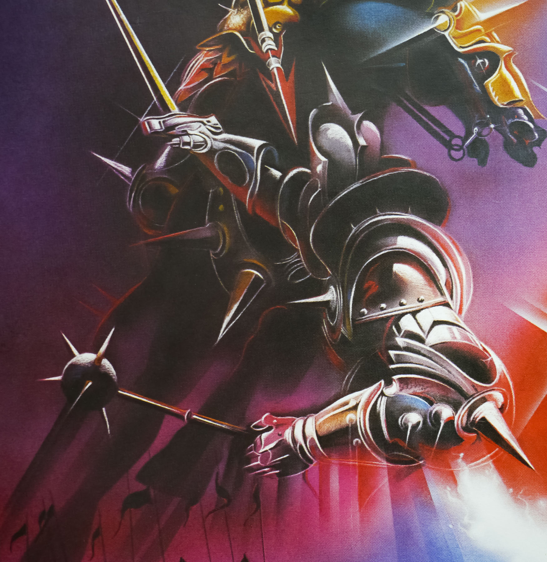
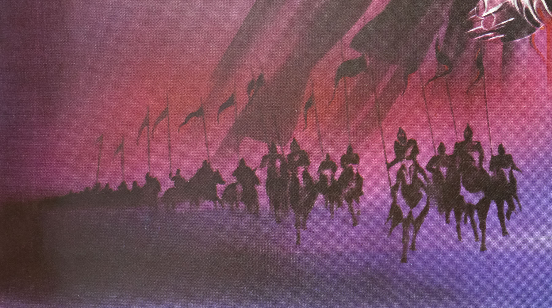
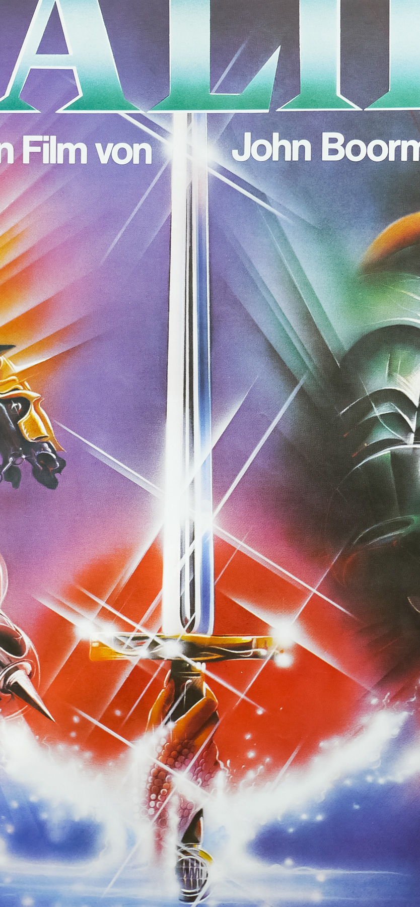
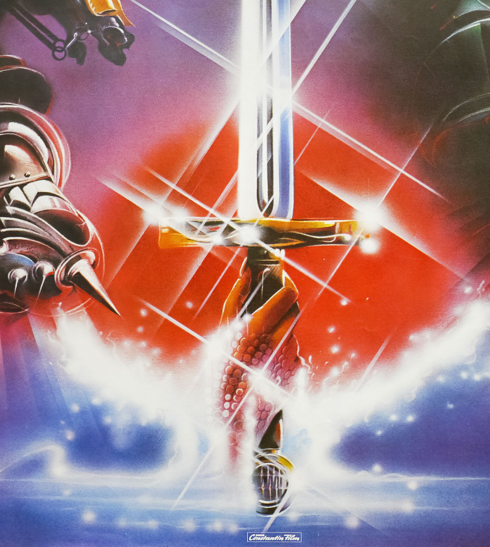
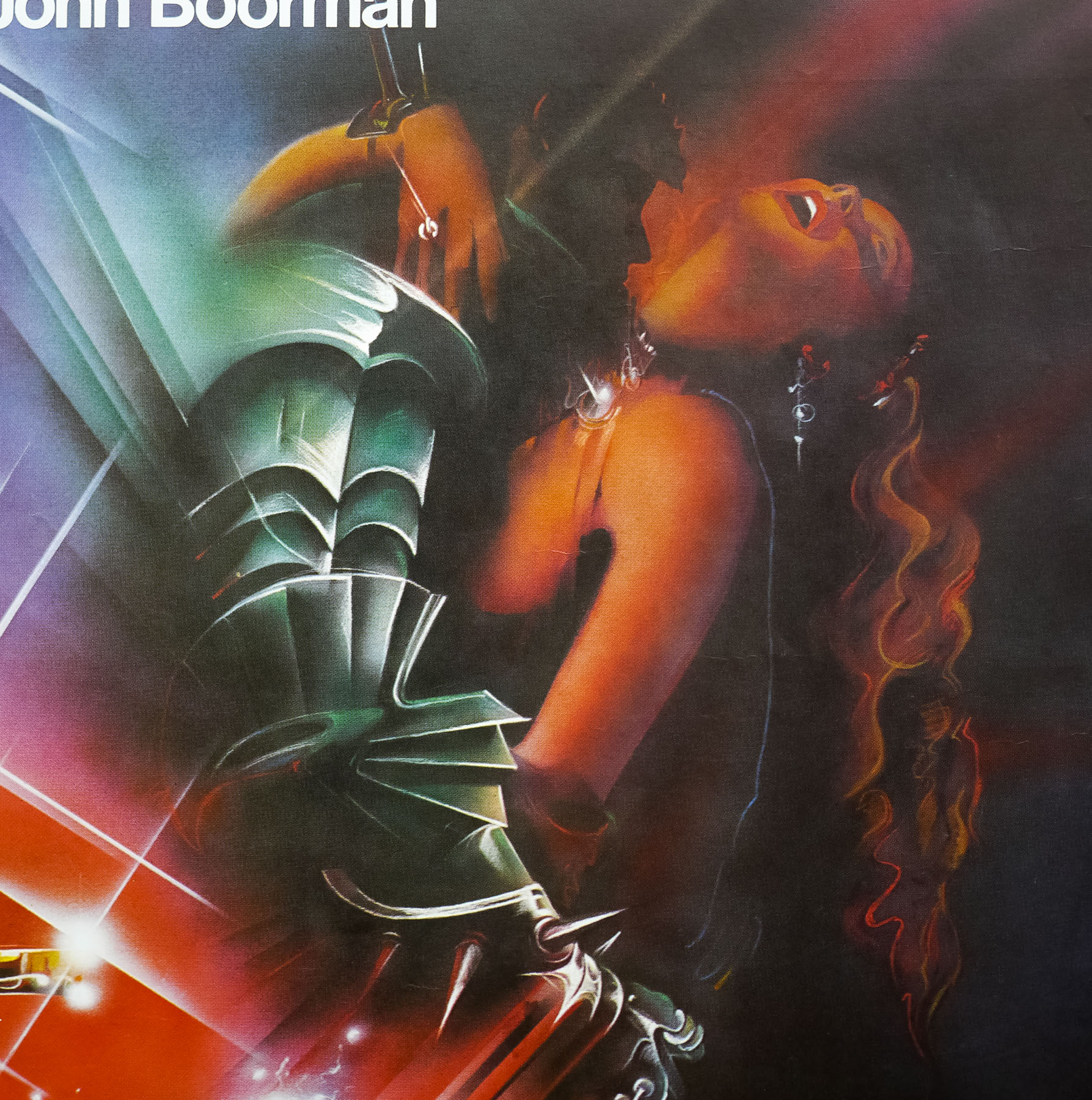
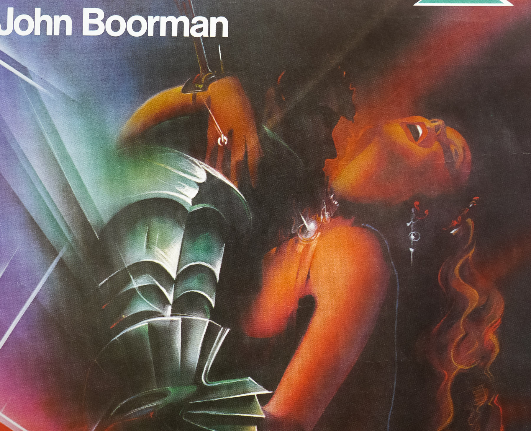
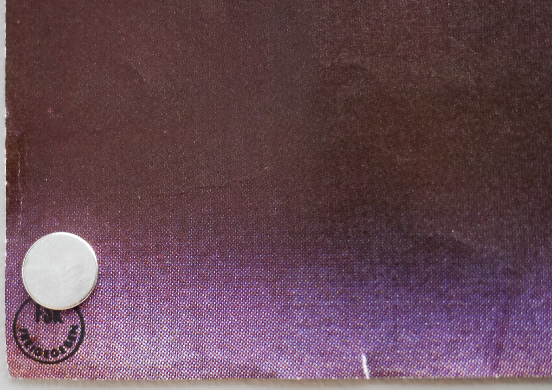
At first glance, the artwork on this large-format (A0) German poster for the 1981 fantasy film Excalibur seems to be the same Bob Peak artwork that appears on posters from around the world, including the US one sheet, but it is not. When viewed up close, and compared to the Peak art, it’s clear that the (German) artist was asked to replicate the original as closely as possible, but the quality is definitely lacking in comparison to Peak. The likely reason the distributor decided to have the art repainted, as opposed to cutting and recomposing Peak’s, is that the one sheet art’s composition is completely unsuited to the landscape format of this A0. I suspect a similar thing happened with the British quad, which features an image of the sword being held aloft that is not the same artwork as on the Peak one sheet. The sword appears alongside an image of Merlin that is the artist’s work.
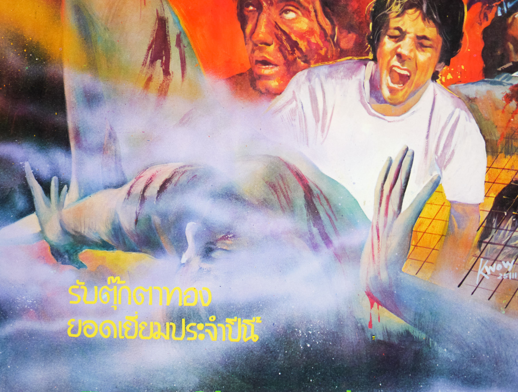
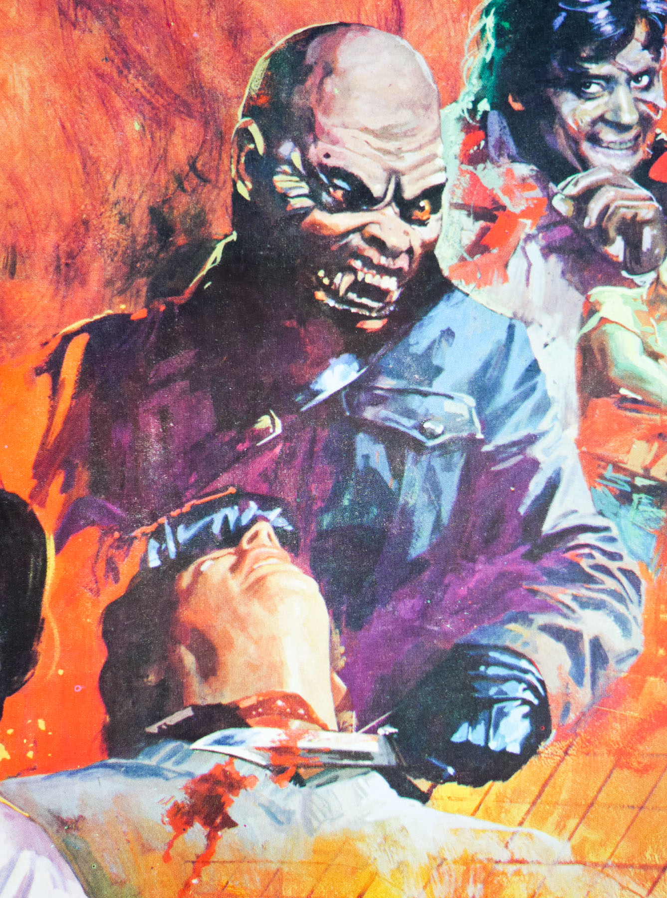
Excalibur was a passion project for the director John Boorman (Deliverance, Point Blank) who had been trying to kickstart a project based on the legend of King Arthur and the Knights of the Round Table since 1969. After almost a decade he was able to pull together the financial backing to commence filming, with a script based on the 15th century tales of Le Morte d’Arthur by Thomas Malory. The film is notable for being entirely shot on location in Ireland and for featuring breakout performances from a number of notable actors, including Helen Mirren, Gabriel Byrne, and Liam Neeson. Set over several decades, the story follows the machinations of multiple characters, with the wizard Merlin (Nicol Williamson) acting as something of a constant (if deeply eccentric) figure who floats around the rulers of Britain. In one of the first scenes we see him retrieving the titular sword from the Lady of the Lake.
Beginning with a king called Uther Pendragon (Byrne), Merlin first assists him in first reaching a truce with Gorlois, the Duke of Cornwall, before Uther sets his sights on the Duke’s wife Igrayne and war breaks out once more. Merlin reluctantly offers to help him defeat Gorlois and capture Igrayne on the condition that he can have ‘whatever results from this lust’. Without fully understanding the ramifications of the deal, Uther agrees, slays the Duke and has his way with Igrayne (albeit under a Merlin spell that makes him look like the Duke). Nine months later Merlin arrives to claim his agreed prize, a boy born of that night’s passion. The wizard leaves the castle with him, much to Igrayne’s horror, and eventually Uther decides to pursue and attempt to rescue his son. Unfortunately he is attacked in a forest by a group of Gorlois’ men and dies, but not before he thrusts Excalibur into a stone and proclaims, “He who draws the sword from the stone, he shall be king.”
The story then jumps forward several years and sees the boy, now grown into a teenager named Arthur, completely unaware of his origins (Merlin had given him to another couple to raise as their own). Whilst attending a jousting contest with his father and brother, a mixup with a stolen sword sees Arthur easily pulling Excalibur from the stone after hundreds of men have failed to do so in the past. Unaware of the significance of the event, it takes Arthur a while to understand that he is now the rightful king and only a visit from Merlin eventually convinces him. The rest of the film follows Arthur as he rallies knights around him, takes the throne and establishes the famous court and castle of Camelot. He also meets and falls in love with Guinevere (Cherie Lunghi) but eventually tensions rise when Lancelot, one of his trusted knights, becomes infatuated with her. Morgana, a budding sorceress and Arthur’s half-sister, also tricks Merlin into teaching her the Charm of Making, allowing her to take the form of others. When she tricks Arthur into sleeping with her (him believing it to be Guinevere) the resultant child threatens an end to the whole kingdom.
Apparently the film was originally completed to a length of around three hours before having 40 minutes trimmed and I can’t help but feel that allowing the film to breathe might have helped. There’s a lot of story to fit in and it’s fair to say that the cuts do show; I found some of the time jumps and scene to scene transitions pretty jarring, whilst the script doesn’t exactly help matters. Critics at the time also found the film’s story and exposition wanting but most agreed that Boorman had definitely succeeded in making the film visually stunning. The use of real locations along with some incredible costumes such as the shiny chrome armour worn by most of the male cast (Merlin even has a shiny cap) are accentuated by the use of coloured lighting. The film has developed something of a cult reputation over the years, largely thanks to the arresting visuals on display.
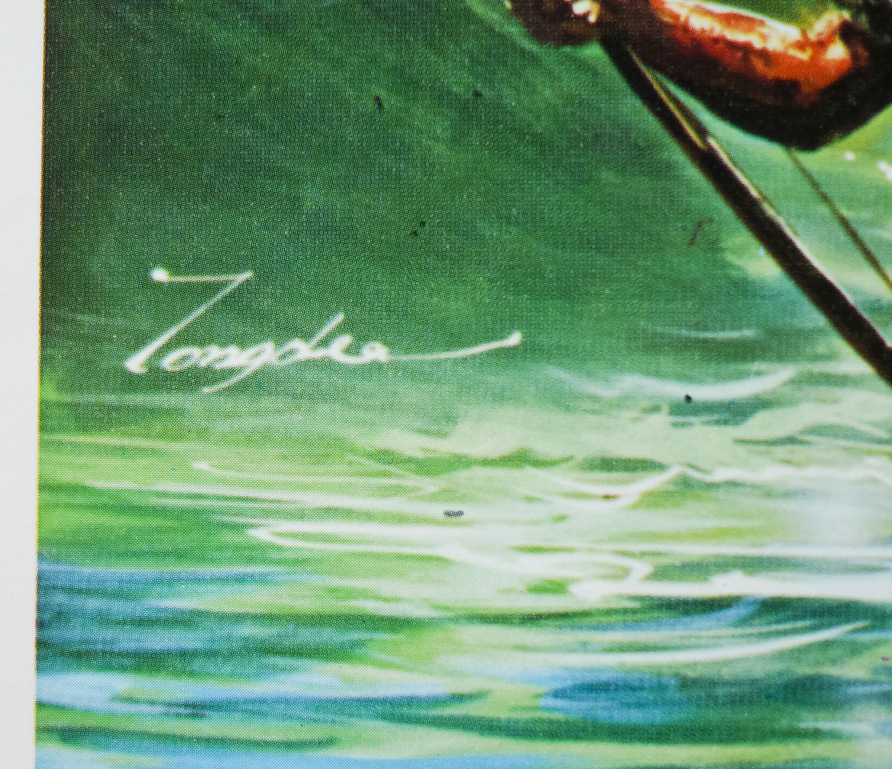
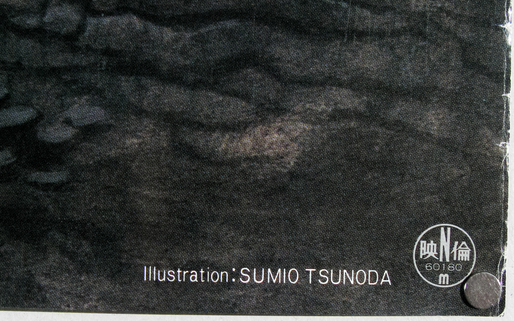
If anyone knows who the artist was that repainted the original Bob Peak art, please get in touch.