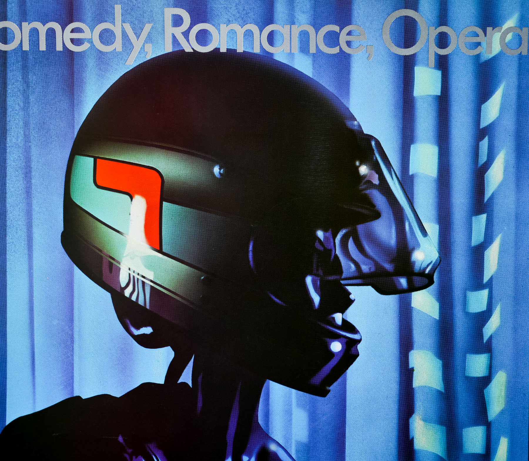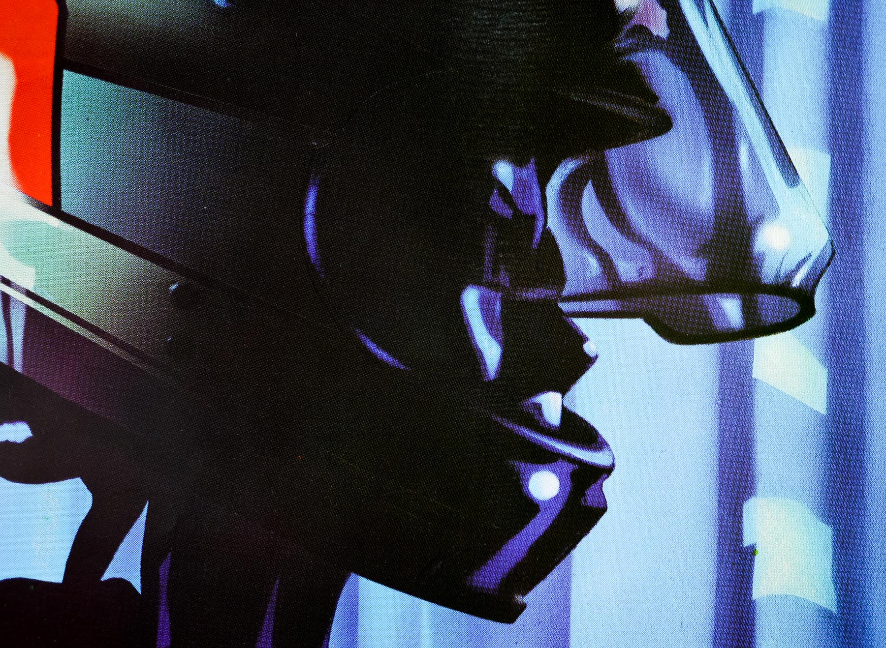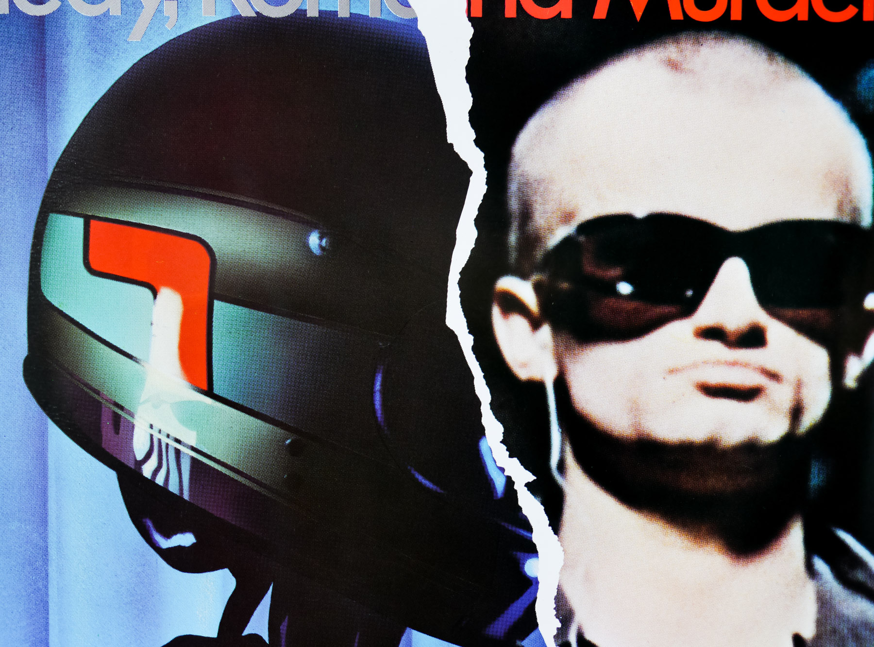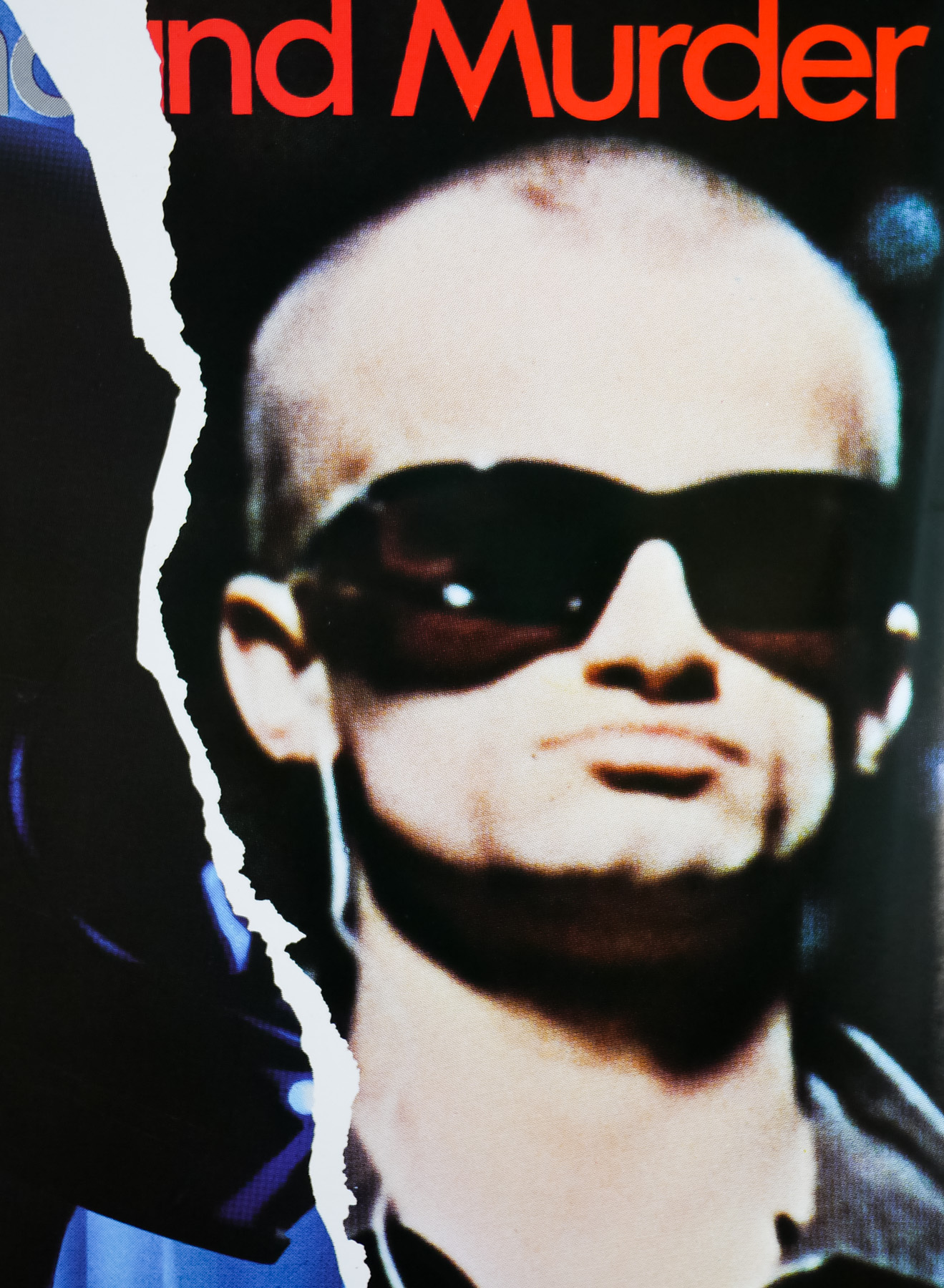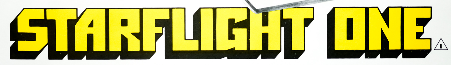

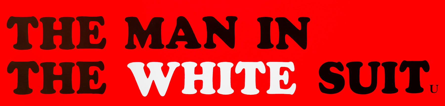
Poster detail
1-5

- AKA
- --
- Year of Film
- 1951
- Director
- Alexander Mackendrick
- Starring
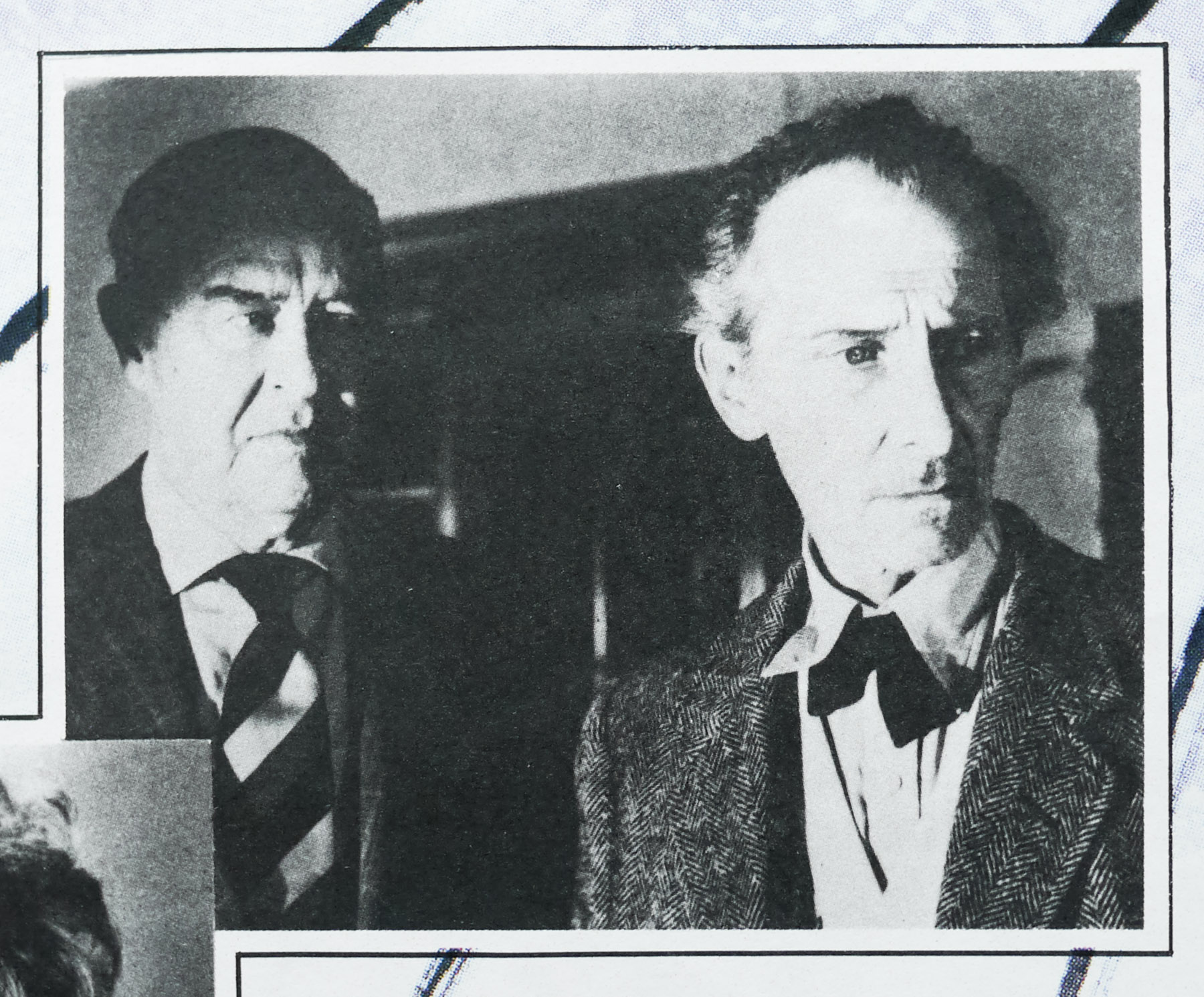
- Alec Guinness, Joan Greenwood, Cecil Parker, Michael Gough, Ernest Thesiger, Howard Marion-Crawford, Henry Mollison, Vida Hope, Patric Doonan
- Origin of Film
- UK
- Genre(s) of Film
- Alec Guinness, Joan Greenwood, Cecil Parker, Michael Gough, Ernest Thesiger, Howard Marion-Crawford, Henry Mollison, Vida Hope, Patric Doonan,
- Type of Poster
- Quad
- Style of Poster
- BFI re-release
- Origin of Poster
- UK
- Year of Poster
- 1993
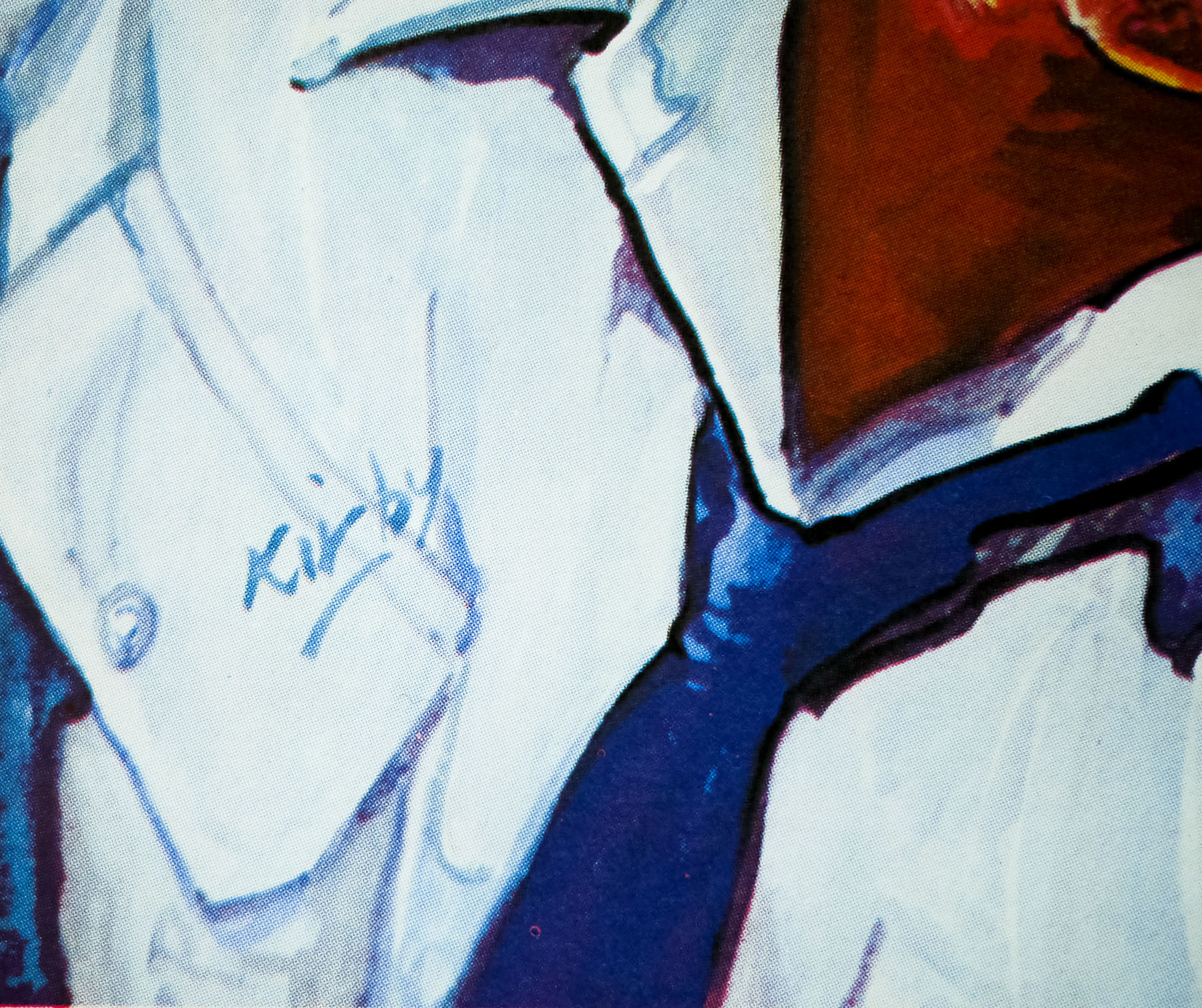
- Designer
- Sydney John Woods
- Artist
- Alfred Reginald Thomson
- Size (inches)
- 30 2/16" x 39 15/16"
- SS or DS
- SS
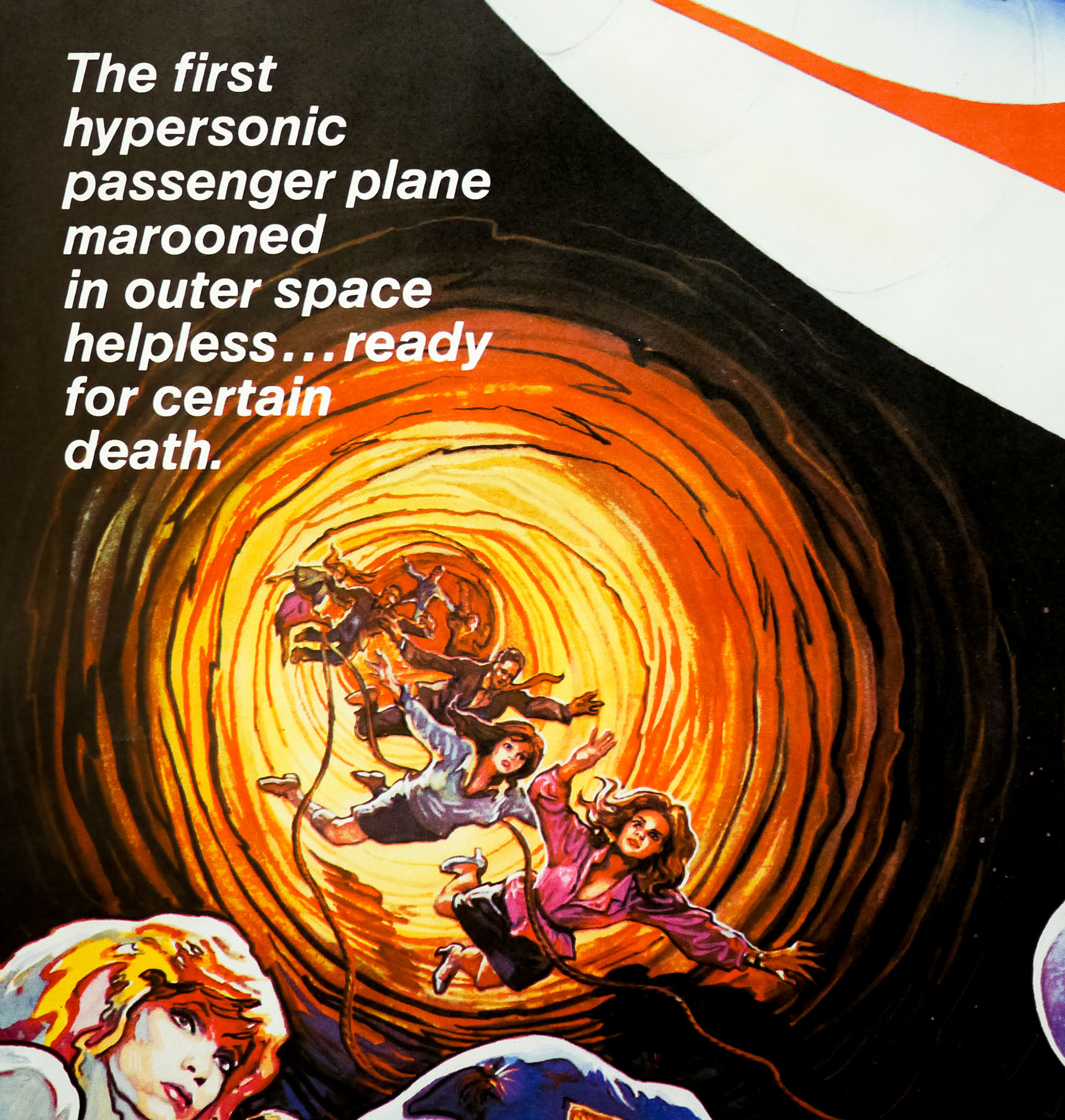
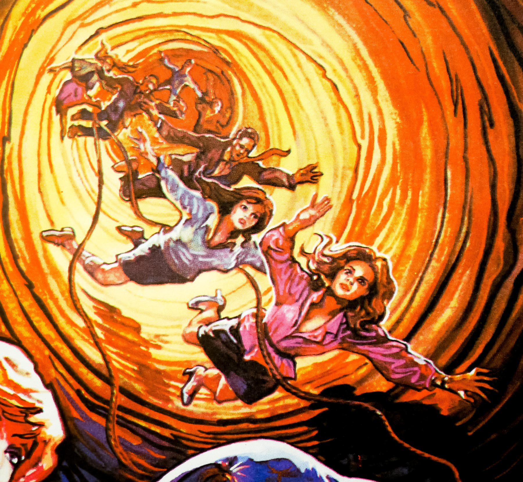
- Tagline
- --
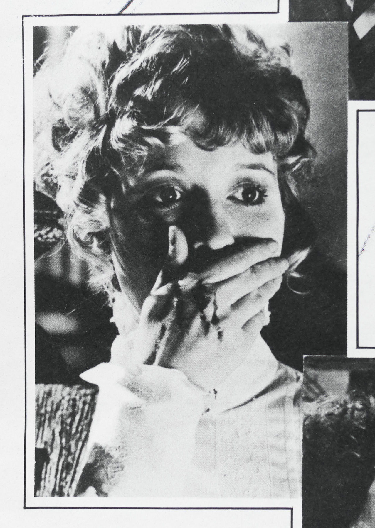
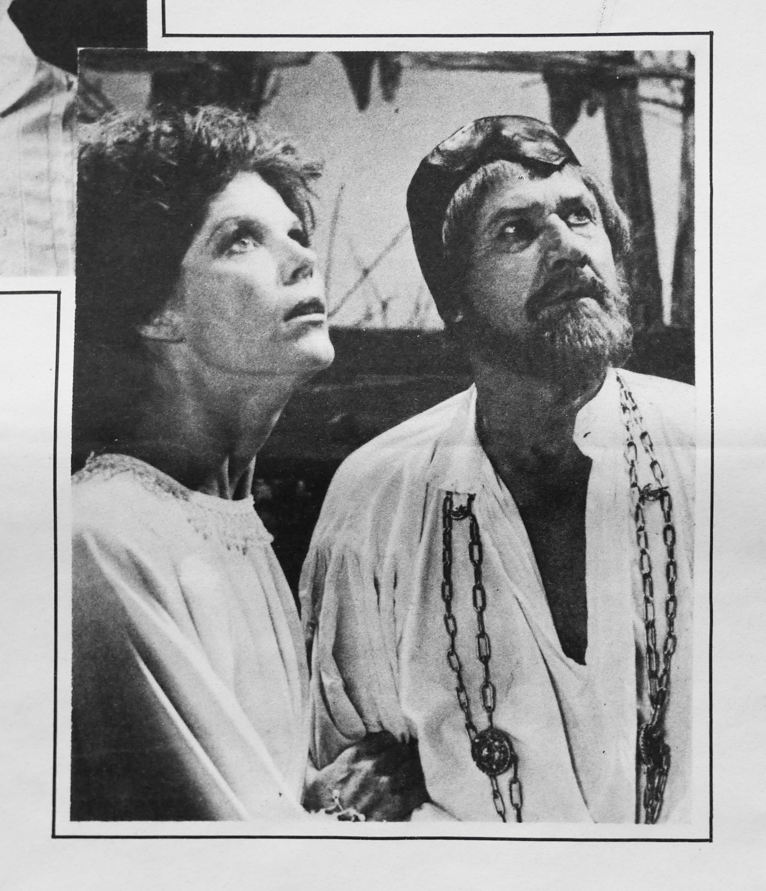
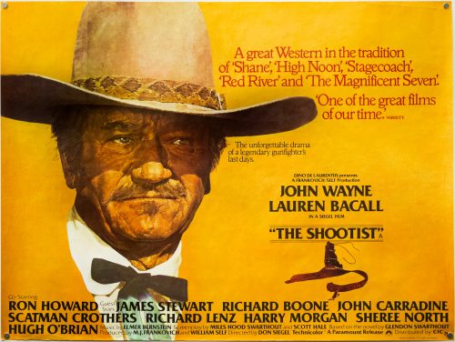
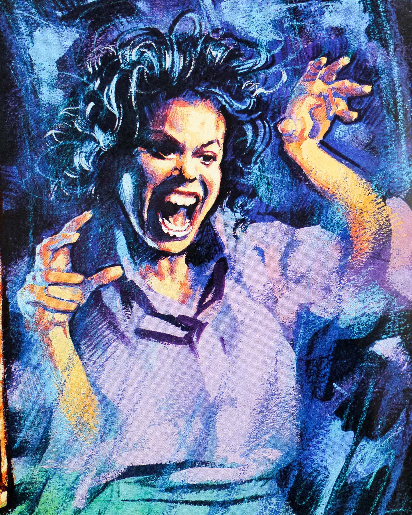
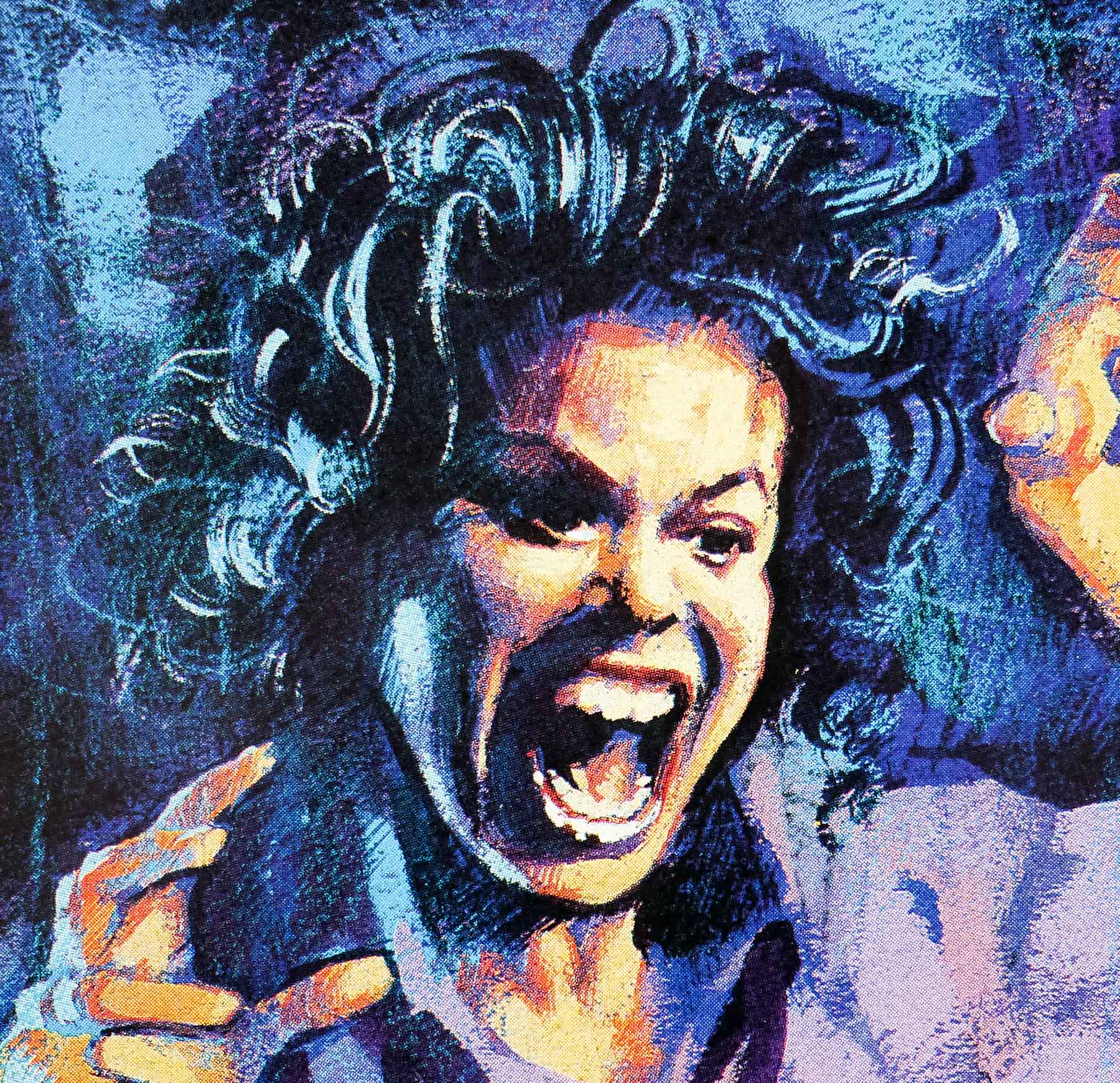
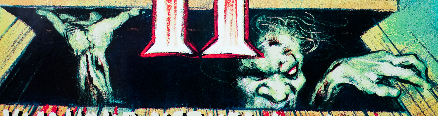
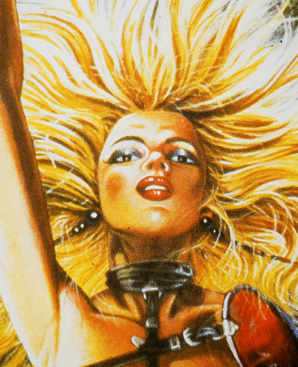
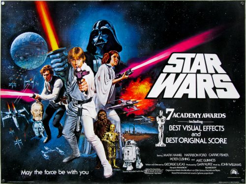
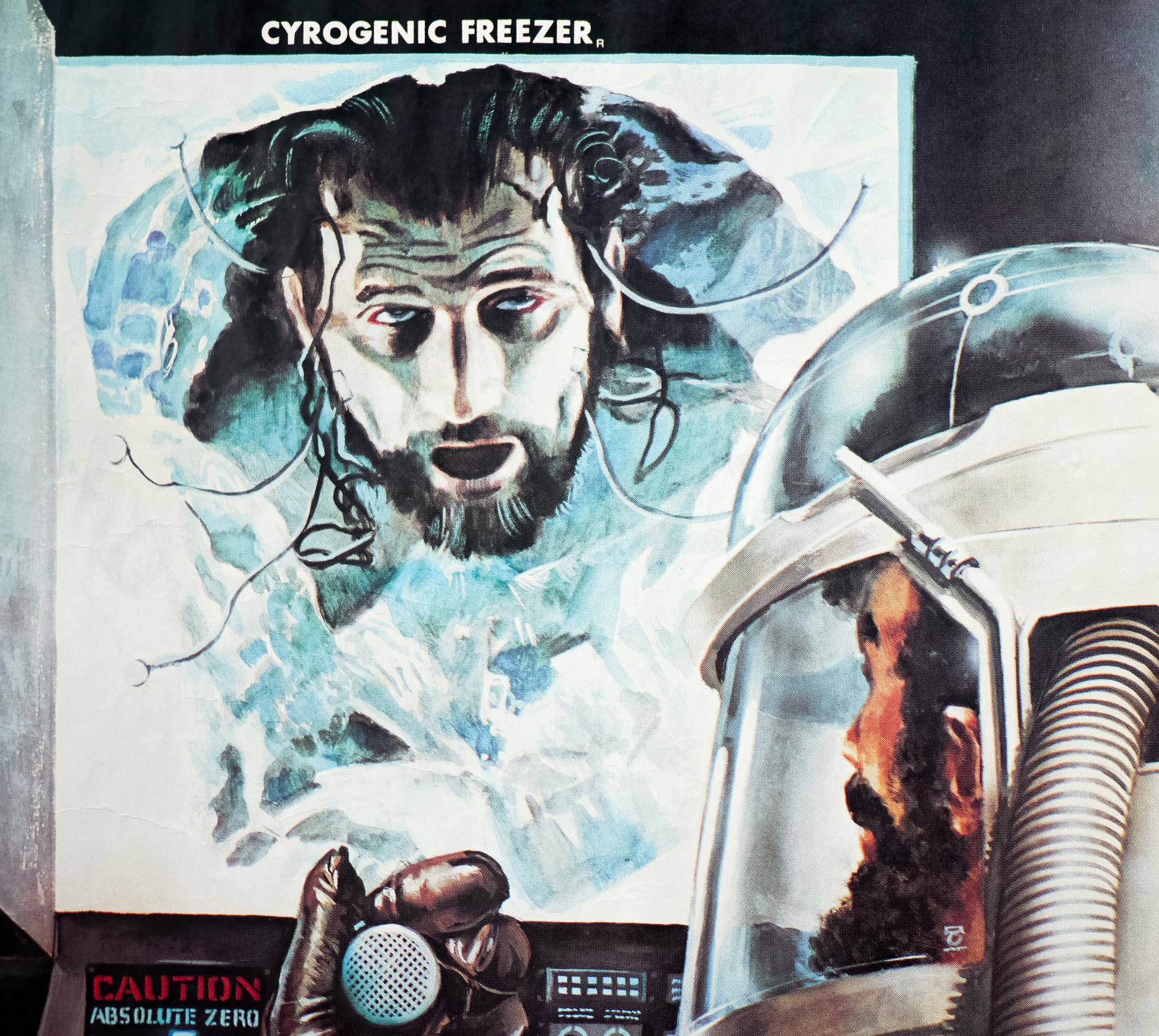
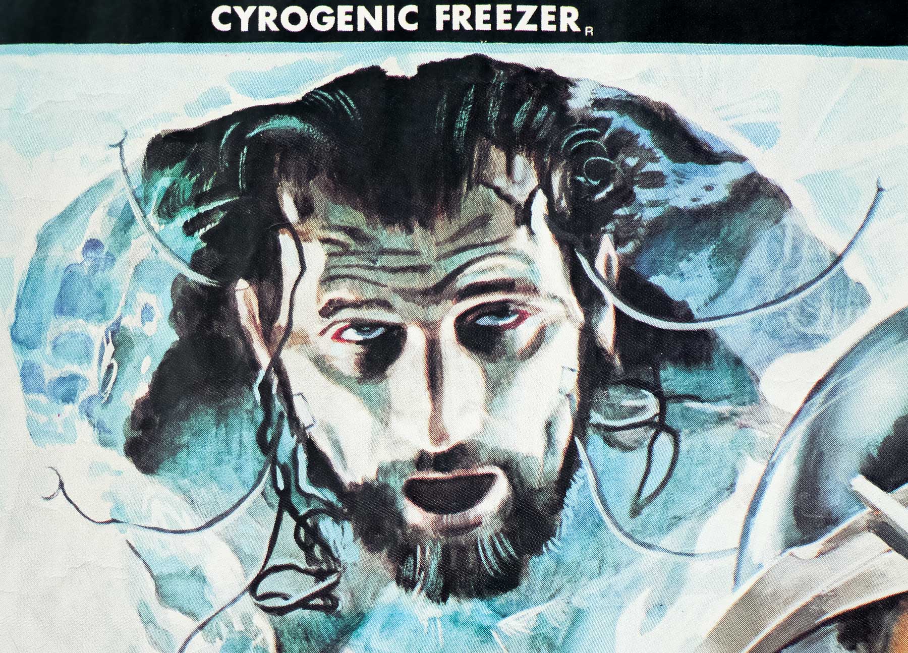
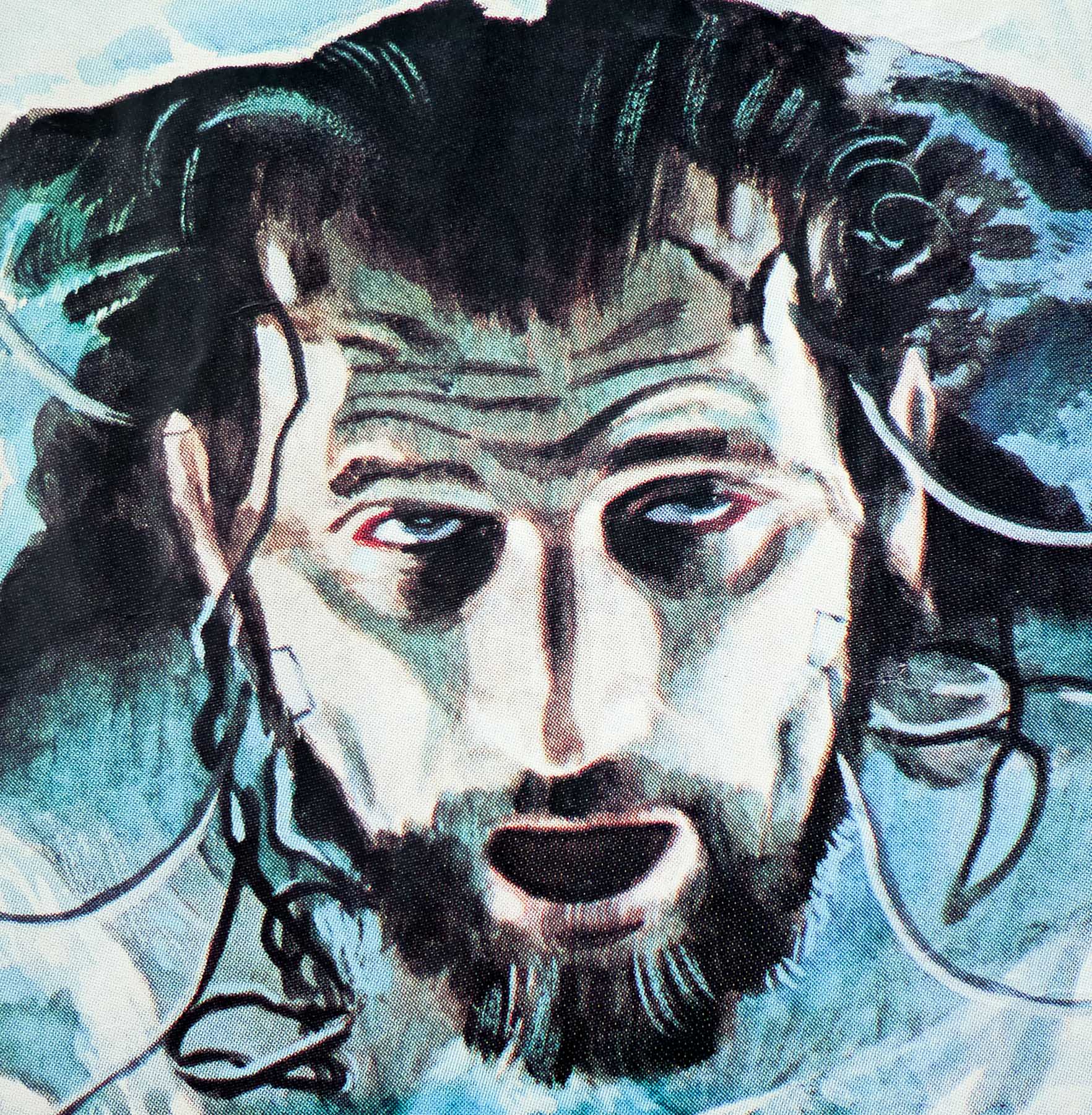
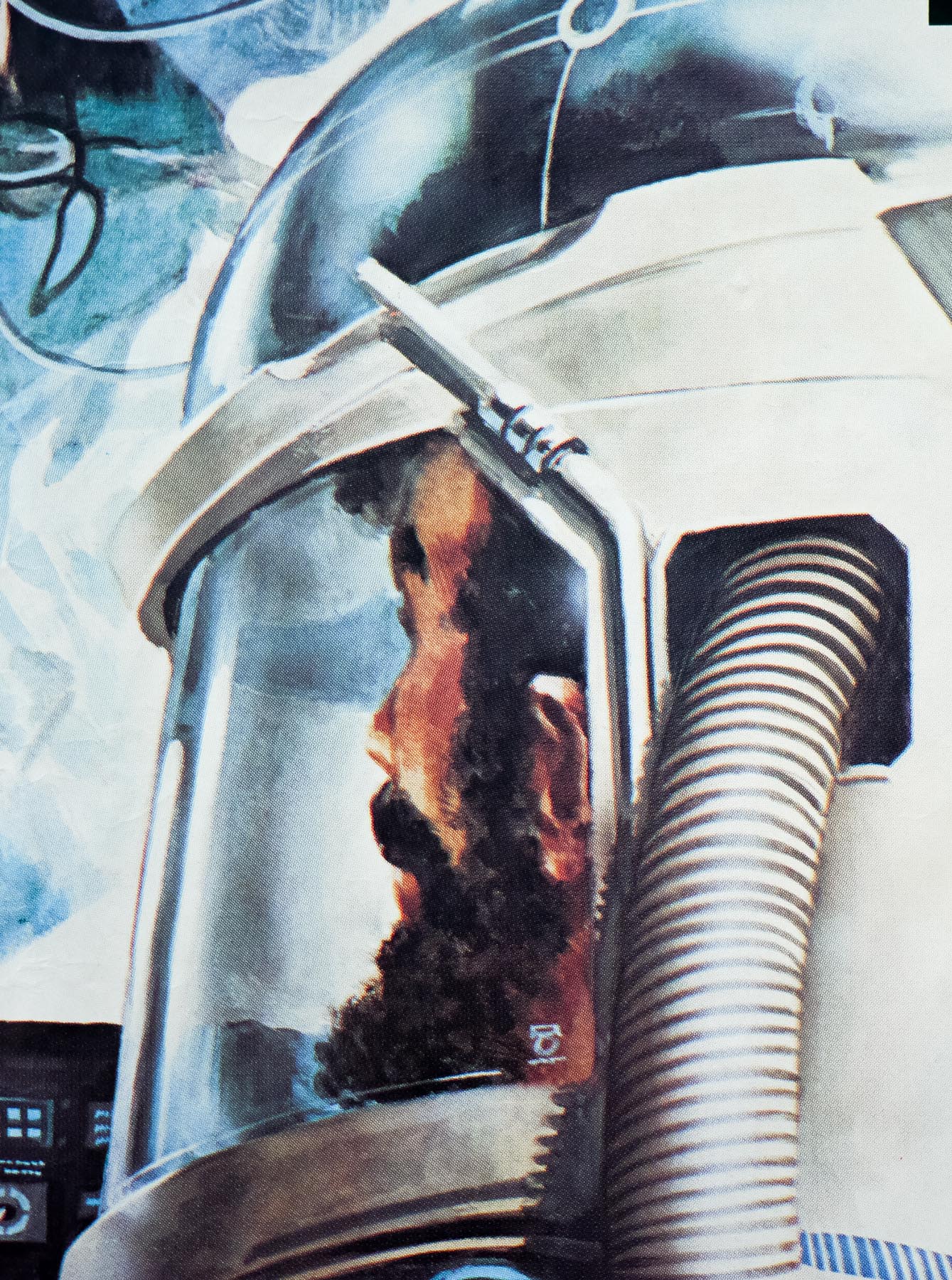
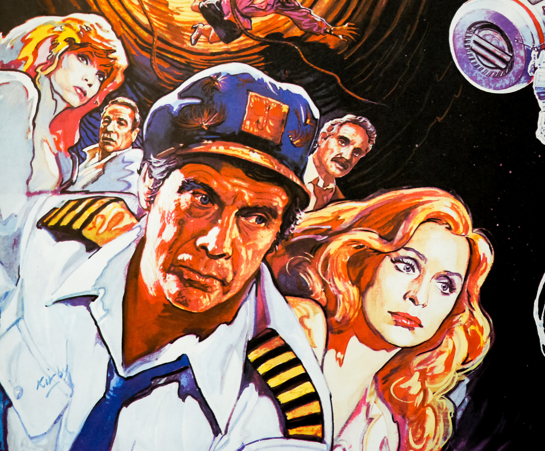
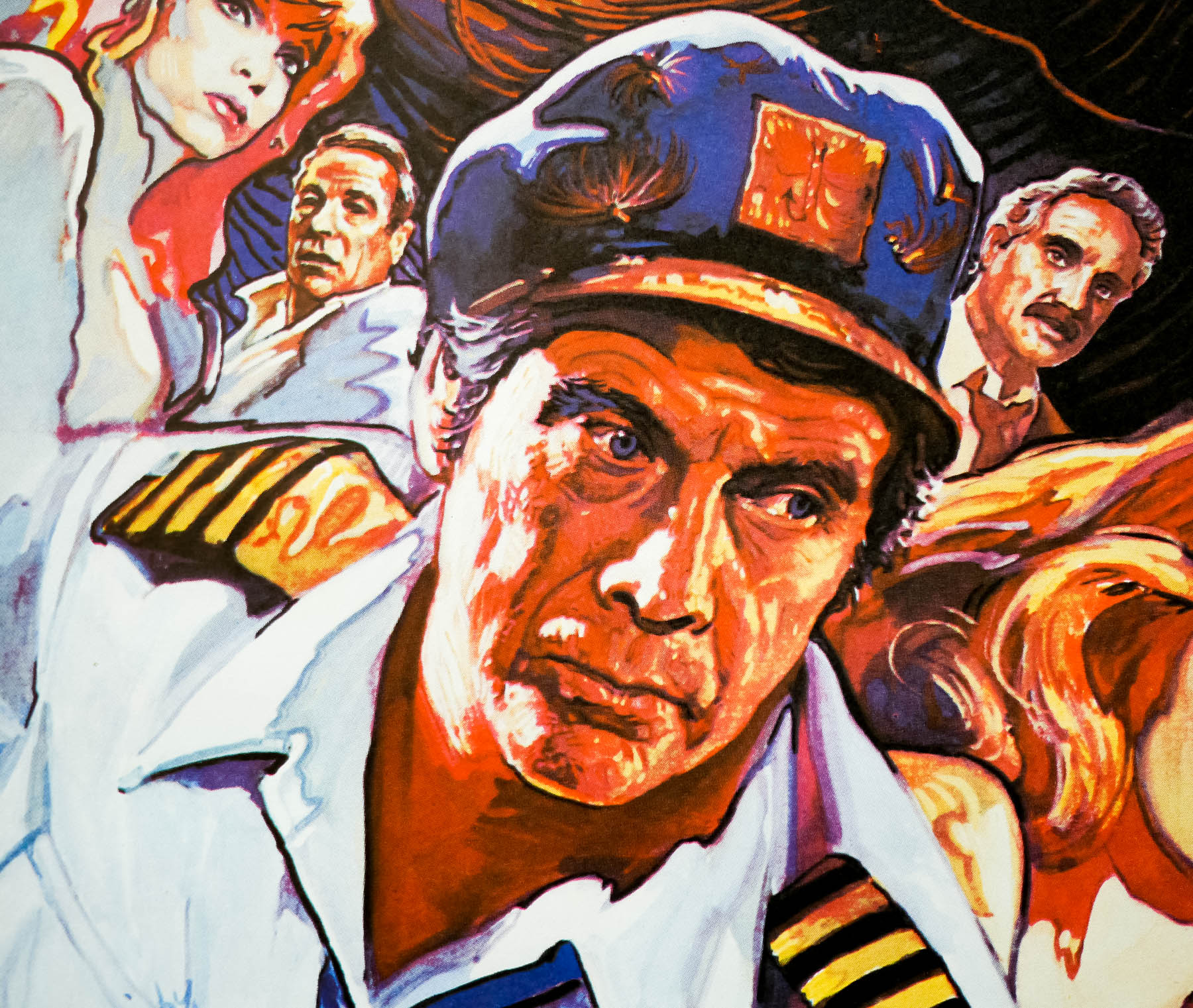
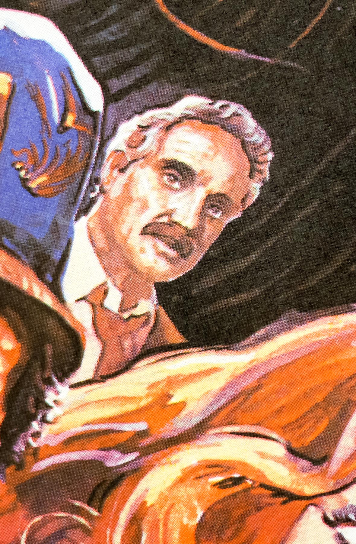
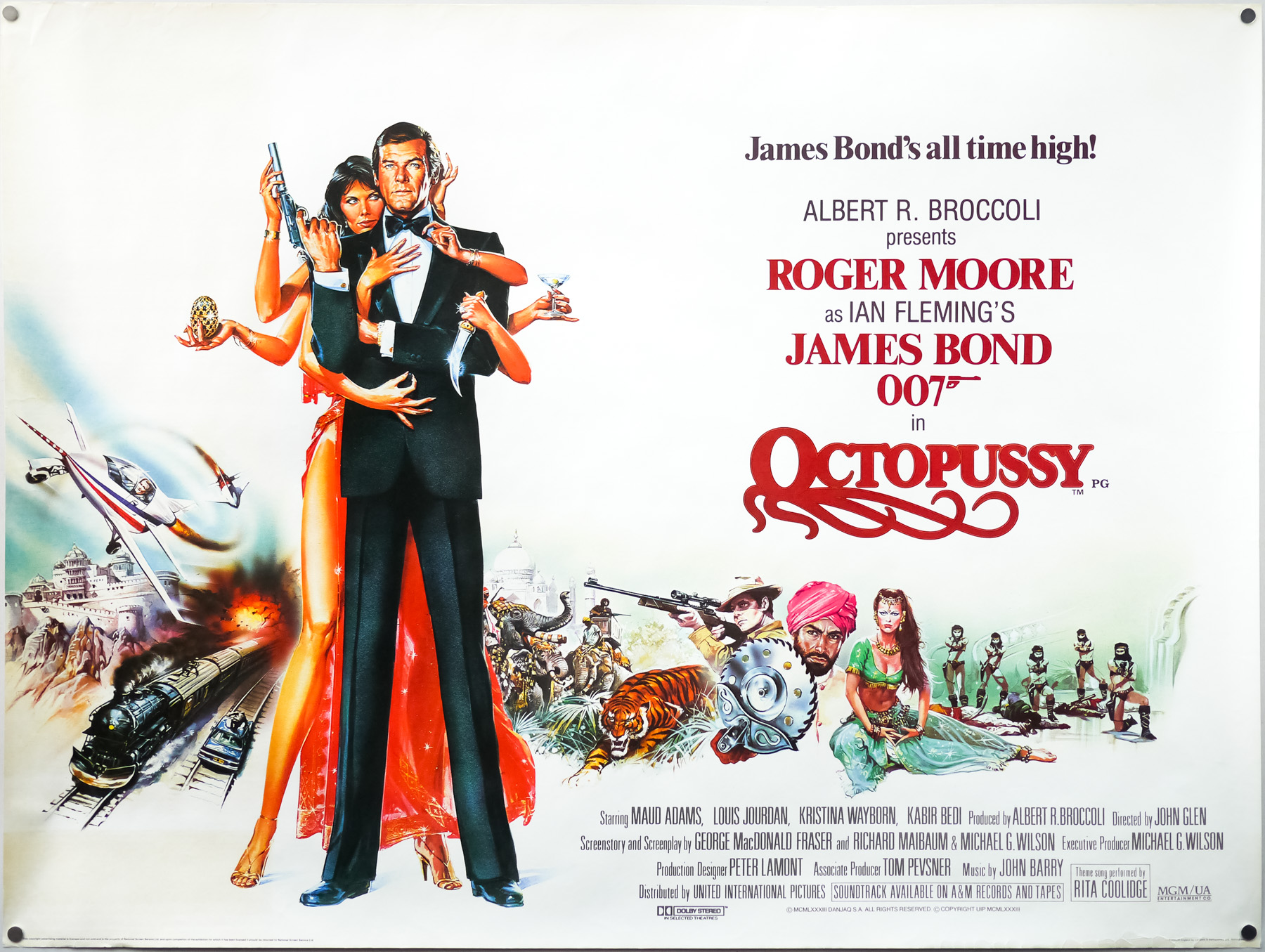
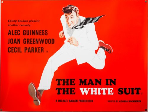
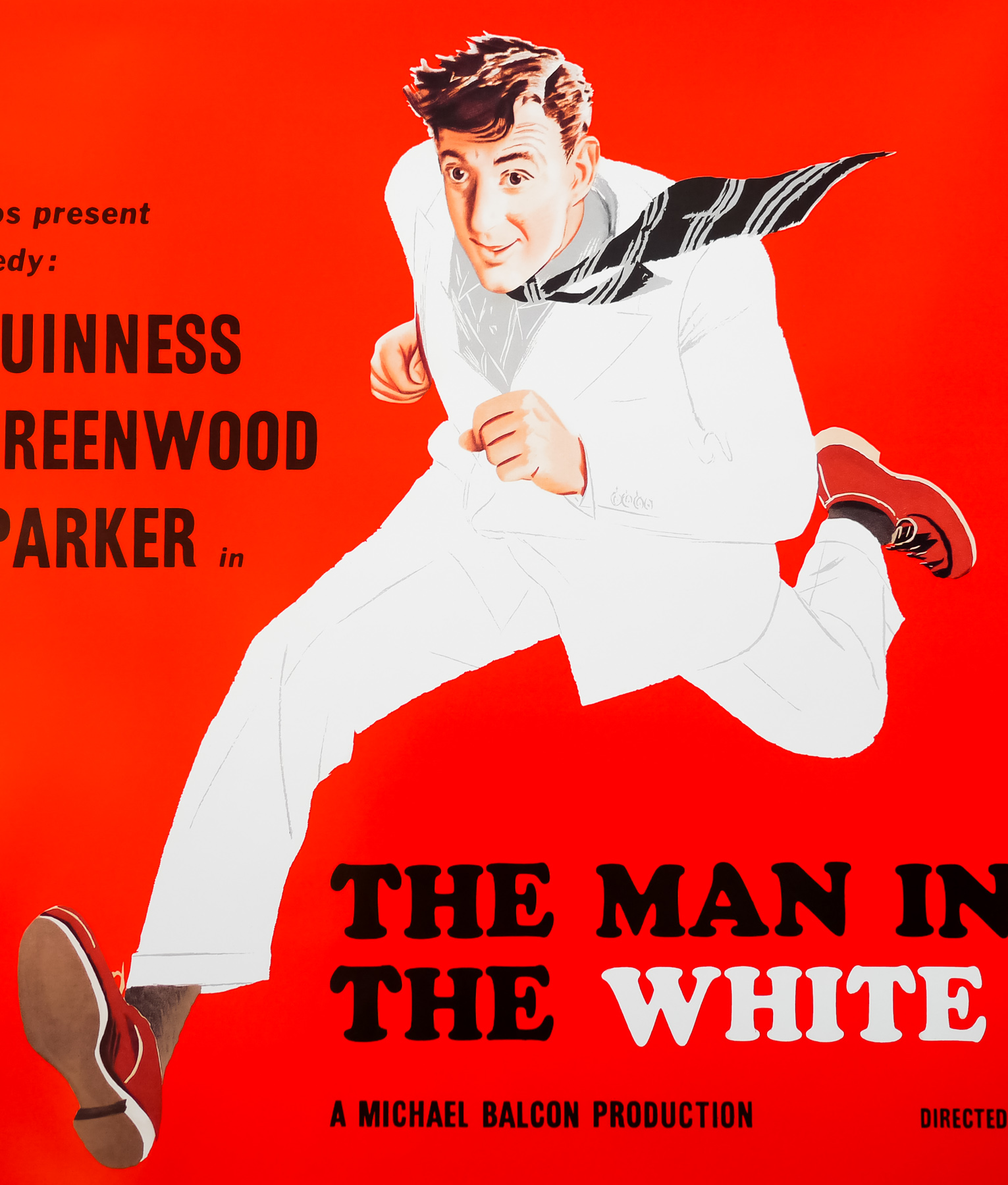
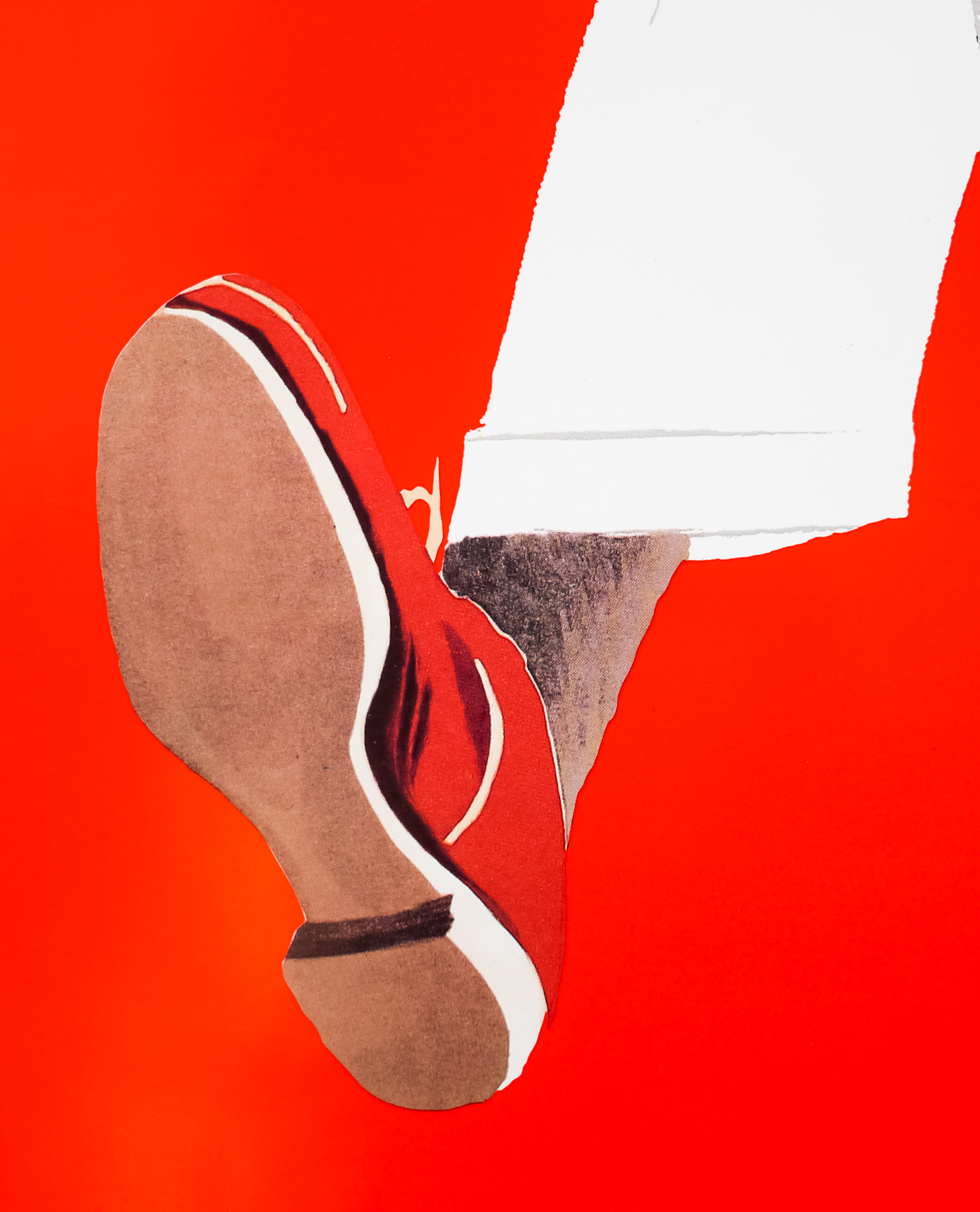
The Man in the White Suit is a satirical comedy that was made for the famous Ealing Studios in London and released in 1951. Directed by regular Ealing collaborator Alexander Mackendrick (who also helmed The Ladykillers and others), the film stars Alec Guinness as Sidney Stratton a frustrated chemist who is obsessed with creating an everlasting fibre. Sidney has been fired from several mills around Manchester because of his unauthorised use of expensive lab materials and his focusing on invention instead of the job he’s being paid to do. After starting at Alan Birnley’s (Cecil Parker) textile mill he manages to wangle an unpaid job as a researcher and is eventually afforded the space and materials to come up with his miracle fibre that resists all dirt and stays spotless.
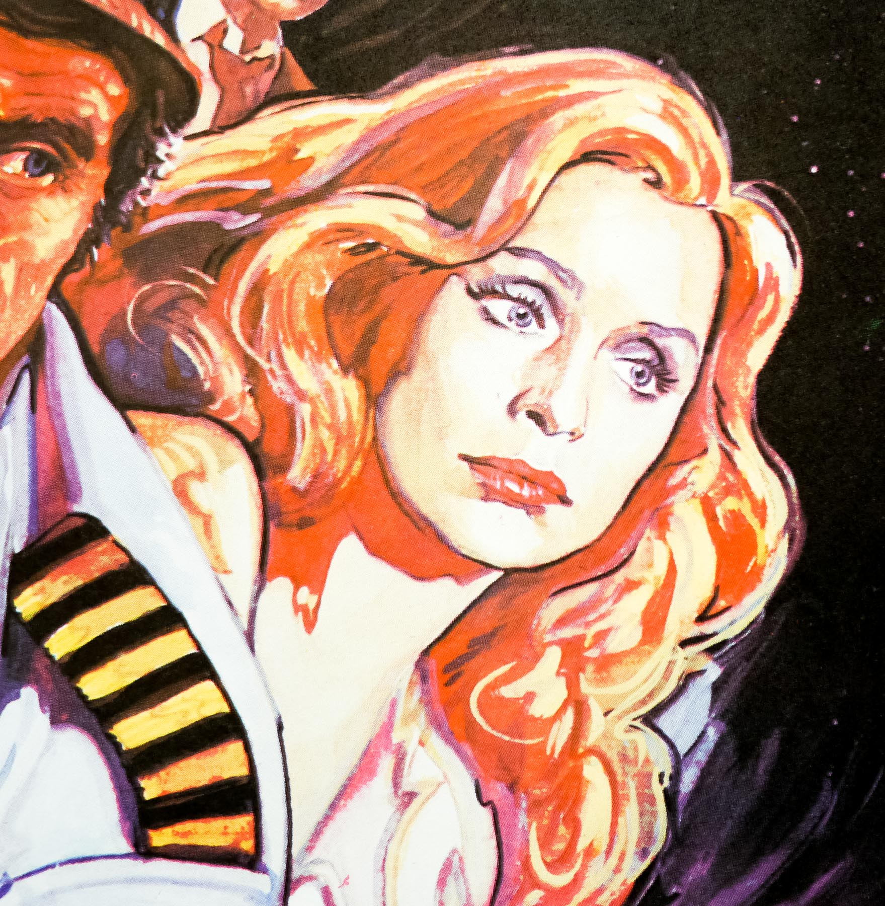
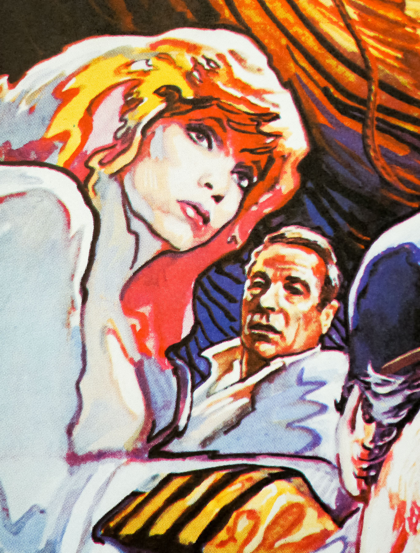
Soon the management are aware of his invention, thanks to Birnley’s daughter Daphne (Joan Greenwood) spotting the potential, and are about to go public with the news when the trade unions and mill workers get involved. Both parties realise that such an invention will put them out of business since the public will never need to buy items made from the material again. They end up trying to bargain with Sidney but when he realises they just want to suppress the invention he tries to escape from their clutches, leading everyone on a chase around town. Unluckily for Sidney, it turns out his invention is not as robust as he’d hoped!
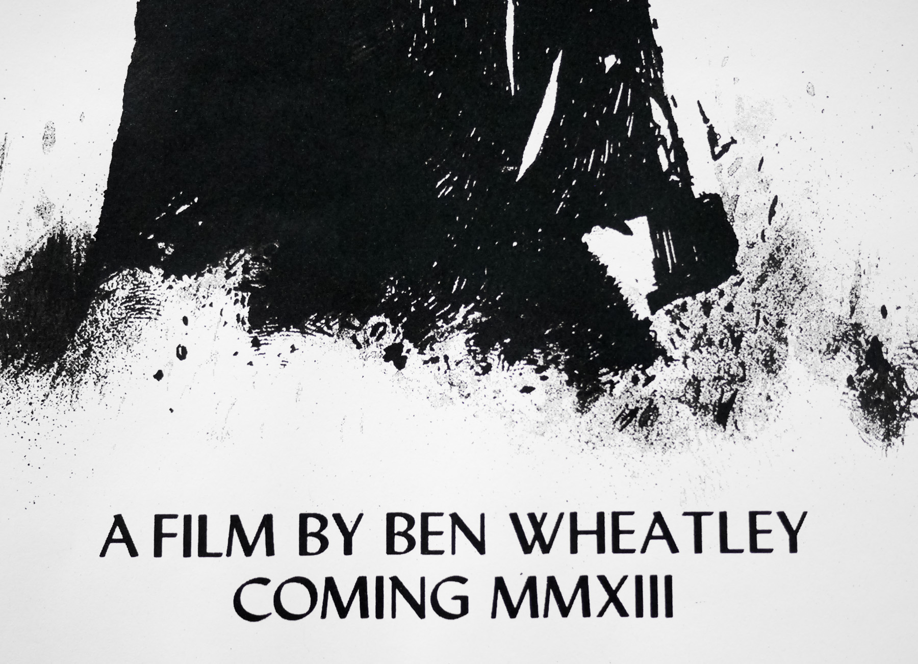
This British quad is from a BFI re-release of the film in 1993 (thanks to Sim Branaghan for confirmation of the exact year). It’s almost identical to the original 1950s quad but is missing the original distributor logo in the bottom left-hand corner, as well as the designer/artist credits. See this thread on the NSFGE poster forum for details and check out the image of a previous sale of the poster at Christies auction house.
The original 1951 quad was one of two that featured on the cover of Sim Branaghan‘s must-own British Film Posters, the definitive reference for those interested in the history of the subject. As detailed in the book, the poster was designed by man called Sydney John Woods who Sim notes was ‘more or less single-handedly responsible for the Ealing poster success’. Born in 1915, Woods trained as a graphic designer and painter and was also an art critic. He also design posters for theatres, including the Old Vic and Sadler’s Wells before starting to work for the film industry with a role in Fox’s publicity department.
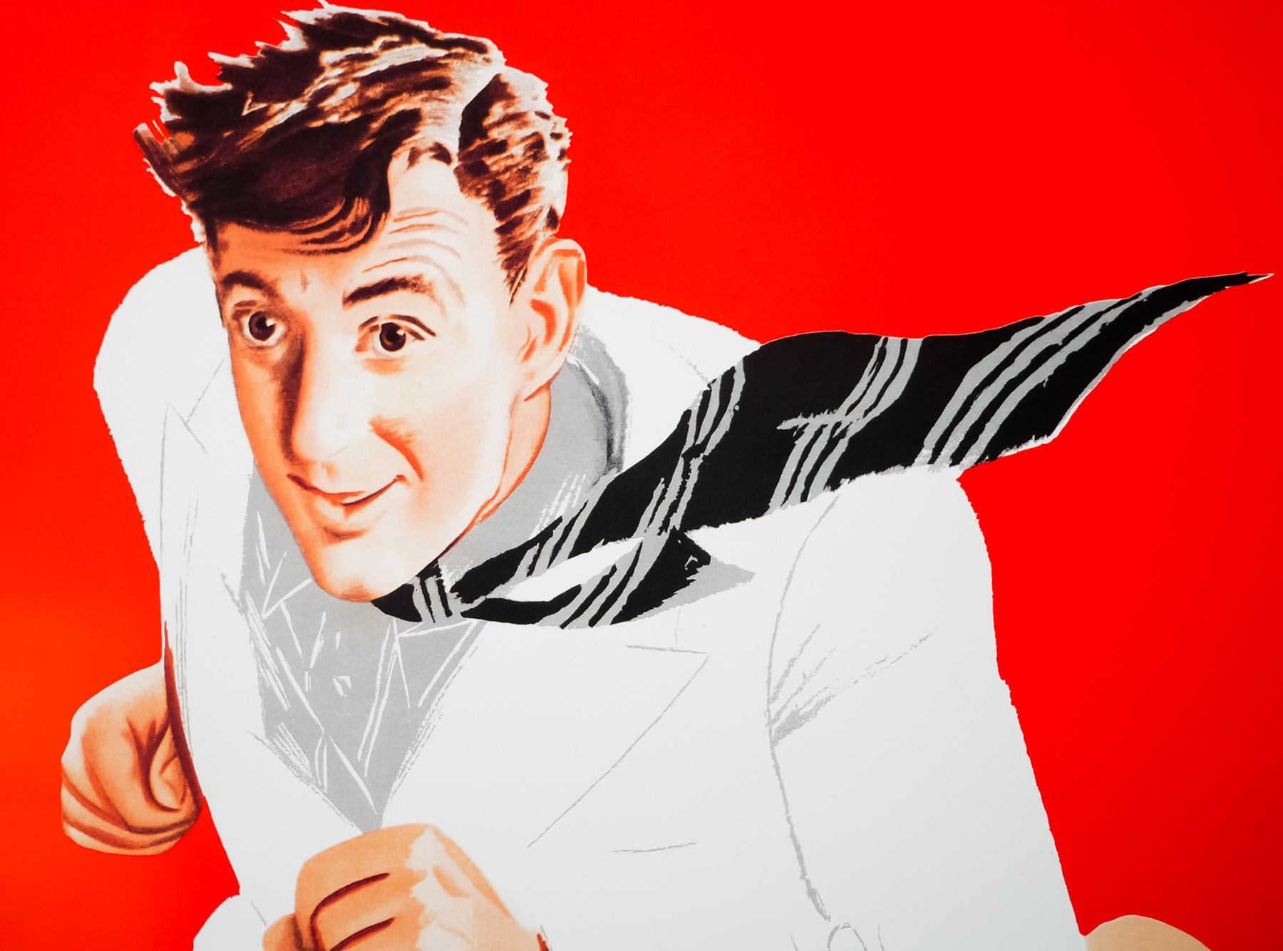
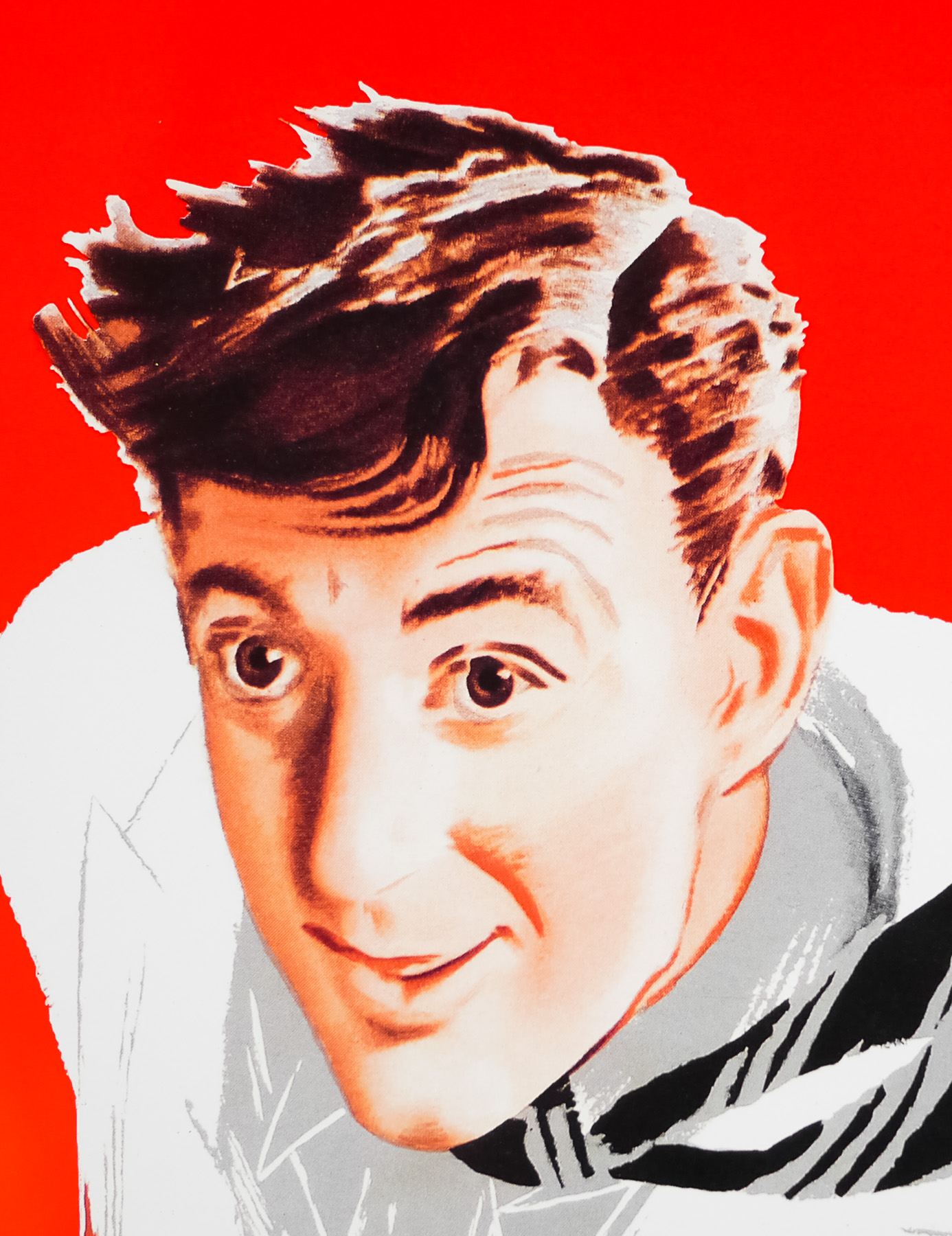
Woods joined Ealing in 1943 and worked there until the studios’ demise in 1959. Sim notes that Woods ‘revealed perhaps his greatest skill as an impresario, marshalling, encouraging, and exploiting to best advantage the talents of other artists’. He built up an impressive stable of artists that he could call on to produce illustrations for the studios’ output. This included the cartoonist Nicolas Bentley (for Passport to Pimlico, 1949) and Ronald Searle, creator of the St. Trinian’s cartoons (for The Lavender Hill Mob, 1951). The same year he would commission the artist A. R. Thomson to paint this portrait of Alec Guinness.
Thomson was born deaf and dumb in India in 1894 to a civil servant father who later brought the family back to London where Alfred attended the Royal School for Deaf Children. He became known as the ‘deaf and dumb artist’ and would go on to work on commercial advertising for the likes of Daimler, and also became the RAF’s official war artist in 1940. Interestingly, he was also the last person to win a gold medal for painting at the 1948 Olympic games in London (the last year that artists were allowed to compete). Thomson passed away in 1979. The ArtUK site features a gallery of his work.