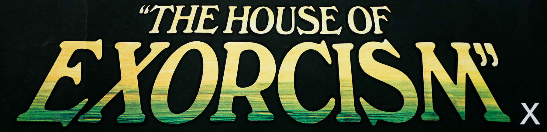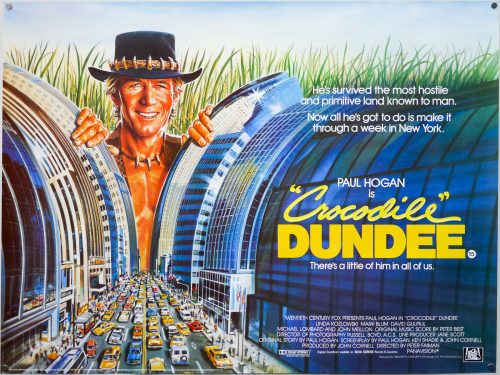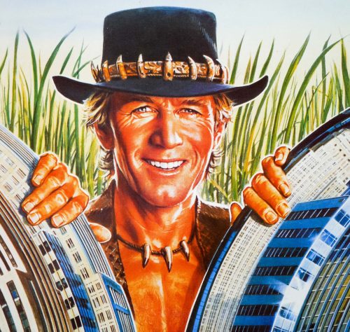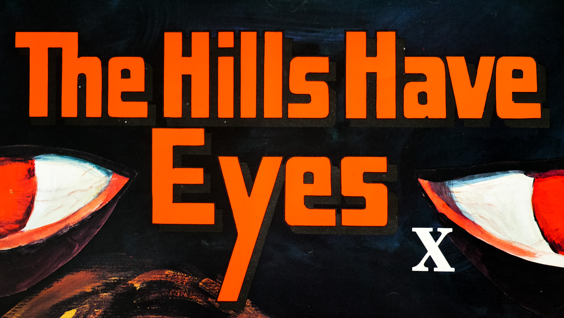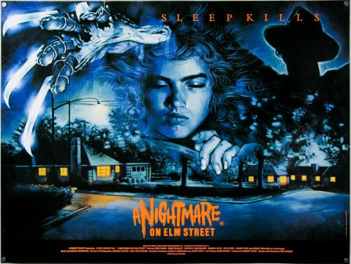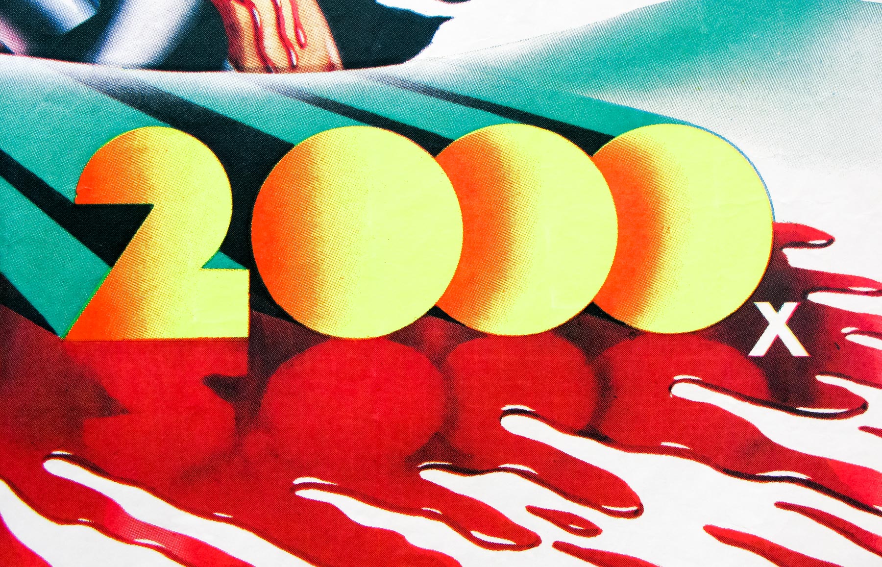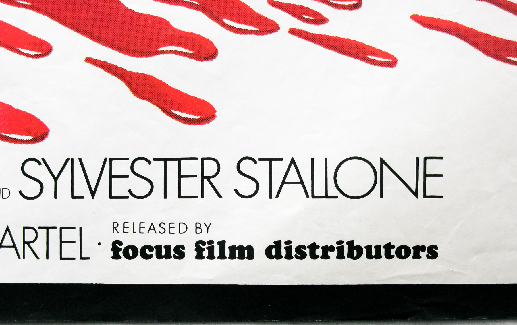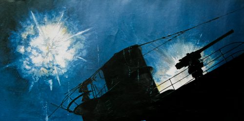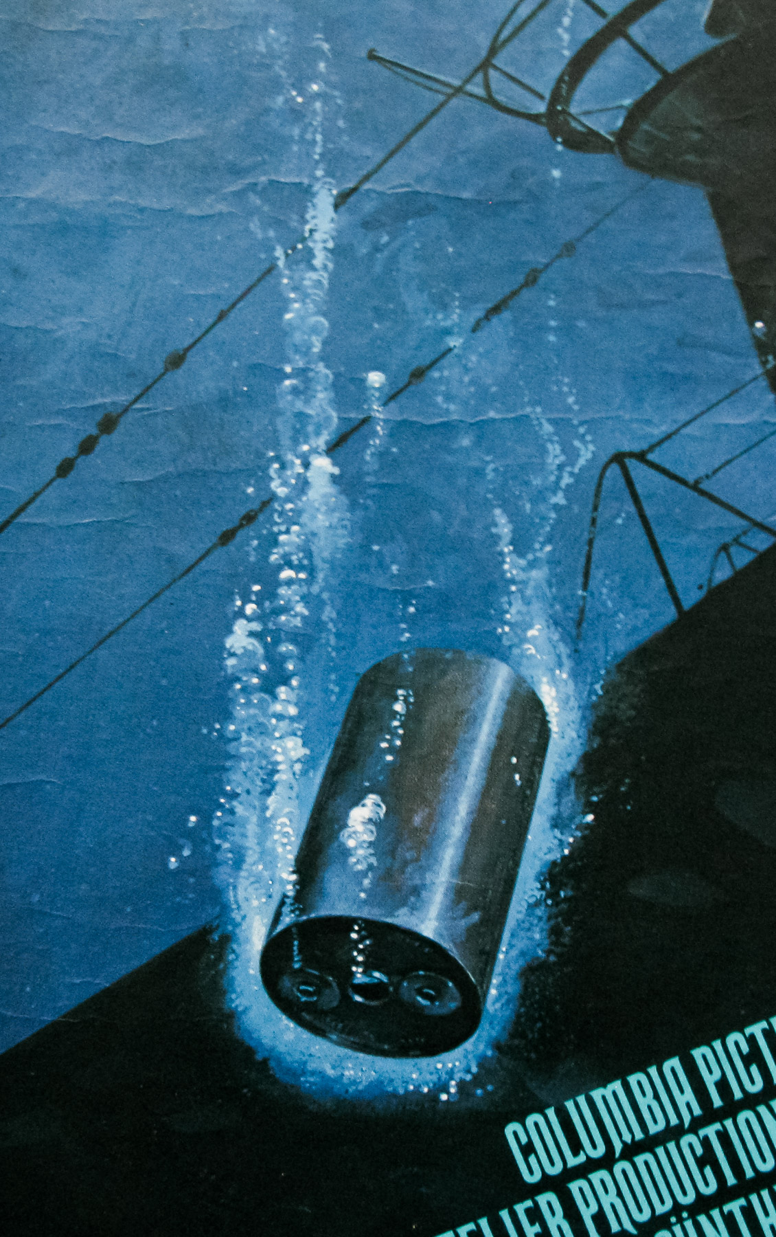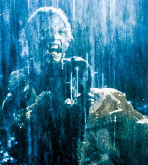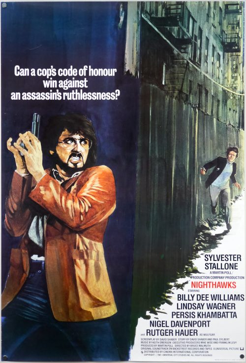
Poster detail
1-5


- Title
- Nighthawks
- Year of Film
- 1981
- Director
- Bruce Malmuth
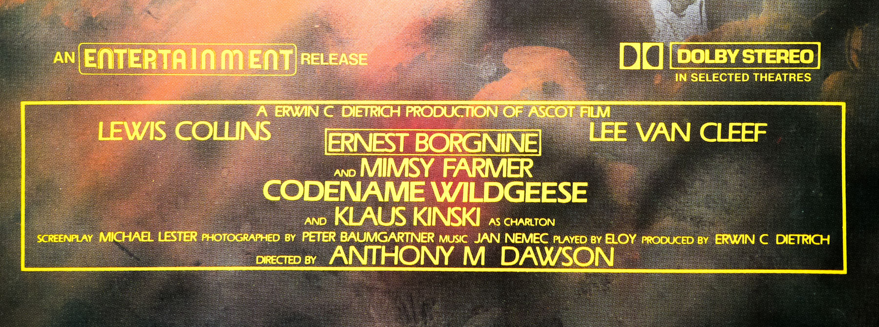
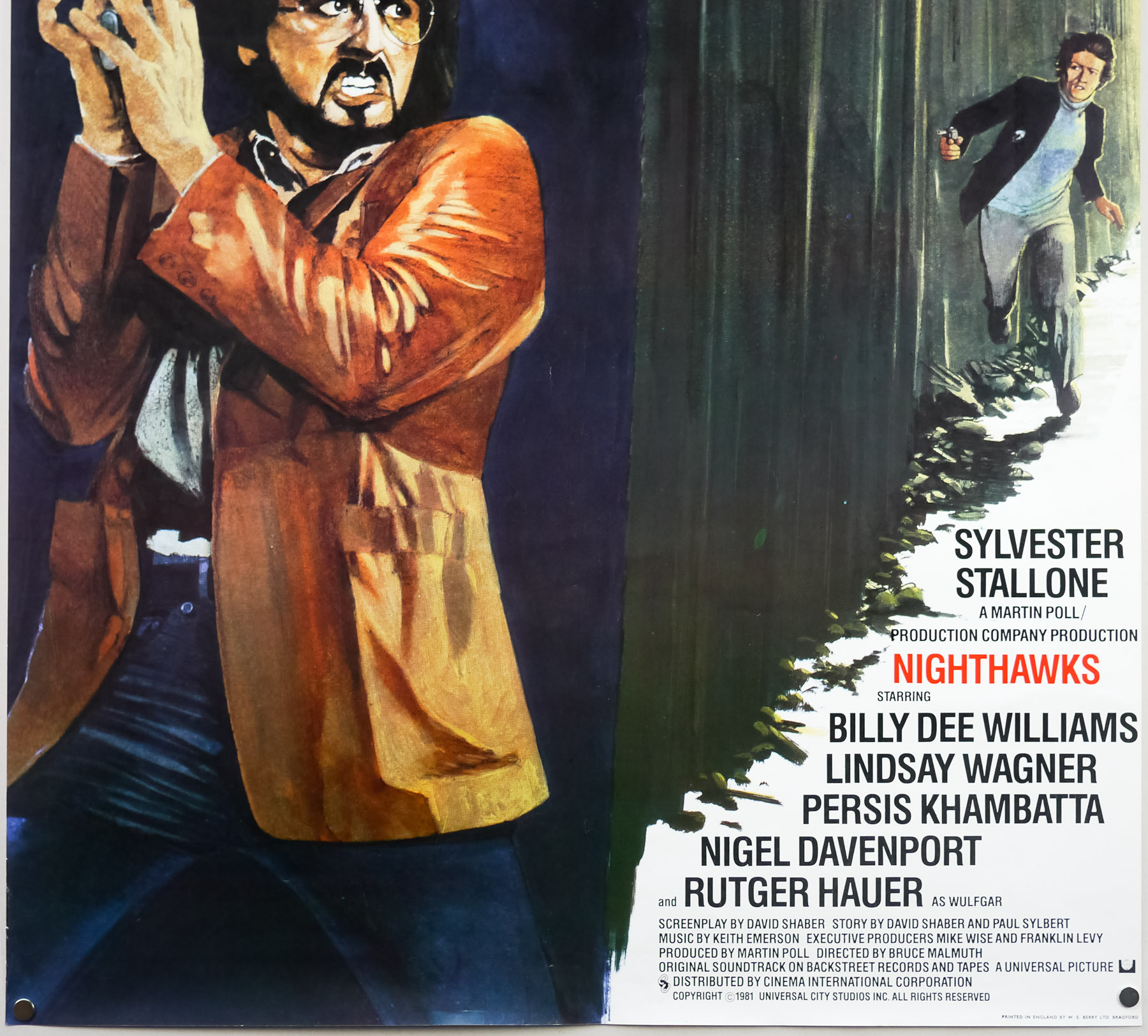
- Starring
- Sylvester Stallone, Billy Dee Williams, Lindsay Wagner, Persis Khambatta, Nigel Davenport, Rutger Hauer, Hilary Thompson, Joe Spinell, Walter Mathews
- Origin of Film
- USA
- Genre(s) of Film
- Sylvester Stallone, Billy Dee Williams, Lindsay Wagner, Persis Khambatta, Nigel Davenport, Rutger Hauer, Hilary Thompson, Joe Spinell, Walter Mathews,
- Type of Poster
- One sheet
- Style of Poster
- --
- Origin of Poster
- UK
- Year of Poster
- 1981
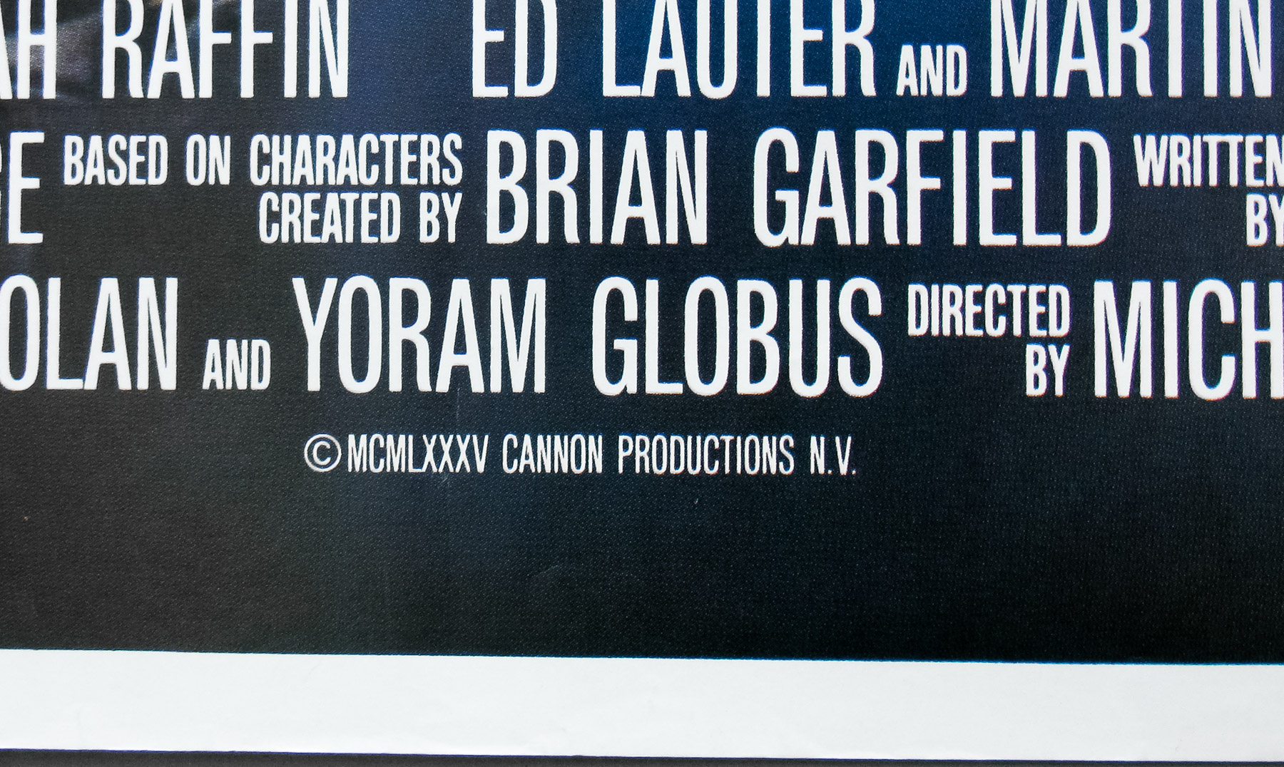
- Designer
- Unknown
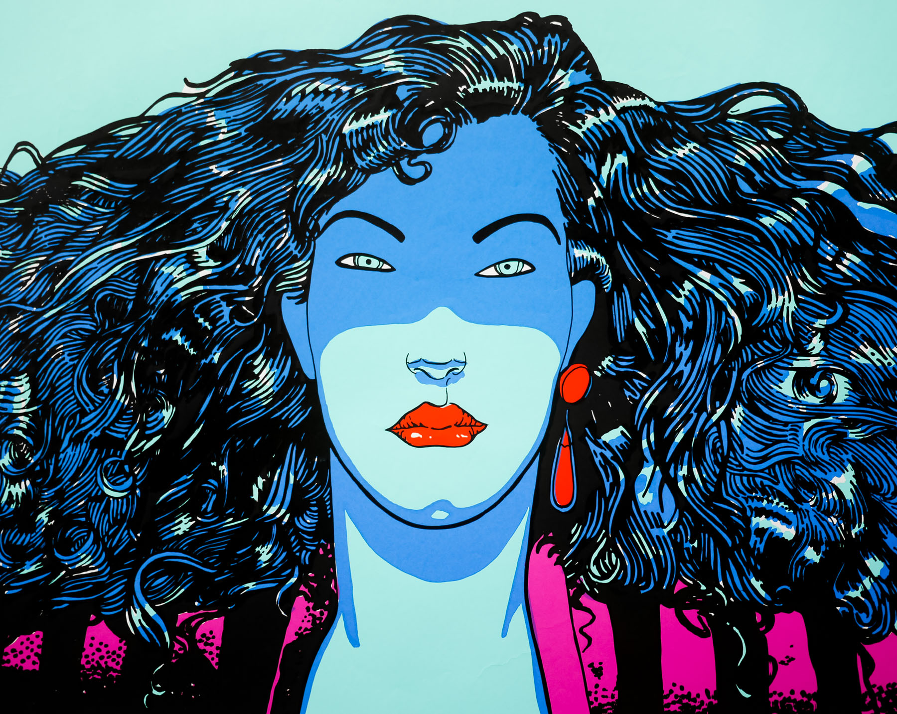
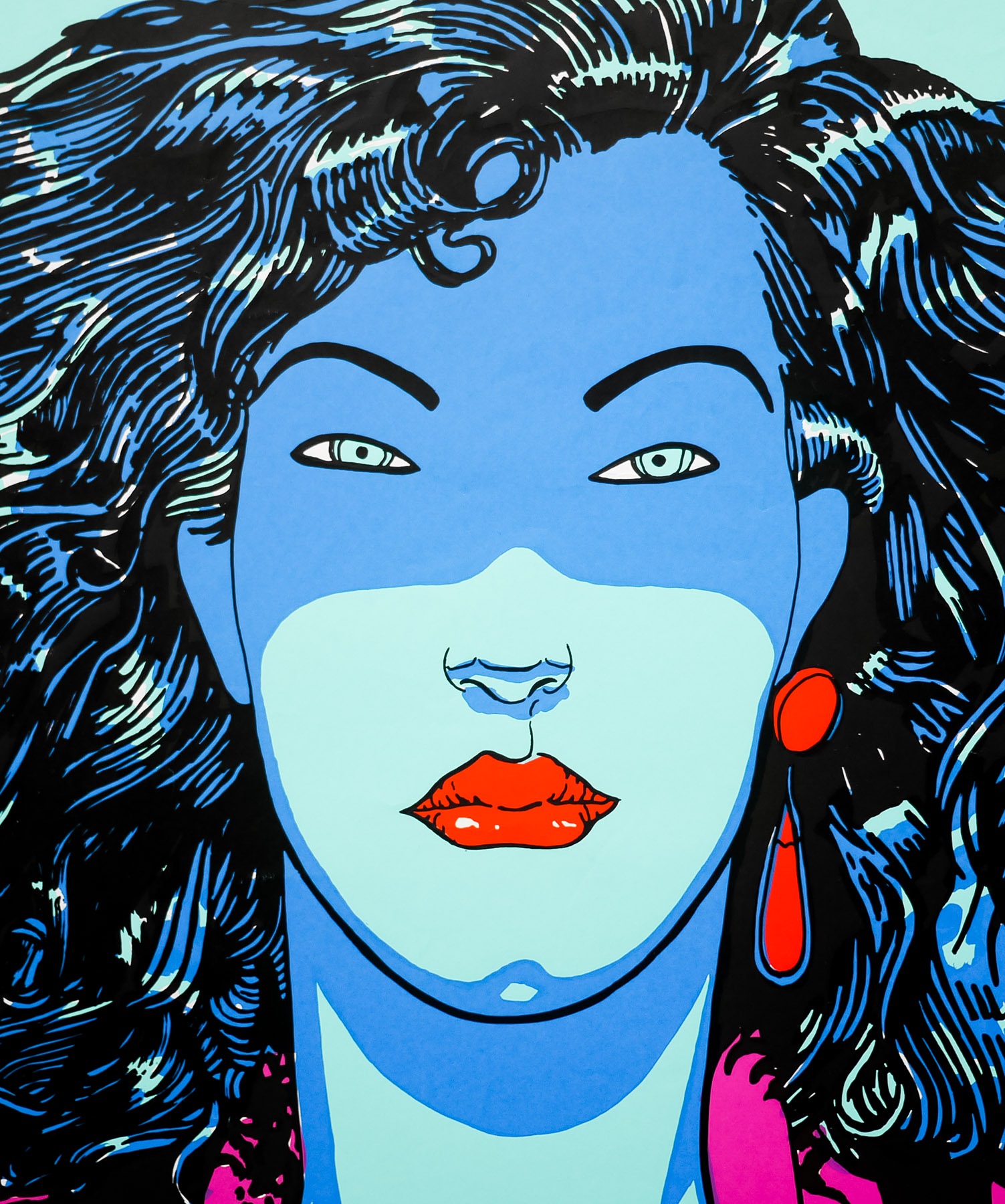
- Artist
- Ron Fenton (unconfirmed)
- Size (inches)
- 27 2/16" x 39 14/16"
- SS or DS
- SS
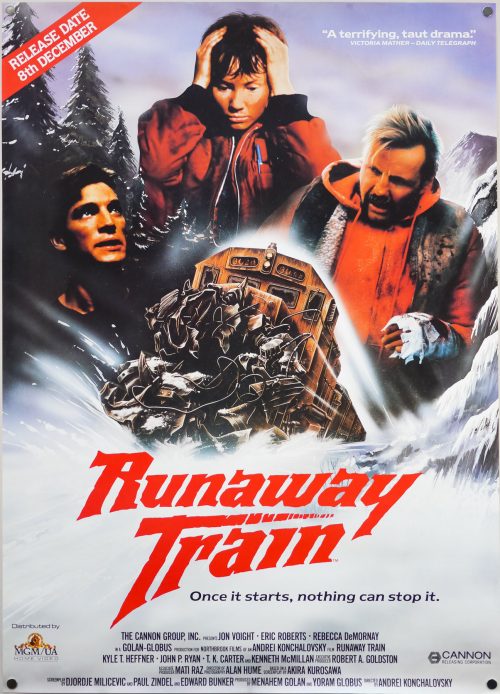
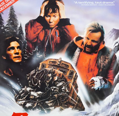
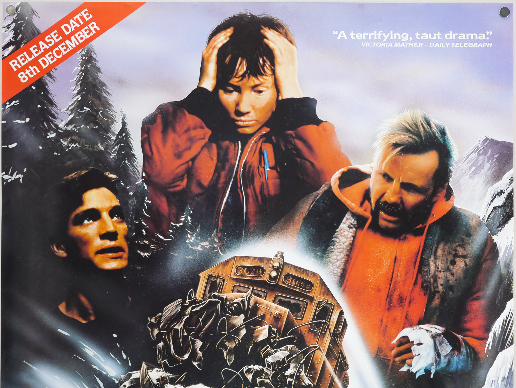
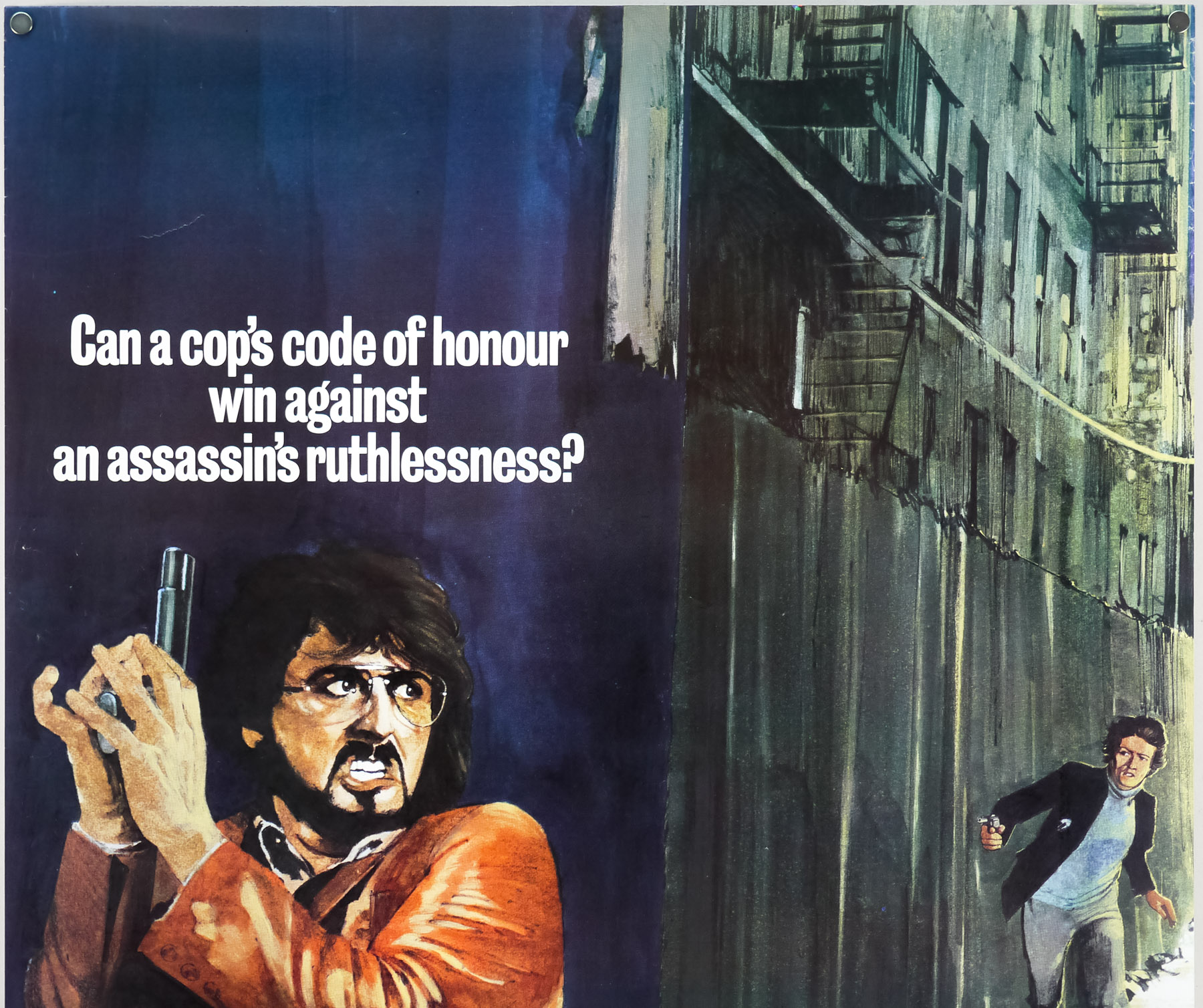
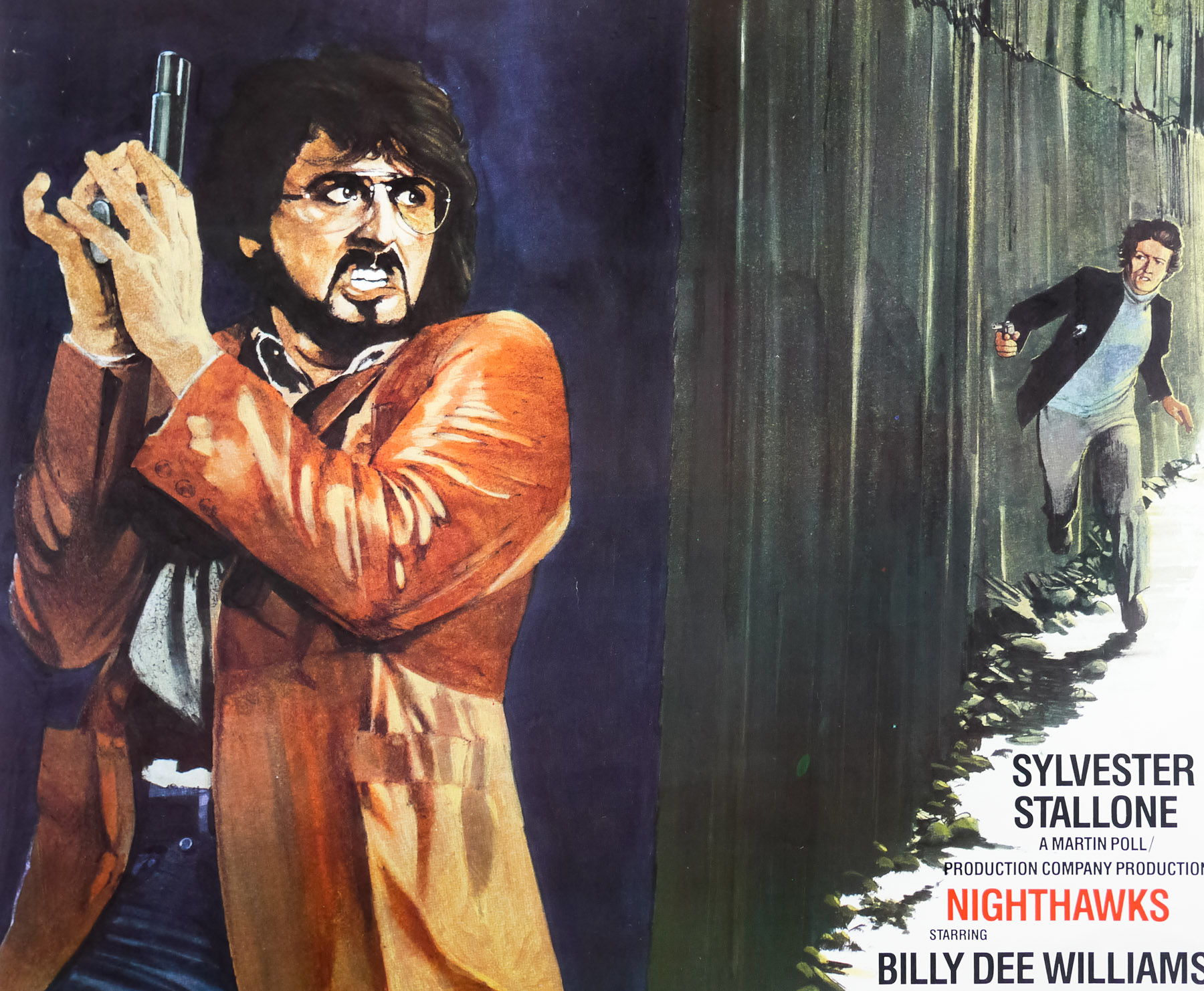
- Tagline
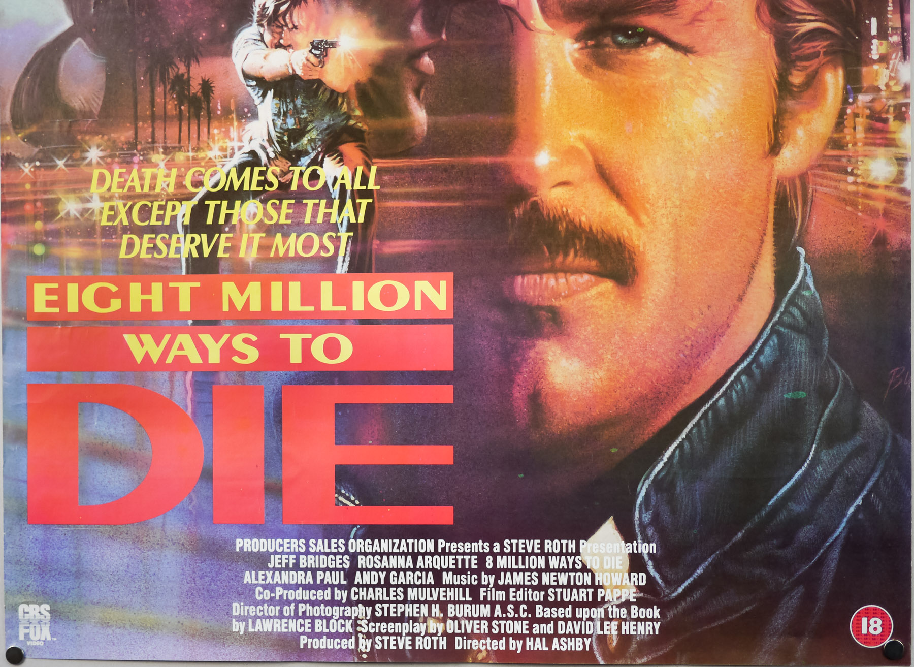
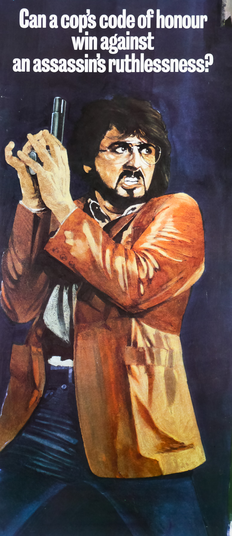
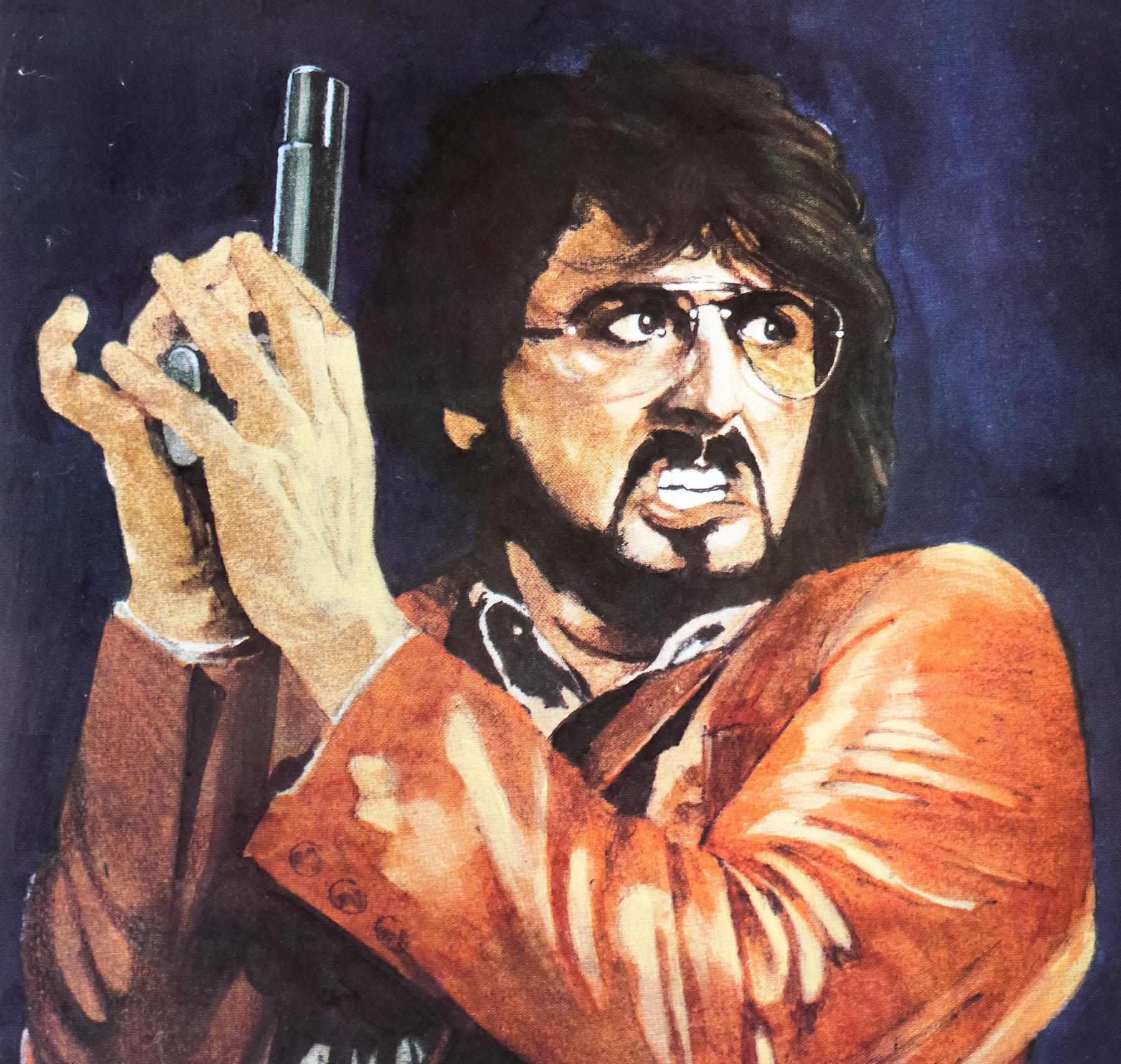
- Can a cop's code of honour win against an assassin's ruthlessness?
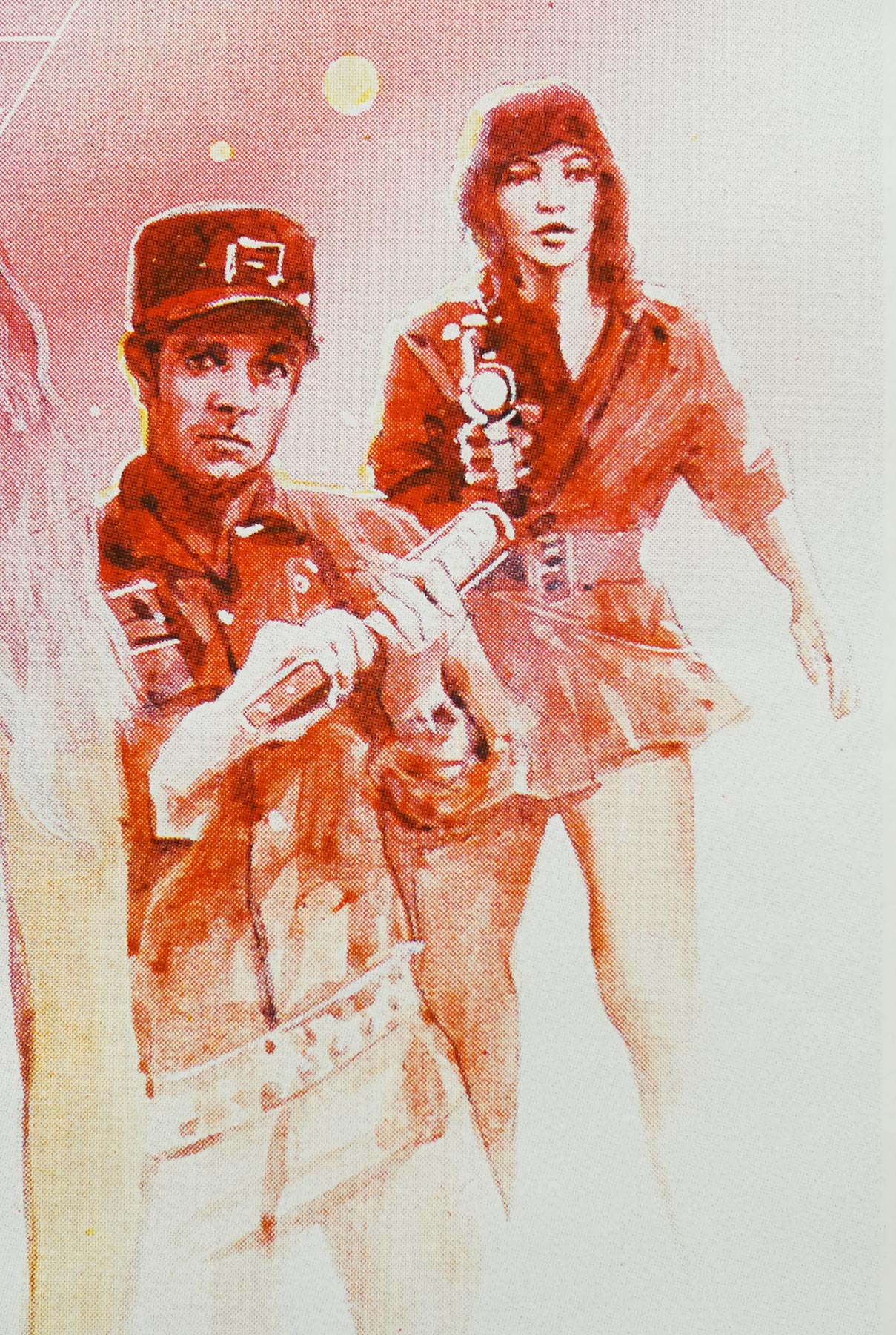
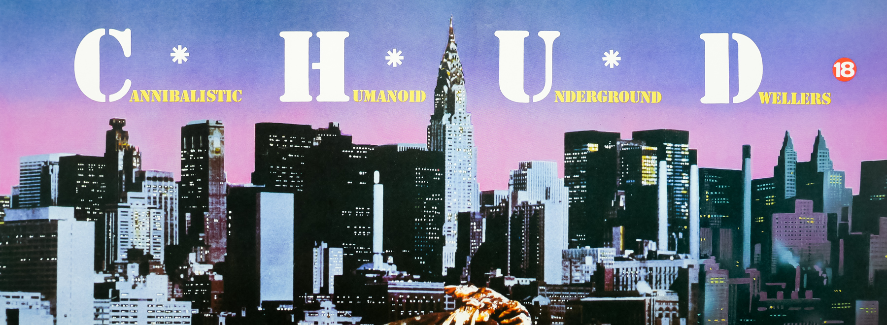
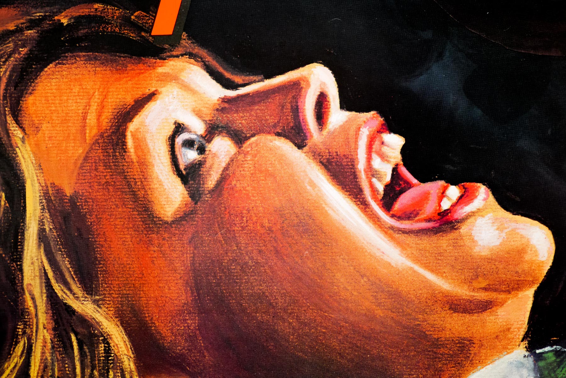
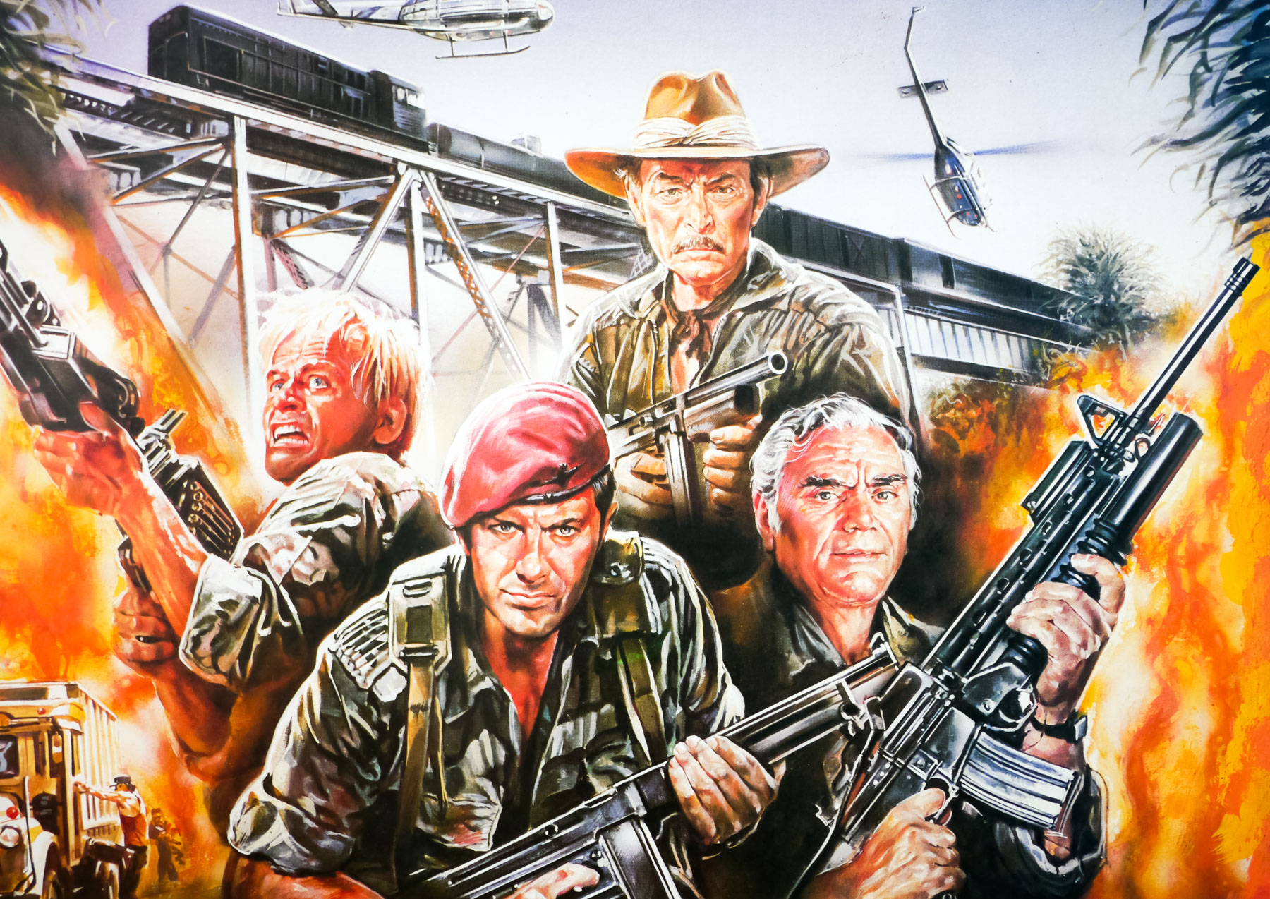
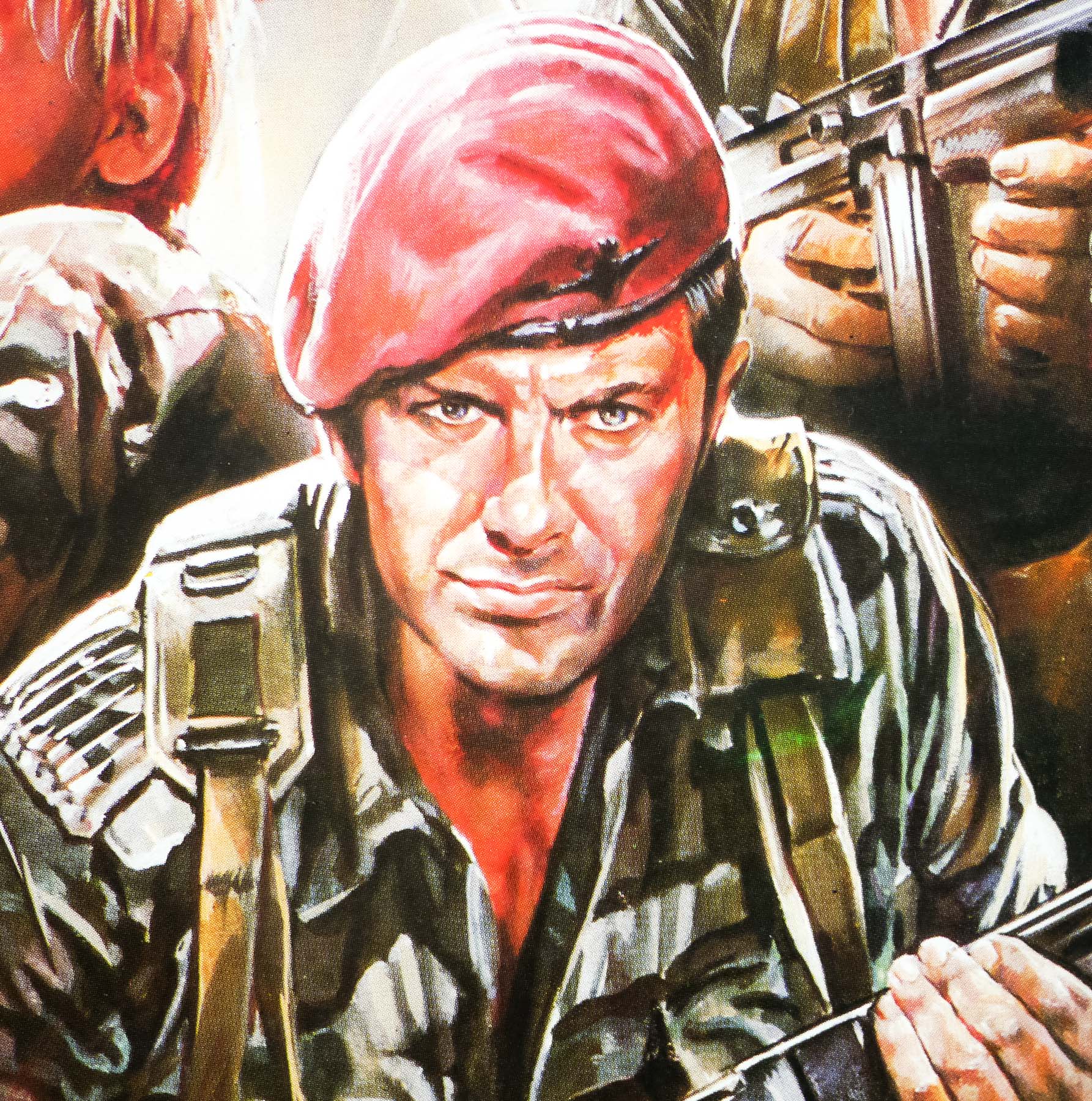
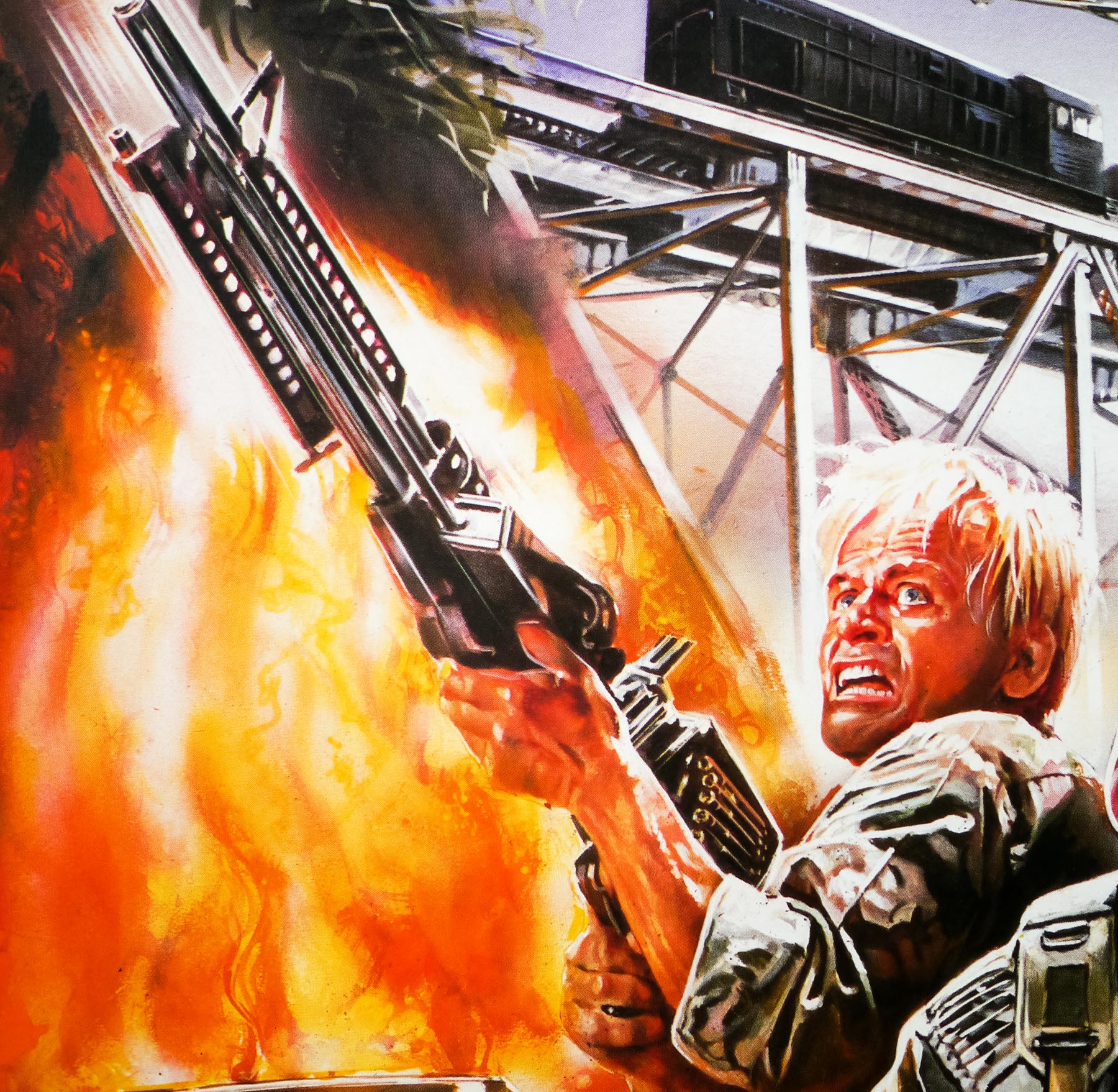
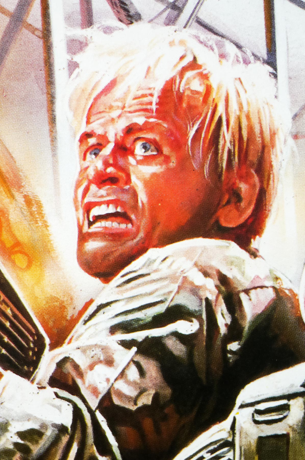
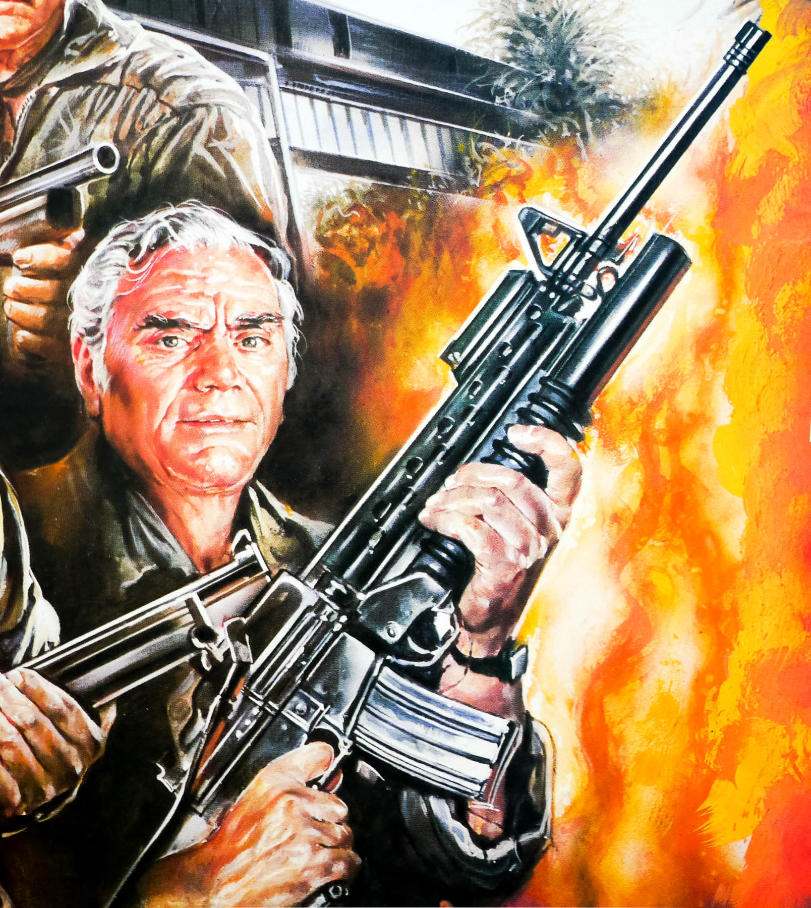
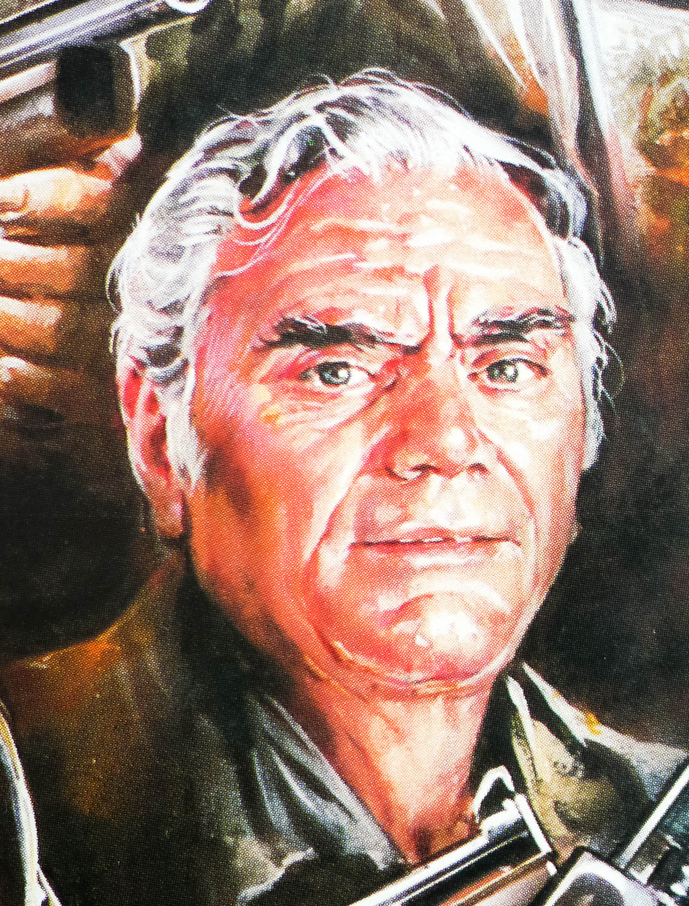
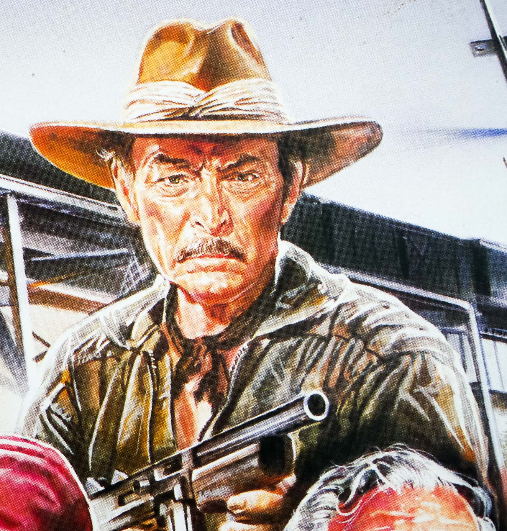
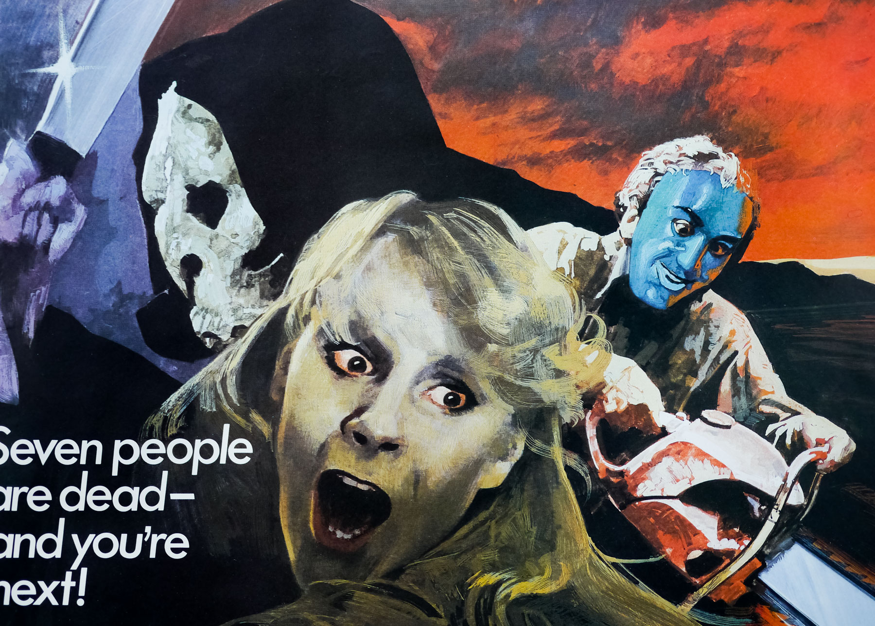
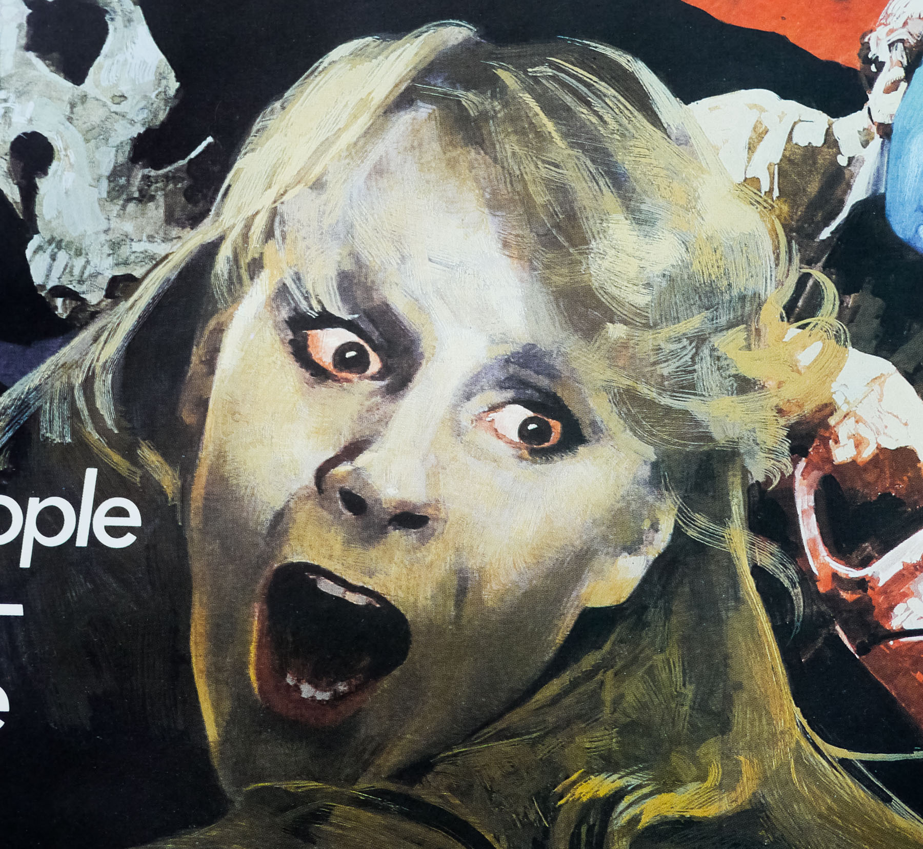
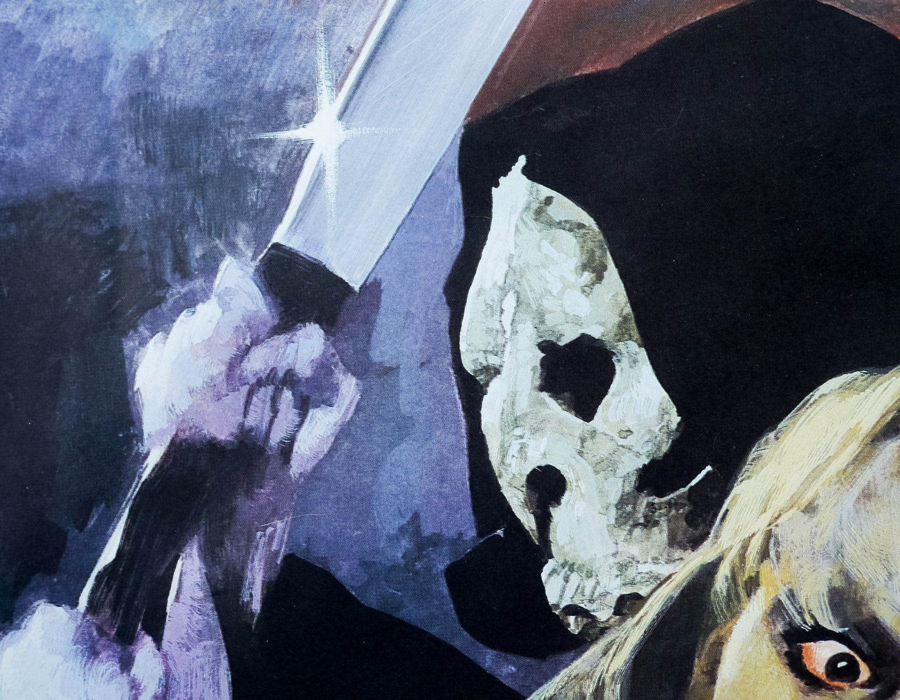
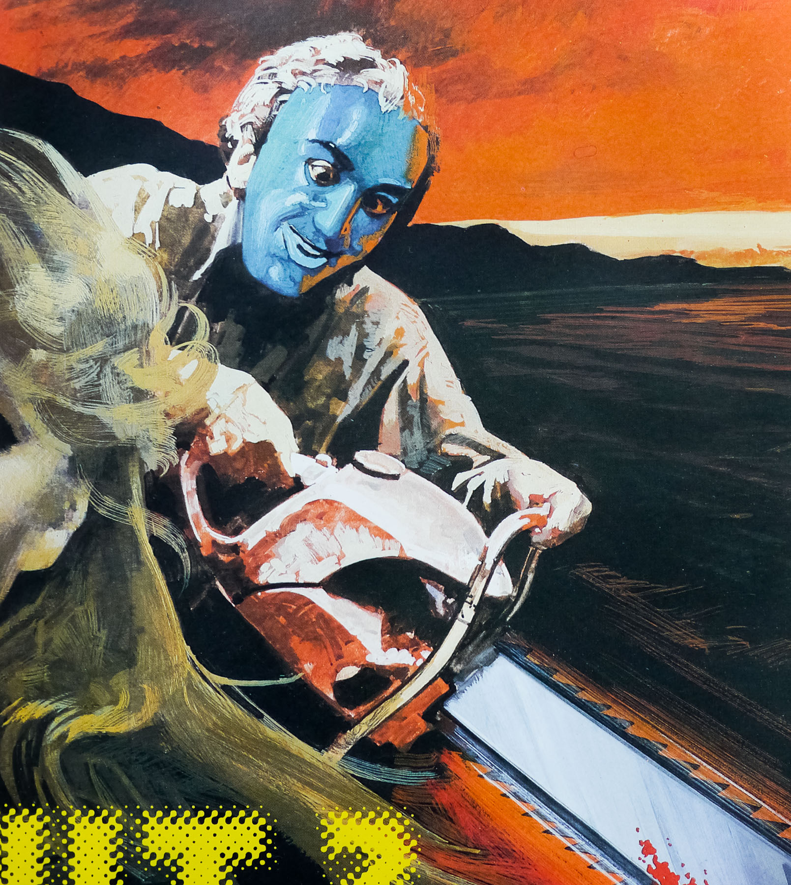
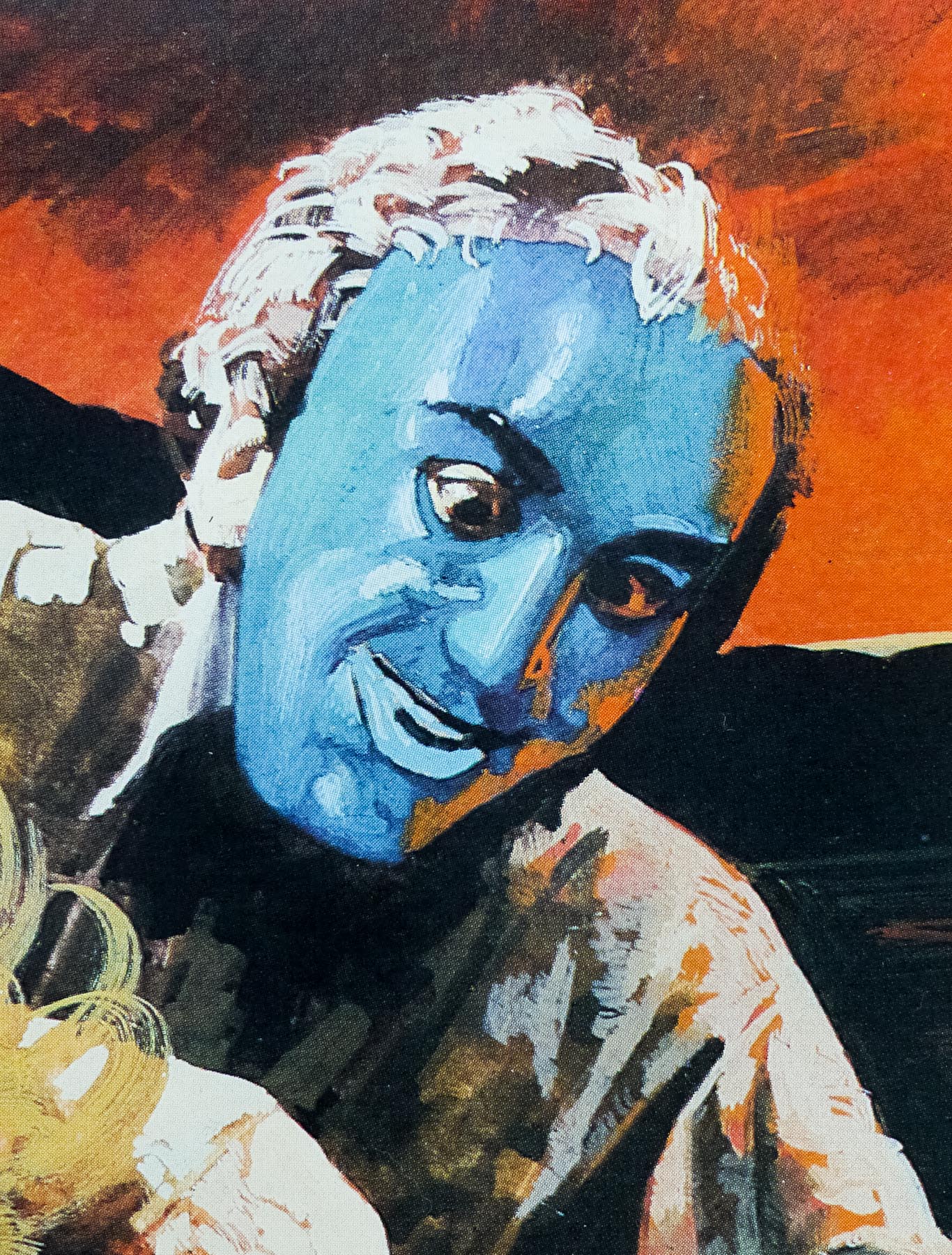
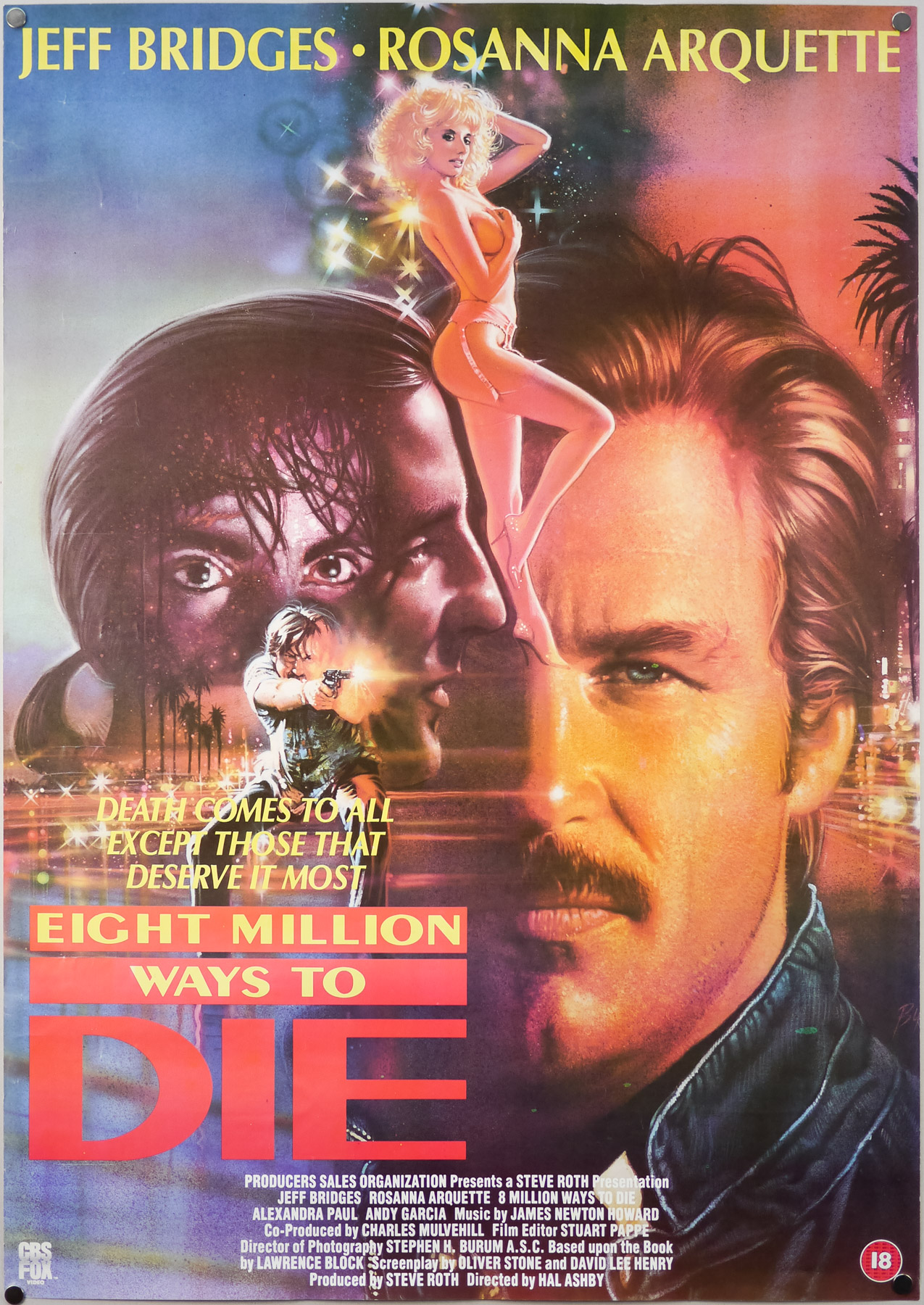
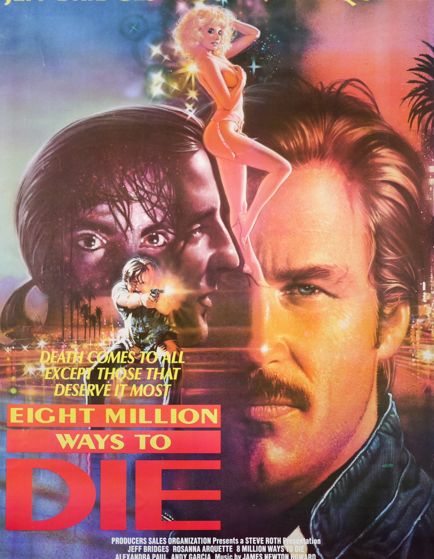
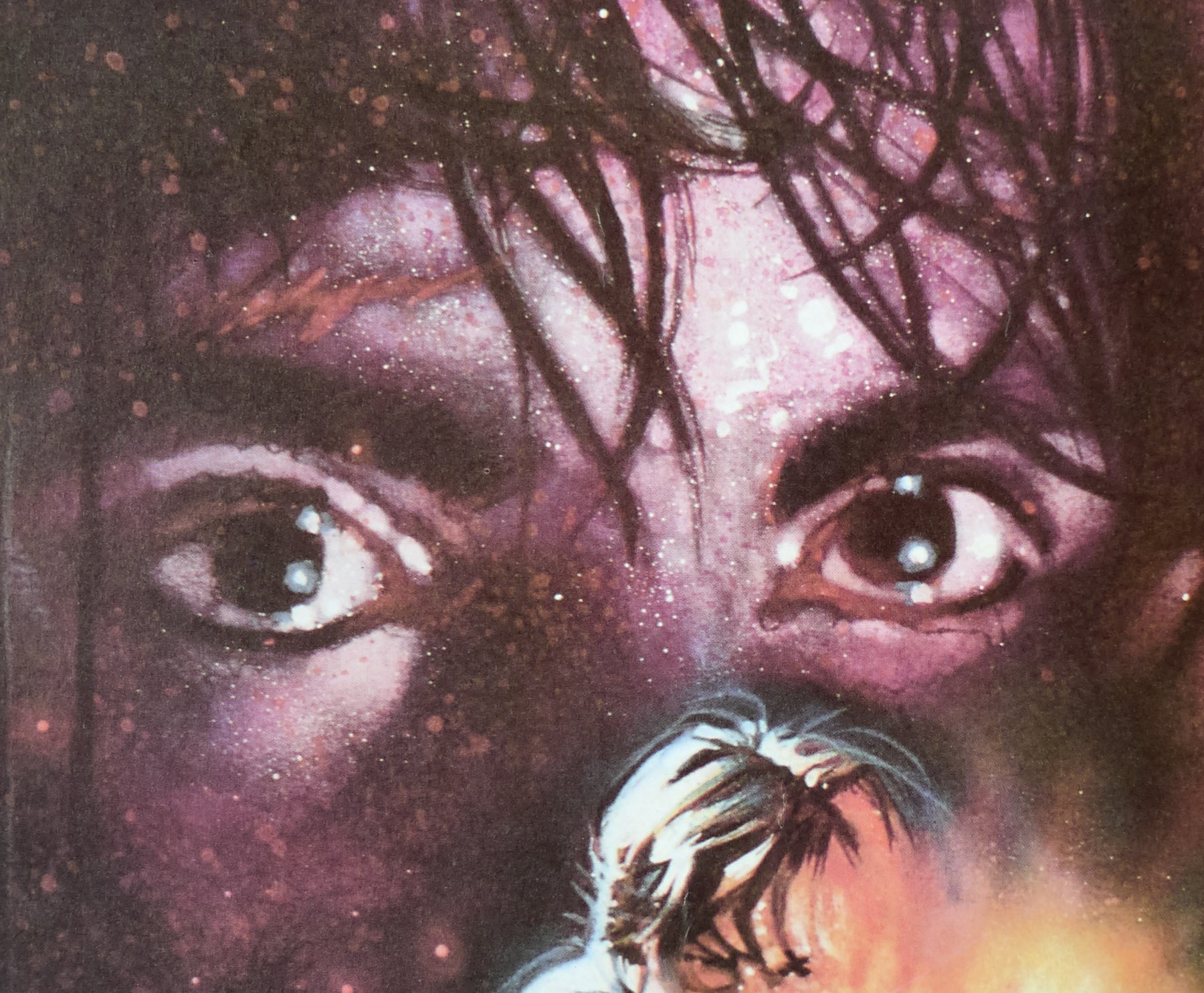
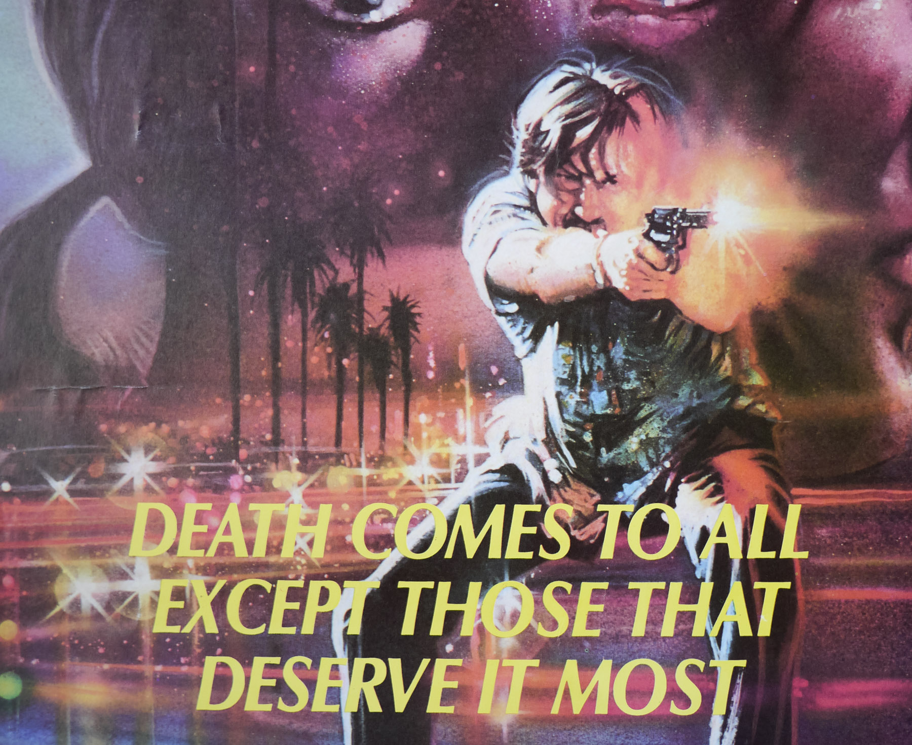
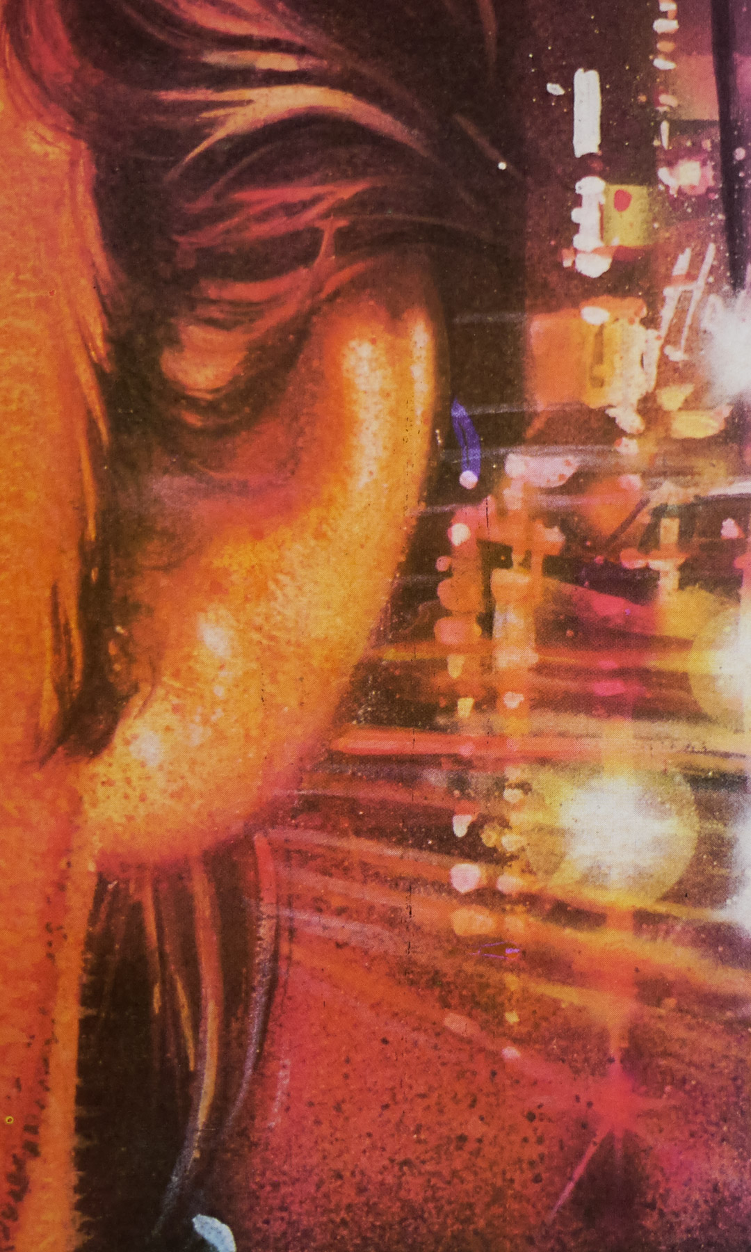
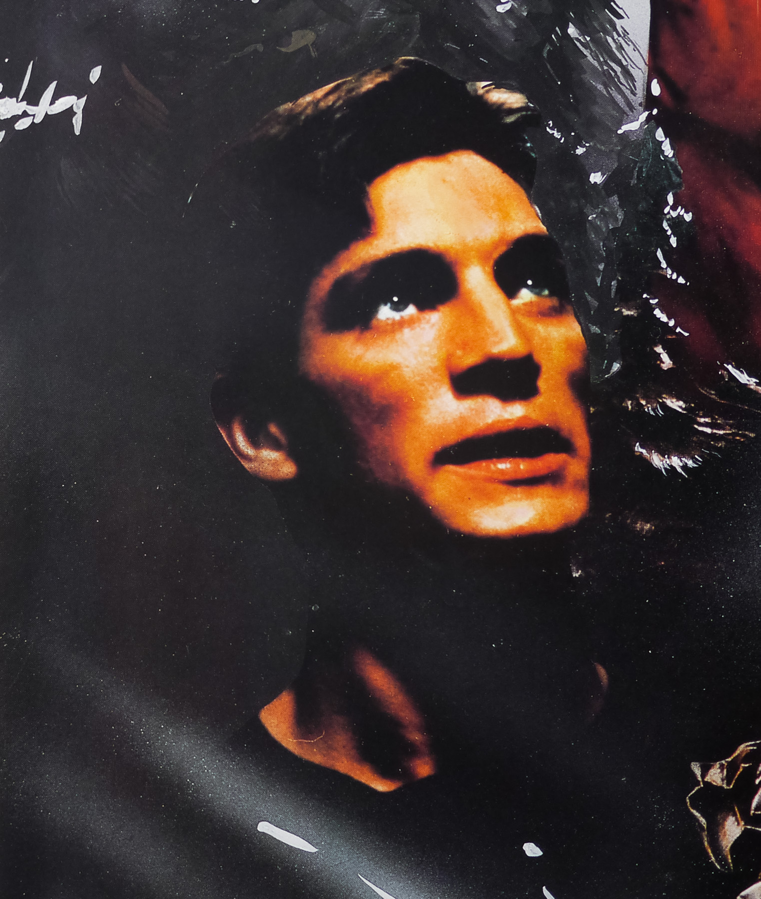
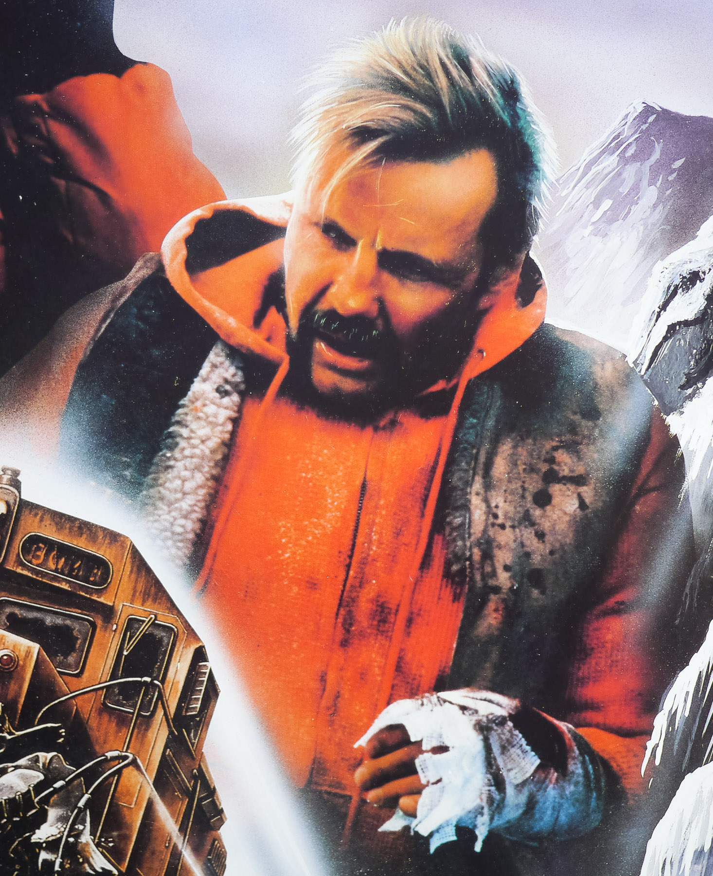
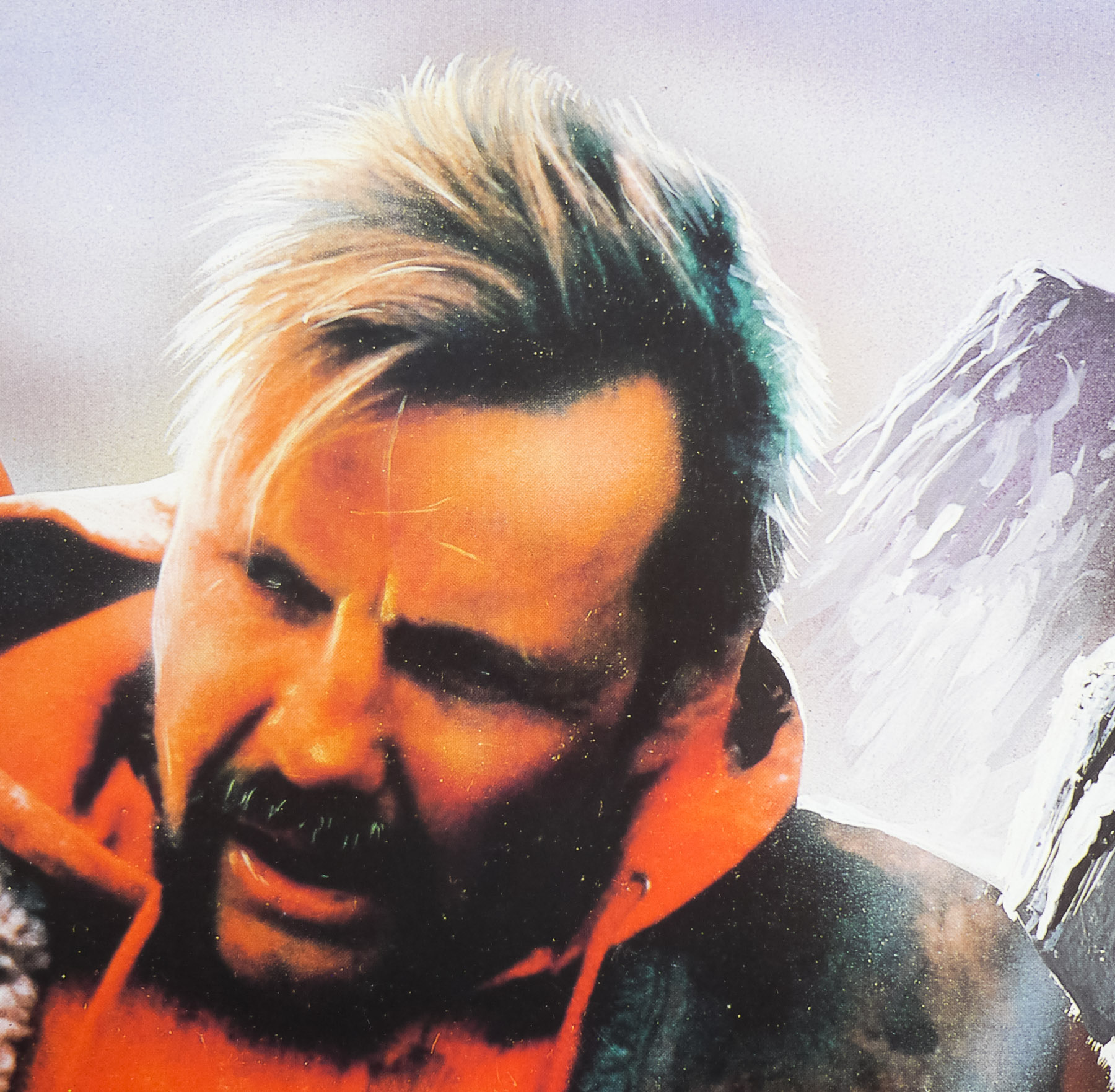
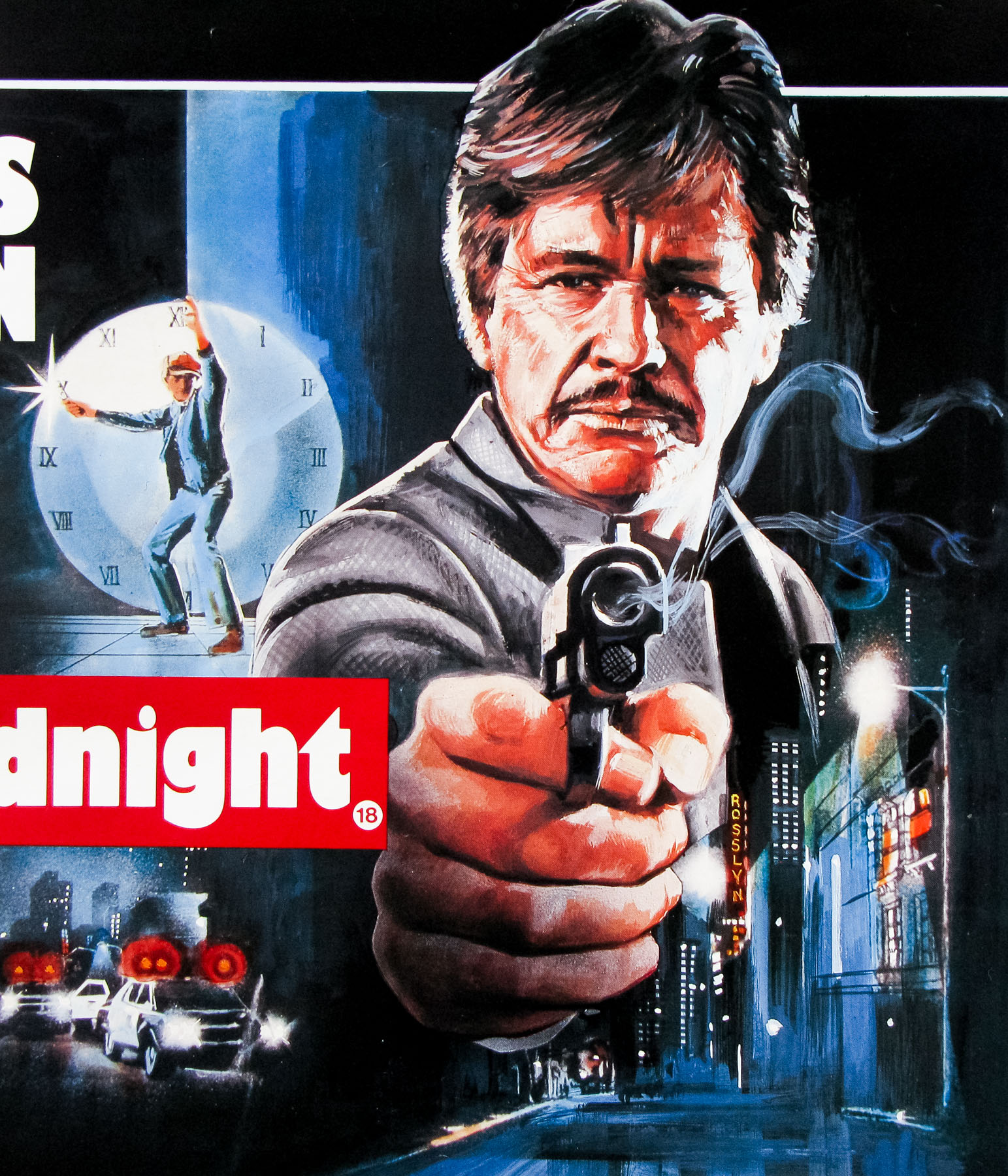
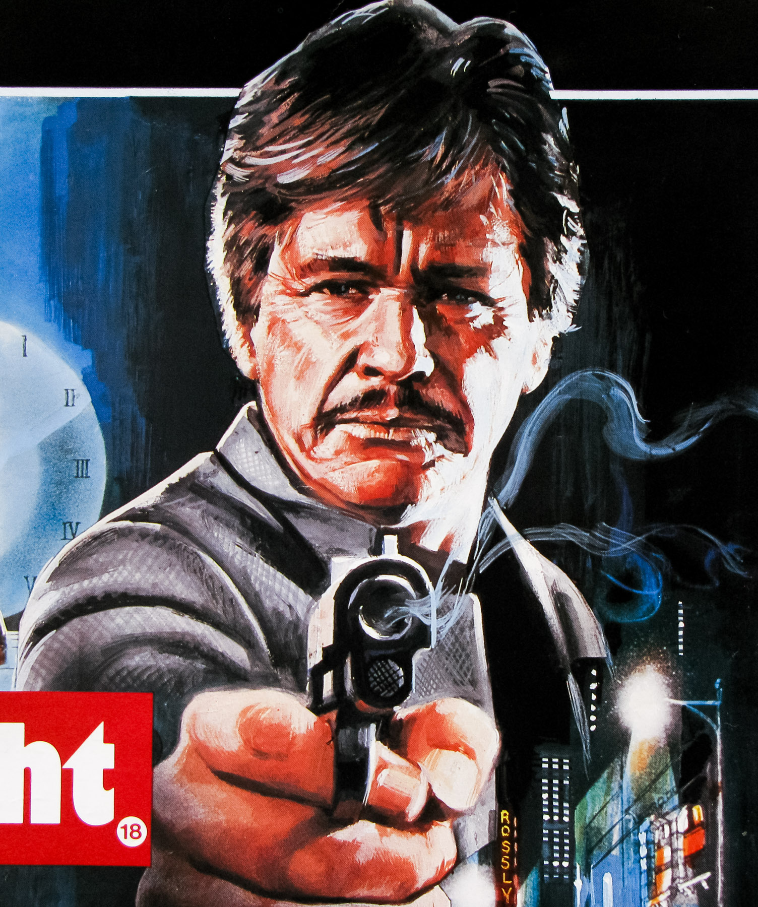
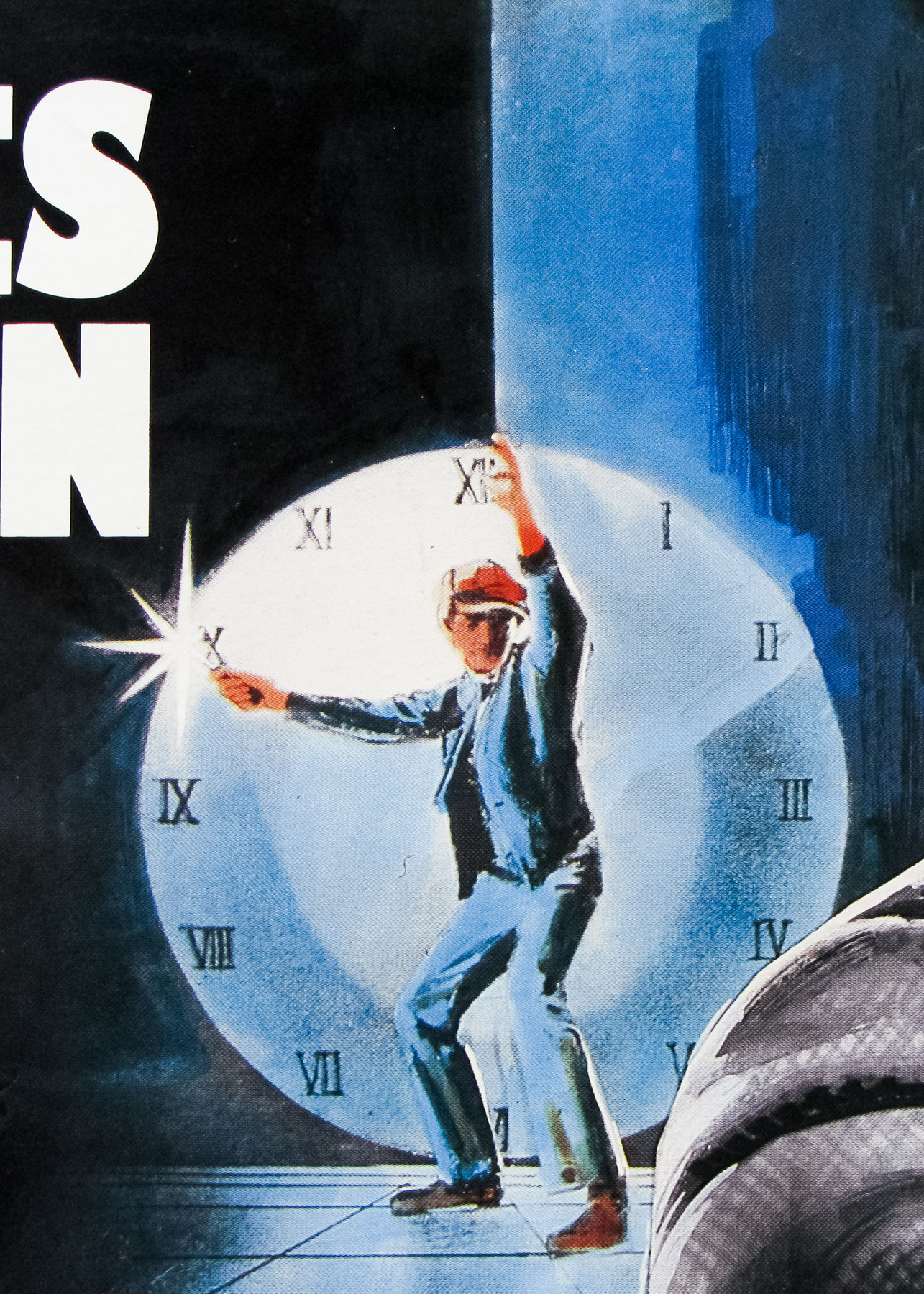
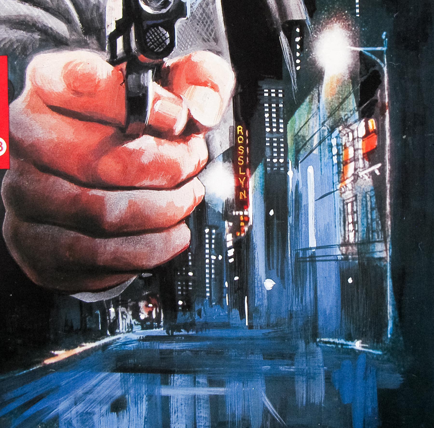
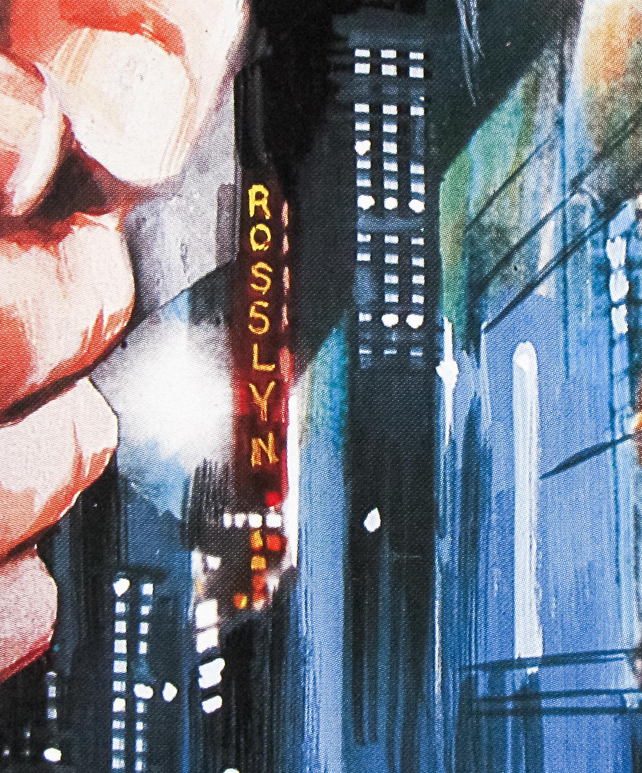
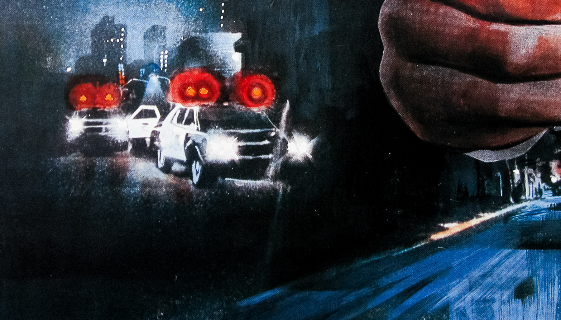
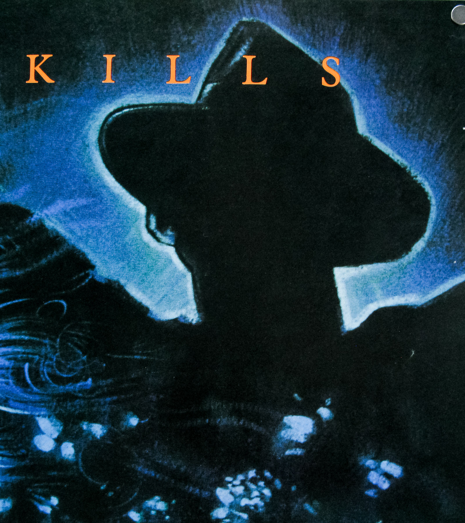
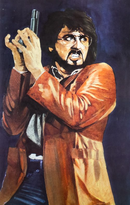
This is the scarce UK one sheet for the release of the little-seen 1981 thriller Nighthawks, which stars Sylvester Stallone as a New York City detective who, along with partner Billy Dee Williams, is assigned to a team charged with apprehending an international terrorist played by Rutger Hauer. This is arguably Stallone’s last starring role where he was playing a ‘normal’ man, rather than the invincible tough guys he would later be most associated with – First Blood (Rambo) would be released a year after this film. Nighthawks also marked the first Hollywood role for Hauer following a run of Paul Verhoeven directed features in his native Holland – only a year later he would be starring in arguably his most iconic role as the replicant Roy Batty in Blade Runner.
Nighthawks starts with a bang as Hauer’s international terrorist Wulfgar Reinhardt blows up a department store in London (a scene actually filmed on location in Clapham, I believe) in what is implied to be a job for the IRA. When the bomb causes more carnage than his employers desired – several children are killed – Wulfgar decides to travel to New York City where he plans to carry out a series of attacks to advertise his skills to potential future benefactors. Stallone’s brilliantly named detective Deke DeSilva and his partner Matthew Fox (Dee Williams) are taken off their usual street work and given to the task force charged with hunting down and ‘terminating’ Wulfgar.
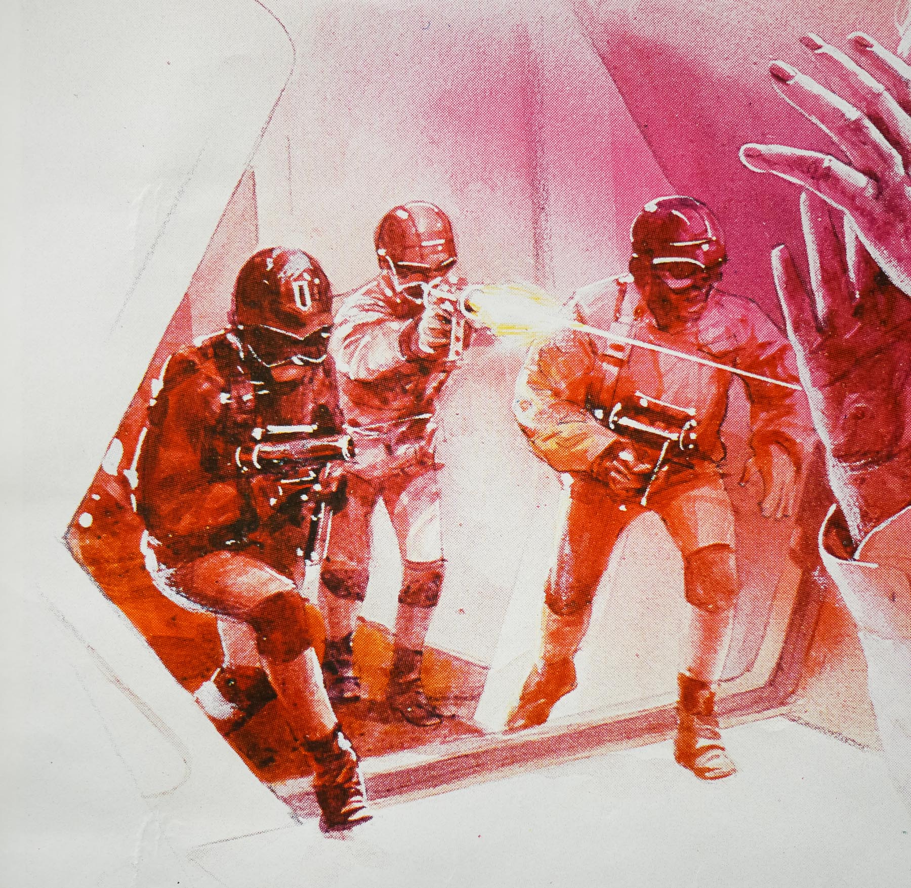
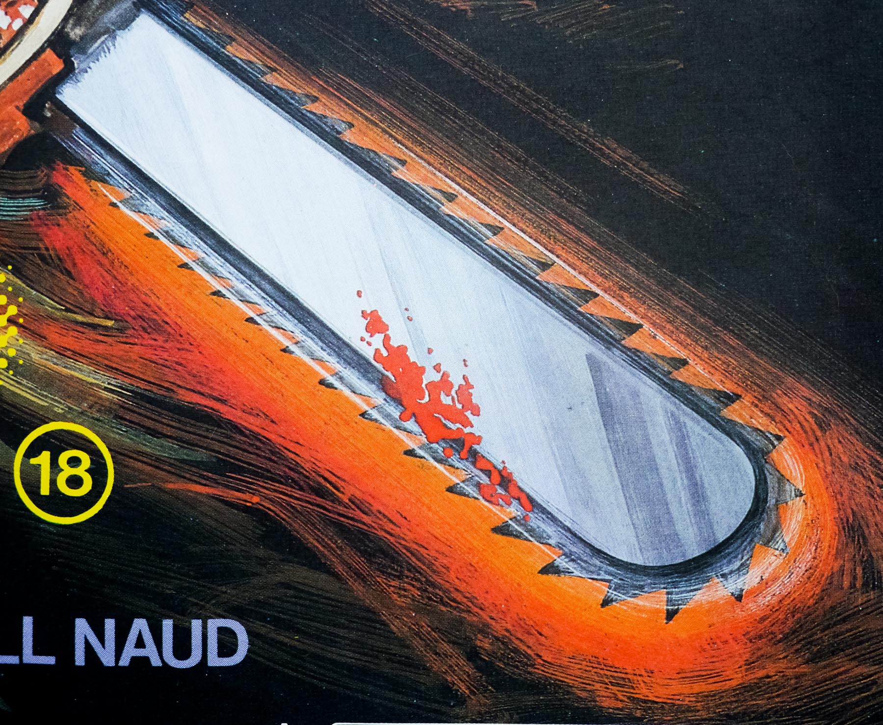
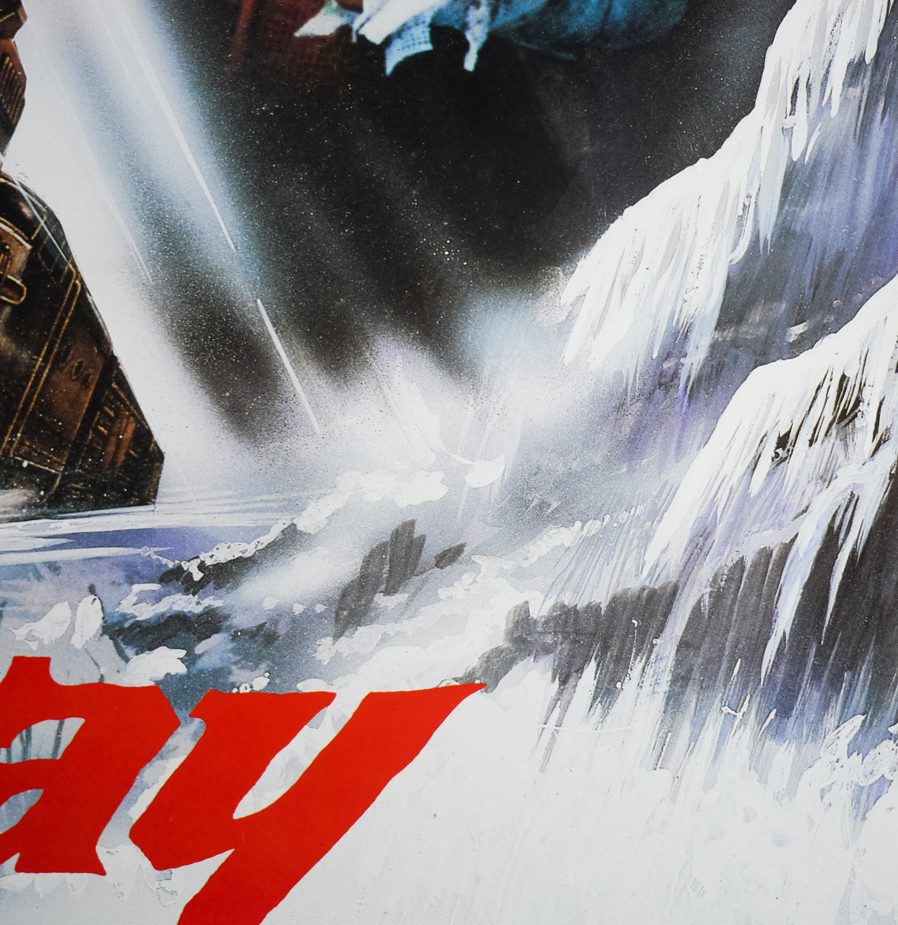
What follows is a very solid thriller featuring several well-staged chases and a tense showdown centred around a cable car. The film makes excellent use of real locations and features some great stunt work, particularly from Stallone who apparently did all of his own without the use of a double. It’s certainly an impressive debut feature from director Bruce Malmuth and Hauer, Stallone and Billy Dee Williams give very solid performances that make up for some weaknesses in the supporting cast.
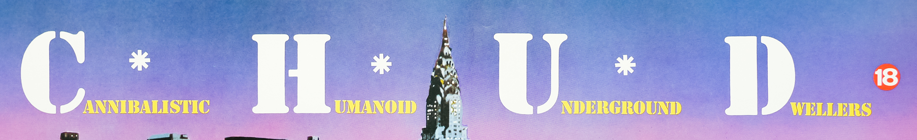
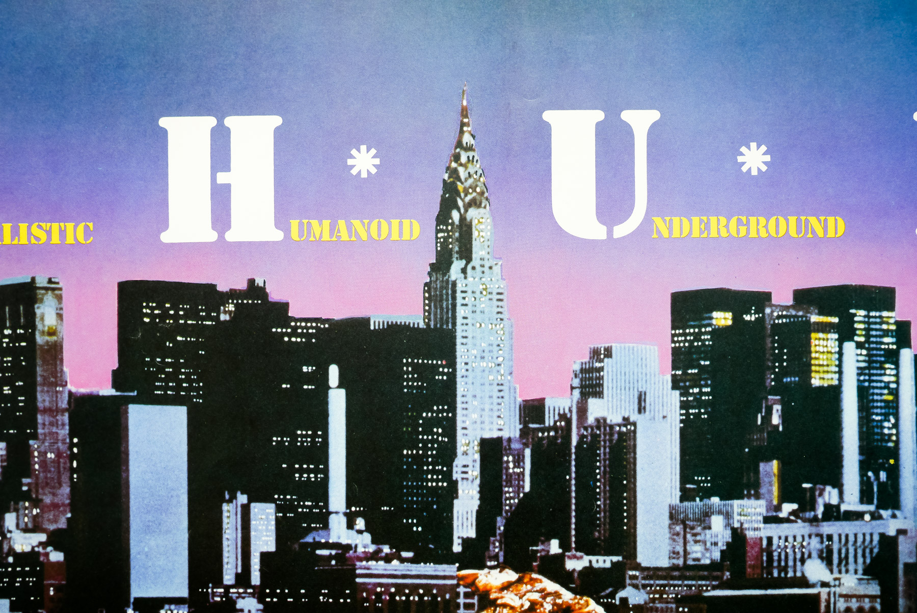
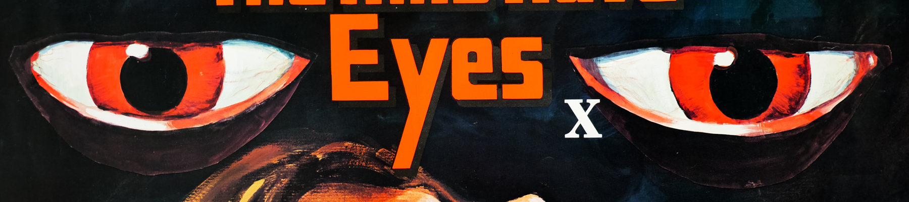
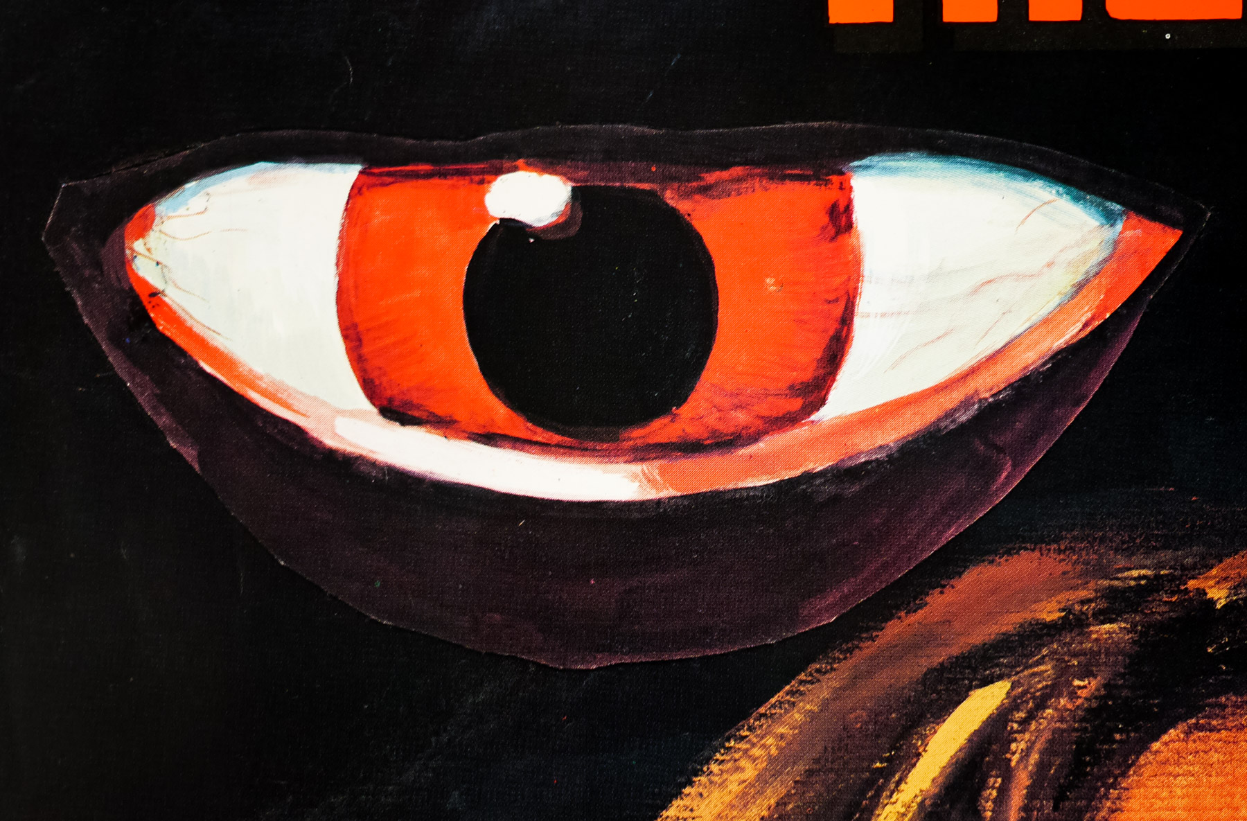
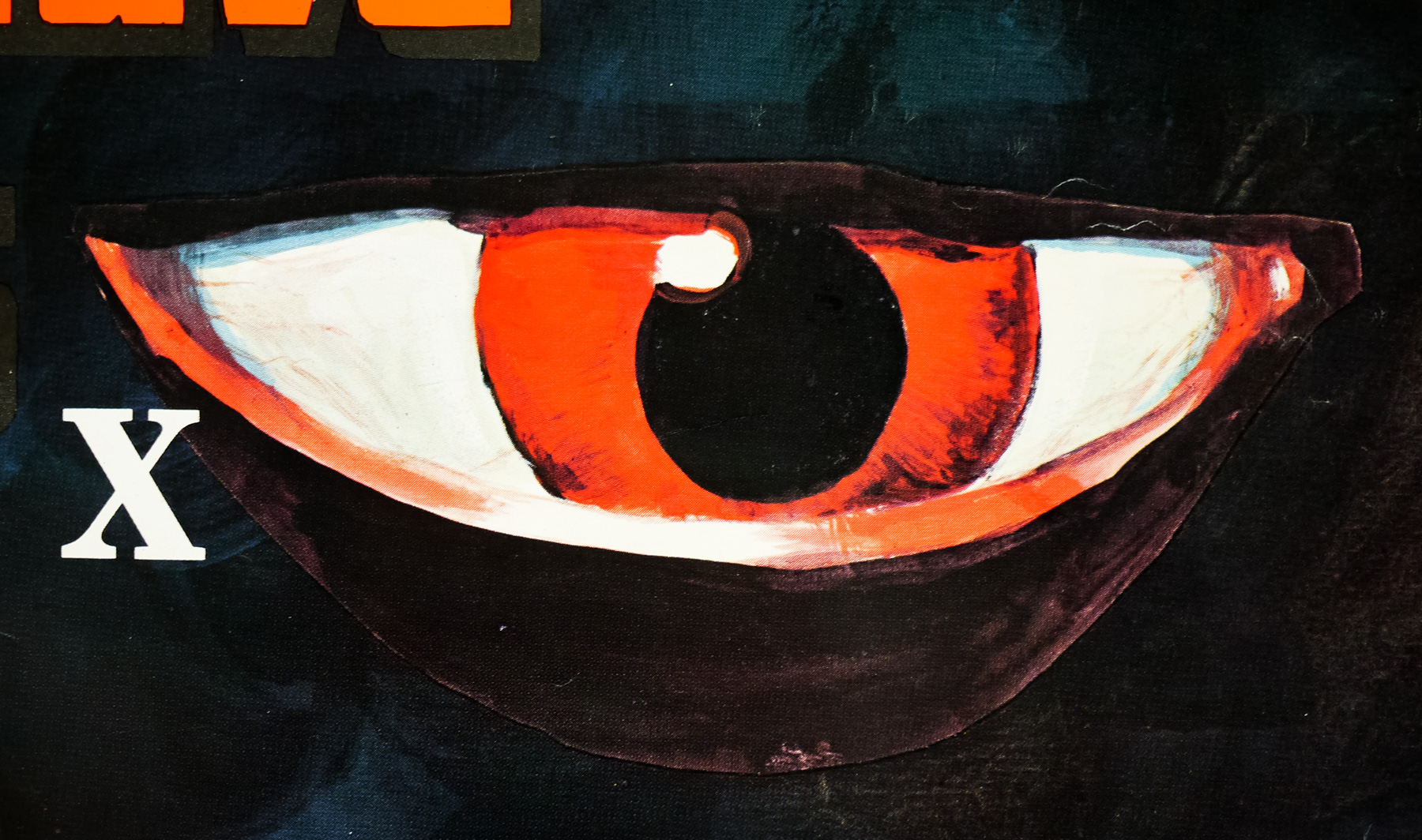
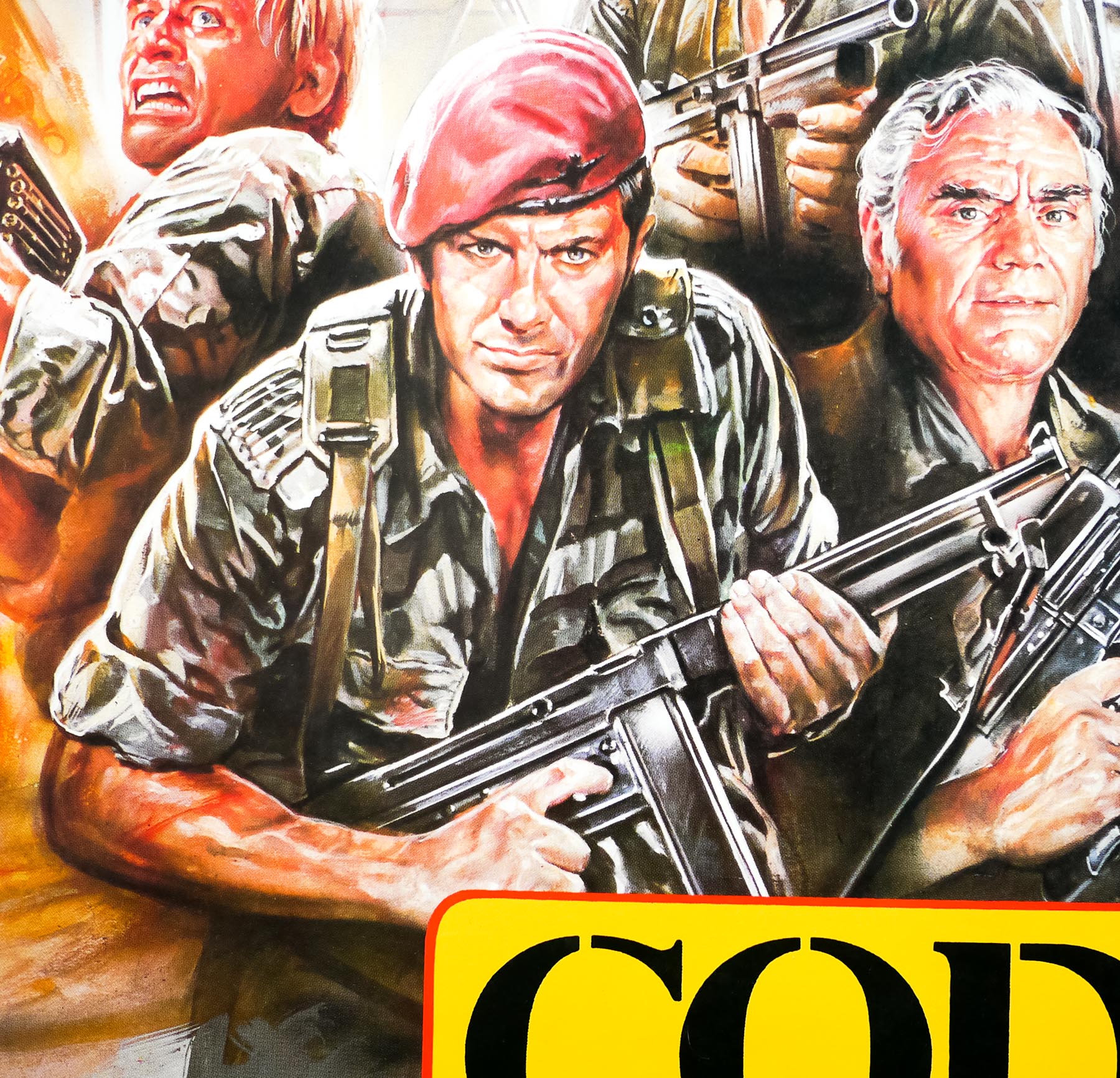
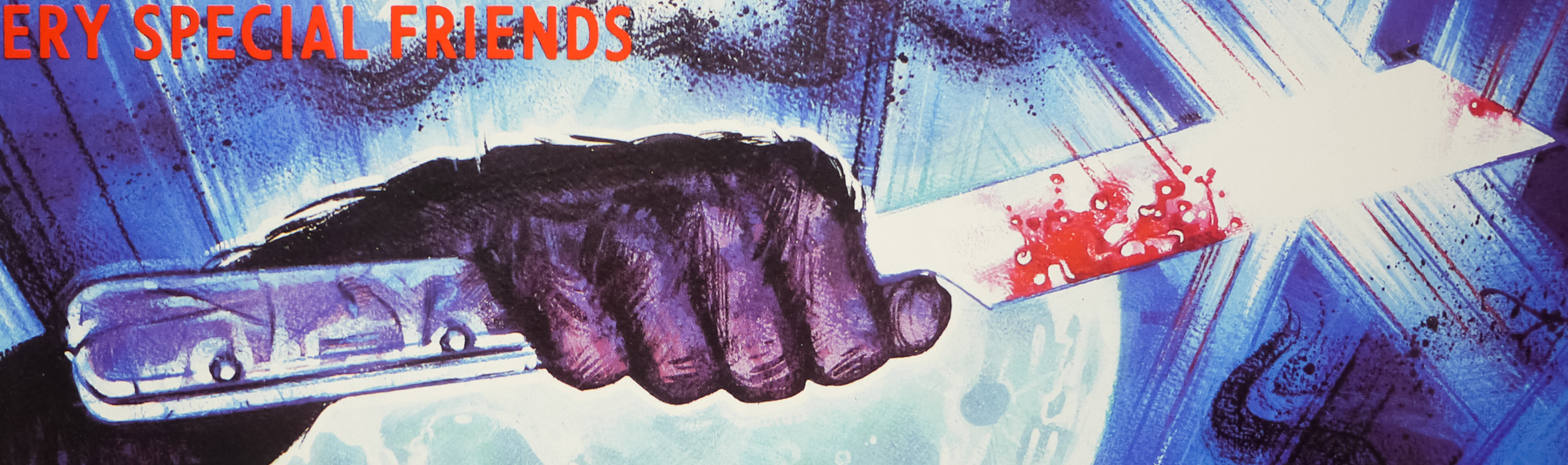
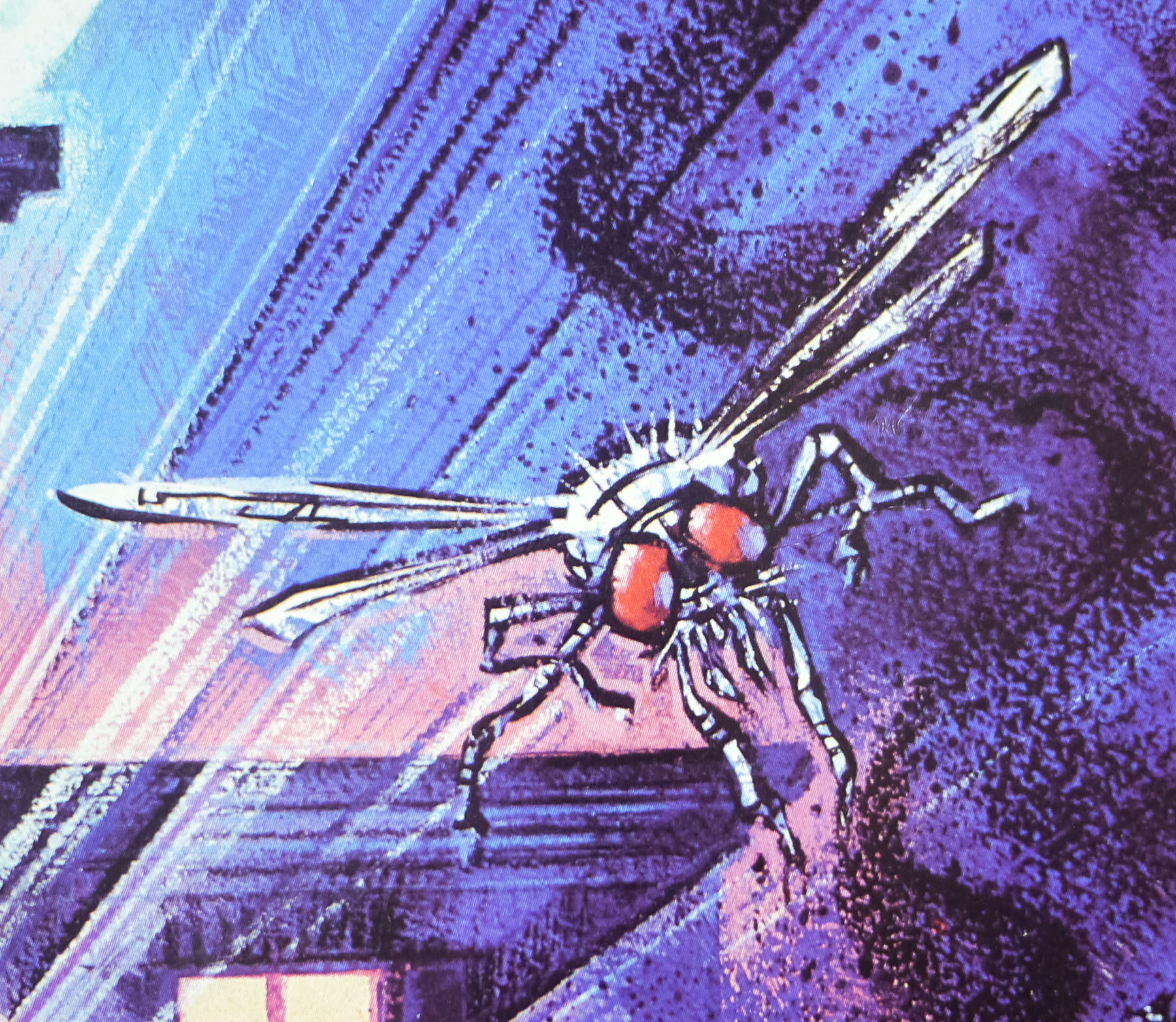
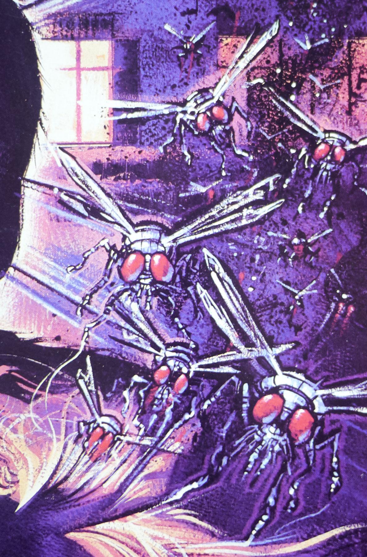
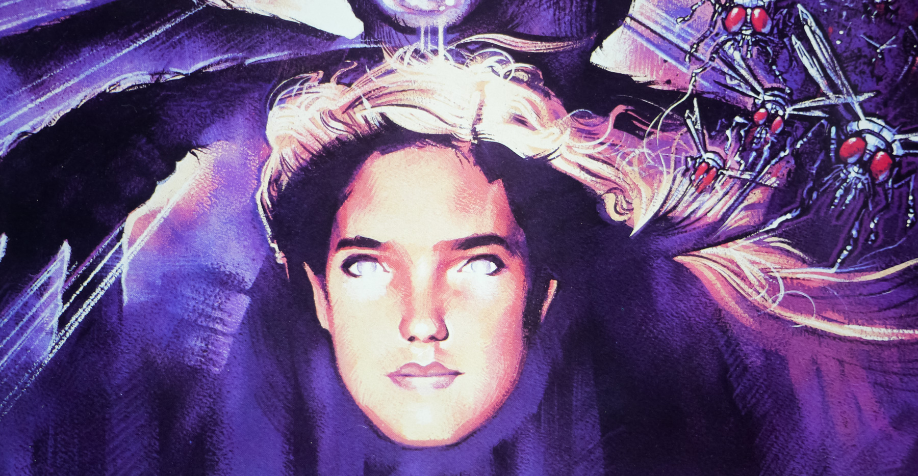
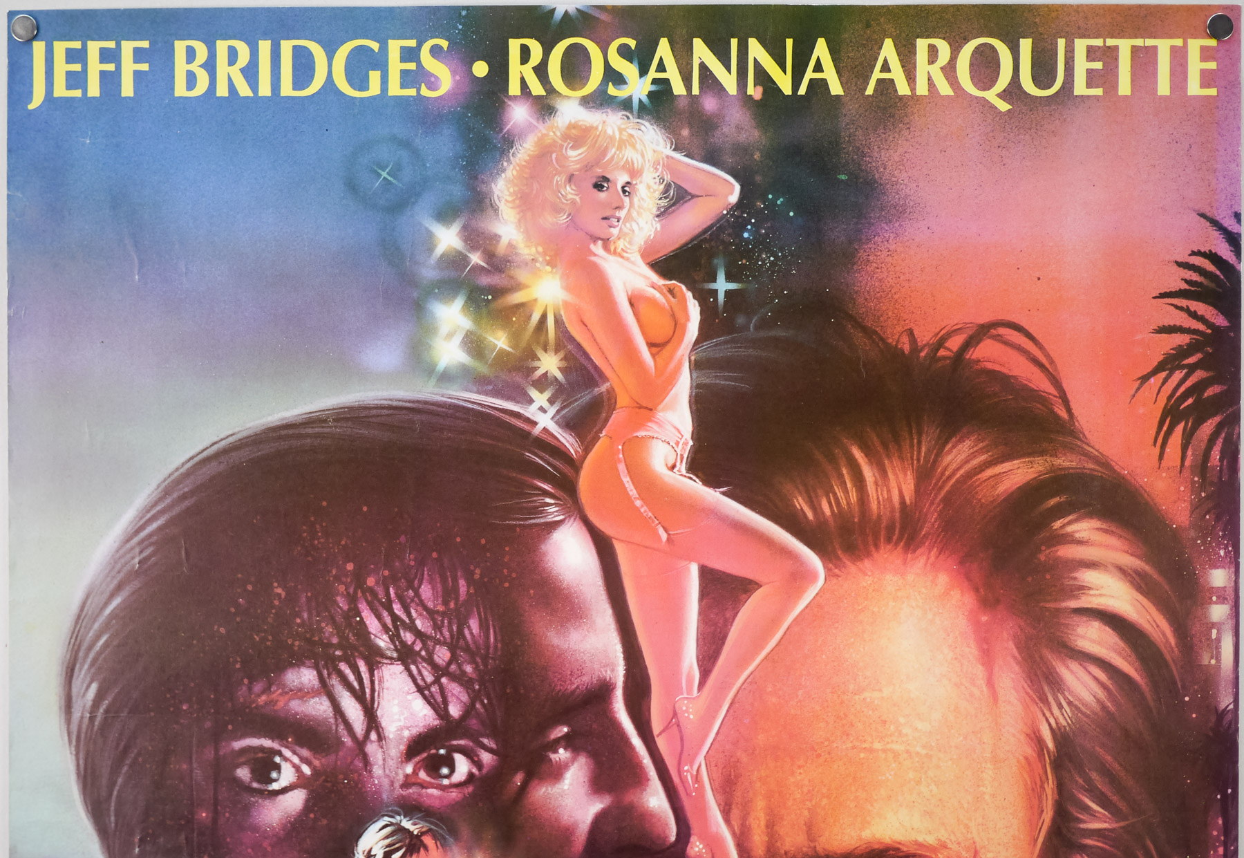
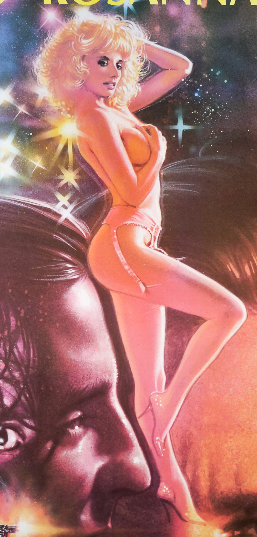
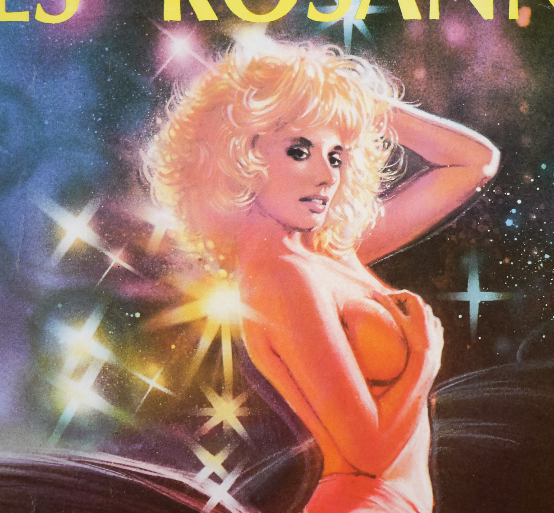
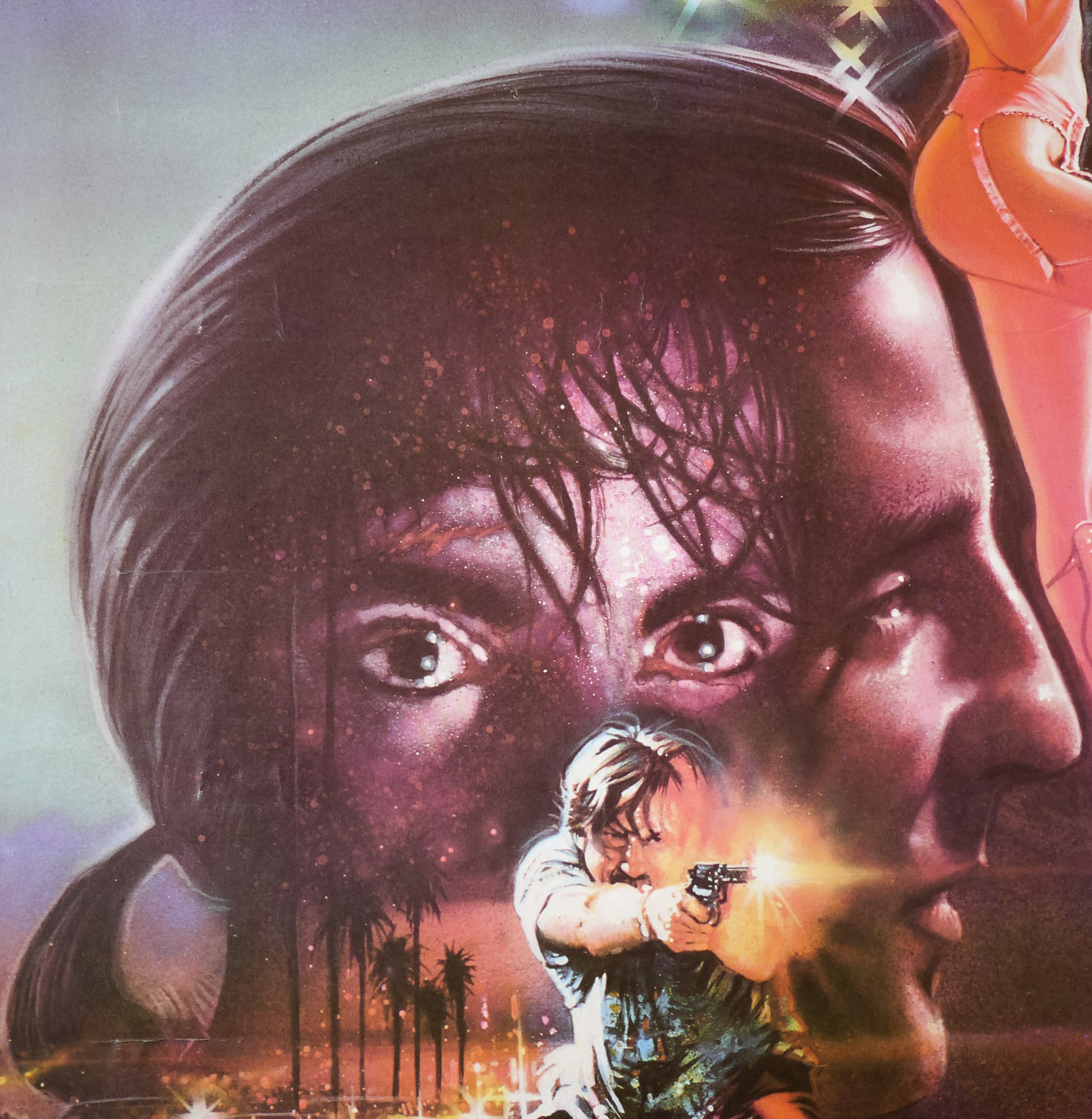
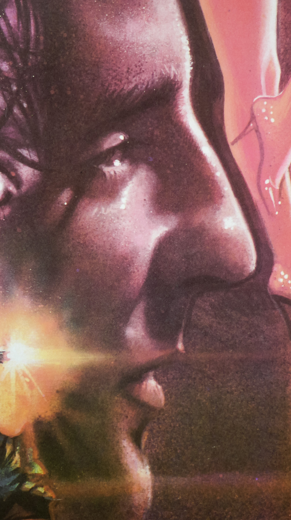
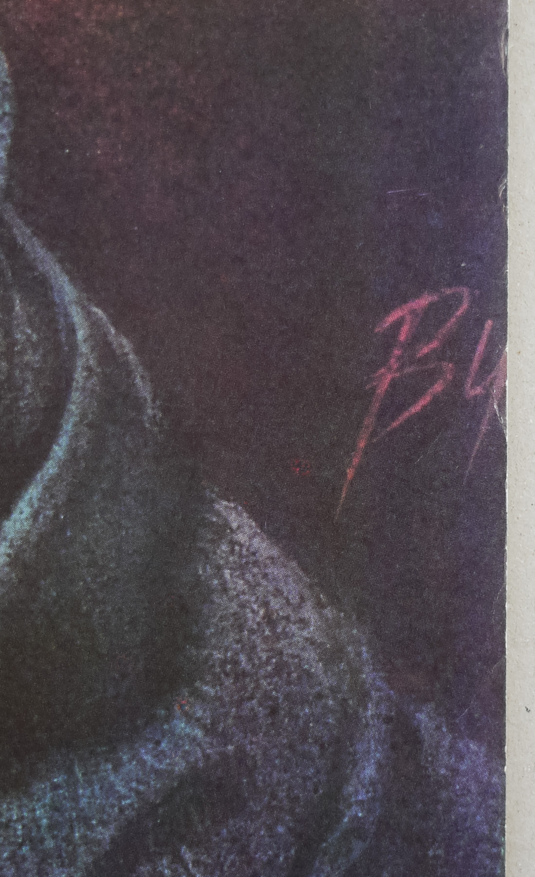
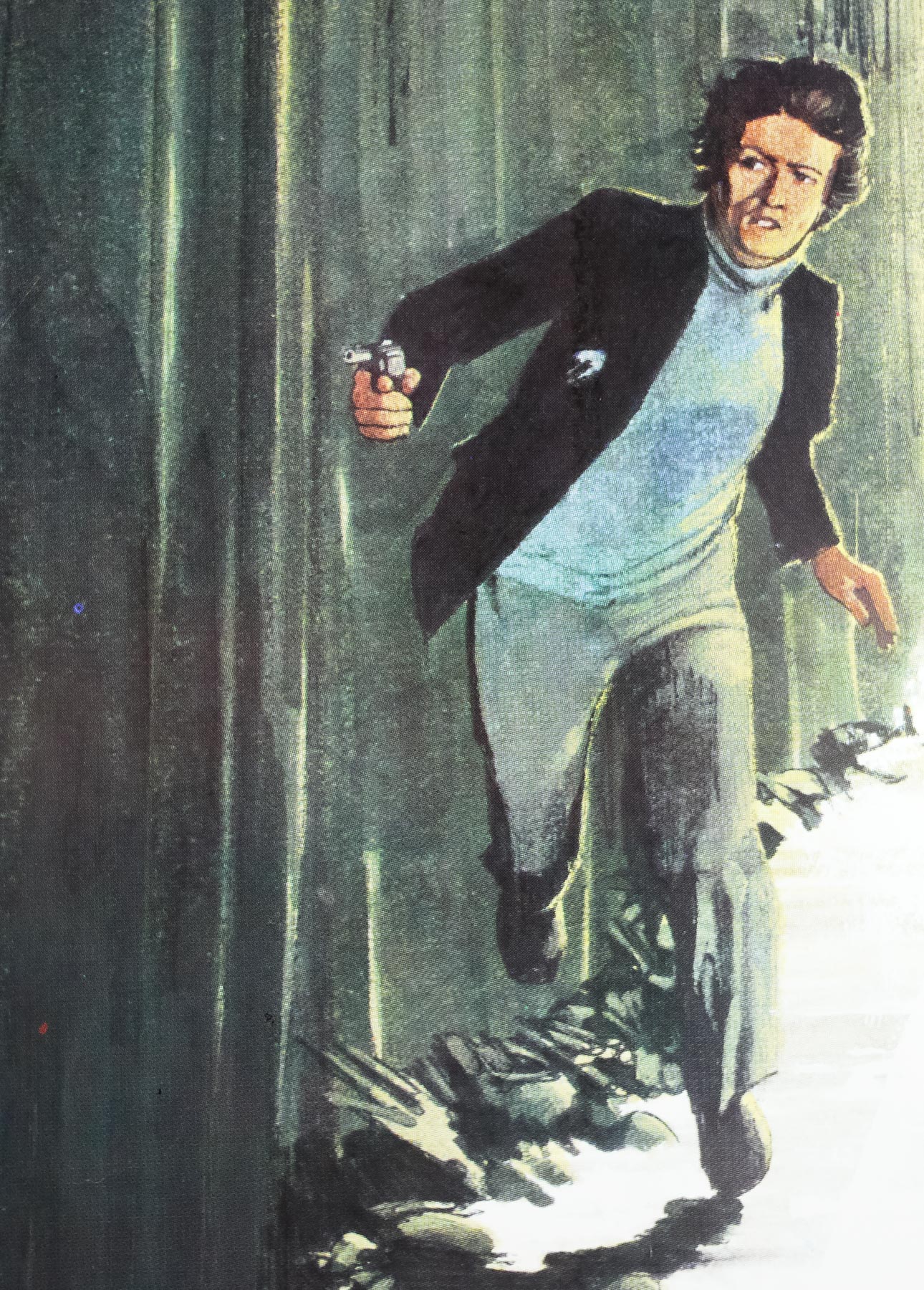
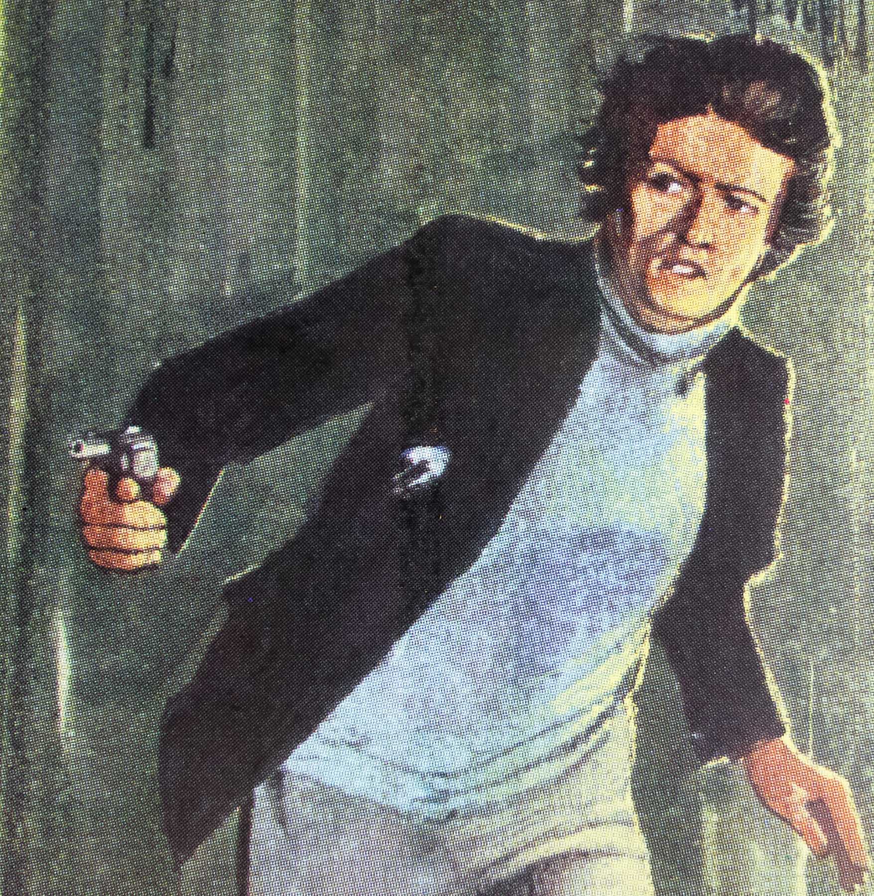
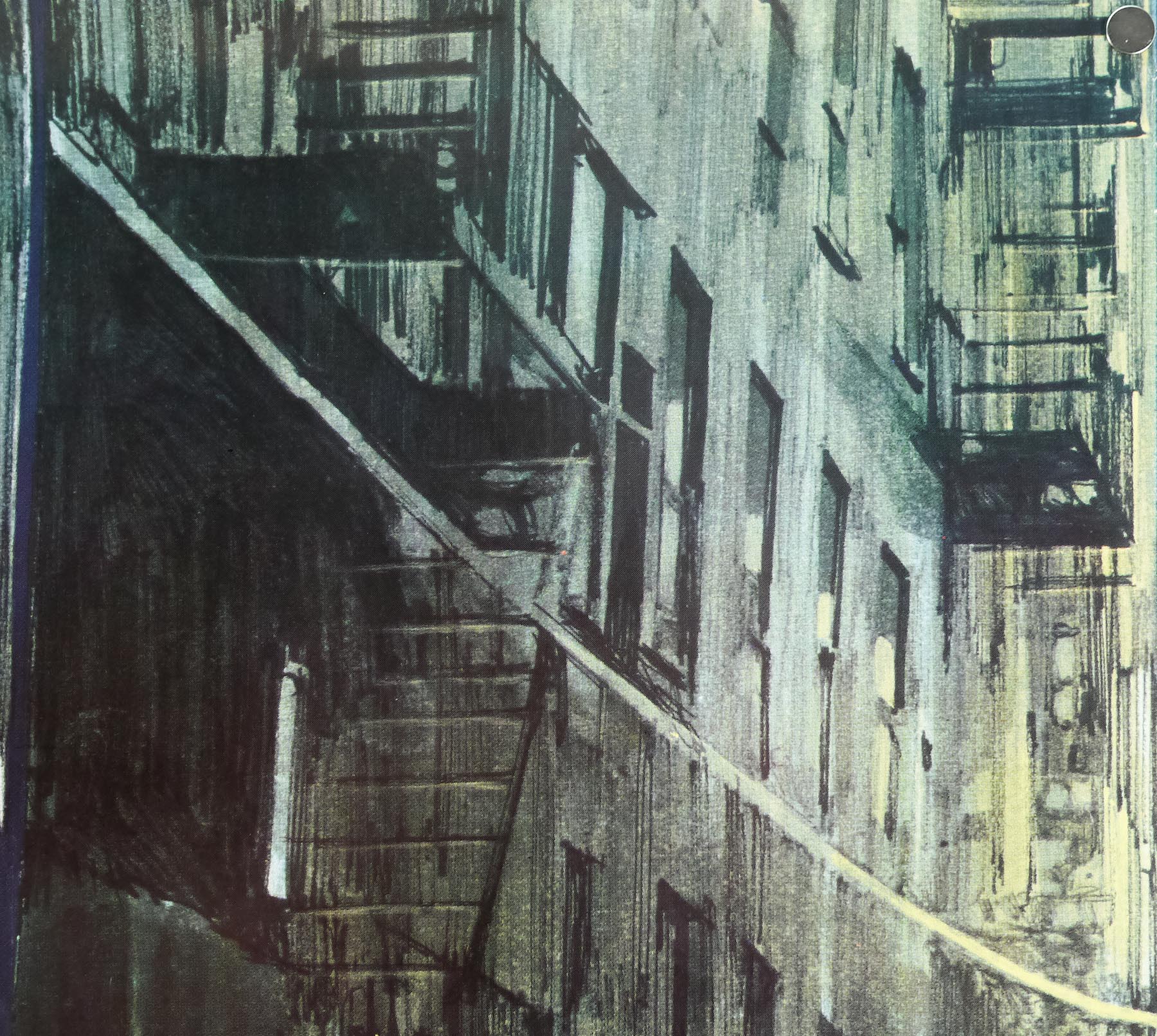
This one sheet features UK-exclusive artwork that was also used on the quad. I’m not 100% certain but I believe it to be the work of an artist called Ron Fenton who also worked on the one sheet for The Long Good Friday that was printed only a year before. Check out the pictures on this page to see the similarities. The only thing is that Nighthawks is missing the signature that Fenton scrawled on the LGF one sheet. If anyone knows for sure that Fenton can be credited with the poster please get in touch.