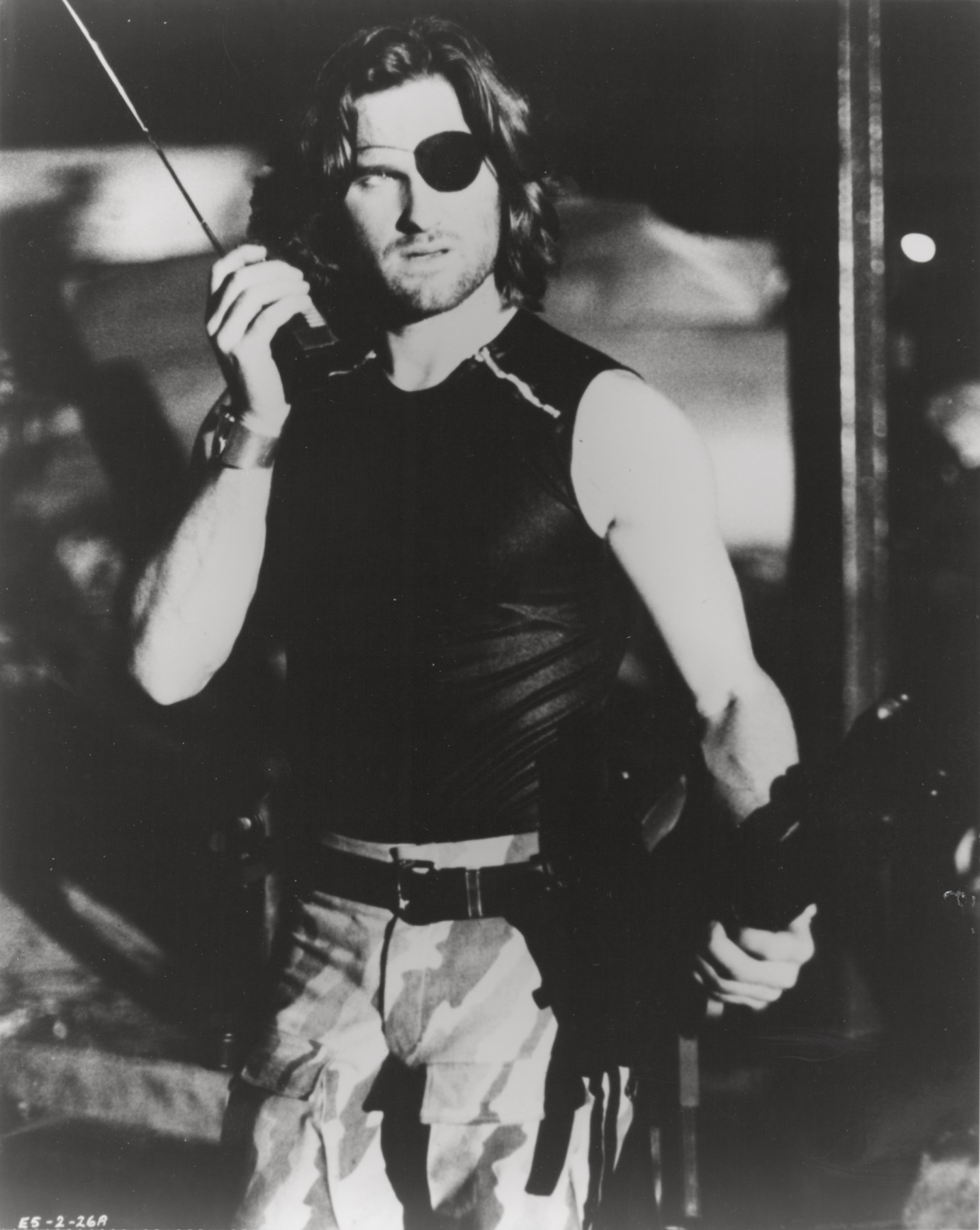
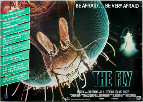
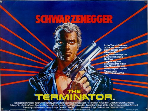
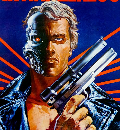
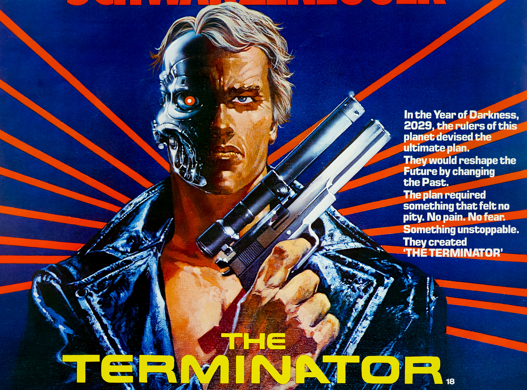
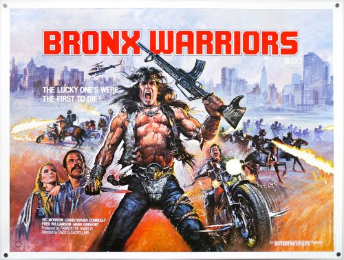
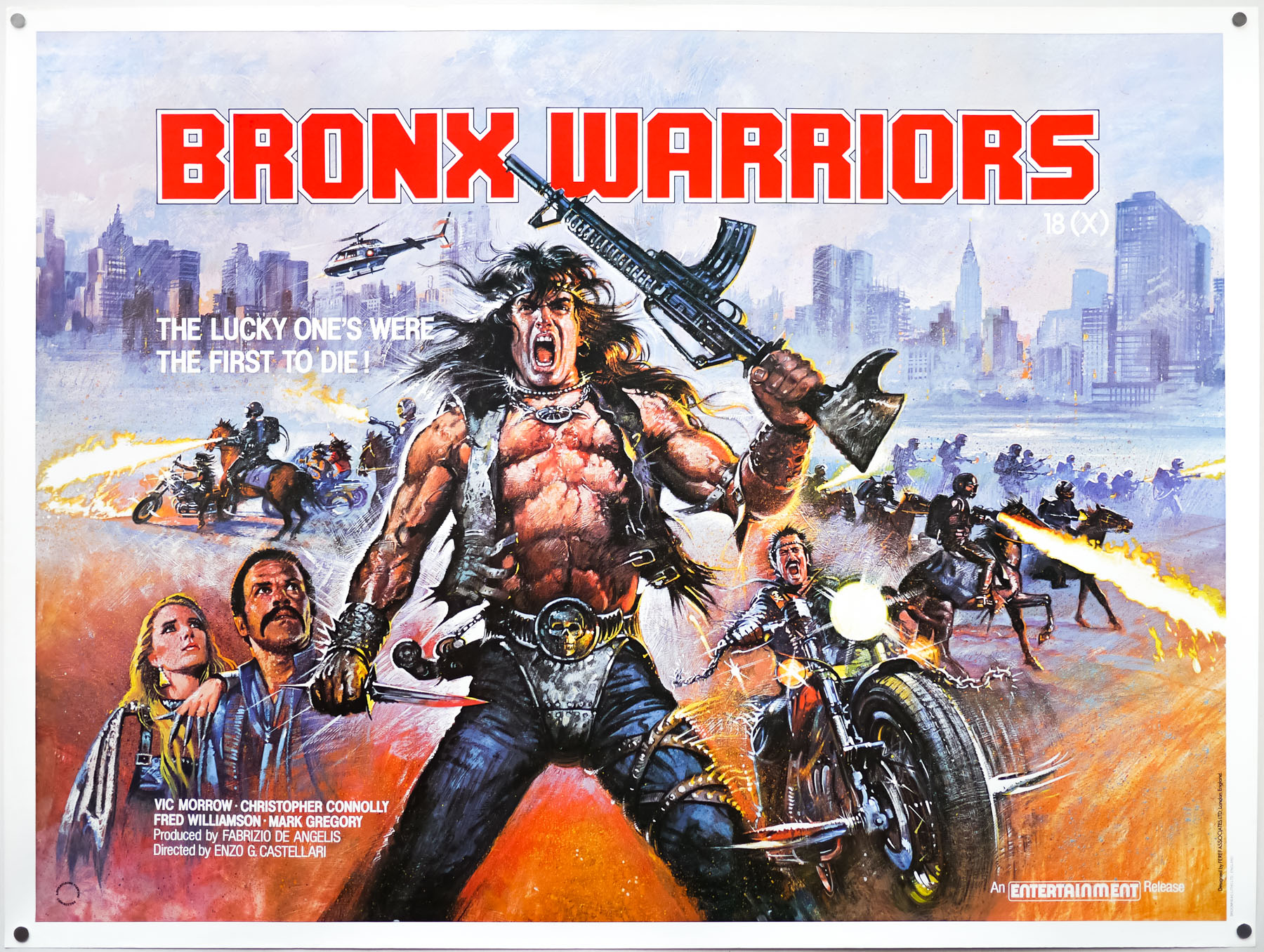
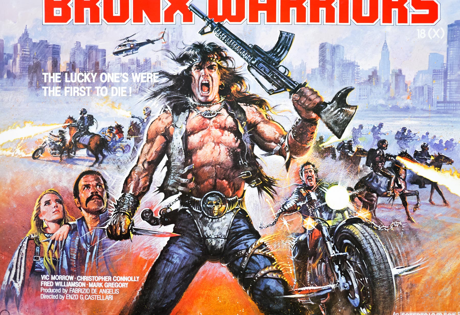
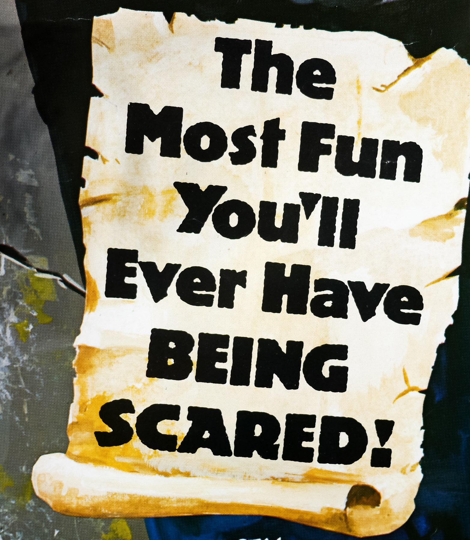
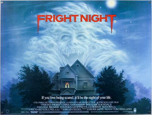
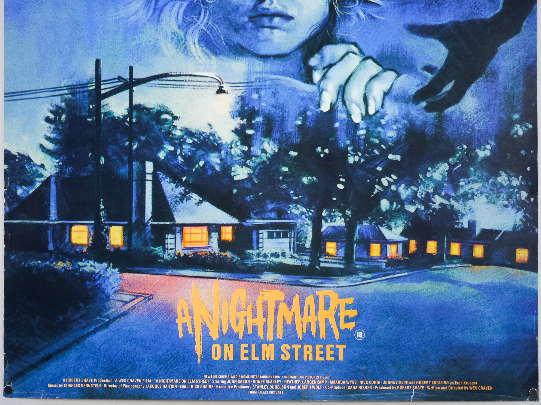
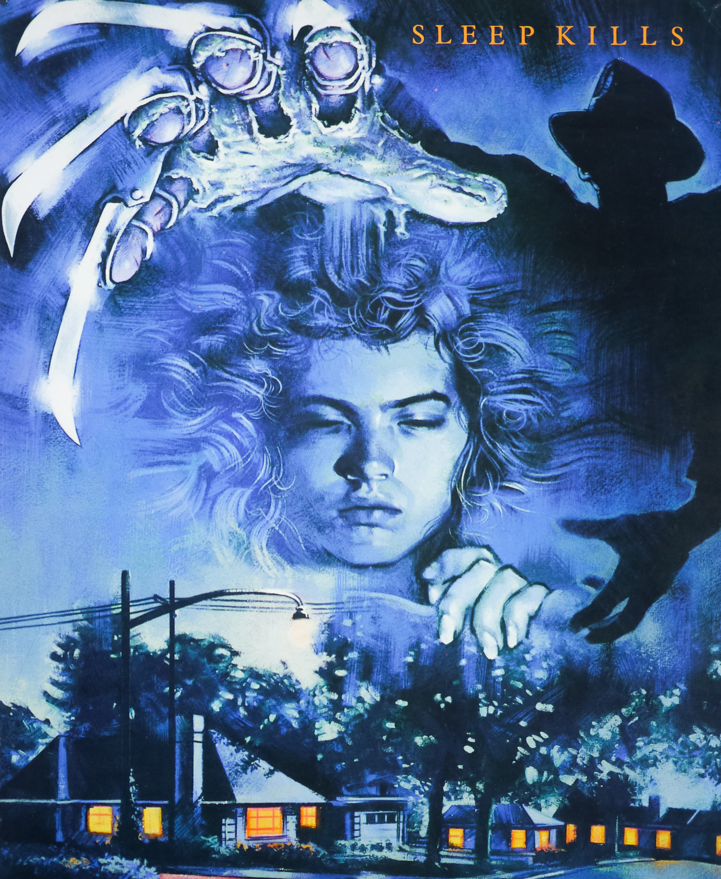
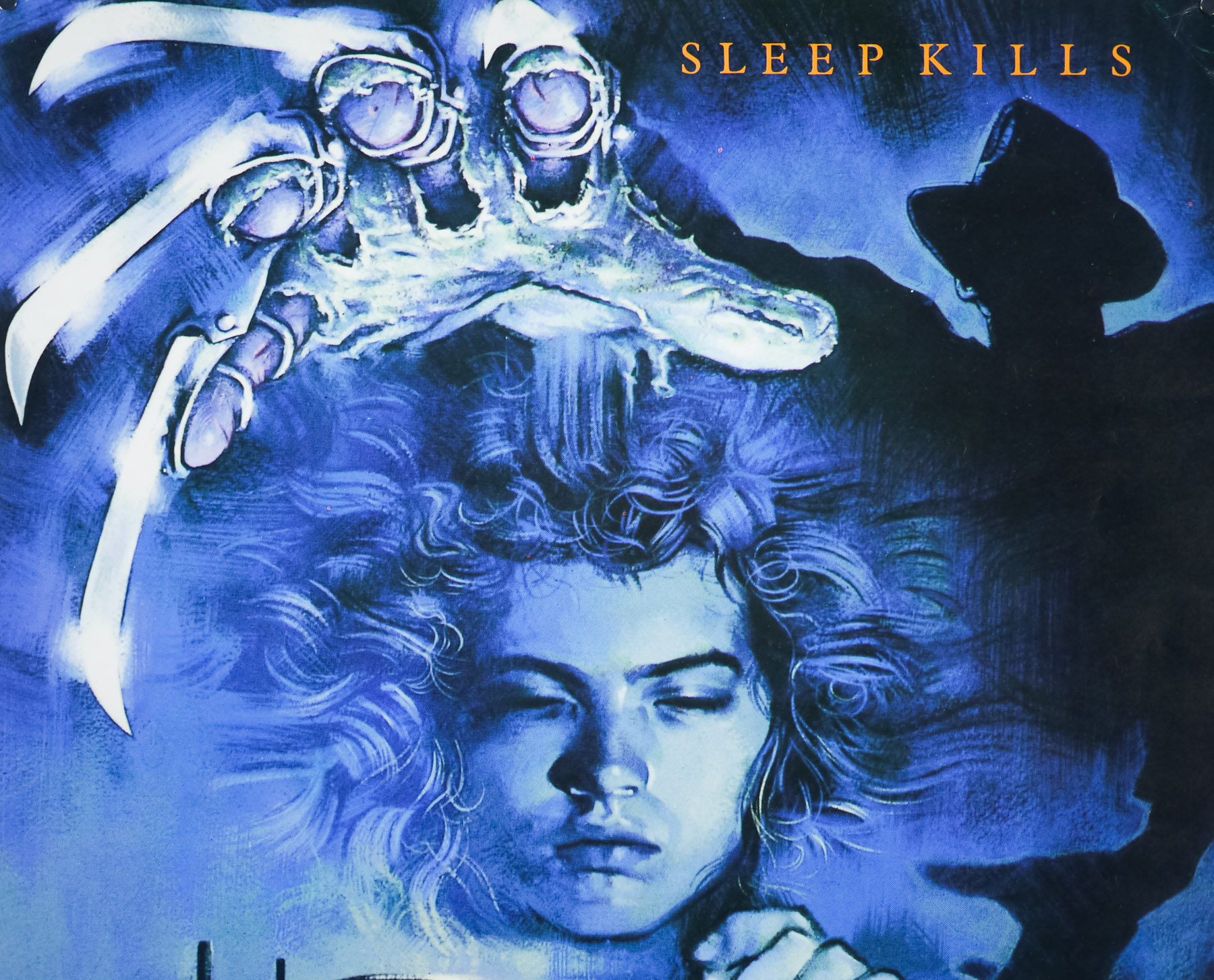
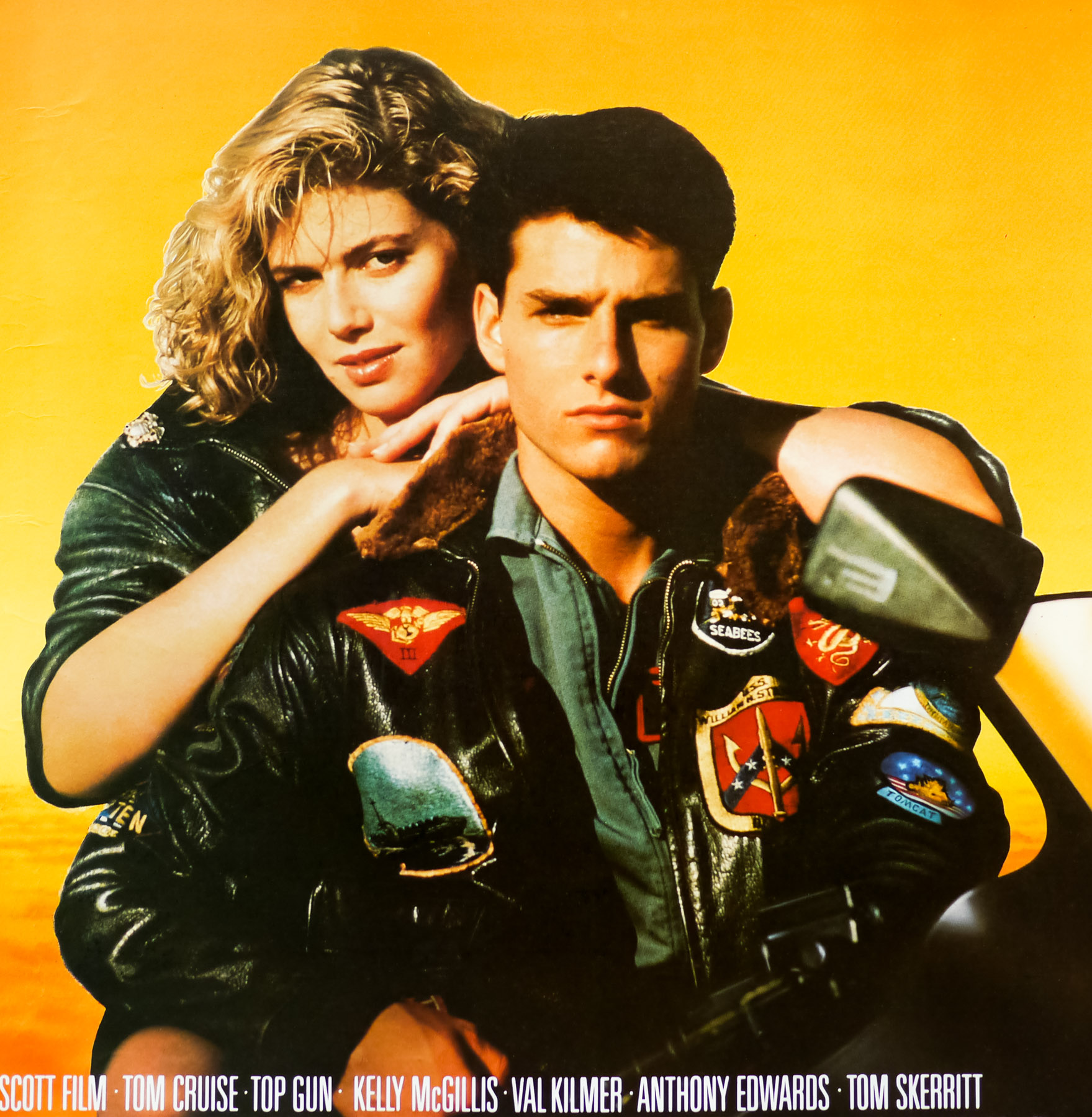
You searched for: %2520UK

A Nightmare on Elm Street 3: Dream Warriors / quad / video / UK

16.05.16

Poster Poster
Title
A Nightmare on Elm Street 3: Dream Warriors
AKA
--
Year of Film
1987
Director
Chuck Russell
Starring
Heather Langenkamp, Patricia Arquette, Craig, Wasson, Robert Englund
Origin of Film
USA
Genre(s) of Film
Heather Langenkamp, Patricia Arquette, Craig, Wasson, Robert Englund,
Type of Poster
Quad
Style of Poster
Video
Origin of Poster
UK
Year of Poster
1987
Designer
Graham Humphreys
Artist
--
Size (inches)
30" x 40"
SS or DS
SS
Tagline
--

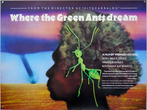
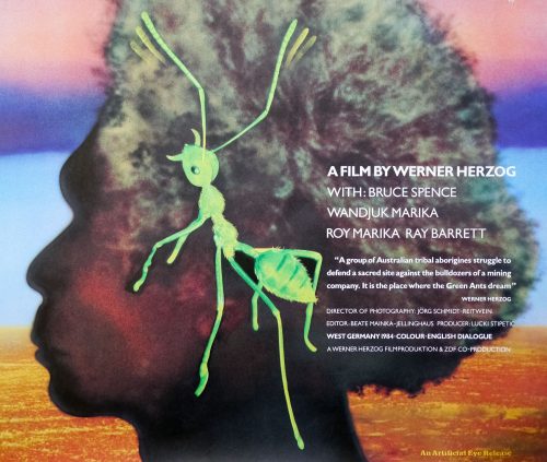
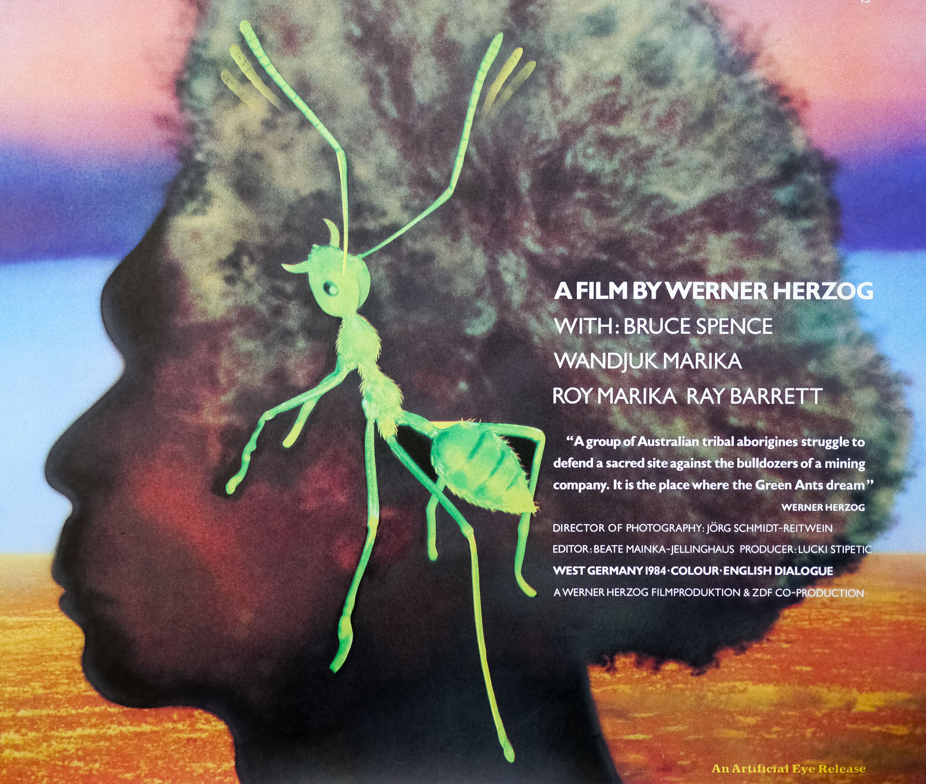
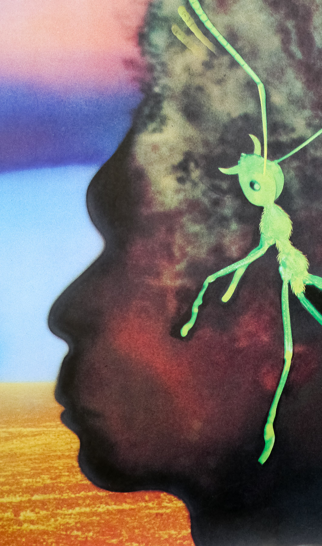
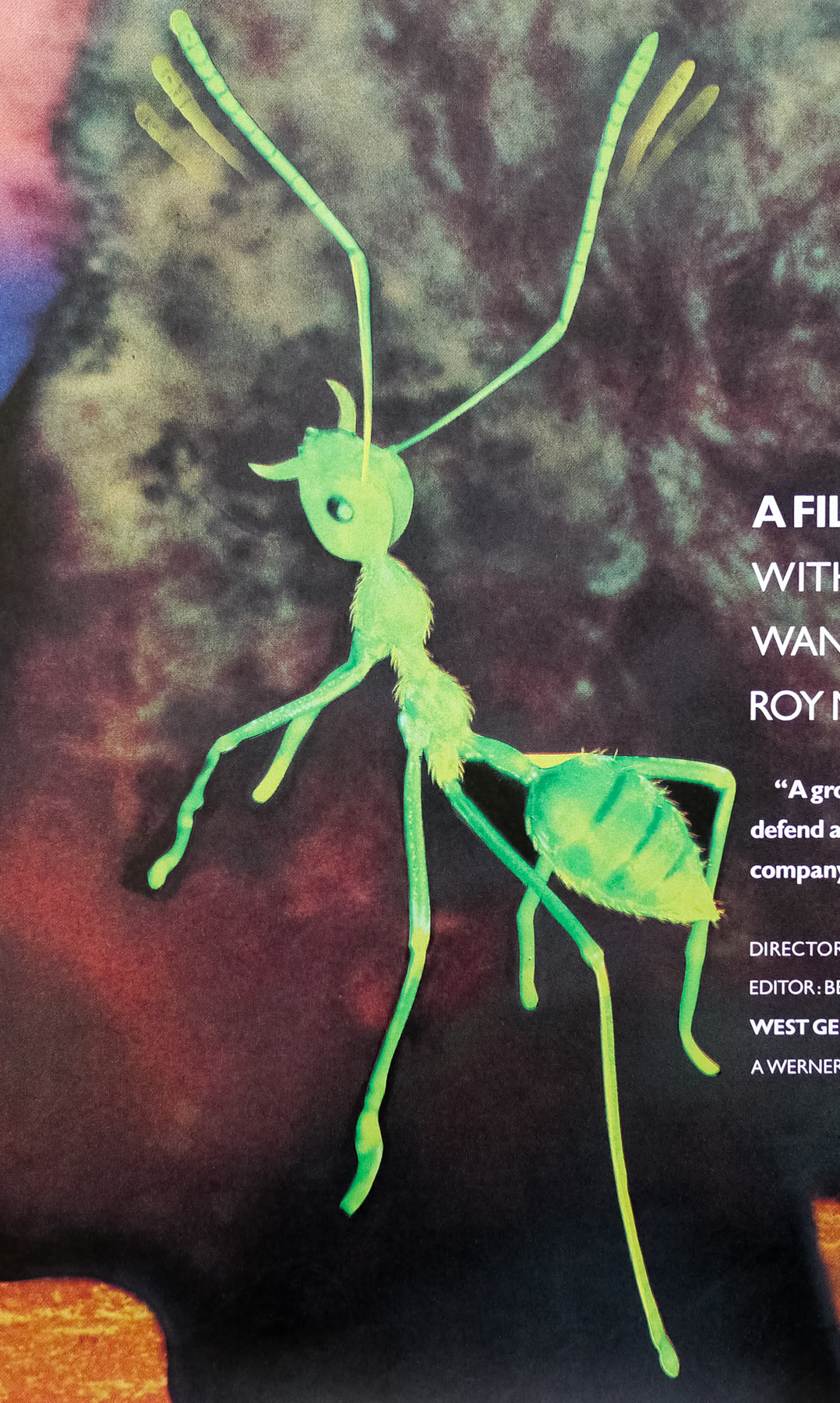
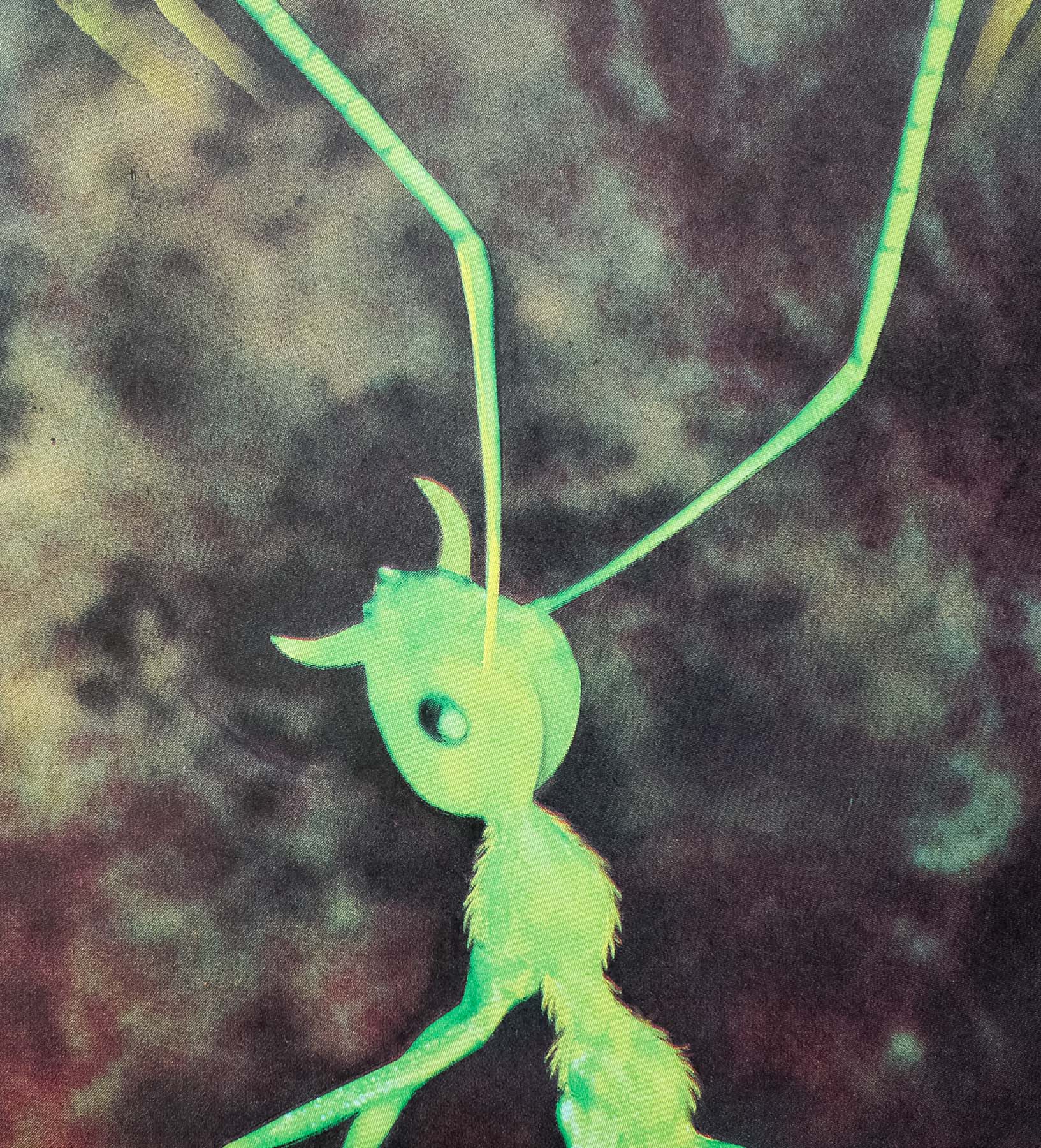
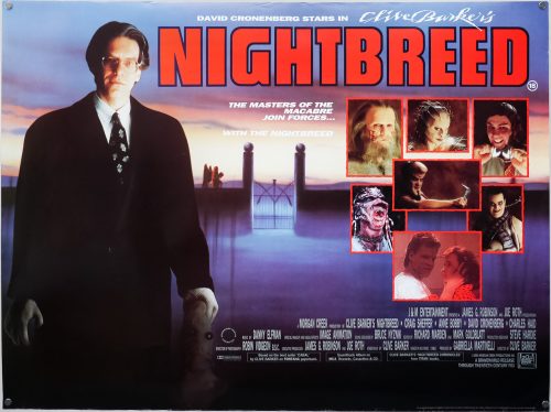
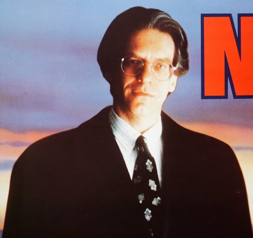
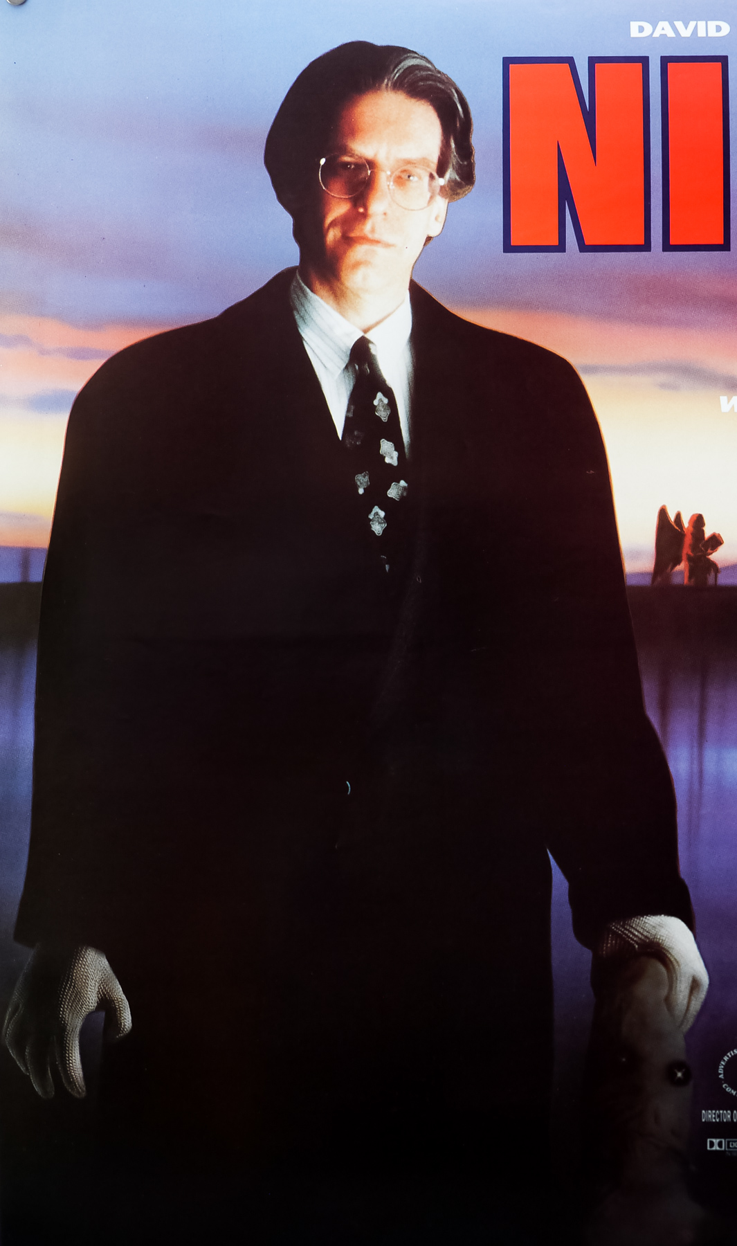
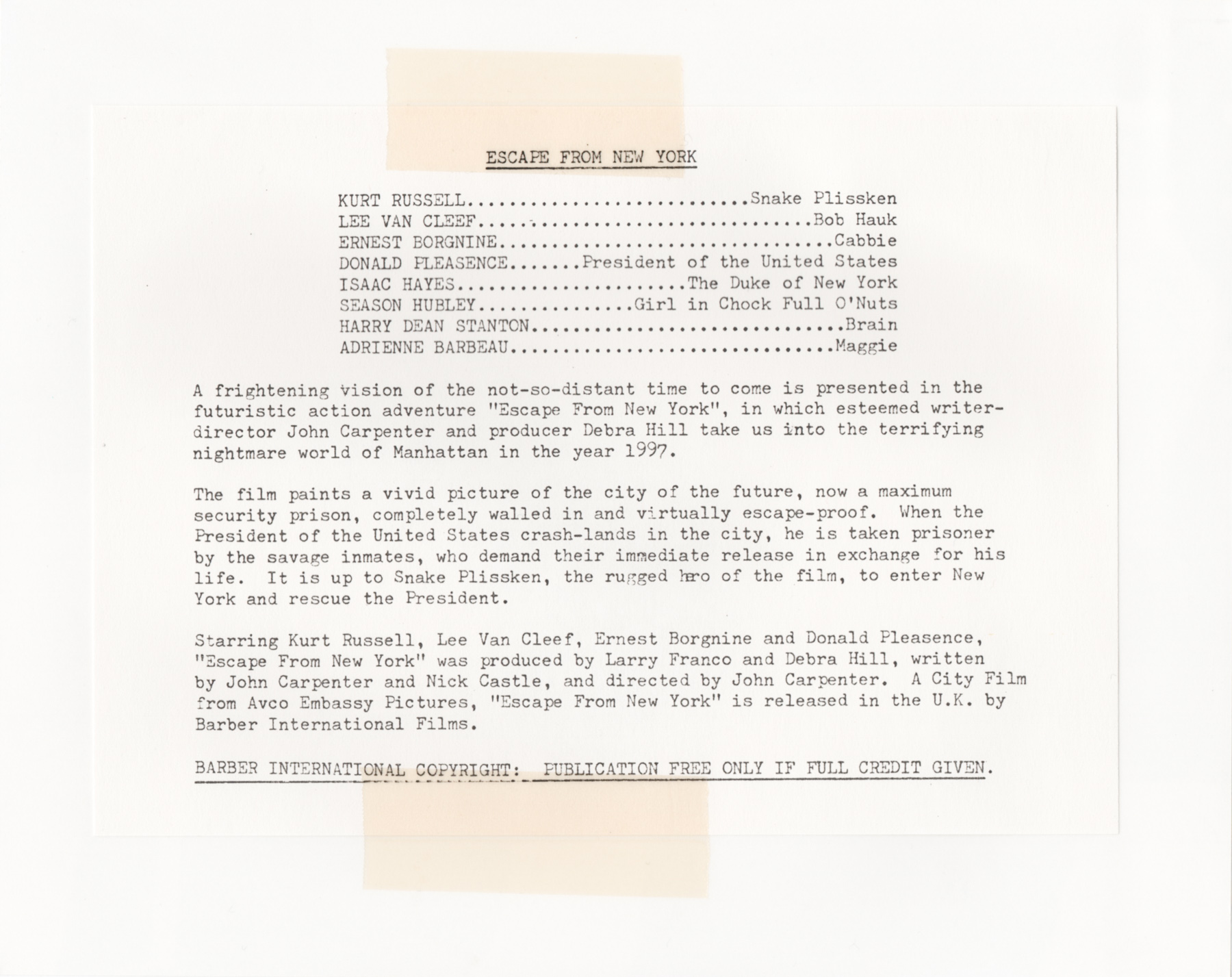
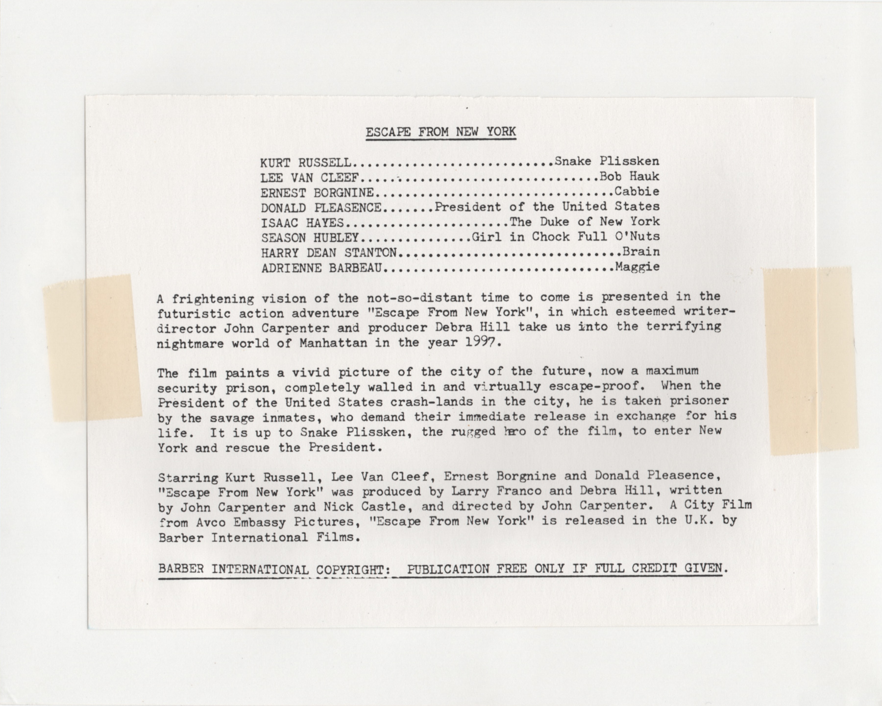
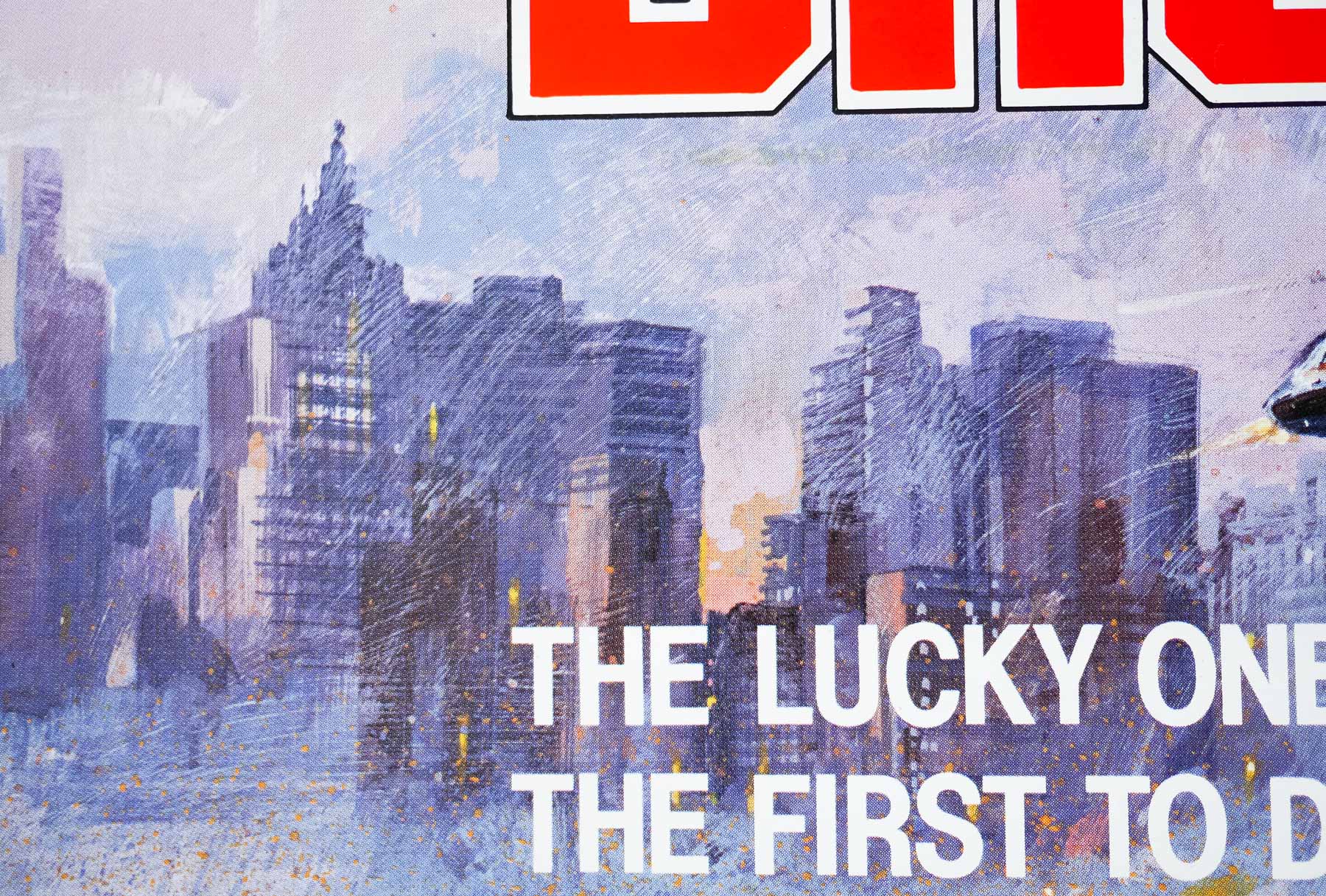
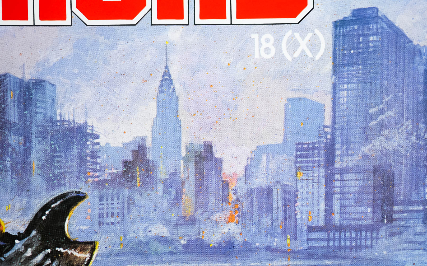
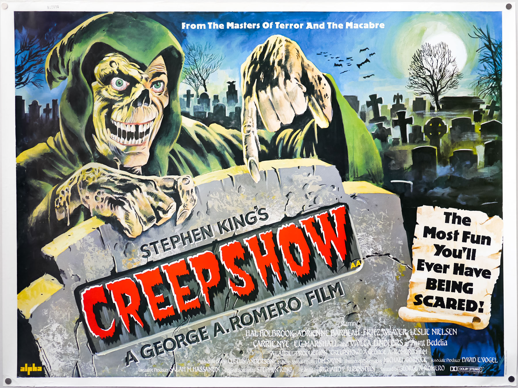
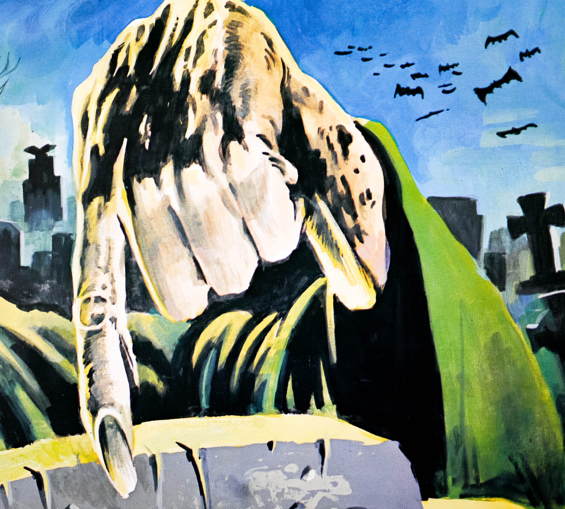
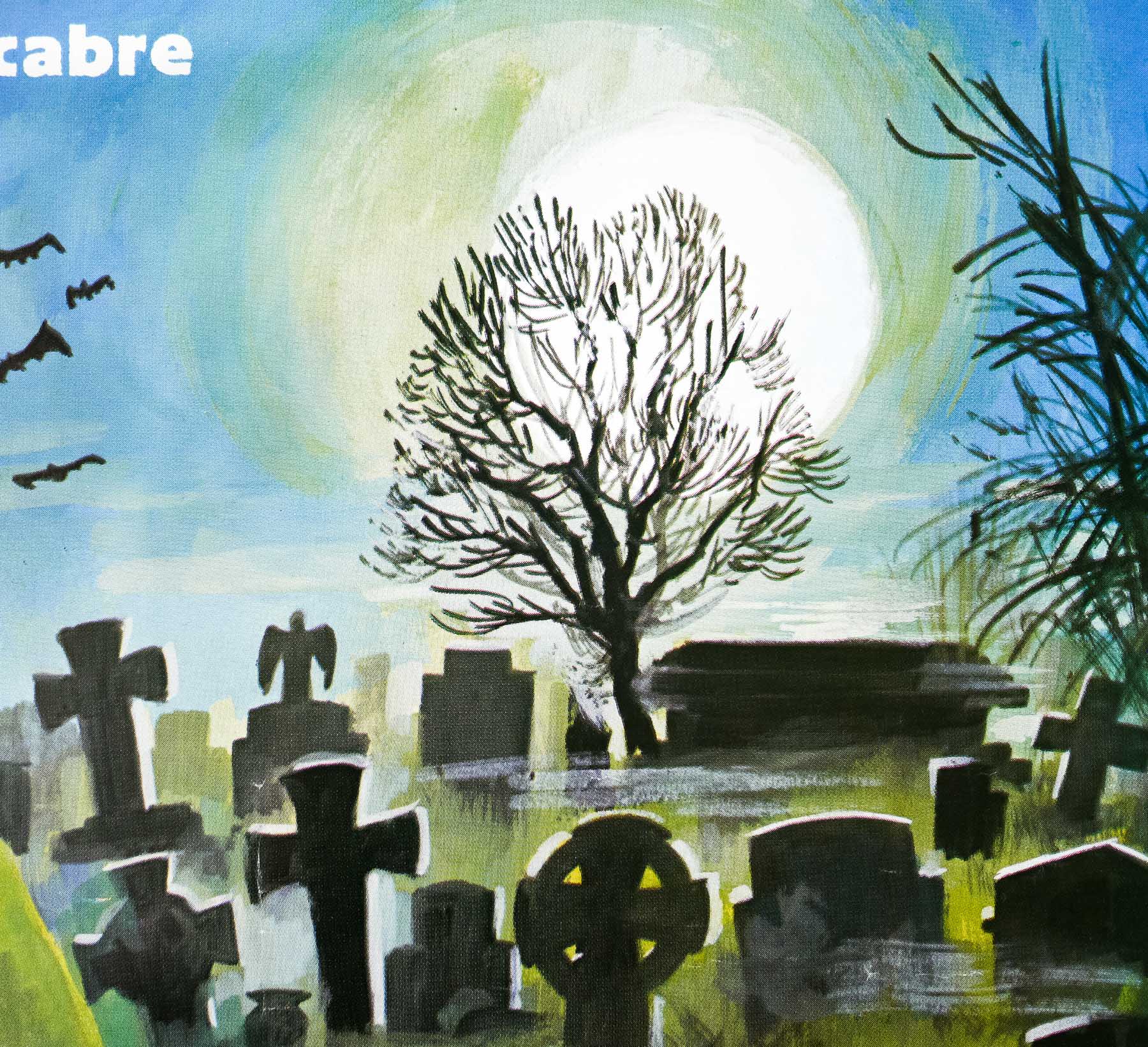
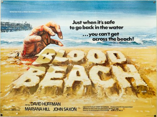
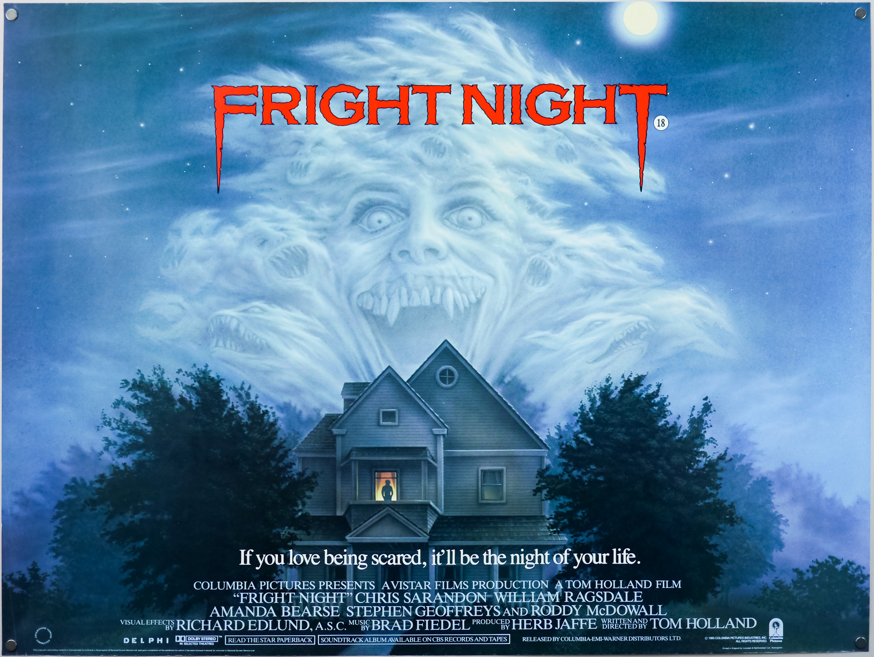
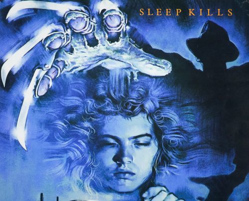
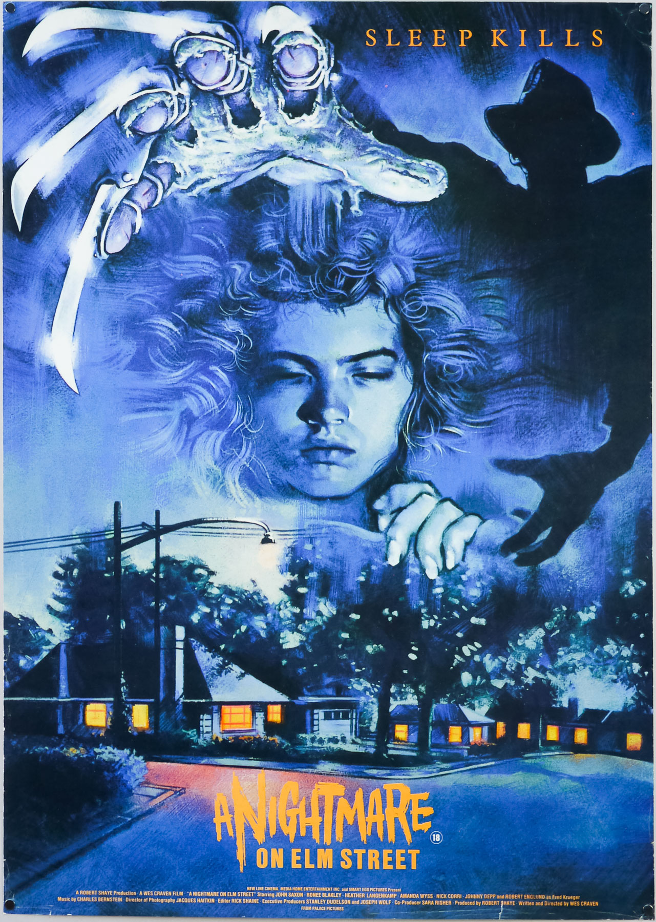
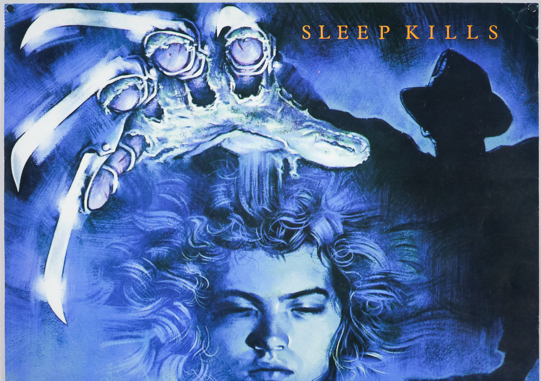
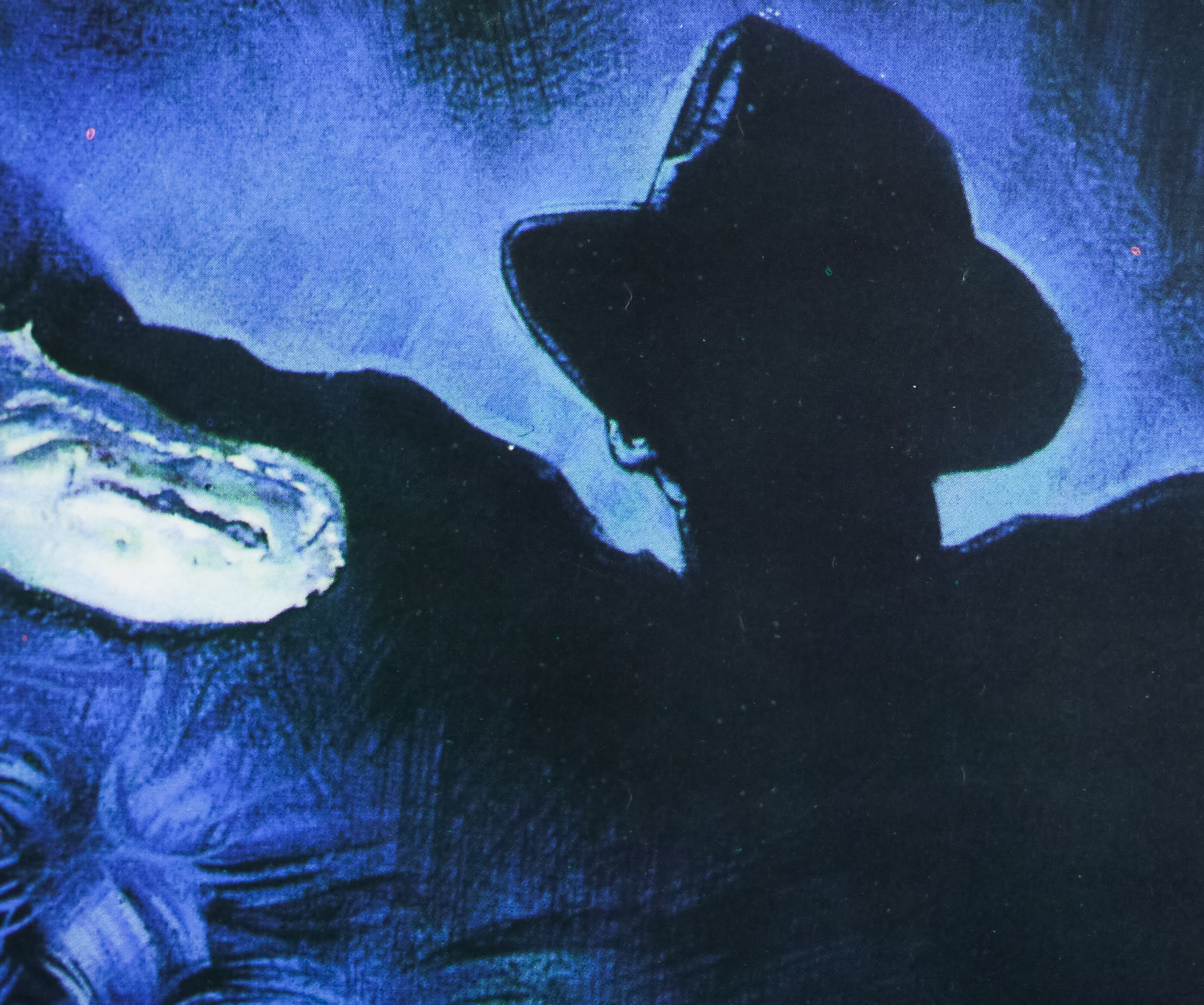
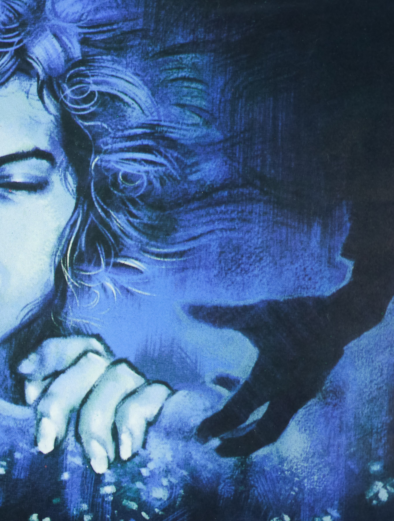
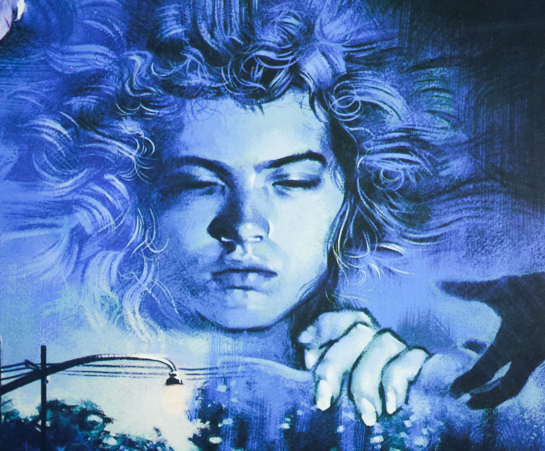
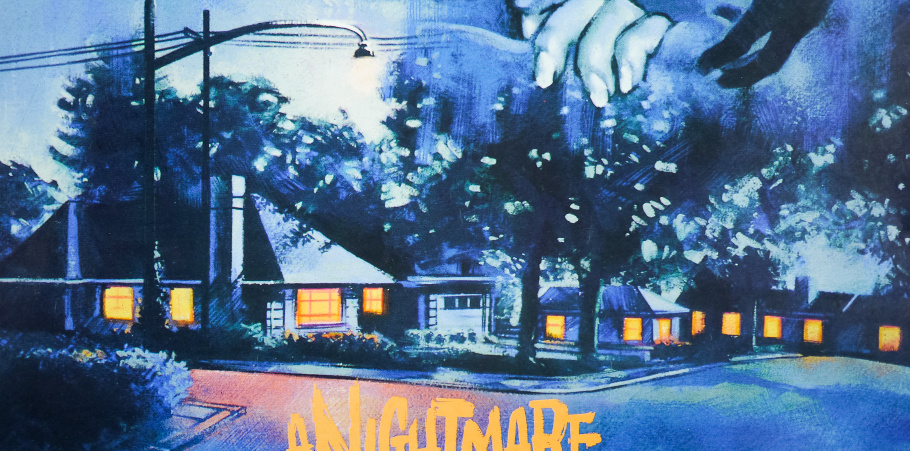
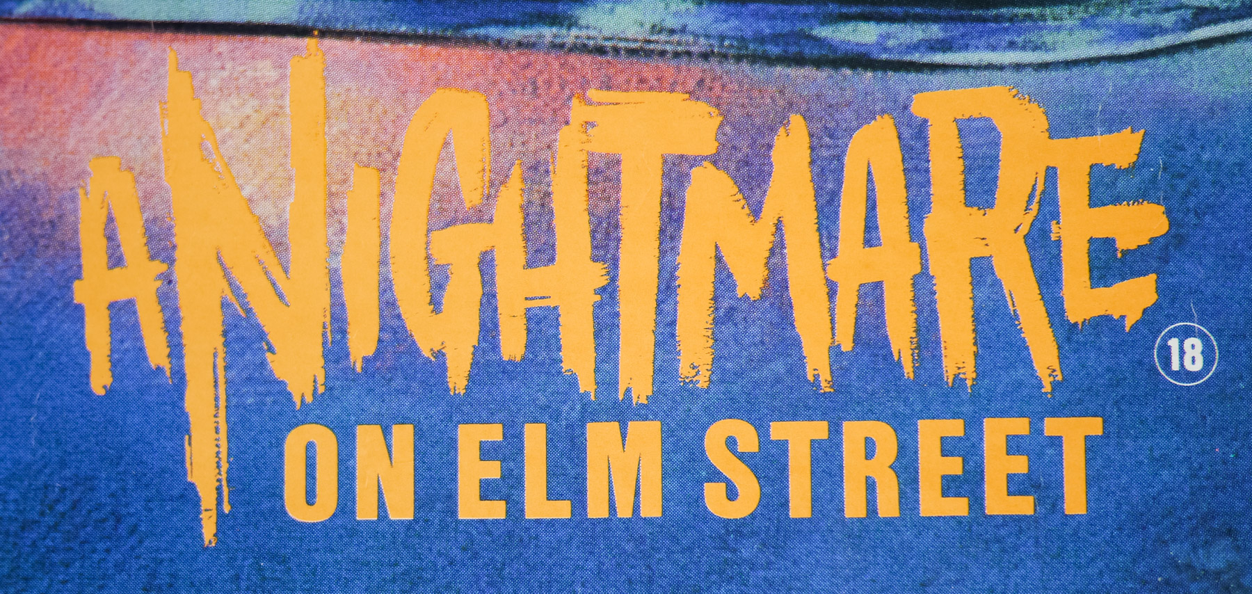
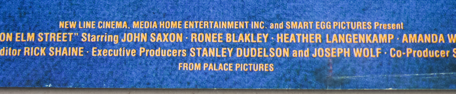
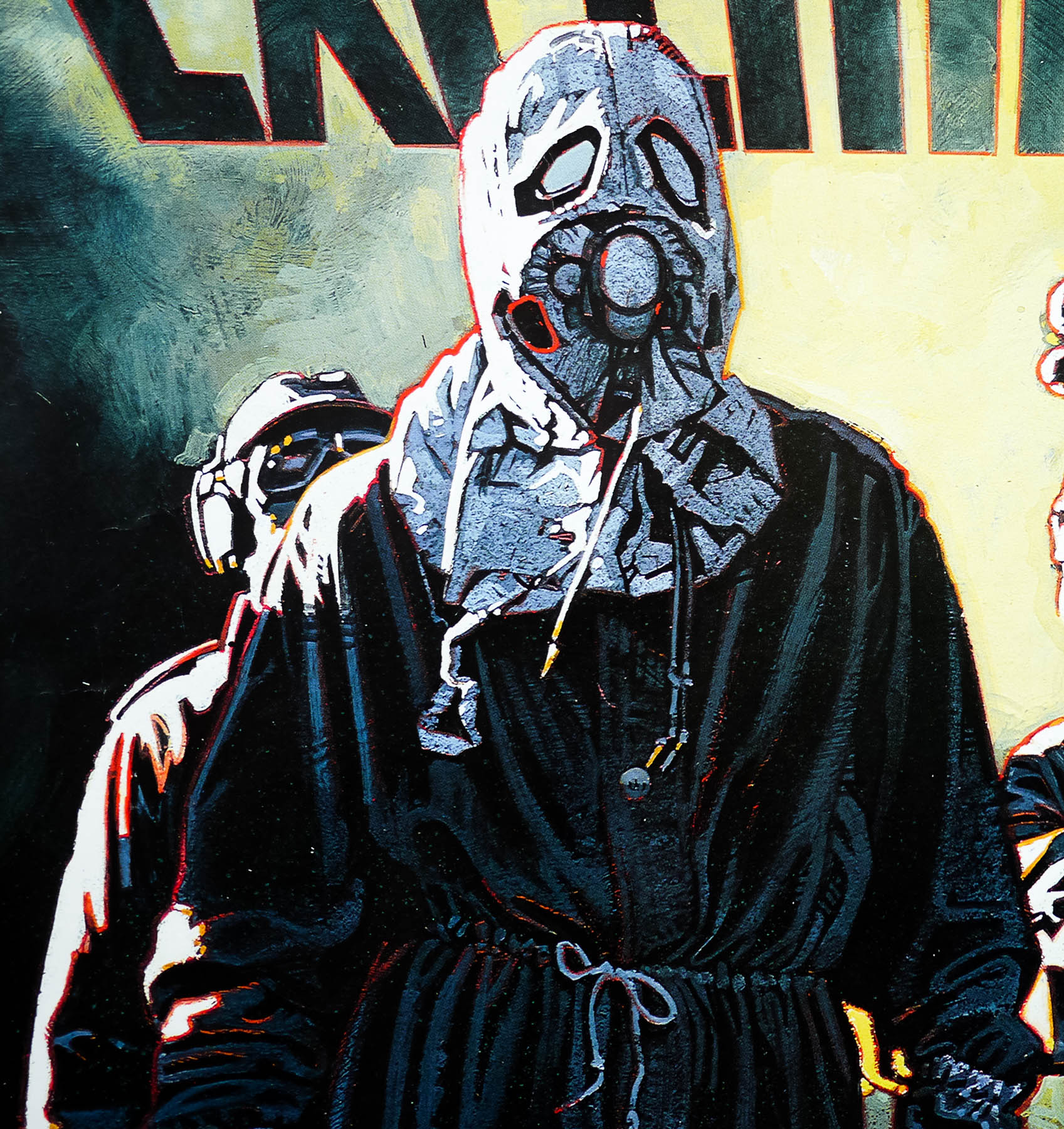
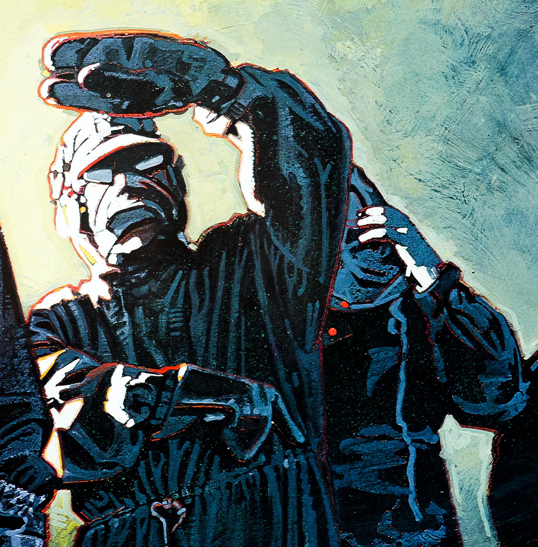
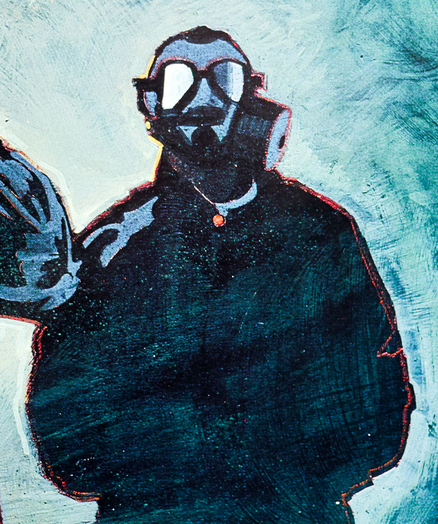
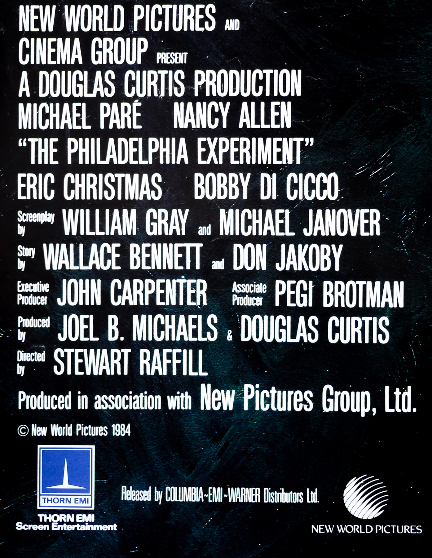
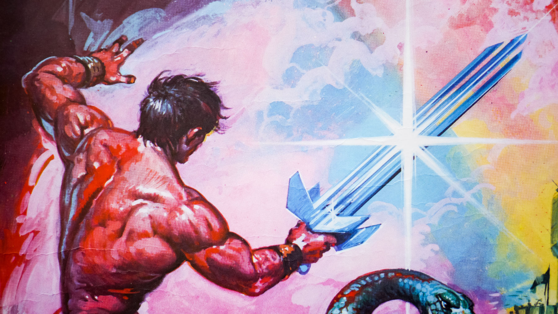
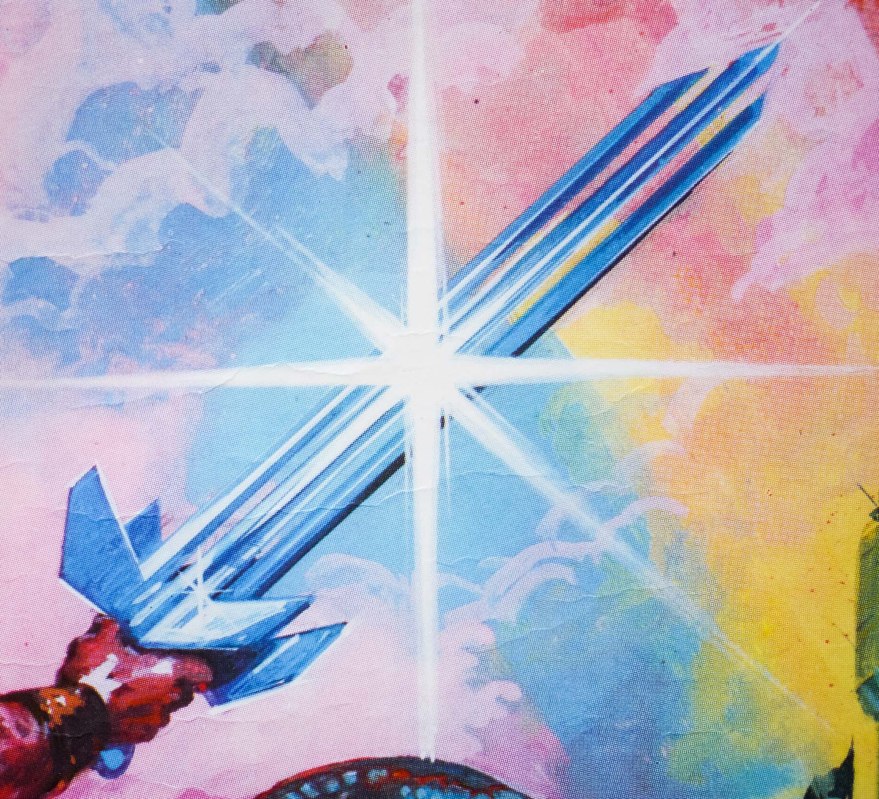
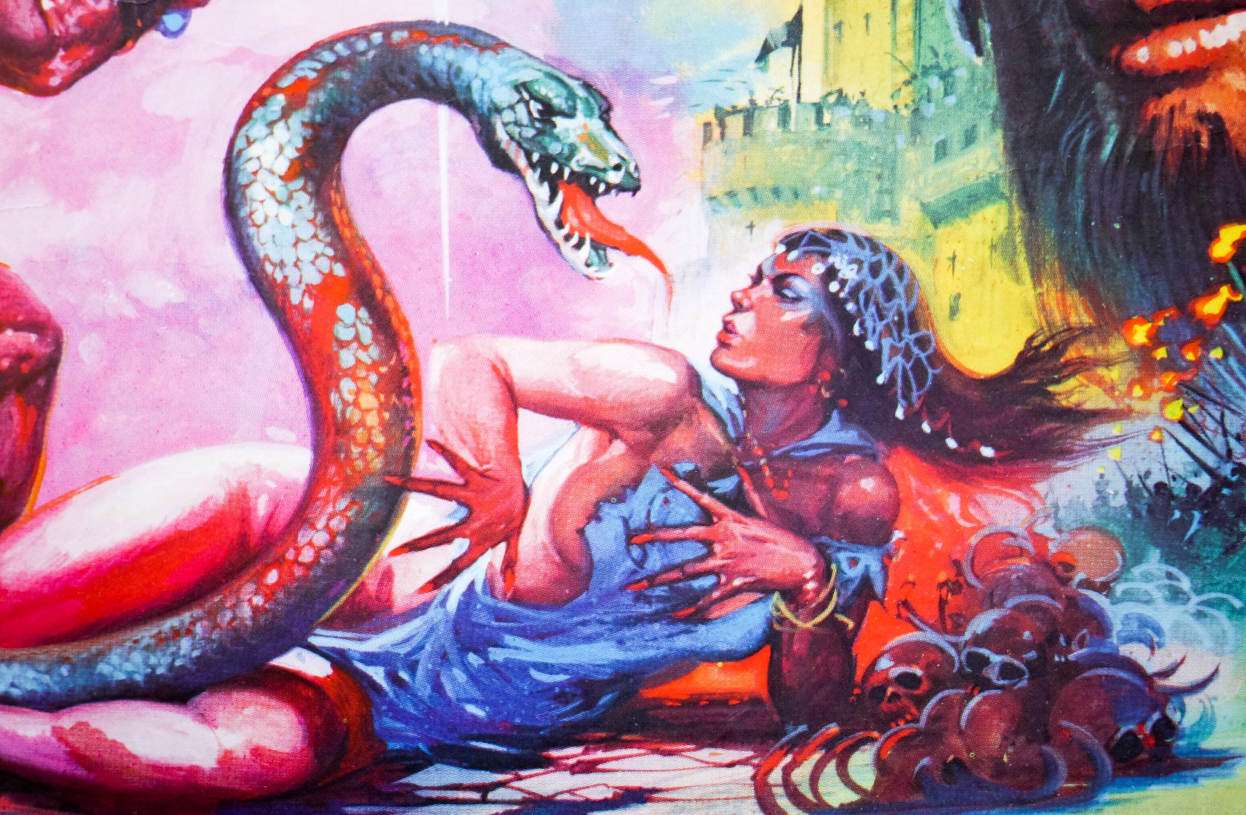
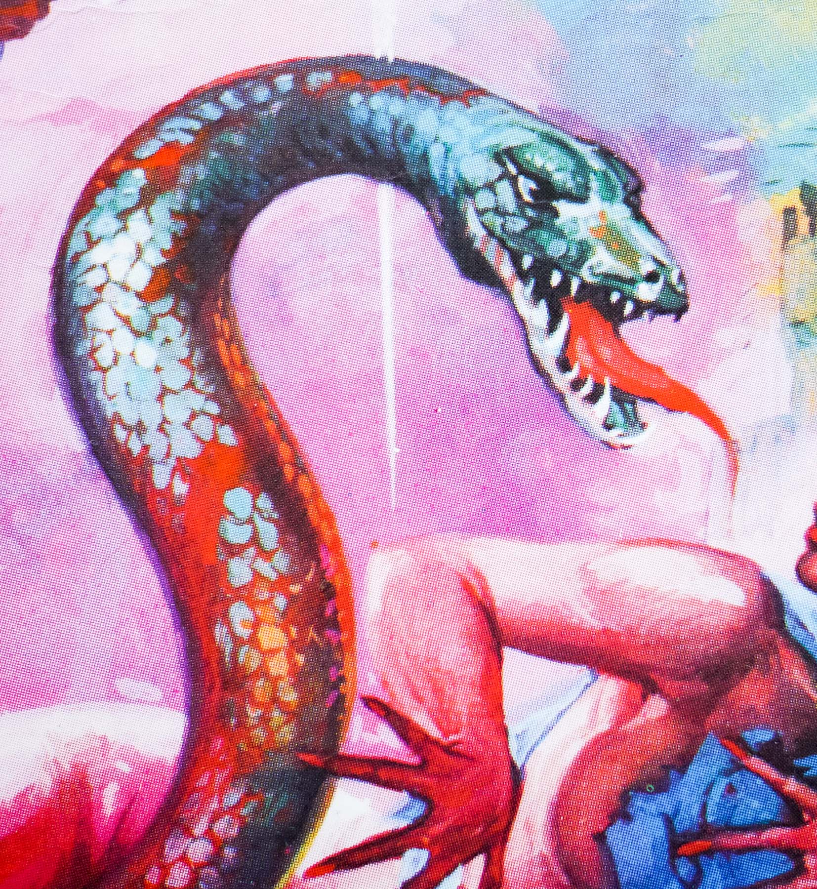
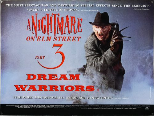
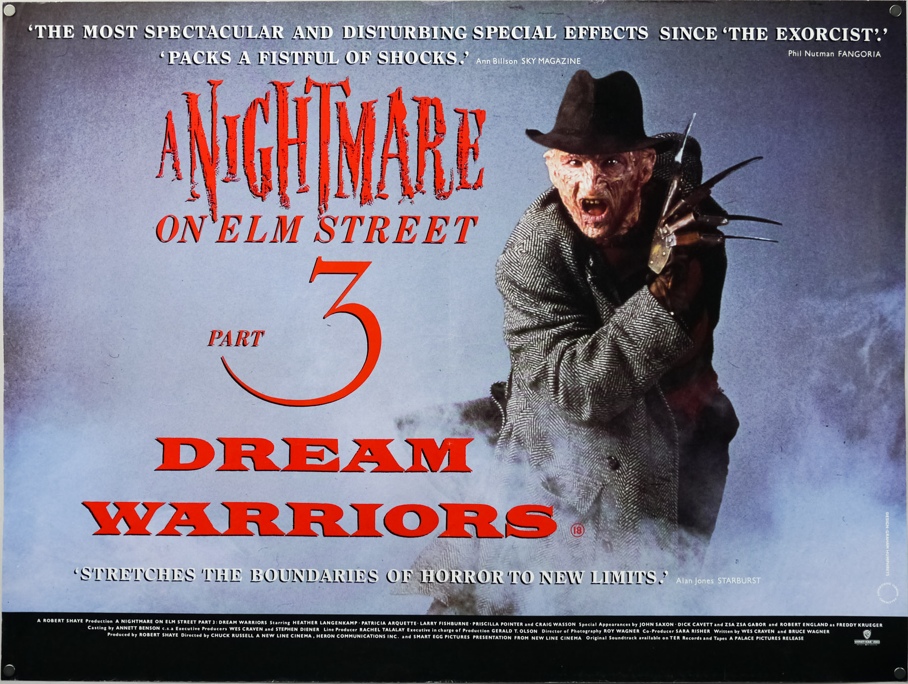
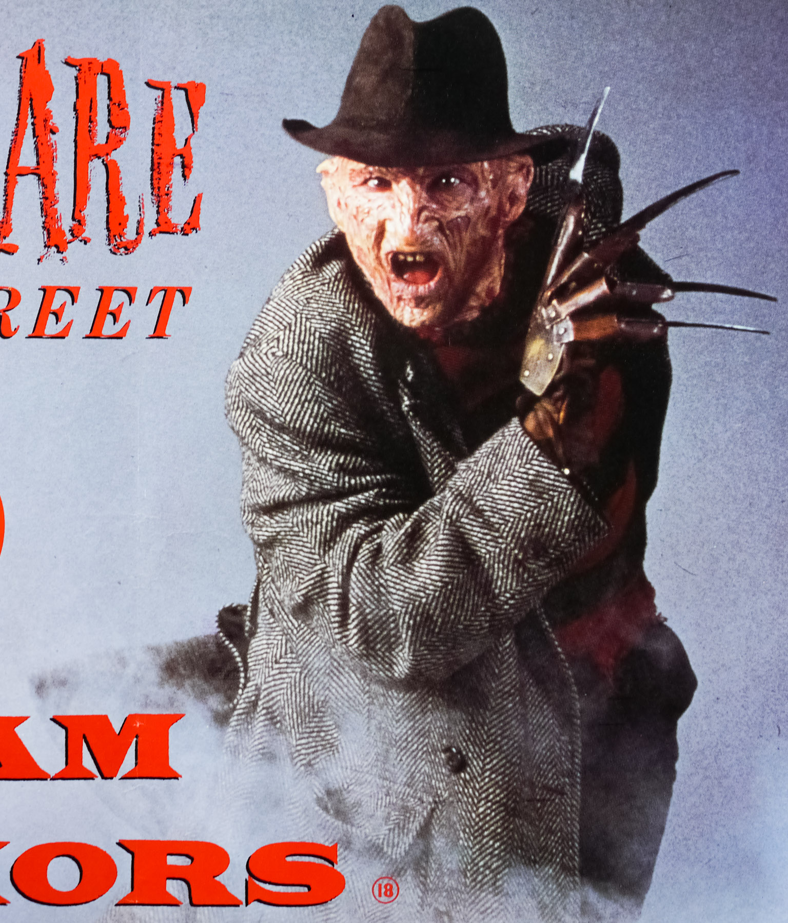
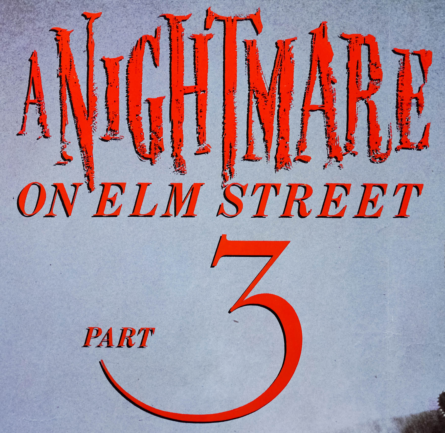
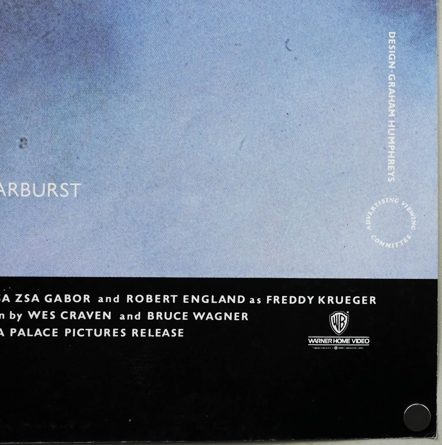
This is the UK video poster for the third entry in one of the most beloved horror franchises, A Nightmare on Elm Street 3 (subtitled Dream Warriors). It’s a full-size quad (30″ x 40″) and the only way to tell that it’s a video poster is the ‘Warner Home Video’ logo (they handled the home video release) in the bottom right corner. As you can see on this image from emovieposter.com it’s otherwise identical to the Palace Pictures cinema release quad which has their logo in the bottom right.

The third film, whilst not as great as the original, was nevertheless a significant return to form following the very lacklustre part 2 that had been released a year earlier to reasonable box-office returns but poor critical reception. Both Wes Craven and Heather Langenkamp (Nancy) had been absent from the first sequel but were persuaded to return for Part 3, with Wes providing drafts of the screenplay and being instrumental in getting Langenkamp onboard. The story went through several iterations with Wes and Bruce Wagner both writing a series of initial drafts and then Frank Darabont (of Shawshank Redemption fame) and the film’s director Chuck Russell completing the screenplay.

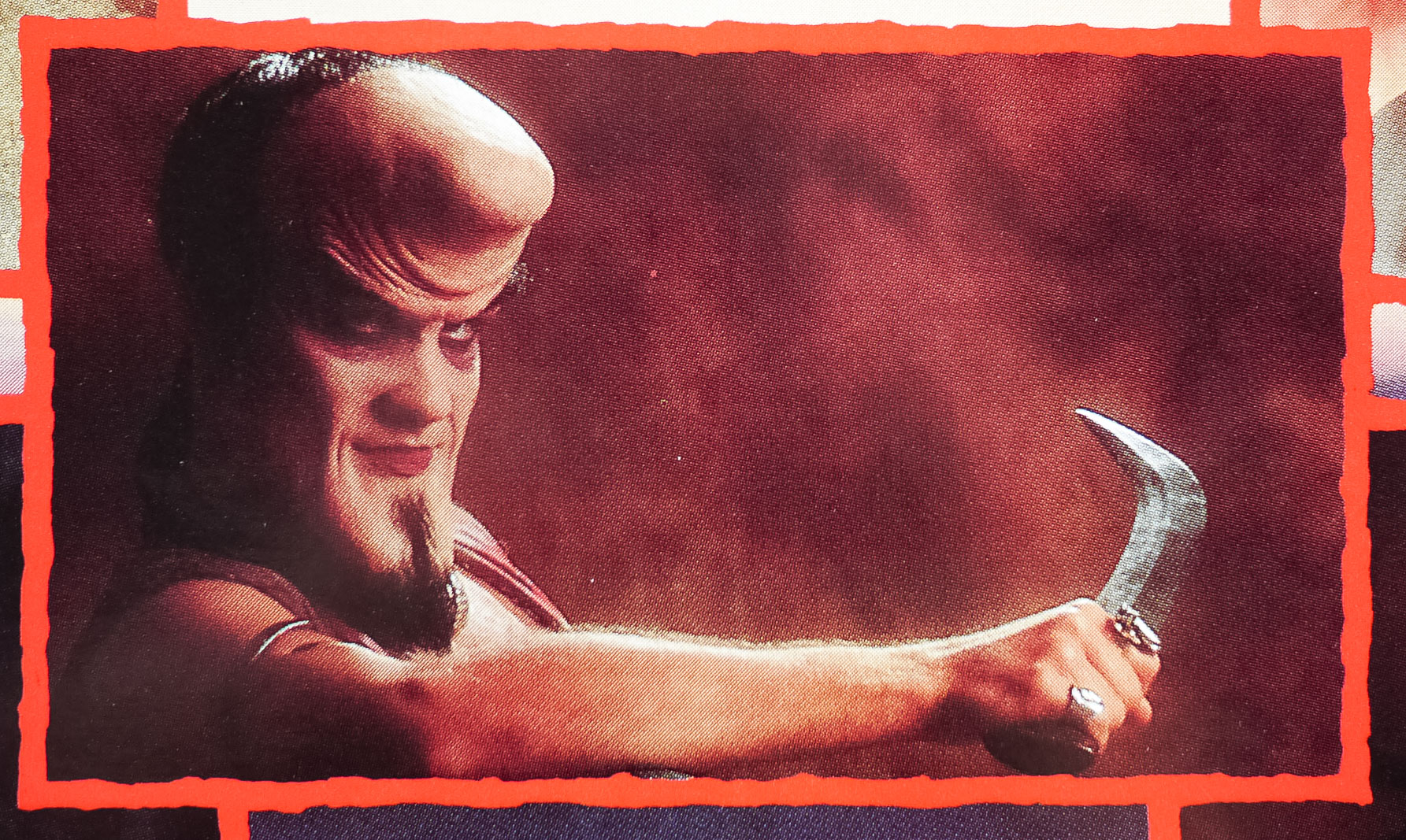
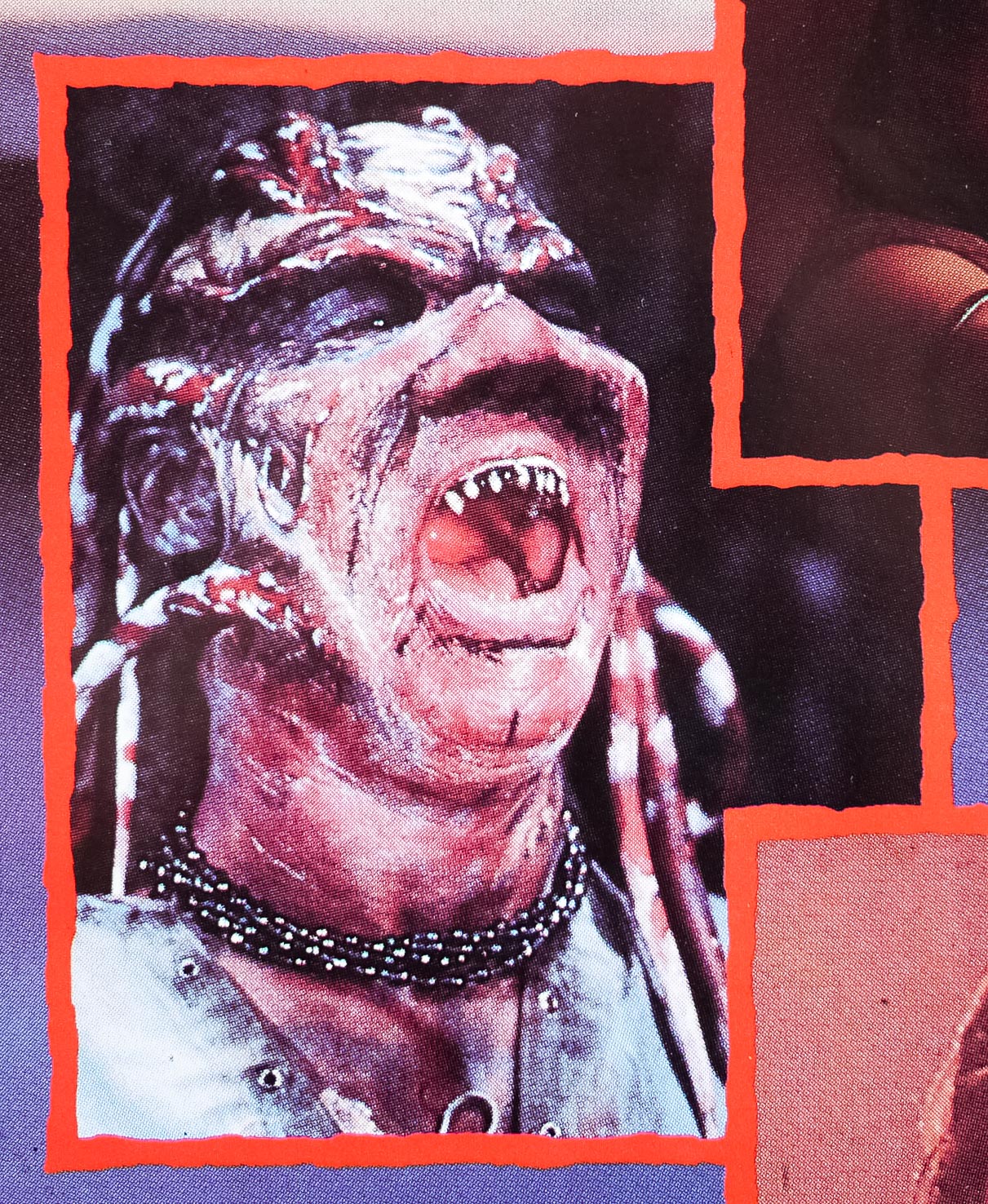
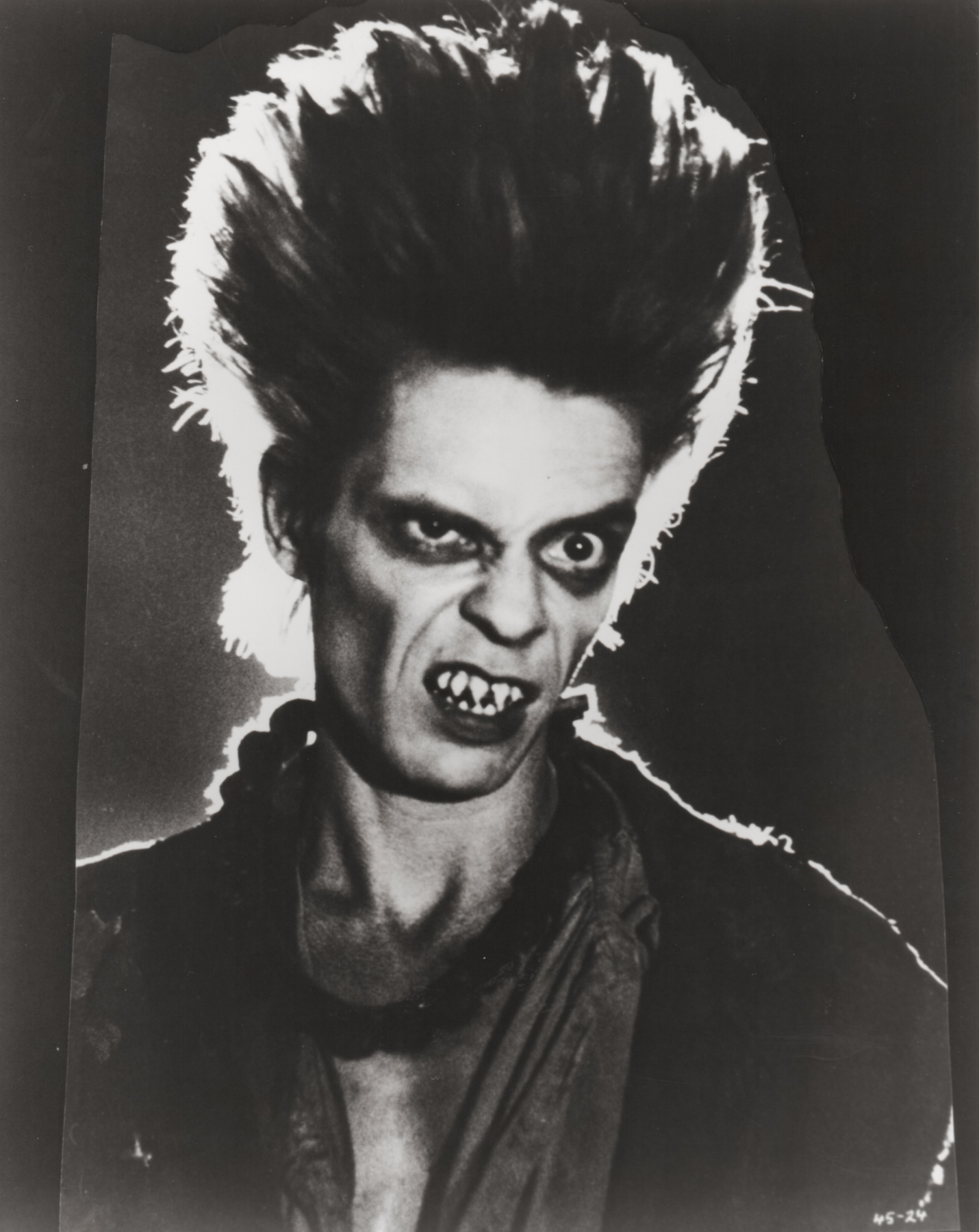
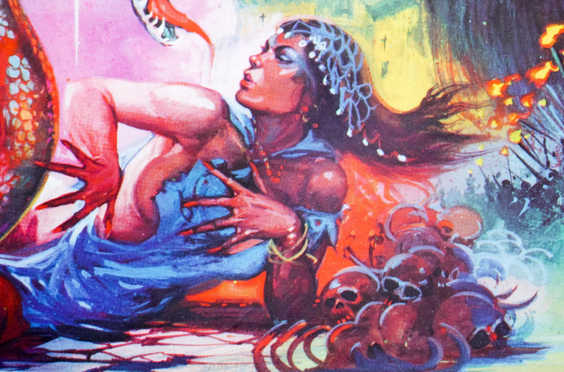
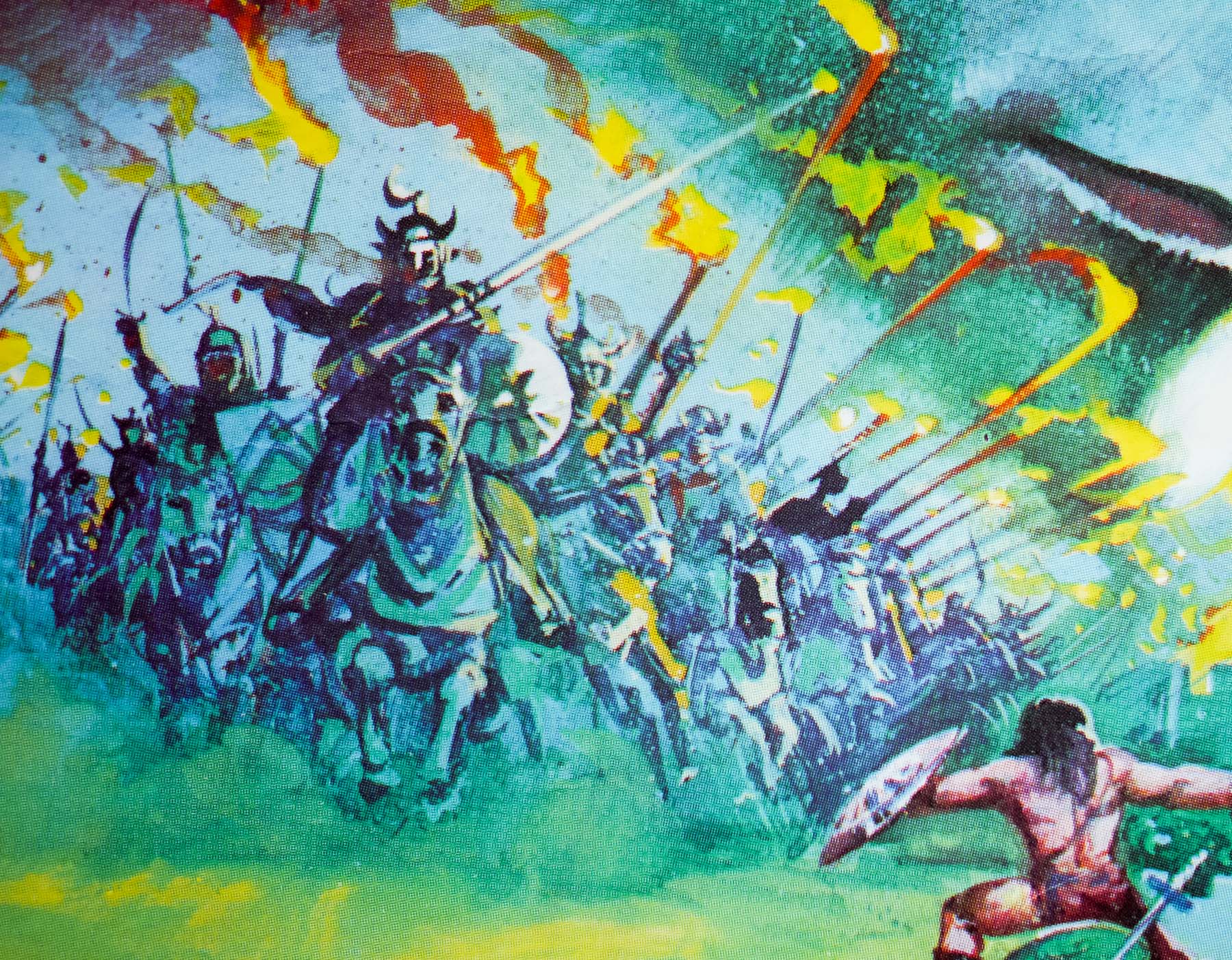
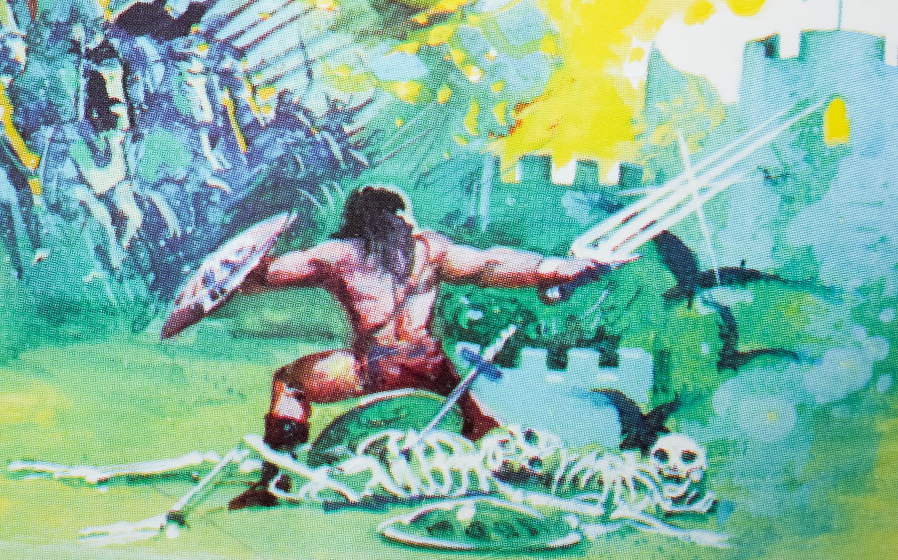
Part of the film’s success is that they return to what made the original much scarier than part 2, which is the concept of the evil Freddy Krueger only having his power in the dreams of the kids he’s attacking. This is what made the first film so effective and allowed Freddy to be much more inventive with the way he attacks his victims. In part 2 there are several sequences where Freddy is in the ‘real world’ and he simply becomes a standard slasher antagonist, losing his uniqueness as a villain in the process. Aside from one sequence involving a Ray Harryhausen-esque skeleton, all of the Freddy scenes take place in the dream world of his teenage victims.

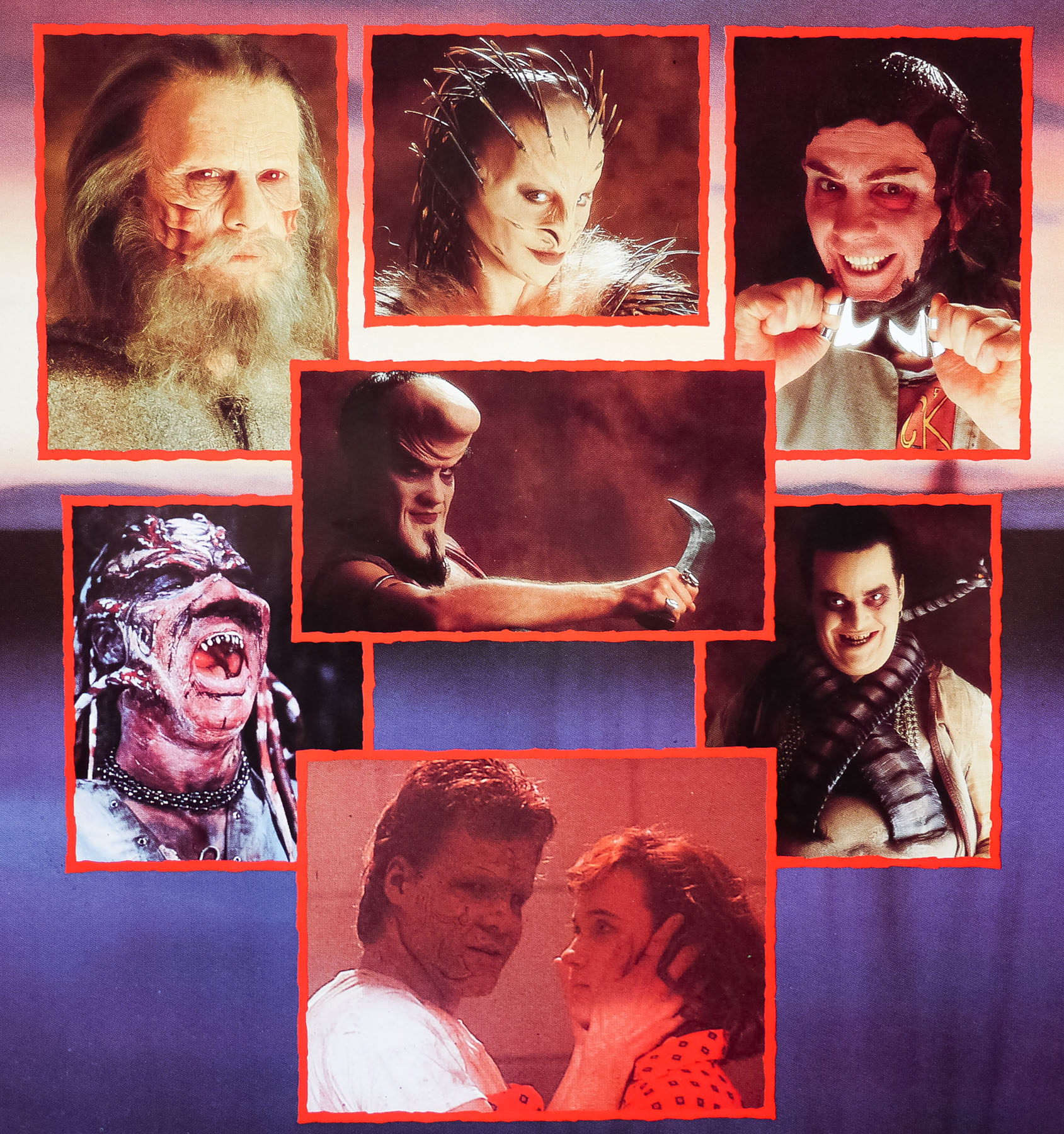
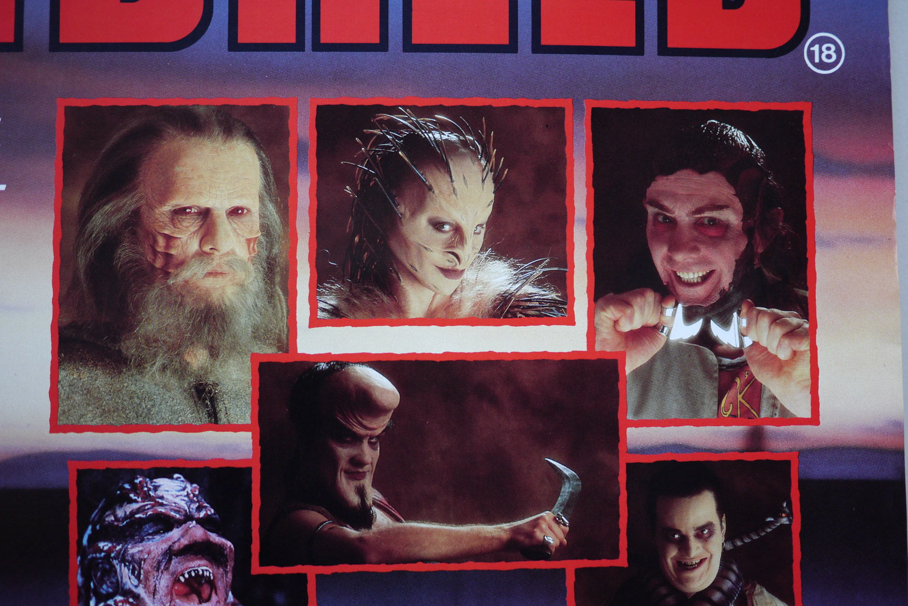
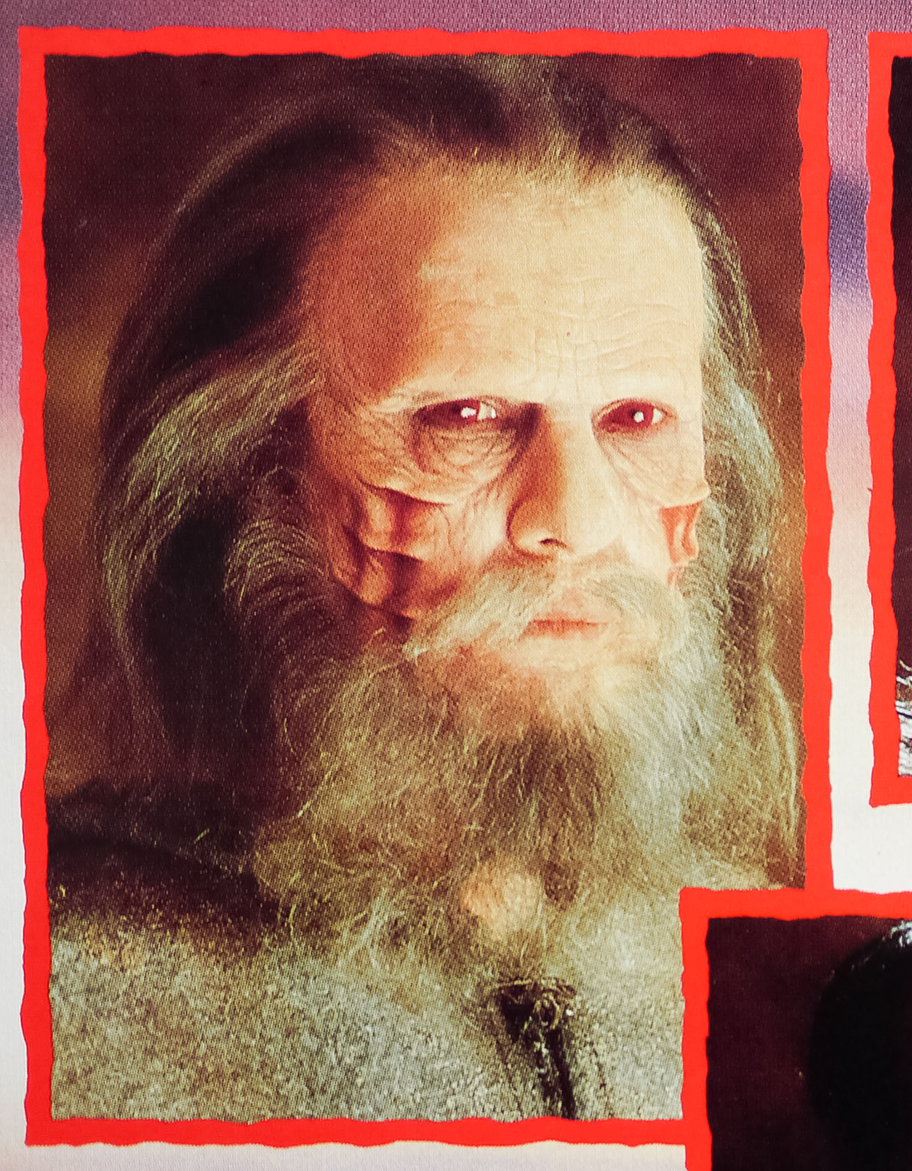
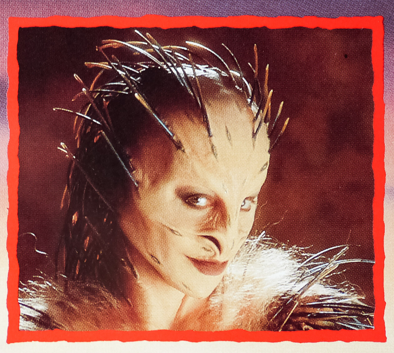
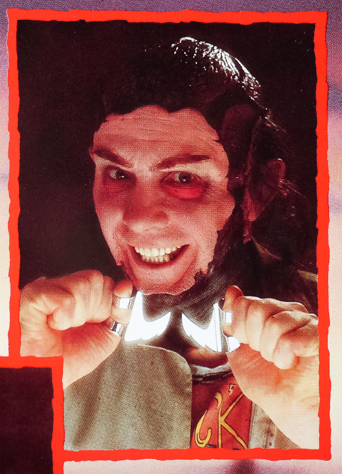
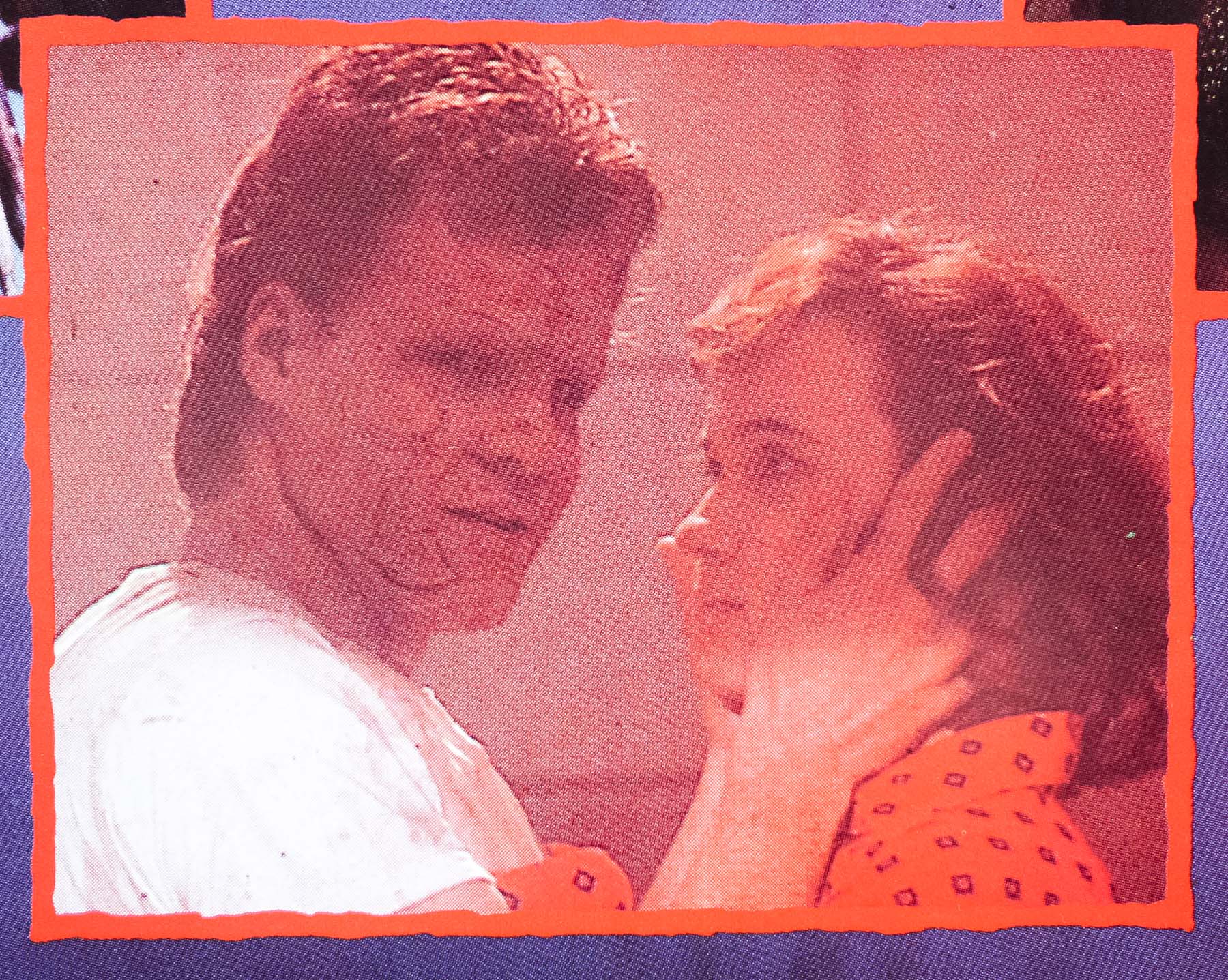
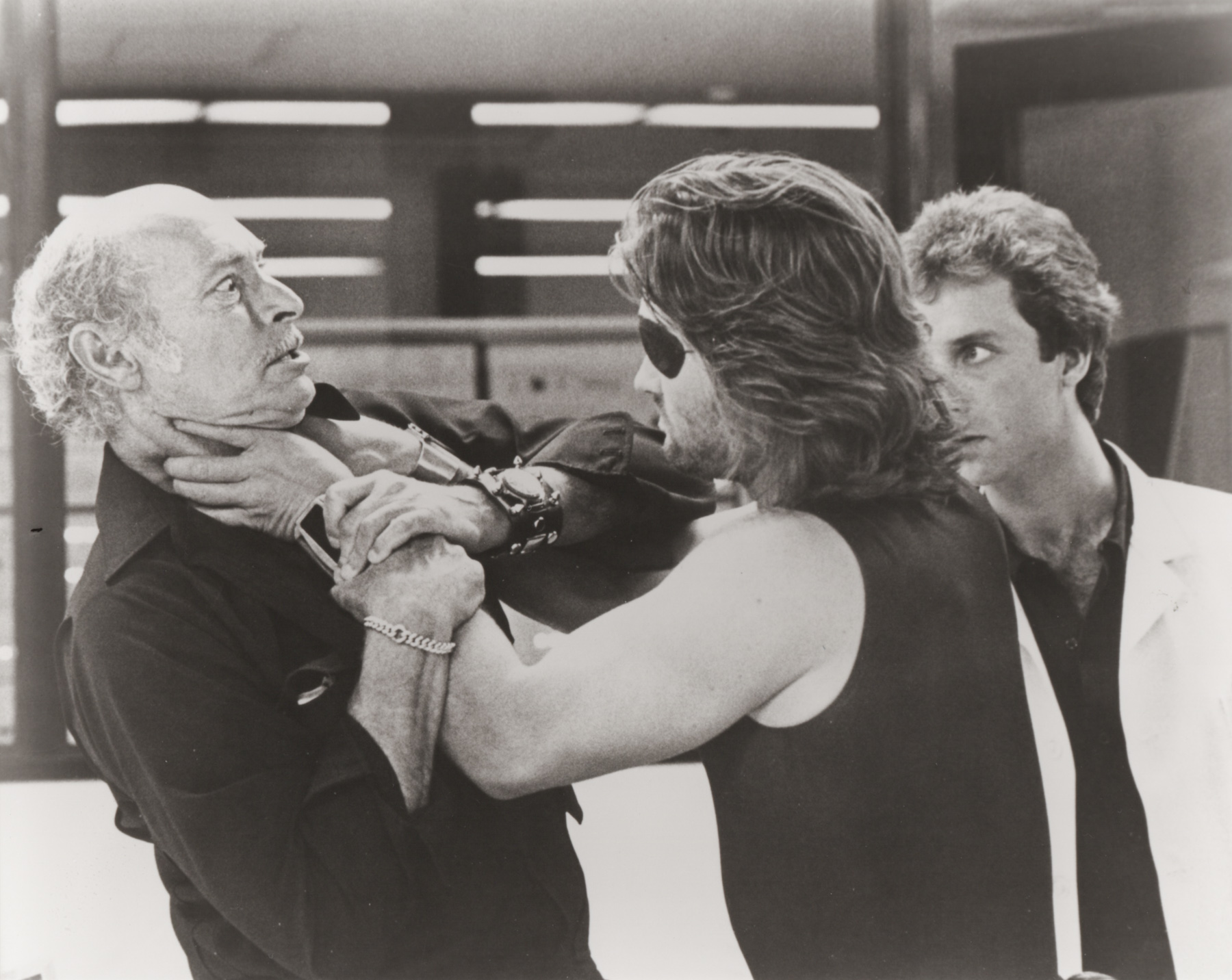
The concept for the third one, hinted at with the film’s subtitle, is that the characters are able to enter each other’s dreams in order to try and defeat Freddy. Patricia Arquette (in her film debut) plays Kirsten Walker, a teenager who has been suffering terrible nightmares at the hands of Freddy. After an attack that leaves her wrist slashed, her mother has Kirsten taken to a secure psychiatric hospital and there she meets a number of other teens all suffering from the same nightmares, with the adult carers at a loss to explain it. Dr Neil Gordon (Craig Wasson) is the only one who begins to believe the group and he’s helped when Nancy begins working at the hospital as an intern.

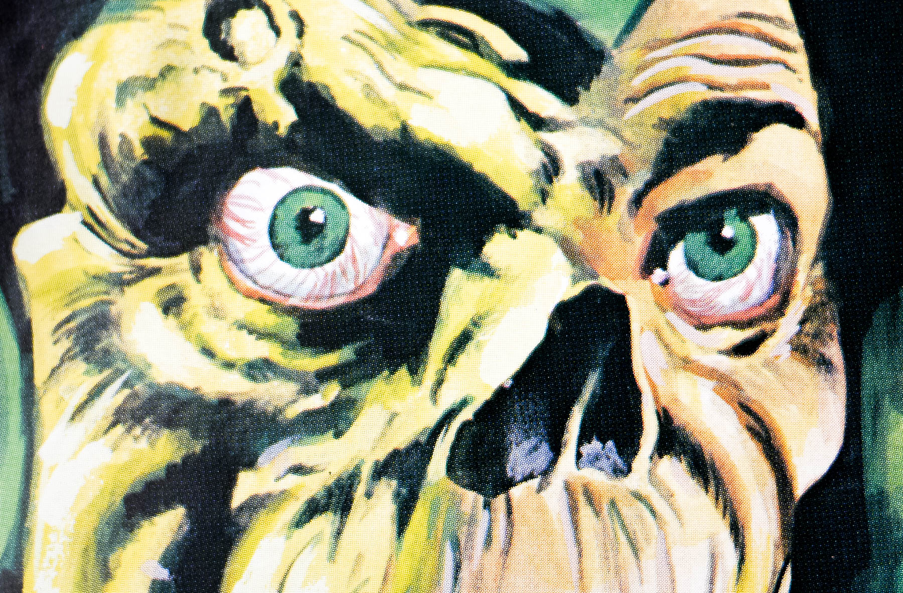
After two of the gang die following a Krueger attack, ruled as suicides by the hospital bosses, Gordon and Nancy realise the key to defeating him is using Kirsten’s gift of being able to bring other people into her own dreams. They also discover that each of the remaining kids has a particular gift when they’re in their dreams. Having multiple characters in one dream allows Chuck Russell and the special effects crew to stage a number of memorable sequences, filled with inventive gore coupled with a much more interesting script for Robert Englund (Freddy) to have fun with. There are a number of moments in the film that are ingrained in my memory from the first time I saw it almost 20 years ago and it’s definitely a fan favourite sequel. The film was a hit at the box-office and ensured Freddy’s return in part 4 only a year later.

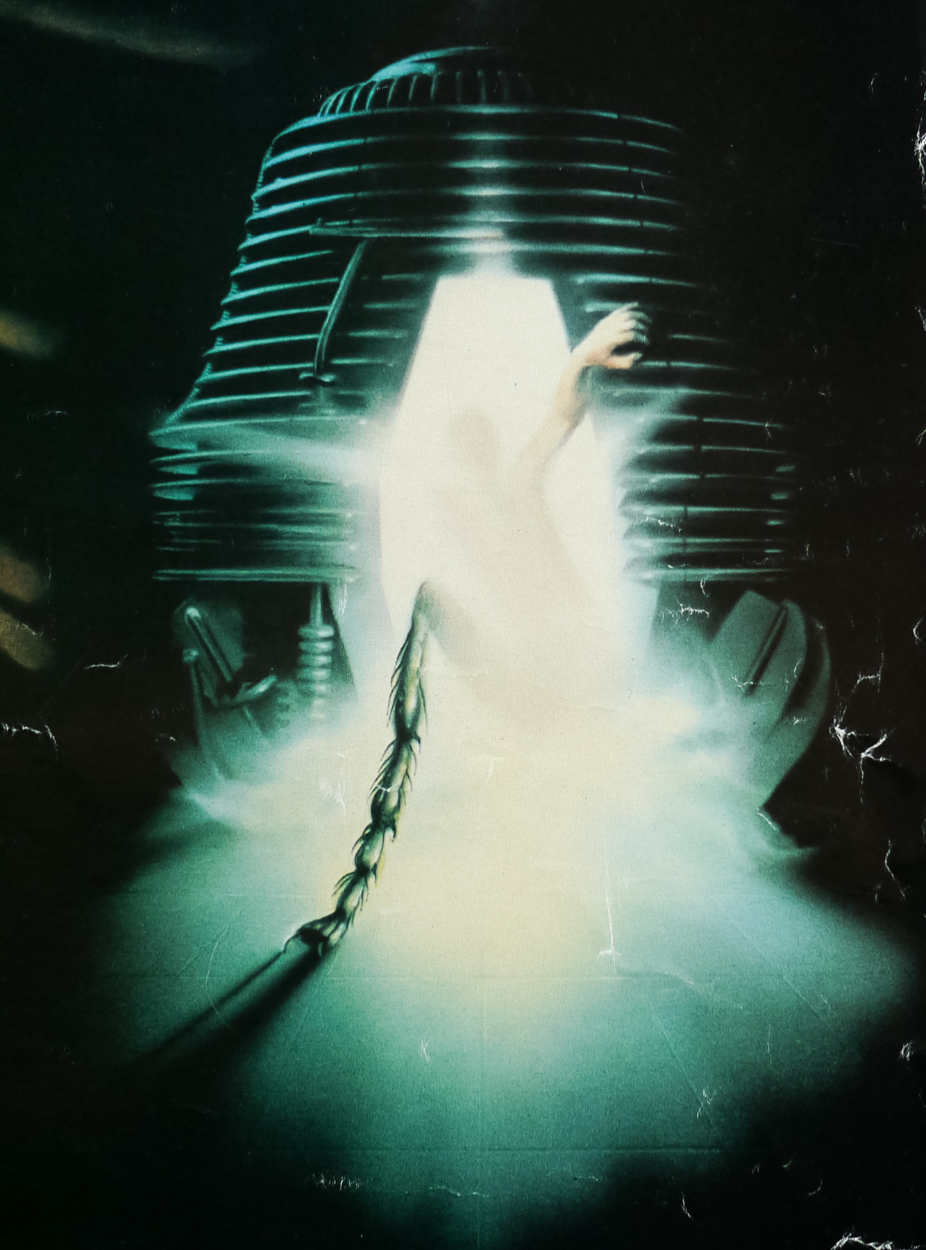
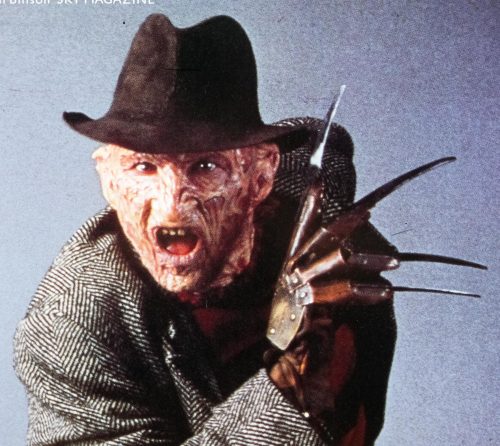
The celebrated British designer and artist Graham Humphreys was chosen by Palace to work on the posters for the first five A Nightmare on Elm Street films. This poster for part 3 is notable for being the only one of the five that’s photographic, rather than illustrated, and when I interviewed Graham in 2011 for this site he explained how that came about:

——————

For A Nightmare on Elm Street 3 they went with a photographic image and you designed the poster. Was there a reason they didn’t have an illustration?
No idea at all. They might have been cheap-skating. I think they thought the photographs were quite good from the session they’d had so why not use one of them. I redid the logo and drew the number 3, which took ages!

How easy was it working with photographs at this time, before computers?
Well given a computer this poster would have been so different. I mean I would have used the same photograph but so much more could have been done to make it more sinister and far more exciting. In those days all I could do was play around with the lettering.

Did you actually ask if you could do an illustration or suggest an idea for one?
No, the decision was made that it would be a photo and that was that.

———–——

To see the other posters I’ve collected by Graham click here and read the exclusive interview with the artist here.

Where the Green Ants Dream / quad / UK

12.09.16

Poster Poster
Title
Where the Green Ants Dream
AKA
Wo die grünen Ameisen träumen (Germany - original title)
Year of Film
1984
Director
Werner Herzog
Starring
Bruce Spence, Wandjuk Marika, Roy Marika, Ray Barrett, Norman Kaye, Ralph Cotterill, Nick Lathouris, Basil Clarke, Ray Marshall
Origin of Film
West Germany | Australia
Genre(s) of Film
Bruce Spence, Wandjuk Marika, Roy Marika, Ray Barrett, Norman Kaye, Ralph Cotterill, Nick Lathouris, Basil Clarke, Ray Marshall,
Type of Poster
Quad
Style of Poster
--
Origin of Poster
UK
Year of Poster
1984
Designer
Paul Derrick
Artist
--
Size (inches)
30 4/16" x 40 2/16"
SS or DS
SS
Tagline
--

A striking image by the British designer Paul Derrick features on this UK quad for the release of maverick director Werner Herzog‘s 1984 drama Where the Green Ants Dream. The film was the directorial follow up to what many consider to be Herzog’s masterpiece, Fitzcarraldo, and is set in the Australian outback. Co-written with the Australian screenwriter Bob Ellis, the film deals with the contentious issue of aboriginal land rights that has existed ever since the British established a settlement there in the 18th Century. A mix of facts and fiction, the film features a number of aboriginal activists who had been involved in a real-life court case

Bruce Spence, who is best known as the Gyro Captain from Mad Max 2, plays Lance Hackett, a geologist working for a mining company that is carrying out a series of tests on some land that they intend to mine for Uranium. The title refers to the insects that the aborigines believe to be sacred and they fear will be disturbed by the blasting and drilling. One of the tribal elders, as featured on this poster, explains that this disturbance could bring about the end of the world. Lance is instructed to spend time with the activists and try and work out a deal with them so that the mining company can carry on their testing. When that eventually fails, even after they are given a large army plane as part of an attempted deal, the case goes to the courts. 

Paul Derrick’s official website can be viewed here and, according to the short biography on the site, he has been working for many years on publishing and visual identity projects for a wide range of clients, including arts and educational organisations as well as government clients. He also says that he is ‘experienced in undertaking, and art directing, documentary photography to create visual narratives and storytelling.’ There are a few examples of posters he worked on and the British distribution company Artificial Eye is listed in the projects section.

The Lighthorsemen / one sheet / UK

09.01.17

Poster Poster
Title
The Lighthorsemen
AKA
--
Year of Film
1987
Director
Simon Wincer
Starring
Jon Blake, Peter Phelps, Tony Bonner, Bill Kerr, John Walton, Gary Sweet, Tim McKenzie, Sigrid Thornton, Anthony Andrews
Origin of Film
Australia
Genre(s) of Film
Jon Blake, Peter Phelps, Tony Bonner, Bill Kerr, John Walton, Gary Sweet, Tim McKenzie, Sigrid Thornton, Anthony Andrews,
Type of Poster
One sheet
Style of Poster
--
Origin of Poster
UK
Year of Poster
1987
Designer
Brian Bysouth
Artist
Brian Bysouth
Size (inches)
27" x 39.5"
SS or DS
SS
NSS #
--
Tagline
At last... the true and epic story... of triumph, love, courage and adventure.

Typically detailed and action-packed artwork by the British artist Brian Bysouth features on this UK one sheet for the release of The Lighthorsemen. The film is an Australian production helmed by Simon Wincer, a director best known for films such as Free Willy and D.A.R.Y.L.. It tells the true story of the heroism of an Australian light horse unit in the first World War. Featuring largely unknown actors, the story leads up to a famous incident at the Battle of Beersheeba in Palestine, 1917.

The plot focuses on a group of friends in the unit and in particular a soldier called Dave Mitchell (Peter Phelps) who proves himself in various skirmishes before being injured in a bi-plane attack. Whilst in hospital he meets and falls in love with an army nurse called Anne (Sigrid Thornton). The pair are featured in the top right of the artwork. The film also shows how the Australian and British army worked together to fool the Turks and Germans who were controlling towns in Palestine, including Gaza.

Using a secret scheme involving faked papers and personal letters, they managed to convince the opposition that an attack would take place on Gaza and not the strategically important settlement of Bersheeba. The film climaxes with an incredible charge by the Lighthorsemen as they run towards the Turkish cannons and guns. The mind boggles at the bravery of the real soldiers who faced down terrifying odds. The film was critically well-received and saw good returns at the box-office in Australia, in particular.

Brian Bysouth is one of my favourite poster artists and he was responsible for many classic posters from the 1960s to the 1980s, including the final painted poster for a James Bond film, The Living Daylights. In 2012 I was fortunate to meet and interview Brian for this site and the article can be read here.

The other posters I’ve collected by Brian can be seen by clicking here.

Note that there is a British quad for the film and it features the same artwork in the centre but is surrounded by photographs of the cast members.

Nightbreed / quad / UK

22.02.17

Poster Poster
Title
Nightbreed
AKA
Cabal (France, Italy)
Year of Film
1990
Director
Clive Barker
Starring
Craig Sheffer, Anne Bobby, David Cronenberg, Charles Haid, Hugh Quarshie, Hugh Ross, Doug Bradley, Catherine Chevalier, Malcolm Smith, Bob Sessions, Oliver Parker
Origin of Film
USA
Genre(s) of Film
Craig Sheffer, Anne Bobby, David Cronenberg, Charles Haid, Hugh Quarshie, Hugh Ross, Doug Bradley, Catherine Chevalier, Malcolm Smith, Bob Sessions, Oliver Parker,
Type of Poster
Quad
Style of Poster
--
Origin of Poster
UK
Year of Poster
1990
Designer
Unknown
Artist
--
Size (inches)
30 3/16" x 40 1/16"
SS or DS
SS
Tagline
The masters of the macabre join forces... with the Nightbreed

This is the UK quad for the original release of ace British writer/director Clive Barker‘s 1990 film Nightbreed. Based on Barker’s own 1988 novel Cabal, which was the sixth and final entry in his celebrated series ‘Books of Blood‘, the film was notoriously a flop upon its original release. The director has been candid in the years following its release and maintains that studio interference and a lack of understanding of how to market the film ultimately hampered its release. Having scored a hit with Hellraiser (1986) on a budget of just under $1m, 20th Century Fox gave Barker over 10 times that for Nightbreed, but with it they took away the freedom he had on the previous film. Ultimately the studio made extensive cuts to the film just before release without Barker’s input and marketed it as a slasher film, which was far from accurate.

The story focuses on a man named Aaron Boone (Craig Sheffer) who has been having vivid dreams about a city called Midian where monsters are accepted and live peacefully with each other. We learn that his girlfriend Lori (Anne Bobby) has encouraged him to see a psychologist named Dr. Phillip Decker (the cult Canadian director David Cronenberg). Decker tells Boone that he’s been suffering from a type of psychosis, is responsible for multiple murders and that he should turn himself into the police. In reality, it’s Decker who is a serial killer and he’s attempting to use Boone as a shill to cover his crimes. After being hit by a truck on his way home, Boone wakes in hospital where he meets a man named Narcisse who talks about accessing Midian before mutilating himself with a pair of blades. 

Boone follows Narcisse’s instructions and makes his way to an old cemetery in the middle of nowhere (the film is set in Canada). Once there he is confronted by a pair of monsters, Peloquin (Oliver Parker) and Kinski (Nicholas Vince), who block his request to enter Midian. Peloquin attempts to eat Boone, biting his shoulder before the latter breaks free and escapes the cemetery. Outside he is confronted by Decker and a squad of police officers and when Decker falsely shouts that Boone has a gun, he is gunned down by the squad. After Lori visits the morgue to identify Boone’s body, the bite given by Peloquin causes him to reanimate. He returns to Midian where he meets a whole host of monsters who call the city home. This time he is accepted into the city after being touched by the blood of their deity Baphomet. Meanwhile, Lori wants to understand why Boone traveled to Midian. She is eventually allowed into the city and discovers that it is a refuge for monsters after centuries of them being hunted to near extinction by humans. Unfortunately Decker has tracked her down and he plans to destroy the city and the monsters within.

One of the things that the studio struggled with is that the monsters are ultimately depicted as being the ‘good guys’ and this was obviously something of a departure from standard horror film tropes. The film has incredible production design and make-up effects, particularly the look of the various monsters in Midian. Despite critical and commercial failure in 1990, Nightbreed quickly garnered a cult following and for many years fans had been calling for the release of the longer cut that Barker had promised existed. An unofficial ‘Cabal cut’ was compiled using VHS-quality material a few years ago but in 2015 the original film elements were found and a special director’s cut released by the American video label Scream Factory, much to the delight of horror fans around the world.

This British quad differs greatly from the disappointing American one sheet and includes several photographs of the Nightbreed and is dominated by an image of David Cronenberg. The minor spoiler (for those that were yet to view the film) that he is the masked killer obviously didn’t bother the distributors! The tagline also makes a deal of the fact that Cronenberg and Barker were working together, perhaps understandably.

Escape From New York / press kit / UK

27.03.17

Poster Poster
Title
Escape From New York
AKA
New York 1997 ( France / Japan - English title) | John Carpenter's Die Klapper-Schlange [Rattlesnake] (Germany)
Year of Film
1981
Director
John Carpenter
Starring
Kurt Russell, Lee Van Cleef, Ernest Borgnine, Donald Pleasence, Isaac Hayes, Harry Dean Stanton, Adrienne Barbeau, Season Hubley, Tom Atkins
Origin of Film
USA
Genre(s) of Film
Kurt Russell, Lee Van Cleef, Ernest Borgnine, Donald Pleasence, Isaac Hayes, Harry Dean Stanton, Adrienne Barbeau, Season Hubley, Tom Atkins,
Type of Poster
Press kit
Style of Poster
--
Origin of Poster
UK
Year of Poster
1981
Designer
Unknown
Artist
--
Size (inches)
8" x 11"
SS or DS
--
Tagline
--

This is the original UK press kit for the release of John Carpenter’s sci-fi classic Escape From New York. I’d have a hard time choosing my favourite of the three (fictional) characters Carpenter and Kurt Russell created together; R.J. MacReady (The Thing), Jack Burton (Big Trouble in Little China) and Snake Plissken (EFNY). The latter is the gruff former war hero and convicted bank robber who is sent onto the island of Manhattan of an alternative 1997, which has been sealed-off as a lawless prison, in search of the American President whose plane crashed there after a terrorist attack. He’s arguably the coolest of the three and is a character much imitated in other lesser films featuring a reluctant hero.

As the name suggests, a press kit was supplied by the film’s distributors to members of the press for the purpose of promoting the release. It offers an outline of the story along with details of the cast and filmmakers involved. This kit also included four 8×10″ stills from the film, with each one having a short cast list and synopsis taped to the back. Some press kits are significantly larger and more detailed than this one so I suspect there may have been other parts to it, but I’m not certain.


The rest of the John Carpenter posters I’ve collected can be seen by clicking here.

Spaced Invaders / quad / teaser / UK

22.05.17

Poster Poster
Title
Spaced Invaders
AKA
--
Year of Film
1990
Director
Patrick Read Johnson
Starring
Douglas Barr, Royal Dano, Ariana Richards, J.J. Anderson, Gregg Berger, Wayne Alexander, Fred Applegate, Patrika Darbo, Tonya Williams
Origin of Film
USA
Genre(s) of Film
Douglas Barr, Royal Dano, Ariana Richards, J.J. Anderson, Gregg Berger, Wayne Alexander, Fred Applegate, Patrika Darbo, Tonya Williams,
Type of Poster
Quad
Style of Poster
Teaser
Origin of Poster
UK
Year of Poster
1990
Designer
Unknown
Artist
Renato Casaro
Size (inches)
30 1/16" x 40"
SS or DS
SS
Tagline
Crash landing here soon

Colourful artwork by the artist Renato Casaro features on this UK quad for the release of the 1990 sci-fi comedy Spaced Invaders. It was one of a number of kid-friendly sci-fi films made in the wake of the release of Spielberg’s E.T. the Extra Terrestrial, such as ‘Flight of the Navigator’ and ‘Mac and Me’. The film was the directorial debut of Patrick Read Johnson who would later direct Baby’s Day Out (1994) and Angus (1995), as well as provide the story for the Sean Connery-starring fantasy Dragonheart.

The wafer thin plot sees a spaceship full of diminutive Martians, who all inexplicably speak English in a variety of ‘hilarious’ accents and dress like characters from distinct human tropes (nerd, jock, fighter pilot), mistakenly head to earth after they intercept a small-town radio station’s transmission of Orson Welles’ famous War of the Worlds radio play. After they crash land in a barn the bumbling crew declare their intention to be the advance attack party of the Martian fleet. Unfortunately they’ve timed their attack with Halloween and are instantly mistaken for children in trick or treat costumes.

Despite their attempts to be taken seriously, they fail to intimidate the local populace. Two children, Kathy (Ariana Richards of Jurassic Park fame) and Brian (J.J. Anderson) realise that they really are Martian invaders. After initially attempting to expose them to the other townspeople, the pair soon realise the Martians need help to escape from the commands of the enforcer droid that traveled to Earth with them. The film just about hangs together but the genuine laughs are few and far between and the ‘wacky’ Martians quickly begin to grate. The special effects and production design are at least decent enough for the time, but it’s a largely forgettable affair.

One of my favourite artists, Renato Casaro is an Italian with a prolific movie poster output that lasted over 35 years. He began his career in 1953, aged 19, at the famous Studio Favalli in Rome and would go on to design and paint posters for many of the biggest directors in the world. His skill at accurately portraying actors and his brilliant use of colour and composition saw him much in demand from studios and actors alike. His artwork has featured on posters used in multiple countries, including Japan, Germany, USA as well as in his native Italy.

Check out the incredible amount of work on his official website here, which also features a biography of the artist. In March 2014 I published an exclusive interview with Renato and it can be read by clicking here. The other posters I’ve collected by Renato Casaro are here.

Note that Casaro’s signature is just visible under the ‘A’ of Spaced – only the R of ‘R. Casaro’ can be seen.

The Fly / video / UK

14.08.17

Poster Poster
Title
The Fly
AKA
--
Year of Film
1986
Director
David Cronenberg
Starring
Jeff Goldblum, Geena Davis, John Getz
Origin of Film
USA
Genre(s) of Film
Jeff Goldblum, Geena Davis, John Getz,
Type of Poster
Video
Style of Poster
--
Origin of Poster
UK
Year of Poster
1986
Designer
Unknown
Artist
Richard Mahon (pod artwork)
Size (inches)
23 7/16" x 33"
SS or DS
SS
Tagline
--

A unique design features on this UK poster for the video release of David Cronenberg‘s sci-fi classic, The Fly. Loosely based on a 1957 short story of the same name by George Langelaan, which was first adapted for the big screen in 1958, the screenplay was written by Cronenberg himself and based on an initial draft by Charles Edward Pogue. The director rewrote most of the characters and dialogue and added themes of identity, sexuality and body horror with which he’d become synonymous.

Cronenberg cast Jeff Goldblum as the gifted but eccentric scientist Seth Brundle who has secretly been working on teleportation of objects from one place to another instantly. He works for Bartok Science Industries but has been working on a pair of ‘telepods’ at his home laboratory. When he’s introduced to the journalist Veronica Quaife (Geena Davis) at a ‘meet the press’ event he decides to risk taking her to see his work, which he demonstrates by teleporting inanimate objects. Impressed, Veronica agrees to keep quiet in return for exclusive rights to the story.

Soon afterwards the pair start a romantic relationship as Brundle continues to work on the pods. He decides that he wants to have the pods teleport living tissue and eventually manages to do so successfully with a baboon he’s borrowed from his company. Flushed with success Brundle begins drinking and starts to get paranoid that Veronica has rekindled her relationship with her editor and former lover Stathis Borans John Getz. He decides to try teleporting himself but unbeknownst to him a housefly gets inside the pod with him.

He emerges in the other pod seemingly fine and initially feels he’s come out of the pod an ‘improved’ human with higher strength and stamina. However over the following weeks Brundle’s mood becomes highly erratic and he begins a bodily transformation that starts out with unwanted hairs and fingernails falling out but begins to progress into something much more destructive as he realises his pod had been contaminated. The transformation into ‘Brundlefly’ sees the scientist scrambling for a cure before it’s too late, desperately imploring a pregnant Veronica to help him.

Goldblum’s performance was rightly celebrated and it remains one of his most memorable roles to date. The special effects depicting Brundle’s deterioration were executed by Chris Walas‘ company and ended up rightfully winning an Academy Award. The film is as impressive as it was 30 years ago and is definitely one of Cronenberg’s best.

The close-up image of a fly’s eyes is, I believe, unique to this poster but note that it also features the illustrated telepod that appeared on the US one sheet, which was painted by Richard Mahon. The logo is also the same one seen on the American poster and British quad.

Here’s the film’s original trailer.

Metropolis / quad / 1984 re-release / UK

20.01.12

Poster Poster
Title
Metropolis
AKA
--
Year of Film
1927
Director
Fritz Lang
Starring
Alfred Abel, Brigitte Helm, Gustav Fröhlich, Rudolf Klein-Rogge
Origin of Film
Germany
Genre(s) of Film
Alfred Abel, Brigitte Helm, Gustav Fröhlich, Rudolf Klein-Rogge,
Type of Poster
Quad
Style of Poster
Re-release
Origin of Poster
UK
Year of Poster
1984
Designer
Unknown
Artist
Unknown
Size (inches)
30" x 39 15/16"
SS or DS
SS
Tagline
--

Fritz Lang’s 1927 sci-fi masterpiece Metropolis was given a cinema re-release in 2010 after missing scenes, long thought lost, were discovered in an Argentinian museum and reintegrated back into the film. 26 years earlier, music producer Giorgio Moroder produced and released an alternative version of the film which was restored and had various scenes that were missing from the first US release reinserted back in.

Controversially, Moroder also replaced the original orchestral score by Gottfried Huppertz with contemporary rock and pop music from the likes of Pat BenatarBonnie TylerAdam Ant and Freddie Mercury. Despite the heated debate that this re-release provoked it did have the benefit of bringing the film back into the public consciousness and led to further restorations over the following years. The discovery of the lost footage in 2008 was a complete revelation and brought the film very close to its original release version, which many feared was lost forever.

Queen’s music video for their song ‘Radio Ga Ga’ was released at the same time and featured footage for the film.

As well as the original restored film, the Moroder version was released on blu-ray in 2011.

The original trailer for this version is on YouTube.

The Terminator / quad / UK

29.08.12

Poster Poster
Title
The Terminator
AKA
O Exterminador do Futuro (Brazil)
Year of Film
1984
Director
James Cameron
Starring
Arnold Schwarzenegger, Michael Biehn, Linda Hamilton, Paul Winfield, Lance Henriksen, Bess Motta, Earl Boen, Rick Rossovich, Dick Miller, Shawn Schepps, Bruce M. Kerner, Franco Columbu,, Bill Paxton, Brad Rearden, Brian Thompson
Origin of Film
UK | USA
Genre(s) of Film
Arnold Schwarzenegger, Michael Biehn, Linda Hamilton, Paul Winfield, Lance Henriksen, Bess Motta, Earl Boen, Rick Rossovich, Dick Miller, Shawn Schepps, Bruce M. Kerner, Franco Columbu,, Bill Paxton, Brad Rearden, Brian Thompson,
Type of Poster
Quad
Style of Poster
--
Origin of Poster
USA
Year of Poster
1985
Designer
Unknown
Artist
Mike Francis
Size (inches)
30 2/16 x 40"
SS or DS
SS
NSS #
--
Tagline
In the Year of Darkness, 2029, the rulers of this planet devised the ultimate plan. They would reshape the Future by changing the Past. The plan required something that felt no pity. No pain. No fear. Something unstoppable. They created 'THE TERMINATOR'

James Cameron’s seminal sci-fi classic The Terminator was given a unique poster design when it was released on these shores in January 1985. The US poster had featured the iconic photograph of Arnold Schwarzenegger alongside the lengthy tagline (that also appears on this quad), but the decision was taken to go with a painted portrait of the actor, which also features a depiction of the robotic endoskeleton underneath the Arnie exterior.

The person responsible for the image on this quad was the British artist Mike Francis. Whilst putting together the must-own book British Film Posters, Sim Branaghan met and spoke to Francis about his life and career and, as always, I heartily recommend picking up the book to read the section in full. Born in Surrey in 1938, Francis got his first job in commerical art in the early 1950s at the Rome Studios in Soho, London. Starting out as a messenger boy he began to be given illustration jobs and after a stint as a National Serviceman he returned to the studio in 1958 to a welcome pay raise and an increase in illustration work.

Mike stayed with Rome Studios until 1970 when he left to join Illustrators of London on Great Marlborough Street and this is where he was given his first film posters to work on. His first quad was for the 1971 version of Black Beauty and he also worked on posters for Hammer and other independent companies. In 1974 Francis won the National Gallery’s 150th Anniversary Award, and with the prize money he took the decision to go freelance. Although film posters were only a small part of his overall output (he estimates he was doing a couple per year) he continued to paint for film-related studios such as Downtons and some of his other quads include The Karate Kid (1984), Not Quite Jerusalem (1985) and The Holocroft Covenant (1985).

By about 1990 the illustration work had dried up completely but Francis had been painting highly finished photorealist work for many years and this side of his career had taken off significantly with high-profile exhibitions and celebrity clients. However, in terms of film work there’s no question that this painting for The Terminator is the artist’s most iconic work.

Bronx Warriors / quad / UK

13.09.12

Poster Poster
Title
Bronx Warriors
AKA
1990: I guerrieri del Bronx (Italy - original title)
Year of Film
1982
Director
Enzo G. Castellari
Starring
Vic Morrow, Christopher Connelly, Fred Williamson, Mark Gregory, Stefania Girolami Goodwin, Ennio Girolami, George Eastman, Joshua Sinclair, Betty Dessy, Rocco Lerro
Origin of Film
Italy
Genre(s) of Film
Vic Morrow, Christopher Connelly, Fred Williamson, Mark Gregory, Stefania Girolami Goodwin, Ennio Girolami, George Eastman, Joshua Sinclair, Betty Dessy, Rocco Lerro,
Type of Poster
Quad
Style of Poster
--
Origin of Poster
UK
Year of Poster
1982
Designer
Brian Bysouth
Artist
Brian Bysouth
Size (inches)
30 2/16 x 40"
SS or DS
SS
NSS #
--
Tagline
The lucky ones were the first to die!

Prolific Italian director Enzo G Castellari was behind a string of low-budget rip-offs homages of successful American productions during the 1980s. Having directed Great White in 1980 (pulled from release after a successful lawsuit by Universal Pictures), there’s no question that his 1983 post-apocalyptic film Bronx Warriors owes a lot to John Carpenter’s classic Escape From New York, with a generous dash of Walter Hill’s The Warriors (1979)

To be fair to Castellari he was a pioneer in the Poliziotteschi (Italian crime film) genre in the 1970s, with La Polizia Incrimina la Legge Assolve (AKA High Crimes – 1973) and Il Grande Racket (The Big Racket – 1976) being particular standouts. He was also behind the war films La battaglia d’Inghilterra (Eagles over London – 1969) and the original Inglorious Bastards (Quel maledetto treno blindato – 1978). By the 1980s the director was churning out a series of B-movies, including Bronx Warriors and The New Barbarians (1983) and would eventually move into directing TV movies during the 1990s and 2000s.

Bronx Warriors follows the plight of 17-year-old Ann (Stefania Girolami Goodwin), the heiress to a questionable arms company (The Manhattan Corporation) who runs away into the lawless wasteland of a post-apocalyptic Bronx and is attacked by a gang of roller skaters (!) called The Zombies. She’s rescued by The Riders, another gang who are led by Trash – played by Mark Gregory (actually Marco de Gregorio, a non-actor Castellari had met in the gym) – who take Ann under their protection. The corporation dispatches the ruthless psychopath Hammer (Vic Morrow in his penultimate role before his untimely death during the filming of Twilight Zone the Movie) to disrupt the gangs and return Ann safely.

The artwork on this quad is by the brilliant British artist Brian Bysouth, whose wonderfully detailed illustrations featured on hundreds of posters over three decades. His most famous designs and artwork include the withdrawn one sheet for A View to a Kill, Highlander, Big Trouble in Little China and The Living Daylights. Bysouth would work on the quad for the sequel to this film, Escape 2000 (AKA Fuga Dal Bronx), one year later.

In 2012 I interviewed Brian Bysouth and the resulting article can be read here.

The international trailer is on YouTube.

The Taking of Pelham 123 / quad / UK

23.11.12

Poster Poster
Title
The Taking of Pelham 123
AKA
The Taking of Pelham One Two Three (alternative title) | Il colpo della metropolitana - un ostaggio al minuto [The underground hit - one hostage a minute] (Italy)
Year of Film
1974
Director
Joseph Sargent
Starring
Walter Matthau, Robert Shaw, Martin Balsam, Jerry Stiller, Hector Elizondo, Dick O'Neill, Earl Hindman
Origin of Film
USA
Genre(s) of Film
Walter Matthau, Robert Shaw, Martin Balsam, Jerry Stiller, Hector Elizondo, Dick O'Neill, Earl Hindman,
Type of Poster
Quad
Style of Poster
--
Origin of Poster
UK
Year of Poster
1974
Designer
Unknown
Artist
Unknown
Size (inches)
29 14/16" x 39 14/16"
SS or DS
SS
Tagline
Before this train reaches the next station it will become the scene of the most spectacular hijack ever attempted

A really striking design on this British quad for the release of the original New York subway-based action thriller, The Taking of Pelham 123. Directed by Joseph Sargent, whose career seems to have consisted mostly of TV movies, the film stars the late Robert Shaw as the psychotic leader of a gang of criminals who board and hijack a subway train. The gang demand a ransom of $1million and threaten to execute a passenger for every minute over the deadline.

Walter Matthau plays a world-weary New York City Transit Authority police lieutenant who ends up being the chief negotiator between the gang, working to try and foil their plans. Famously the gang have colour-based nicknames, which they use instead of their real names (Robert Shaw is blue, for example). Director Quentin Tarantino would later use this idea for his film debut Reservoir Dogs. This film was remade by the late Tony Scott in 2009

This design is unique to the British quad and brilliantly uses the colourful lines of the real New York subway map designed by Massimo Vignelli as the background to the sweeping train made from the title of the film. The front element of the shadowy figure standing in the door is actually taken from the American advance one sheet, which can be seen here. I’m unsure who is responsible for the design of the quad so if you have any ideas please get in touch.

I had been hunting for a rolled copy of this quad for over a decade after seeing it in the book ‘Film Posters of the 1970s’ and I was thrilled to finally track down a copy as I consider it to be one of the best British posters ever printed.

Rosemary’s Baby / quad / UK

07.12.12

Poster Poster

Roman Polanski’s 1968 horror masterpiece Rosemary’s Baby was released with one of the most iconic posters of all time that, like many of the most memorable designs, features a striking image in conjunction with an intriguing tagline. There is a fascinating, newly-filmed documentary on the recently released Criterion blu-ray of the film, which features many of the people involved in its making, including the legendary producer Robert Evans who recounts the story of how this poster came to be:

“When we finished the film the front office [of Paramount], which was in New York at the time, didn’t want to release it. They didn’t know how to sell it. I went to a friend of mine [Stephen Frankfurt] who was president at Young & Rubicam, a very large advertising agency, and I told him my problem; I can’t release the movie because the whole of our advertising team doesn’t know how to sell it, and the picture’s brilliant! He goes to see it and then he said to be ‘Bob, I’m going to tell it you straight; it’s not an easy picture to sell and I’m not going to take one dime from you to give you a whole campaign for it.’ He then said ‘But if you buy what I give you I want one hundred thousand dollars’.

I walked in to the chairman of the board Charles Bluhdorn‘s office and said ‘take a look at this and you tell me if you want to write a cheque for one hundred thousand dollars’ and I turned the artboard around and there it is; there’s a mountain and a carriage and it says ‘Pray for Rosemary’s Baby’, that’s all. And he looks at it and he becomes so pale that he’s as white as these shoes that I’m wearing and he said ‘I have to pay him one hundred thousand dollars for three [four] words?!’ and I said that’s right, and he did! Pray for Rosemary’s Baby became the ad of the year. It made the picture and without that image people wouldn’t know what it is and they still didn’t know but they were intrigued. It opened to the biggest business Paramount had done in years.”

After a bit of research it seems that although Stephen Frankfurt should be credited as the creative director for the poster, it was actually designed by Philip Gips in conjunction with Richard Danne. I’ve been attempting to figure out exactly where each of these designers worked and I have to confess it has left me slightly confused. Stephen Frankfurt is profiled in this excellent piece by Adrian Curry on Mubi.com that details his involvement in several seminal film posters of the 1960s and 70s, including Downhill Racer and the first Emmanuelle movie. He also worked on opening titles (To Kill a Mockingbird) and trailers for several films, including the one for Rosemary’s Baby. According to the article Frankfurt’s thing ‘was to see the packaging of movies as a totality—designing the titles, posters, trailers and ads with one common look and theme.’ The article also notes that the baby carriage on the crag was shot on the outcrops of rocks in Manhattan’s Central Park.

Frankfurt died earlier this year and in this article in Adweek it mentions that he was also a partner in an agency he set up with Philip Gips and Aubrey Balkind (named simply Frankfurt Gips Balkind), where he worked on over 55 film marketing campaigns. It’s not totally clear but I believe that he must have worked on this poster whilst also serving as president at Young and Rubicam, hence the fact that Robert Evans mentions the larger agency in the interview above.

Note that in the comments of that article someone with the username ‘Villafranca’ writes the following:
“In the mid-90’s, I worked for Philip Gips’s the small agency that he started after he left Frankfurt, Gips Balkind. In his office, he had framed prints of both the “Rosemary’s Baby” and “Alien” posters hanging in his office because, well, he designed them. And one other small tidbit: his wife, Barbara, wrote the line “In space no one can hear you scream” (not Stephen Frankfurt). Phil told me this personally.”

Further on in the comments another poster called ‘danagips’ writes:
“This should absolutely be retitled the movie posters of Phil Gips. And my mother did indeed write, ‘In Space No One Can Hear You Scream’ for Alien.”

In addition to this, the website of AIGA (American Institute of Graphic Arts) features a page on the poster that also credits Richard Danne as a co-designer of the poster. Danne appears to have had a lengthy and lauded career in the New York advertising industry and his official website features a biography that indicates he served as president of AIGA as well as a several other organisations. The Rosemary’s Baby poster features on his website where another agency ‘Gips and Danne’ is mentioned (the AIGA website has examples of that agency’s work).

The agency for the poster is credited as Gips and Danne so does that mean that Philip Gips was also working as a partner in a second design firm in addition to the one he founded with Frankurt and Balkind? Was this job given to Gips and Richard Danne’s firm by Frankfurt who was working for Paramount? I intend to contact Richard Danne to try and clarify but I’d appreciate any other information that people may have so I can accurately credit the poster.

This is the original British quad for the release of the film over here and I was utterly thrilled to find it in excellent, rolled condition. Note the circular snipe in the bottom corner which ties it to the Paramount cinema in London’s Piccadilly Circus. The building was opened in 1921 as the large and luxurious cinema known as the Plaza Theatre that was designed and built for Paramount Pictures to be their showcase venue in London. The Arthur Lloyd ‘music hall and theatre history’ website features a page on the cinema that details its history and has several excellent pictures included. Finally, I’m unsure who will have done the design work to adapt the original portrait one sheet design to the landscape quad format.

Creepshow / quad / UK

25.01.13

Poster Poster

Director George A. Romero was hired to direct this horror anthology and was paired with legendary horror author Stephen King who was on screen-writing duties (hence the top tagline). The film is an homage to boys’ comics of the 1950s, including Tales from the Crypt and The Vault of Horror, and features five short stories that are bookended by scenes featuring a young boy (played Joe King, son of Stephen) who is berated by his abusive father for reading those ‘crap’ comics and who later takes deadly revenge on his father. As with any anthology some of the stories are stronger than others and arguably the best is the one called ‘The Crate’ that sees an ancient creature unleashed from its titular prison, whilst ‘Something to Tide You Over’ a seriously creepy tale of revenge starring Ted Danson and a villainous Leslie Nielsen.

Romero once again collaborated with the special effects guru Tom Savini whose work on Creepshow definitely stands up as amongst the finest of his career. His cockroach-wrangling during the final story ‘They’re Creeping Up On You’ deserves special mention. The director assembled a very impressive cast that includes the likes of Ed HarrisHal Holbrook and genre-favourite Adrienne Barbeau. Stephen King himself even makes an (overblown, hammy) appearance as an unlucky yokel who gets more than he bargained for after discovering a strange meteorite.

The artwork is unique to this British quad but is based on artwork (source) by the American artist Bernie Wrightson that was painted for the title page of the tie-in comic book adaptation. The artwork has recently (July 2013) been confirmed as having been painted by the British poster art stalwart Tom Chantrell. Confirmation was made after the job books of Alan Wheatley, the design agency account handler for the distributor Alpha Films Ltd, were checked and Chantrell’s name was assigned to it. The poster’s artist identity had previously been unknown, although Chantrell’s name had been put forward despite the lack of his usual signature.

Note that there is a printed code upside down on the top left edge of the poster (see last picture). I’m not sure why this was added but it’s possibly to do with it being part of a poster dealer’s inventory – someone cataloguing posters may stamp them with a number to keep track of them – but why stamp it on the front? I know of at least one other copy of the poster with the number on the top so it’s a bit of a mystery.

The character of The Creep depicted on the poster also features on both the excellent advance one sheet and the final version, as well as the Japanese B2.

Blood Beach / quad / UK

04.02.13

Poster Poster
Title
Blood Beach
AKA
--
Year of Film
1980
Director
Jeffrey Bloom
Starring
David Huffman, Marianna Hill, Burt Young, Otis Young, Lena Pousette, John Saxon, Darrell Fetty, Stefan Gierasch, Eleanor Zee, Pamela McMyler, Harriet Medin, Mickey Fox
Origin of Film
USA
Genre(s) of Film
David Huffman, Marianna Hill, Burt Young, Otis Young, Lena Pousette, John Saxon, Darrell Fetty, Stefan Gierasch, Eleanor Zee, Pamela McMyler, Harriet Medin, Mickey Fox,
Type of Poster
Quad
Style of Poster
--
Origin of Poster
UK
Year of Poster
1981
Designer
Tom Beauvais
Artist
Tom Beauvais
Size (inches)
30" x 40"
SS or DS
SS
Tagline
Just when it's safe to go back in the water... you can't get across the beach!

Something lurks beneath the surface of Santa Monica beach and it’s hungry for flesh – can it be stopped? That’s pretty much the elevator pitch for the 1980 horror film Blood Beach, which was directed by Jeffrey Bloom and features genre stalwart John Saxon and prolific character actor Burt Young (perhaps best known for his role as Paulie in Rocky) as two local policemen assigned to discover the truth behind a number of mysterious disappearances (and a dog with a missing head).

For a film with such a simple premise Blood Beach is surprisingly boring and features several limp sequences involving the other two names mentioned on this poster. David Huffman and Marianna Hill play two locals with a muddily explained backstory and any pretence of them being the film’s leads is abandoned halfway through. There are a handful of effective scenes featuring victims being dragged beneath the sand (I’d actually like to know how the effect was achieved) and one moment where an unlucky gentlemen (well, technically, would-be rapist) has his privates removed by the creature. When it is finally revealed, the beast is so terribly realised that any fear that might have built up immediately evaporates – perhaps the budget ran out by that point but the rubber monstrosity on show is beyond laughable.

Currently the film is very hard to track down if you do want to subject yourself to it, and I actually ended up watching it on a German DVD, which is the only digital release available worldwide and is the slightly modified R-rated version.

The poster was designed and illustrated by Tom Beauvais, a British artist with a lengthy career working in film marketing which saw him design and/or illustrate several notable posters, including the quad for Butch Cassidy and the Sundance Kid and Mad Max. He was also responsible for the infamous ‘rotten hand bursting from the ground’ image for Lucio Fulci’s Zombie Flesh Eaters, a device Tom was clearly happy reusing for this poster! In 2012 I was lucky enough to meet and interview Tom and the article can be read here.

Predator / quad / UK

15.04.13

Poster Poster
Title
Predator
AKA
O Predador (Brazil / Portugal)
Year of Film
1987
Director
John McTiernan
Starring
Arnold Schwarzenegger, Carl Weathers, Elpidia Carrillo, Bill Duke, Jesse Ventura, Kevin Peter Hall, Shane Black, Sonny Landham, Richard Chaves
Origin of Film
USA
Genre(s) of Film
Arnold Schwarzenegger, Carl Weathers, Elpidia Carrillo, Bill Duke, Jesse Ventura, Kevin Peter Hall, Shane Black, Sonny Landham, Richard Chaves,
Type of Poster
Quad
Style of Poster
--
Origin of Poster
UK
Year of Poster
1987
Designer
Brian Bysouth, Stephen Laws, Frank Hillary (FEREF)
Artist
--
Size (inches)
30" x 39 13/16"
SS or DS
SS
NSS #
--
Tagline
It hunts for sport. It kills for pleasure. This time it picked the wrong man!

One of the best films of the 1980s and certainly one of the Austrian Oak‘s finest roles, Predator is a film I’ve seen more times than I care to remember. Directed by John McTiernan, who would go on to helm Die Hard the following year (arguably the greatest action movie ever made), the film is an excellent mix of gung-ho action and sci-fi horror with a truly iconic monster that has gone on to appear in several (not so great) sequels and spin-offs.

The story sees Schwarzenegger’s team of single-monikered, rough-neck commandos dropped into a dangerous South-American jungle ostensibly on a rescue mission. When they discover a series of butchered and skinned corpses it soon becomes clear that they’re dealing with more than just a bunch of gun-toting guerrillas and someone, or something, is following them through the jungle. The film features several memorable characters, including Native American Sonny Landham‘s Billy, a man-mountain with much-needed tracking skills and the first one to realise they’re not alone, and Bill Duke‘s Mac who memorably leads the charge with a mini-gun when one of his comrades is killed. Like many of Schwarzenegger’s films, Predator is eminently quotable and features countless memorable lines spoken by several of the characters – ‘If it bleeds, we can kill it!’

This quad was put together by a team at the FEREF design agency, including Stephen Laws, Frank Hillary and artist Brian Bysouth. This was one of the first posters by the artist to have been created with photo composition and not painted, as had been the case with his previous posters. In fact, his iconic painting for The Living Daylights was done the same year as this one. In 2012 I published an interview with Brian and the article can be read in full by clicking here. The other posters I’ve collected by him can be seen by clicking here.

The Nightmare Before Christmas / quad / illustration style / UK

13.12.13

Poster Poster
Title
The Nightmare Before Christmas
AKA
Tim Burton's The Nightmare Before Christmas (USA - complete title)
Year of Film
1993
Director
Henry Selick
Starring
Danny Elfman, Chris Sarandon, Catherine O'Hara, William Hickey, Glenn Shadix, Ken Page
Origin of Film
USA
Genre(s) of Film
Danny Elfman, Chris Sarandon, Catherine O'Hara, William Hickey, Glenn Shadix, Ken Page,
Type of Poster
Quad
Style of Poster
Illustration
Origin of Poster
UK
Year of Poster
1993
Designer
Unknown
Artist
Unknown
Size (inches)
30 1/16" x 40"
SS or DS
SS
NSS #
--
Tagline
--

It’s hard to believe that it’s celebrating its 20th anniversary this year but The Nightmare Before Christmas has lost none of its magic and is a film that I could happily re-watch year after year. The combination of Tim Burton‘s storytelling and character design, with Henry Selick‘s direction and Danny Elfman‘s brilliant songs (and voice) make for one of the best animated films ever made. The story has its origins from the time when Tim Burton was working at Disney as an animator and had just completed the short film Vincent in 1982. After writing a short poem with the same title, Burton played around the idea of adapting it as a television special and a book, but eventually Disney agreed to help him produce it as a short film. 

After meeting Selick, a fellow animator at the same studio, he came close to realising his original vision before development stalled, apparently after Disney felt the project was ‘too weird’. Several years passed which saw Burton strike box-office gold with Beetlejuice and Batman, before he discovered that Disney still owned the rights to the film. He and Selick committed to the idea of developing the project into a feature length animation and because of commitments to directing Batman Returns (1992) it was agreed that the latter would direct.

Utilising 20 sound stages and 120 animators, Selick set about bringing to life the story of Jack Skellington, the Pumpkin King, and organiser of Halloweentown’s annual party. Fed up of the same routine year after year, Jack is walking in the forest and discovers a series of doors leading to other holiday-based worlds. Upon entering the Christmas door Jack is enchanted by everything he sees and vows to take on the role of Santa for the next Christmas day. Each member of Halloweentown is given a task to prepare for the big event, but their penchant for all things ghoulish isn’t compatible with the jollity of Christmas and Jack’s dream is in danger of unravelling completely.

The quality of the stop-motion animation and character design is first-rate and Elfman’s songs are unforgettably great. The Nightmare Before Christmas has a legion of fans and a 3D re-release occurred in 2006 which further increased its popularity, and a seemingly endless stream of merchandise has been released over the past two decades.

This is the illustration style British quad that was printed for the original release of the film and there is also another quad which I’ve dubbed the photo style (photo in the sense that it’s a posed still from the film) and that can be seen here. I’m unsure who’s responsible for this artwork so please get in touch if you have an idea.

The Nightmare Before Christmas / quad / photo style / UK

13.12.13

Poster Poster
Title
The Nightmare Before Christmas
AKA
Tim Burton's The Nightmare Before Christmas (USA - complete title)
Year of Film
1993
Director
Henry Selick
Starring
Danny Elfman, Chris Sarandon, Catherine O'Hara, William Hickey, Glenn Shadix, Ken Page
Origin of Film
USA
Genre(s) of Film
Danny Elfman, Chris Sarandon, Catherine O'Hara, William Hickey, Glenn Shadix, Ken Page,
Type of Poster
Quad
Style of Poster
Photo
Origin of Poster
UK
Year of Poster
1993
Designer
Unknown
Artist
--
Size (inches)
30 1/16" x 40"
SS or DS
SS
NSS #
--
Tagline
--

It’s hard to believe that it’s celebrating its 20th anniversary this year but The Nightmare Before Christmas has lost none of its magic and is a film that I could happily re-watch year after year. The combination of Tim Burton‘s storytelling and character design, with Henry Selick‘s direction and Danny Elfman‘s brilliant songs (and voice) make for one of the best animated films ever made. The story has its origins from the time when Tim Burton was working at Disney as an animator and had just completed the short film Vincent in 1982. After writing a short poem with the same title, Burton played around the idea of adapting it as a television special and a book, but eventually Disney agreed to help him produce it as a short film. 

After meeting Selick, a fellow animator at the same studio, he came close to realising his original vision before development stalled, apparently after Disney felt the project was ‘too weird’. Several years passed which saw Burton strike box-office gold with Beetlejuice and Batman, before he discovered that Disney still owned the rights to the film. He and Selick committed to the idea of developing the project into a feature length animation and because of commitments to directing Batman Returns (1992) it was agreed that the latter would direct.

Utilising 20 sound stages and 120 animators, Selick set about bringing to life the story of Jack Skellington, the Pumpkin King, and organiser of Halloweentown’s annual party. Fed up of the same routine year after year, Jack is walking in the forest and discovers a series of doors leading to other holiday-based worlds. Upon entering the Christmas door Jack is enchanted by everything he sees and vows to take on the role of Santa for the next Christmas day. Each member of Halloweentown is given a task to prepare for the big event, but their penchant for all things ghoulish isn’t compatible with the jollity of Christmas and Jack’s dream is in danger of unravelling completely.

The quality of the stop-motion animation and character design is first-rate and Elfman’s songs are unforgettably great. The Nightmare Before Christmas has a legion of fans and a 3D re-release occurred in 2006 which further increased its popularity, and a seemingly endless stream of merchandise has been released over the past two decades.

This is the photo style (photo in the sense that it’s a posed still from the film) British quad that was printed for the original release of the film and there is also another quad which features an illustration and that can be seen here. This design is effectively the landscape format version of the US one sheet.

Fright Night / quad / UK

04.04.14

Poster Poster
Title
Fright Night
AKA
Ammazzavampiri (Italy)
Year of Film
1985
Director
Tom Holland
Starring
Chris Sarandon, William Ragsdale, Roddy McDowall, Amanda Bearse, Stephen Geoffreys, Jonathan Stark
Origin of Film
USA
Genre(s) of Film
Chris Sarandon, William Ragsdale, Roddy McDowall, Amanda Bearse, Stephen Geoffreys, Jonathan Stark,
Type of Poster
Quad
Style of Poster
--
Origin of Poster
UK
Year of Poster
1985
Designer
Unknown
Artist
Peter Mueller
Size (inches)
30 1/16" x 39 15/16"
SS or DS
SS
Tagline
If you love being scared, it'll be the night of your life.

Iconic horror artwork on this British quad for the release of the superior original Fright Night, an excellent vampire flick directed by Tom Holland. Charlie Brewster (William Ragsdale) is an average high school kid who’s a fan of gothic horrors and often stays up late to watch Fright Night, a horror film TV series hosted by ageing actor Peter Vincent (Roddy McDowall), known for playing vampire hunters in the past. One day the mysterious, suave Jerry Dandrige (Chris Sarandon) moves in next door and before long Charlie sees him attacking and biting the neck of a woman leading him to suspect that Jerry is a creature of the night.

After everyone, including the local police, his girlfriend Amy and his best friend ‘Evil’ Ed doubt Charlie’s claims, he visits the TV studio and tries to convince Peter Vincent to help him uncover the truth about Jerry. Although initially dismissing Charlie as a deluded fan, the financially struggling Vincent eventually agrees to help once Amy, worrying about her boyfriend’s sanity, hires him to look into his claims. Soon the pair are engaged in a game of cat and mouse with Jerry who first goes after Ed, biting and converting him into a vampire. When Jerry turns his attentions to Amy, Charlie and Vincent must try to outwit him before it’s too late.

An effective, fun horror film with solid special effects, a creepy atmosphere and memorable characters, Fright Night was a box office and critical hit at the time of release, despite its modest production budget. A middling sequel followed three years later which saw Charlie and Peter Vincent facing off against Jerry’s sister and friends. The poster for the sequel used a very similar design to this one. After wondering for years who was responsible for the artwork on the original poster I was contacted by a fellow poster fan in relation to the Japanese poster (which uses the same art) and was given the name of Peter Mueller as the artist behind the one sheet, done for the design firm B.D. Fox Independent. The quad is a slightly zoomed in reproduction of the same art. I’ve credited it to Mueller but if anyone knows anything different please get in touch.

A Nightmare On Elm Street / double crown / UK

28.04.14

Poster Poster
Title
A Nightmare On Elm Street
AKA
Nightmare dal profondo della notte [Nightmare from the depths of the night] (Italy)
Year of Film
1984
Director
Wes Craven
Starring
John Saxon, Ronee Blakley, Heather Langenkamp, Amanda Wyss, Nick Corri, Johnny Depp, Robert Englund
Origin of Film
USA
Genre(s) of Film
John Saxon, Ronee Blakley, Heather Langenkamp, Amanda Wyss, Nick Corri, Johnny Depp, Robert Englund,
Type of Poster
Double Crown
Style of Poster
--
Origin of Poster
UK
Year of Poster
1985
Designer
Graham Humphreys
Artist
Graham Humphreys
Size (inches)
20 2/16" x 28 4/16"
SS or DS
SS
Tagline
Sleep kills

Iconic illustration features on this very scarce double crown (20″ x 30″) for the film that started the successful Freddy Krueger franchise, A Nightmare on Elm Street. The design and illustration was done by the celebrated British designer and artist Graham Humphreys and when I interviewed him about his career in 2011 I asked about his work on the film, which I’ve excerpted below. Note that the last paragraph deals with this double crown specifically and when compared to the quad poster you can see how it differs, particularly with the inclusion of Freddy’s hand reaching down the right side of the poster.

Here’s the section of the interview:

———————-

I wanted to move onto another poster that’s many people’s favourite for the film, and that’s your design for A Nightmare on Elm Street. That was another one for Palace Pictures?
It was shortly after the Evil Dead. I wasn’t commissioned directly, it was through a couple of friends of mine who had set up a design company and they were working with Palace. The company was called Red Ranch. I’d been at college with one of the guys. They got on very well with Palace Pictures and they were given this project. They realised it was going to be an illustration and they were very happy to use me. I was able to do the logo for the poster as well.

Can you talk about the design of the poster?
There was an American flyer for the film that was essentially the street with four tears through it. I saw the film and knew what I was going to do. I’d actually gone along to a screening with my friend, Phil Nutman, who I’ve since given this to [Graham points at the Evil Dead artwork] so I’d already seen it at the cinema before I was given a VHS copy. Anyway, I paused the VHS and took a photograph of Nancy’s face so I could draw that easily.

Freddy [Krueger] himself is actually silhouetted in the background. In the later posters he’s more prominent but on this first quad you don’t see anything, just the shadow and his glove.
I think they wanted the poster to look fairly classy, in comparison to the Evil Dead quad which shows exactly the type of film it is. Obviously the glove became iconic but at the time people had no clue who Freddy was. To me, it was the glove and the whole dreaming thing that was the interesting thing about the film. You’ve got the pretty girl, the glove and the dream-like urban setting, you don’t need the big ugly face leering at you. I hand lettered the title too.

There’s also a second painting which is in portrait format and features Freddy’s other hand reaching down below Nancy’s face.
Yes, I think I prefer this one. This was used for fly posting and was the VHS cover too. For some reason at that time no one would think about the whole different format thing. Everyone was always focusing on quad posters for underground advertising and cinema fronts. The 40×60 inches or bus stop format was very much an American thing, but then when cinema became more commercial we found we had to start doing that size and format.

———————–

Check out the other posters I’ve collected that were designed and illustrated by Graham by clicking here. You can read the Film on Paper exclusive interview with Graham by clicking here.

Graham’s official website can be seen here.

Top Gun / quad / UK

30.04.14

Poster Poster

Top Gun is one of the quintessential popcorn films of the 1980s and certainly the one that launched and boosted several Hollywood careers, including that of its director, the late Tony Scott, star Tom Cruise and producing partners Jerry Bruckheimer and the late Don Simpson who were responsible for some of the biggest box-office successes of the 80s and 1990s. The film’s script was based on a magazine article about a top Navy fighter pilot training school, Cruise plays pilot Maverick who is bumped up the ranks and sent to the Top Gun training school after he successfully aids a fellow pilot in distress. There his reckless flying draws the attention of the school’s instructors and disdain from fellow trainees, including top student Iceman (Val Kilmer) who considers his methods dangerous and unsafe. At the same time, Maverick chases after a civilian contractor called Charlie (Kelly McGilliswho is initially wary of his advances. The film features corny dialogue and cheesy acting but is never anything but entertaining and its soundtrack, by Harold Faltermeyer, is one of the most successful of all time in terms of sales.

This British quad was created by the British designer and artist Brian Bysouth who I interviewed for this site in 2012. In the mid-1980s the requests for painted artwork, of which Brian was a renowned specialist, were drying up so Brian realised it was time to learn how to use computers to create photographic posters, as detailed below. This Top Gun quad is likely to have been one of the first computer-generated posters that the designer worked on (see also the Predator quad)

——————————

Computers as an art tool came in during the time you were at FEREF. What was it like making that transition? Was it easy for the company?
Yes, luckily Steve Laws, the studio manager at the time and also a good designer, managed to persuade the upper management that desktop publishing was coming and that we had to embrace it. I can’t remember exactly when this was, but it was clear that the Apple Macintosh was the best computer. At that time they were very expensive but gradually the studio was equipped with the new technology.

Unfortunately, the computers replaced the jobs of paste up artists and it soon became apparent that unless they were capable of making the transition they were no longer needed. One machine and an operator could add all the text and details to an advert or illustration, ready for it to be sent to the printer. To keep their jobs our paste up artists had to learn how to use a Mac.

In the beginning the computers couldn’t handle very large files so things went very slowly, especially with complex designs. But when Macs started to get a lot faster the way forward was firmly established and we began to recruit skilled computer designers and operators.

I realised when my illustration work was drying up that I needed to become more of an art director. I was interested in helping out the Mac designers and I was able to use my experience to help them. I always found it easy to suggest ways to improve a design, which they came to appreciate; gradually it became usual for me to be asked to help if a design was proving troublesome.  I wasn’t as quick on the Macs as the operators but I realised that I had to learn Photoshop to enable me to art direct them properly. Learning the correct commands was essential, so I read the manual of Photoshop 3, (which I think was the version at that time), and learned the various key-commands and technical terms.

Eventually I asked for a Mac of my own and I was given use of one that had become surplus. When I wasn’t painting I was practicing. Looking back now, it was instrumental in helping me when I was asked to work on the Star Trek DVD covers.

——————————-

To see the other posters in the Film on Paper collection that were designed and/or painted by Brian Bysouth click here.


The Philadelphia Experiment / quad / UK

08.08.14

Poster Poster
Title
The Philadelphia Experiment
AKA
--
Year of Film
1984
Director
Stewart Raffill
Starring
Michael Paré, Nancy Allen, Eric Christmas, Bobby Di Cicco, Louise Latham, Kene Holliday, Joe Dorsey, Michael Currie, Stephen Tobolowsky
Origin of Film
USA
Genre(s) of Film
Michael Paré, Nancy Allen, Eric Christmas, Bobby Di Cicco, Louise Latham, Kene Holliday, Joe Dorsey, Michael Currie, Stephen Tobolowsky,
Type of Poster
Quad
Style of Poster
--
Origin of Poster
UK
Year of Poster
1984
Designer
Brian Bysouth
Artist
Brian Bysouth
Size (inches)
30" x 39 15/16"
SS or DS
SS
Tagline
The terrifying story of an experiment that went wrong. | They opened a whole in time. Now there is no going back.

Unique artwork features on this British quad for the release of the science-fiction film The Philadelphia Experiment. Based on the urban legend of the same name in which the US Navy was said to have temporarily rendered one of its destroyer escorts, the USS Eldridge, invisible (or rather cloaked) to the naked eye in October 1943. The experiment has never been validated, despite investigations (most famously by an astronomer and researcher called Morris Jessup) and several unverified accounts of the events.

The film takes the experiment as the basis for a story in which two sailors aboard the ship, David Herdeg (Michael Paré) and Jim Parker (Bobby Di Cicco), are transported through time during the 1943 experiment and end up in 1984. A scientist called Dr Longstreet (Eric Christmas) tried to use the same experiment in 1984 to protect a town in Nevada from a missile attack. The plan backfired, causing the town to disappear, David and Jim to be sucked through time and a black hole opens up at the site of the town. David agrees to help the scientist close the vortex before it destroys the planet.

This quad was created by the British designer and artist Brian Bysouth who I interviewed for this site in 2012. He is one of my favourite artists and worked on multiple classic posters from the 1960s to the 1980s, including the final painted poster for a James Bond film, The Living Daylights. The other posters I’ve collected by Brian can be seen by clicking here.

The Sword and the Sorcerer / quad / UK

30.01.15

Poster Poster

The Sword and the Sorcerer is a 1982 fantasy film directed by Albert Pyun (in his debut) and was one of several entries in the genre that were released the same year, including Conan the Barbarian and The Beastmaster. Lee Horsley appears in his first film role as Prince Talon the song of a King and Queen who are slain by the evil King Cromwell (Richard Lynch) after he uses the black magic of a sorcerer named Xusia (Richard Moll) to overthrow their kingdom.

Over a decade later, Talon returns to the kingdom as a mercenary leading a band of men on a mission to help rebels overthrow Cromwell. Talon is asked to help free Mikah (Simon MacCorkindale), Cromwell’s war chancellor, who is secretly a double agent and is captured and imprisoned. His sister Alana (Kathleen Beller) begs for help from Talon and the mercenary sets out to Cromwell’s castle where the final showdown with his parents’ murderer takes place.

The film was critically derided at the time but still proved a popular box-office draw, easily recouping its relatively low budget and ending up as the most profitable independent film of 1982.

This quad was painted by the British designer and artist Brian Bysouth who I interviewed for this site in 2012, There is also a quad for Willow featuring the same artwork. Brian is one of my favourite artists and worked on multiple classic posters from the 1960s to the 1980s, including the final painted poster for a James Bond film, The Living Daylights. The other posters I’ve collected by Brian can be seen by clicking here.

This poster takes elements from both the Style A US one sheet as well as the Style B one sheet, both credited to the artist Peter Andrew Jones.

Alien / quad / UK

18.05.11

Poster Poster
Title
Alien
AKA
Star Beast (USA - working title) | Alien - Den 8. passager (Denmark)
Year of Film
1979
Director
Ridley Scott
Starring
Tom Skerritt, Sigourney Weaver, Veronica Cartwright, Harry Dean Stanton, John Hurt, Ian Holm, Yaphet Kotto
Origin of Film
USA | UK
Genre(s) of Film
Tom Skerritt, Sigourney Weaver, Veronica Cartwright, Harry Dean Stanton, John Hurt, Ian Holm, Yaphet Kotto,
Type of Poster
Quad
Style of Poster
--
Origin of Poster
UK
Year of Poster
1979
Designer
Bemis Balkind
Artist
Philip Gips
Size (inches)
29 15/16" x 39 14/16"
SS or DS
SS
Tagline
In space no one can hear you scream.

2001: A Space Odyssey / quad / 2001 re-release / UK

18.05.11

Poster Poster
Title
2001: A Space Odyssey
AKA
Journey Beyond the Stars (USA working title)
Year of Film
1968
Director
Stanley Kubrick
Starring
Keir Dullea, Gary Lockwood, William Sylvester, Daniel Richter, Leonard Rossiter, voice of Douglas Rain
Origin of Film
UK | USA
Genre(s) of Film
Keir Dullea, Gary Lockwood, William Sylvester, Daniel Richter, Leonard Rossiter, voice of Douglas Rain,
Type of Poster
Quad
Style of Poster
Re-release
Origin of Poster
UK
Year of Poster
2001
Designer
Unknown
Artist
Robert McCall
Size (inches)
29 6/8" x 40"
SS or DS
DS
Tagline
still the ultimate trip

A Bigger Splash / quad / UK

18.05.11

Poster Poster
Title
A Bigger Splash
Year of Film
1973
Director
Jack Hazan
Starring
David Hockney, Peter Schlesinger, Celia Birtwell, Mo McDermott, Henry Geldzahler, Kasmin
Origin of Film
UK
Genre(s) of Film
David Hockney, Peter Schlesinger, Celia Birtwell, Mo McDermott, Henry Geldzahler, Kasmin,
Type of Poster
Quad
Style of Poster
--
Origin of Poster
UK
Year of Poster
1973
Designer
Lagoon and Buzzy / Mike Kaplan (?)
Artist
David Hockney (details from 'Portrait of an artist')
Size (inches)
30" x 40"
SS or DS
SS
Tagline
--