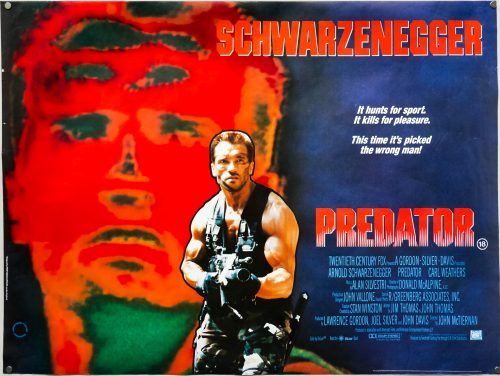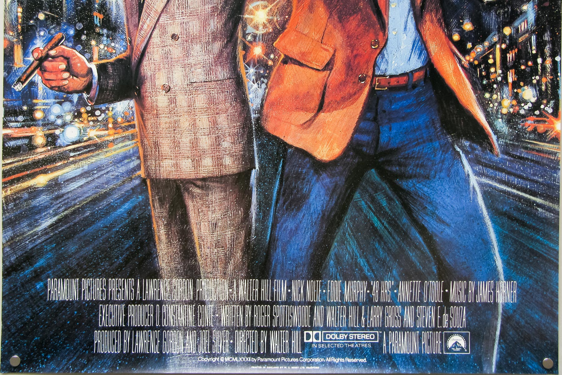
Poster detail
1-5


- Title
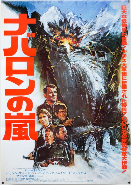
- Force 10 From Navarone
- AKA
- --
- Year of Film
- 1978
- Director
- Guy Hamilton
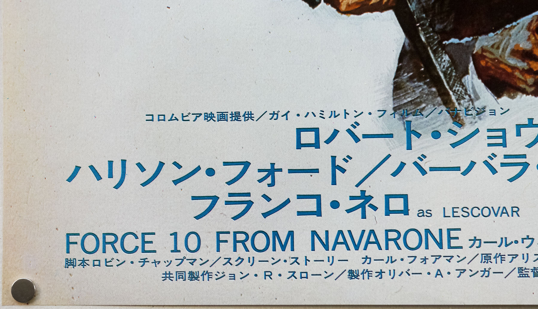
- Starring
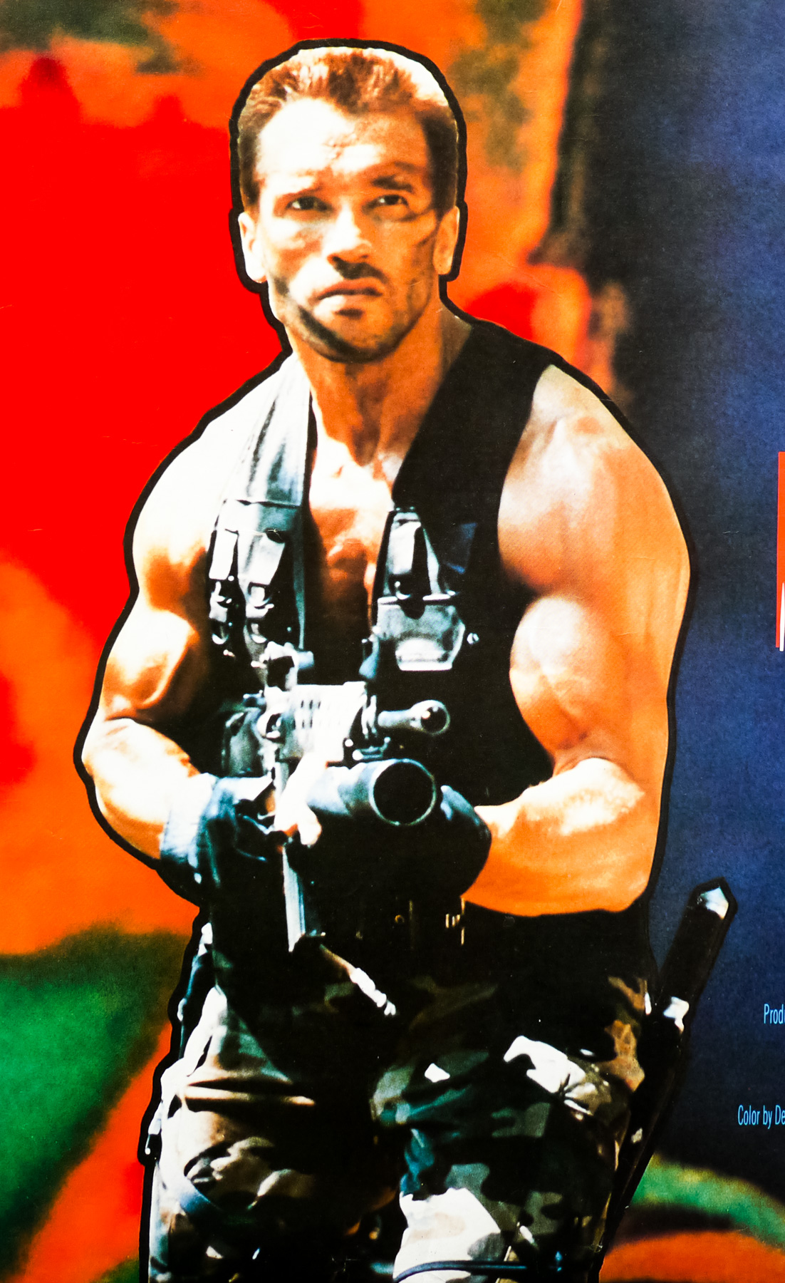
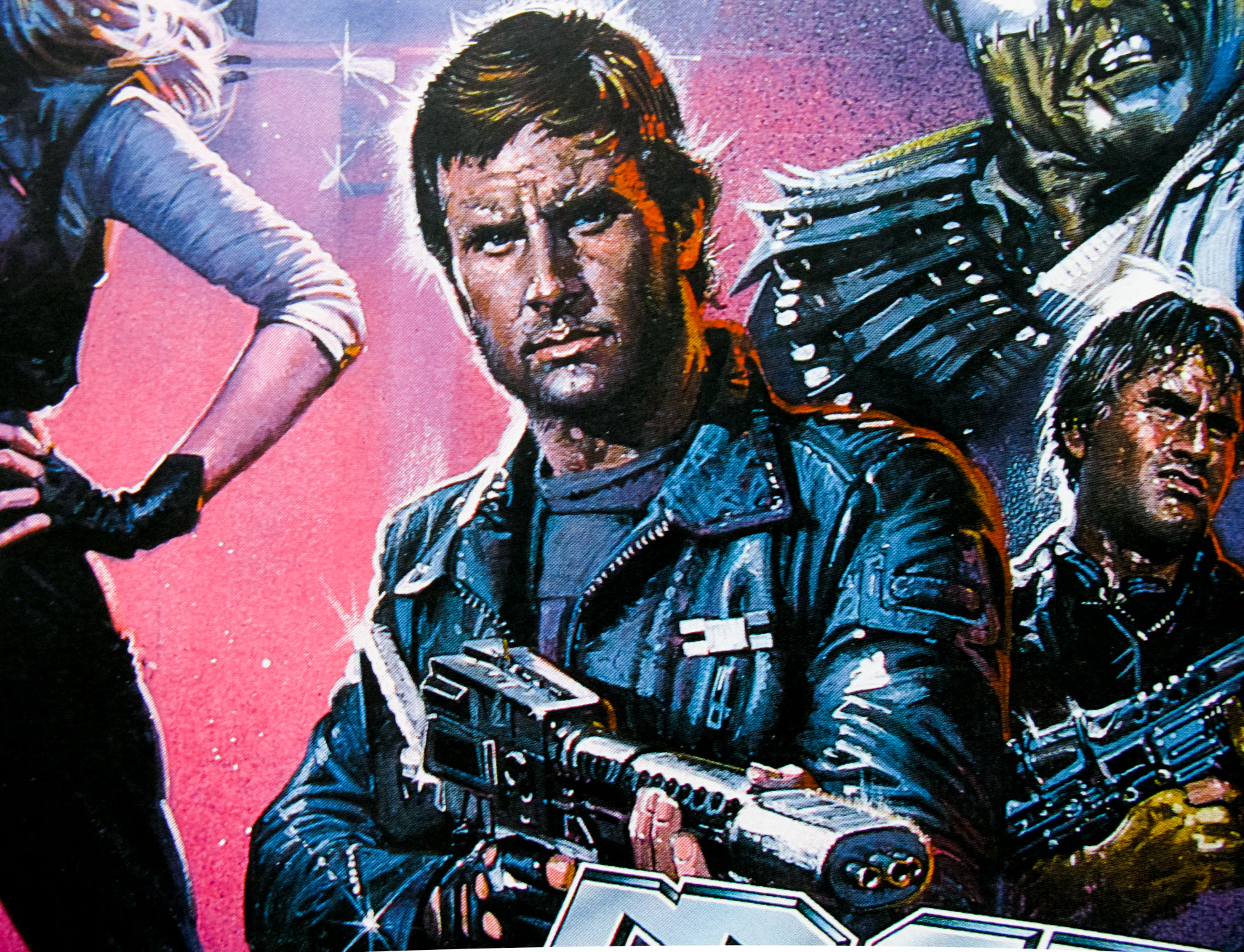
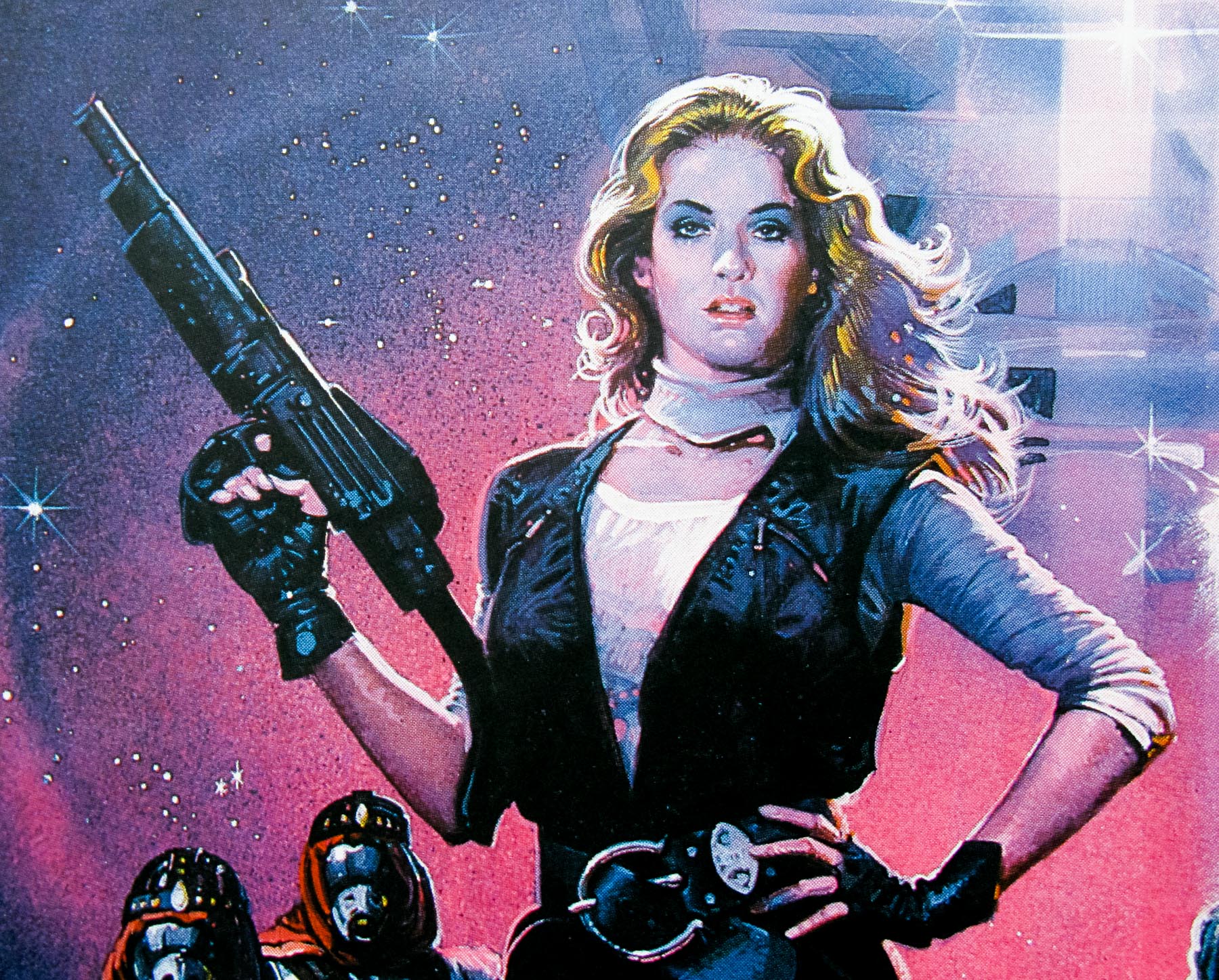
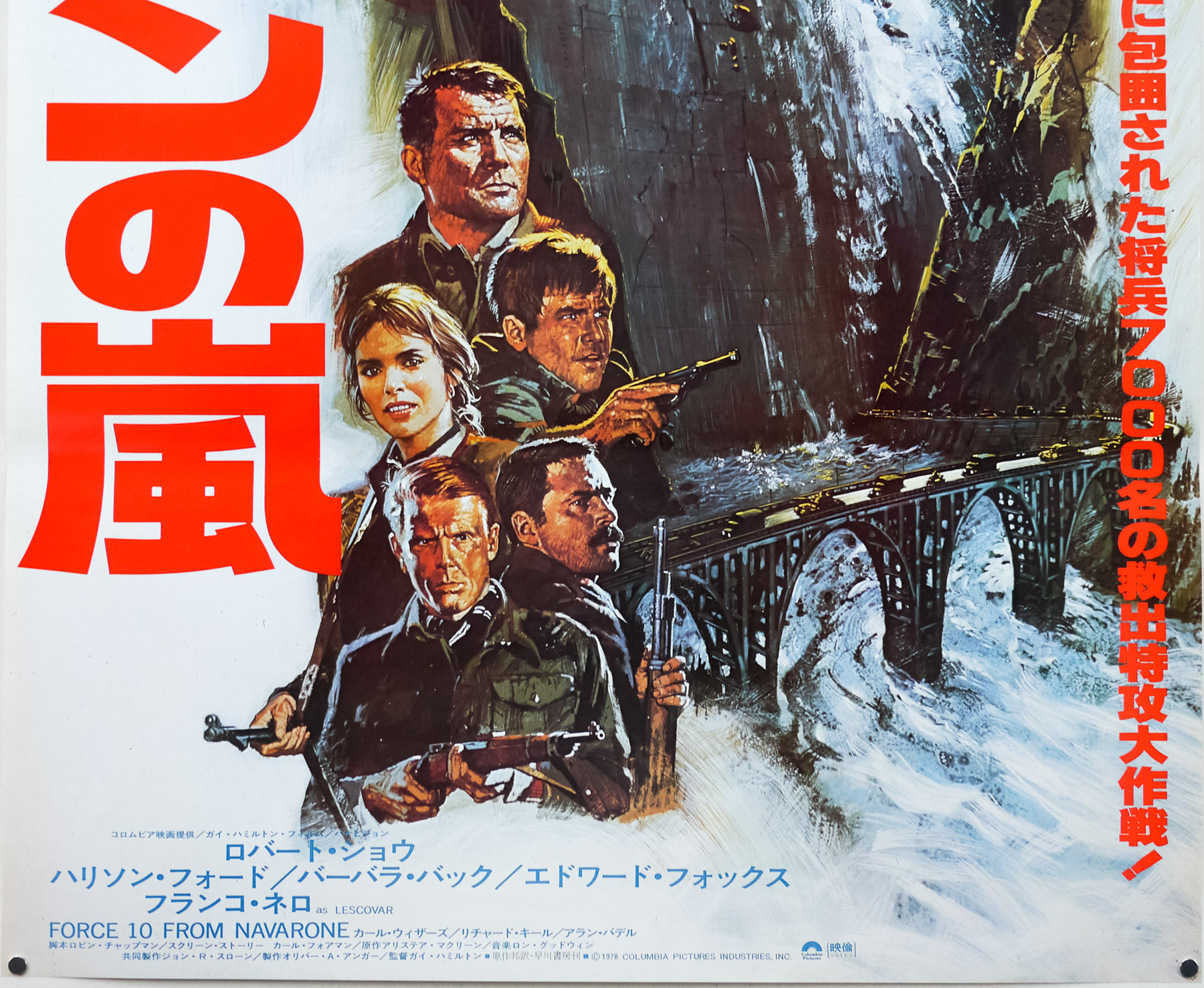
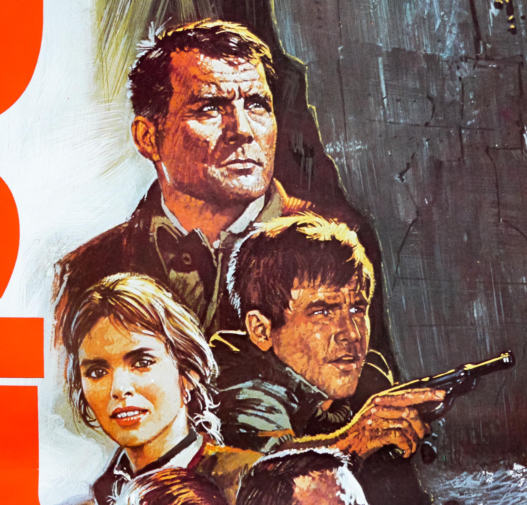
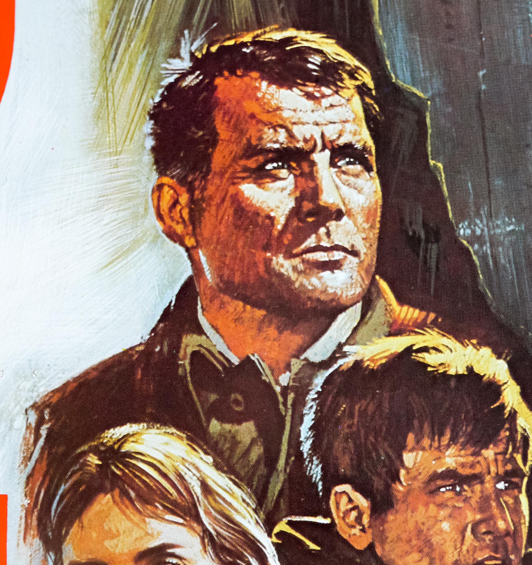
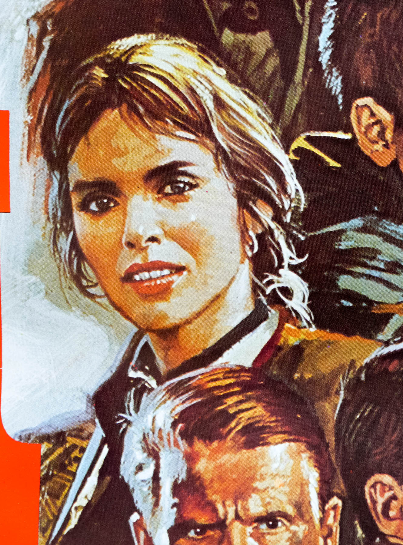
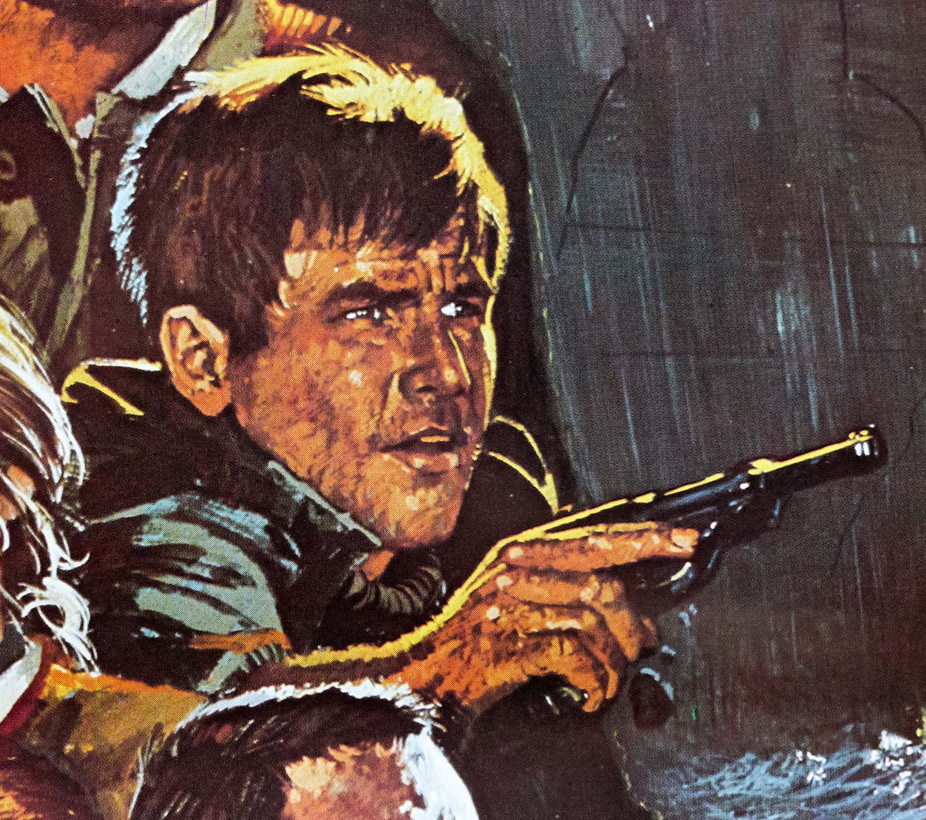
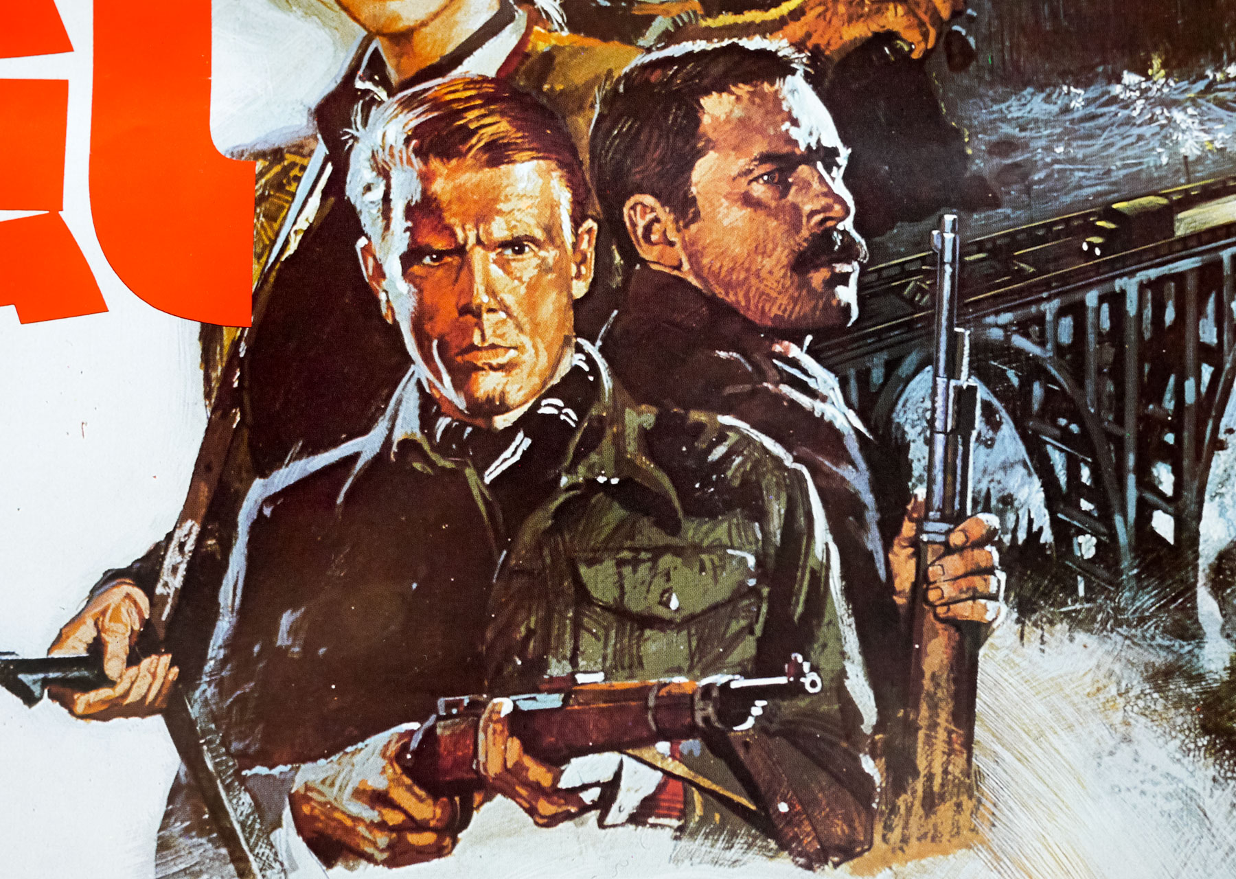
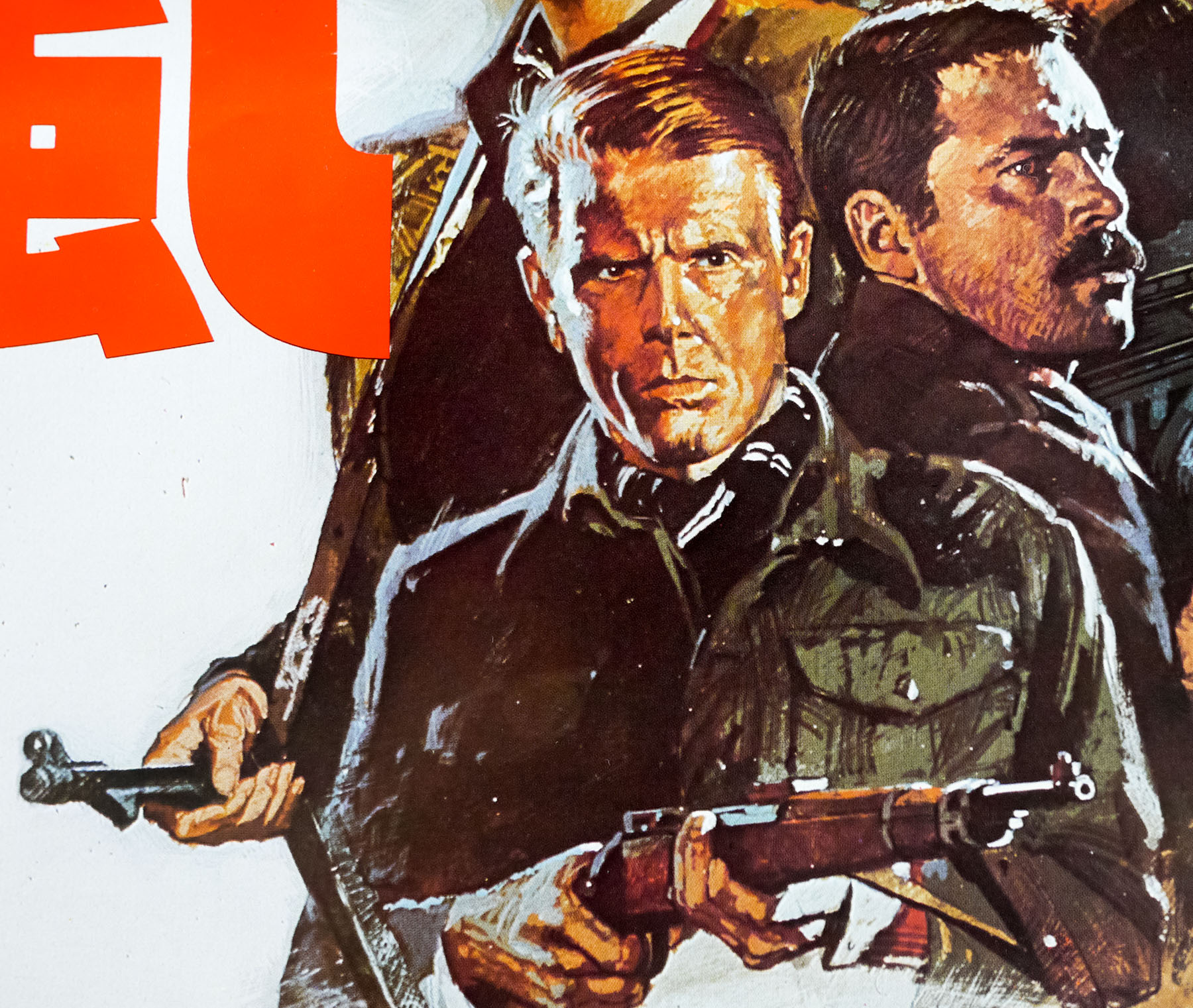
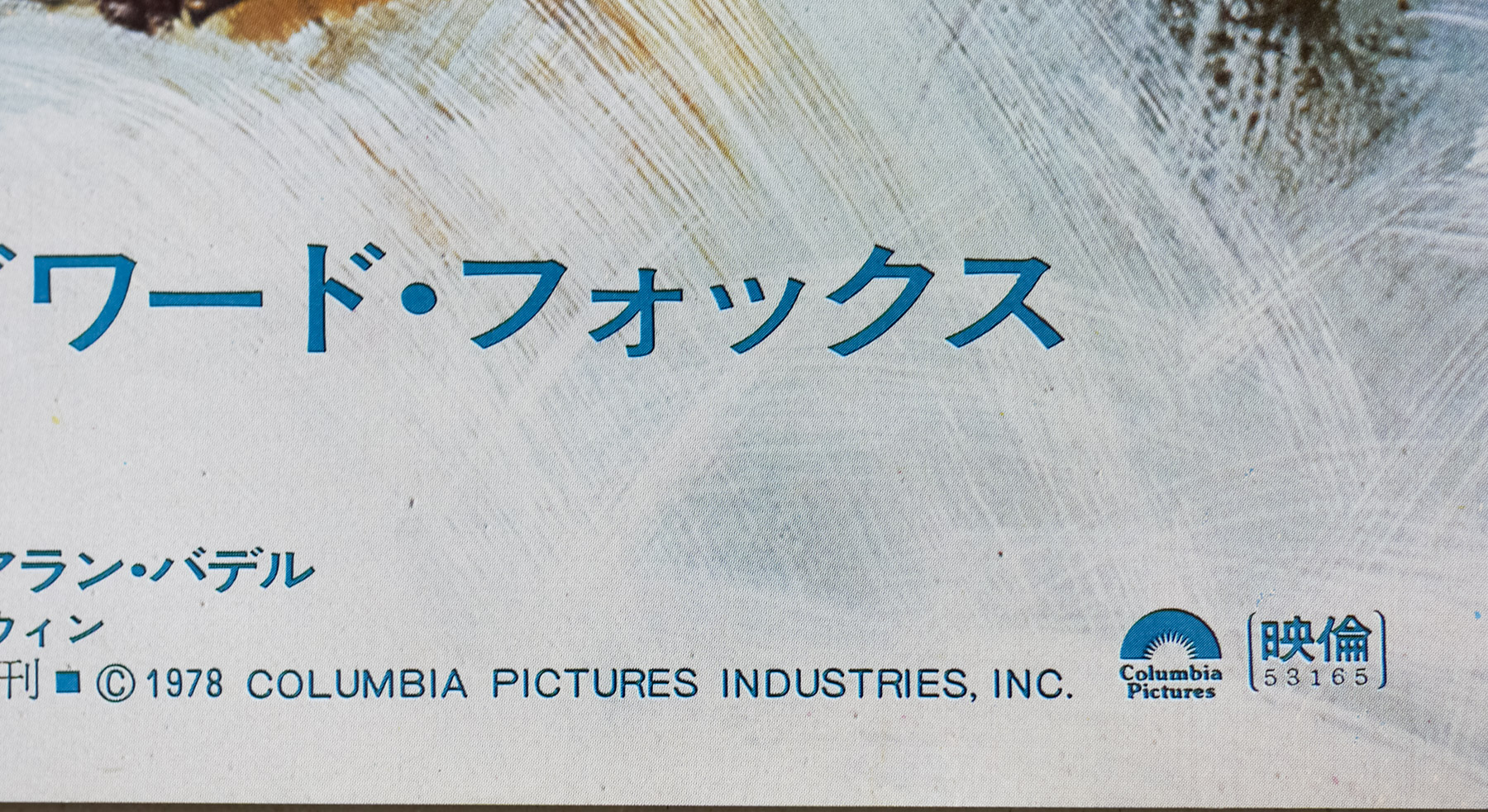
- Robert Shaw, Harrison Ford, Barbara Bach, Edward Fox, Franco Nero, Carl Weathers, Richard Kiel, Alan Badel, Michael Byrne, Philip Latham, Angus MacInnes, Michael Sheard
- Origin of Film
- UK | USA
- Genre(s) of Film
- Robert Shaw, Harrison Ford, Barbara Bach, Edward Fox, Franco Nero, Carl Weathers, Richard Kiel, Alan Badel, Michael Byrne, Philip Latham, Angus MacInnes, Michael Sheard,
- Type of Poster
- B2
- Style of Poster
- --
- Origin of Poster
- Japan
- Year of Poster
- 1978
- Designer
- Unknown
- Artist
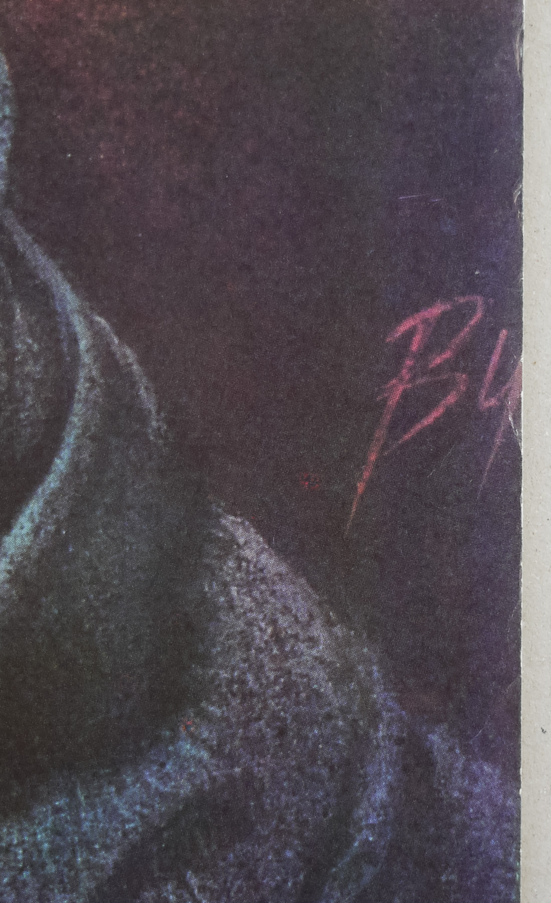
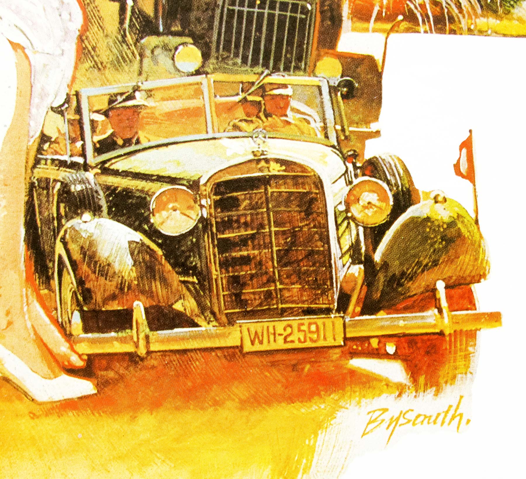
- Brian Bysouth
- Size (inches)
- 20 6/16" x 28 12/16"
- SS or DS
- SS
- Tagline
- --
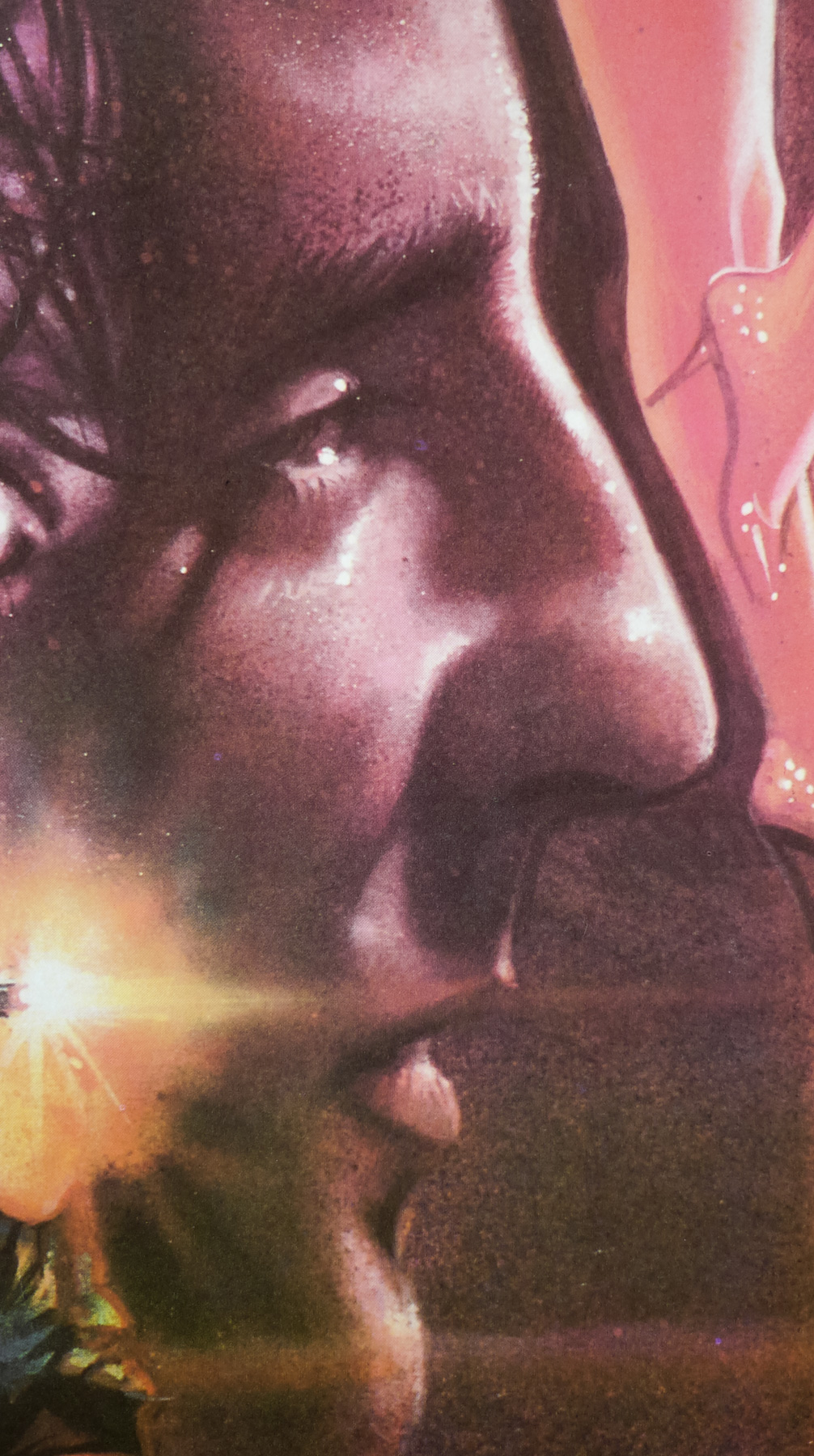
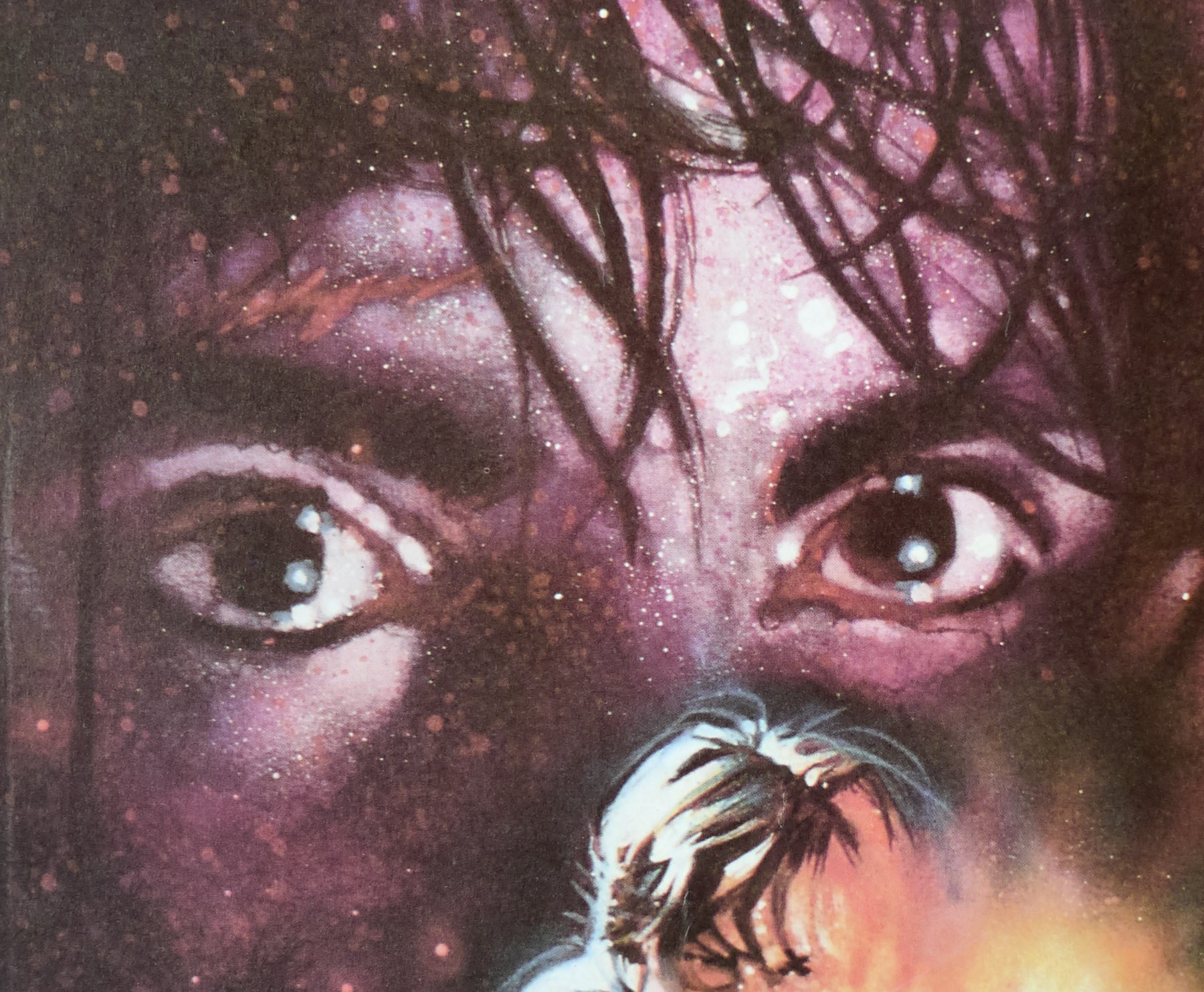
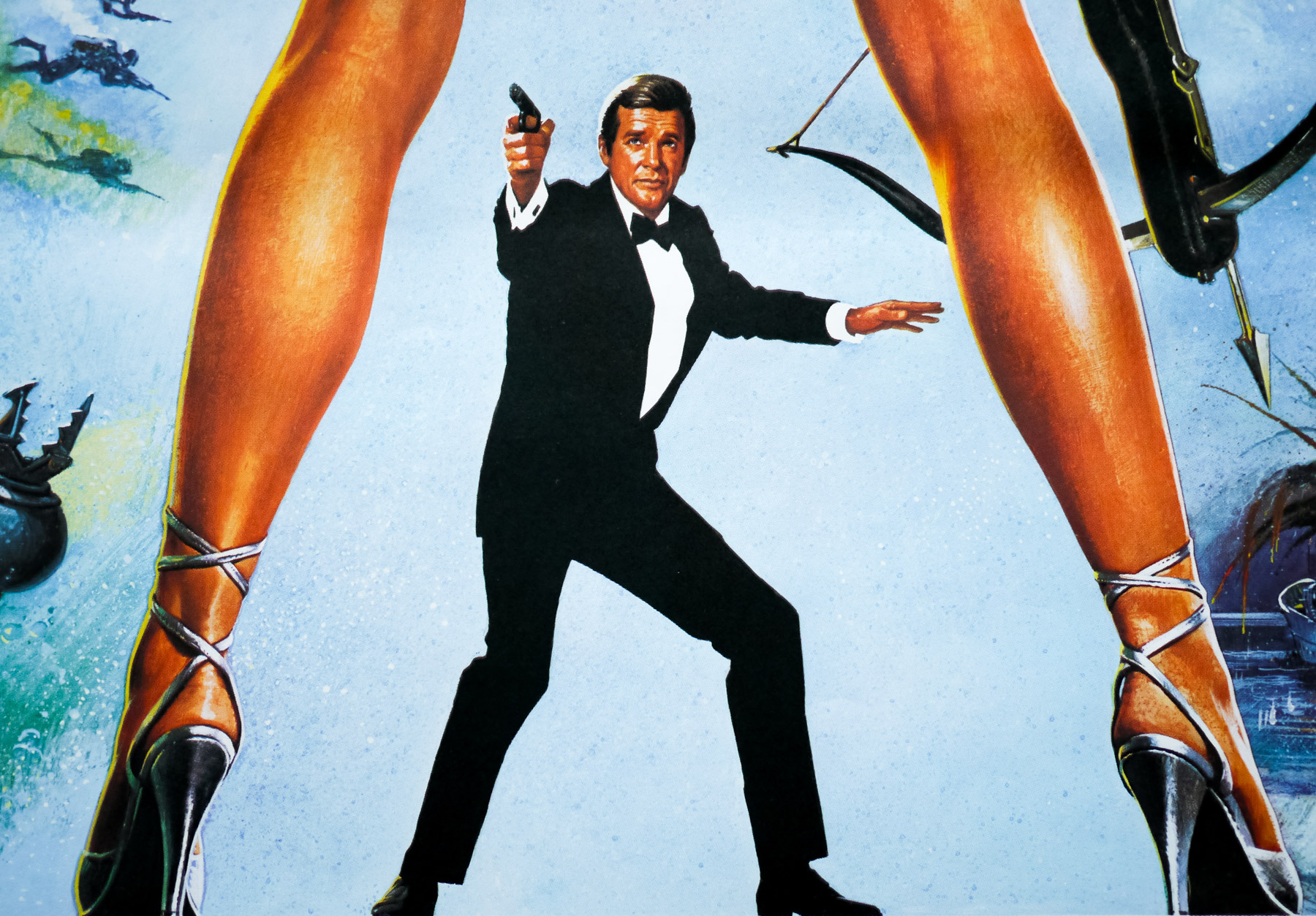
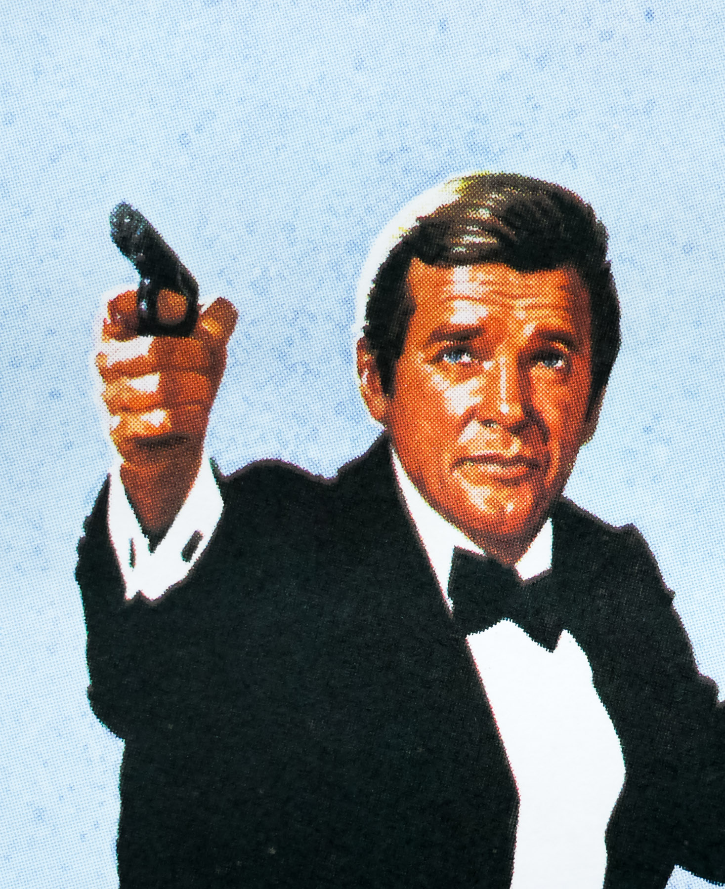
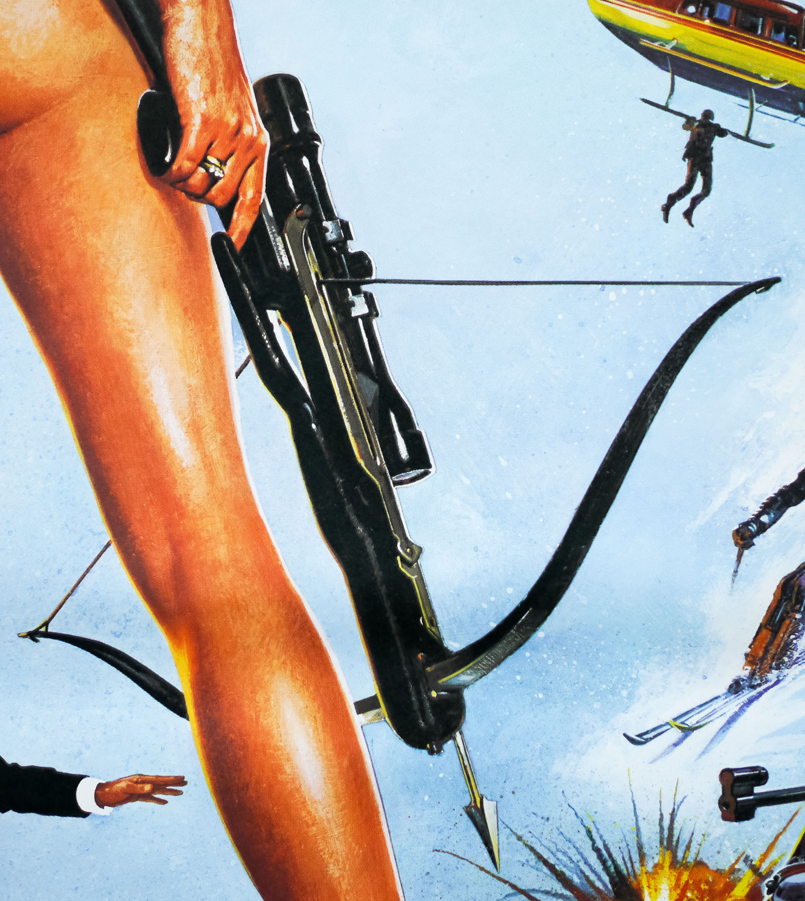
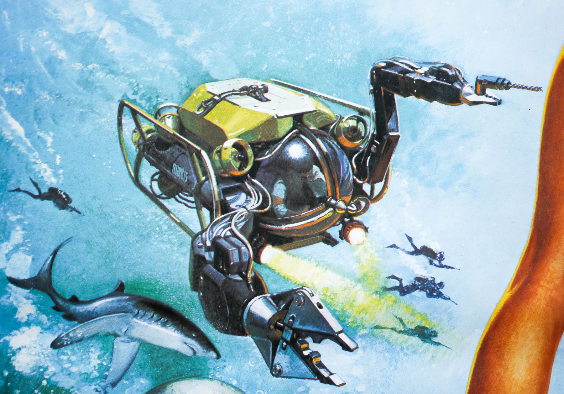
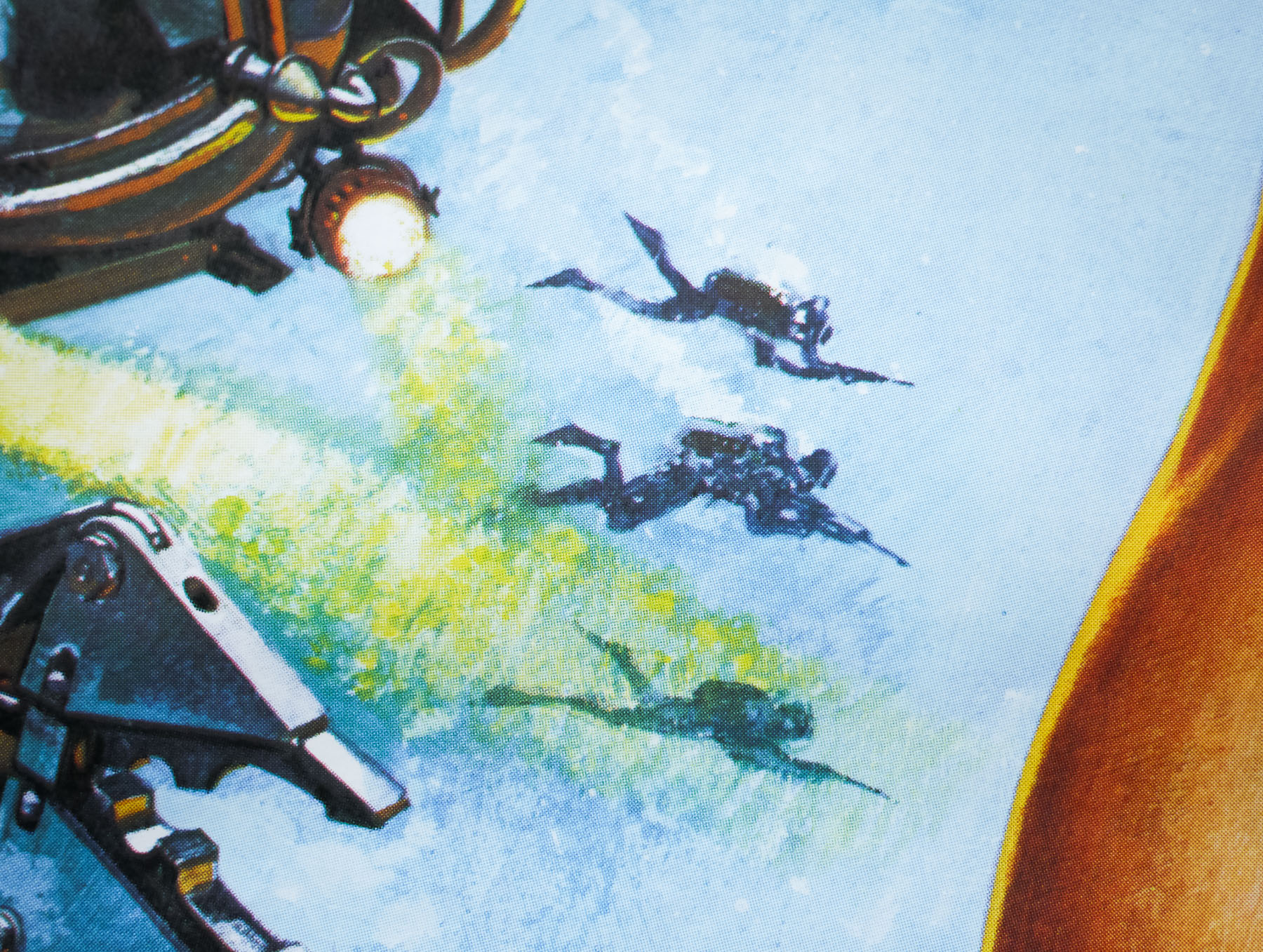
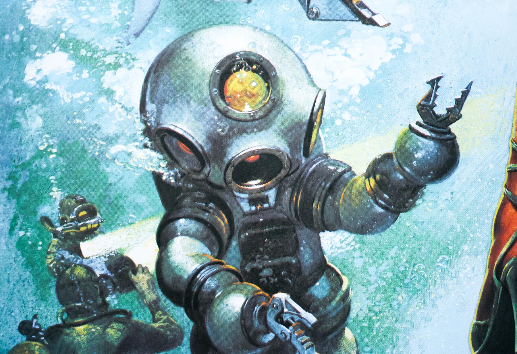
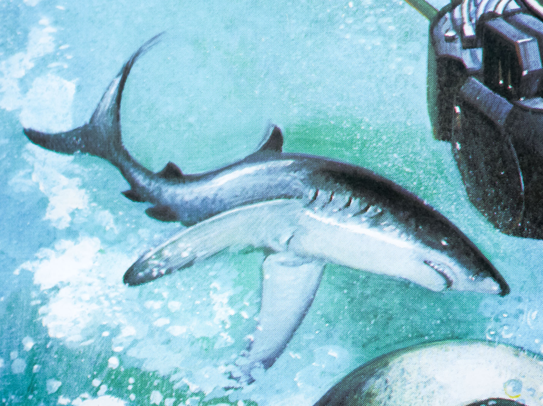
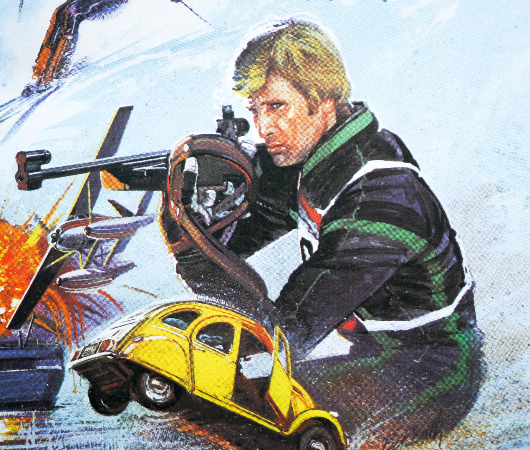
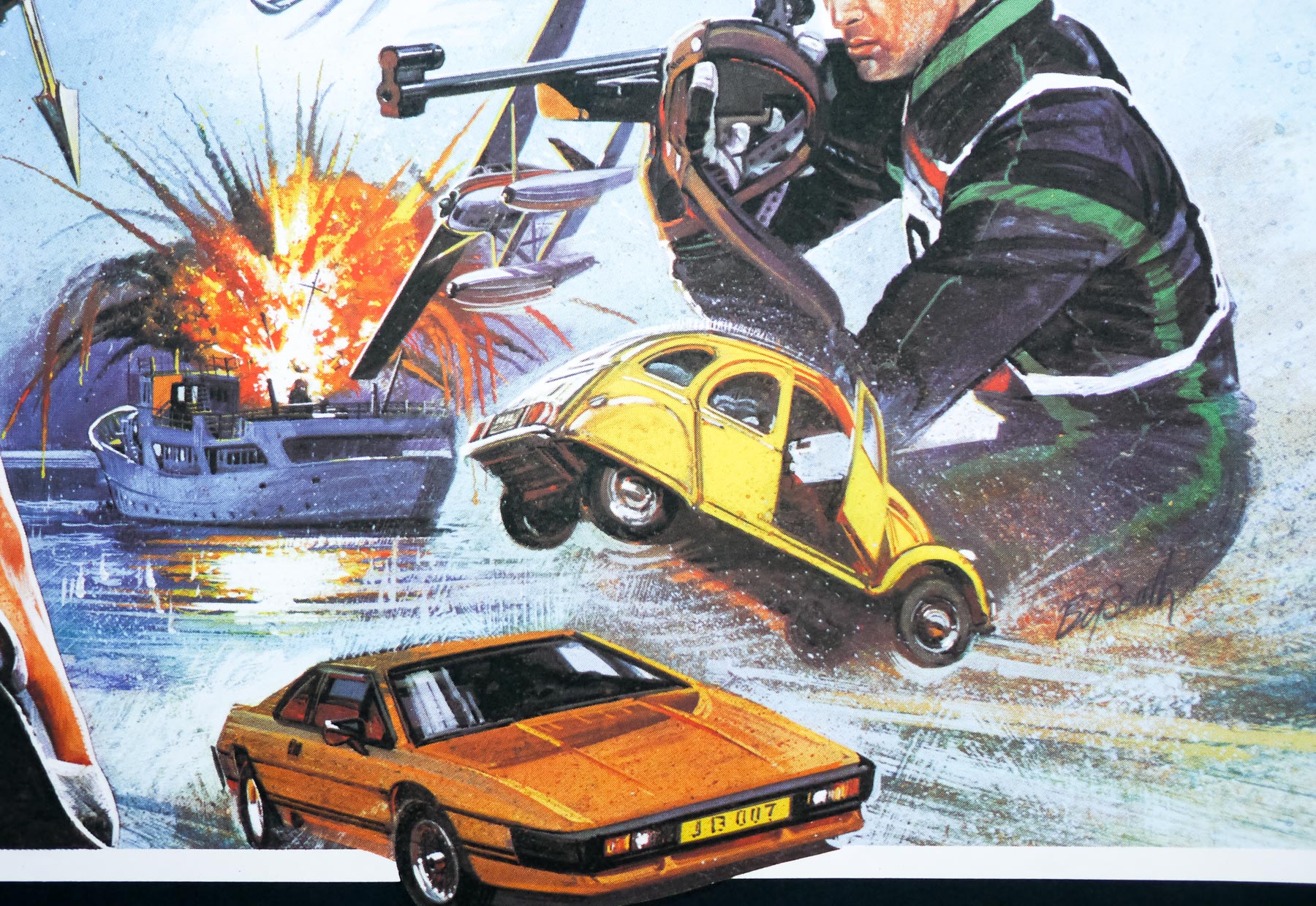
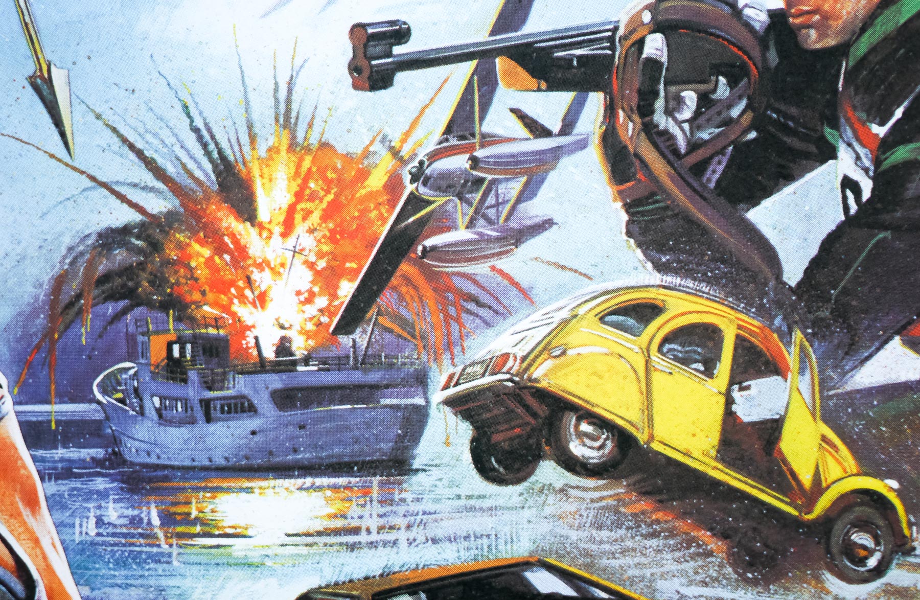
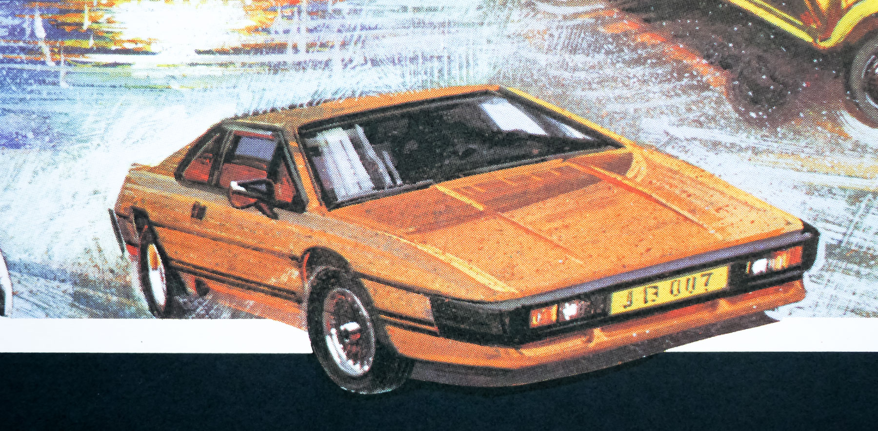
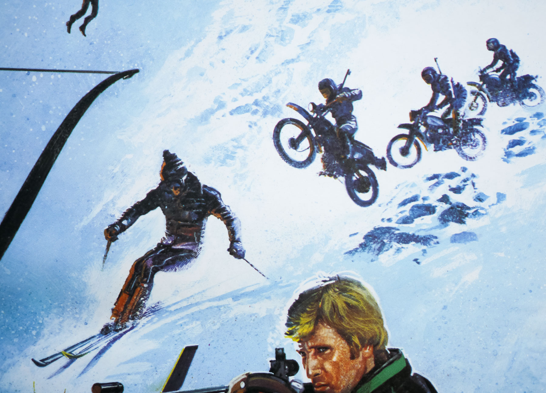
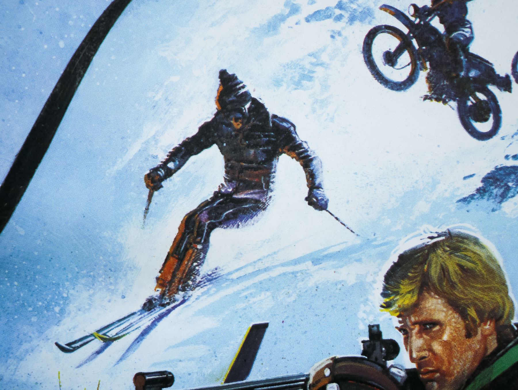
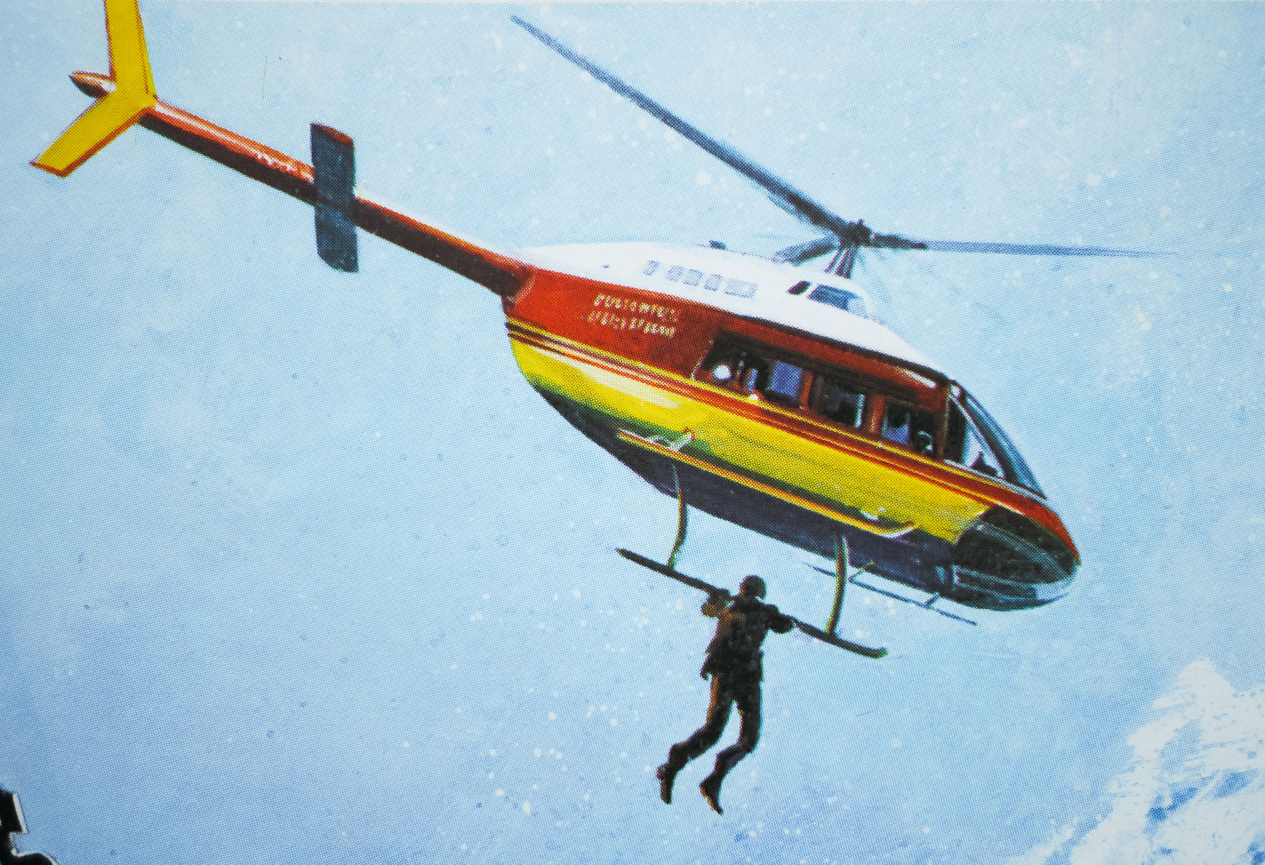
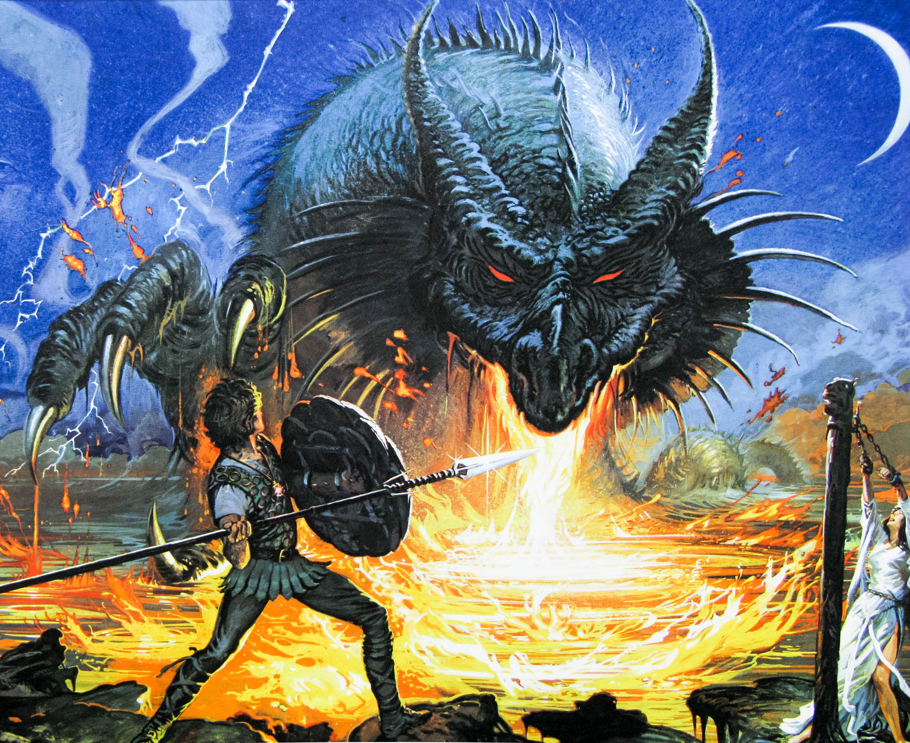
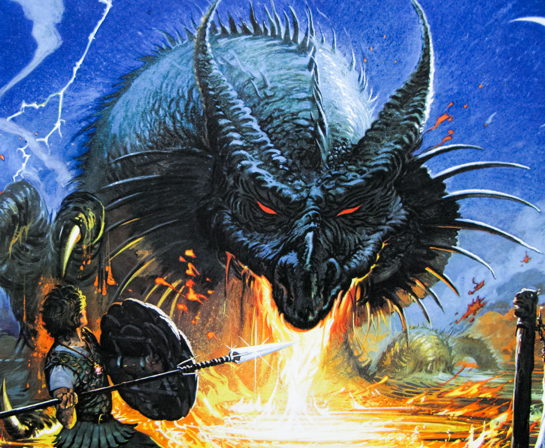
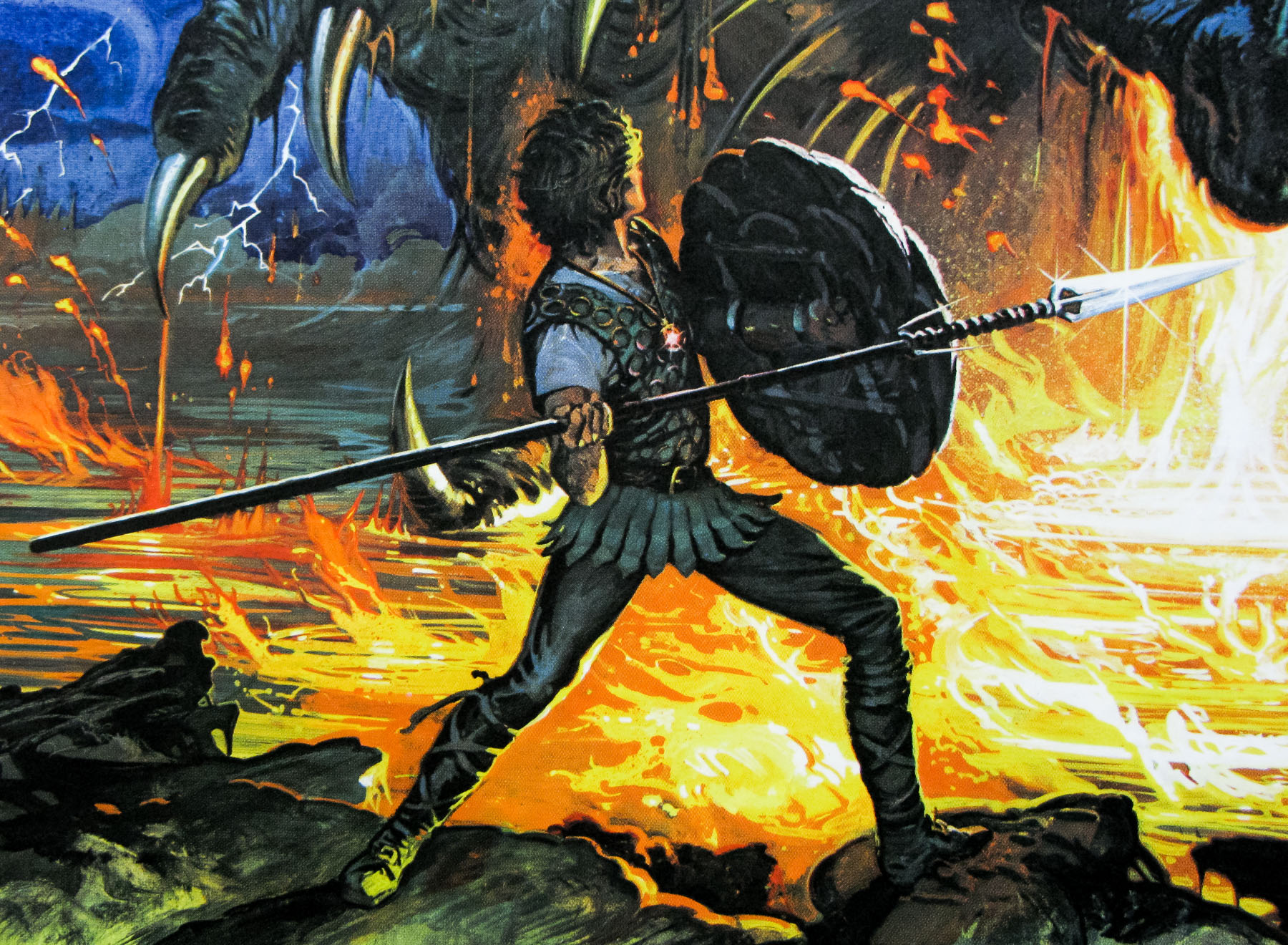
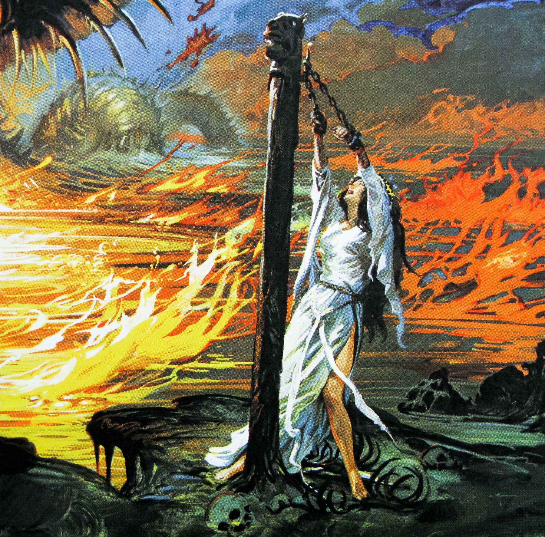
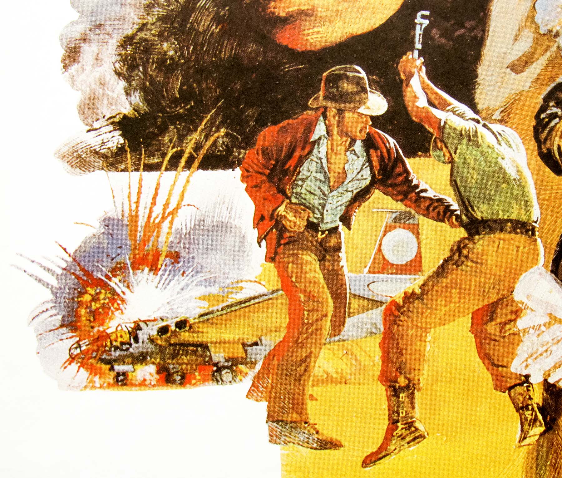
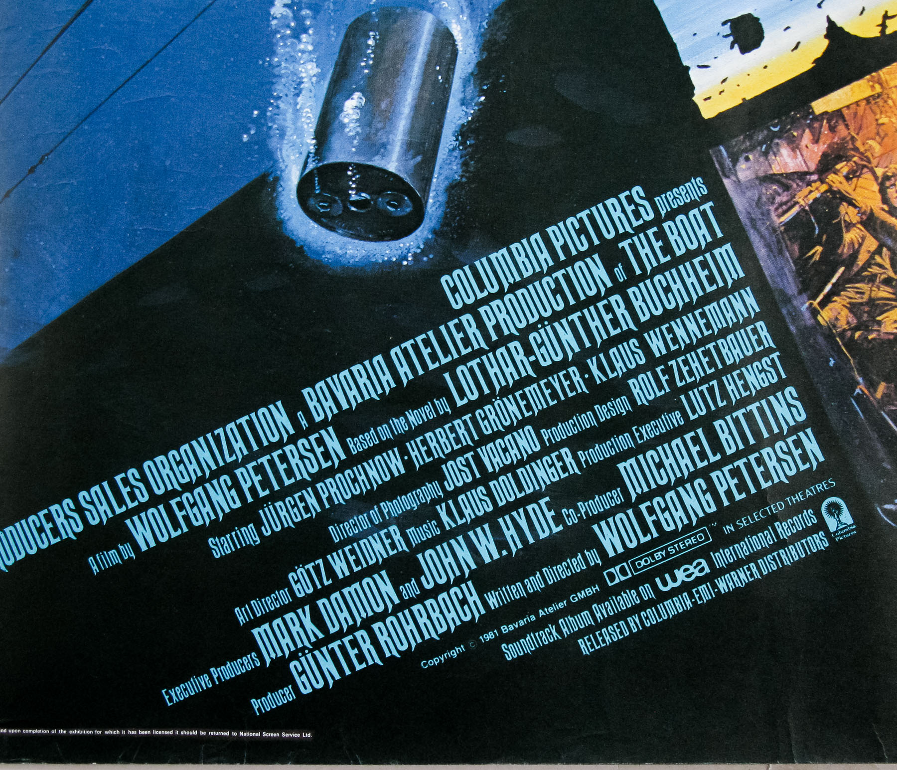
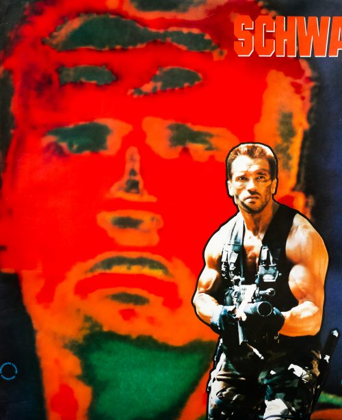
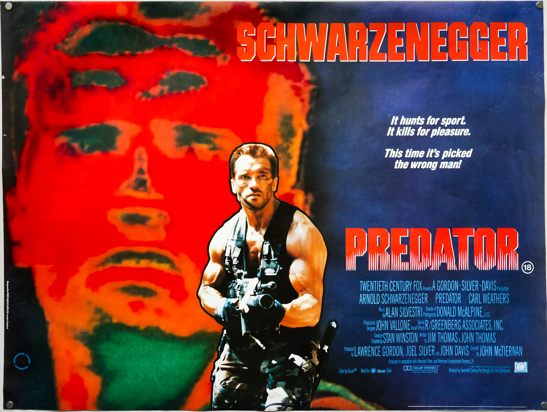
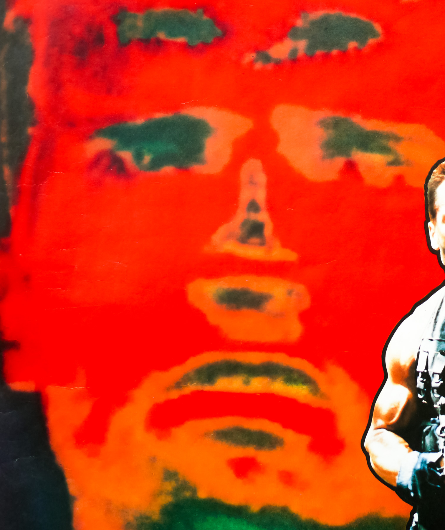
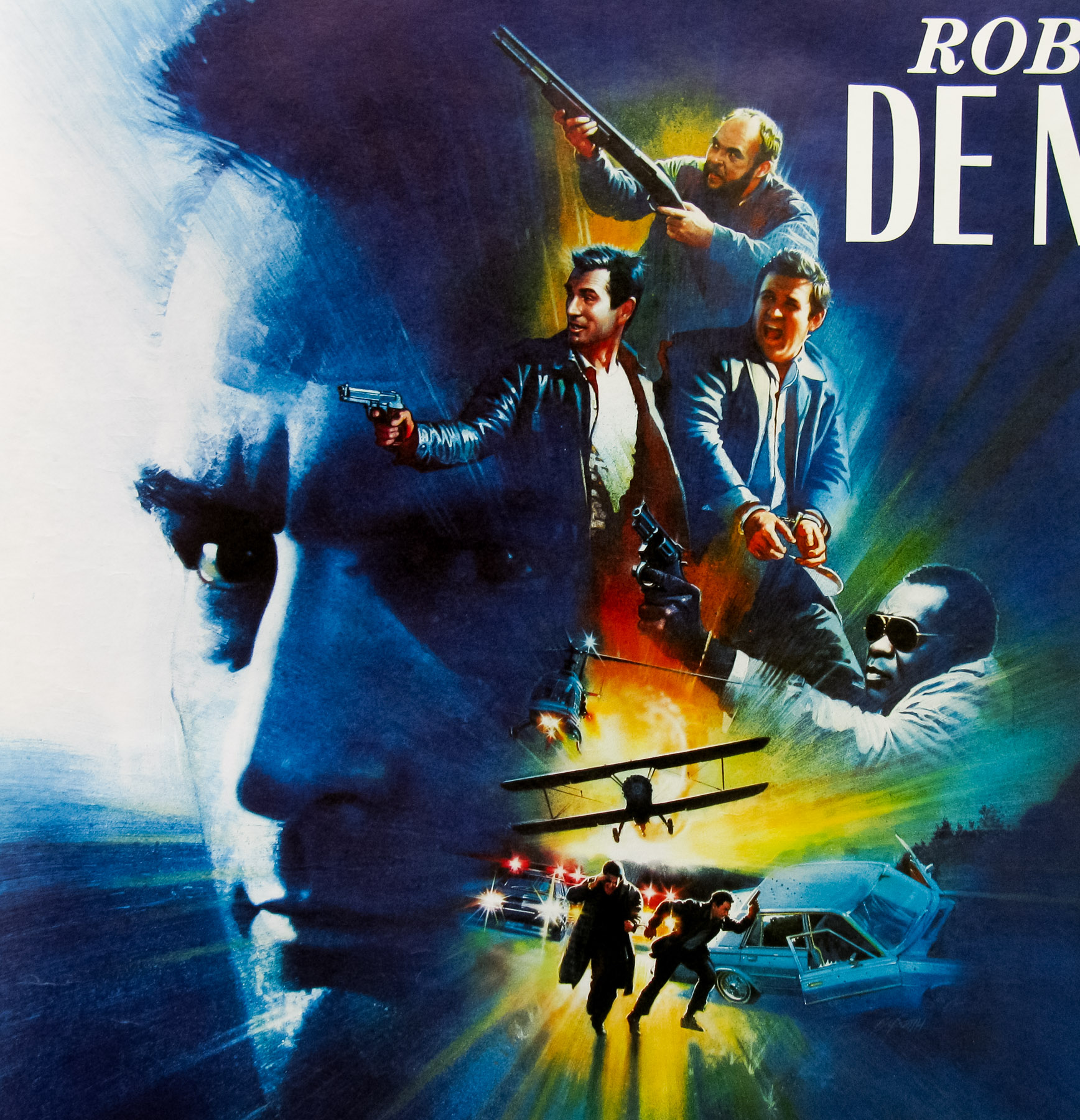
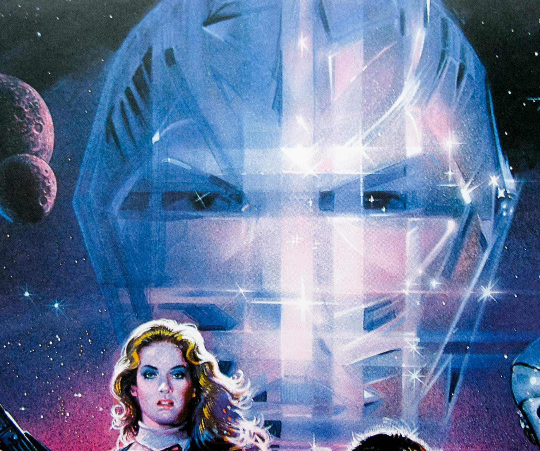
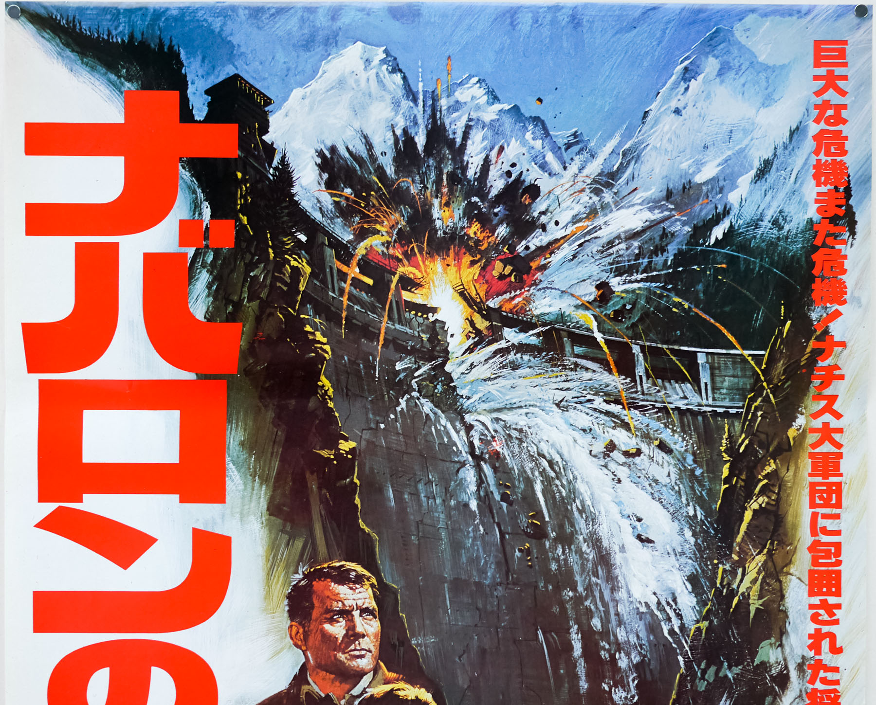
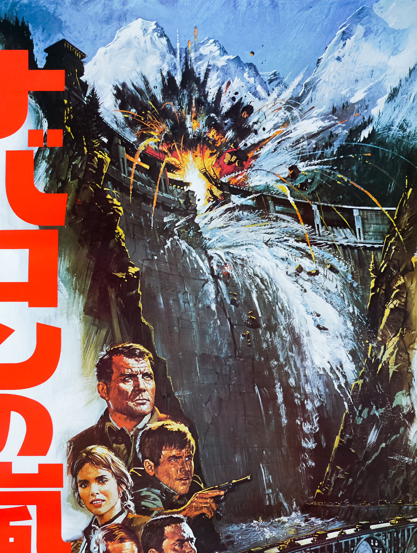
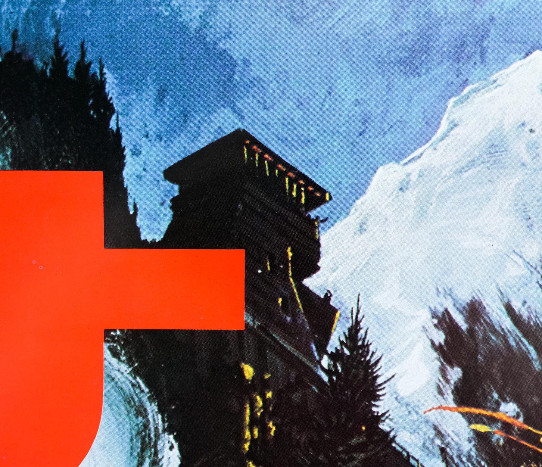
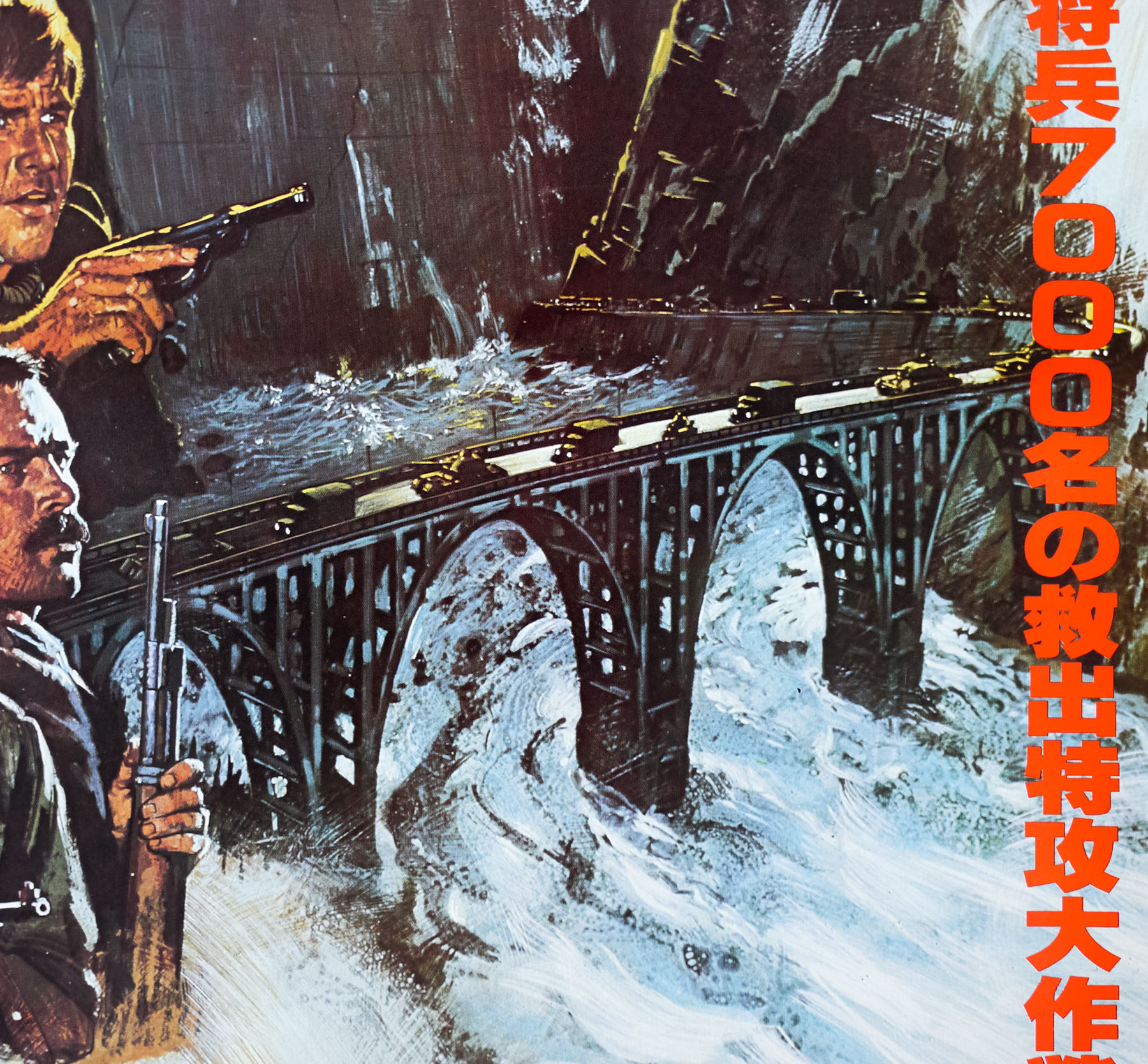
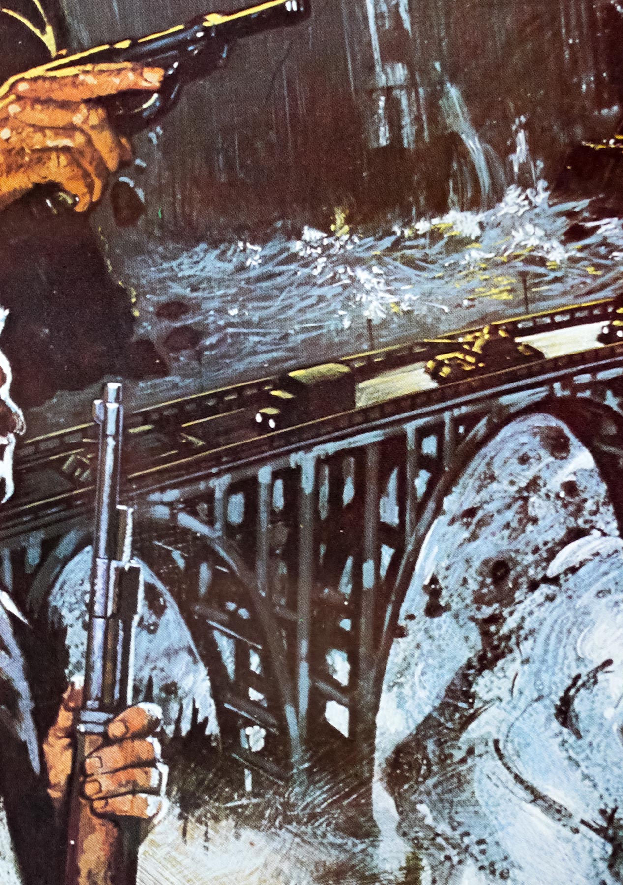
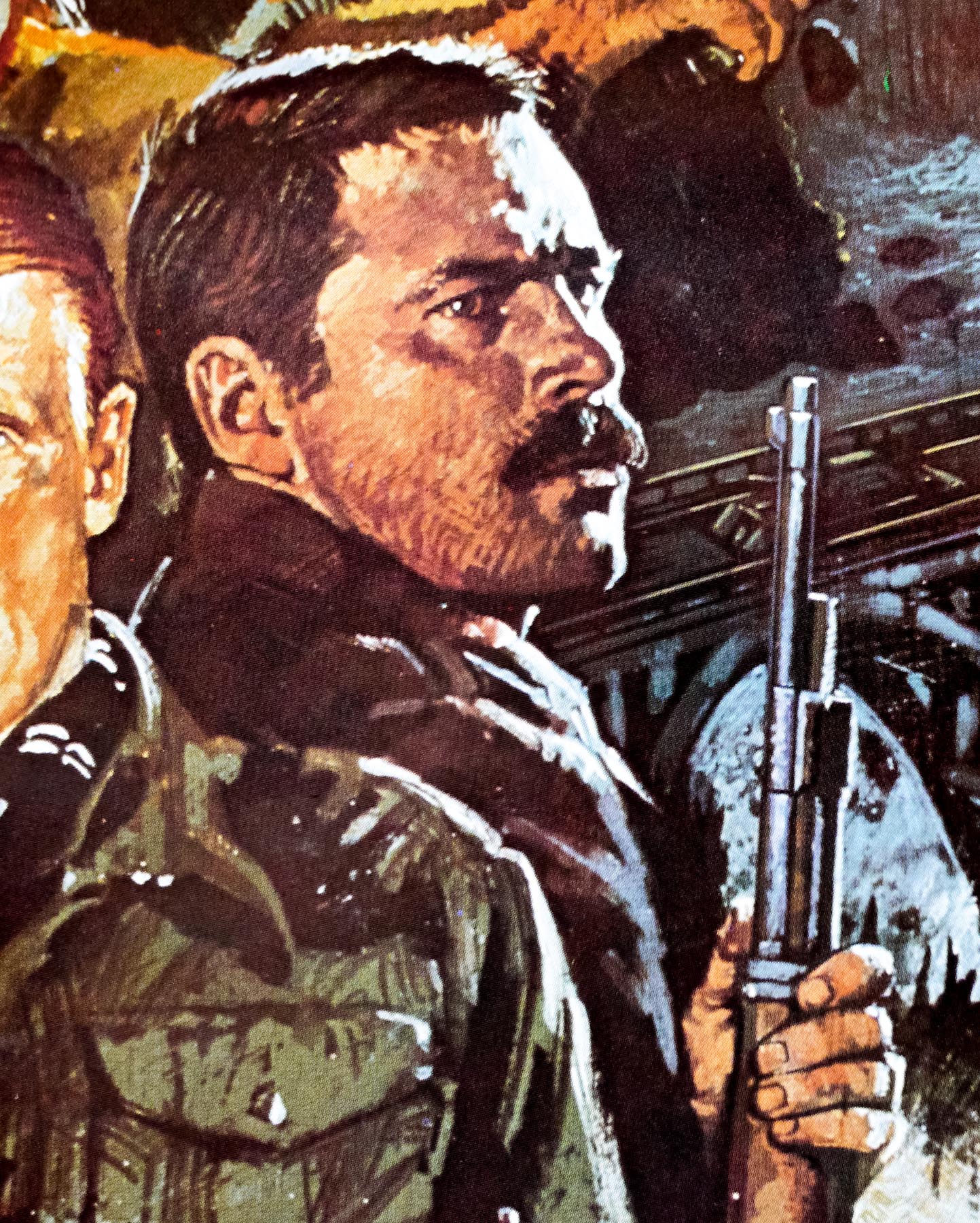
Typically detailed artwork by the British artist Brian Bysouth features on this Japanese poster for the release of the 1978 film Force 10 From Navarone. Created as a sequel to the 1961 film The Guns of Navarone, the film is loosely based on the 1968 novel of the same name by Alistair MacLean. The 17 year gap between films was due to MacLean’s treatment of a sequel to ‘Guns…’, written shortly after the original film was met with box-office success, becoming bogged down in development hell. When it was clear that the production was going nowhere MacLean turned his treatment into a novel. The Producer of ‘Guns…’, Carl Foreman, spent years trying to get the sequel off the ground and eventually succeeded by scraping together a budget from five different international sources. The final screenplay bears little resemblance to MacLean’s novel released a decade earlier.
Because almost two decades had passed since ‘Guns…’, the two actors who had played the leads in that film, Gregory Peck and David Niven, were decided to be too old to convince as the leads and the parts of Miller and Mallory were awarded to Edward Fox and Robert Shaw. Brit director Guy Hamilton, best known for a number of James Bond adventures, including Goldfinger and Diamonds are Forever, was given the task of directing, having impressed with his 1969 WWII film ‘Battle of Britain’.
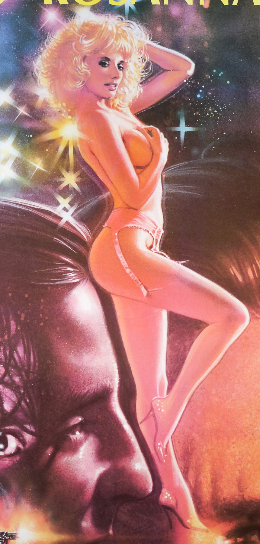
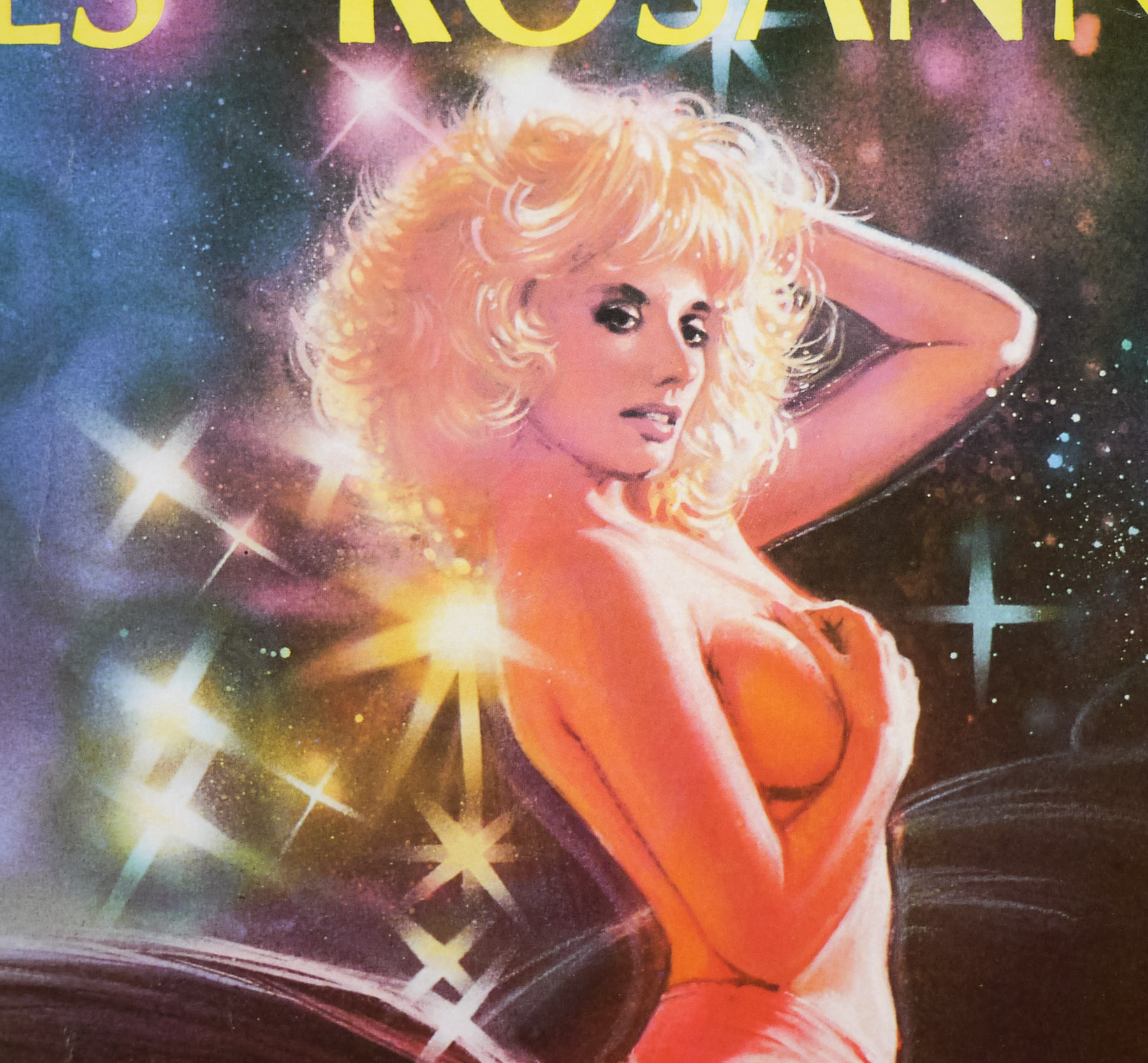
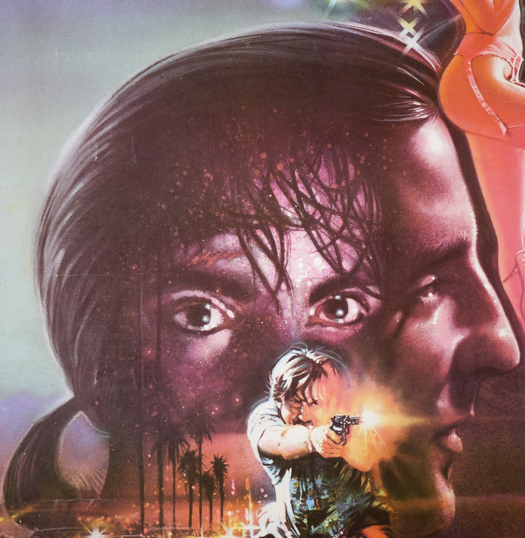
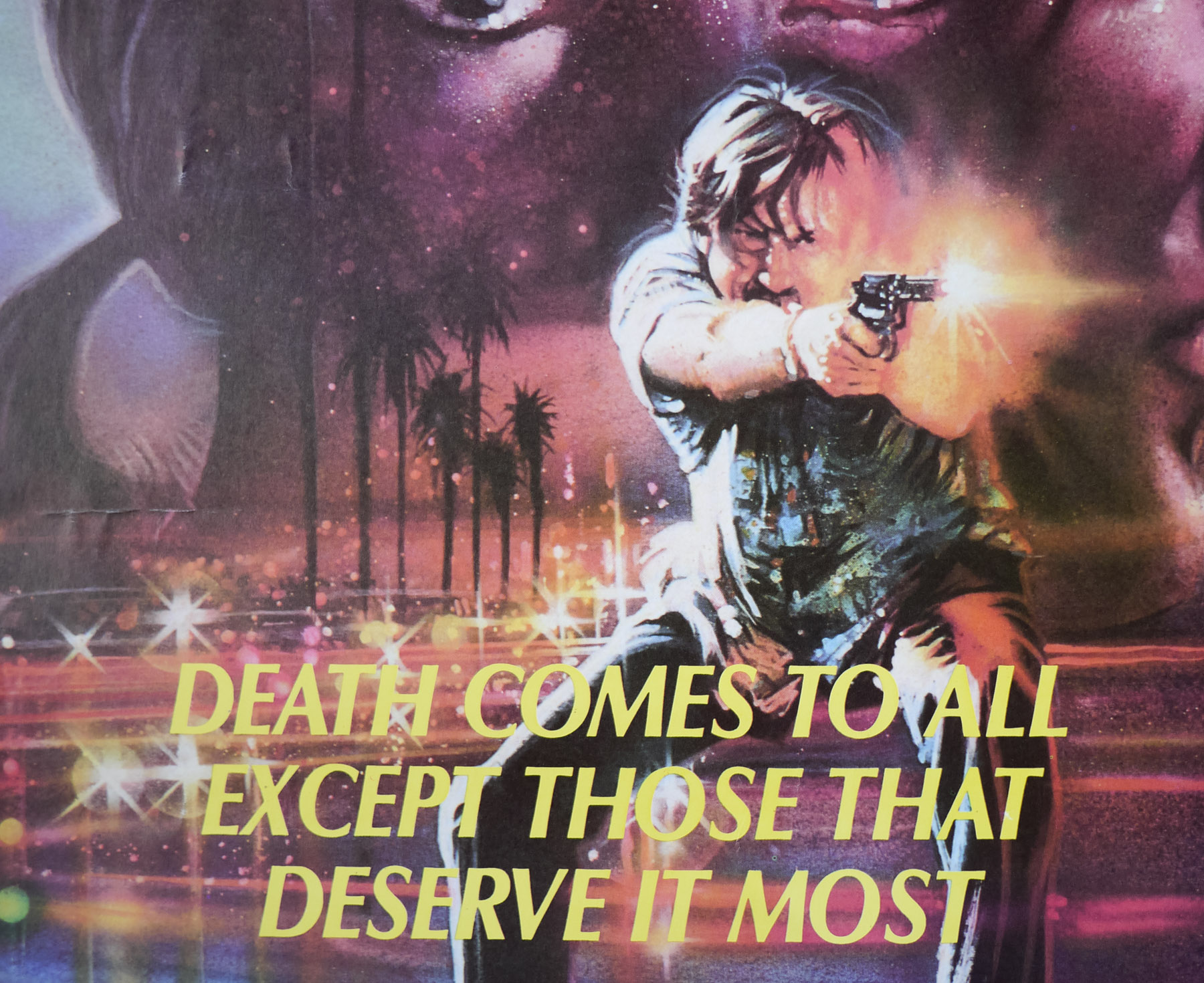
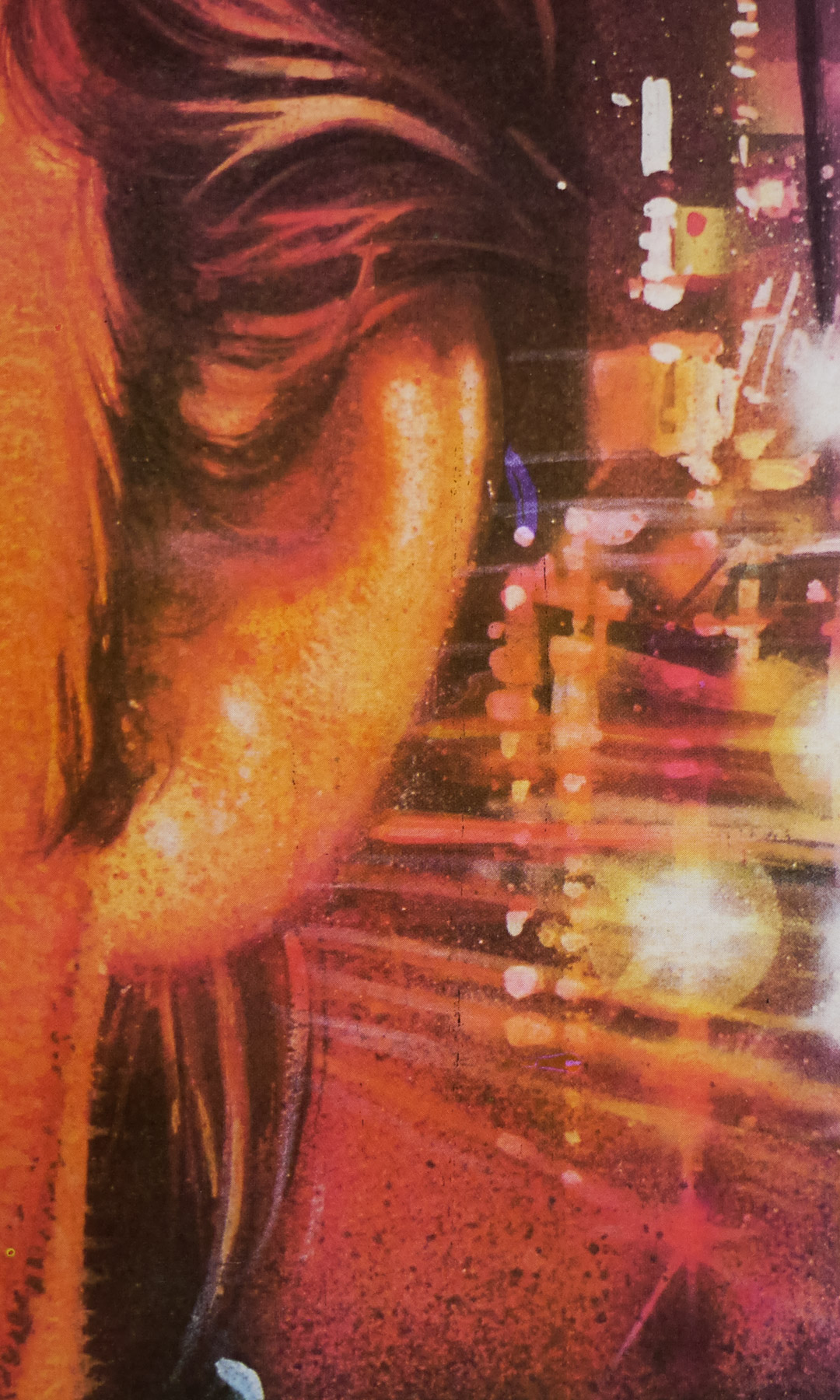
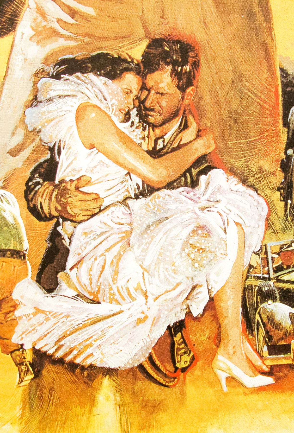
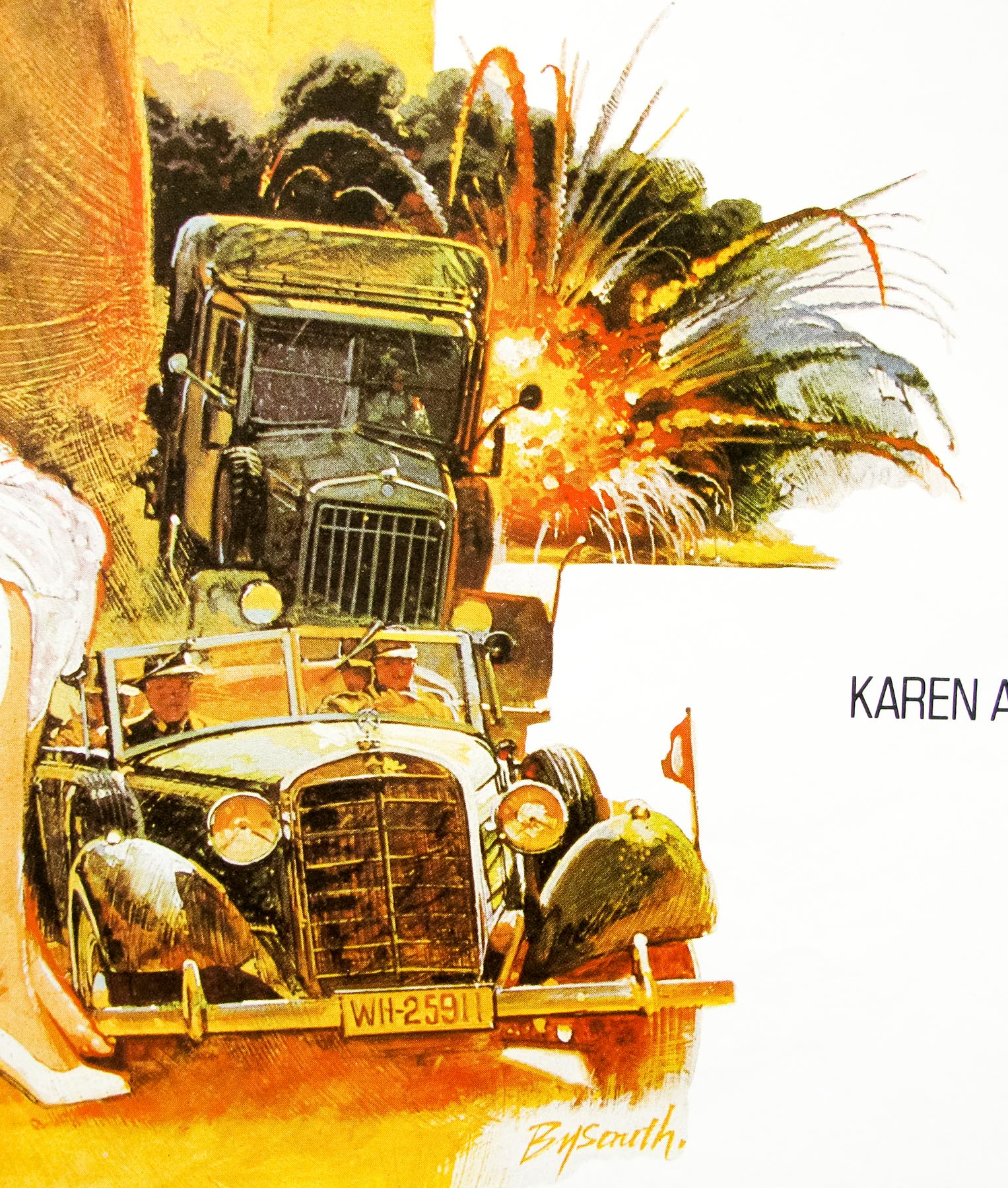
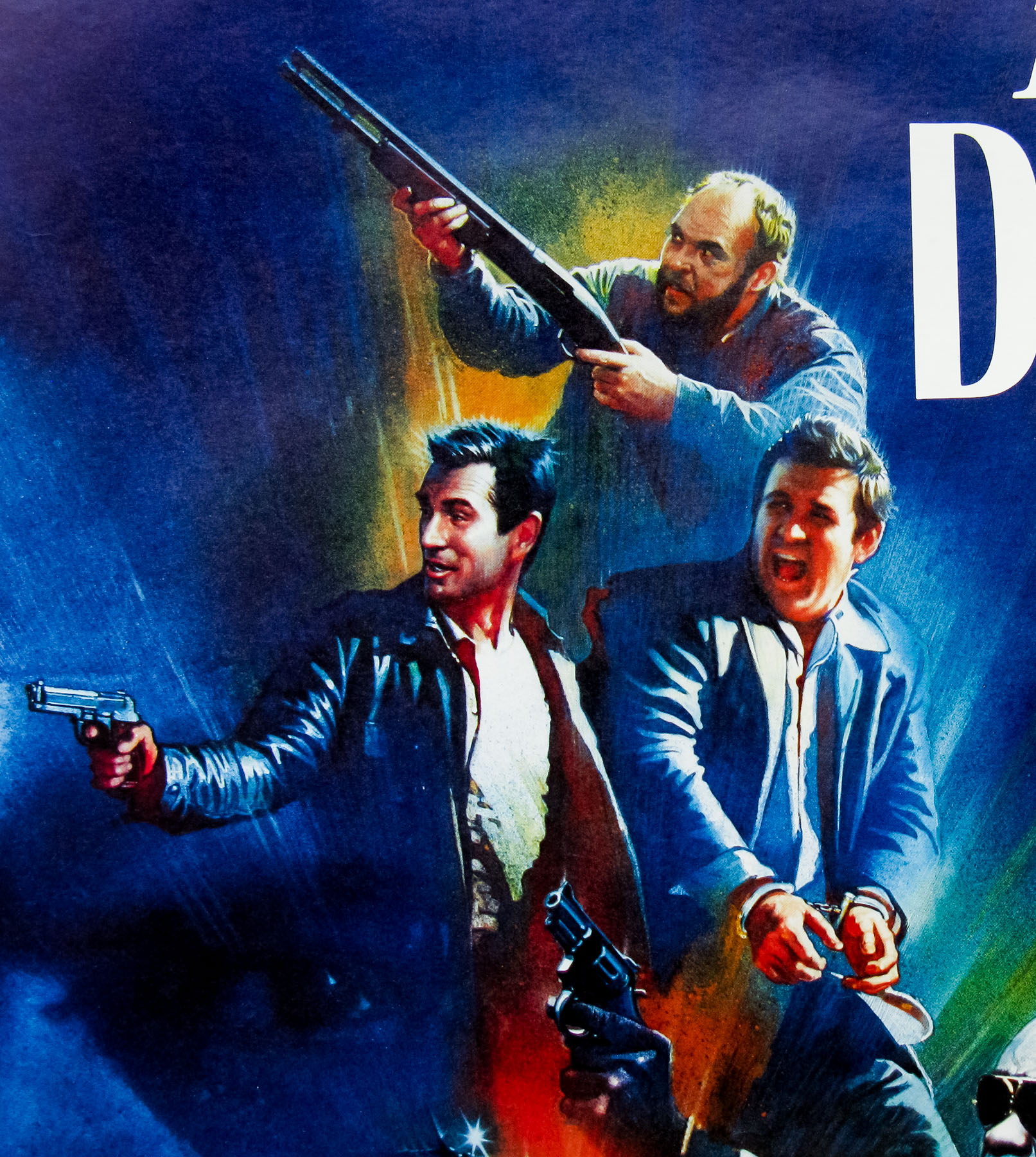
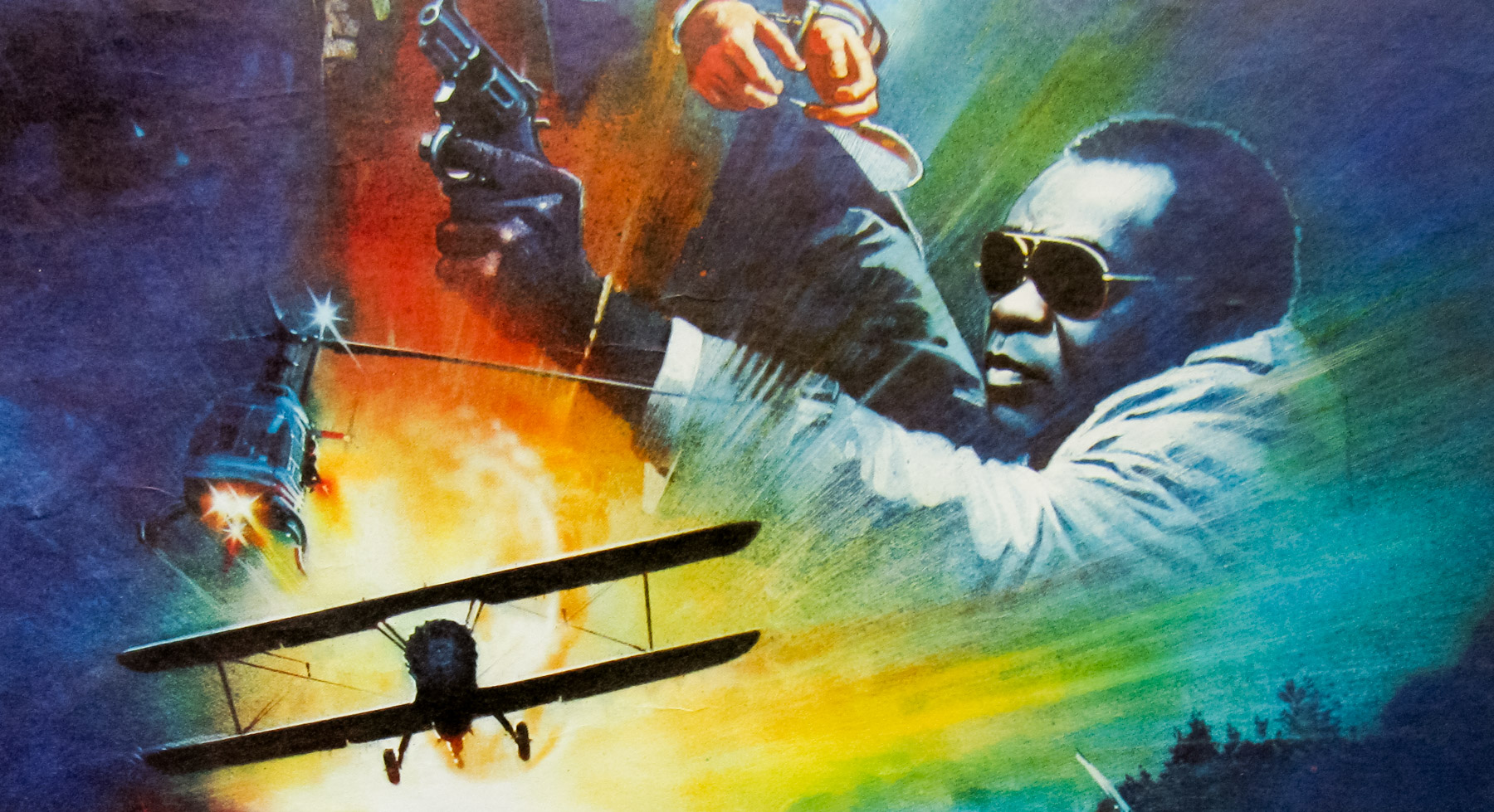
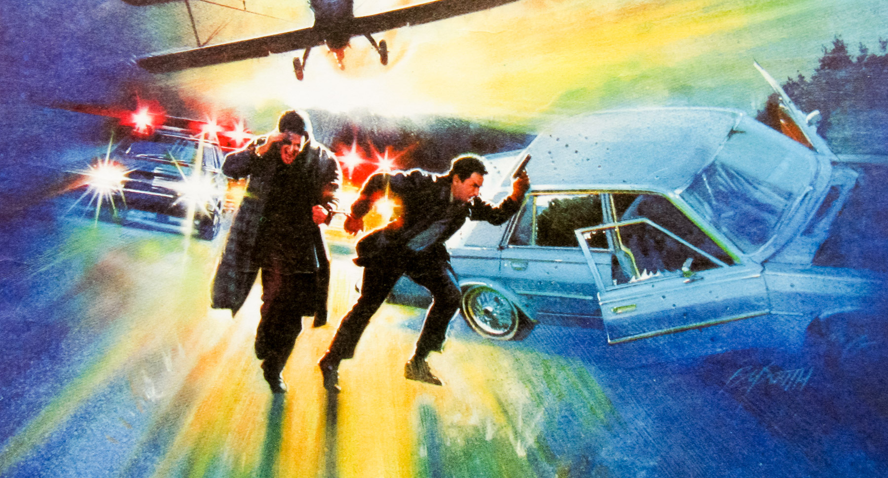
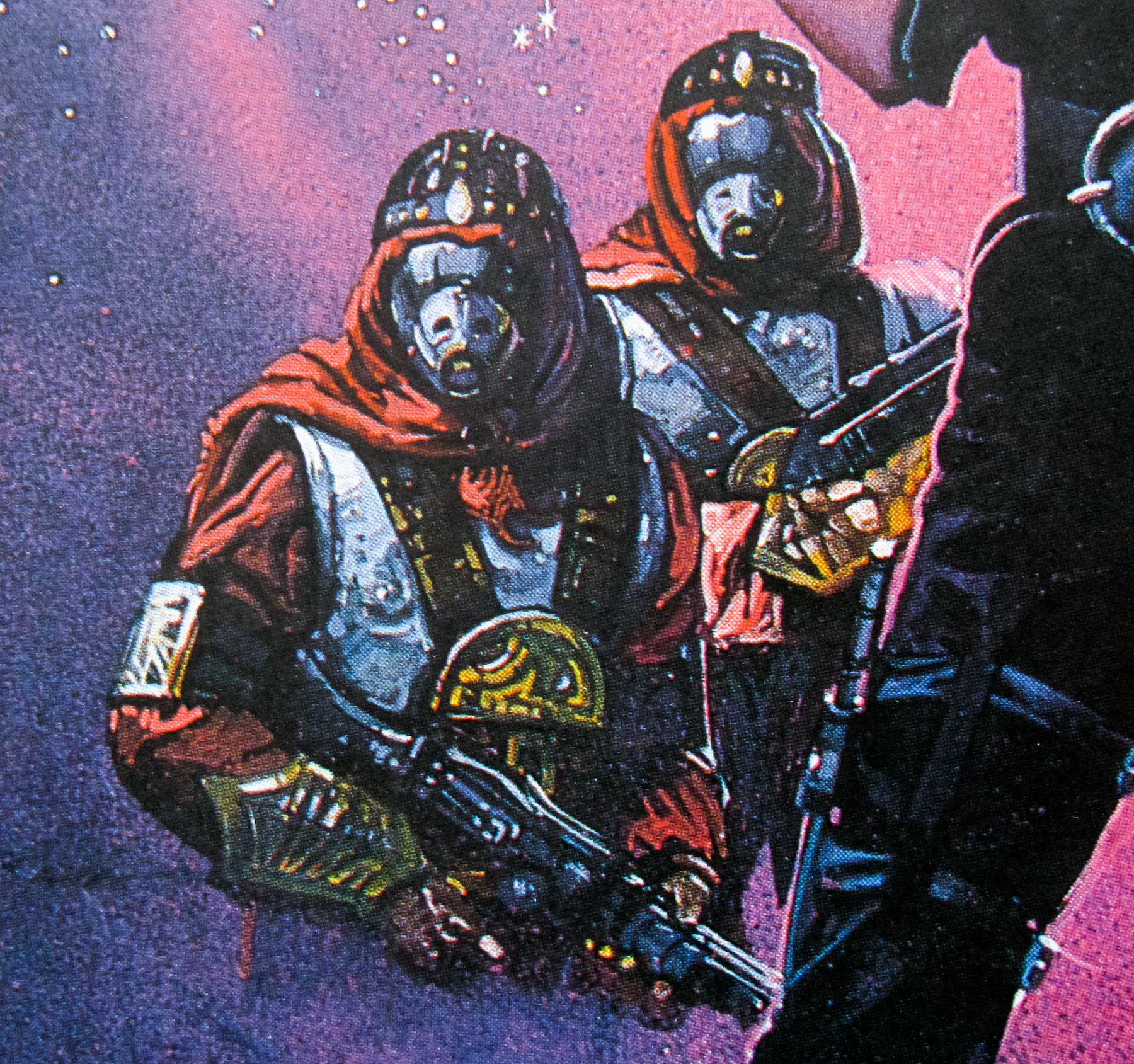
The story sees the pair tasked with hunting down a traitor from the original mission, a German spy who has infiltrated the Yugoslavian resistance and is masquerading as Captain Lescovar (Franco Nero). They join up with an elite American sabotage unit, known as Force 10, which is led by Colonel Barnsby (Harrison Ford, fresh off the success of Star Wars in 1977) who have a mission to carry out of their own. The crew steal an RAF Lancaster bomber and head towards the mission site but the plane is shot down by German fighters and most of the squad are lost. Miller, Mallory and the remaining soldiers are soon captured and imprisoned by German forces but all is not lost as they have a spy of their own in the ranks, Maritza (Barbara Bach) who helps them to escape and continue their mission. Soon they come across Lescovar and the Partisan army. A plan to destroy a large bridge being used by the German forces unites them together, but the German spy’s double-crossing threatens to jeopardise everything.
Force 10 would prove to be Shaw’s penultimate role as he died a year later during the filming of Avalanche Express. The film was met with less than stellar box-office results and general audience indifference, likely not helped by there being such a large gap between the films.
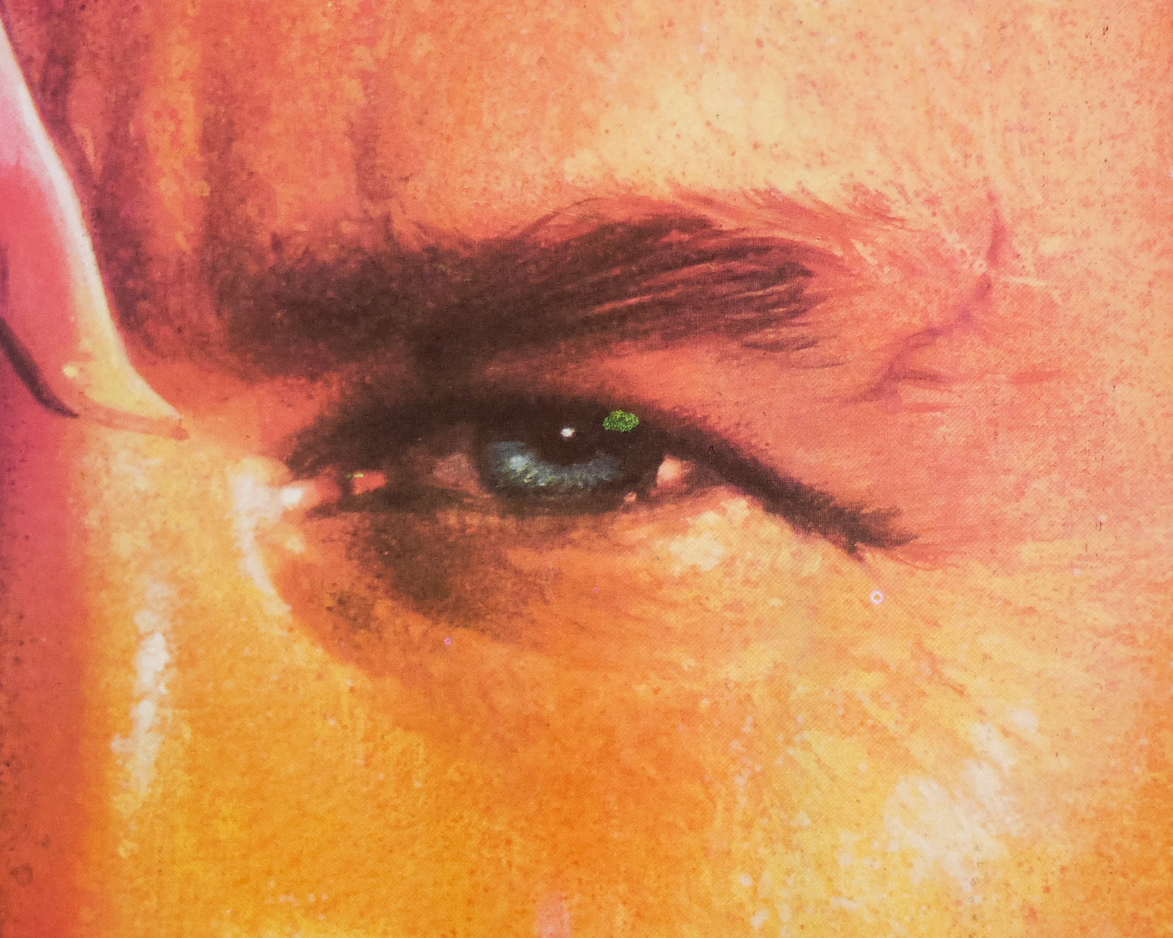
The artwork on this poster was painted by Brian Bysouth who is one of my favourite poster artists and was responsible for many classic posters from the 1960s to the 1980s, including the final painted poster for a James Bond film, The Living Daylights. In 2012 I was fortunate to meet and interview Brian for this site and the article can be read here. The other posters I’ve collected by Brian can be seen by clicking here.
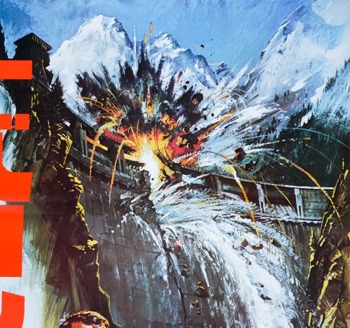
The artwork was reused around the world with the original title, painted to resemble part of the dam, redrawn depending on the language required. The results page for Force 10 on emovieposter.com shows some of these alternative versions, including those for the French and Italian releases. Interestingly this Japanese poster features the title printed down the left hand side, rather than painted onto the dam.
Note that there is an alternative style of poster for the film, the artwork of which can be seen here, that also features the dam bursting and is, I’m fairly certain, erroneously credited to Brian on emovieposter. If anyone has any ideas who the artist of that version is please get in touch or leave a comment below.