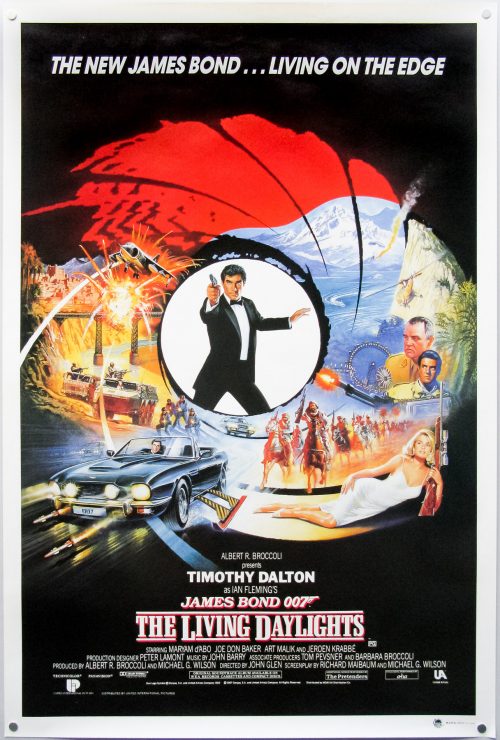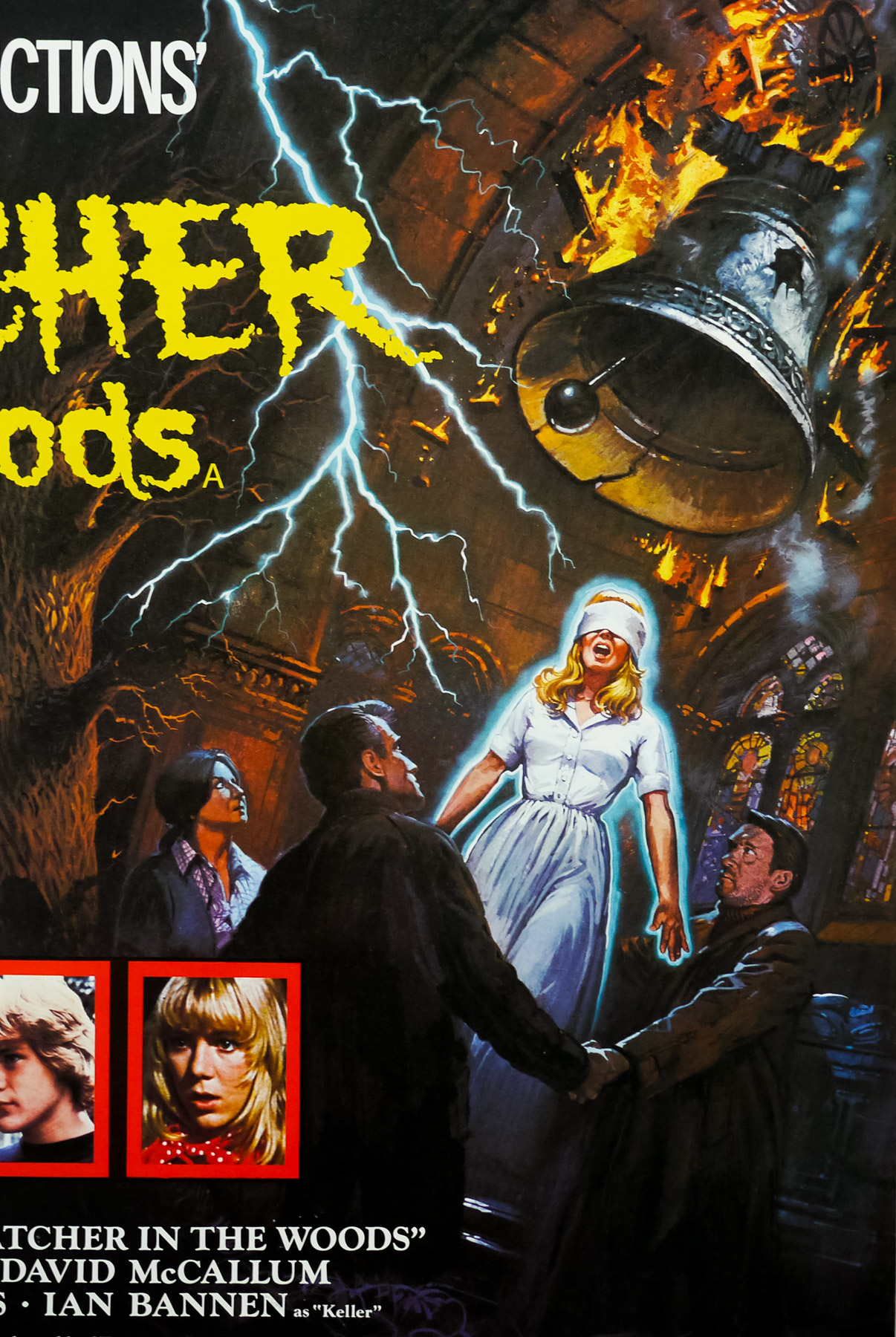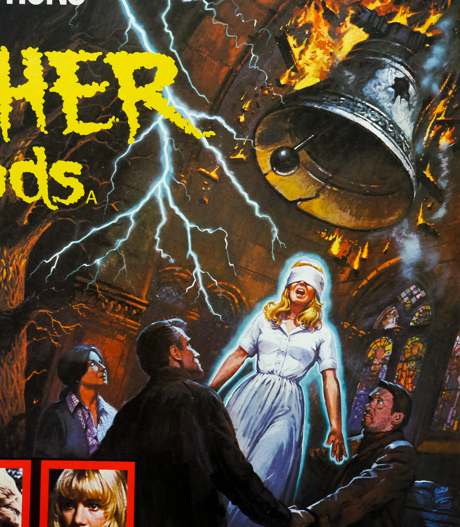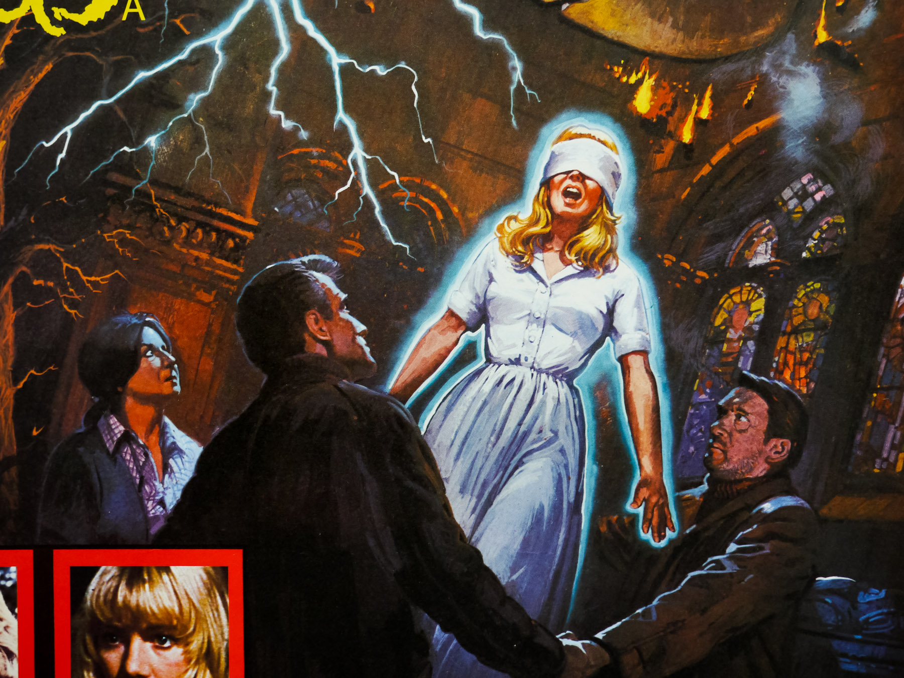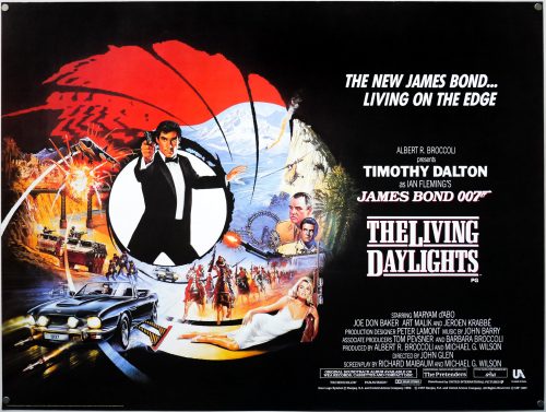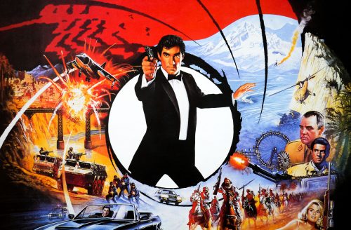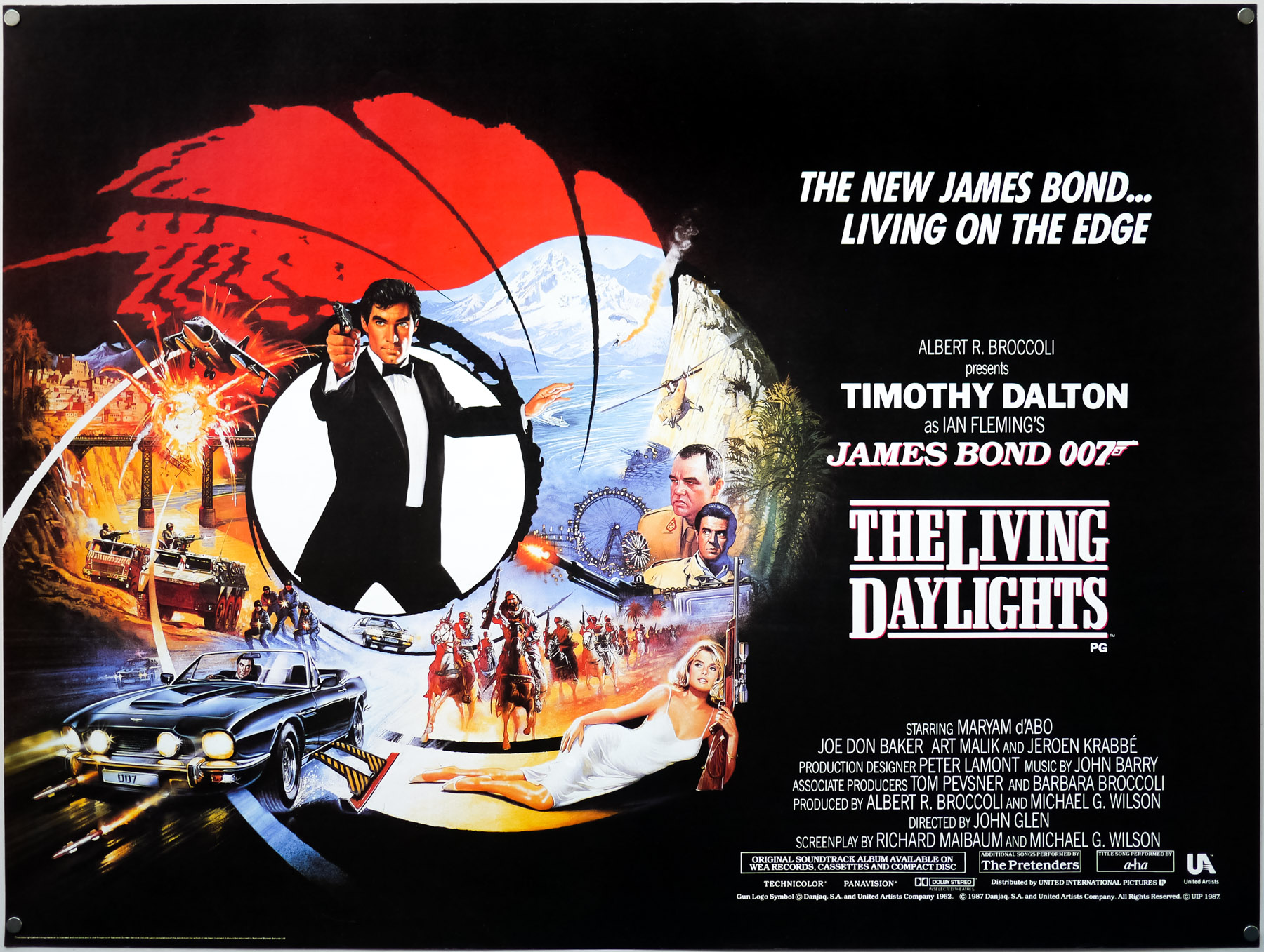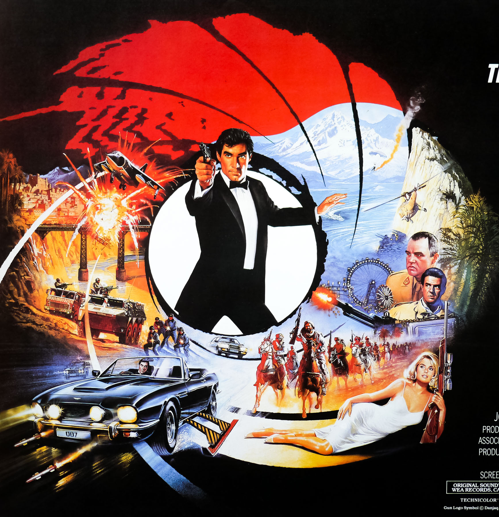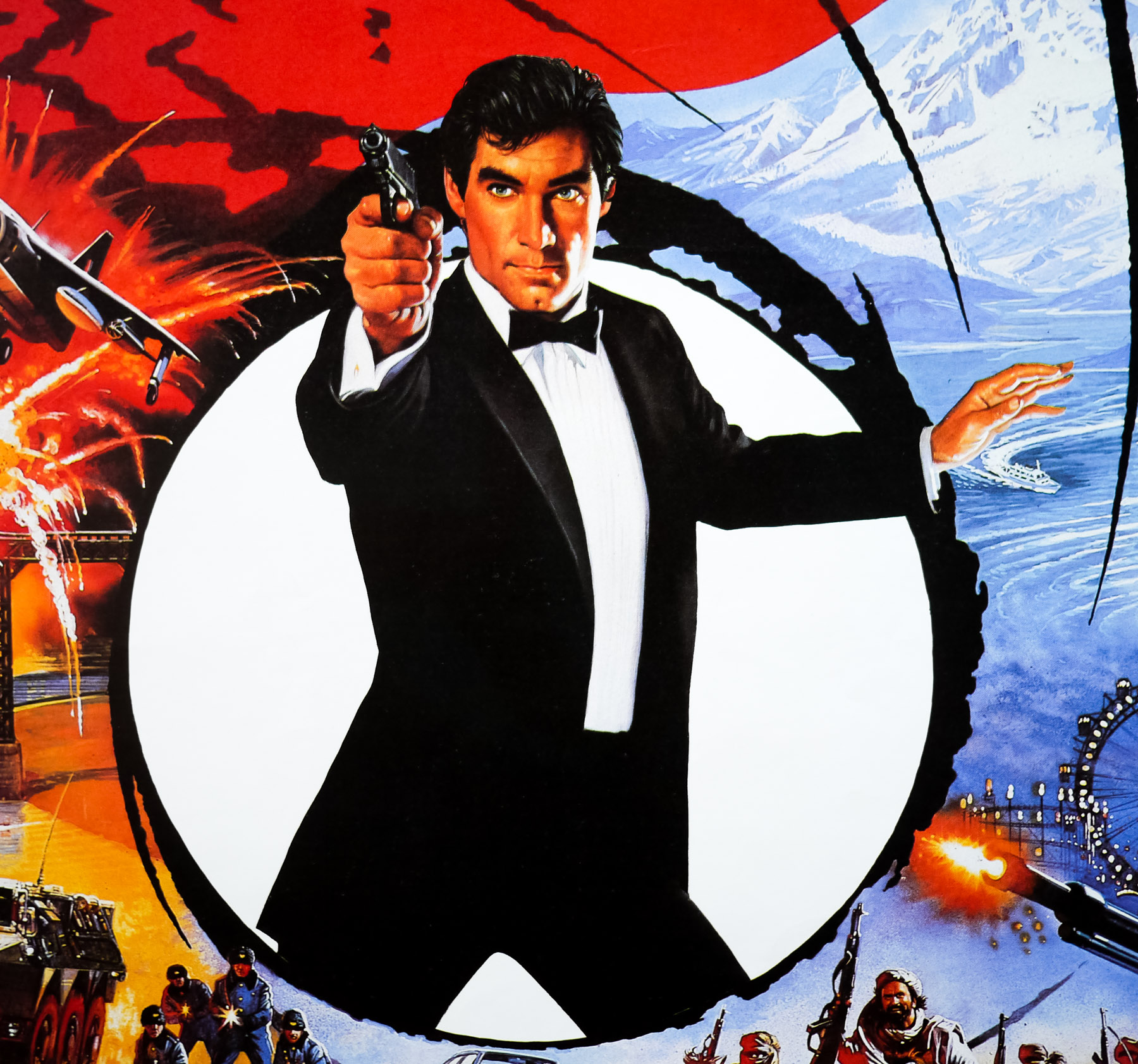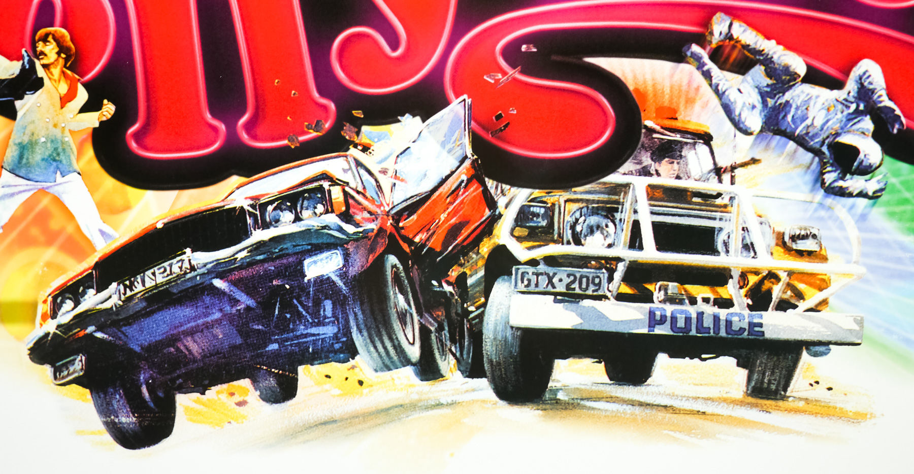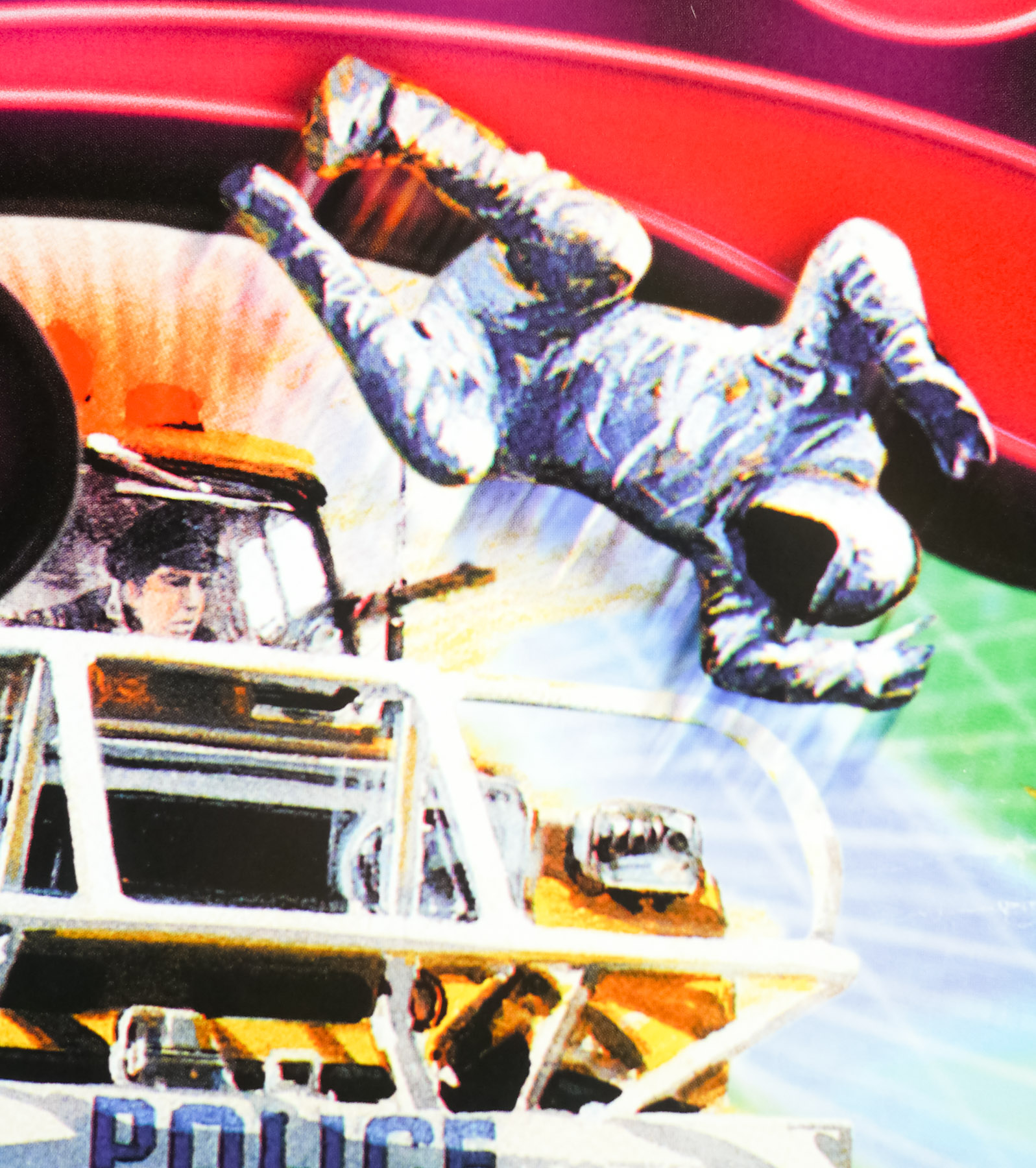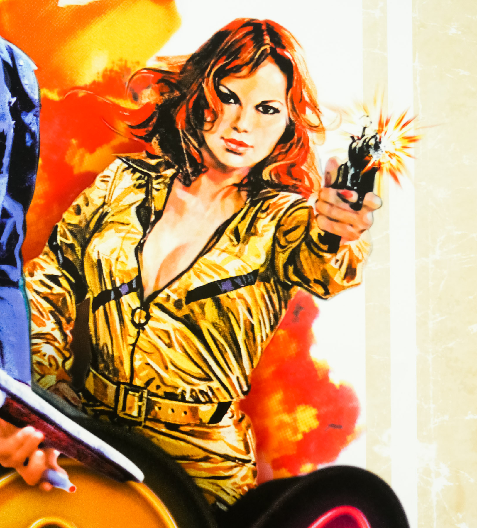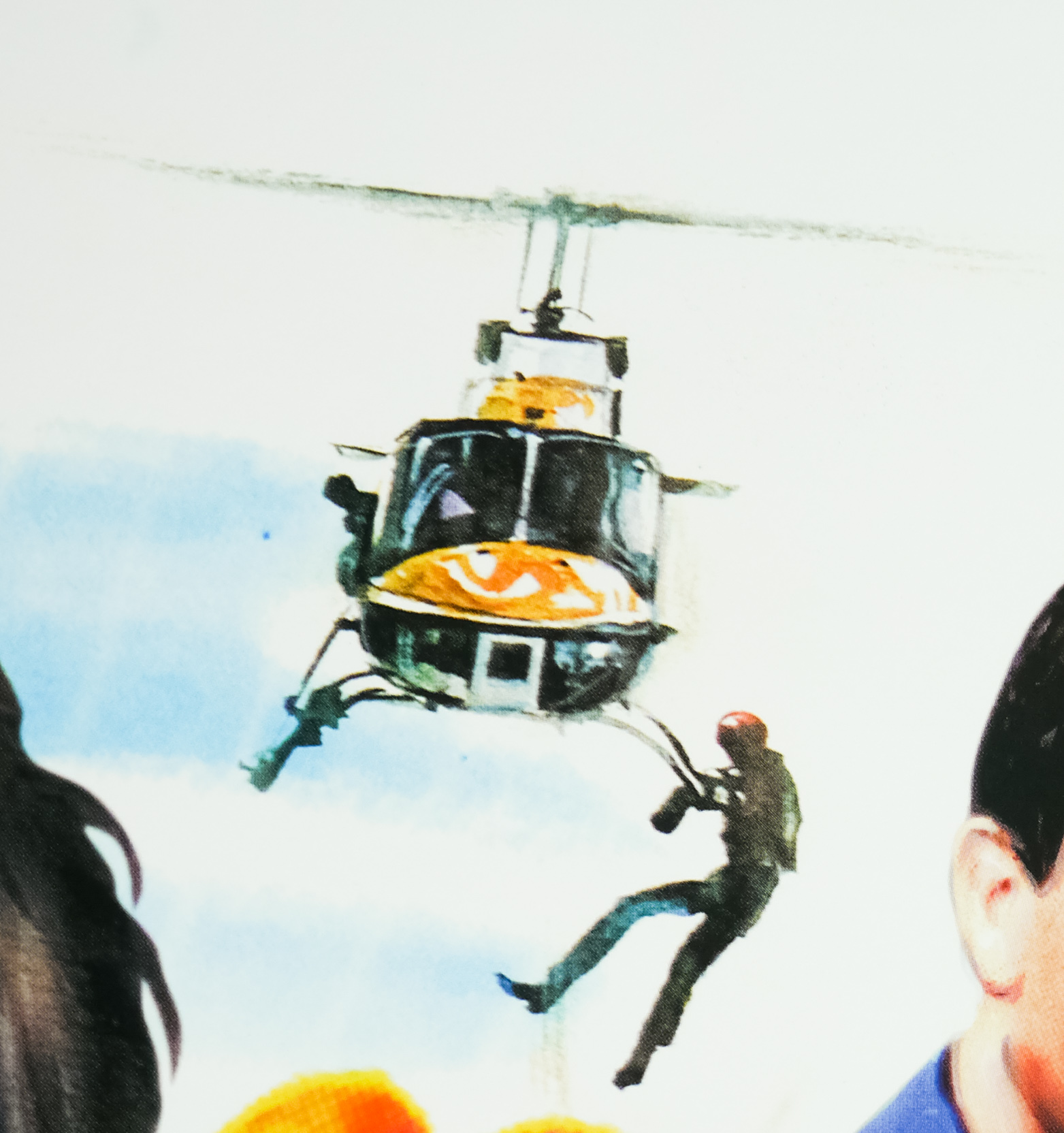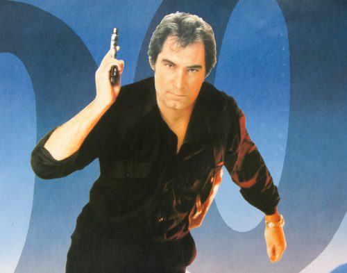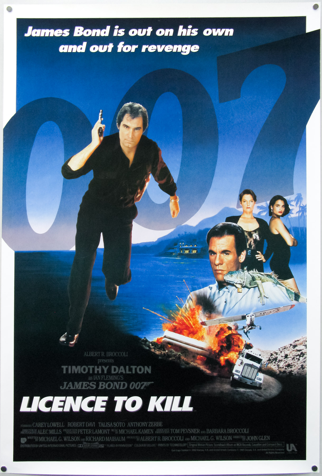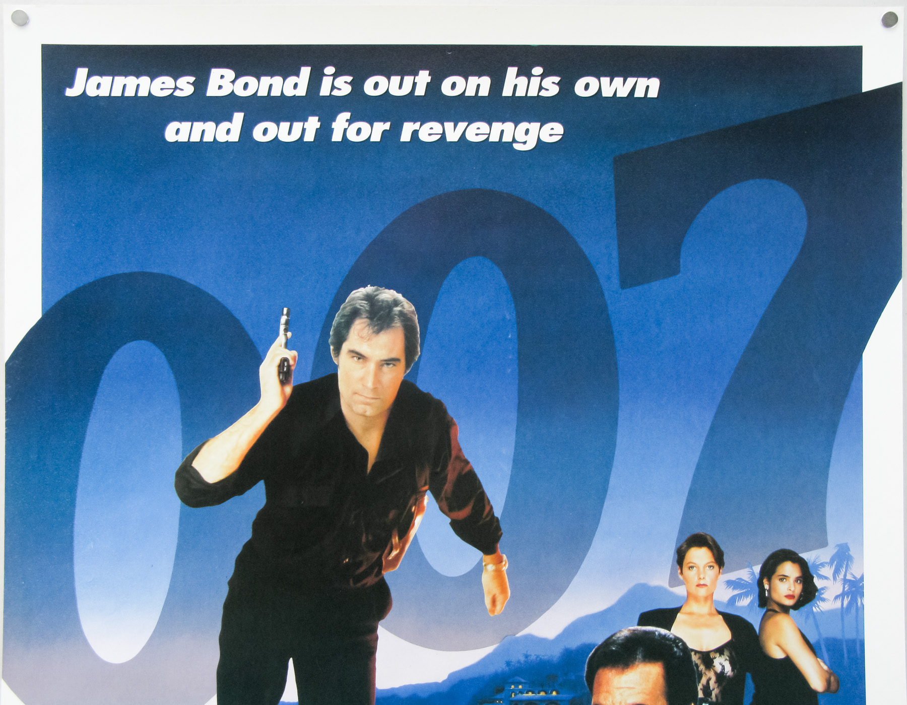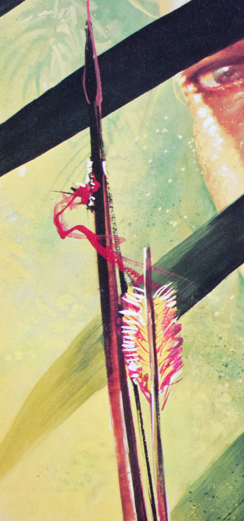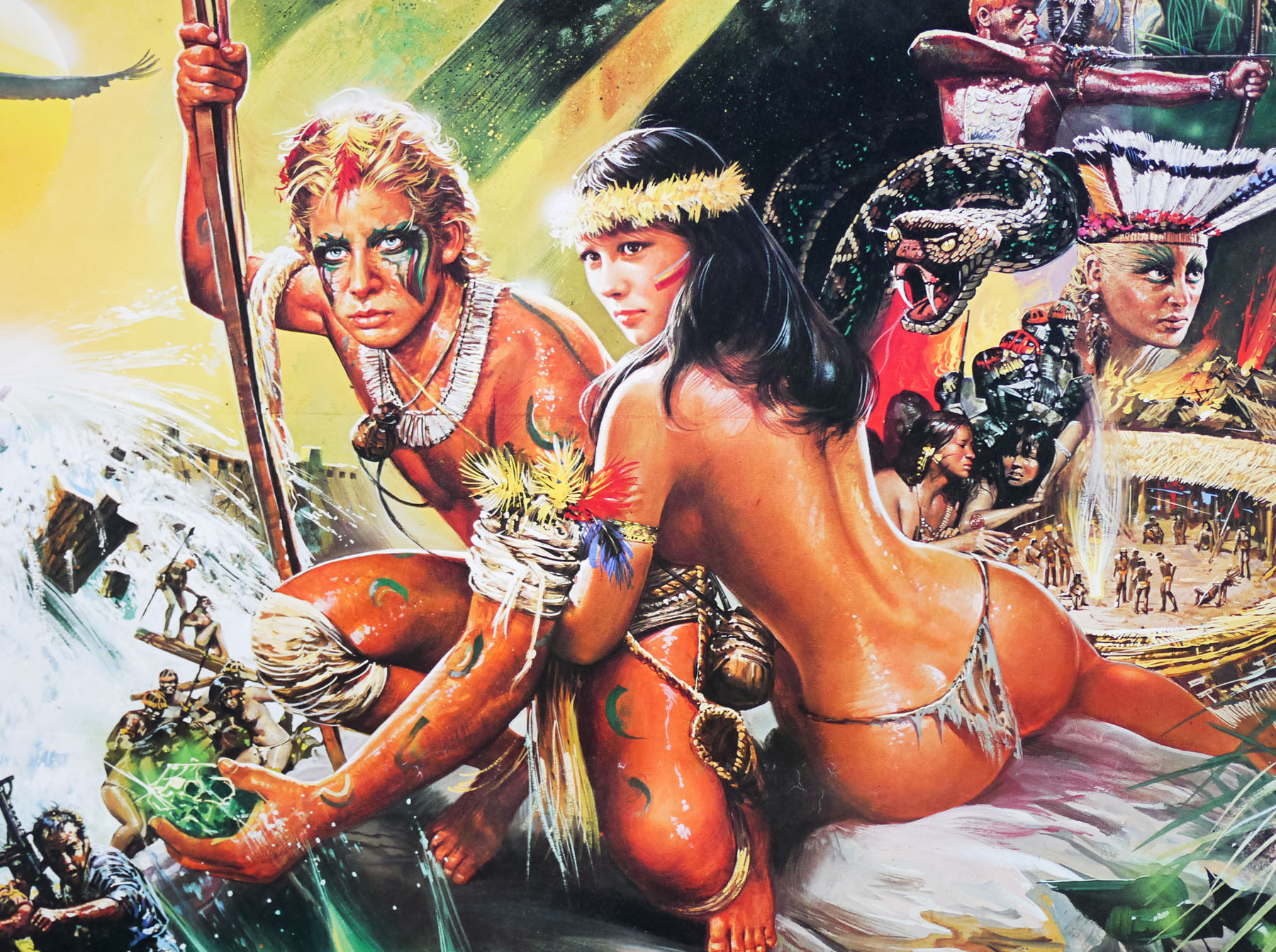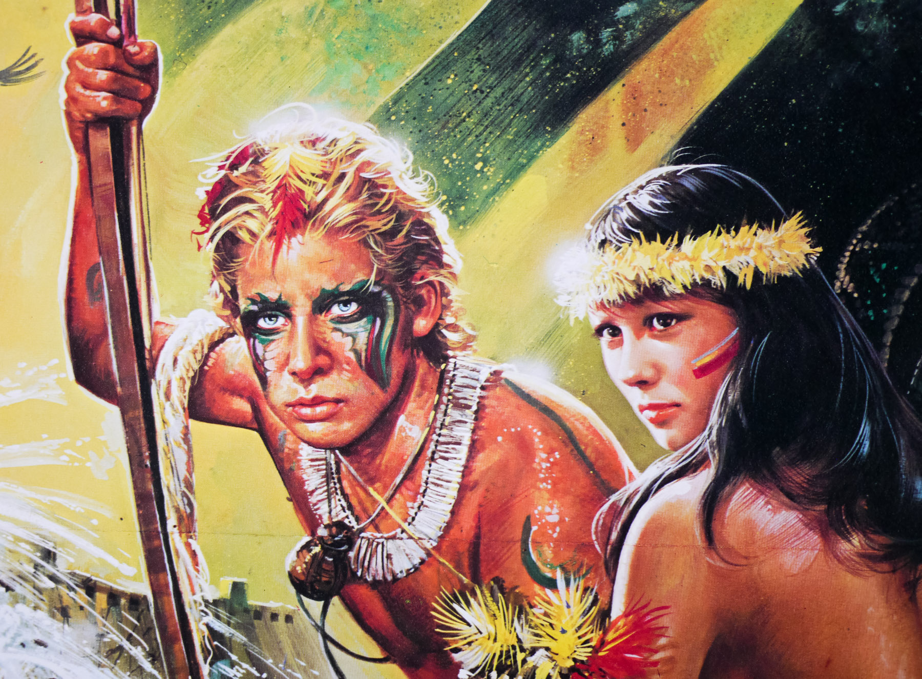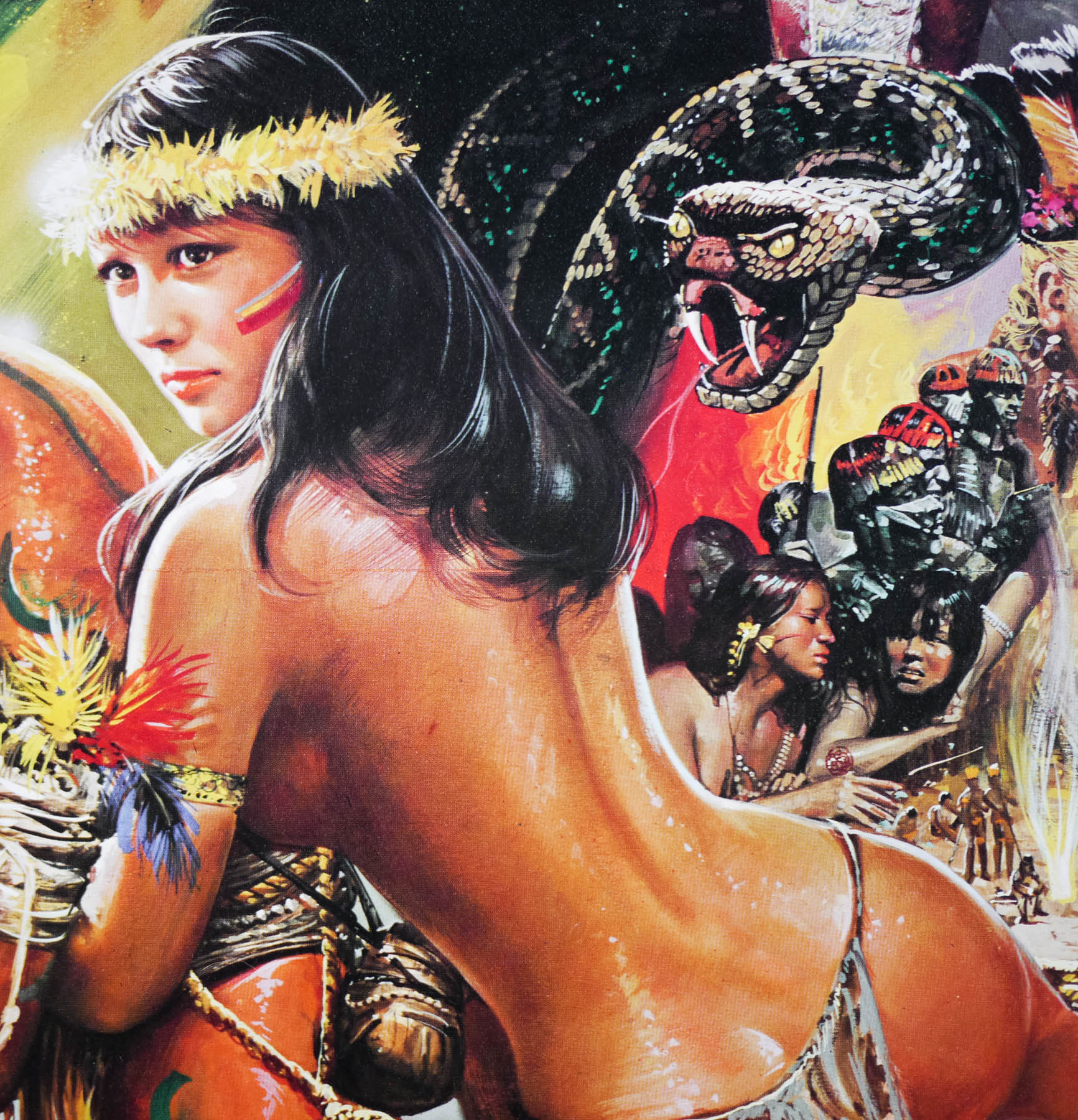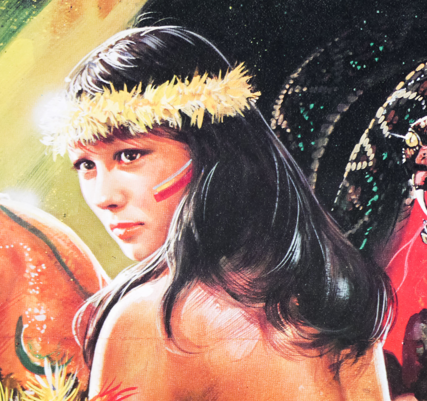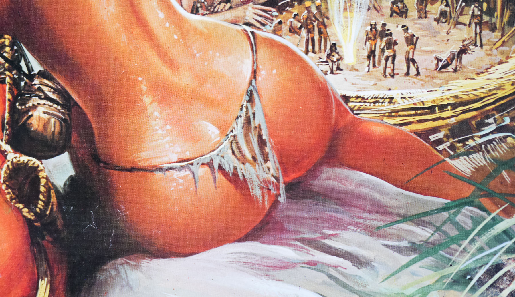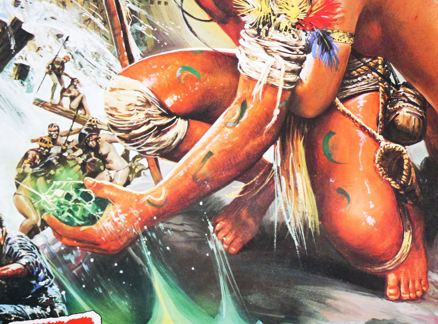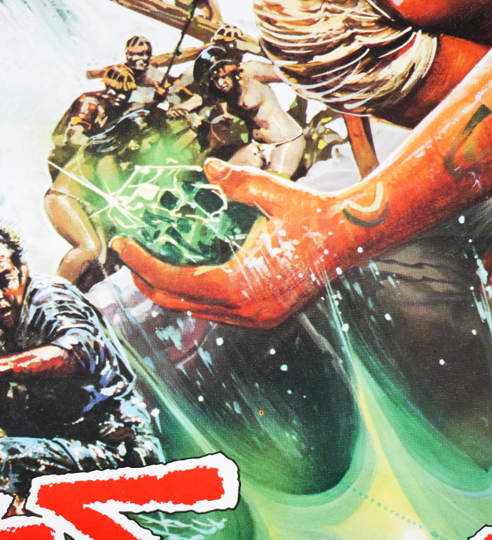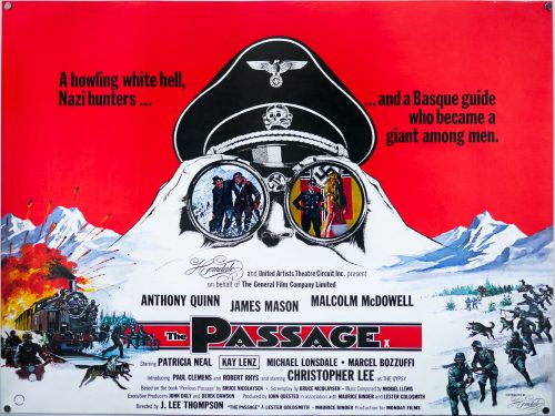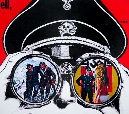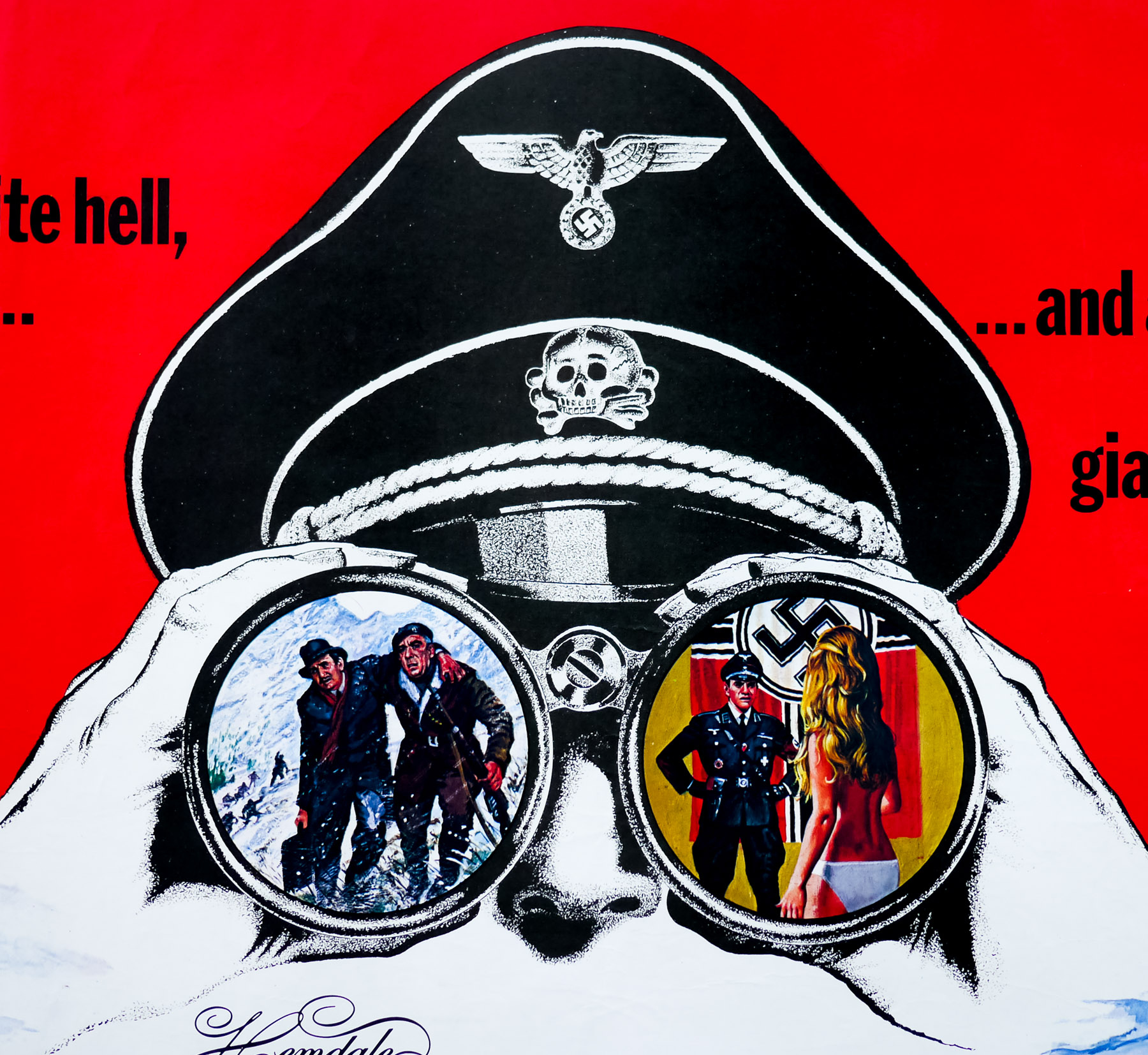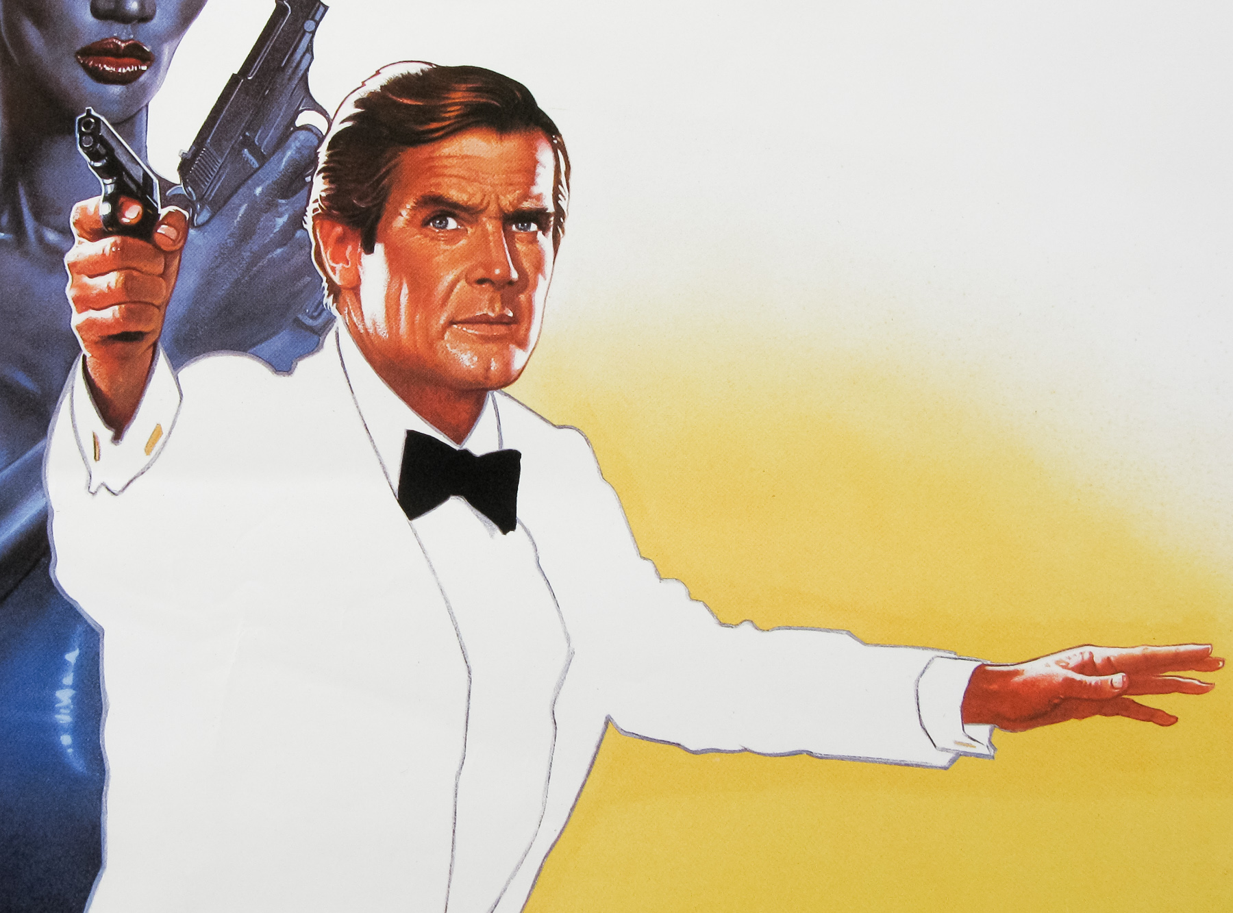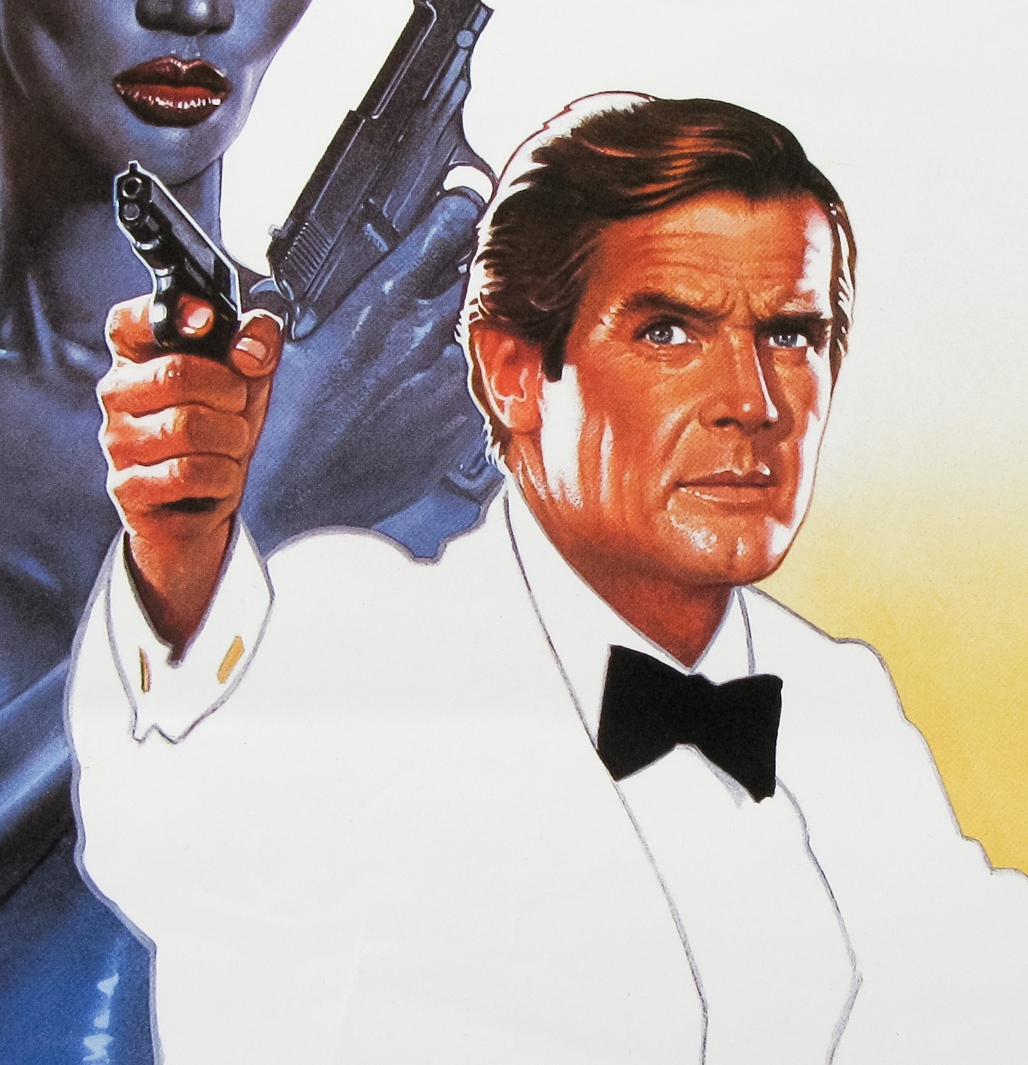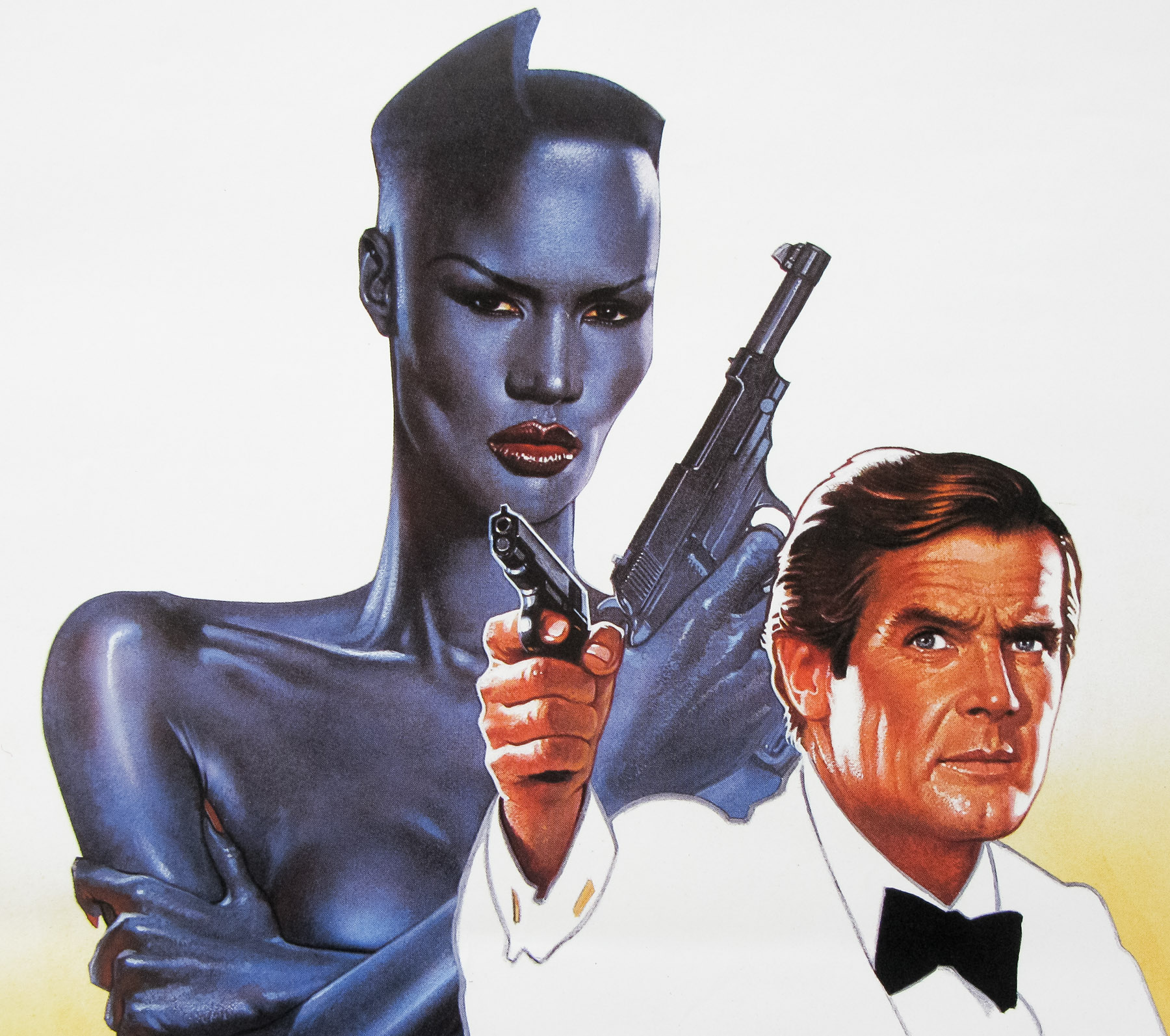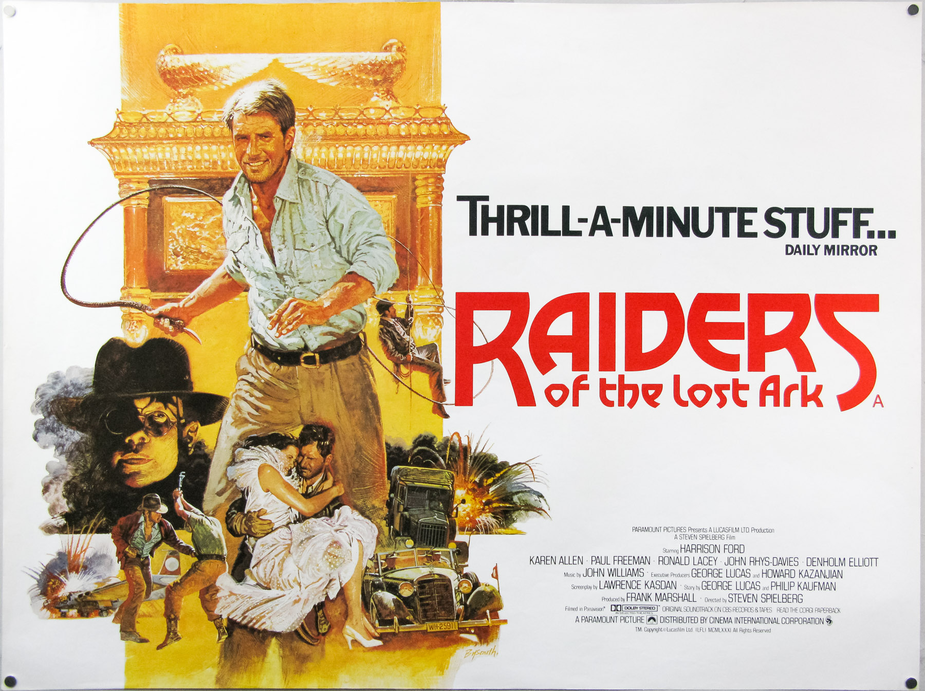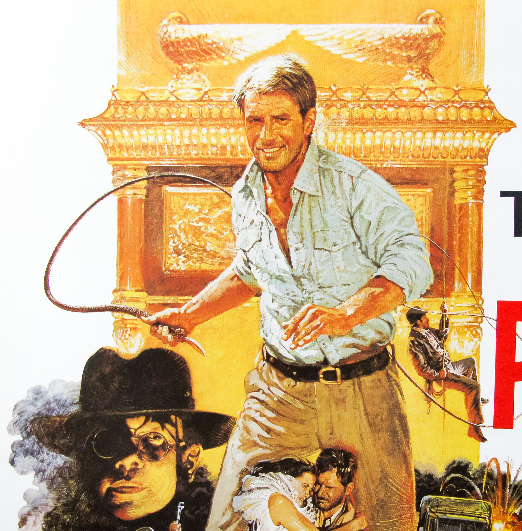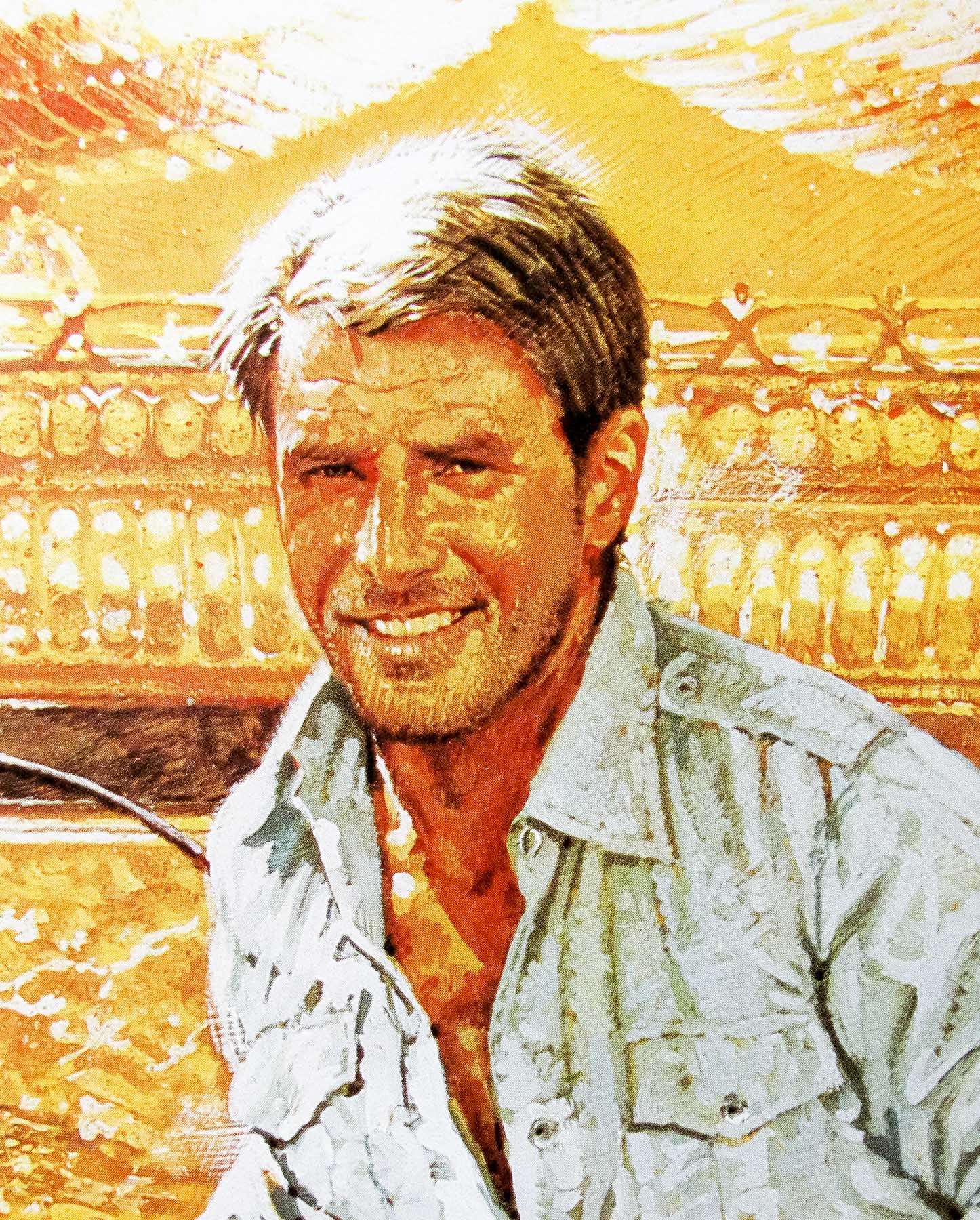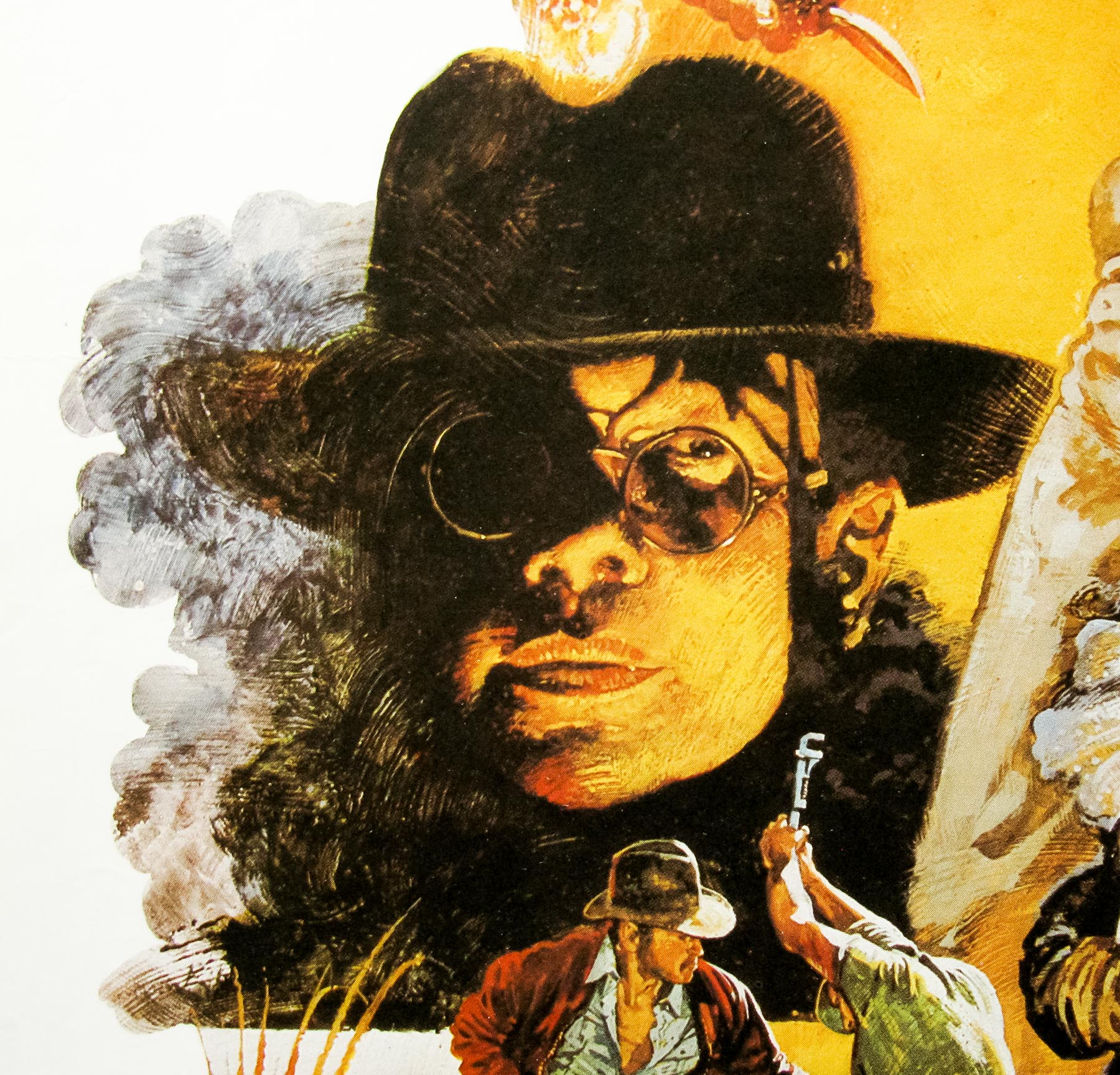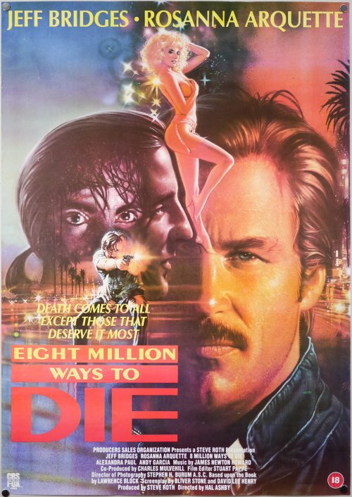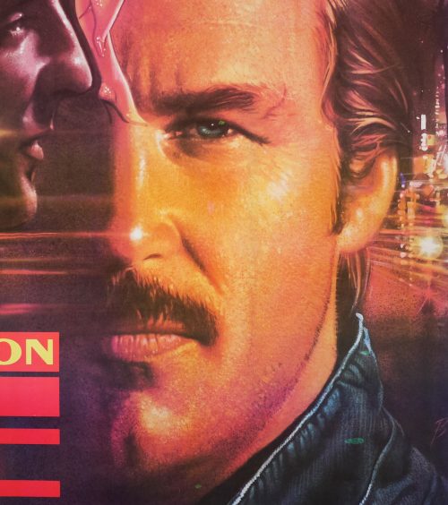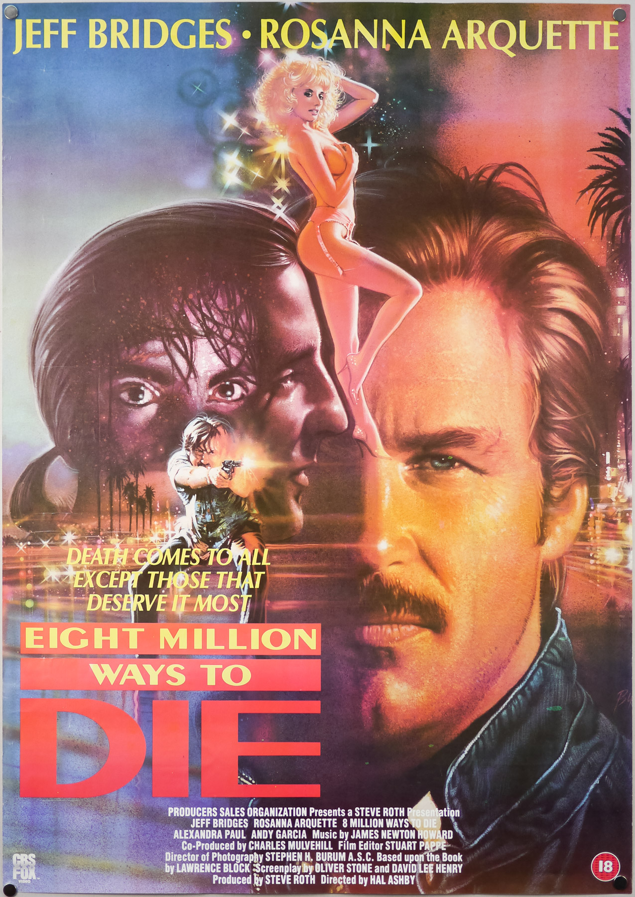
Poster detail
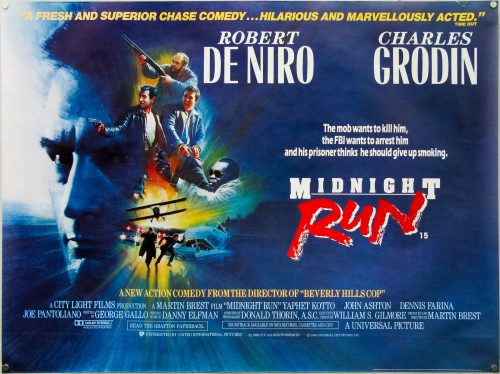
1-5
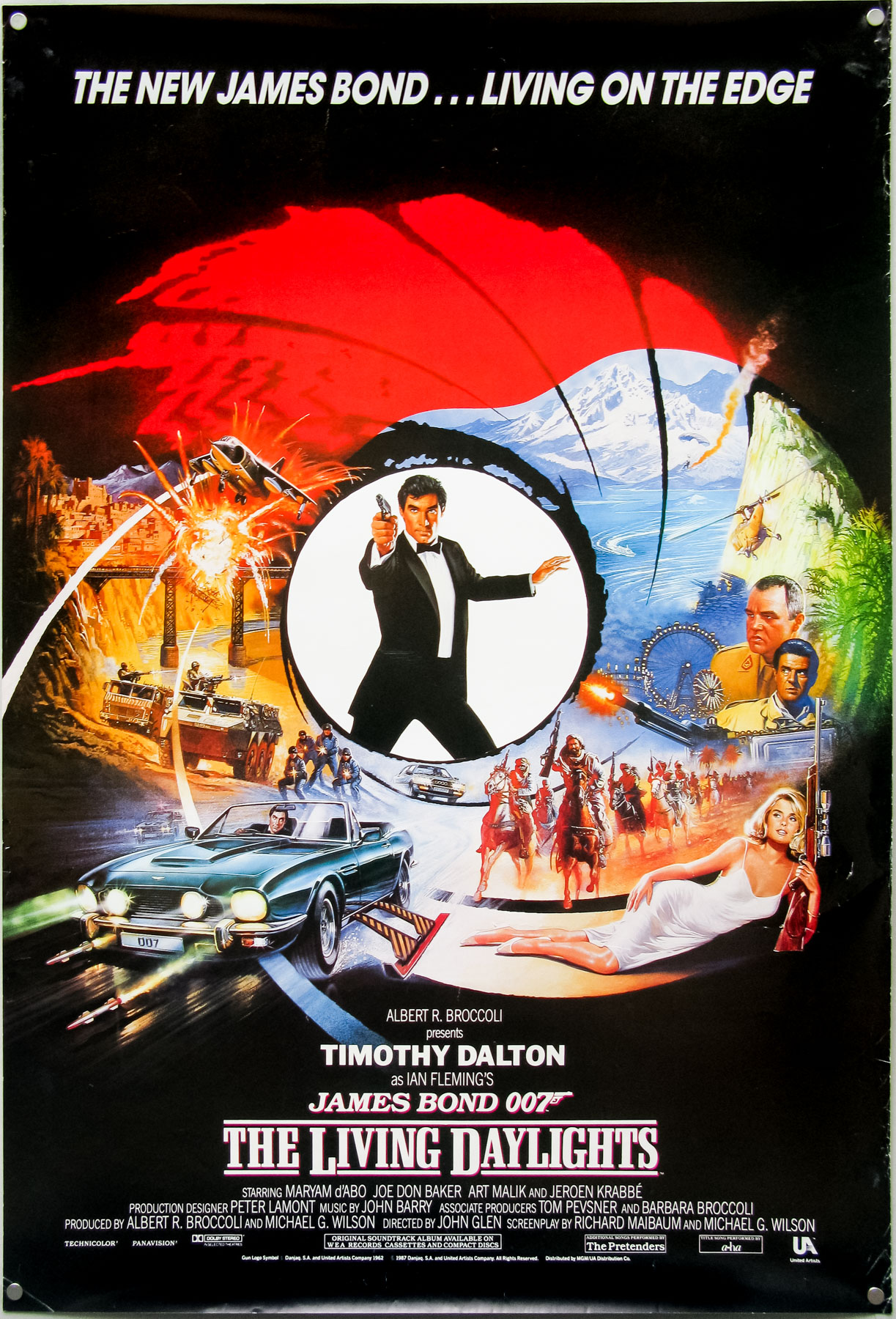
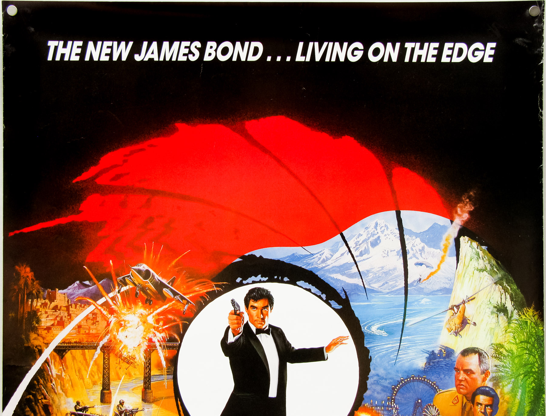
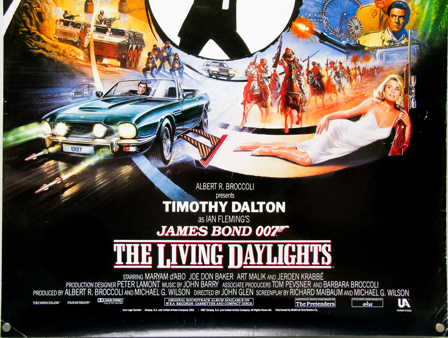

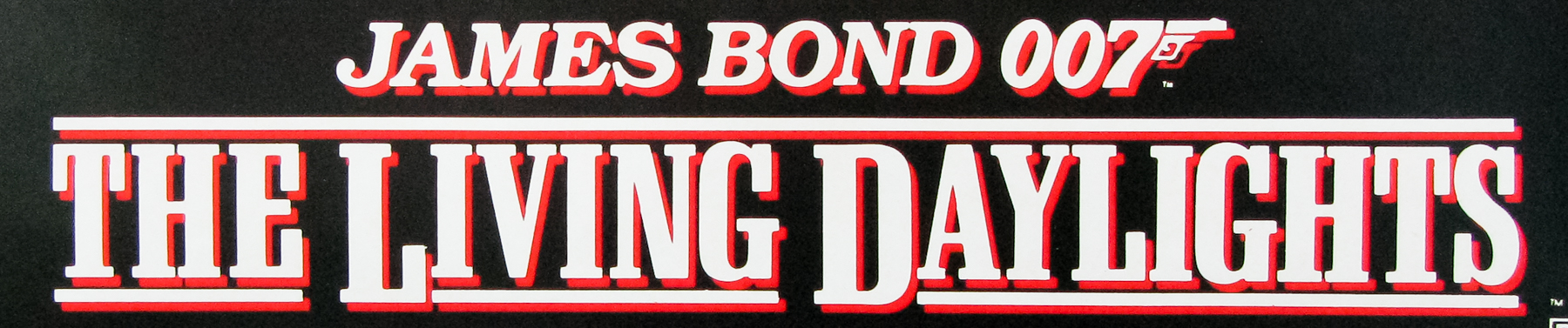
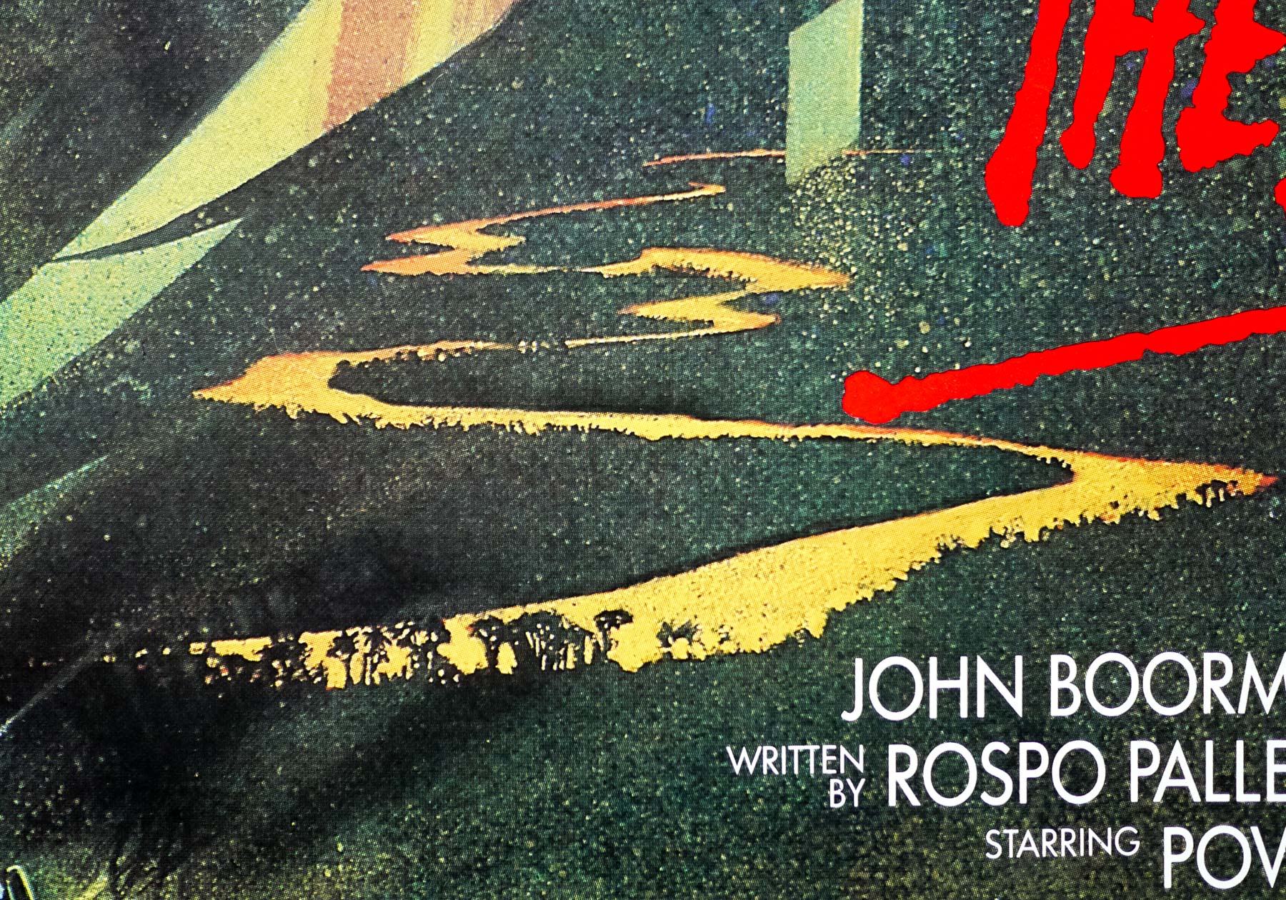
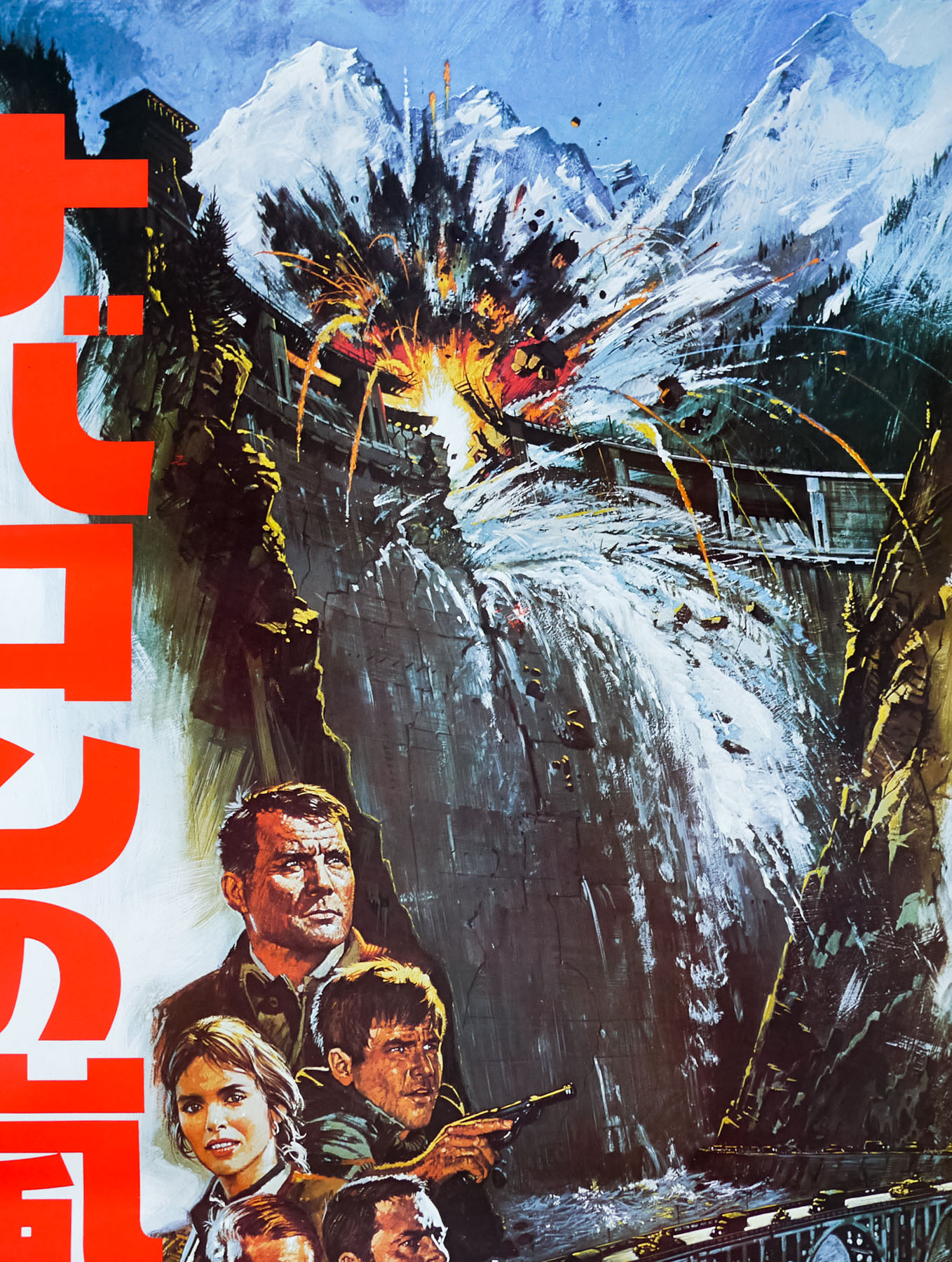
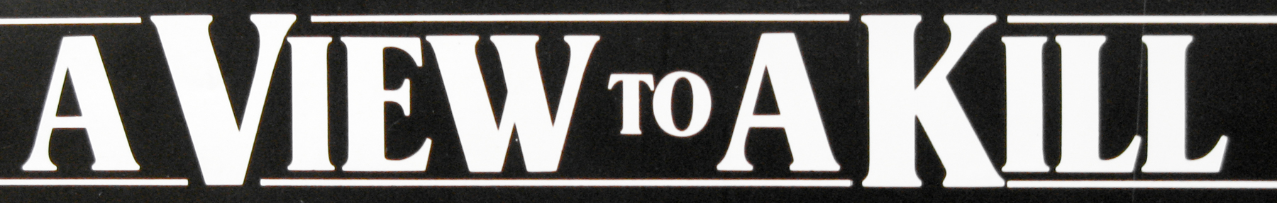
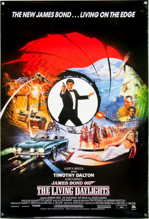
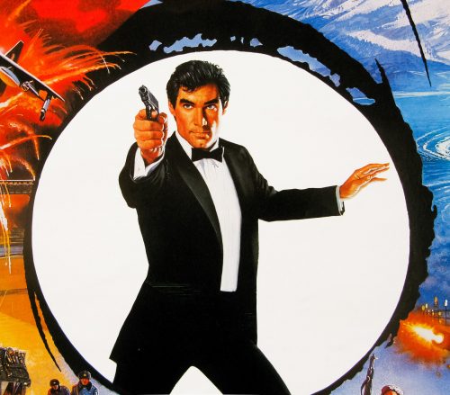
- Title
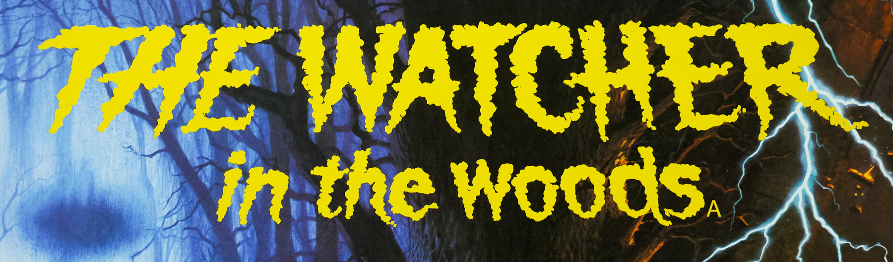
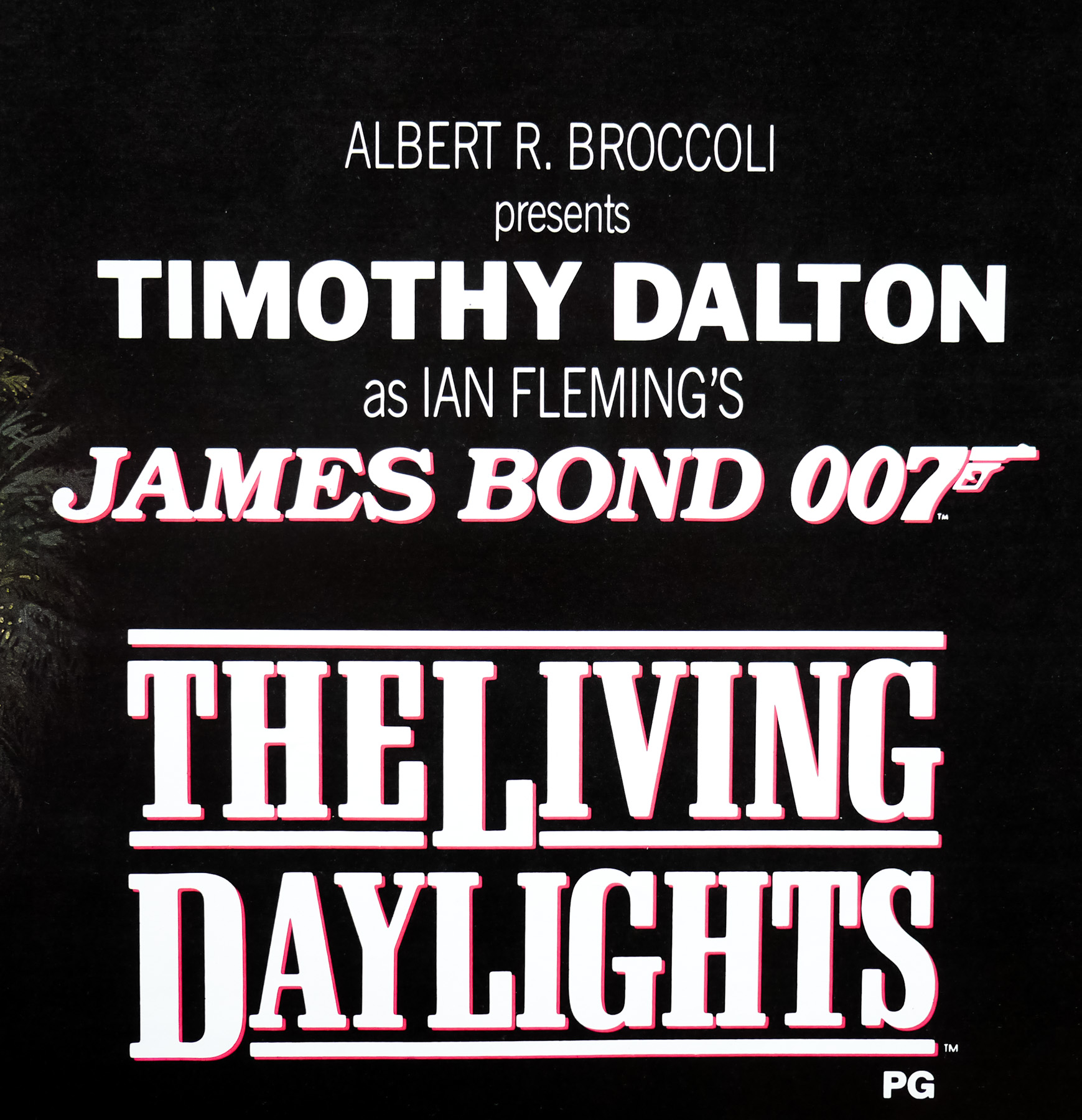
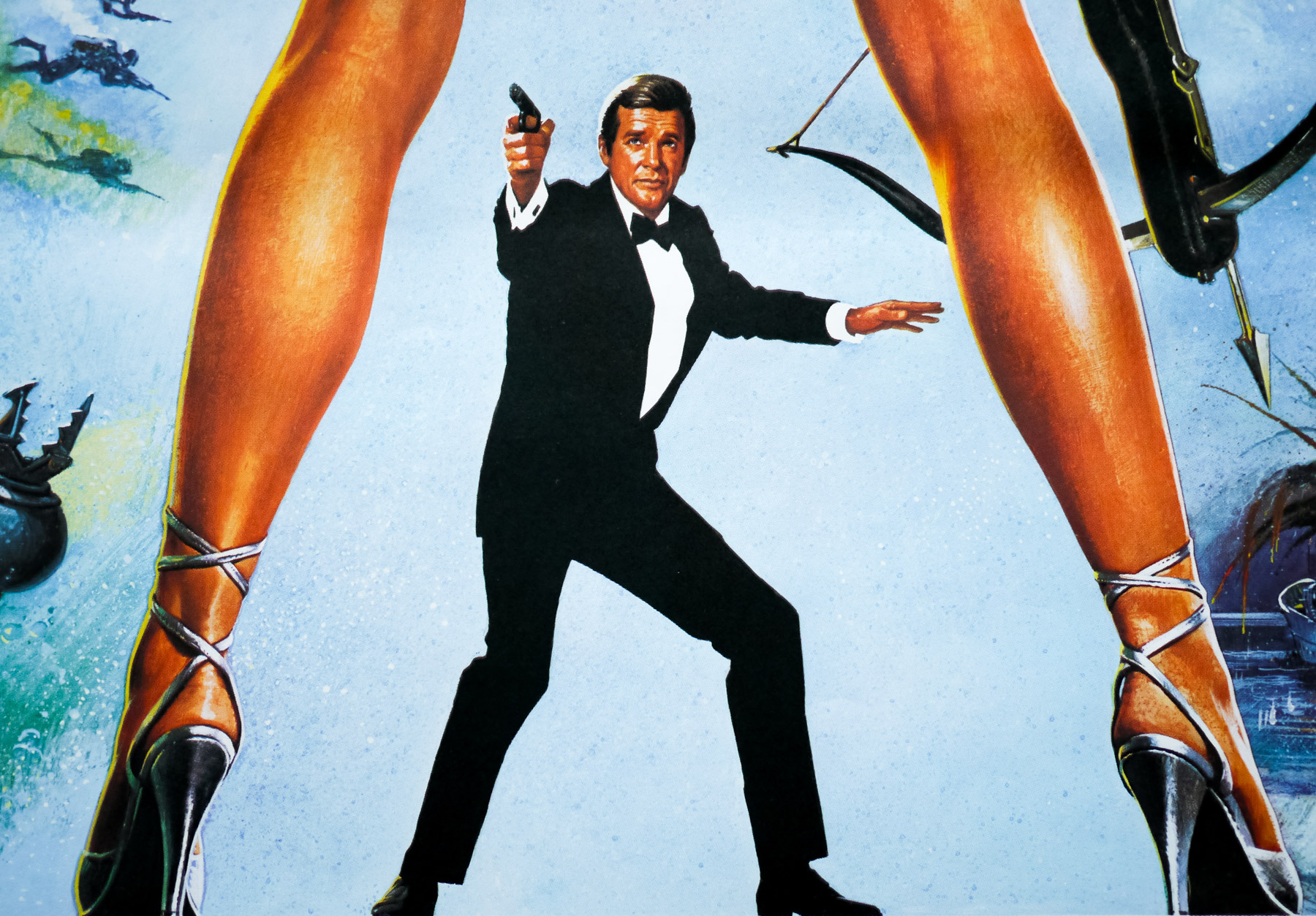
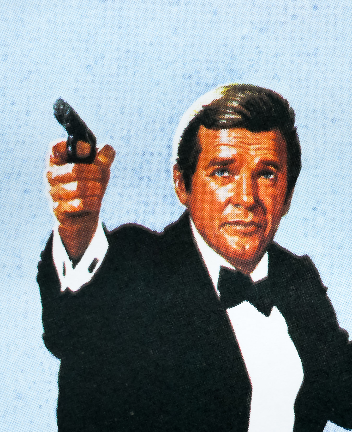
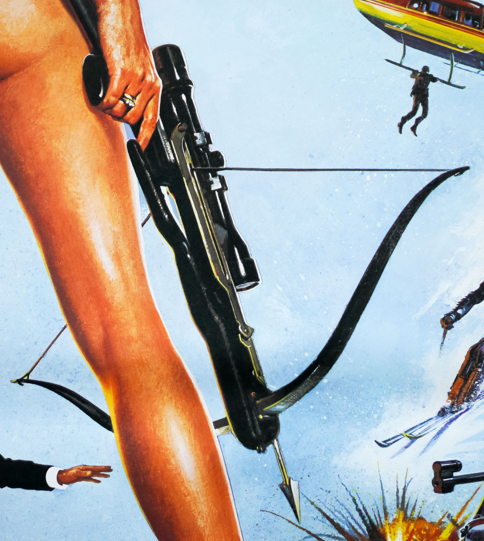
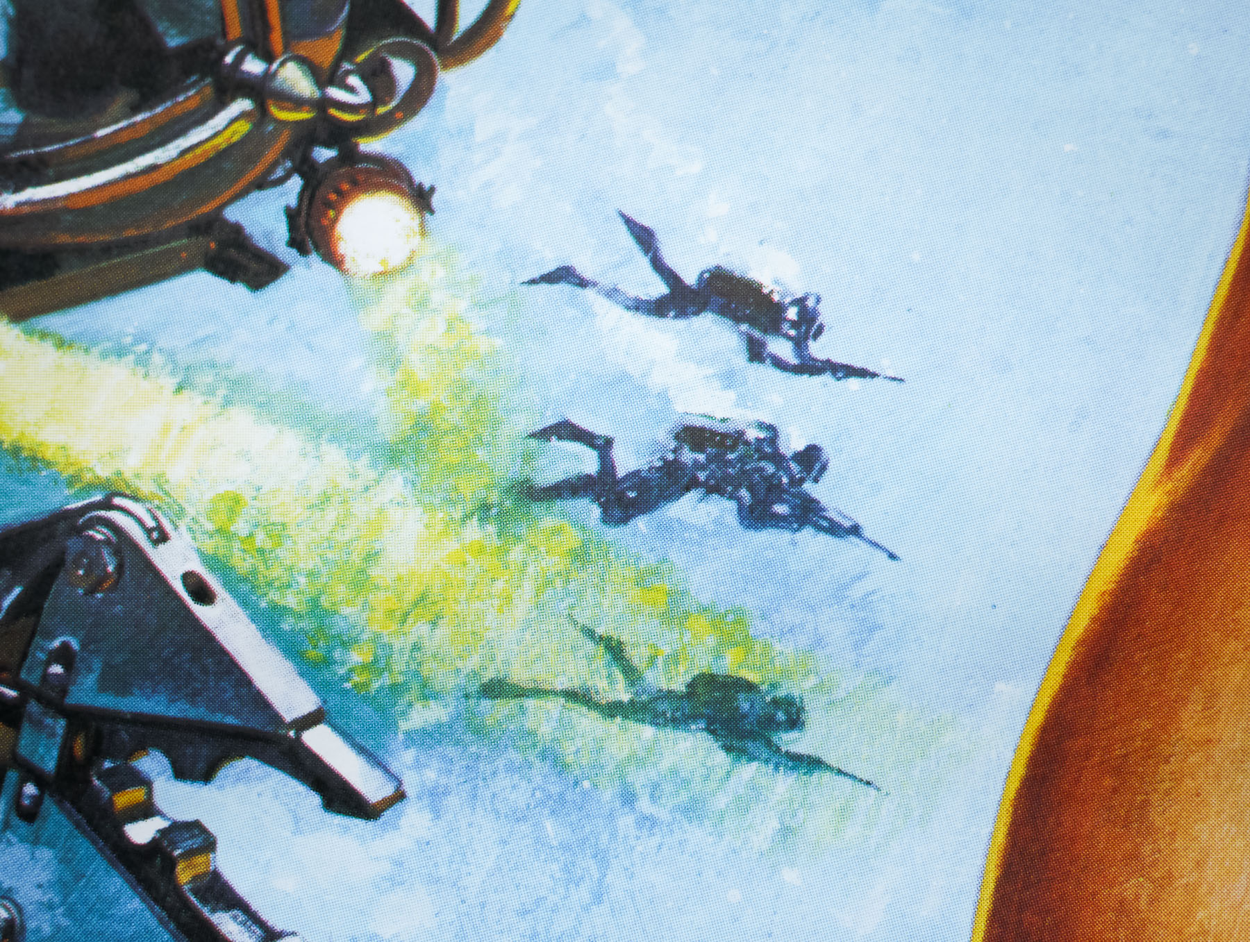
- The Living Daylights
- AKA
- 007 zona pericolo [Dangerous area] (Italy)
- Year of Film
- 1987
- Director
- John Glen
- Origin of Film
- UK | USA
- Genre(s) of Film
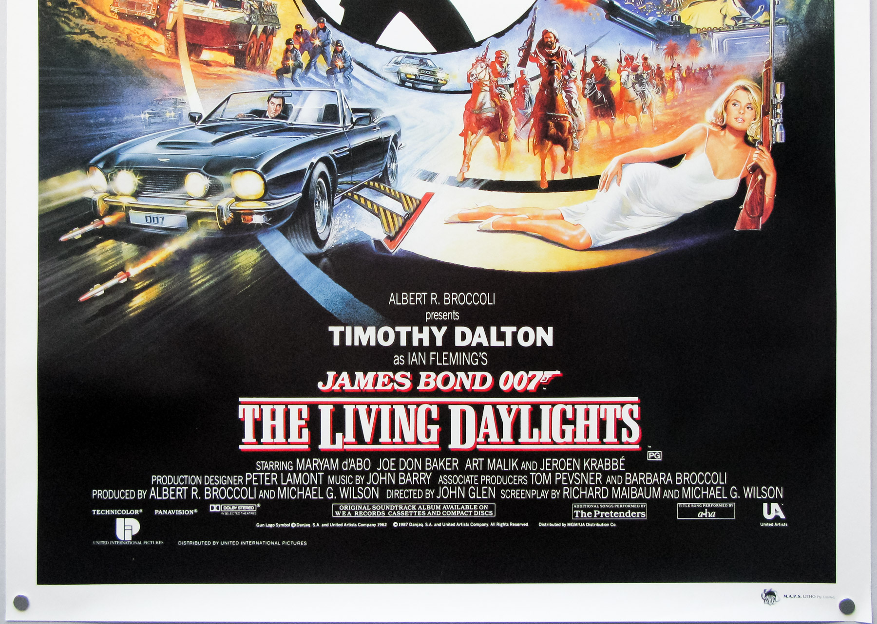
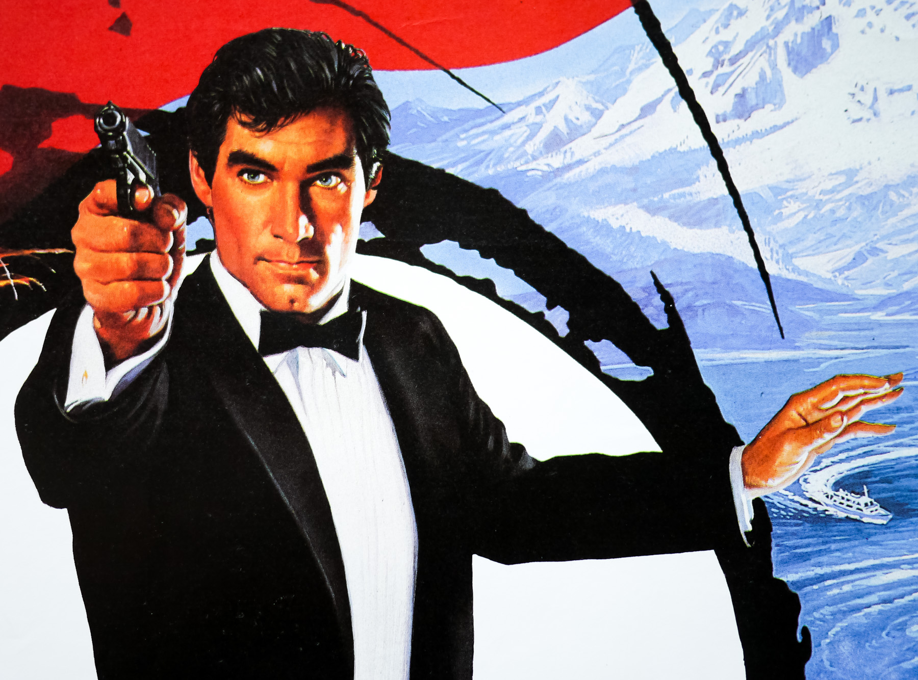
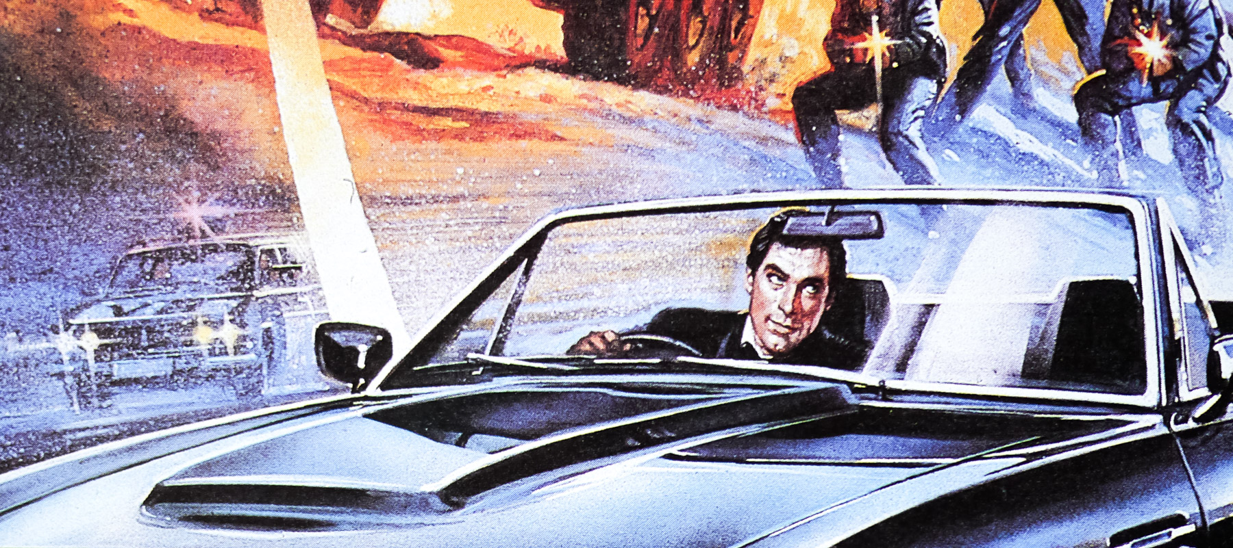
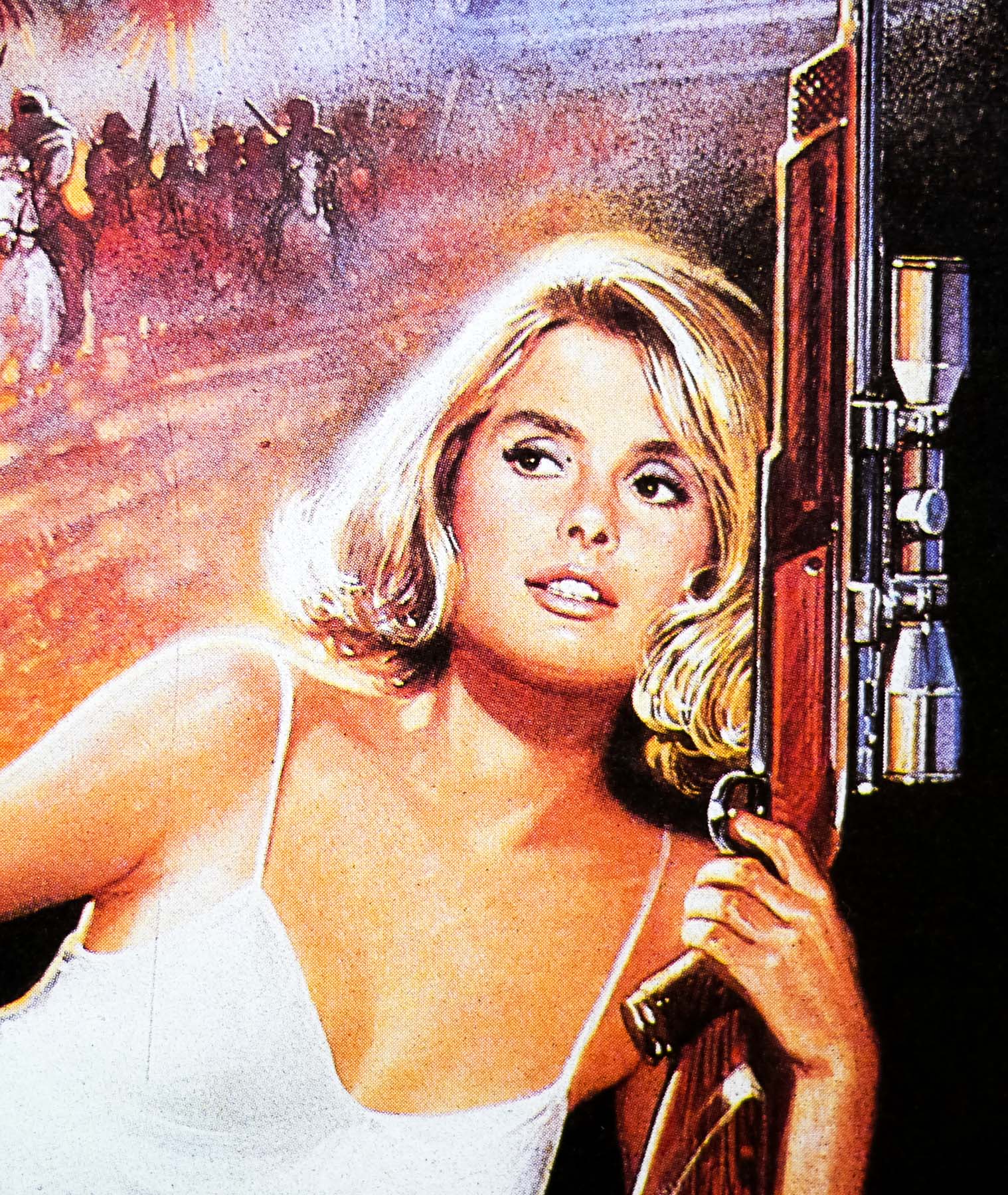
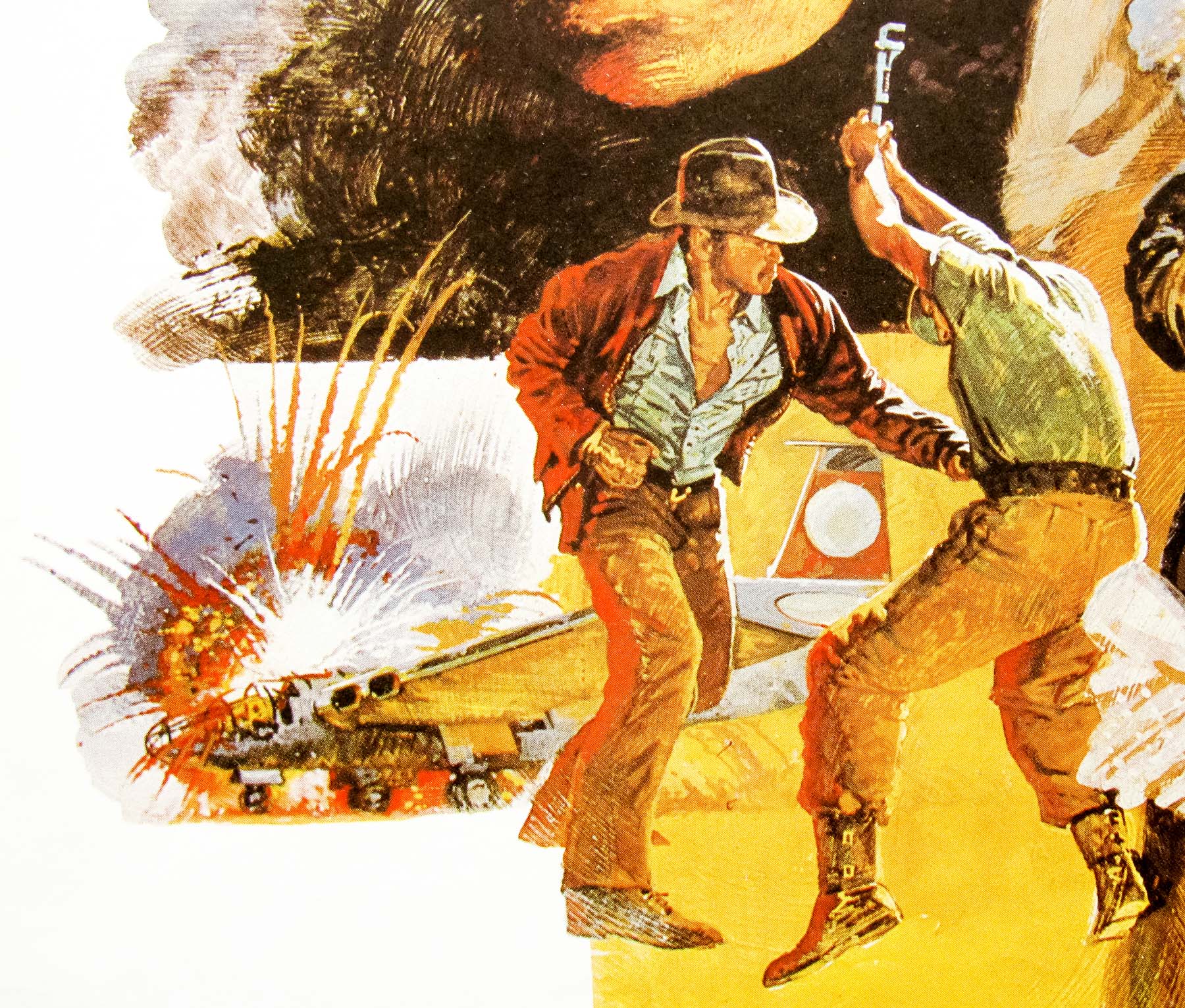
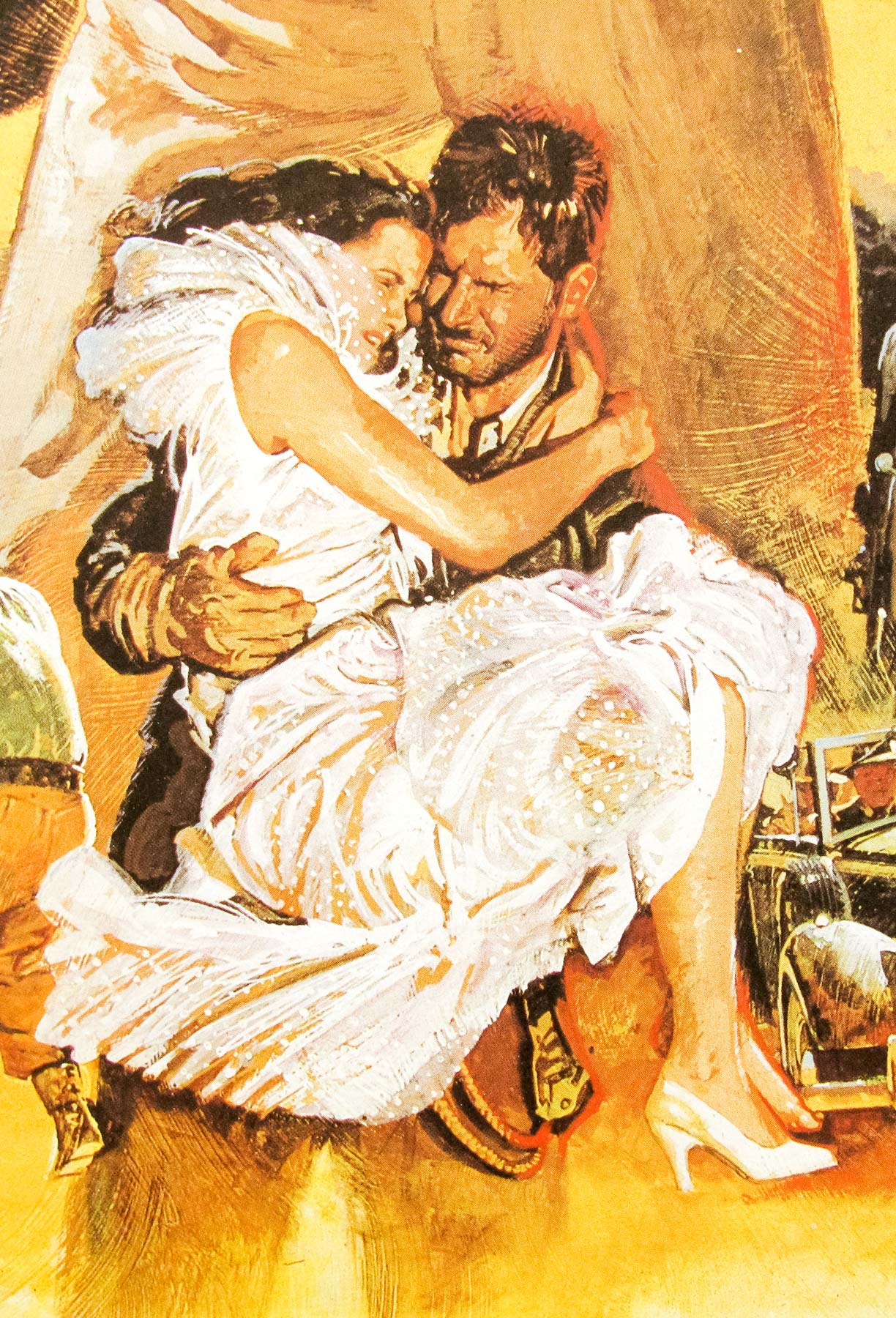
- Timothy Dalton, Maryam d'Abo, Joe Don Baker, Art Malik, John Rhys-Davies, Jeroen Krabbé,
- Type of Poster
- One sheet
- Style of Poster
- --
- Origin of Poster
- International
- Year of Poster
- 1987
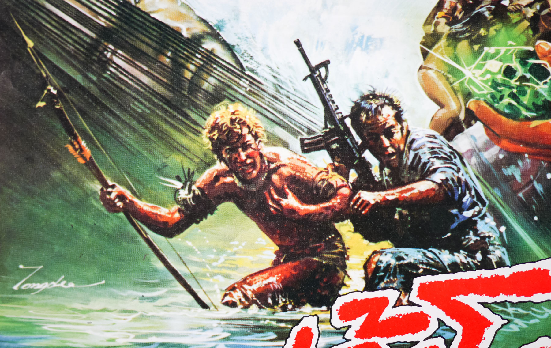
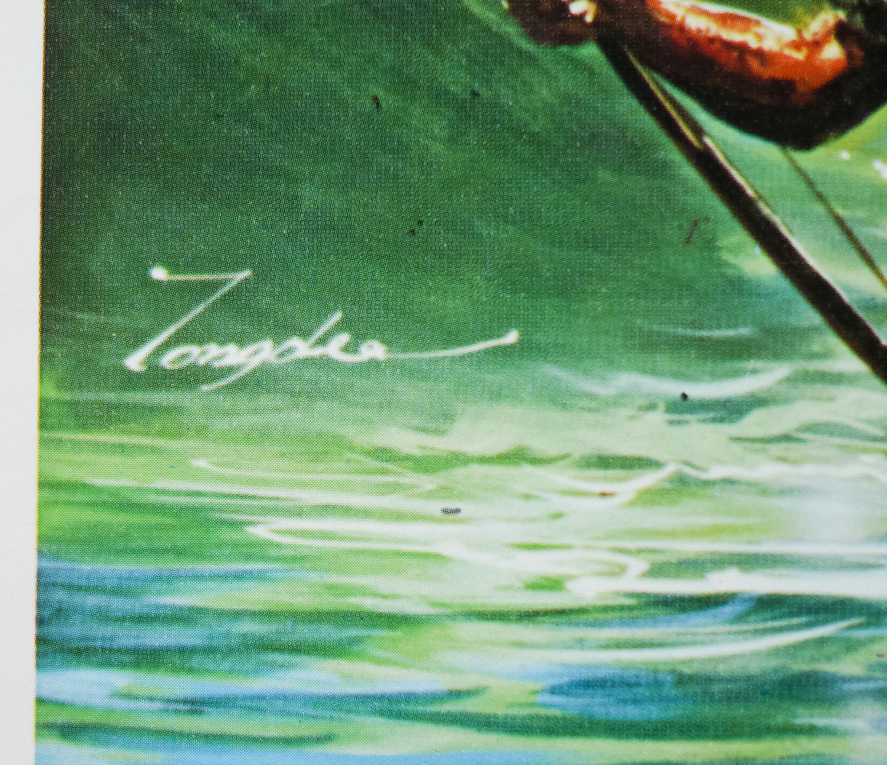
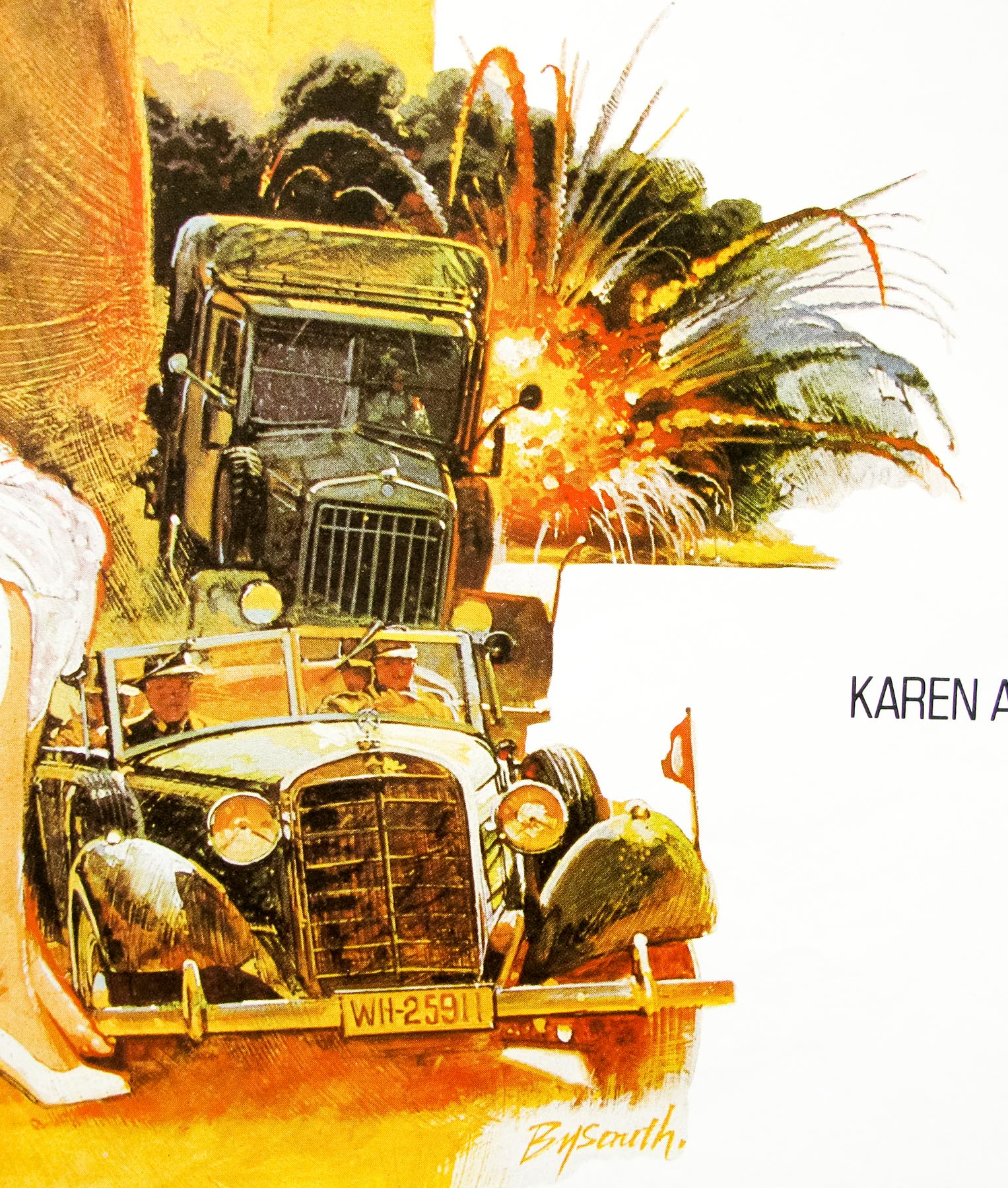
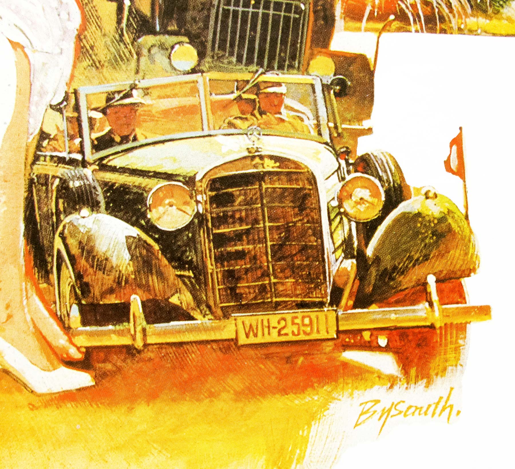
- Artist
- Brian Bysouth
- Size (inches)
- 27" x 40 13/16"
- SS or DS
- SS
- NSS #
- --
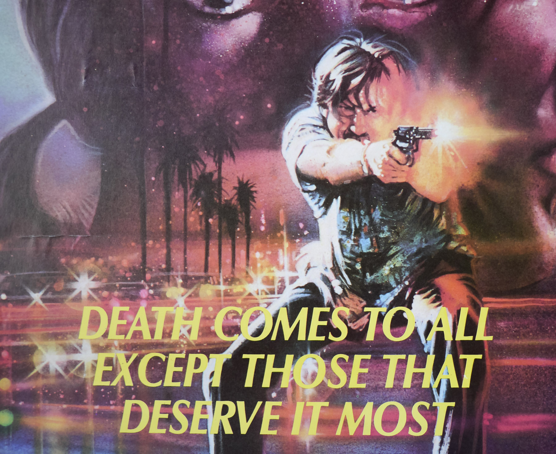
- Tagline
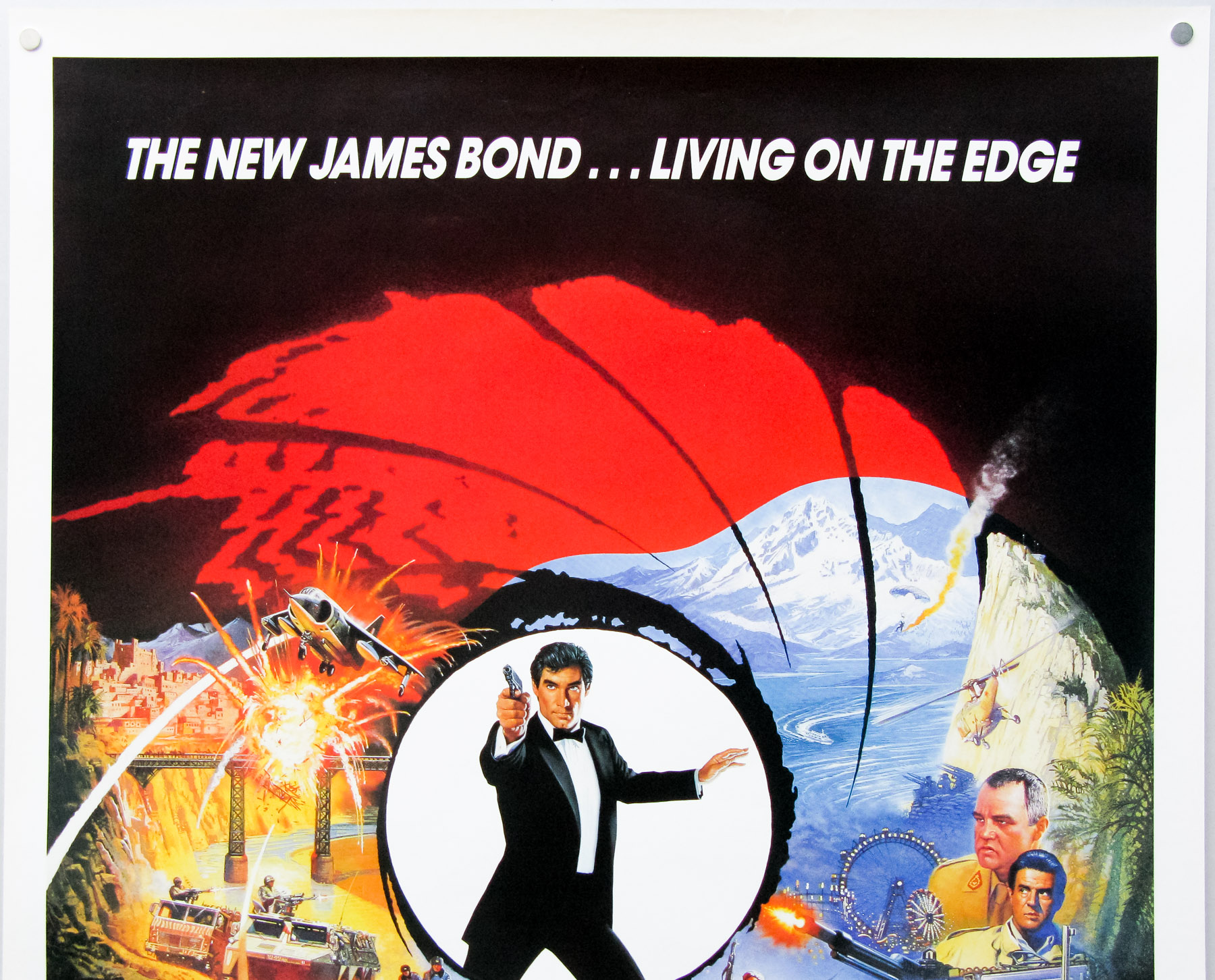
- The new James Bond... living on the edge.
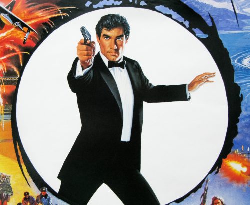
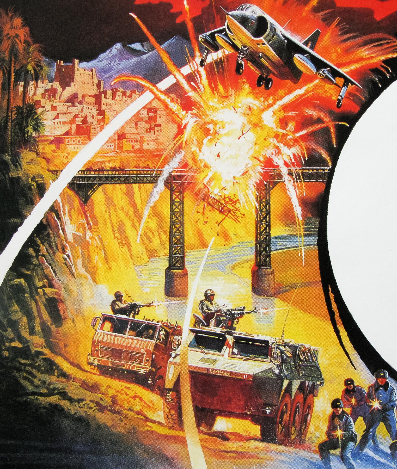
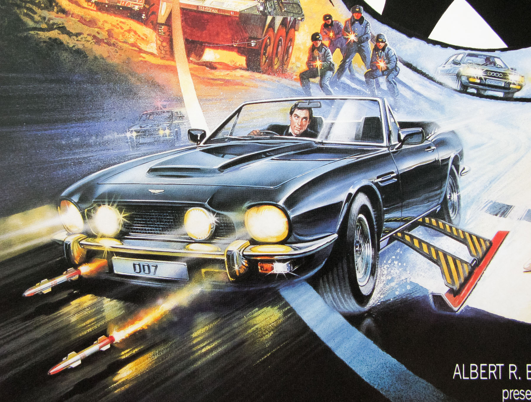
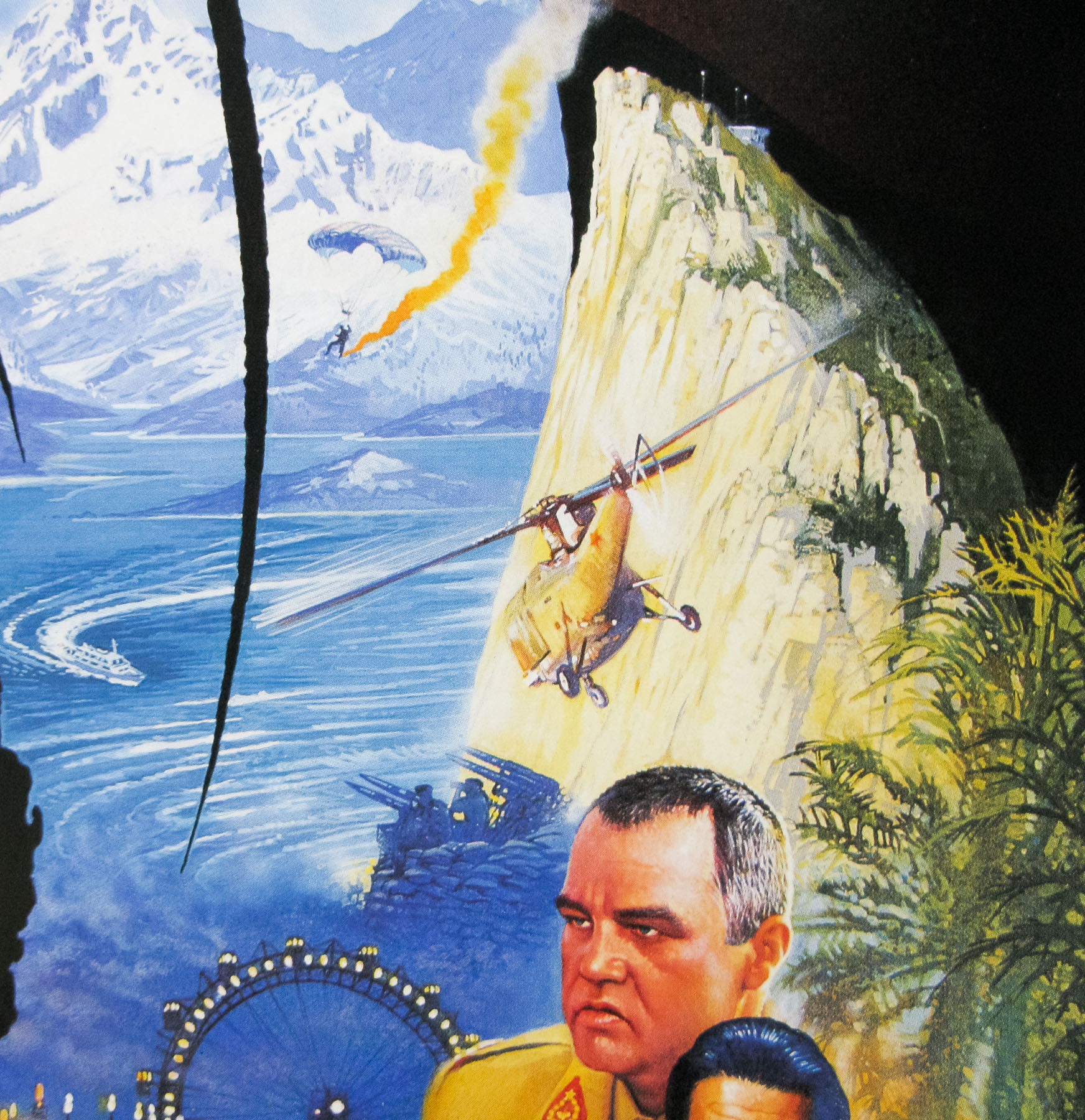
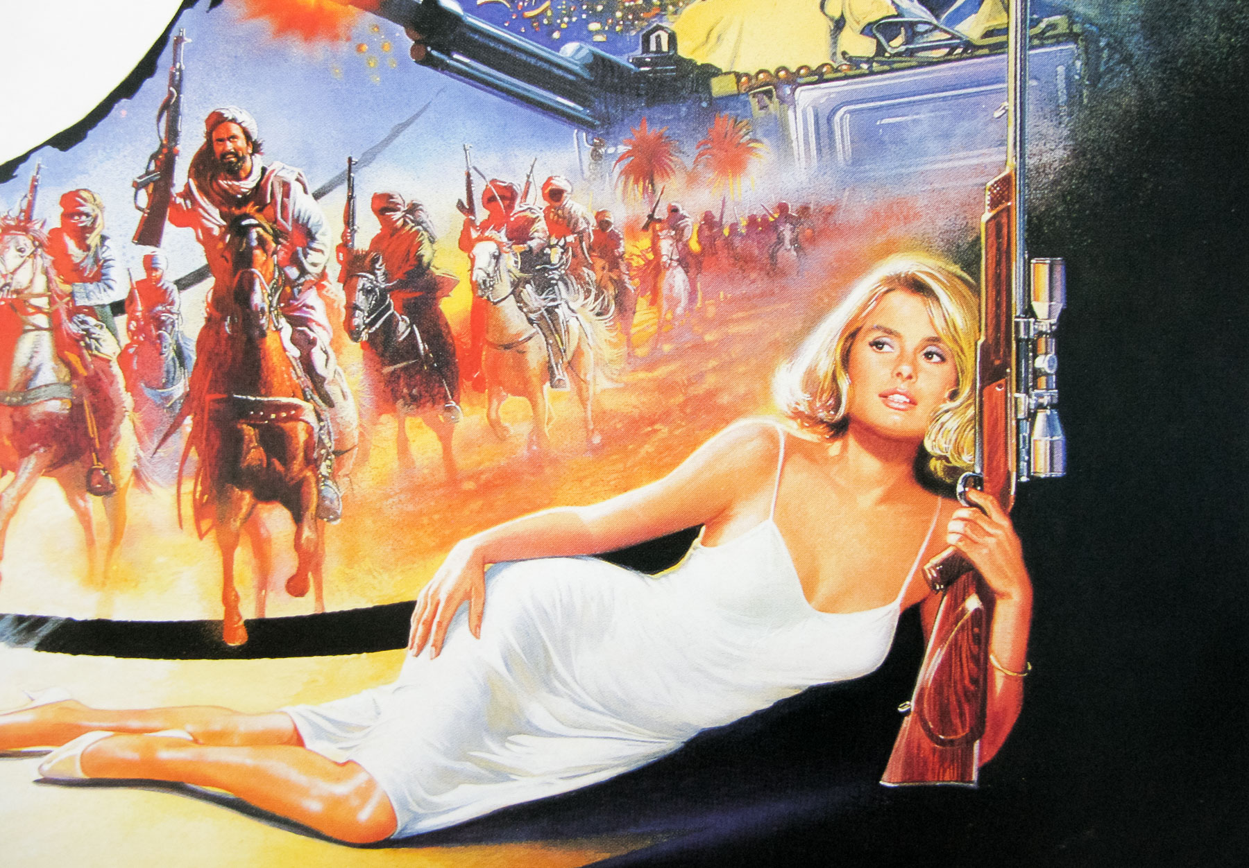
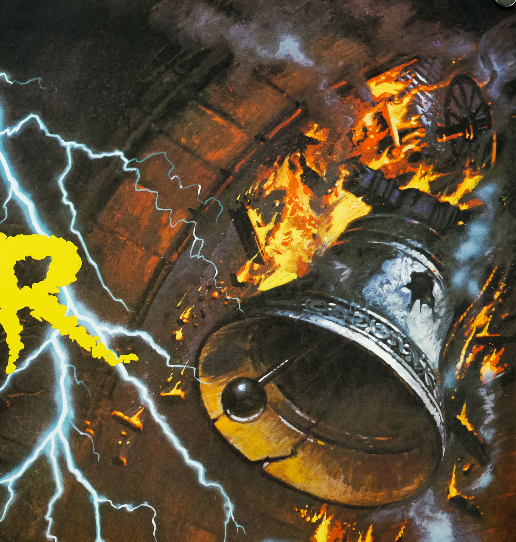
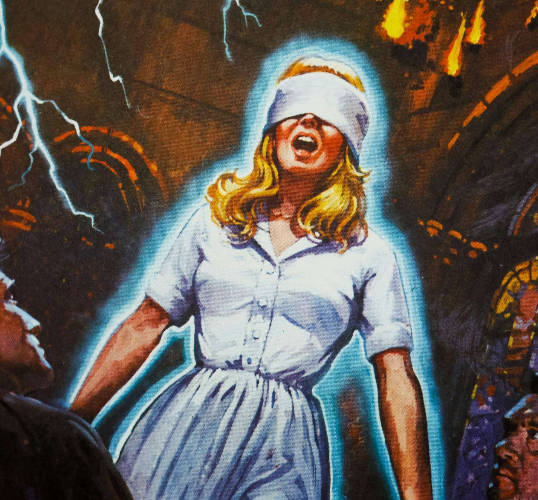
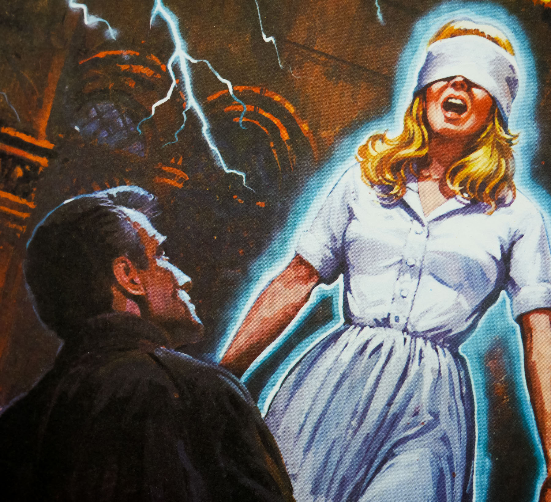
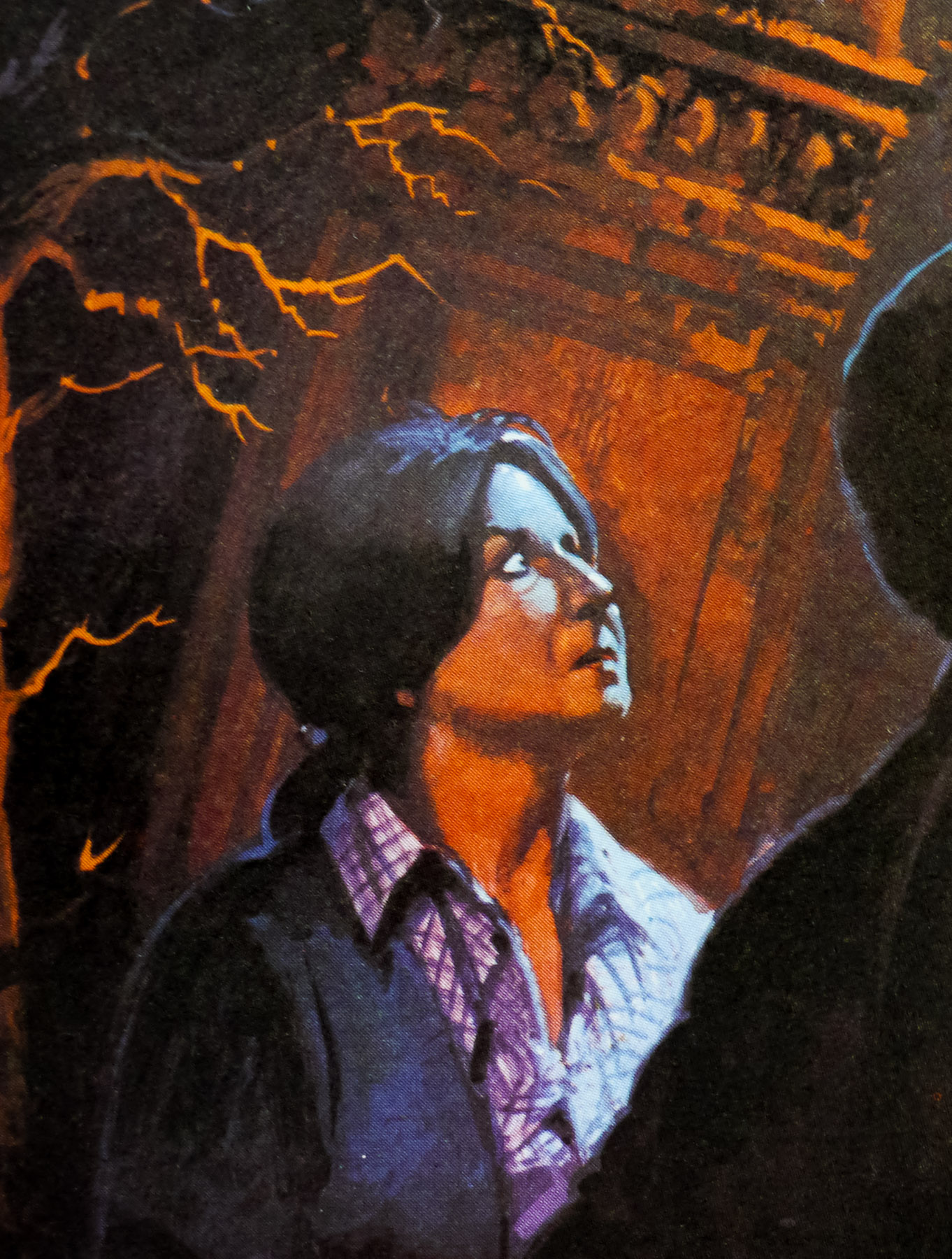
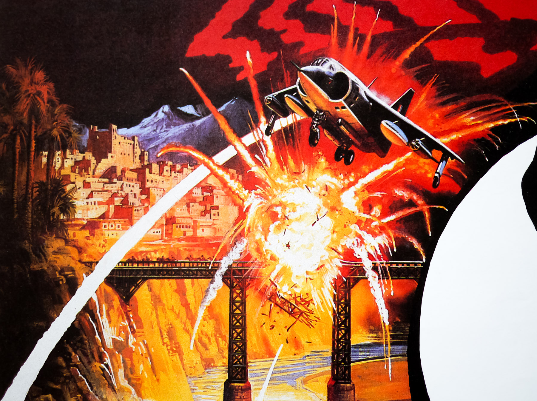
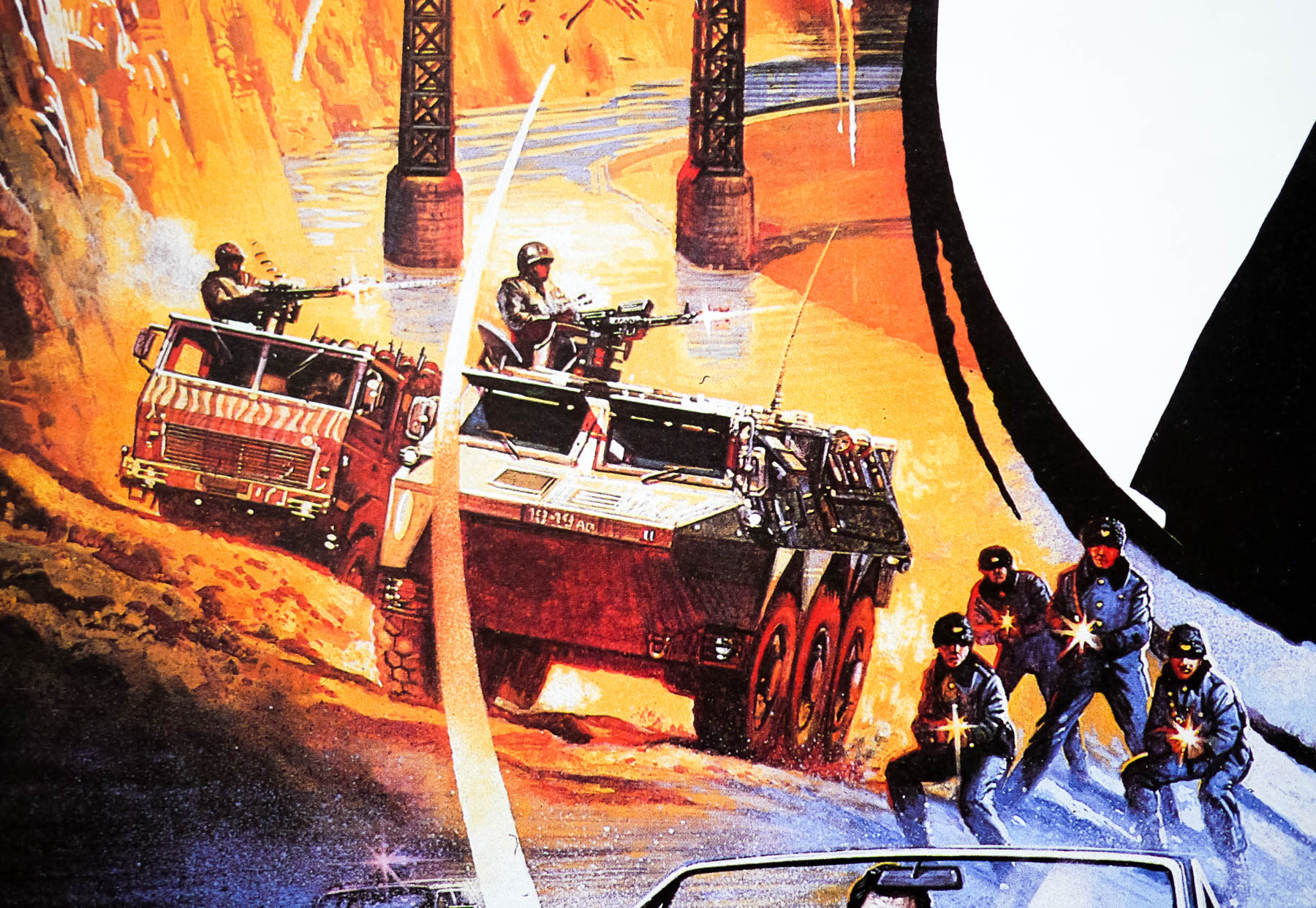
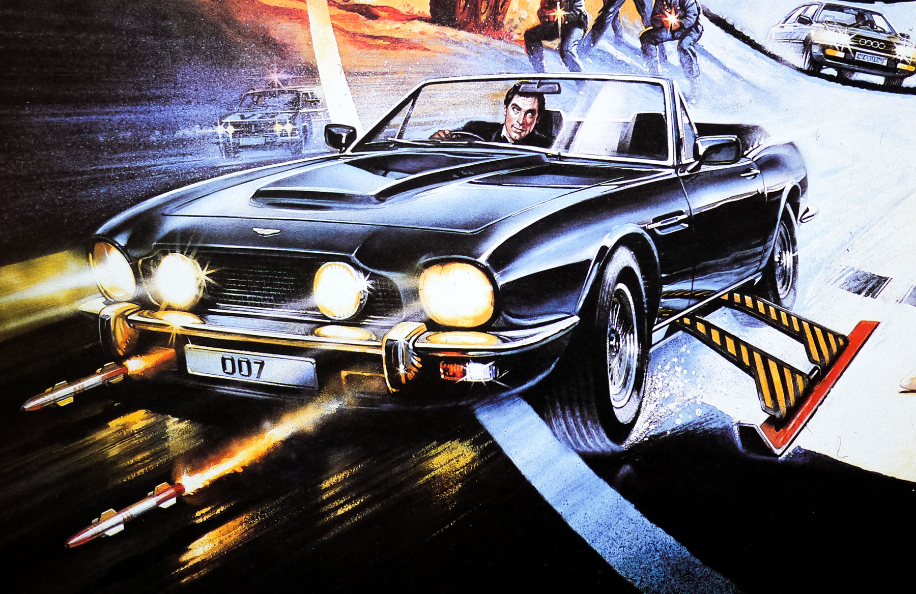
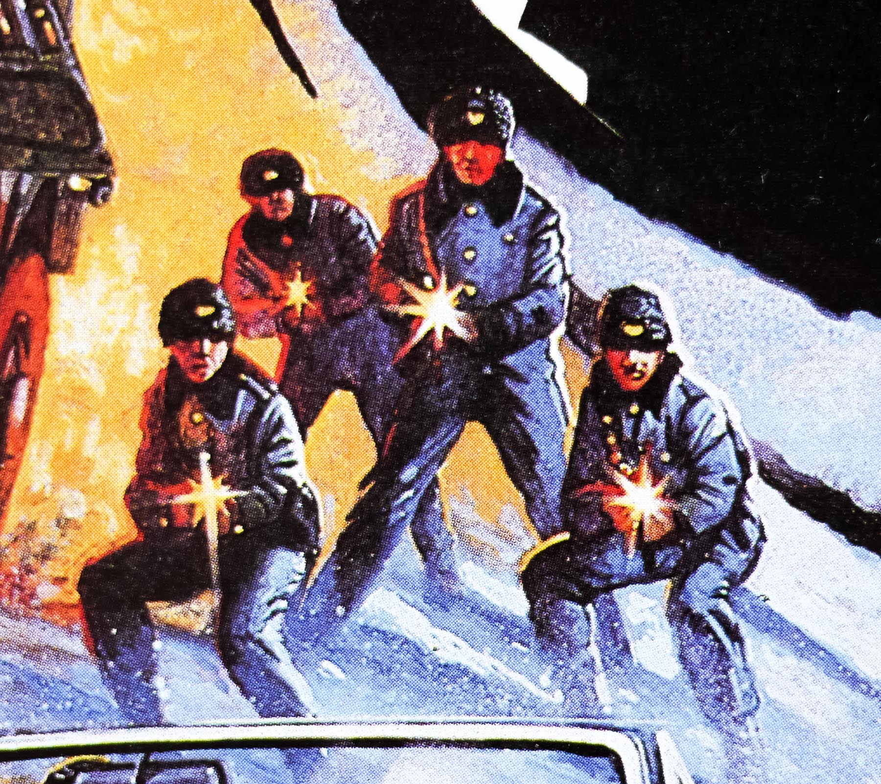
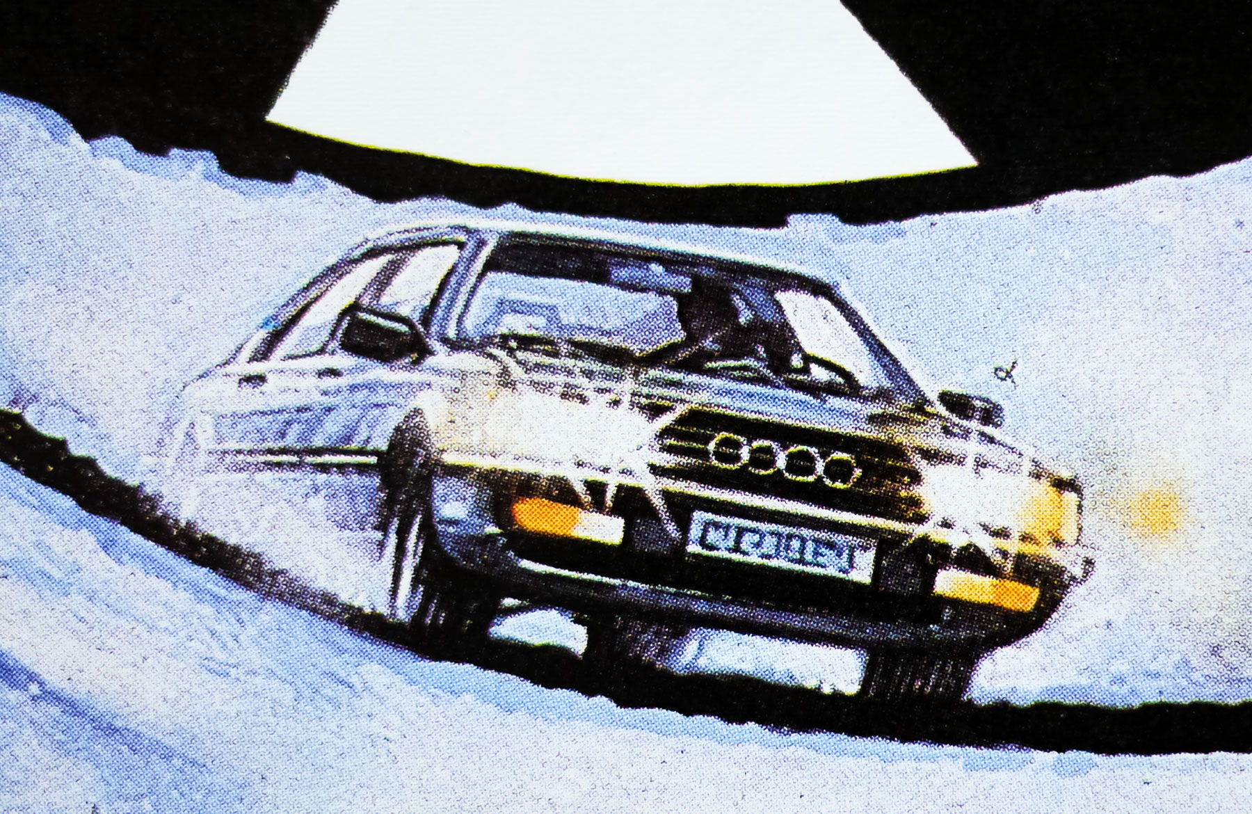
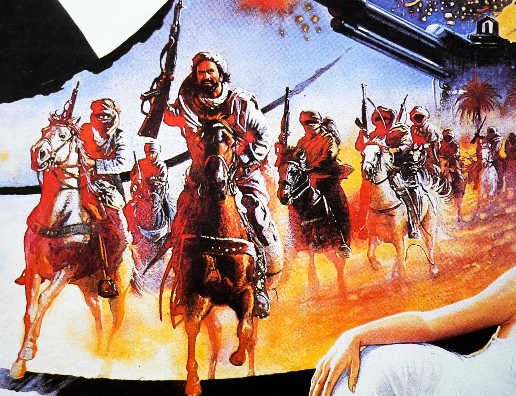
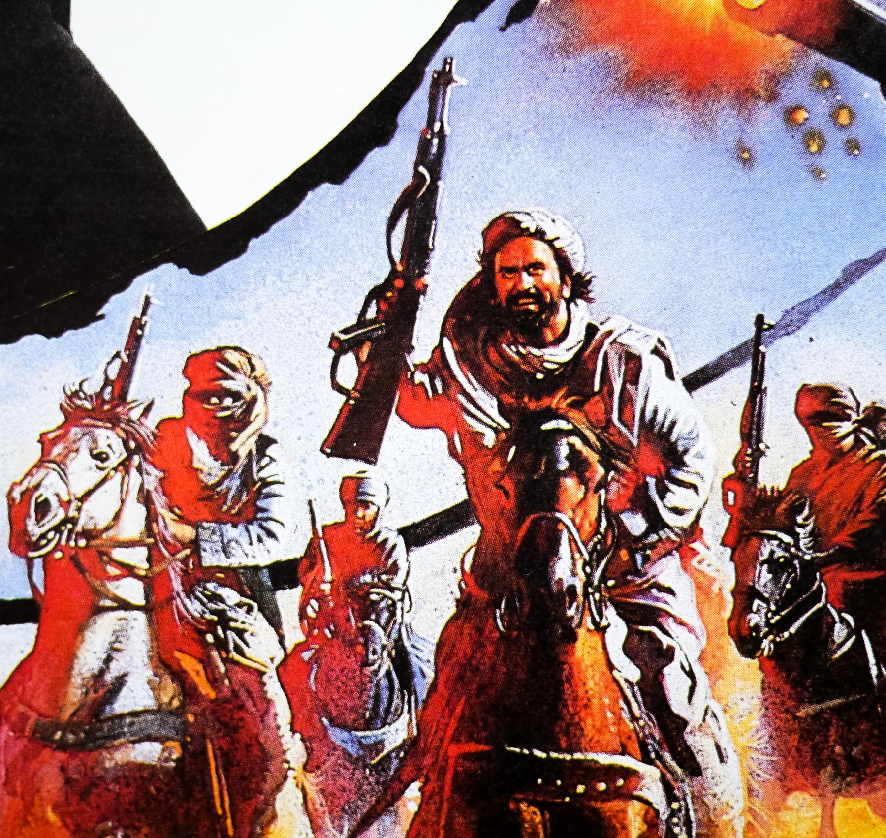
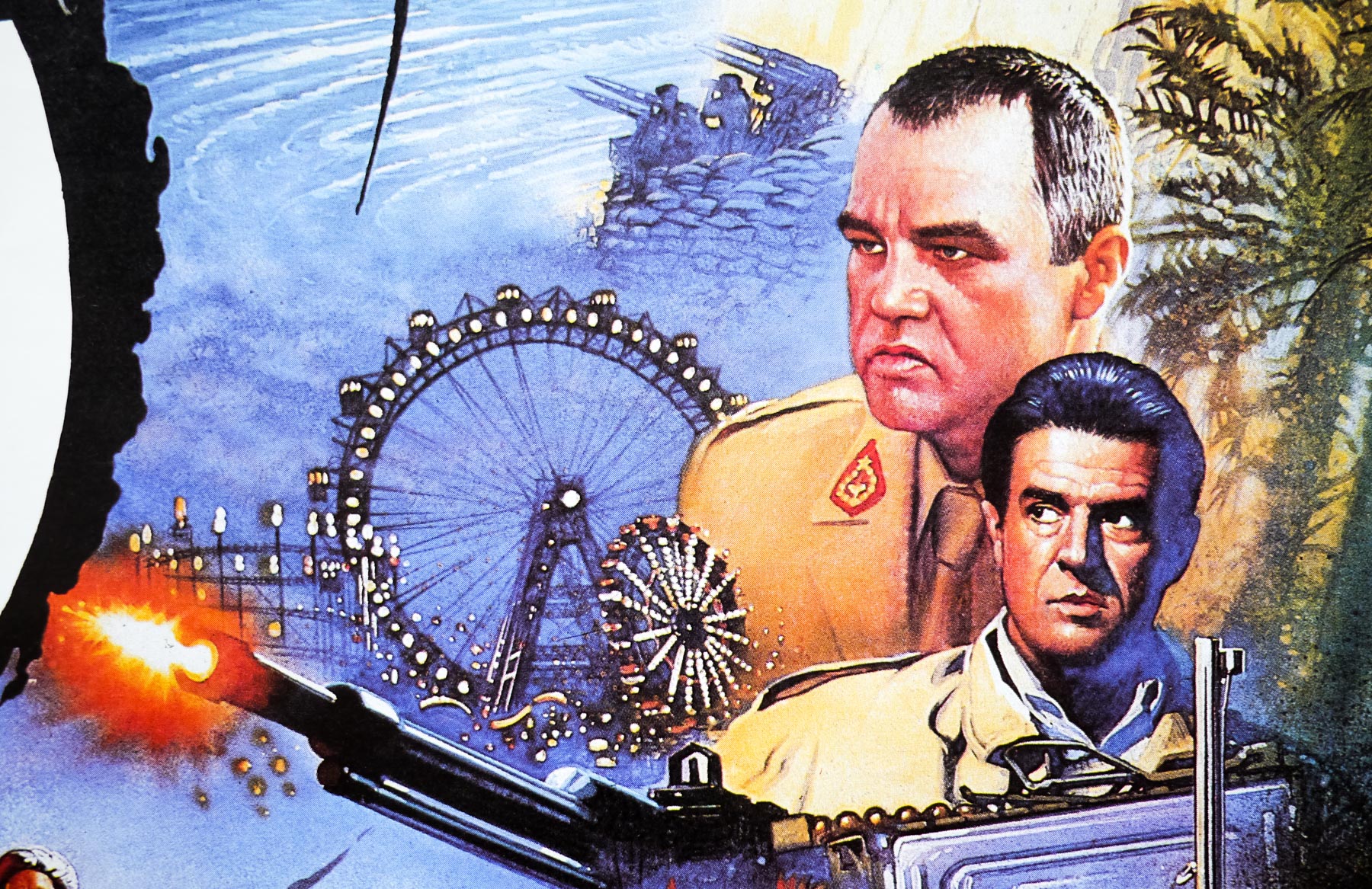
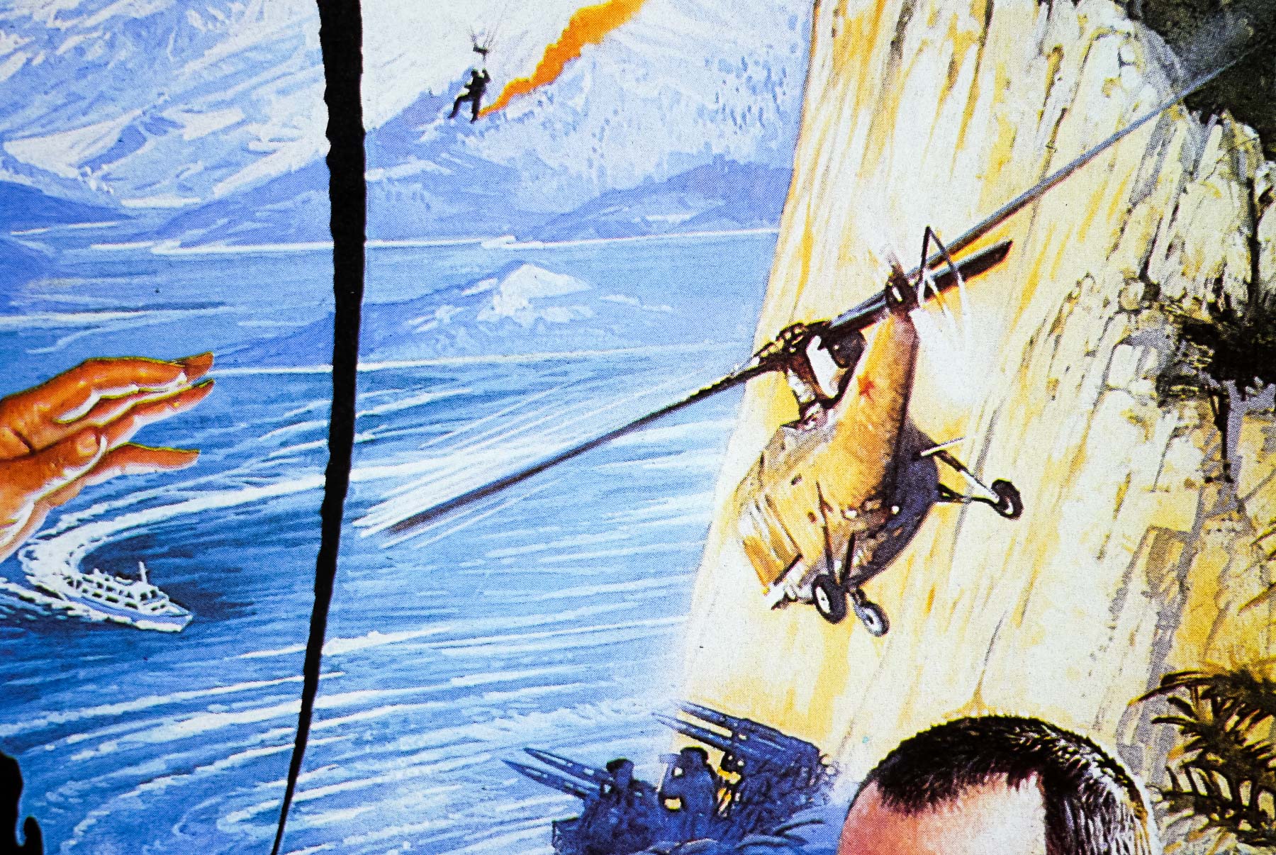
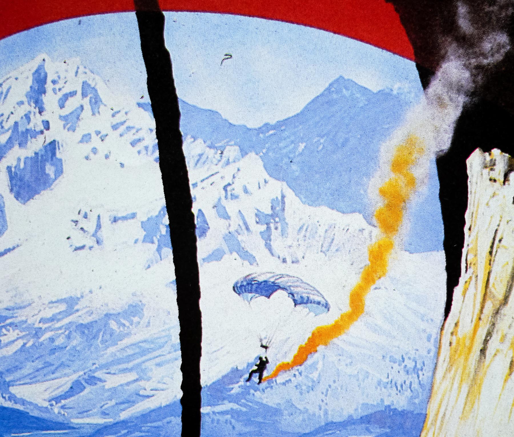
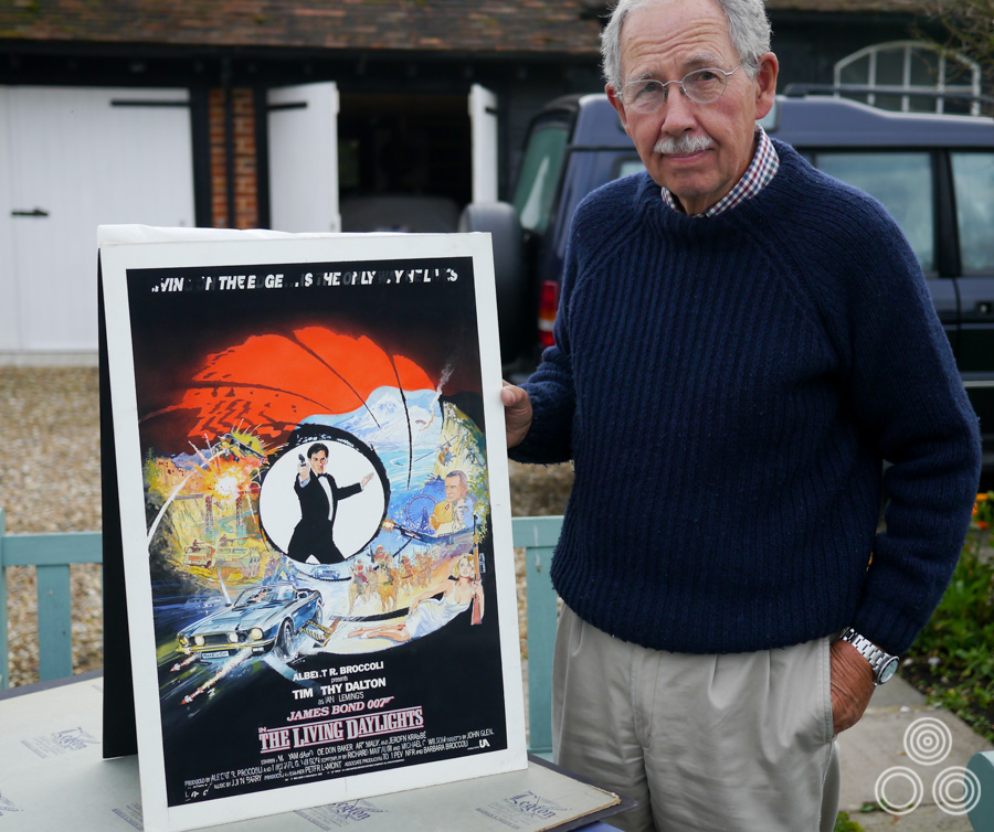
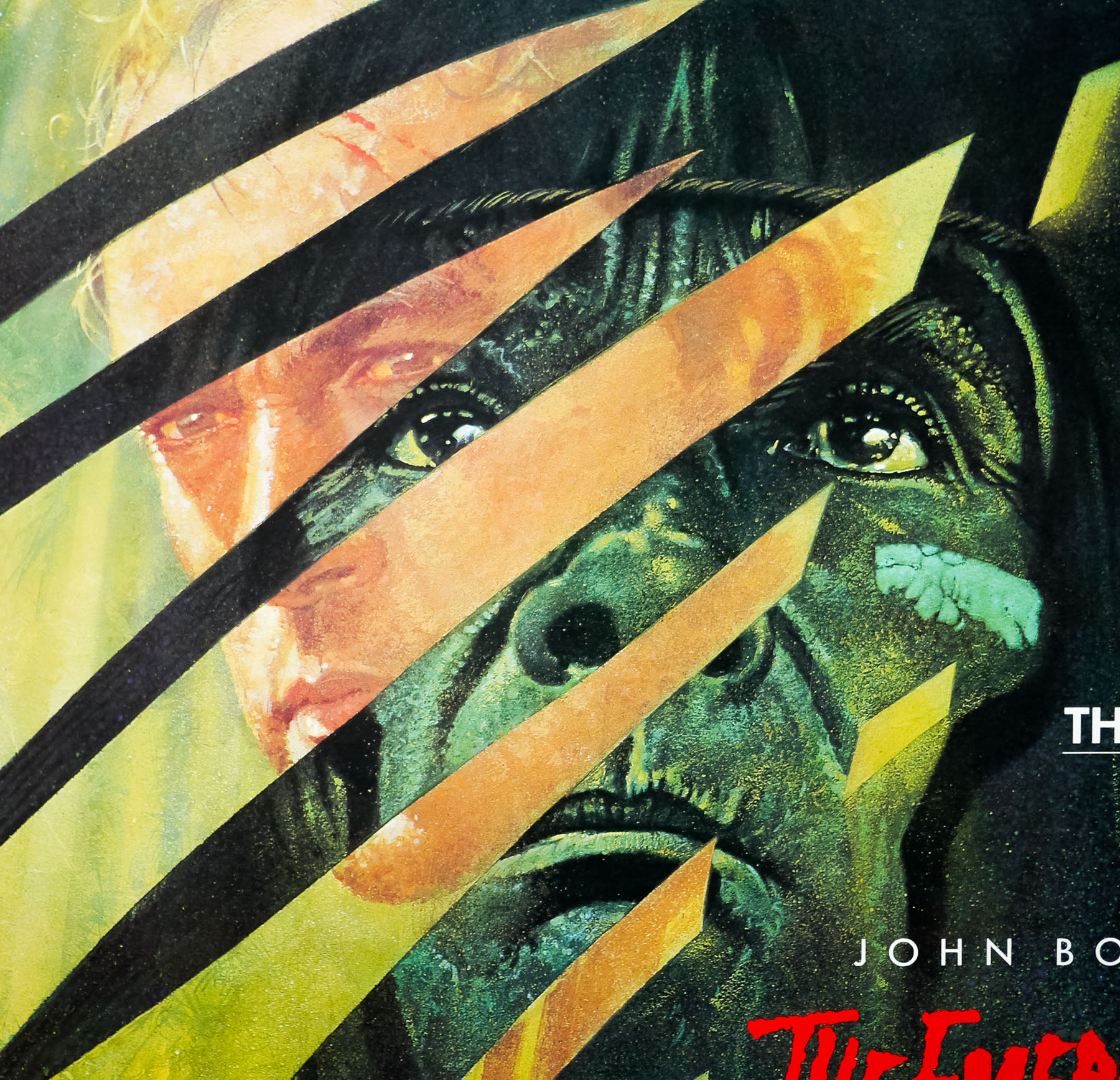
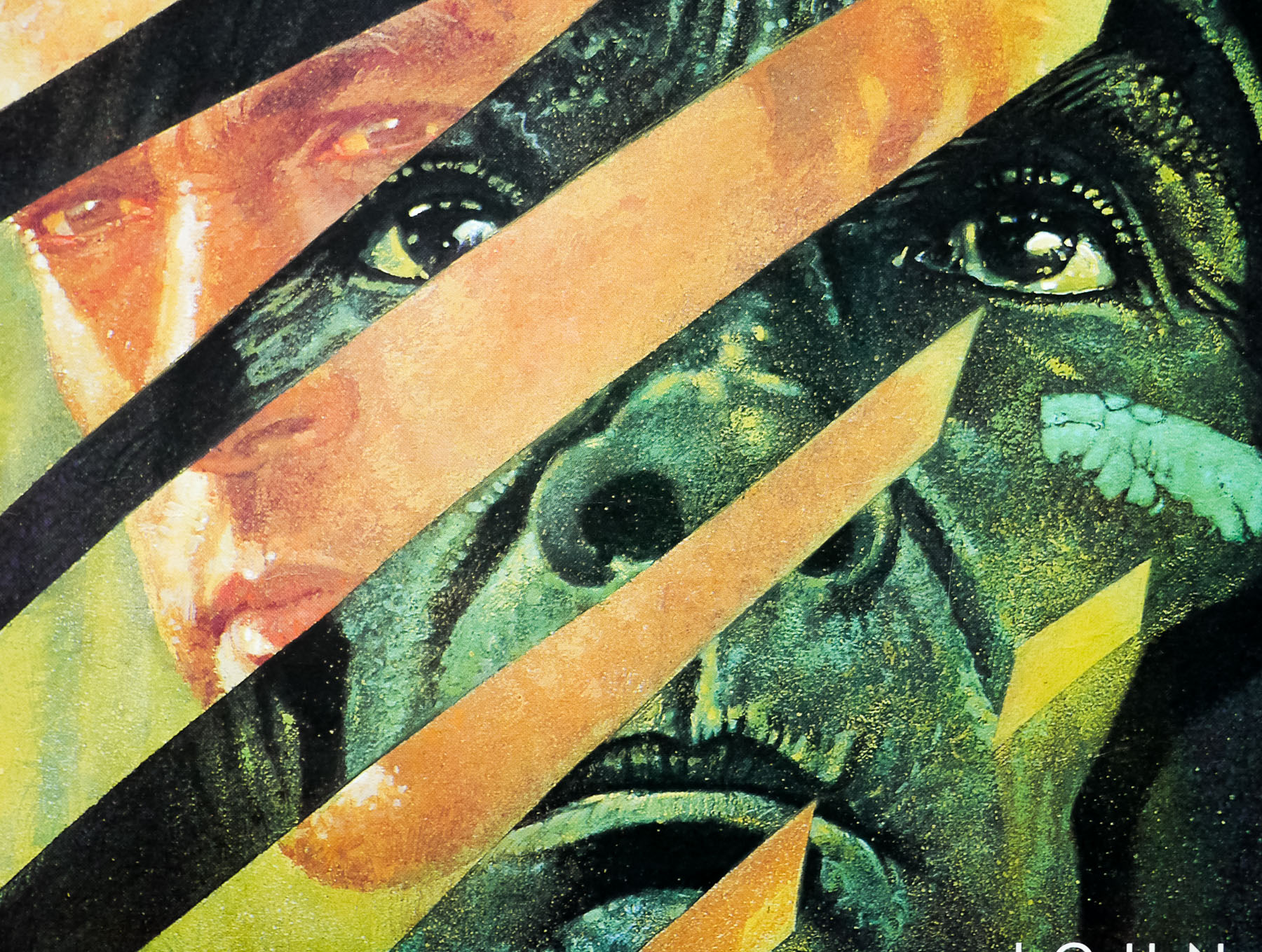
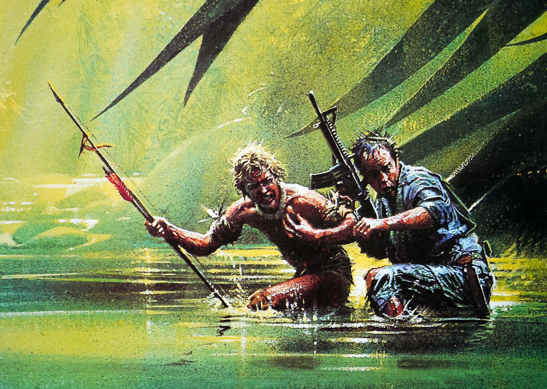
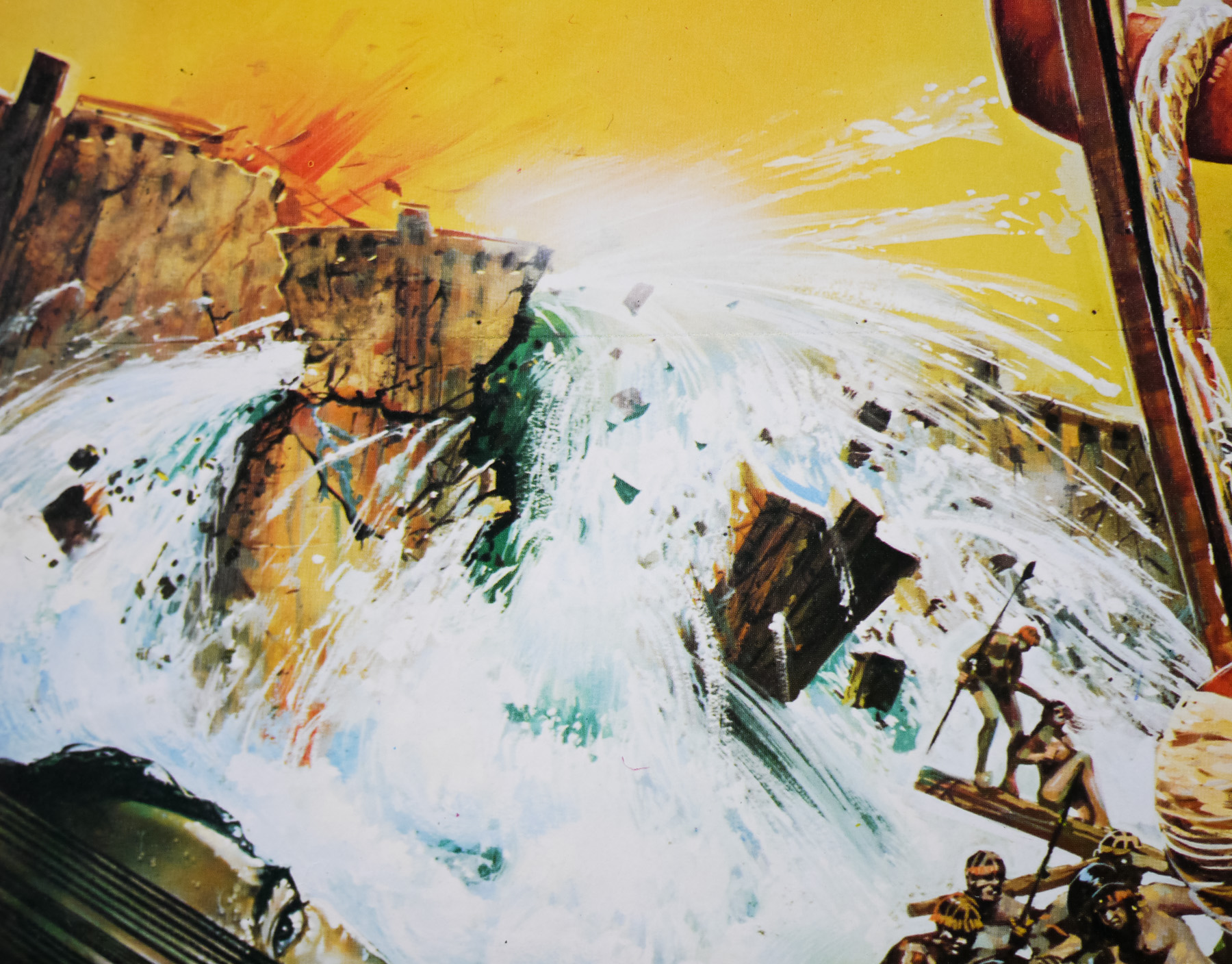
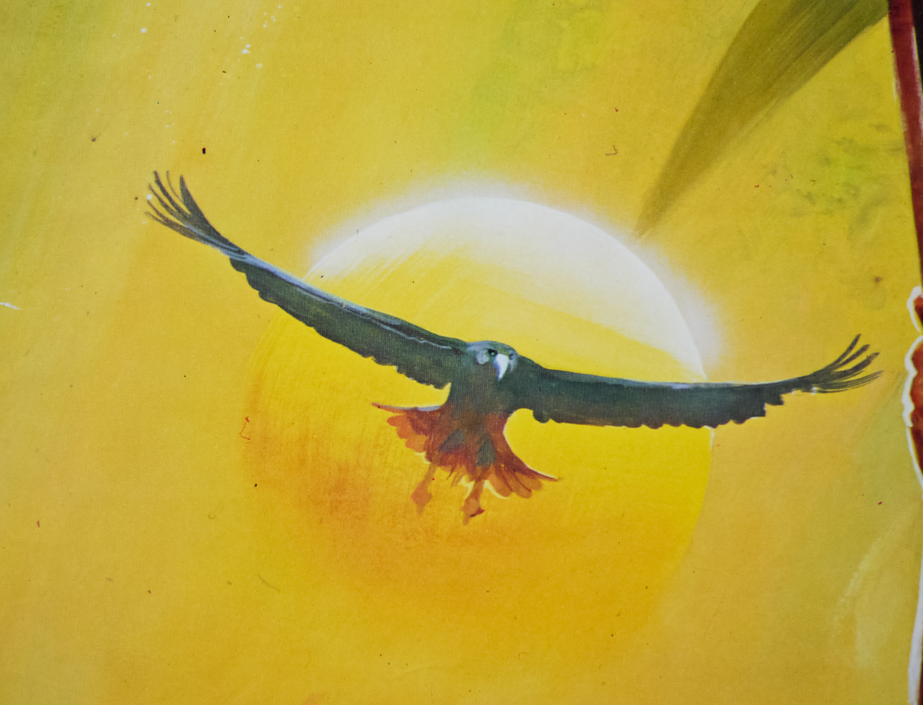
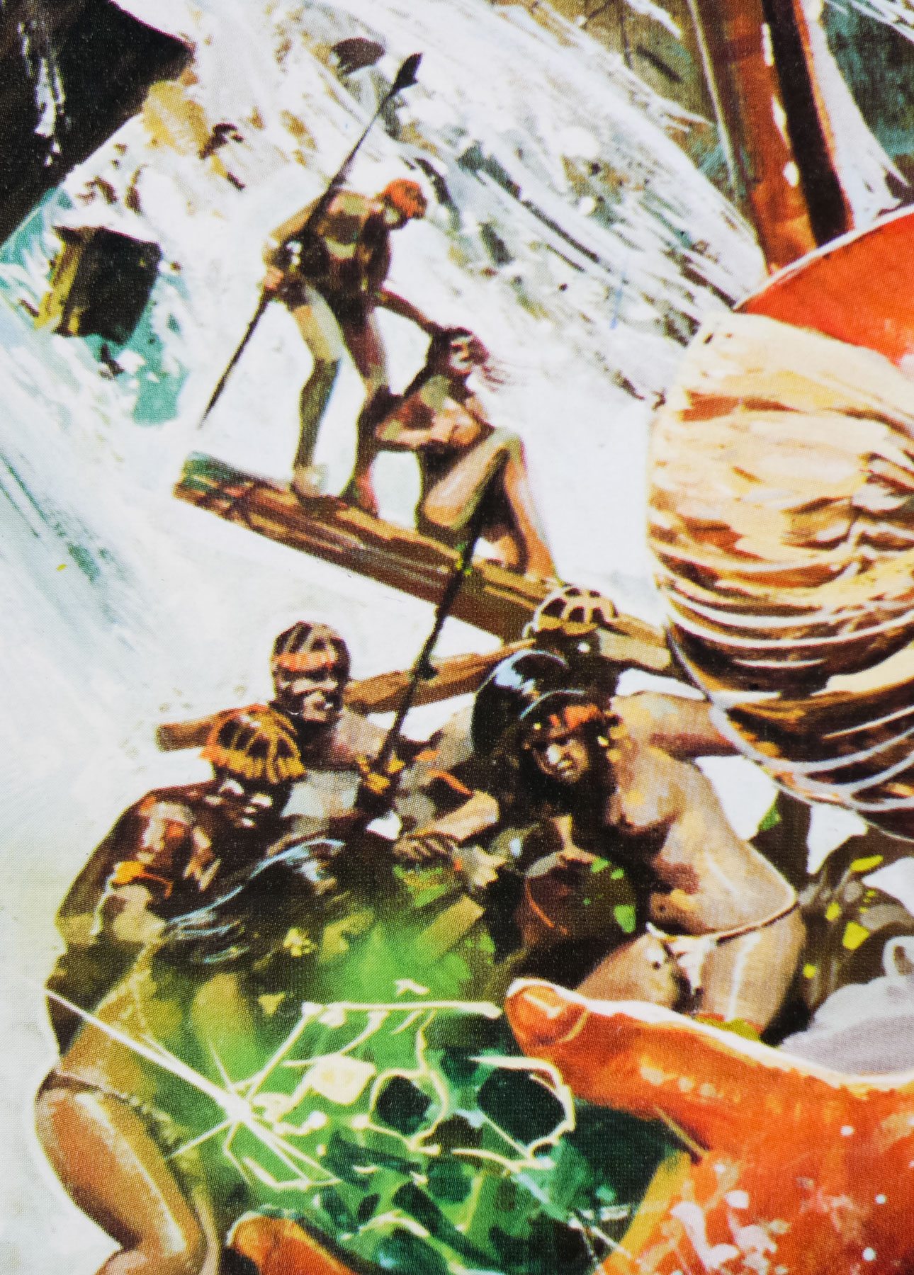
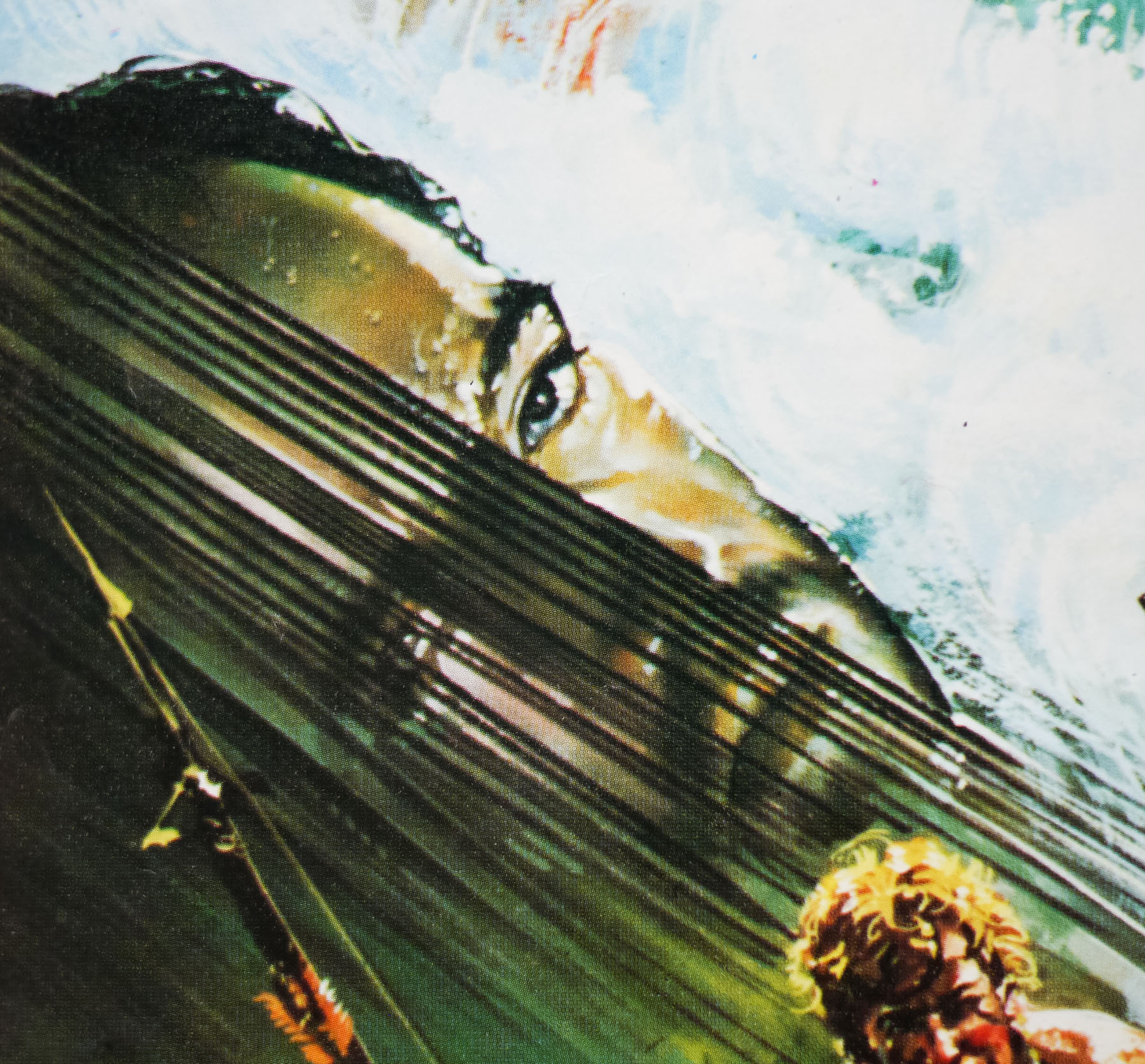
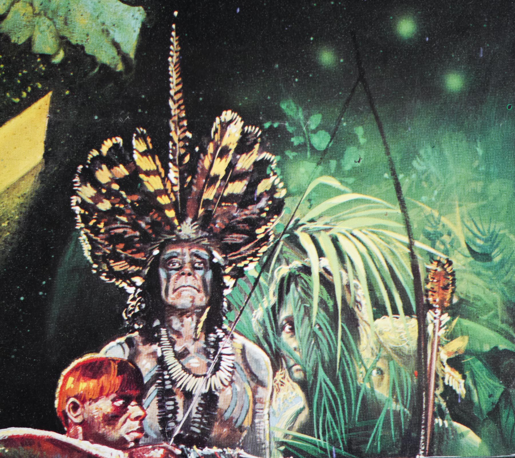
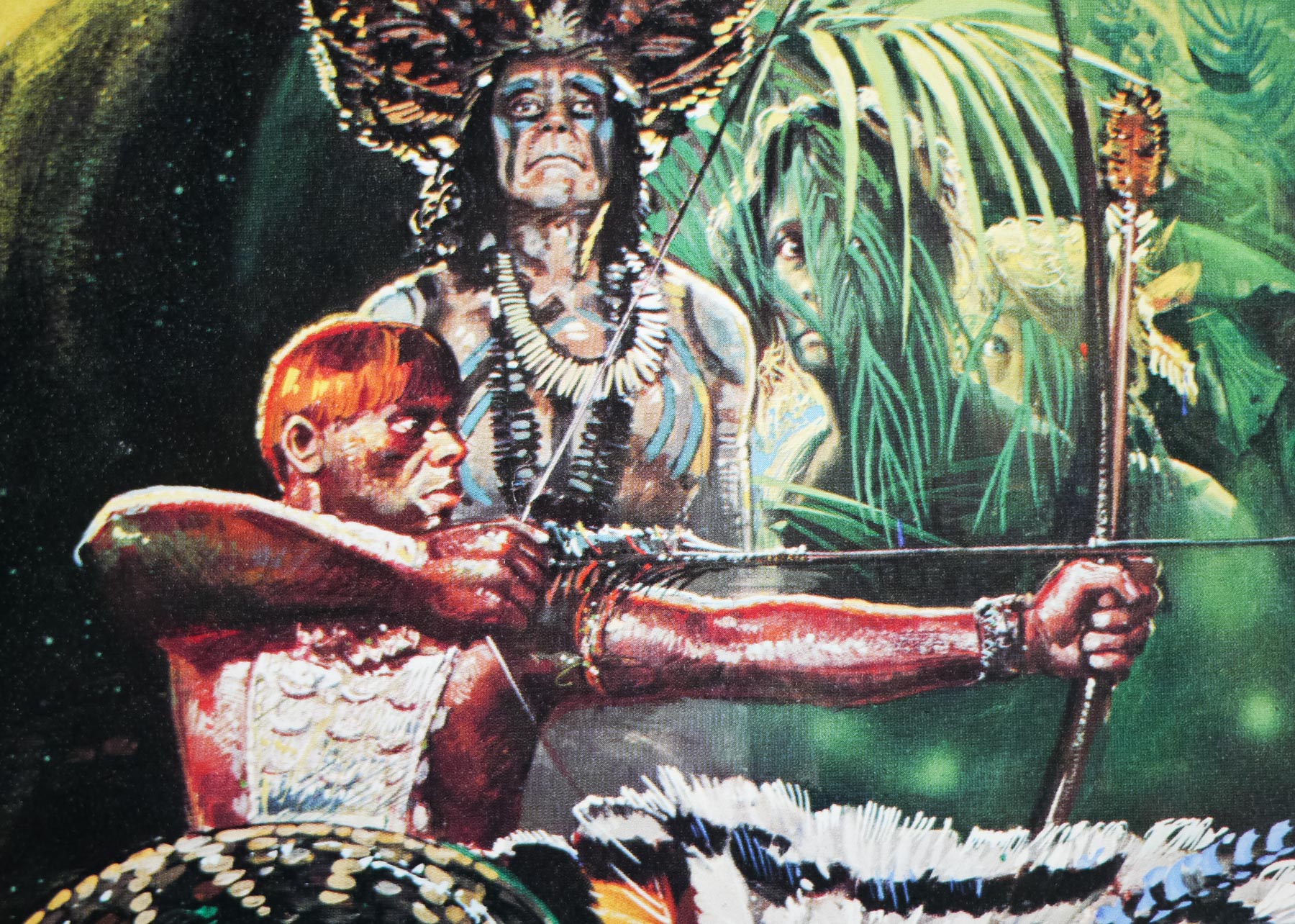
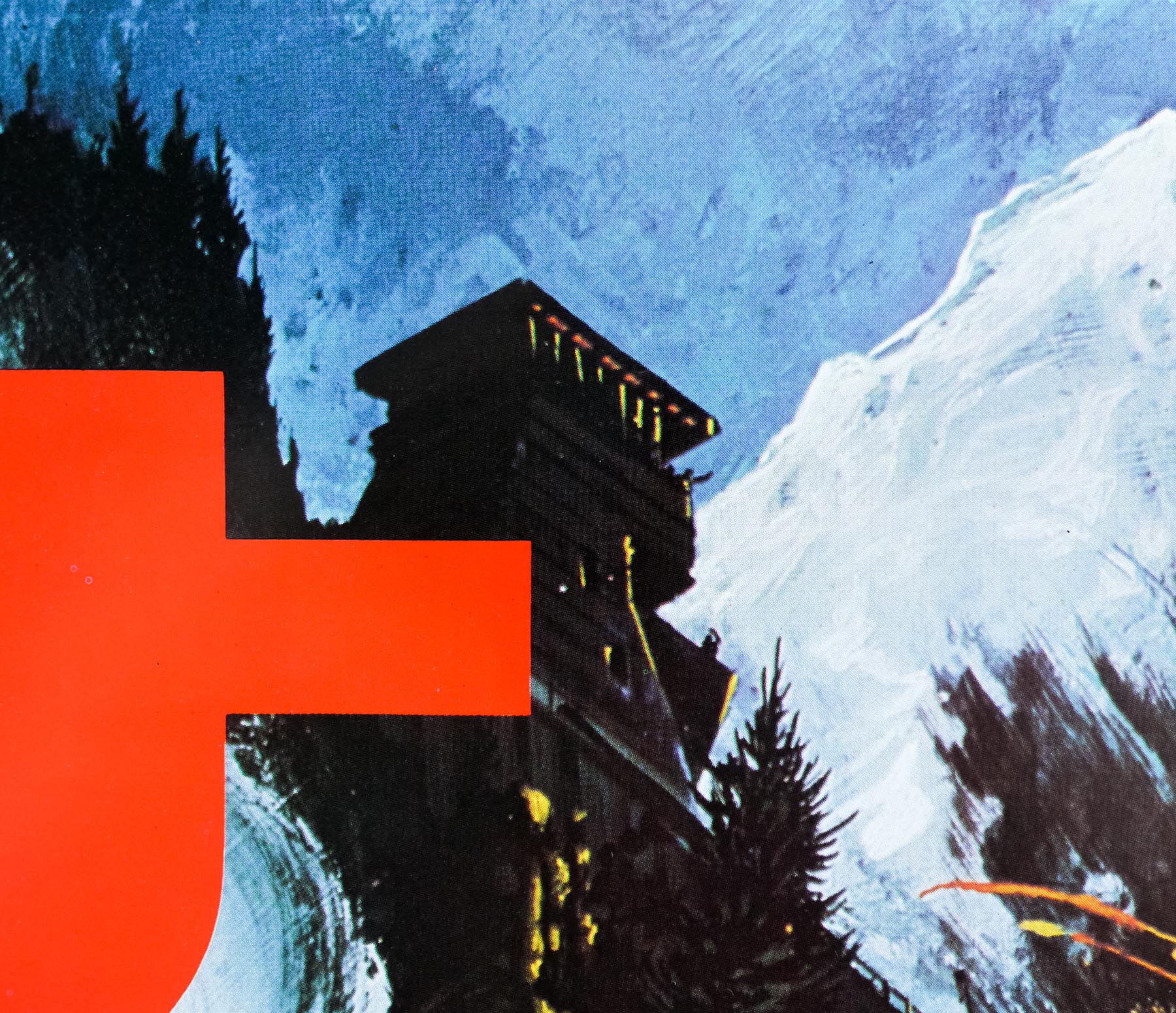
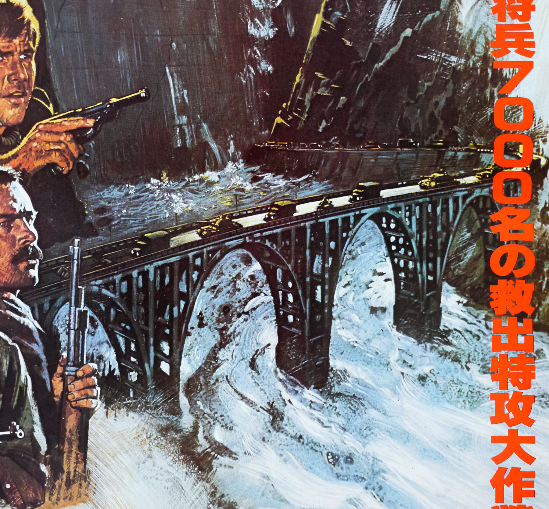
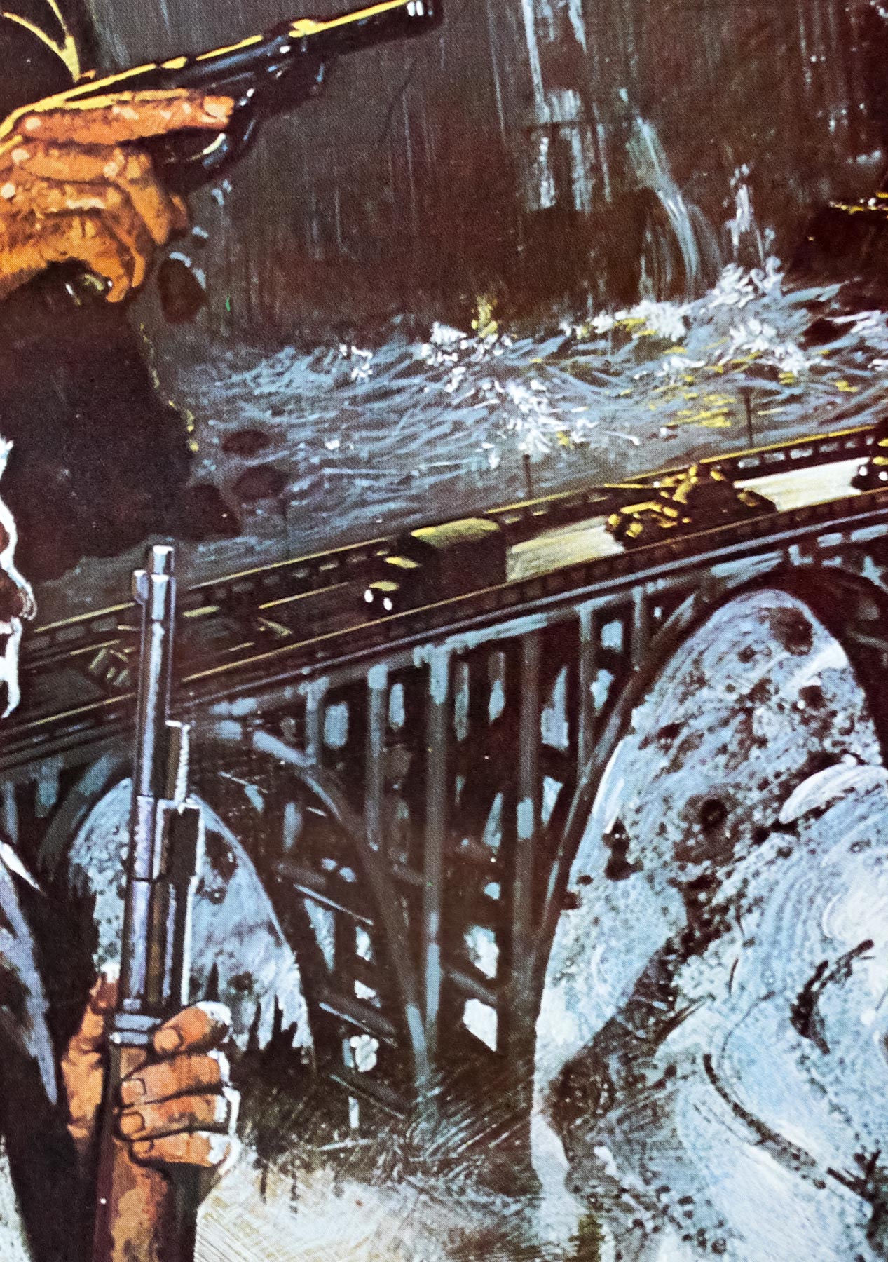
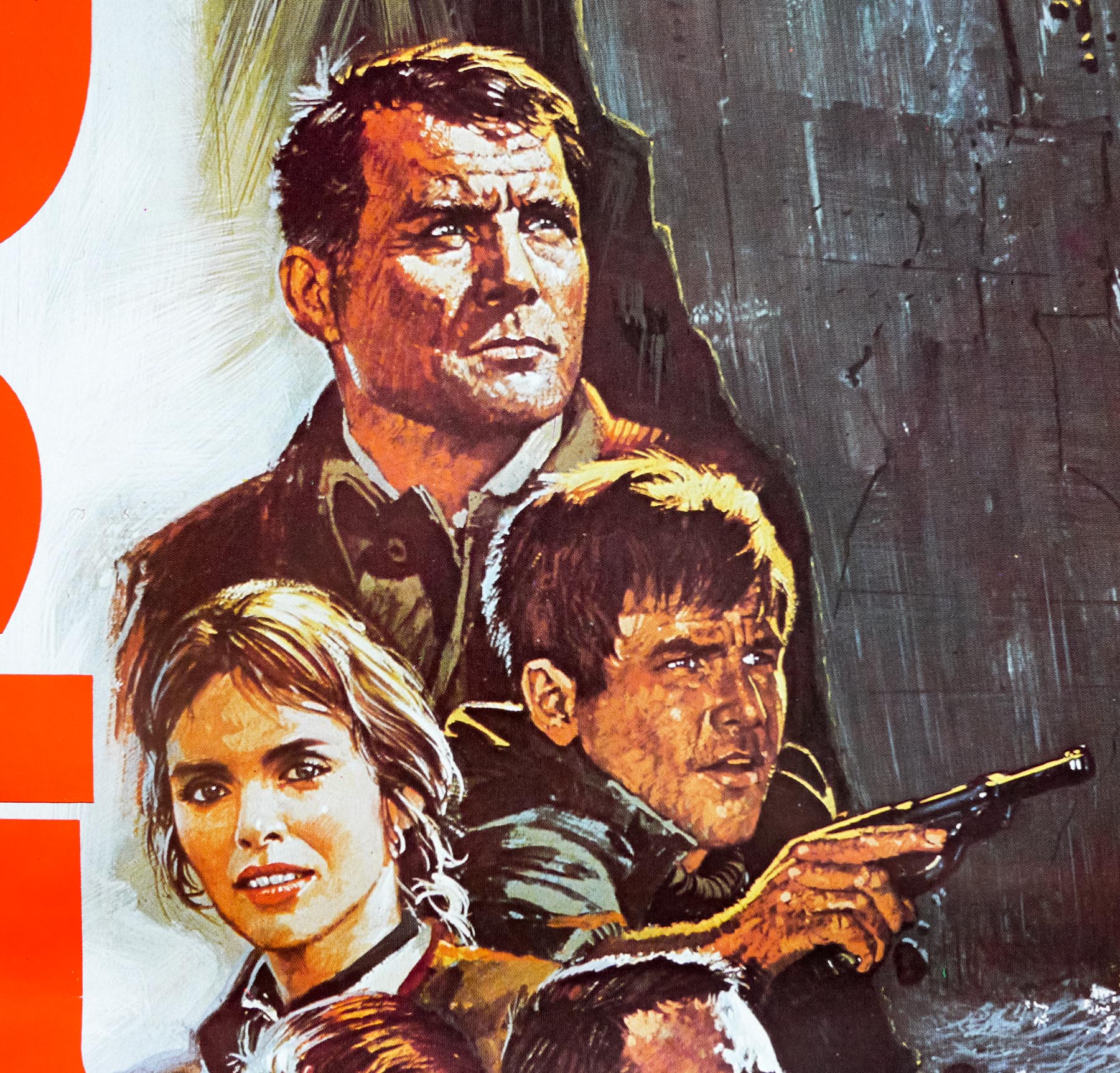
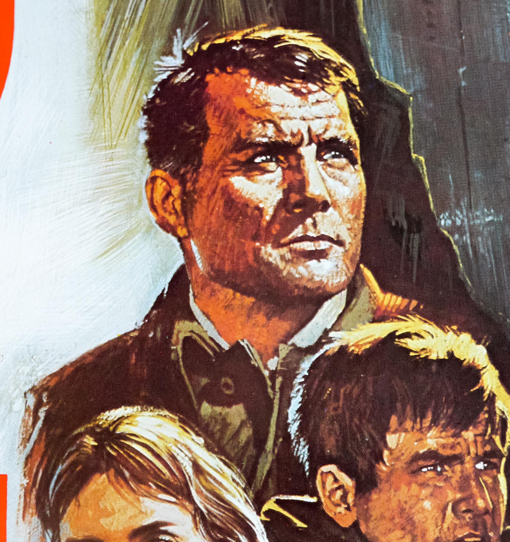
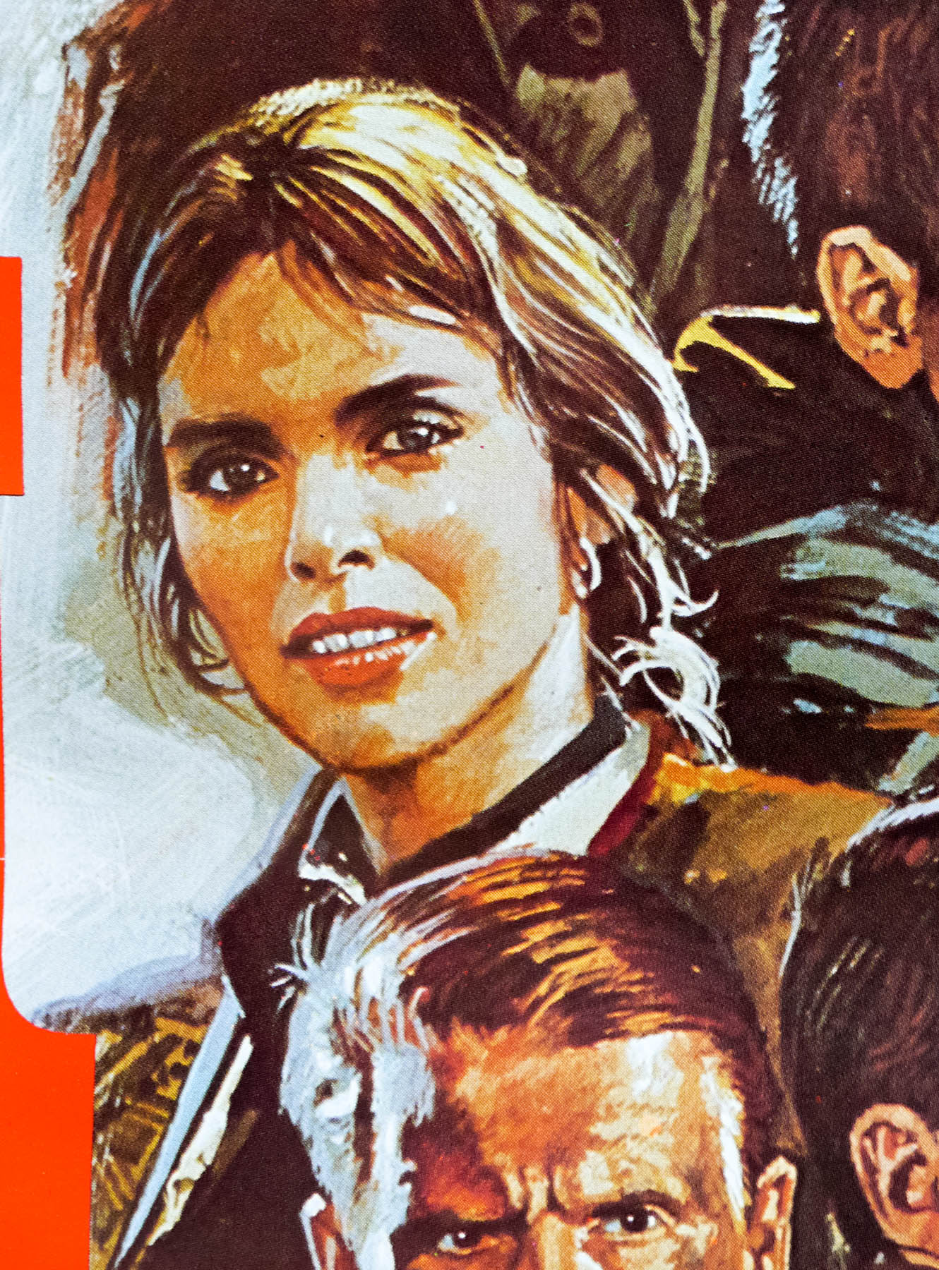
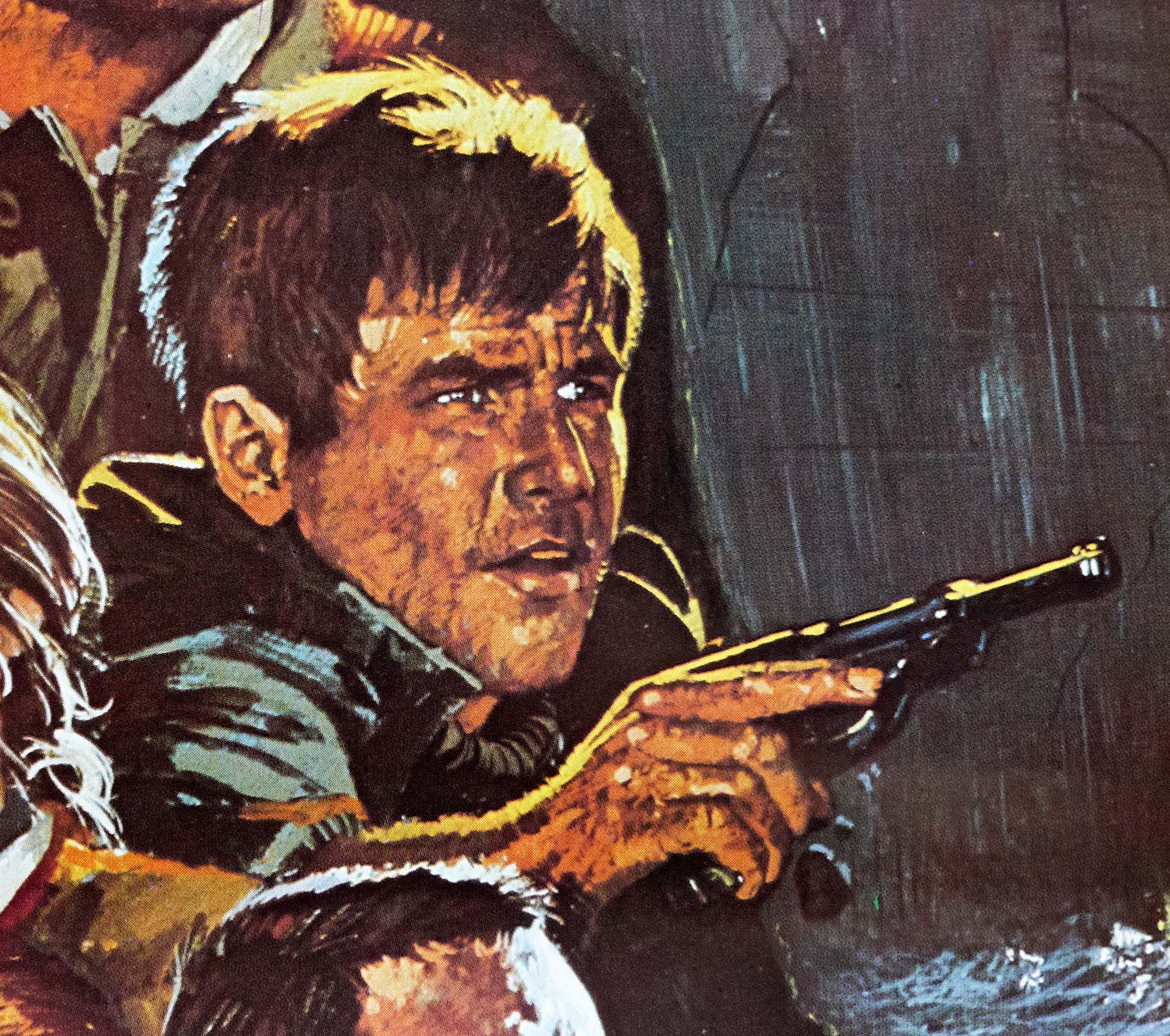
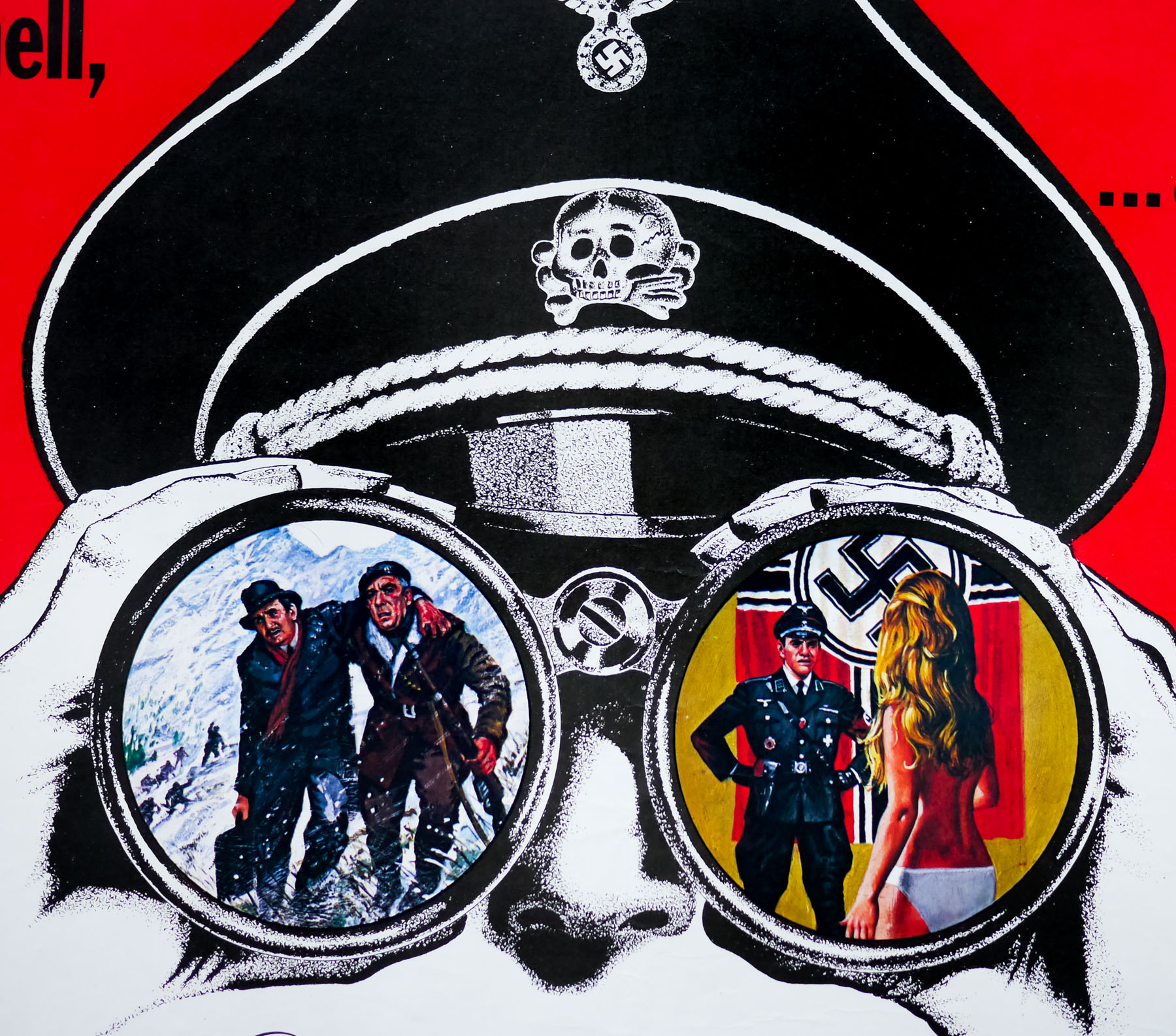
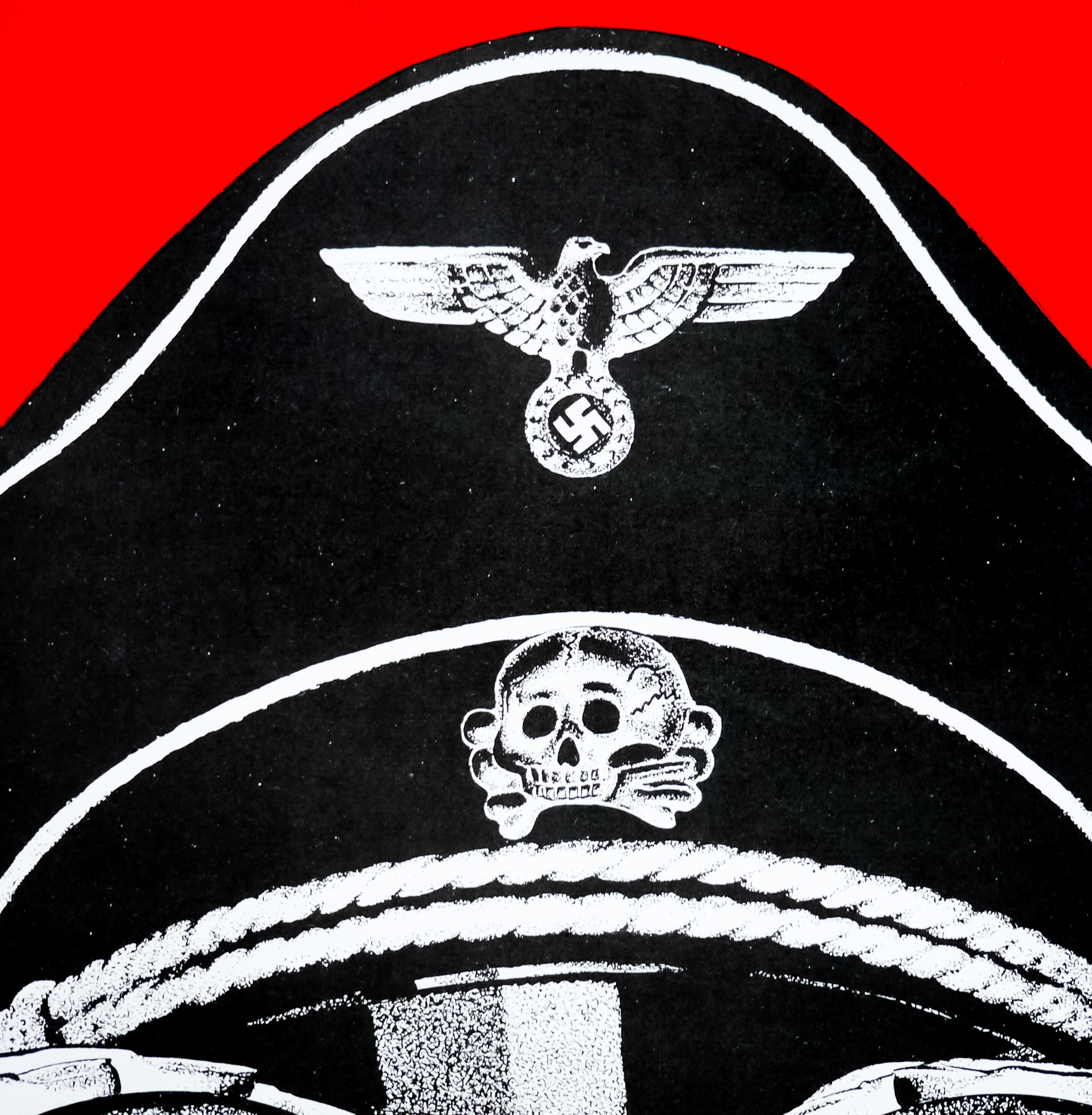
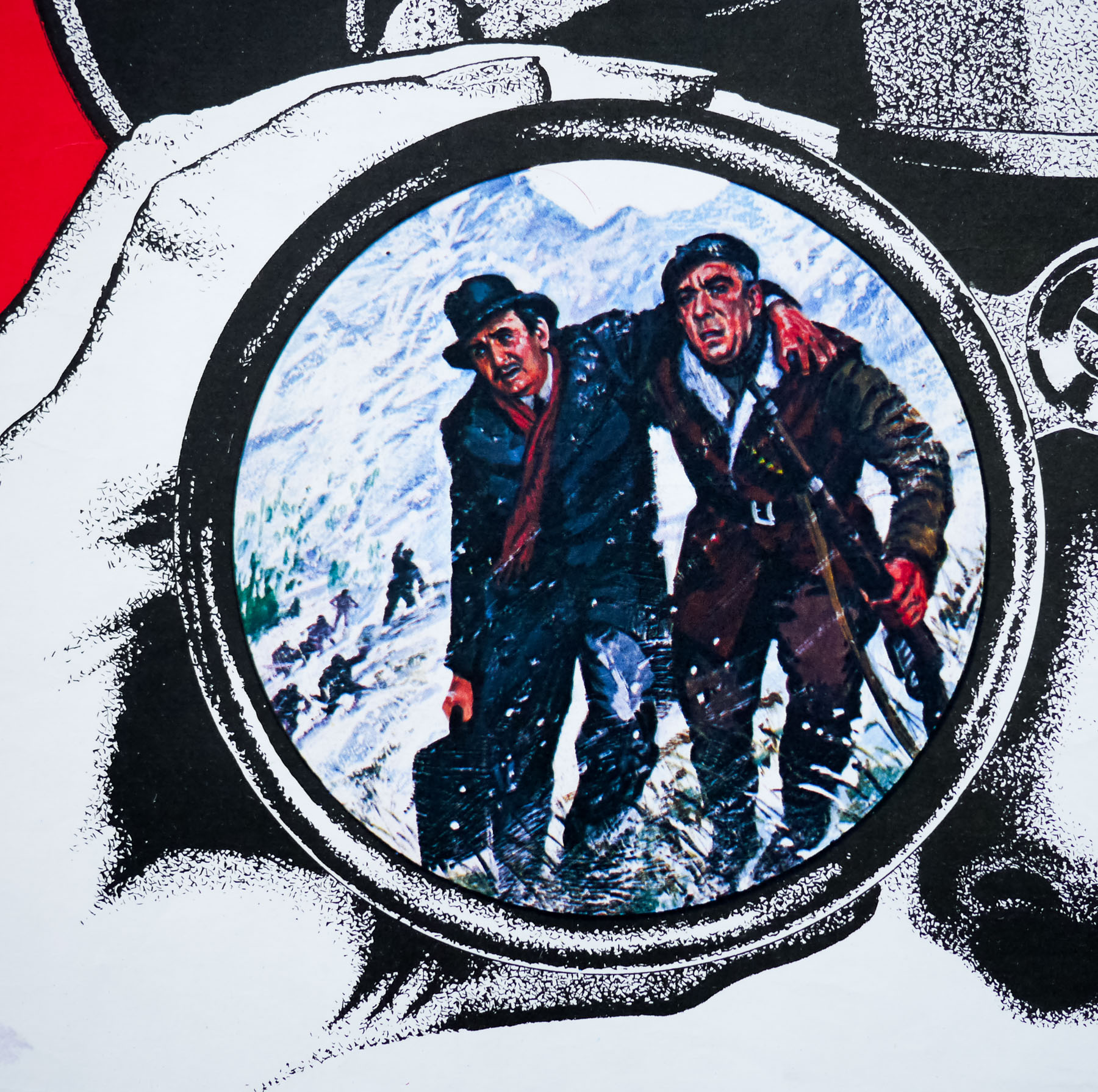
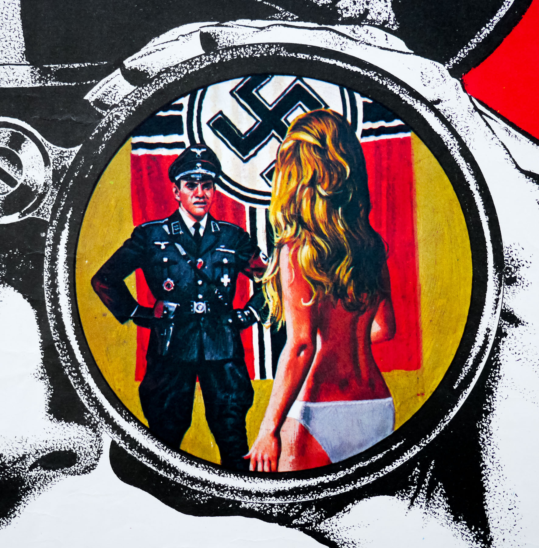
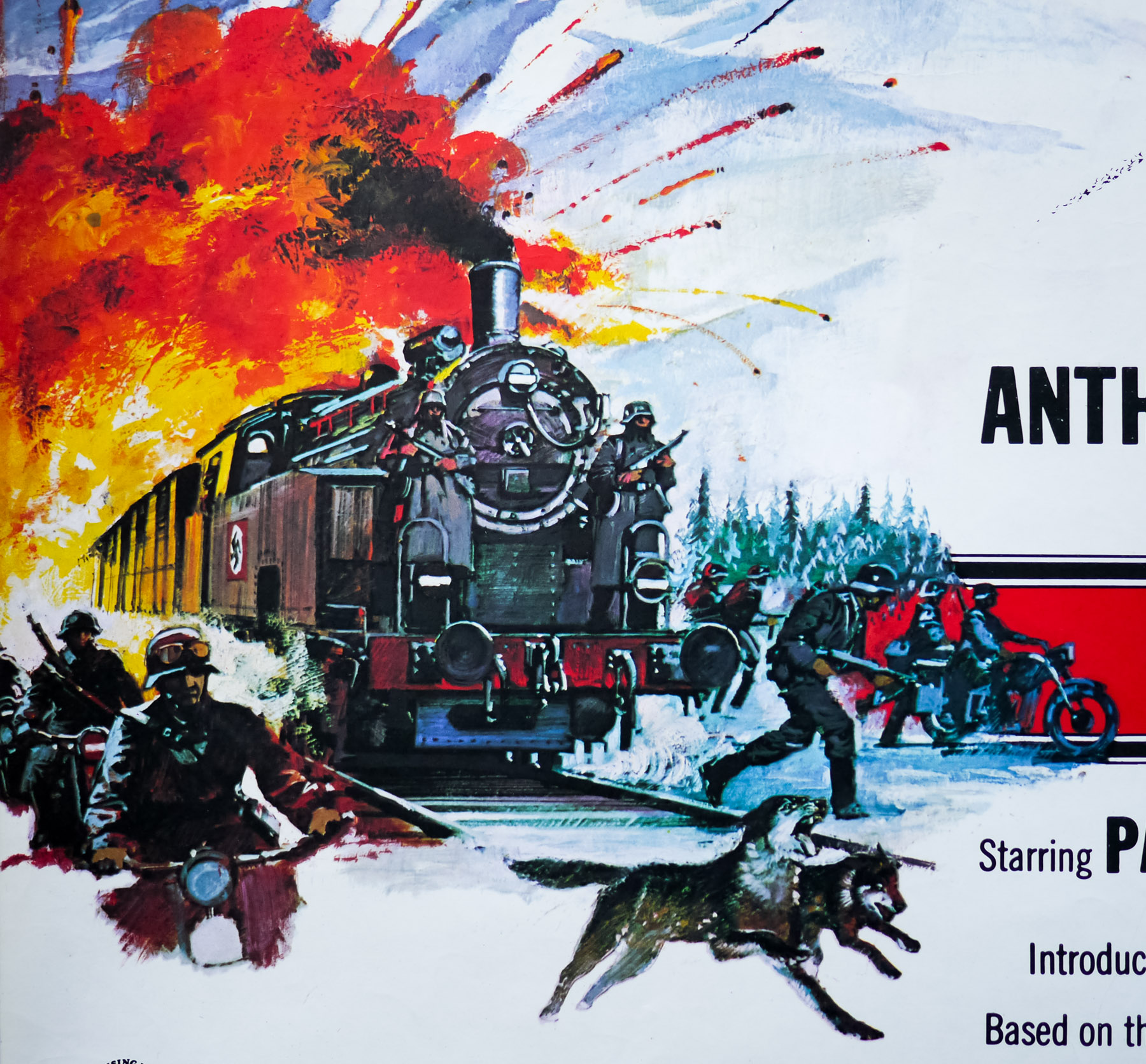
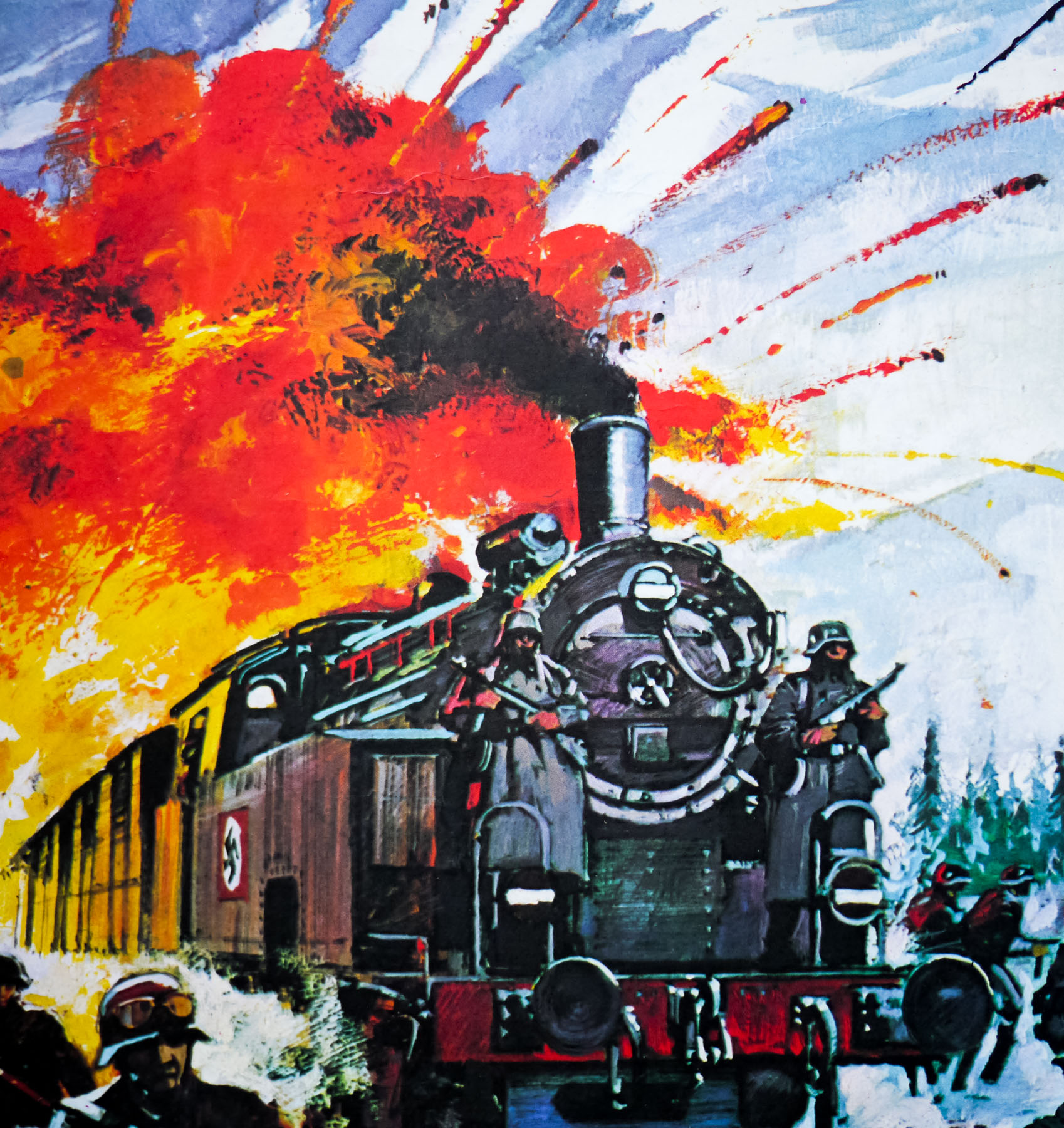
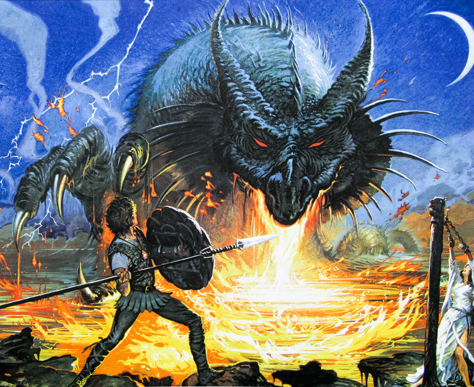
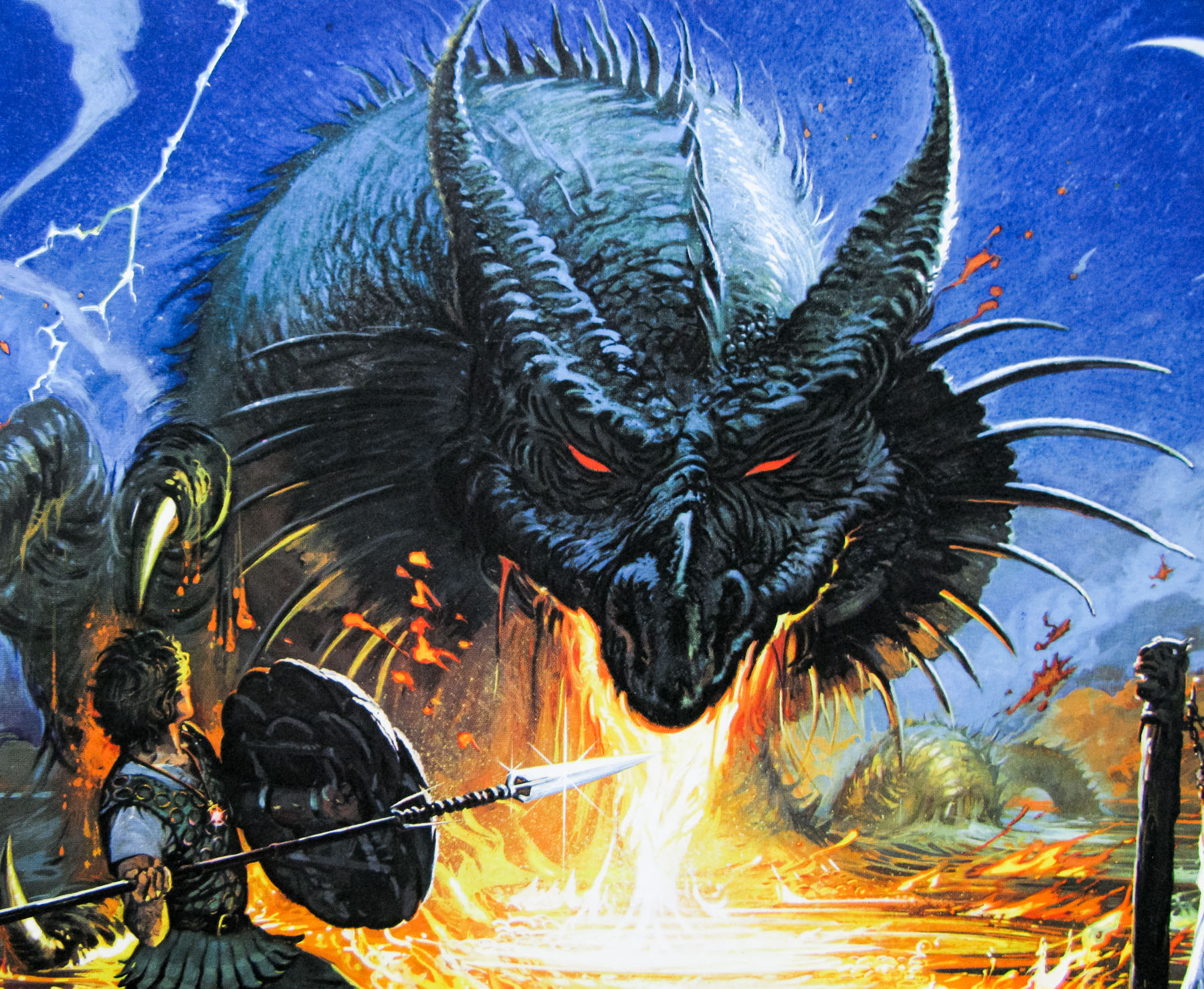
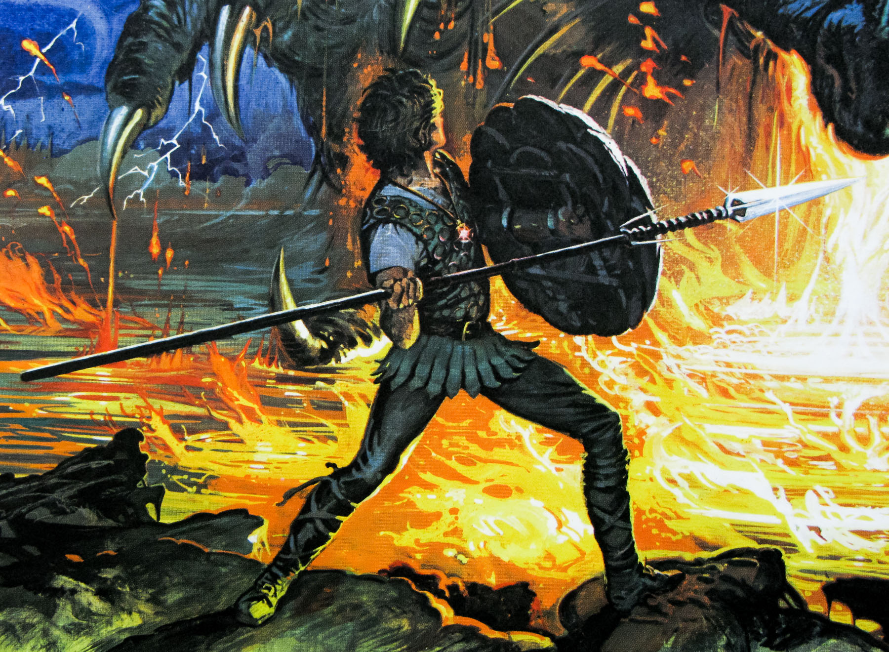
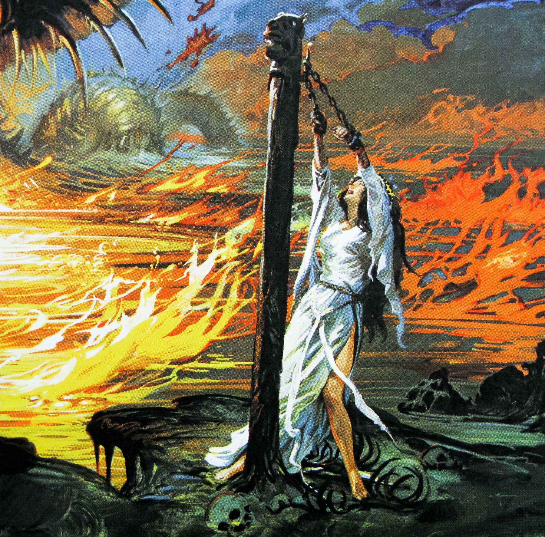
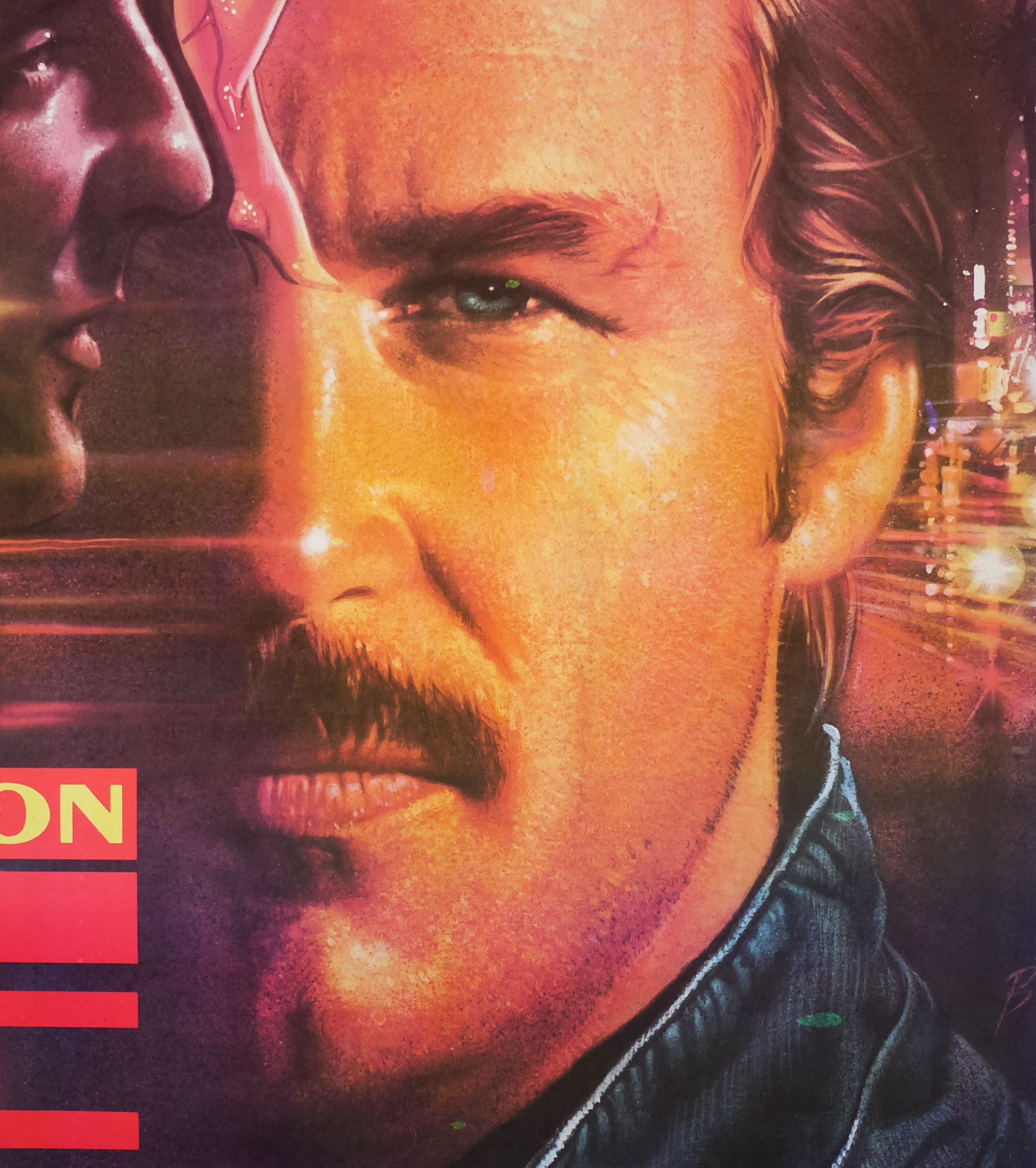
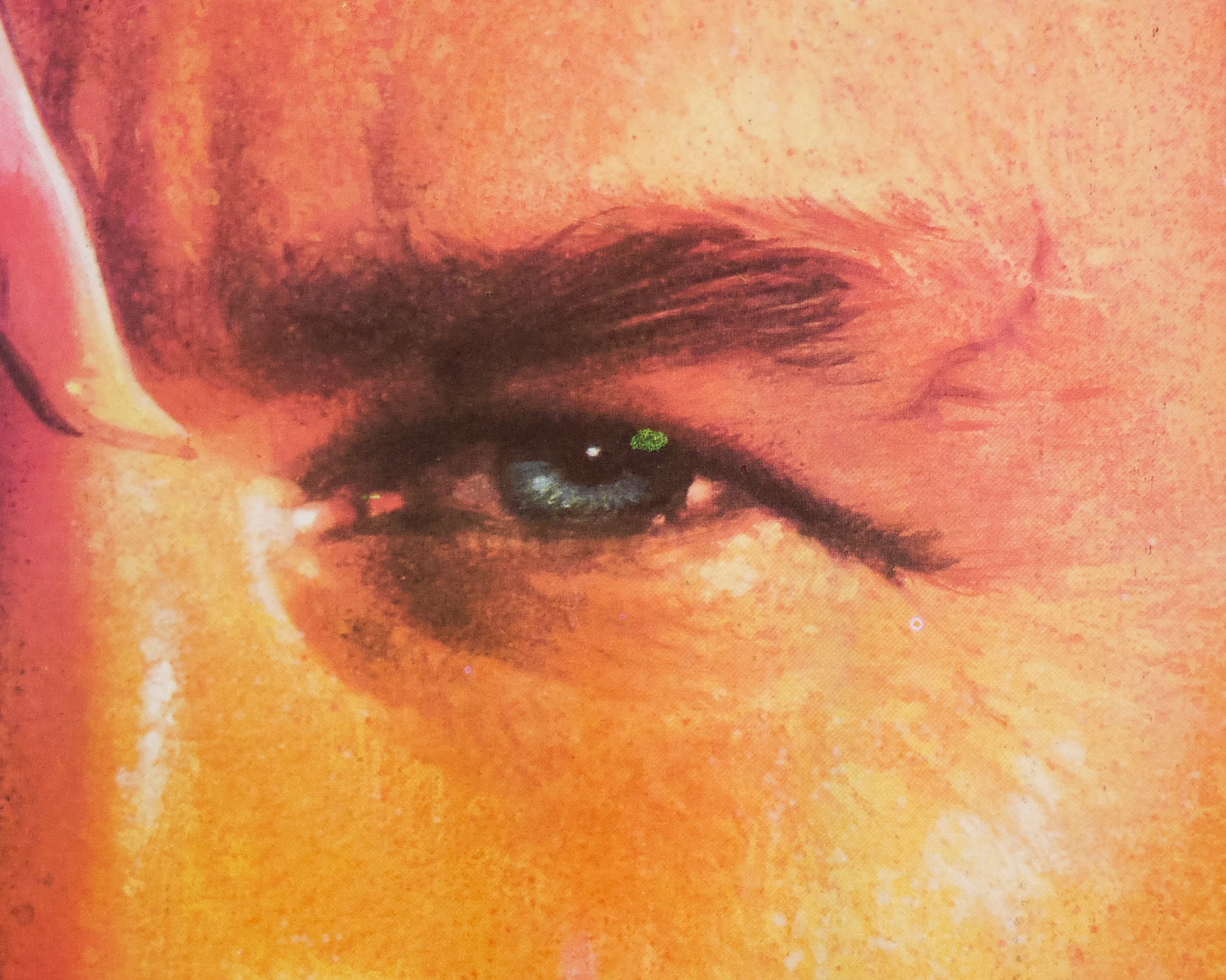
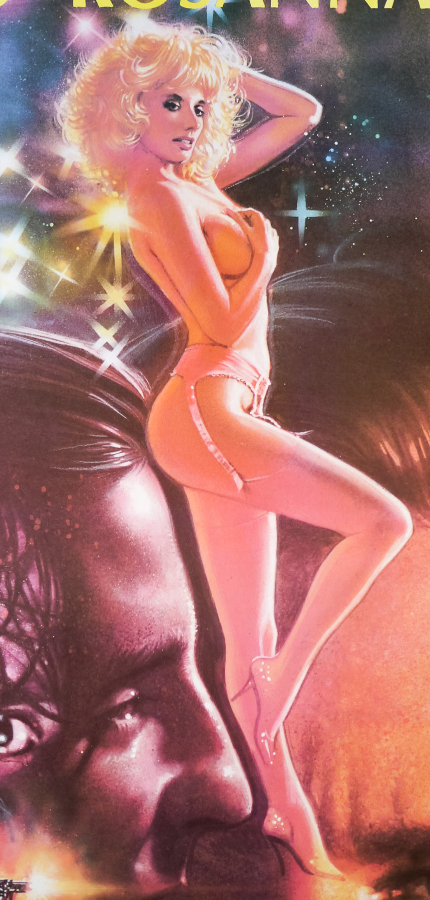
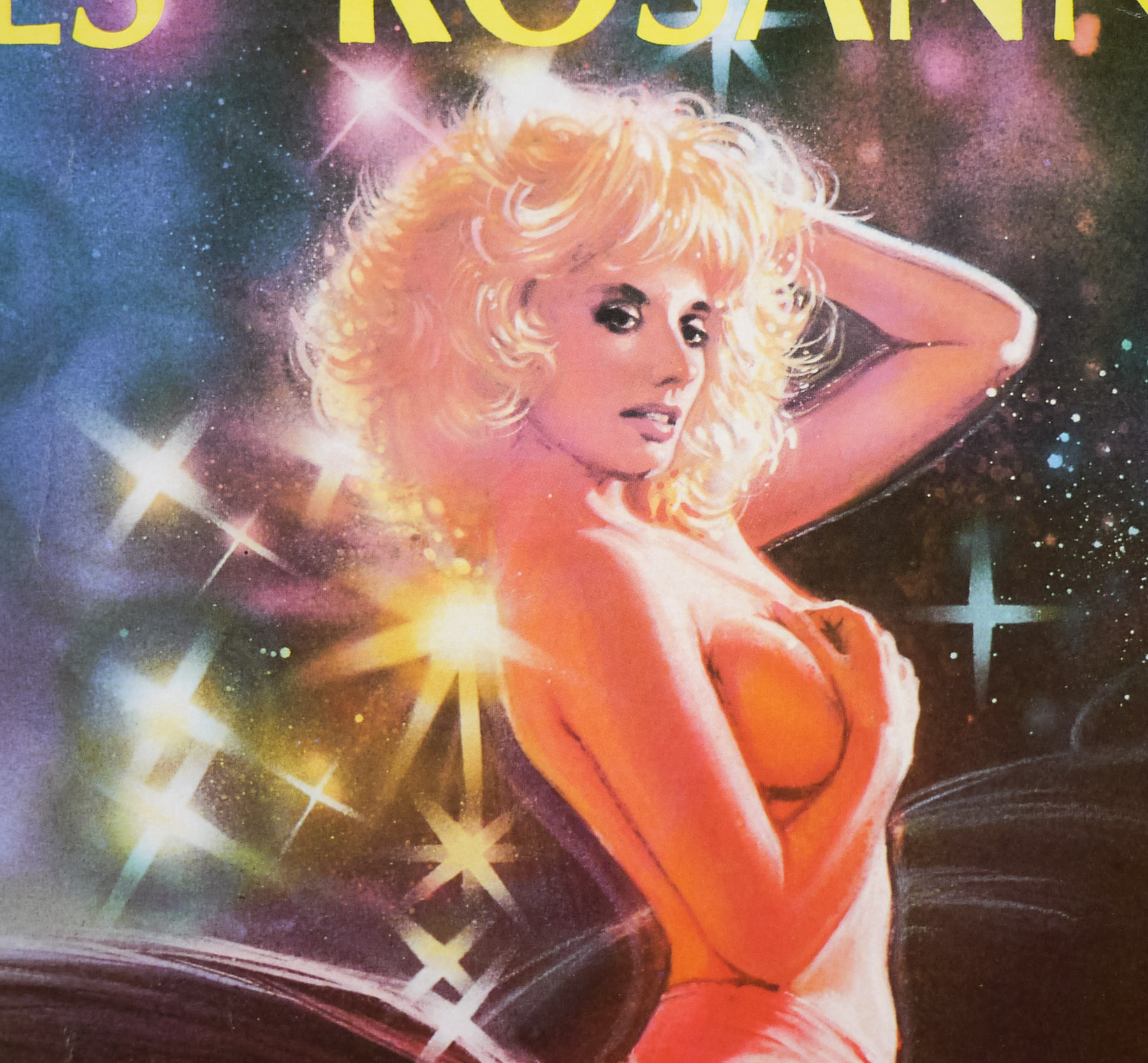
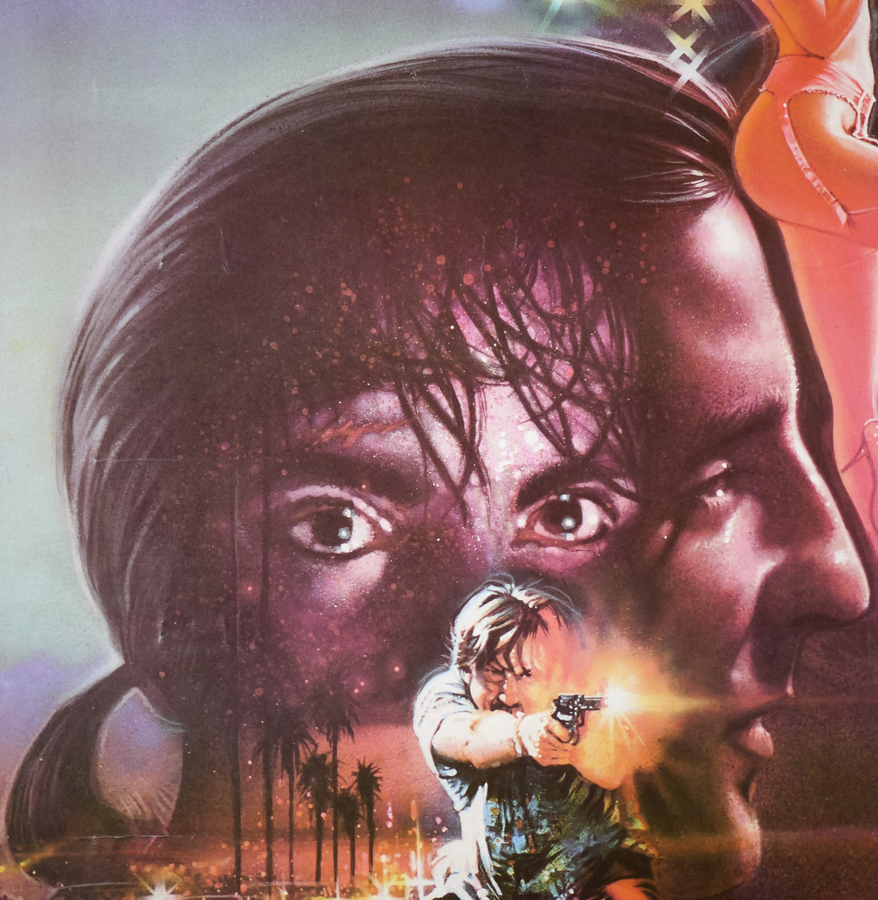
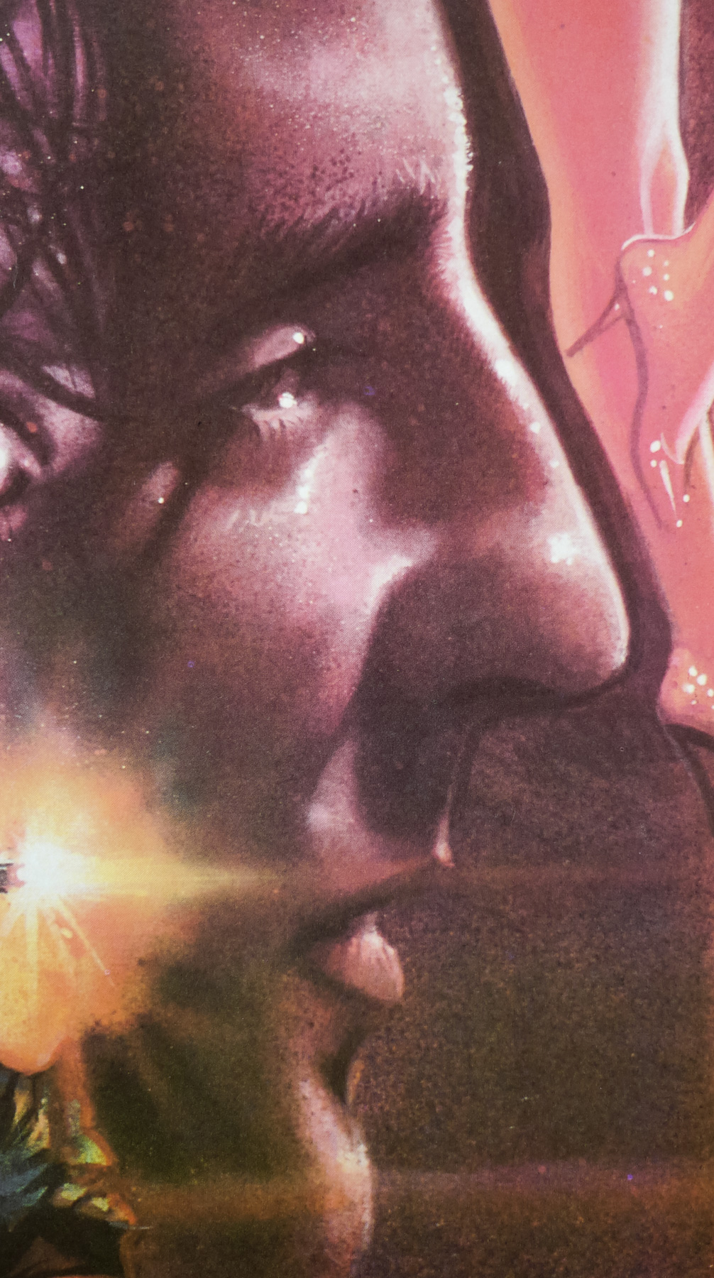
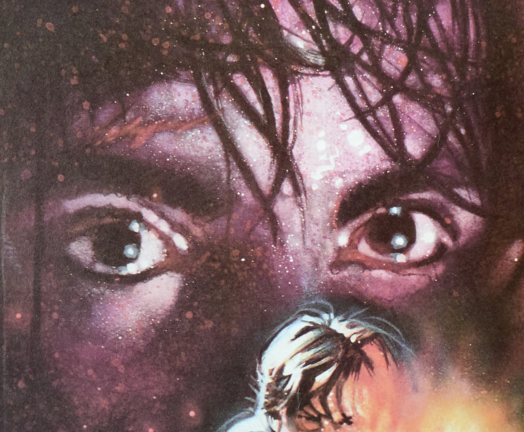
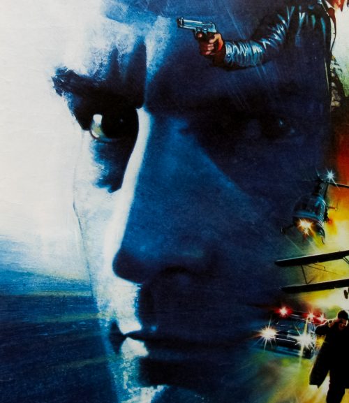
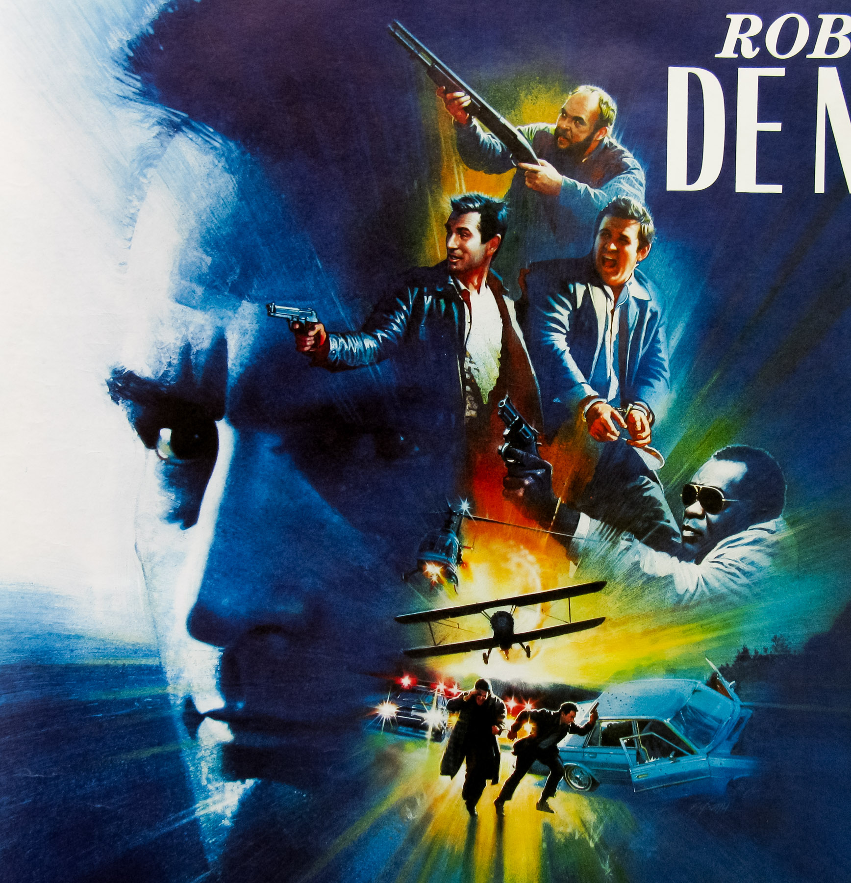
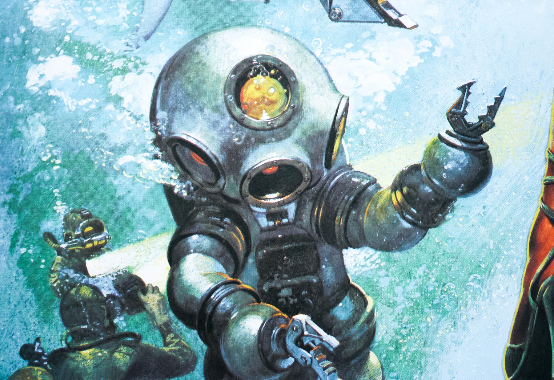
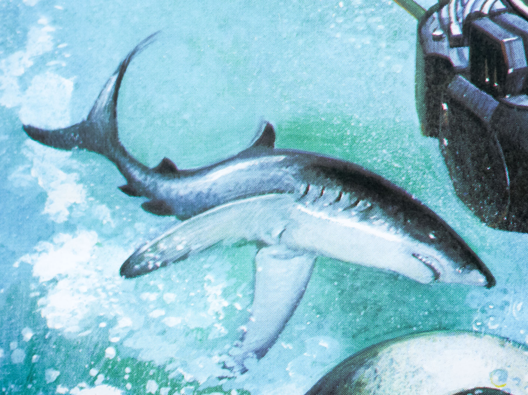
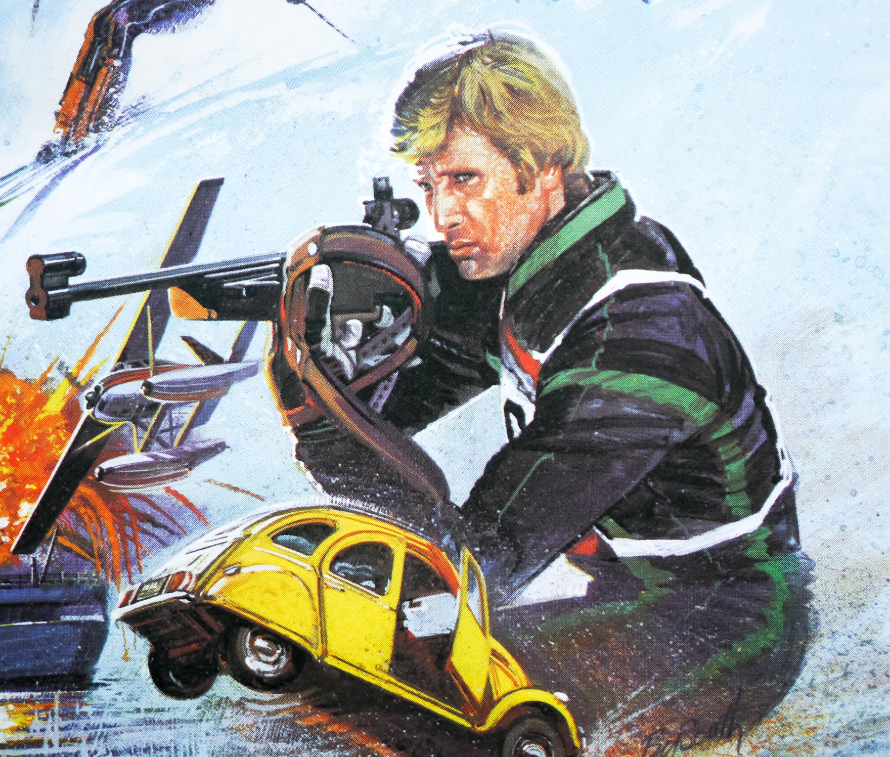
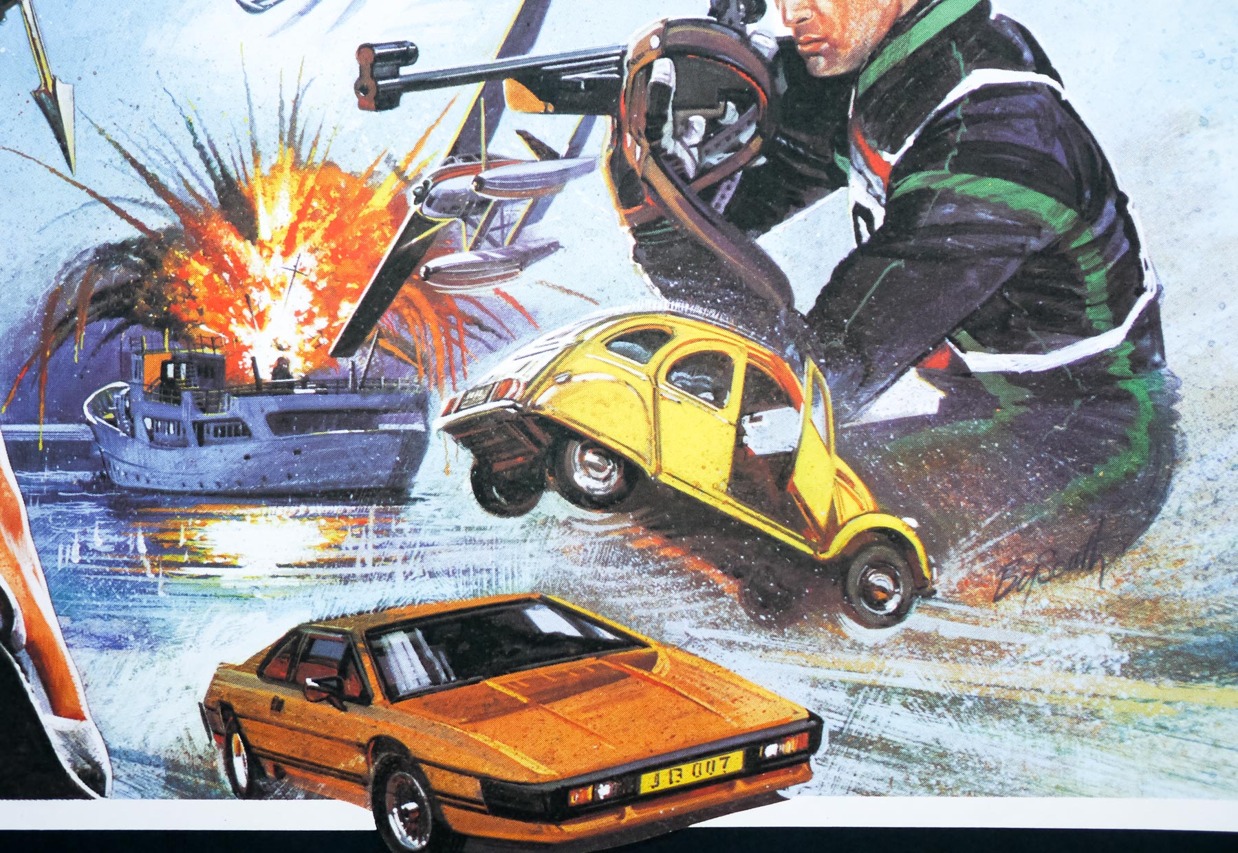
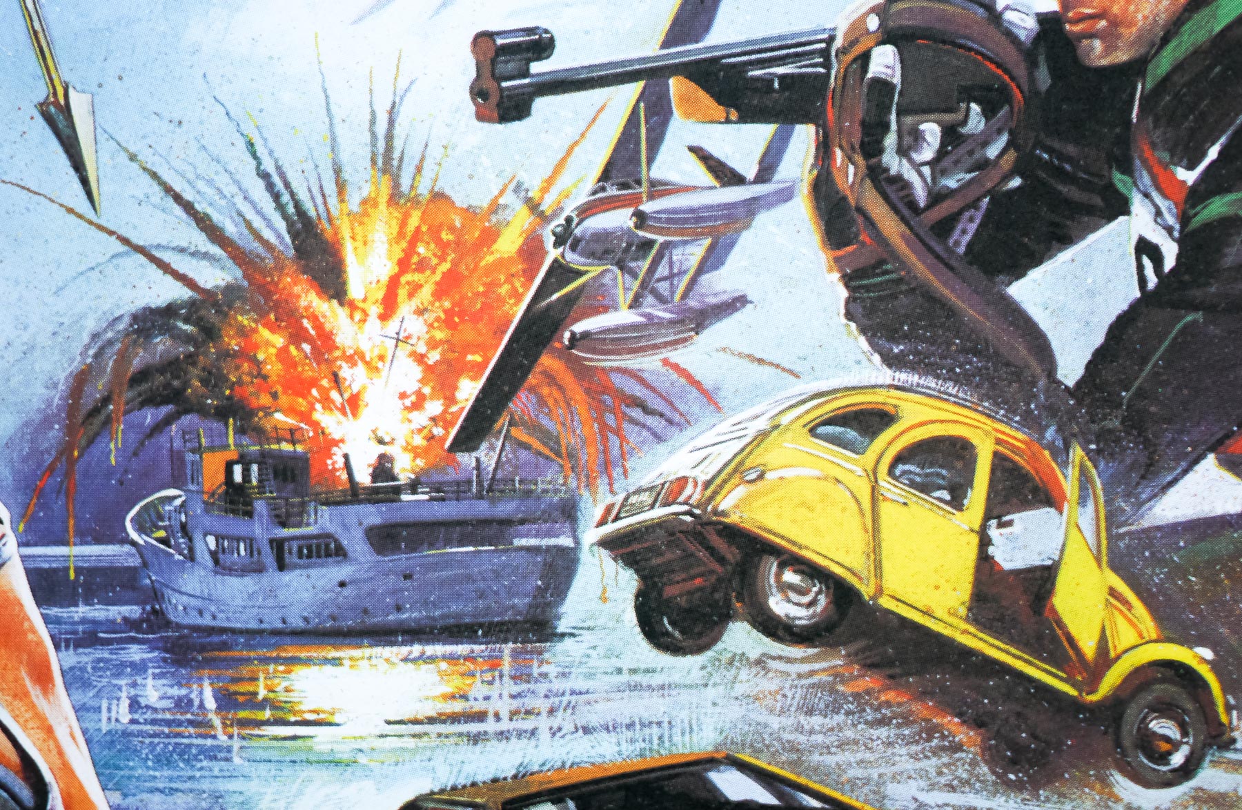
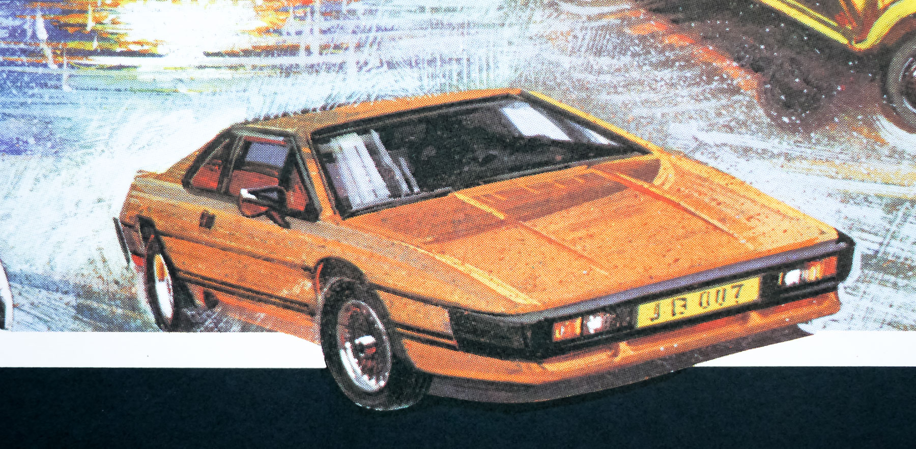
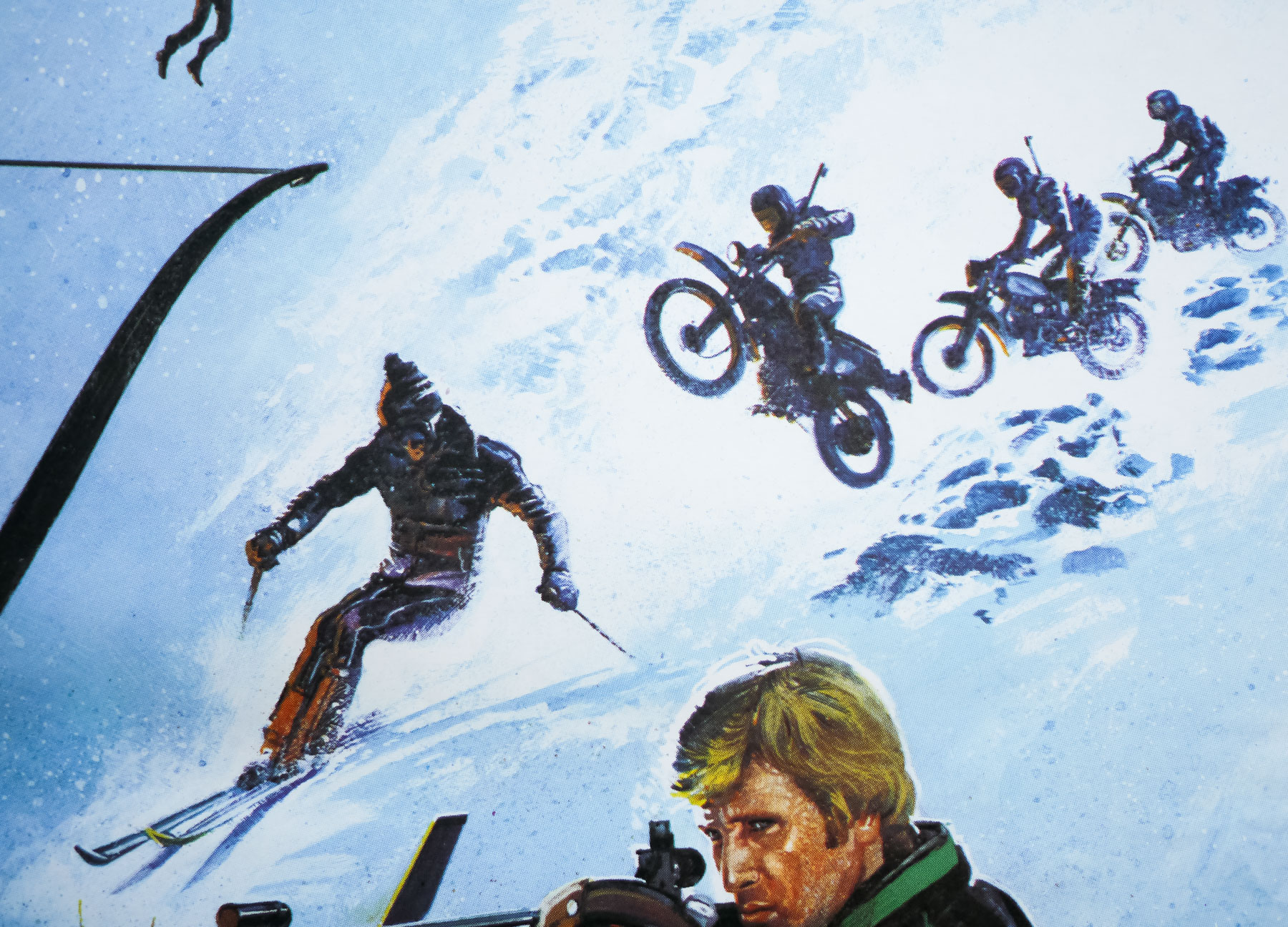
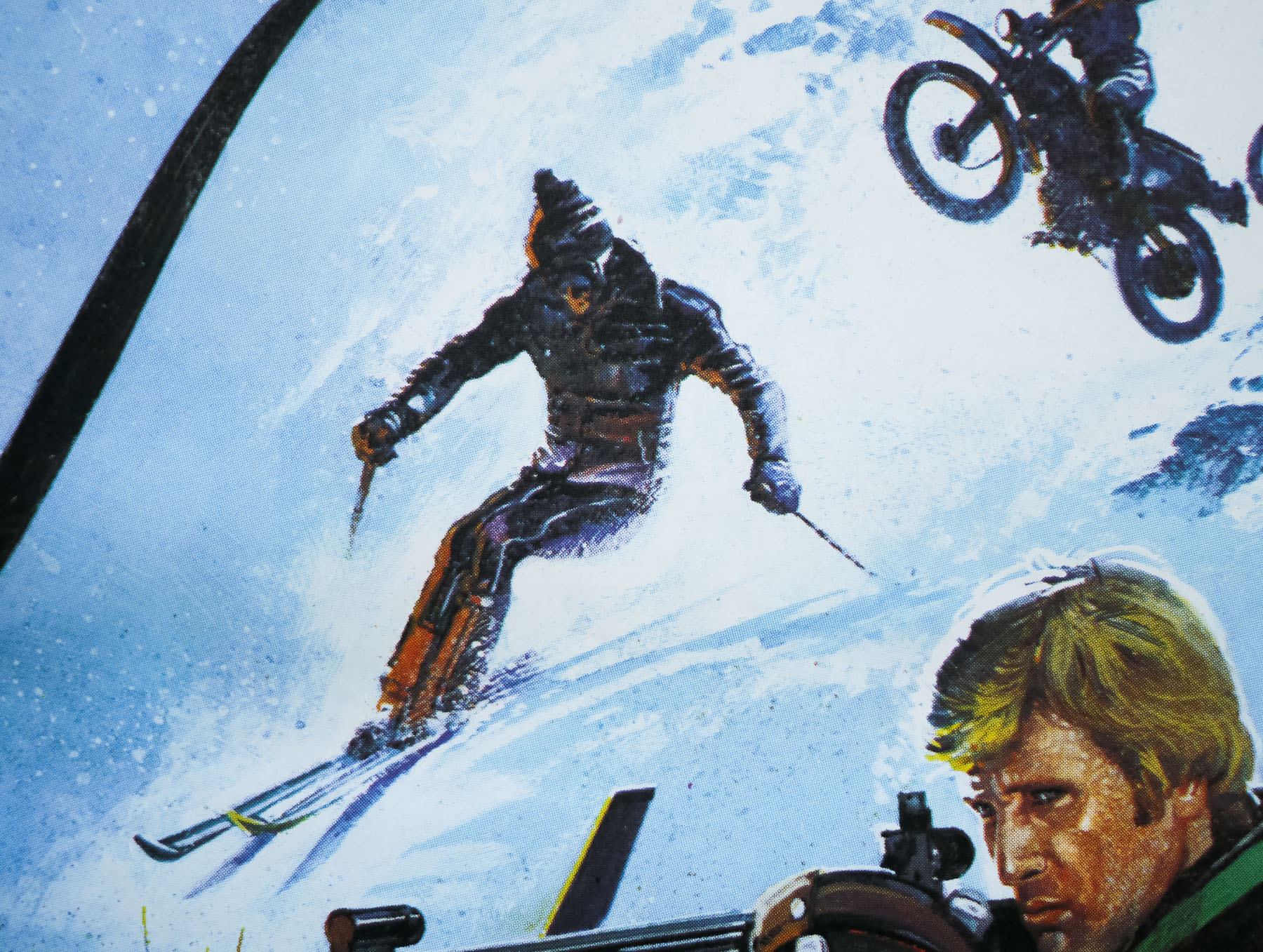
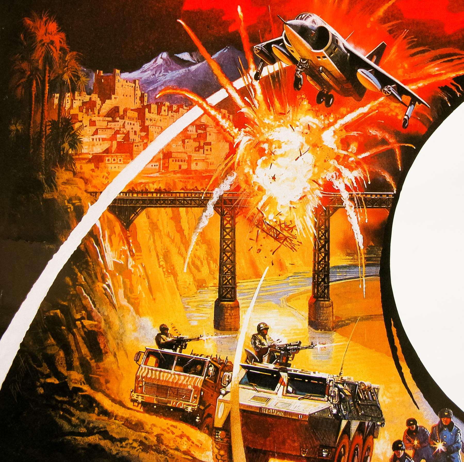
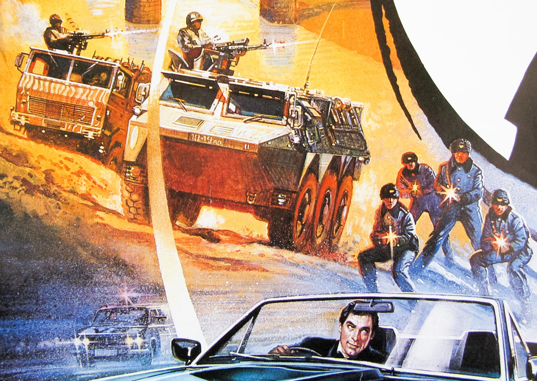
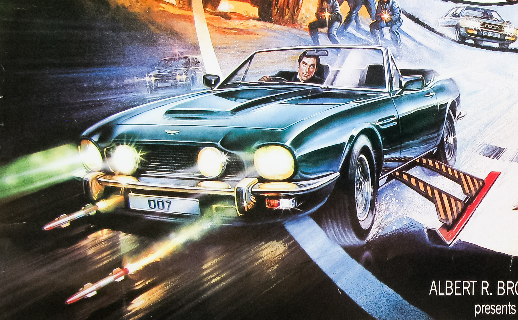
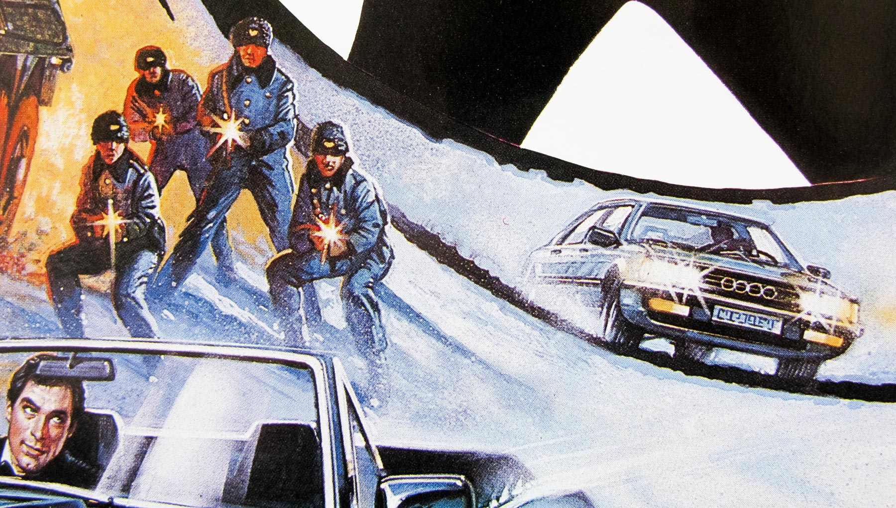
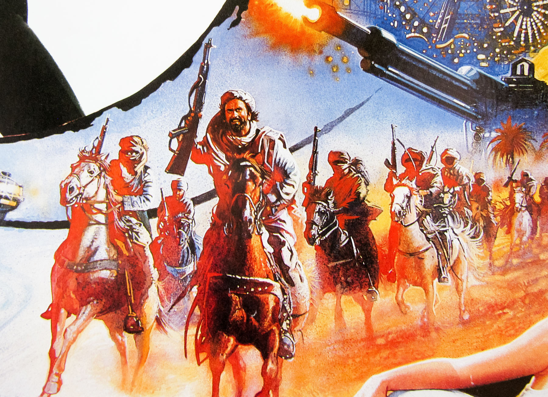
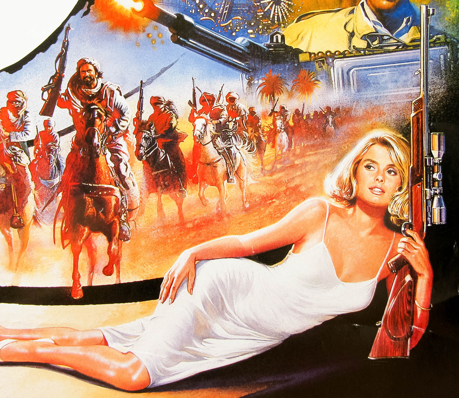
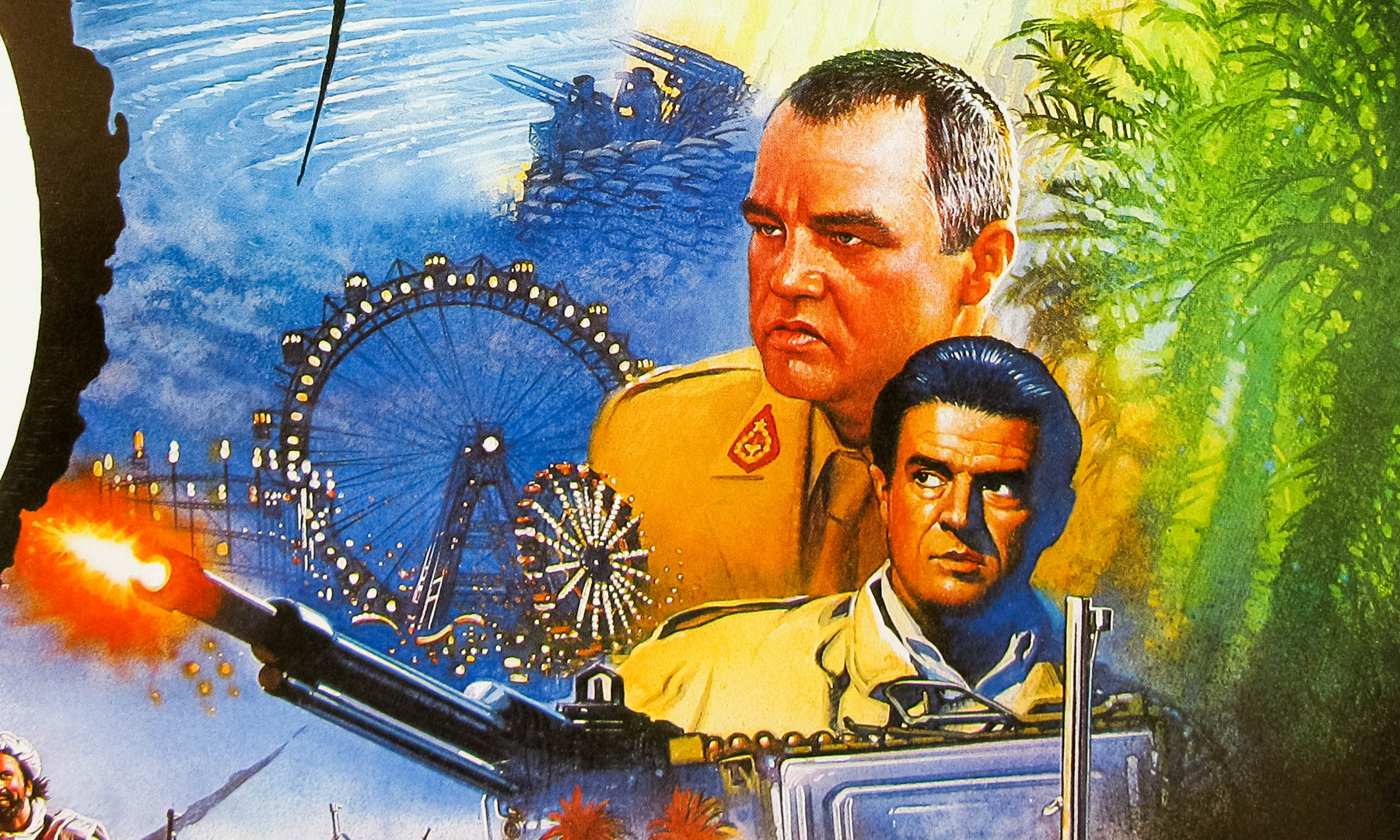
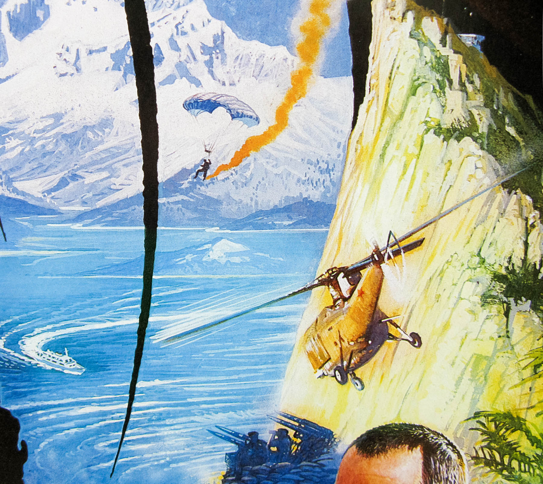
Unquestionably the last truly great James Bond poster was painted by the British artist Brian Bysouth and the design was discussed during my 2012 interview with him:
“The last painting I did was for The Living Daylights. There were a number of us involved with the initial design ideas for that poster, including Bernie Goddard, a freelance designer who often worked with FEREF. Mike Bell and Stephen Laws also produced some concept roughs. Using the original Bond spiral gun barrel idea was a concept that featured on some of the designs and Bernie submitted one using it. The final concept was an amalgamation of ideas and I was tasked with composing the montage that became the poster. I produced the final colour rough that was sent to the client and we were all very glad when it was approved and I was able to start the finished painting.
I came across the rough a little while ago and it’s in reasonable condition considering it’s age.
That design ended up being used around the world and, as Sim Branaghan disclosed in his book, you were paid the highest fee ever given to a British film poster artist for that.
[Laughs] I probably shouldn’t have told Sim that! I don’t know if it was the highest fee ever paid, as I have no idea what other artists in Britain were getting for their work. But later I read somewhere that Bob Peak was being paid up to $50,000 for one poster at the beginning of the 1980s, and other artists such as Drew Struzan were perceived as being extremely well rewarded. I used to charge a day rate and always felt there was a downward pressure on the fees I charged. I was aware that as a director of the company I felt obliged not to inflate my prices, always making allowance for the company mark-up. With the wisdom of hindsight, maybe I was wrong and I should have charged more. Anyway, I remember being content at the time.
I never knew how much FEREF were charging the client and I never thought to enquire. I decided that I was going to charge £3000 for my work on The Living Daylights because I had been working on the campaign for weeks. The fee was agreed and that was fine. Looking back in retrospect at an illustration that was used around the world to market a James Bond film do you really think that was a lot of money? It’s peanuts! Especially in comparison to the enormous budget the studio would have allotted to the marketing in total. Finally, I hope I am right in believing the client thought well of FEREF because we didn’t ridiculously inflate the price of the work we did for them. We sincerely believed we were the best at what we did, and it was upmost in our minds that we had to be competitive with our charges.”
The article also features pictures of the original artwork and initial sketches for this poster.