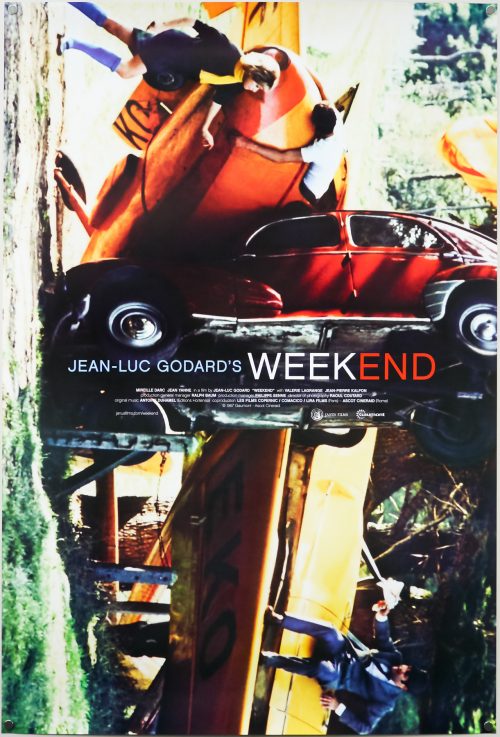
This one sheet was printed by Janus films for their 2011 re-release of Jean-Luc Godard‘s celebrated 1967 film Weekend (or Le Week End). One of the most anarchic and surreal films ever committed to celluloid, Weekend is a satire which takes aim at, amongst other things, the bourgeois status and money-obsessed French middle-class. The story, such as there is one, focuses on a self-obsessed couple played by Mireille Darc and Jean Yanne who have plotted to murder her parents and collect their inheritance. They set off from their home in the city and travel into the French countryside where they come across all manner of scenes, including fatal car crashes and a (justifiably famous) sequence of a traffic jam which the audience watches them traverse with horns blaring the entire time. Society appears to be crumbling around them as they make their way to the small village where her parents live. Eventually, things take a turn for the deadly when they end up in the clutches of a band of hippie, cannibalistic revolutionaries.
This one sheet was created by the Vancouver-based designer Steve Chow who is a regular collaborator with Janus and its sister company The Criterion Collection (the film was released on disc soon after its cinema outing in 2011). Chow has worked on hundreds of posters, magazines, advertising elements and covers for home video releases of various films. Check out his official website to see a gallery of his work and a short biography about his career so far.
In 2011, the Criterion website featured a short interview with Chow on the creation of this poster and I’ve copied the detail here (in case that page disappears one day):
What was your inspiration for the new poster for Weekend?
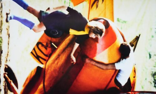
That particular image really only works with all the elements intact—cropping was not doing us any favors—so we figured, Why not use it whole? It’s just that in order to do that, we had to turn it sideways. It was a natural choice—and it seemed to fit the film’s unpredictable, violent, and humorous tenor. It’s like, “WTF just happened? Is that a plane? A body? How did that car end up like that?” It’s kind of like the visual punch line to a joke that starts with “two materialistic bourgeois jerks go on a road trip . . .”
Where does your interest in Godard films come from?
Godard’s influence is everywhere—in contemporary advertising, commercials, music videos. You could be watching something that is “Godard” and not even realize it. (Just the other night, I saw a new Mexican film that riffed on Anna Karina’s back-of-the-head introduction in Vivre sa vie.) His 1960s works, in particular, still resonate with so much life and excitement. So daring, and so very, very cool, even decades later.
Do you have a particular approach to designing for them?
With all of these Godard posters, I pretty much tried to just get out of the way and let the image speak for itself, and in the end, the most intuitive options were successful. With Pierrot le fou and Vivre sa vie, the resonance of those particular images is strong; title treatments that are too heavy or that get too much attention wouldn’t help tell their stories. Similarly, for Weekend, we’d have a hard time creating an image or a collage that captured the crazy, chaotic energy and direction of the film as well as the one we ended up using. So, with regards to these three posters, if I never hear “Wow, that’s a killer title treatment!” I’ll consider that a success.
Chow also designed the Janus re-release one sheets for Godard’s Pierrot Le Fou and Vivre Sa Vie and both can be seen in this Mubi.com ‘Movie Poster of the Week’ article.
