You searched for: James%2520D.%2520Parriott

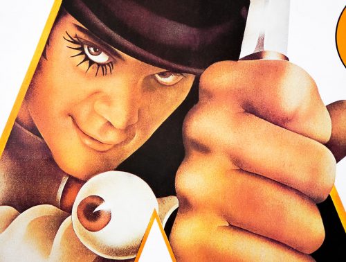
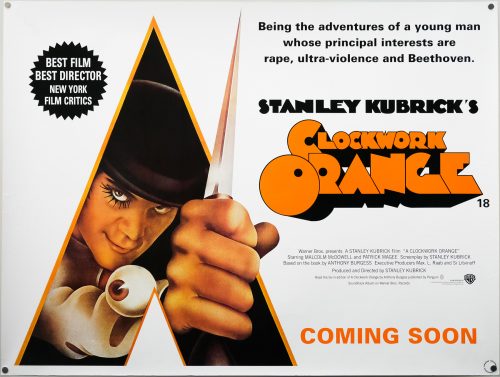
Clockwork Orange / quad / 2000 re-release / UK

21.05.14

Poster Poster
Title
Clockwork Orange
AKA
Stanley Kubrick's A Clockwork Orange (USA - poster title) | Arancia meccanica (Italy)
Year of Film
1971
Director
Stanley Kubrick
Starring
Malcolm McDowell, Warren Clarke, Michael Bates, James Marcus, Michael Tarn, Patrick Magee
Origin of Film
USA | UK
Genre(s) of Film
Malcolm McDowell, Warren Clarke, Michael Bates, James Marcus, Michael Tarn, Patrick Magee,
Type of Poster
Quad
Style of Poster
Re-release | advance
Origin of Poster
UK
Year of Poster
2000
Designer
Unknown
Artist
Philip Castle
Size (inches)
30 1/16" x 39 15/16"
SS or DS
SS
Tagline
Being the adventures of a young man whose principal interests are rape, ultra-violence and Beethoven.

Stanley Kubrick’s classic 1971 dystopian sci-fi, A Clockwork Orange, was met with controversy as soon as it was released in 1971, despite being a hit with UK and US audiences and earning box-office profits several times its original production budget. Unfortunately for UK audiences, the film was withdrawn from distribution in 1973 at the insistence of Kubrick himself following a number of death threats that were apparently received by the director and his family. These threats had been the result of the film being implicated, or at least referenced, in several high-profile criminal cases, including one in which an elderly vagrant had been kicked to death, mirroring an infamous scene in Kubrick’s film.

Despite being freely available across the rest of Europe and in the US, the film remained out of UK cinemas and, during the 1980s, off British video rental shop shelves. When the legendary London cinema the Scala Film Club decided to show the film in 1993 they were sued by Warner Bros at Kubrick’s insistence. The studio won the court case and the cinema club was effectively bankrupt, with plans for expansion quickly shelved. The club produced its last ‘what’s on’ calendar in May 1993 and the Scala converted to a music venue towards the end of the 1990s.

When Kubrick died in 1999 the ban was relaxed and the film was finally made available on VHS and DVD. A limited cinema run also took place and this quad was produced at the time. It uses part of the original artwork that featured on posters for the film around the world, which was painted by the renowned British artist Philip Castle. The final one sheet for the film is one of the most iconic posters of all time, with the same painting being used to promote the film all over the world, and it continues to be used to promote the film to this day. The original UK quad features more of Castle’s artwork and a more muted colour scheme, but features the same tag-line.

Born in London in 1943, Philip Castle’s design career has seen him working on album covers for some of the biggest names in British music, including Wings, Mott the Hoople and Pulp. His skills were utilised for the famous cover for David Bowie’s Aladdin Sane, which saw him airbrushing over a photograph by Celia Philo. He also worked on the cover for the legendary computer game Elite. In 1987 Kubrick and Castle would collaborate once more on the poster for Full Metal Jacket, which again proved to be a seminal piece of work. There’s an interesting interview with Castle available to watch on YouTube in which he discusses his work with Kubrick.

This page features several examples of his brilliant work and there are multiple images tagged on Tumblr. The posters I’ve collected by him can be seen here.
Apocalypse Now Redux / B1 / Japan

04.09.14

Poster Poster

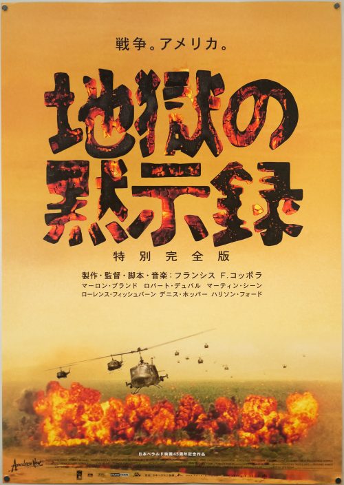
This is the Japanese B1 poster for the 2001 re-release of arguably the best war film ever made, Francis Ford Coppola’s Apocalypse Now. This release, known as ‘Redux’ was a new version prepared by the director and his editor and long-time collaborator Walter Murch that saw almost 50 minutes inserted back into the film with several sequences extended and the flow of the film altered as a result. Set during America’s war in Vietnam, the film follows Martin Sheen‘s US Army Army and special forces veteran Benjamin Willard as he journeys up the dangerous Nung River and deeper into the jungle in the search of the rogue Special Forces Colonel Walter E. Kurtz (Marlon Brando in an unforgettable role). Willard is told that an insane Kurtz has gathered together an army of indigenous fighters inside neutral Cambodia and that he must ‘terminate with extreme prejudice’. After landing at the mouth of the river in a spectacular sequence in which Colonel Kilgore (Robert Duvall) first attacks an enemy village from helicopters whilst blasting Wagner’s Ride of the Valkyries from loudspeakers, then orders some of his men to surf despite the fact that mortar shells continue to land all around them, Willard  joins the crew of a Navy PBR boat that transports him on his fateful journey up river.

Apocalypse Now is famous for its fraught production in which the shoot went over time and over budget, sets were destroyed by storms, Martin Sheen suffered a heart attack and other woes that caused Coppola to famously say, “We had access to too much money, too much equipment, and little by little we went insane”, and “My film is not about Vietnam, it is Vietnam”. The director’s wife Eleanor helped to put together the acclaimed documentary of the troubled production called Hearts of Darkness: A Filmmaker’s Apocalypse, which is an essential watch for fans of the film. Despite the production woes, the film was a huge critical and commercial success, with its cultural impact undeniable.

The Redux version, which involved re-recording several of the original actors’ dialogue 30 years since the original filming, plus the addition of newly recorded music, was met with generally positive reviews. Many critics felt that the revisions made the film an even richer, stranger experience, whilst some felt that the new cut was self-indulgent and that the new sequences, particularly one set in a French plantation, slowed the film down too much. Check out this wikipedia article for details of the changes. I personally prefer the original cut but the new additions are undoubtedly interesting to watch.

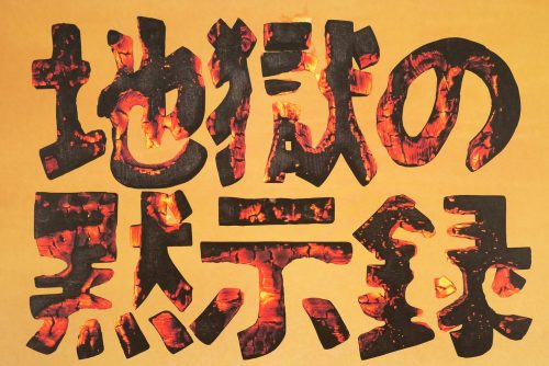
The Japanese title on this poster is made from a photographic image of burning wood and the explosion and helicopters are taken from the now iconic ‘Charlie don’t surf’ sequence.


Blade Runner / one sheet / studio version / USA

15.09.14

Poster Poster
Title
Blade Runner
AKA
Blade Runner - Metropolis 2020 (Finland)
Year of Film
1982
Director
Ridley Scott
Starring
Harrison Ford, Rutger Hauer, Sean Young, Edward James Olmos, M. Emmet Walsh, Daryl Hannah
Origin of Film
USA | Hong Kong
Genre(s) of Film
Harrison Ford, Rutger Hauer, Sean Young, Edward James Olmos, M. Emmet Walsh, Daryl Hannah,
Type of Poster
One sheet
Style of Poster
Studio version
Origin of Poster
USA
Year of Poster
1982
Designer
Intralink Film Graphic Design
Artist
John Alvin
Size (inches)
27" x 41"
SS or DS
SS
NSS #
820007
Tagline
Man Has Made His Match... Now It's His Problem

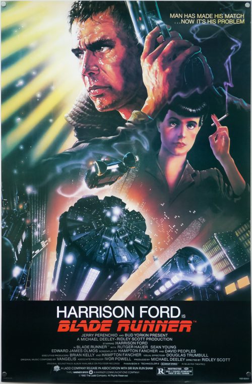
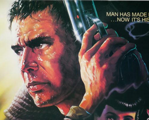
One of my top five films of all time, Blade Runner was released with easily one of the most iconic sci-fi one sheets ever printed. The design and artwork is by the late, great John Alvin, a man responsible for several of the most memorable film posters of the past 40 years. This is perhaps his most well known piece since it featured on posters across the globe, was reused for the 1992 Director’s cut release and has been on the cover of home video releases for many years.

In August 2014 a book entitled The Art of John Alvin was released after four years of preparation by his wife and studio partner Andrea. An absolute must-own for any fan of film posters and the art of cinema, the book features almost all of John’s most memorable posters which are each given their own section. As well as images of the printed poster, there are also early sketches, painted concepts and pictures of the original artwork itself, plus Andrea has provided fascinating commentary detailing the creation of each piece.

Blade Runner is given six pages and the section features a look at the original graphite sketches done by Alvin to show to Ridley Scott and the studio’s marketing department. Elements of these were then combined to create the painting we know today. Andrea notes that the posters for the film were originally conceived to focus on the relationship with the characters and the futuristic city, but by the time of release Harrison Ford was a global star so Alvin was asked to make him more prominent in the artwork.

John apparently always regretted not featuring Rutger Hauer’s android Roy Batty so when he was asked to revisit the design for a 25th anniversary print he reworked several elements, including the two portraits of Harrison Ford and Sean Young and added the face of Roy Batty looming large over them. The print was called ‘I’ve Seen Things’ by John and can be viewed here.

There are known reprints of this poster and this particular version is one of three known variants. LAMP has a guide to all three here. To summarise:

Variation 1 – NSS Version
This version has NOTHING in the bottom left corner; Litho in U.S.A. (AND) the NSS tag in the center; BLADE RUNNER 820007 in the bottom right

Variation 2 – Studio Version
This variation has “PRINTED IN U.S.A.” in the bottom left corner; NOTHING in the center; and “NSS 820007” in the bottom right.

Variation 3 – Odd NSS Version
In the bottom left corner has “PRINTED IN U.S.A.”; in the center ‘IN SMALLER PRINT’ has “LITHO IN U.S.A.” (AND) the NSS tag; In the bottom right has “BLADE RUNNER NSS 820007” in ‘UNEVEN’ print.

This is the second variation (studio version) but I also have the ‘Odd NSS Version’, which can be viewed here. A dealer in London once told me he believes all NSS versions of this poster are reprints/restrikes. If this is the case then the poster has fooled both respected dealers and collectors alike.

The Hills Have Eyes / quad / UK

03.10.14

Poster Poster

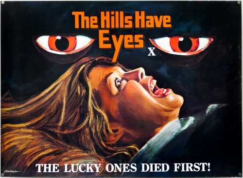
Striking artwork on this UK quad for the release of The Hills Have Eyes, which was director Wes Craven‘s third film, following his notorious breakout horror The Last House on the Left (1972) and the little seen adult drama The Fireworks Woman (1975). Written by Craven himself, the film is an exploitation horror that follows events when a family heading to California with a caravan crash in a remote part of the Nevada desert. Unluckily for them, the area used to be a nuclear testing site and there are a pack of feral, deformed cannibal freaks living in the nearby hills who subject the Carter family to a sustained series of brutal attacks.

The film was reasonably well received at the time of original release but went on to gain a cult following and is today regarded as one of the director’s best films. I watched it again recently and it retains its power to shock, with some of the attacks being particularly brutal. A remake was released in 2006 which was at least stylistically interesting, if nothing else.

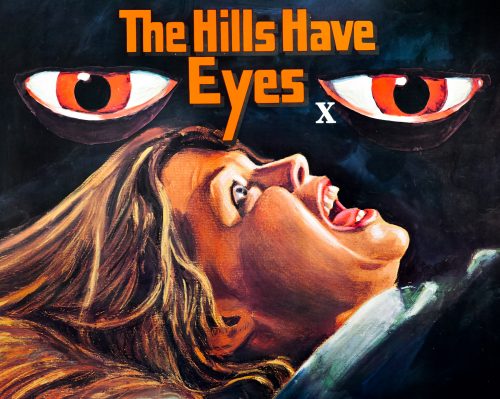
This UK quad is unusual in that it has no credits block or distributor information and features only the signature of the artist, Tom Chantrell. The only other British poster for the film that I’ve seen is a double-bill quad and I don’t think this one could be considered a teaser or advance (despite featuring little detail).

Tom Chantrell’s dynamic and colourful work featured on hundreds of posters over a forty year period. His official website features a great biography written by Sim Branaghan, author of the must-own British Film Posters. Chantrell illustrated many classic poster designs, including several Hammer posters such as the brilliant quad for ‘One Million Years B.C.’, and was also responsible for the iconic Star Wars quad, the artwork of which ended up being used around the globe. I have a handful of other designs by him on this site.

The Land That Time Forgot / quad / UK

24.10.14

Poster Poster
Title
The Land That Time Forgot
AKA
--
Year of Film
1975
Director
Kevin Connor
Starring
Doug McClure, John McEnery, Susan Penhaligon, Keith Barron, Anthony Ainley, Godfrey James, Bobby Parr
Origin of Film
UK | USA
Genre(s) of Film
Doug McClure, John McEnery, Susan Penhaligon, Keith Barron, Anthony Ainley, Godfrey James, Bobby Parr,
Type of Poster
Quad
Style of Poster
--
Origin of Poster
UK
Year of Poster
1975
Designer
Tom Chantrell
Artist
Tom Chantrell
Size (inches)
30" x 40"
SS or DS
SS
Tagline
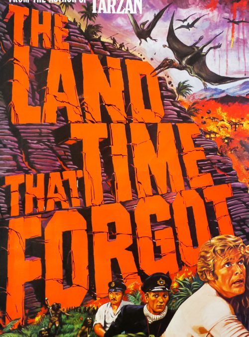
From the author of Tarzan

The Land That Time Forgot was the first entry in a series of British sci-fi/fantasy b-movies that were directed by Kevin Connor and starred the prolific American actor Doug McClure, known for his hammy leading man performances (McClure was one of the inspirations for The Simpsons’ Troy ‘You may remember me from…’ McClure). The series continued with At the Earth’s Core (1976) and The People That Time Forgot (1977), and ended with Warlords of Atlantis (1978). The initial three were shepherded through production by Max Rosenberg and Milton Subotsky’s Amicus Productions, which was based at Shepperton studios and is perhaps best remembered for its series of portmanteau horror films. By the time Warlords of Atlantis was released the company was almost defunct and so EMI Films stepped in and produced it, utilising many of the same cast and crew as the previous films.

The Land That Time Forgot starts with the torpedoing of a passenger ship by a German U-boat crew. The few remaining survivors, including Bowen Tyler (McClure) and Lisa Clayton (Penhaligon), manage to overcome the U-boat’s crew when it surfaces and they force the captain to pilot the craft back to allied waters. The crew decide to sabotage their plans and the craft ends up completely lost in unknown waters. They happen across a strange island and find an underwater cave through which they pilot the U-boat. When they surface in the islands interior they are immediately set upon by a dinosaur-like creature that eats one of the crew before Tyler manages to decapitate it. The crew then venture through the strange land and come across more giant beasts and a tribe of primitive cavemen before discovering oil, which they hope will allow them to escape back to civilisation.

The film is never less than entertaining and McClure definitely gives it all he’s got. The creature effects have really dated badly, however, and are definitely not up to the standard set by Ray Harryhausen. There’s one excruciatingly bad sequence where the crew blast away at a pair of T-Rex like creatures and the second one takes an age to fall over unconvincingly (explained away by saying that the creature’s brains are slow to send signals). There are some decent special effects like the U-boat scenes underwater but it’s one film that hasn’t stood the test of time as well as some of its contemporaries.

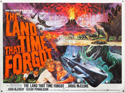
The brilliant artwork on this quad, featuring a cheeky image of a T-Rex underwater (which is definitely not in the film itself), is by Tom Chantrell, the celebrated British artist whose dynamic and colourful work featured on hundreds of posters over a forty year period. His official website features a great biography written by Sim Branaghan, author of the must-own British Film Posters. Chantrell illustrated many classic poster designs, including several Hammer posters such as the brilliant quad for ‘One Million Years B.C.’, and was also responsible for the iconic Star Wars quad, the artwork of which ended up being used around the globe. I have a number of other designs by him on this site.

Return of the Living Dead / Thai

19.11.14

Poster Poster

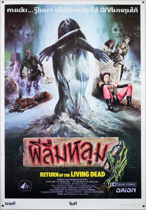
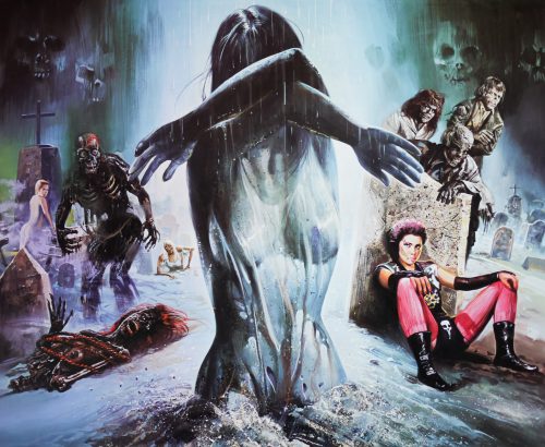
Unique artwork by artist Tongdee on this Thai poster for the release of the 80s zombie classic Return of the Living Dead, featuring a depiction of the memorable character played by Linnea Quigley (represented here in undead form). When I first saw the film I was a little mystified by her ‘Barbie doll’ look (smooth bump) when she’s naked in the graveyard and only later found out that one of the producers made her wear prosthetics to cover up her privates. I can only imagine that it confused a lot of impressionable teenagers who were watching this back in the 1980s.

I recently bought the blu-ray and have to say the film still holds up really well – the creature designs and music are particular standouts. I’m definitely going to pick up ‘The Complete History of the Return of the Living Dead’ book, which is meant to be excellent.

Tongdee Panumas (he signs his posters with just his first name) was an incredibly prolific Thai film poster artist during the 70s, 80s and 90s but I’ve been unable to find out much about him, other than that he was born in 1947. If anyone has any more information please get in touch. A knowledgeable collector of Thai posters told me that the artists would rarely if ever see the film they were creating the poster for and would instead paint images based on still photos or posters from other countries. This led to some wild designs and even some artwork with characters and elements that didn’t even appear in the actual film!

The US one sheet is markedly different and can be seen here.

The original trailer is on YouTube.

Virgin Witch / quad / UK

19.01.15

Poster Poster
Title
Virgin Witch
AKA
--
Year of Film
1972
Director
Ray Austin
Starring
Ann Michelle, Vicki Michelle, Keith Buckley, Patricia Haines, James Chase, Paula Wright, Christopher Strain, Esme Smythe, Garth Watkins, Neil Hallett
Origin of Film
UK
Genre(s) of Film
Ann Michelle, Vicki Michelle, Keith Buckley, Patricia Haines, James Chase, Paula Wright, Christopher Strain, Esme Smythe, Garth Watkins, Neil Hallett,
Type of Poster
Quad
Style of Poster
--
Origin of Poster
UK
Year of Poster
1972
Designer
Fred Atkins
Artist
Arnaldo Putzu
Size (inches)
30" x 39 14/16"
SS or DS
SS
Tagline
Her lust was innocence - her desires... evil.

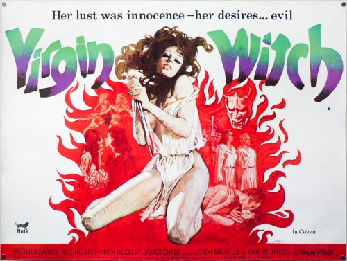
A classic case of the poster being better than the film it’s advertising, this is the UK quad for the 1972 British sexploitation horror Virgin Witch, which was produced and released by Tigon, primarily known for their horror output. Directed by Ray Austin who spent most of his career directing TV shows, the film stars Ann Michelle and her sister Vicki (later to gain fame as Yvette Carte-Blanche in the TV series Allo ‘Allo!) as Betty and Christine, a pair of wannabe models.

Answering an advert in a shop window, the more confident Betty meets Sybil Waite, a lecherous modelling scout played by the late Patricia Haines (the first wife of Michael Caine), who invites her to a country manor on the pretense of being photographed for an advertising campaign. Sybil encourages Betty to invite Christine along and after arriving there the sisters soon discover that all is not as it seems on the outside. Before long, Betty is being inducted to a witches coven in a laughable sequence in which the coven’s leader Gerald (Neil Hallett) gets to have his way with her.

Later it appears that Christine is to be sacrificed in another ceremony but the script is so weak that it’s not clear why and the attempt at a shock ending falls totally flat. The story comes a distant second to the almost constant female nudity, clearly a requisite from producers keen to sell the film to as many international buyers looking to satisfy the punters of ‘adult’ cinemas. Virgin Witch is totally devoid of anything in the way of supernatural scares, or indeed horror of any kind, and any attempt is fumbled badly. Both leading ladies have apparently disowned the film since it was made and it’s not hard to see why!

This poster is the result of a collaboration between two key figures in the history of British poster design: Fred Atkins and Arnaldo Putzu. Atkins was born in Kent in 1928 and attended art school before joining an agency on Sloane Street in London as a junior. He moved around a few agencies before joining Pulford Publicity in 1951 where he designed multiple quad posters, staying with Eric Pulford through several mergers and acquisitions, eventually leaving what became Downtons in 1968 to help set up the FEREF agency (he’s one of the Fs in the name) from where he would eventually retire. Virgin Witch is one of the posters he designed whilst at FEREF.

Arnaldo Putzu was born in Rome in 1927 and began painting from a very early age and in 1948 he got involved with the world of film publicity under the guidance of the famous artist Enrico De Seta. Eventually Putzu would gain enough confidence in his abilities to set up his own agency and it was this move that saw him getting involved in work for the British studio Rank. Eric Pulford was so impressed with his work that he brought him over to London to work at Downtons in 1967.

The artist worked on many quads whilst over here and also gained notoriety for lending his talents to the popular children’s magazine Look-in, for which he painted almost every cover during its publication lifetime. His best-known quad is undoubtedly the one he painted for the Michael Caine gangster classic Get Carter in 1971. My friend, and author of the must-own British Film Posters, Sim Branaghan met Putzu during the making of his book and describes it as a very memorable experience in the interview I published in 2012. Putzu sadly passed away the same year, aged 85, and Sim wrote an excellent obituary for The Guardian newspaper, which can be read here.

A Passage to India / B1 / Poland

22.04.15

Poster Poster

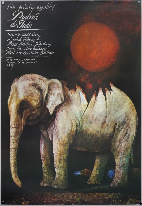
This is the Polish poster for the release of British director David Lean‘s final film behind the camera, 1984’s A Passage to India. Lean hadn’t helmed a feature film since 1970’s Ryan’s Daughter, the poor reception of which had put him off directing for a few years, and an abandoned attempt to make a pair of films based on the Mutiny of the Bounty also took up several years of Lean’s life. The film is an adaptation of English author E. M. Forster’s novel of the same name and also a stage production of the book by Indian-born American playwright Santha Rama Rau.

Set in India during the 1920s when there was a growing Indian independence movement in the British Raj, the film sees young British woman Adela Quested (Judy Davistravel to India to visit her fiancee Ronny Heaslop (Nigel Havers) who is serving as a magistrate in the town of Chandrapore. Accompanying her on the trip is Ronny’s mother Mrs Moore (Peggy Ashcroft). The pair spend time in the company of British colonials but when Mrs Moore meets a local doctor named Aziz Ahmed (Victor Banerjee) they see the opportunity to experience ‘the real India.’ Aziz agrees to take them on an expedition to the remote Marabar Caves (actually based on the real life Barabar Caves) but when Adela is attacked and almost raped, Aziz is accused of the crime and relations between the natives and the British quickly break down.

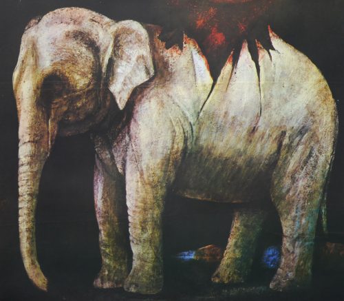
This poster was painted for the first release of the film in Poland in 1988 and was created by the Polish artist Wiktor Sadowski who was born in Olendry in 1956 and later graduated from the Academy of Fine Arts in Warsaw. Sadowski has painted hundreds of film posters during his career and has won several prestigious awards, including a gold medal at Poster Biennale of Poland in 1984 and a gold medal from the New York Society of Illustrators in 1994. There are multiple galleries of his work online, including this one on the Polish Poster Gallery website and this one on Polishposter.com that both clearly show the quality of his artwork.

At the Earth’s Core / quad / style B / UK

08.07.15

Poster Poster
Title
At the Earth's Core
AKA
--
Year of Film
1976
Director
Kevin Connor
Starring
Doug McClure, Peter Cushing, Caroline Munro, Cy Grant, Godfrey James, Sean Lynch, Keith Barron, Helen Gill, Anthony Verner
Origin of Film
UK | USA
Genre(s) of Film
Doug McClure, Peter Cushing, Caroline Munro, Cy Grant, Godfrey James, Sean Lynch, Keith Barron, Helen Gill, Anthony Verner,
Type of Poster
Quad
Style of Poster
Style B
Origin of Poster
UK
Year of Poster
1976
Designer
Tom Chantrell
Artist
Tom Chantrell
Size (inches)
30" x 38 14/16"
SS or DS
SS
Tagline
From the creator of 'The Land That Time Forgot'

At the Earth’s Core was the first entry in a series of British sci-fi/fantasy b-movies that were directed by Kevin Connor and starred the prolific American actor Doug McClure, known for his hammy leading man performances (McClure was one of the inspirations for The Simpsons’Troy ‘You may remember me from…’ McClure). The series began with The Land That Time Forgot (1975), was followed by The People That Time Forgot (1977) and ended with Warlords of Atlantis (1978). The initial three were shepherded through production by Max Rosenberg and Milton Subotsky’s Amicus Productions, which was based at Shepperton studios and is perhaps best remembered for its series of portmanteau horror films. By the time Warlords of Atlantis was released the company was almost defunct and so EMI Films stepped in and produced it, utilising many of the same cast and crew as the previous films.

Like the first three films in the series, At the Earth’s Core is based on a novel by the American author Edgar Rice Burroughs, creator of Tarzan and prolific creator of adventure and sci-fi tales. First published in 1914, the story introduced the author’s creation of Pellucidar, which is the idea that Earth is a hollow shell with another land 500 miles beneath the crust. Pellucidar featured in a number of other Burroughs stories and Tarzan even visited it in a 1929 story.

Set in Victorian Britain, the film features McClure playing David Innes, an American financier working with scientist Dr. Abner Perry (Peter Cushing) who has built a giant drilling machine nicknamed the Iron Mole. The idea of the machine is to make the creation of tunnels much easier and the pair have decided to first test it on a Welsh mountain. After launch, the Mole takes an unexpected turn and they find themselves in a strange land with a pink sky and giant unidentified fauna. Suddenly they are attacked by a giant dinosaur-like creature with a beak-like face, but are eventually rescued by an aggressive group of pig-faced cavemen who add them to a gang of primitive humans they have enslaved, including Dia (the stunning Caroline Munro). Soon they are taken to a city ruled over by the evil, pterodactyl-like creatures called The Mahar who, they are horrified to discover, eat human sacrifices. It’s up to David to find a way of escaping from their enslavement and put an end to the Mahar’s reign of terror.

The film has aged pretty badly, not least in the area of the special effects with the creatures looking particularly hokey. The production team decided not to use the stop-motion style of the previous film and instead went for stuntmen in suits for most of the creatures. It’s safe to say that, whilst it may have wowed audiences of the time, it now looks extremely hokey. The production design is otherwise excellent, with some superb sets and lots of effort put into props like the Iron Mole. McClure is his usual ebullient self and Cushing gives it plenty of gusto, although the strange high-pitched voice he affects gets very grating after a while. The score by Michael Vickers is notably decent.

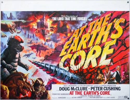
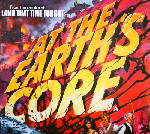
The brilliant artwork on this quad, featuring a similarly chunky title treatment as seen on the quad for the first film in the series, is by Tom Chantrell, the celebrated British artist whose dynamic and colourful work featured on hundreds of posters over a forty year period. His official website features a great biography written by Sim Branaghan, author of the must-own British Film Posters. Chantrell illustrated many classic poster designs, including several Hammer posters such as the brilliant quad for ‘One Million Years B.C.’, and was also responsible for the iconic Star Wars quad, the artwork of which ended up being used around the globe. I have a number of other designs by him on this site.

Note that there are two styles of the UK quad and I’ve called this one style 2. The more common style 1 (see this picture) is fairly similar but features a bit more artwork at the bottom of the poster. Note the extra vegetation on style 1 and the alternate placement of the credits block, with style 2’s covering over part of the fire-breathing frog. I’m not sure why there are two versions of the poster and the answer is sadly likely to be lost to time, with Chantrell having passed away in 2001. This poster is also undersized widthways but I don’t believe it has been trimmed.

Red Scorpion / one sheet / USA

15.07.15

Poster Poster
Title
Red Scorpion
AKA
--
Year of Film
1988
Director
Joseph Zito
Starring
Dolph Lundgren, M. Emmet Walsh, Al White, T.P. McKenna, Carmen Argenziano, Alex Colon, Brion James, Ruben Nthodi
Origin of Film
South Africa | USA | Namibia
Genre(s) of Film
Dolph Lundgren, M. Emmet Walsh, Al White, T.P. McKenna, Carmen Argenziano, Alex Colon, Brion James, Ruben Nthodi,
Type of Poster
One sheet
Style of Poster
--
Origin of Poster
USA
Year of Poster
1988
Designer
Kaiser Creative
Artist
Unknown
Size (inches)
27 1/16" x 40 14/16"
SS or DS
SS
NSS #
--
Tagline
They think they control him. Think again.

Directed by Joseph Zito, a man with only 9 films under his belt, including a couple of Chuck Norris titles and the notorious slasher The Prowler, Red Scorpion was the second film to be headlined by the Swedish action star Dolph Lundgren. After earning degrees in chemical engineering, Lundgren won a couple of European championships in the martial art of Karate and eventually landed a job as a bodyguard for the singer and actress Grace Jones. The pair soon began a relationship and when he accompanied Jones during the filming of A View to a Kill she suggested he try out for a minor role in the film. This appearance helped him land the memorable role of the Russian boxer Ivan Drago in Rocky IV and then in 1987 he played He-Man in the ill-advised live-action film Masters of the Universe. Since then he has featured in over 60 films, mostly in the action genre.

Red Scorpion was produced by the disgraced former American lobbyist Jack Abramoff who was sentenced to jail in 2006 for mail fraud, conspiracy to bribe public officials, and tax evasion, all related to his involvement in lobbying for American Indian tribes and casinos. Before his career as a lobbyist, Abramoff spent 10 years in Hollywood as a producer and developed the screenplay for Red Scorpion along with his brother Robert, a more prolific producer who is still working in the industry today. Red Scorpion was filmed in Swaziland and the production became embroiled in the South African apartheid situation at the time, allegedly receiving some funding from the government as part of efforts to undermine the movement. The film suffered multiple delays and ultimately ended up about 8 million dollars over budget.

Dolph appears as Nikolai Petrovitch Radchenko, a Soviet Spetsnaz agent who is sent to a fictional African country to assassinate the leader of a large anti-communist rebel group. In order to get near to his target he gets involved in a bar brawl and is arrested and placed in a cell with a rebel commander. After gaining the man’s trust, the pair escape and end up at the rebel’s main hideout. He is met with distrust by most of the group and his attempt to assassinate the leader during the night results in his capture. After he ends up back in Soviet hands he is tortured and disgraced by his commanders, but manages to escape from an interrogation chamber and ends up in the desert where he is rescued by native bushmen. He learns about their customs and way of life, discovering that the peaceful tribe continues to be attacked by the Soviet forces. Radchenko is later given a ceremonial brand in the shape of a scorpion. Eventually he joins the rebel forces for an attack on the base where the corrupt Soviet commanders are based.

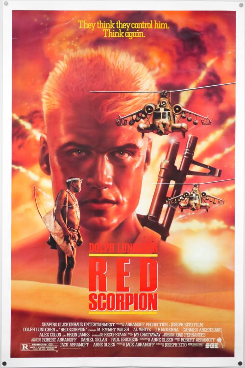
This poster was designed by the Los Angeles-based Kaiser Creative who worked on a number of film posters over the years. IMPAwards has a gallery of many of their posters. I’ve been unable to determine who is responsible for the artwork so if anyone has any ideas please get in touch.

Flesh and Blood / quad / UK

29.07.15

Poster Poster
Title
Flesh and Blood
AKA
Flesh+Blood (alt. spelling)
Year of Film
1985
Director
Paul Verhoeven
Starring
Rutger Hauer, Jennifer Jason Leigh, Tom Burlinson, Jack Thompson, Fernando Hilbeck, Susan Tyrrell, Ronald Lacey, Brion James
Origin of Film
Spain | USA | Netherlands
Genre(s) of Film
Rutger Hauer, Jennifer Jason Leigh, Tom Burlinson, Jack Thompson, Fernando Hilbeck, Susan Tyrrell, Ronald Lacey, Brion James,
Type of Poster
Quad
Style of Poster
--
Origin of Poster
UK
Year of Poster
1985
Designer
Unknown
Artist
Unknown artist - based on artwork by Renato Casaro
Size (inches)
30 3/16" x 39 15/16"
SS or DS
SS
Tagline
A timeless adventure, a passion for wealth and power. Only the strongest will survive.

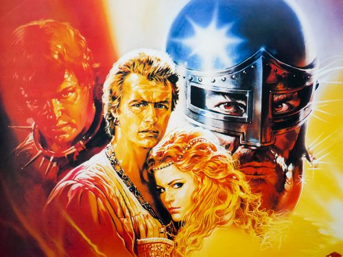
This is the British quad for the release of Dutch director Paul Verhoeven‘s first English language film, Flesh and Blood (sometimes referred to as Flesh+Blood). Verhoeven had been making films with subsidies from the Dutch government but things had been proving difficult due to the controversial subject matter of his stories so he decided to seek financial backing from a Hollywood studio. The now defunct Orion Pictures stumped up most of the budget for Flesh and Blood and had asked the director for a war film after seeing the celebrated Soldier of Orange. Verhoeven had nothing prepared in that genre so he worked hastily with a regular collaborator, the screenwriter Gerard Soeteman, to adapt some unused material from their TV series Floris, which was set during the Middle-Ages. Verhoeven would later rue the decision to allow Orion to insist on script changes that added a romantic interest to the story.

Set in Italy in 1501, the film features the Dutch actor Rutger Hauer, who had worked with Verhoeven several times before (including on Floris), as Martin, the leader of a band of mercenaries who are asked to help Lord Arnolfini (Fernando Hilbeck) retake his city that was captured whilst he was away. After successfully storming and recapturing it the mercenaries are initially told they can ransack the houses of the richest inhabitants of the city, but Arnolfini then changes his mind and orders his army to march the mercenaries from the city without the bounty that was agreed. The group vow to take their revenge and when Arnolfini’s son Steven (Tom Burlinson) leaves the castle to meet Agnes (Jennifer Jason Leigh), a noblewoman who has been betrothed to him, the mercenaries strike. After attacking the caravan and badly wounding Arnolfini, they kidnap Agnes and ride away with her. Eventually they end up at a castle where they hole-up and attempt to see off any attempts to rescue Agnes, who is seemingly falling in love with Martin.

Although it features moments of humour, Verhoeven’s intention was to show that the Middle-Ages weren’t as glamorous and pleasant as had been depicted in previous films, so he doesn’t shy away from casual violence, filth and degradation. Agnes in particular is subjected to a humiliating ordeal at the hands of the mercenaries, effectively ending up as their plaything later in the film. There’s plenty of blood-letting too with some battle scenes that are not for the faint hearted. Apparently the production was beset with problems, including an uncooperative international crew who were often drunk or under the influence of drugs, as well as a giant rift that opened up between Verhoeven and Hauer because the actor wanted to build a career as a heroic leading man, but the director wanted his character to be more ambiguous and at times unpleasant. The resulting film is definitely uneven and at times confusing, but is nevertheless engaging. Hauer in particular injects his scenes with plenty of wild energy and Jennifer Jason Leigh is memorable as the sensuous Agnes. Unfortunately Orion botched the American release and the film apparently flopped quickly. Verhoeven would later say he felt that he’d probably made the film too cynical and downbeat for audiences to take.

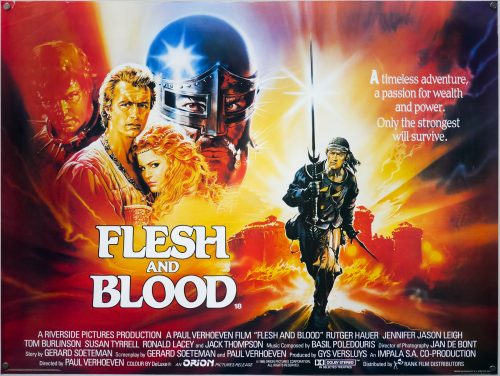
This artwork was adapted by an unknown British artist from an original piece of art by the Italian artist Renato Casaro, which was originally painted for the German poster. Notable changes include the position of the characters, which widened for this quad, plus the smaller figure of Hauer is also markedly different. One of my favourite artists, Renato Casaro had a prolific movie poster output that lasted over 35 years. He began his career in 1953, aged 19, at the famous Studio Favalli in Rome and would go on to design and paint posters for many of the biggest directors in the world. His skill at accurately portraying actors and his brilliant use of colour and composition saw him much in demand from studios and actors alike. His artwork has featured on posters used in multiple countries, including Japan, Germany, USA as well as in his native Italy.

Check out the incredible amount of work on his official website here, which also features a biography of the artist. In March 2014 I published an exclusive interview with Renato and it can be read by clicking here. The other posters I’ve collected by Renato Casaro are here.

Apocalypse Now / Thailand

23.09.15

Poster Poster

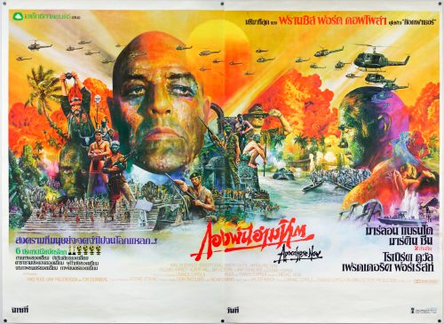
This is the very scarce original 2-sheet poster for the Thai release of arguably the best war film ever made, Francis Ford Coppola’s Apocalypse Now.  Set during America’s war in Vietnam, the film follows Martin Sheen’s US Army Army and special forces veteran Benjamin Willard as he journeys up the dangerous Nung River and deeper into the jungle in the search of the rogue Special Forces Colonel Walter E. Kurtz (Marlon Brando in an unforgettable role). Willard is told that an insane Kurtz has gathered together an army of indigenous fighters inside neutral Cambodia and that he must ‘terminate with extreme prejudice’. After landing at the mouth of the river in a spectacular sequence in which Colonel Kilgore (Robert Duvall) first attacks an enemy village from helicopters whilst blasting Wagner’s Ride of the Valkyries from loudspeakers, then orders some of his men to surf despite the fact that mortar shells continue to land all around them, Willard  joins the crew of a Navy PBR boat that transports him on his fateful journey up river.

Apocalypse Now is famous for its fraught production in which the shoot went over time and over budget, sets were destroyed by storms, Martin Sheen suffered a heart attack and other woes that caused Coppola to famously say, “We had access to too much money, too much equipment, and little by little we went insane”, and “My film is not about Vietnam, it is Vietnam”. The director’s wife Eleanor helped to put together the acclaimed documentary of the troubled production called Hearts of Darkness: A Filmmaker’s Apocalypse, which is an essential watch for fans of the film. Despite the production woes, the film was a huge critical and commercial success, with its cultural impact undeniable.

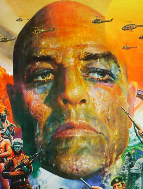
The film had several interesting posters printed for its release, including the great Bob Peak artwork used around the world, but this Thai 2-sheet is up there, in my mind, as one of the best posters ever painted, full stop. The amount of detail, use of colour and expertly arranged montage all add up to a visual feast of a design and I find some new detail every time I look at it. I’ve added 70 photos for you to really get a sense of the poster.

This poster was painted by the artist Tongdee Panumas (he signs his posters with just his first name) who was an incredibly prolific Thai film poster artist during the 70s, 80s and 90s but I’ve been unable to find out much about him, other than that he was born in 1947. If anyone has any more information please get in touch.

The two sides of the poster were printed separately and then joined together once they were displayed at cinemas. I tried my best to join them together with Photoshop but it’s not that easy to get them to match. Photos 2 and 3 show the two halves separately. It’s interesting to note that Tongdee actually painted the original art on two canvases as can be seen on this photograph showing him and the British collector Neil Pettigrew that was published in issue 168 of Dark Side magazine. This means that getting a totally seamless join between the two halves is impossible.

Note that there was a reprint made of this poster several years ago where someone in Thailand scanned the poster when the two halves were joined together and then printed it as a single sheet poster at the standard Thai film poster size of around 21″ x 31″. These have sometimes been sold as ‘commercial posters’ but are nothing more than unauthorised fakes and should be avoided at all costs. Permission was not sought from the distributor or the artist to make these copies and their sale should not be supported.

Vertigo / one sheet / 1996 re-release / USA

27.01.16

Poster Poster
Title
Vertigo
AKA
La donna che visse due volte [The woman who lived twice] (Italy)
Year of Film
1958
Director
Alfred Hitchcock
Starring
James Stewart, Kim Novak, Barbara Bel Geddes, Tom Helmore, Henry Jones, Raymond Bailey, Ellen Corby
Origin of Film
USA
Genre(s) of Film
James Stewart, Kim Novak, Barbara Bel Geddes, Tom Helmore, Henry Jones, Raymond Bailey, Ellen Corby,
Type of Poster
One sheet
Style of Poster
Re-release
Origin of Poster
USA
Year of Poster
1996
Designer
Saul Bass
Artist
Saul Bass | Art Goodman (figures)
Size (inches)
27" x 40"
SS or DS
DS
NSS #
--
Tagline
--

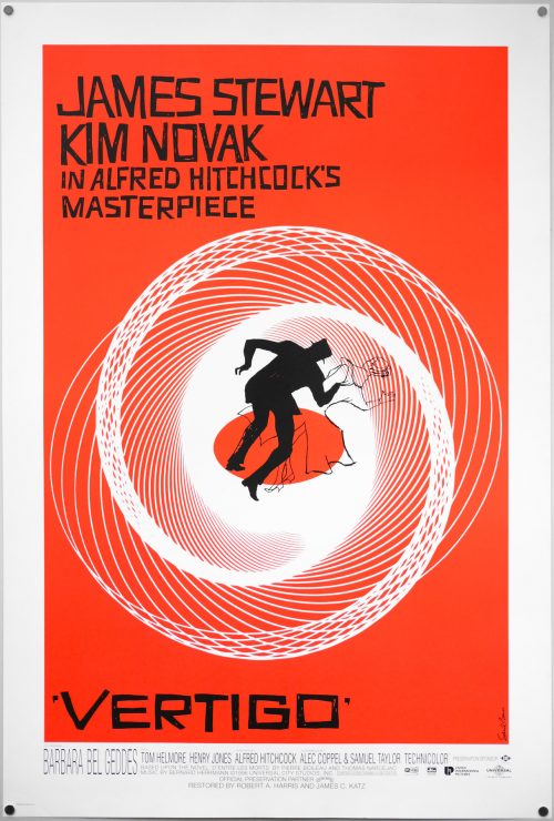
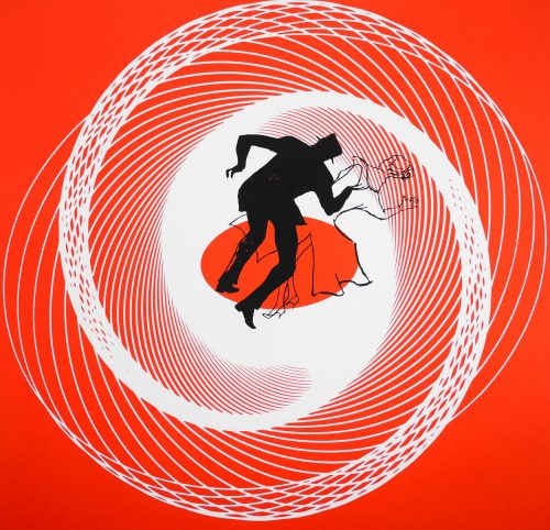
This US one sheet was printed to mark the 1996 re-release of a restored print of director Alfred Hitchcock‘s classic thriller Vertigo. The film marked the first time Hitchcock worked with the celebrated American designer Saul Bass and the pair would collaborate on two further films together. Hitchcock had himself started his film career developing inter-title cards for silent movies and he commissioned Bass to create the title sequences for Vertigo, North by Northwest and Psycho. As detailed in the must-own book ‘Saul Bass: A Life in Film & Design’ (designed by Bass’ daughter Jennifer), the director knew of Bass’ work well before the commission as he kept a close eye on movie graphics and was a subscriber to Graphis, a print journal that had featured Saul’s work.

As well as creating the influential title sequences for each film, Bass was also commissioned to design the advertising campaign for Vertigo. He created the central motif of two figures swirling in a vortex, which is detailed in ‘A Life in Film & Design’:

‘The main poster also captures the sensation of vertigo by having a couple sucked into a vortex. The slightly off-kilter, irregular capitals further hint at the vertiginous. The figures were drawn by Art Goodman, who recalled Saul specifying and sketching out a black silhouette for the man and a light outline, like an apparition, for the woman of his obsessions.’

Several different colours and variations were utilised for the various elements of the ad campaign (trade ads, large posters, brochures, etc) with the concept that the variation of colour and design around a central theme ‘was spinning the viewer in another direction’. Some of these alternatives can be seen in this excellent blog post.

Even if the film wasn’t a great box-office and critical triumph during its initial release, with a reappraisal and celebration not happening until several years later, the title sequence advertising campaign was declared an immediate success and was to win Bass several awards. This one sheet is practically identical to the original 1958 poster with the exception of an altered credits block at the bottom and slightly darker shade of orange (note that this poster is also double-sided, for use in lightboxes)

The film’s Wikipedia article details how the 1996 restoration proved quite controversial since the experts charged with the task were forced to alter the soundtrack (during the creation of a new 6 channel track) and restore the colour as best as they could since the original negatives had faded over the years.

This article on Mubi.com by Adrian Curry does a thorough job of detailing all the various posters printed for Vertigo around the world.

For more on Bass I thoroughly recommend picking up ‘Saul Bass: A Life in Film & Design’ and also check out the extensive page about him on the brilliant Art of the Title

Mountaintop Motel Massacre / one sheet / video / USA

13.04.16

Poster Poster
Title
Mountaintop Motel Massacre
AKA
--
Year of Film
1986
Director
Jim McCullough Sr.
Starring
Bill Thurman, Anna Chappell, Will Mitchell, Virginia Loridans, Major Brock, James Bradford, Amy Hill, Marian Jones, Gregg Brazzel
Origin of Film
USA
Genre(s) of Film
Bill Thurman, Anna Chappell, Will Mitchell, Virginia Loridans, Major Brock, James Bradford, Amy Hill, Marian Jones, Gregg Brazzel,
Type of Poster
One sheet
Style of Poster
Video
Origin of Poster
USA
Year of Poster
1986
Designer
Unknown
Artist
--
Size (inches)
27 4/16" x 41"
SS or DS
SS
NSS #
--
Tagline
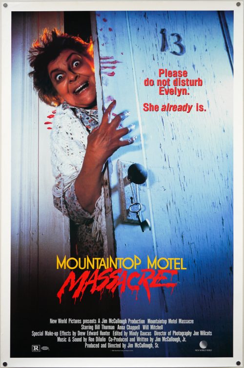
Please do not disturb Evelyn. She already is.

A no nonsense design graces this one sheet for the release of the 1986 horror film Mountaintop Motel Massacre. The film was co-produced and directed by the late Jim McCullough Sr., with his son Jim McCullough Jr. sharing producing duties as well as writing the script. It was apparently shot in 1983 in Shreveport, Louisiana but was not released across the States until 1986 after Roger Corman’s company New World Pictures picked up the distribution rights. I believe it was released straight to video in most countries, including the UK.

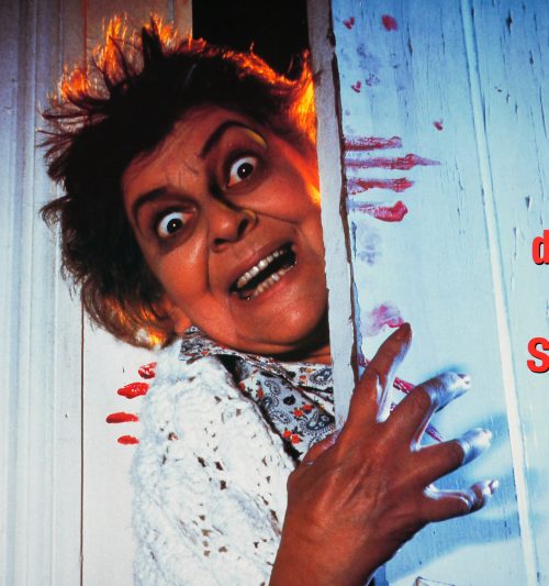
Evelyn (Anna Chappell) has spent three years living in an insane asylum and upon her release returns to the eponymous hotel but not before murdering her own daughter Lorri, who it’s revealed was into the occult and conducting seances. The murder unleashes dark forces and when Evelyn once again reopens the hotel to paying guests no one is safe. One night, during a violent thunderstorm, Evelyn commences a murder spree, making her way from room to room via a hidden underground tunnel.

This is actually the one sheet for the video release of the film (note the text at the bottom) but the poster that was used for its release into cinemas is practically identical as can be seen here (note the alternate logo). It also appears that Jim McCullough Sr. attempted to release the film off his own back prior to 1986, titled as just Mountaintop Motel and the poster for that can be seen here.

Black Joy / quad / UK

28.04.16

Poster Poster
Title
Black Joy
AKA
--
Year of Film
1977
Director
Anthony Simmons
Starring
Norman Beaton, Trevor Thomas, Floella Benjamin, Dawn Hope, Oscar James, Paul J. Medford, Shango Baku
Origin of Film
UK
Genre(s) of Film
Norman Beaton, Trevor Thomas, Floella Benjamin, Dawn Hope, Oscar James, Paul J. Medford, Shango Baku,
Type of Poster
Quad
Style of Poster
--
Origin of Poster
UK
Year of Poster
1977
Designer
FEREF
Artist
Arnaldo Putzu
Size (inches)
30" x 39 15/16"
SS or DS
SS
Tagline
Life is for living...

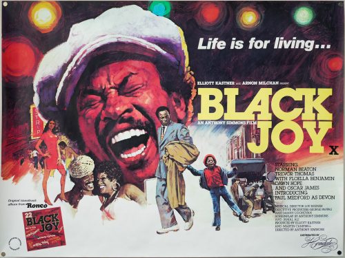
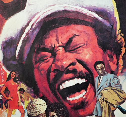
Excellent artwork by the Italian artist Arnaldo Putzu features on this quad poster for the release of the 1977 British film Black Joy. Based on a stage play called ‘Dark Days and Light Nights’ by Jamal Ali (who also wrote the screenplay) it was directed by the late Anthony Simmons. The film, something of a time capsule of a period in London’s history, is a culture-clash comedy about a Guyanese country boy called Ben Jones (Trevor Thomaswho arrives in the borough of Brixton. Ben had assumed life will be easier in the UK but after meeting several streetwise characters, including a wannabe hustler called Dave King (Norman Beaton), he soon learns that not everyone is out for his best interests.

The film notably stars Floella Benjamin a Trinidadian actress who is famous for her work as a presenter on children’s TV programmes in the 1970s and 80s, including Play School, and more recently for her extensive charity work and as the chancellor of the University of Exeter. In 2010 she was made a Baroness as a Liberal Democrat Life Peer and is a member of the House of Lords.


Arnaldo Putzu was born in Rome in 1927 and began painting from a very early age. In 1948 he began his relationship with the world of film publicity under the guidance of the famous artist Enrico De Seta. Eventually Putzu would gain enough confidence in his abilities to set up his own agency and it was this move that saw him getting involved in work for the British studio Rank. Eric Pulford was so impressed with his work that he brought him over to London to work at Downtons in 1967.

The artist worked on many quads whilst over here and also gained notoriety for lending his talents to the popular children’s magazine Look-in, for which he painted almost every cover during its publication lifetime. His best-known quad is undoubtedly the one he painted for the Michael Caine gangster classic Get Carter in 1971. My friend, and author of the must-own British Film Posters, Sim Branaghan met Putzu during the making of his book and describes it as a very memorable experience in the interview I published in 2012. Putzu sadly passed away the same year, aged 85, and Sim wrote an excellent obituary for The Guardian newspaper, which can be read here.

Silver Streak / one sheet / style A / USA

31.05.16

Poster Poster
Title
Silver Streak
AKA
--
Year of Film
1976
Director
Arthur Hiller
Starring
Gene Wilder, Jill Clayburgh, Richard Pryor, Patrick McGoohan, Ned Beatty, Clifton James, Ray Walston, Stefan Gierasch, Len Birman, Valerie Curtin, Lucille Benson, Scatman Crothers, Richard Kiel, Fred Willard
Origin of Film
USA
Genre(s) of Film
Gene Wilder, Jill Clayburgh, Richard Pryor, Patrick McGoohan, Ned Beatty, Clifton James, Ray Walston, Stefan Gierasch, Len Birman, Valerie Curtin, Lucille Benson, Scatman Crothers, Richard Kiel, Fred Willard,
Type of Poster
One sheet
Style of Poster
Style A
Origin of Poster
USA
Year of Poster
1976
Designer
Unknown
Artist
George Gross
Size (inches)
27 2/16" x 41"
SS or DS
SS
NSS #
76/200
Tagline
By plane, by train, by the edge of your seat, it's the most hilarious suspense ride of your life!

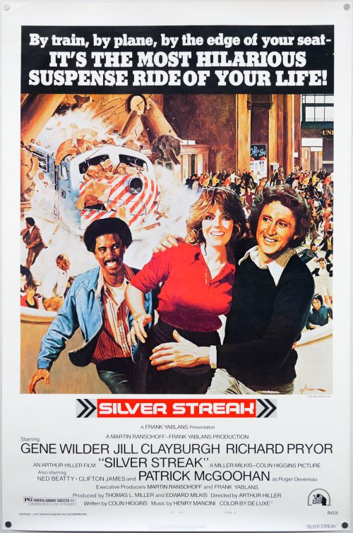
Silver Streak, a 1976 comedy thriller, marked the first time that the celebrated comic actors Gene Wilder and Richard Pryor would appear together in a film and there would be a further three pairings following this one. Directed by Arthur Hiller, who would helm See No Evil, Hear No Evil starring Wilder and Pryor 13 years later, the film is mostly set onboard the eponymous long distance train. Wilder plays George Caldwell a book editor who is traveling from Los Angeles to Chicago for his sister’s wedding. Whilst onboard he meets Hilly (Jill Clayburgh) and the pair strike up a romance, but soon George is battling to stay alive after he witnesses the murder of an art historian and attracts the attention of the killers.

The gang plan to impersonate the dead historian in order to pass of a pair of forged Rembrandt paintings as original. George is forcefully removed from the train several times and it’s during one of these escapades that he meets the criminal Grover T. Muldoon (Pryor) who he enlists in helping him reach the train to climb back onboard and bring the conspiracy to light. As this poster artwork suggests, the film ends in a spectacular train crash.

The artwork is by George Gross, an American who is best known as an artist of pulp book covers but, as this short biography details, he also worked on magazine illustrations and covers for popular novels. The artist was born in 1909 in Brooklyn and he followed his father into the area of commercial illustration, with both of his siblings eventually making it a proper family affair. This site has a gallery of his pulp covers. I’ve been unable to determine if he painted any other film posters so please get in touch if you know of any others.

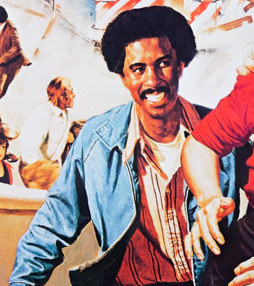
It’s worth noting that the central figures have been rather crudely cut out and placed over the background scenes, which have also been cut up in places (see if you can spot the replicated policeman).

Beastmaster 2 / Thailand

15.07.16

Poster Poster
Title
Beastmaster 2
AKA
Beastmaster 2: Through the Portal of Time (International alt. title)
Year of Film
1991
Director
Sylvio Tabet
Starring
Marc Singer, Kari Wuhrer, Sarah Douglas, Wings Hauser, James Avery, Robert Fieldsteel, Arthur Malet, Robert Z'Dar
Origin of Film
USA | France
Genre(s) of Film
Marc Singer, Kari Wuhrer, Sarah Douglas, Wings Hauser, James Avery, Robert Fieldsteel, Arthur Malet, Robert Z'Dar,
Type of Poster
Thai
Style of Poster
--
Origin of Poster
Thailand
Year of Poster
1991
Designer
Unknown
Artist
Tongdee Panumas
Size (inches)
25" x 35.5"
SS or DS
SS
Tagline
--

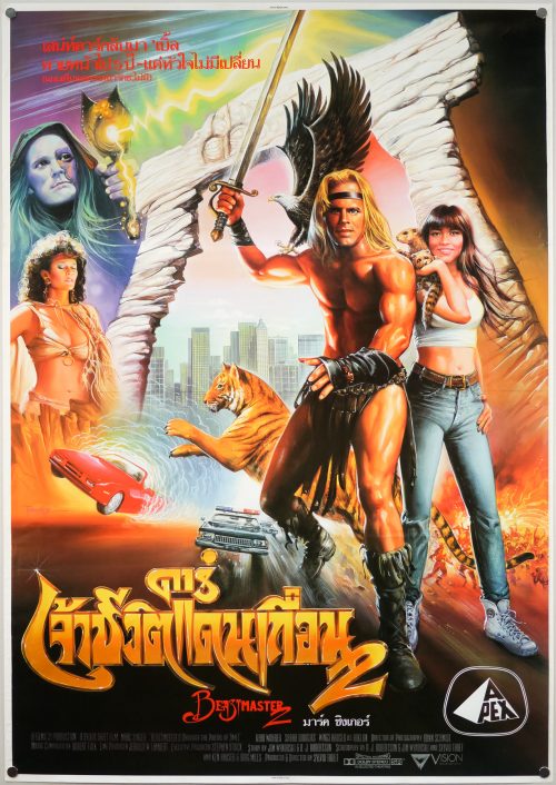
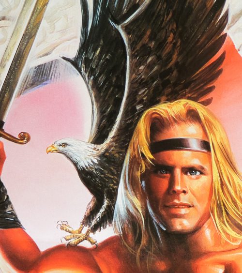
Colourful artwork by the artist Tongdee Panumas on this poster for the Thai release of the belated sequel to the 1982 original, Beastmaster 2. The film was directed by Sylvio Tabet who was the co-producer on the first film. The original screenwriter also returned, although judging by the number of screenwriter credits on the film’s IMDb page it clearly went through multiple re-writes before making it to the screen. The only member of the first film’s cast to return was Marc Singer who plays the titular character, also known as Dar. The plot is described thusly on Wikipedia:

Dar, the Beastmaster, is back and now he has to deal with his half-brother, Arklon (Wings Hauser), and a sorceress named Lyranna (Sarah Douglas) who have escaped to present day Los Angeles. Despite the name, the movie is not about traveling through a time portal, but traveling through a portal to a parallel universe that 1991 Earth exists in. Dar and his animal companions, Ruh, Kodo, Podo and Sharak, must follow them through the portal and stop them from obtaining a neutron bomb. During his visit, Dar meets a rich girl named Jackie Trent (Kari Wuhrer) and they become friends.

The film was roundly panned by critics and largely ignored by audiences on its release. Today it’s considered to be one of the worst sequels ever made. The handful of reviews on IMDb are largely unforgiving, for example:

If you are ever in the mood for a truly terrible film, it would be hard to find something that could even compare to this. I have spent a lot of time watching a lot of terrible movies just for the sheer joy I get from it, and man, this is one of the worst. This movie was so bad, I had to buy the third Beastermaster online. That one wasn’t as bad, which is amazing since it was straight to video.

The ending sounds unintentionally hilarious:

During the closing credits (at least in the version that hit theatres), the Beastmaster can be seen running into the sunset. This sunset is actually a painted backdrop, and after a while, you can clearly discern that the guy is actually running in place for almost two minutes as the credits roll! A perfect end to a perfect movie!


Tongdee Panumas (he signs his posters with just his first name) was an incredibly prolific Thai film poster artist during the 70s, 80s and 90s. I’ve been unable to find out much about him, other than that he was born in 1947, so if anyone has any more details please get in touch.

Note that the line across the centre of the poster is where the original artboards onto which Tongdee paints were joined. Thai artists apparently often struggled to find large enough canvases to paint on.