You searched for: James%2520O%5C%27Connell

Planet Of The Apes / giclee / Now Showing exhibition / UK

17.05.11

Poster Poster
Title
Planet Of The Apes
AKA
Apornas planet (Sweden)
Year of Film
1968
Director
Franklin J. Schaffner
Starring
Charlton Heston, Roddy McDowall, Kim Hunter, Maurice Evans, James Whitmore, James Daly, Linda Harrison
Origin of Film
USA
Genre(s) of Film
Charlton Heston, Roddy McDowall, Kim Hunter, Maurice Evans, James Whitmore, James Daly, Linda Harrison,
Type of Poster
Giclee
Style of Poster
--
Origin of Poster
UK
Year of Poster
2008
Designer
Non Format
Artist
Von
Size (inches)
23 1/4" x 33"
SS or DS
SS
Tagline
--

Planet Of The Apes / screen print / Todd Slater / regular / USA

17.05.11

Poster Poster
Title
Planet Of The Apes
AKA
Apornas planet (Sweden)
Year of Film
1968
Director
Franklin J. Schaffner
Starring
Charlton Heston, Roddy McDowall, Kim Hunter, Maurice Evans, James Whitmore, James Daly, Linda Harrison
Origin of Film
USA
Genre(s) of Film
Charlton Heston, Roddy McDowall, Kim Hunter, Maurice Evans, James Whitmore, James Daly, Linda Harrison,
Type of Poster
Screen print
Style of Poster
Regular
Origin of Poster
USA
Year of Poster
2008
Designer
Todd Slater
Artist
Todd Slater
Size (inches)
23 6/16" x 34 3/16"
SS or DS
SS
Tagline
--

Planet Of The Apes / screen print / Todd Slater / variant / USA

17.05.11

Poster Poster
Title
Planet Of The Apes
AKA
Apornas planet (Sweden)
Year of Film
1968
Director
Franklin J. Schaffner
Starring
Charlton Heston, Roddy McDowall, Kim Hunter, Maurice Evans, James Whitmore, James Daly, Linda Harrison
Origin of Film
USA
Genre(s) of Film
Charlton Heston, Roddy McDowall, Kim Hunter, Maurice Evans, James Whitmore, James Daly, Linda Harrison,
Type of Poster
Screen print
Style of Poster
Variant
Origin of Poster
USA
Year of Poster
2008
Designer
Todd Slater
Artist
Todd Slater
Size (inches)
23.5" x 34 2/8"
SS or DS
SS
Tagline
--

Silverado / B2 / Japan

17.05.11

Poster Poster

Swashbuckler / 30×40 / USA

30.12.11

Poster Poster
Title
Swashbuckler
AKA
The Scarlet Buccaneer (UK) | Le pirate des Caraïbes [The Pirate Of The Caribbean] (France) | Il corsaro della Giamaica [The Pirate of Jamaica] (Italy)
Year of Film
1976
Director
James Goldstone
Starring
Robert Shaw, James Earl Jones, Peter Boyle, Geneviève Bujold, Beau Bridges, Geoffrey Holder, Avery Schreiber, Tom Clancy, Anjelica Huston, Bernard Behrens, Dorothy Tristan
Origin of Film
USA
Genre(s) of Film
Robert Shaw, James Earl Jones, Peter Boyle, Geneviève Bujold, Beau Bridges, Geoffrey Holder, Avery Schreiber, Tom Clancy, Anjelica Huston, Bernard Behrens, Dorothy Tristan,
Type of Poster
30x40
Style of Poster
--
Origin of Poster
USA
Year of Poster
1976
Designer
Unknown
Artist
John Solie
Size (inches)
29 7/8" x 40 1/16"
SS or DS
SS
NSS #
76/164
Tagline
Come have a wonderful time - Enjoy the Biggest Grandest Pirate Movie ever!

Great artwork featuring the legendary actor Robert Shaw in a dramatic pose for this largely forgotten pirate romp Swashbuckler. The film is known as Scarlet Buccaneer in several other English-speaking territories, including the UK. The Japanese poster featuring an adaptation of this artwork can be seen here.

The artwork on this poster is by the American artist John Solie who has been working as an illustrator for over 40 years. Film posters are just one aspect of his output, which also includes book and magazine covers, sculptures, portraits and work for NASA. He continues to paint today in Tucson, Arizona. Here are the posters by John Solie I have collected to date.

The original trailer can be viewed on IMDb.

The Scarlet Buccaneer / B2 / Japan

17.05.11

Poster Poster
Title
The Scarlet Buccaneer
AKA
Swashbuckler (USA) | Le pirate des Caraïbes [The Pirate Of The Caribbean] (France) | Il corsaro della Giamaica [The Pirate of Jamaica] (Italy)
Year of Film
1976
Director
James Goldstone
Starring
Robert Shaw, James Earl Jones, Peter Boyle, Geneviève Bujold, Beau Bridges, Geoffrey Holder, Avery Schreiber, Tom Clancy, Anjelica Huston, Bernard Behrens, Dorothy Tristan
Origin of Film
USA
Genre(s) of Film
Robert Shaw, James Earl Jones, Peter Boyle, Geneviève Bujold, Beau Bridges, Geoffrey Holder, Avery Schreiber, Tom Clancy, Anjelica Huston, Bernard Behrens, Dorothy Tristan,
Type of Poster
B2
Style of Poster
--
Origin of Poster
Japan
Year of Poster
1976
Designer
Unknown
Artist
John Solie
Size (inches)
20 6/16" x 28 14/16"
SS or DS
SS
Tagline
--

Twentyfour Seven / one sheet / USA

17.05.11

Poster Poster
Title
Twentyfour Seven
AKA
24:7 Twenty Four Seven (full title)
Year of Film
1997
Director
Shane Meadows
Starring
Bob Hoskins, Danny Nussbaum, Justin Brady, James Hooton, Darren O. Campbell, Karl Collins, Johann Myers, Jimmy Hynd, Mat Hand, James Corden, Frank Harper
Origin of Film
UK
Genre(s) of Film
Bob Hoskins, Danny Nussbaum, Justin Brady, James Hooton, Darren O. Campbell, Karl Collins, Johann Myers, Jimmy Hynd, Mat Hand, James Corden, Frank Harper,
Type of Poster
One sheet
Style of Poster
--
Origin of Poster
USA
Year of Poster
1998
Designer
Unknown
Artist
--
Size (inches)
27" x 40"
SS or DS
SS
NSS #
--
Tagline
Try love. Try hate. Try anything. Just try. | Everybody wants to be somebody.

Star Trek II – The Wrath of Khan / screen print / regular / Tyler Stout / USA

29.04.13

Poster Poster

The Wrath of Khan was the follow up to 1979s Star Trek – The Motion Picture, which was the first feature film to hit cinemas following the ending of the original series 10 years previously. Even though the show was cancelled by the network (NBC) after only three seasons, it had garnered a significant cult following and had made a major impact on popular culture, helped greatly by broadcast syndication on channels across the US during the 1970s. Despite earning significant box-office takings, many critics and fans of the original series were disappointed with the first feature film and reviews tended to criticise it as overlong, bereft of any significant action and, worst of all, boring.

A sequel was inevitable, but Gene Roddenberry, the creator of the original series and executive producer of the first film, was removed from its production by Paramount after they claimed that Roddenberry had forced the first film over budget and had muddled the script with too many re-writes. His replacement was Harve Bennett, with Roddenberry given an ‘executive consultant’ role. Bennett studied the original series for inspiration having decided that the film should be more action-packed and regain some of the swashbuckling feel that had been lost in the first film. Deciding that the sequel needed a decent bad guy, Bennett settled on the character of Khan Noonien Singh, a genetically engineered super solider, who had featured in the first series episode Space Seed, which had long been a fan favourite. At the end of that episode Khan and some of his comrades had been banished to the inhospitable planet of Ceti Alpha V so his return in the film would not be against the series’ canon.

Mexican actor Ricardo Montalban agreed to reprise his role as Khan and the story sees him escaping exile and seeking revenge against Captain Kirk, whom he blames for the death of his wife. After commandeering the USS Reliant, Khan learns of the Genesis Device, a torpedo which is intended to reorganise matter to create a hospitable world but can also destroy planets if used in the wrong way. The crew of the Starship Enterprise sets out to stop Khan but their intervention will not be without sacrifice and the ending of the film sees Leonard Nimoy’s Spock seemingly dead after sacrificing himself to save his comrades. This story arc would continue for two more films, concluding with The Voyage Home in 1986. Among several memorable scenes is the moment when Khan taunts Kirk with a threat against his wife, leading to this infamous outburst. KHAAAAAAAAAN!

When Mondo, the incomparable limited-edition screen print outfit, announced they were opening a gallery in their hometown of Austin, anticipation quickly reached fever pitch, with fans desperate to see what artwork would be on the walls when the doors opened for the first time. The answer was kept secret until the evening of March the 10th, 2012 when the opening night was held and the theme of their first show was revealed to be that of classic sci-fi. Most of Mondo’s premier artists turned in some incredible pieces for the show, as can be seen on this recap blog post on their website and on this SlashFilm post.

One of the highlights of the show was fan-favourite artist Tyler Stout’s print for The Wrath of Khan. A brilliantly composed image featuring Ricardo Montalban‘s unforgettable, titular bad guy, the poster was printed in two flavours; a red and gold regular and a silver and gold variant. Whilst adding the regular version to the Film on Paper collection I wanted to interview the man himself about the creation of the poster and that article can be read here.

Once Upon a Time In America / A1 / Germany

03.03.14

Poster Poster

Considered by many to be Sergio Leone’s masterpiece – certainly not an easy choice to make when there are films like The Good, the Bad and the Ugly and Once Upon a Time in the West to choose from – ‘…America’ was to be the Italian director’s last film. Infamously, it had almost 90 minutes removed for its US cinematic release (in 1984), apparently after receiving terrible notice from American critics at the Cannes Film Festival – the re-cut version was also given a slating when it appeared.

Eventually the full 229 minute version was made available on home video in America. In 2012 it was announced that the film was to be restored to an even longer cut with over 40 minutes of newly discovered material that was thought lost. An extended cut of the film was released on blu-ray in 2014.

I recently visited the same street in Brooklyn that leads down to the Manhattan Bridge and is featured in the film and on this poster. I took this picture, which gives you an idea of how the street looks today.

This is the German poster (style A) that was designed and painted by one of my favourite artists, Renato Casaro, an Italian with a prolific movie poster output that lasted over 35 years. He began his career in 1953, aged 19, at the famous Studio Favalli in Rome and would go on to design and paint posters for many of the biggest directors in the world. His skill at accurately portraying actors and his brilliant use of colour and composition saw him much in demand from studios and actors alike.

His artwork has featured on posters used in multiple countries, including Japan, Germany, USA as well as in his native Italy. Check out the incredible amount of work on his official website here, which also features a biography of the artist. The other posters I have collected by Casaro can be seen by clicking here.

The original trailer is on YouTube.


An interview with James White (Signalnoise)

18.01.12

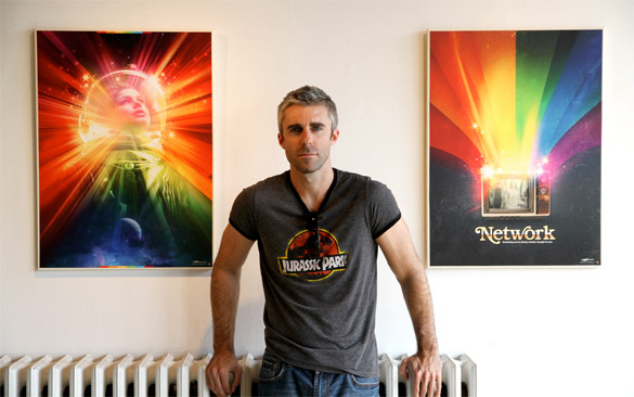
James White is the one man design machine behind the celebrated Signalnoise studio, based in the Canadian city of Dartmouth (Nova Scotia). Having spent 11 years working as a web and print designer for various international companies, and pursuing his own personal projects on the side, James decided to create Signalnoise.com. The site serves as both a personal design blog and a fantastic source of inspiration for other designers, with daily links and galleries of incredible graphic work from all over the world.

Over the years James has cultivated a unique style which reflects on his love of design history and in particular the nostalgic inspiration he continues to draw from the designs he loved whilst growing up in the 1980s. Not only does he showcase finished personal projects on the site, but he regularly shares the processes behind creating the pieces and has also recorded over 60 ‘Broadcasts‘ in which he talks about the work and answers questions from fans of the site and fellow designers. James is also an international speaker on design and has several dates coming up in 2012. To top it all off he’s a genuinely nice chap and is also sickeningly handsome (my wife let out a small whimper when she first saw a picture of him).

Last year James created an unofficial poster for the superb film Drive that was much-heralded and brought him acclaim from film fans and designers alike. The poster perfectly captures the spirit and aesthetics of the film in one image, which is what all film posters should aim to do, and I wasn’t alone in thinking it did a better job than the official US one sheets.

I was lucky enough to be sent one of the small run that James printed soon after the poster was finished but, thanks to a great effort from his agent, Ollie Judge, the poster was recently given the nod from the film’s rights owners. This has resulted in the poster being considered official merchandise and has allowed James to reprint and sell the posters via his website. On the eve of the launch I wanted to share a recent interview I conducted with the man himself in which we discuss the sources of his inspiration, the other film posters and artists he loves and the process behind creating the Drive poster.

James White - AKA Signalnoise - handsome S.O.B.

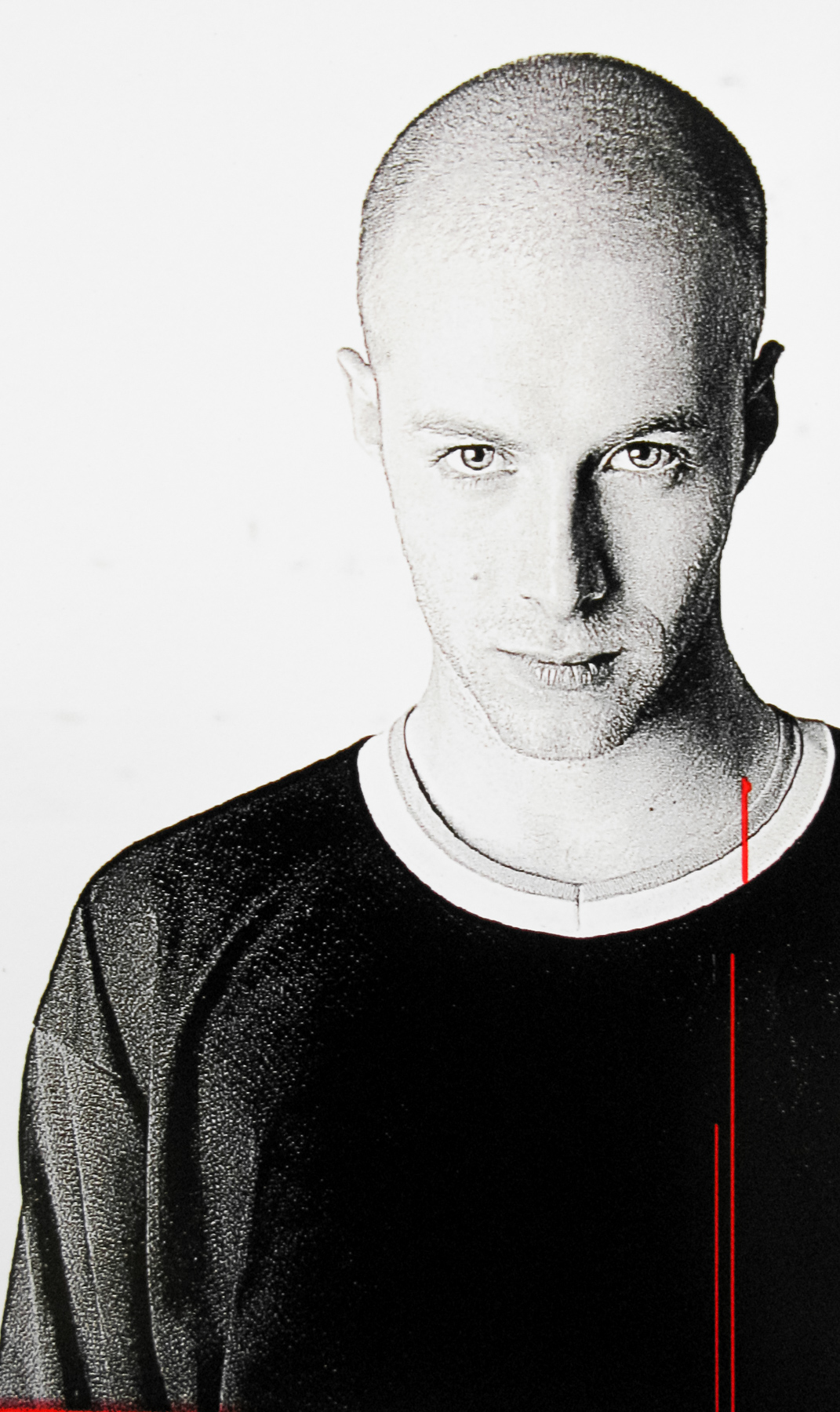
James White – AKA Signalnoise – handsome S.O.B.

Hi James, thanks a lot for taking the time to speak to me. I’d like to begin by asking what it was that inspired you to start out as a graphic designer?
I’ve been drawing my whole life, since I could pick up a pencil at the age of 4. I grew up drawing my favourite characters from a myriad of television shows, comics books, cartoons, movies and even cereal boxes. I lived for art classes in elementary school, when the construction paper and markers started to fly.

I never stopped doodling and drawing all the way through junior high and high school, and upon graduation I was accepted into a 1-year graphic design course at a community college in my hometown. It was pretty bare bones, but I got all the education I needed to really dive into creating a career. This was 1995. That’s when I was introduced to Adobe Photoshop and Illustrator which changed my life forever. Almost immediately I started figuring out how I could take my drawings off the page and use this new weapon, the computer, to move to the next level.

I got scooped up into the web design industry in ’98 when everything was booming. Even though I worked for a variety of agencies in Halifax, Nova Scotia, I never lost touch with that raw creative freedom I had while growing up. I’d work by day, then by night I’d pursue my personal projects like creating comics, animation, character design, painting … whatever I wanted to create. I never stopped.

1980s Transformers box art - inspiration on Signalnoise.com - see Botchthecrab.com for more.

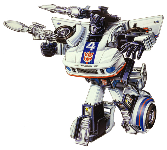
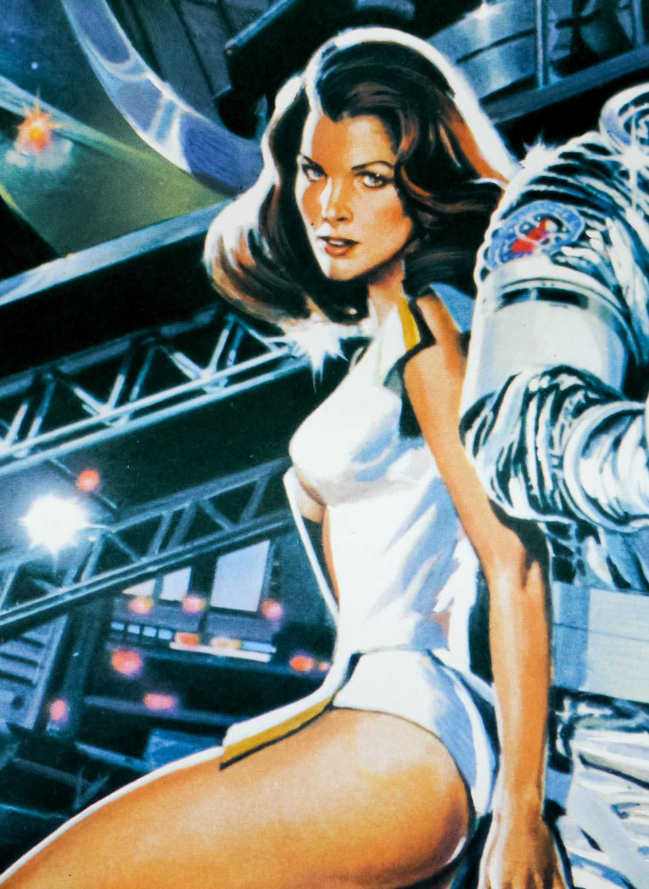
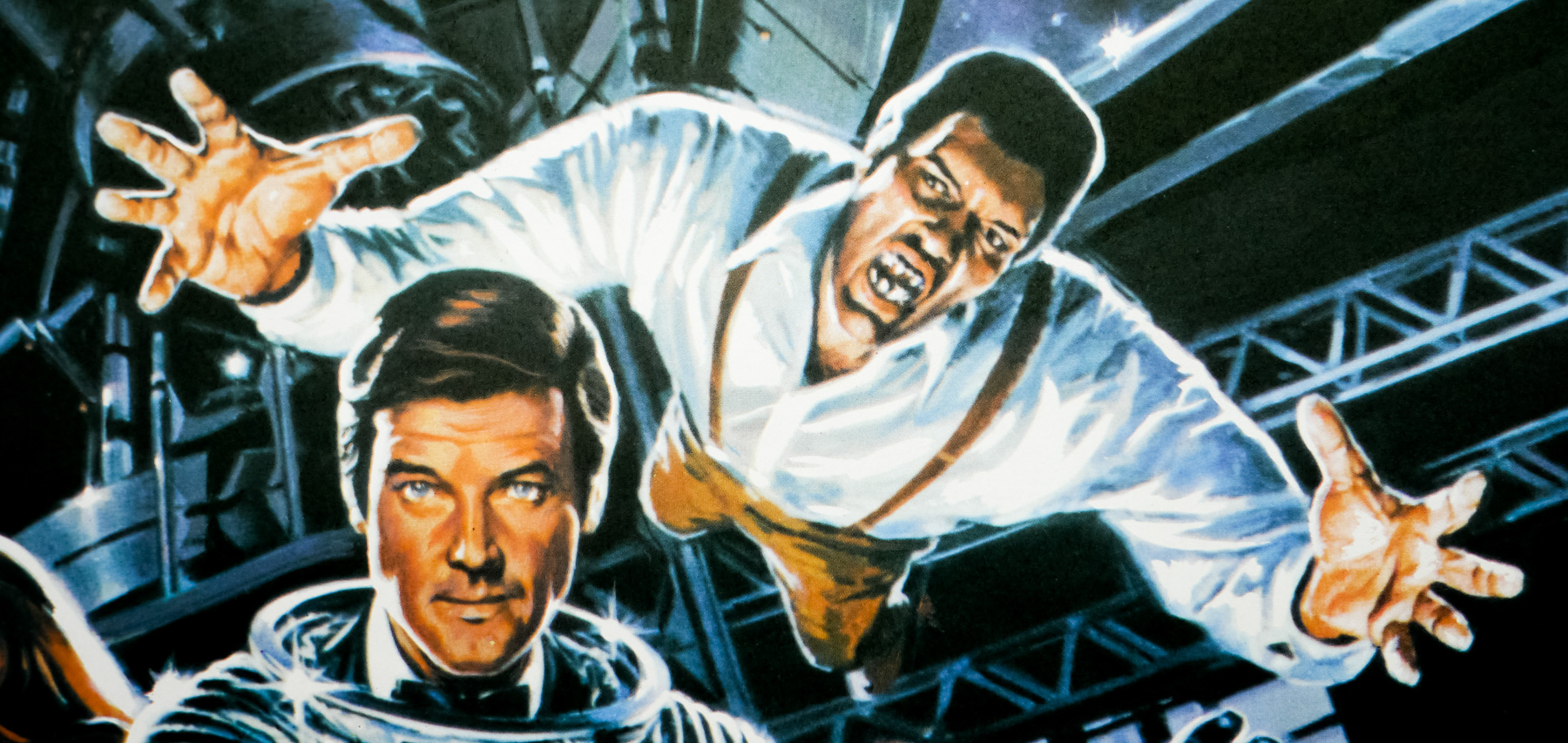
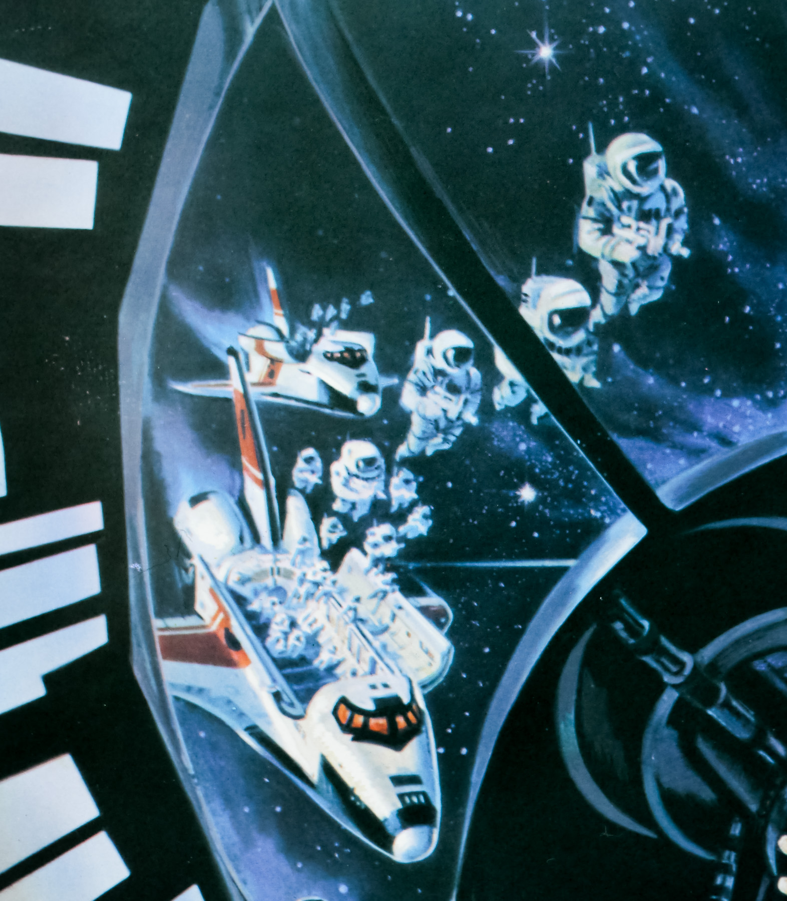
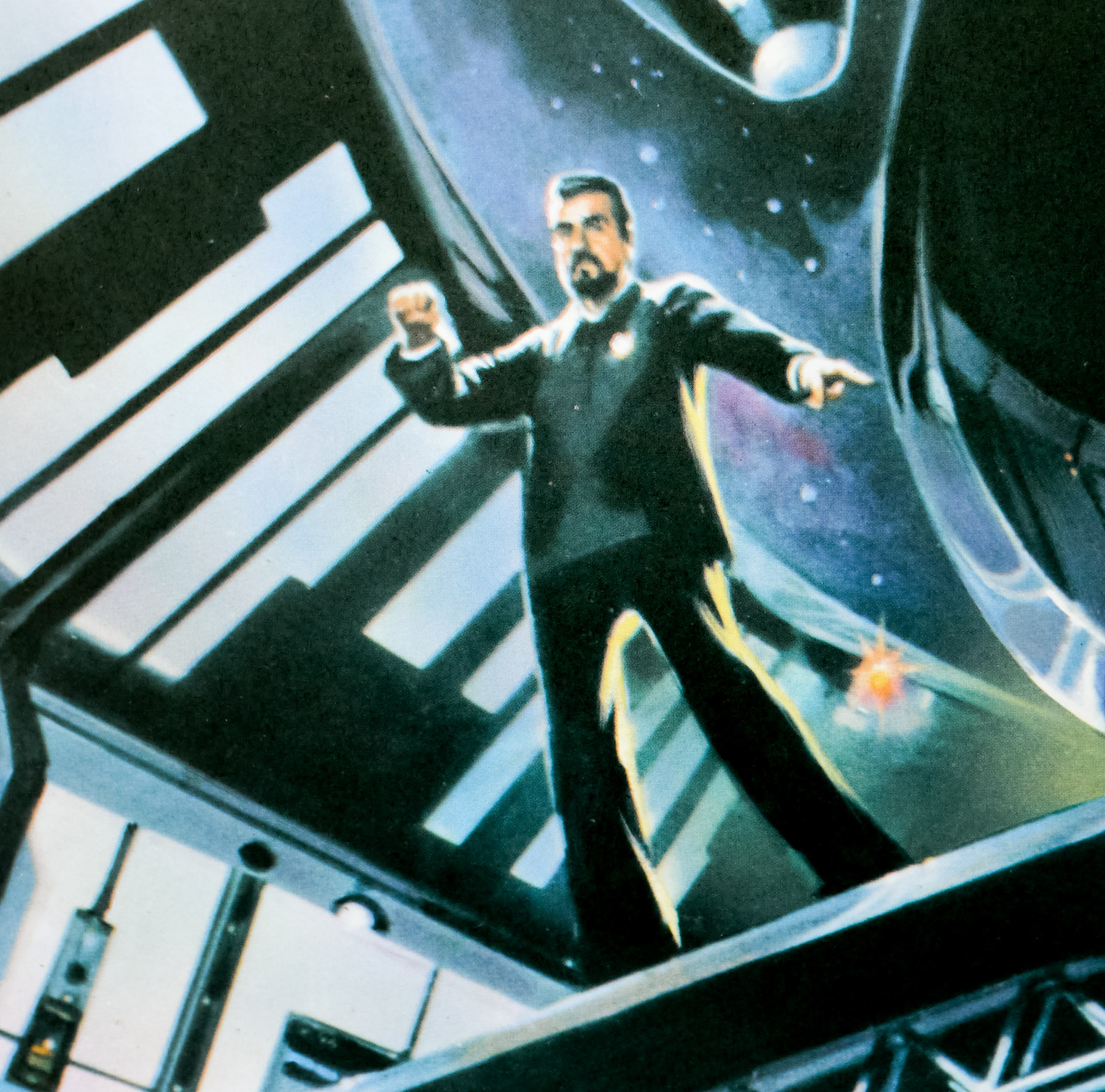
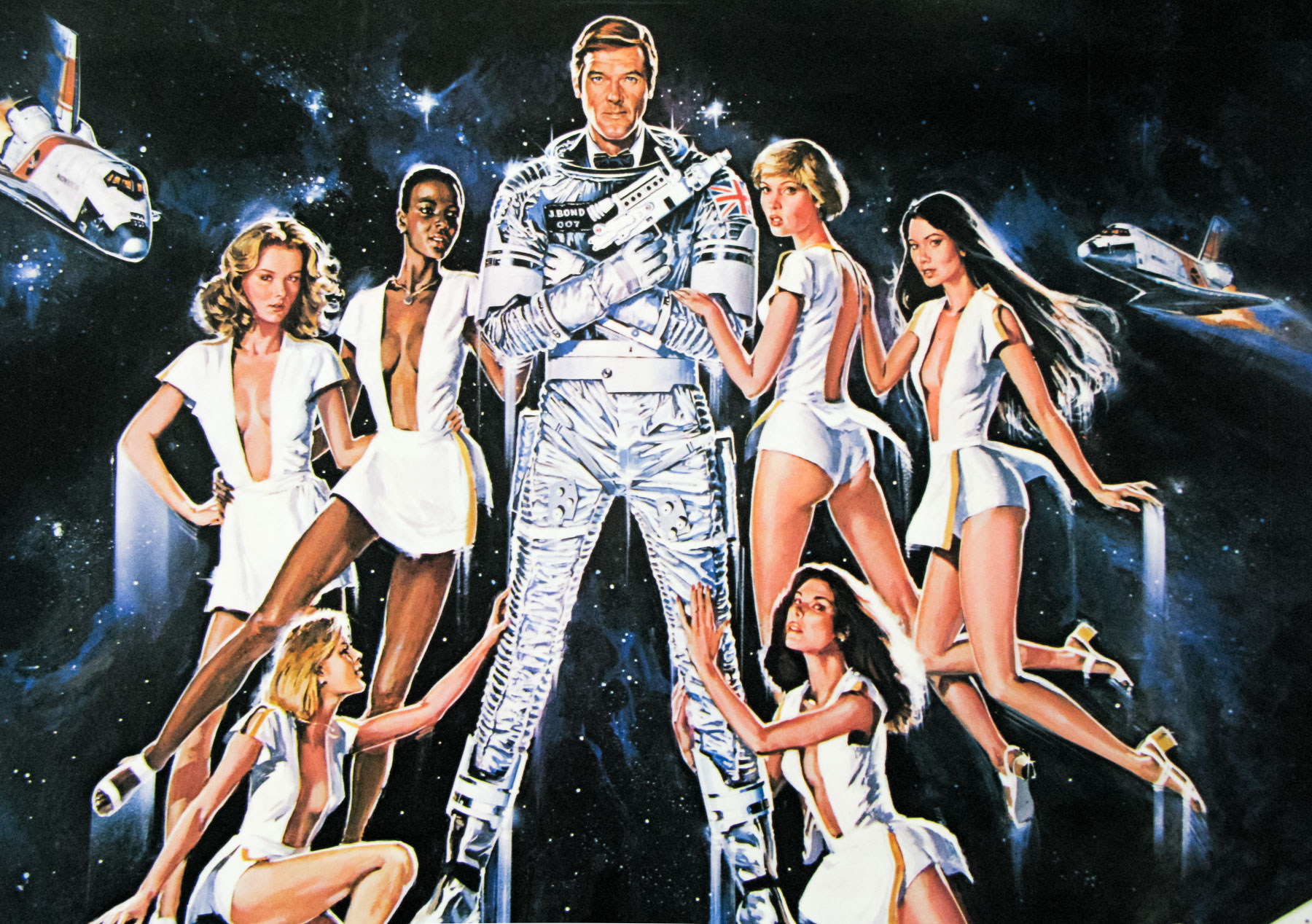
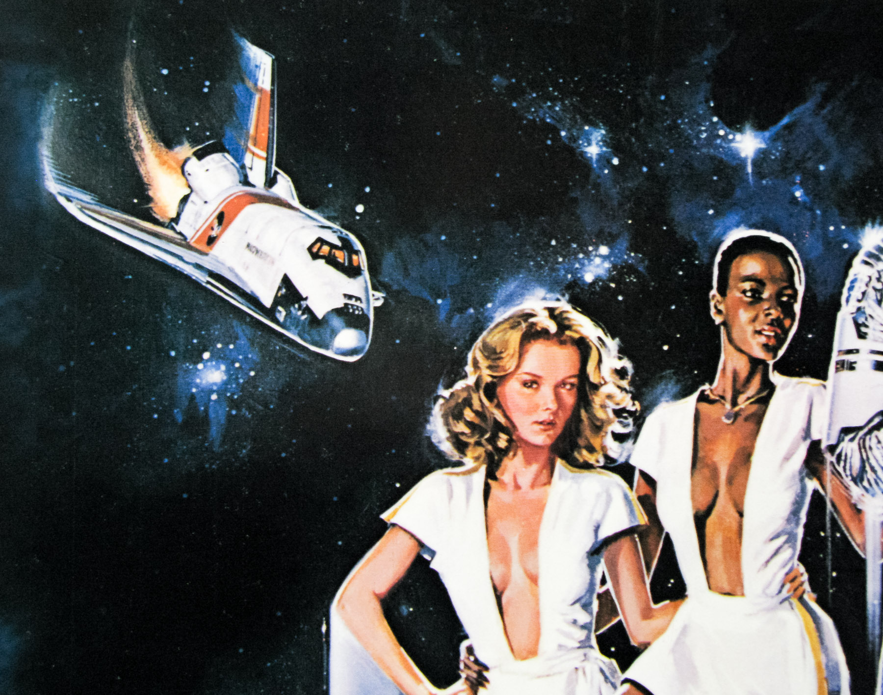
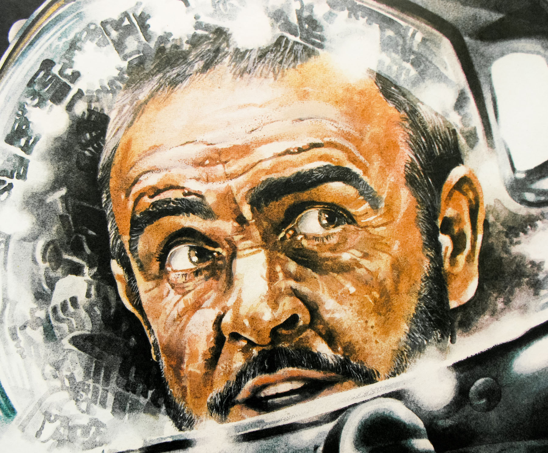
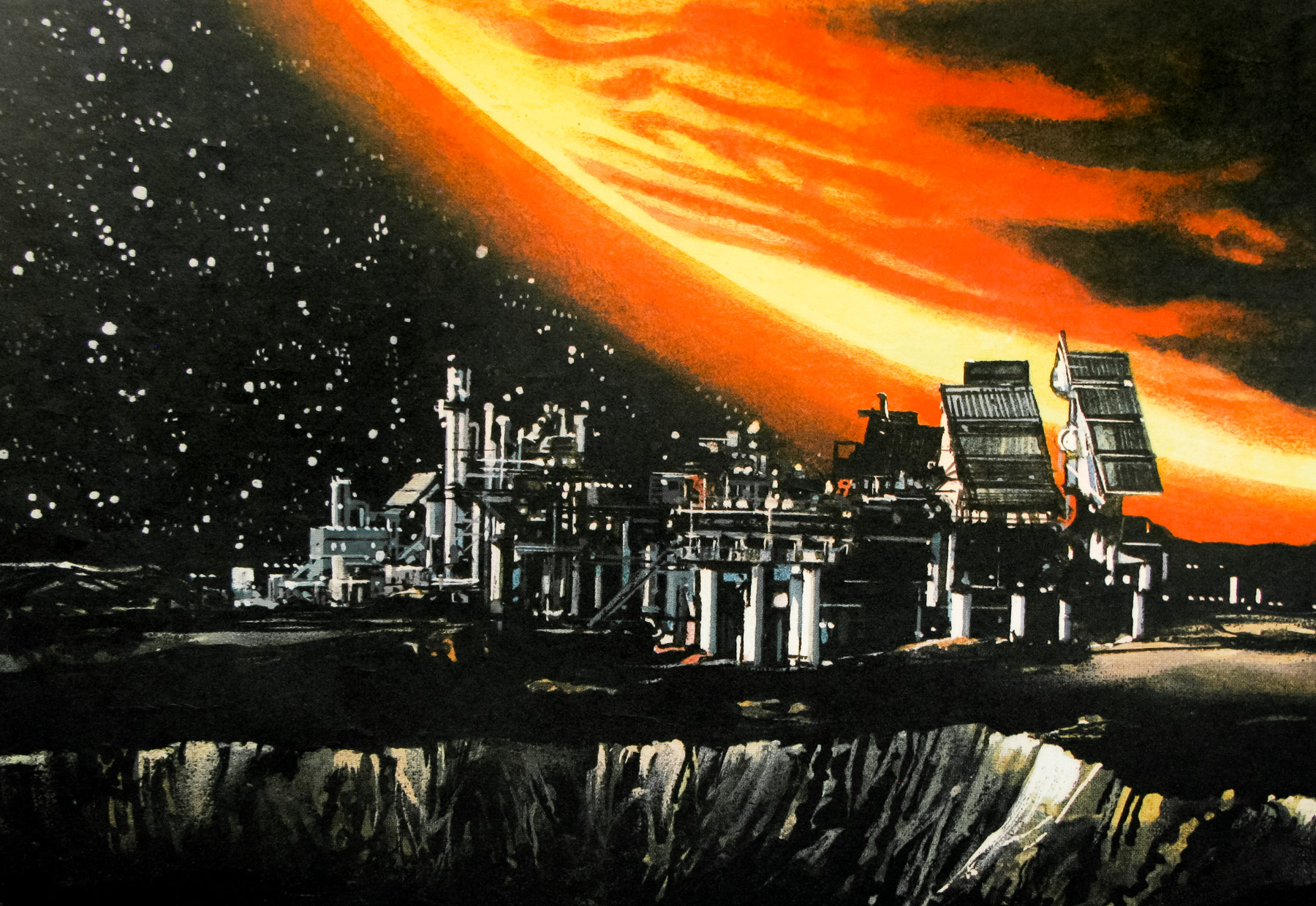
1980s Transformers box art – inspiration on Signalnoise.com – see Botchthecrab.com for more.

You often post nostalgic images of graphic design that you loved when you were growing up and you really get a sense that you’ve had this love for 80s toys and posters going on for a long time. What do these designs mean to you now?
Oh man, I love that stuff so much. My parents are often amazed at the sharp memory I have of my childhood and all the things I loved back then. I can’t remember what I had for breakfast this morning, but I can remember that toy I got out of a box of Shreddies back in ’83. It’s ridiculous.

I was a typical boy in the ’80s. I lived for Star Wars, Transformers, Scooby-doo, He-man, GI Joe, all that rad stuff. I cherished all the toys I had and have vivid memories of every Christmas morning and all the amazing stuff my parents managed to track down for me.

So, fast forward to about four years ago. I was quietly sitting at home contemplating my design career and what I truly wanted to create for myself. Up until that point I had been following trends and art styles that others were doing but nothing really felt like “my own”. What meant the most to ME? What did I want to create out of the sheer joy of creating it? Everything snapped into place when I realized I am the person I am today because of my wonderful childhood, and the excitement I got from all the stuff I was into. I wanted THAT excitement in my art.

Network - poster designed by Signalnoise in 2009

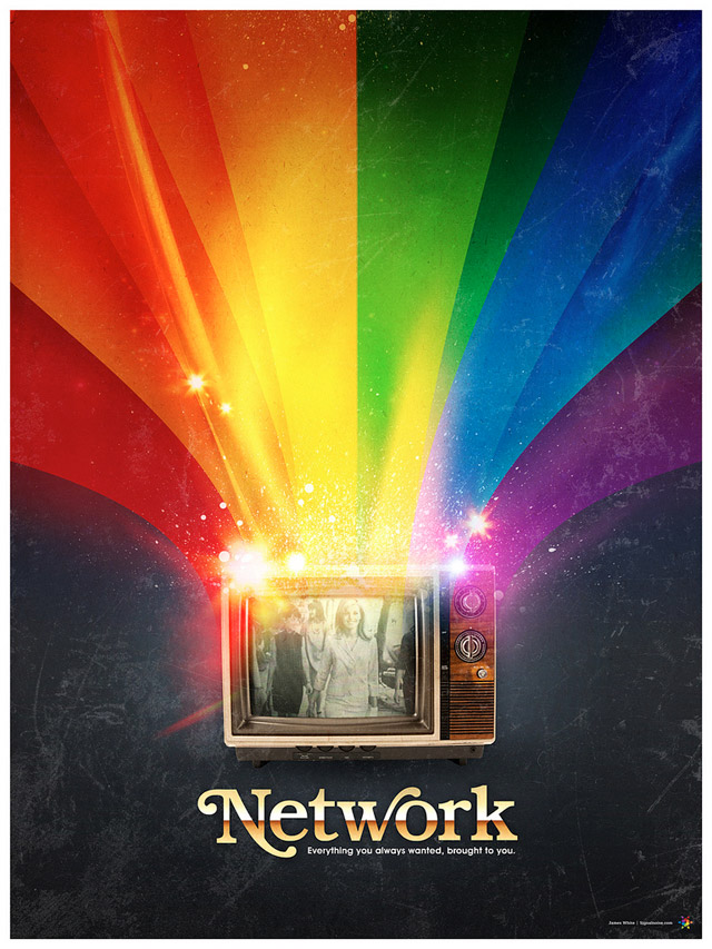
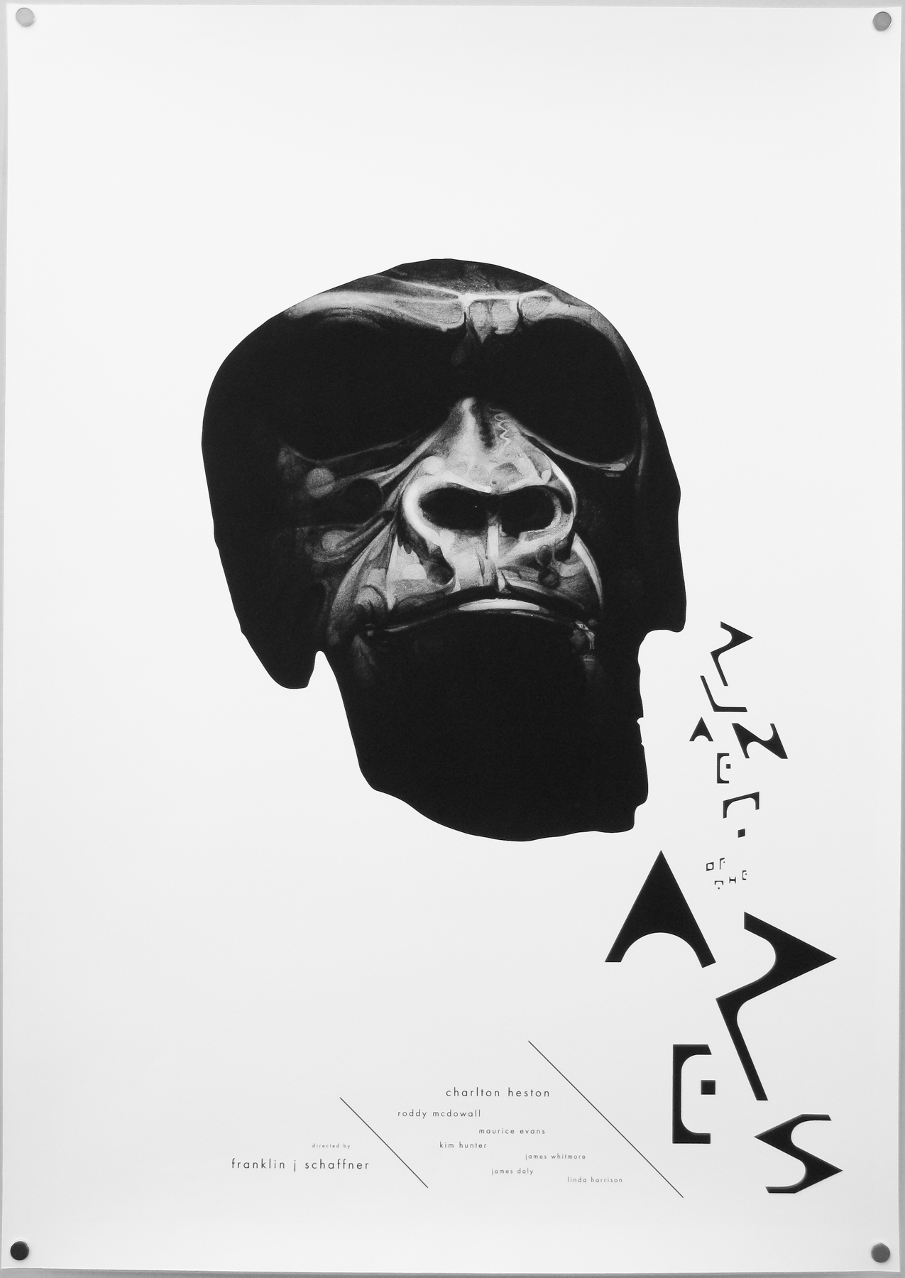
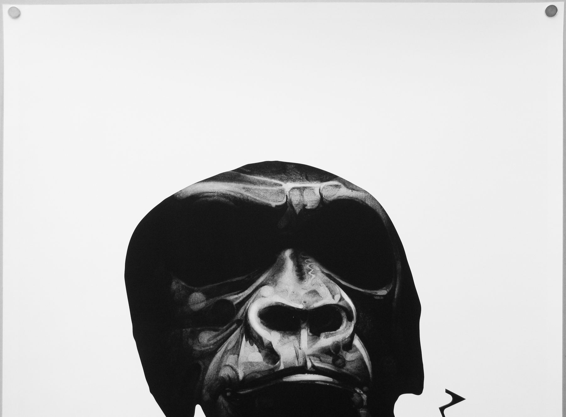
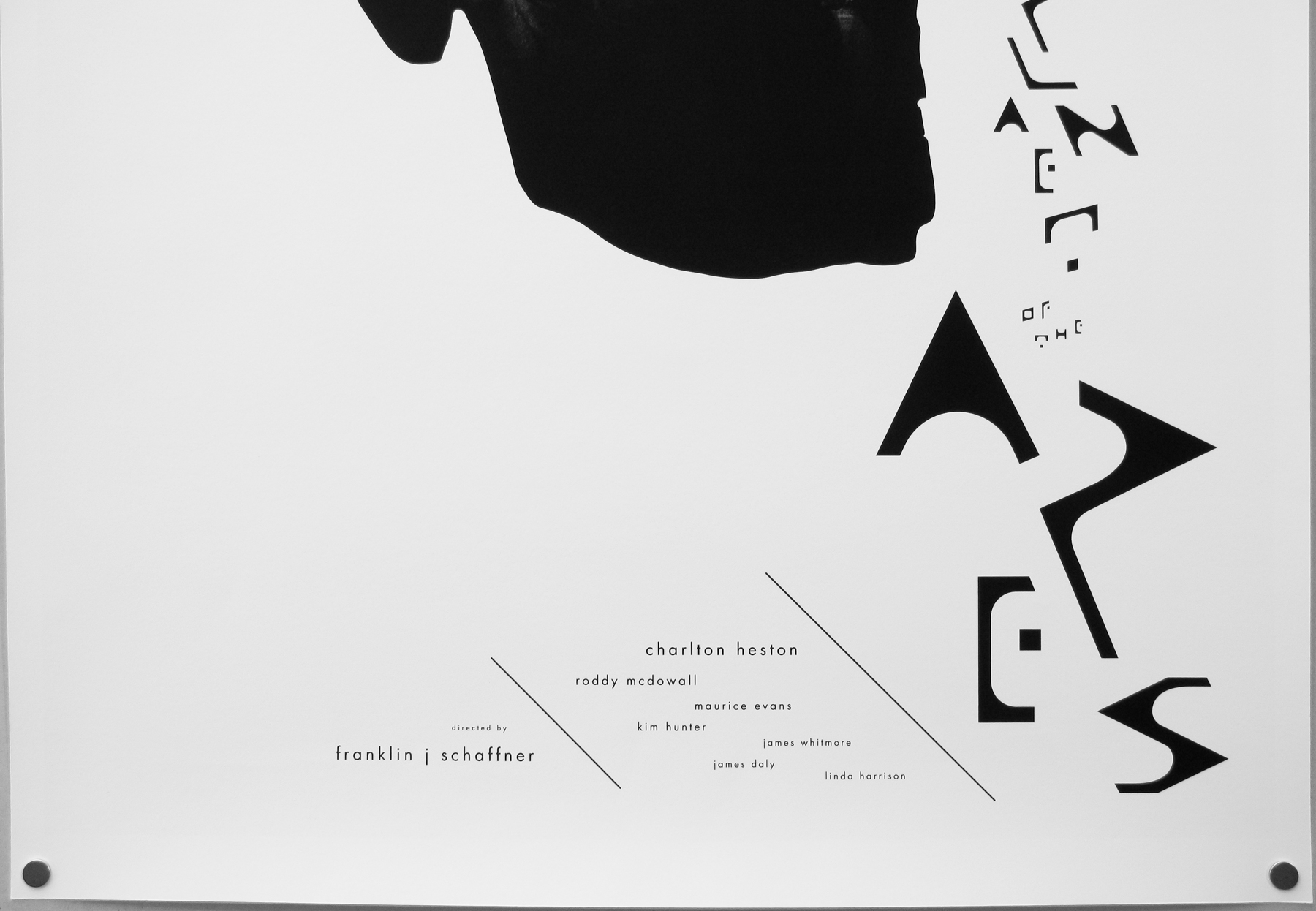
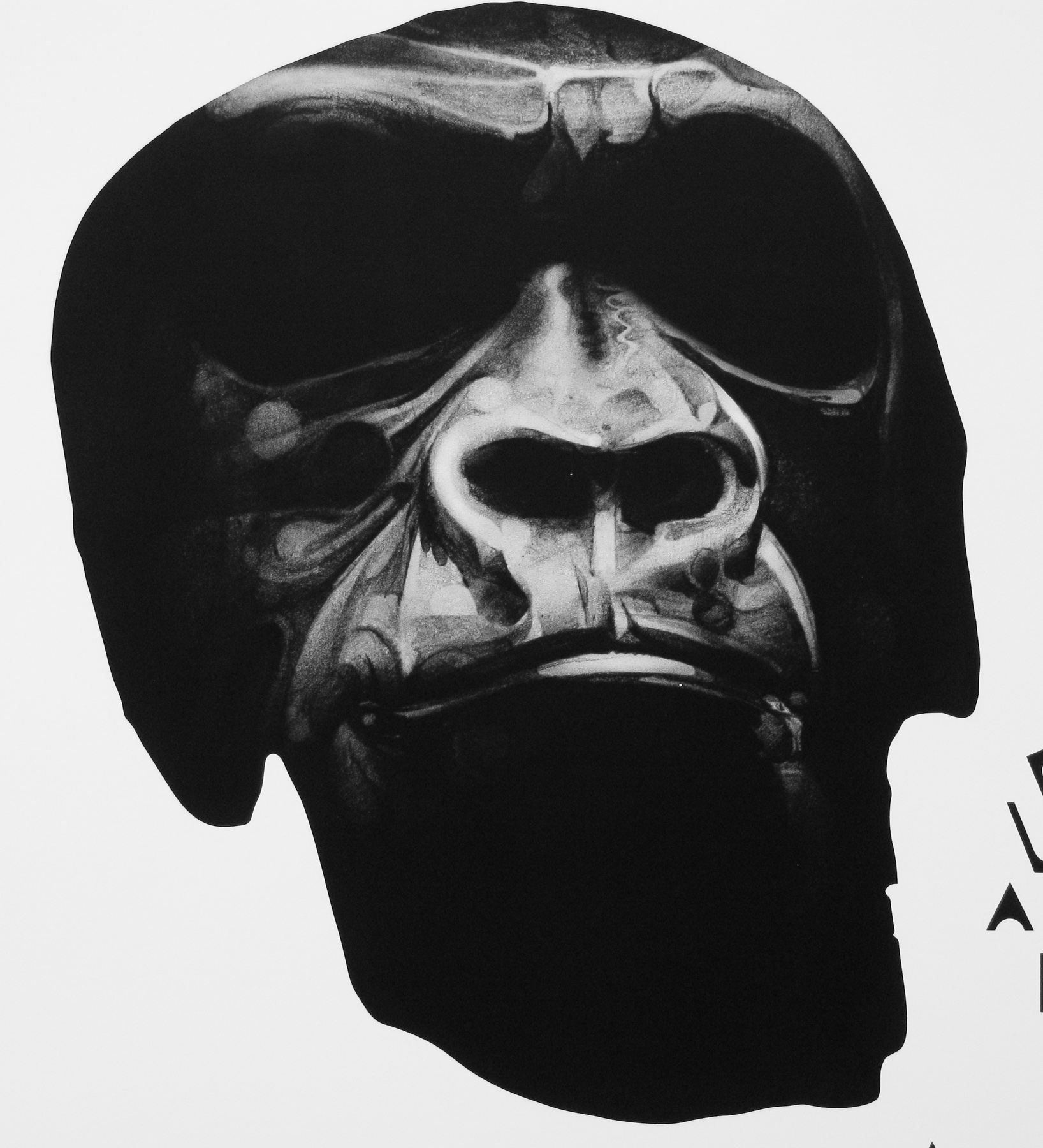
Network – poster designed by Signalnoise in 2009

Can you talk about what it is that you love about the film poster format?
I’ve been a big fan of movie poster art for about as long as I can remember, even long before I appreciated them on an artistic level. Whenever I went to the theatre as a kid to see a movie, I’d always be amazed by the posters for movies I WASN’T going to see, like the crazy horror film my parents wouldn’t take me to, for example. It was wonder, mystery and excitement … maybe they even freaked me out once or twice.

The 80s is when the movie poster as an art form was at it’s peak. Beautifully painted pieces of work that evoked an emotion in the viewer, making us want to see that movie because it looked so awesome, or crazy, or scary. The same goes for VHS covers from back in the day. When the 1990s came about we started seeing a steady decline in quality of movie posters. Beautiful paintings and clever arrangements were being replaced by boring photos and floating heads. My appreciation of design started to grow in the late 90s which is when I started seeing how sad movie poster art was becoming. I was hanging out with my pal Dave Howlett one night, reminiscing about old movie posters when he said “It really is a dying art form.” That hit home … I needed to start designing movie posters just to keep the art form alive in my own world.

Tron Legacy - self-initiated poster by James White (Signalnoise)

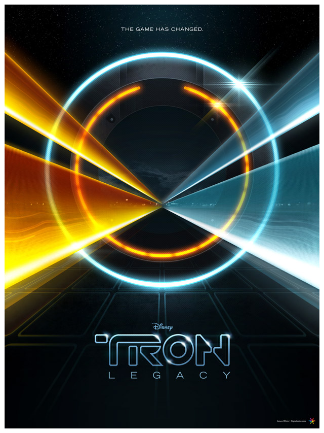
Tron Legacy – self-initiated poster by James White [Signalnoise]

Are there any film posters that particularly stand out or artists that you really admire?
I have so many “favourite” movie posters, but I’ll give you a quick rundown on the ones that really stand out to me.

My absolute favourite movie poster is THE THING by Drew Struzan. The fact that Drew had very little time to complete the poster led to a very simplistic take on the project, painting a winter-clad figure with beams of light shooting from his face. He captured perfectly the fear, paranoia and helplessness that the movie evoked. If he had 3 weeks to do the poster, would it have been as well executed? Who knows. Man, love that poster.

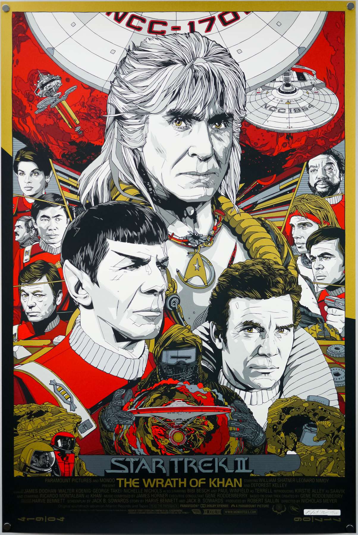
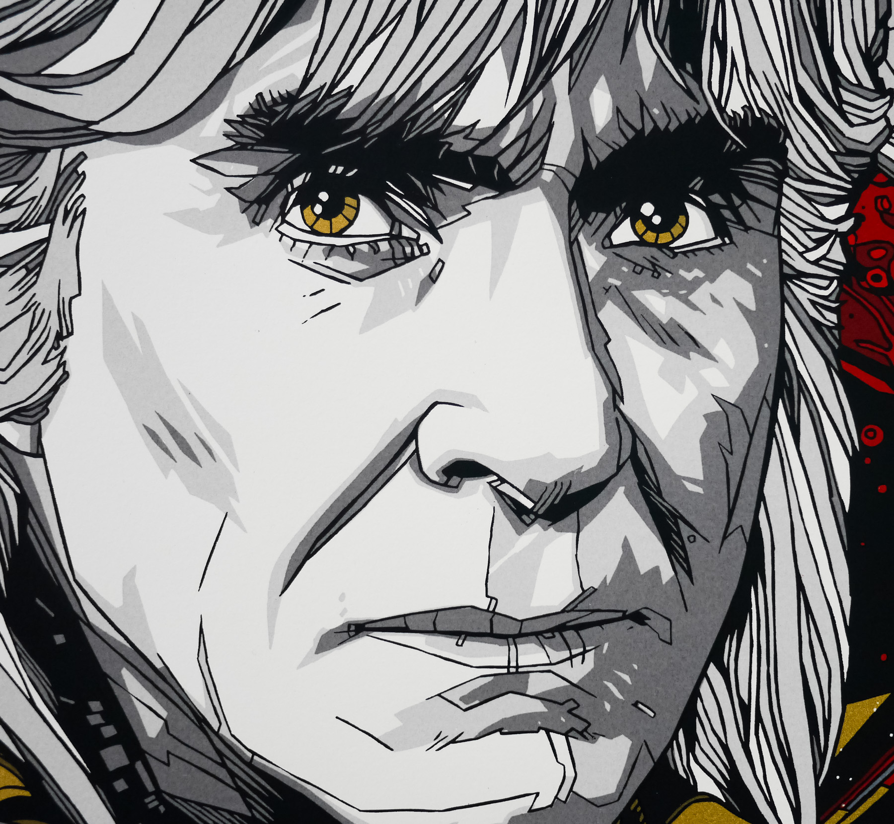
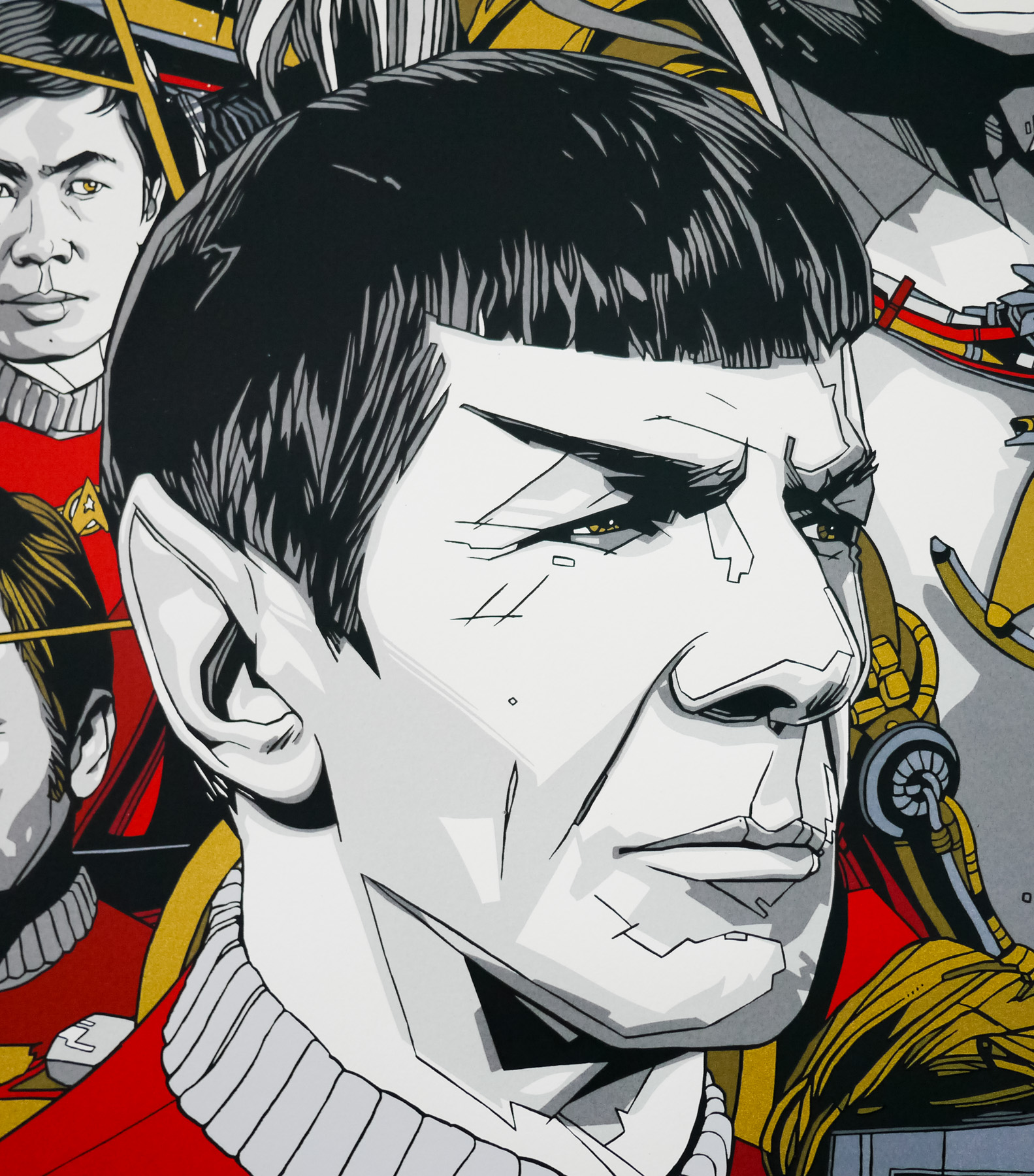
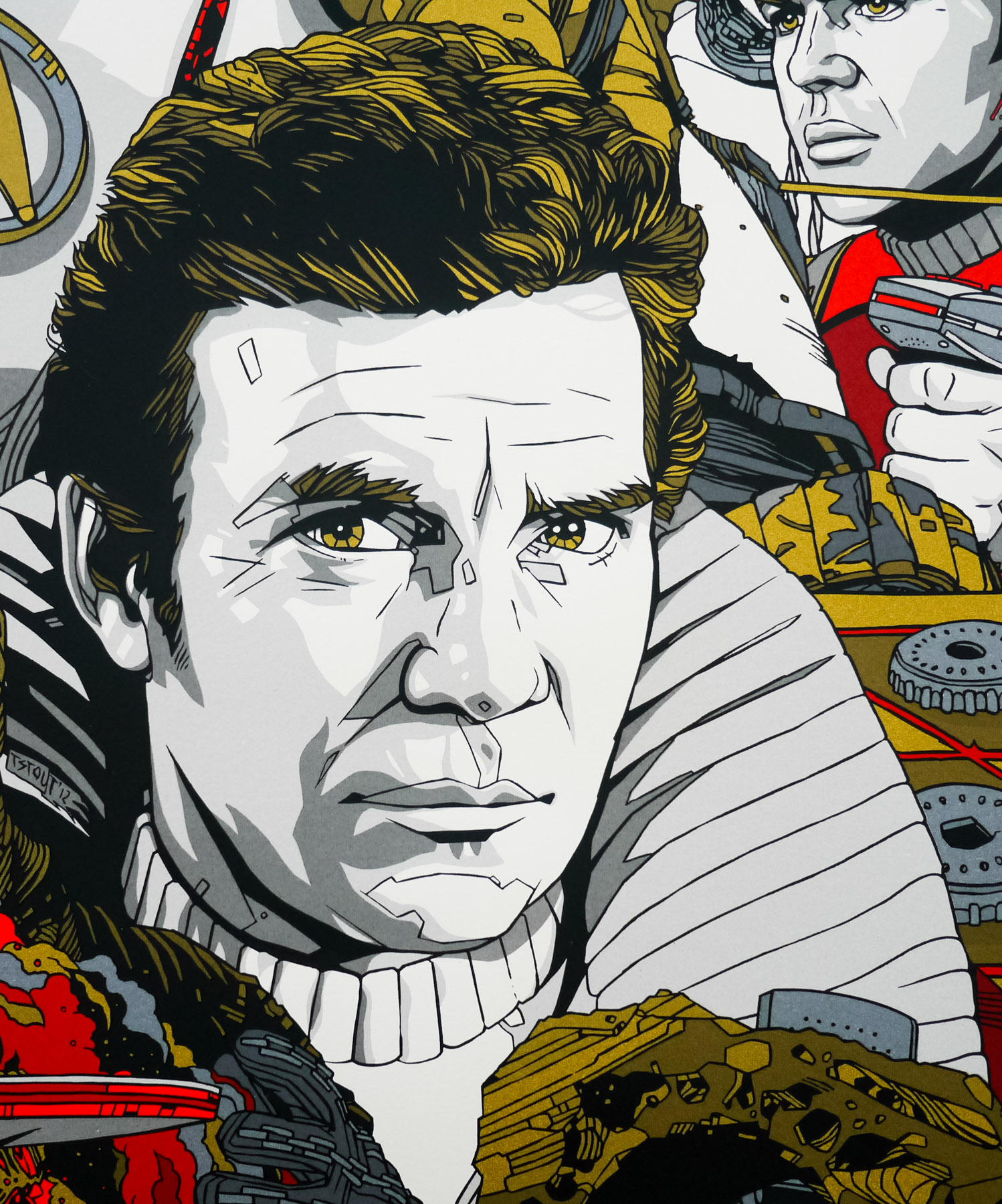
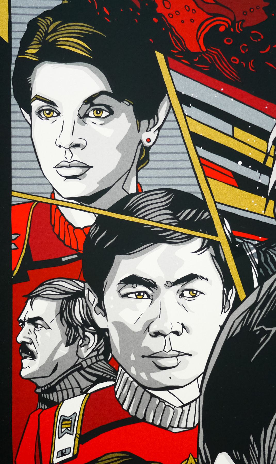
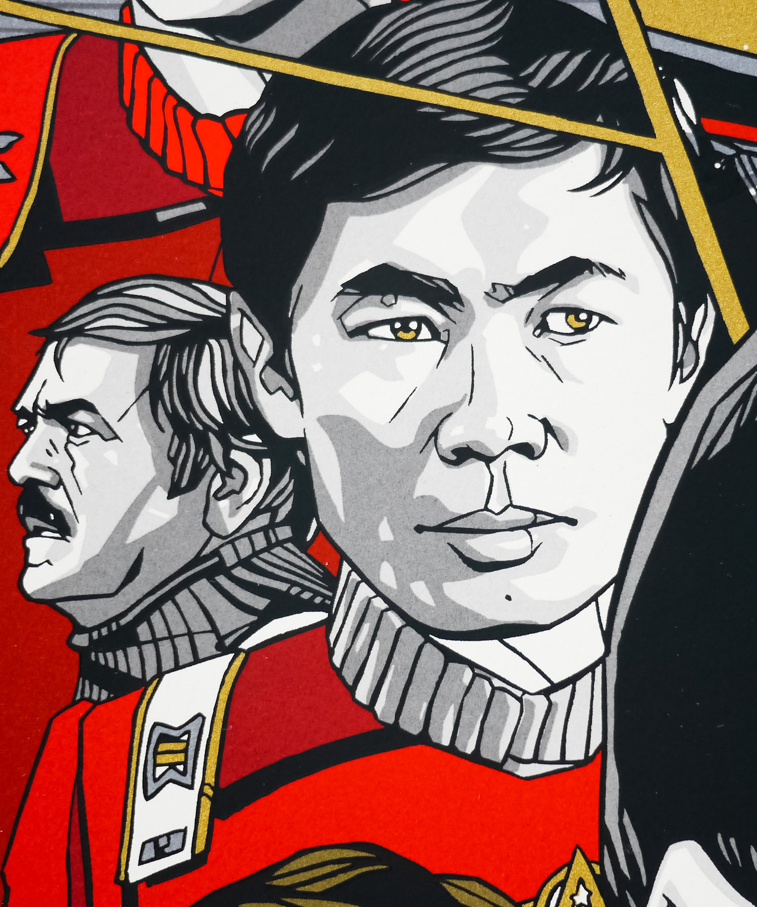
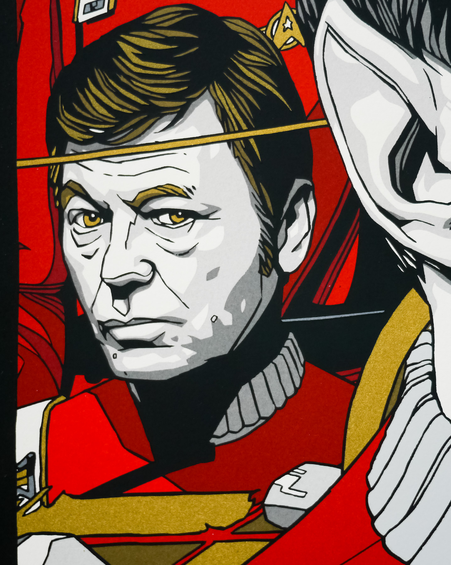
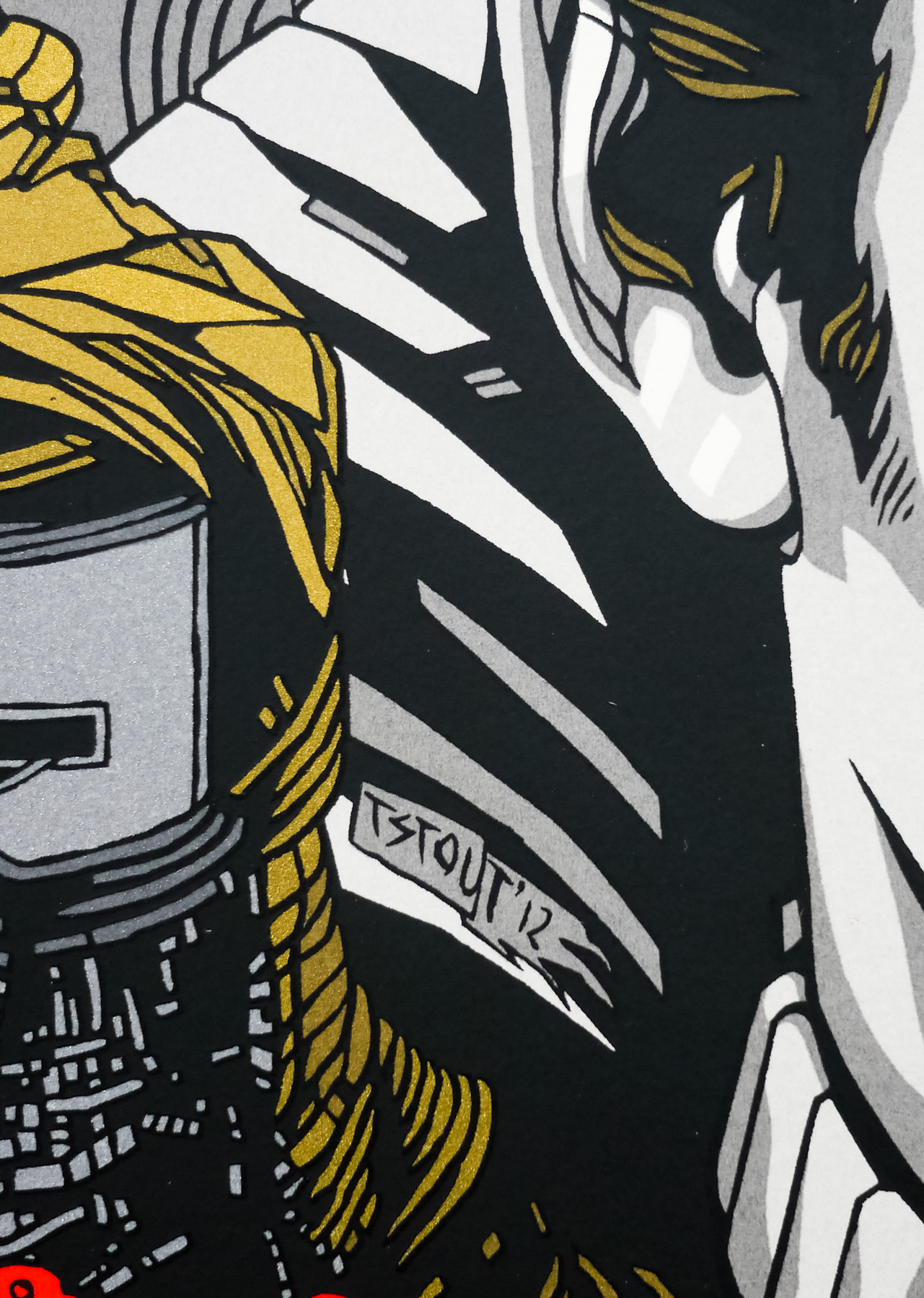
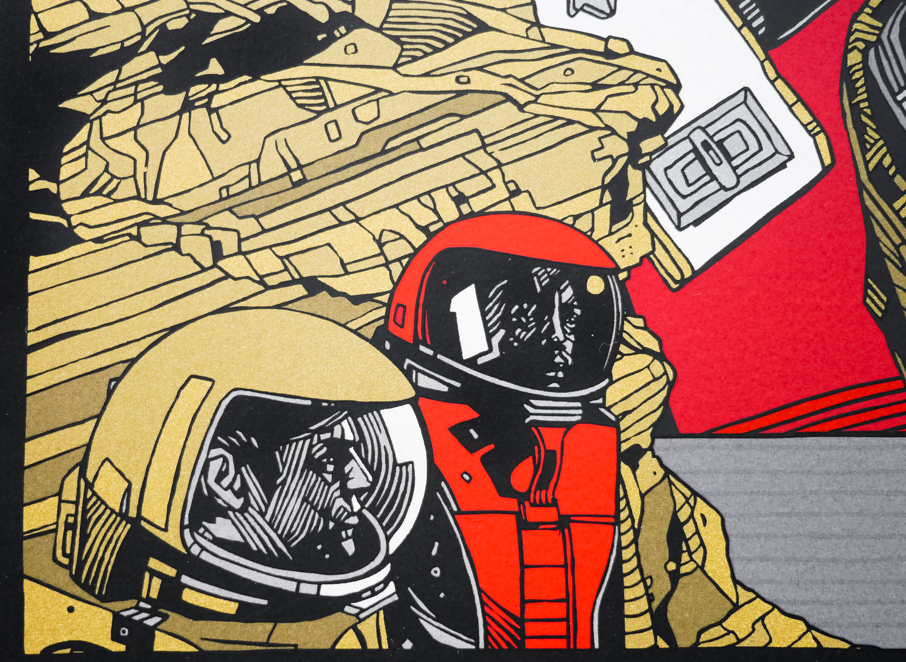
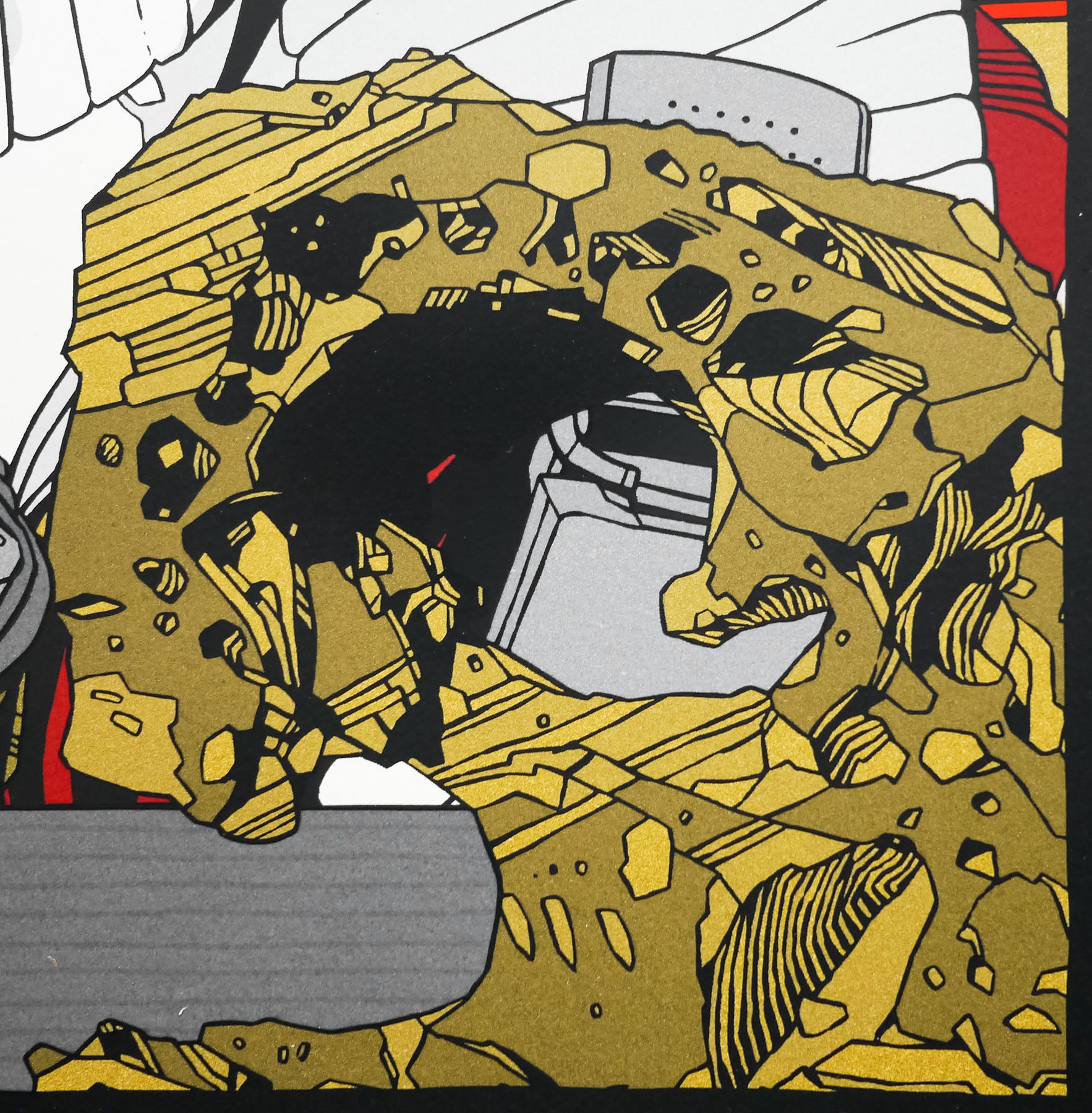
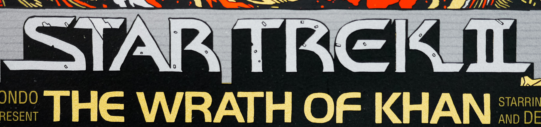
Another great one is Bob Peak’s work on STAR TREK: THE MOTION PICTURE. The poster doesn’t necessarily capture the special effects the movie showcased, but that giant rainbow right down the middle is just so captivating. Bright colours, they really suck you in. Sure, the main characters are in there but they are second place to the fantastic palette.

A brilliant bit of execution is the HALLOWEEN poster by Bob Gleason. The hand and knife morphing to the form of the pumpkin is a stroke of genius. I remember seeing that VHS cover when I was a kid and had NO idea what that movie could possibly be about. That was one my parents wouldn’t rent for me.

I’ll wrap this up with one more Struzan piece, his BACK TO THE FUTURE trilogy of posters. That first poster with Marty McFly looking nervously at his watch while climbing into the DeLorean was an instant classic and has been with me my whole life. The colours, composition, logo … everything works in that poster. Then he goes and does it two more times for the sequels. So good.

What was the first movie poster you worked on yourself?
I remember being a little nervous getting into the movie poster design thing years ago, so I started really slowly to get my feet wet. At the time I was experimenting with colourful lines and geometry and I put together a 2001: A SPACE ODYSSEY poster late one night. I had been a fan of the film for quite some time and I wanted to create something a bit different to represent the film.

2001: A Space Odyssey V1 - design by James White [Signalnoise]

2001: A Space Odyssey V1 – design by James White [Signalnoise]

Even though I’m not very fond of that initial design I put together (and just last year revisited the film for a new design), it was a great stepping stone. I started to pay more attention to the title, tag-lines, credits and making sure the composition benefitted all of those things. It was a great practise piece.

2001: A Space Odyseey V2 - poster by James White [Signalnoise]

2001: A Space Odyseey V2 – poster by James White [Signalnoise]

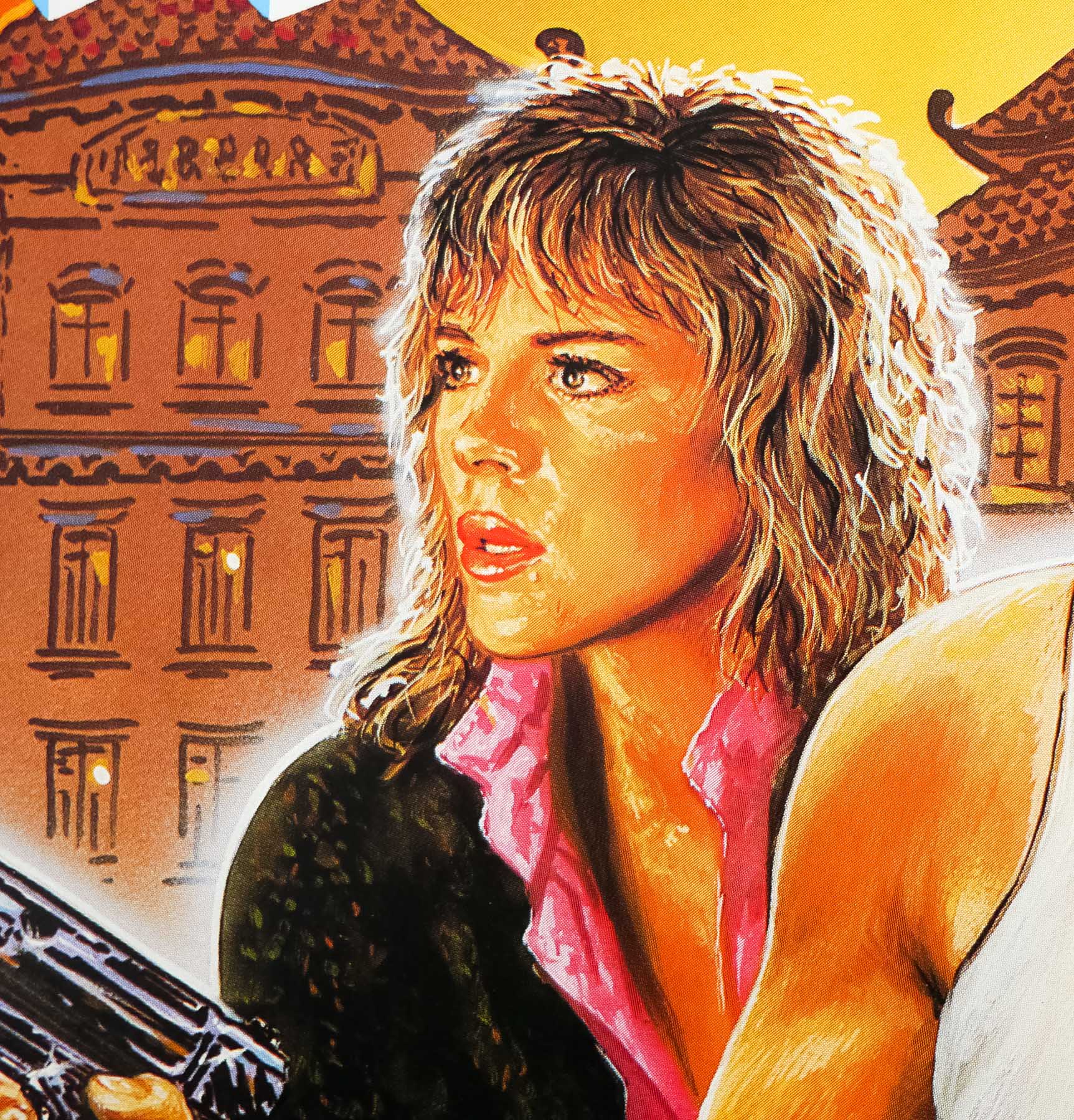
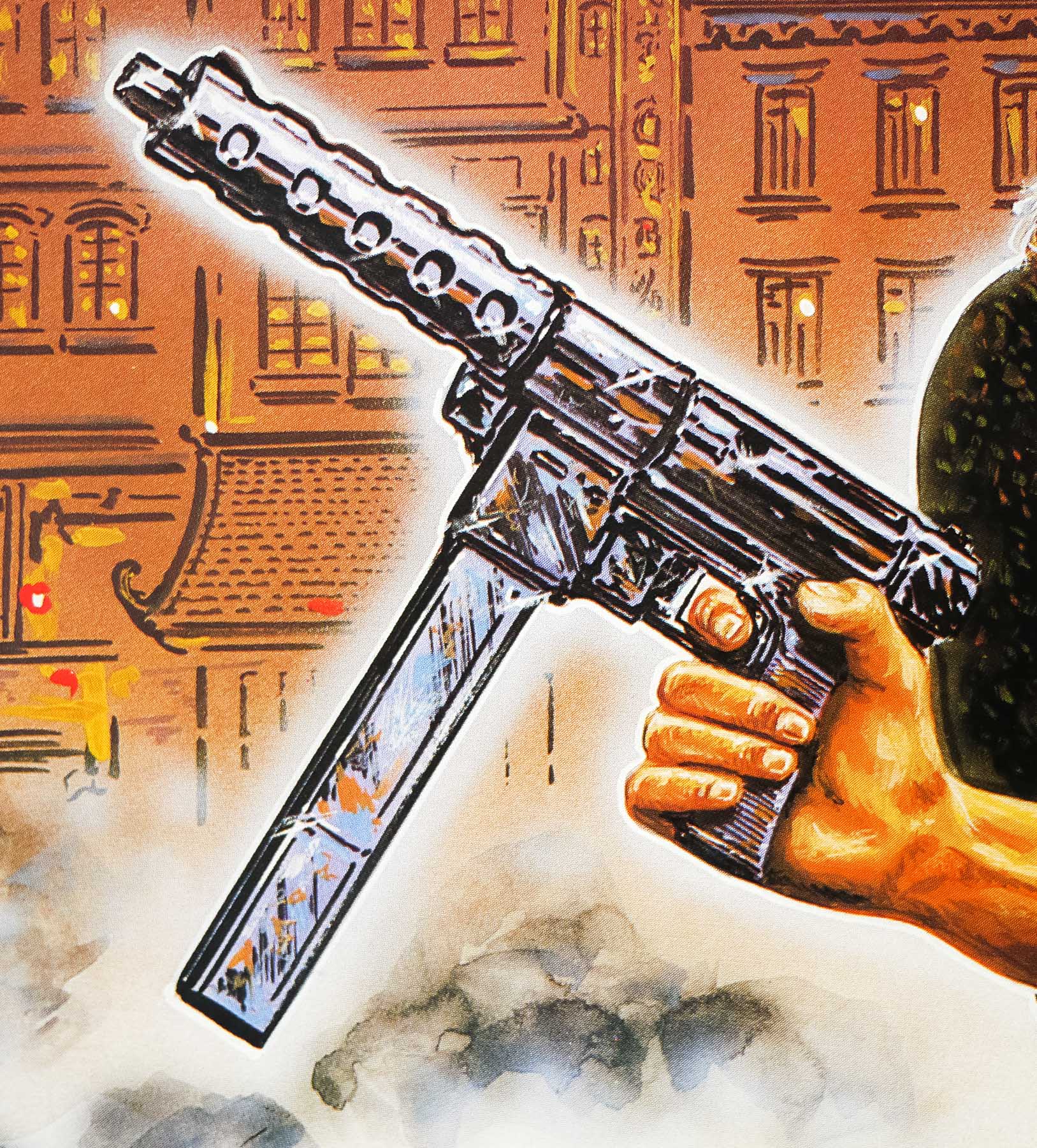
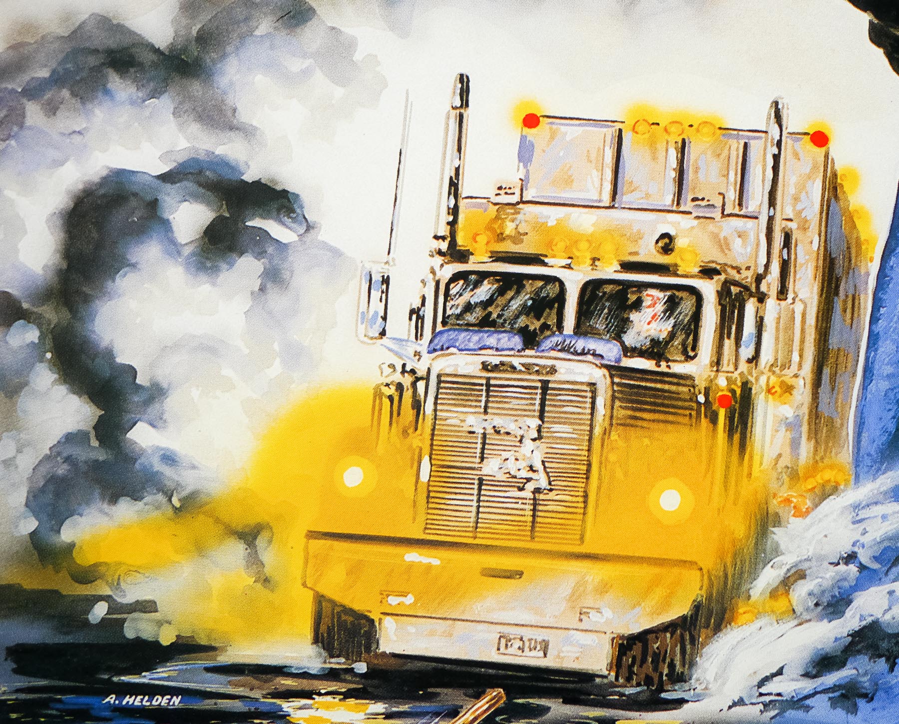
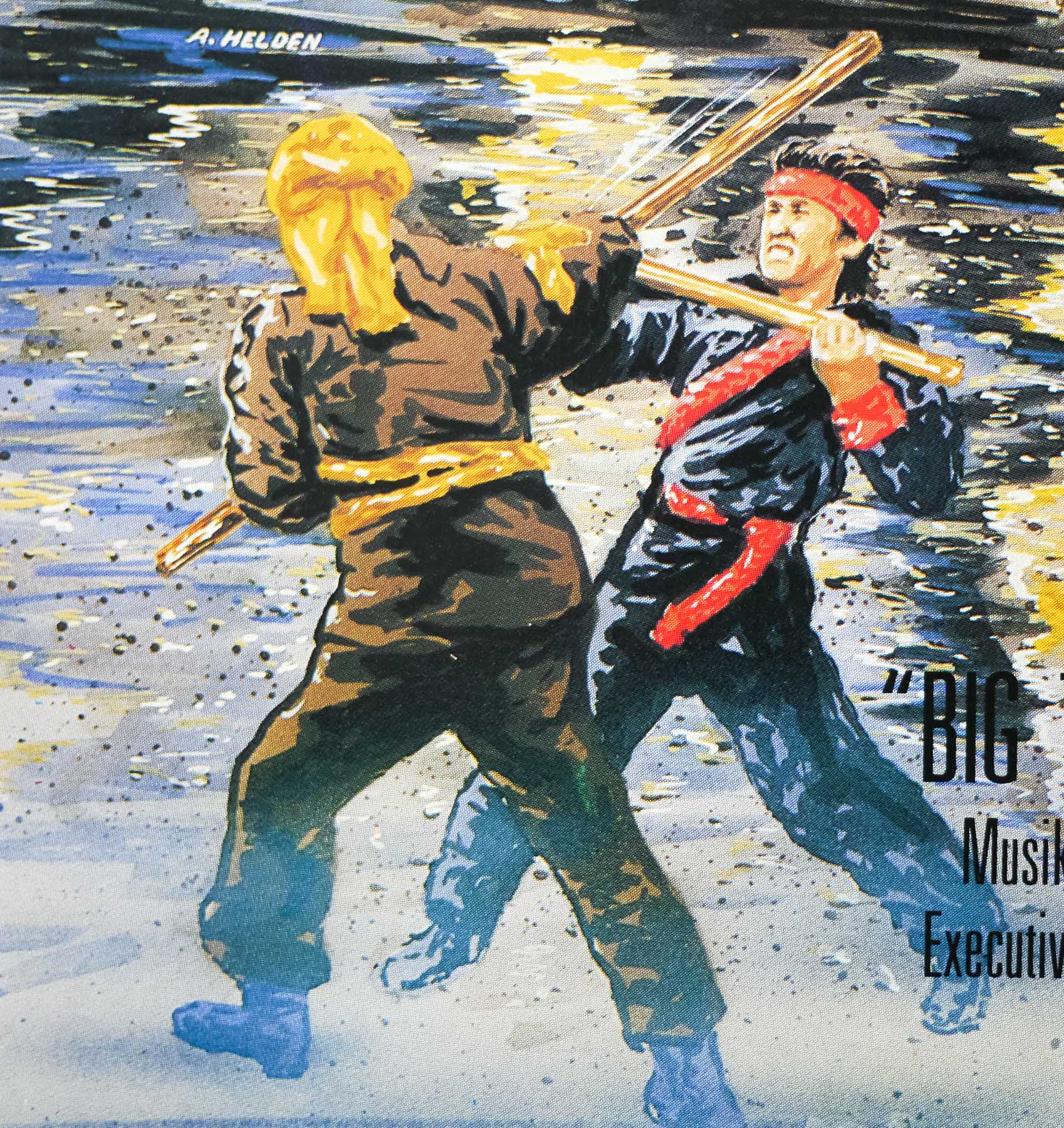
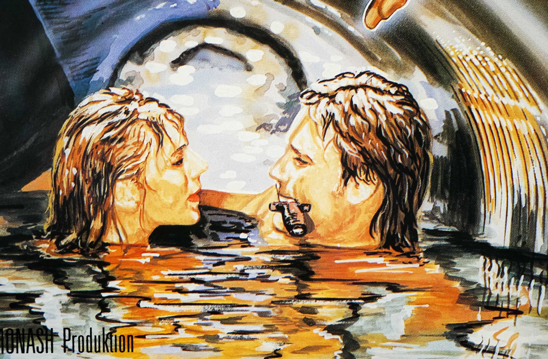
You’re good buddies with Jason Eisener (director of Hobo with a Shotgun) and designed a poster for his film – what was that like to work on?
Yeah, I live in Dartmouth, Nova Scotia and Jason Eisener lives about 5 minutes from my place. I enjoy working with Jason and Rob Cotterill on anything they need. They always have a clear vision of the vibe they are going for, but leave the creativity open to experiment with new ideas. They are kids of the 80s like me, so we’re all coming from the same era of inspiration. But the great thing is Jason scours the internet for new awesome stuff, and every time we hang out the laptops open and we just show rad images and art to each other. Really fires me up to work on cool stuff.

Hobo With a Shotgun - poster by James White [Signalnoise]

Hobo With a Shotgun – poster by James White [Signalnoise]

I designed the HOBO WITH A SHOTGUN logo for Jason and the boys back in ’08 (I think) as well as their YER DEAD PRODUCTIONS logo this past year. But the biggest undertaking was the HOBO poster which I worked on for about 2 months. It was the first time I dove head first into digital painting, pouring over the works of Peak, Struzan and Bill Sienkiewicz to learn the science. It was probably the most fun I’ve had on a poster.

Yer Dead Productions - logo design by James White [Signalnoise]

Yer Dead Productions – logo design by James White [Signalnoise]

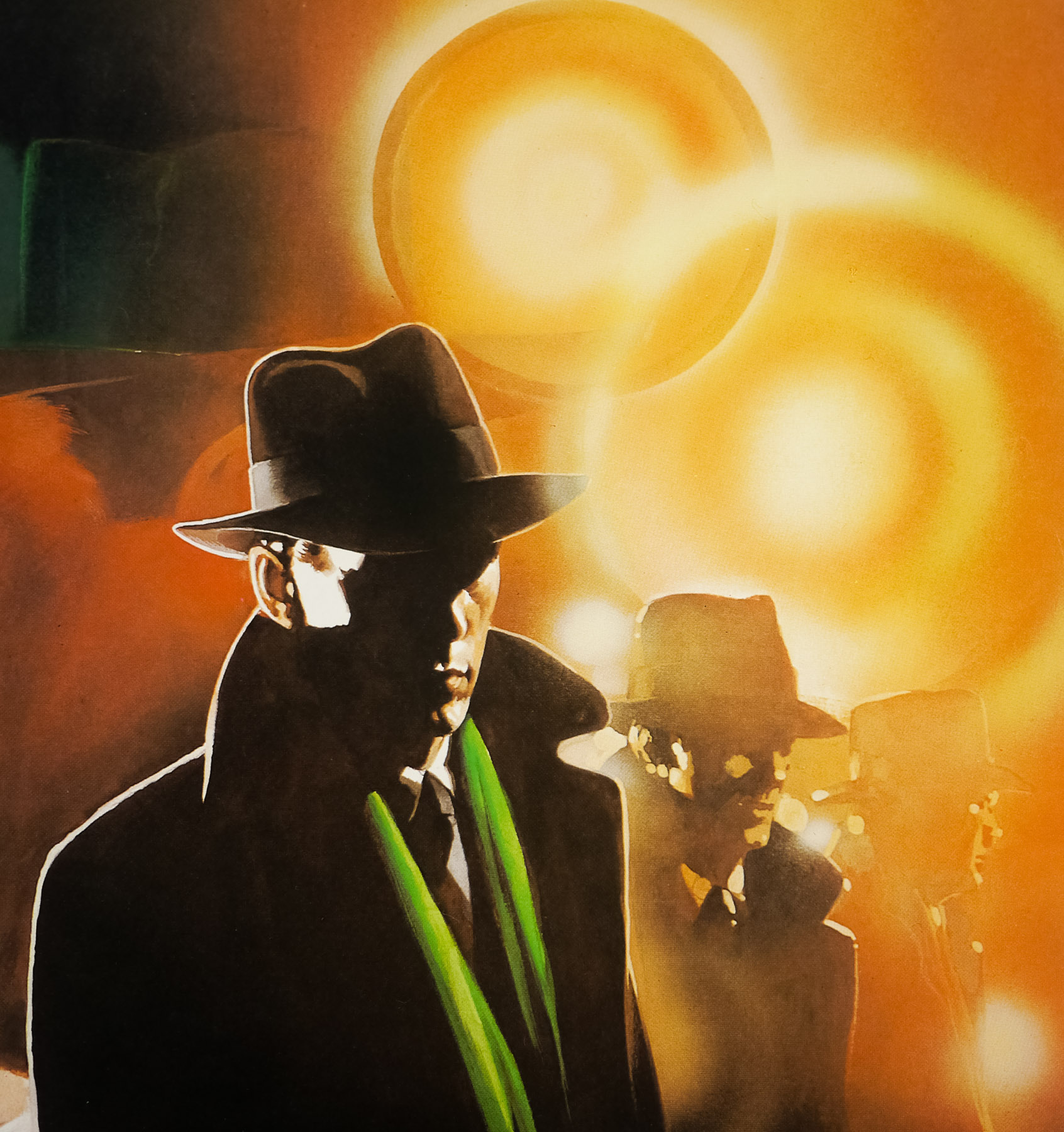
Moving on to the tribute poster for Drive. How did that poster come about?
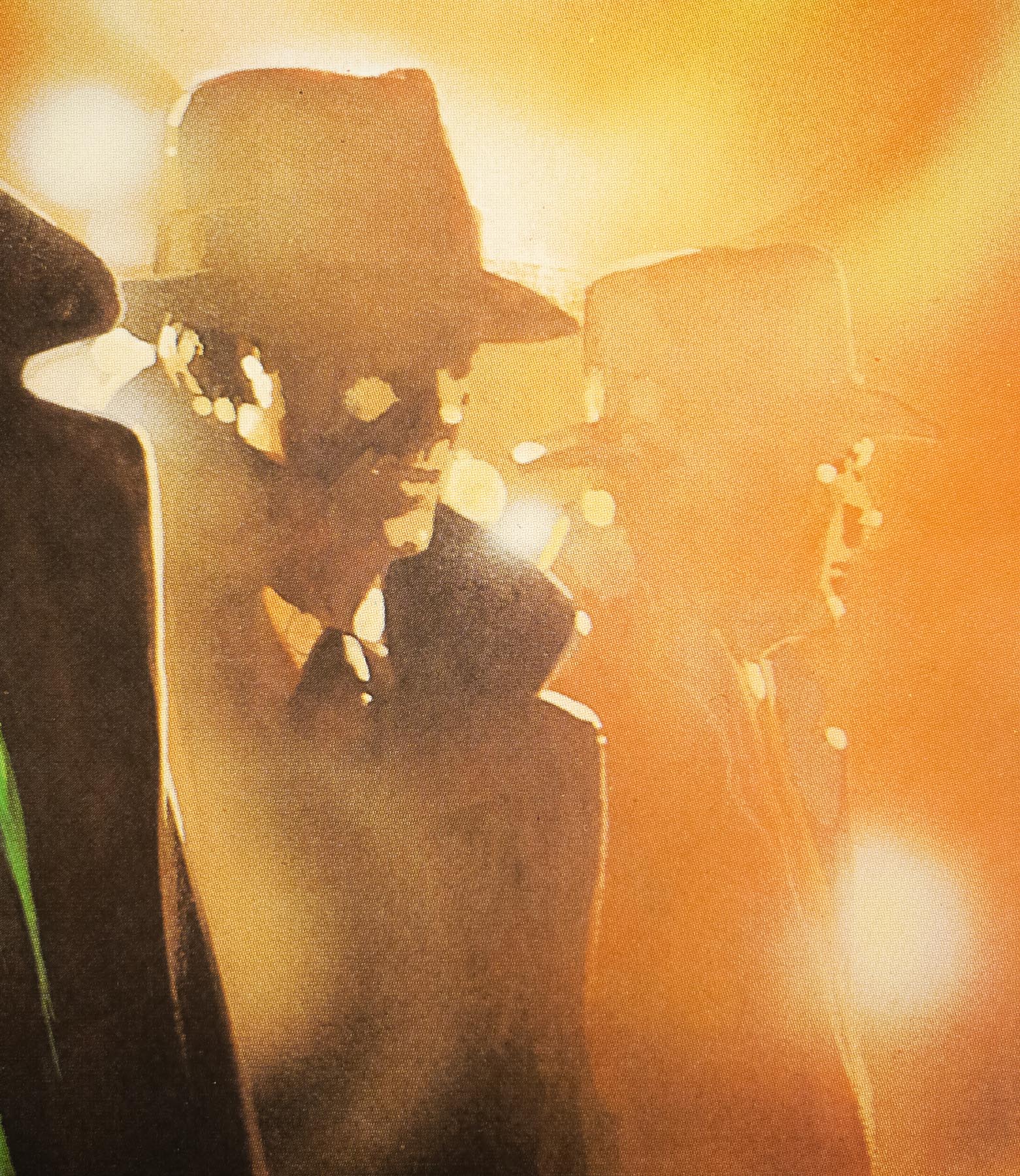
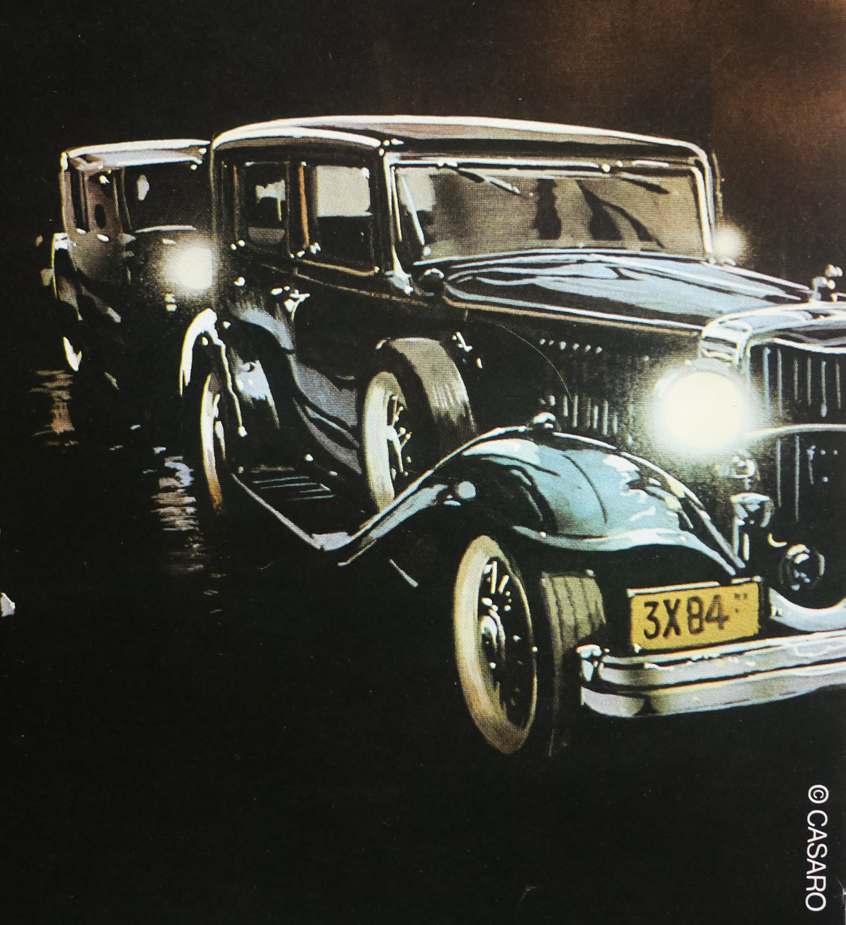
Little known fact, I created the DRIVE poster the day after I hung out with Jason. As I said, we trade off a lot of art inspiration and he highly recommended I track down a copy of DRIVE to watch. “You’re gonna LOVE it,” he said. And he was right. While watching I was really feeling the urge to create a poster for it. Something that really captures an ’80s vibe that was so heavy in the film, while mixing it with film noir. What might that look like?

Drive poster - design by James White [Signalnoise]

Drive poster – design by James White [Signalnoise]

When I finished the movie I jumped online to see what the official posters looked like, and I was shocked to discover they really didn’t represent the film all that well, at least in my opinion. They looked really generic, and didn’t represent the heart and theme of the movie at all. So I decided I wanted to create a DRIVE poster that I’d like to see. I started the day after, first thing in the morning. After 2 days of work it was done.

I’m guessing the ‘cat and mouse’ scene at the beginning had a big impression of you?
Absolutely. What a great way to open the film, huh? It said so much about Ryan Gosling’s character and the world he lived in without hardly saying a thing. There was so little dialogue and full of style and intensity. Great piece of work, I’ve watched that sequence loads of times since that first watch.

There’s one scene where Gosling is across an intersection from a police car. If you watch that scene closely, you’ll see the shot I used as reference for my DRIVE poster.

It’d be great if you could talk about the process you went through to get to the final design. How many versions were there of the poster and what was the development of it like?

Concept
Under normal circumstances I do a lot of sketching at the beginning of a poster project in order to nail down my concept. But the DRIVE poster concept sort of hit me out of nowhere. I knew early on I didn’t want something “clever”, I didn’t want a bunch of stuff from the movie jammed in there. I was sitting quietly in my office pondering the movie and the image of Gosling calmly driving with the world zooming by outside popped into my head. Something calm, maybe a bit lonely. I threw down a very rough doodle and knew that was my concept.

Drive concept sketches - by James White [Signalnoise]

Drive concept sketches – by James White [Signalnoise]

Reference
I was never very good at drawing a unique character pose and nailing the likeness, and I knew trying that would be a complete failure. So I started scouring the movie for a scene that might help me with the digital paints. The opening scene we were talking about fit the bill and I discovered the perfect point of reference. You know that scene where Gosling is across the intersection from the cop car? If you look close, you can see the shot that I based the poster on.

Digital studies
Before I started building the digital paints in Photoshop I had to make for damn sure that I knew what I was doing. I knew this would be a very different process then what I’m used to, so I had to learn some techniques before I got to it. I spent some time playing with colours and brush strokes so I could get a decent idea of how to proceed. These were incredibly helpful.

Drive poster - digital studies - designed by James White [Signalnoise]

Drive poster – digital studies – designed by James White [Signalnoise]

Digital paints
Head first, man. I remember when I started building the layers of paint in Photoshop and thinking “What on earth have I gotten myself into?”. The thing about painting is that it looks like absolute crap for a LONG time before it starts resembling what you have in your head. For the first … I dunno, 6 hours I was in a rotten mood because it was a big mess. But it was the same with the HOBO poster and I forced myself to stick it out. Sure enough, things started snapping together. I then had a lot of adjusting to do with the palette. There were several colour combinations I was playing with, but eventually landed on the pink/blue combo. It made the most sense.
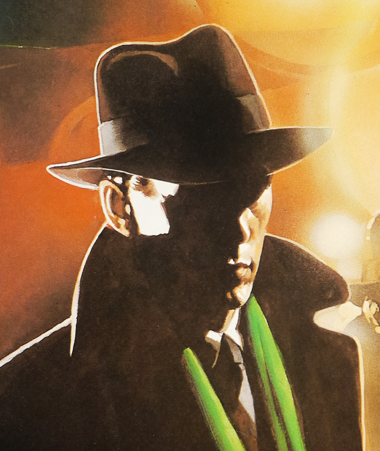
Texture
After the character form was in place I did a lot of experimenting with paint textures. My Photoshop paints looked way too smooth and perfect and I needed to get in there and mess with them. I have a lot of splattery paint textures onhand so I started adding a bunch in, then taking them out, then adding more, and removing them. I wanted a good balance of clean form with gritty brushes. I needed a good balance. This took hours, but finally it all came together the way I wanted it to. But I’ll be completely honest, this thing was a bit of a jungle.

Drive - the texture - designed by James White [Signalnoise]

Drive – the texture – designed by James White [Signalnoise]

Were there any last-minute tweaks or changes you decided to make?
I had a hard time painting his sleeve, as silly as that sounds. What you see in the final version was my fourth or fifth attempt to get the fabric looking good. My previous attempts were all too detailed, and I was referencing folded silk and all these stupid things. It wasn’t until I looked at Frank Miller’s old Sin City stuff that I realized it was simplicity that would win. He had a great method of creating folds using simple brush strokes.

Most of the last minute things were tiny tweaks to the content areas. I wanted to make sure I had the size of the DRIVE logo right, the spacing of the credit block correct, the line of logos across the bottom had to look good. All of these little elements were heavily scrutinized during the final couple of hours because I needed it to all balance and not take away from the character or composition.

Although this started out as a ‘tribute’ poster, you recently announced that the rights holders to the film are going to let you sell the poster officially, which is great news. For folks that are interested can you talk when it will be available?
Yeah, my agent and all around superhero Ollie Judge at Mystery Box made a tonne of phone calls to movie people and managed to convince them to allow us the rights to sell the poster. It’s an officially licensed DRIVE product, which is really exciting. I think a large part of that goes to the amount of internet buzz the poster got after I unofficially released it. Ollie and I got swamped with emails.

The poster will be available to purchase online on Thursday, January 19 at 1pm EST. The poster will be activated in the Signalnoise Store (http://www.merchline.com/signalnoise/) at that time. I will have 300 copies of the 22″ x 28″ poster for $50 along with a super limited 30 copies of the 24″ x 36″ poster for $90. They’re expected to move pretty quick.

Finally, do you have any other movie posters in the works at the moment. What does 2012 hold in store for Signalnoise when it comes to poster design?
Ollie and I have been scheming over the last few weeks and we have some big plans on the go, most of which revolve around creating original movie posters. I can’t really get into very much at the moment, but this will be a very full year for Signalnoise. Shaking with excitement over here. News will be coming real soon, man.

A huge thanks to James for taking the time to answer my questions and provide us with a glimpse into the making of his awesome Drive print. Check out the links below to see more of his work and I strongly advise following the man on Twitter for daily inspiration and design links.

– Signalnoise Studio: http://www.signalnoise.com/

– Twitter: https://twitter.com/#!/Signalnoise

– Facebook: http://www.facebook.com/signalnoise

The Great Northfield Minnesota Raid / 30×40 / USA

12.06.17

Poster Poster
Title
The Great Northfield Minnesota Raid
AKA
La légende de Jesse James (France)
Year of Film
1972
Director
Philip Kaufman
Starring
Cliff Robertson, Robert Duvall, Luke Askew, R.G. Armstrong, Dana Elcar, Donald Moffat, John Pearce, Matt Clark, Wayne Sutherlin ... Charley Pitts Robert H. Harris Robert H. Harris
Origin of Film
USA
Genre(s) of Film
Cliff Robertson, Robert Duvall, Luke Askew, R.G. Armstrong, Dana Elcar, Donald Moffat, John Pearce, Matt Clark, Wayne Sutherlin ... Charley Pitts Robert H. Harris Robert H. Harris,
Type of Poster
30x40
Style of Poster
--
Origin of Poster
USA
Year of Poster
1972
Designer
Unknown
Artist
Unknown
Size (inches)
30" x 40 2/16"
SS or DS
SS
NSS #
72/151
Tagline
The West the way it really was! | Cole Younger and Jesse James starring in the greatest western of the century!

The Great Northfield Minnesota Raid is a 1972 Western, written and directed by the American director Philip Kaufman. The film was Kaufman’s first commercial film following the two independent pictures he had directed in the 1960s. He is perhaps best known for the 1983 film The Right Stuff, based on the lives of the first test pilots involved in the race for space during the 1950s. This film is roughly based on the escapades of the real-life outlaws, the James-Younger Gang, who were active during the latter half of the 19th Century.

The film focuses on one of the gang’s most famous escapades which was the robbery of the bank known as ‘the biggest west of the Mississippi’ in the titular town of Northfield, Minnesota. The late actor Cliff Robertson appears as Cole Younger and Robert Duvall stars as Jesse James. That same year Duvall appeared in one of his most famous roles as Tom Hagen in The Godfather, and also starred alongside Clint Eastwood in the western Joe Kidd. The botched raid on the bank would have tragic consequences for most of the gang and eventually saw Cole Younger captured. Jesse James and one other man escaped but he was later infamously killed by a member of his own gang (brilliantly depicted in the 2007 film The Assassination of Jesse James by the Coward Robert Ford).

I’m unsure who is responsible for the artwork on this US 30×40 poster, which also features on the US one sheet and insert posters. If anyone has any ideas please get in touch.

Missing in Action / one sheet / teaser / USA

01.05.12

Poster Poster
Title
Missing in Action
AKA
--
Year of Film
1984
Director
Joseph Zito
Starring
Chuck Norris, M. Emmet Walsh, David Tress, Lenore Kasdorf, James Hong, Ernie Ortega, Pierrino Mascarino, Erich Anderson, Joseph Carberry
Origin of Film
USA
Genre(s) of Film
Chuck Norris, M. Emmet Walsh, David Tress, Lenore Kasdorf, James Hong, Ernie Ortega, Pierrino Mascarino, Erich Anderson, Joseph Carberry,
Type of Poster
One sheet
Style of Poster
Teaser
Origin of Poster
USA
Year of Poster
1984
Designer
Unknown
Artist
Stan Watts
Size (inches)
27 1/16" x 41"
SS or DS
SS
NSS #
--
Tagline
The war's not over until the last man comes home.

Action legend Chuck Norris stars in this Vietnam Prisoner of War (POW) film that shamelessly ripped off borrowed many elements from a script for Rambo: First Blood Part II, which had been written by James Cameron and had been doing the rounds in Hollywood for several months. Apparently folks at the Cannon Group had seen the script and quickly put the first two Missing in Action films into production; part 2, which is actually a prequel, was filmed at the same time as this film.

The story sees Colonel James Braddock escaping from a POW camp after seven years of captivity and then returning to Vietnam on a covert mission to rescue the men he had to leave behind. The film was absolutely savaged by critics on its release, with Derek Adams of Time Out saying that the film is “so bad that it defies belief. It’s xenophobic, amateurish and extraordinarily dull”. The biggest problem with the film is that it feels like a handful of set pieces with a lot of padding to fill in the rest of the running time, making it a frustratingly boring experience.

For all of its faults, it does feature this utterly brilliant minute of action, which has to be seen to be believed.

The poster artwork is by Stan Watts, who painted the posters for Invasion USA and The Delta Force, also starring Norris.

The trailer can be seen on YouTube.

Moonraker / B2 / Japan

19.05.14

Poster Poster
Title
Moonraker
AKA
Agente 007, Moonraker: Operazione Spazio (Italy)
Year of Film
1979
Director
Lewis Gilbert
Starring
Roger Moore, Lois Chiles, Michael Lonsdale, Richard Kiel, Corinne Clery, Bernard Lee, Geoffrey Keen, Desmond Llewelyn, Lois Maxwell, Toshirô Suga, Blanche Ravalec
Origin of Film
UK | France
Genre(s) of Film
Roger Moore, Lois Chiles, Michael Lonsdale, Richard Kiel, Corinne Clery, Bernard Lee, Geoffrey Keen, Desmond Llewelyn, Lois Maxwell, Toshirô Suga, Blanche Ravalec,
Type of Poster
B2
Style of Poster
--
Origin of Poster
Japan
Year of Poster
1979
Designer
Unknown
Artist
Dan Goozee
Size (inches)
20 6/16" x 28 14/16"
SS or DS
SS
Tagline
--

Although considered by most Bond fans to be one of the weakest of the series, I know I’m not the only one to have a soft spot for MoonrakerRoger Moore‘s fifth outing as James Bond. Thanks to endless TV showings during the 1980s and early 1990s I’ve probably seen this more than any other in the series and, like Live and Let Die, it had a huge impression on my young mind.

Looking at it through the cynical fog of adulthood it’s easy to sneer at the camp script, supremely daft action sequences (motorised Gondola anyone?) and painfully obvious attempt to cash in on the success of Star Wars (a very common theme amongst films released in its wake). The film is probably the quintessential outing for Moore as Bond and only he could have pulled it off as well as he did, particularly when it comes to the hokey script and madcap action.

The film features several memorable sequences, including a cable car fight over Rio de Janeiro, and a decent bad guy in Richard Kiel‘s inimitable ‘Jaws’ who used to scare me senseless as a kid. Also notable is John Barry‘s soundtrack, which marked a departure from his previous Bond work by mainly using strings instead of the typical brass. The film also features one of the most (literally) eyebrow-raising character names in the form of Dr Holly Goodhead (Lois Chiles) and one of the best/worst sign-offs of the entire series:

Sir Frederick Gray, Minister of Defence:  My God, what’s Bond doing?
Q: I think he’s attempting re-entry, sir.

This is the Japanese B2 featuring artwork by the American artist Dan Goozee that was also used on the final Moonraker US one sheet and on the film’s posters in several other countries. Dan Goozee also worked on several other James Bond posters including the international advance one sheet for Moonraker, the artwork for Octopussy and two one sheets for A View to a Kill.

Other posters I’ve collected by Goozee can be seen here.

The Living Daylights / one sheet / international

17.05.11

Poster Poster
Title
The Living Daylights
AKA
007 zona pericolo [Dangerous area] (Italy)
Year of Film
1987
Director
John Glen
Starring
Timothy Dalton, Maryam d'Abo, Joe Don Baker, Art Malik, John Rhys-Davies, Jeroen Krabbé
Origin of Film
UK | USA
Genre(s) of Film
Timothy Dalton, Maryam d'Abo, Joe Don Baker, Art Malik, John Rhys-Davies, Jeroen Krabbé,
Type of Poster
One sheet
Style of Poster
--
Origin of Poster
International
Year of Poster
1987
Designer
Brian Bysouth | Bernie Goddard | Mike Bell | Stephen Laws
Artist
Brian Bysouth
Size (inches)
27" x 40 13/16"
SS or DS
SS
NSS #
--
Tagline
The new James Bond... living on the edge.

Unquestionably the last truly great James Bond poster was painted by the British artist Brian Bysouth and the design was discussed during my 2012 interview with him:

“The last painting I did was for The Living Daylights. There were a number of us involved with the initial design ideas for that poster, including Bernie Goddard, a freelance designer who often worked with FEREF. Mike Bell and Stephen Laws also produced some concept roughs. Using the original Bond spiral gun barrel idea was a concept that featured on some of the designs and Bernie submitted one using it. The final concept was an amalgamation of ideas and I was tasked with composing the montage that became the poster. I produced the final colour rough that was sent to the client and we were all very glad when it was approved and I was able to start the finished painting.

I came across the rough a little while ago and it’s in reasonable condition considering it’s age.

That design ended up being used around the world and, as Sim Branaghan disclosed in his book, you were paid the highest fee ever given to a British film poster artist for that.
[Laughs] I probably shouldn’t have told Sim that! I don’t know if it was the highest fee ever paid, as I have no idea what other artists in Britain were getting for their work. But later I read somewhere that Bob Peak was being paid up to $50,000 for one poster at the beginning of the 1980s, and other artists such as Drew Struzan were perceived as being extremely well rewarded. I used to charge a day rate and always felt there was a downward pressure on the fees I charged. I was aware that as a director of the company I felt obliged not to inflate my prices, always making allowance for the company mark-up.  With the wisdom of hindsight, maybe I was wrong and I should have charged more. Anyway, I remember being content at the time.

I never knew how much FEREF were charging the client and I never thought to enquire. I decided that I was going to charge £3000 for my work on The Living Daylights because I had been working on the campaign for weeks. The fee was agreed and that was fine. Looking back in retrospect at an illustration that was used around the world to market a James Bond film do you really think that was a lot of money? It’s peanuts! Especially in comparison to the enormous budget the studio would have allotted to the marketing in total. Finally, I hope I am right in believing the client thought well of FEREF because we didn’t ridiculously inflate the price of the work we did for them. We sincerely believed we were the best at what we did, and it was upmost in our minds that we had to be competitive with our charges.”
The article also features pictures of the original artwork and initial sketches for this poster.

The Living Daylights / one sheet / Australia

17.05.11

Poster Poster
Title
The Living Daylights
AKA
007 zona pericolo [Dangerous area] (Italy)
Year of Film
1987
Director
John Glen
Starring
Timothy Dalton, Maryam d'Abo, Joe Don Baker, Art Malik, John Rhys-Davies, Jeroen Krabbé
Origin of Film
UK | USA
Genre(s) of Film
Timothy Dalton, Maryam d'Abo, Joe Don Baker, Art Malik, John Rhys-Davies, Jeroen Krabbé,
Type of Poster
One sheet
Style of Poster
--
Origin of Poster
Australia
Year of Poster
1987
Designer
Brian Bysouth | Bernie Goddard | Mike Bell | Stephen Laws
Artist
Brian Bysouth
Size (inches)
27" x 40 1/16"
SS or DS
SS
NSS #
--
Tagline
The new James Bond... living on the edge.

Unquestionably the last truly great James Bond poster was painted by the British artist Brian Bysouth and the design was discussed during my 2012 interview with him:

“The last painting I did was for The Living Daylights. There were a number of us involved with the initial design ideas for that poster, including Bernie Goddard, a freelance designer who often worked with FEREF. Mike Bell and Stephen Laws also produced some concept roughs. Using the original Bond spiral gun barrel idea was a concept that featured on some of the designs and Bernie submitted one using it. The final concept was an amalgamation of ideas and I was tasked with composing the montage that became the poster. I produced the final colour rough that was sent to the client and we were all very glad when it was approved and I was able to start the finished painting.

I came across the rough a little while ago and it’s in reasonable condition considering it’s age.

That design ended up being used around the world and, as Sim Branaghan disclosed in his book, you were paid the highest fee ever given to a British film poster artist for that.
[Laughs] I probably shouldn’t have told Sim that! I don’t know if it was the highest fee ever paid, as I have no idea what other artists in Britain were getting for their work. But later I read somewhere that Bob Peak was being paid up to $50,000 for one poster at the beginning of the 1980s, and other artists such as Drew Struzan were perceived as being extremely well rewarded. I used to charge a day rate and always felt there was a downward pressure on the fees I charged. I was aware that as a director of the company I felt obliged not to inflate my prices, always making allowance for the company mark-up.  With the wisdom of hindsight, maybe I was wrong and I should have charged more. Anyway, I remember being content at the time.

I never knew how much FEREF were charging the client and I never thought to enquire. I decided that I was going to charge £3000 for my work on The Living Daylights because I had been working on the campaign for weeks. The fee was agreed and that was fine. Looking back in retrospect at an illustration that was used around the world to market a James Bond film do you really think that was a lot of money? It’s peanuts! Especially in comparison to the enormous budget the studio would have allotted to the marketing in total. Finally, I hope I am right in believing the client thought well of FEREF because we didn’t ridiculously inflate the price of the work we did for them. We sincerely believed we were the best at what we did, and it was upmost in our minds that we had to be competitive with our charges.”
The article also features pictures of the original artwork and initial sketches for this poster.

Big Trouble In Little China / A1 / Germany

20.05.13

Poster Poster
Title
Big Trouble In Little China
AKA
--
Year of Film
1986
Director
John Carpenter
Starring
Kurt Russell, Kim Cattrall, Dennis Dun, James Hong, Victor Wong
Origin of Film
USA
Genre(s) of Film
Kurt Russell, Kim Cattrall, Dennis Dun, James Hong, Victor Wong,
Type of Poster
A1
Style of Poster
--
Origin of Poster
Germany
Year of Poster
1986
Designer
Unknown
Artist
A. Helden
Size (inches)
23 6/16" x 33"
SS or DS
SS
Tagline
--

John Carpenter’s excellent action adventure Big Trouble in Little China marked the director’s fourth outing with lead actor Kurt Russell and also saw him satisfy his long-held desire to make a film featuring martial artistry. The film apparently started life as a Western but the screenwriter W. D. Richter was tasked with retooling the script and modernising it completely. Russell stars as Jack Burton, an all-American trucker who arrives in town with cargo to deliver and, after beating him at a card game, offers to drive his friend Wang Chi (Dennis Dun) to the airport to pick up his fiancee, Miao Yin (Suzee Pai). When a gang of thugs from the Lords of Death street gang abduct Miao Yin, Burton and Wang chase them back to the alleys of Chinatown.

After interrupting a funeral procession the pair become embroiled in a battle between two rival Chinese gangs, which is brought to a conclusion by the arrival of The Three Storms, a trio of supernaturally strong warriors. Whilst attempting to escape, Burton inadvertently runs over the crime lord Lo Pan (James Hong) who then blinds Burton after he exits his truck. As Lo Pan’s gang steals the truck, Wang leads Jack out of the area and to his restaurant where they meet up with a lawyer called Gracie Law (Kim Cattrall), Wang’s friend Eddie Lee (Donald Li) and magician Egg Shen (Victor Wong). The gang then plan a mission to rescue Miao Yin from the clutches of Lo Pan, who aims to sacrifice her in order to break an ancient curse. What follows is an action-packed romp that sees Burton and the others descend into the crime-lord’s lair to face-off against a series of adversaries, both human and otherwise.

Russell plays Burton with a perfect mix of tough-guy bravado and goofball charm and the character makes a nice change from the gruff, no-nonsense roles he played in Escape from New York and The Thing. Sadly, the film was to prove a flop at the box-office and it struggled to even regain its $25 million budget. Carpenter and Russell have since revealed that they feel the studio didn’t really know how to sell the film to audiences, plus it was also (unluckily) released with a couple of weeks of James Cameron’s mega-hit Aliens. Big Trouble in Little China became a huge cult hit on video and has subsequently seen a large amount of critical reappraisal and now stands at 82% fresh on RottenTomatoes.com, for example.

In the States the film was marketed with a Drew Struzan illustration, whilst the UK was treated to a wonderful Brian Bysouth painting. This is the German poster that features exclusive artwork by someone who signs their work A. Helden. It’s a decent portrait of Russell and Cattrall and also features Burton’s truck, the Pork Chop Express. Despite numerous searches I’ve been unable to discover much about the artist, so if you have any ideas about them please get in touch.

The Living Daylights / quad / UK

24.05.13

Poster Poster
Title
The Living Daylights
AKA
007 zona pericolo [Dangerous area] (Italy)
Year of Film
1987
Director
John Glen
Starring
Timothy Dalton, Maryam d'Abo, Joe Don Baker, Art Malik, John Rhys-Davies, Jeroen Krabbé
Origin of Film
UK | USA
Genre(s) of Film
Timothy Dalton, Maryam d'Abo, Joe Don Baker, Art Malik, John Rhys-Davies, Jeroen Krabbé,
Type of Poster
Quad
Style of Poster
--
Origin of Poster
UK
Year of Poster
1987
Designer
Brian Bysouth | Bernie Goddard | Mike Bell | Stephen Laws
Artist
Brian Bysouth
Size (inches)
30 1/16" x 39 14/16"
SS or DS
SS
NSS #
--
Tagline
The new James Bond... living on the edge.

The Living Daylights was the first of two films in the long-running James Bond franchise to feature actor Timothy Dalton as the legendary spy. Dalton had been offered the role following Roger Moore’s decision not to reprise it in the wake of the disappointing performance of 1985’s A View to a Kill. The film sees Bond caught up in an international conspiracy after the abduction from a London safe-house of a recently defected KGB officer, which sees the agent travel to Czechoslovakia, Morocco, Austria and eventually Afghanistan in search of the missing man. The spy uncovers an arms-dealing plot with global ramifications and he must work with the Russian girlfriend of the missing KGB officer to get to the truth and prevent the conspirators from fulfilling their plans.

This is the UK quad and it features artwork that was used across the globe to promote the film. It’s unquestionably the last truly great Bond poster and was also the last to be entirely hand painted. The man responsible is the British artist Brian Bysouth and the poster was discussed during my 2012 interview with him:

“The last painting I did was for The Living Daylights. There were a number of us involved with the initial design ideas for that poster, including Bernie Goddard, a freelance designer who often worked with FEREF. Mike Bell and Stephen Laws also produced some concept roughs. Using the original Bond spiral gun barrel idea was a concept that featured on some of the designs and Bernie submitted one using it. The final concept was an amalgamation of ideas and I was tasked with composing the montage that became the poster. I produced the final colour rough that was sent to the client and we were all very glad when it was approved and I was able to start the finished painting.

I came across the rough a little while ago and it’s in reasonable condition considering it’s age.

That design ended up being used around the world and, as Sim Branaghan disclosed in his book, you were paid the highest fee ever given to a British film poster artist for that.
[Laughs] I probably shouldn’t have told Sim that! I don’t know if it was the highest fee ever paid, as I have no idea what other artists in Britain were getting for their work. But later I read somewhere that Bob Peak was being paid up to $50,000 for one poster at the beginning of the 1980s, and other artists such as Drew Struzan were perceived as being extremely well rewarded. I used to charge a day rate and always felt there was a downward pressure on the fees I charged. I was aware that as a director of the company I felt obliged not to inflate my prices, always making allowance for the company mark-up.  With the wisdom of hindsight, maybe I was wrong and I should have charged more. Anyway, I remember being content at the time.

I never knew how much FEREF were charging the client and I never thought to enquire. I decided that I was going to charge £3000 for my work on The Living Daylights because I had been working on the campaign for weeks. The fee was agreed and that was fine. Looking back in retrospect at an illustration that was used around the world to market a James Bond film do you really think that was a lot of money? It’s peanuts! Especially in comparison to the enormous budget the studio would have allotted to the marketing in total. Finally, I hope I am right in believing the client thought well of FEREF because we didn’t ridiculously inflate the price of the work we did for them. We sincerely believed we were the best at what we did, and it was upmost in our minds that we had to be competitive with our charges.”

The article also features pictures of the original artwork and initial sketches for this poster.

Moonraker / quad / UK

30.09.13

Poster Poster
Title
Moonraker
AKA
Agente 007, Moonraker: Operazione Spazio [Operation Space] (Italy)
Year of Film
1979
Director
Lewis Gilbert
Starring
Roger Moore, Lois Chiles, Michael Lonsdale, Richard Kiel, Corinne Clery, Bernard Lee, Geoffrey Keen, Desmond Llewelyn, Lois Maxwell, Toshirô Suga, Blanche Ravalec
Origin of Film
UK | France
Genre(s) of Film
Roger Moore, Lois Chiles, Michael Lonsdale, Richard Kiel, Corinne Clery, Bernard Lee, Geoffrey Keen, Desmond Llewelyn, Lois Maxwell, Toshirô Suga, Blanche Ravalec,
Type of Poster
Quad
Style of Poster
--
Origin of Poster
UK
Year of Poster
1979
Designer
Unknown
Artist
Dan Goozee
Size (inches)
30 1/16" x 39 15/16"
SS or DS
SS
NSS #
--
Tagline
Where all the other Bonds end... this one begins!

Although considered by most Bond fans to be one of the weakest of the series, I know I’m not the only one to have a soft spot for Moonraker, Roger Moore‘s fifth outing as James Bond. Thanks to endless TV showings during the 1980s and early 1990s I’ve probably seen this more than any other in the series and, like Live and Let Die, it had a huge impression on my young mind.

Looking at it through the cynical fog of adulthood it’s easy to sneer at the camp script, supremely daft action sequences (motorised Gondola anyone?) and painfully obvious attempt to cash in on the success of Star Wars (a very common theme amongst films released in its wake). The film is probably the quintessential outing for Moore as Bond and only he could have pulled it off as well as he did, particularly when it comes to the hokey script and madcap action.

The film features several memorable sequences, including a stunning cable car fight over Rio de Janeiro, and a decent bad guy in Richard Kiel‘s inimitable ‘Jaws’ who used to scare me senseless as a kid. Also notable is John Barry‘s soundtrack, which marked a departure from his previous Bond work by mainly using strings instead of the typical brass. The film also features one of the most (literally) eyebrow-raising character names in the form of Dr Holly Goodhead (Lois Chiles) and one of the best/worst sign-offs of the entire series:

Sir Frederick Gray, Minister of Defence:  My God, what’s Bond doing?
Q: I think he’s attempting re-entry, sir.

This is the British quad featuring artwork by the American artist Dan Goozee that was also used on the final Moonraker US one sheet and on the film’s posters in several other countries. Because the original artwork was copied to create this quad before computer technology meant easy recycling of images, the artwork is slightly ‘softer’ than on the one sheet, with some parts of the image not as sharp as they could be. This is the case on every copy of the poster I’ve ever handled. Dan Goozee also worked on several other James Bond posters including the international advance one sheet for Moonraker, the artwork for Octopussy and two one sheets for A View to a Kill.

Other posters I’ve collected by Goozee can be seen here.

The Passage / quad / UK

06.06.16

Poster Poster

Colourful and typically dynamic artwork by Brian Bysouth features on this UK quad for the largely forgotten British war film The Passage (1979). Based on the novel Perilous Passage by Bruce Nicolaysen (who also wrote the screenplay), the film was directed by the British director J. Lee Thompson who was responsible for the classic war film The Guns of Navarone, as well as multiple films headlined by Charles Bronson.

Set during World War II, the story sees a Basque farmer (played by Anthony Quinn) escort a scientist (James Mason) and his family over the treacherous Pyrenees mountains to escape the sadistic clutches of a Nazi SS officer, Captain Von Berkow (Malcolm McDowell giving an impressively over the top performance). Christopher Lee appears as a character called The Gypsy who is sympathetic to the group’s plight. Apparently the film bombed spectacularly at the US box office and was critically drubbed on release.

This British quad was created at the London-based Downtons Advertising agency by one of the principal designers, Eddie Paul, and painted by Brian Bysouth who was working as a freelancer at the time. Both men are featured in Sim Branaghan’s must-own book British Film Posters: An Illustrated History and are each responsible for several iconic British posters. The designer Eddie Paul was born in Hackney in 1920 and attended Southend School of Art, later beginning his career at Temple Art Studios before moving on to Star Illustrations on Shoe Lane, where he gained a good reputation as a scrapboard artist.

After serving in the RAF during the war, Eddie joined Pulford Publicity in 1946 and started designing film posters using crayons and coloured pencils. He worked on several successful poster campaigns during the 1960s, including El Cid (1961), The Fall of the Roman Empire (1964) and the famous quad for From Russia with Love (painted by Renato Fratini). He later joined four ex-Downton colleagues and formed the successful agency FEREF in 1968. As Sim notes in his book, ‘He was well liked and respected within the business as a gentleman’. Eddie Paul passed away from a heart attack whilst on his way to work in 1984, just shy of his retirement from FEREF.

The artwork was painted by Brian Bysouth who is one of my favourite poster artists and was responsible for many classic posters from the 1960s to the 1980s, including the final painted poster for a James Bond film, The Living Daylights (1987). In 2012 I was fortunate to meet and interview Brian for this site and the article can be read here. The other posters I’ve collected by Brian can be seen by clicking here.

A View To A Kill / one sheet / recalled / UK

25.11.11

Poster Poster

Sir Roger Moore‘s last outing as James Bond, A View to a Kill, was definitely not his finest hour, although it is memorable for a few reasons, including Christopher Walken‘s turn as the truly psychotic bad guy (Max Zorin), Duran Duran’s great title theme and the appearance of the incomparable Grace Jones as Mayday, Zorin’s accomplice. She may not be able to act very well but she’s never anything less than a striking presence and is definitely not a lady to mess with, as British chat show presenter Russell Harty infamously found out.

This poster is the UK one sheet that was designed by Vic Fair and illustrated by Brian Bysouth, a not insignificant pairing of two great English talents. Having been commissioned by the studio the poster was apparently then rejected and ultimately never used in cinemas to promote the film. Sim Branaghan, the man behind the must-own book ‘British Film Posters‘, interviewed Vic Fair who recalled that they were looking for a more conventional design, something that often frustrated the designer when working with clients:

‘Not very exciting are they, the Bond posters … always the same thing. So I had this idea of putting him in a white jacket, but they just threw their arms up in horror – “Ooh no, we can’t have that”. It was ridiculous really’

The poster is now known as the ‘recalled’ UK one sheet as, despite the poster having been printed, it was recalled by the studio and most copies were apparently pulped. Obviously, several did manage to escape destruction and made their way into the hands of poster dealers and collectors. I’d like to know a rough figure on how many did survive since it does show up at major auctions and on Ebay occasionally, so it’s certainly more than a tiny handful. If anyone has any more details on this please get in touch or leave a comment.

The artwork did end up being used for other countries, notably a Japanese B2 poster promoting the film.

For more information on Vic Fair and Brian Bysouth I highly recommend picking up a copy of ‘British Film Posters‘ as it features sections on both men. Here are the posters I’ve collected so far by Brian Bysouth and those by Vic Fair (with more to add over the coming months).

In 2012 I met and interviewed Brian Bysouth and this poster was discussed:

There are two specific collaborations you had with Vic Fair that I’d like to talk about. There was the UK one sheet for A View to a Kill, which you mentioned, and before I read Sim’s book I had no idea that it was one of yours. It’s quite different to others you’d worked on before then.
Ah yes, that poster was painted with a different technique than the one I’d typically work with. It has a very smooth look mostly done with an airbrush. The clients had started to require illustrations to have a less painted look and they were asking for much more photo-realistic illustrations. This requirement was because of falling sales in the video market.  The clients had concluded that the paying public had become more discerning and distrustful of what was portrayed on the video sleeves, and to some extent on film posters. The public had begun to realise that an exciting illustration could flatter what in reality would be a truly awful film.  So illustration had to take on a new, more highly-finished look, but this only worked for a short while before the use of photographs and the versatility of the computer took over completely.

Anyway, to continue, Vic asked me if I’d like to do the finished painting based on his rough; it was a really excellent and novel design, which required me to execute the painting in two stages. The first stage would be used as a teaser poster and this was just the image ofGrace Jones and Bond contained within a diamond motif. All I had to do was get the airbrush out and work up his design. I remember spending a while on the Grace Jones image, polishing and improving her look, as well as the pose of Bond. It went away to be printed but later we were disappointed to learn that it was going to be withdrawn because the clients were not happy with the legendary spy being portrayed in a white tuxedo; that being considered not very Bond-like!

For the second stage, Vic’s design included an exciting montage to fit either side of the central icon of the two characters. The preliminary painting was returned to me for completion and I continued by adding the montage of scenes from the film onto the artwork in a semi-drawn style, which I was experimenting with at the time. I was very pleased with the final results and Vic liked it too. That went off for approval but, for reasons unknown to me, the printing didn’t go ahead. I never saw the artwork again and pathetically, because it was not approved, I don’t even think a transparency was made. I entertain hopes that one day it will eventually re-appear and I will be able to establish my claim to ownership.

Here’s the film’s original trailer.

Duck, You Sucker / one sheet / 1980 re-release / international

13.08.11

Poster Poster
Title
Duck, You Sucker
AKA
Giù la testa ['duck', literally 'down the head'] (Italy - original title) | A Fistful of Dynamite (UK, Australia, USA alt.)
Year of Film
1971
Director
Sergio Leone
Starring
Rod Steiger, James Coburn, Romolo Valli, Maria Monti, Rik Battaglia, Franco Graziosi, Antoine Saint-John, Giulio Battiferri
Origin of Film
Italy
Genre(s) of Film
Rod Steiger, James Coburn, Romolo Valli, Maria Monti, Rik Battaglia, Franco Graziosi, Antoine Saint-John, Giulio Battiferri,
Type of Poster
One sheet
Style of Poster
Re-release
Origin of Poster
International (USA)
Year of Poster
1980
Designer
Unknown
Artist
Robert McGinnis
Size (inches)
27 2/16" x 41"
SS or DS
SS
NSS #
--
Tagline
--

This is the international re-release (1980) poster for Sergio Leone Duck, You Sucker which uses the same design as the original release poster (1971) with only a handful of changes to the credits block and a lack of NSS details.

The artwork is by Robert McGinnis, one of the all time great poster artists, who is perhaps best known for his work on some of the best James Bond posters, including Thunderball (with Frank McCarthy), Live and Let Die and Diamonds are Forever. This great gallery showcases many of his finest pieces.

If you look closely at some of the images of this poster you’ll see the fold lines from the original poster that United Artists must have copied in order to print this re-release (this version is rolled). I’m assuming this is because the original printing plates were lost and it would have been too expensive/impossible to recreate them.

Whilst not as beloved as the films that make up Sergio Leone’s ‘Dollars Trilogy’, this is still an excellent action adventure featuring many memorable scenes and I’m hoping that it will get released on blu-ray soon with both of the versions on the disc.

The original US trailer can be watched on YouTube.

Great White / one sheet / style A / USA

26.09.11

Poster Poster
Title
Great White
AKA
L'ultimo squalo (Italy - original title) | The Last Shark (International - English title)
Year of Film
1980
Director
Enzo G. Castellari
Starring
James Franciscus, Vic Morrow, Micaela Pignatelli, Joshua Sinclair, Giancarlo Prete, Stefania Girolami Goodwin
Origin of Film
Italy
Genre(s) of Film
James Franciscus, Vic Morrow, Micaela Pignatelli, Joshua Sinclair, Giancarlo Prete, Stefania Girolami Goodwin,
Type of Poster
One sheet
Style of Poster
style A
Origin of Poster
USA
Year of Poster
1982
Designer
Unknown
Artist
Jack Leynnwood
Size (inches)
27" x 40 15/16"
SS or DS
SS
NSS #
--
Tagline
A quiet, restful summer in the lazy coastal town of Port Harbor is abruptly about to end.

Italian director Enzo G Castellari’s shark on a rampage film was blocked from release in America after Universal Pictures, the studio behind Jaws, successfully sued citing plagiarism. It’s not hard to see why, as per the plot description on IMDb:

An enormous and angry 35 foot Great White Shark takes revenge on humans when they build a beach just for swimmers by a coastal town. After several shark attacks, and the Mayor does nothing to stop it, James Franisscus and Vic Morrow sail in pursuit to stop it.

This poster comes from a limited release by Venture Pictures International in 1982. The film has never been released on home video in the States or in the UK and it seems that Universal continue to block screenings to this day, though it appears Amazon offers a video on demand version. It’s available on DVD in Italy and Sweden and, as per that article, Severin Films intend to pursue a UK release soon.

I’m not sure who the artist is behind this poster so get in touch if you have an idea.

Here’s the original US trailer – check out Vic Morrow‘s Quint impression!

Moonraker / one sheet / advance / style A – ‘June’ / international

15.02.12

Poster Poster
Title
Moonraker
AKA
Agente 007, Moonraker: Operazione Spazio [Operation Space] (Italy)
Year of Film
1979
Director
Lewis Gilbert
Starring
Roger Moore, Lois Chiles, Michael Lonsdale, Richard Kiel, Corinne Clery, Bernard Lee, Geoffrey Keen, Desmond Llewelyn, Lois Maxwell, Toshirô Suga, Blanche Ravalec
Origin of Film
UK | France
Genre(s) of Film
Roger Moore, Lois Chiles, Michael Lonsdale, Richard Kiel, Corinne Clery, Bernard Lee, Geoffrey Keen, Desmond Llewelyn, Lois Maxwell, Toshirô Suga, Blanche Ravalec,
Type of Poster
One sheet
Style of Poster
Advance - style A - 'June'
Origin of Poster
International
Year of Poster
1979
Designer
Unknown
Artist
Dan Goozee
Size (inches)
27" x 41"
SS or DS
SS
NSS #
--
Tagline
Outer space now belongs to 007

Although considered by most Bond fans to be one of the weakest of the series, I know I’m not the only one to have a soft spot for Moonraker, Roger Moore‘s fifth outing as James Bond. Thanks to endless TV showings during the 1980s and early 1990s I’ve probably seen this more than any other in the series and, like Live and Let Die, it had a huge impression on my young mind.

Looking at it through the cynical fog of adulthood it’s easy to sneer at the camp script, supremely daft action sequences (motorised Gondola anyone?) and painfully obvious attempt to cash in on the success of Star Wars (a very common theme amongst films released in its wake). The film is probably the quintessential outing for Moore as Bond and only he could have pulled it off as well as he did, particularly when it comes to the hokey script and madcap action.

The film features several memorable sequences, including a stunning cable car fight over Rio de Janeiro, and a memorable bad guy in Richard Kiel‘s inimitable ‘Jaws’ who used to scare me senseless as a kid. Also notable is John Barry‘s soundtrack, which marked a departure from his previous Bond work by mainly using strings instead of the typical brass. The film also features one of the most (literally) eyebrow-raising character names in the form of Dr Holly Goodhead (Lois Chiles) and one of the best/worst sign-offs of the entire series:

Sir Frederick Gray, Minister of Defence:  My God, what’s Bond doing? 
Q: I think he’s attempting re-entry, sir.

This particular poster is the advance international one sheet with artwork by Dan Goozee who is responsible for several other Bond posters, including the US one sheet. Other posters I’ve collected by him can be seen here.

This version has the phrase ‘Blasting off in June!’ at the bottom, but I also have one which says ‘Blasting off This Summer’ – see the last photos for images of it. I know there is also at least one other alternative version that has the phrase ‘Blasting off Soon’ (image taken from emovieposter.com).

The original trailer for the film is on YouTube.

Outland / quad / UK

30.05.11

Poster Poster
Title
Outland
AKA
Atmosfera zero (Italy) | Outland - Comando Titânio (Brazil) | Rumstation Jupiter (Denmark) | Operation Outland (Sweden)
Year of Film
1981
Director
Peter Hyams
Starring
Sean Connery, Peter Boyle, Frances Sternhagen, James Sikking, Kika Markham, Clarke Peters, Steven Berkoff
Origin of Film
UK
Genre(s) of Film
Sean Connery, Peter Boyle, Frances Sternhagen, James Sikking, Kika Markham, Clarke Peters, Steven Berkoff,
Type of Poster
Quad
Style of Poster
--
Origin of Poster
UK
Year of Poster
1981
Designer
Unknown
Artist
DFS
Size (inches)
30" x 39 15/16"
SS or DS
SS
Tagline
On Jupiter's moon, something deadly is happening

One of my favourite non-James Bond roles for Sean Connery, this 1981 Sci-Fi thriller still stands up 30 years after its release. The film was an acknowledged influence on Duncan Jones‘ superb 2009 film Moon, which I can heartily recommend. It also has one of the best posters of the past few years.

I was lucky enough to see a double-bill of the two films together presented by Jones (at the Prince Charles Cinema in London) where he talked about his love for Outland and the influence it had on his directorial debut. Without spoiling things, the design of a particular space craft in Moon is a great homage to one in Outland.

I’ve had some trouble identifying who the artist’s initials ‘DFS’ belong to and would appreciate any help with confirming this.

Here’s the trailer for the film.

Pat Garrett and Billy the Kid / B2 / Japan

25.01.12

Poster Poster

A striking use of Japanese characters on this poster for Sam Peckinpah’s 1973 take on the true story of lawman versus outlaw, Pat Garrett and Billy the Kid. The film starred James Coburn and Kris Kristofferson and featured American musician Bob Dylan in his first film role. Dylan also composed several songs for the soundtrack and released an album of the same name that year, which featured the classic song ‘Knockin’ on Heaven’s Door’.

This was Peckinpah’s third western and it’s said that he wanted the film to be the definitive statement on the genre. Sadly, multiple problems beset the production, including budgetary and time constraints, malfunctioning equipment and sick cast and crew members. This led to a falling out between the director and the studio (MGM) and ultimately saw the film being removed from Peckinpah’s control. The footage was roughly edited and cut down before being dumped into cinemas, with an unsurprisingly poor critical and commercial outcome.

In 1988 a director’s cut of the film was released and led to it being given a favourable reappraisal from critics and many now hail the film as one of Peckinpah’s best. In 2005 a third version was released onto DVD, which combines the two cuts and adds in some new material whilst still running shorter than the director’s cut.

The original trailer is on YouTube.