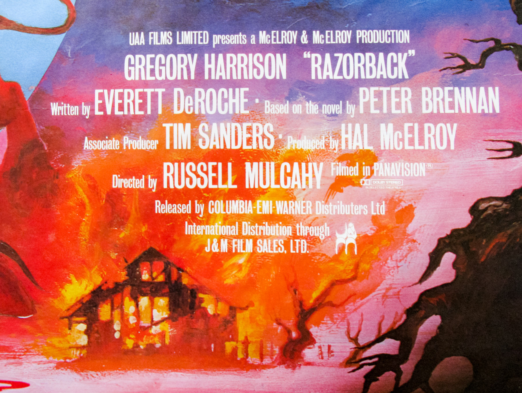
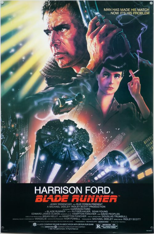
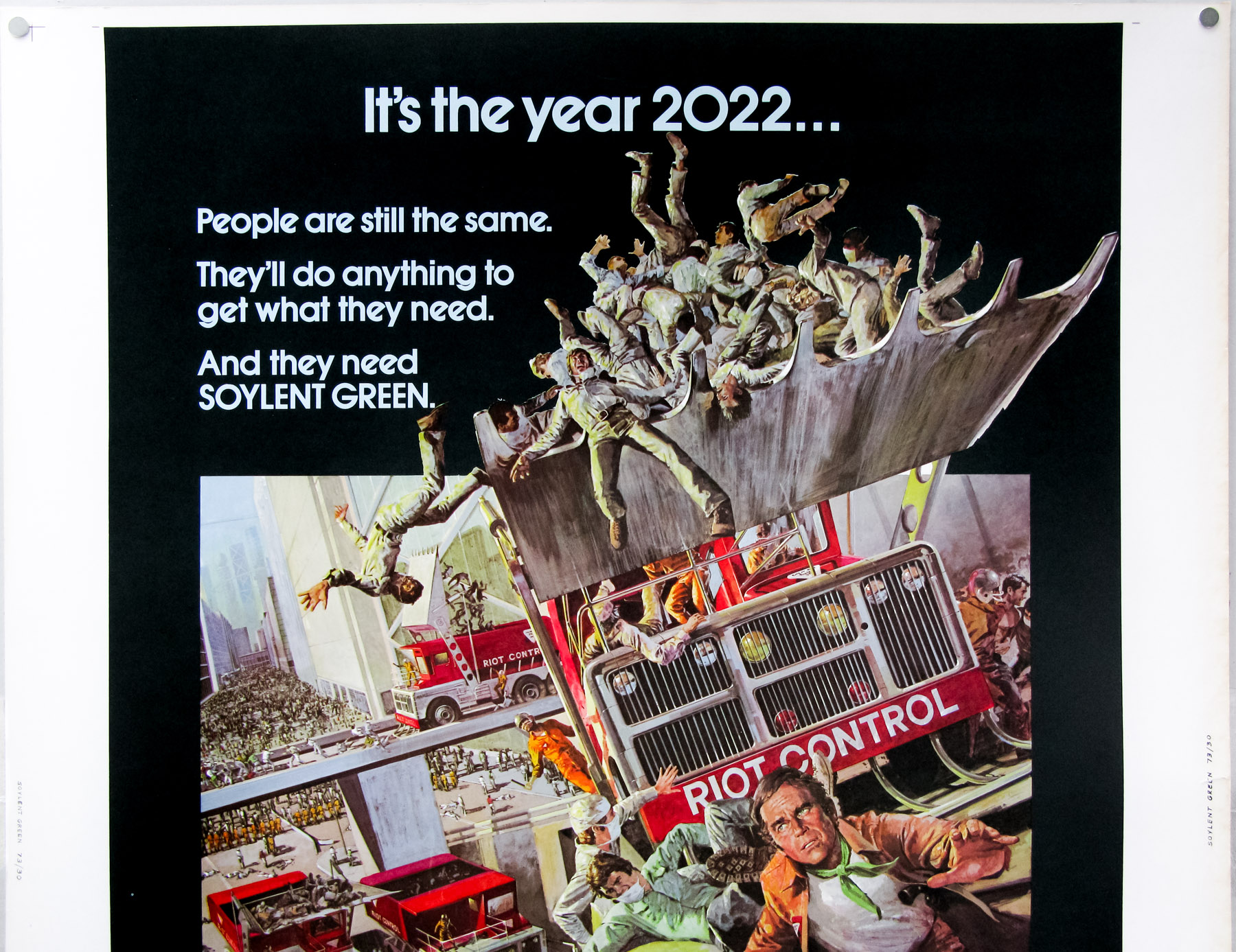
- Title
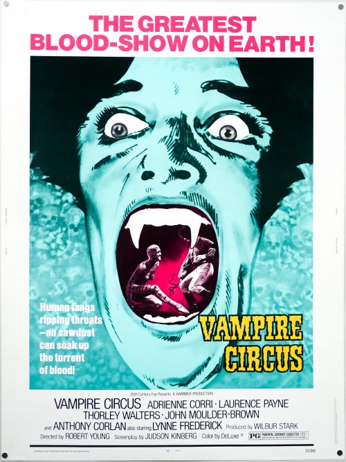
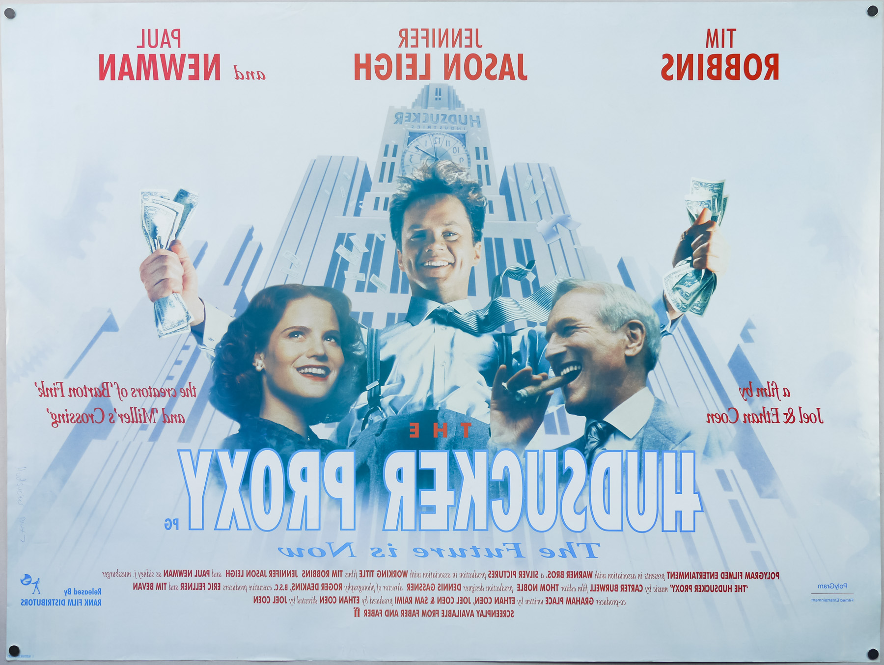
- Blade Runner
- AKA
- Blade Runner - Metropolis 2020 (Finland)
- Year of Film
- 1982
- Director
- Ridley Scott
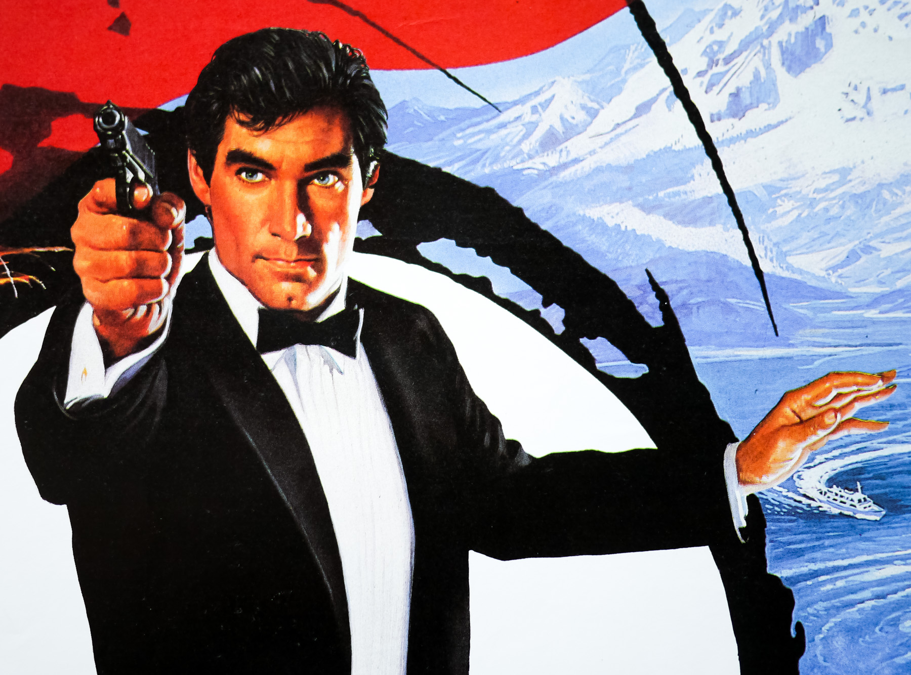
- Starring
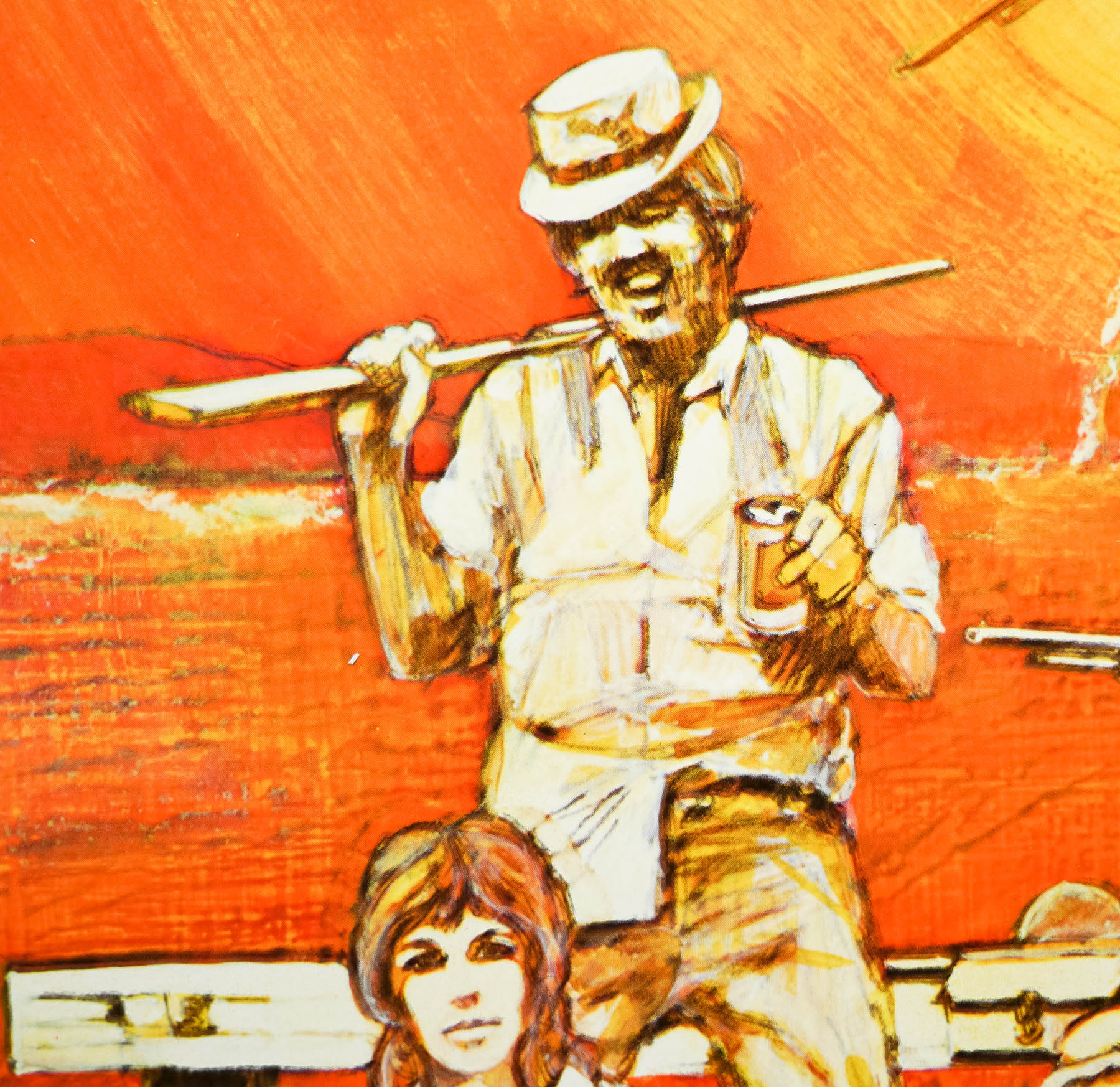
- Harrison Ford, Rutger Hauer, Sean Young, Edward James Olmos, M. Emmet Walsh, Daryl Hannah
- Origin of Film
- USA | Hong Kong
- Genre(s) of Film
- Harrison Ford, Rutger Hauer, Sean Young, Edward James Olmos, M. Emmet Walsh, Daryl Hannah,
- Type of Poster
- One sheet
- Style of Poster
- 'Odd NSS'
- Origin of Poster
- USA
- Year of Poster
- 1982
- Designer
- Intralink Film Graphic Design
- Artist
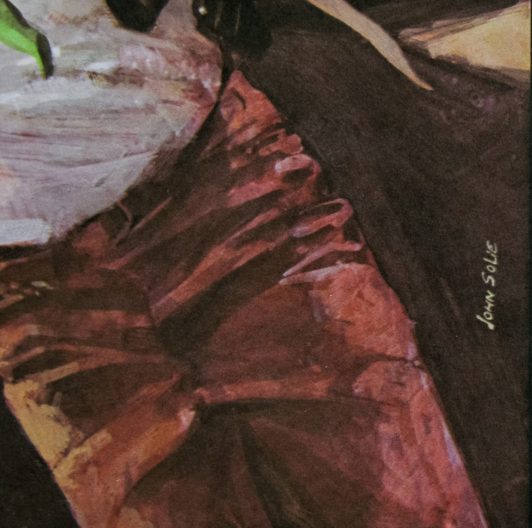
- John Alvin
- Size (inches)
- 27" x 41"
- SS or DS
- SS
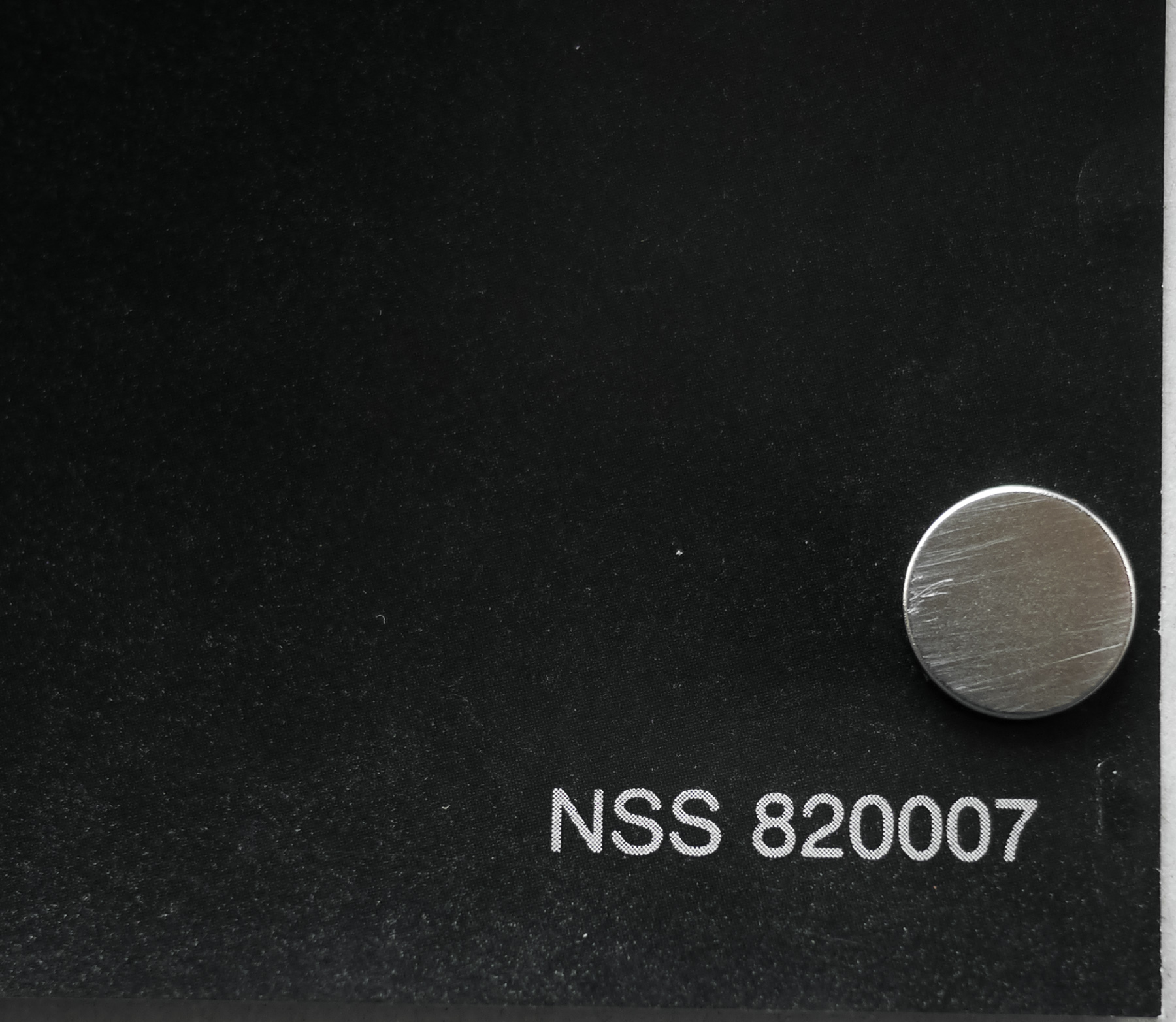
- NSS #
- 820007
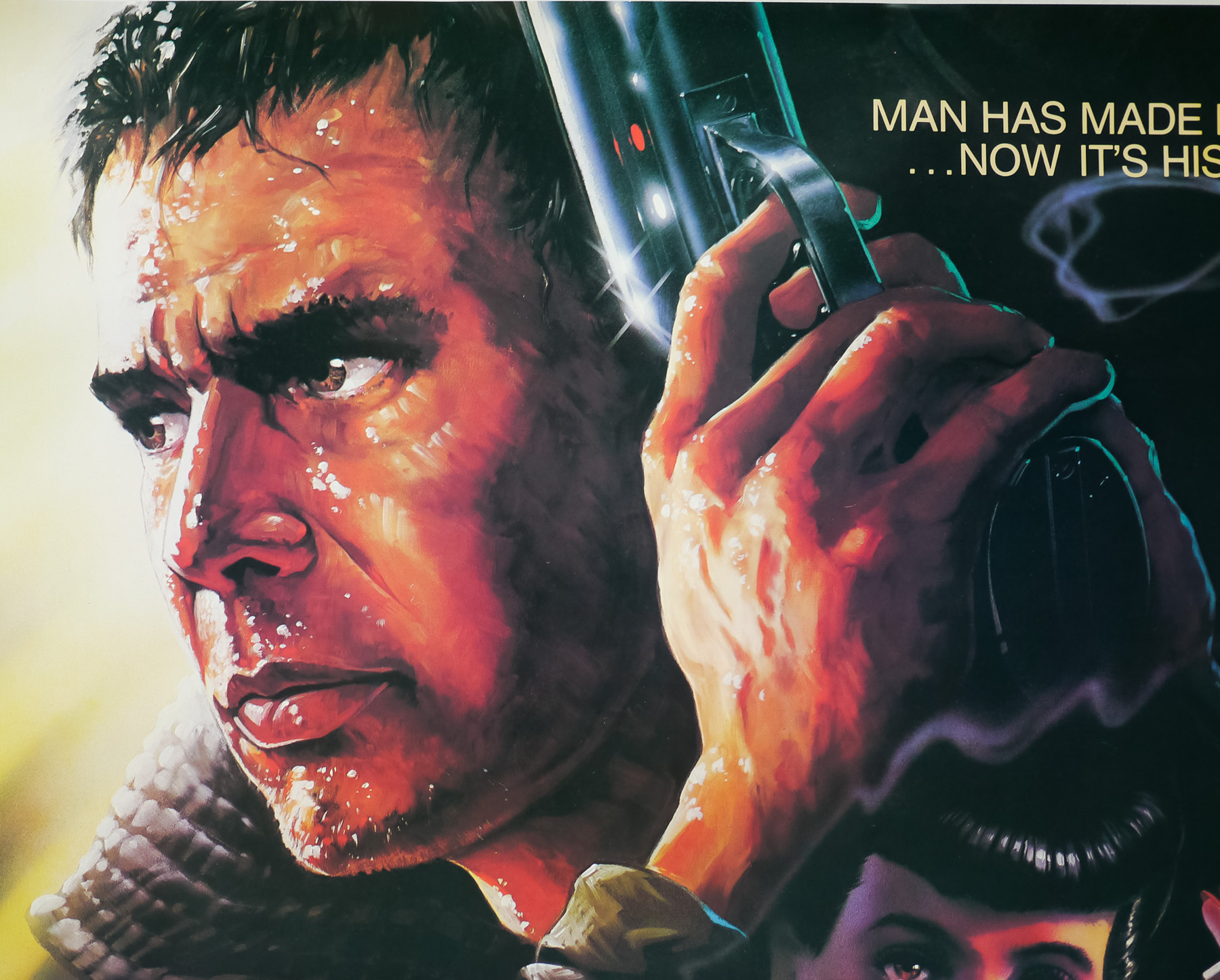
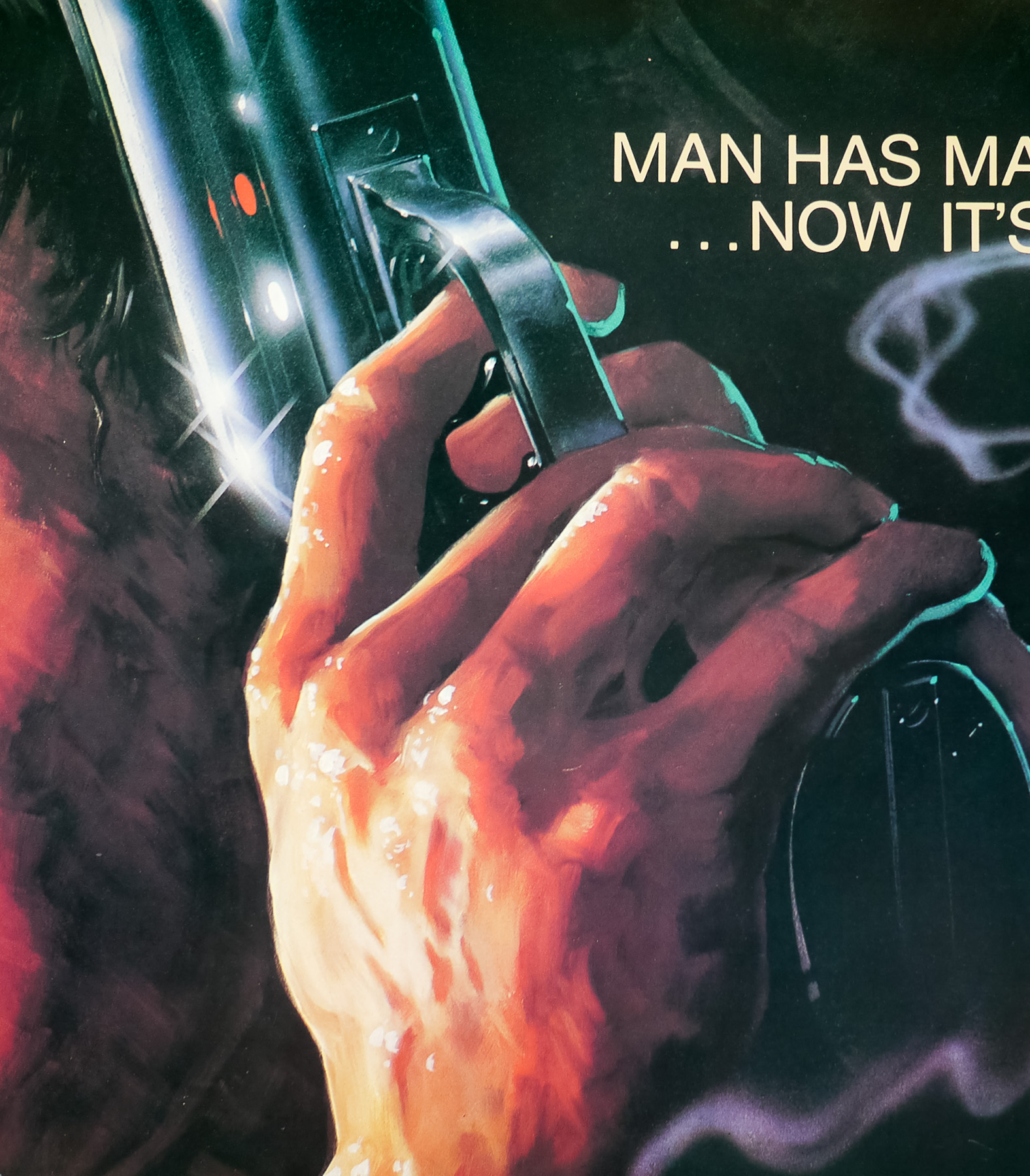
- Tagline
- Man Has Made His Match... Now It's His Problem
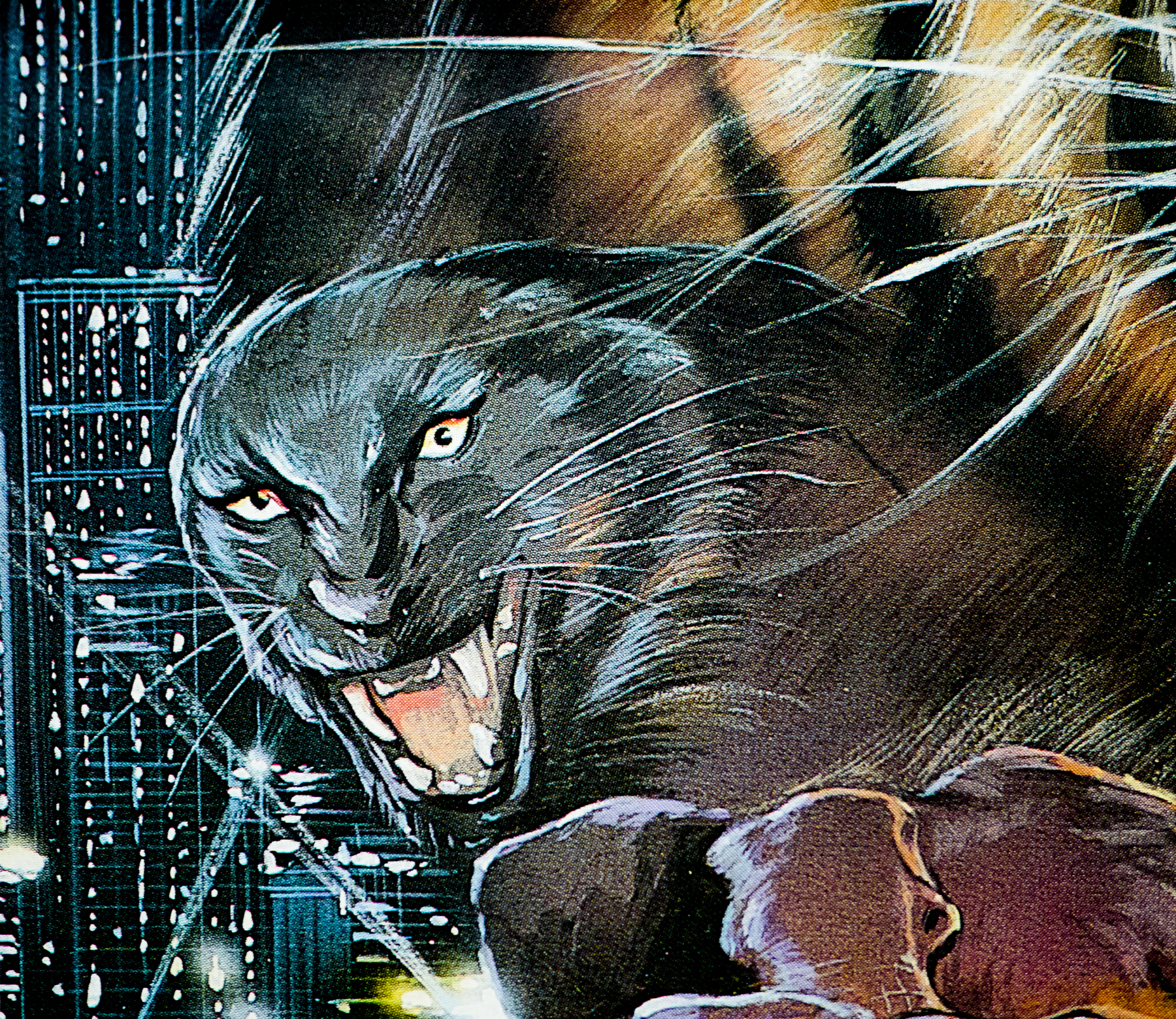
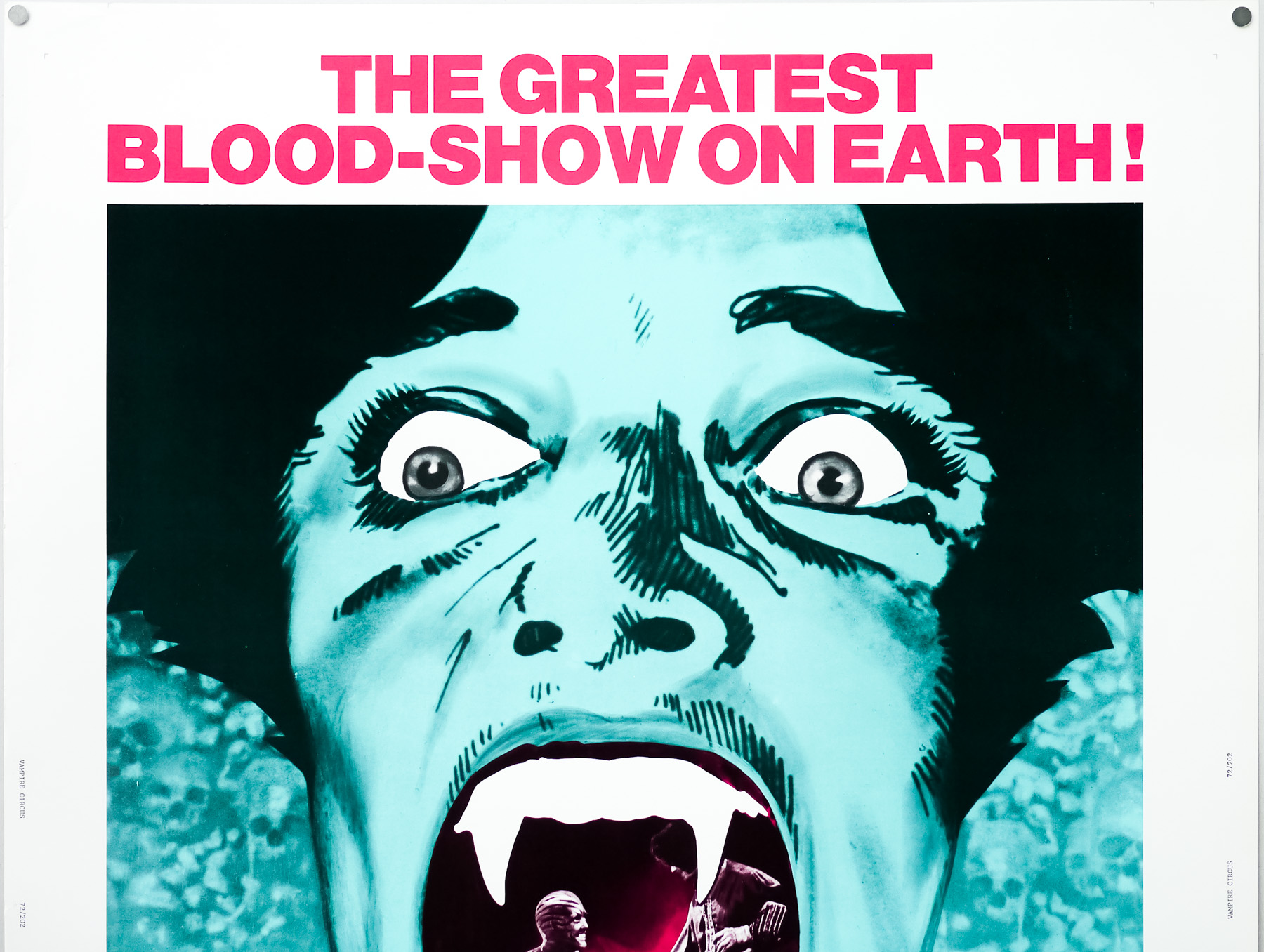
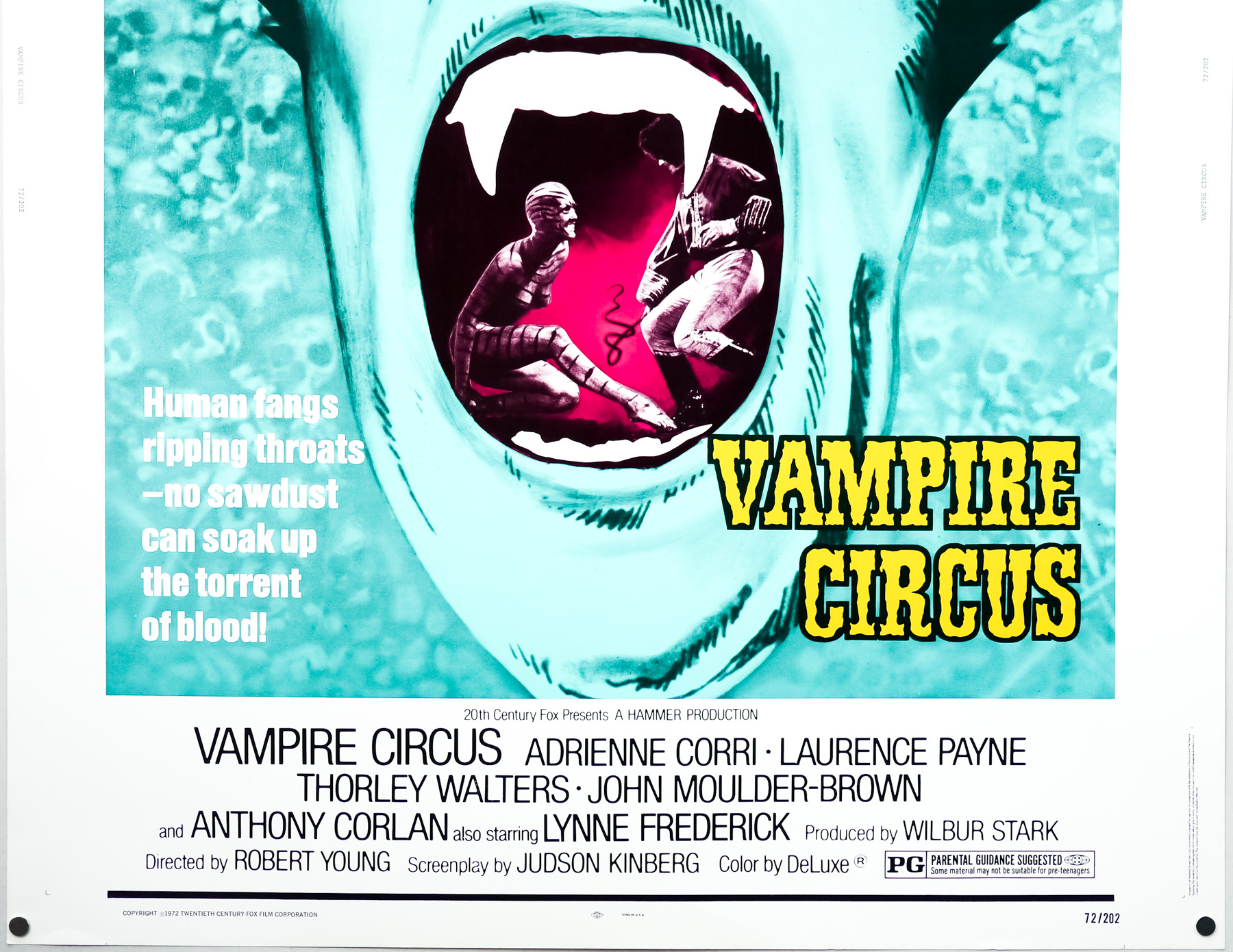
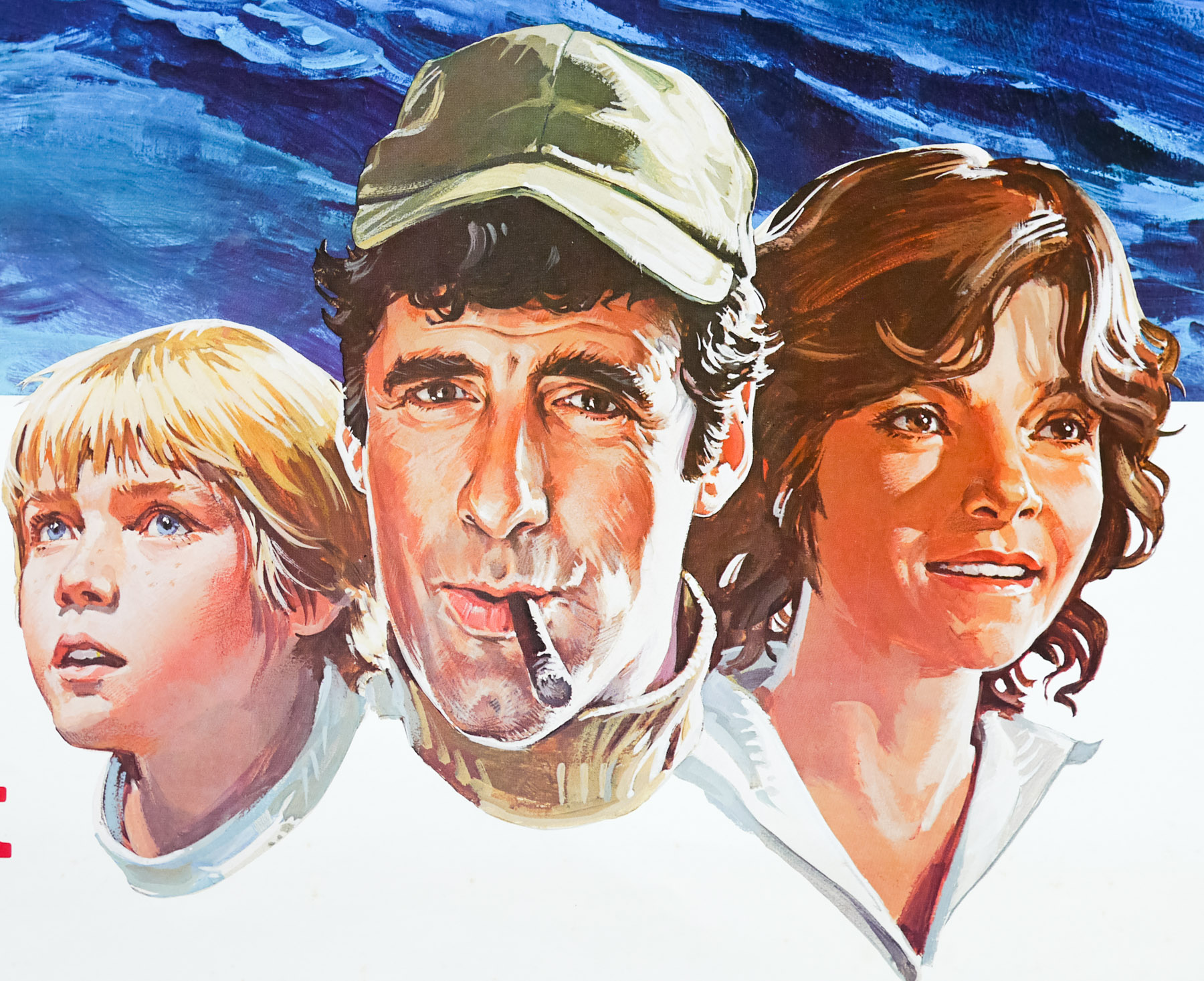
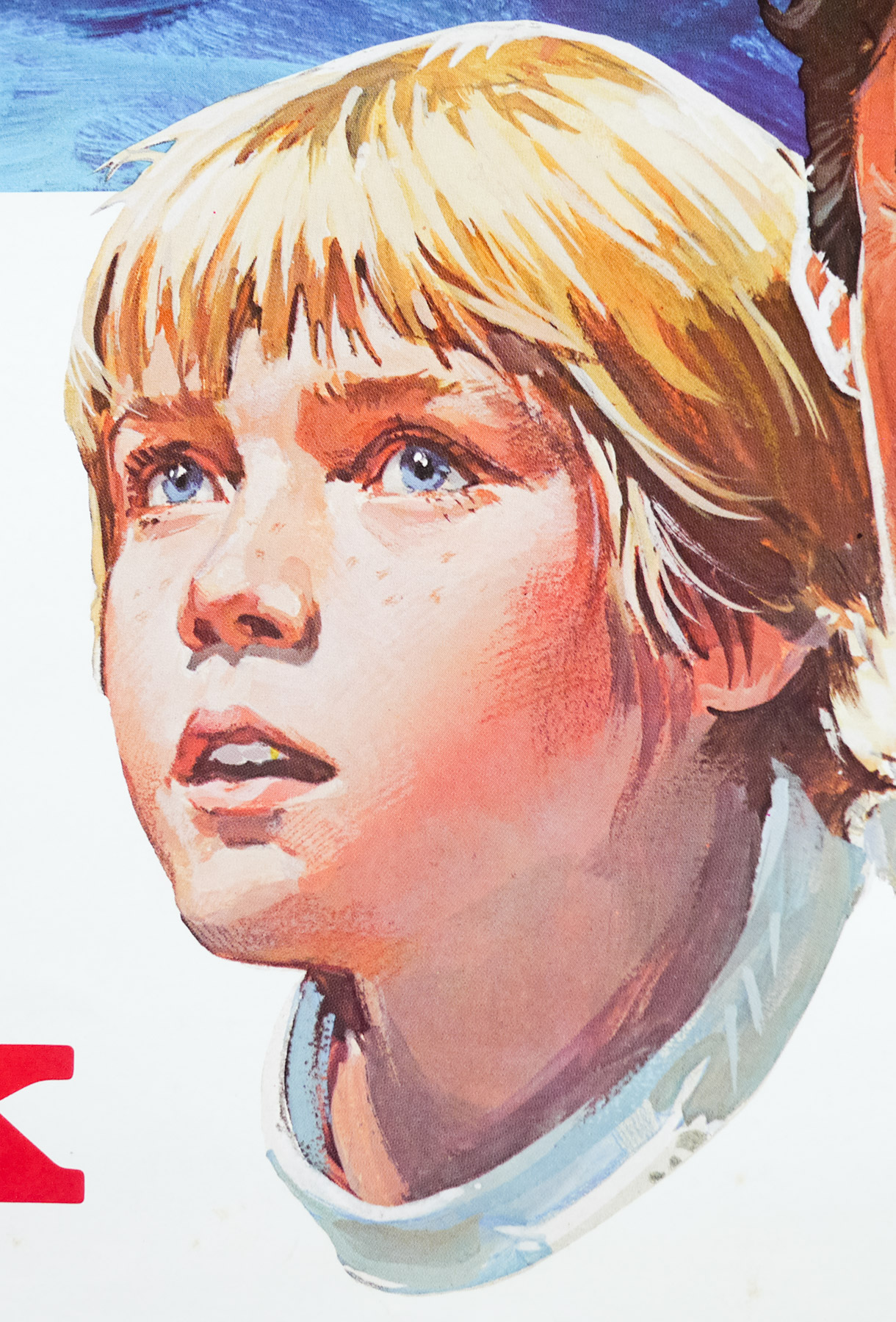
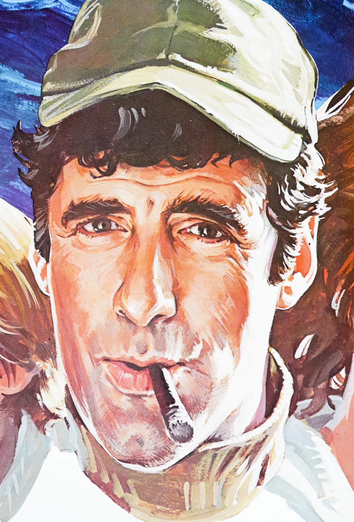
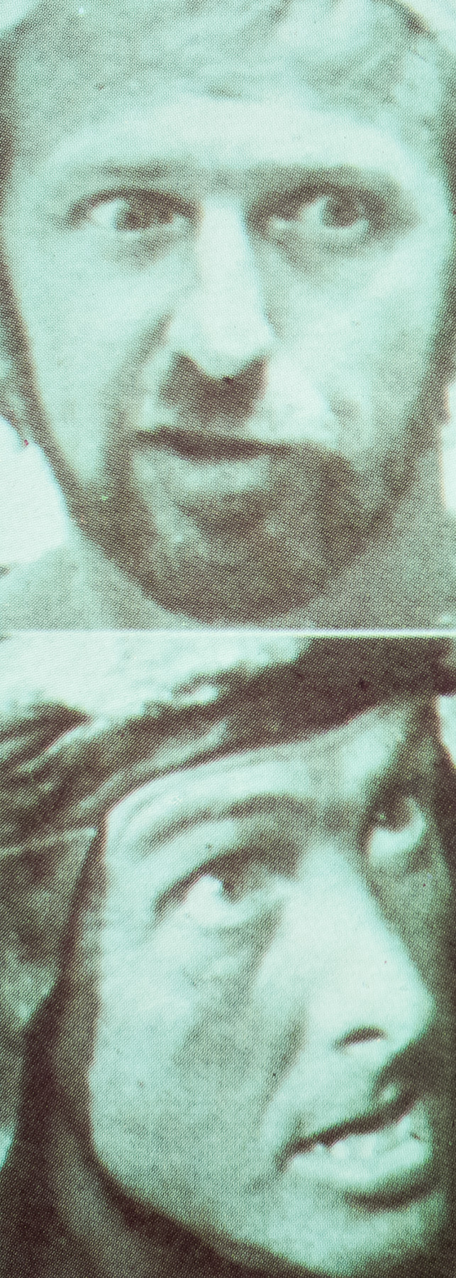
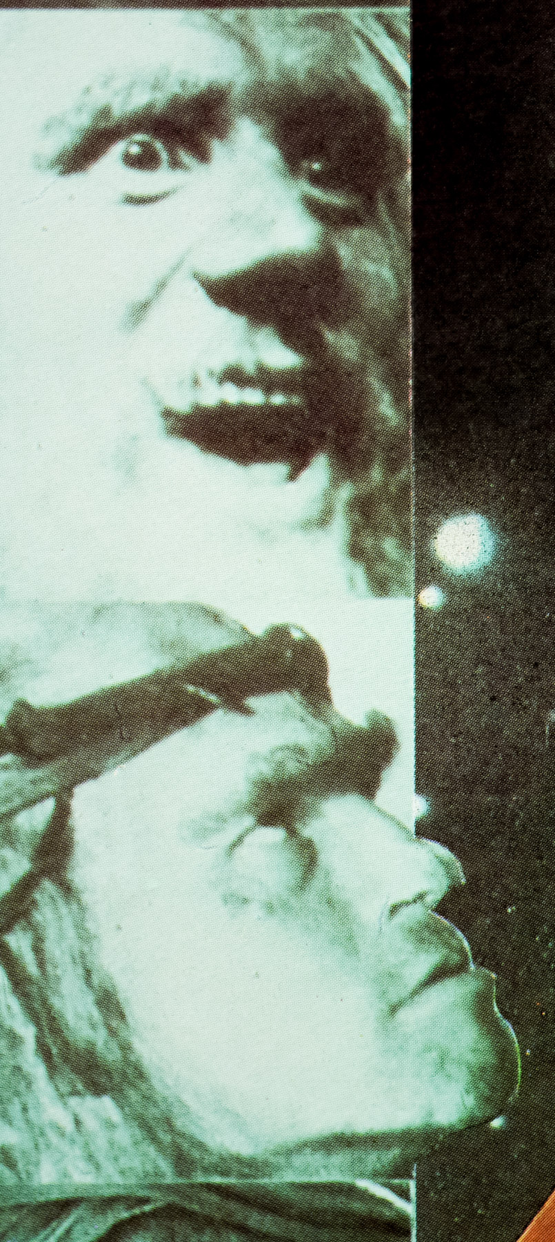
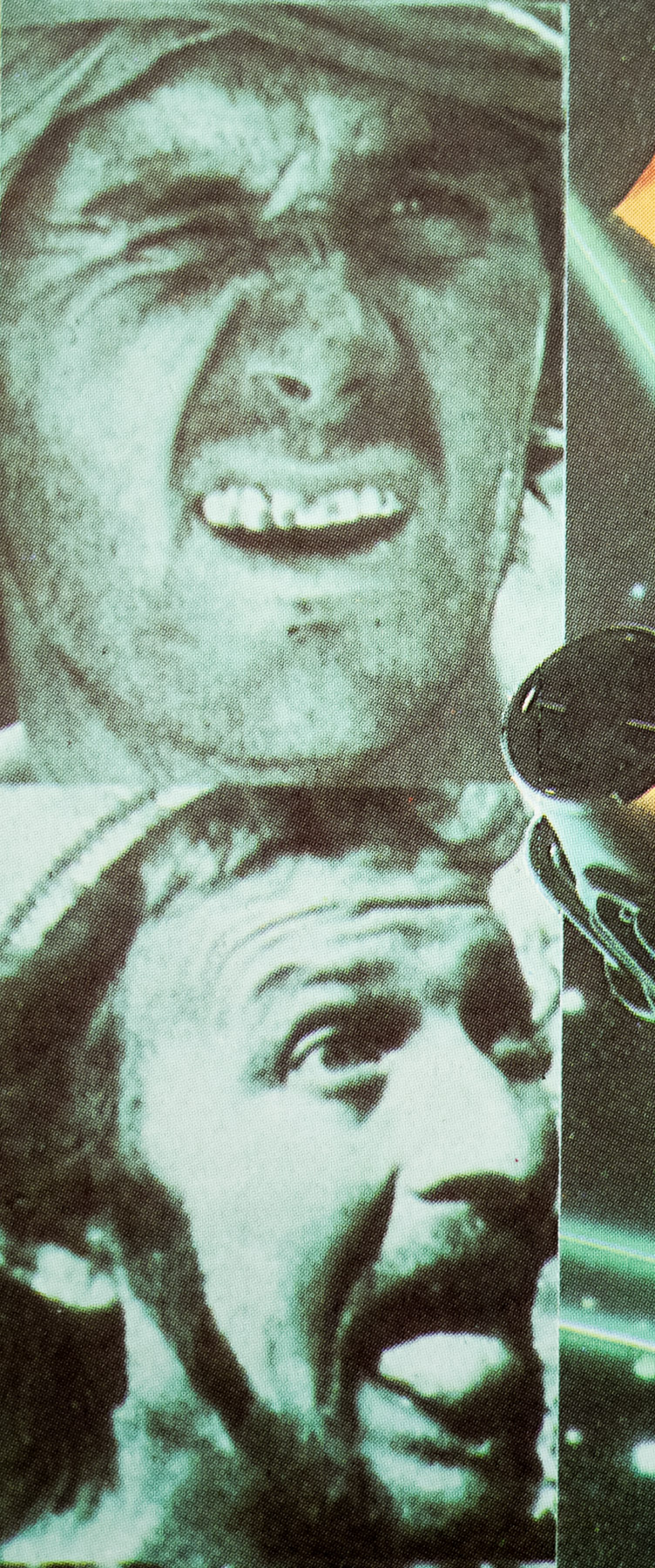
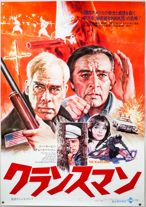
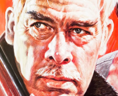
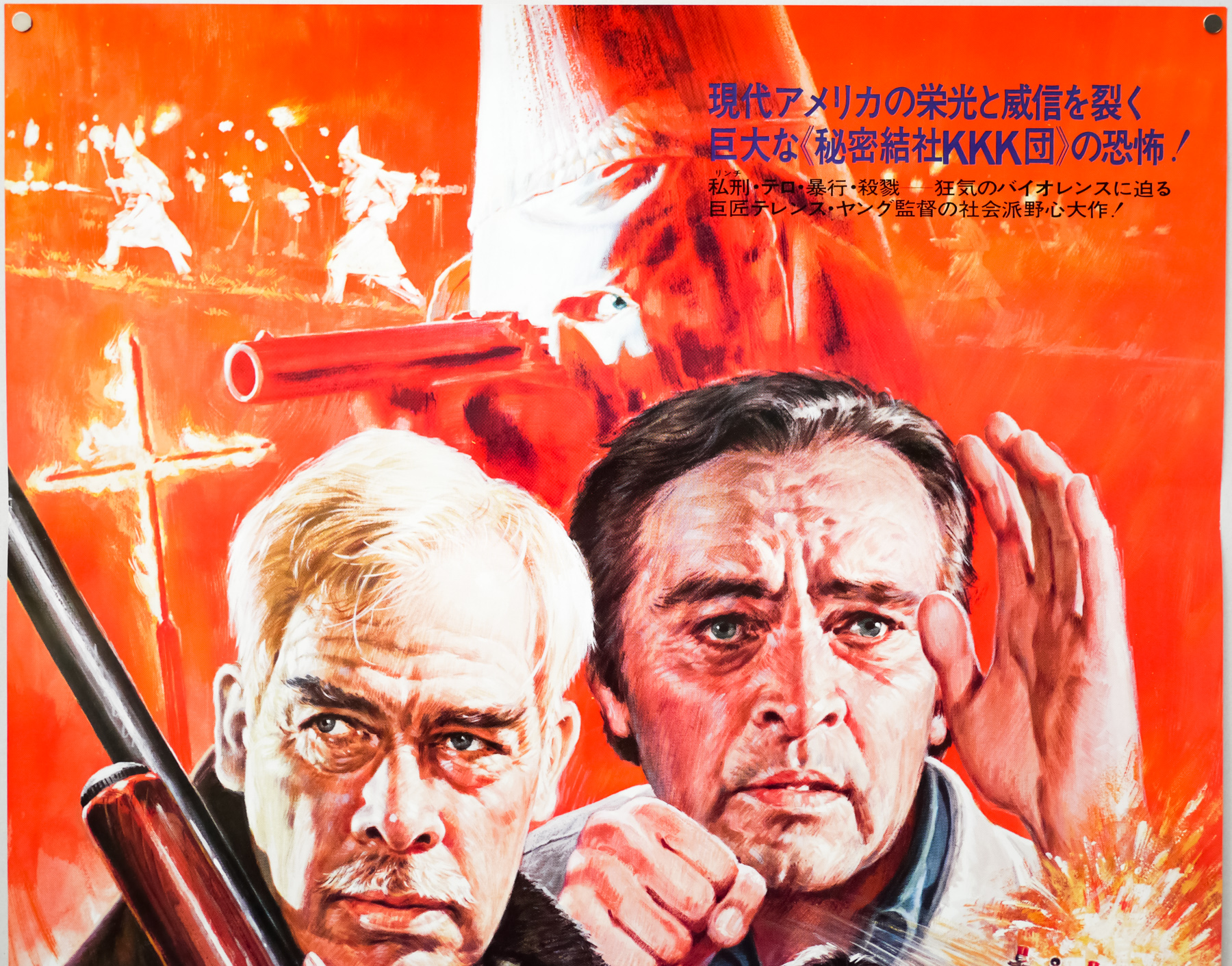
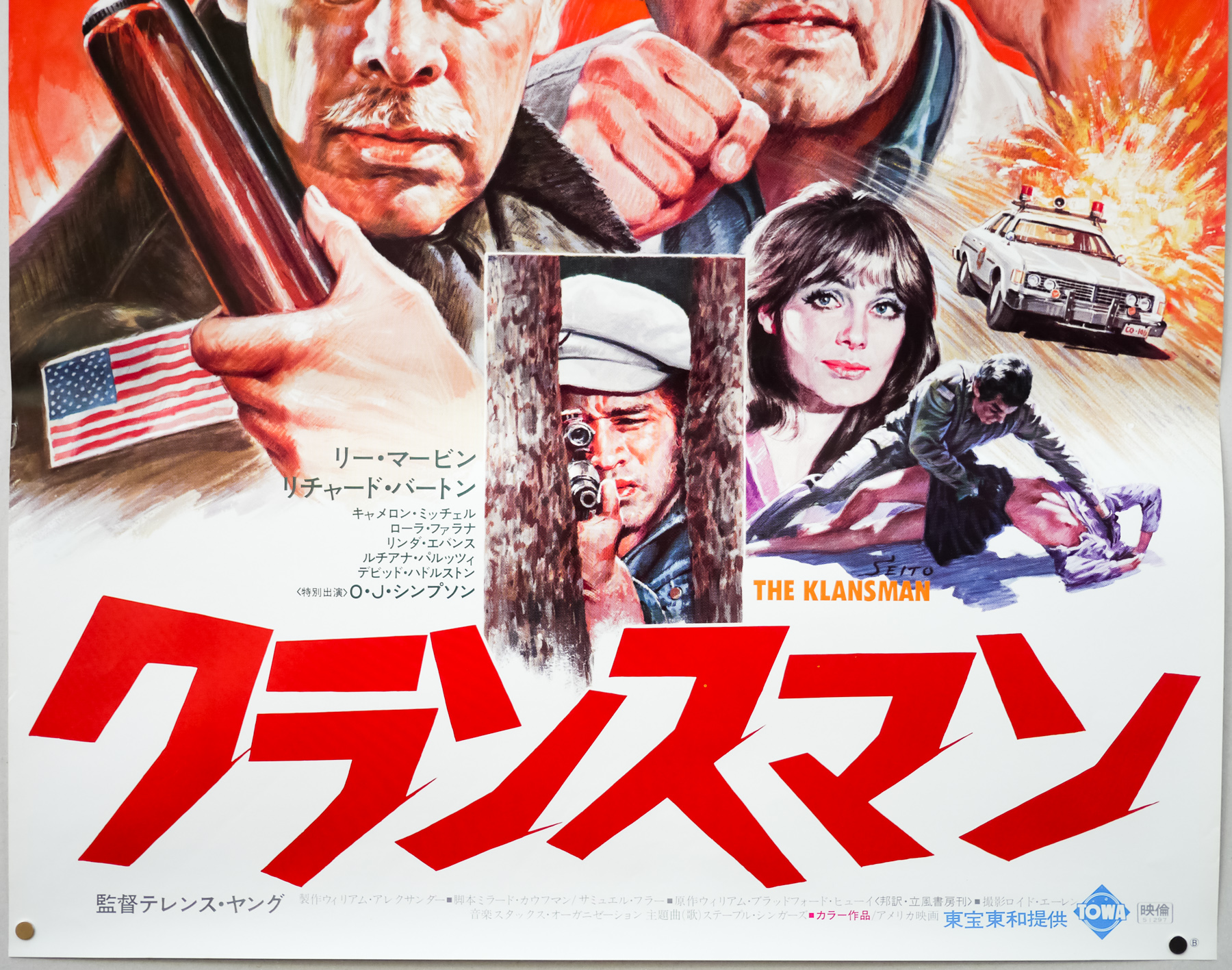
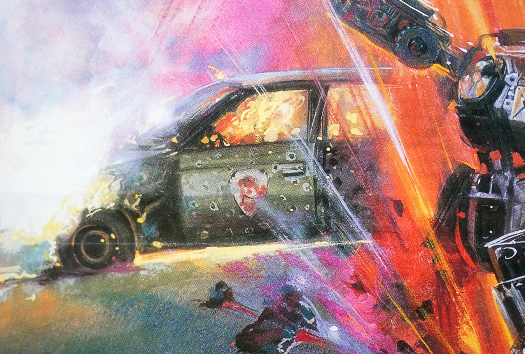
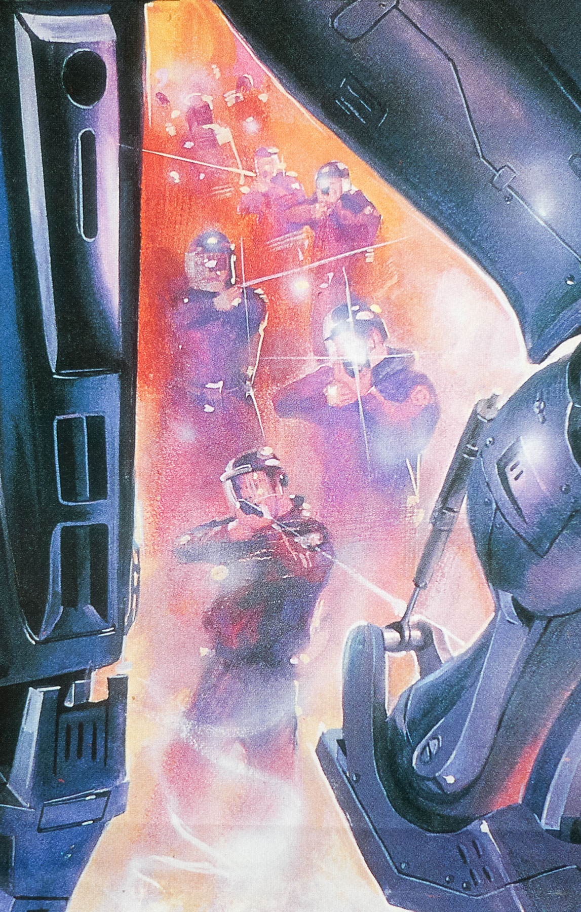
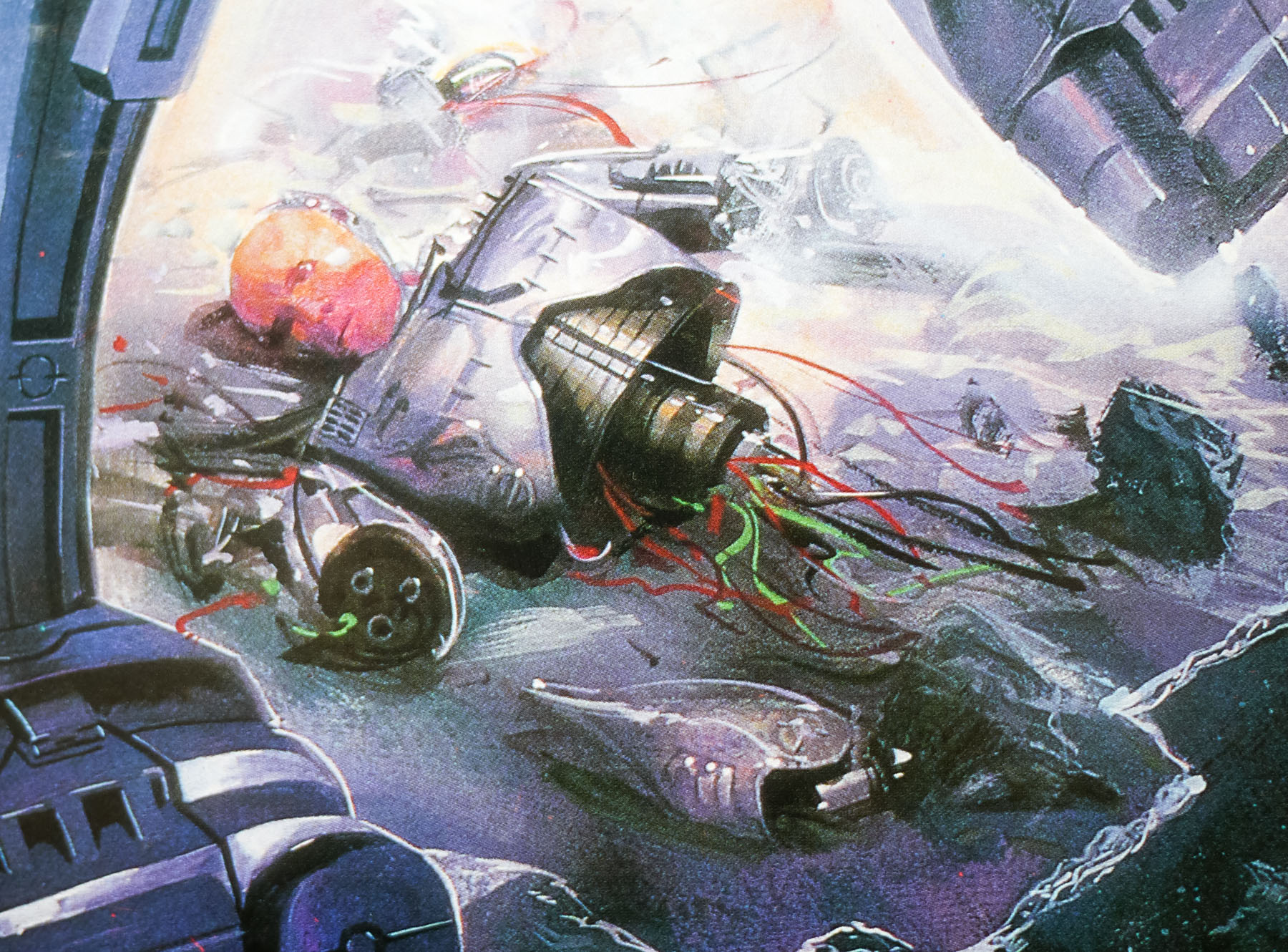
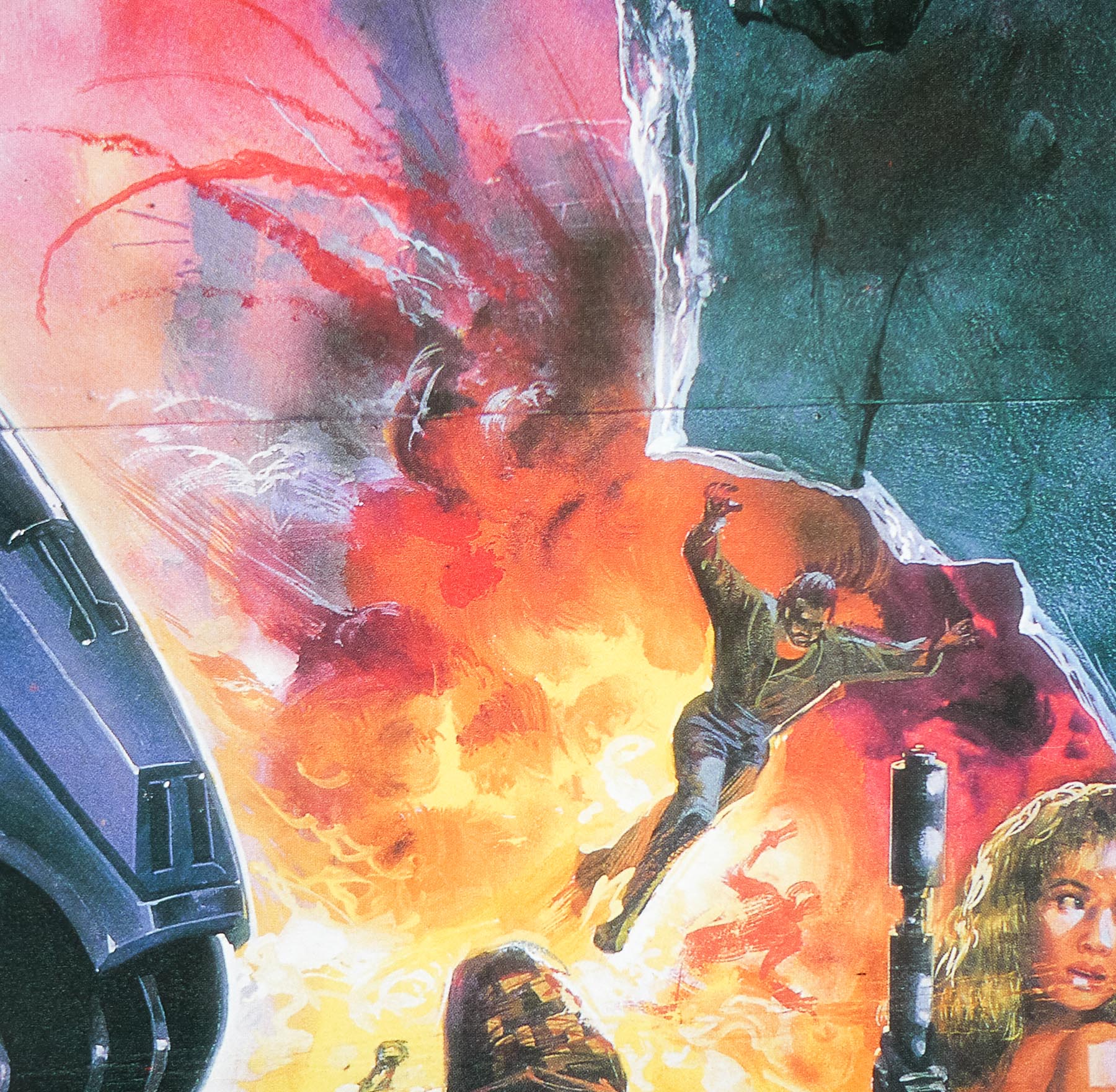
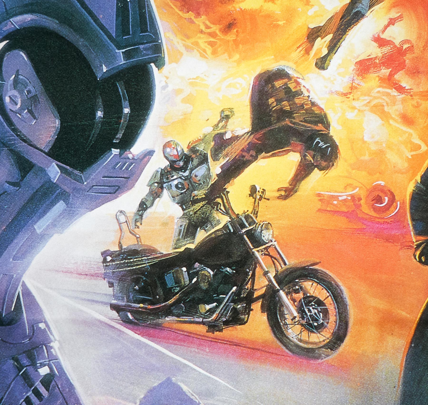
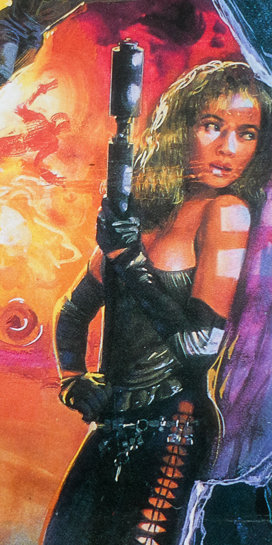
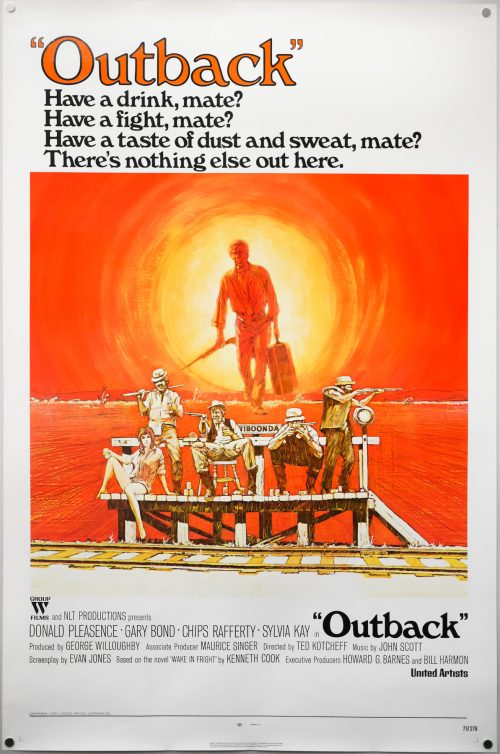
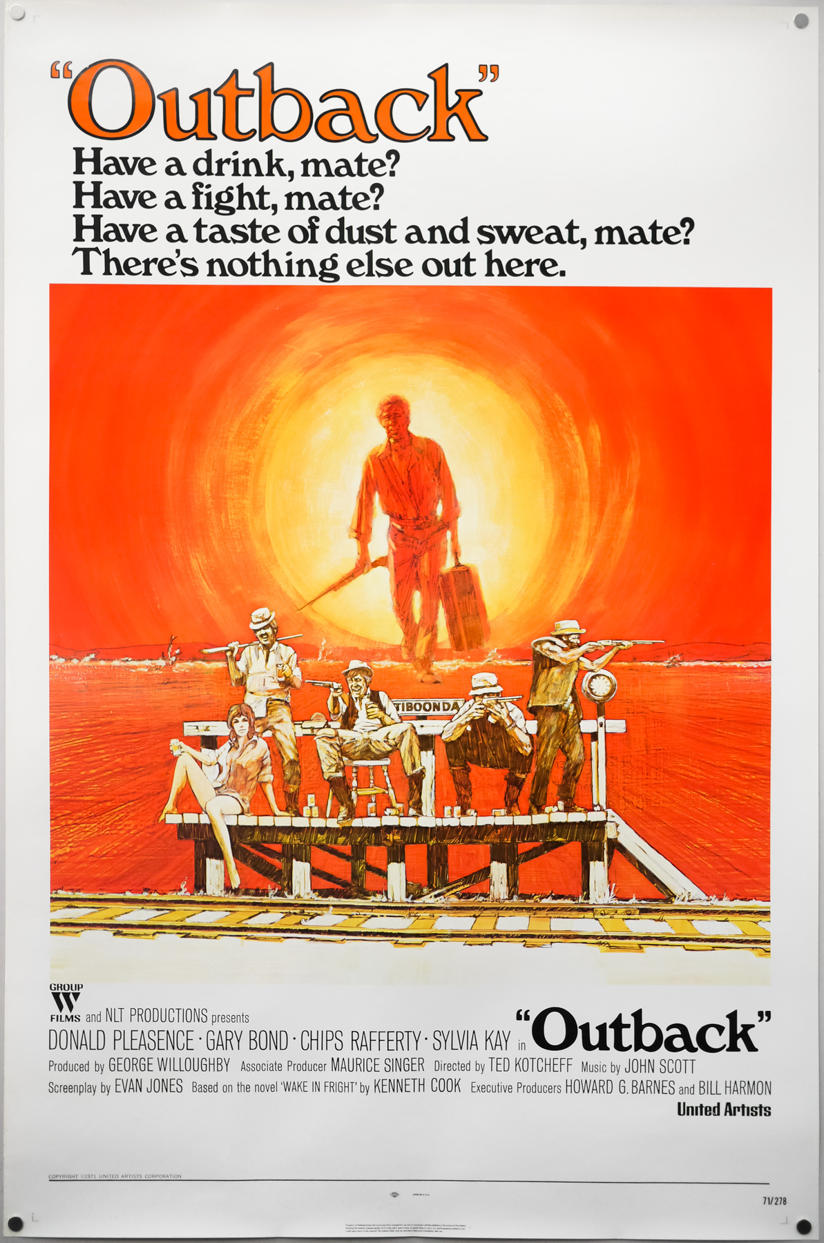
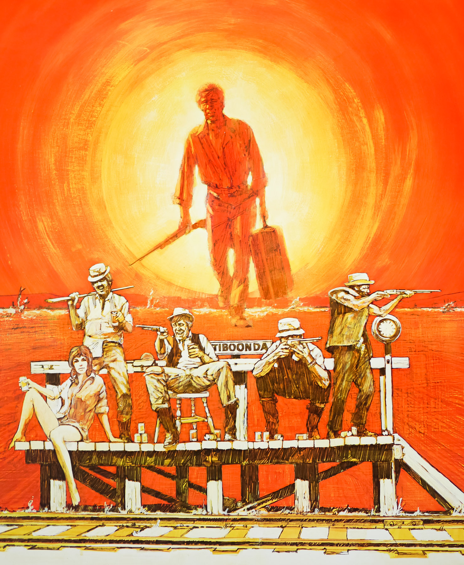
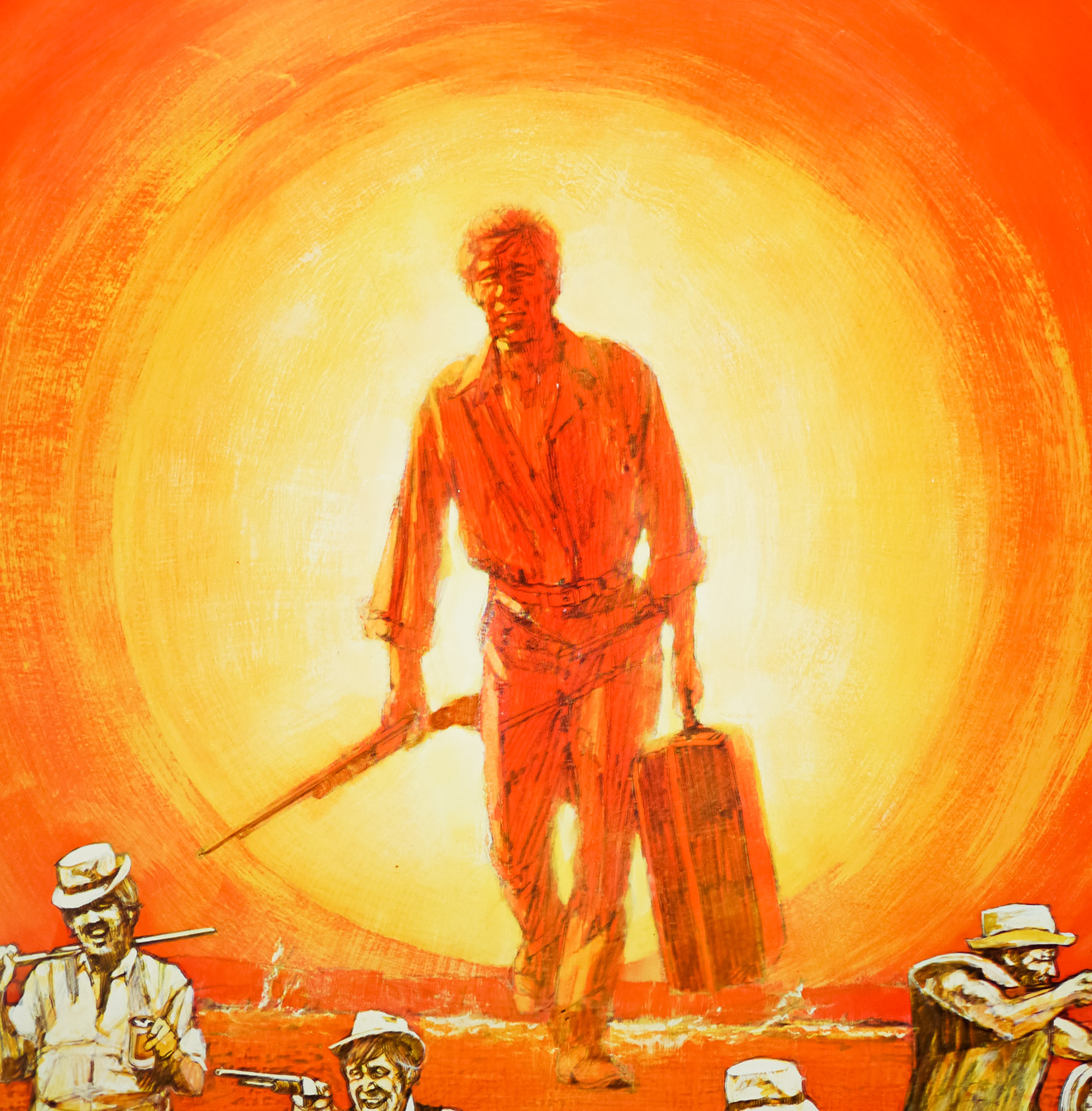
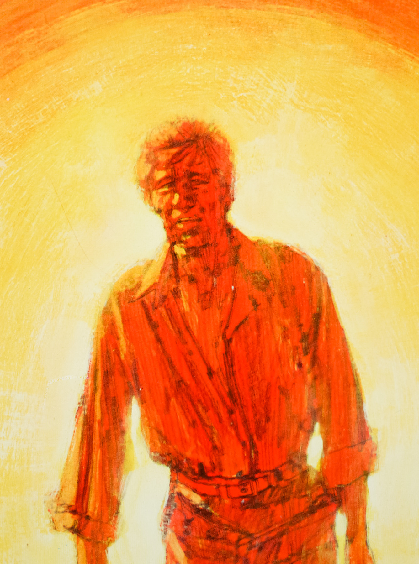
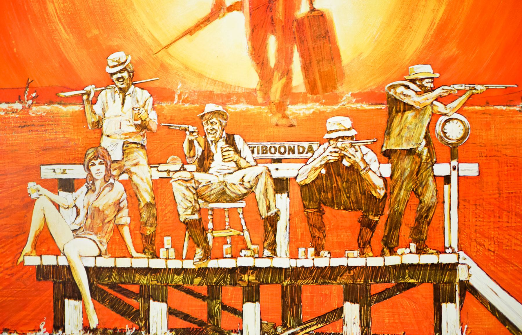
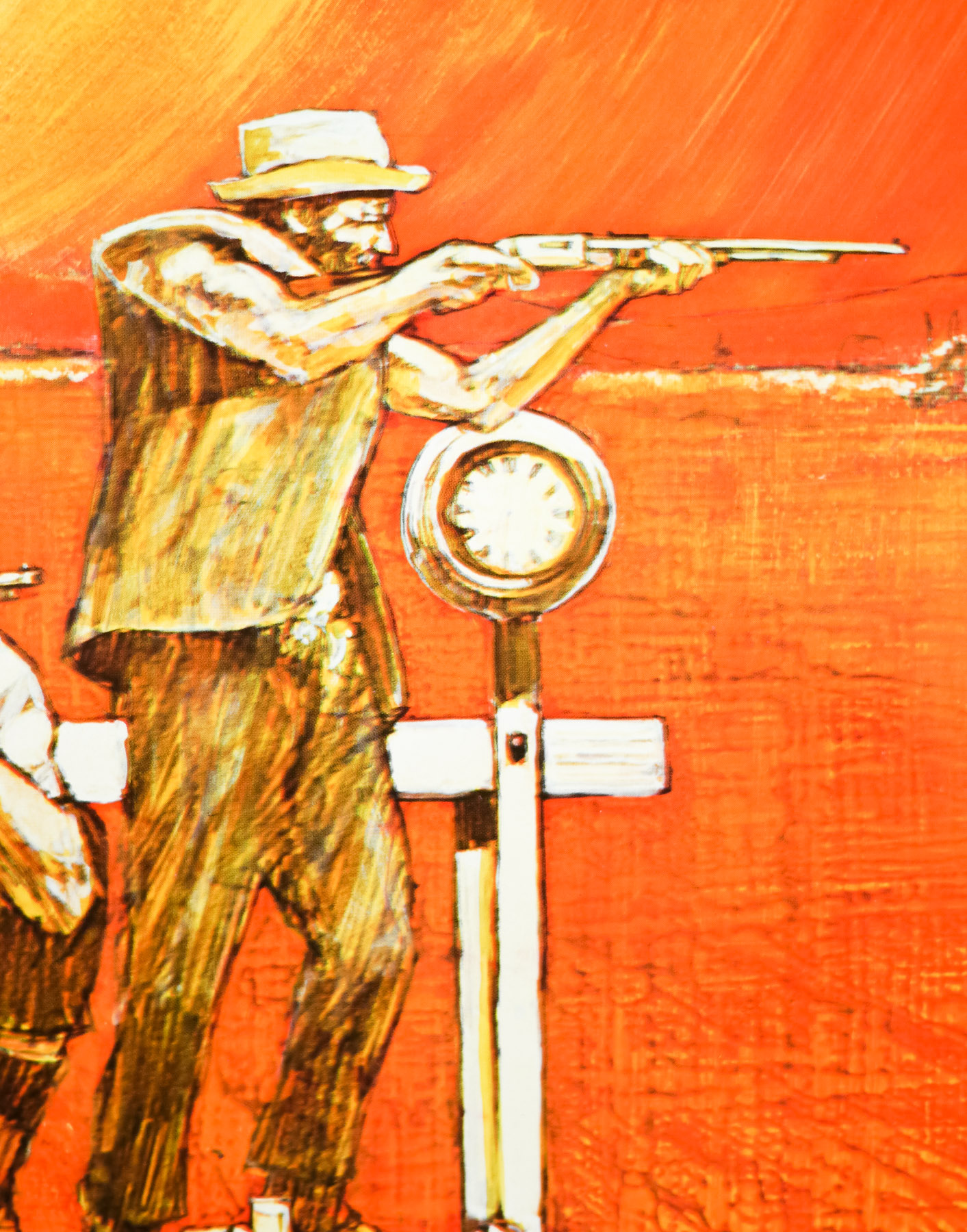
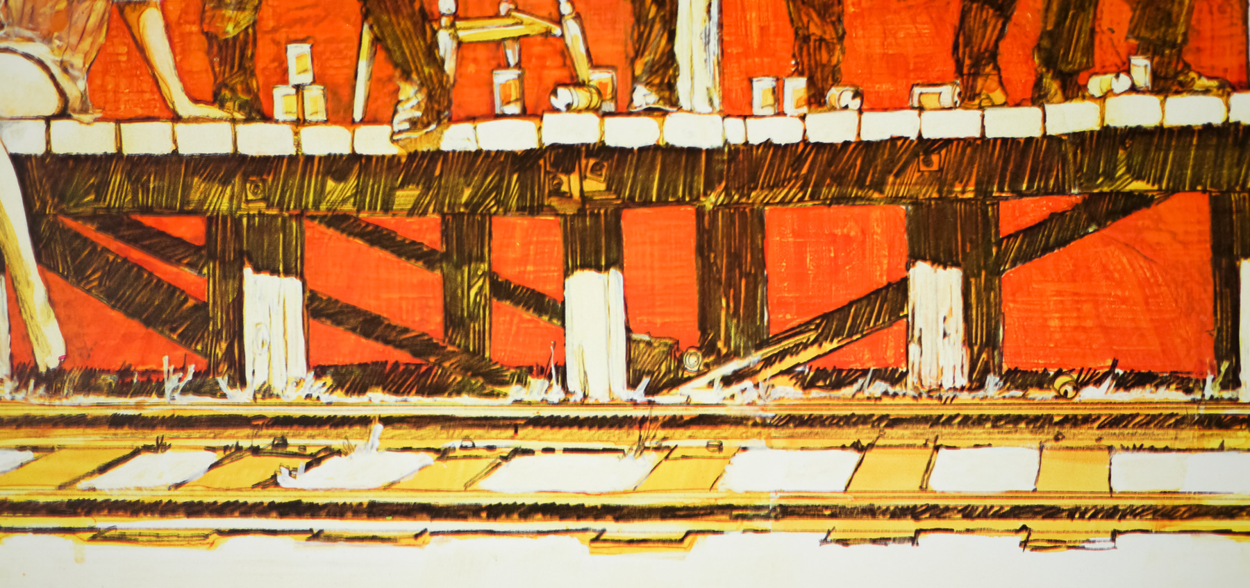
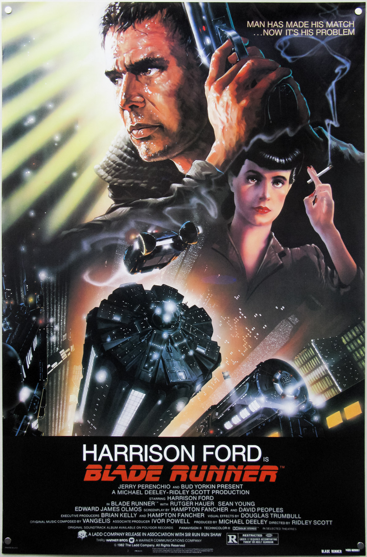
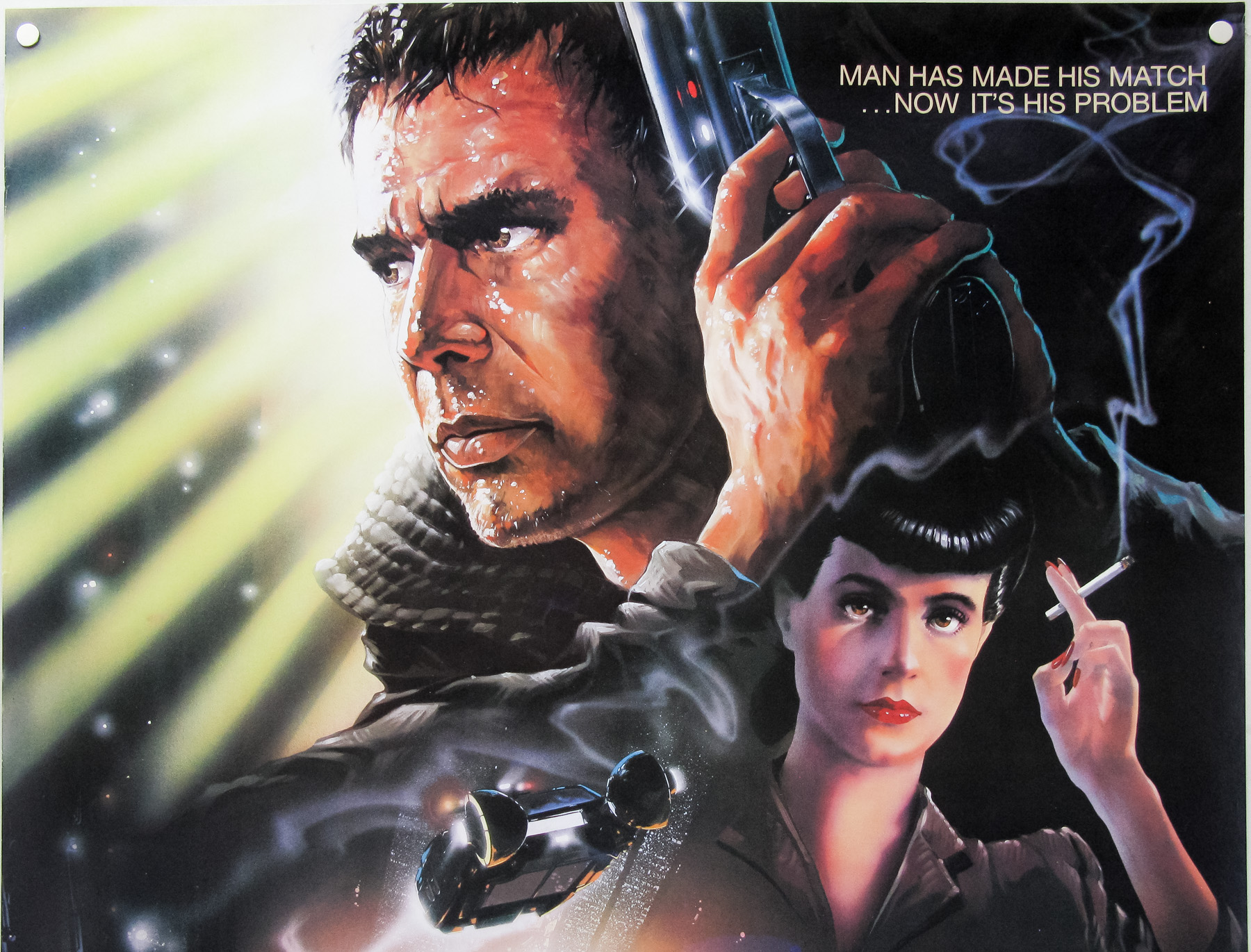
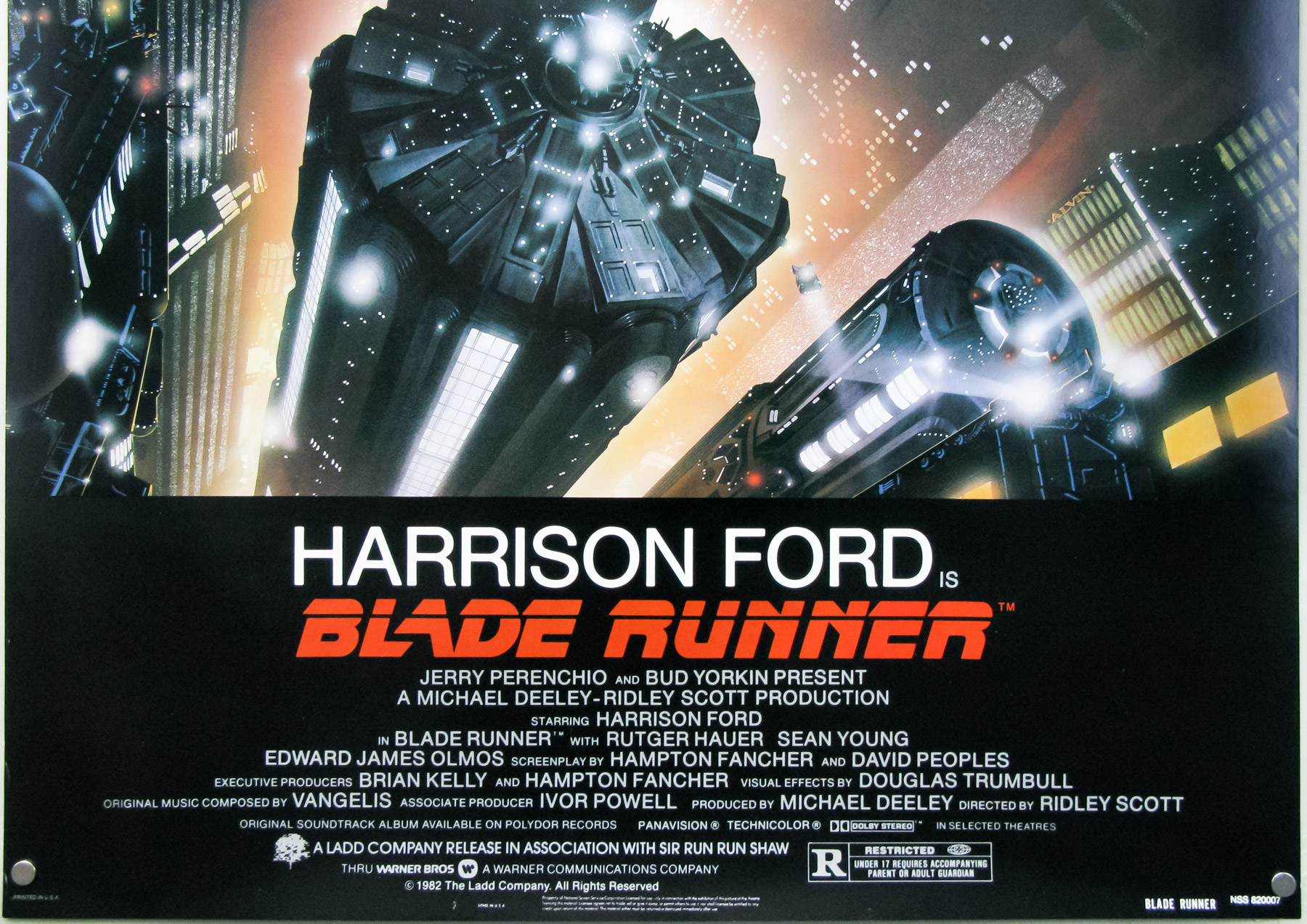
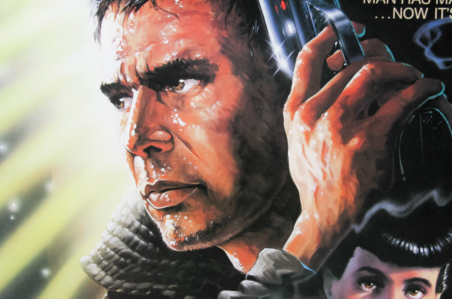
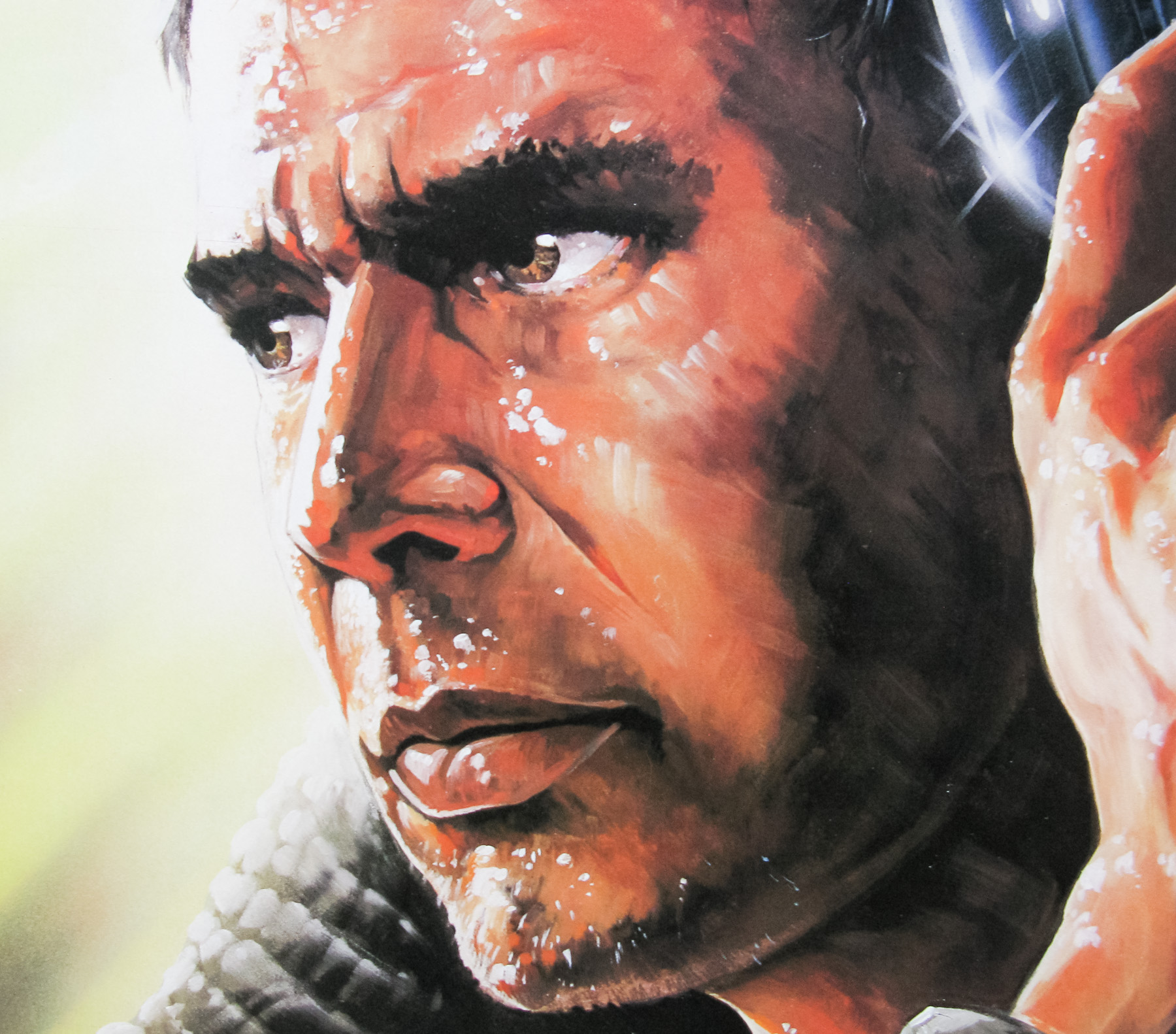
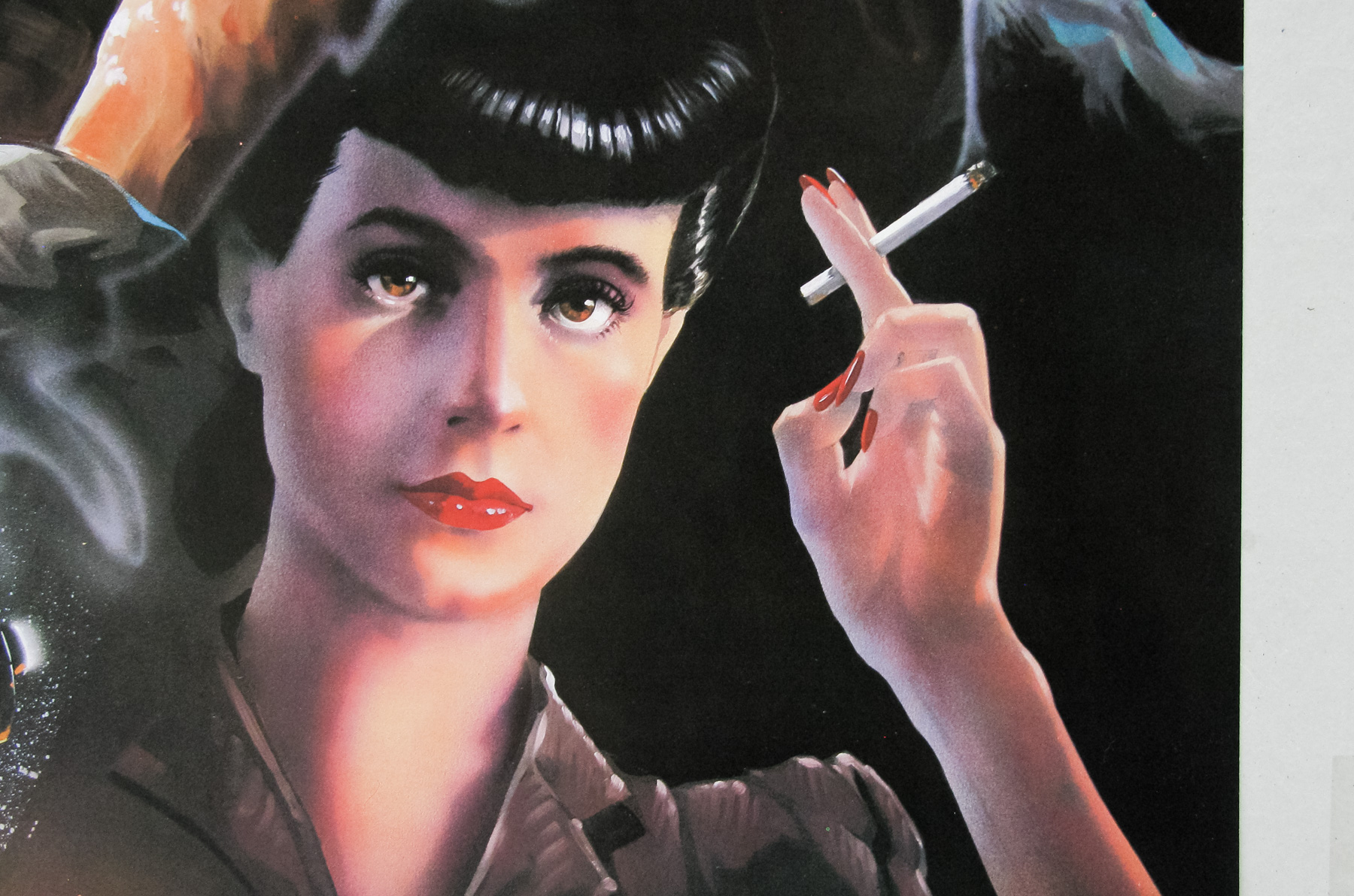
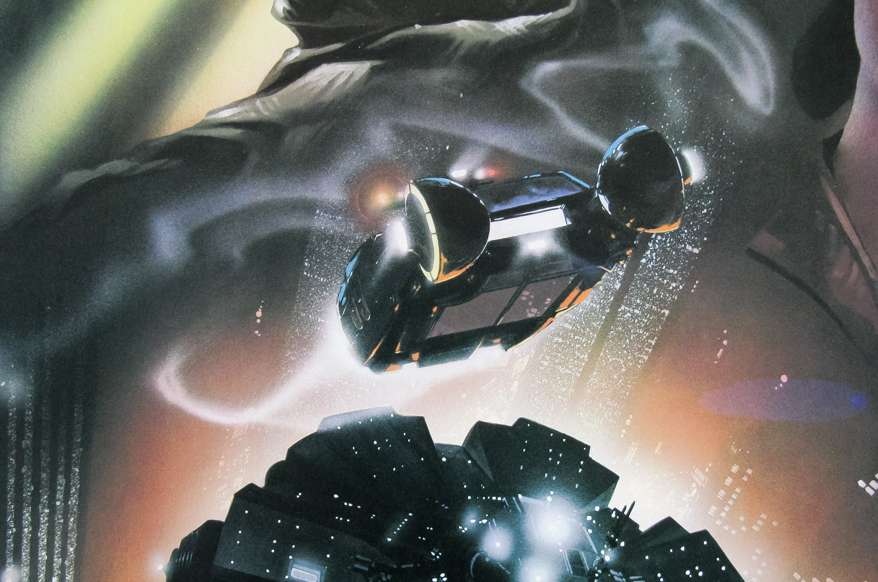
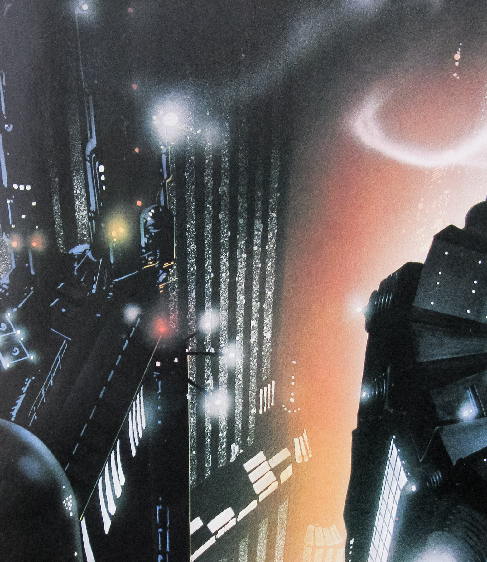
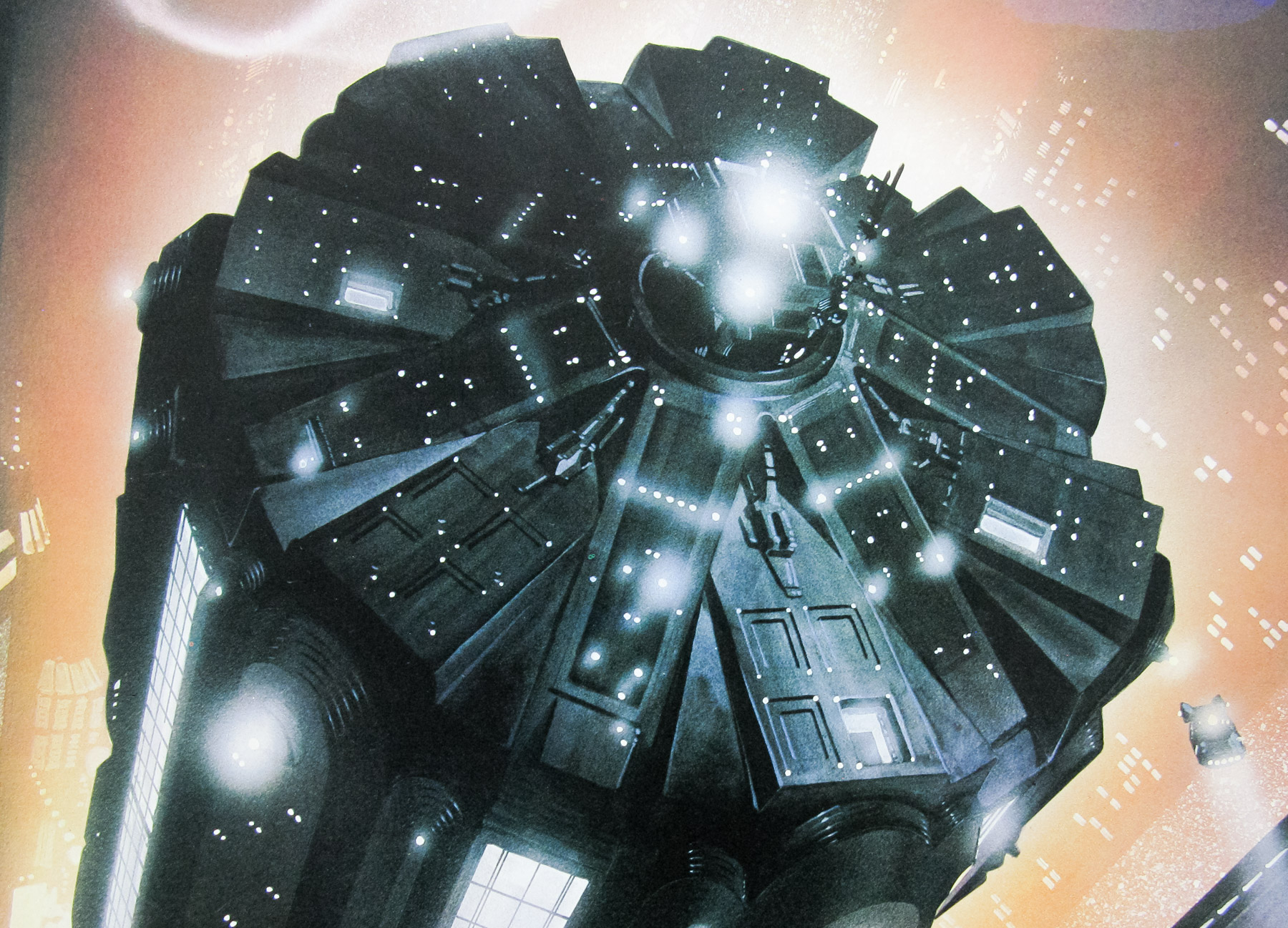
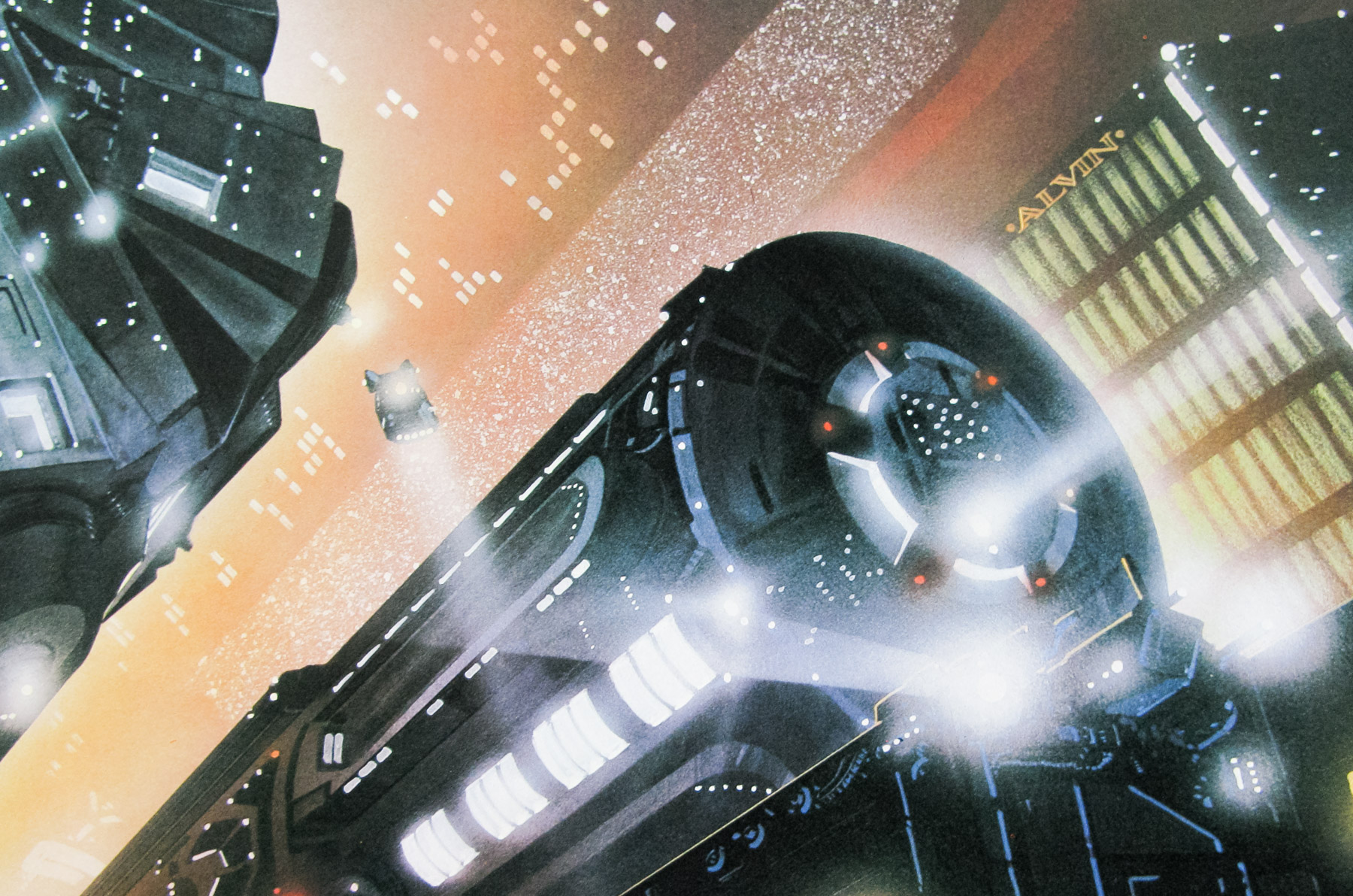
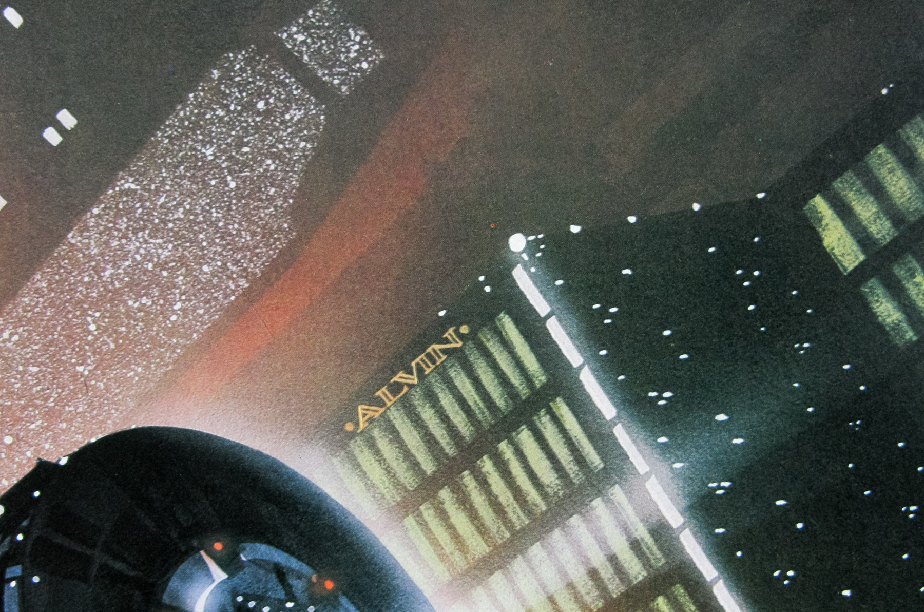
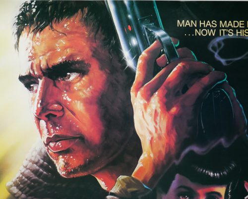
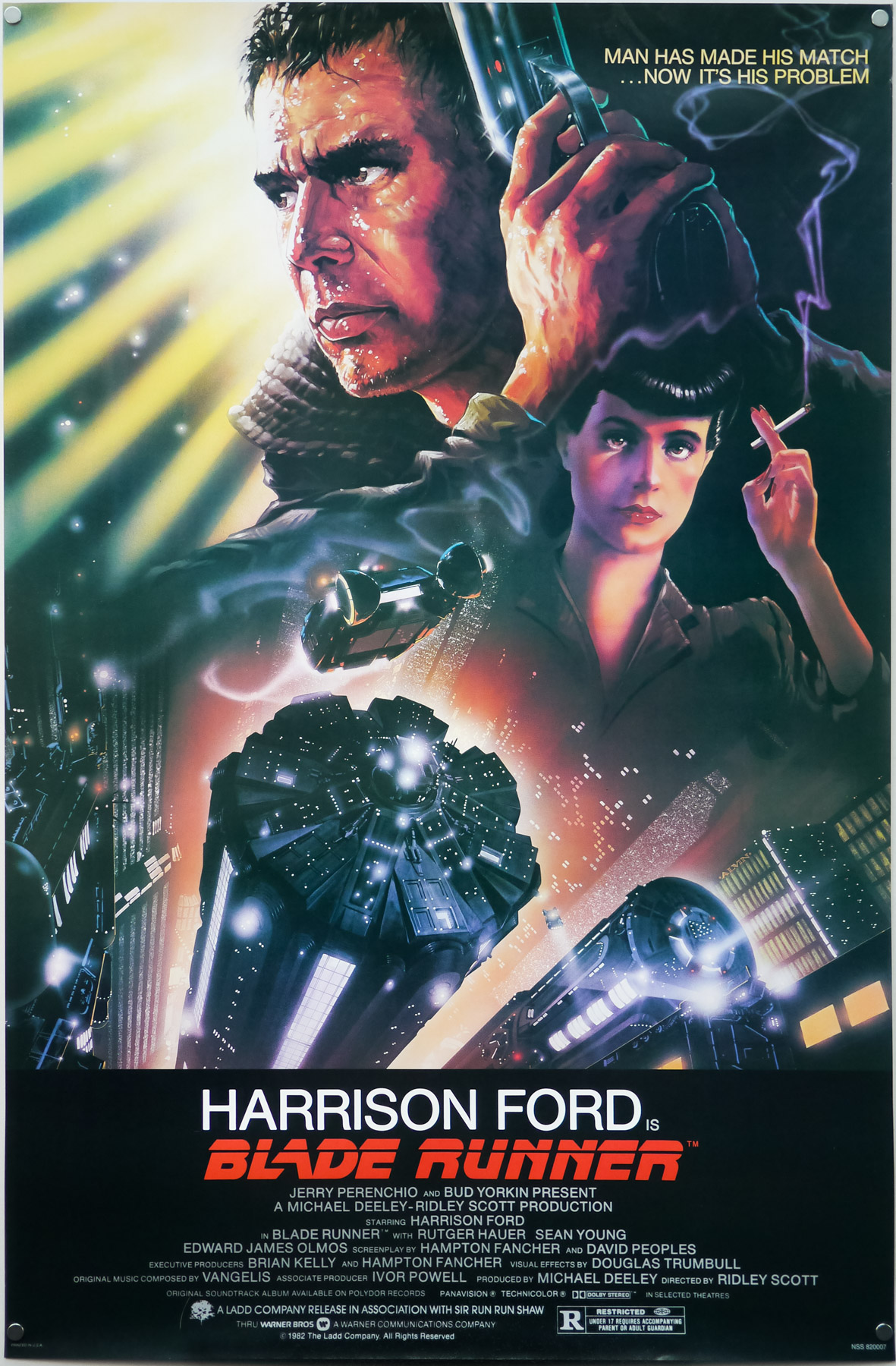
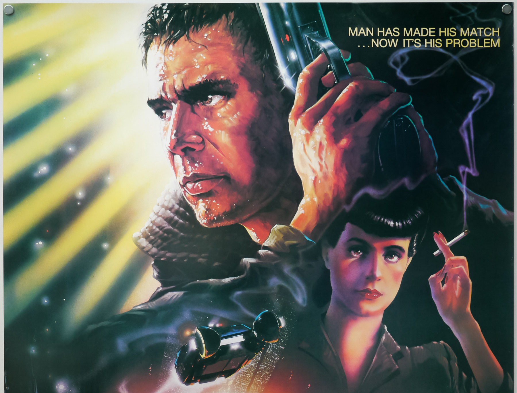
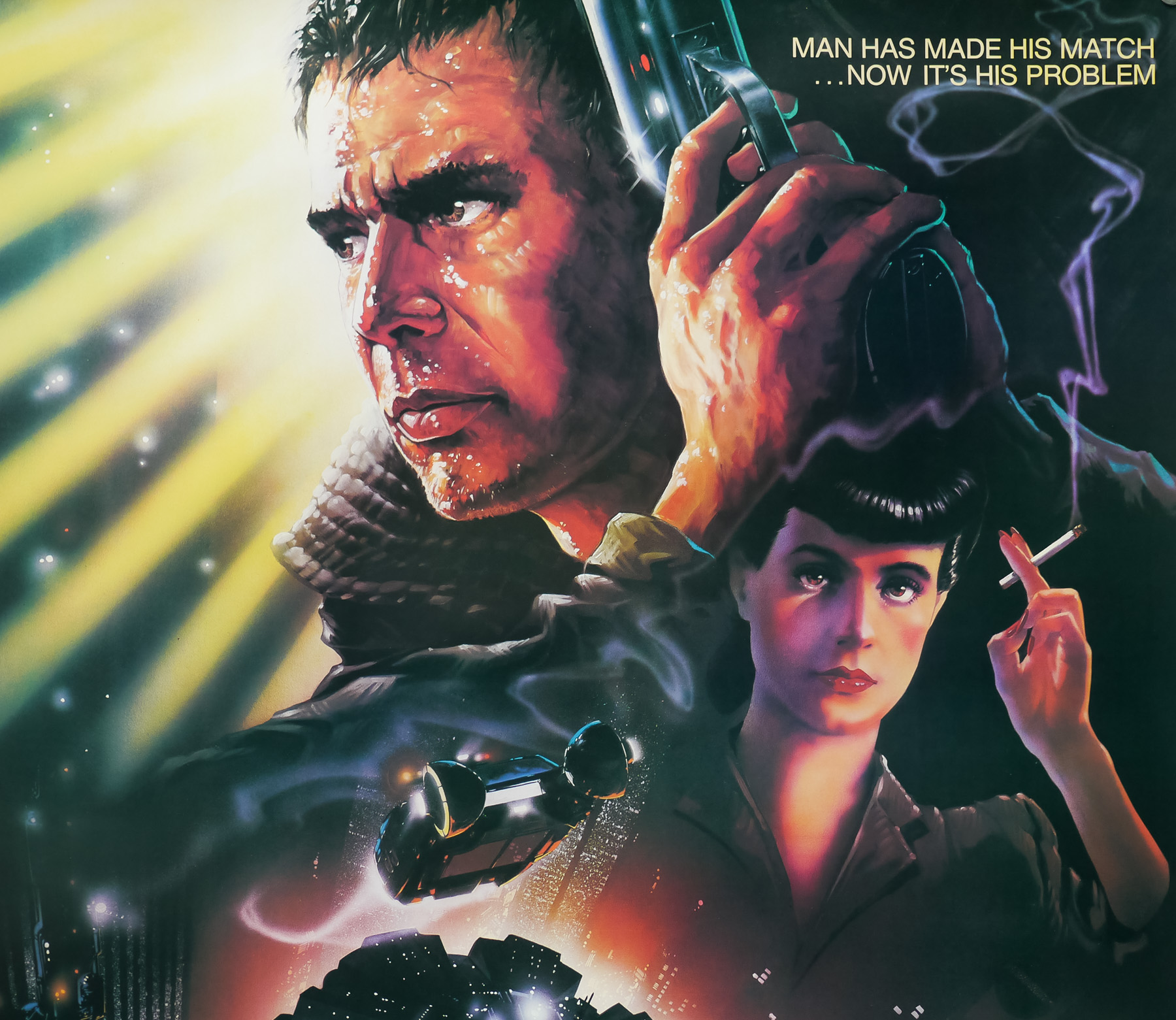
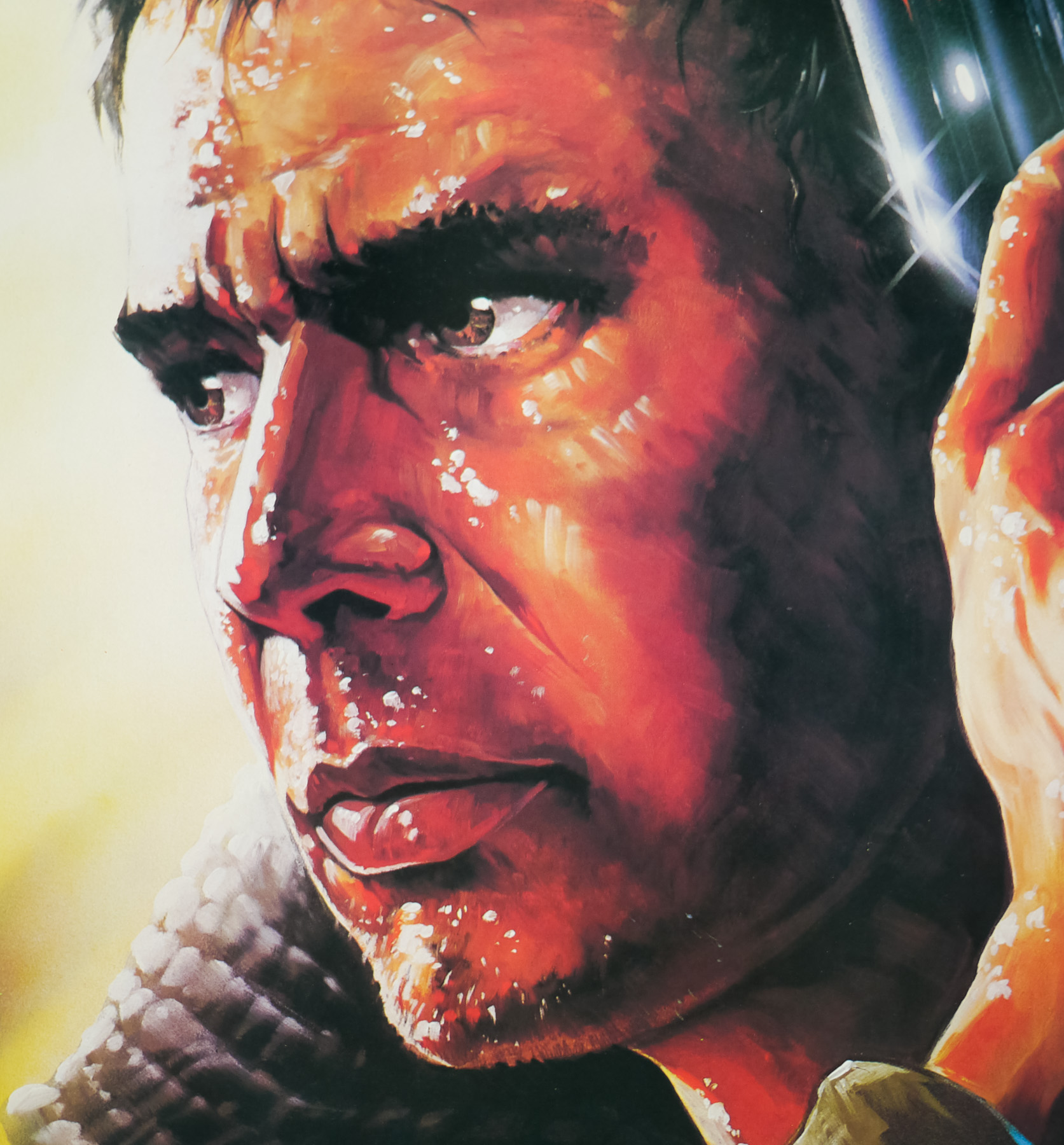
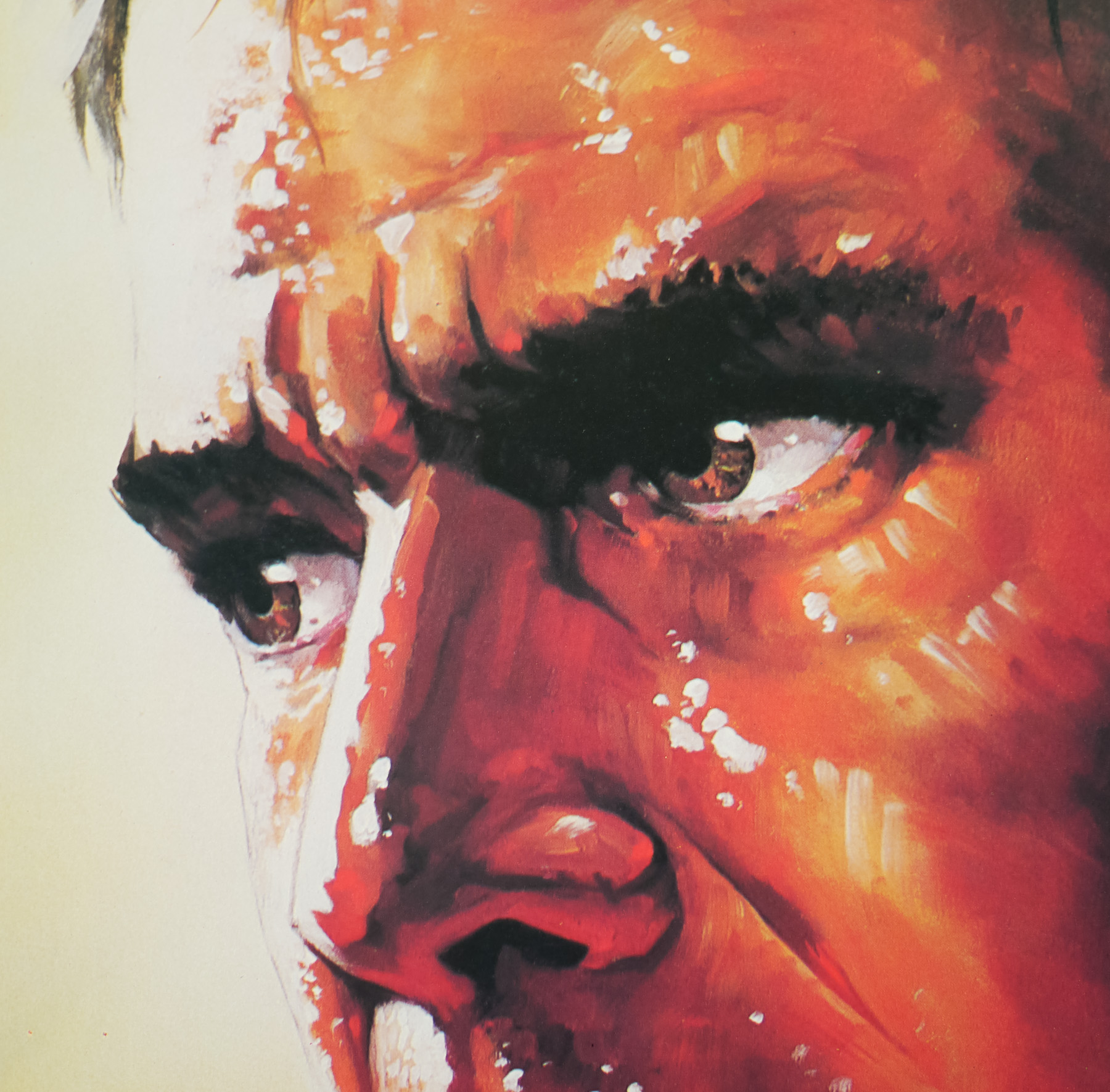
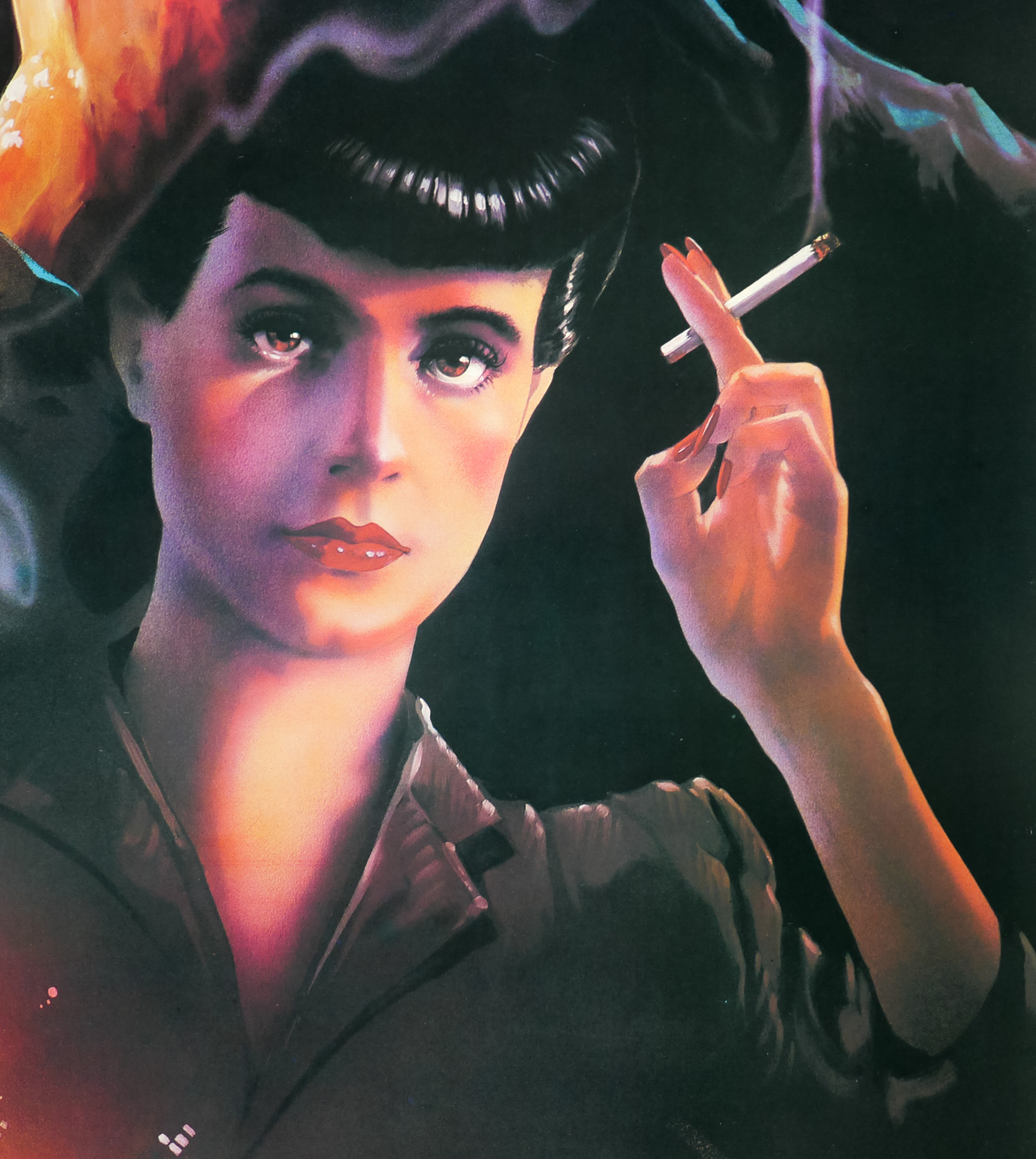
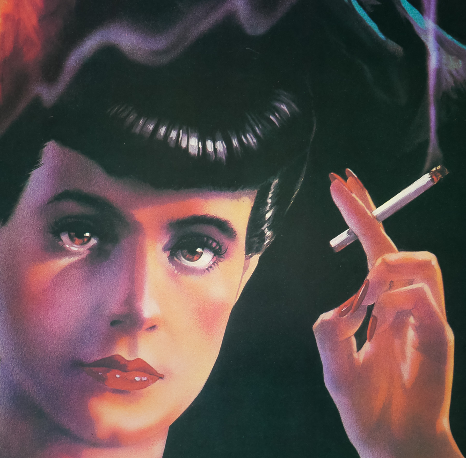
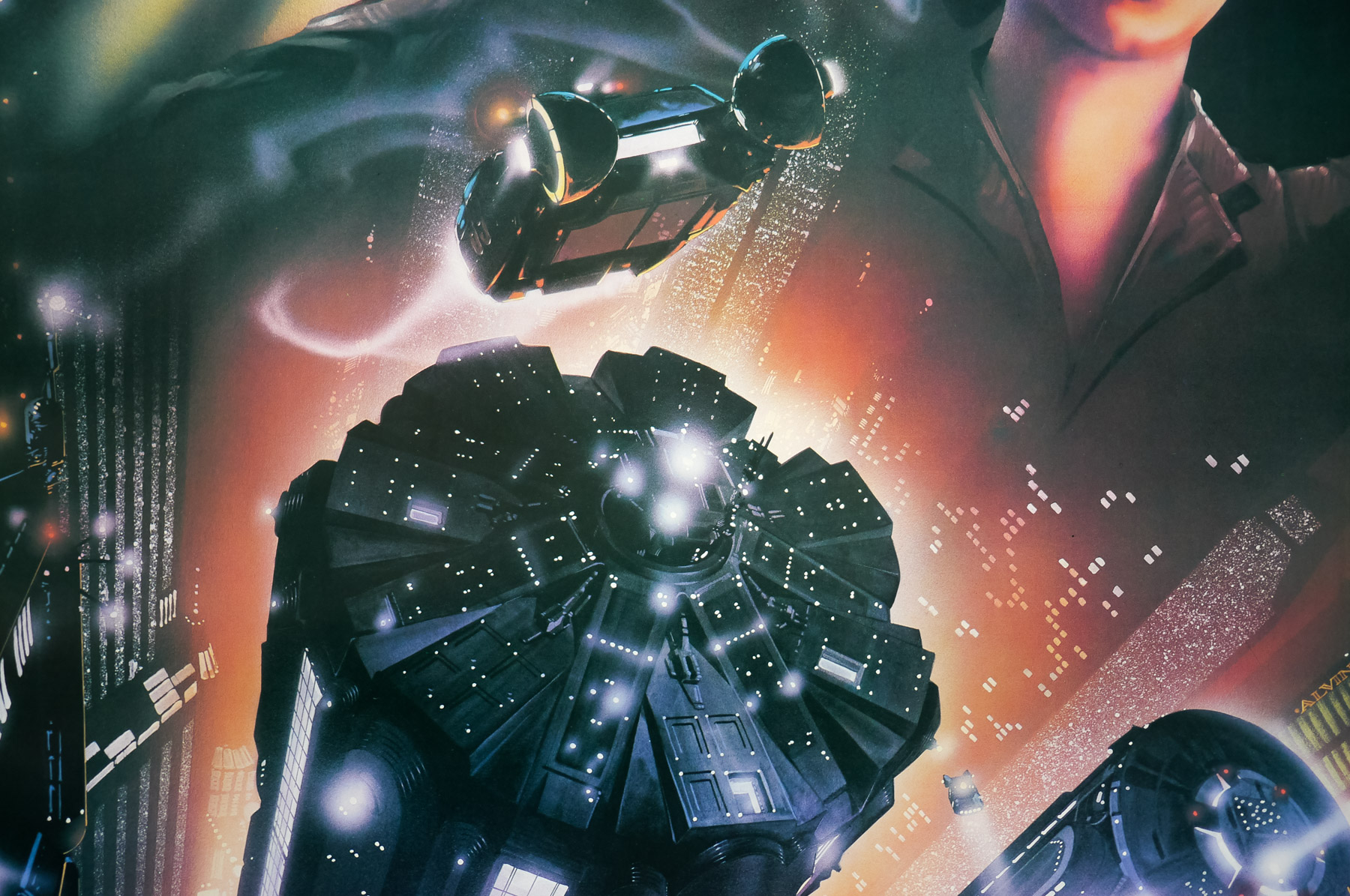
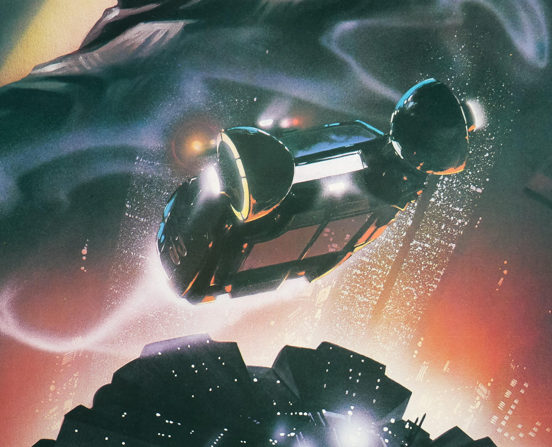
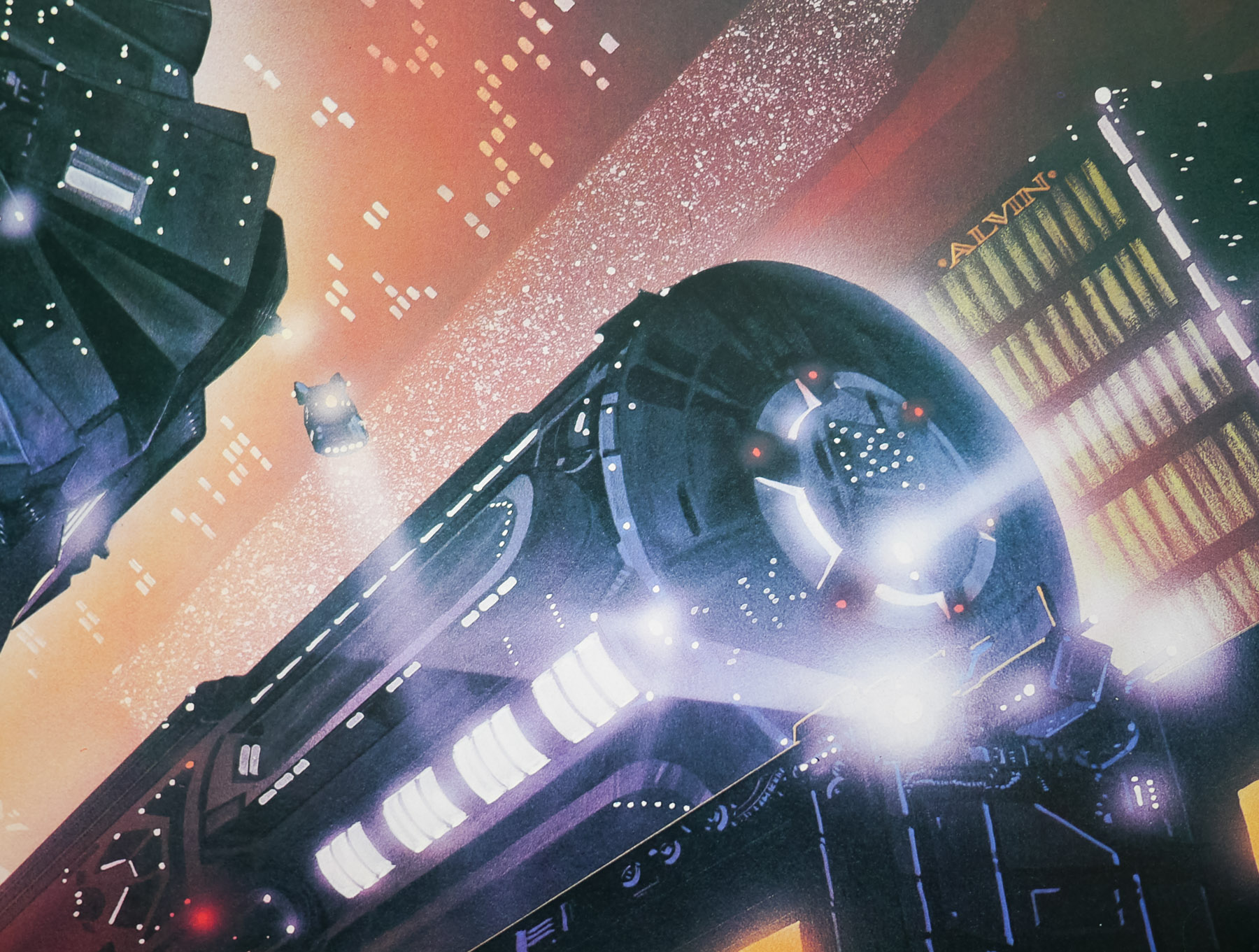
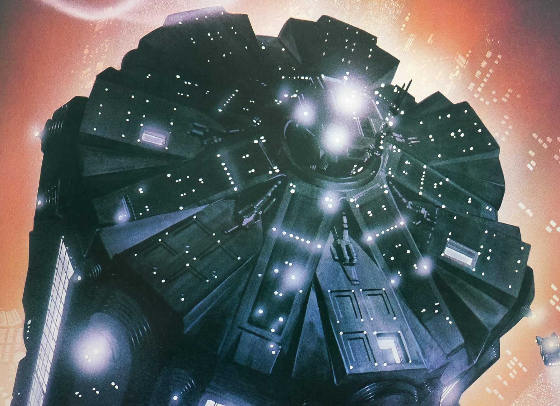
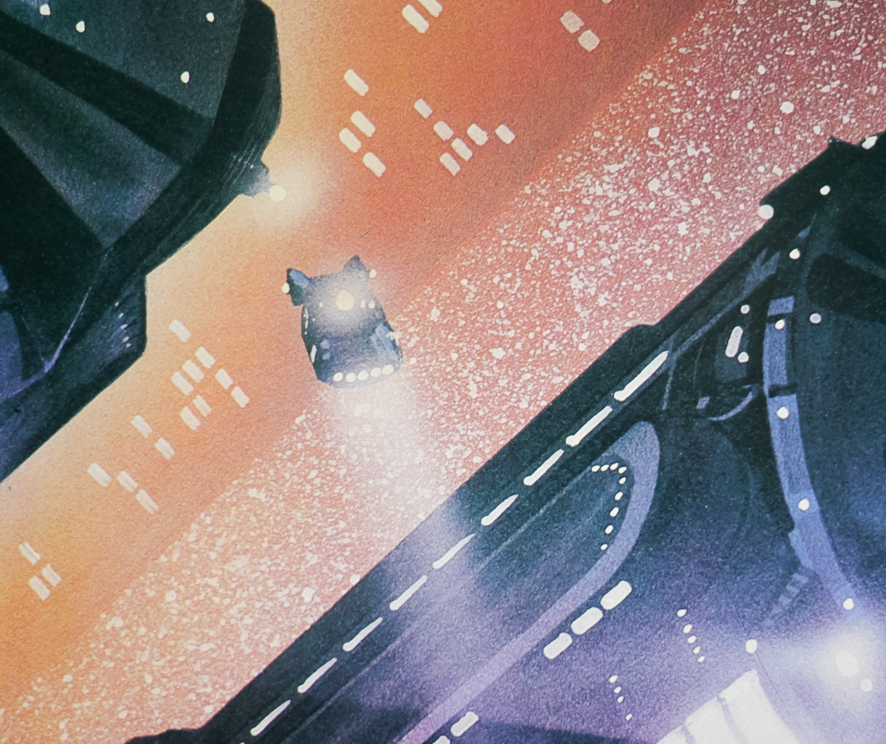
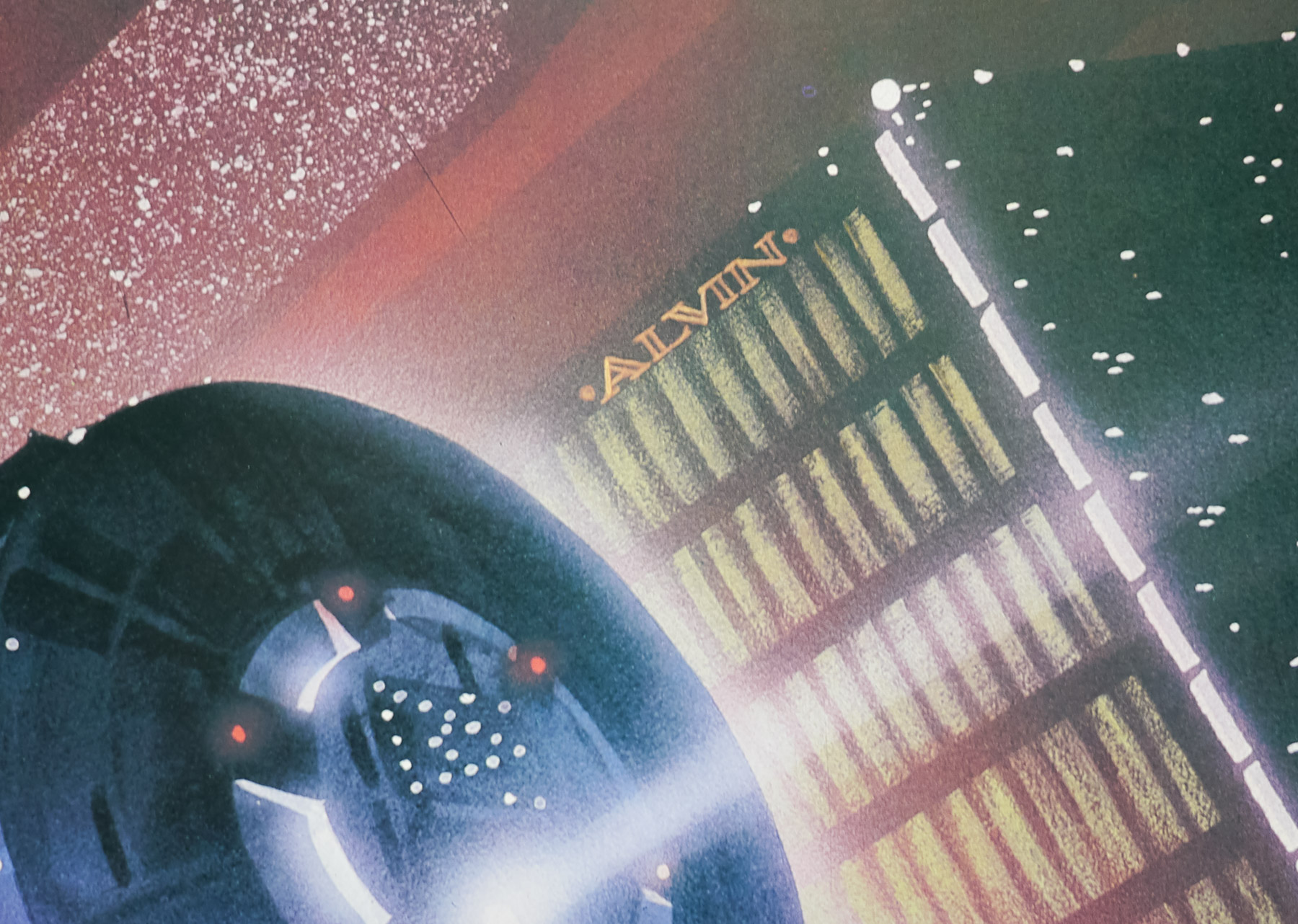
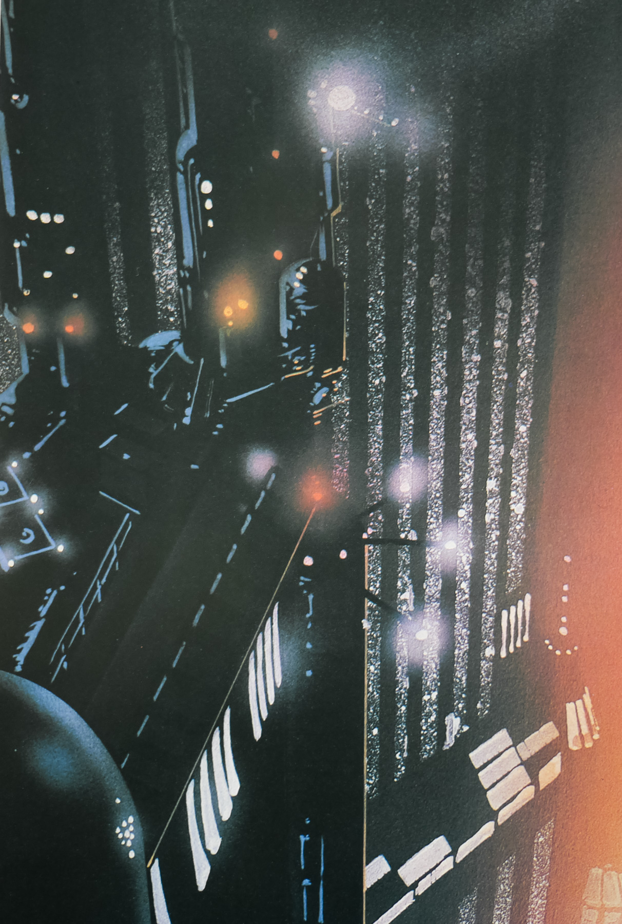
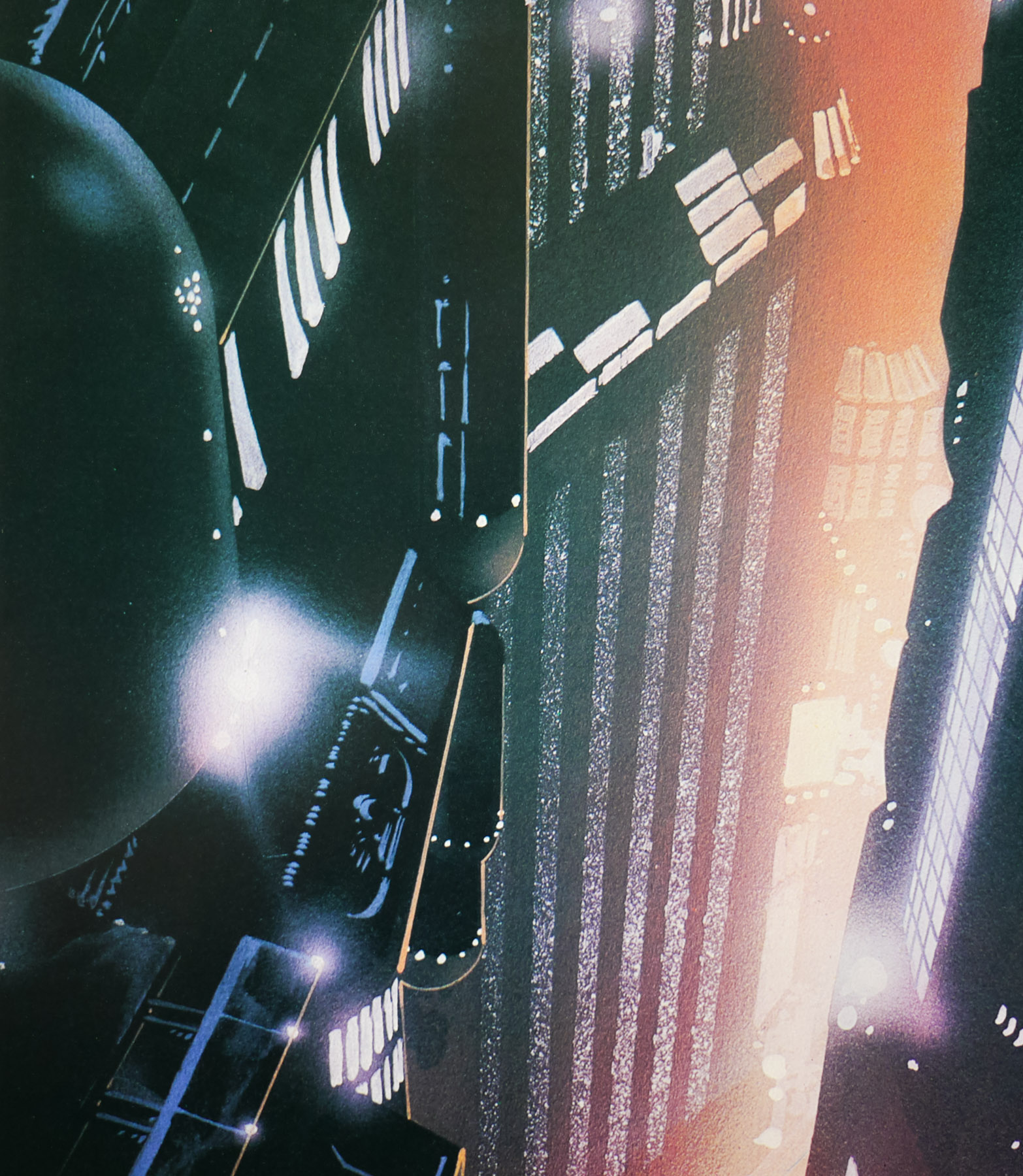
One of my top five films of all time, Blade Runner was released with easily one of the most iconic sci-fi one sheets ever printed. The design and artwork is by the late, great John Alvin, a man responsible for several of the most memorable film posters of the past 40 years. This is perhaps his most well known piece since it featured on posters across the globe, was reused for the 1992 Director’s cut release and has been on the cover of home video releases for many years.
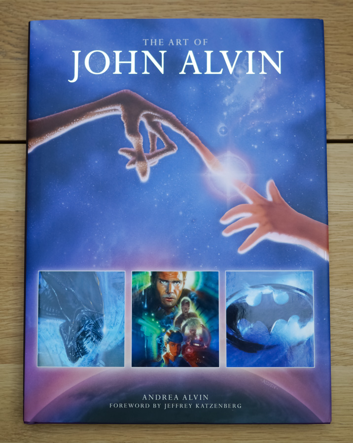
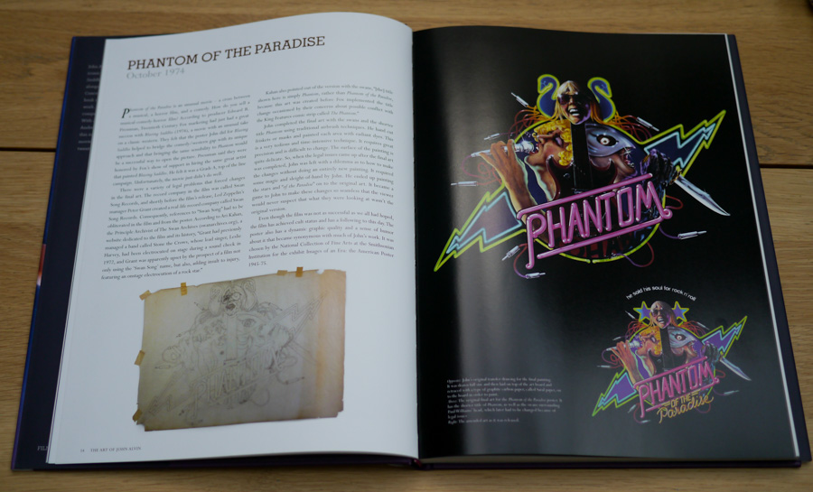
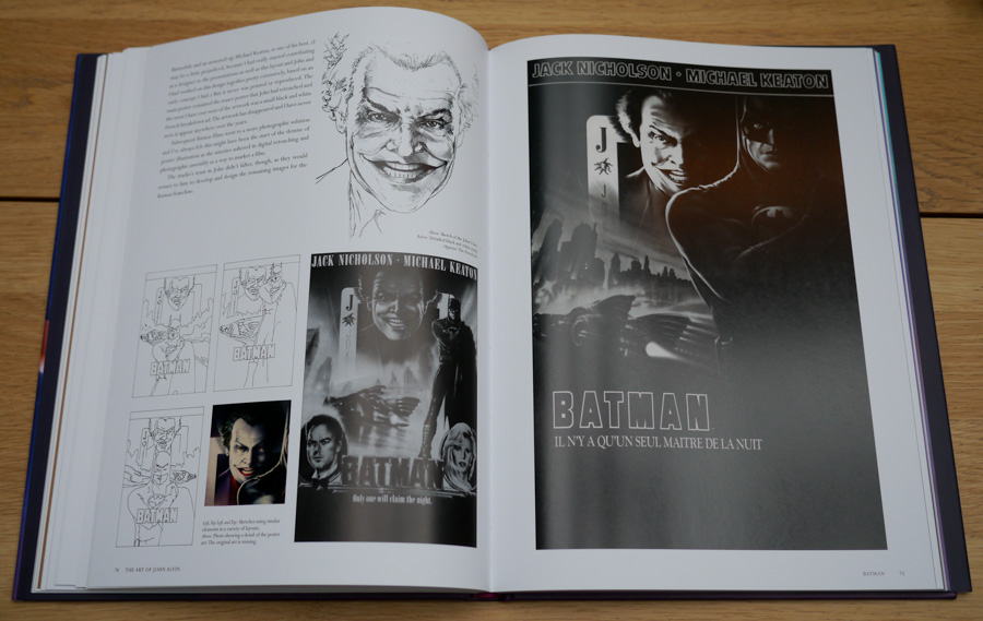
In August 2014 a book entitled The Art of John Alvin was released after four years of preparation by his wife and studio partner Andrea. An absolute must-own for any fan of film posters and the art of cinema, the book features almost all of John’s most memorable posters which are each given their own section. As well as images of the printed poster, there are also early sketches, painted concepts and pictures of the original artwork itself, plus Andrea has provided fascinating commentary detailing the creation of each piece.
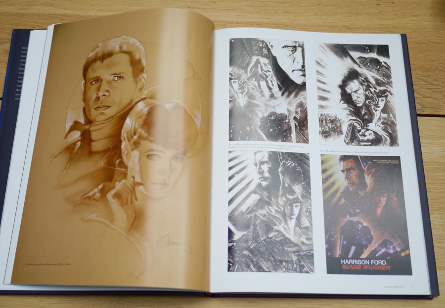
Blade Runner is given six pages and the section features a look at the original graphite sketches done by Alvin to show to Ridley Scott and the studio’s marketing department. Elements of these were then combined to create the painting we know today. Andrea notes that the posters for the film were originally conceived to focus on the relationship with the characters and the futuristic city, but by the time of release Harrison Ford was a global star so Alvin was asked to make him more prominent in the artwork.
John apparently always regretted not featuring Rutger Hauer’s android Roy Batty so when he was asked to revisit the design for a 25th anniversary print he reworked several elements, including the two portraits of Harrison Ford and Sean Young and added the face of Roy Batty looming large over them. The print was called ‘I’ve Seen Things’ by John and can be viewed here.
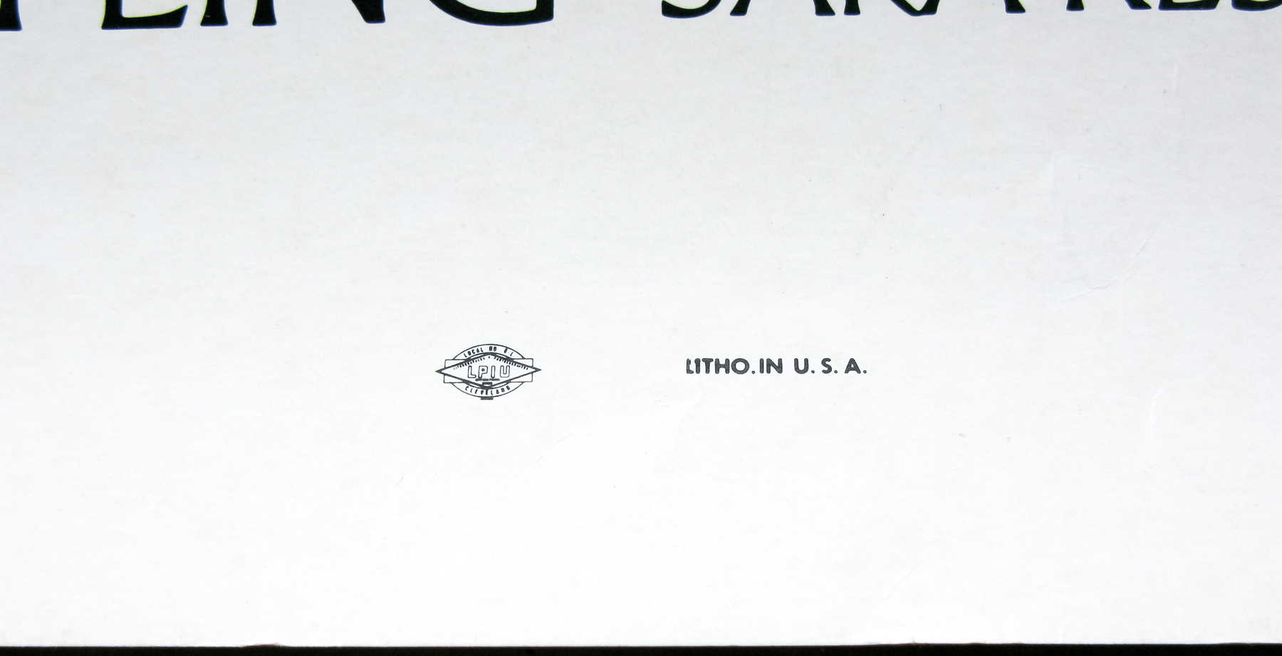
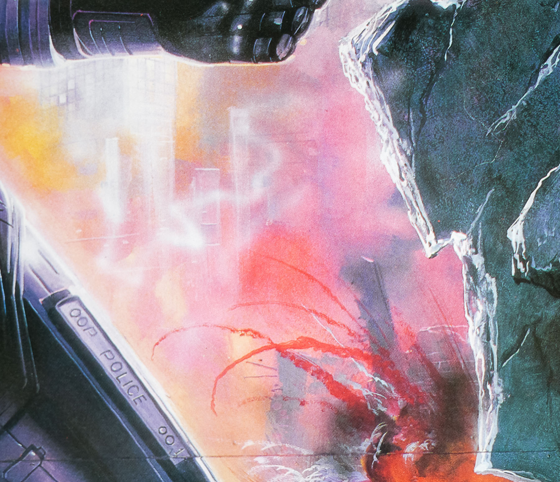
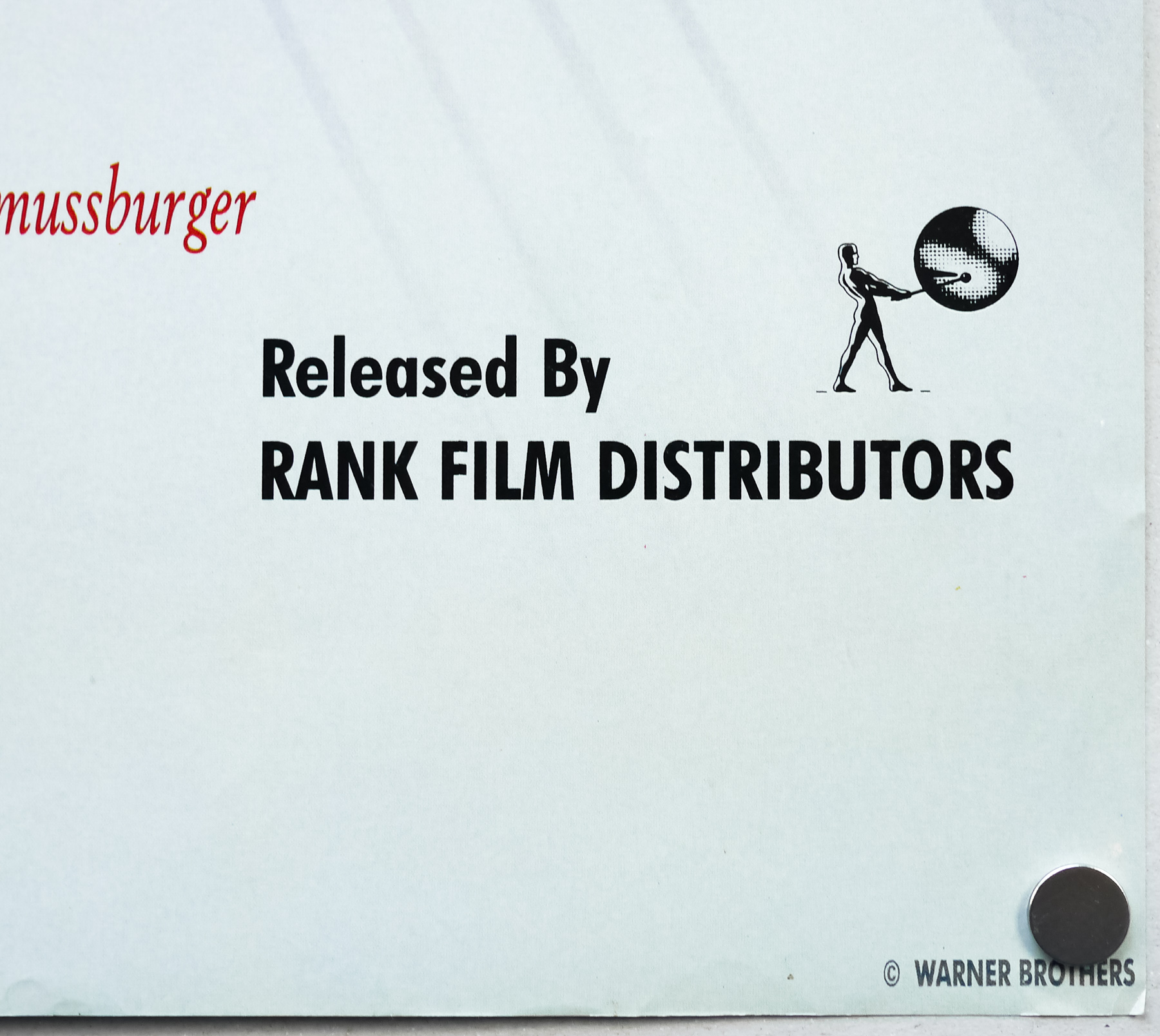
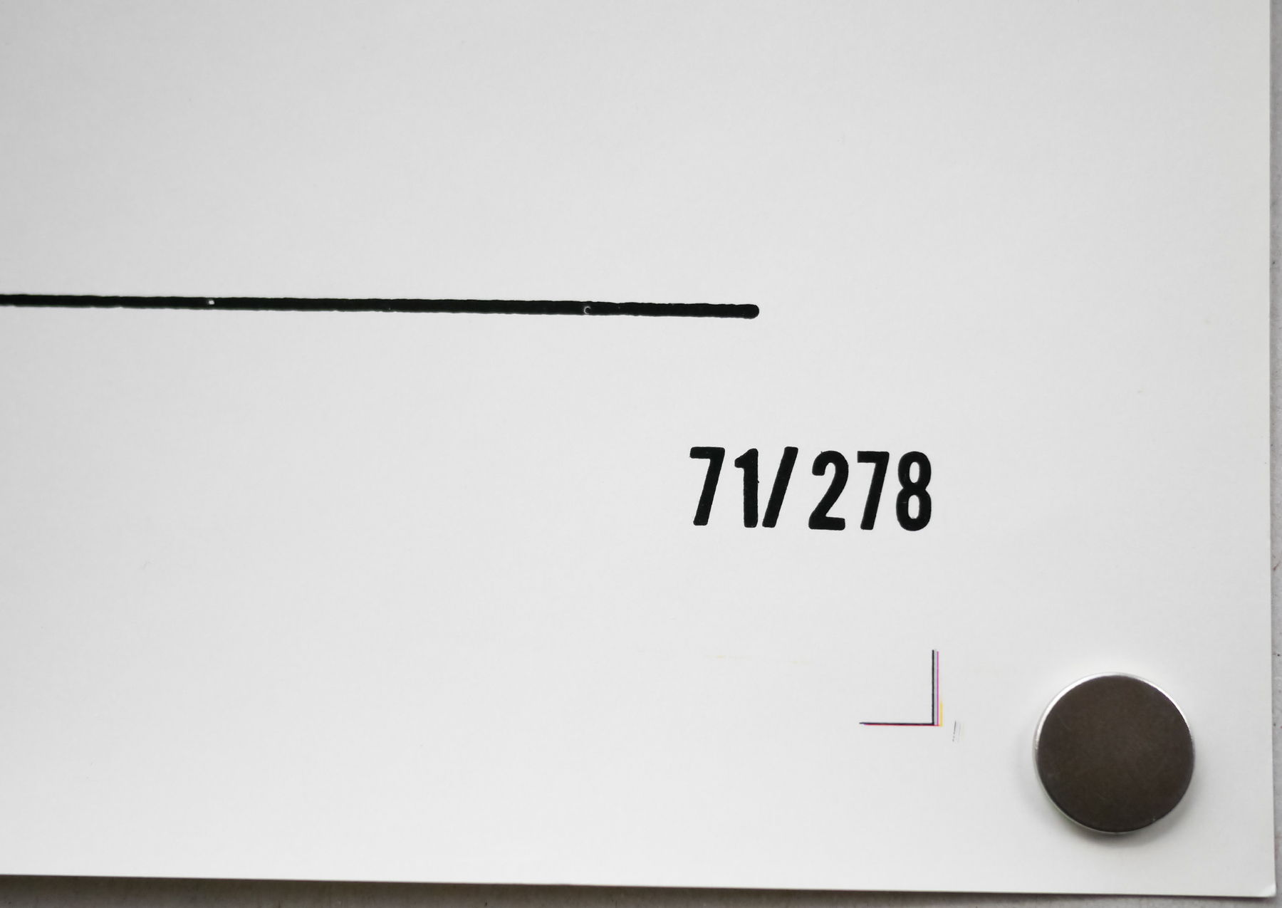
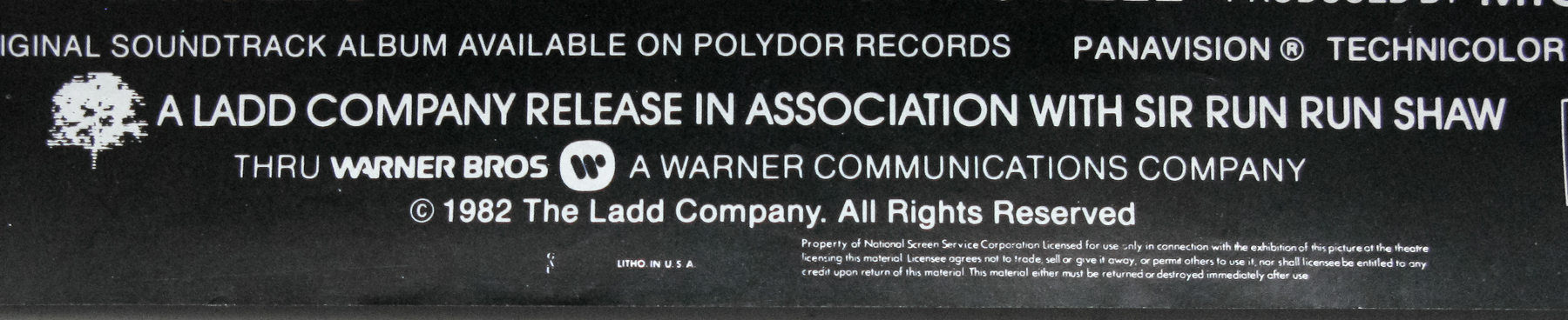
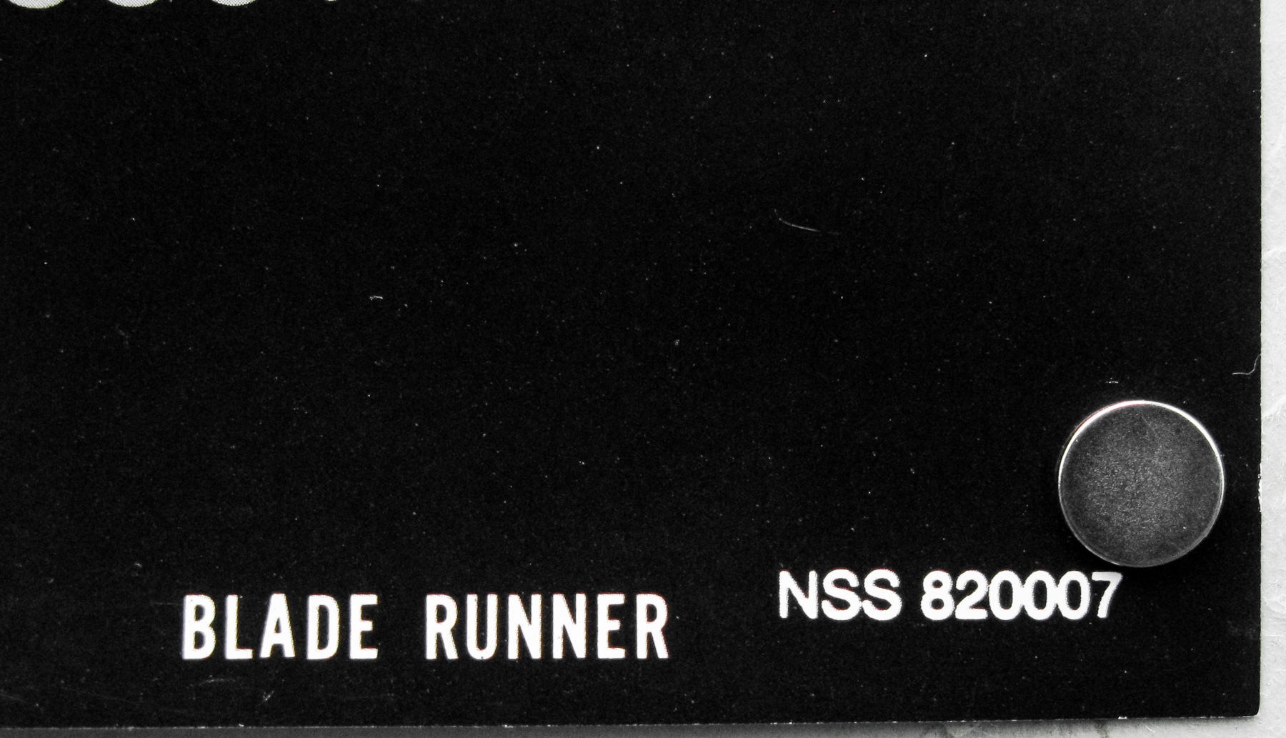
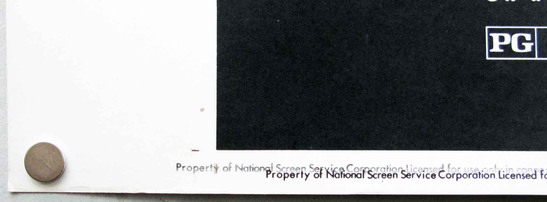
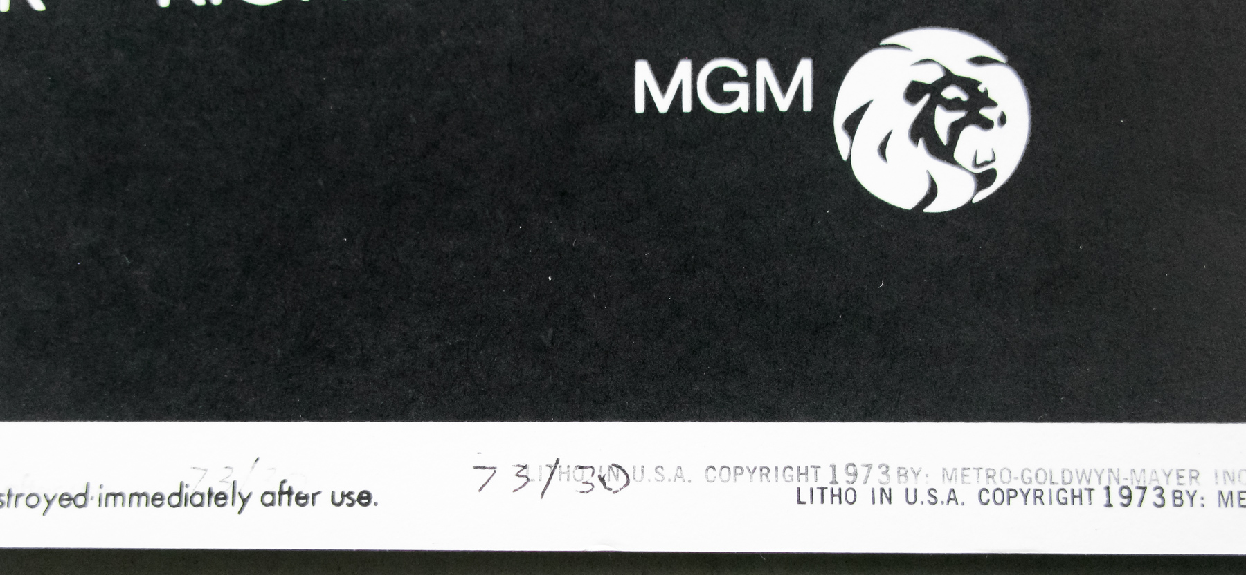
There are known reprints of this poster and this particular version is one of three known variants. LAMP has a guide to all three here. To summarise:
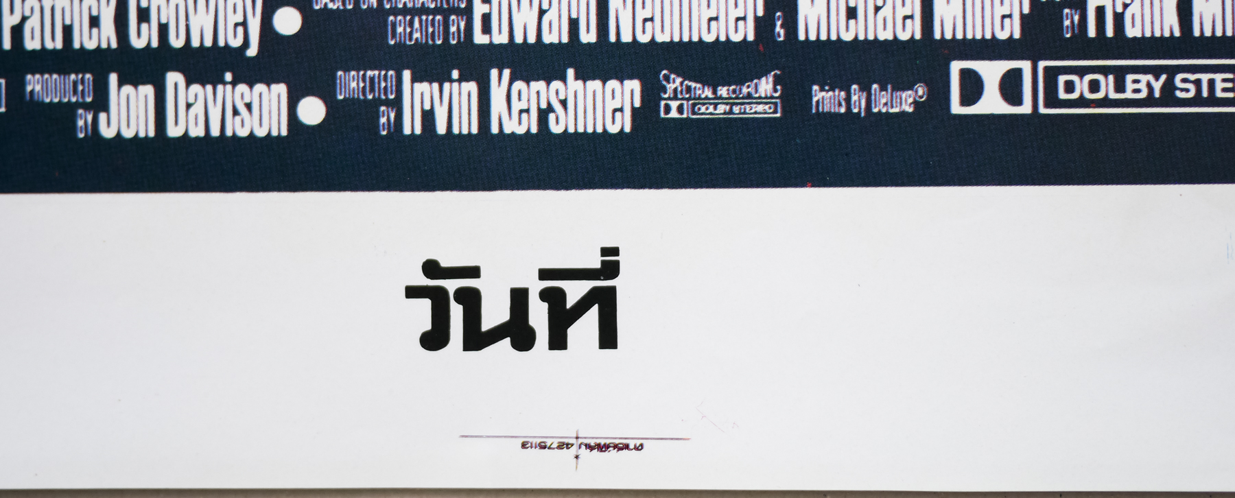
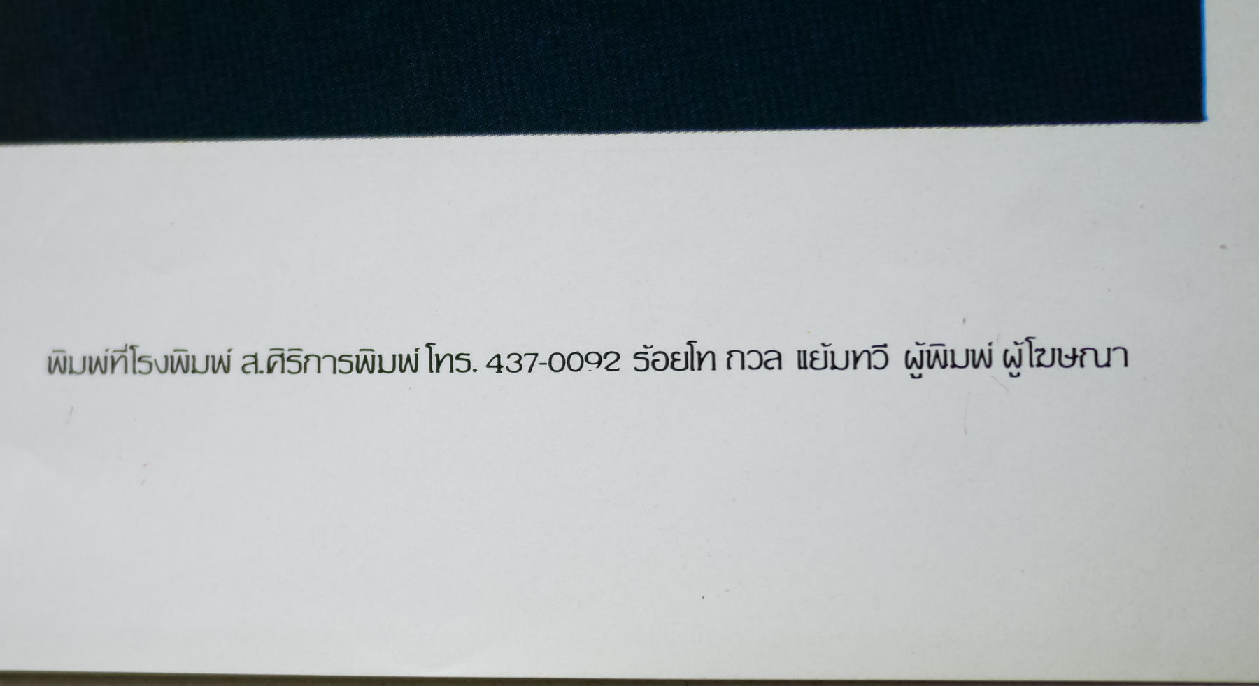
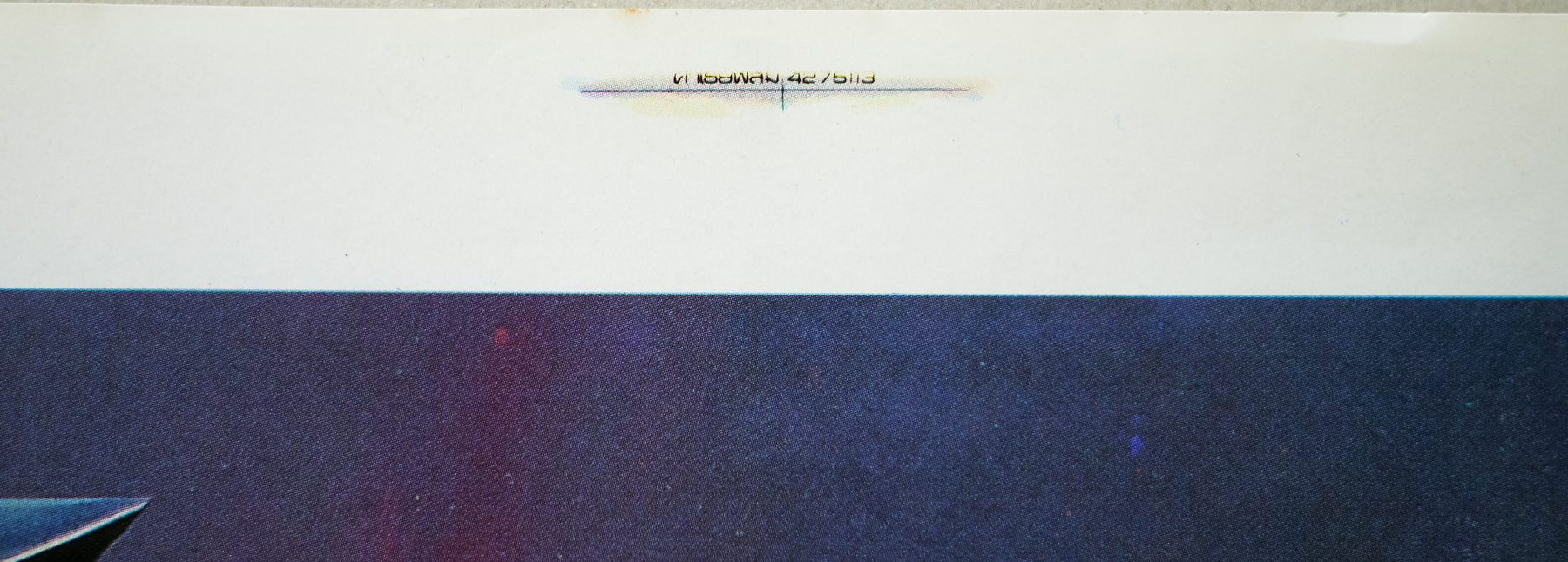
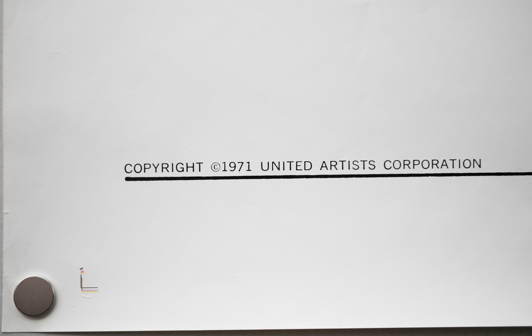
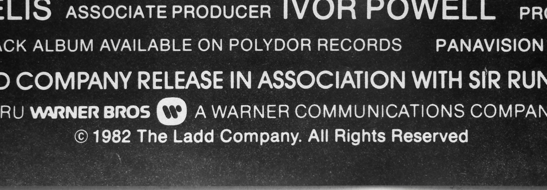
Variation 1 – NSS Version
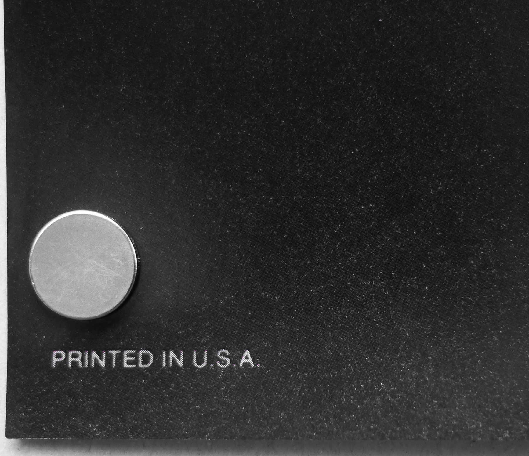
This version has NOTHING in the bottom left corner; Litho in U.S.A. (AND) the NSS tag in the center; BLADE RUNNER 820007 in the bottom right
Variation 2 – Studio Version
This variation has “PRINTED IN U.S.A.” in the bottom left corner; NOTHING in the center; and “NSS 820007” in the bottom right.
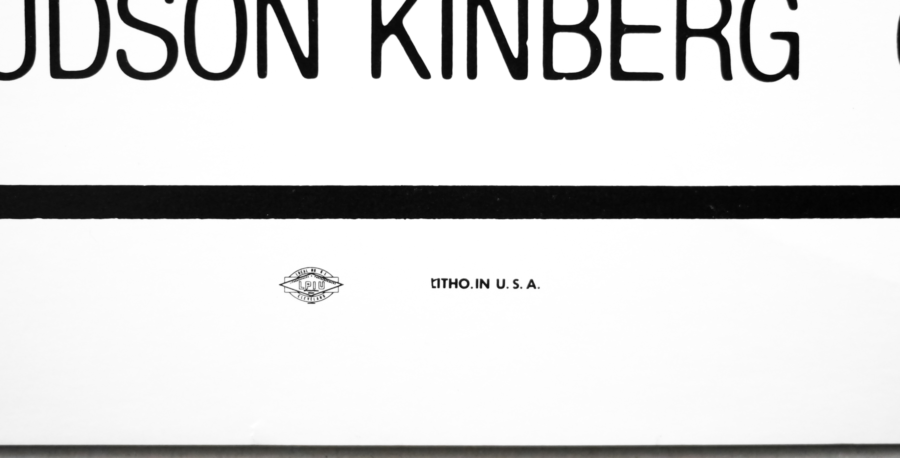
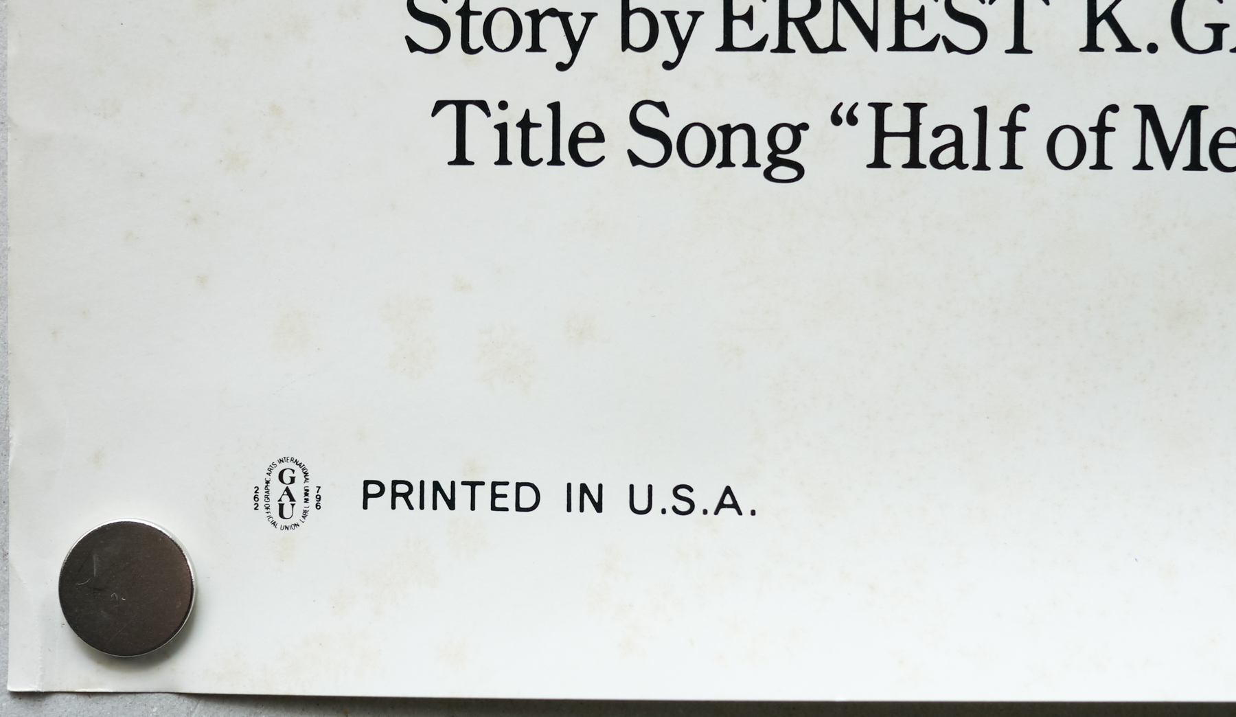
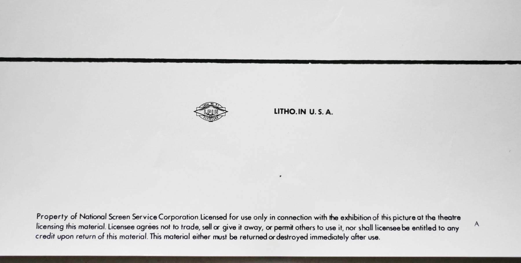
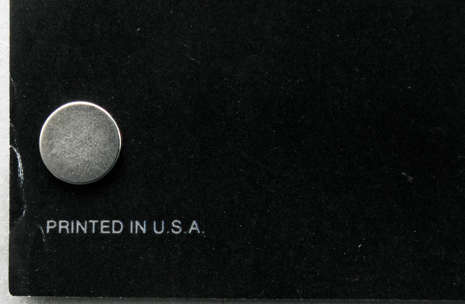
Variation 3 – Odd NSS Version
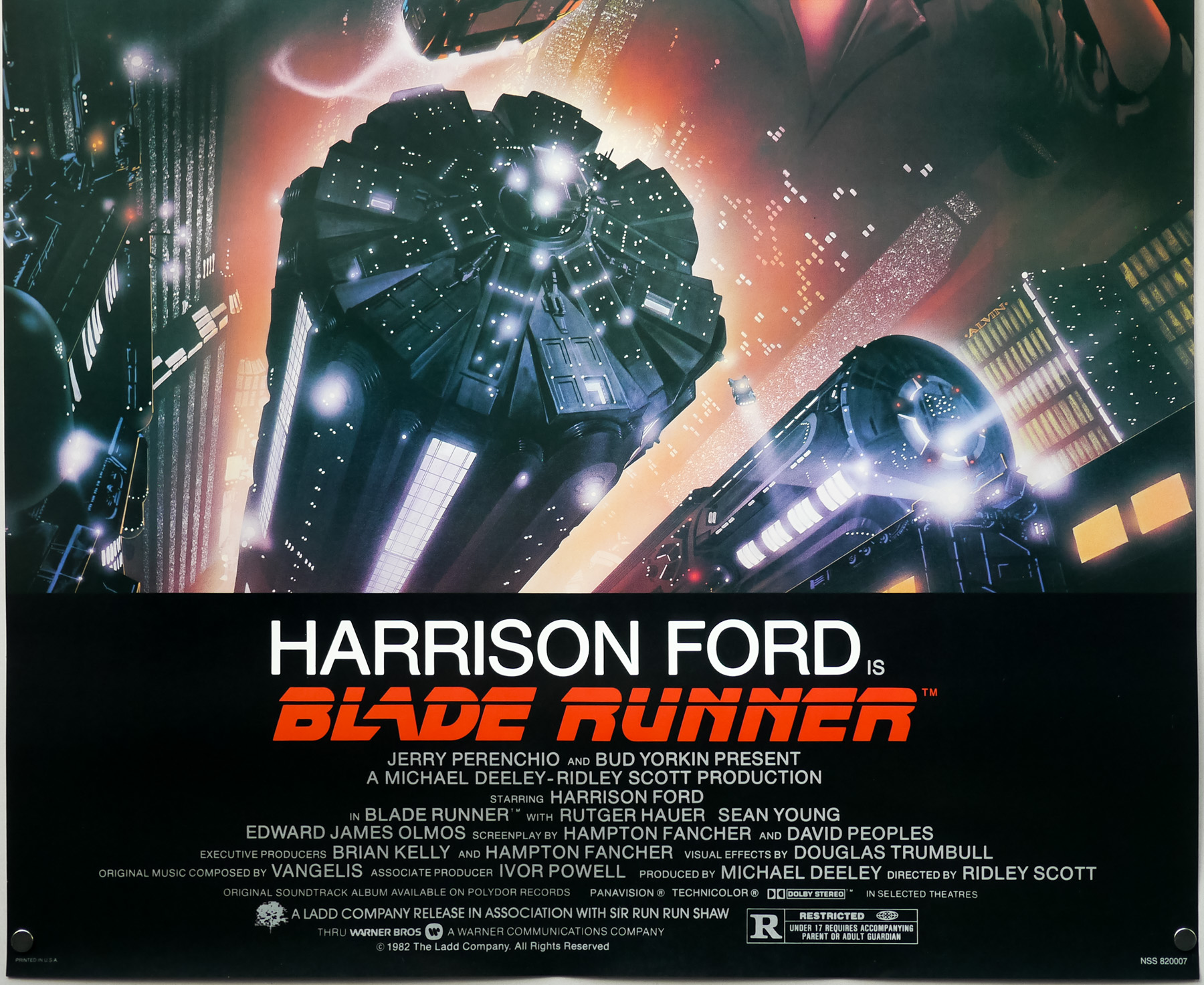
In the bottom left corner has “PRINTED IN U.S.A.”; in the center ‘IN SMALLER PRINT’ has “LITHO IN U.S.A.” (AND) the NSS tag; In the bottom right has “BLADE RUNNER NSS 820007” in ‘UNEVEN’ print.
As is clear from my photos, the version I have is the ‘Odd NSS Version’. I bought this particular example about five years ago from a very reputable and established dealer who has been in business over 25 years. I have also seen this version sold by the major auction houses on a number of occasions and have seen it in the collections of several long-time collectors.
A dealer in London once told me he believes all NSS versions of this poster are reprints/restrikes. If this is the case then the poster has fooled both respected dealers and collectors alike.