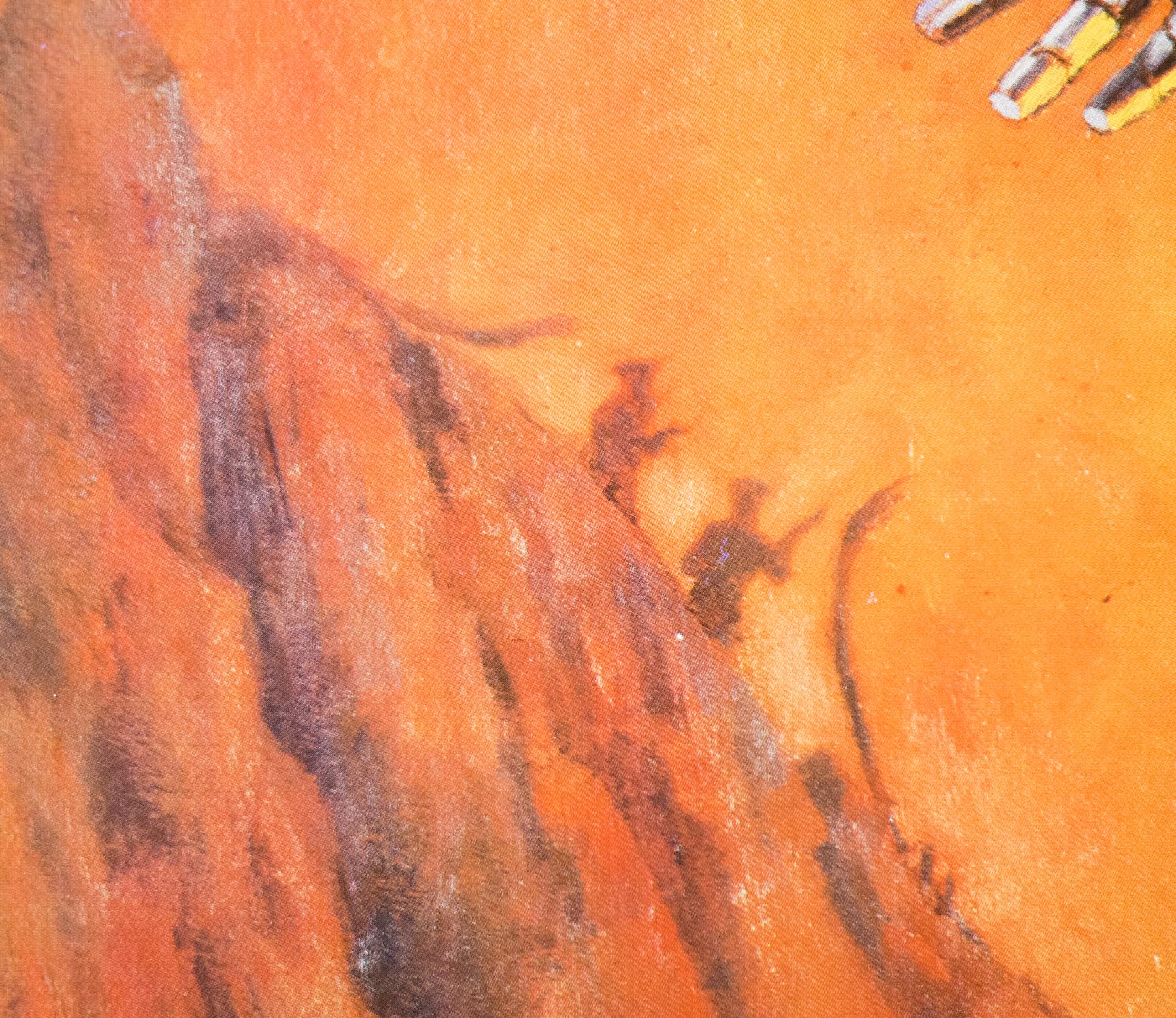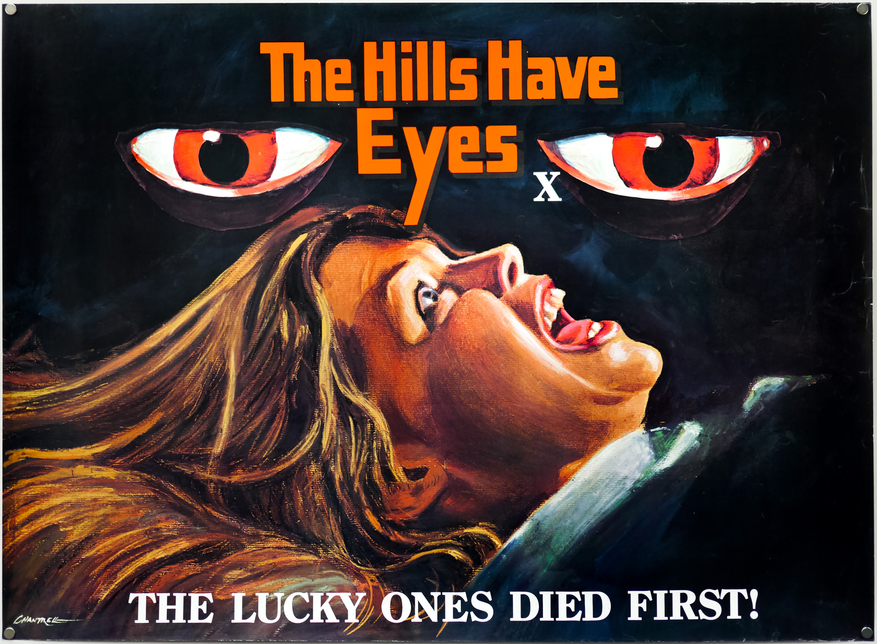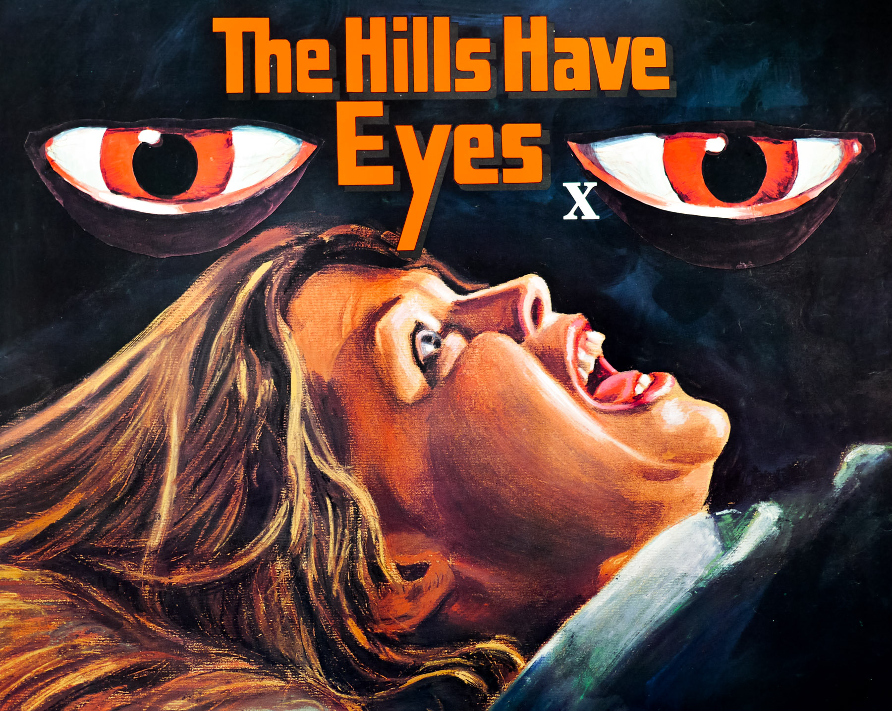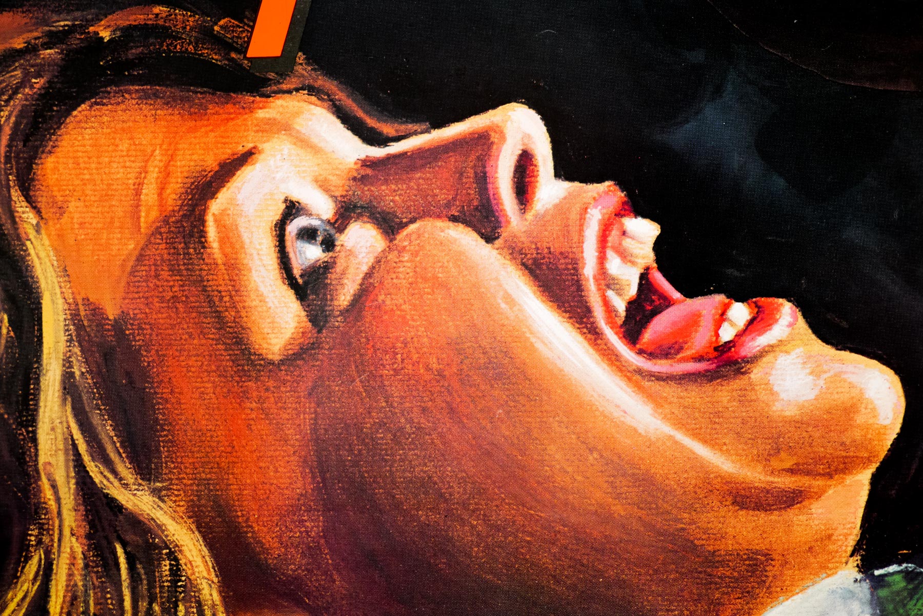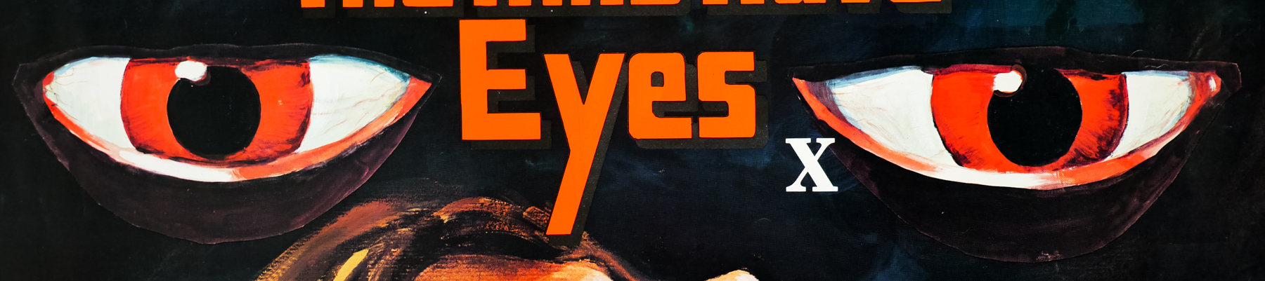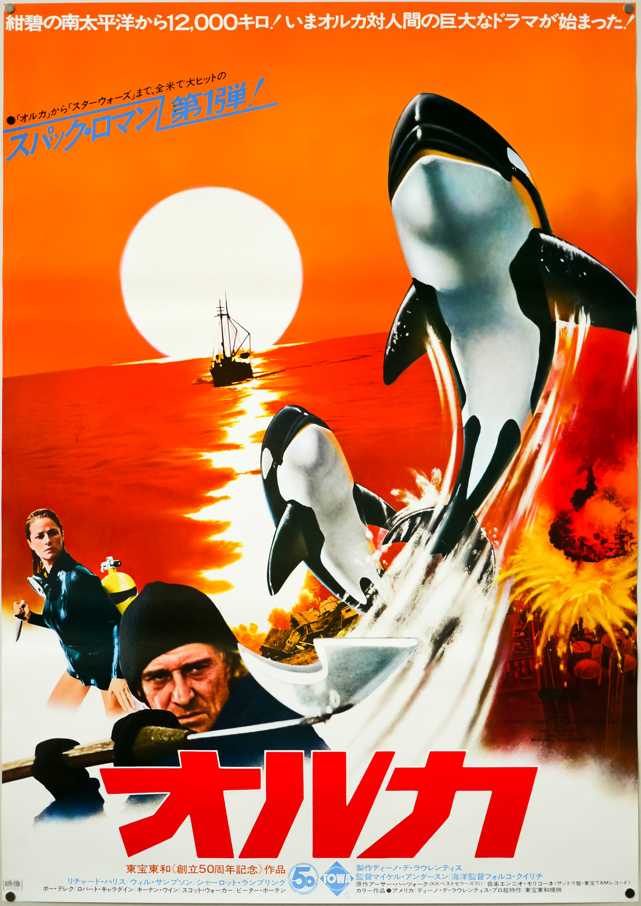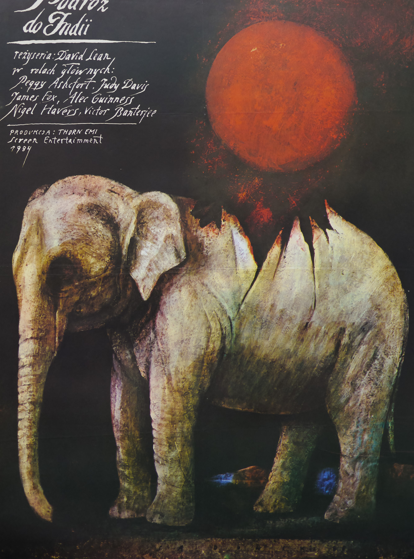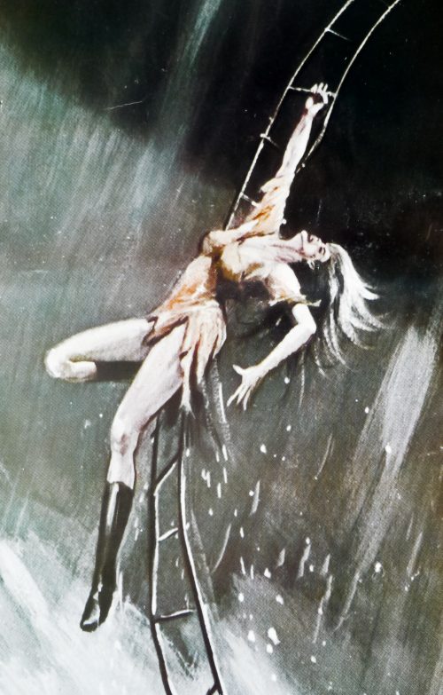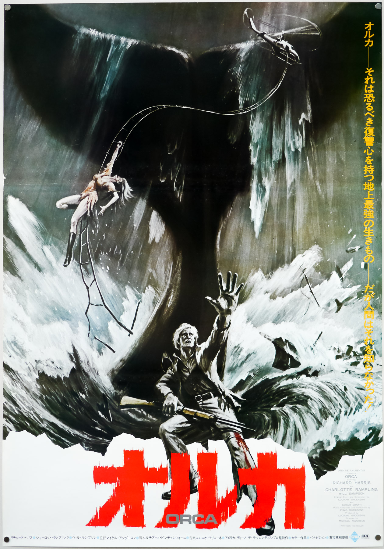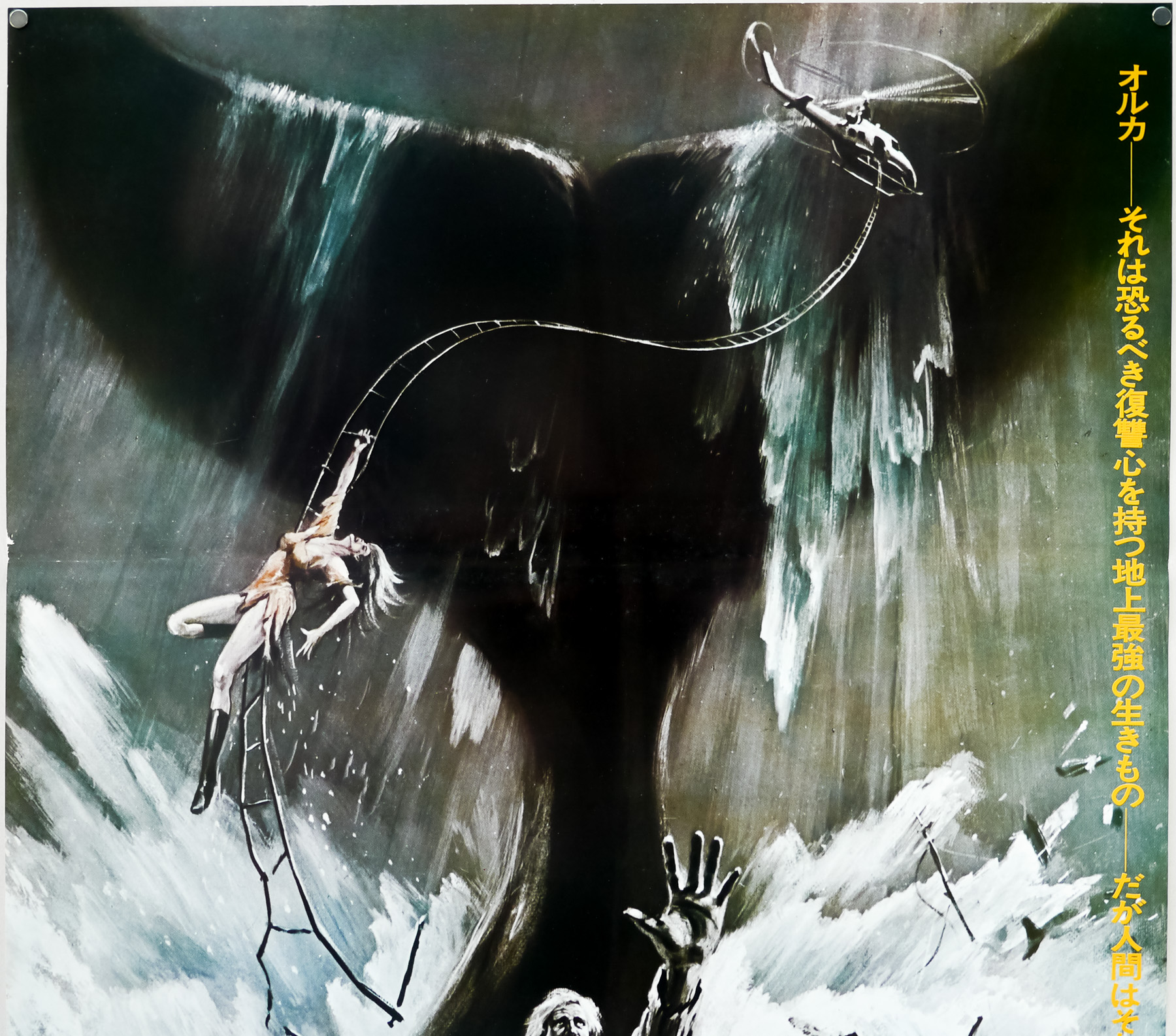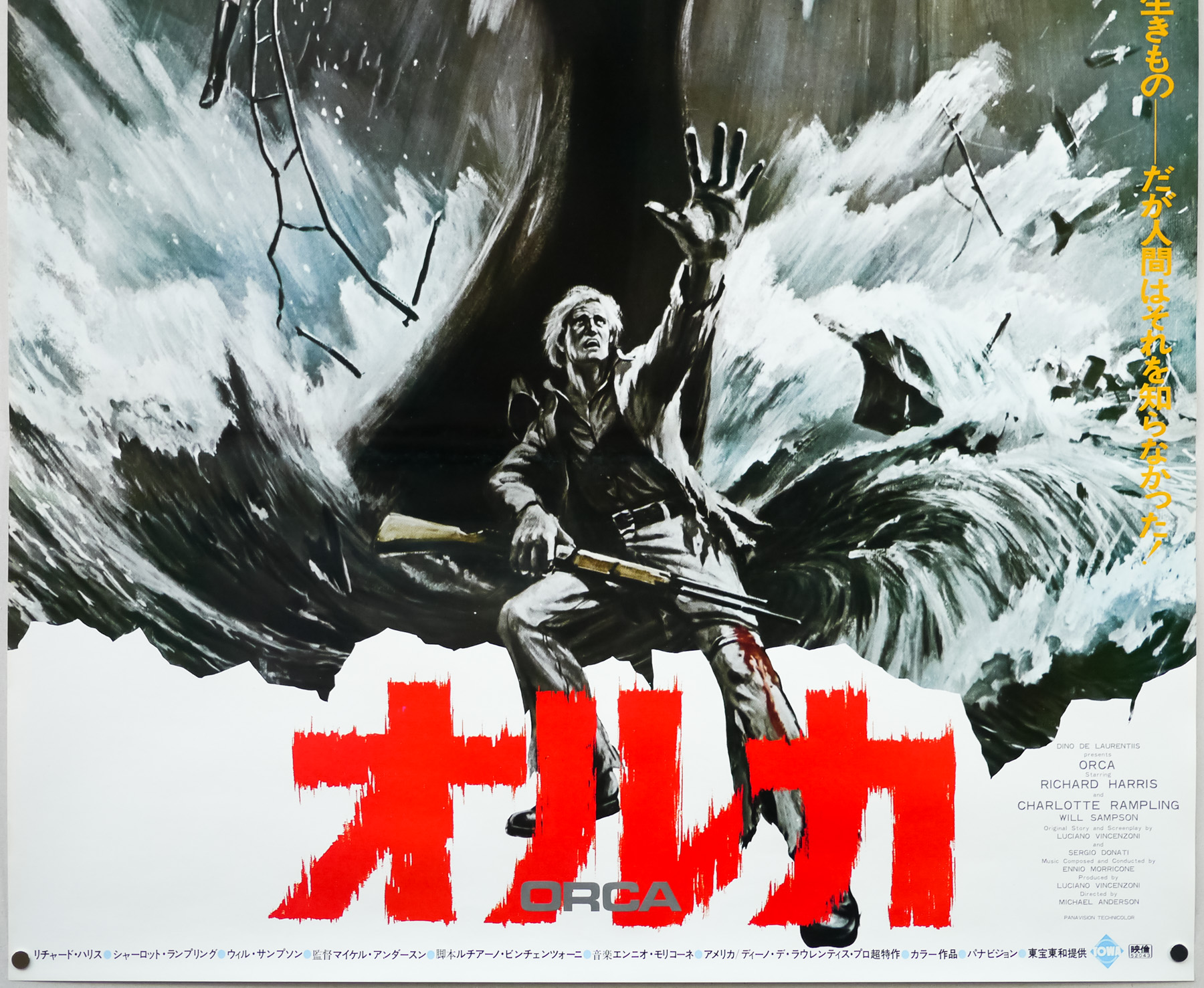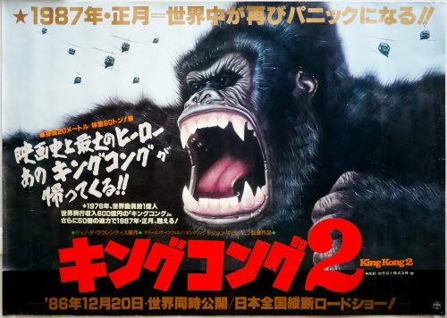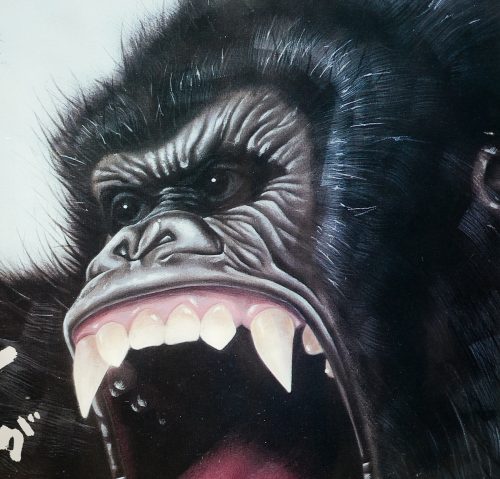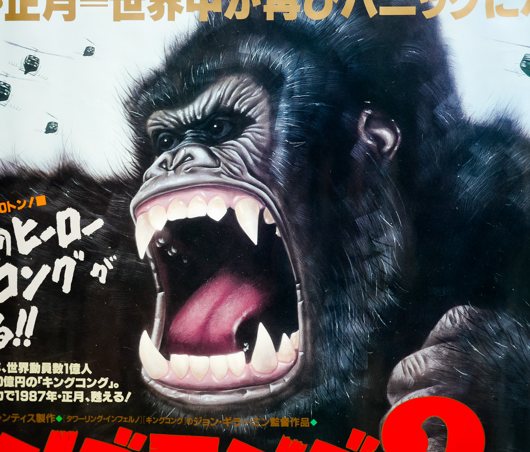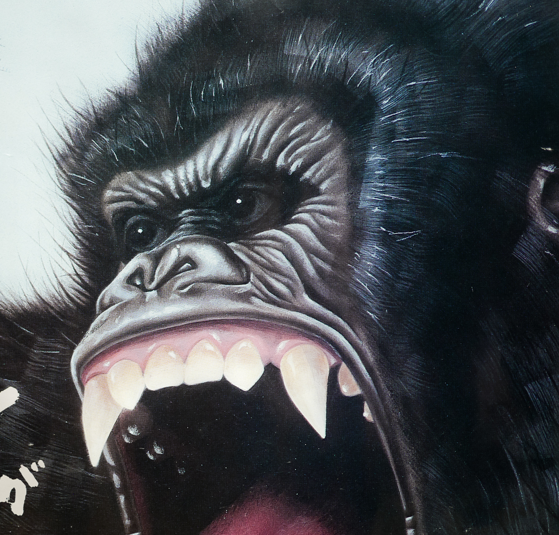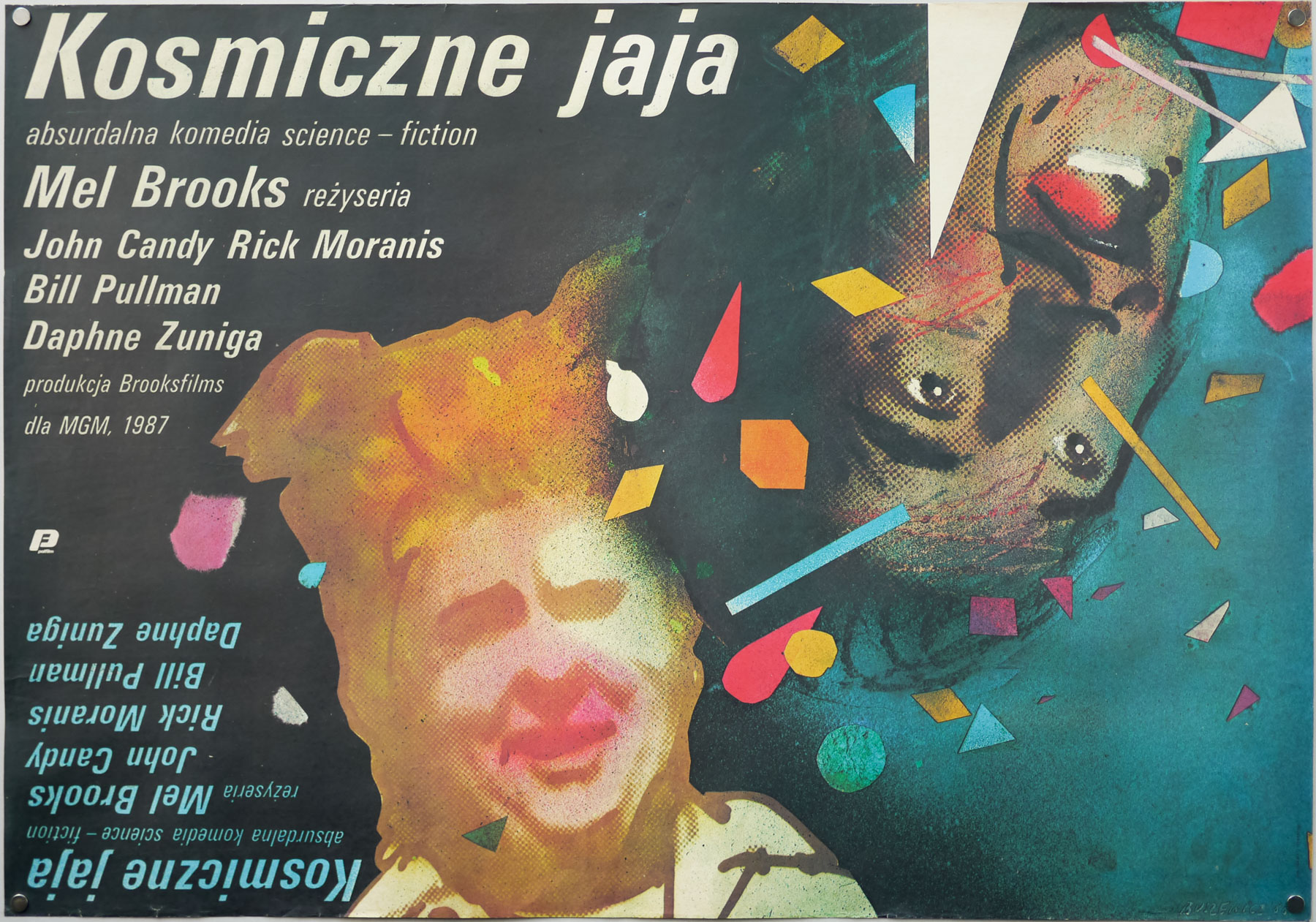
Poster detail
1-5

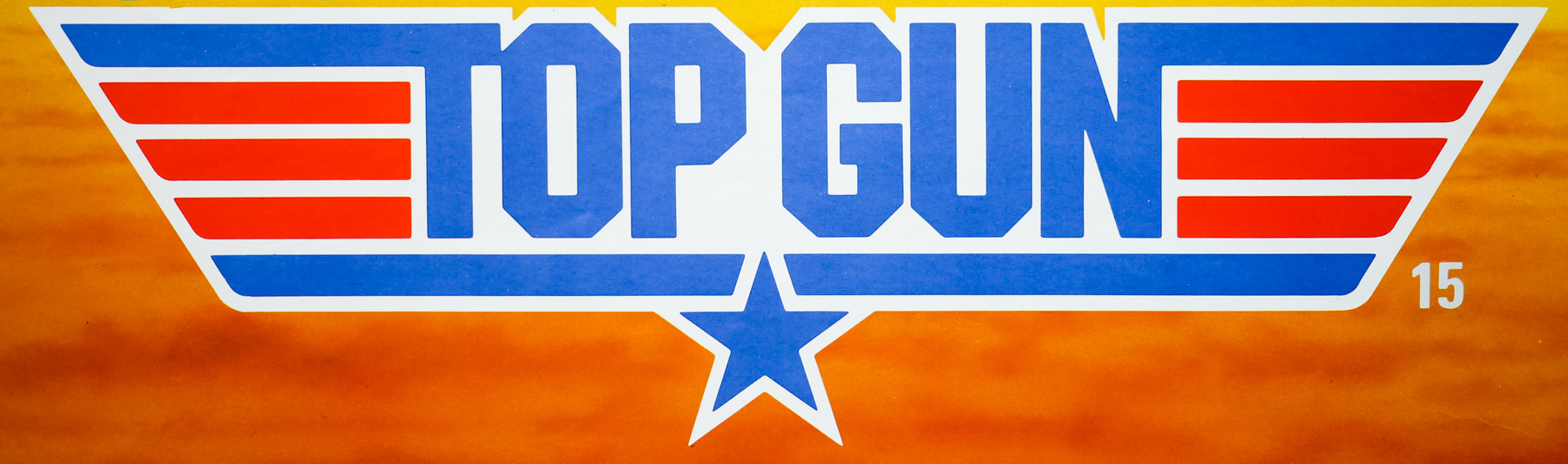
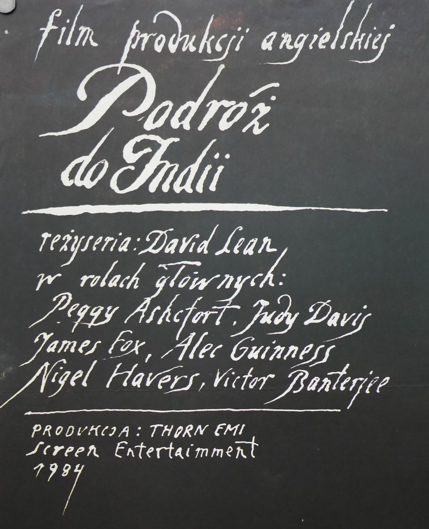
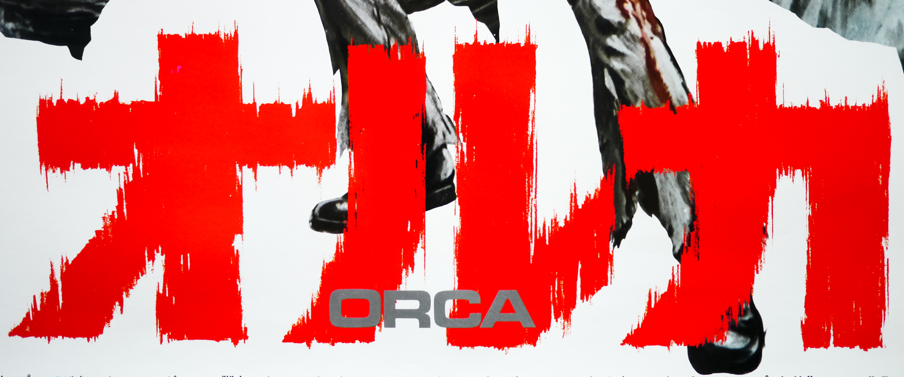
- Title
- Orca
- AKA
- Orca: Killer Whale (alt. title) | The Killer Whale (alt. title)
- Year of Film
- 1977
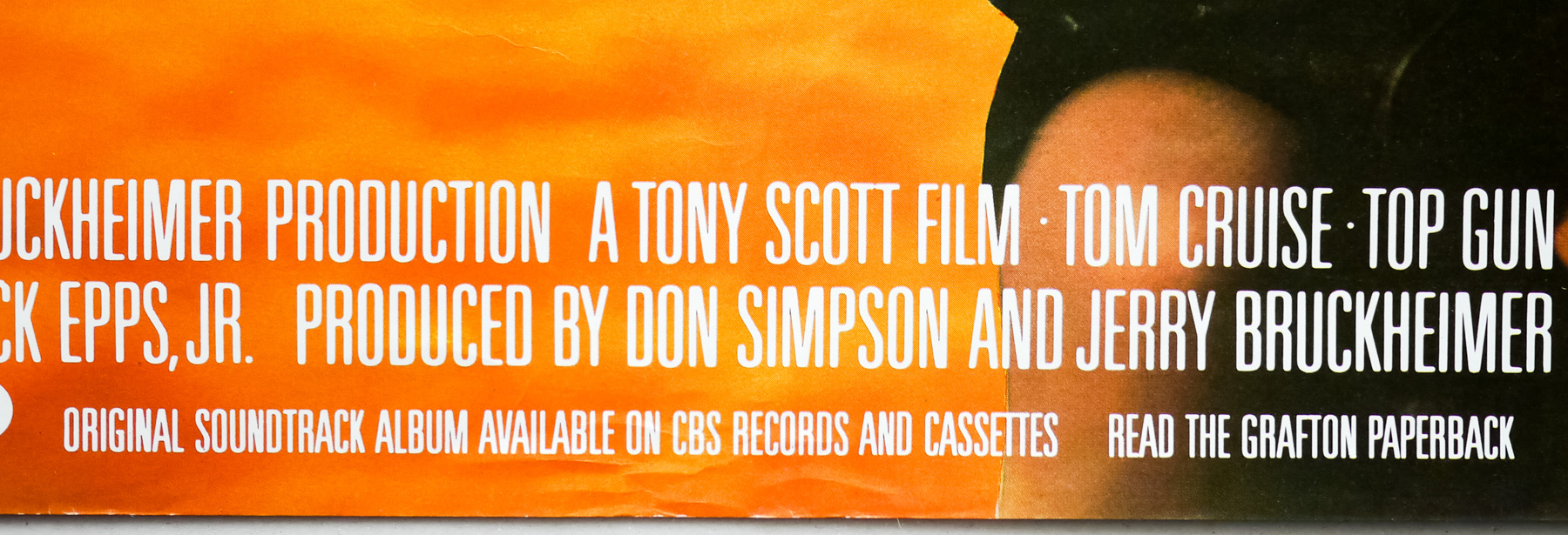
- Director
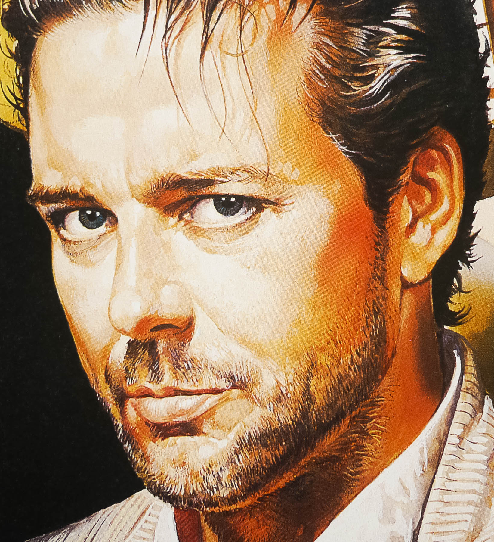
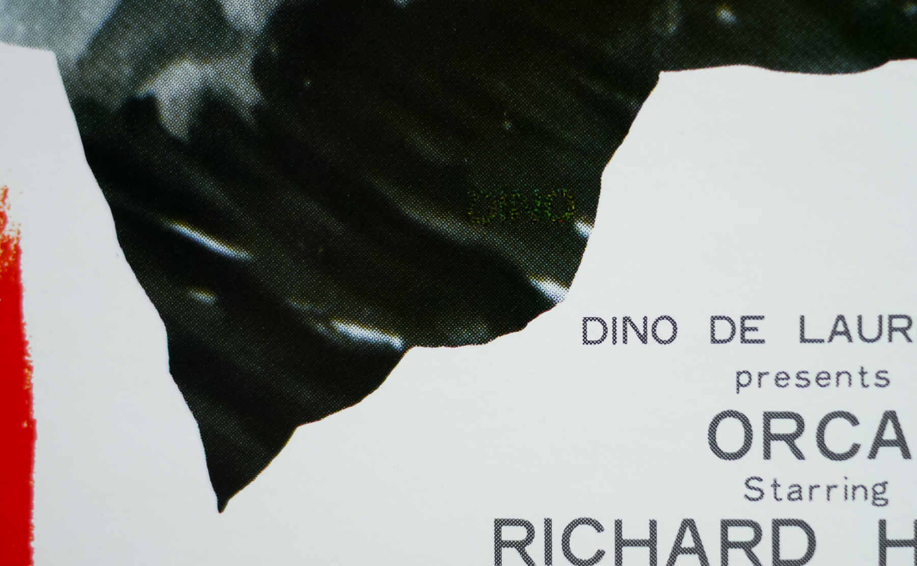
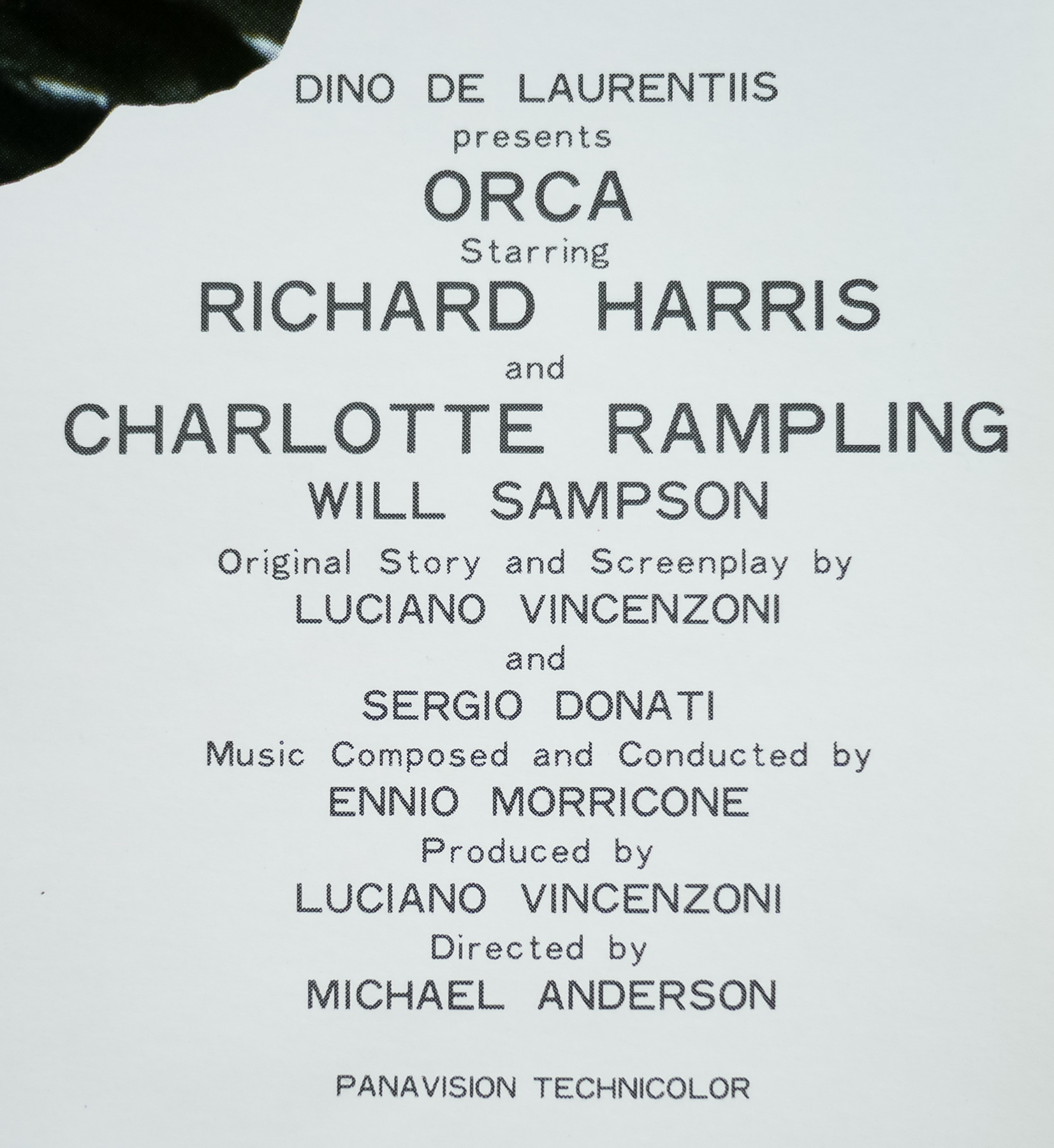
- Michael Anderson
- Starring
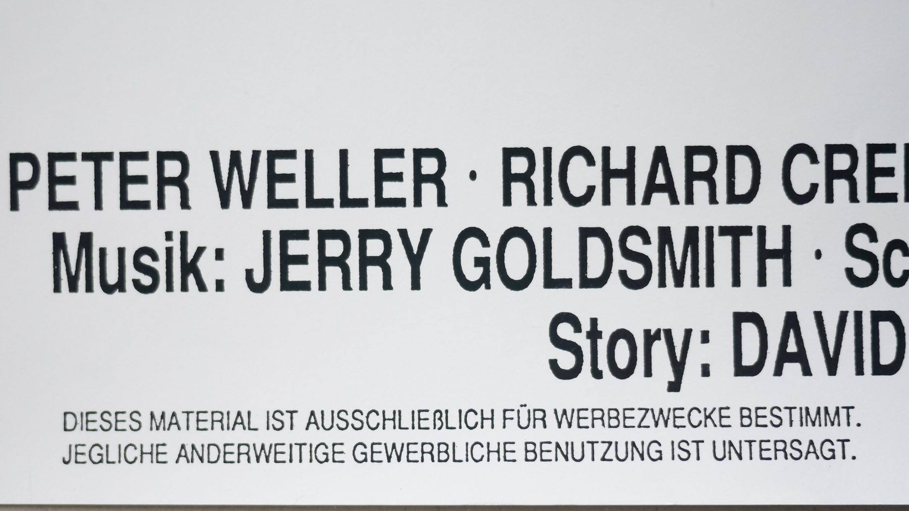
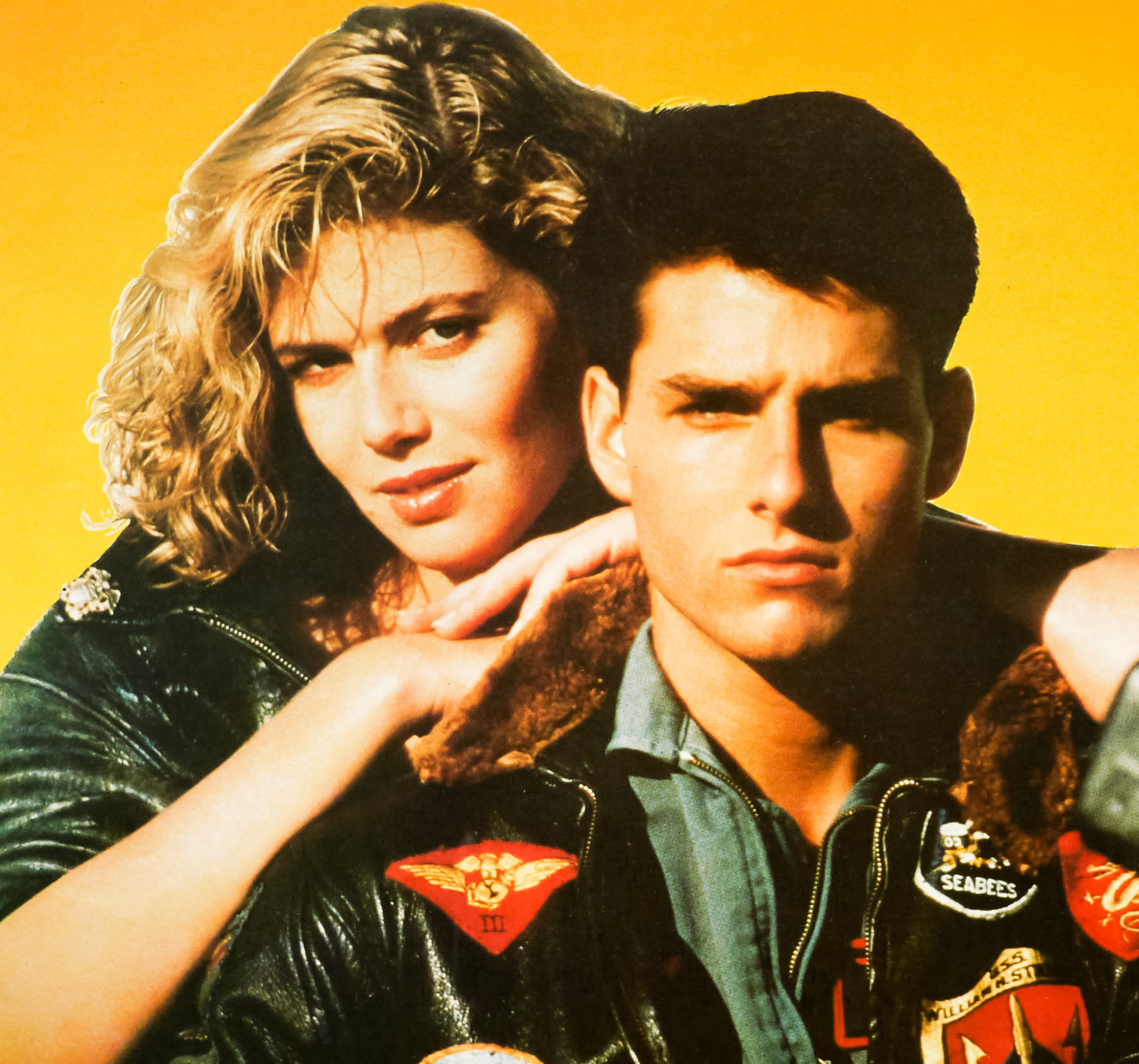
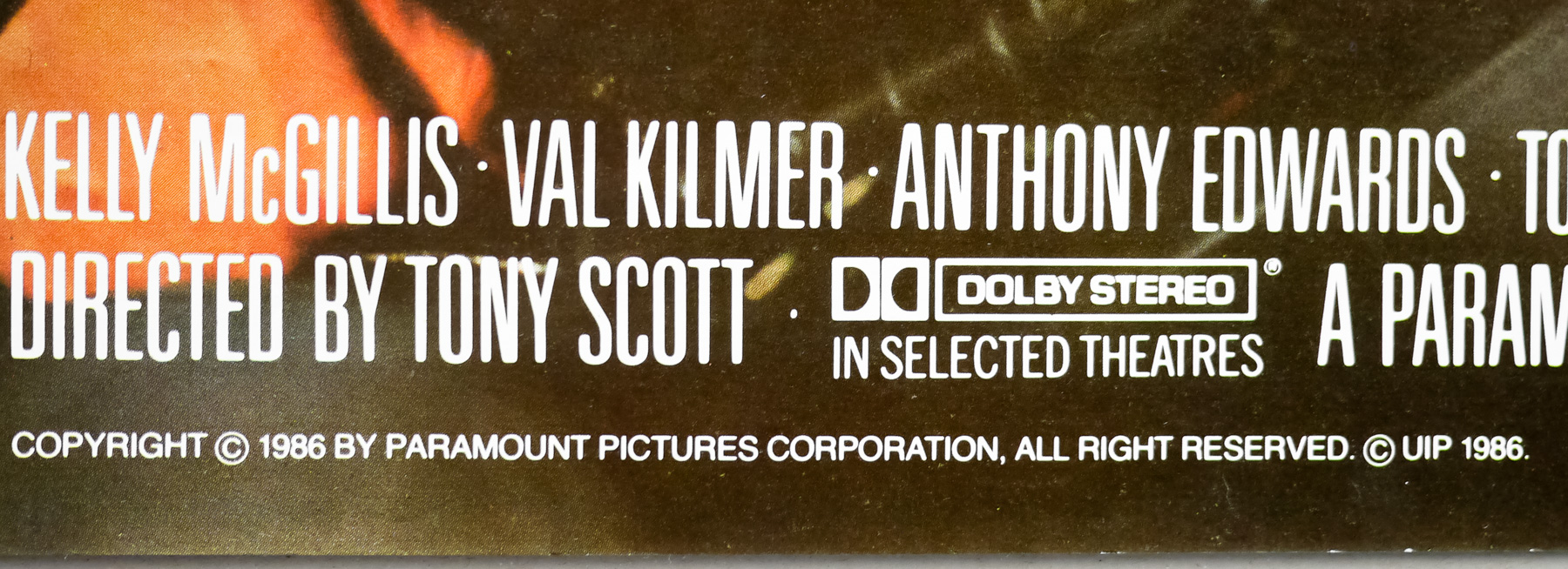
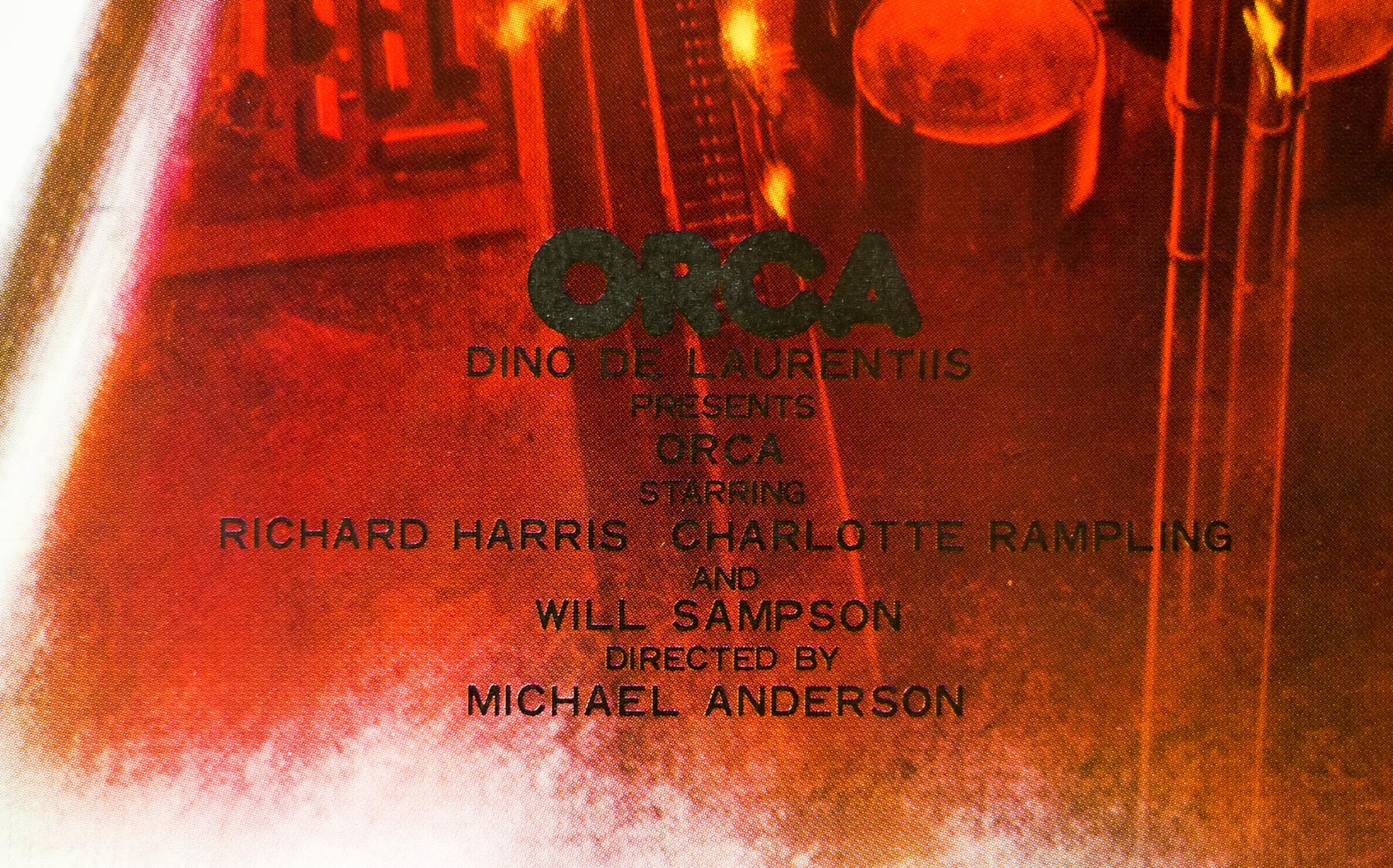
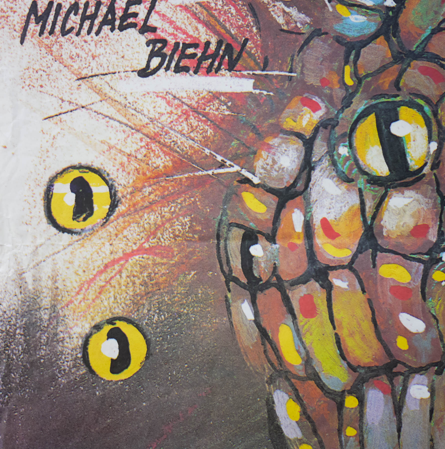
- Richard Harris, Charlotte Rampling, Will Sampson, Bo Derek, Keenan Wynn, Robert Carradine, Scott Walker, Peter Hooten, Wayne Heffley
- Origin of Film
- USA
- Genre(s) of Film
- Richard Harris, Charlotte Rampling, Will Sampson, Bo Derek, Keenan Wynn, Robert Carradine, Scott Walker, Peter Hooten, Wayne Heffley,
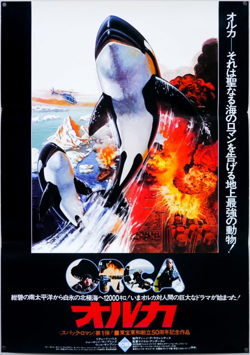
- Type of Poster
- B2
- Style of Poster
- Style A
- Origin of Poster
- Japan
- Year of Poster
- 1977
- Designer
- Unknown
- Artist
- Unknown
- Size (inches)
- 20 7/16" x 28 14/16"
- SS or DS
- SS
- Tagline
- --
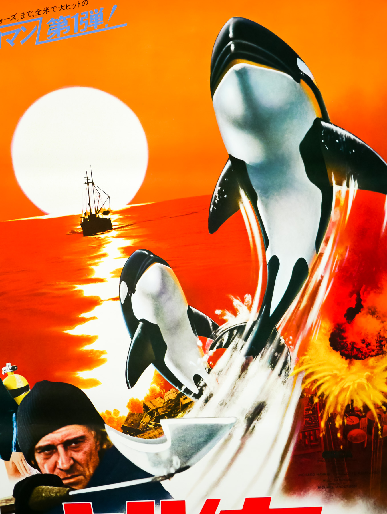
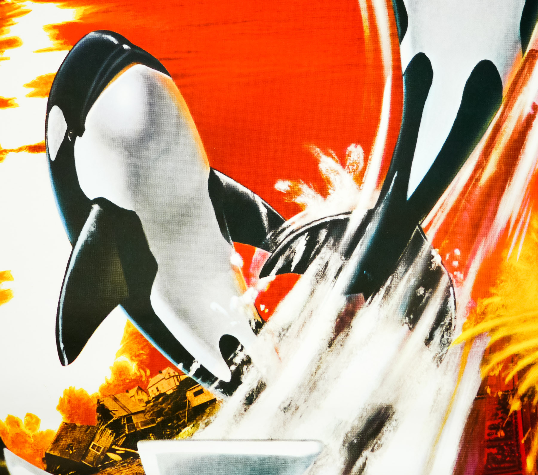
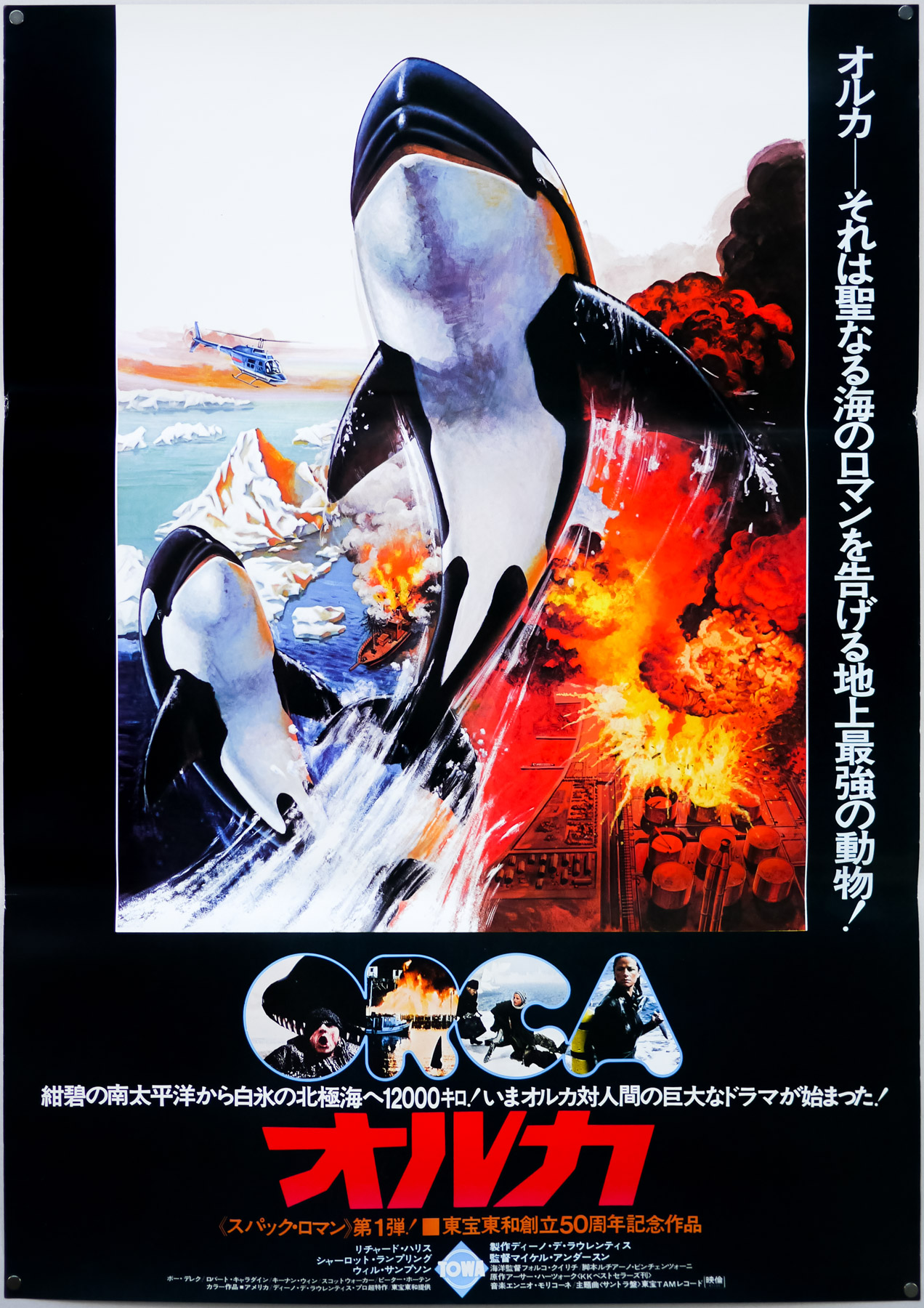
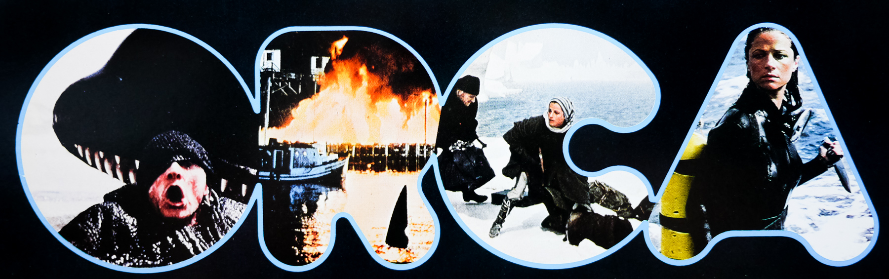
A man versus giant killer fish film that was released two years after the original summer blockbuster Jaws, Orca was always going to be compared to Spielberg’s classic even if its lead actor, the late Richard Harris, was apparently angered by the links; ‘I get really offended when people make the comparison’, he is quoted as saying at the time of release. The late Italian producer Dino De Laurentiis was determined to one-up the spectacle of Jaws and tasked the screenwriter Luciano Vincenzoni to “find a fish tougher and more terrible than the great white”, which led them to the killer whale and production on ‘Orca’ began.
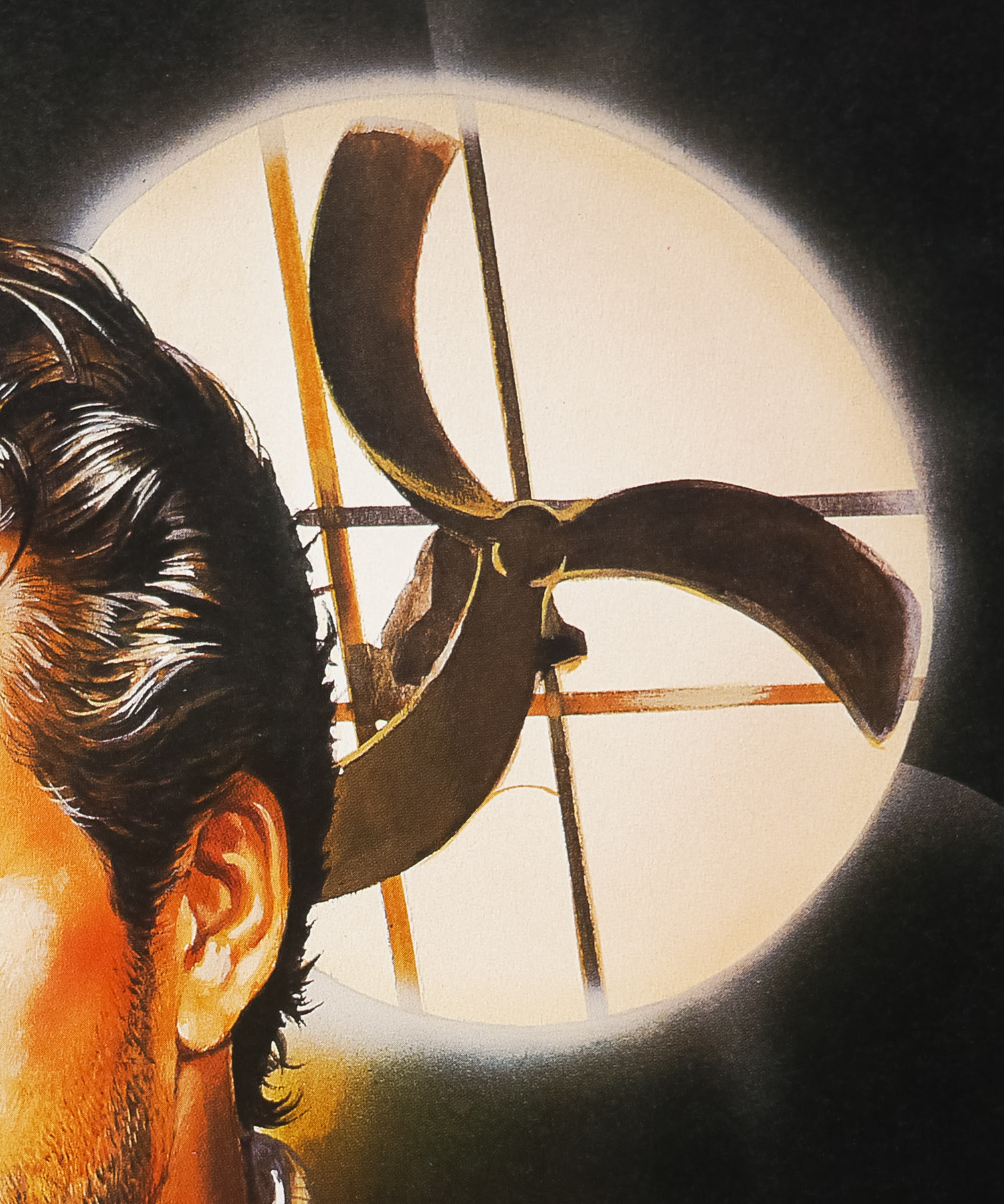
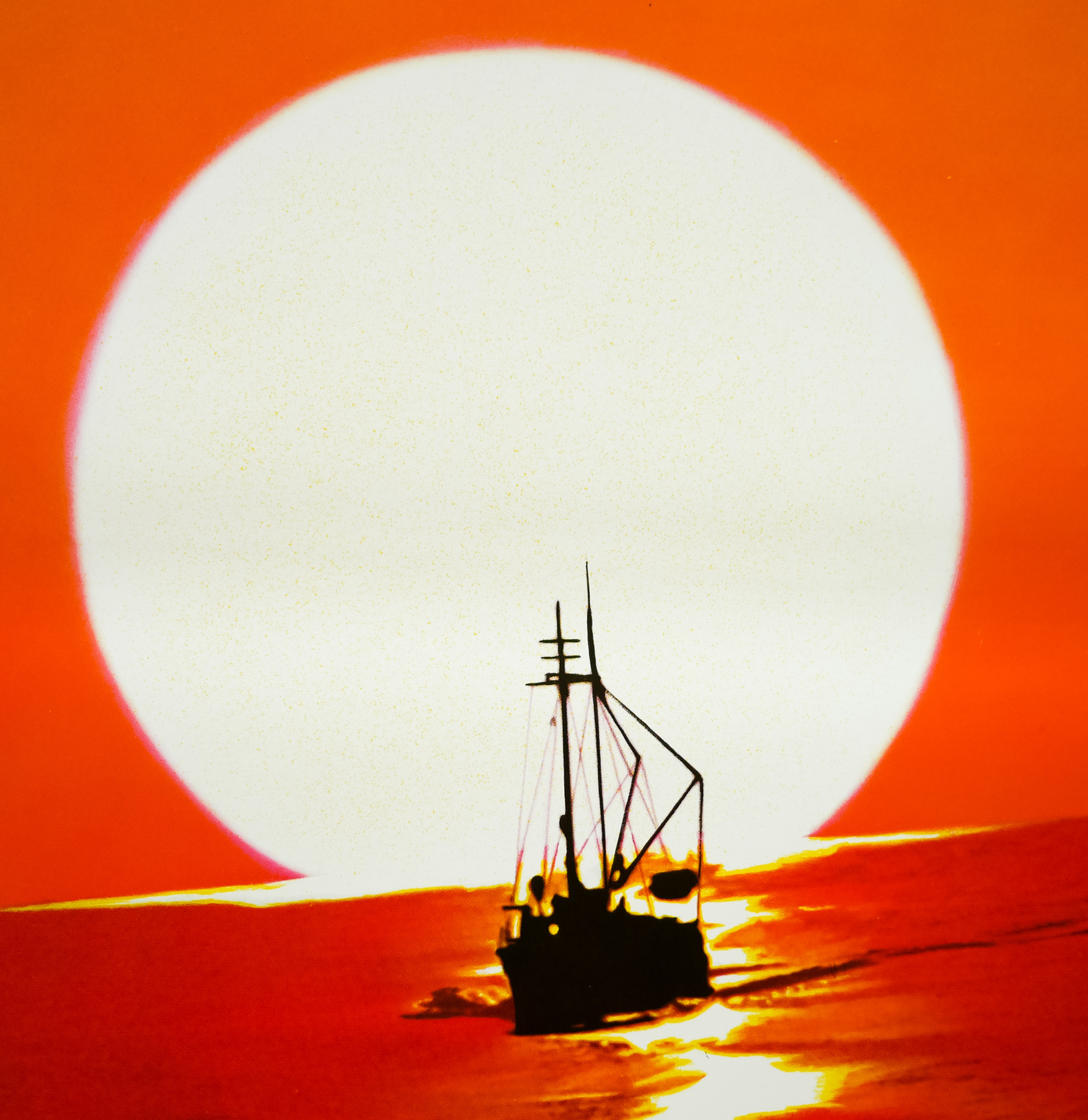
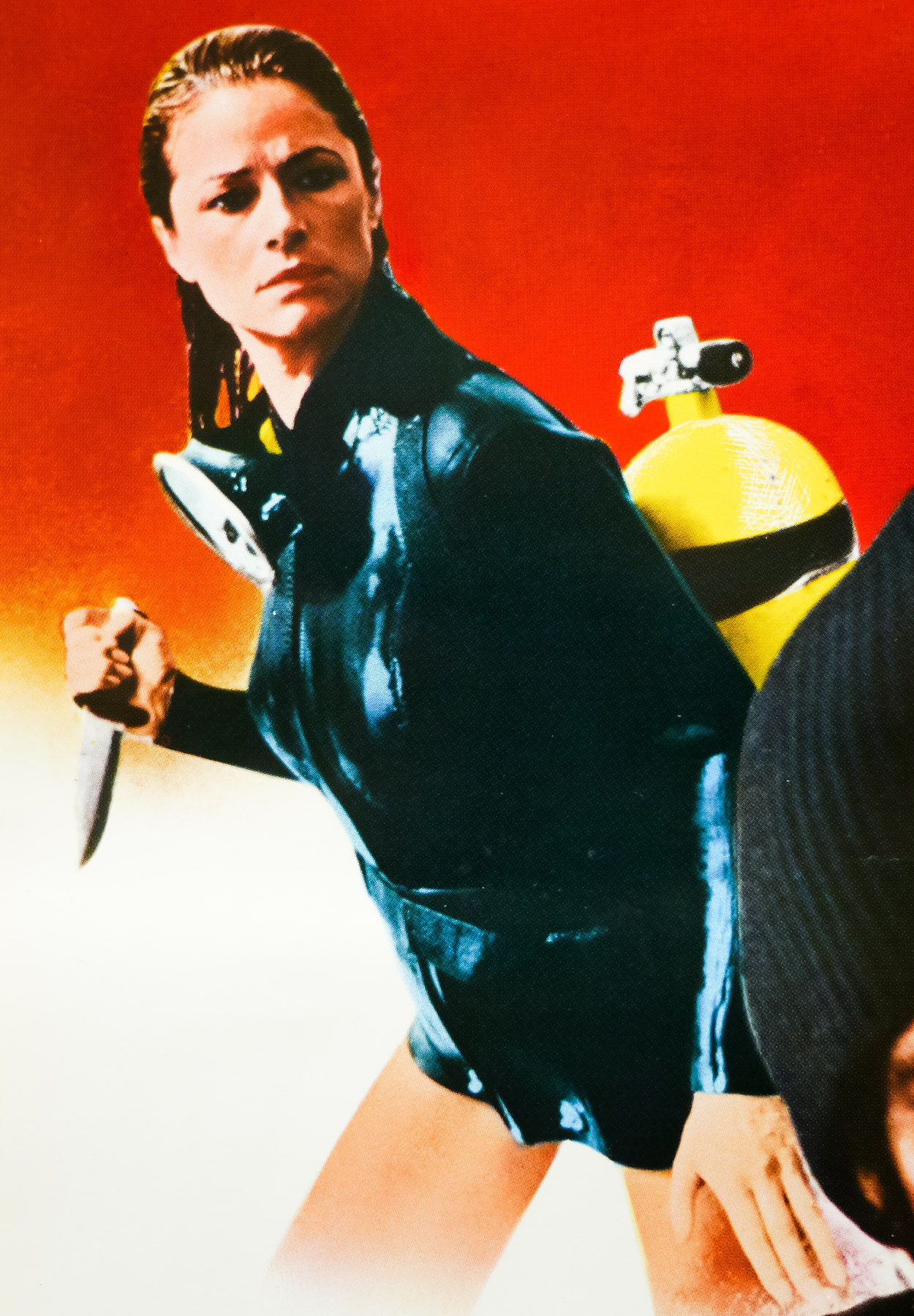
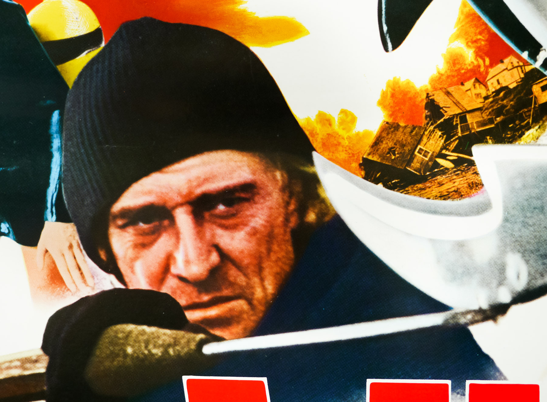
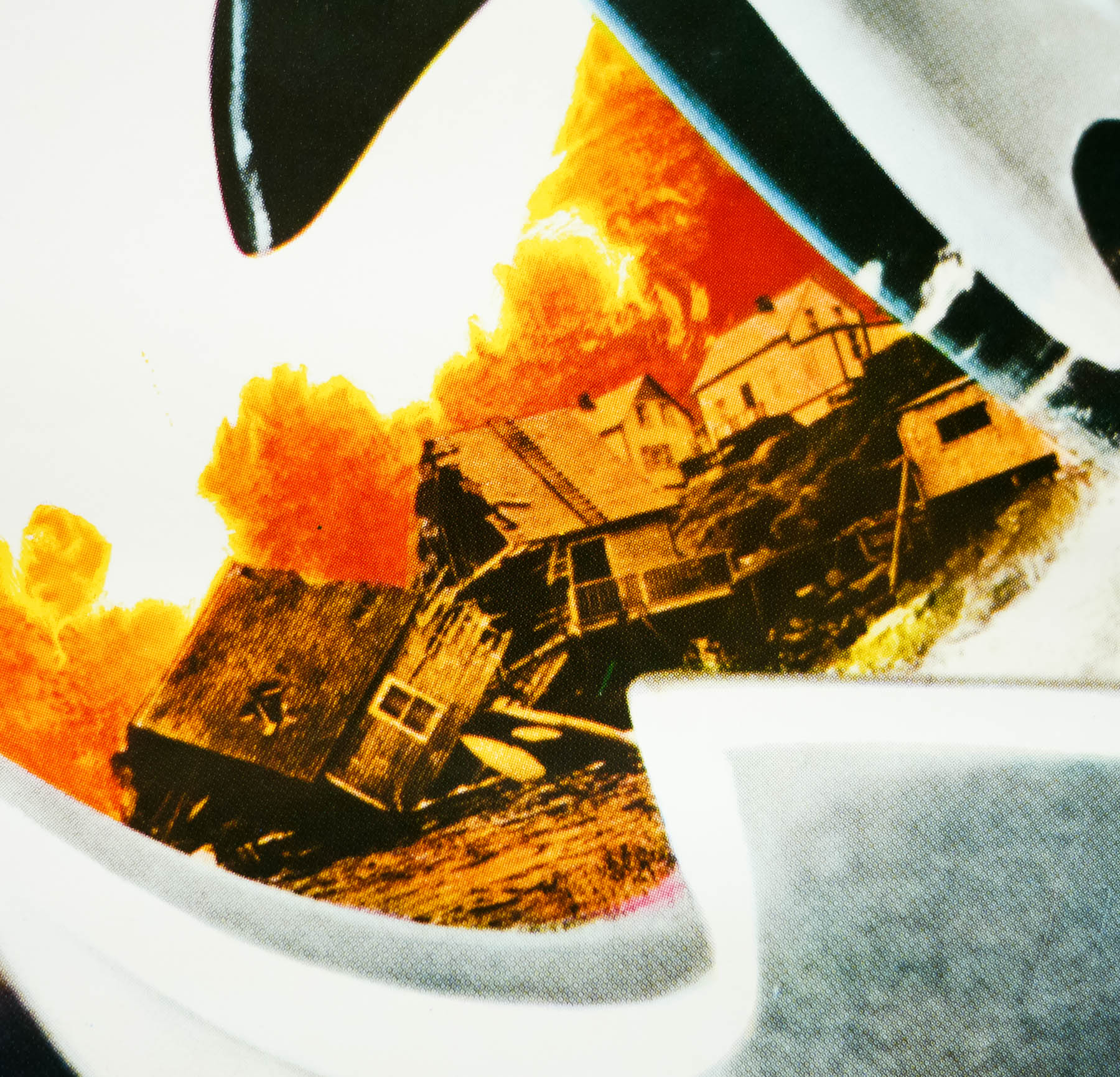
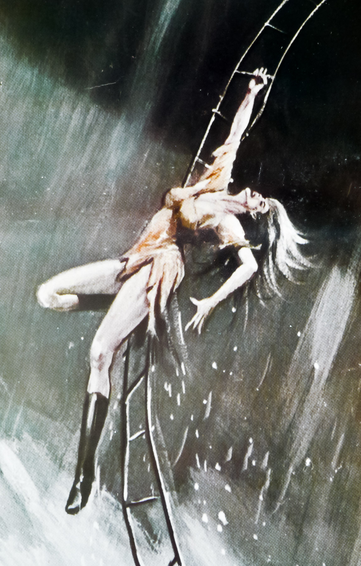
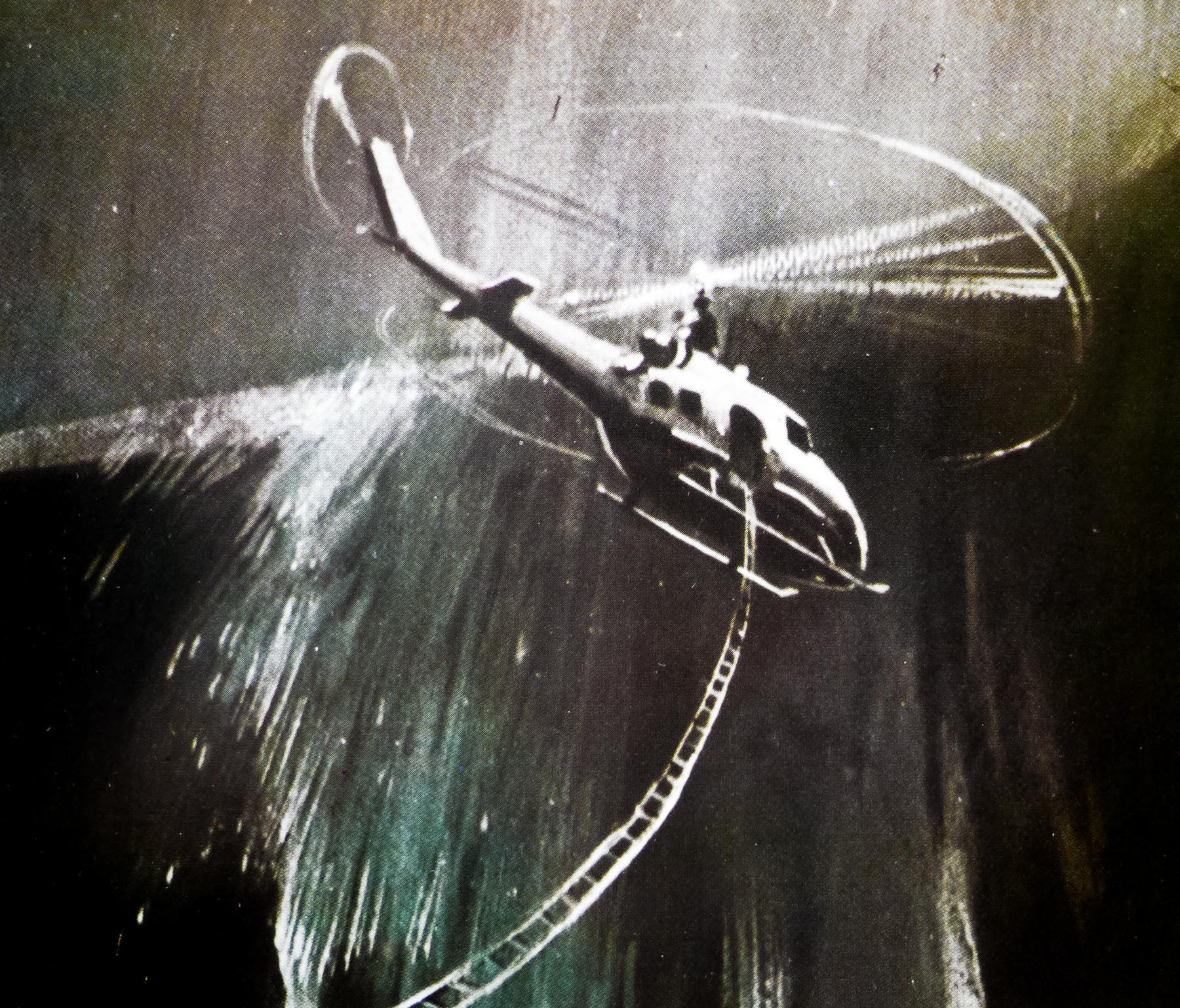
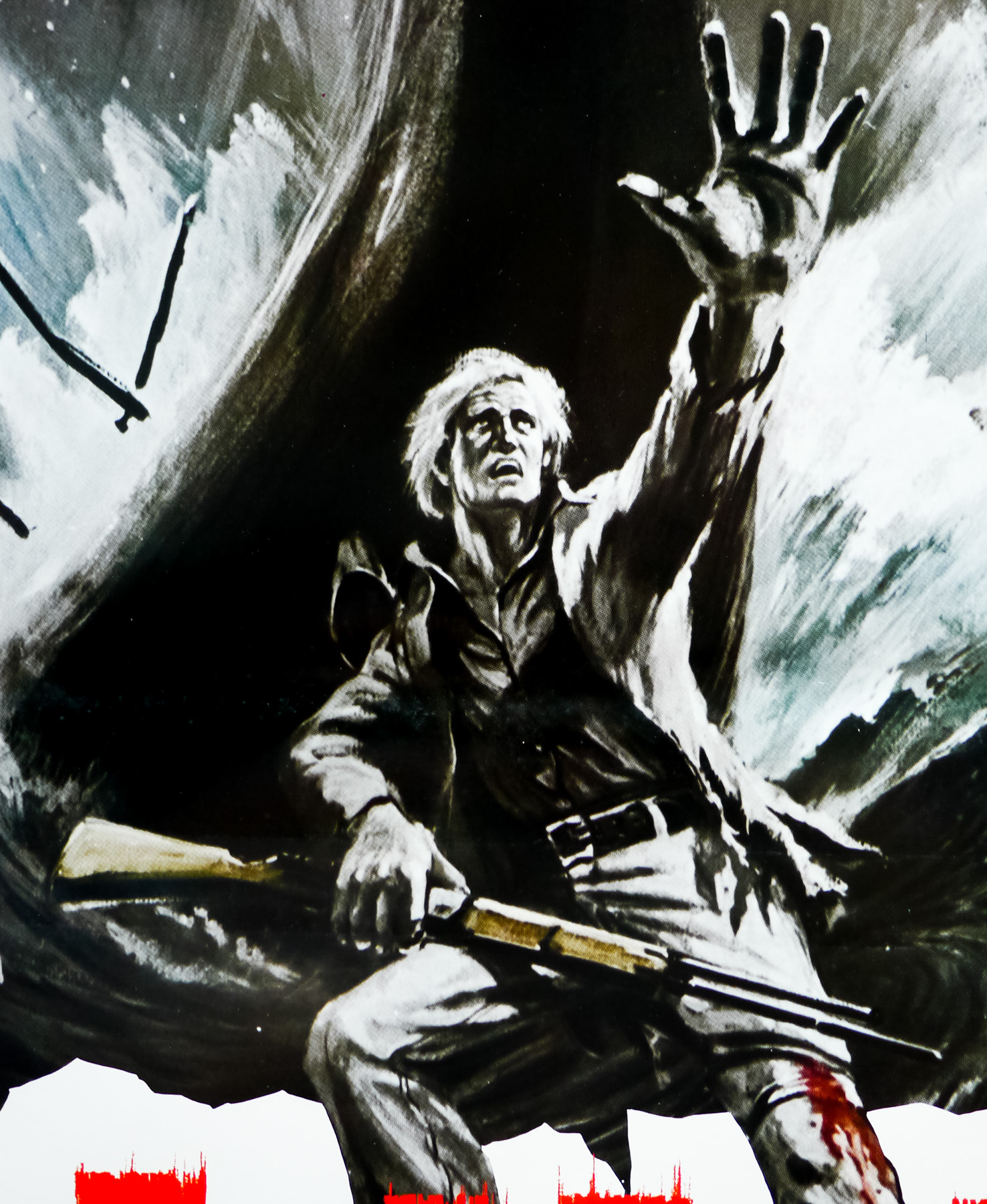
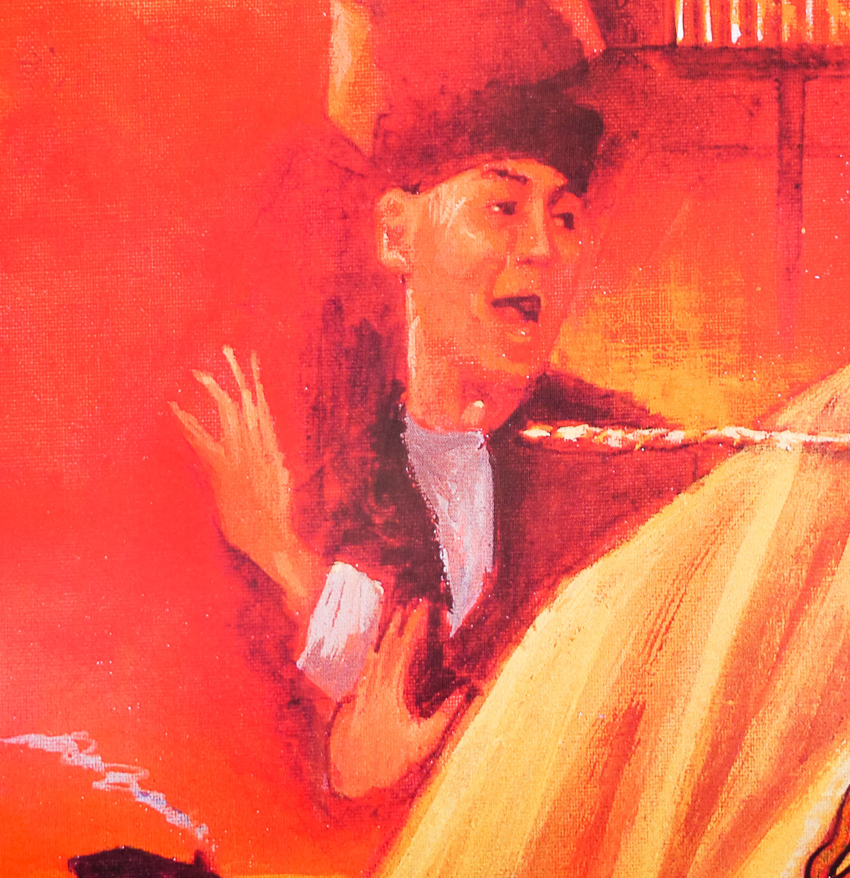
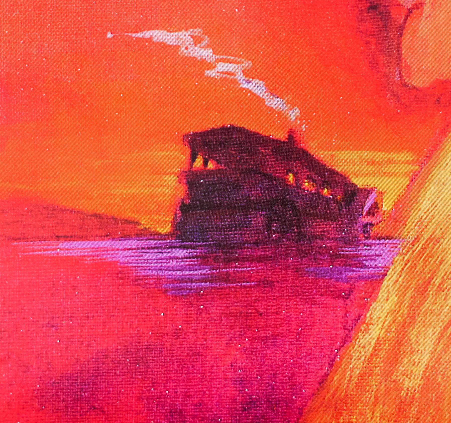
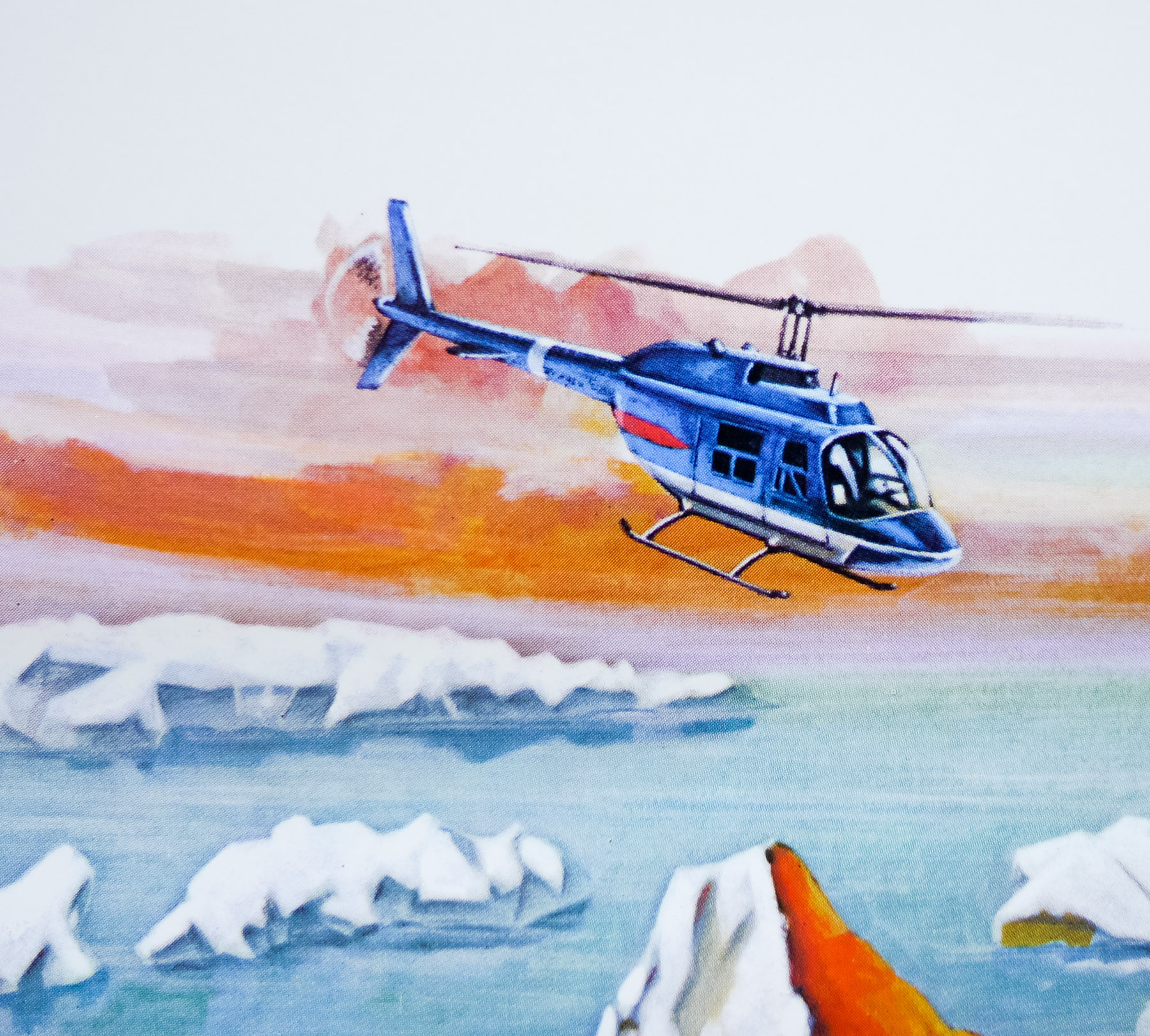
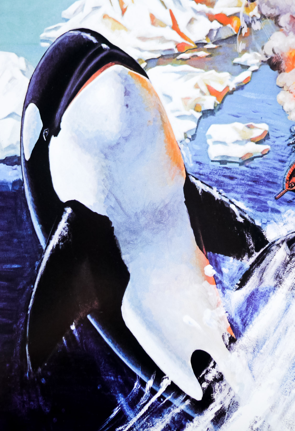
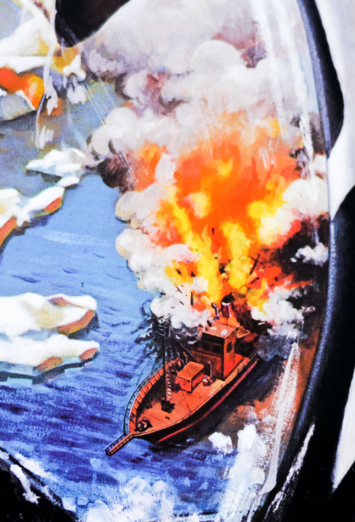
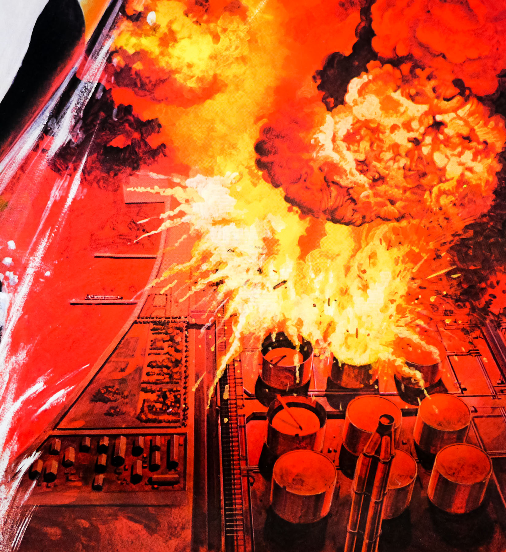
Harris plays Nolan, the Irish captain of a fishing boat operating in the waters off the coast of northern Canada who hears of a lucrative contract being offered for the live capture of a killer whale and hopes the bounty will pay off the mortgage on his boat. After Nolan and his crew accidentally spear a pregnant female killer whale they drag it onto the ship where it miscarries, and almost dies, before the male (Orca) attacks the ship, killing one of the crew before the female is cut loose and falls into the water. The next morning the body of the female whale washes up on shore and before long it becomes clear that Orca is out for revenge, as he attacks the fishing village and destroys vital fuel lines. The villagers insist Nolan is responsible and task him with killing Orca so he sets off with the remainder of his crew, plus marine biologist Rachel Bedford (Charlotte Rampling) and a native American killer whale expert (Will Sampson). The whale leads the boat away from the village into frozen, iceberg covered waters and the stage is set for a final confrontation.
Unfortunately for De Laurentiis and all involved the film was critically derided and sank quickly at the box office, particularly since the juggernaut that was Star Wars was already smashing box office records around the world. The idea of a vengeful fish obviously didn’t go down too well with audiences, although the people behind 1987’s awful Jaws: The Revenge must have forgotten this by the time it was decided to make a third Jaws sequel. The practice of hunting and capturing killer whales to feed the demand from aquariums in the 1960s and 70s was sadly all too prevalent, as documented in the recent heartbreaking documentary Blackfish, which also points out that there are no documented cases of humans being killed by the whales in the wild.
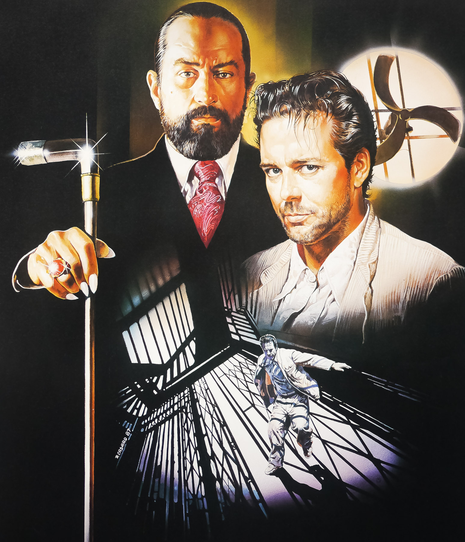
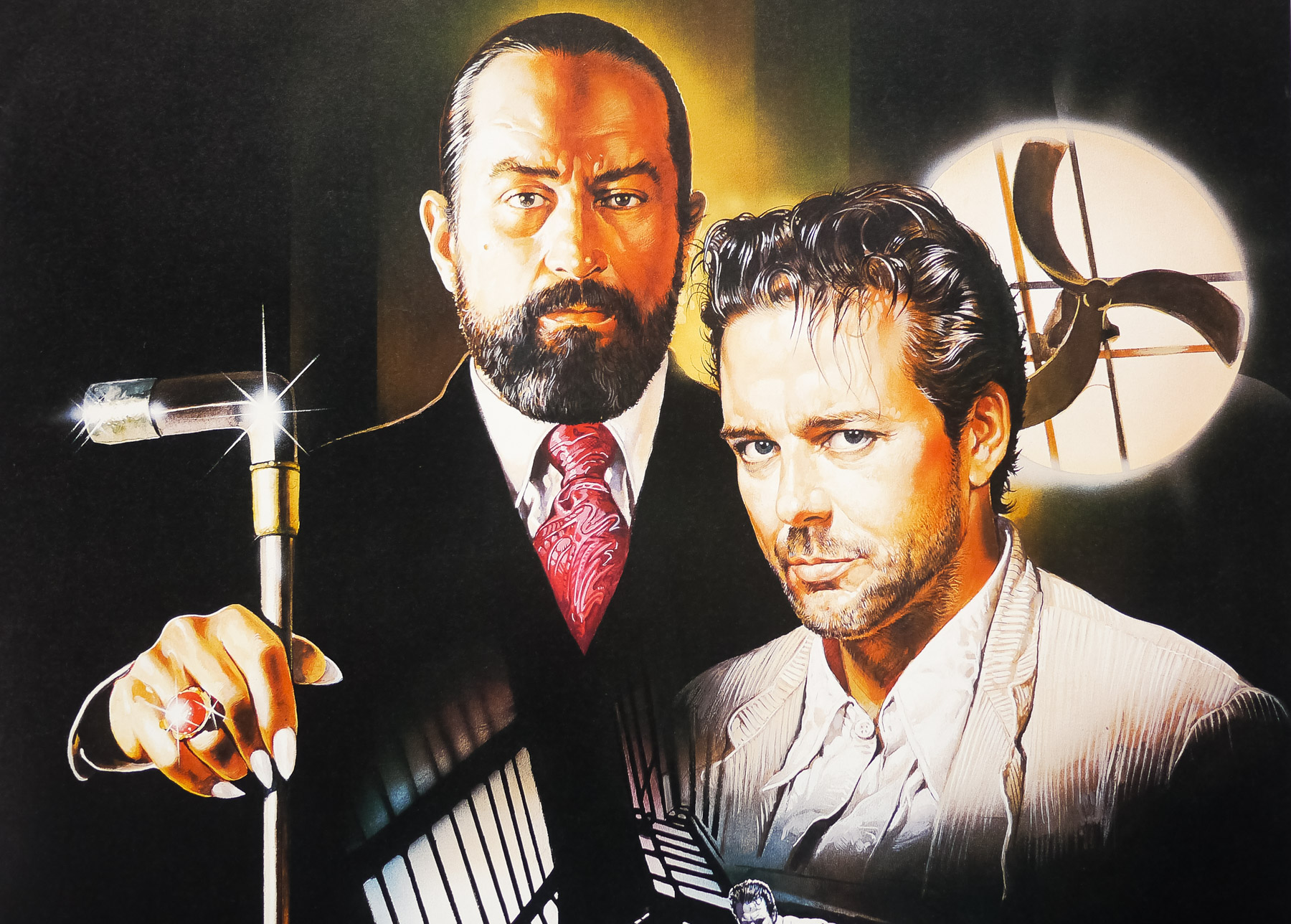
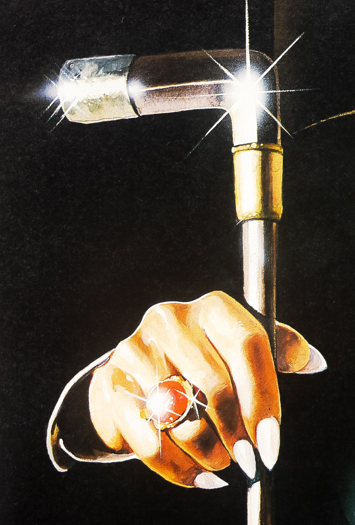
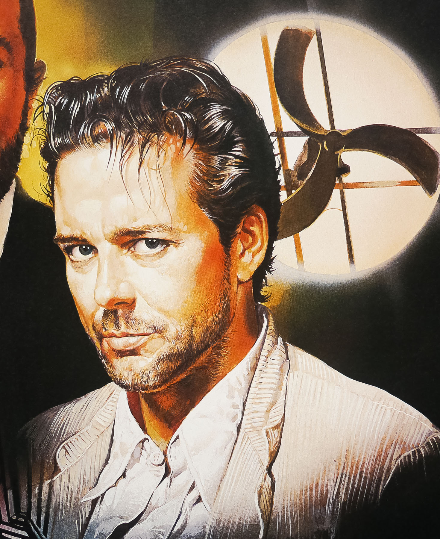
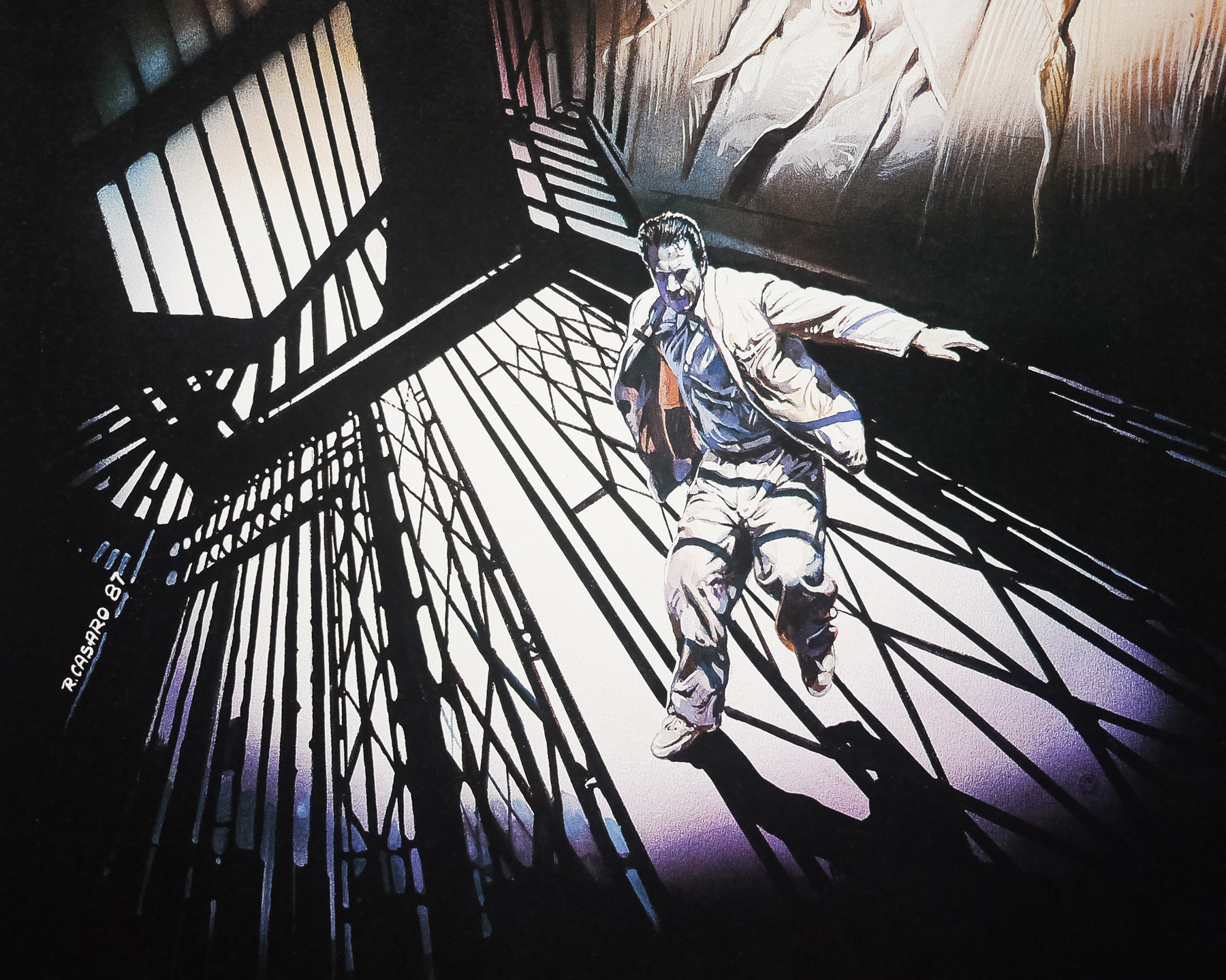
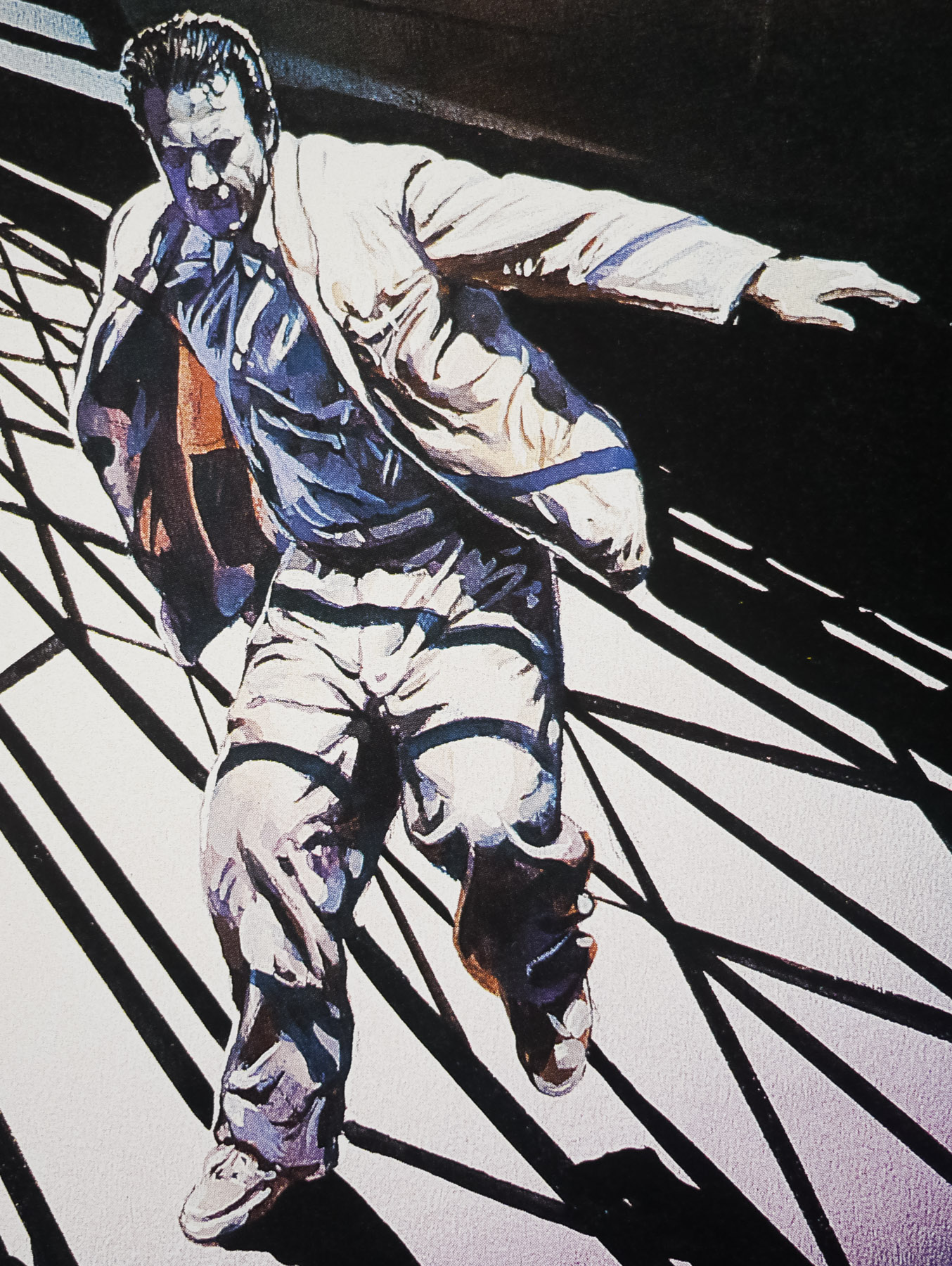
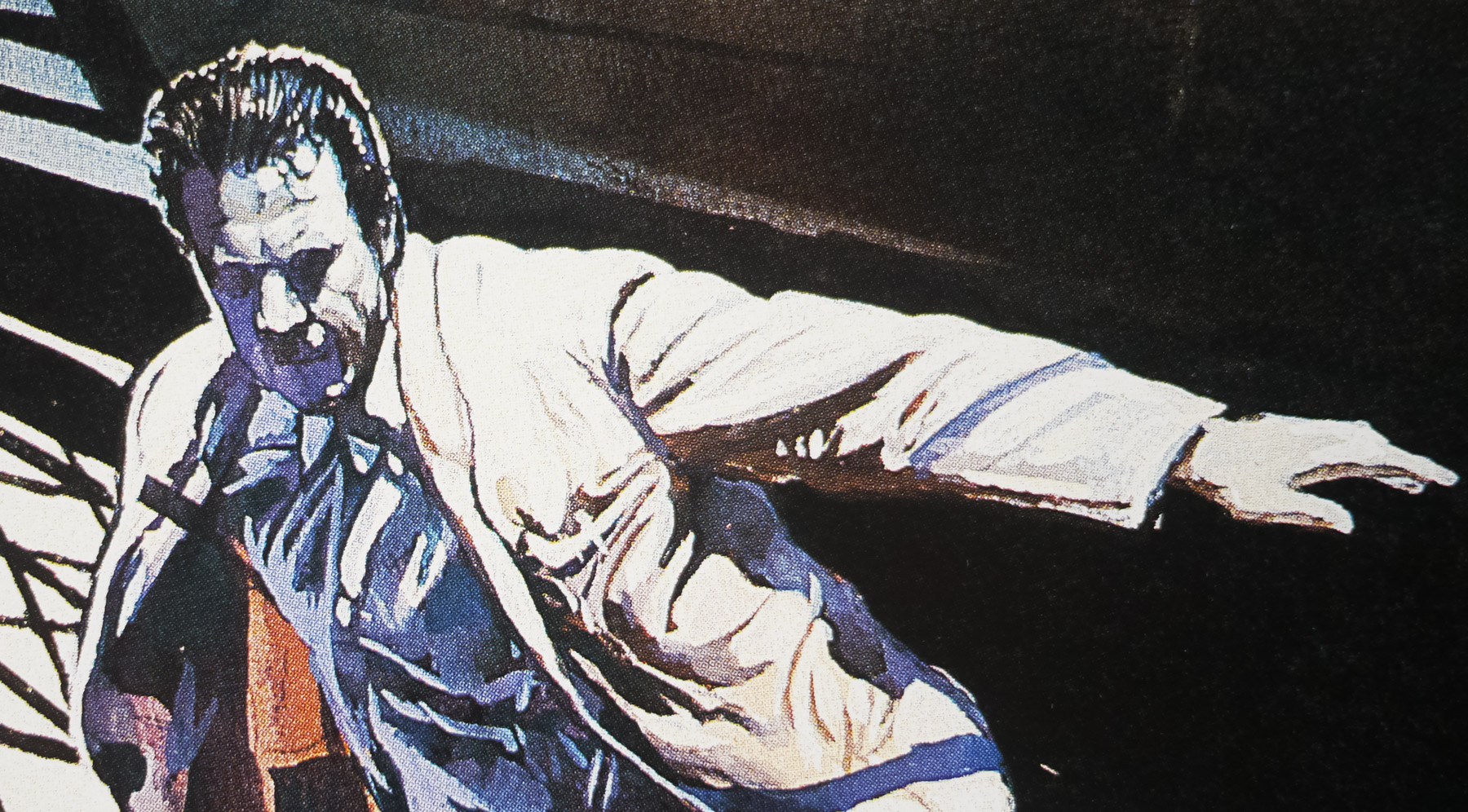
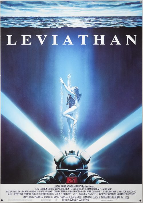
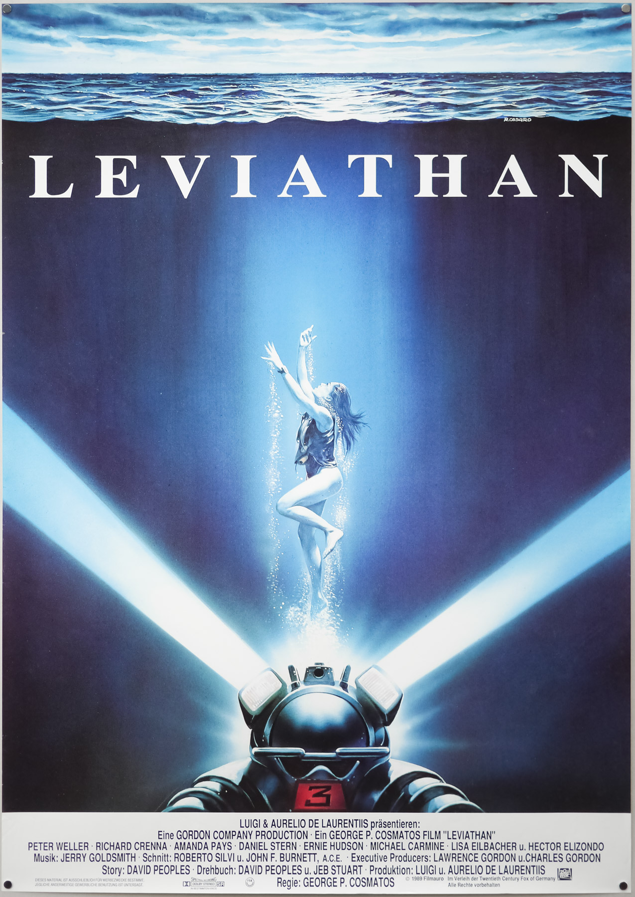
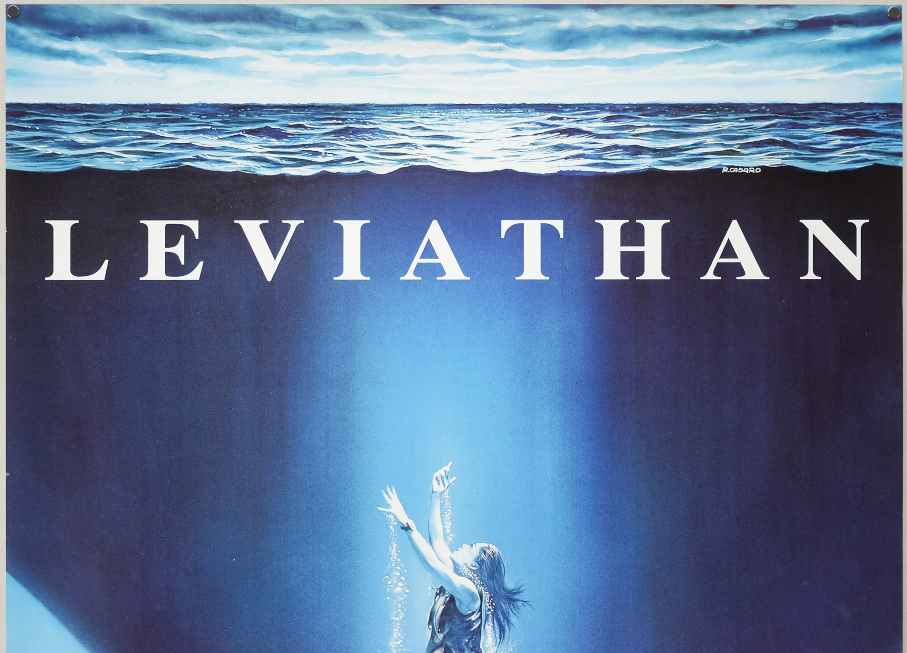
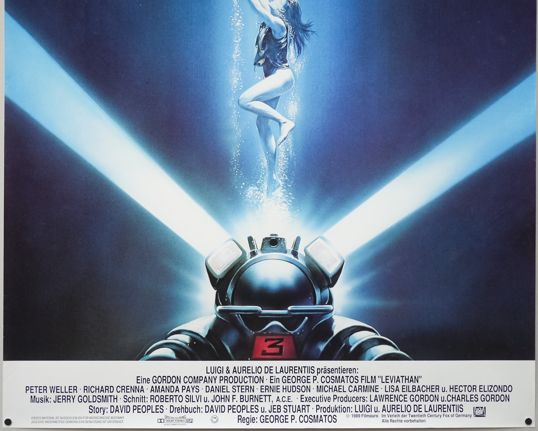
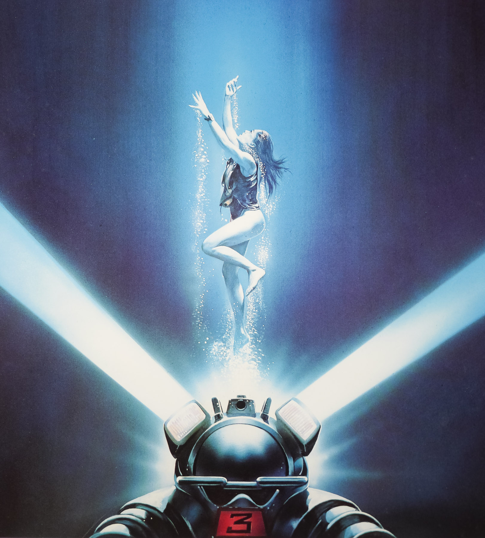
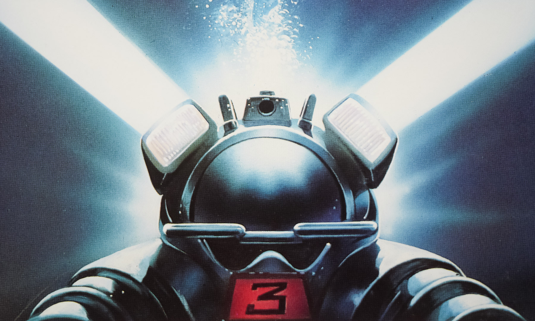
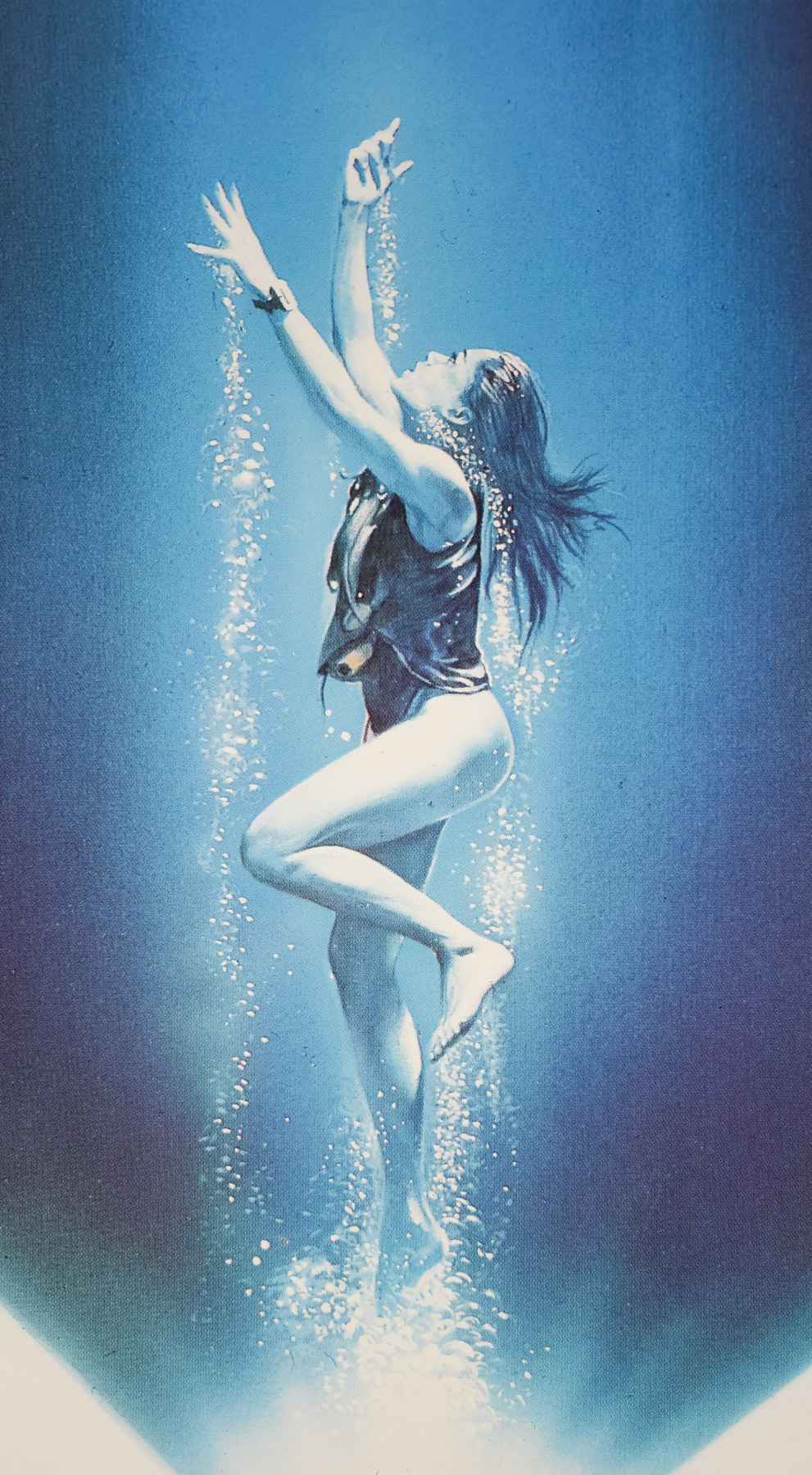
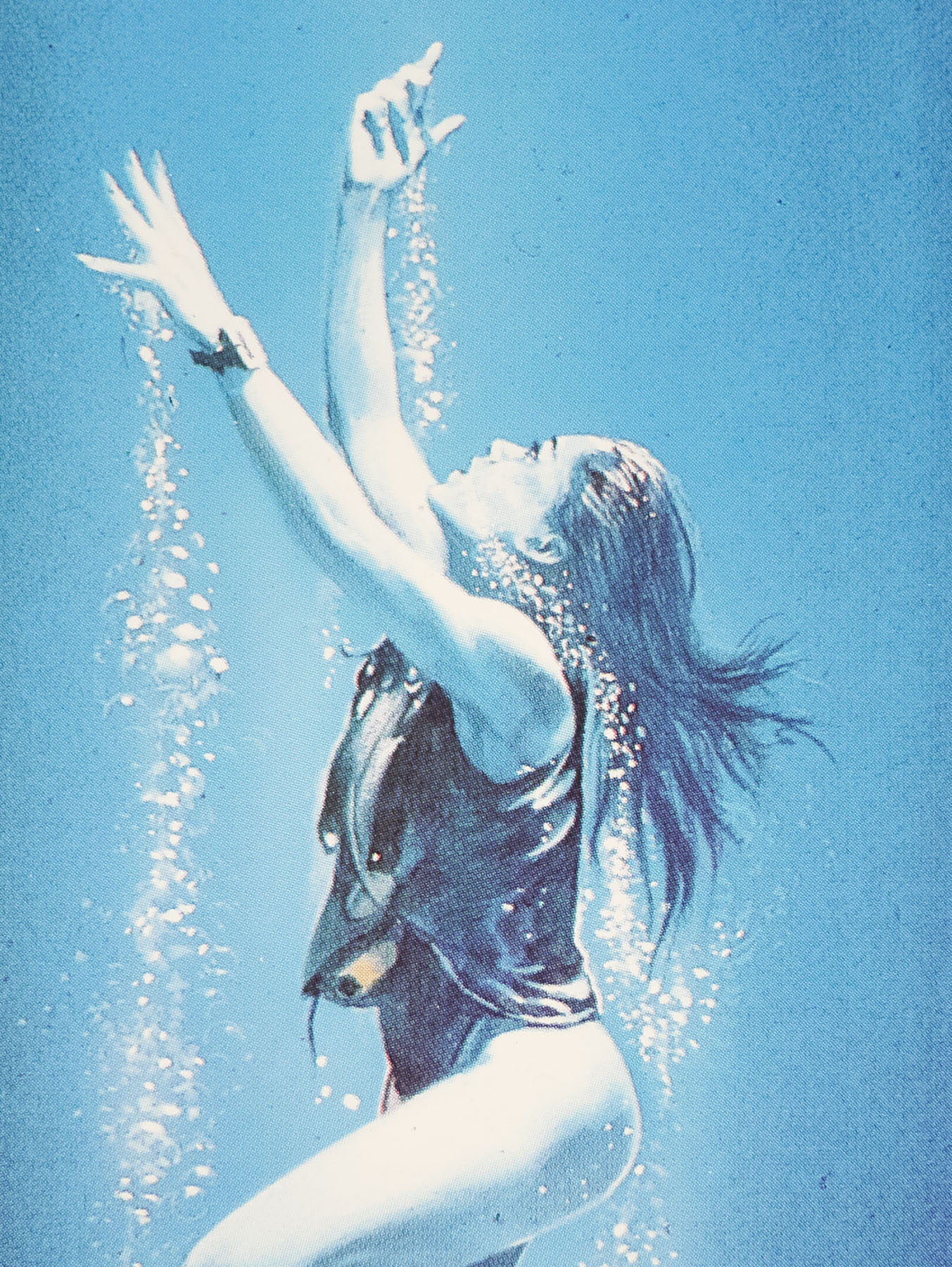
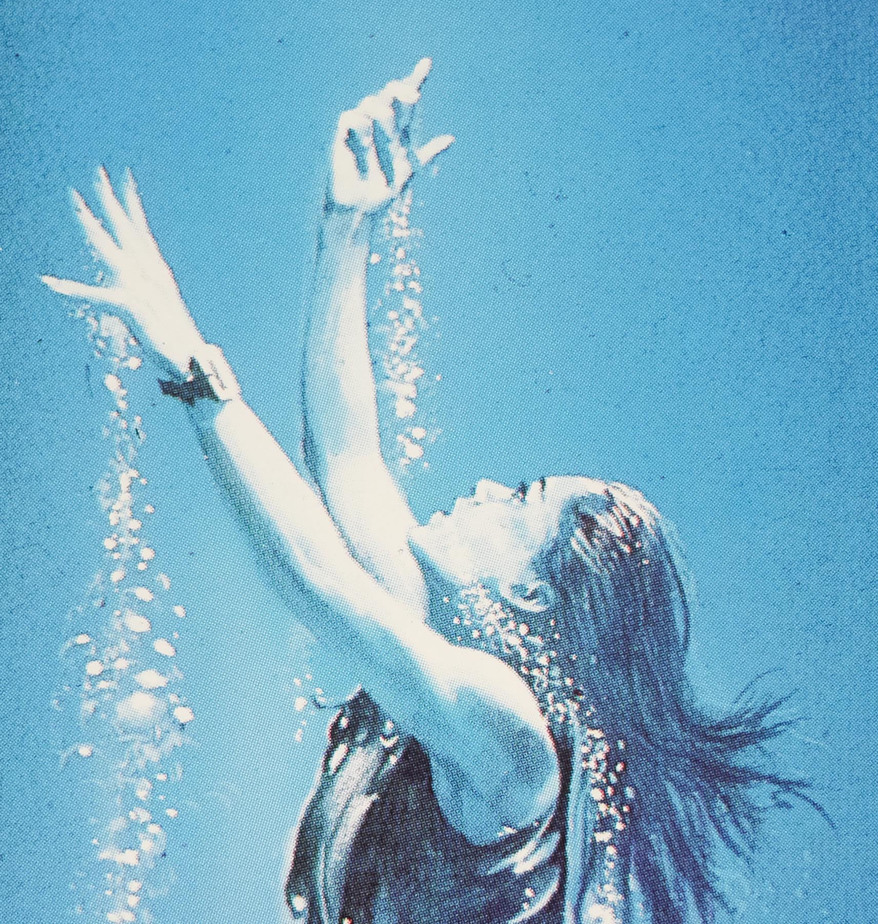
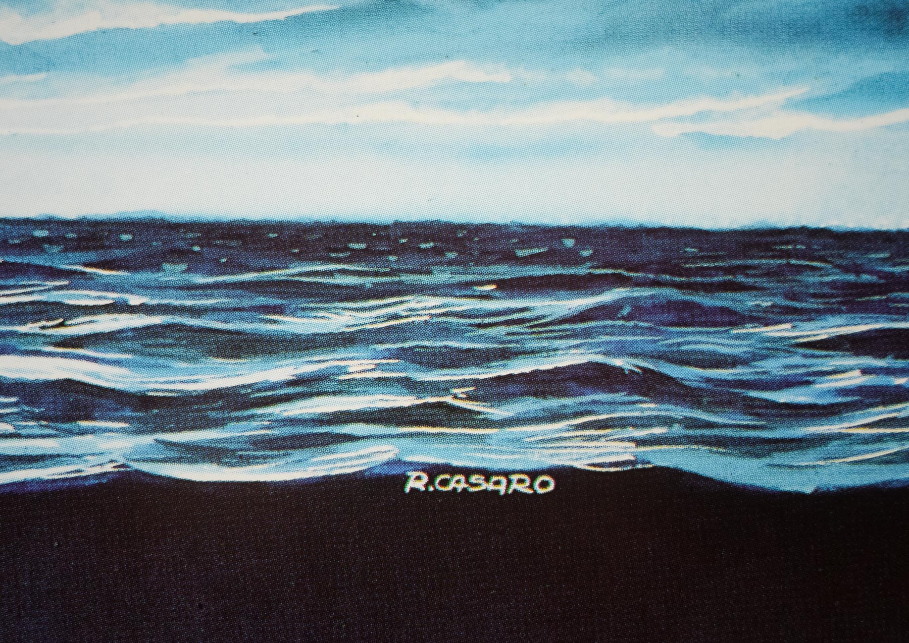
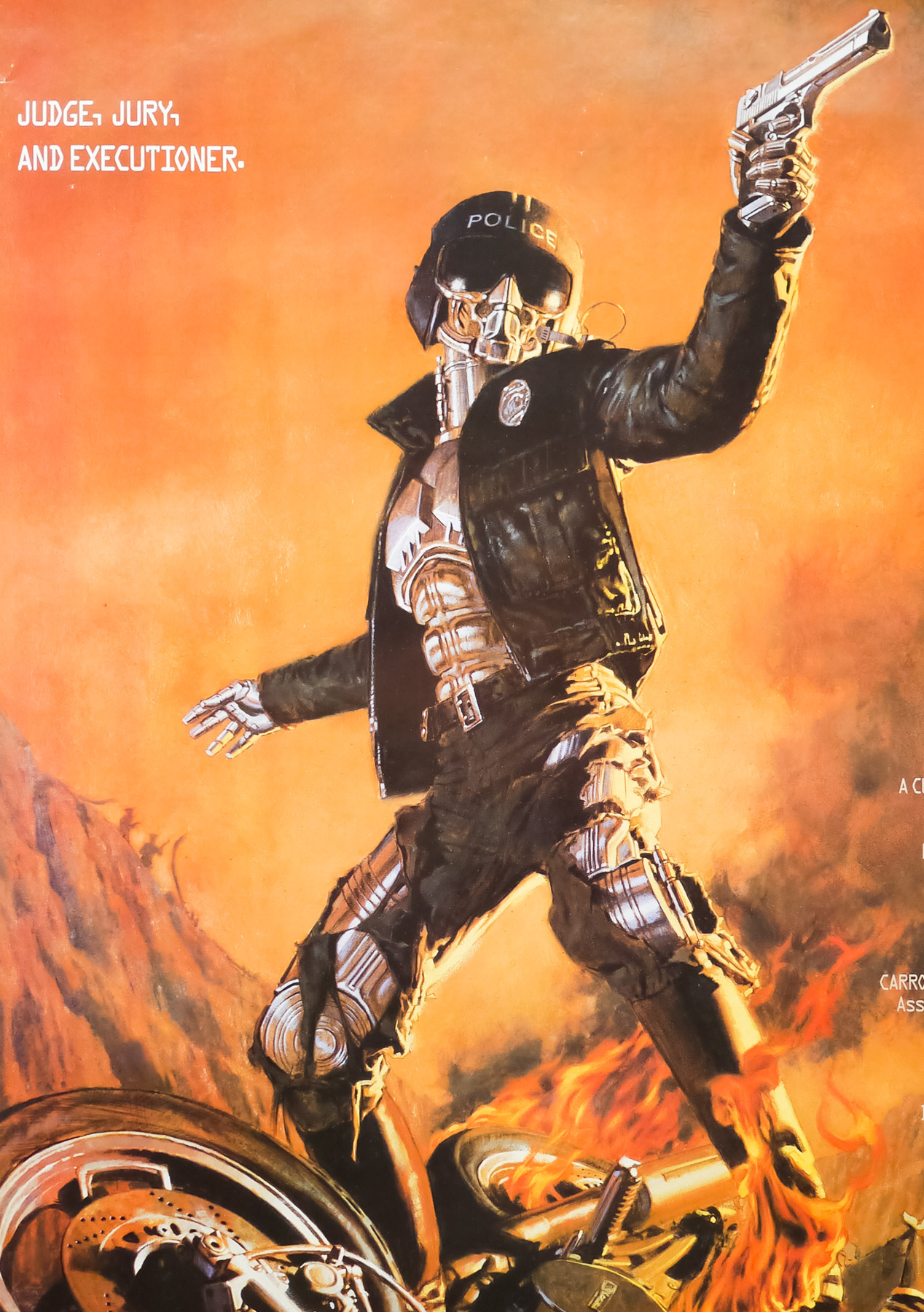
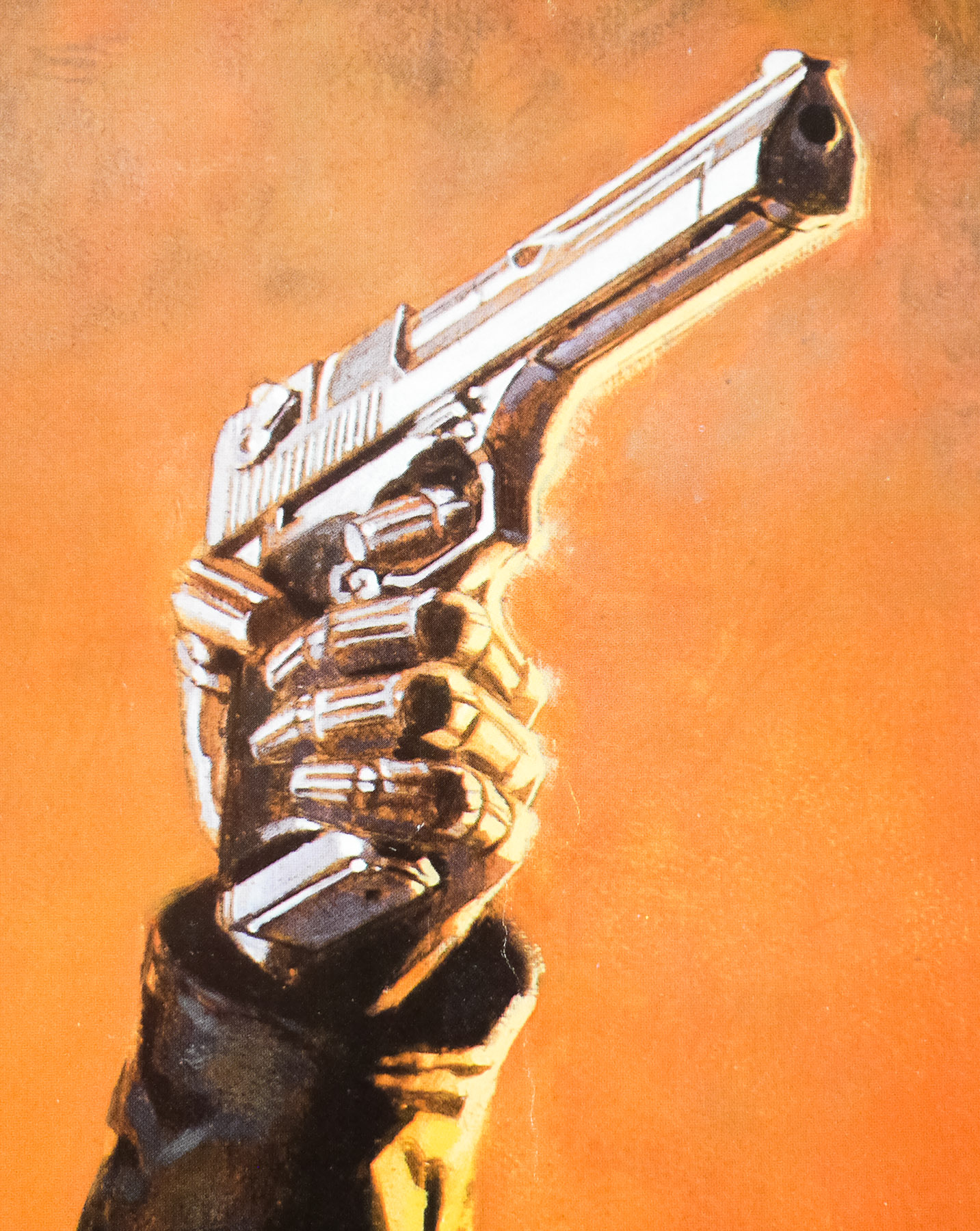
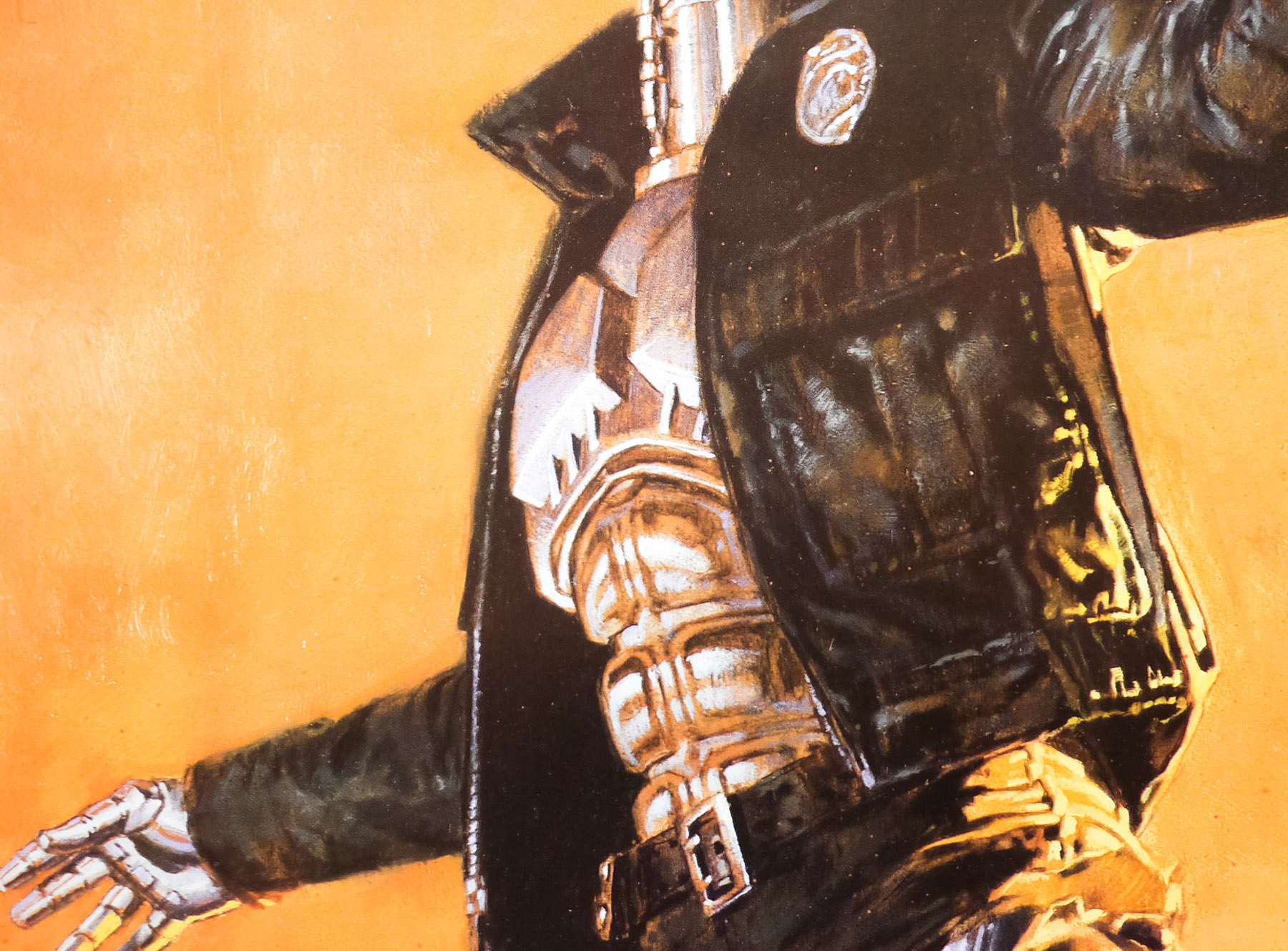
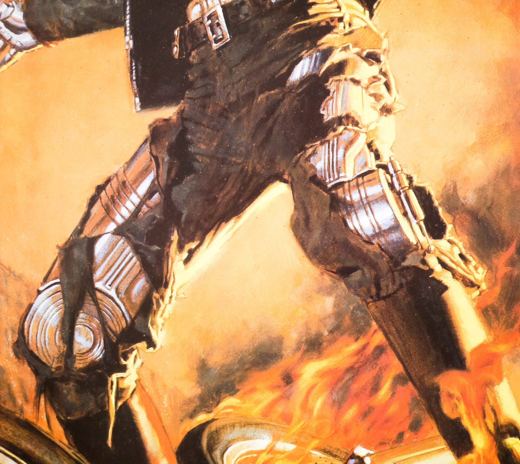
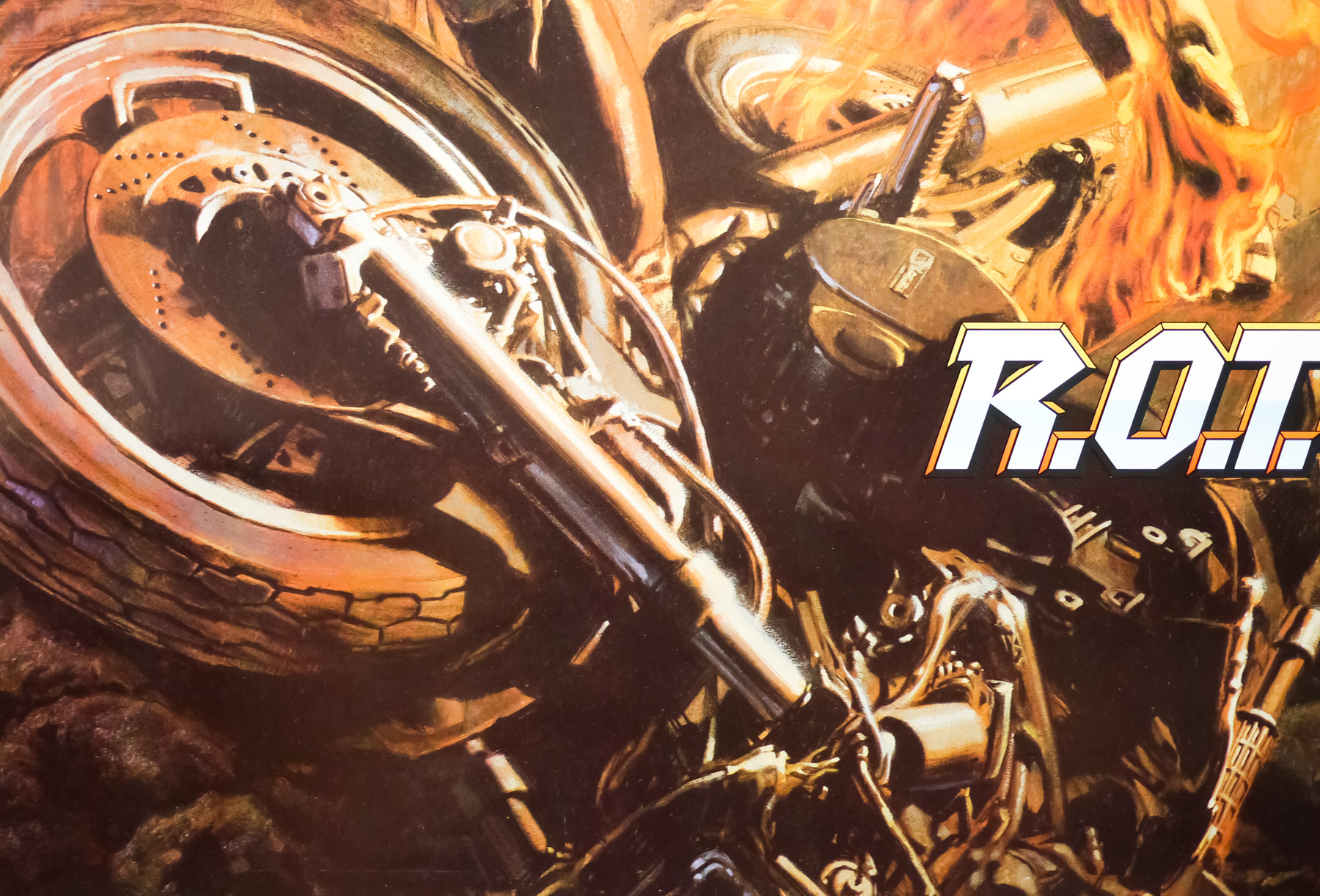
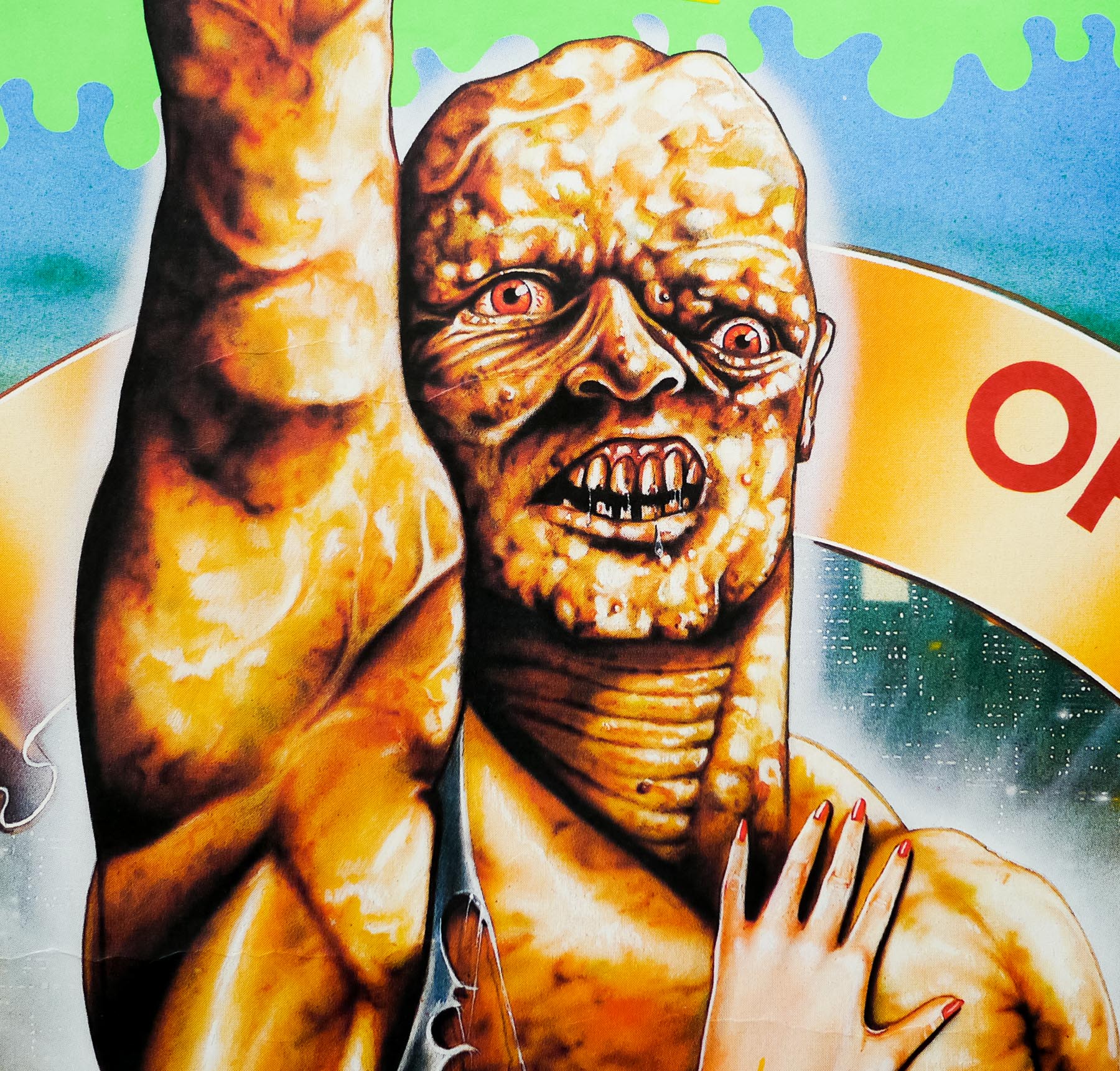
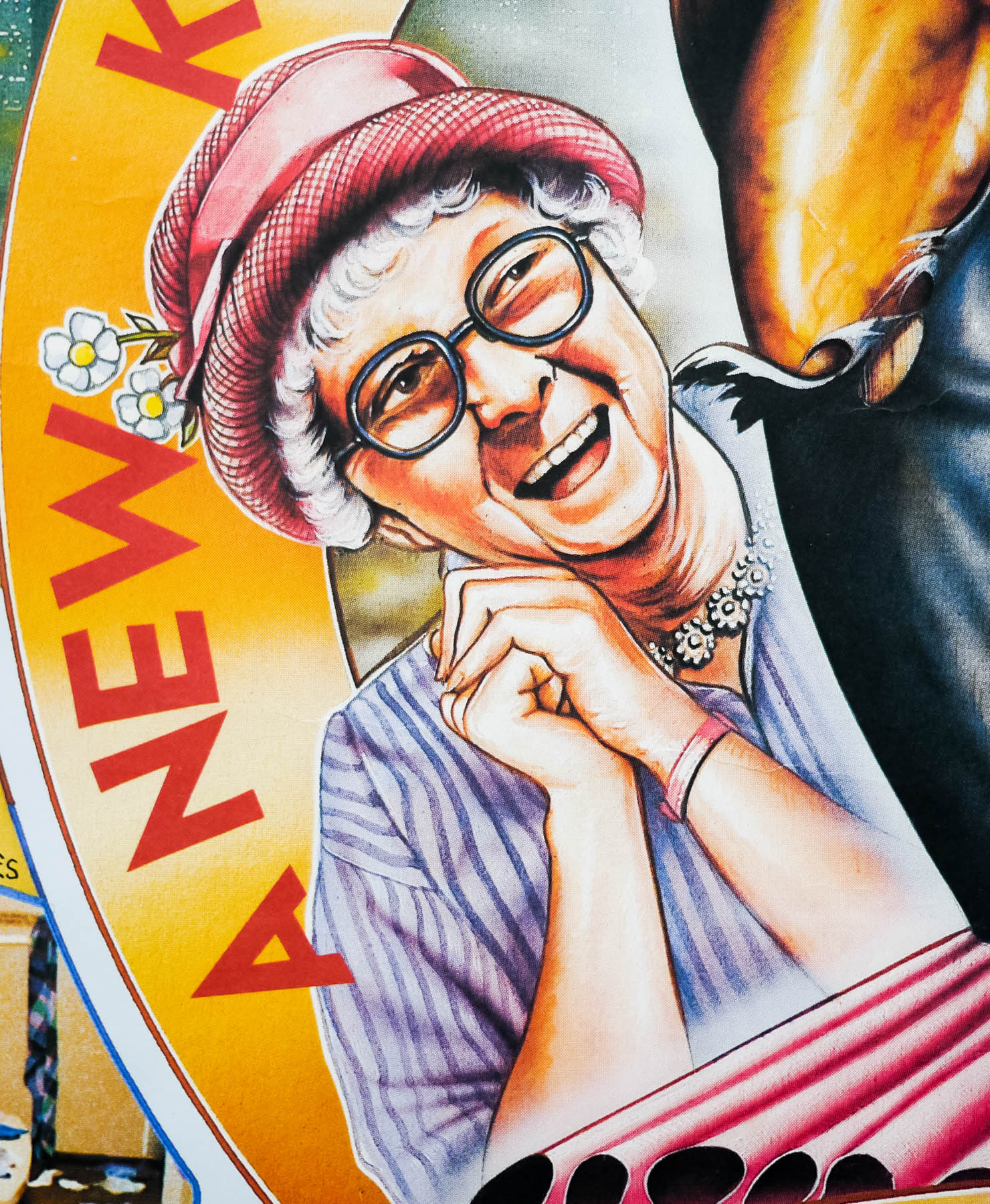
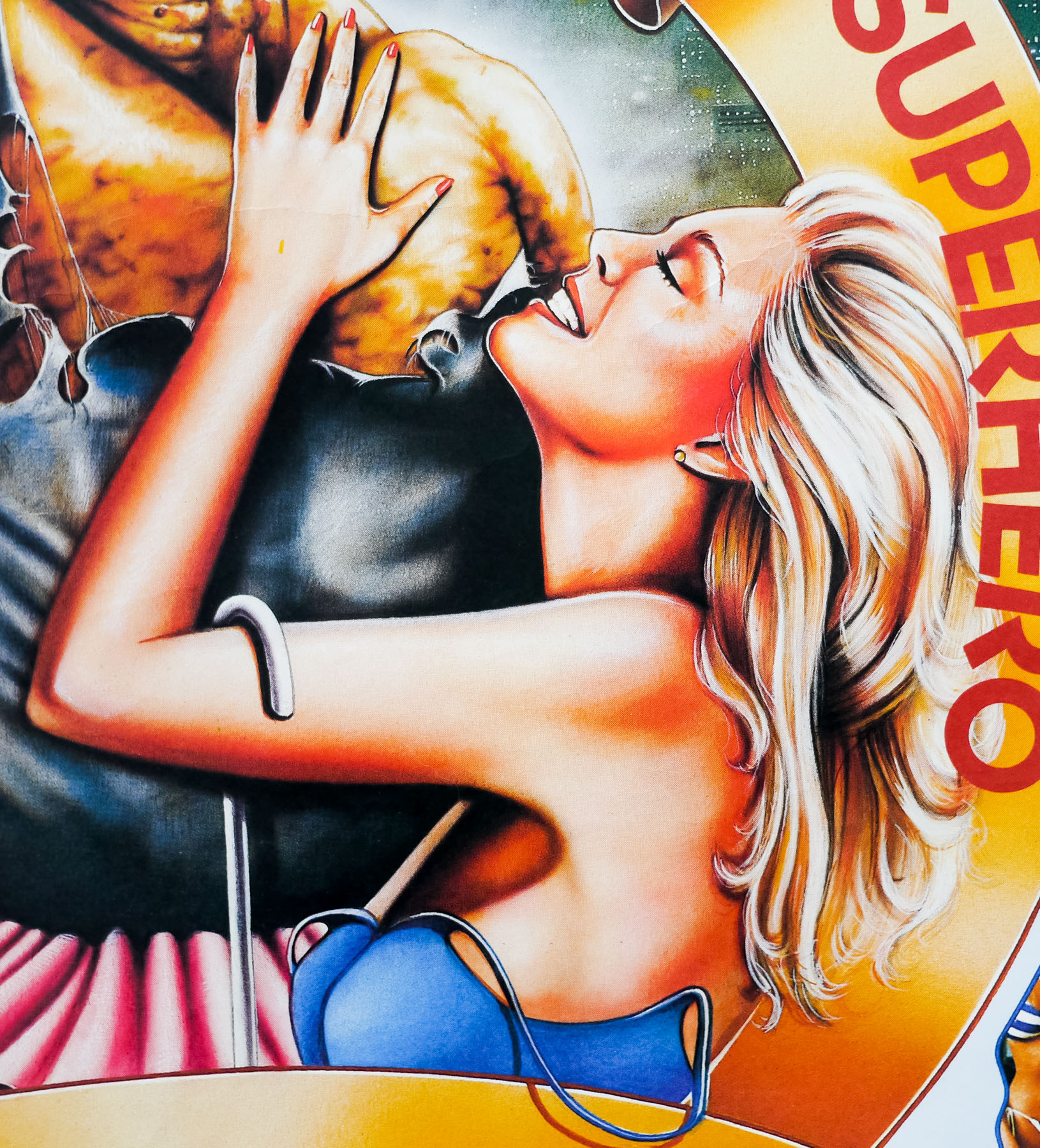
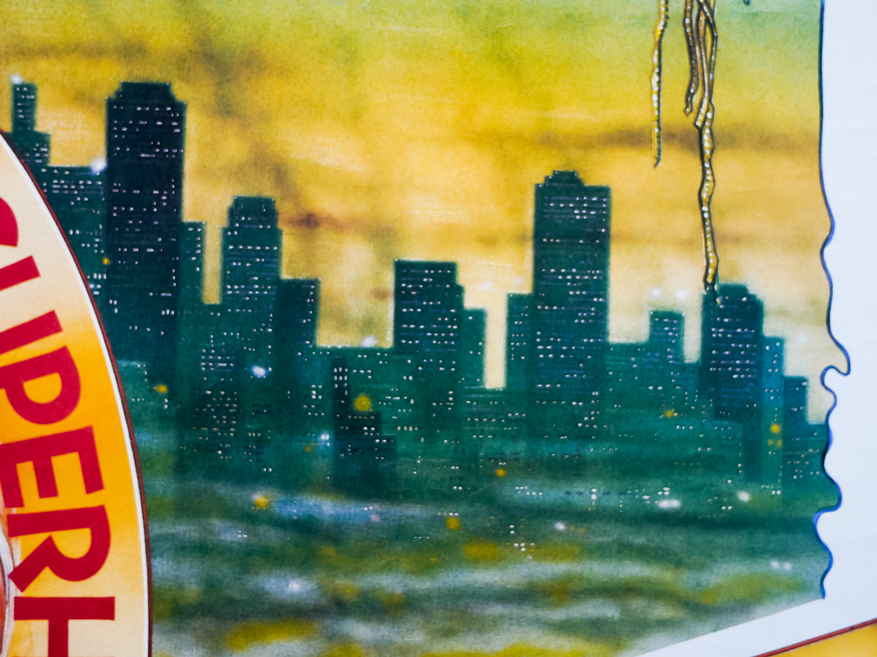
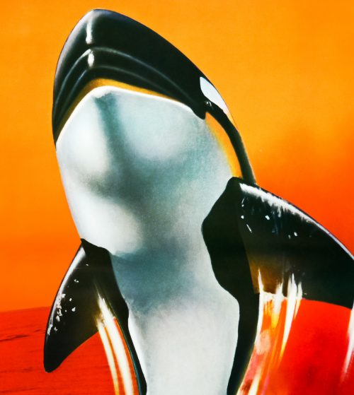
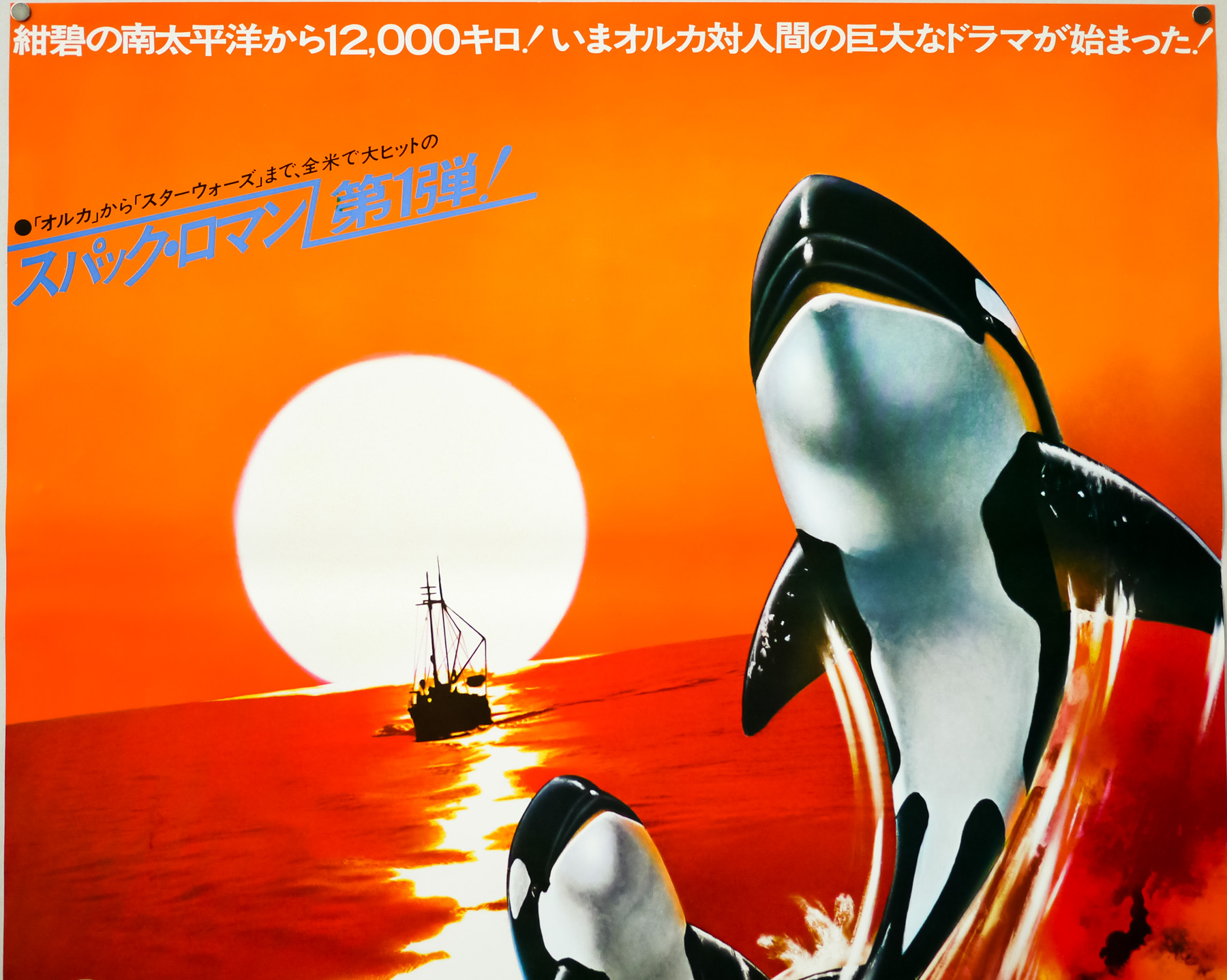
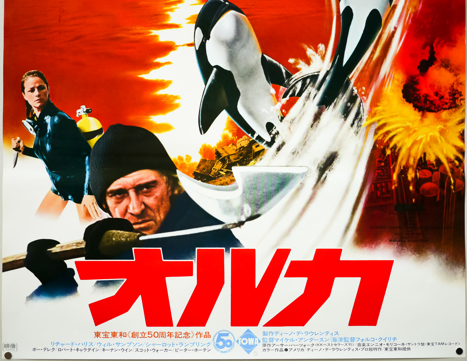
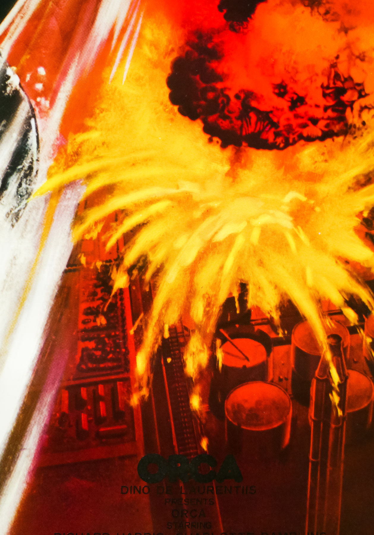
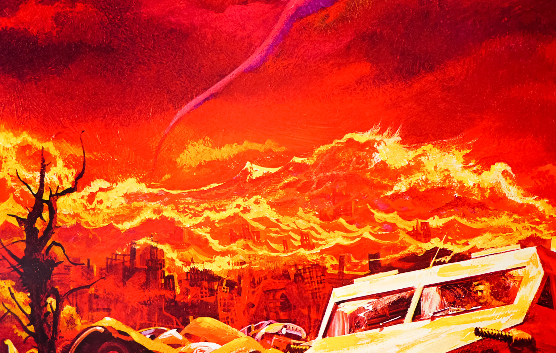
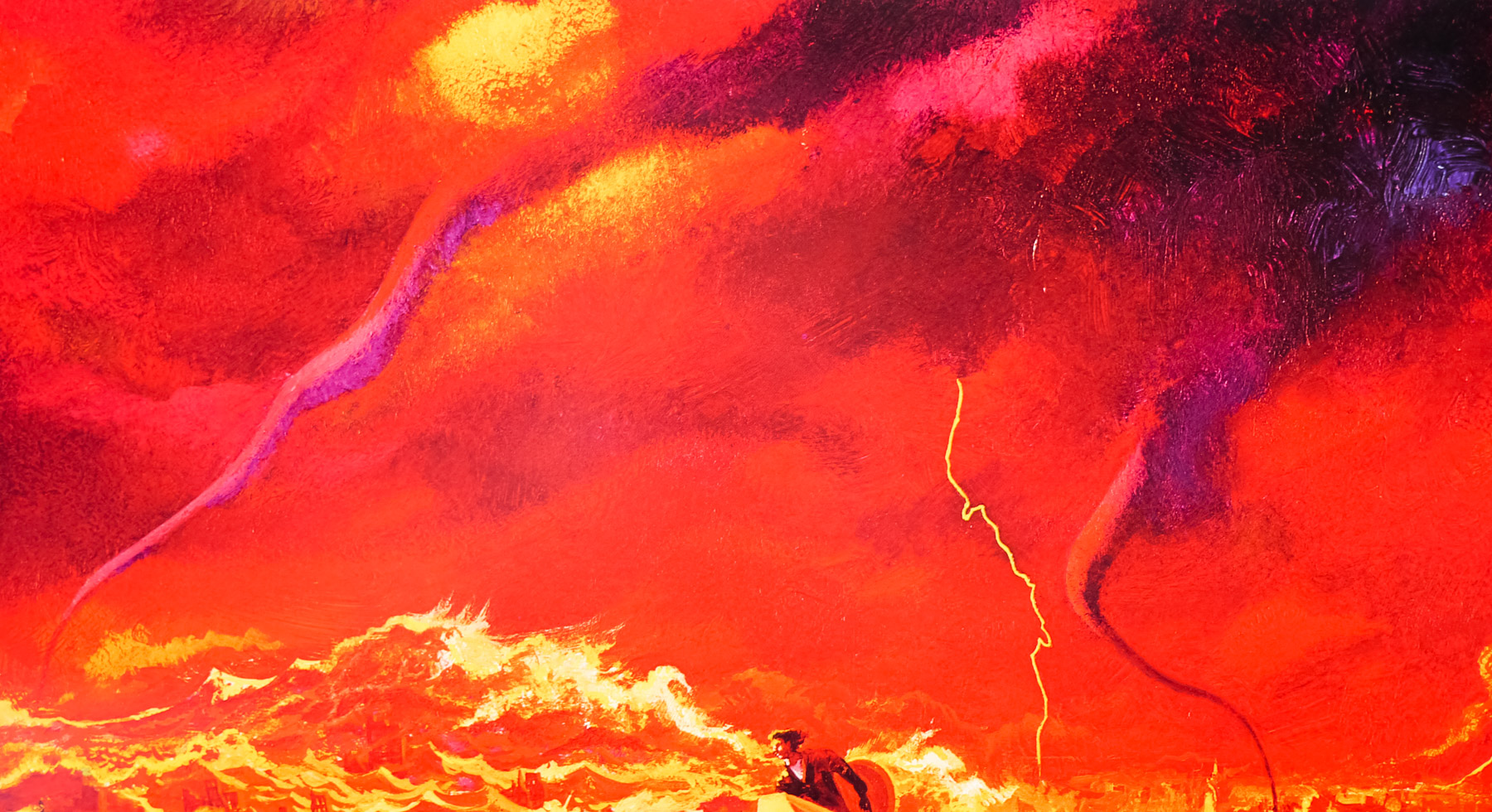
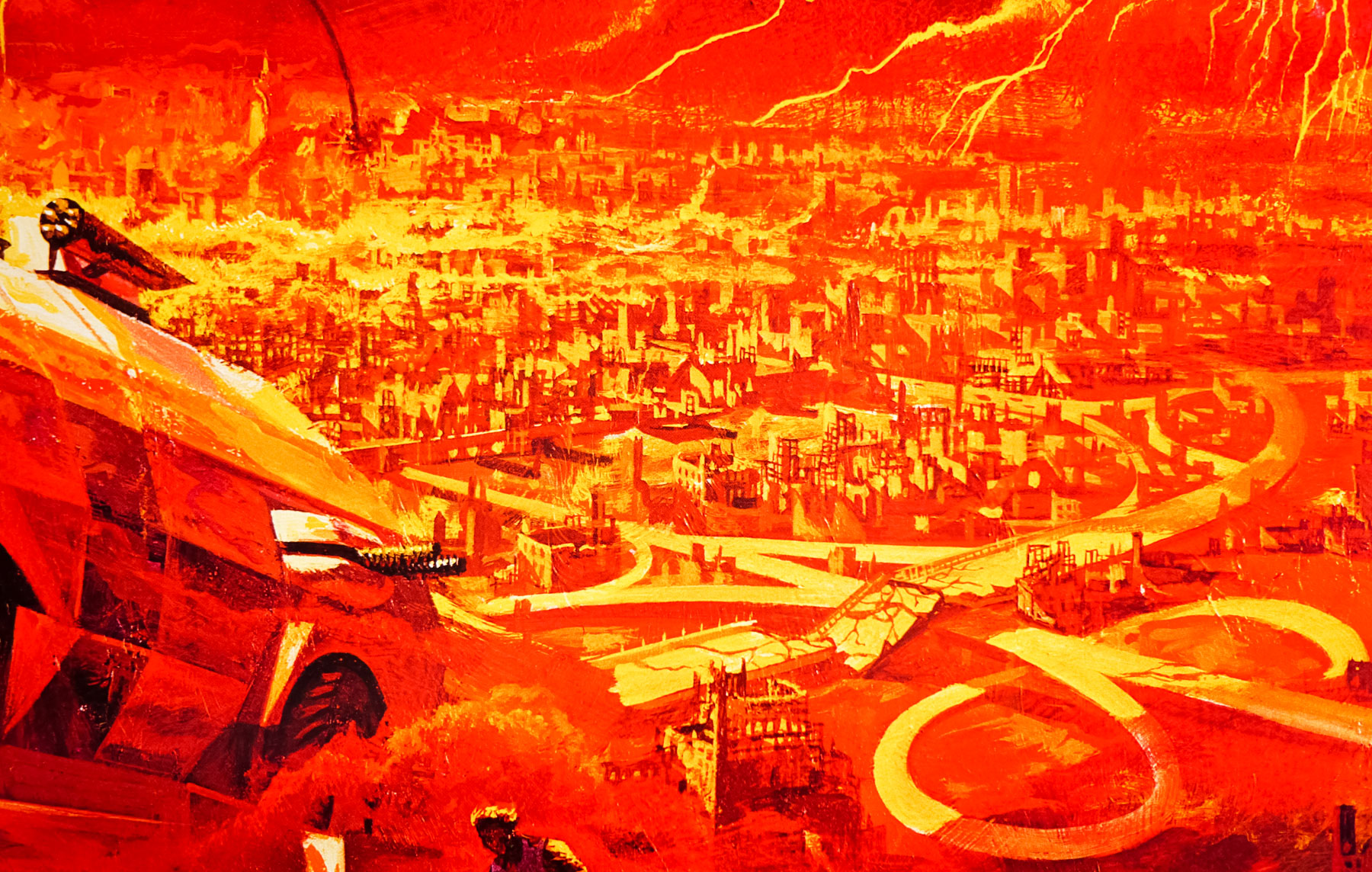
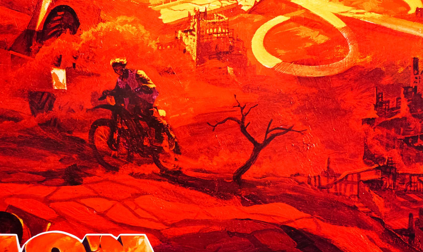
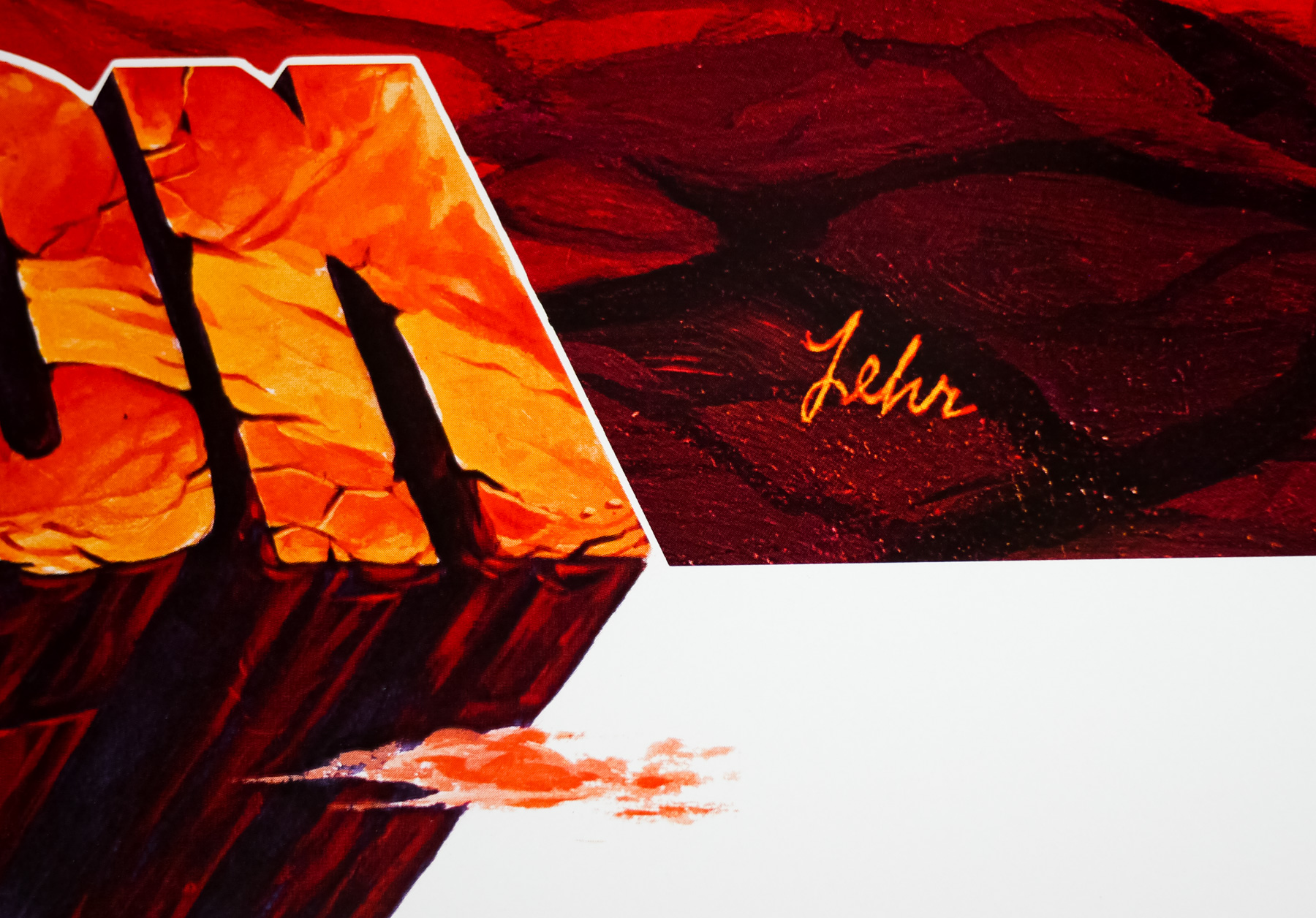
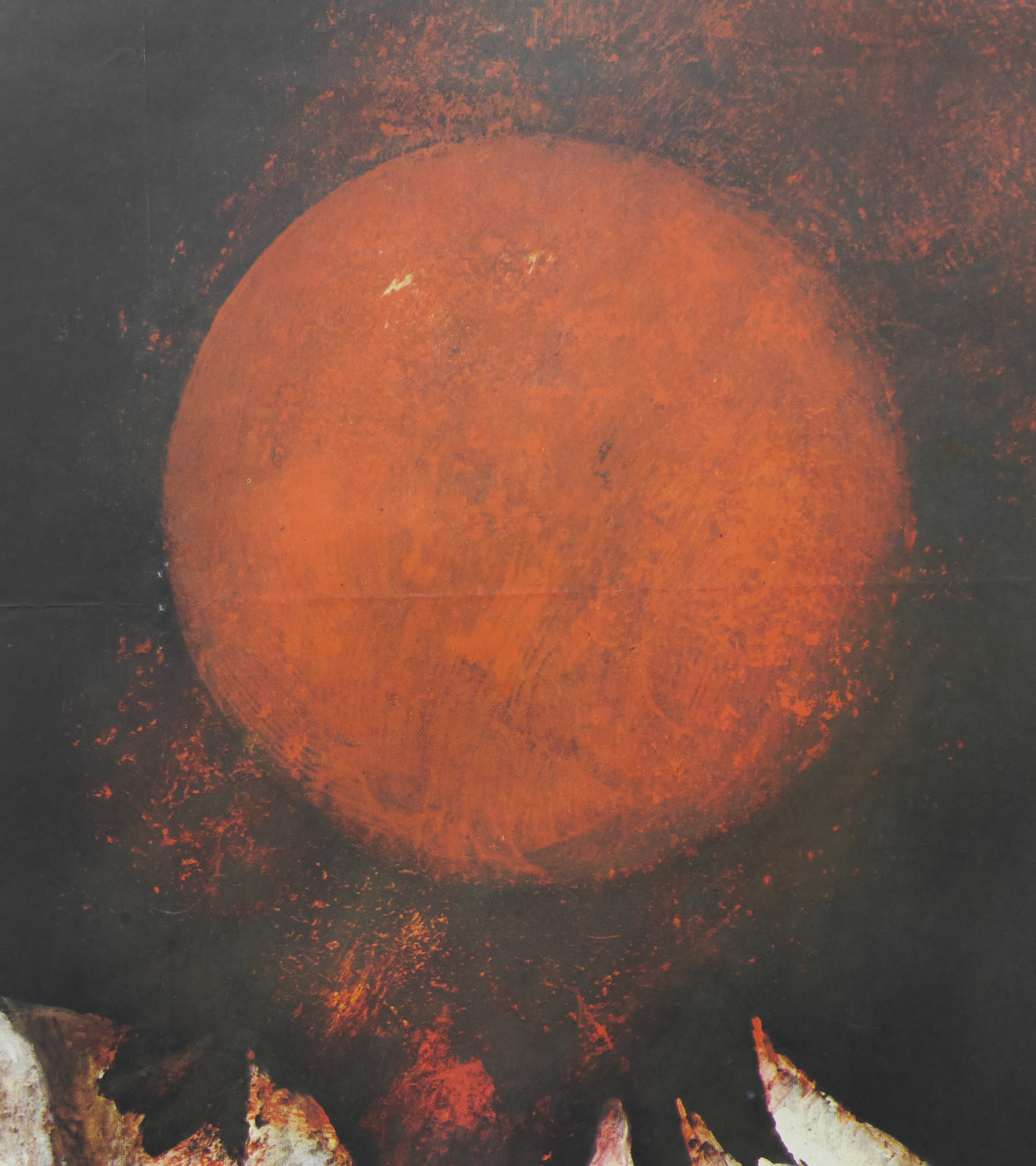
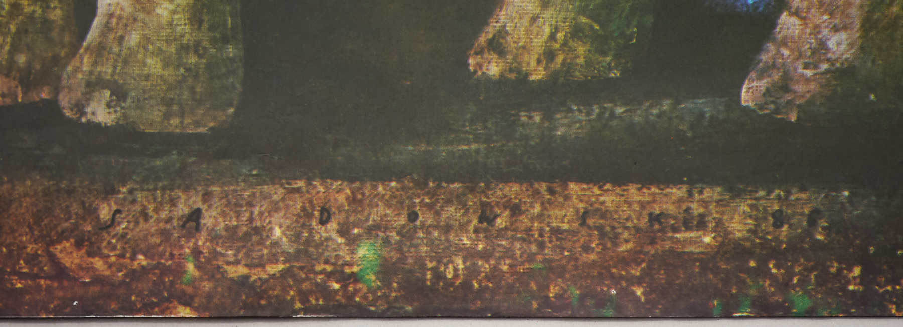
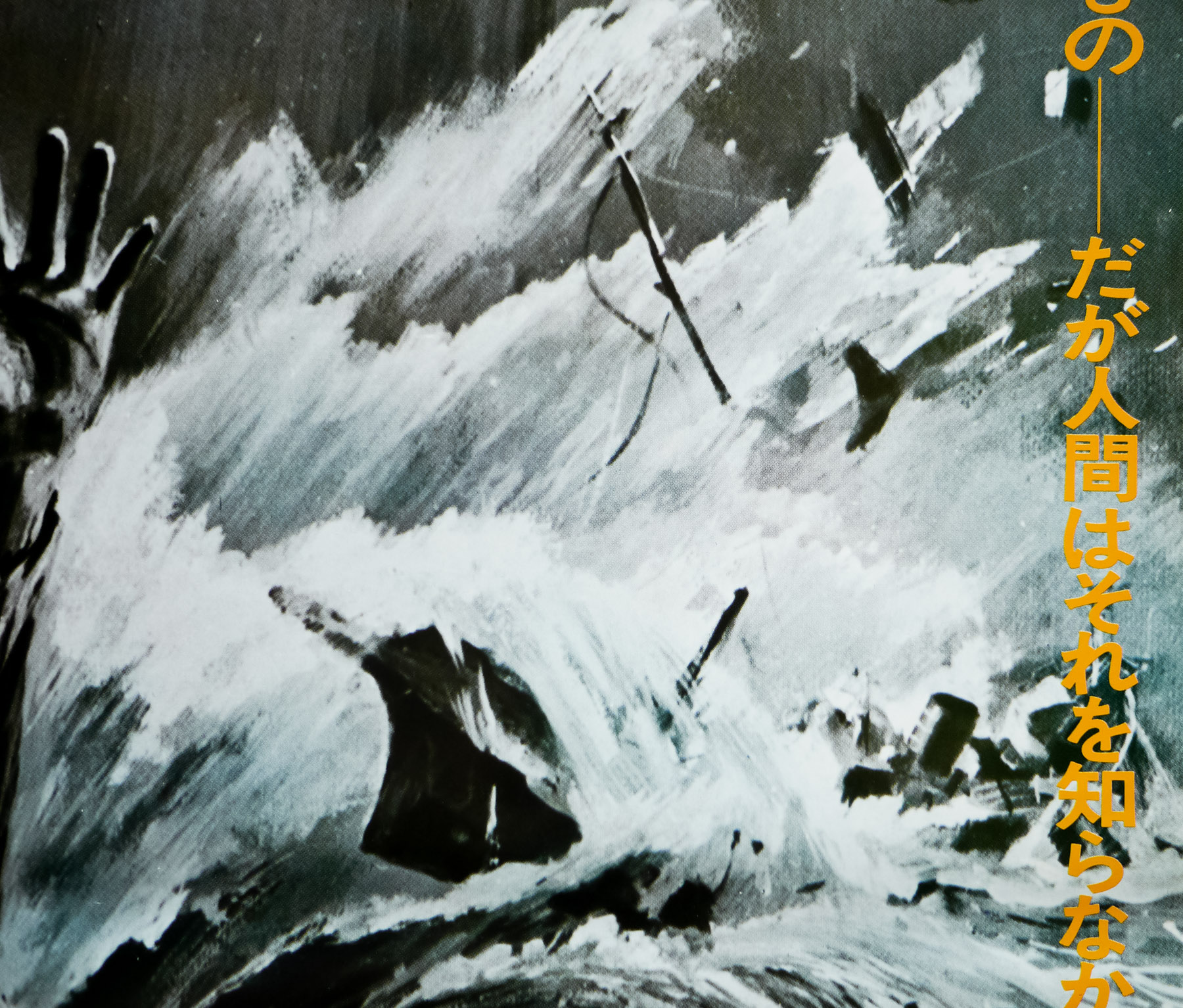
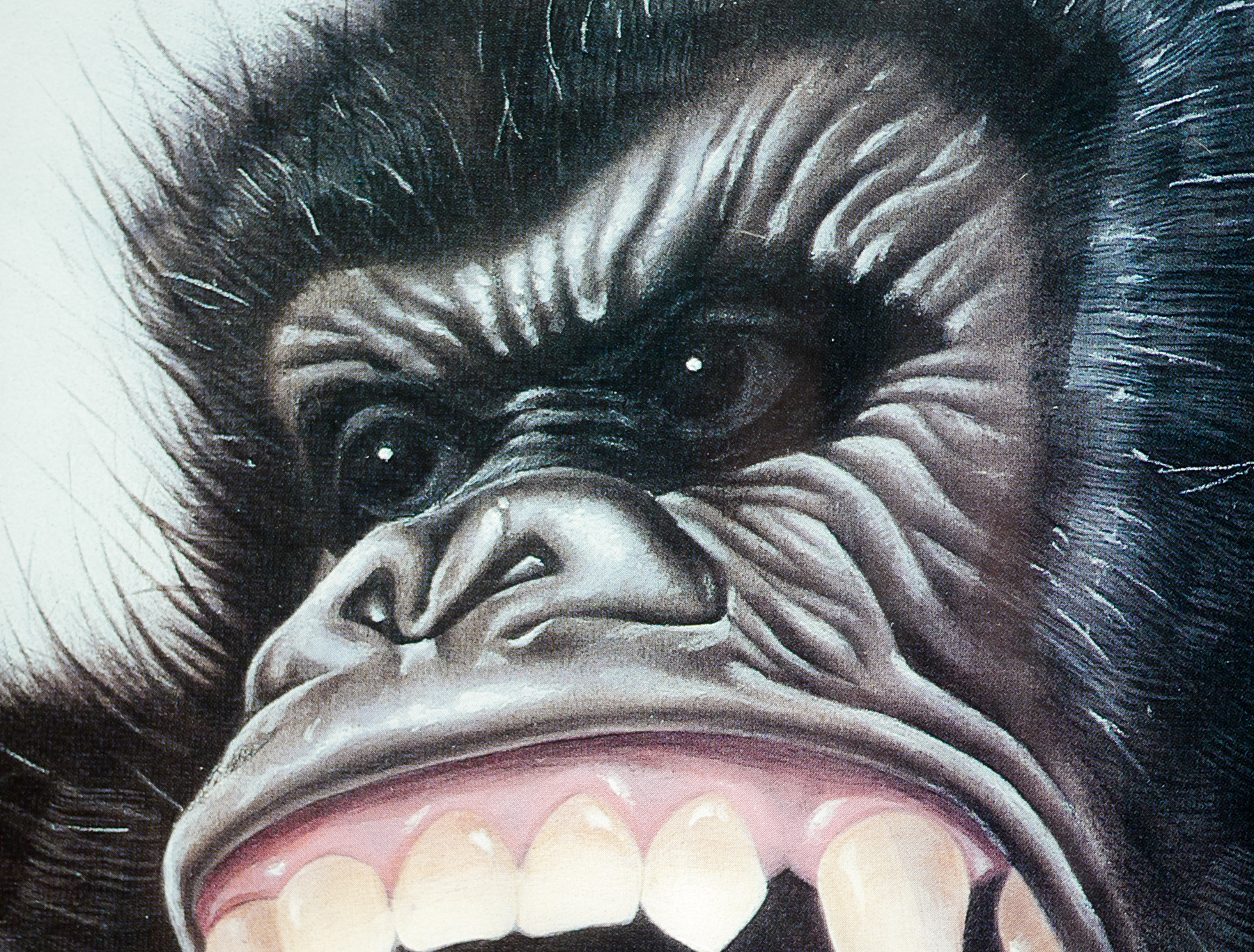
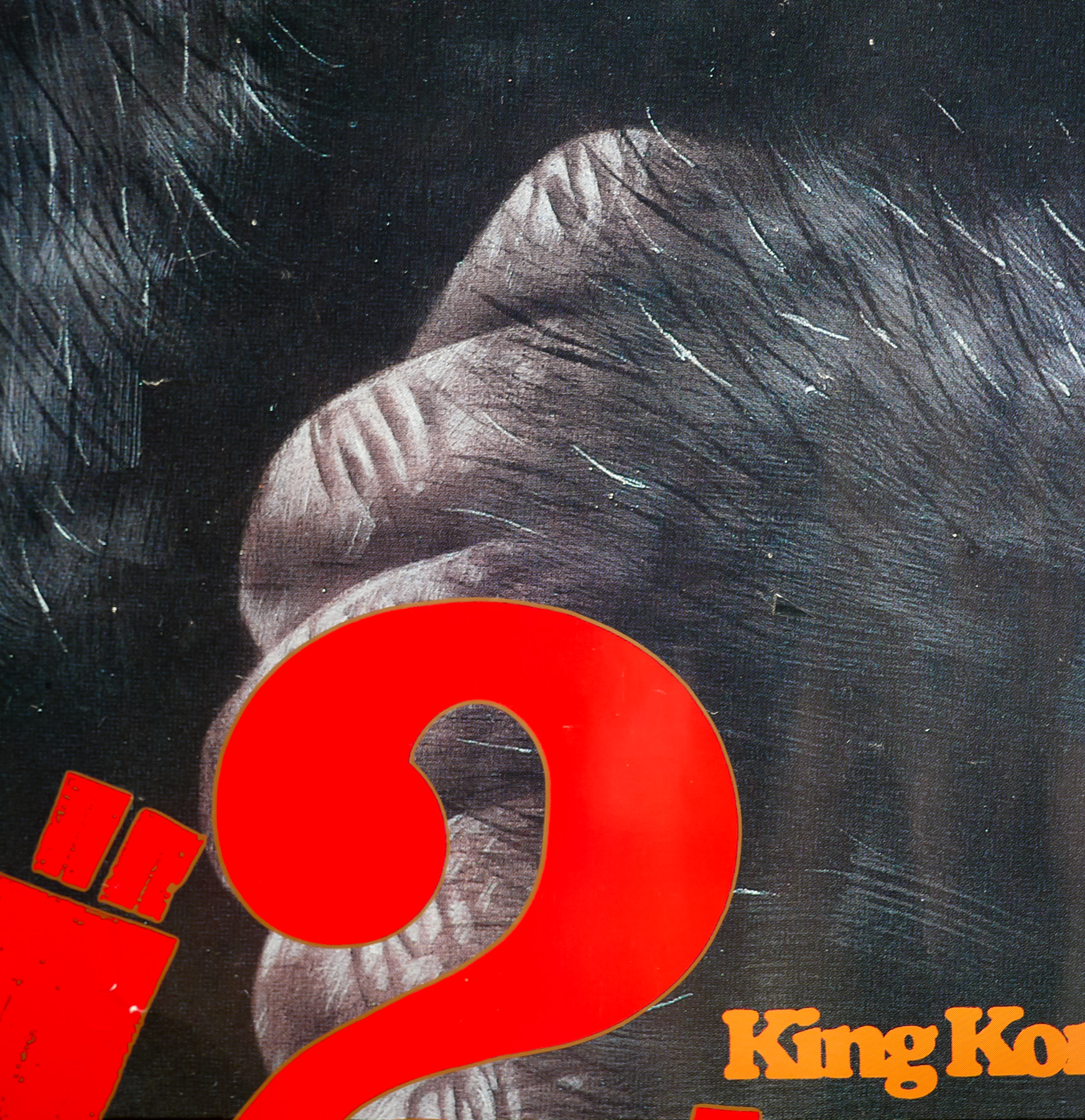
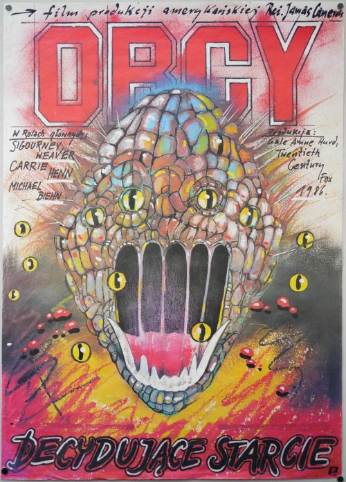
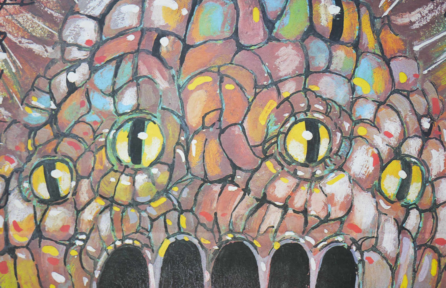
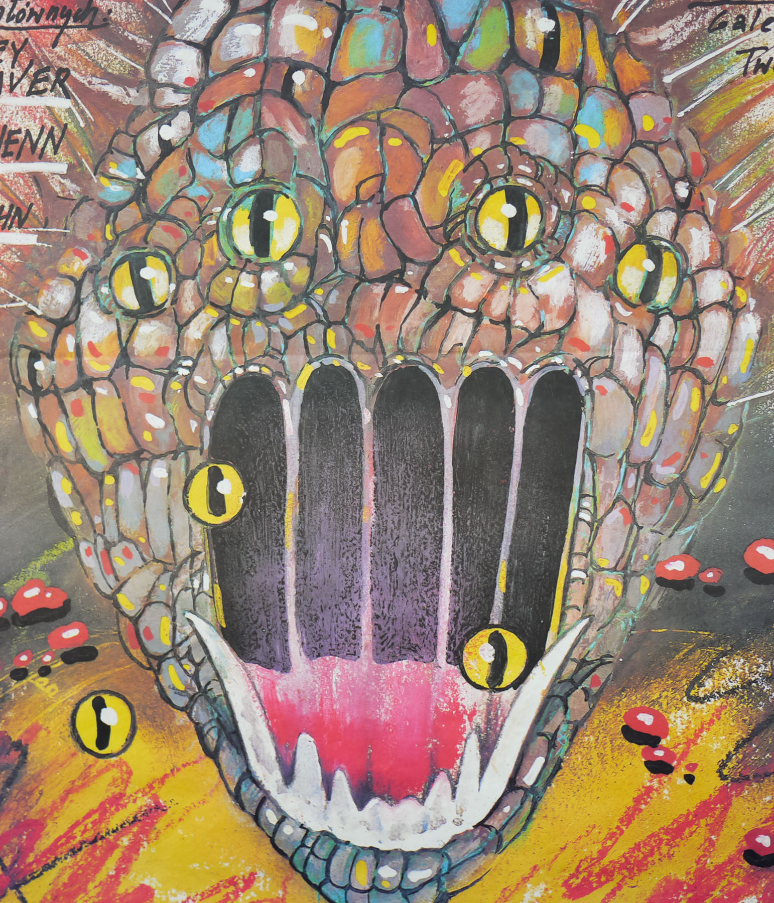
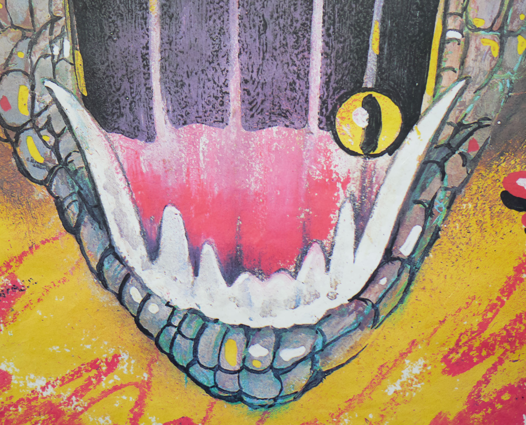
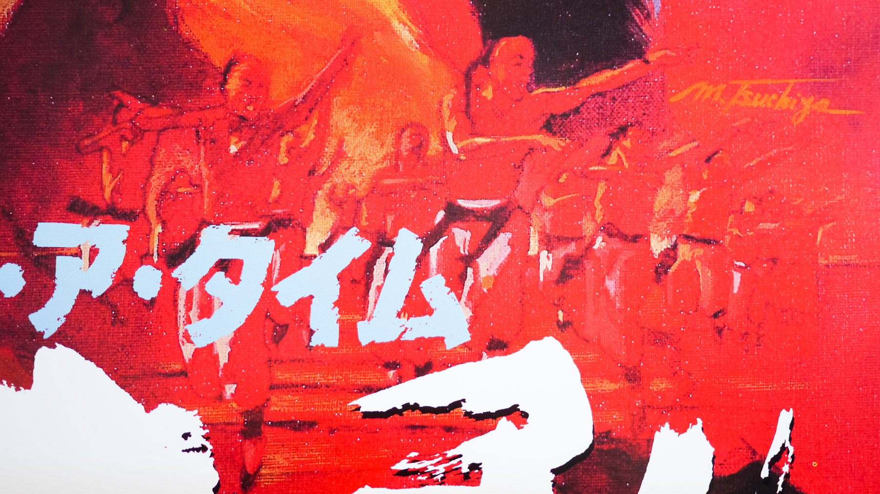
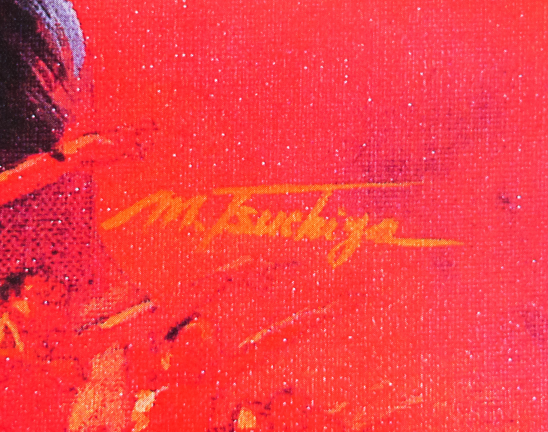
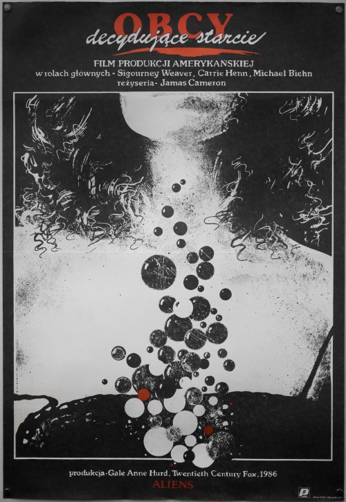
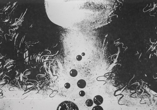
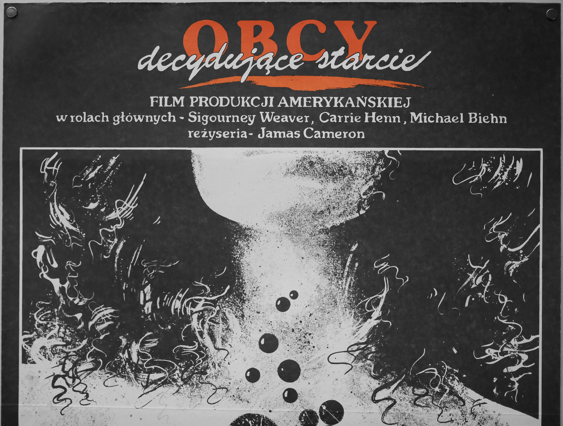
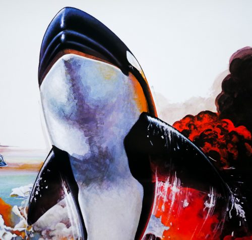
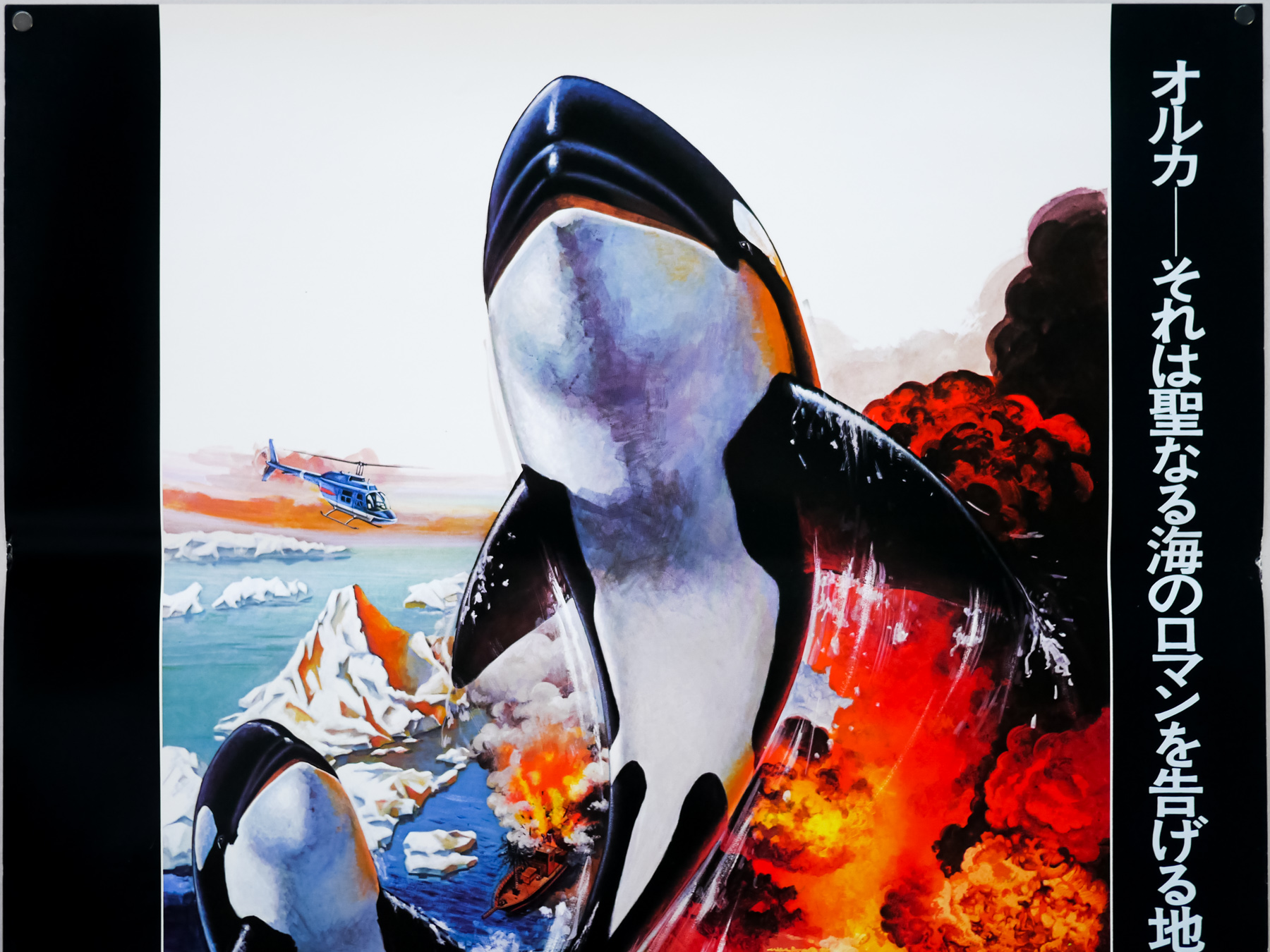
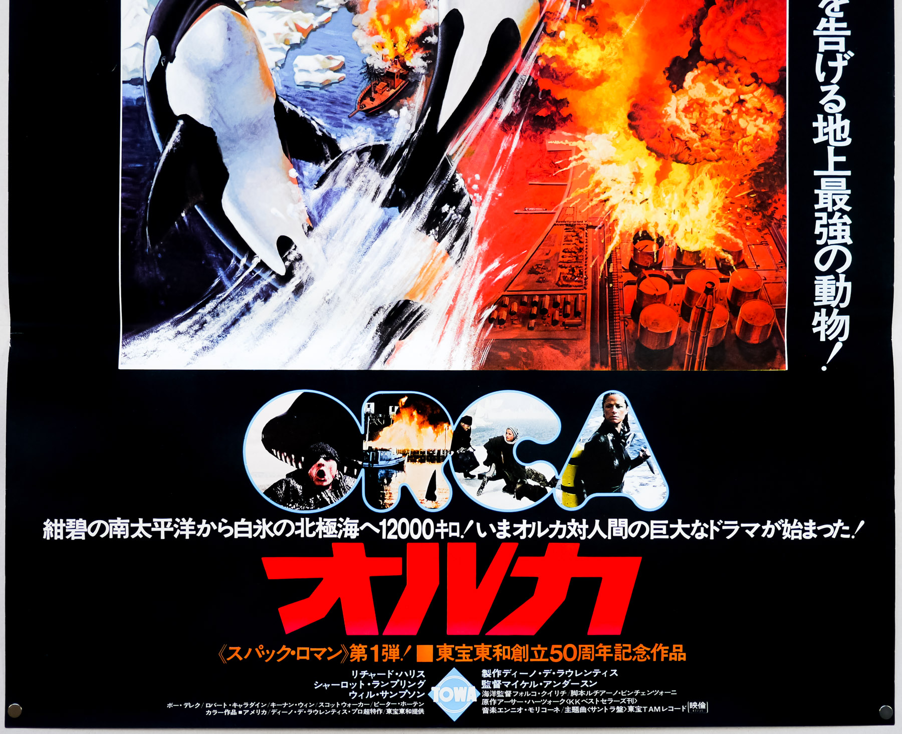
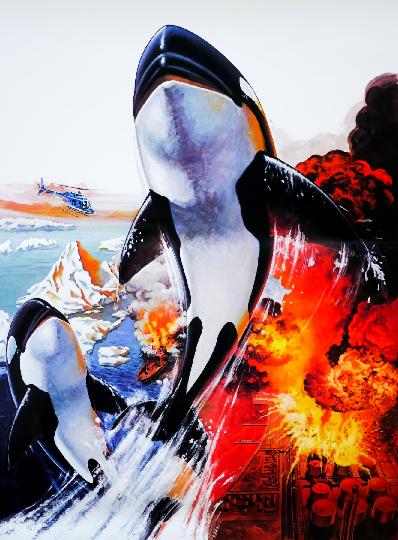
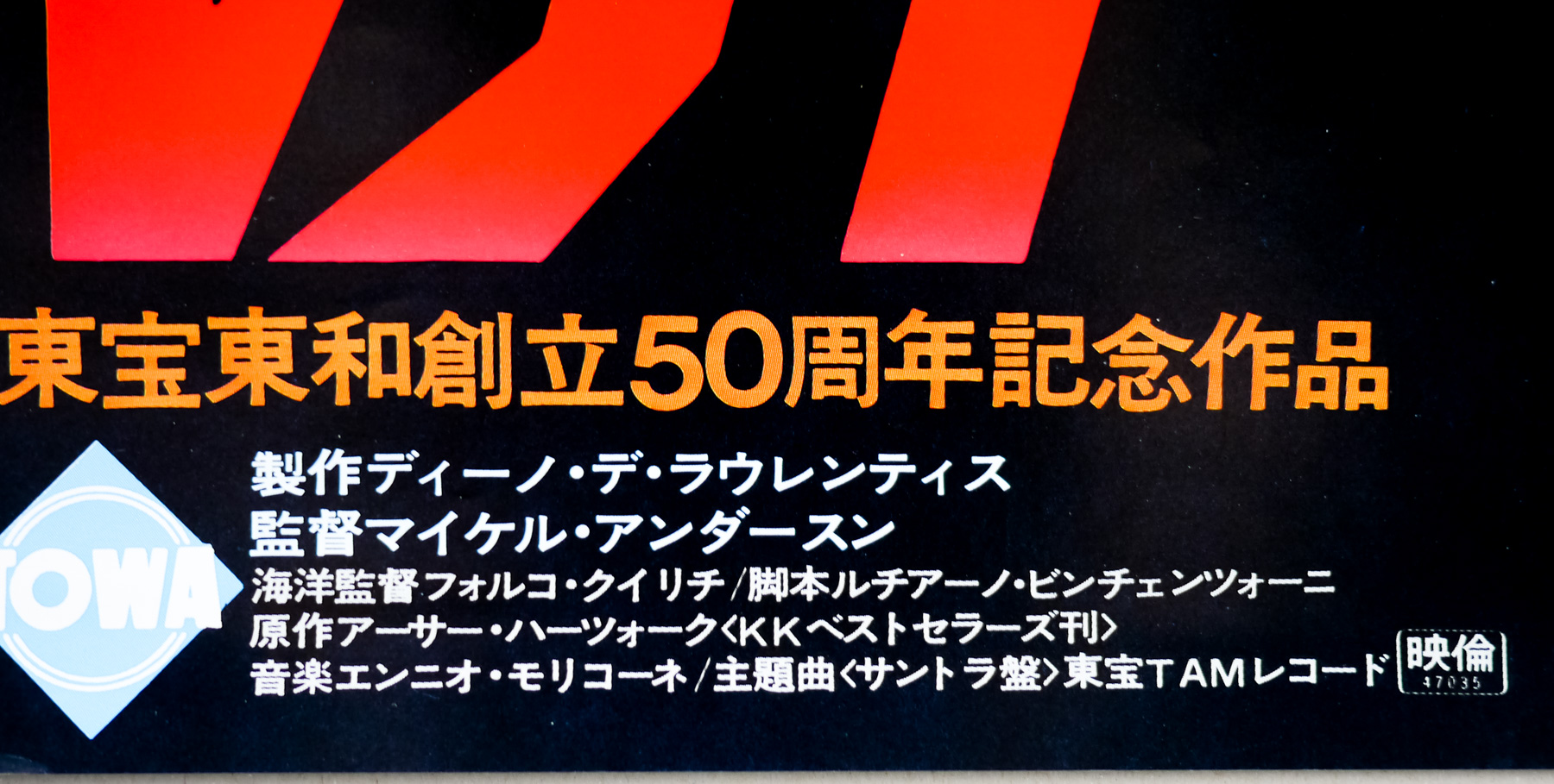
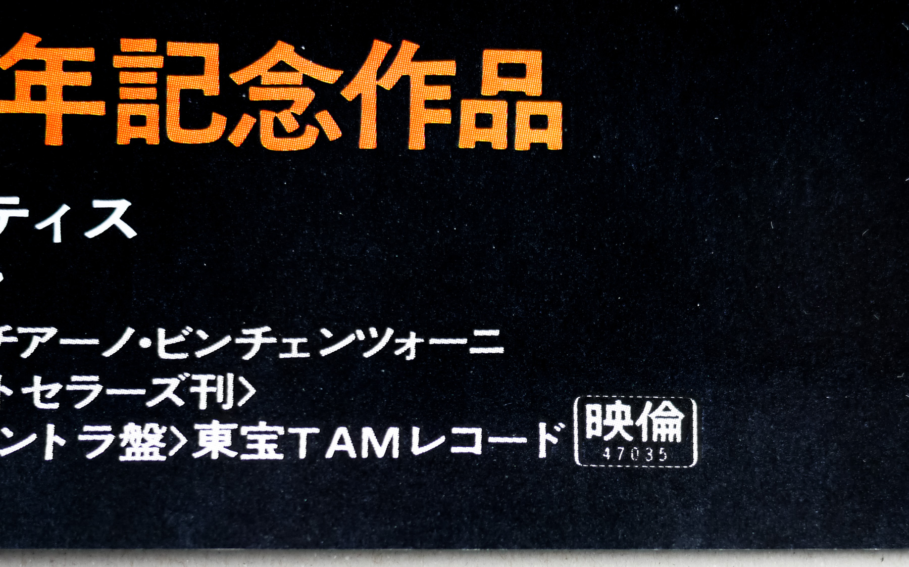
The artwork on the American one sheet was painted by John Berkey who also worked on the poster for the De Laurentiis produced remake of King Kong a year earlier, and the Orca art was also used for the British quad. The Japanese marketing campaign, however, featured at least three B2-sized posters, including this one, that featured artwork apparently unique to the posters and only the B1 format used the Berkey painting. I’ve called this B2 the ‘style A (black surround)’ and I also have the other two styles which will be added to the site eventually. I’ve been unable to find out who is responsible for this artwork so if you have any ideas please get in touch.
Check out the bonkers original trailer on YouTube.