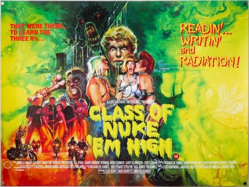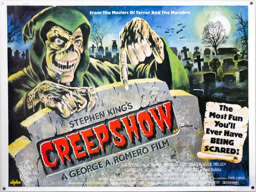
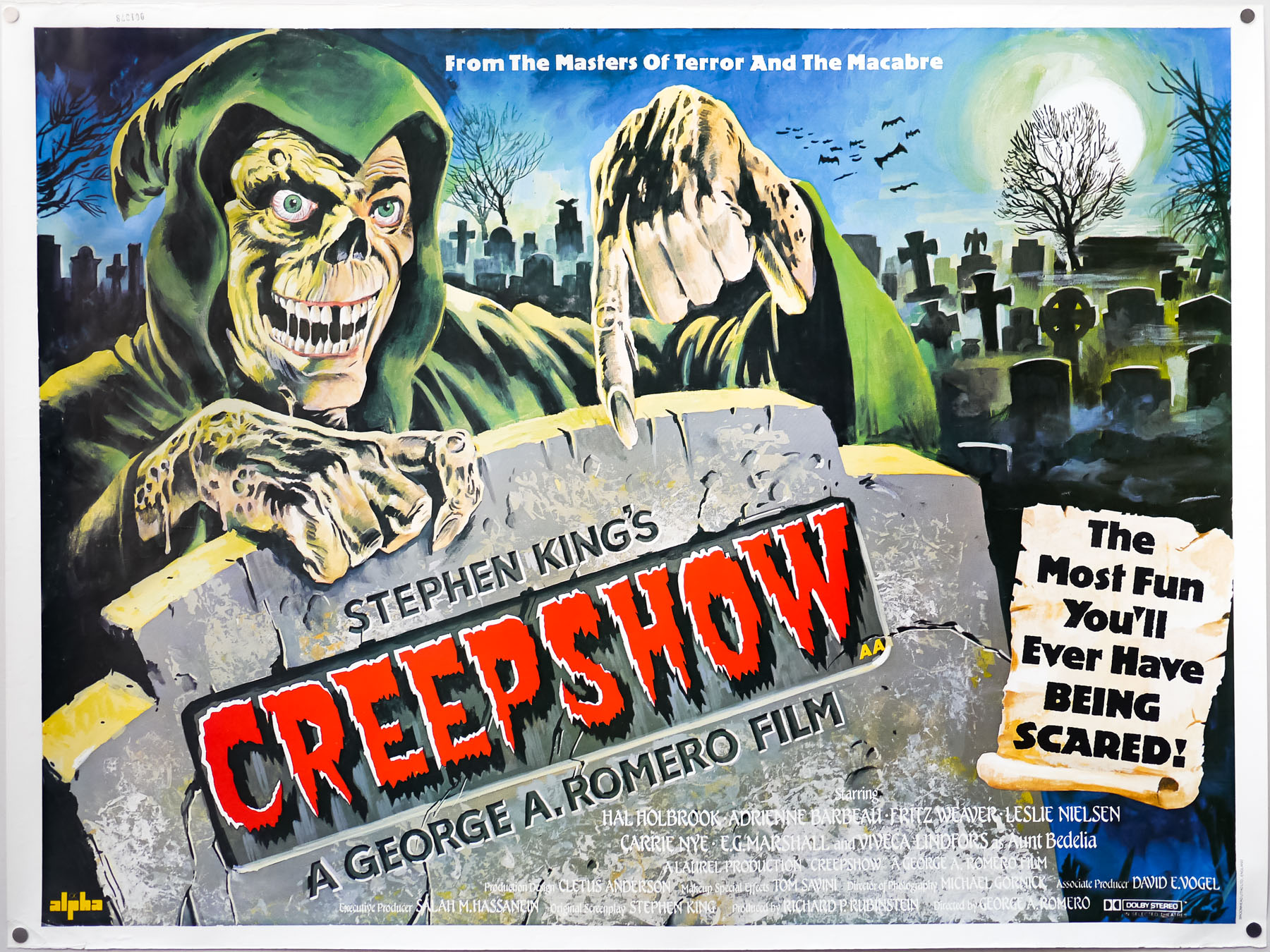
Poster detail
1-5
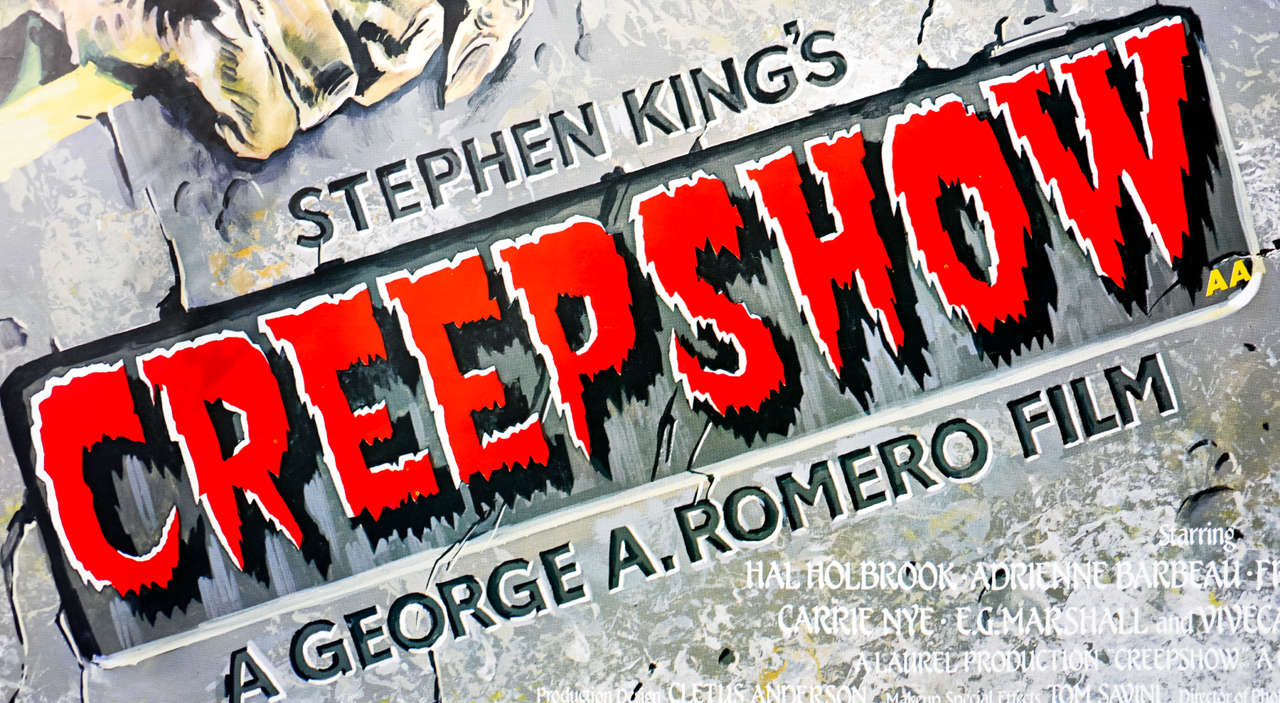
- Title
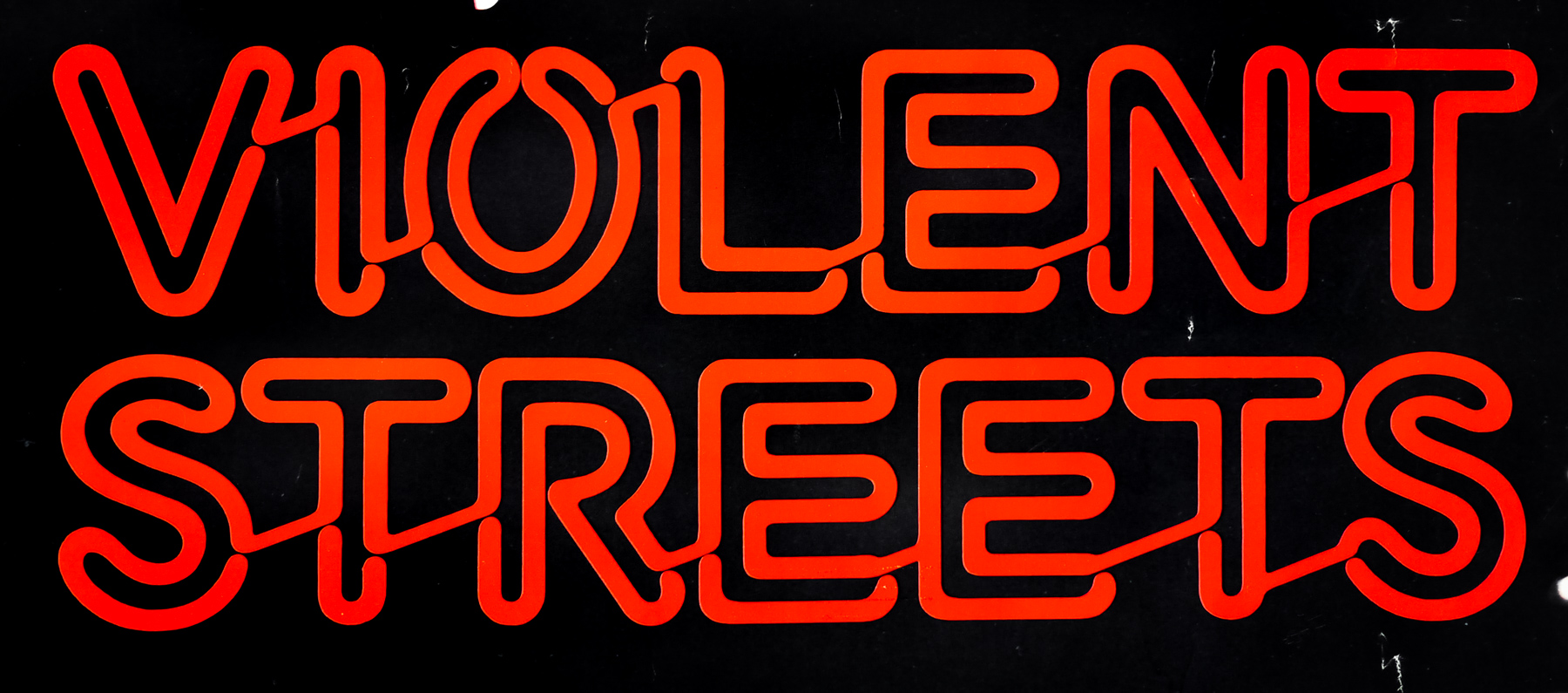
- Creepshow
- AKA
- --
- Year of Film
- 1982
- Director
- George A. Romero
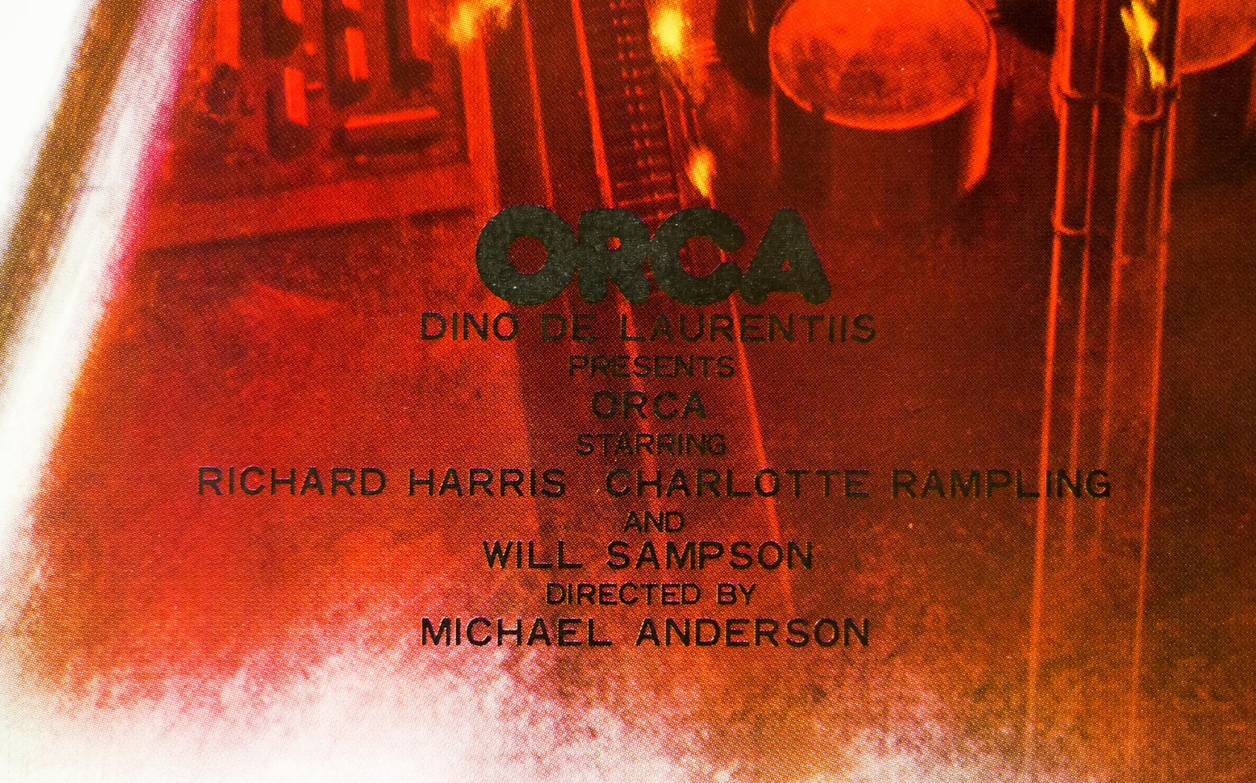
- Starring
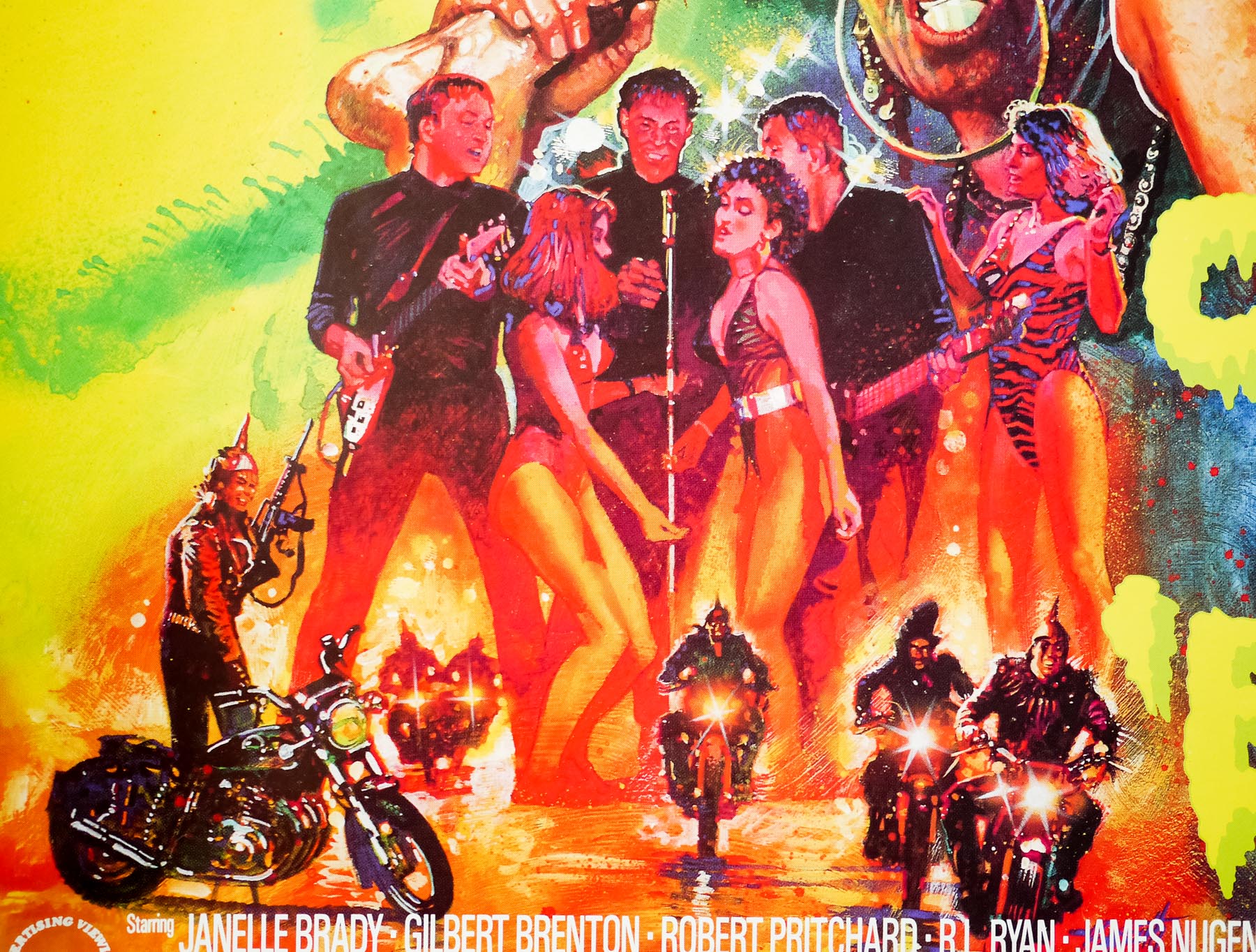
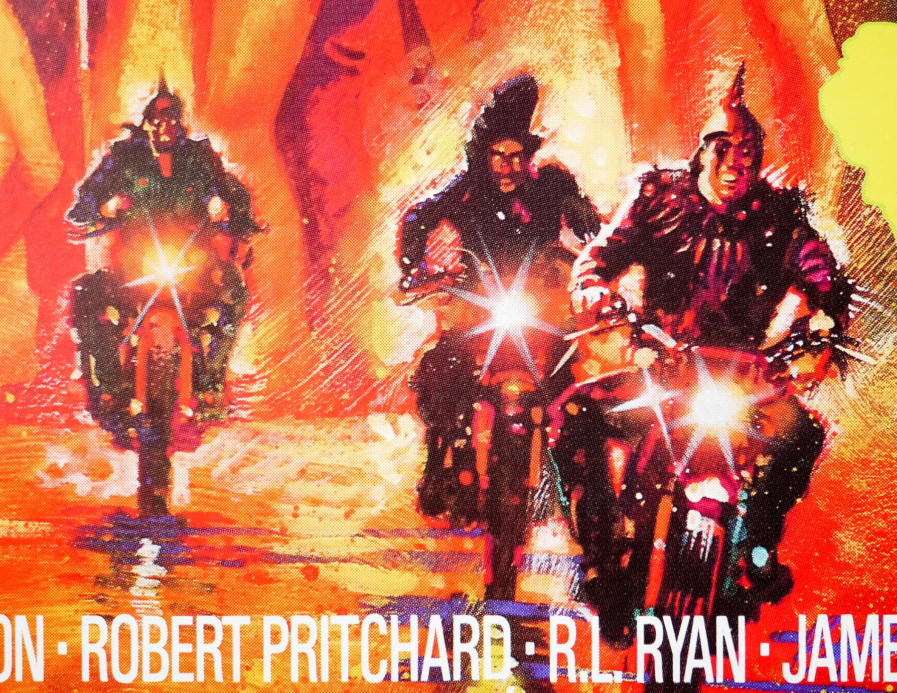
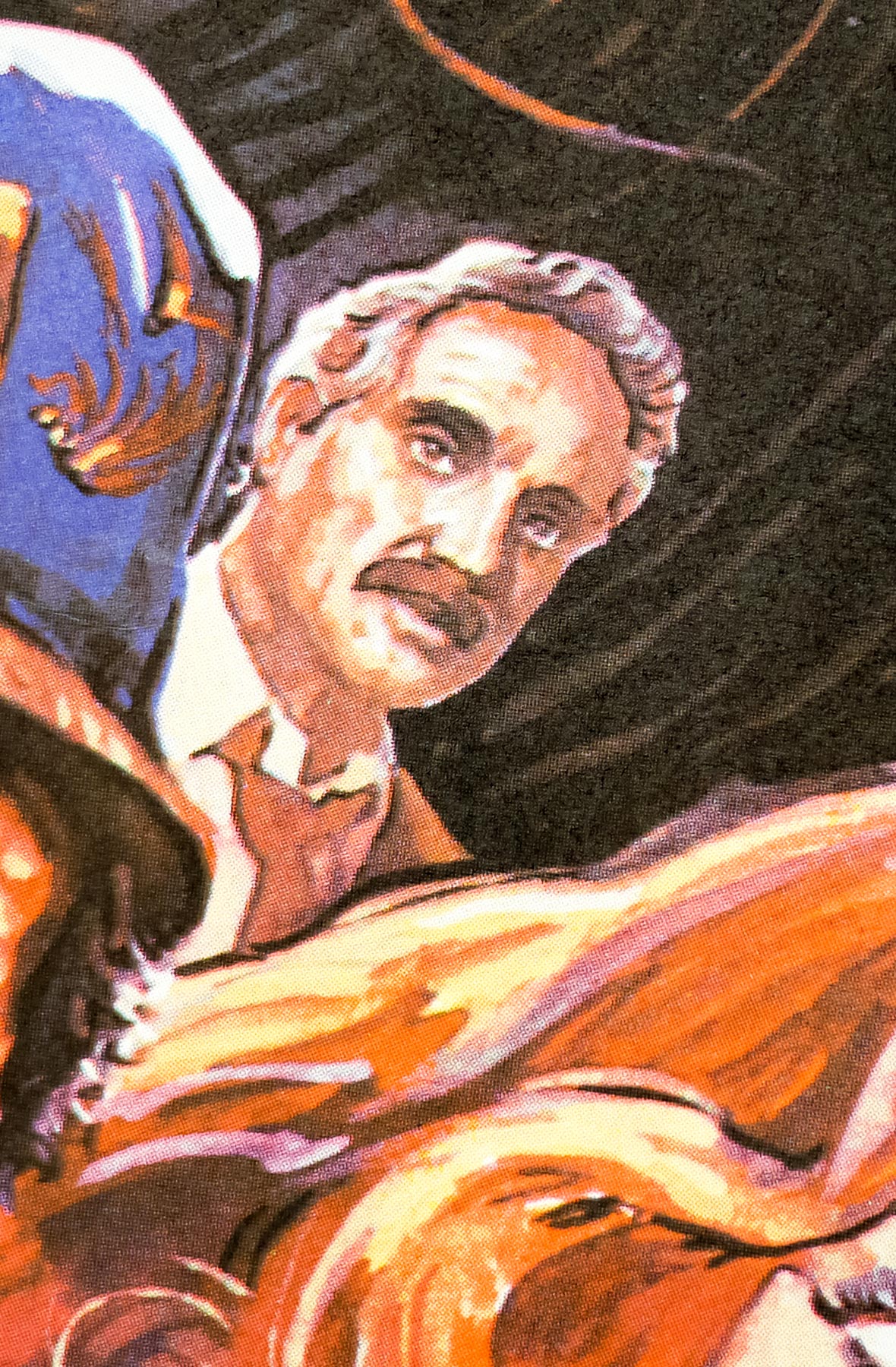
- Hal Holbrook, Adrienne Barbeau, Leslie Nielsen, Ted Danson, E. G. Marshall, Stephen King, Joe King, Viveca Lindfors, Fritz Weaver, Carrie Nye, Ed Harris, Jon Lormer, Tom Atkins, Don Keefer, Robert Harper
- Origin of Film
- USA
- Genre(s) of Film
- Hal Holbrook, Adrienne Barbeau, Leslie Nielsen, Ted Danson, E. G. Marshall, Stephen King, Joe King, Viveca Lindfors, Fritz Weaver, Carrie Nye, Ed Harris, Jon Lormer, Tom Atkins, Don Keefer, Robert Harper,
- Type of Poster
- Quad
- Style of Poster
- --
- Origin of Poster
- UK
- Year of Poster
- 1982
- Designer
- Unknown
- Size (inches)
- 30 2/16" x 39 15/16"
- SS or DS
- SS
- NSS #
- --
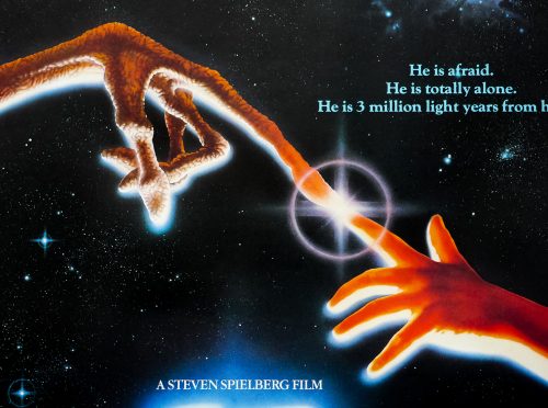
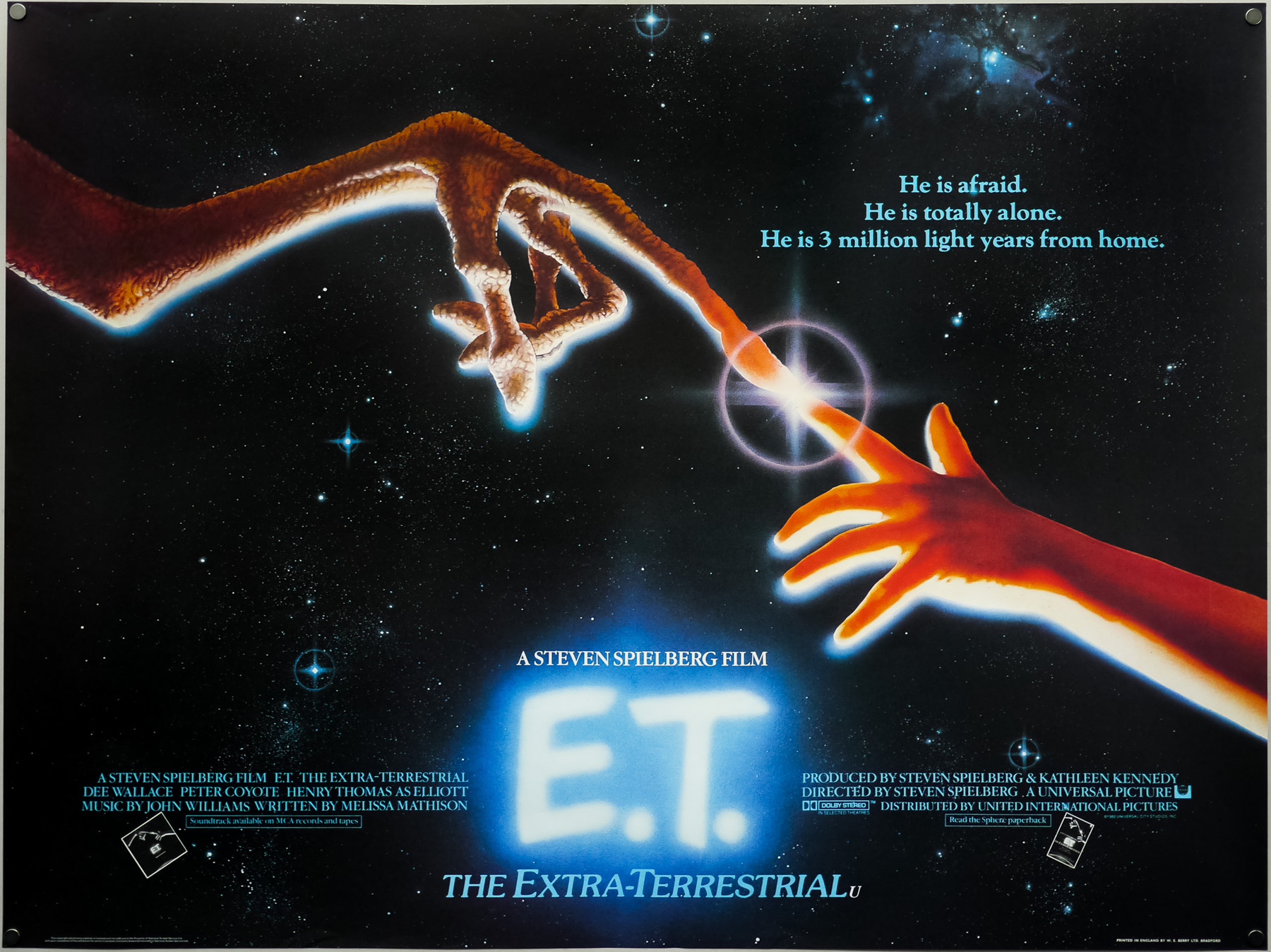
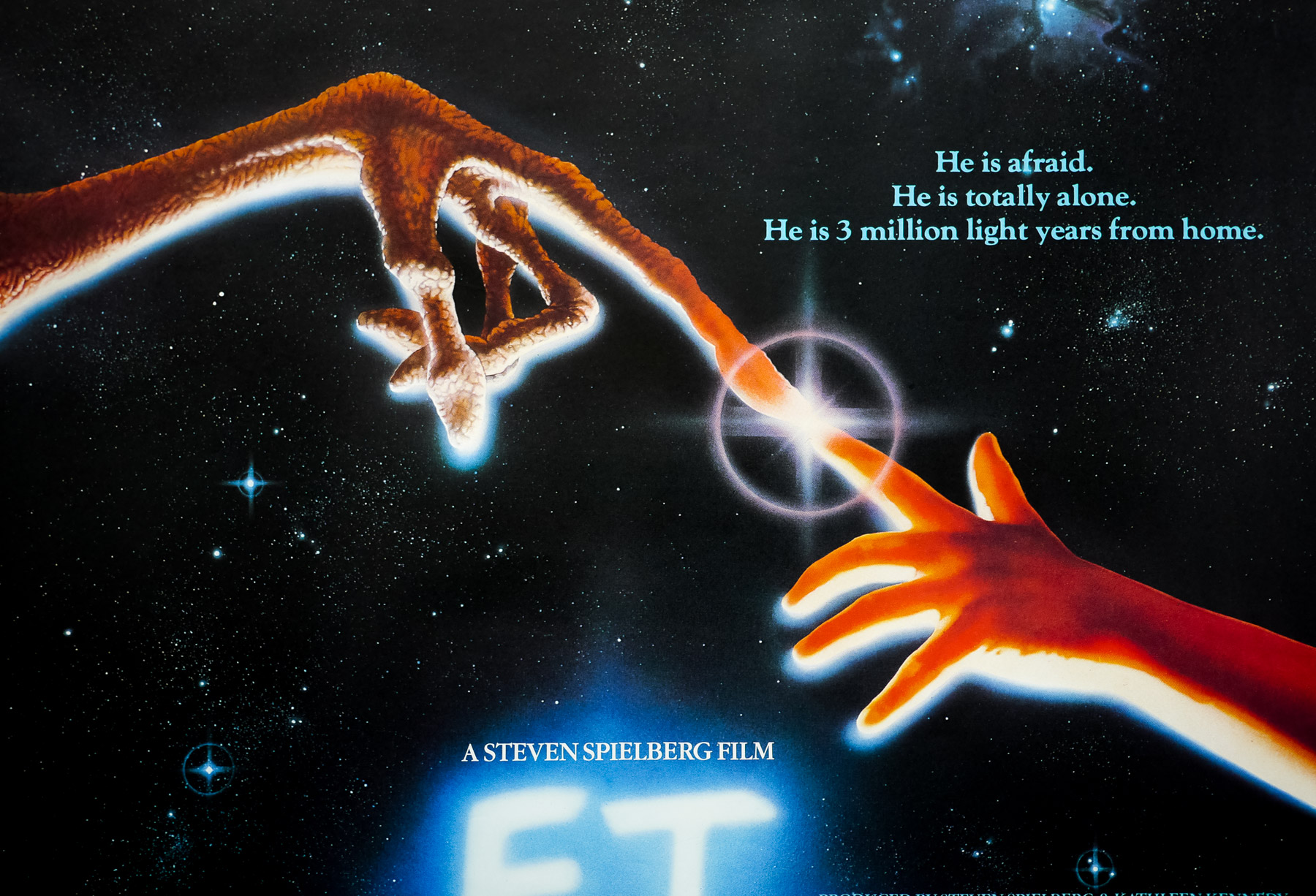
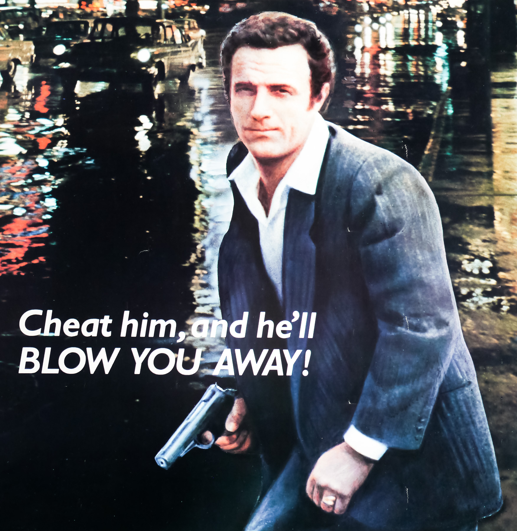
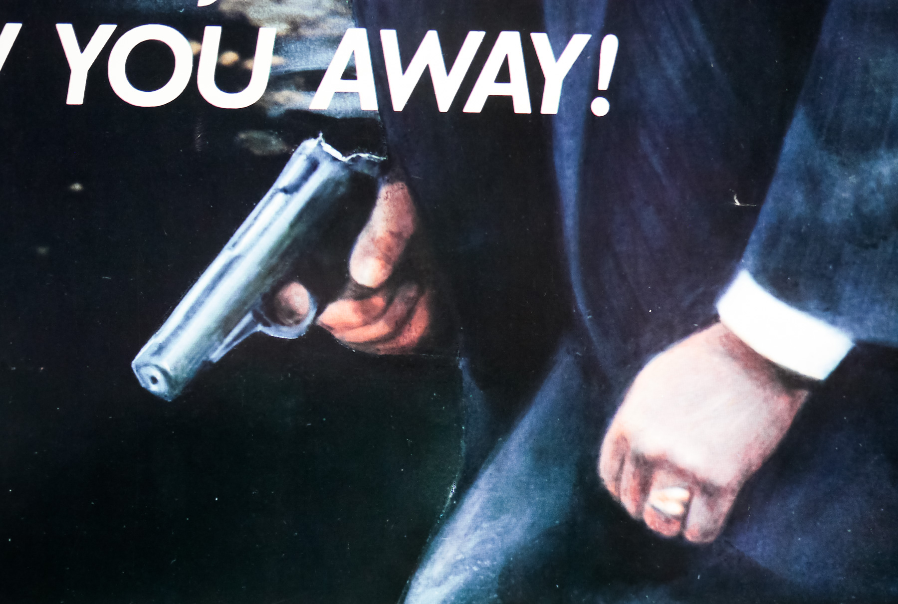
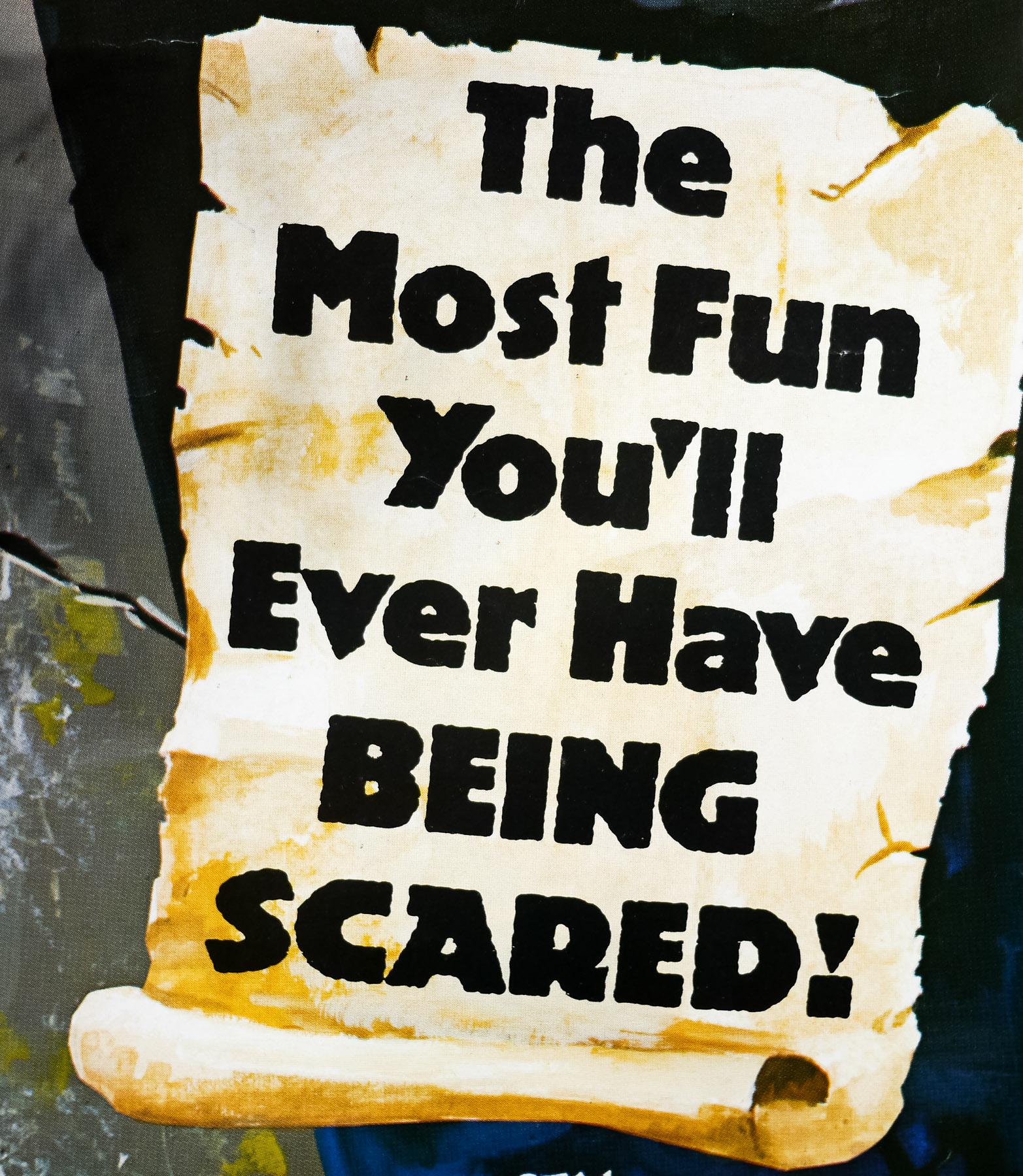
- Tagline
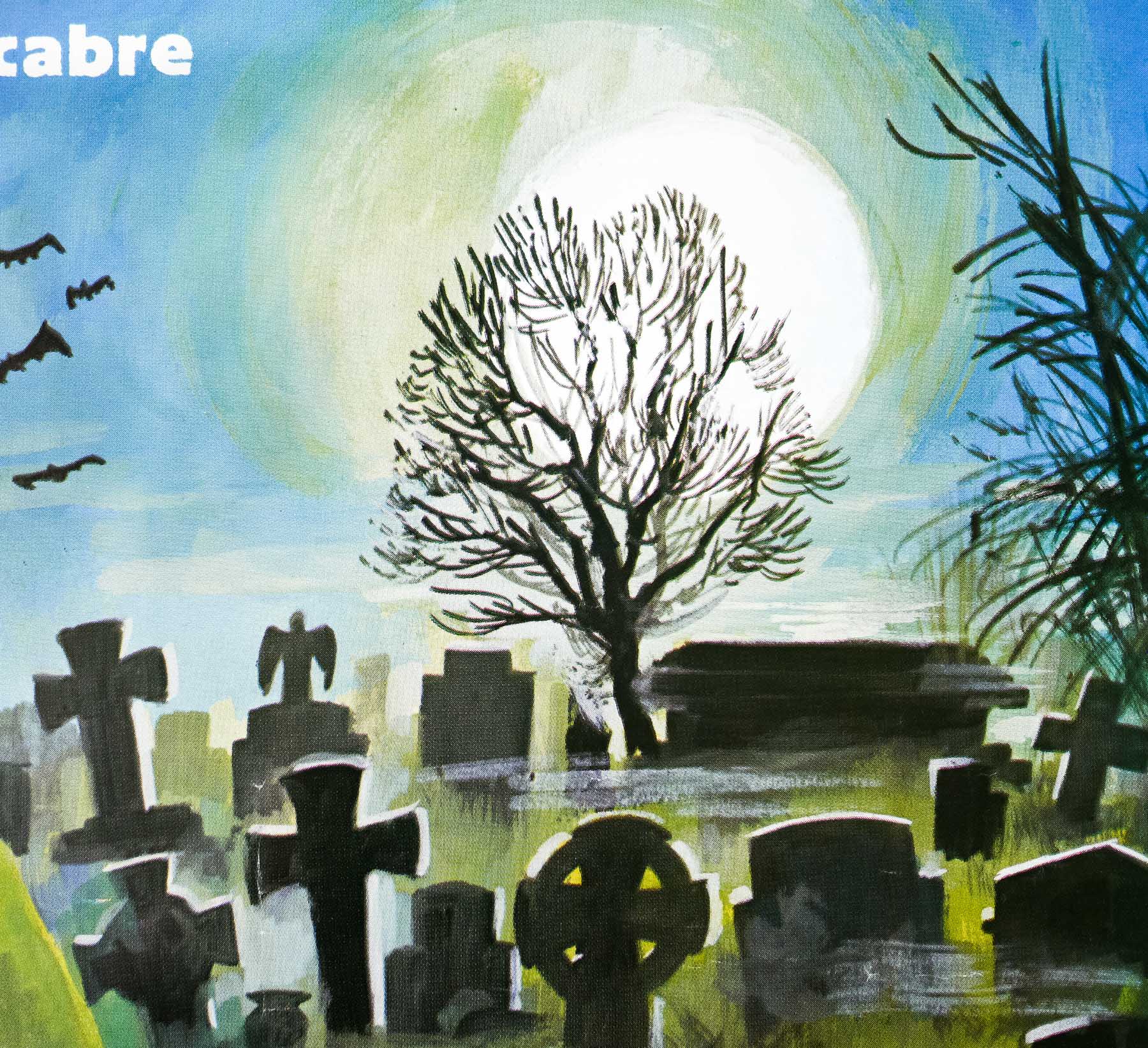
- From The Masters Of Terror And The Macabre | The Most Fun You'll Ever Have Being Scared!
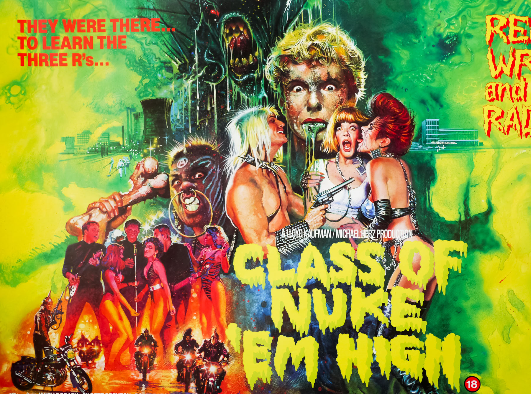
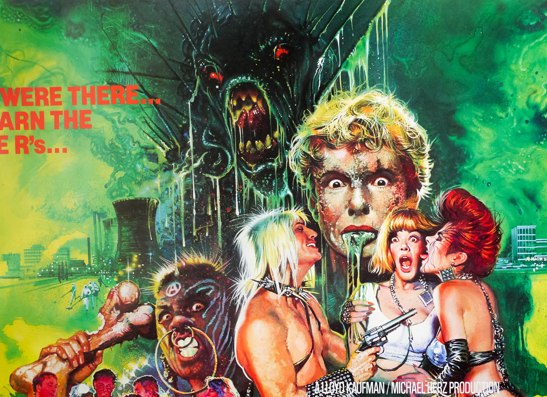
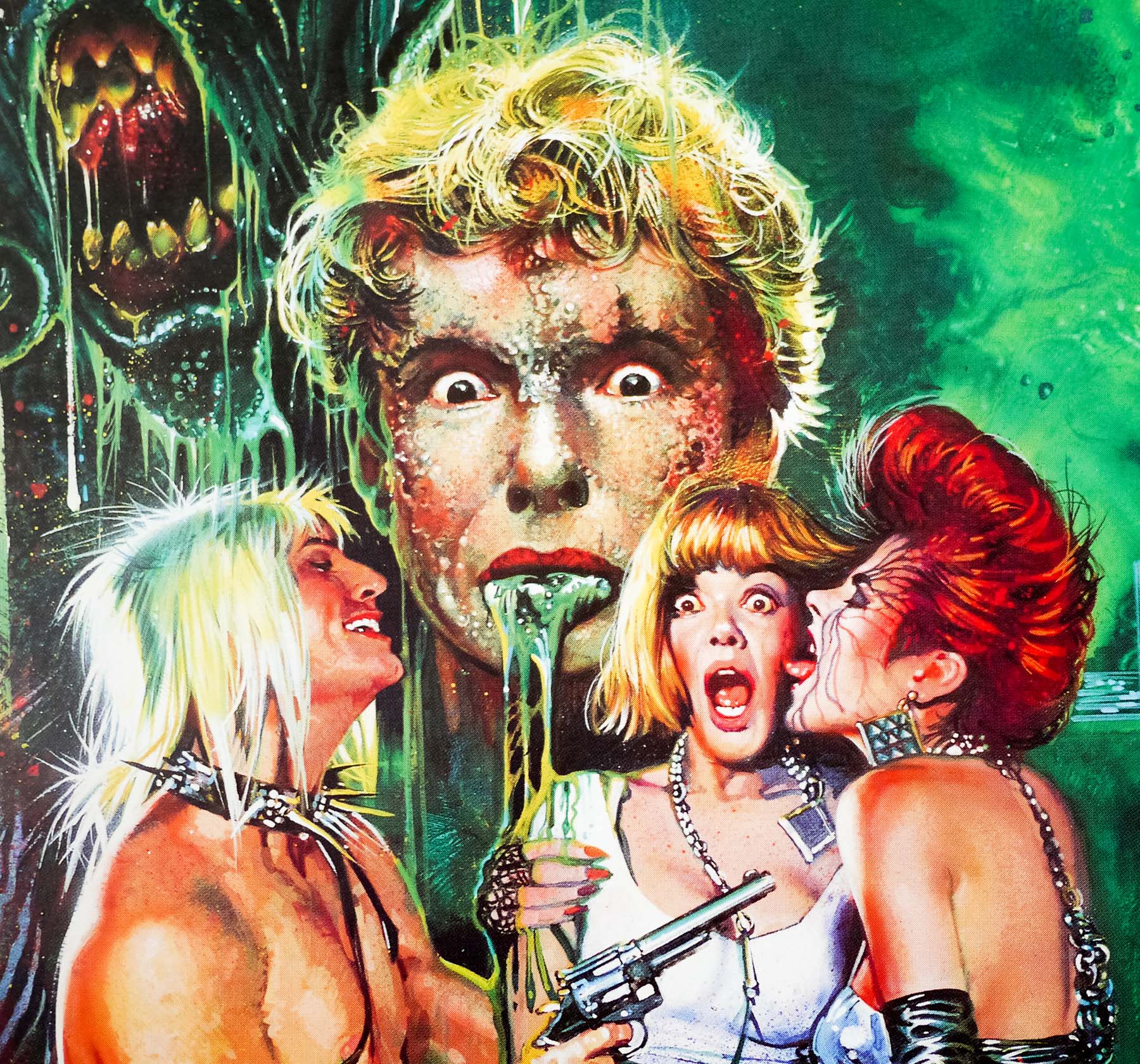
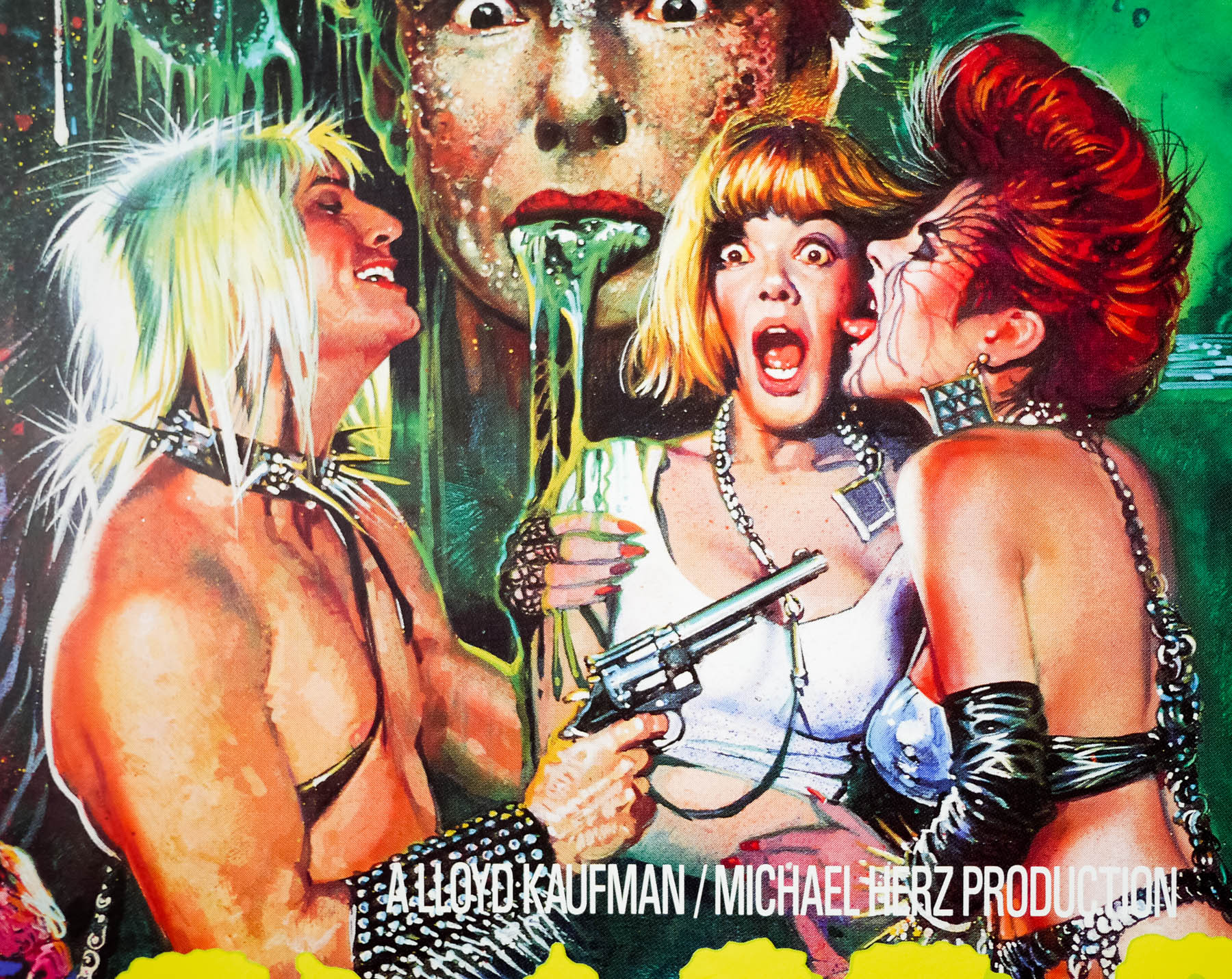
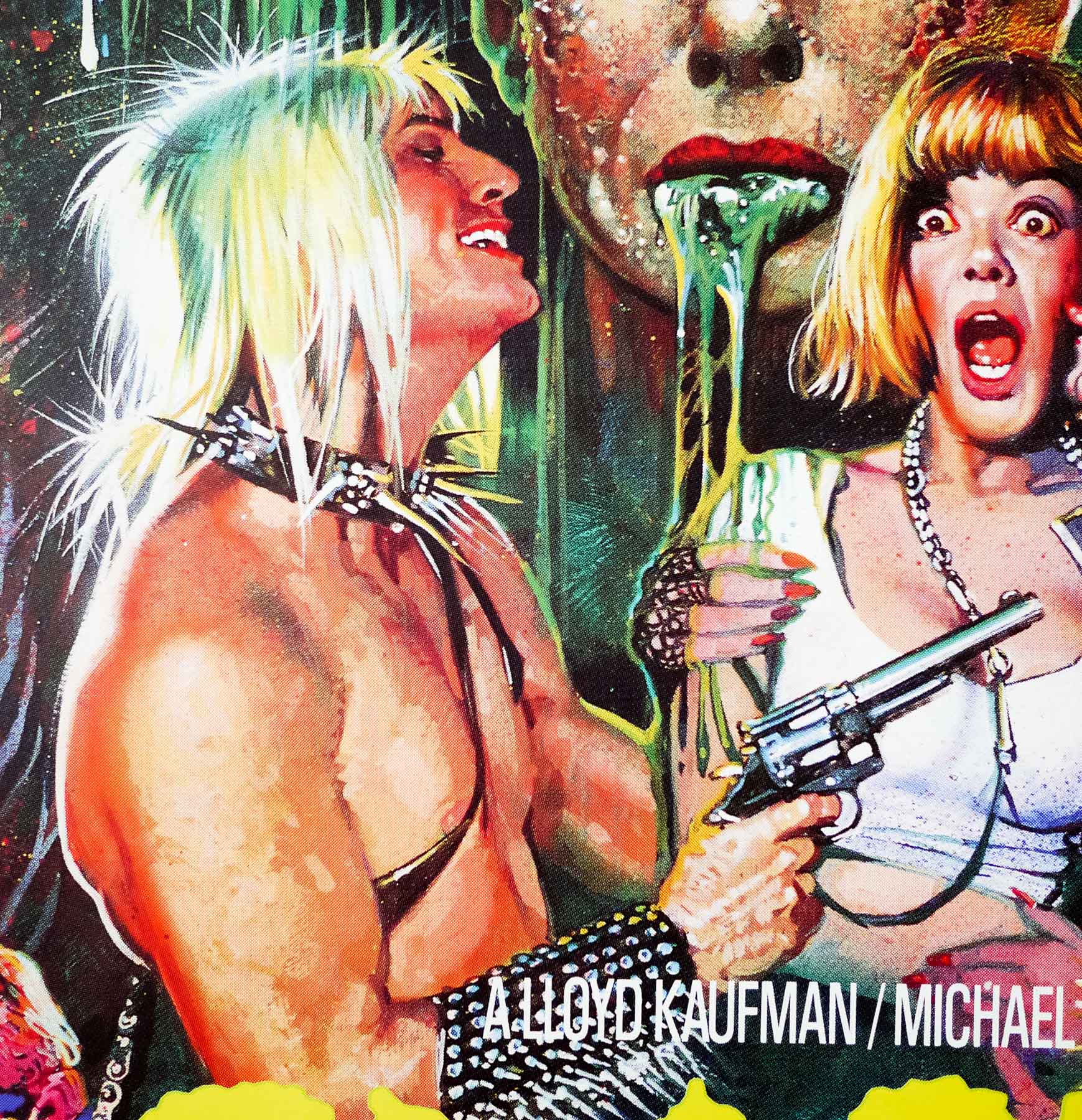
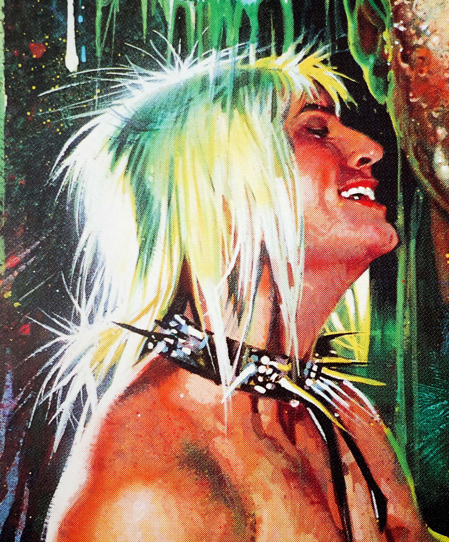
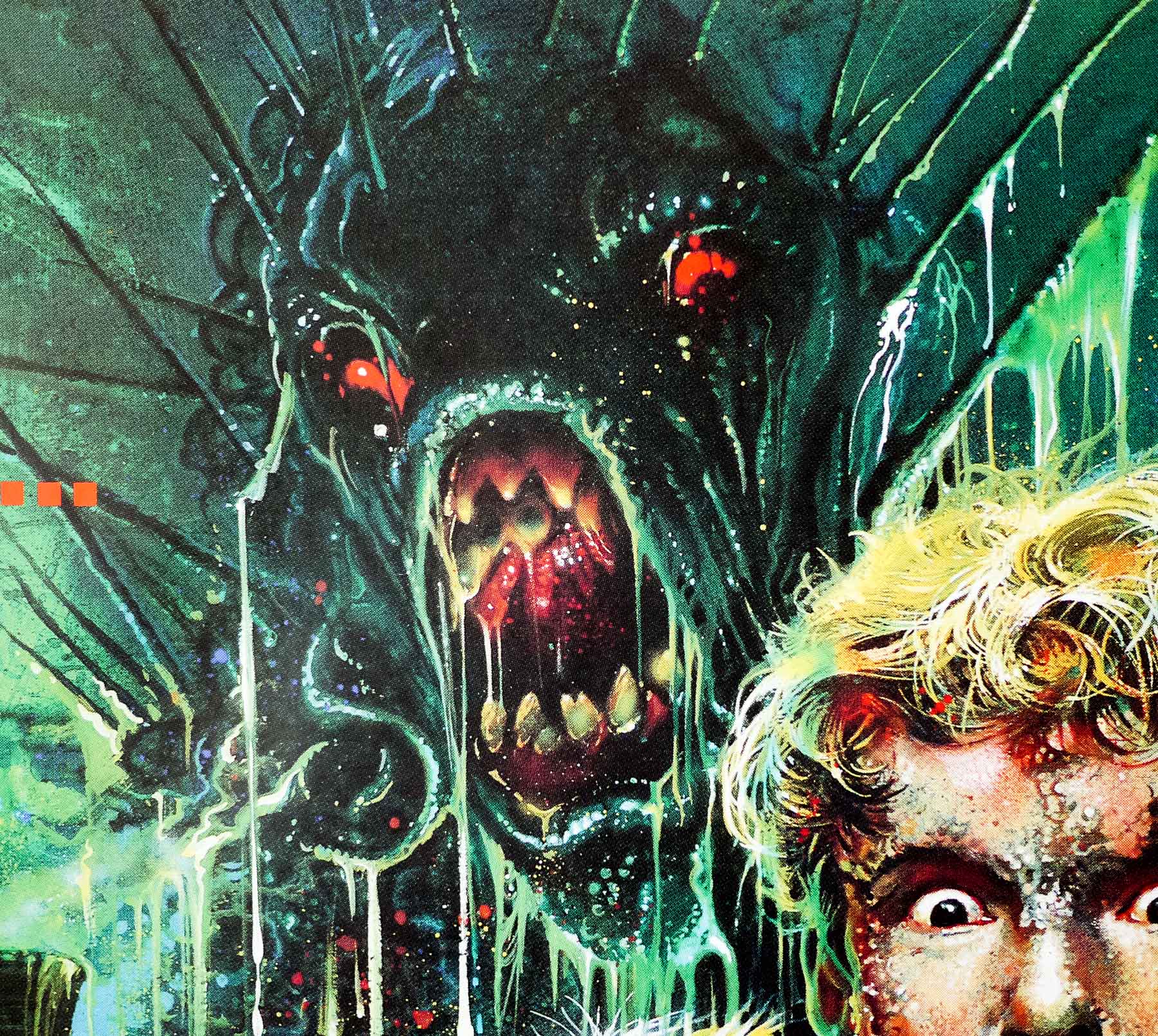
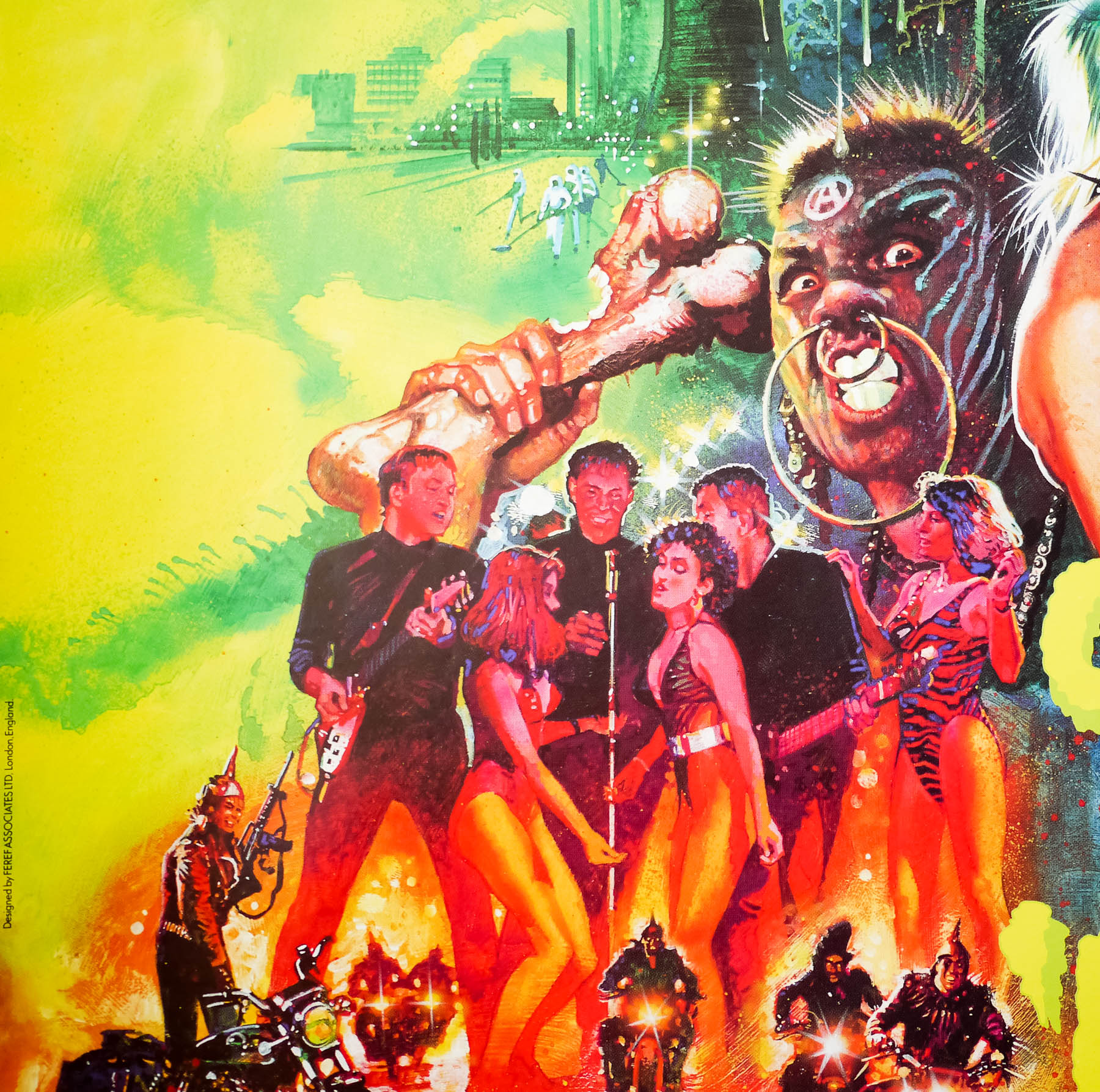
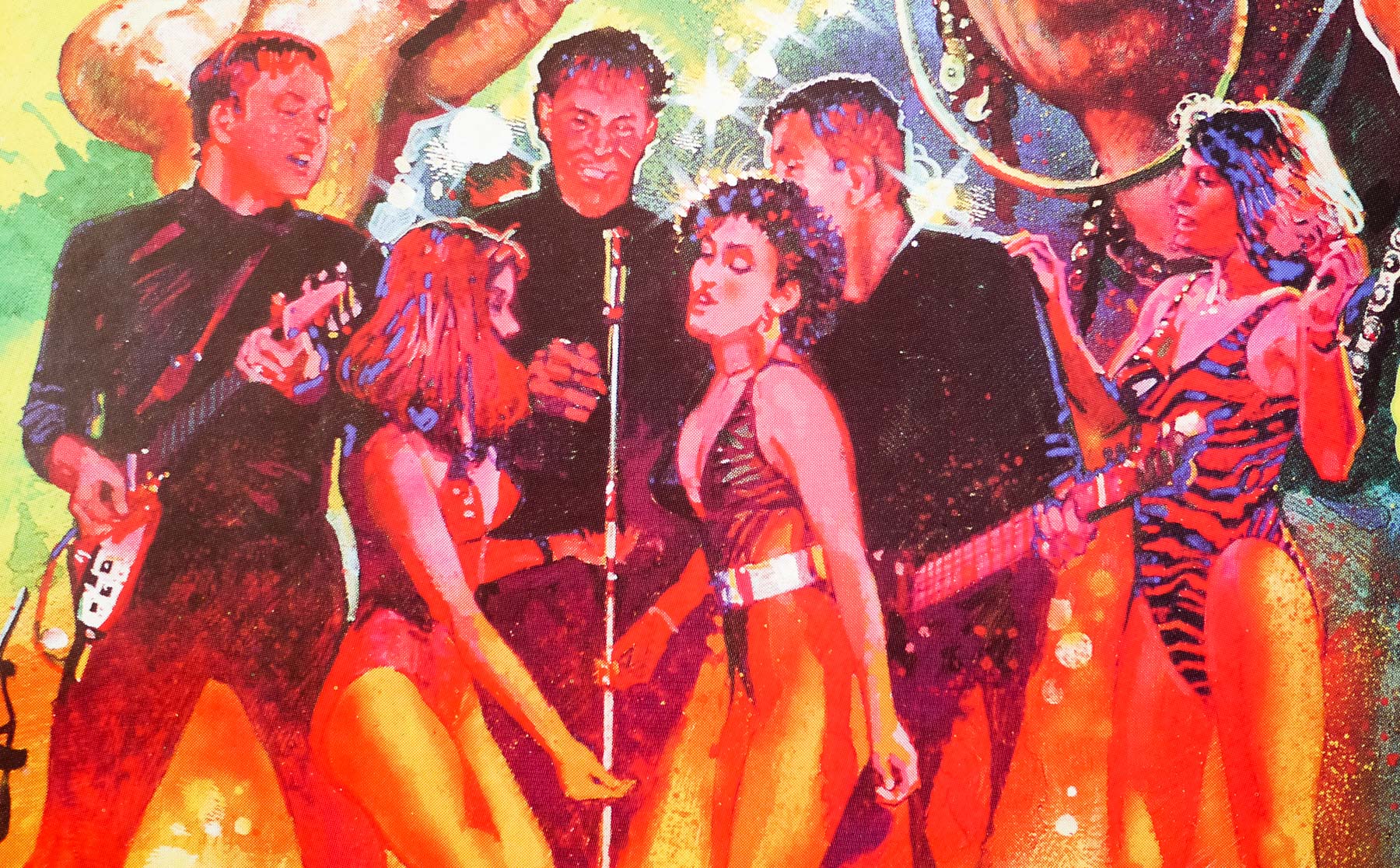
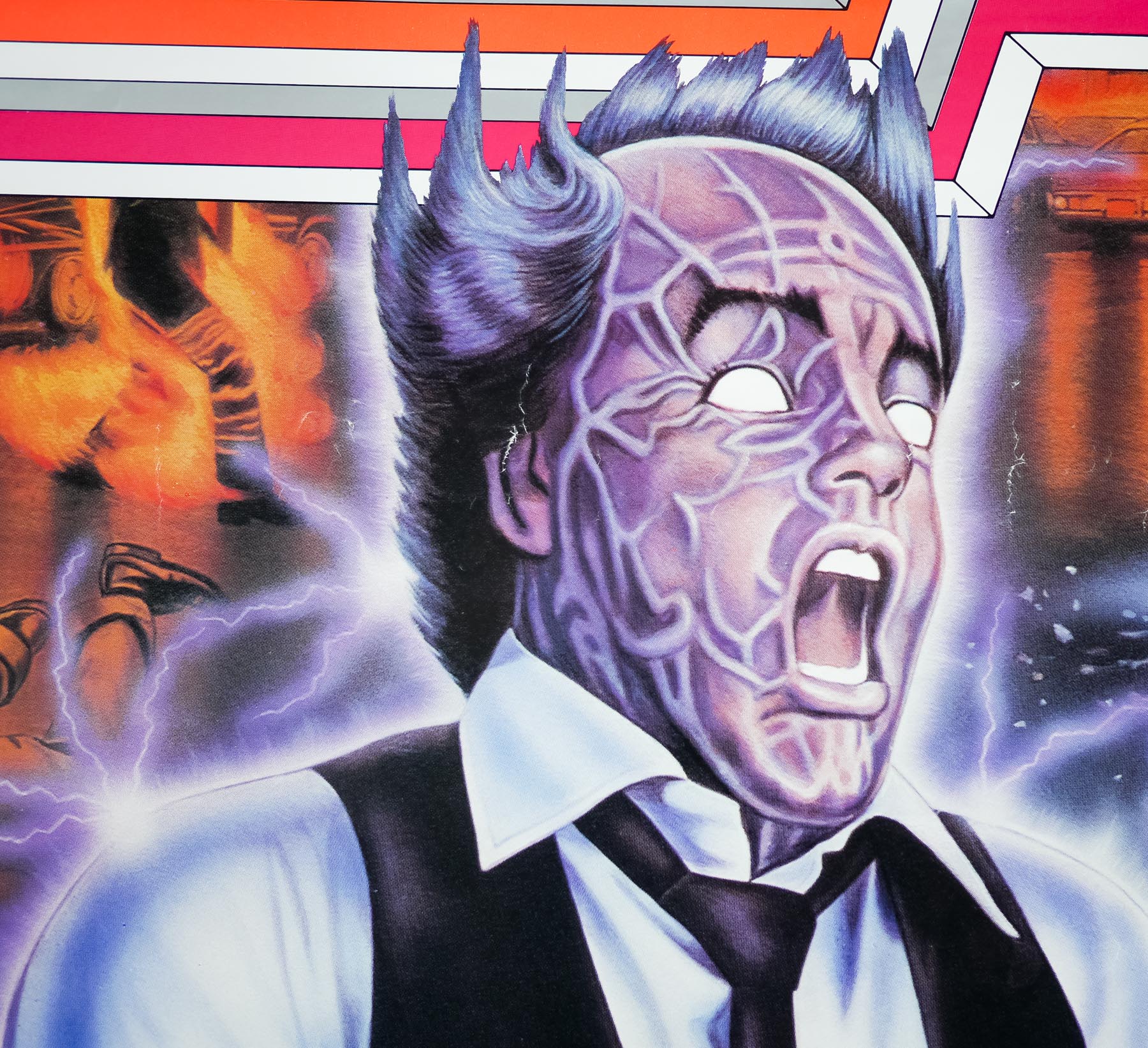
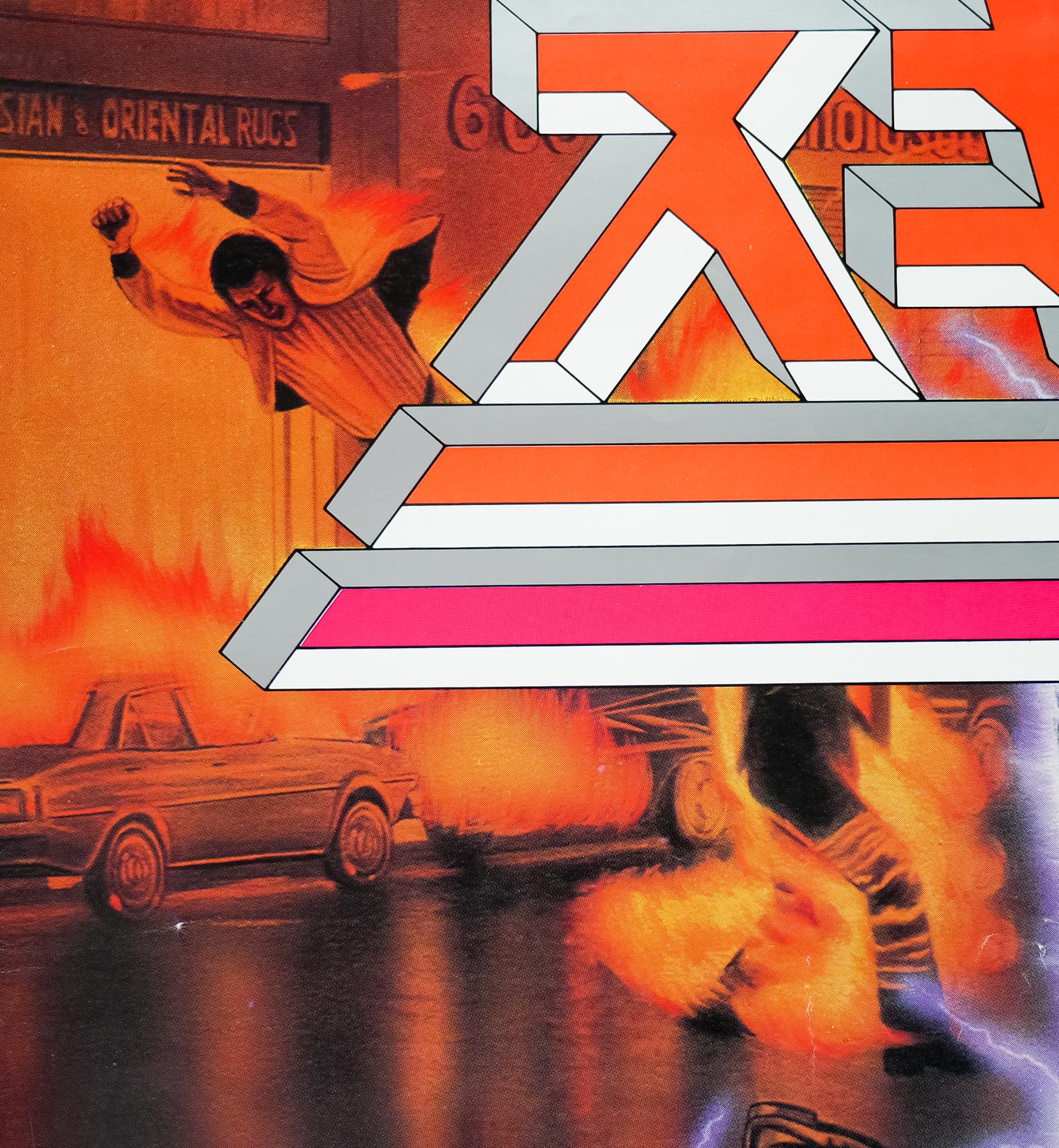
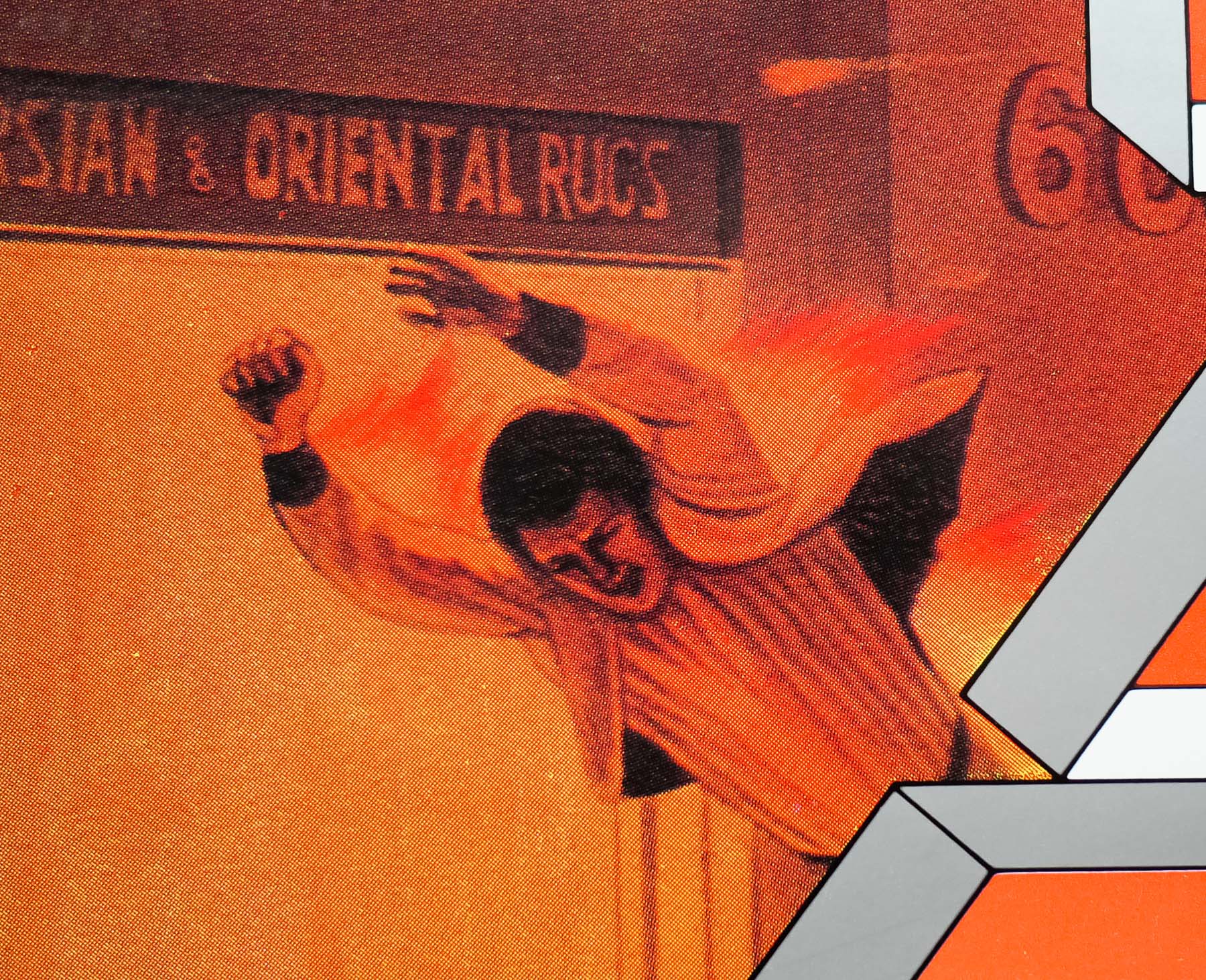
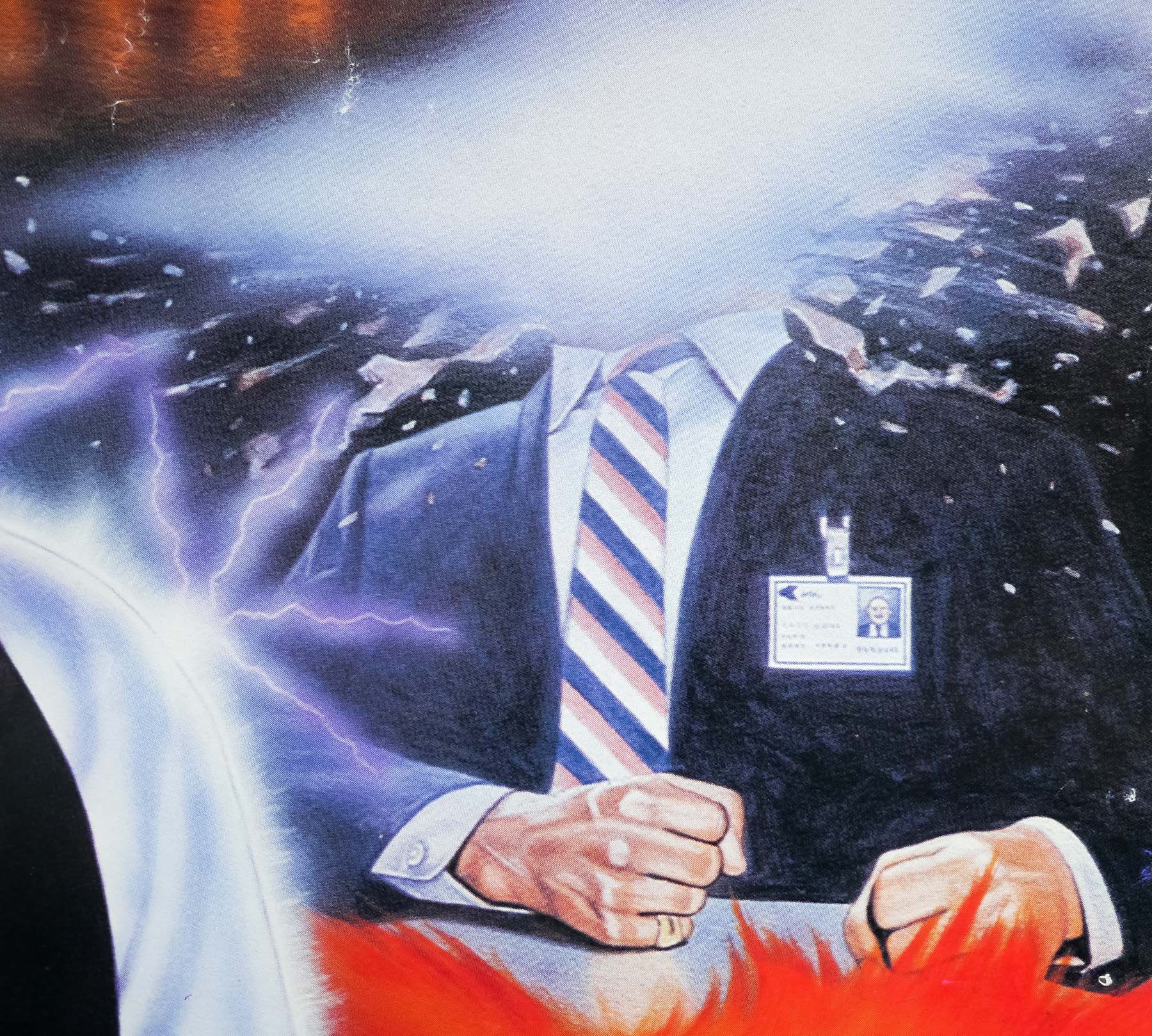
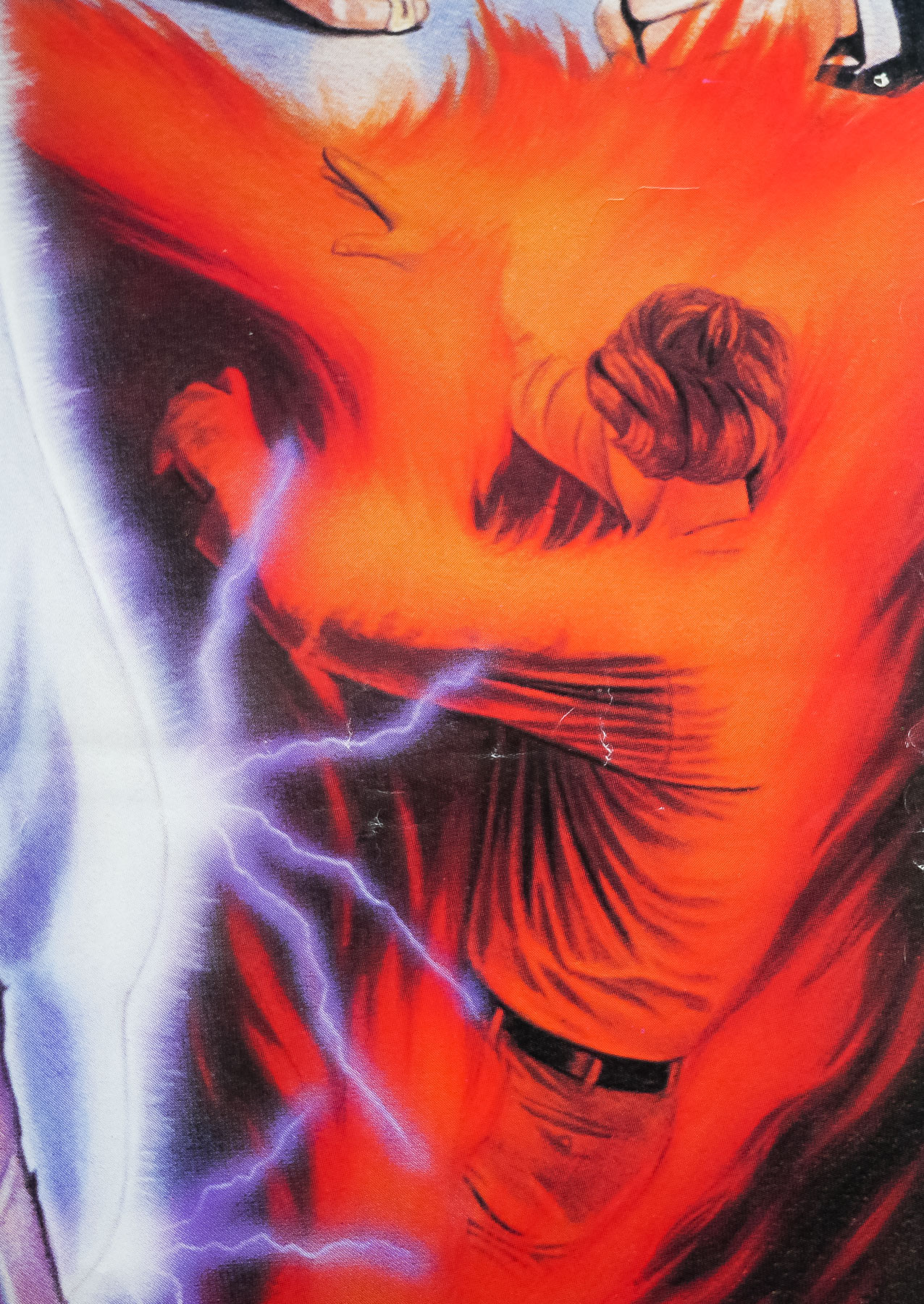
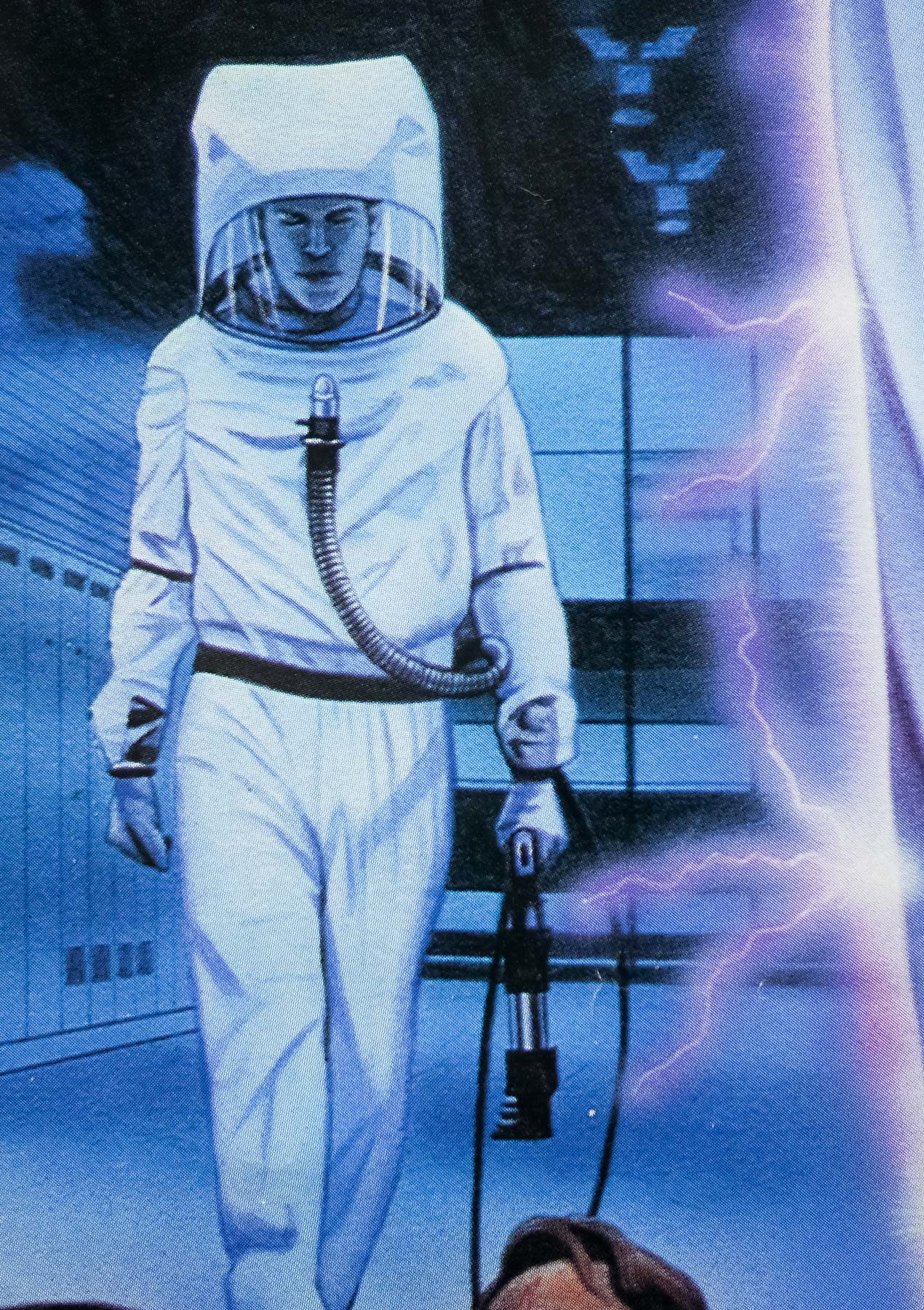
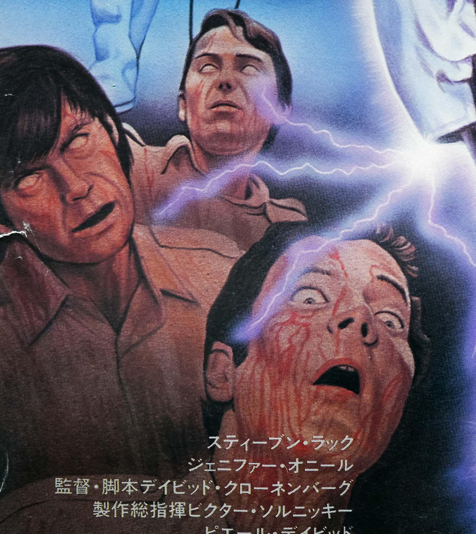
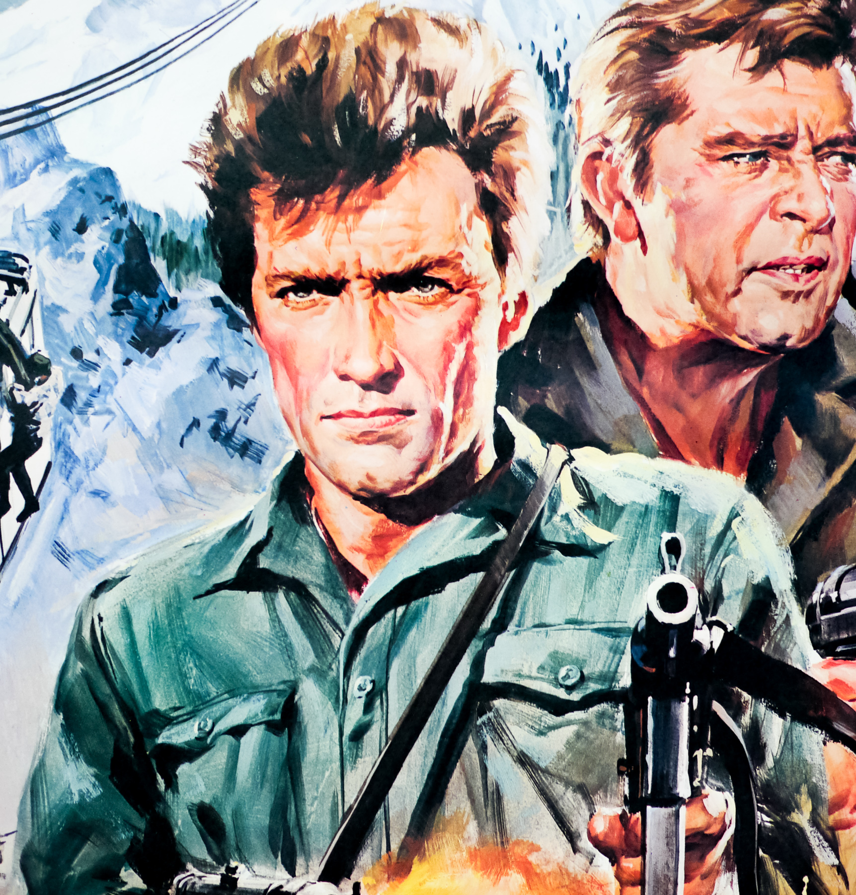
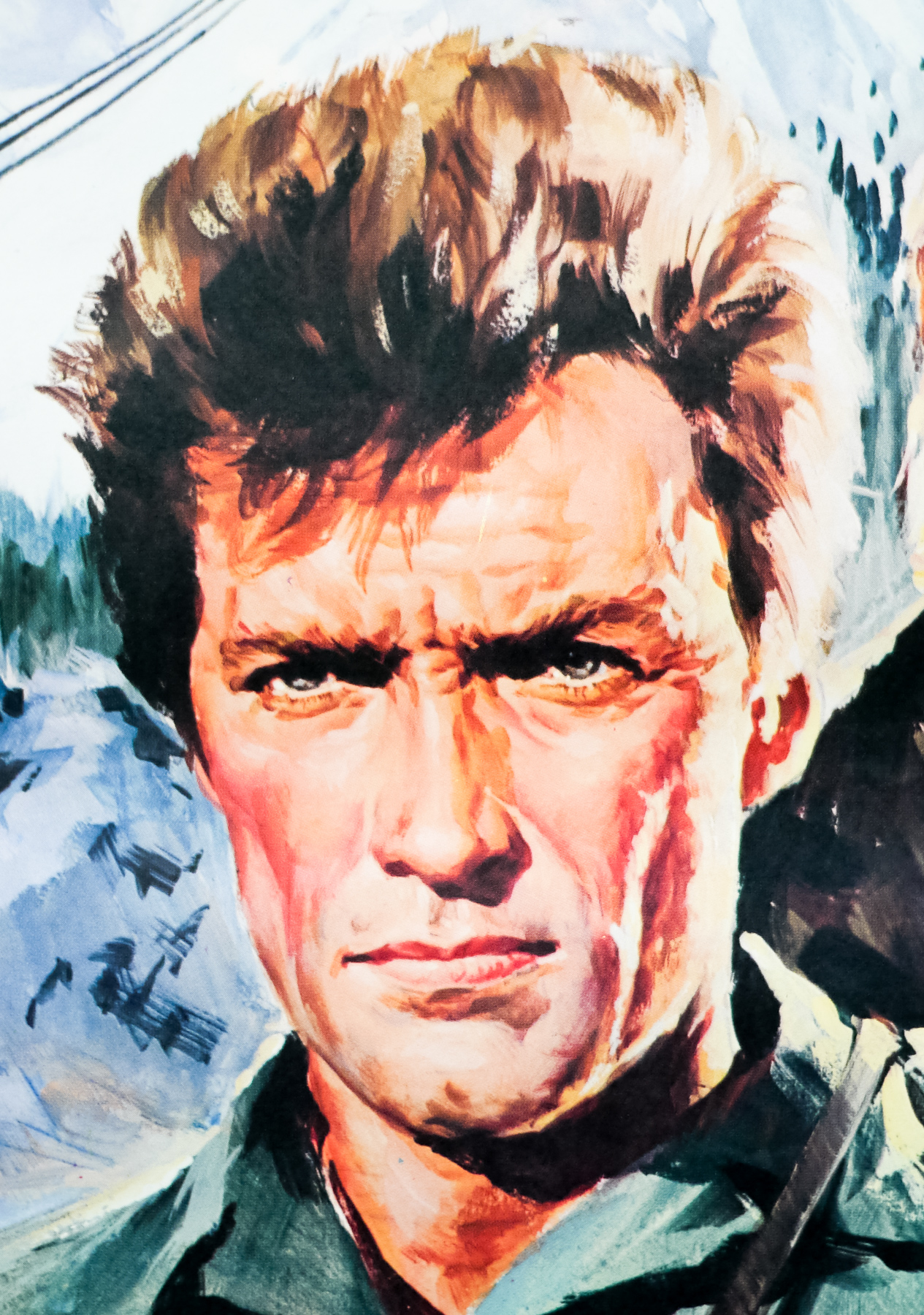
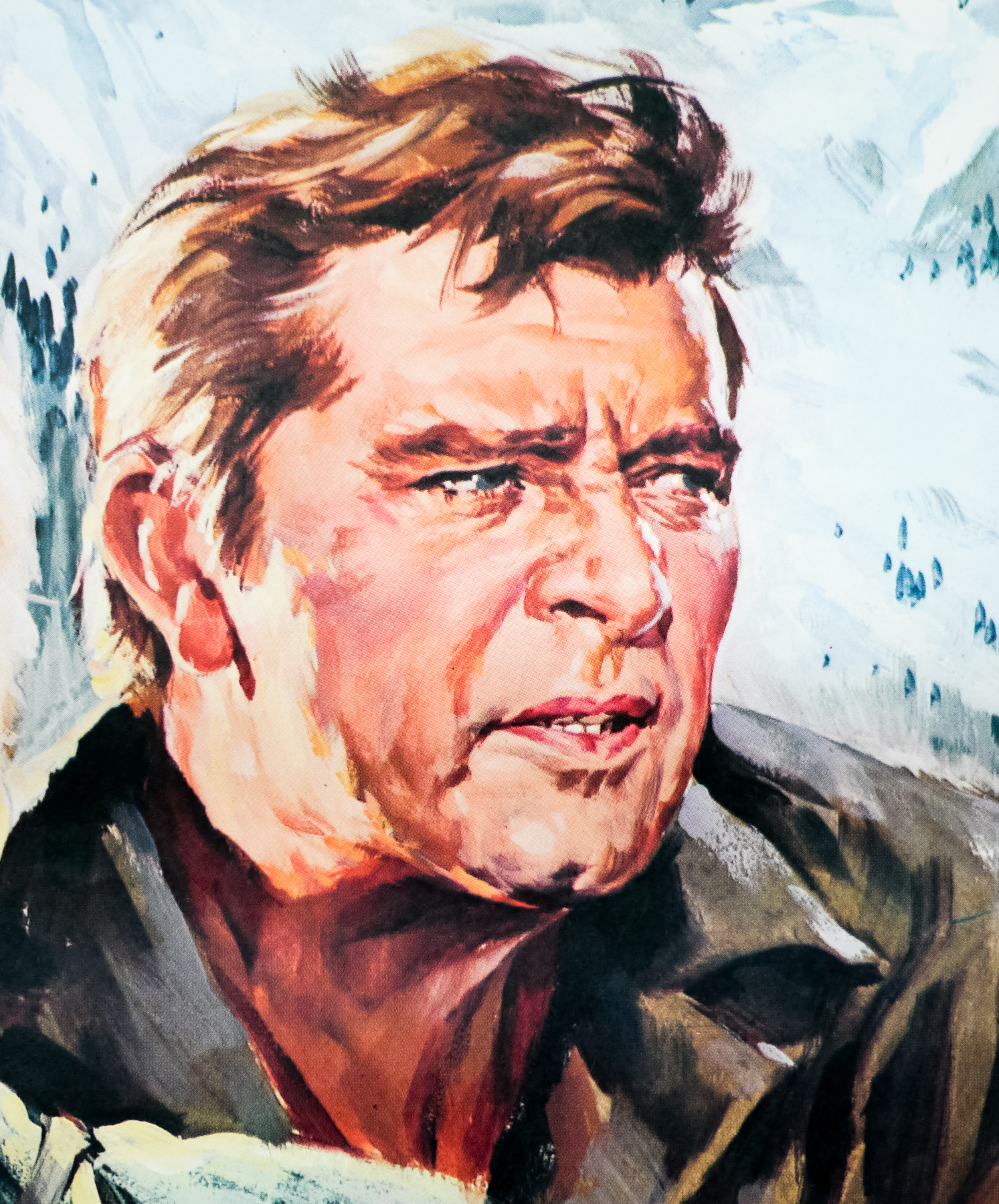
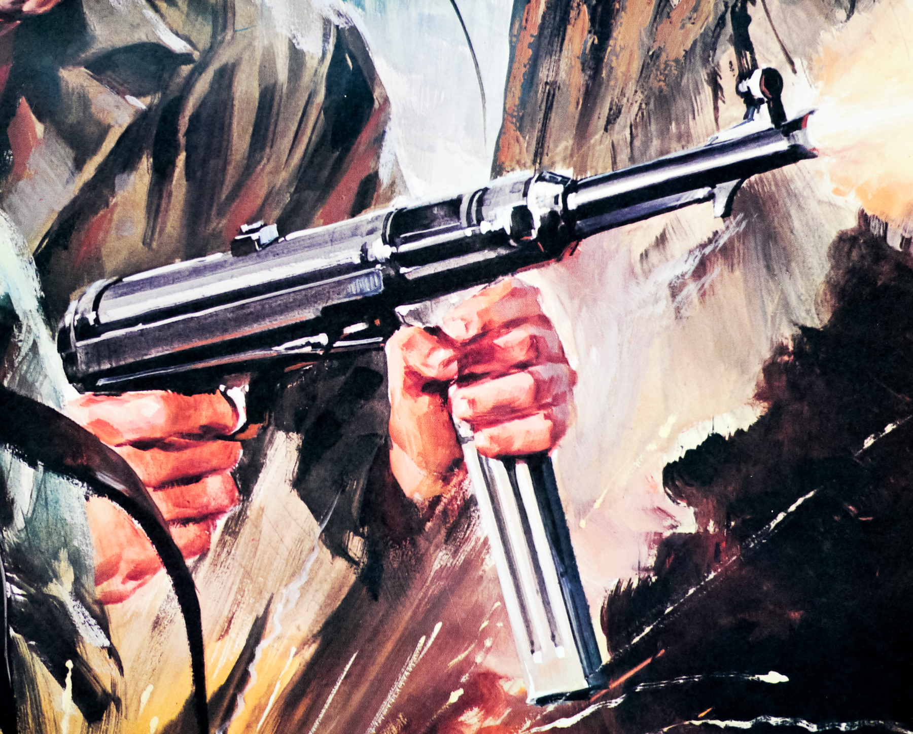
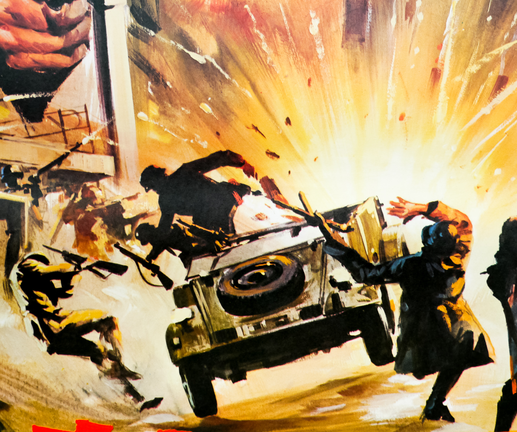
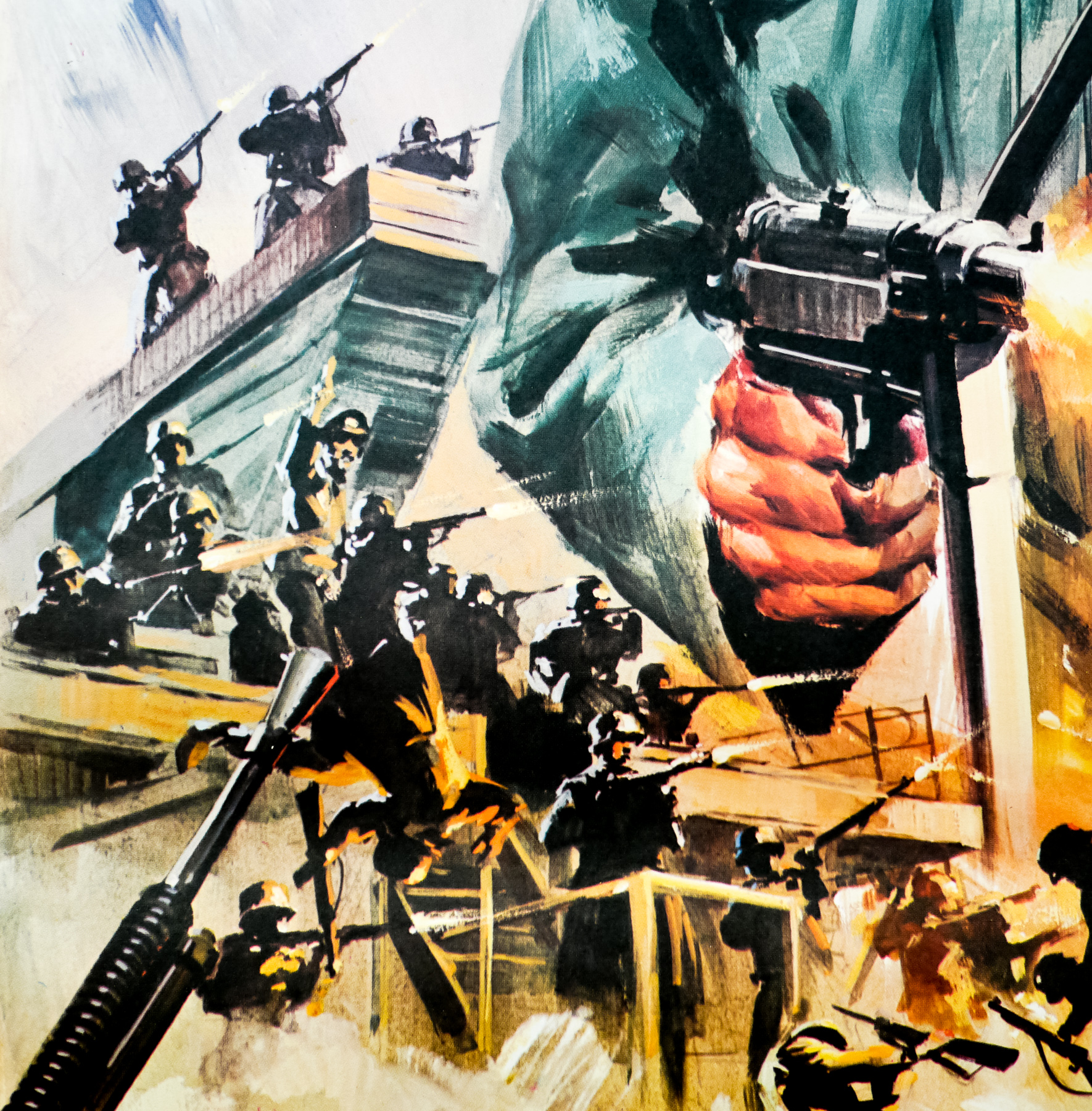
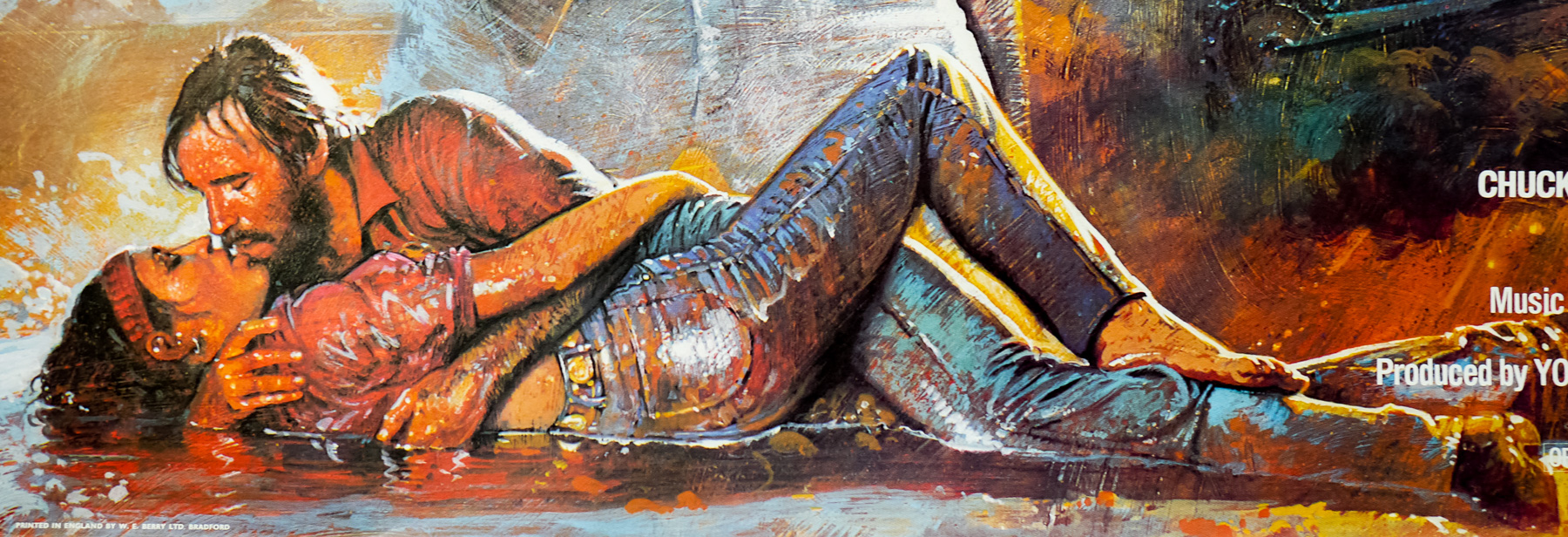
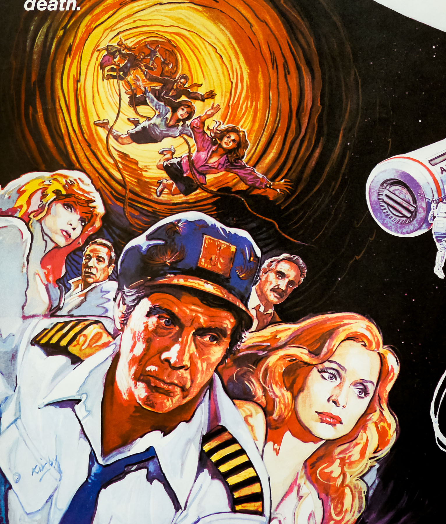
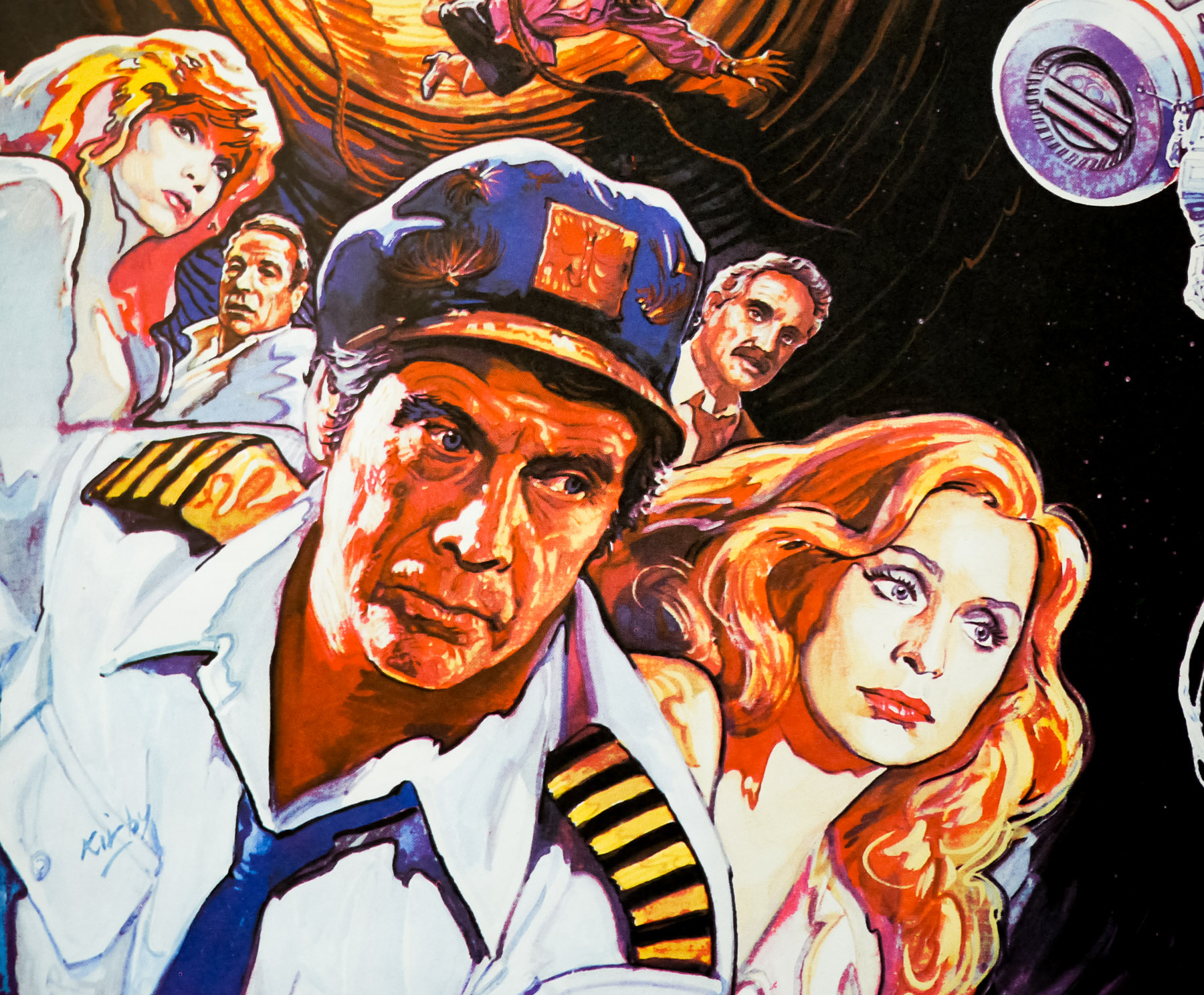
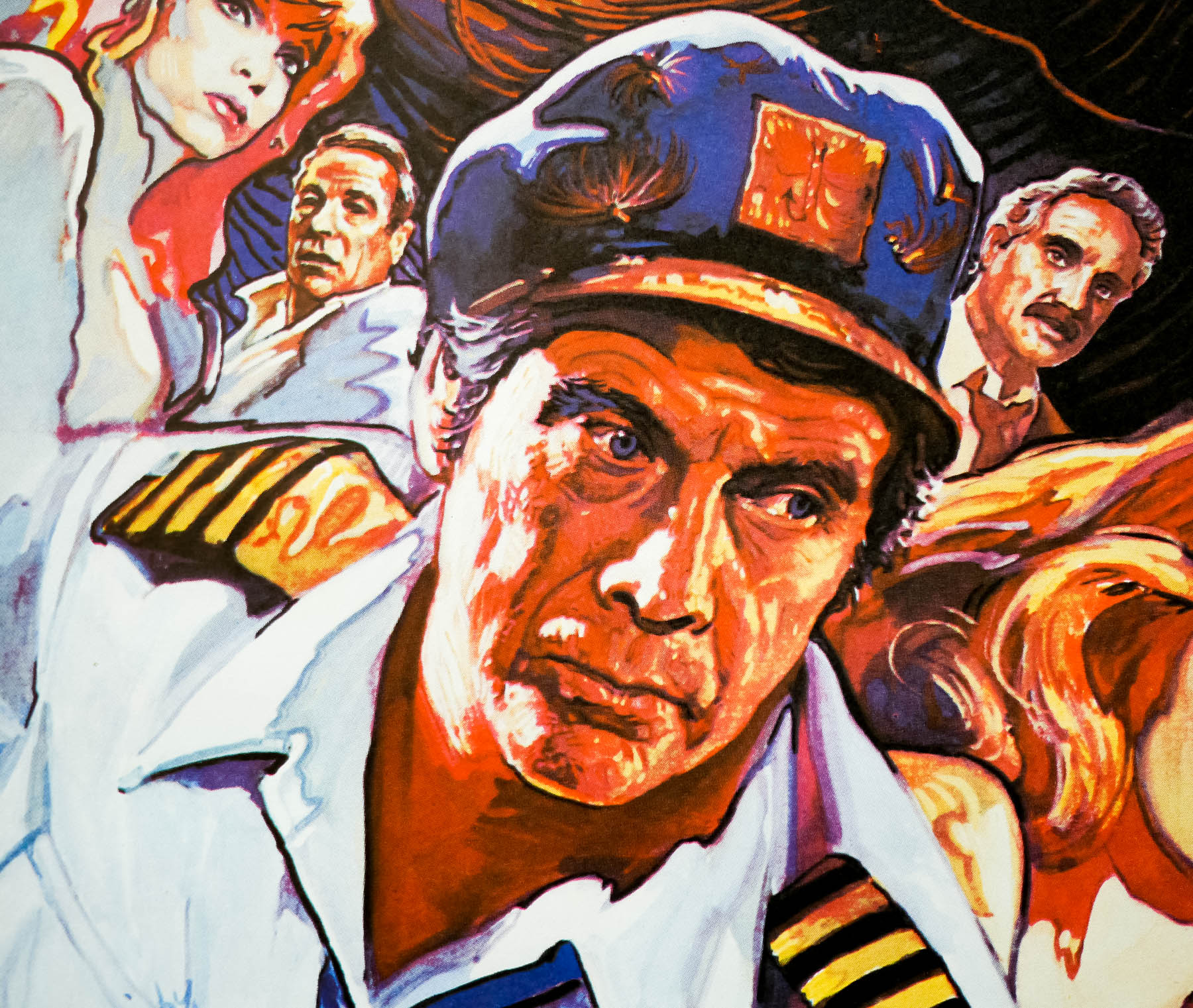
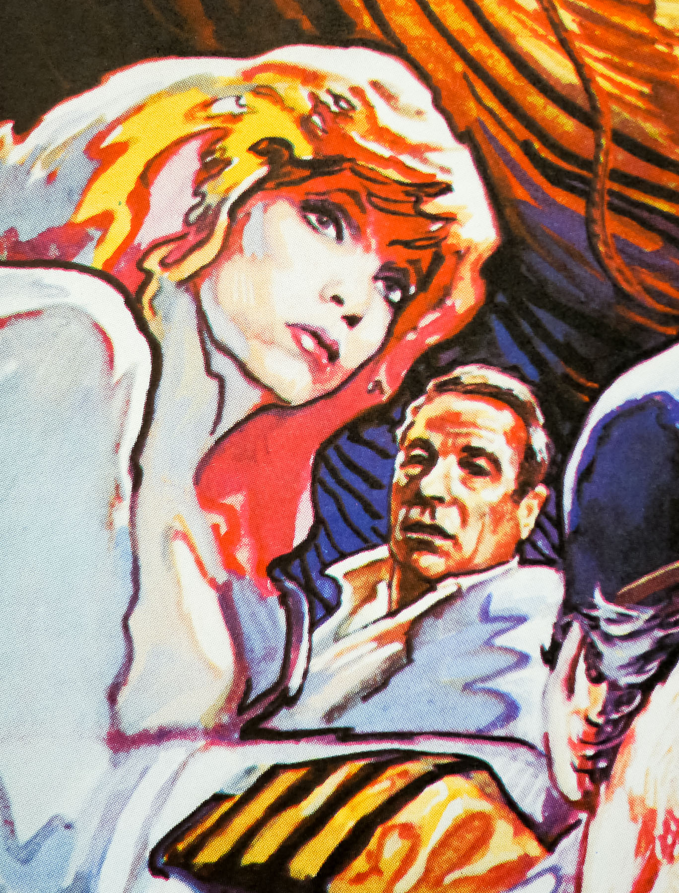
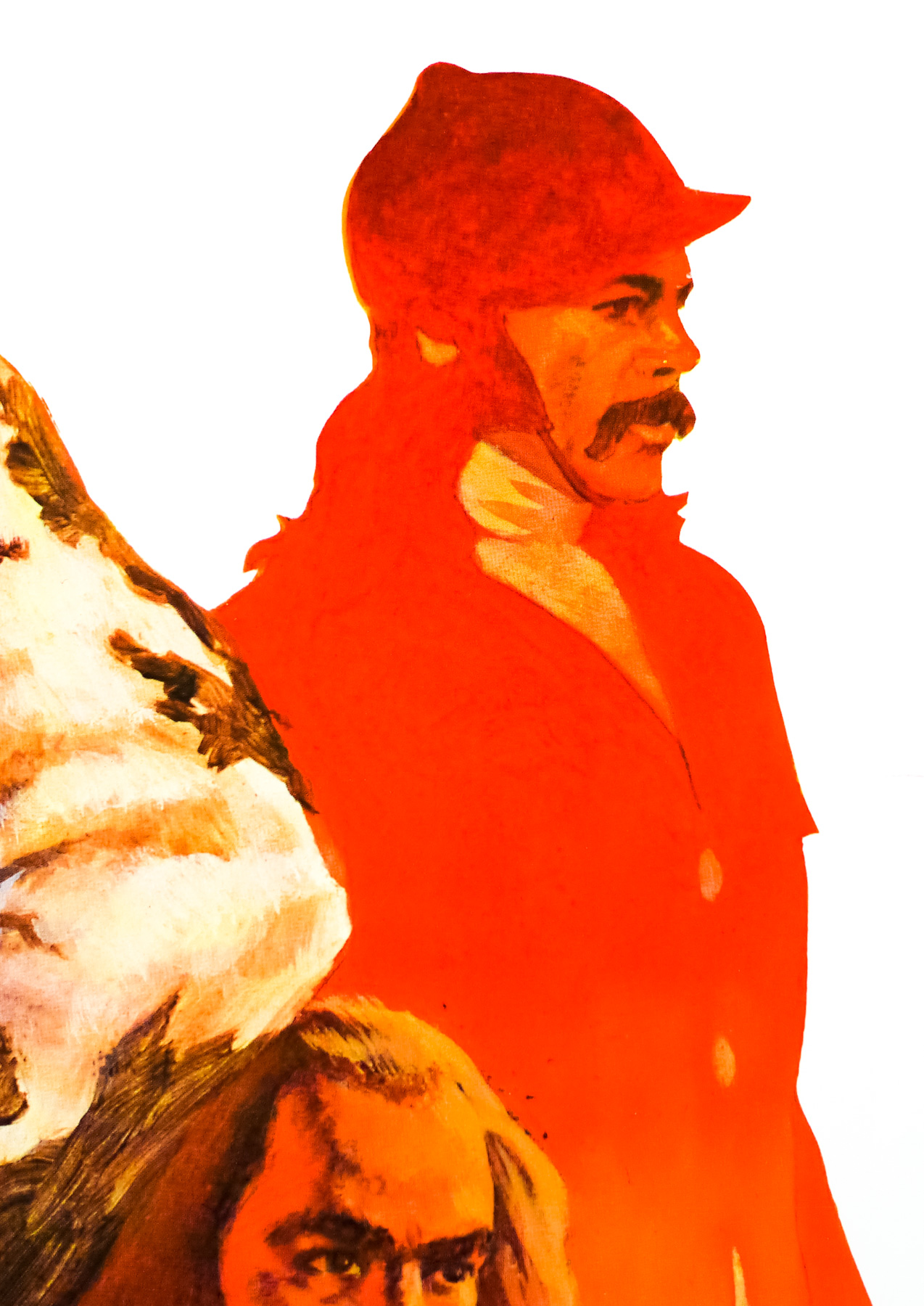
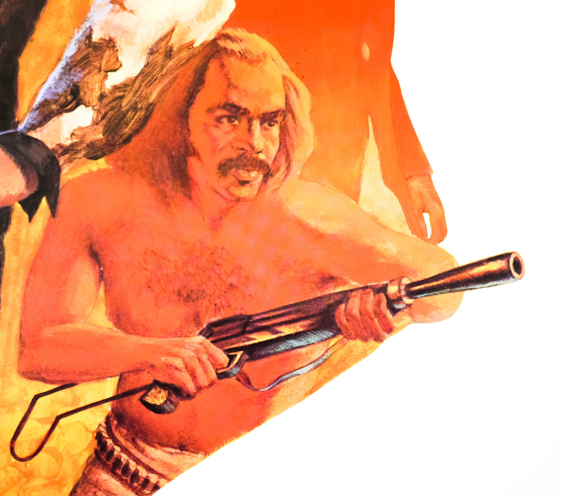
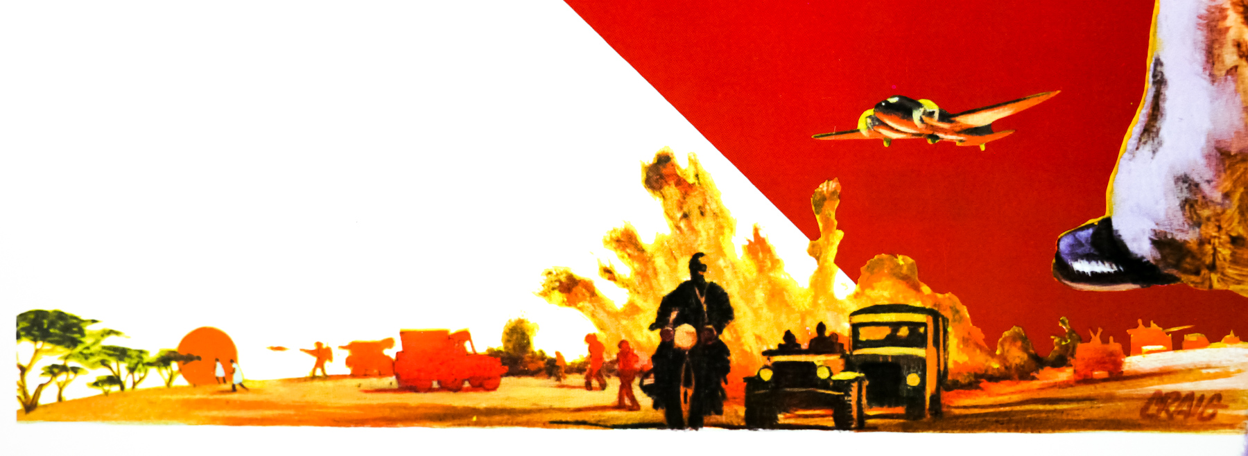
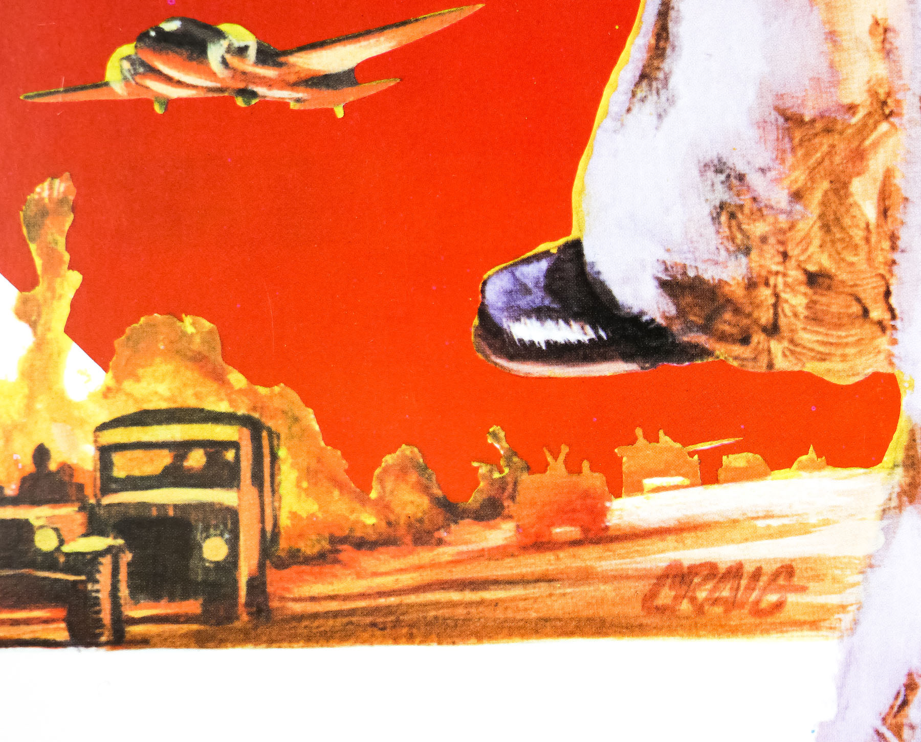
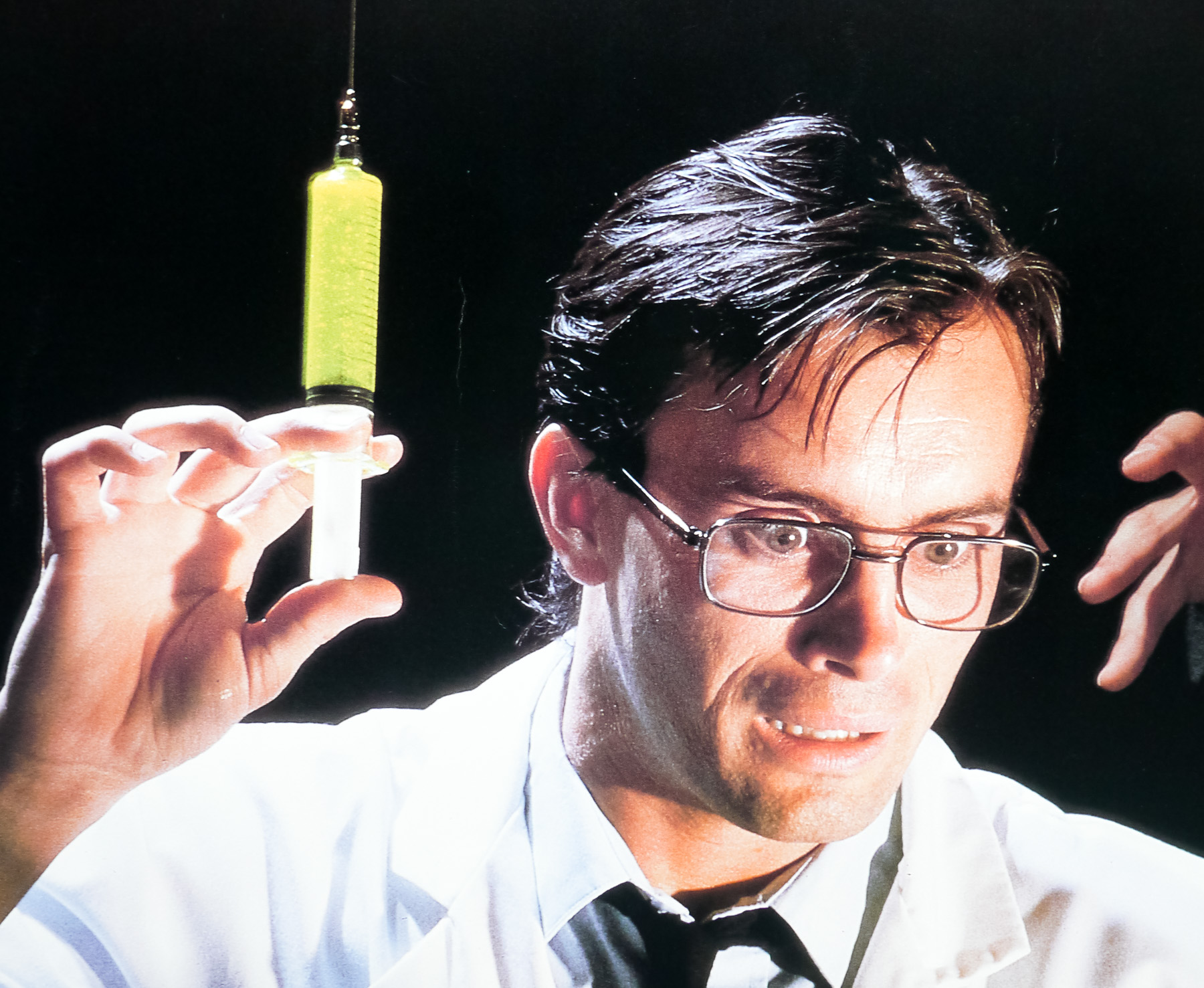
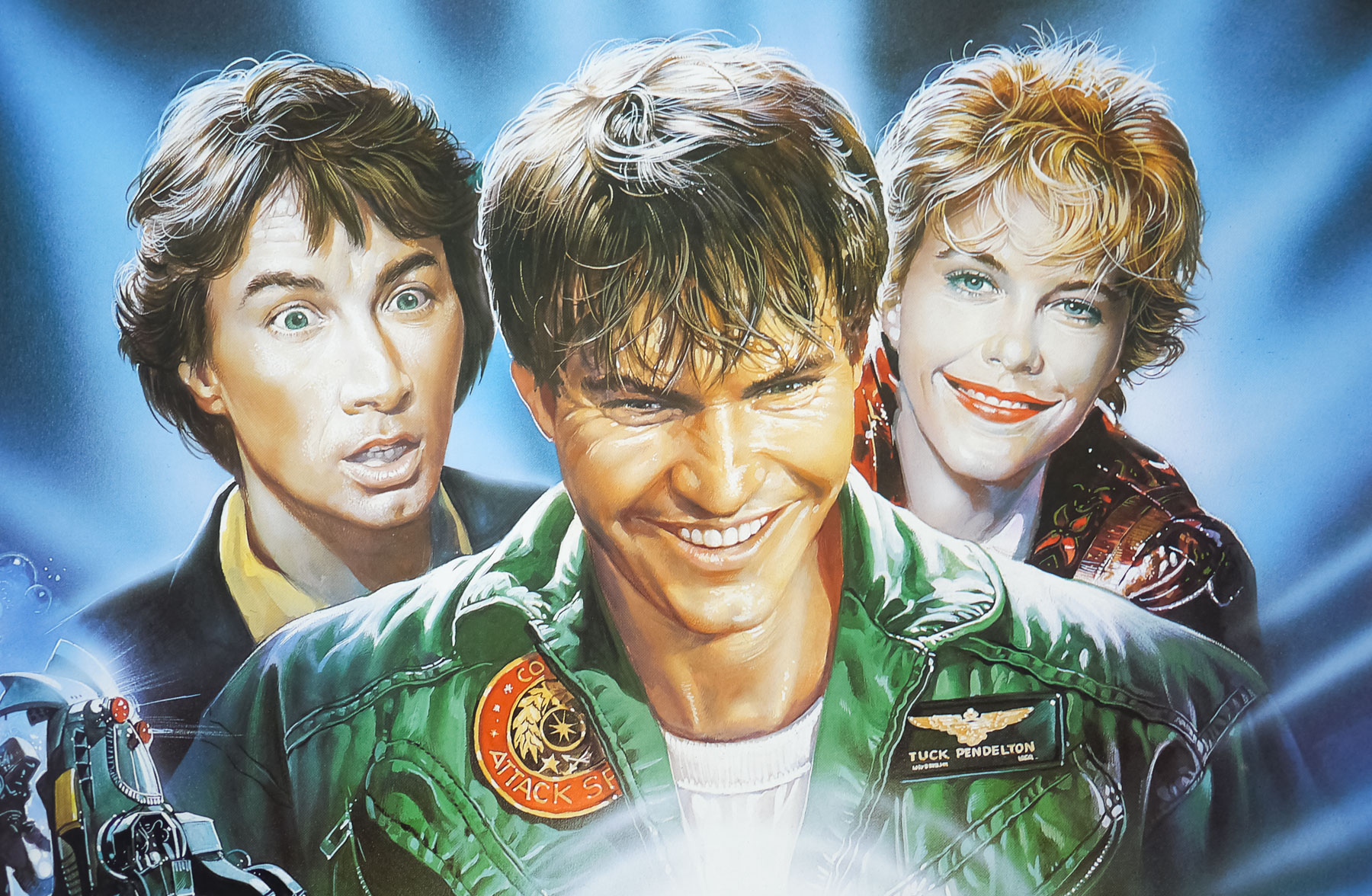
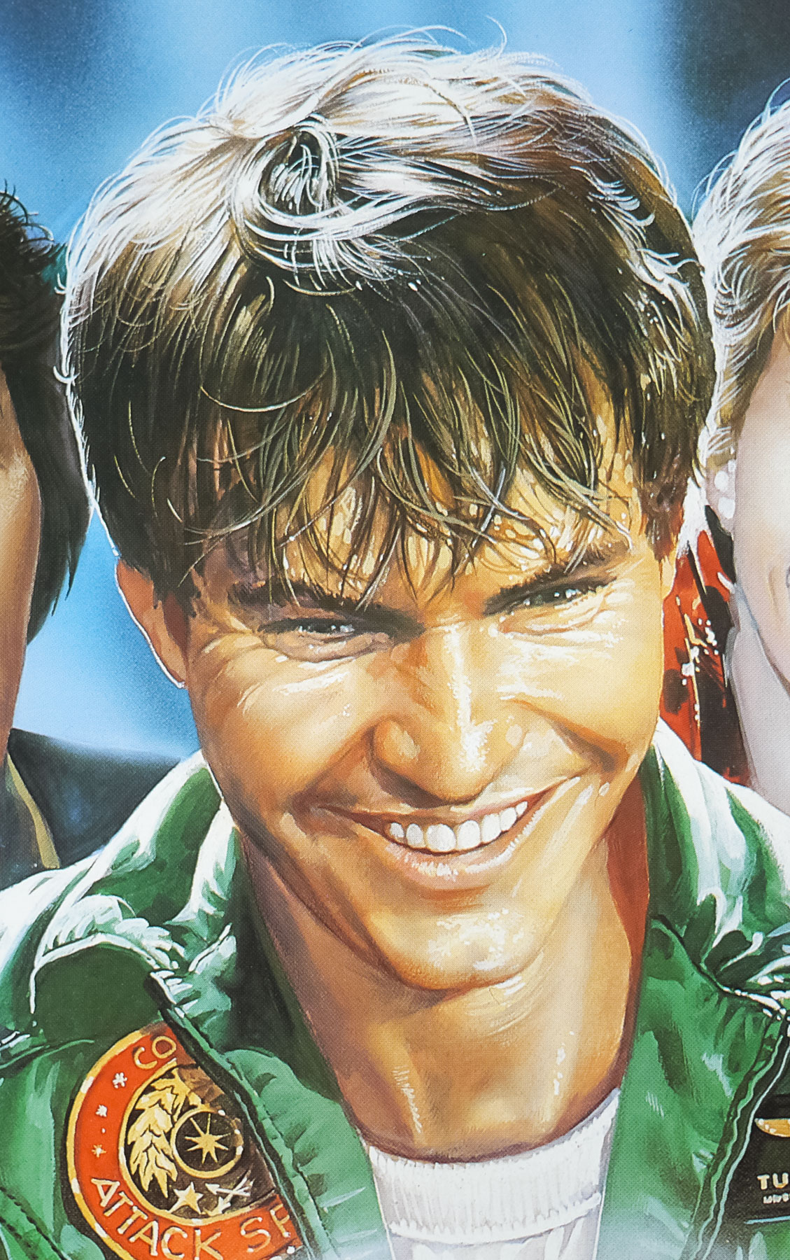
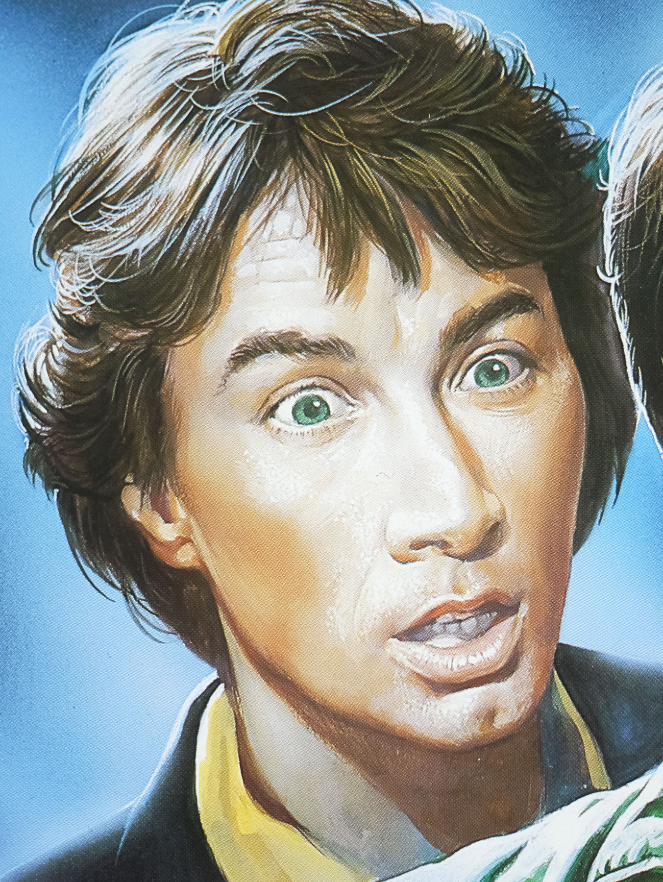
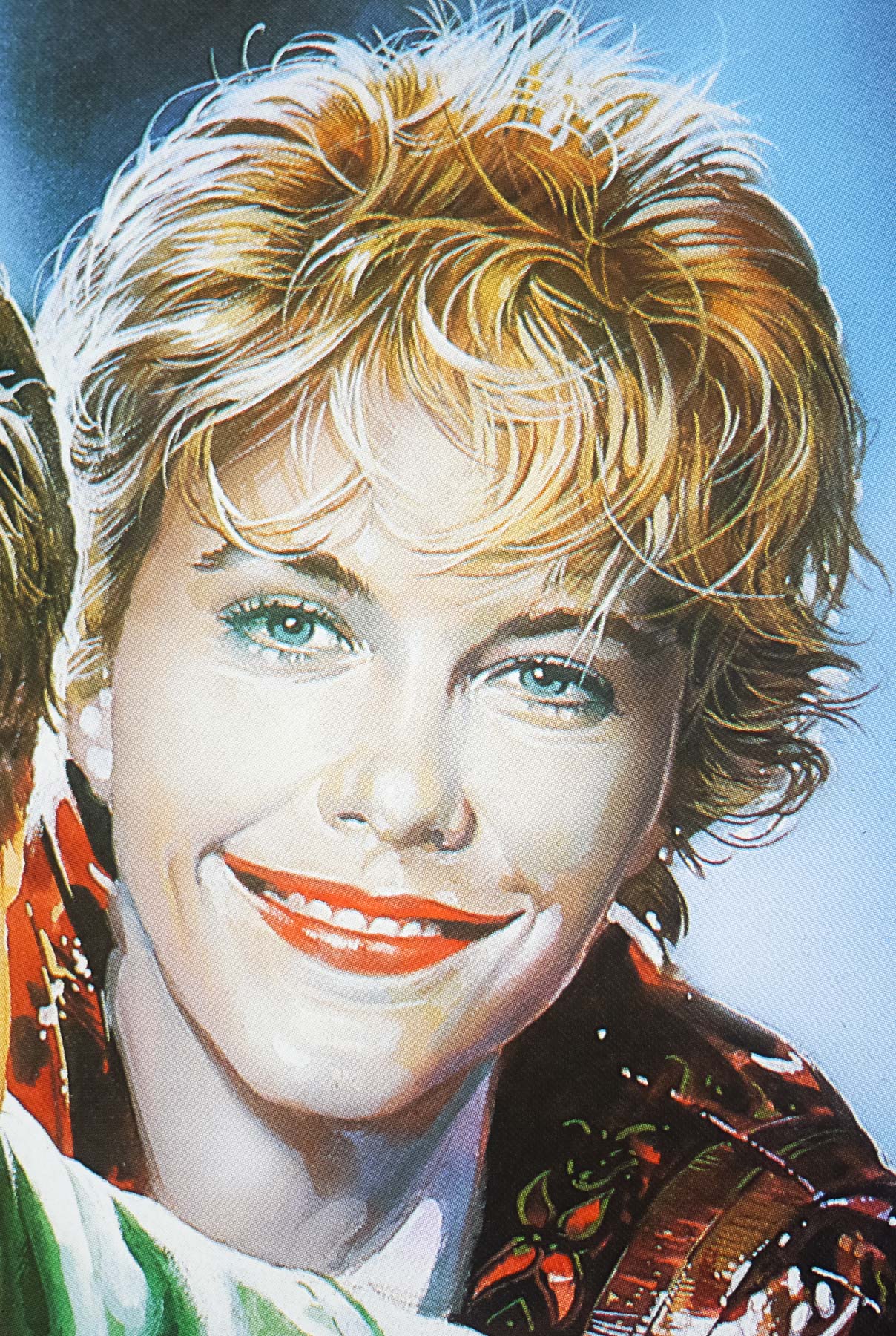
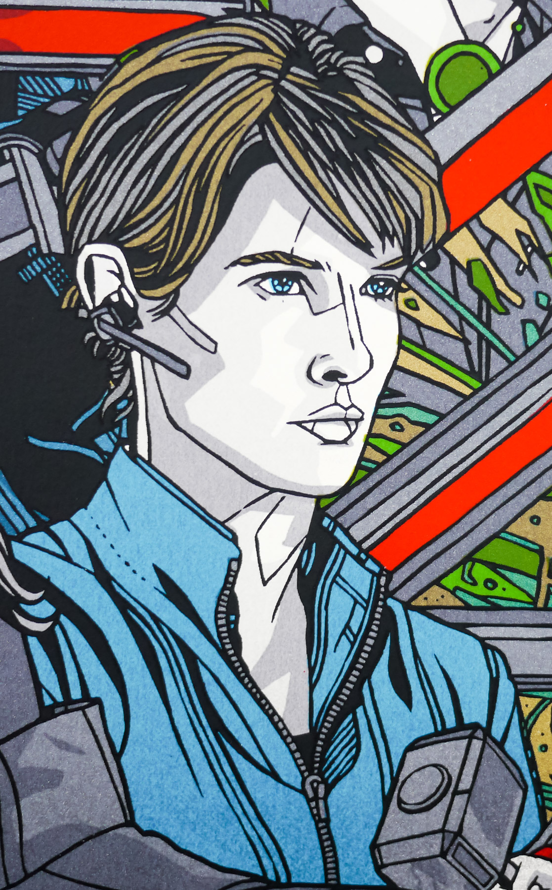
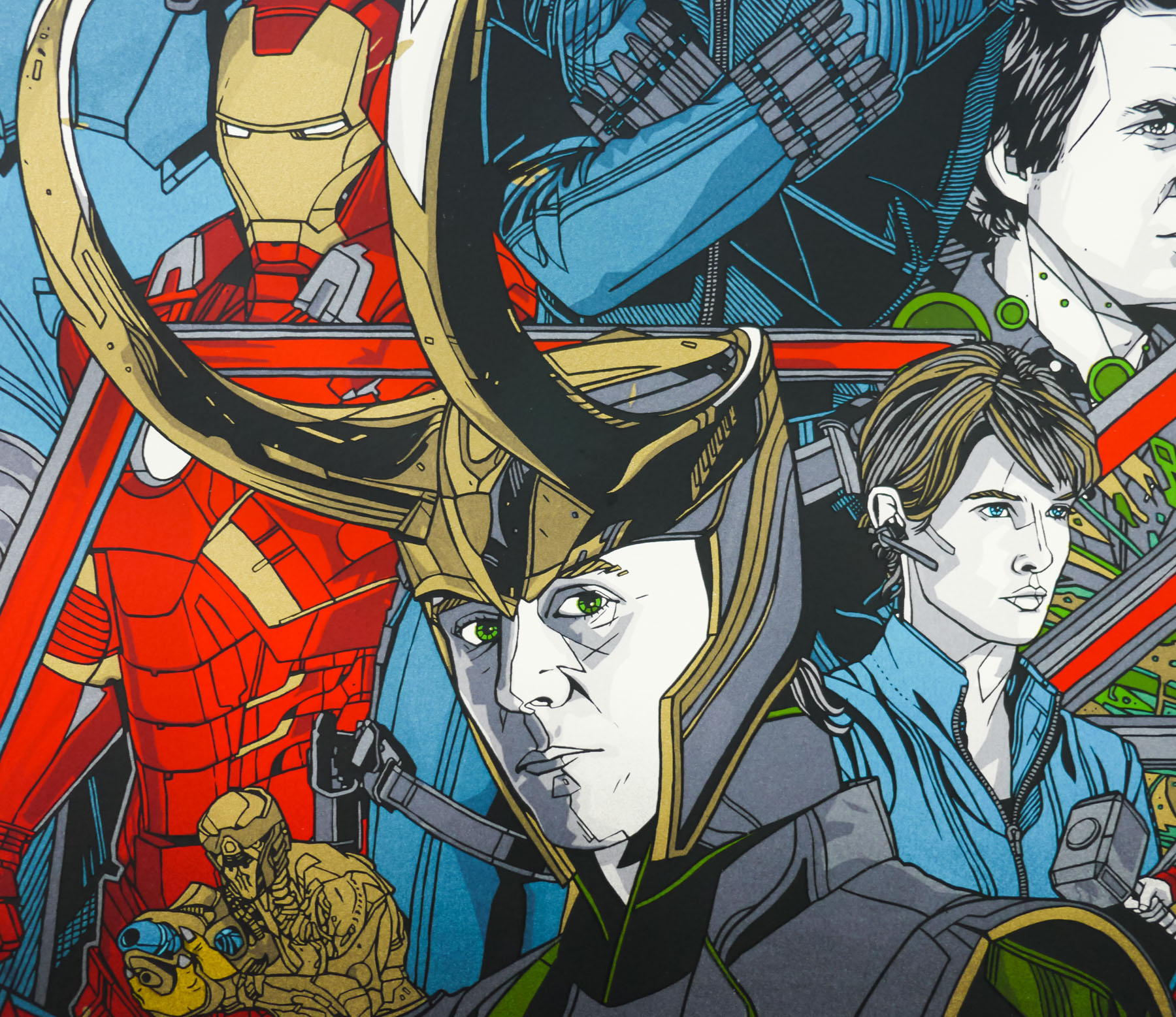
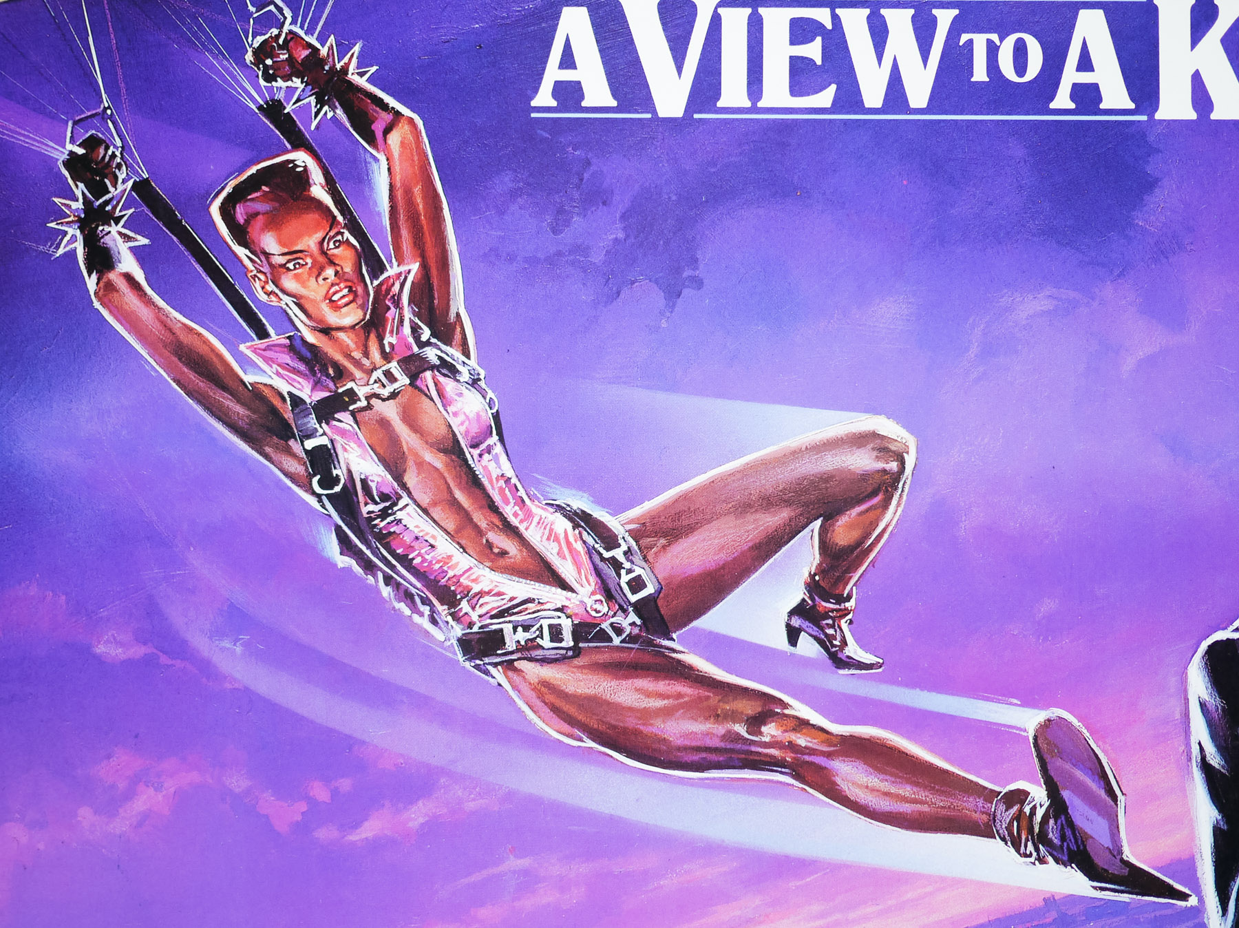
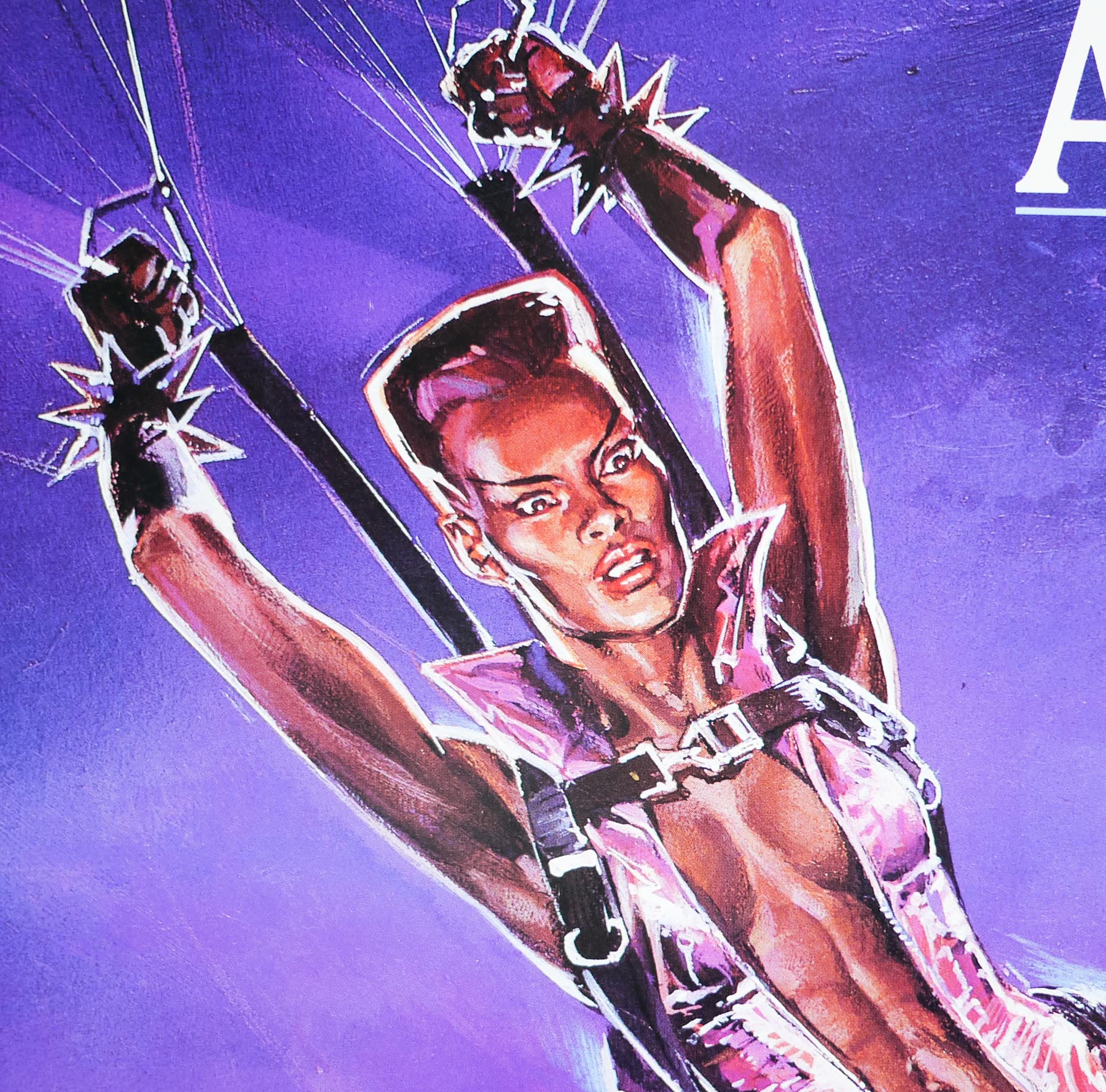
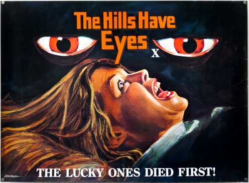
Director George A. Romero was hired to direct this horror anthology and was paired with legendary horror author Stephen King who was on screen-writing duties (hence the top tagline). The film is an homage to boys’ comics of the 1950s, including Tales from the Crypt and The Vault of Horror, and features five short stories that are bookended by scenes featuring a young boy (played Joe King, son of Stephen) who is berated by his abusive father for reading those ‘crap’ comics and who later takes deadly revenge on his father. As with any anthology some of the stories are stronger than others and arguably the best is the one called ‘The Crate’ that sees an ancient creature unleashed from its titular prison, whilst ‘Something to Tide You Over’ a seriously creepy tale of revenge starring Ted Danson and a villainous Leslie Nielsen.
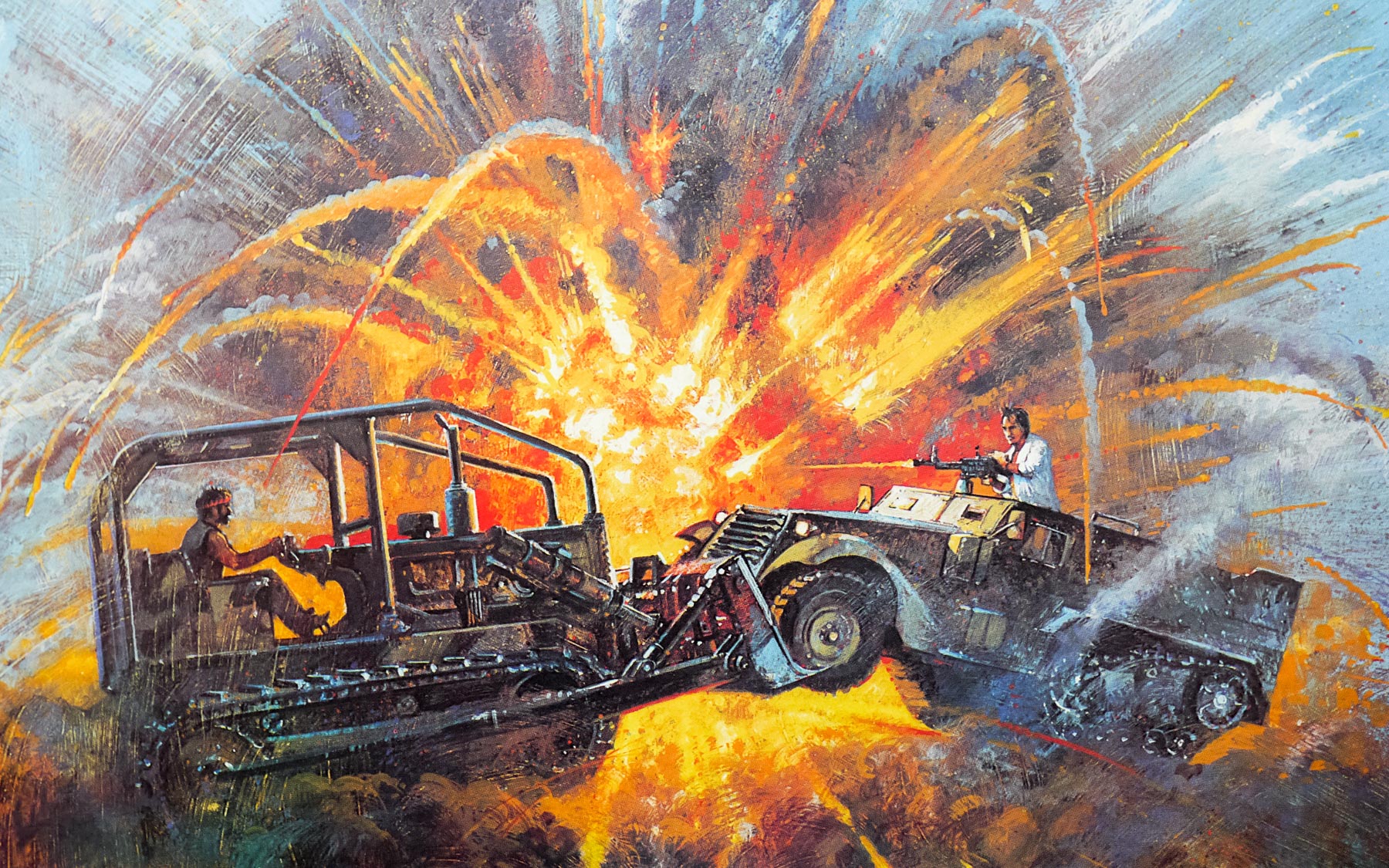
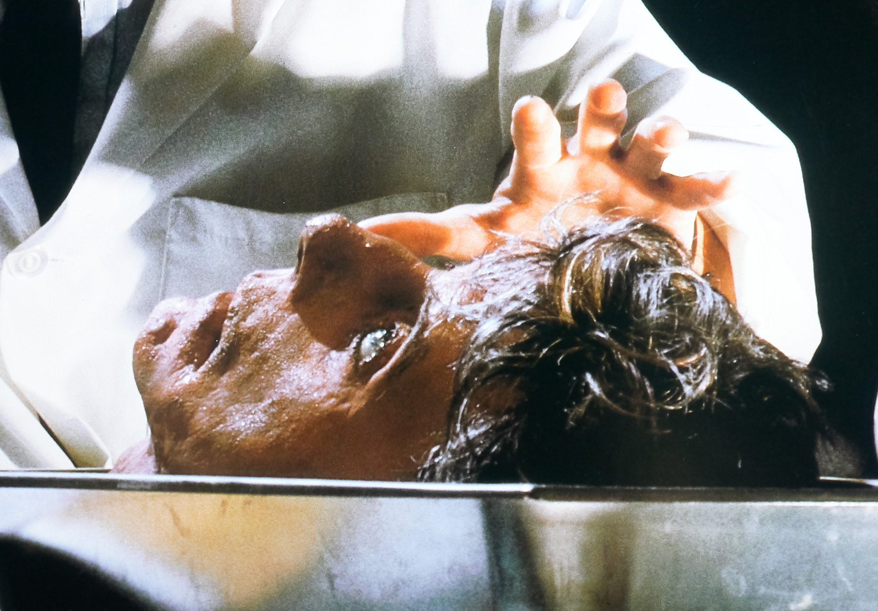
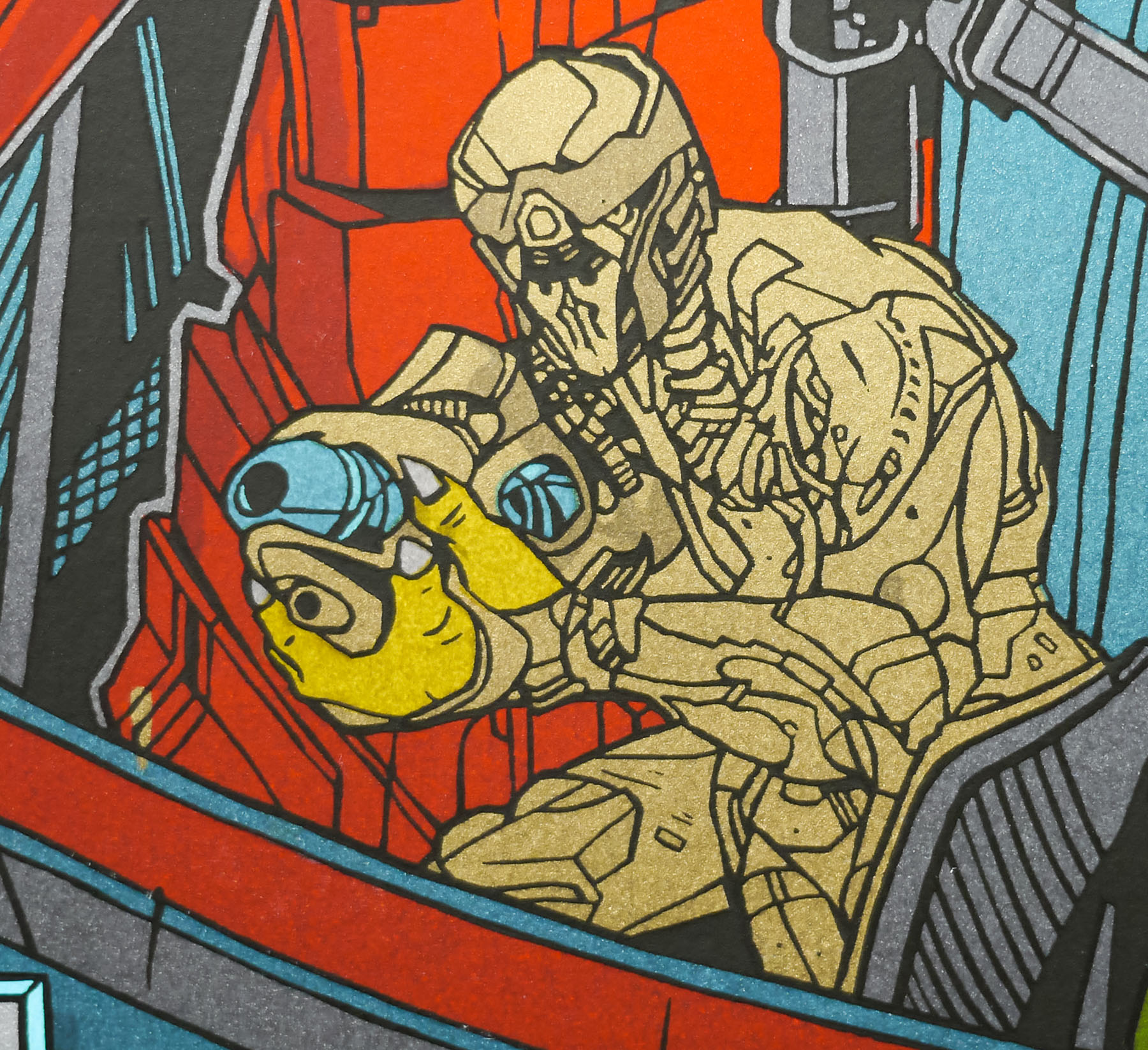
Romero once again collaborated with the special effects guru Tom Savini whose work on Creepshow definitely stands up as amongst the finest of his career. His cockroach-wrangling during the final story ‘They’re Creeping Up On You’ deserves special mention. The director assembled a very impressive cast that includes the likes of Ed Harris, Hal Holbrook and genre-favourite Adrienne Barbeau. Stephen King himself even makes an (overblown, hammy) appearance as an unlucky yokel who gets more than he bargained for after discovering a strange meteorite.
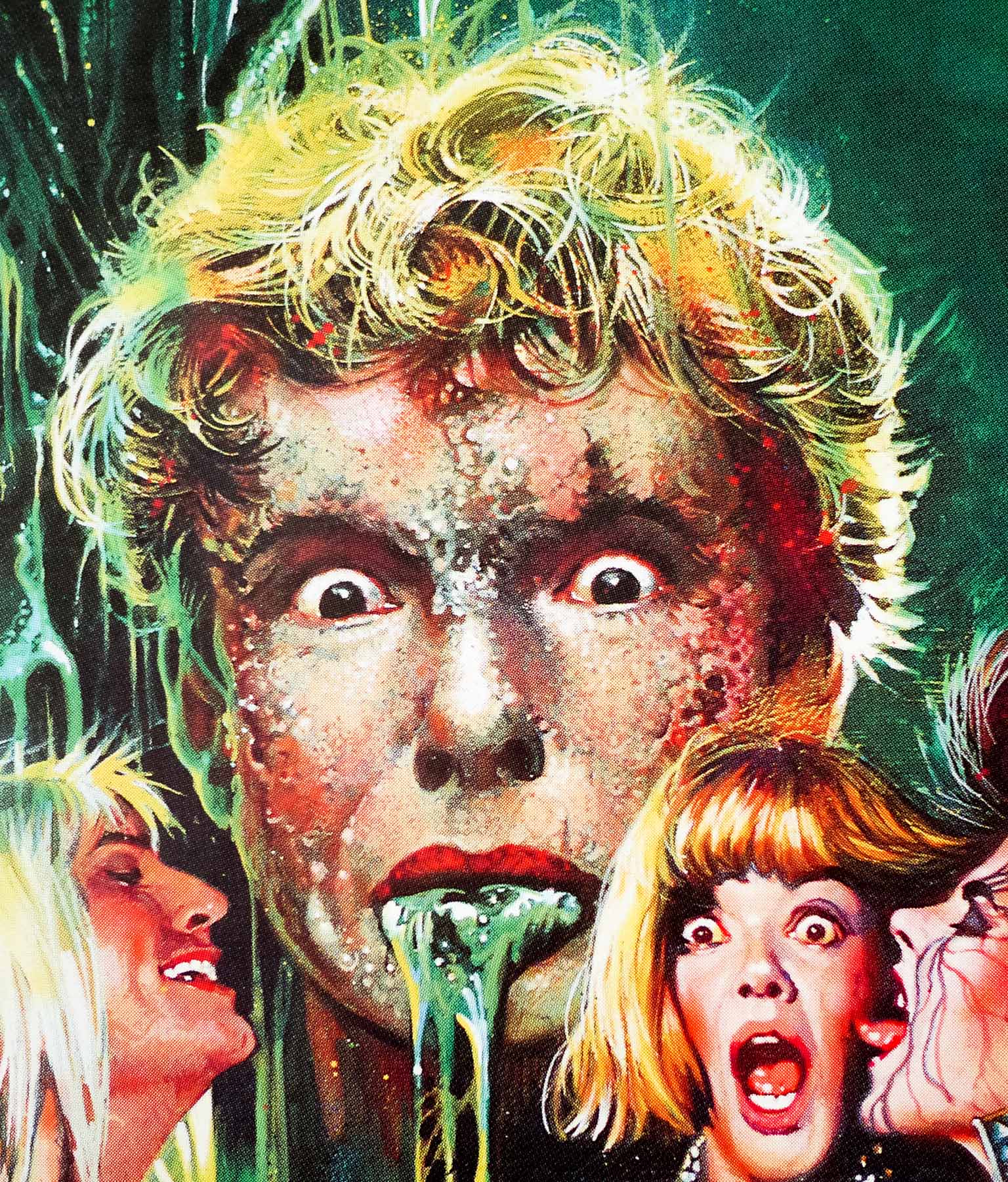
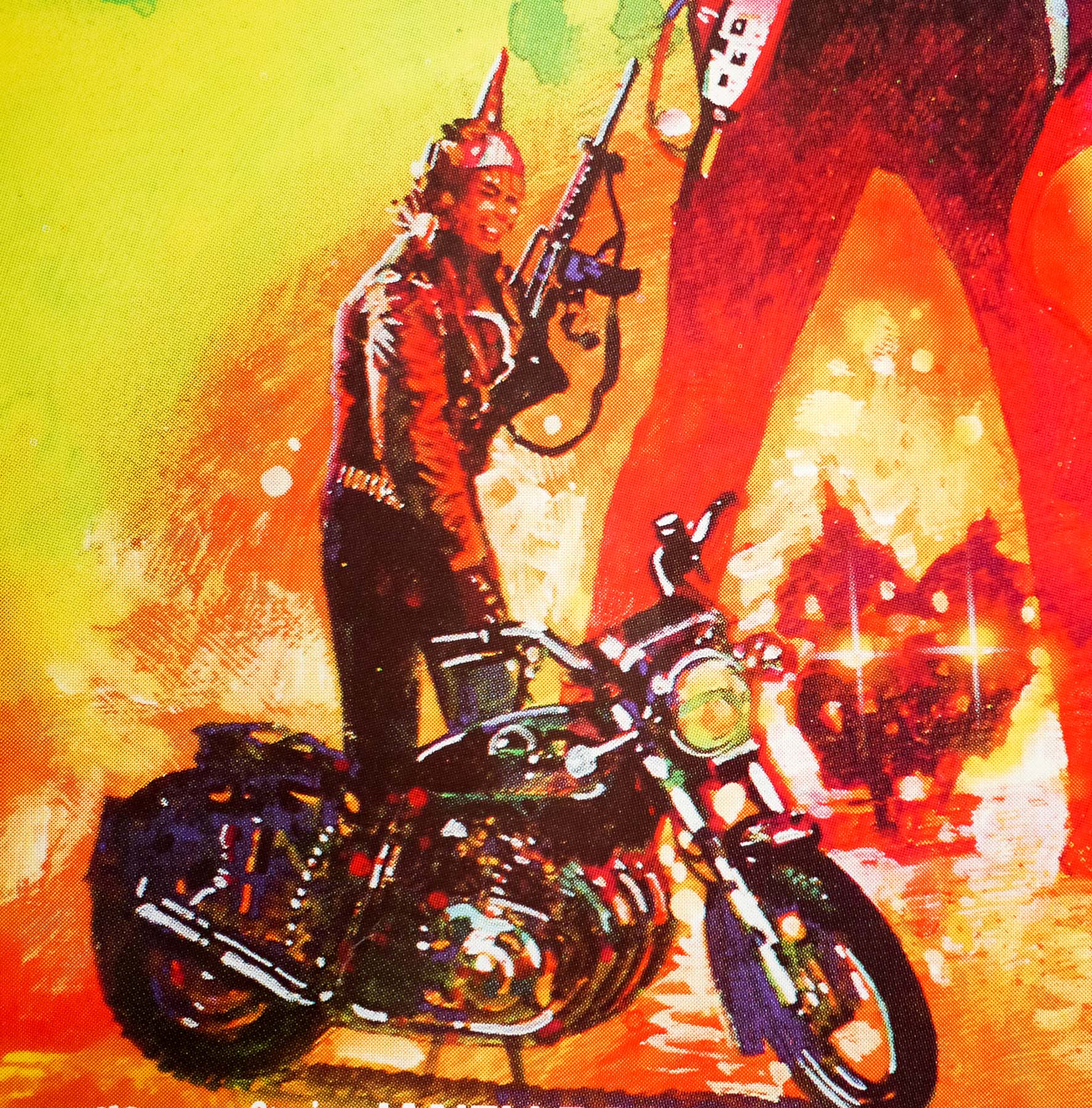
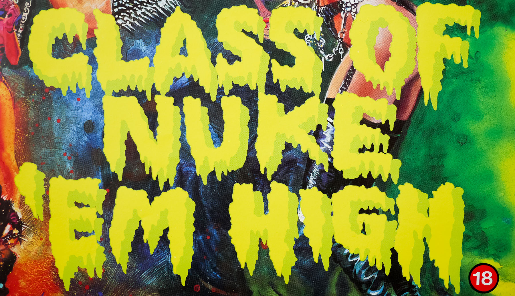
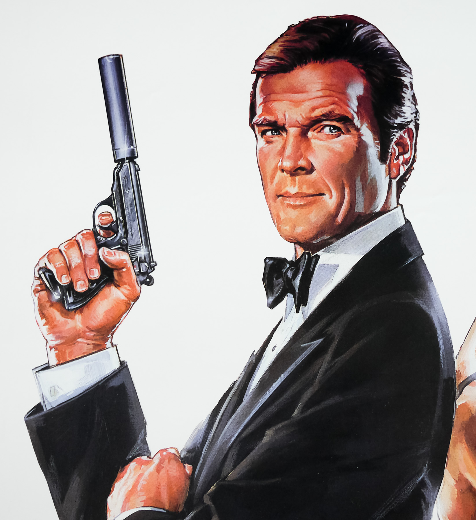
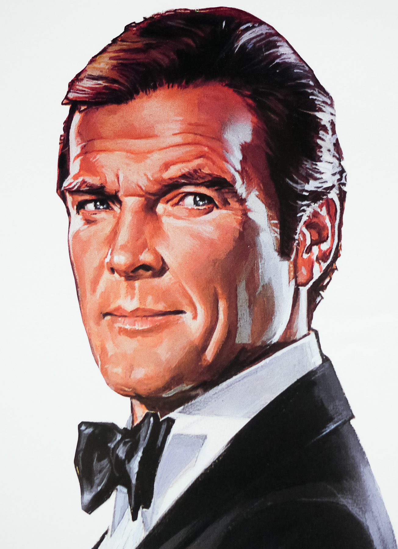
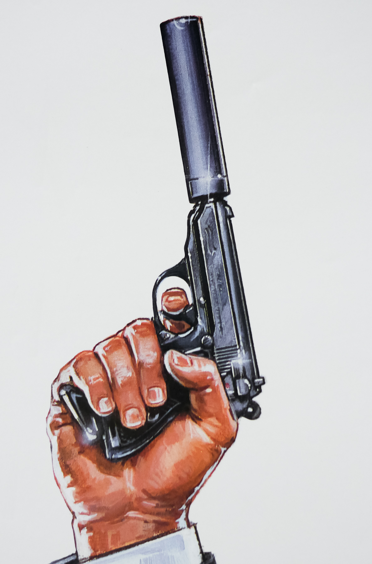
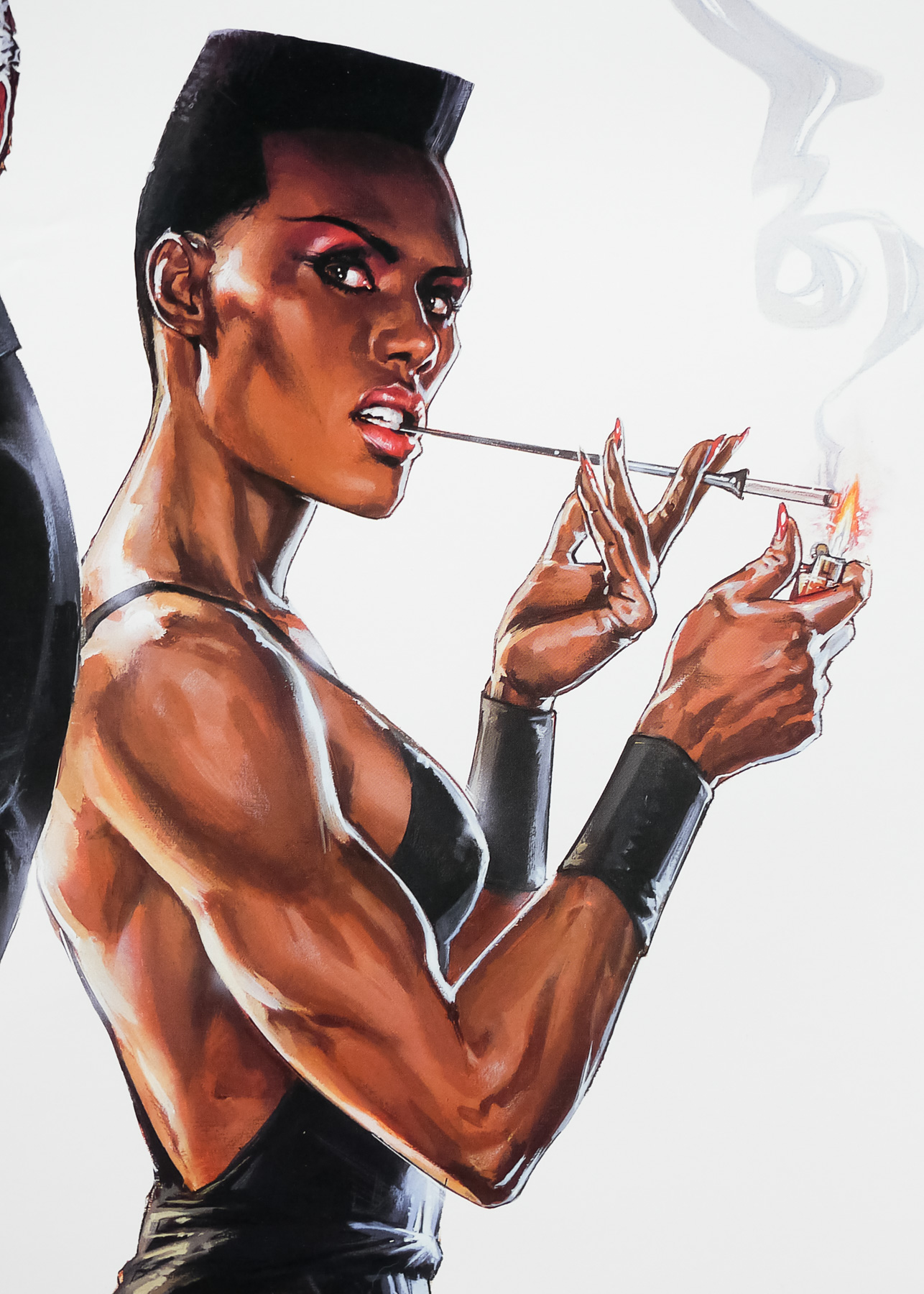
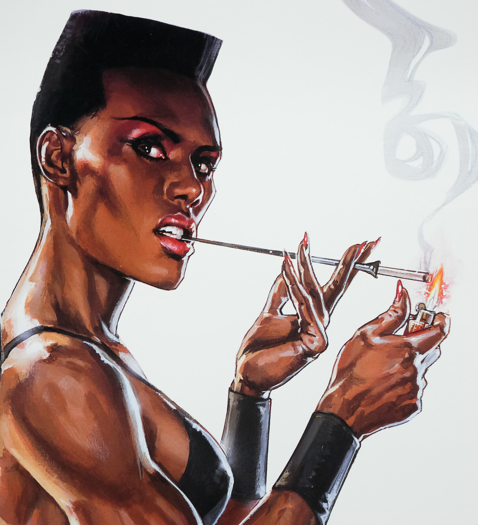
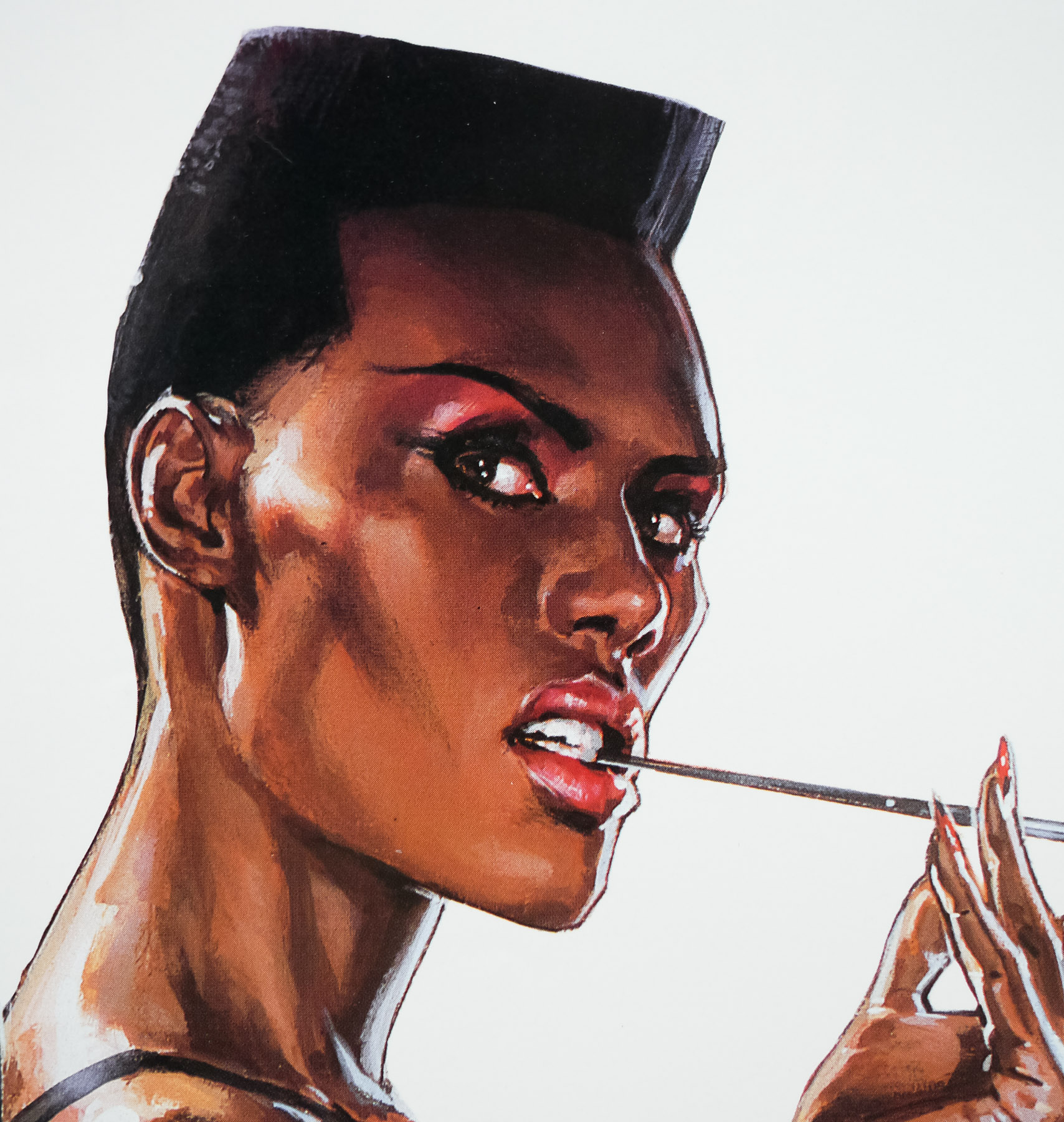
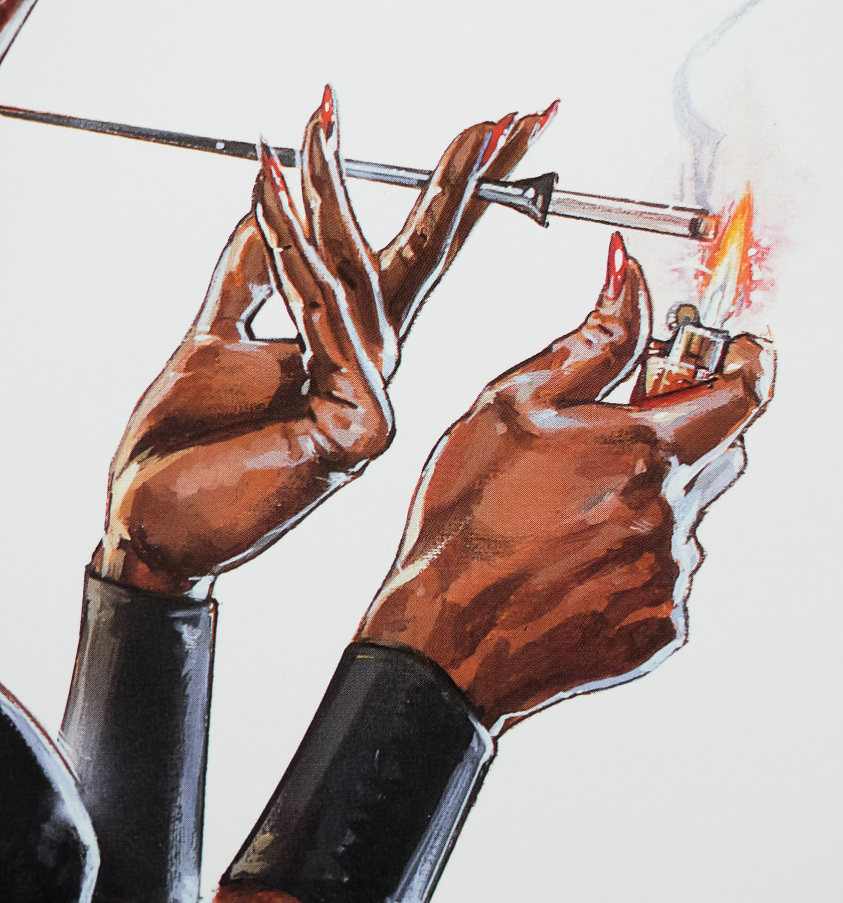
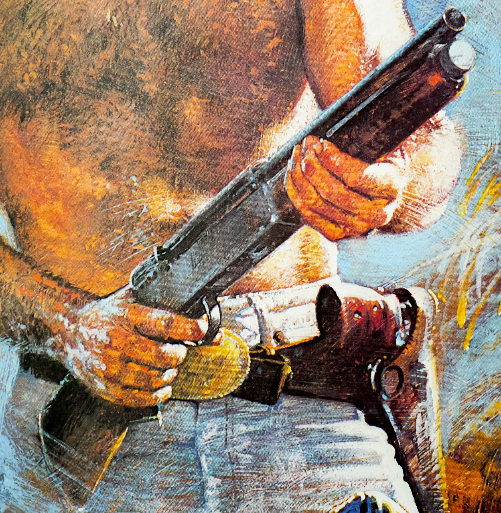
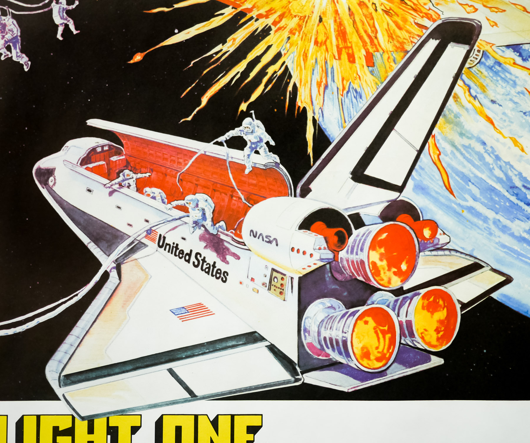
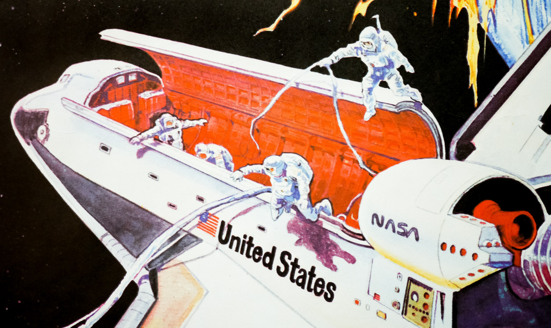
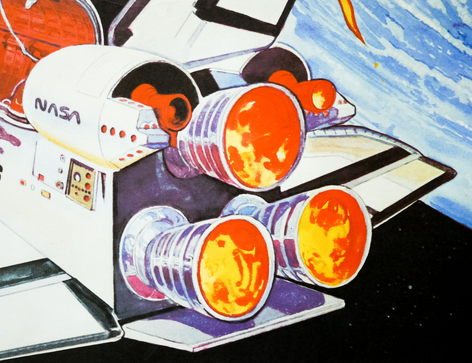
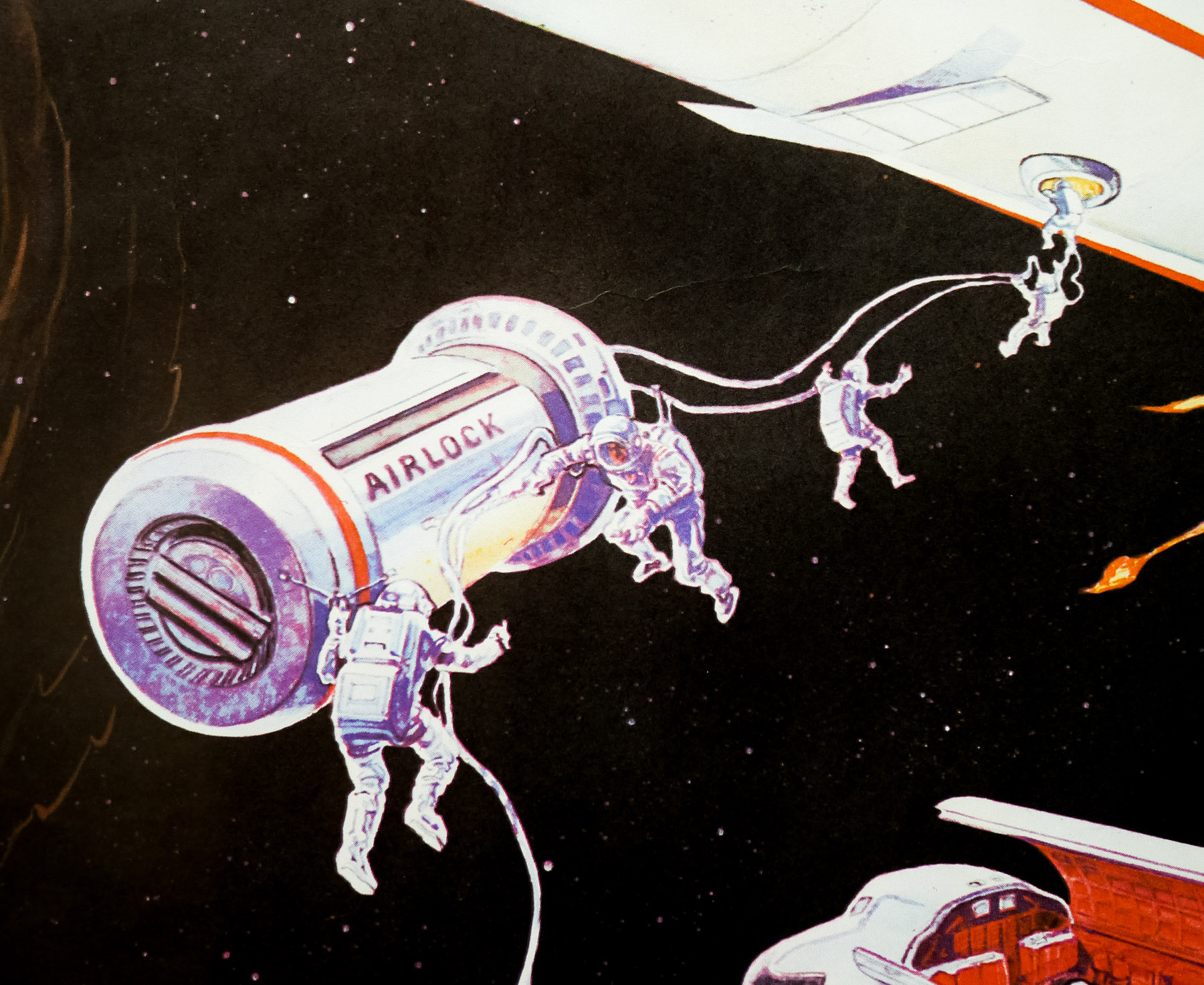
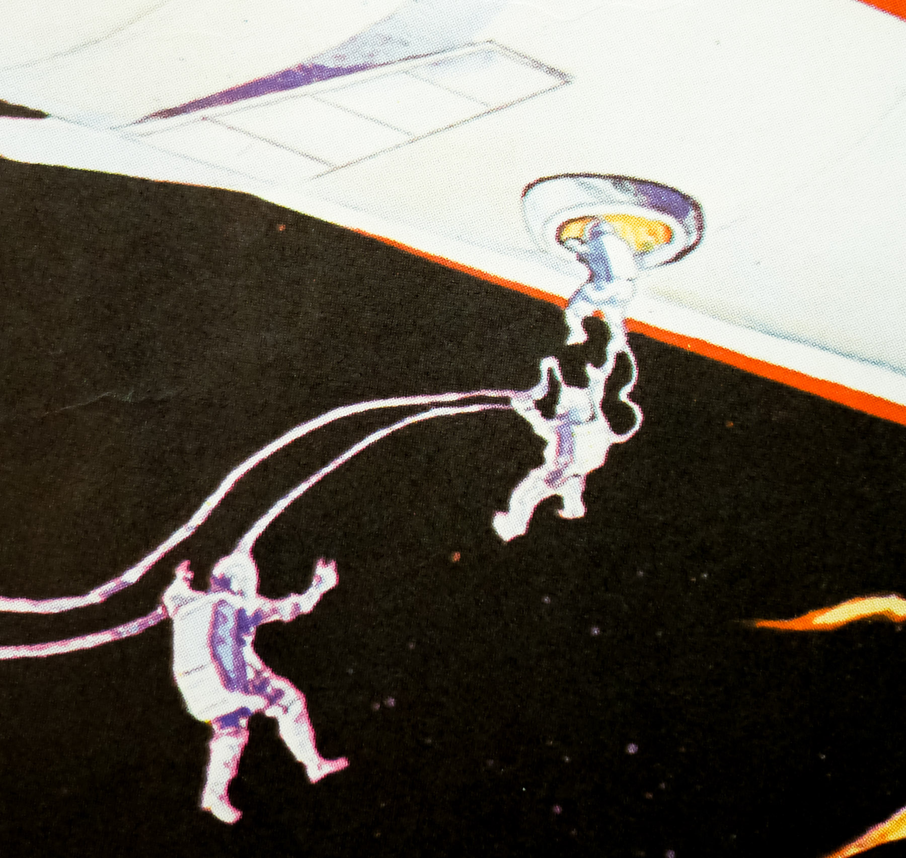
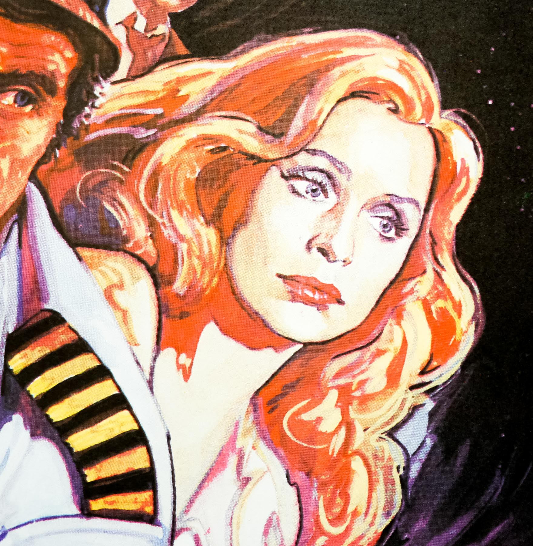
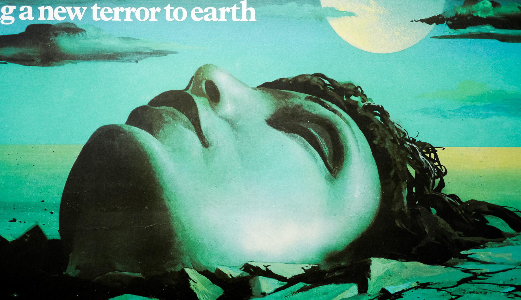
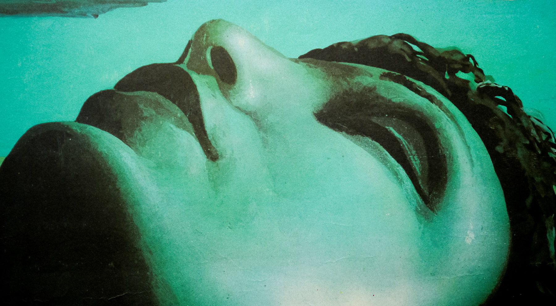
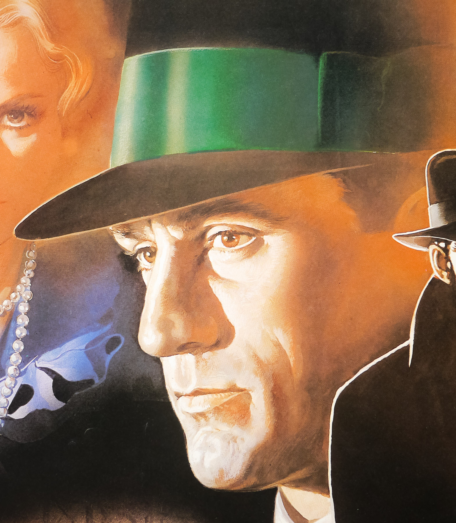
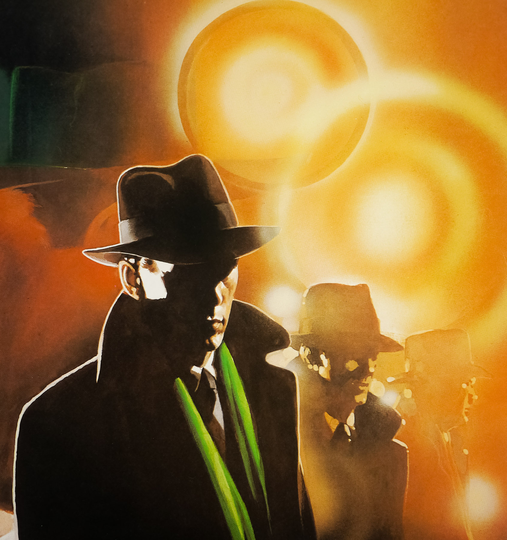
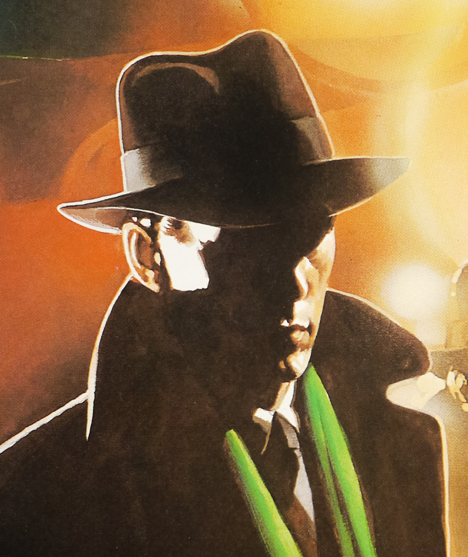
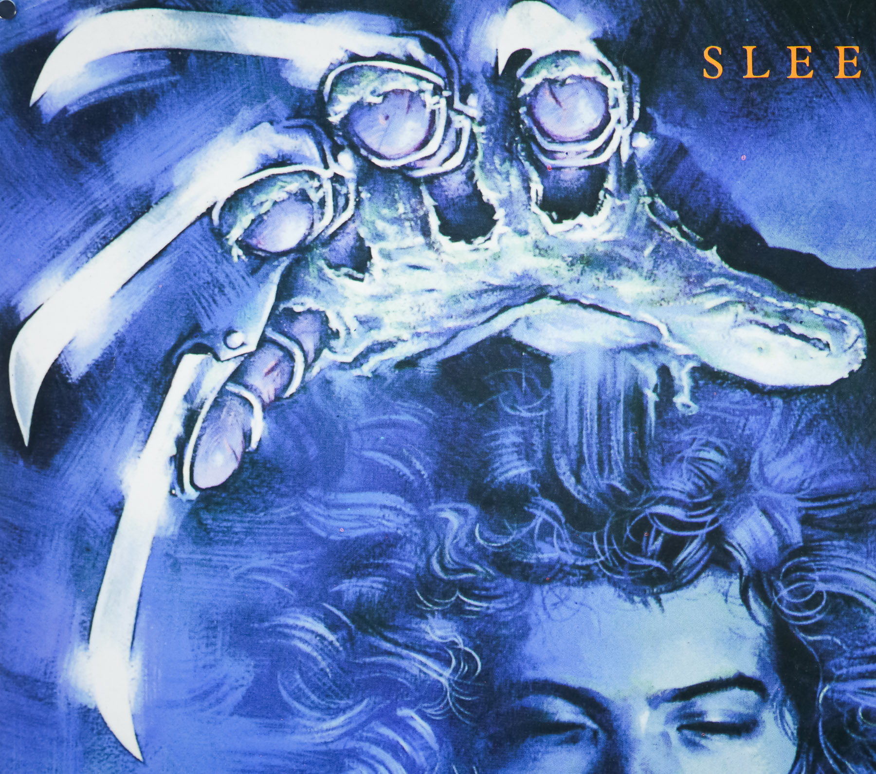
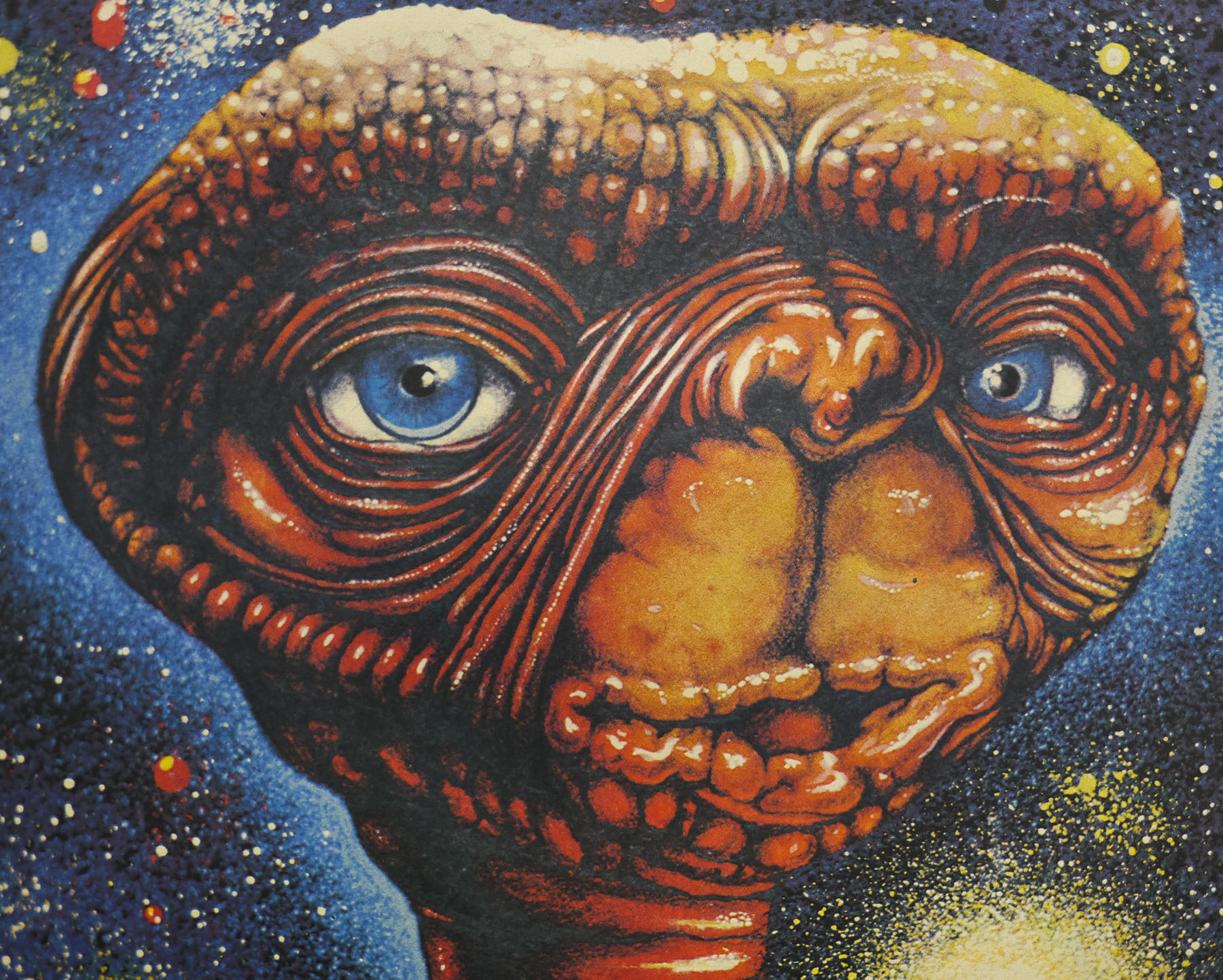
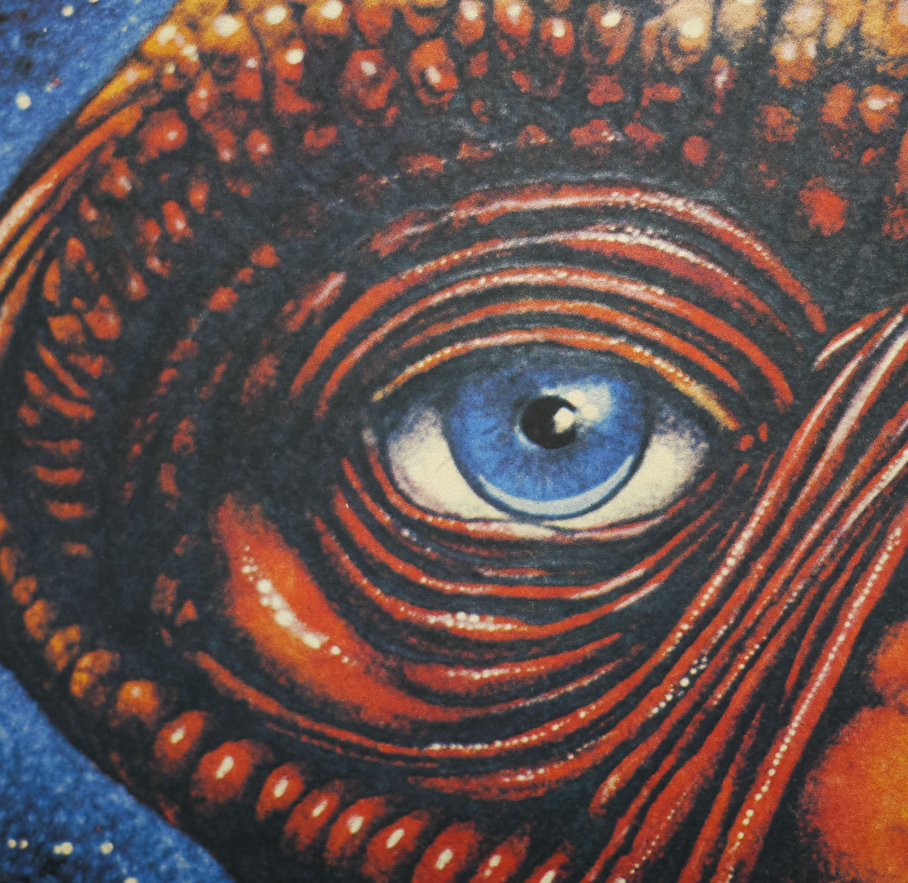
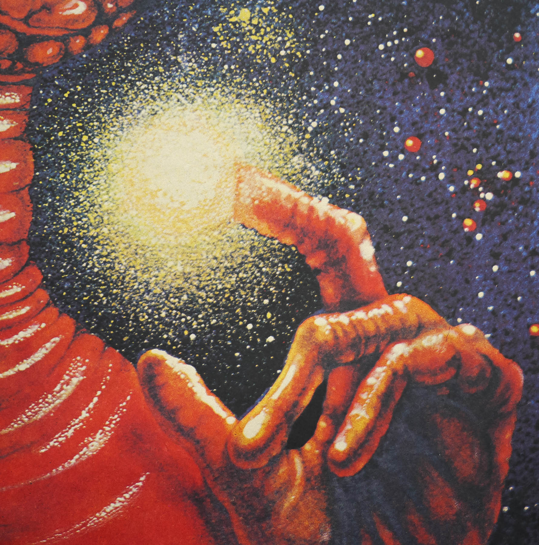
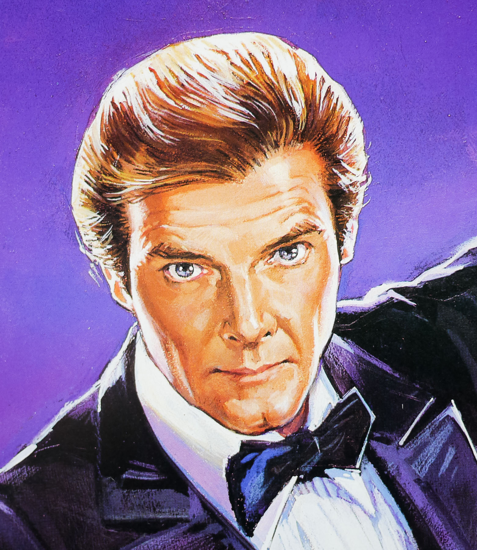
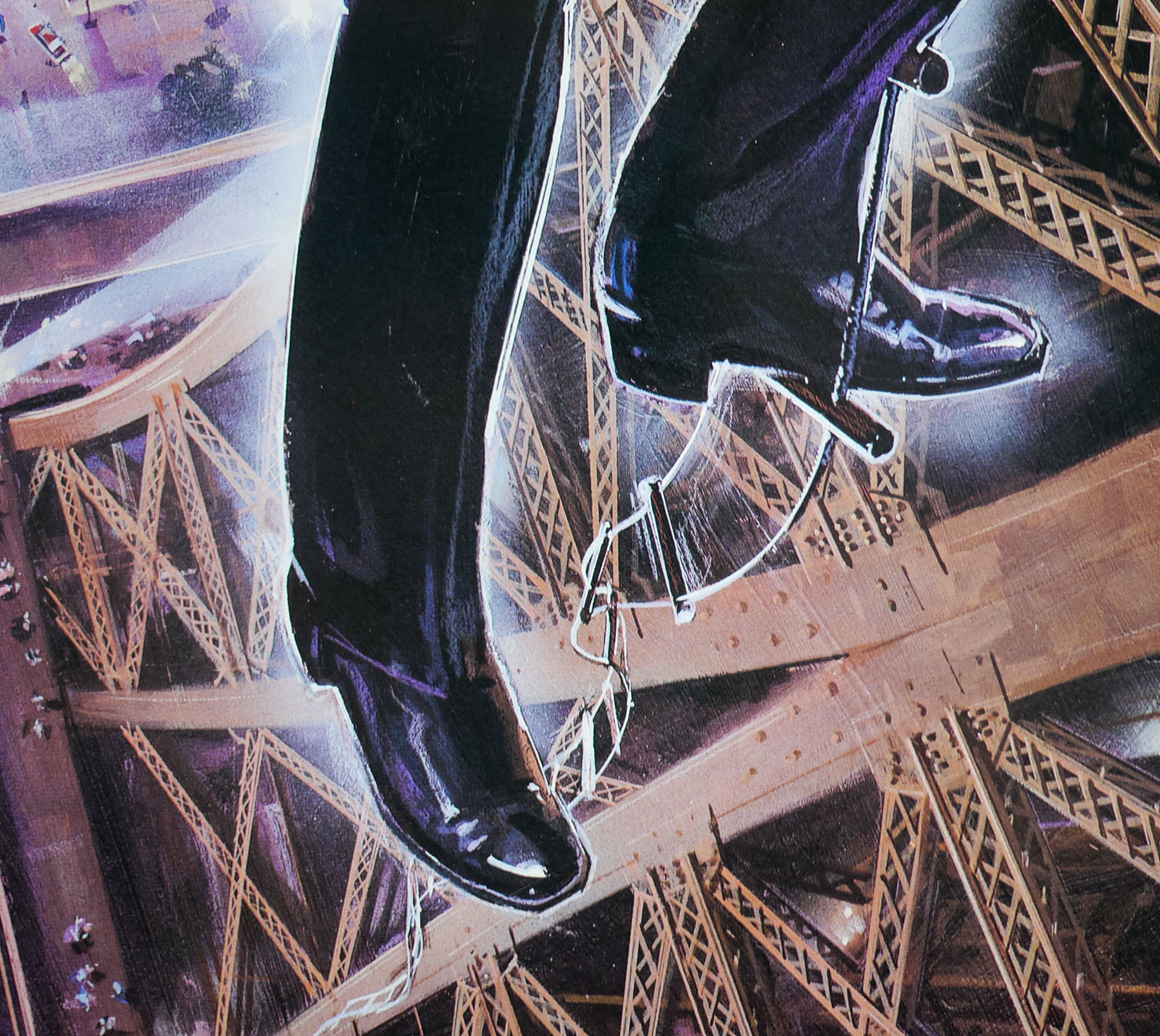
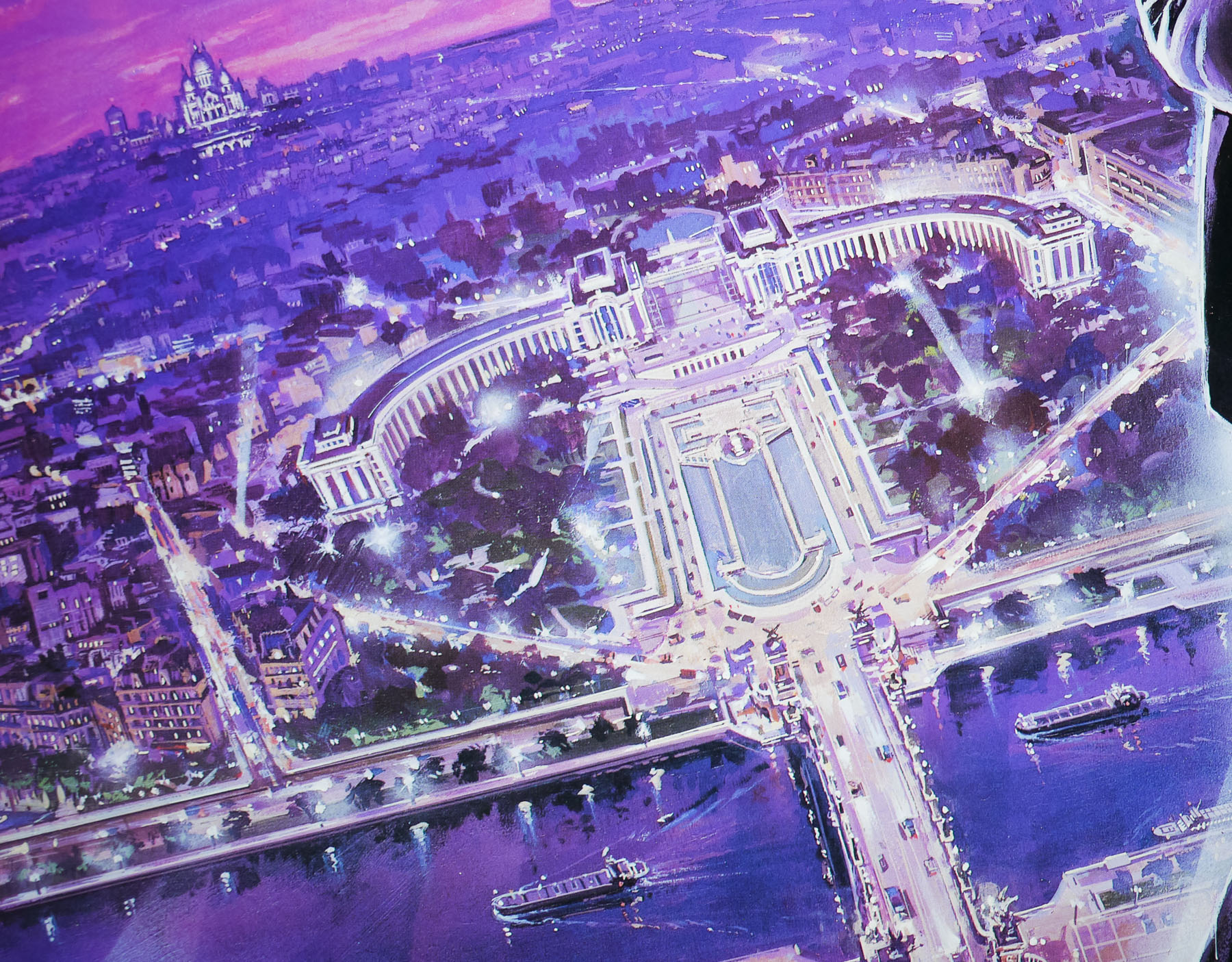
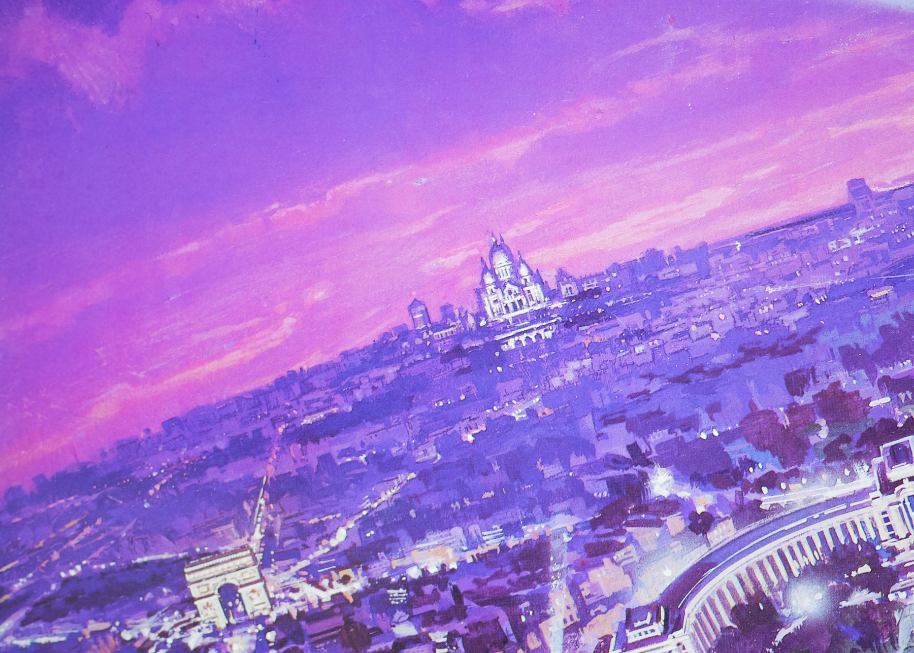
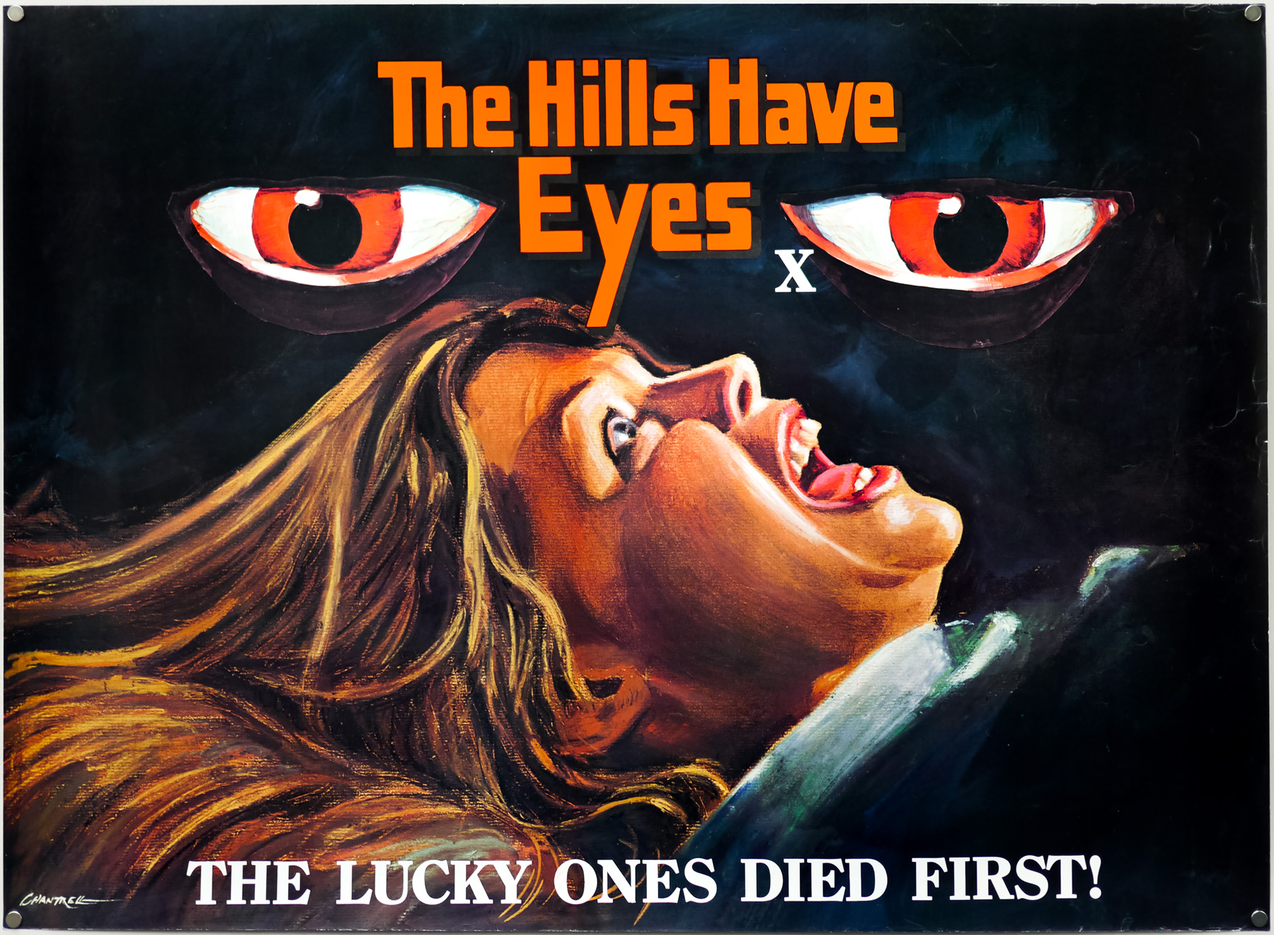
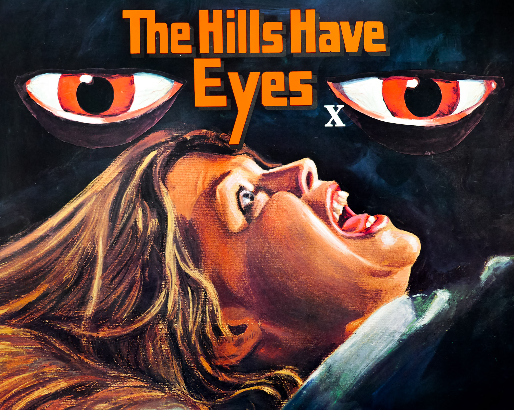
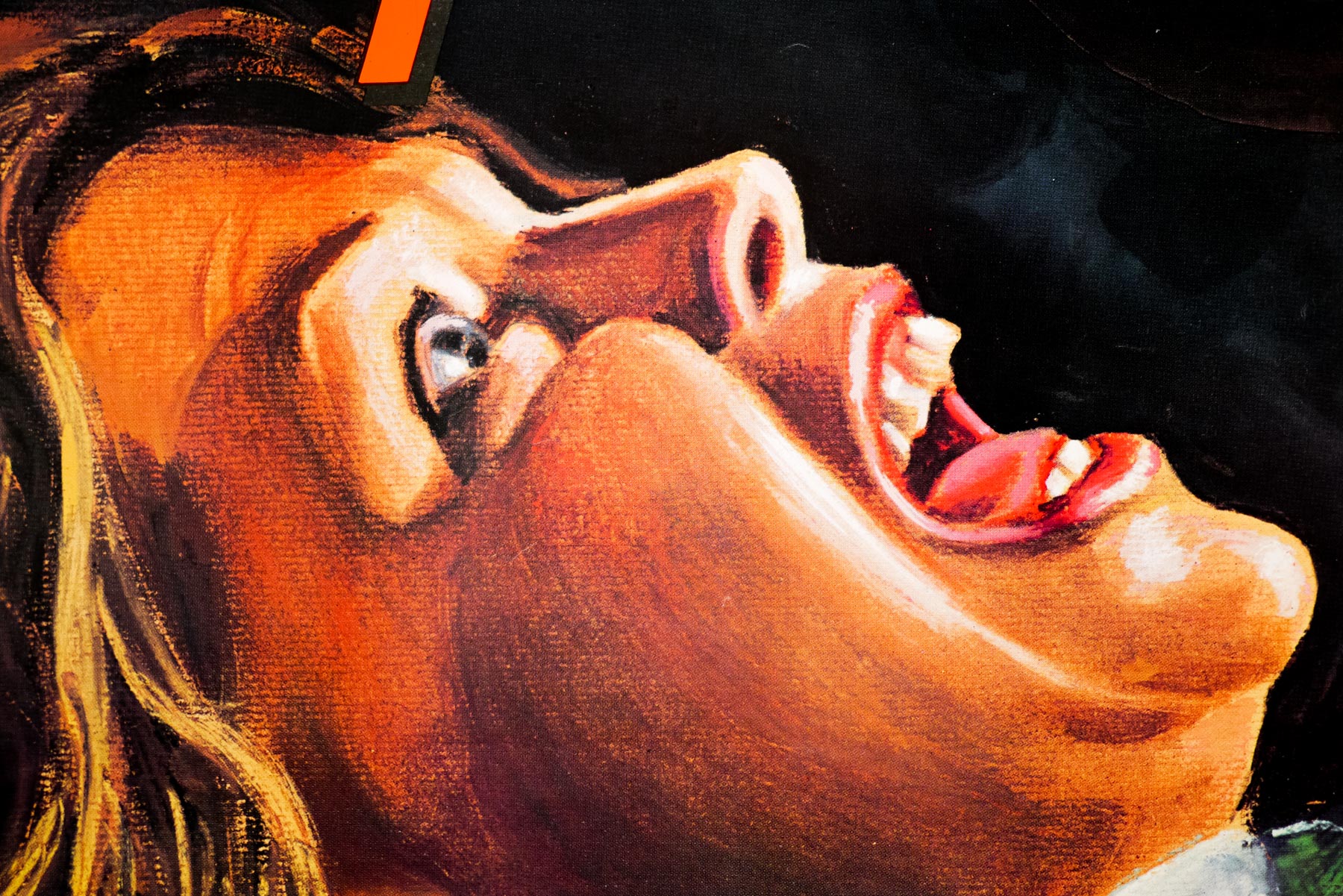
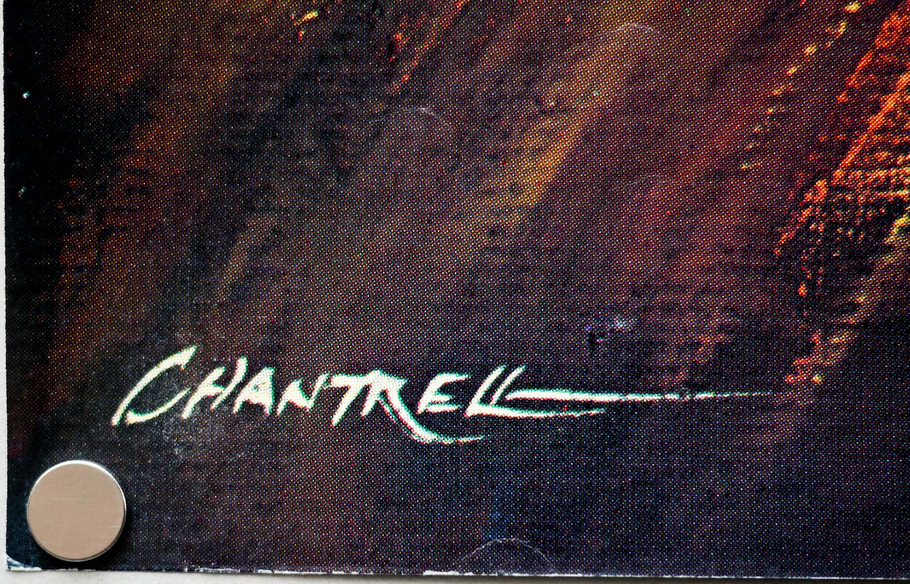
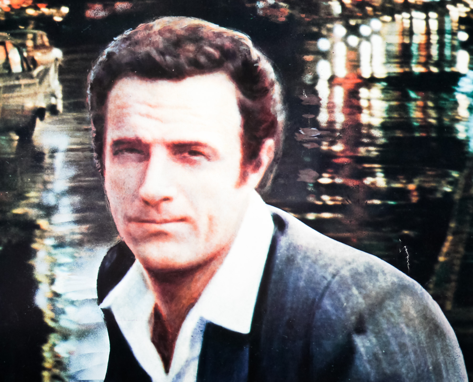
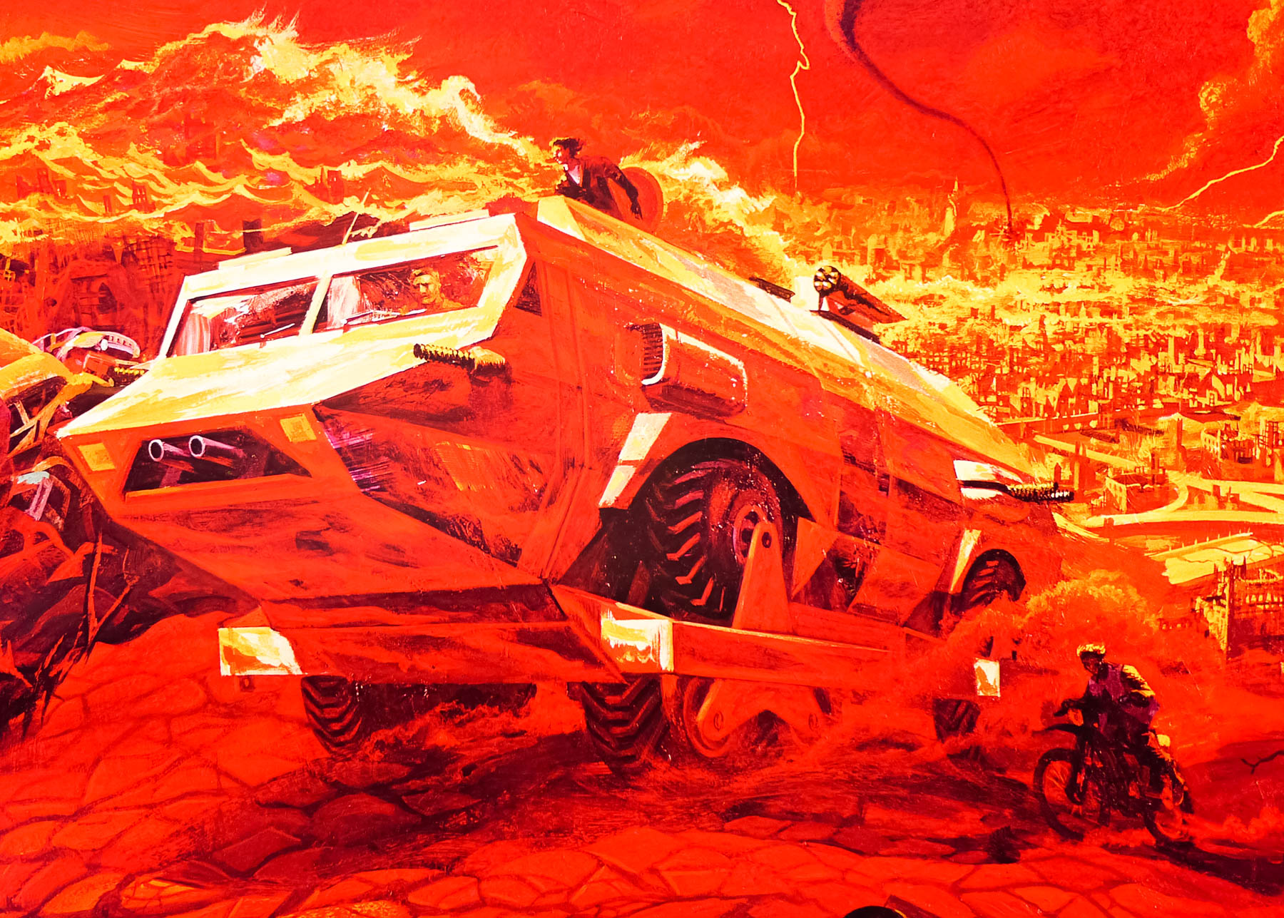
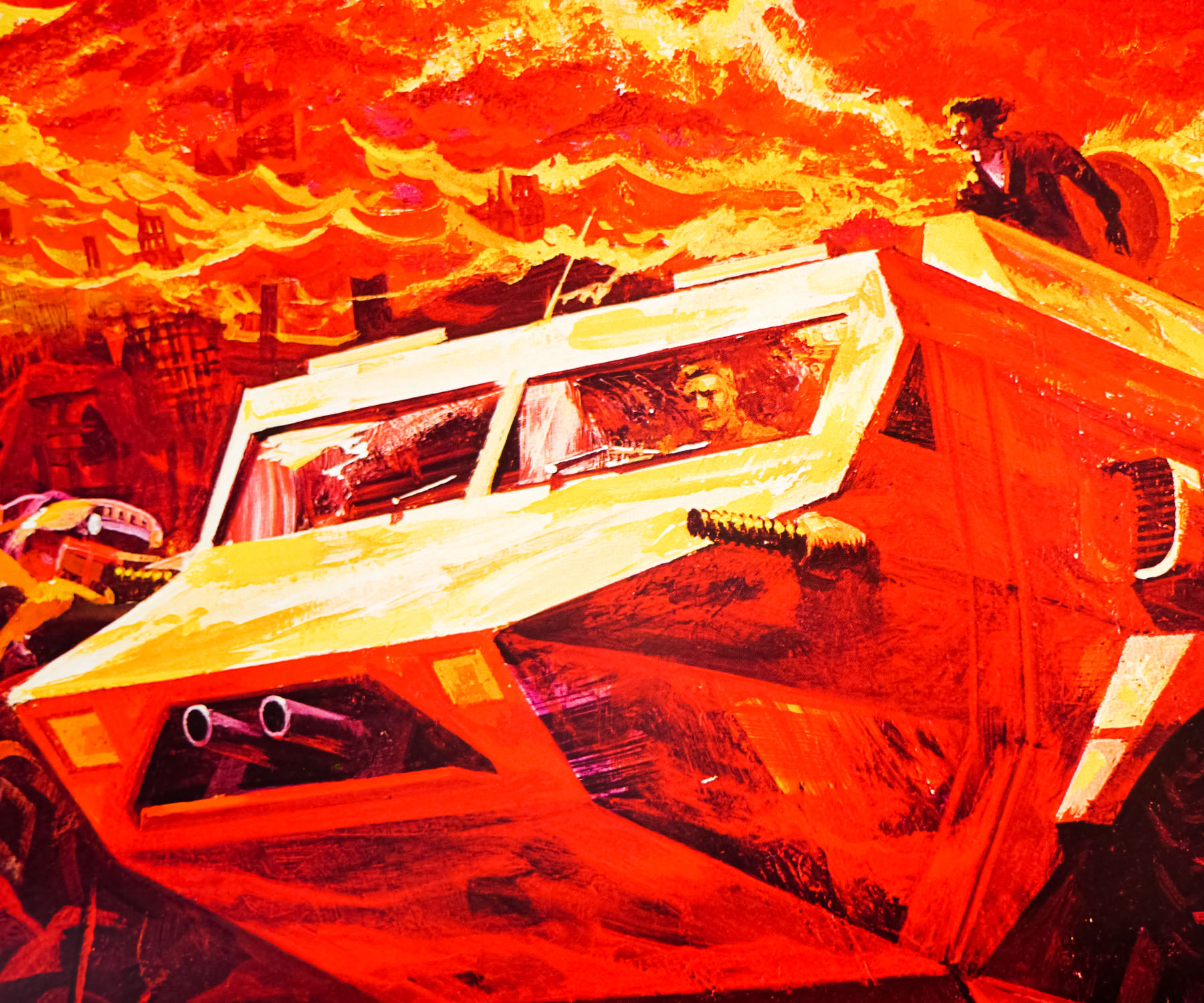
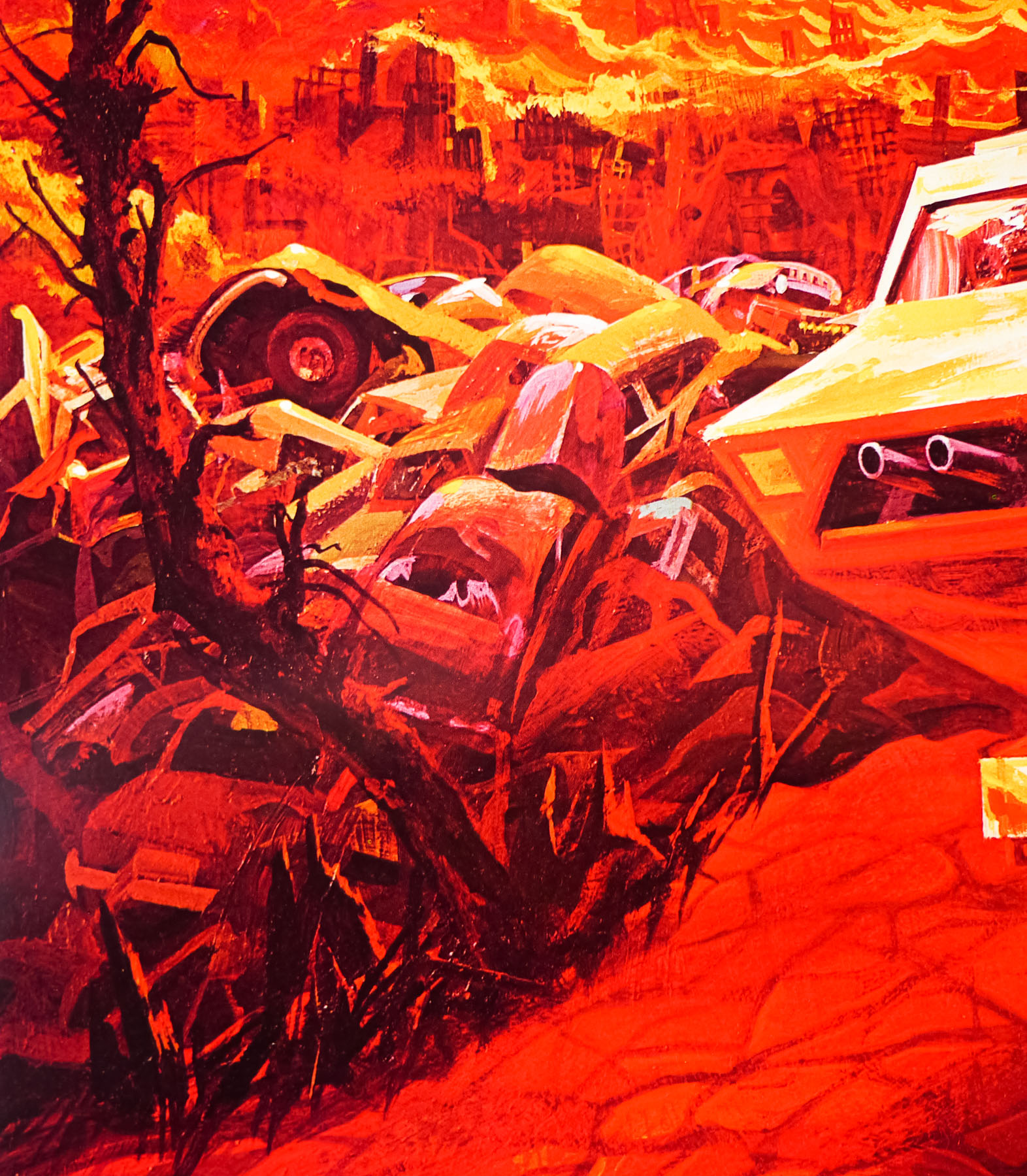
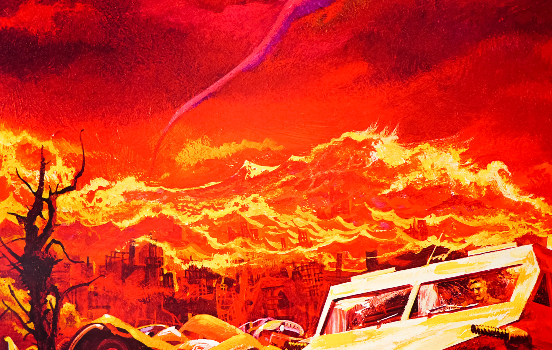
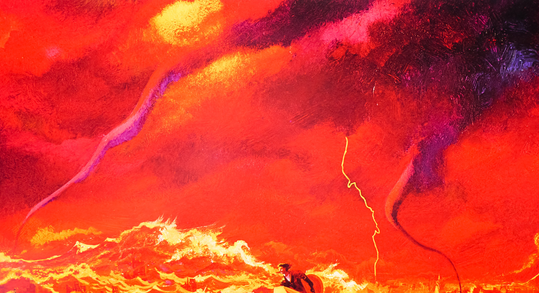
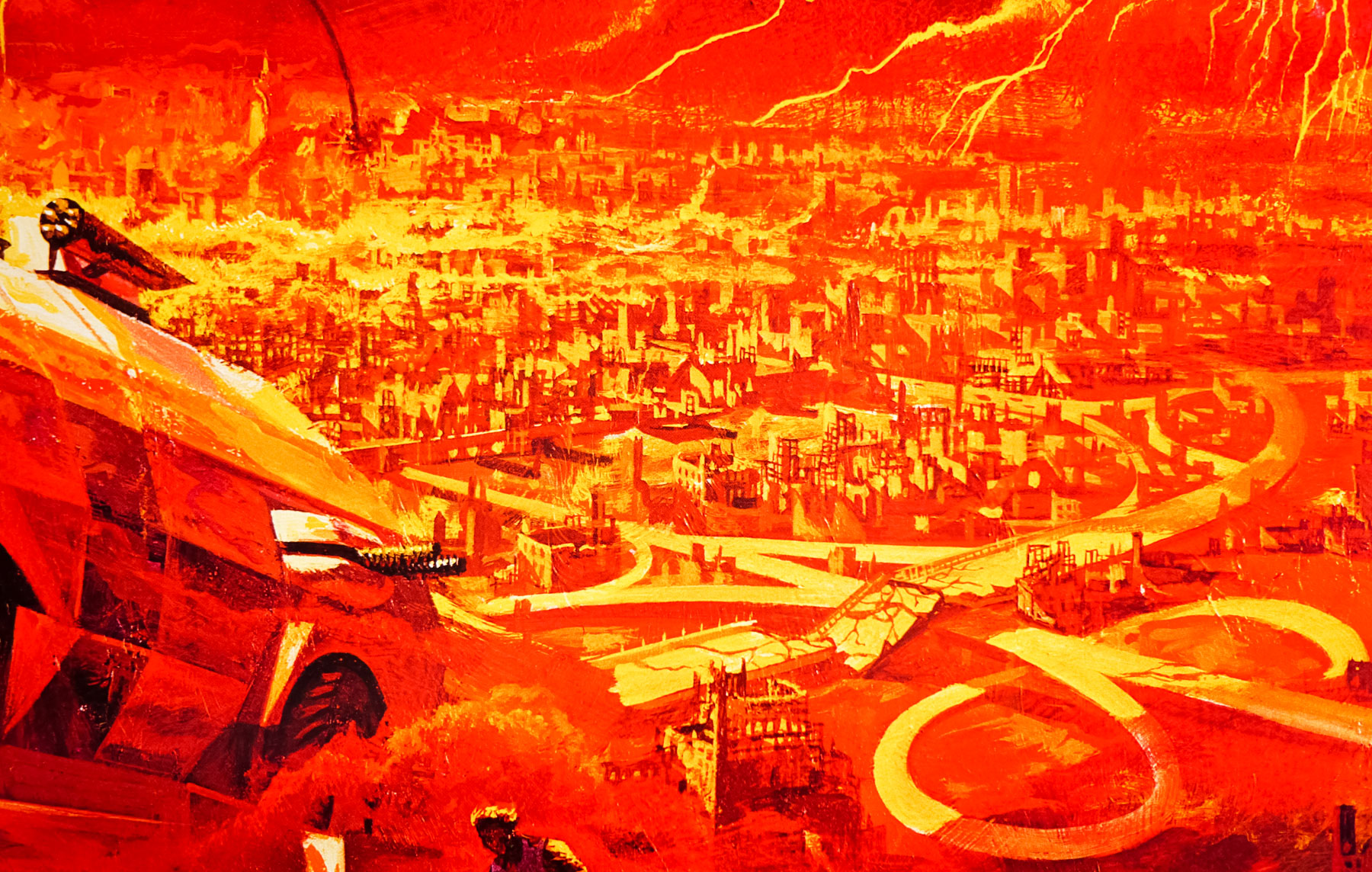
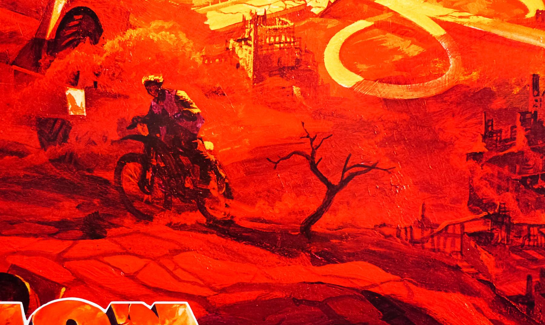
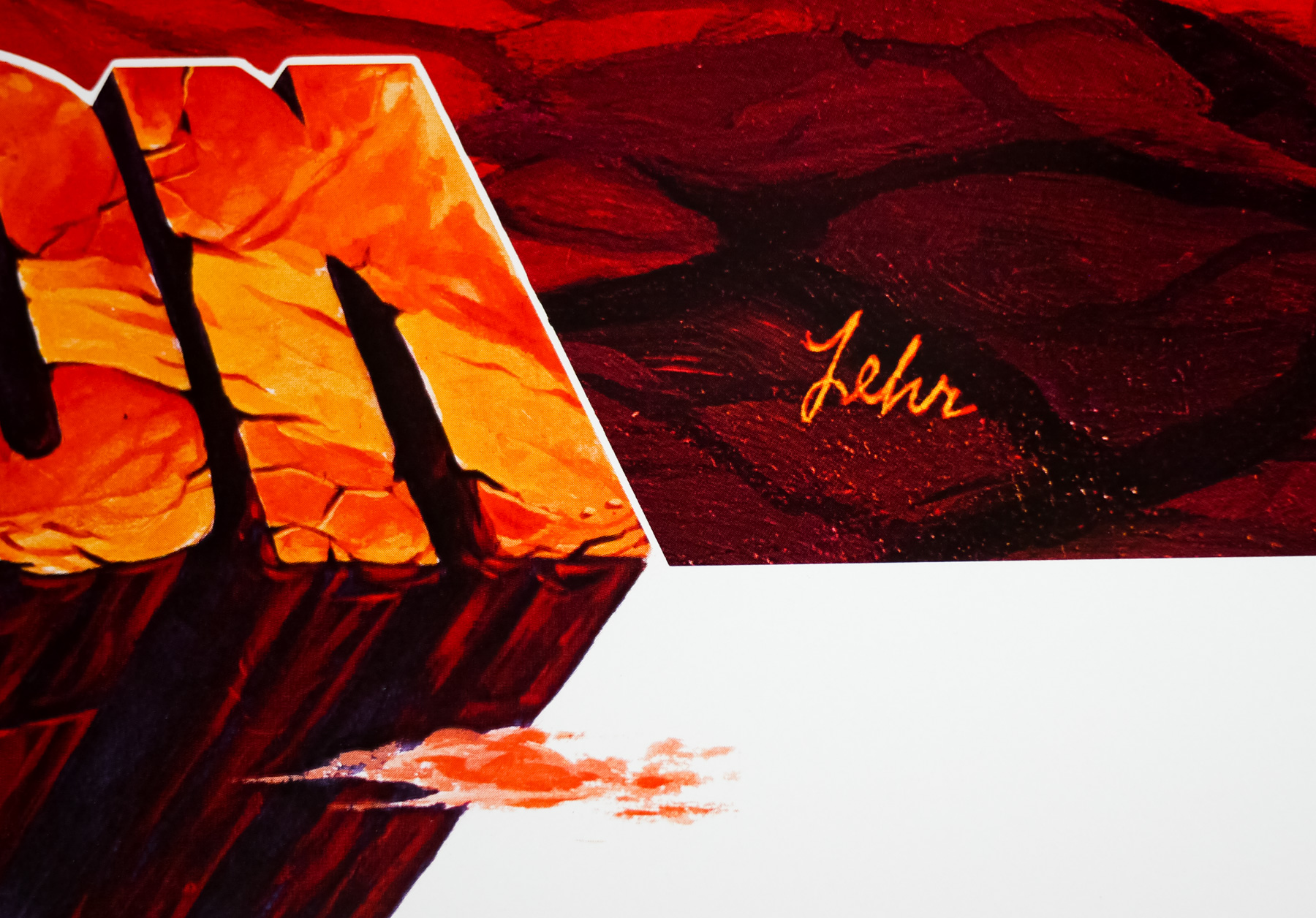
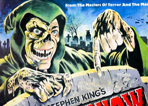
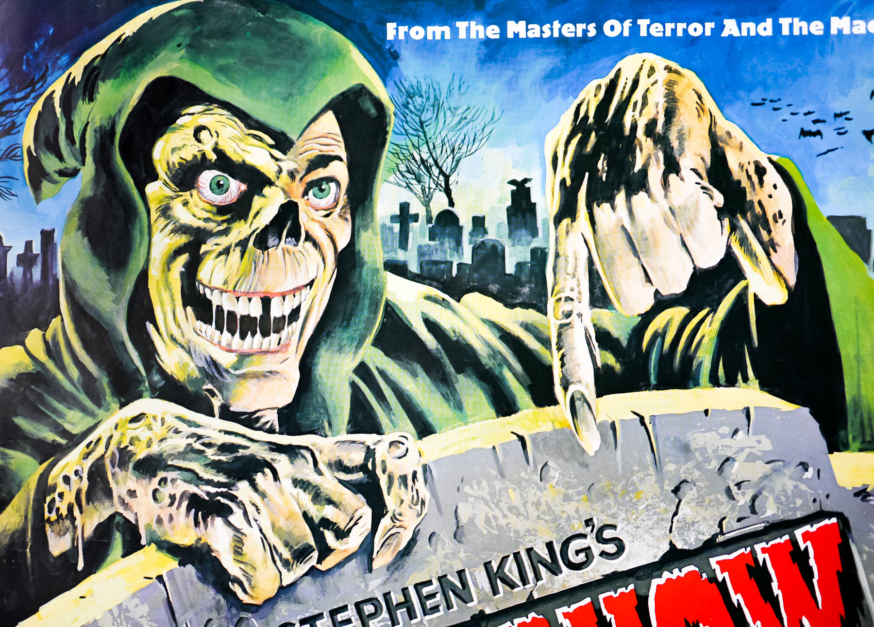
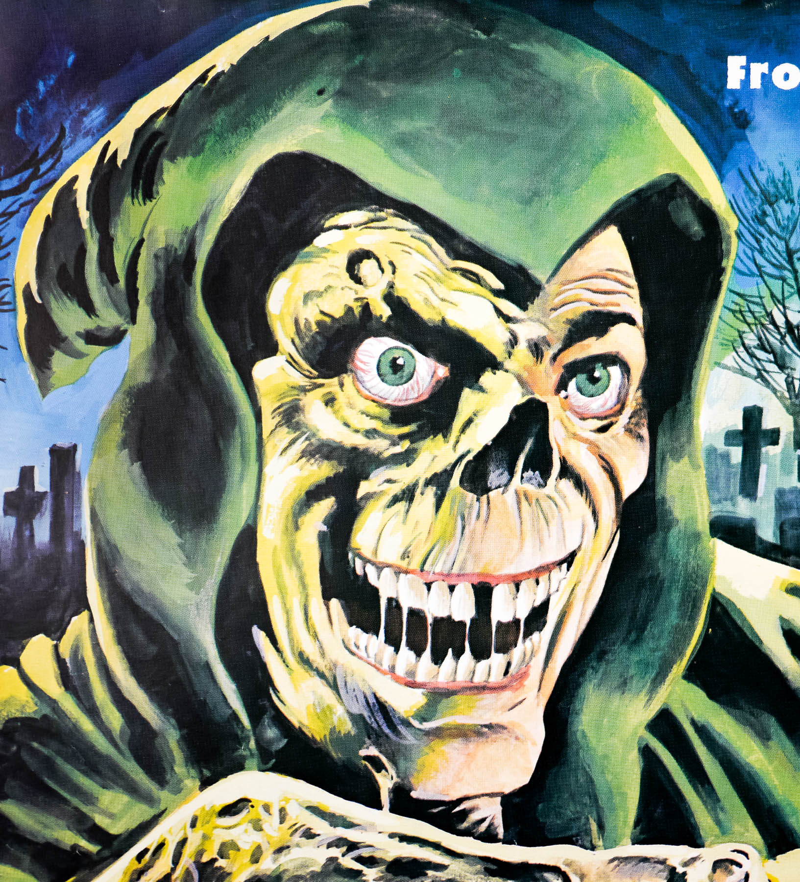
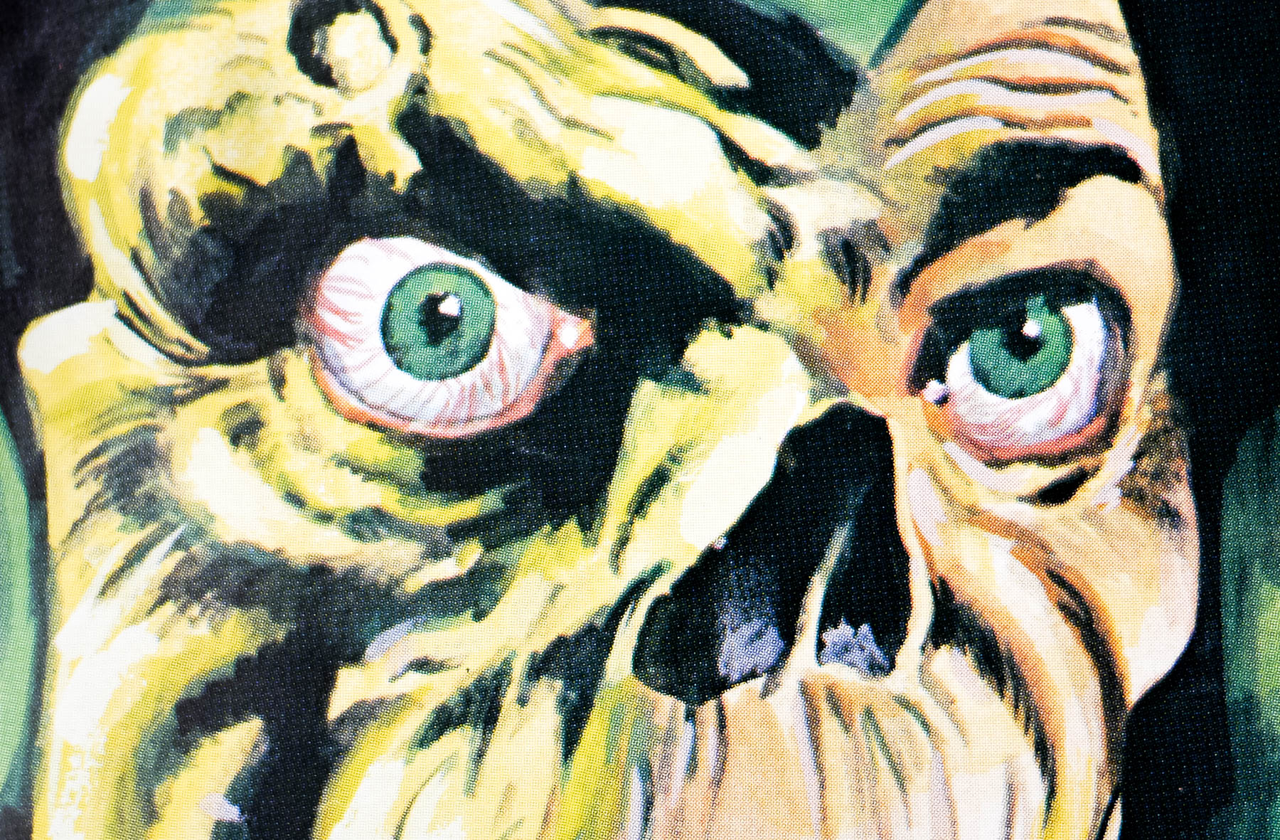
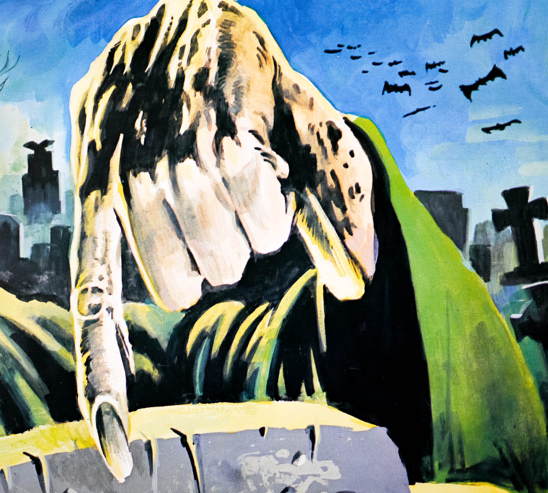
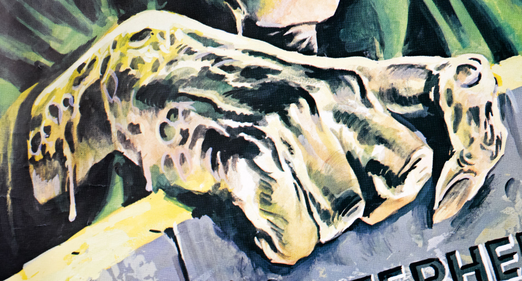
The artwork is unique to this British quad but is based on artwork (source) by the American artist Bernie Wrightson that was painted for the title page of the tie-in comic book adaptation. The artwork has recently (July 2013) been confirmed as having been painted by the British poster art stalwart Tom Chantrell. Confirmation was made after the job books of Alan Wheatley, the design agency account handler for the distributor Alpha Films Ltd, were checked and Chantrell’s name was assigned to it. The poster’s artist identity had previously been unknown, although Chantrell’s name had been put forward despite the lack of his usual signature.
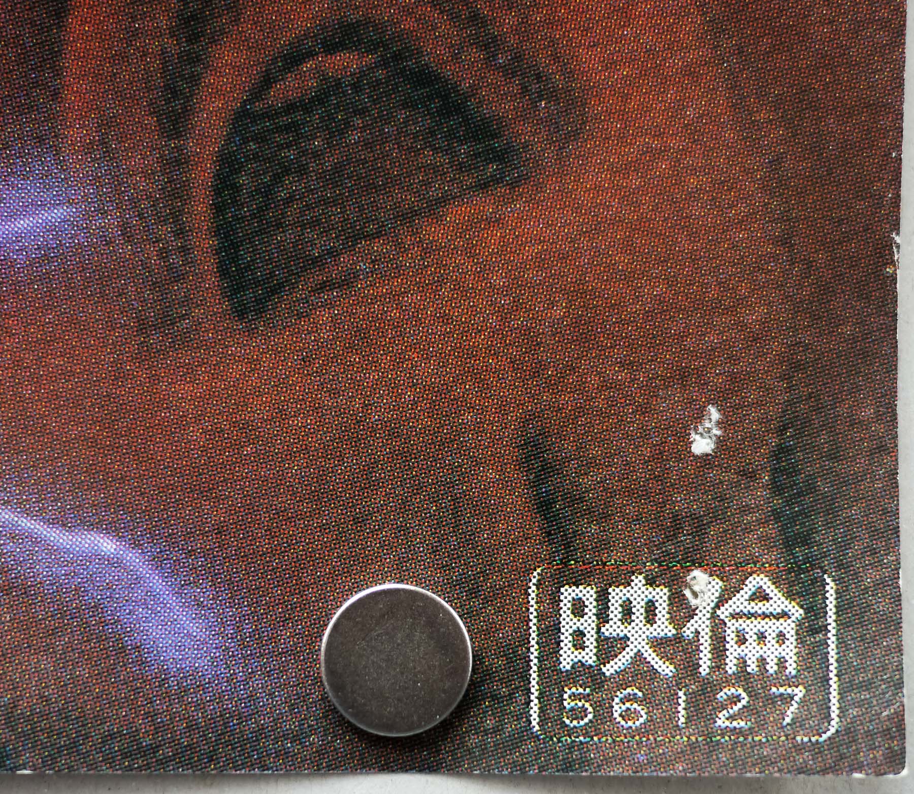
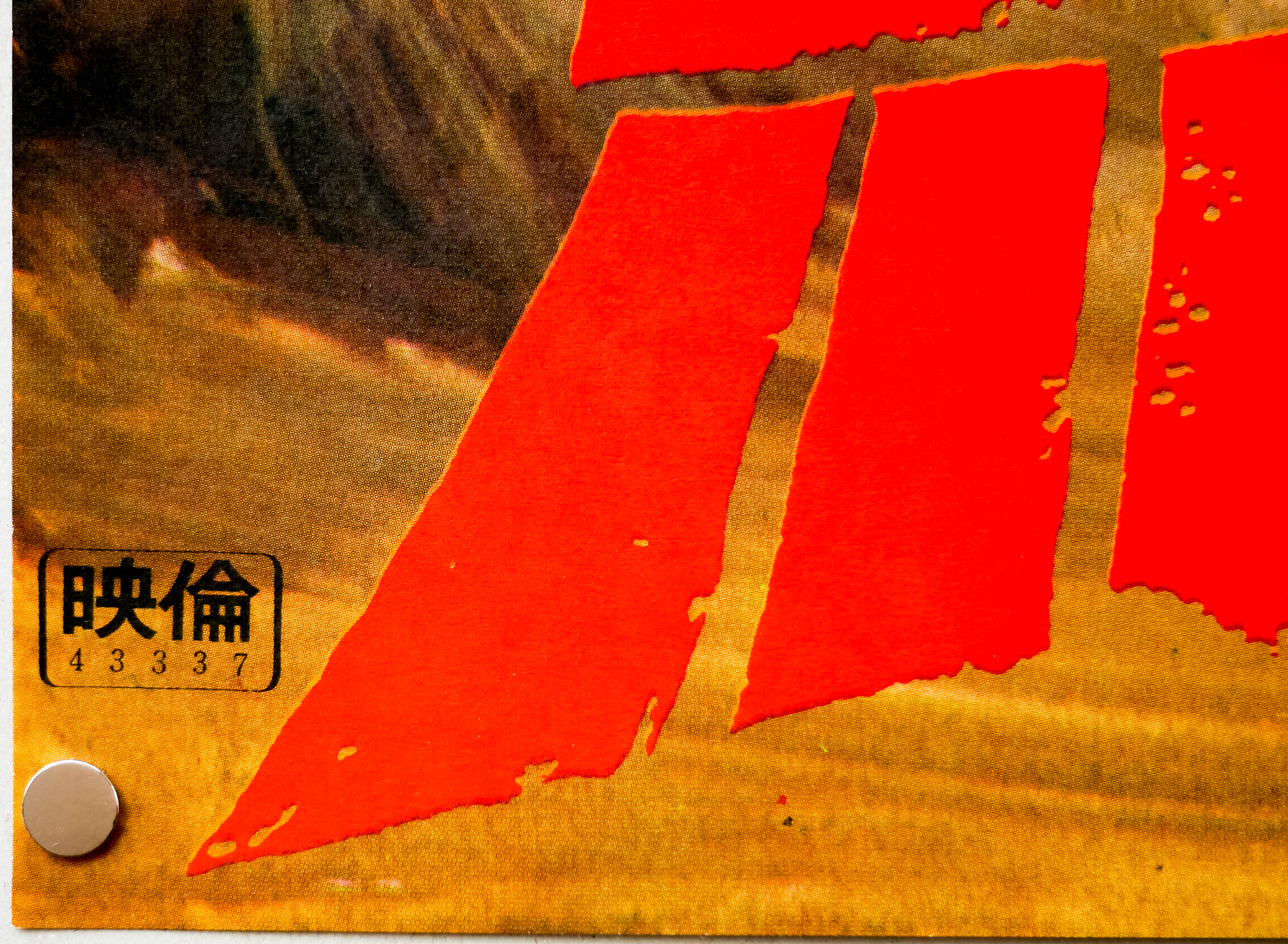
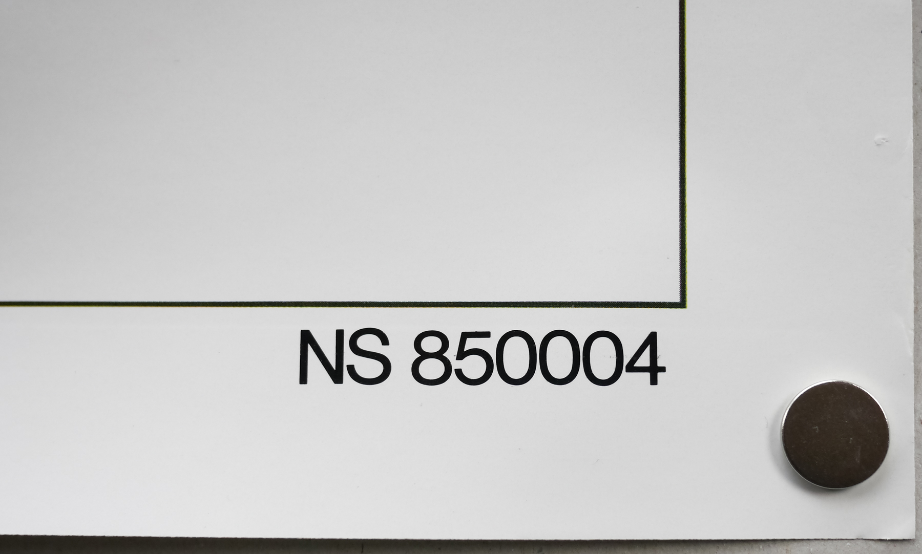
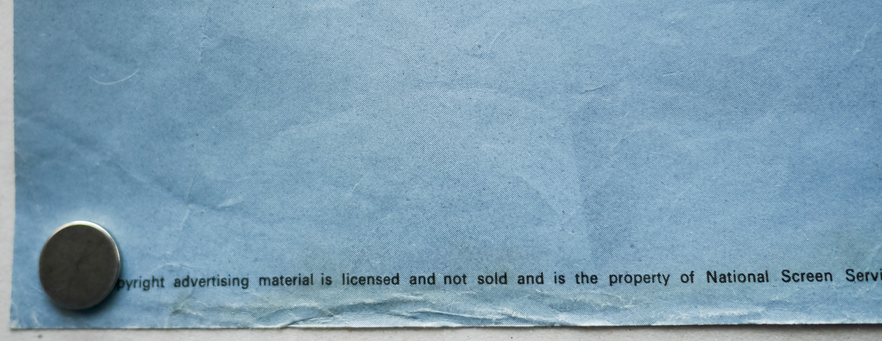
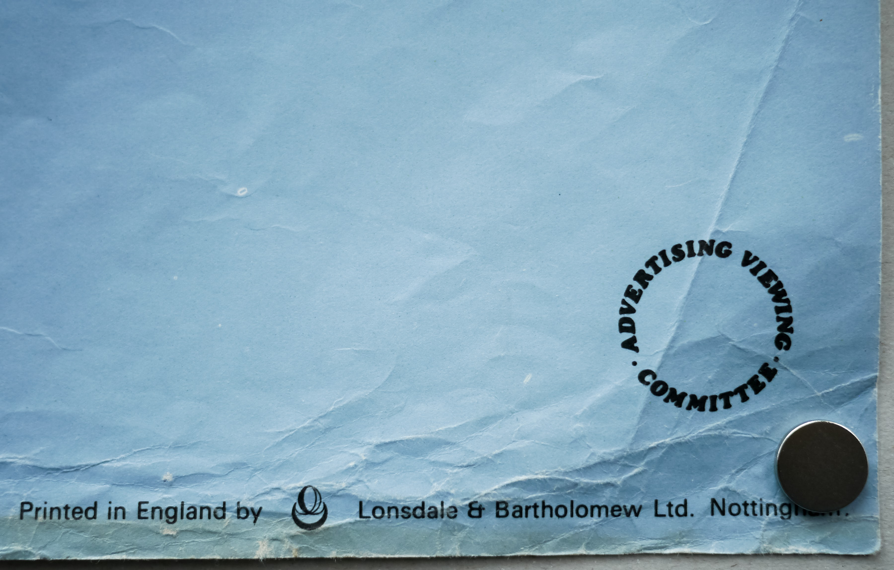
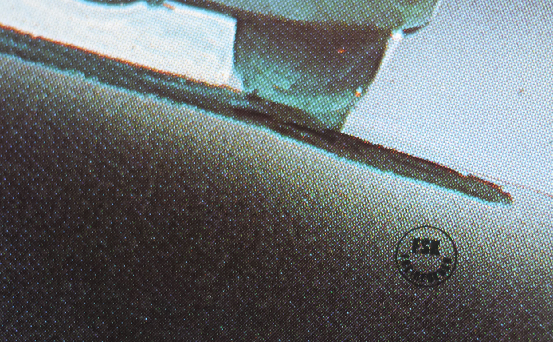
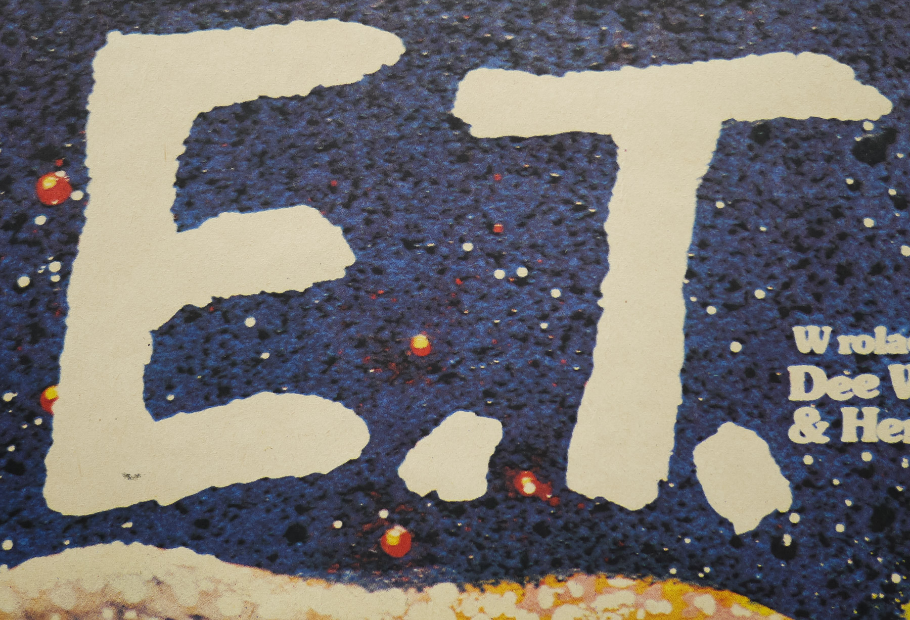
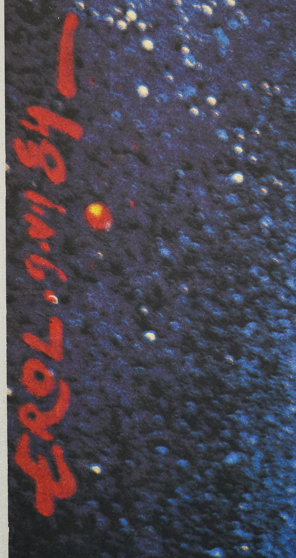
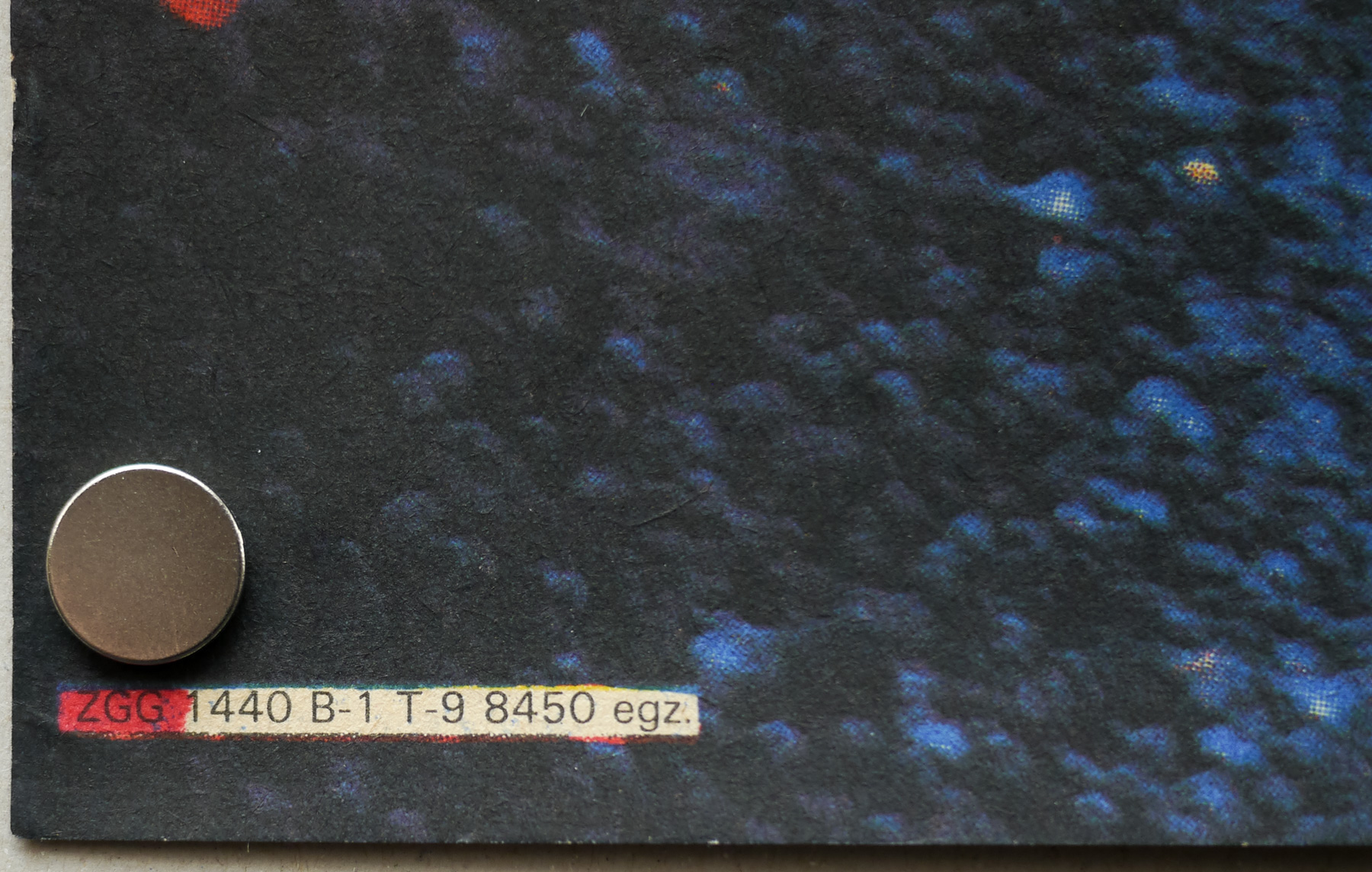
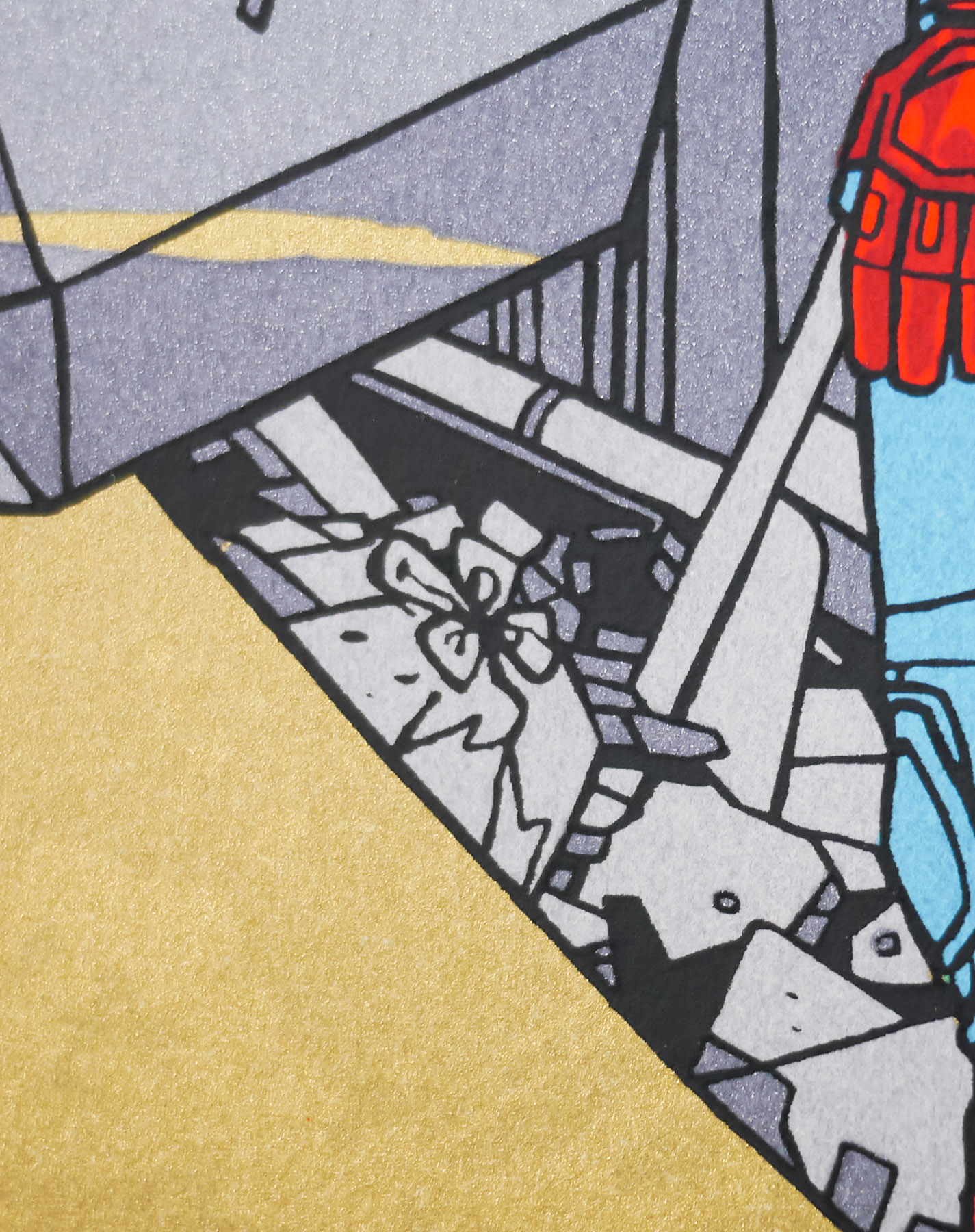
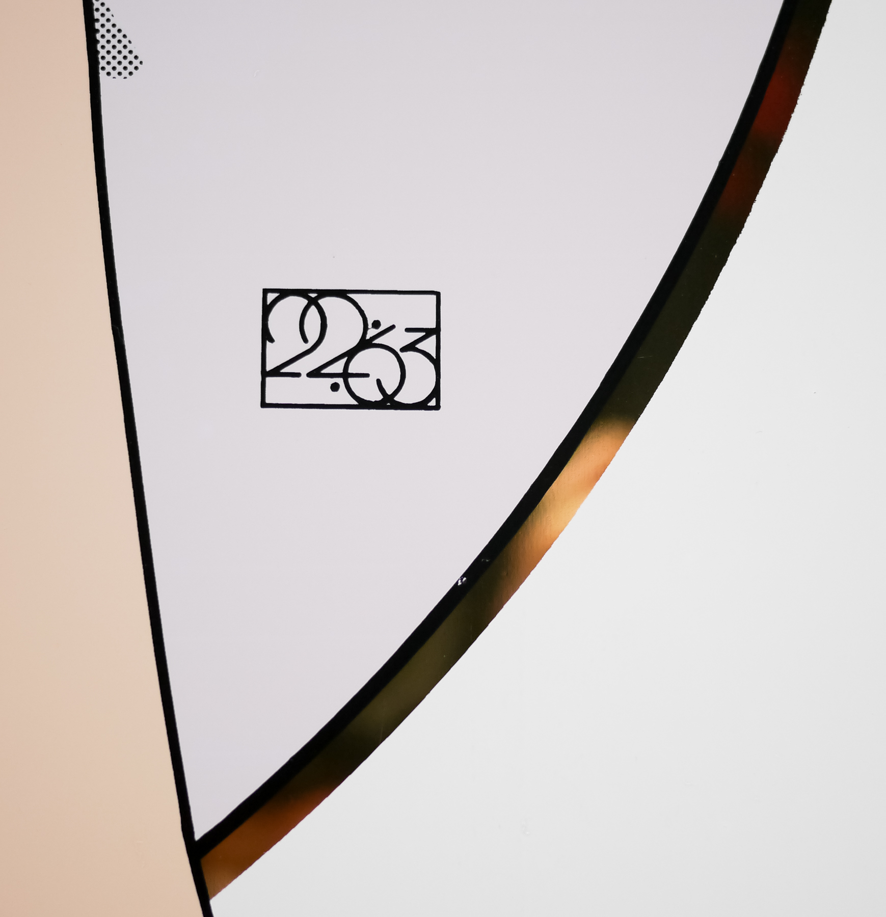
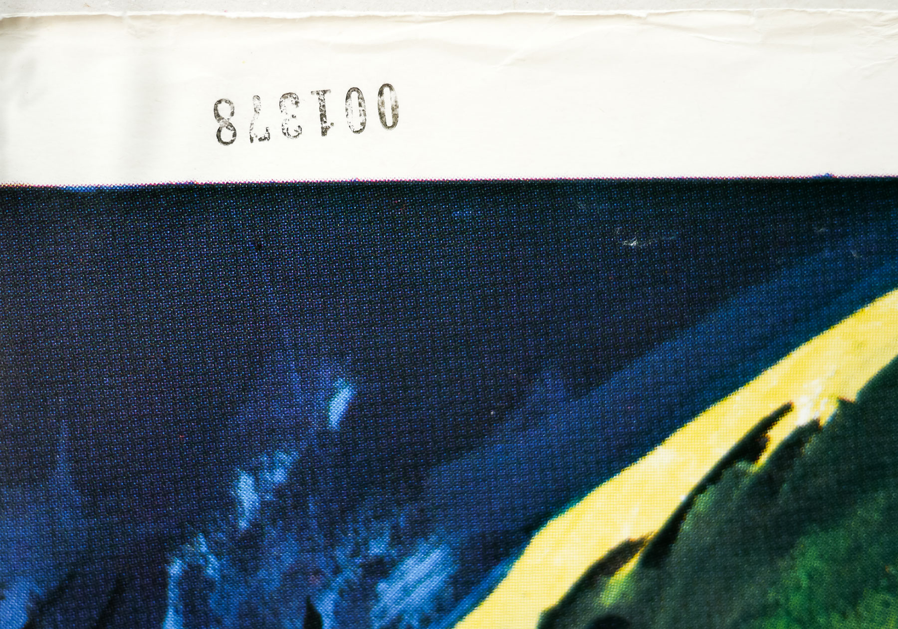
Note that there is a printed code upside down on the top left edge of the poster (see last picture). I’m not sure why this was added but it’s possibly to do with it being part of a poster dealer’s inventory – someone cataloguing posters may stamp them with a number to keep track of them – but why stamp it on the front? I know of at least one other copy of the poster with the number on the top so it’s a bit of a mystery.
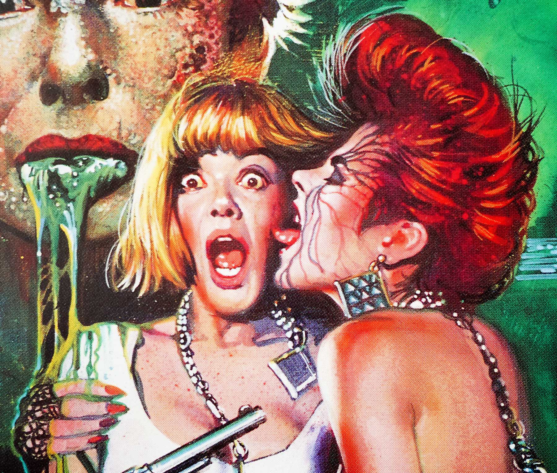
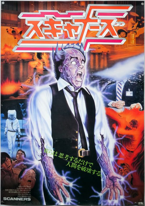
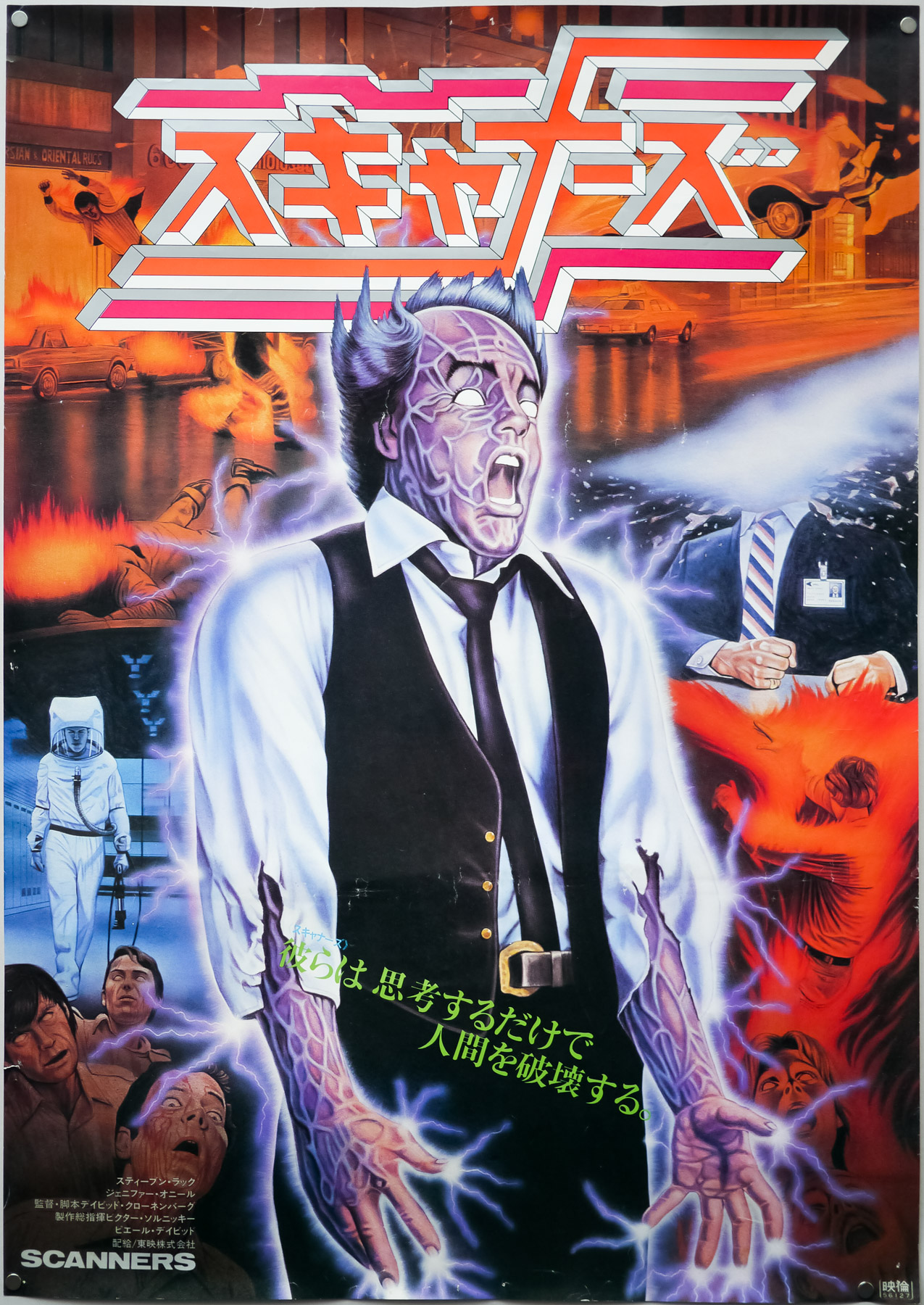
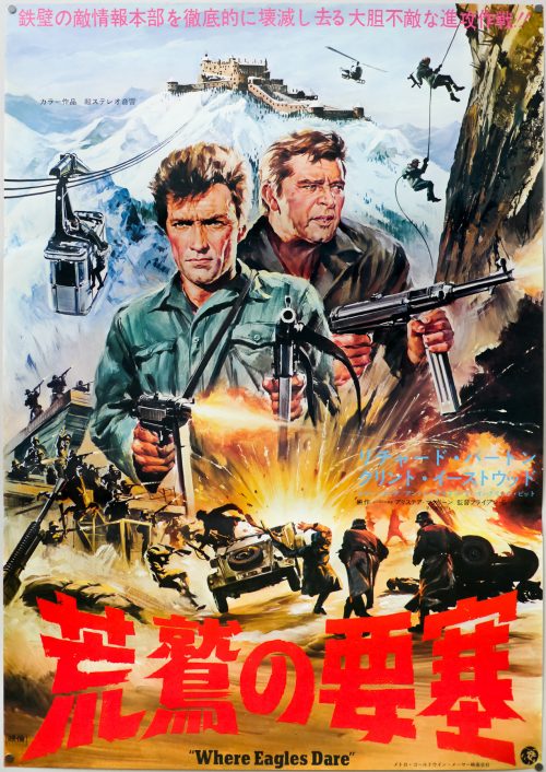
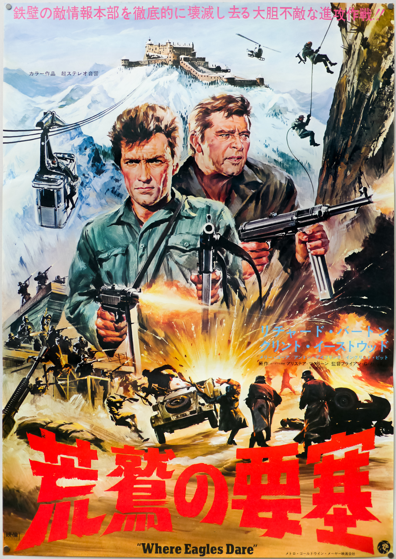
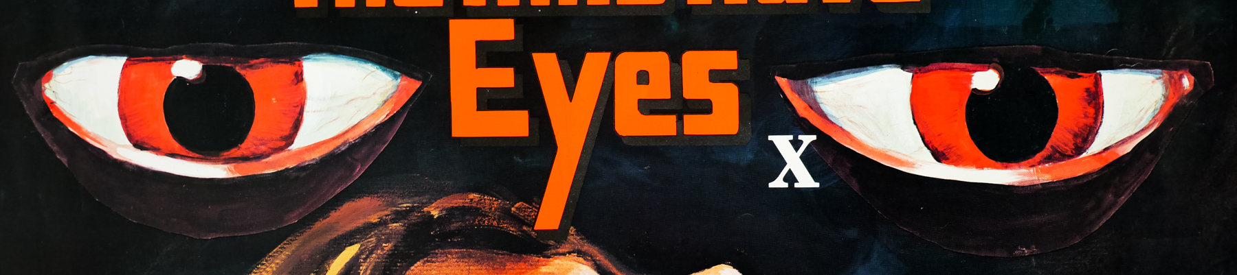
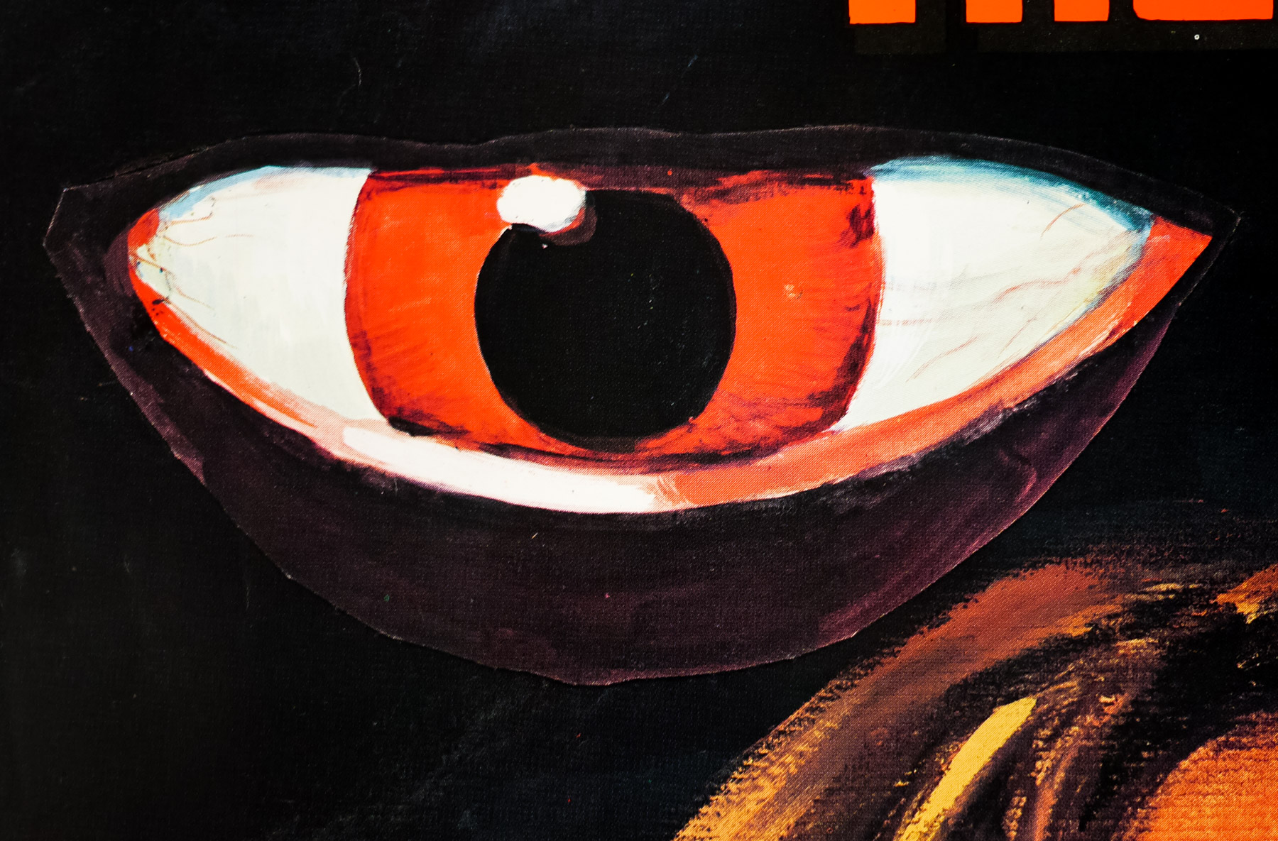
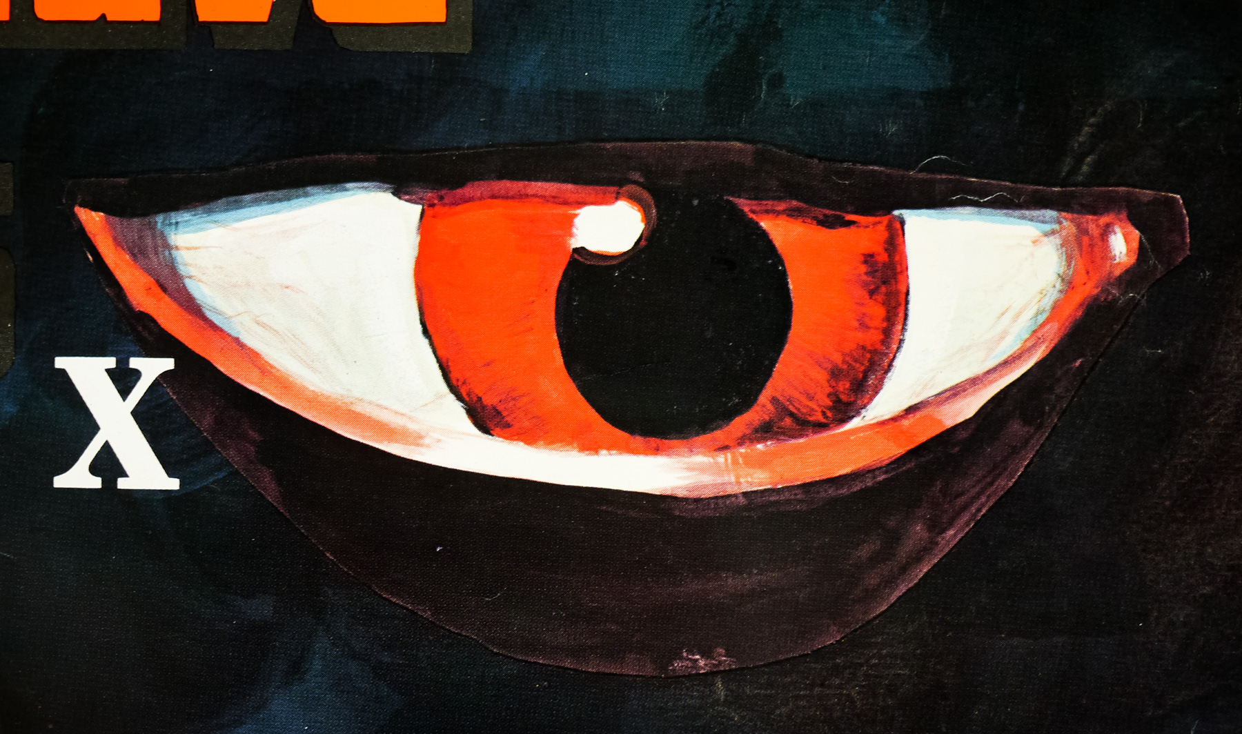
The character of The Creep depicted on the poster also features on both the excellent advance one sheet and the final version, as well as the Japanese B2.