You searched for: Tom%2520Six

Zombies / quad / UK

18.05.11

Poster Poster
Title
Zombies
AKA
Dawn of the Dead (USA / International) | Zombi (Italy / Spain / Turkey) | Zombie - Dawn of the Dead (West Germany)
Year of Film
1978
Director
George A. Romero
Starring
David Emge, Ken Foree, Scott H. Reiniger, Gaylen Ross, Tom Savini
Origin of Film
Italy | USA
Genre(s) of Film
David Emge, Ken Foree, Scott H. Reiniger, Gaylen Ross, Tom Savini,
Type of Poster
Quad
Style of Poster
--
Origin of Poster
UK
Year of Poster
1980
Designer
Tom Chantrell
Artist
Tom Chantrell
Size (inches)
30" x 40"
SS or DS
SS
Tagline
When there's no more room in hell, the dead will walk the earth.

Metropolis / one sheet / 1984 re-release / USA

25.03.13

Poster Poster
Title
Metropolis
AKA
--
Year of Film
1927
Director
Fritz Lang
Starring
Alfred Abel, Brigitte Helm, Gustav Fröhlich, Rudolf Klein-Rogge
Origin of Film
Germany
Genre(s) of Film
Alfred Abel, Brigitte Helm, Gustav Fröhlich, Rudolf Klein-Rogge,
Type of Poster
One sheet
Style of Poster
Re-release
Origin of Poster
USA
Year of Poster
1984
Designer
Tom Nikosey
Artist
Tom Nikosey
Size (inches)
27 2/16" x 41"
SS or DS
SS
Tagline
--

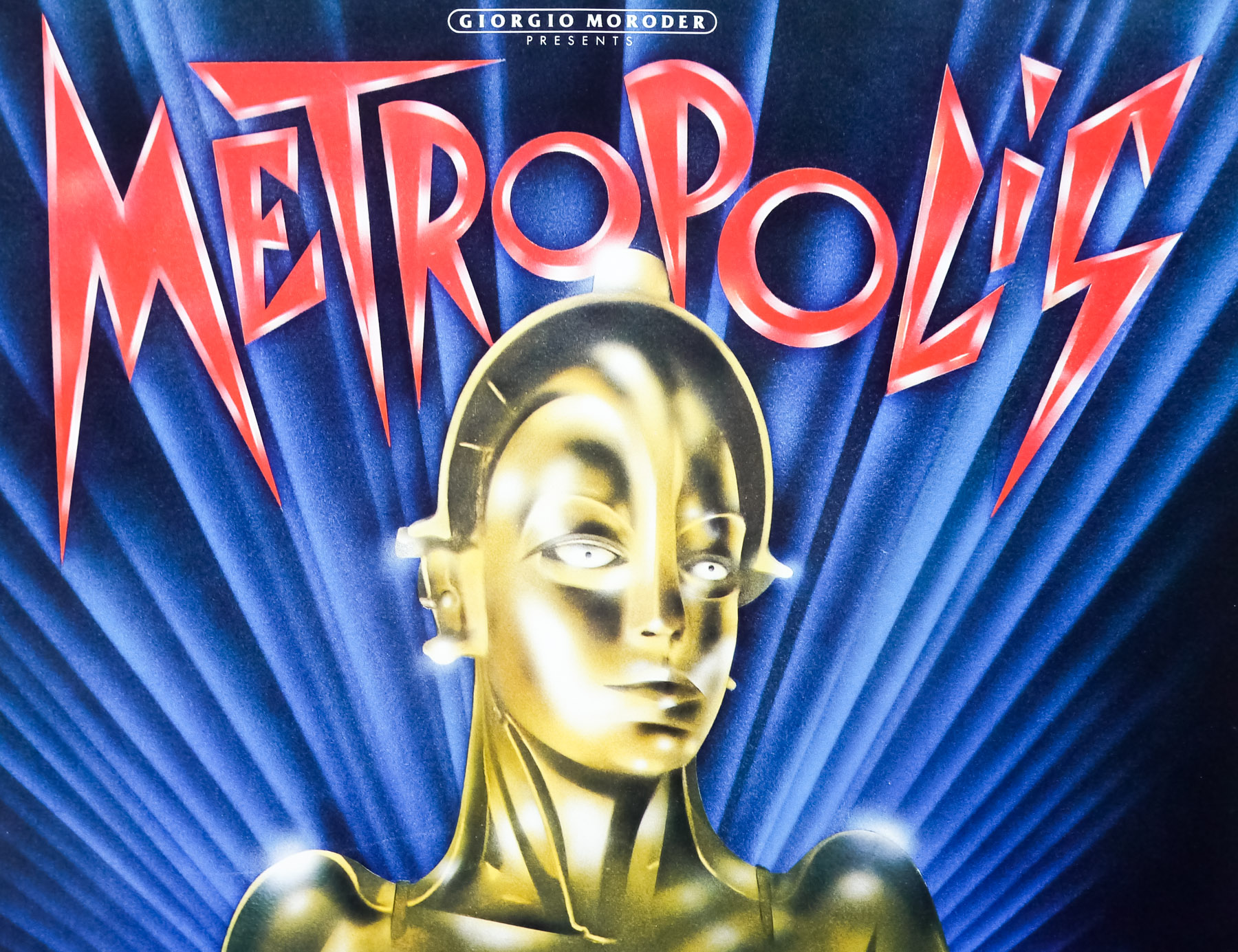
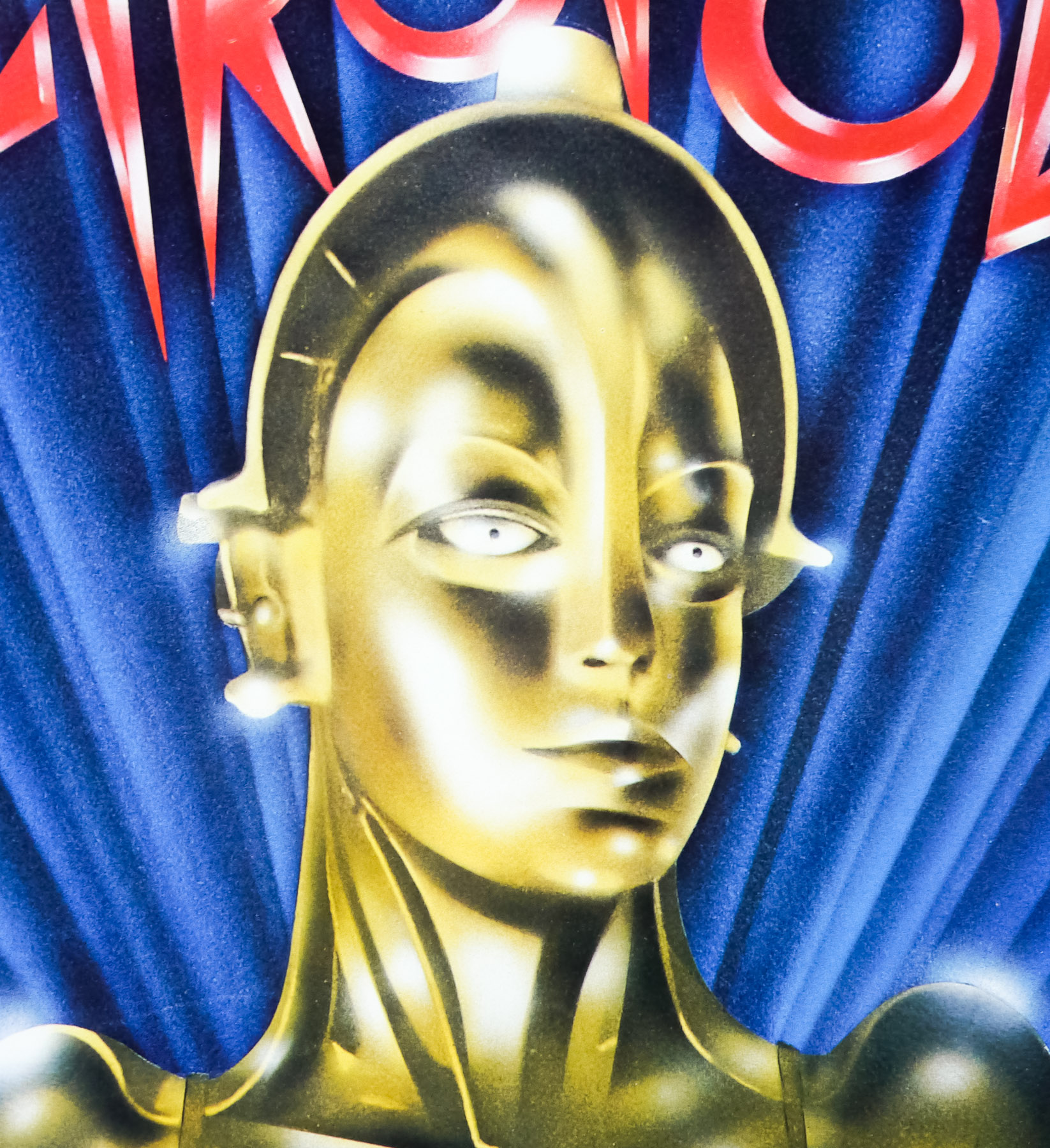
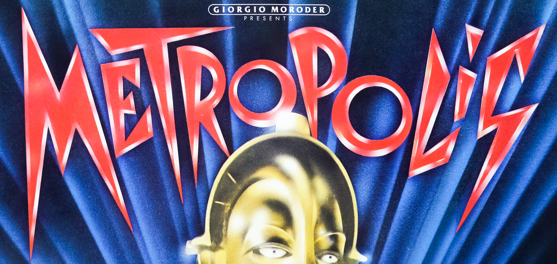
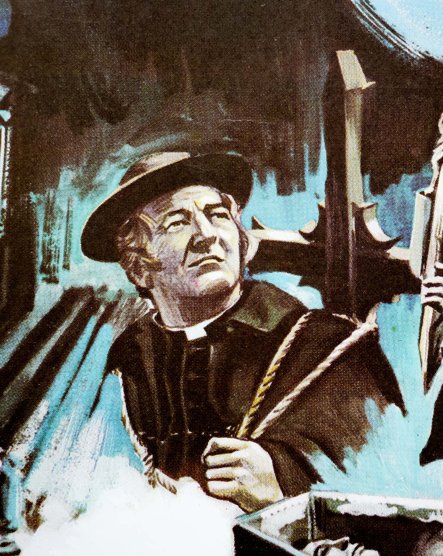
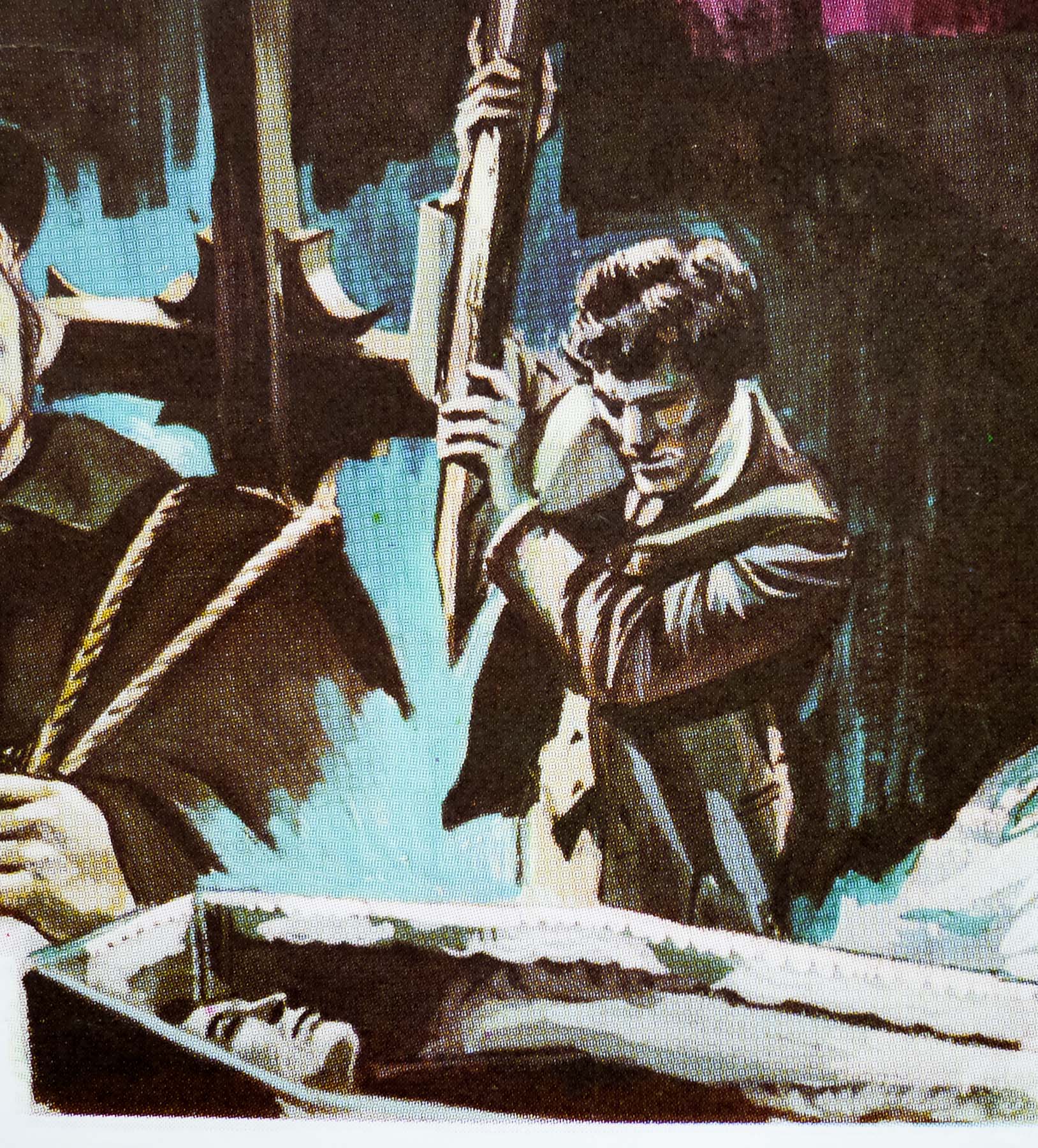
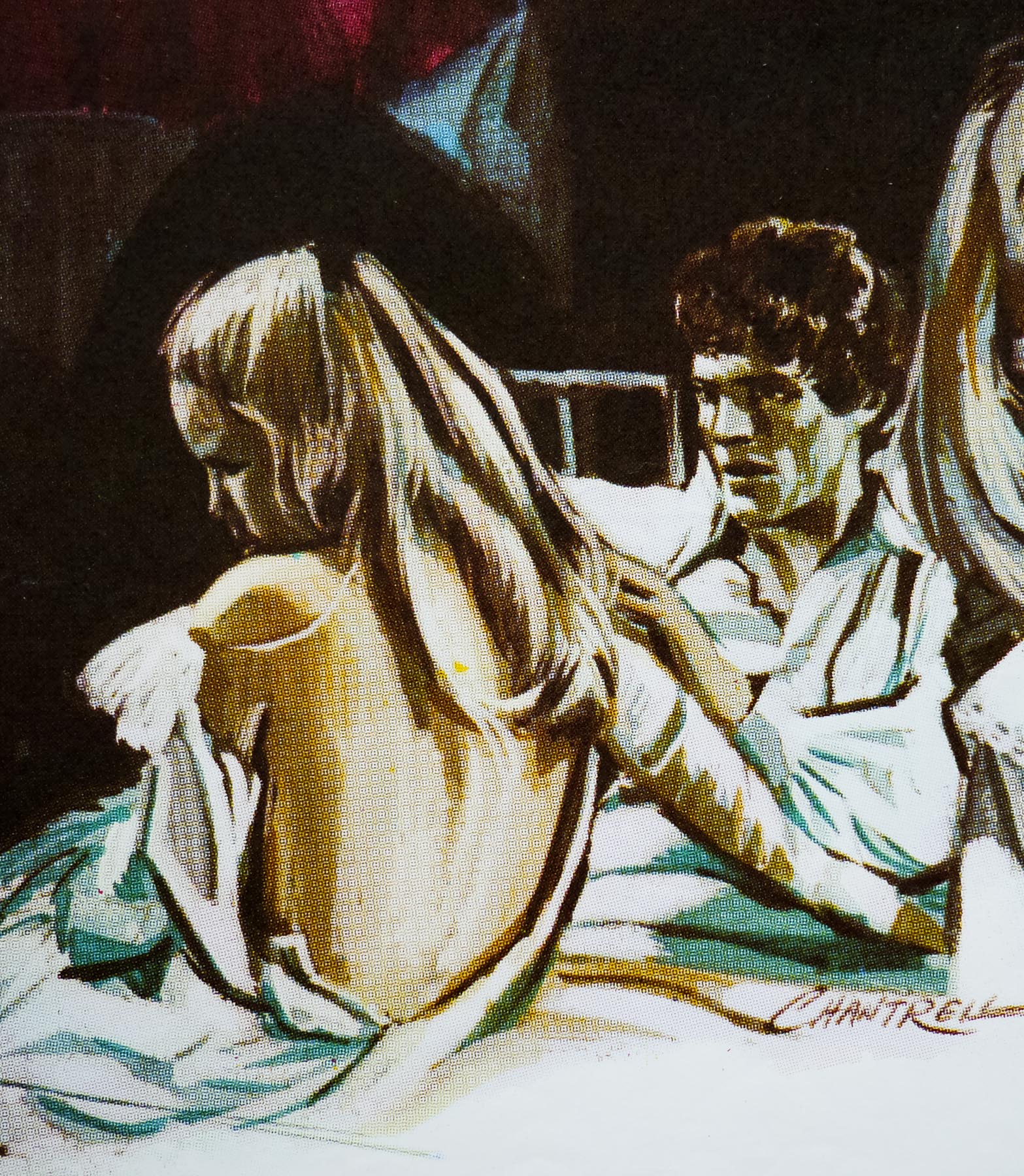
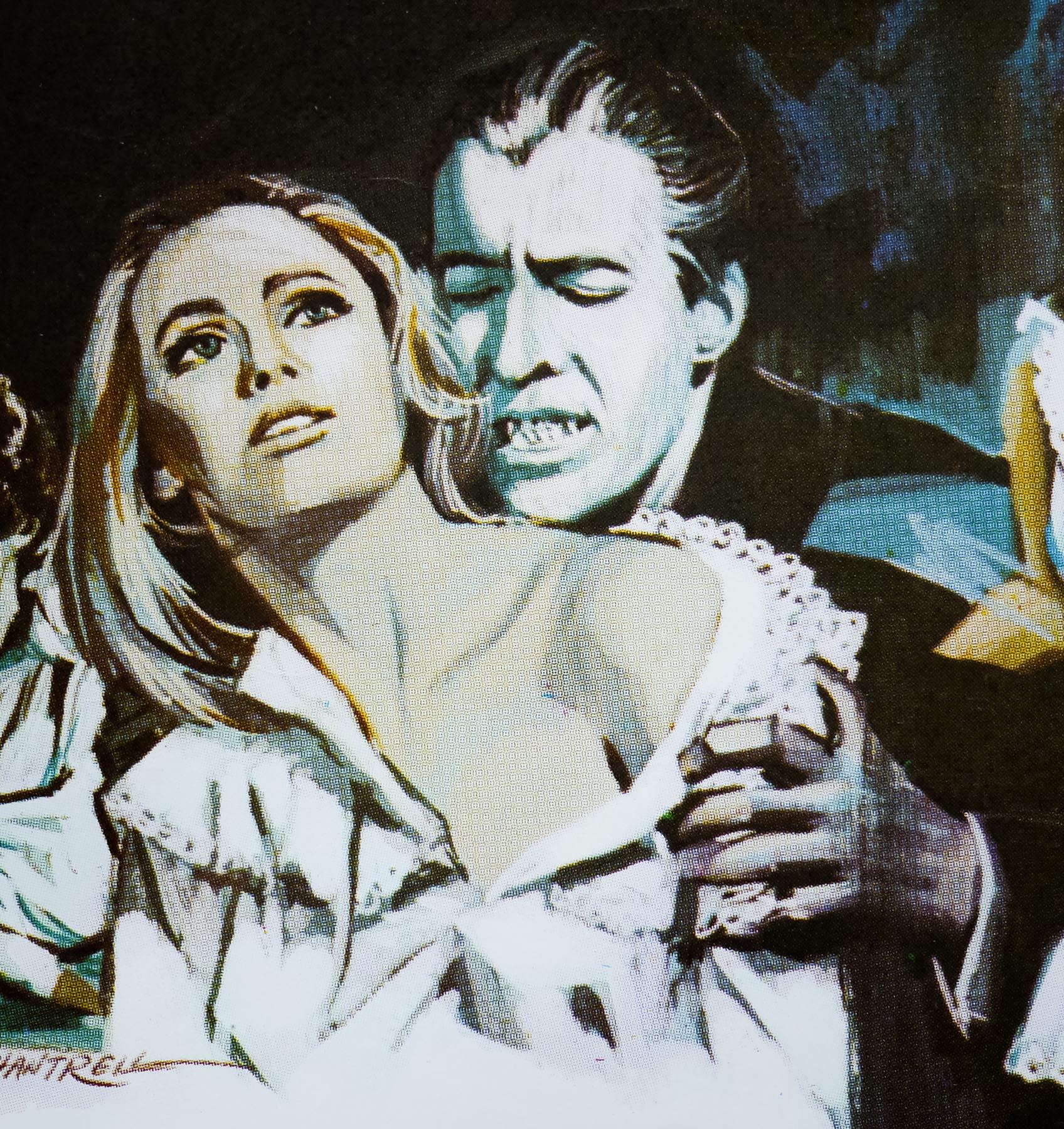
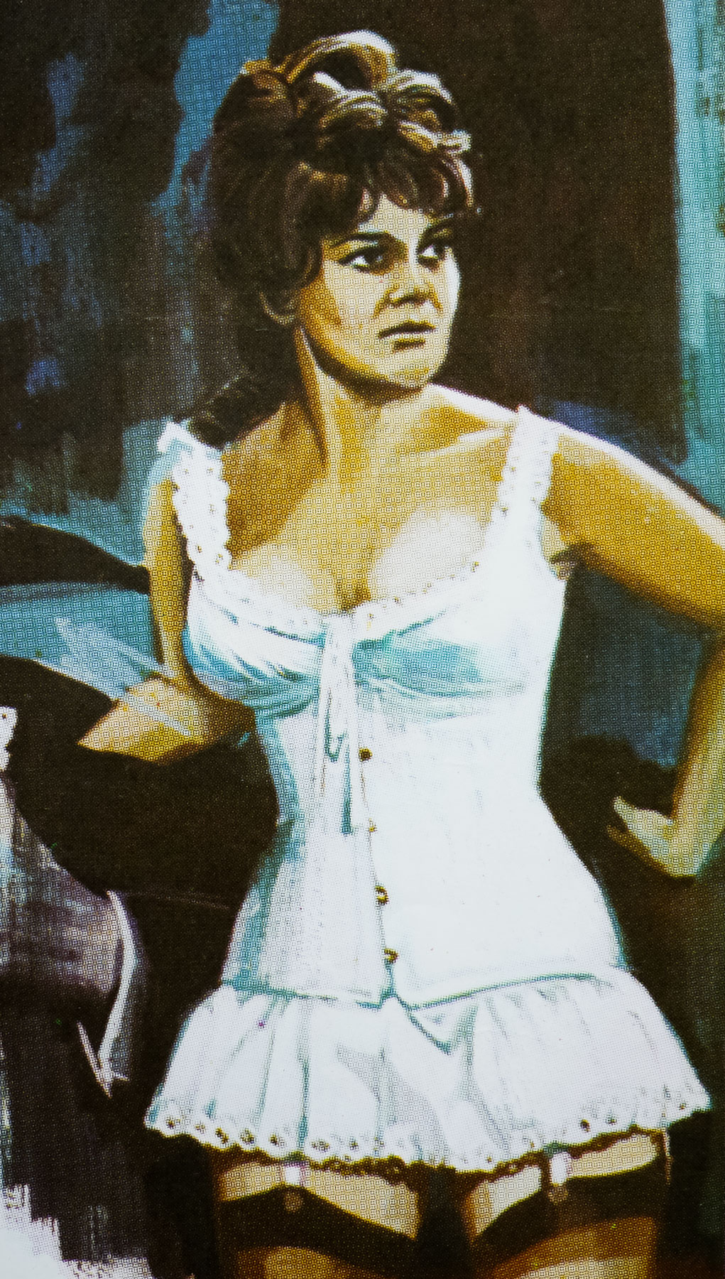
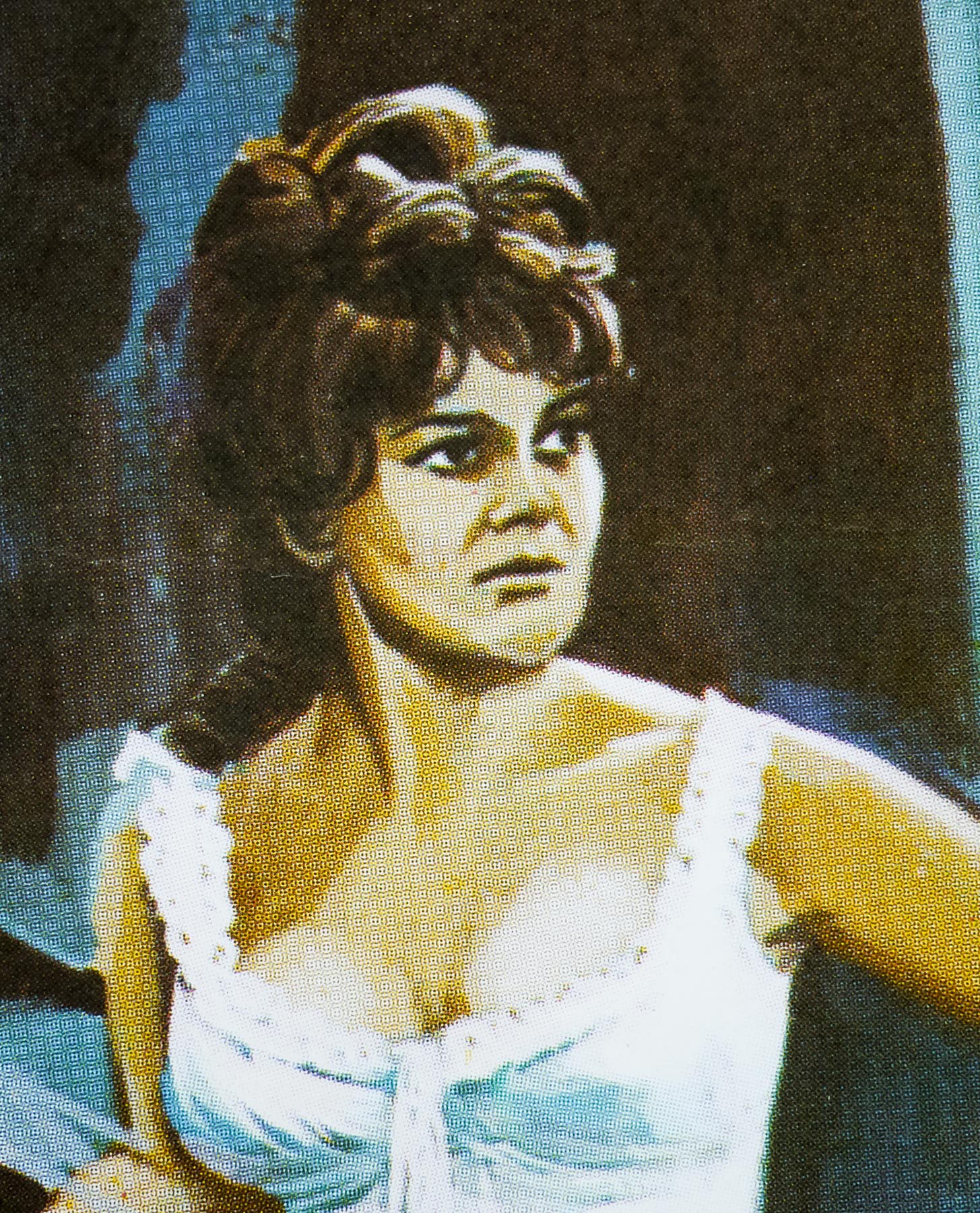
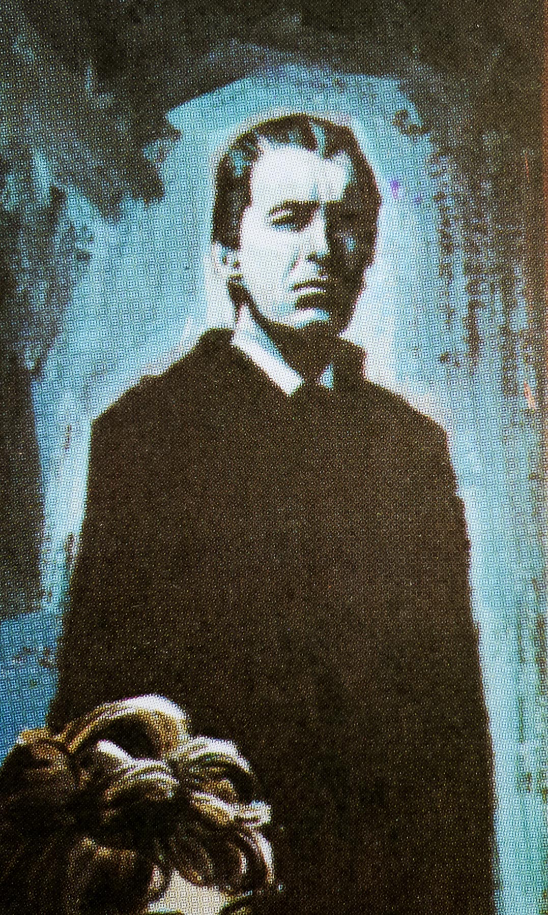
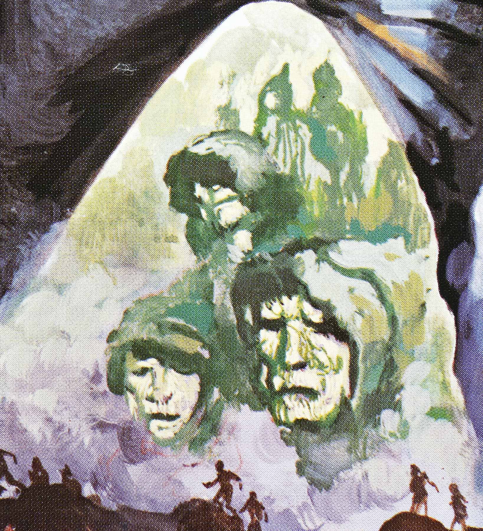
Fritz Lang’s 1927 sci-fi masterpiece Metropolis was given a cinema re-release in 2010 after missing scenes, long thought lost, were discovered in an Argentinian museum and reintegrated back into the film. 26 years earlier, music producer Giorgio Moroder produced and released an alternative version of the film which was restored and had various scenes that were missing from the first US release reinserted back in.

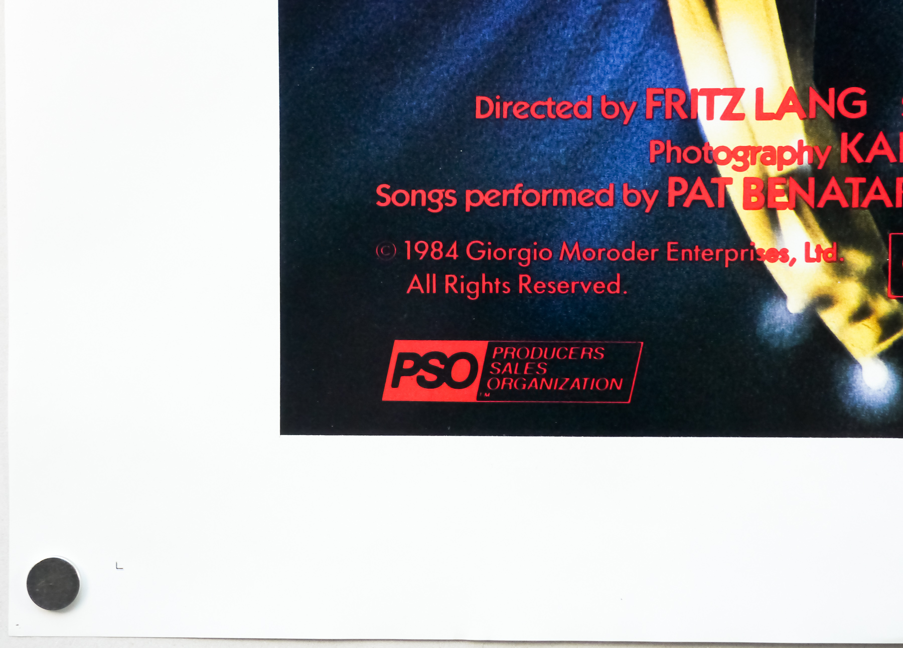
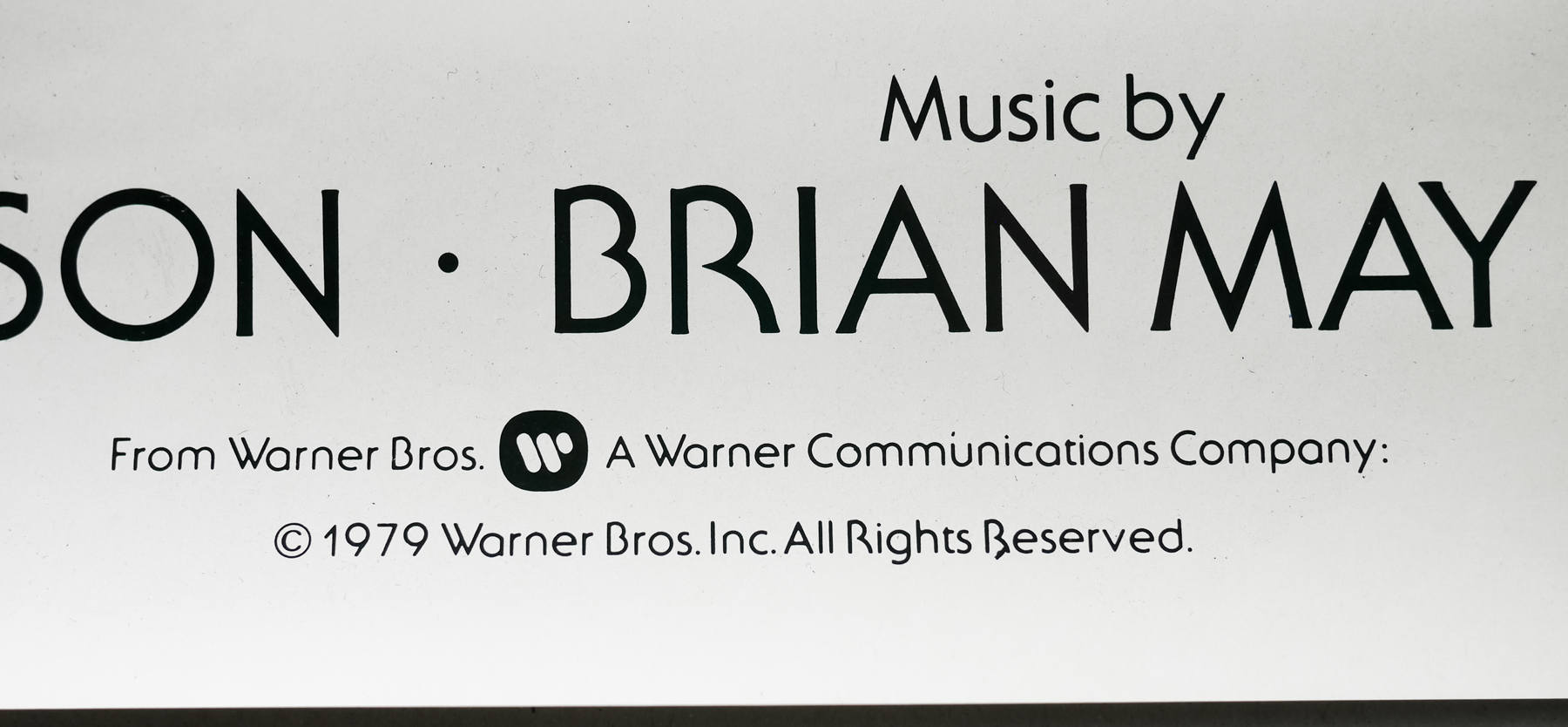
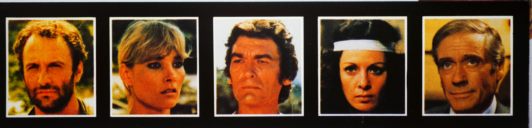
Controversially, Moroder also replaced the original orchestral score by Gottfried Huppertz with contemporary rock and pop music from the likes of Pat BenatarBonnie TylerAdam Ant and Freddie Mercury. Despite the heated debate that this re-release provoked it did have the benefit of bringing the film back into the public consciousness and led to further restorations over the following years. The discovery of the lost footage in 2008 was a complete revelation and brought the film very close to its original release version, which many feared was lost forever.

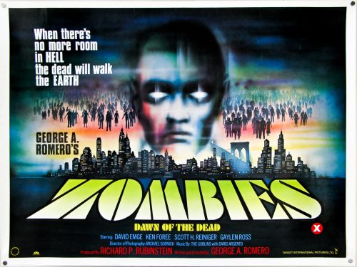
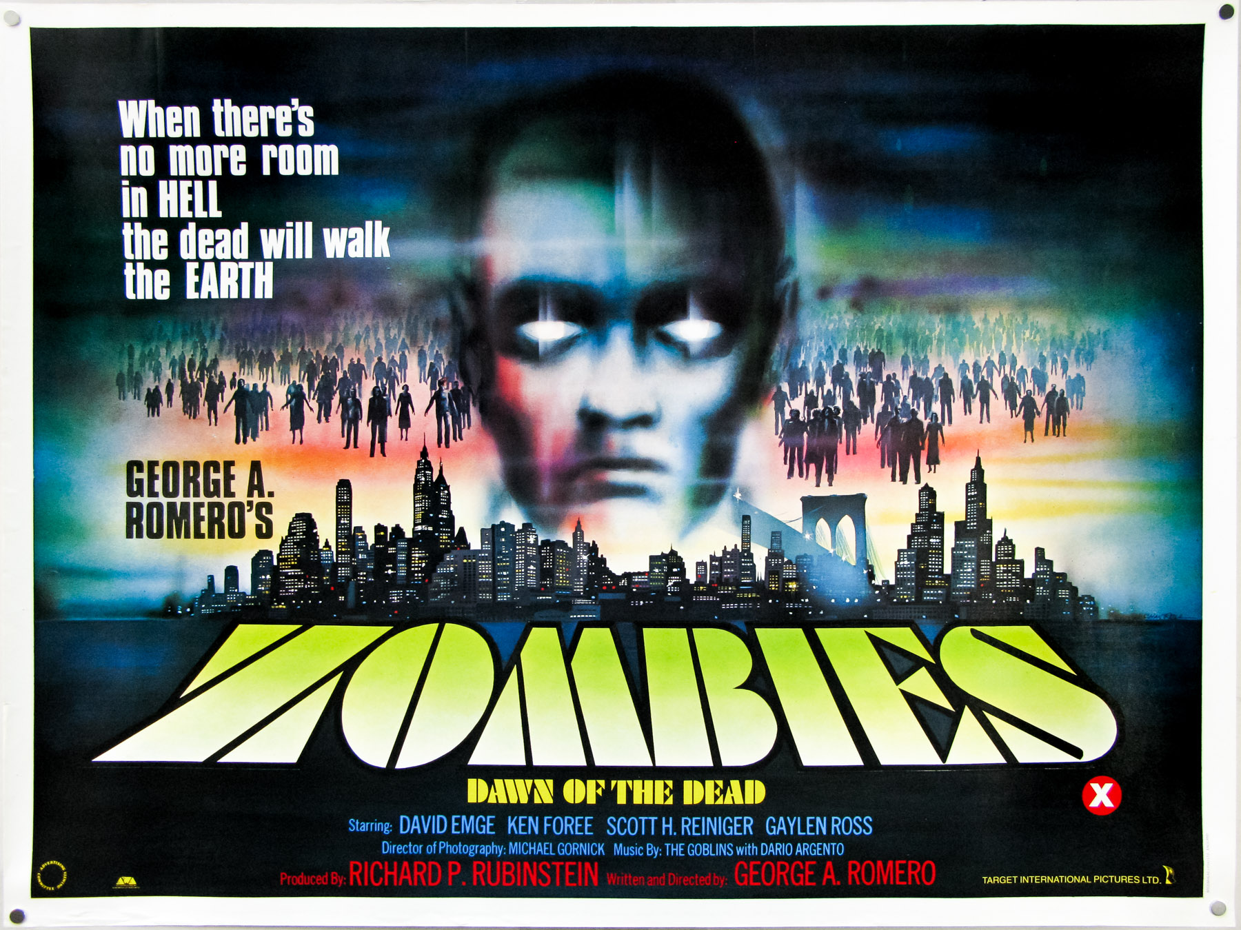
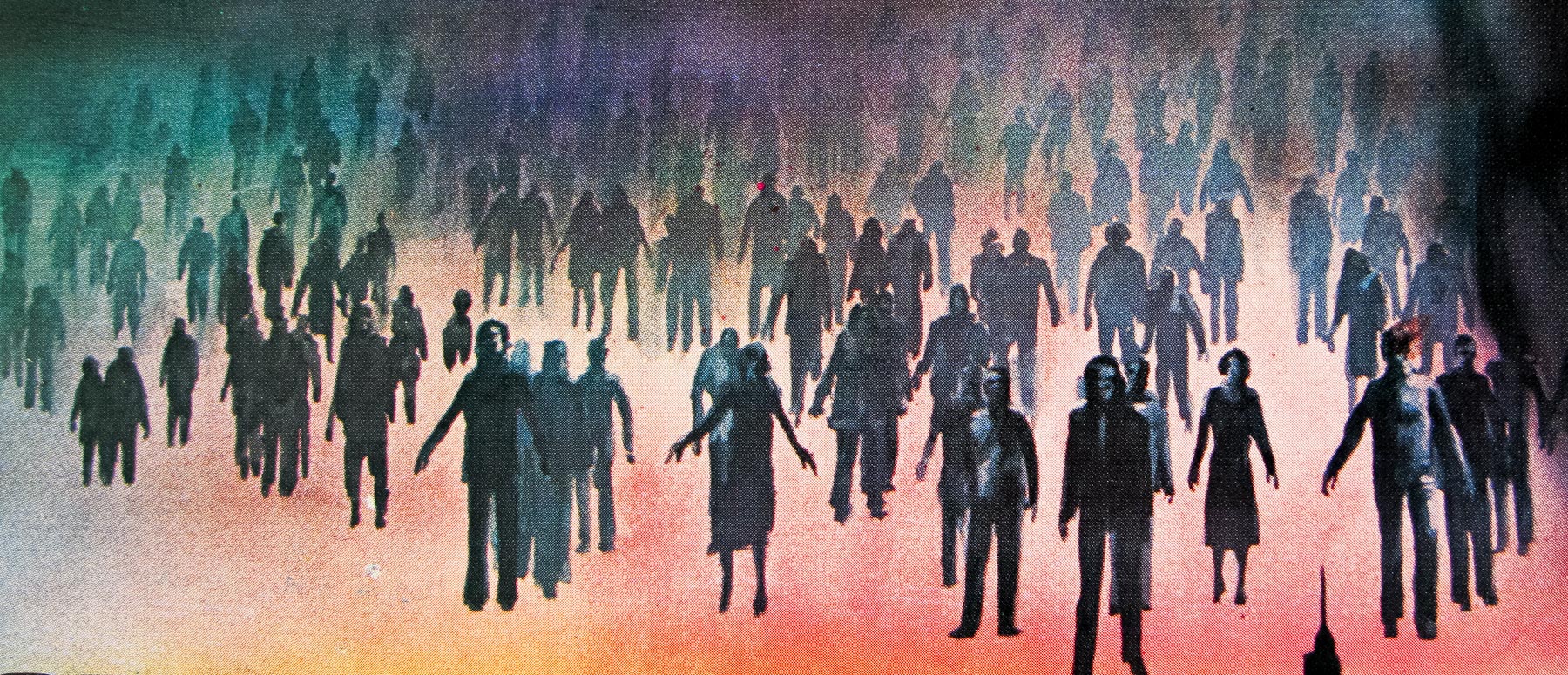
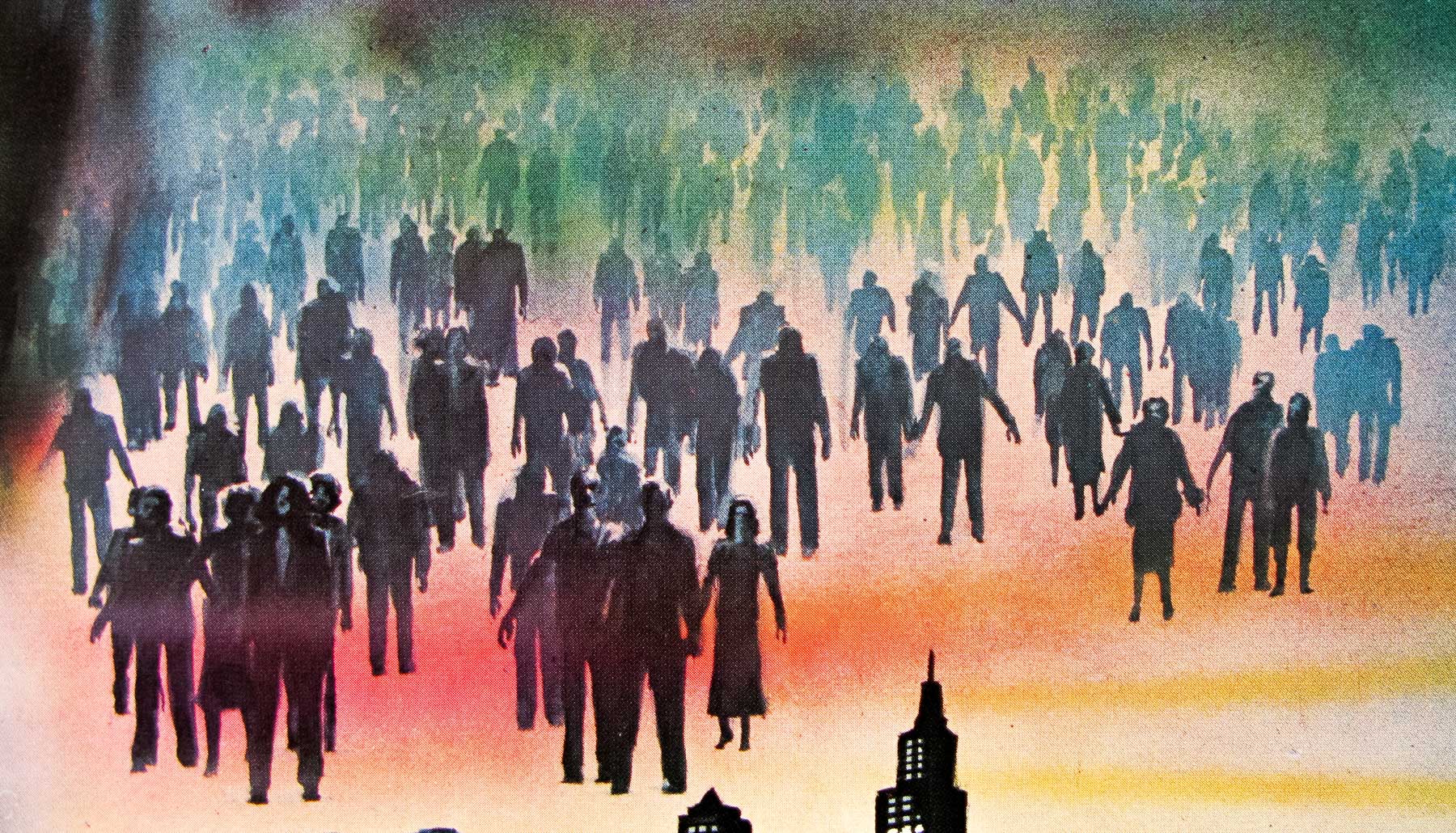
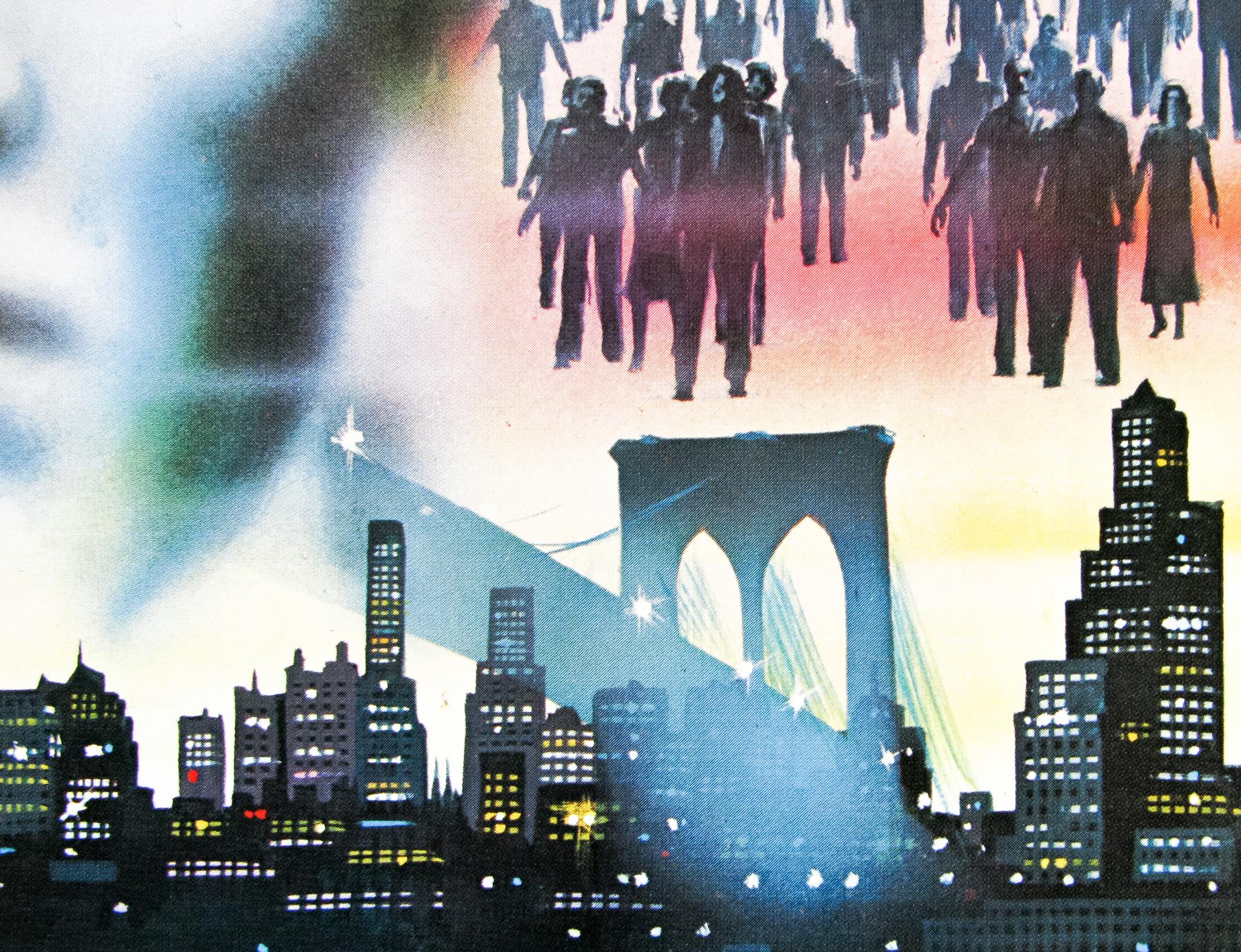
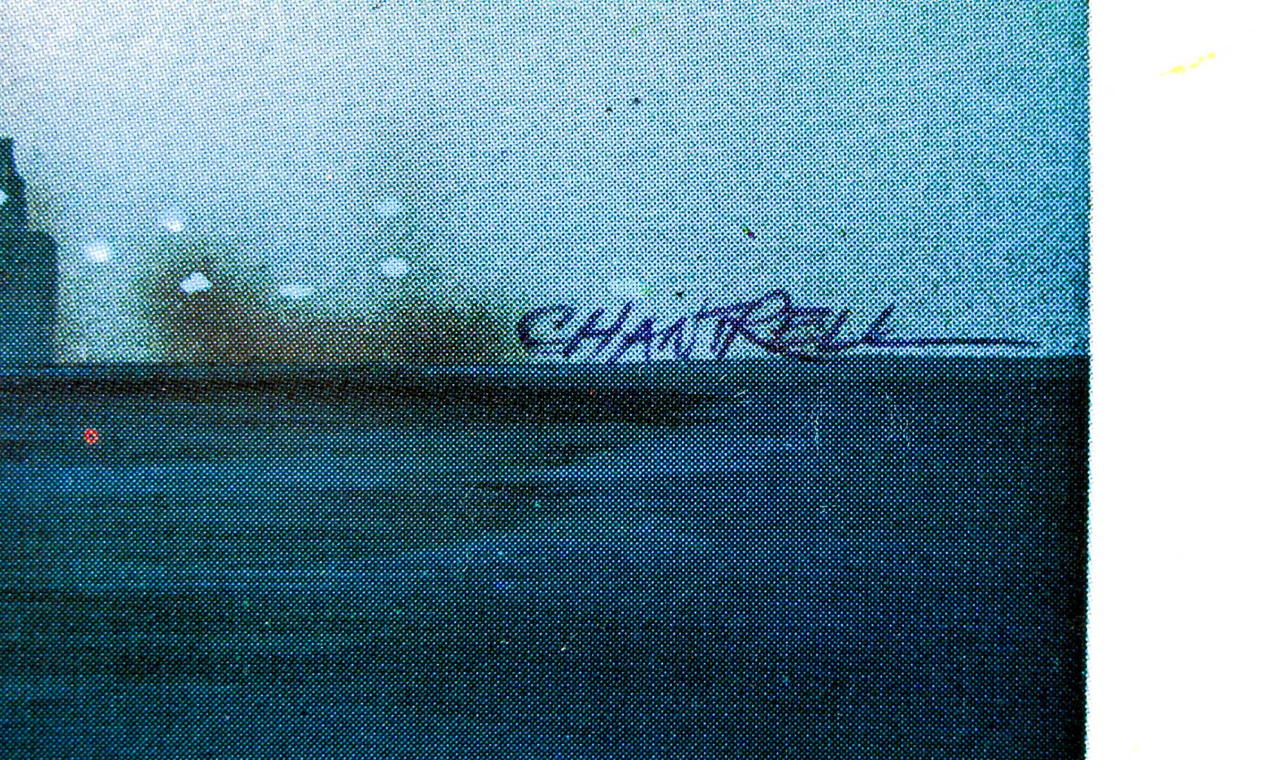
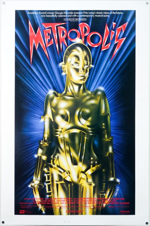
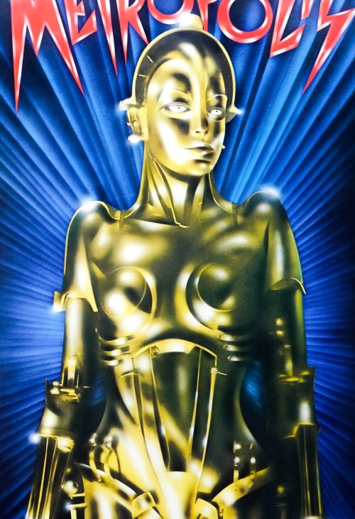
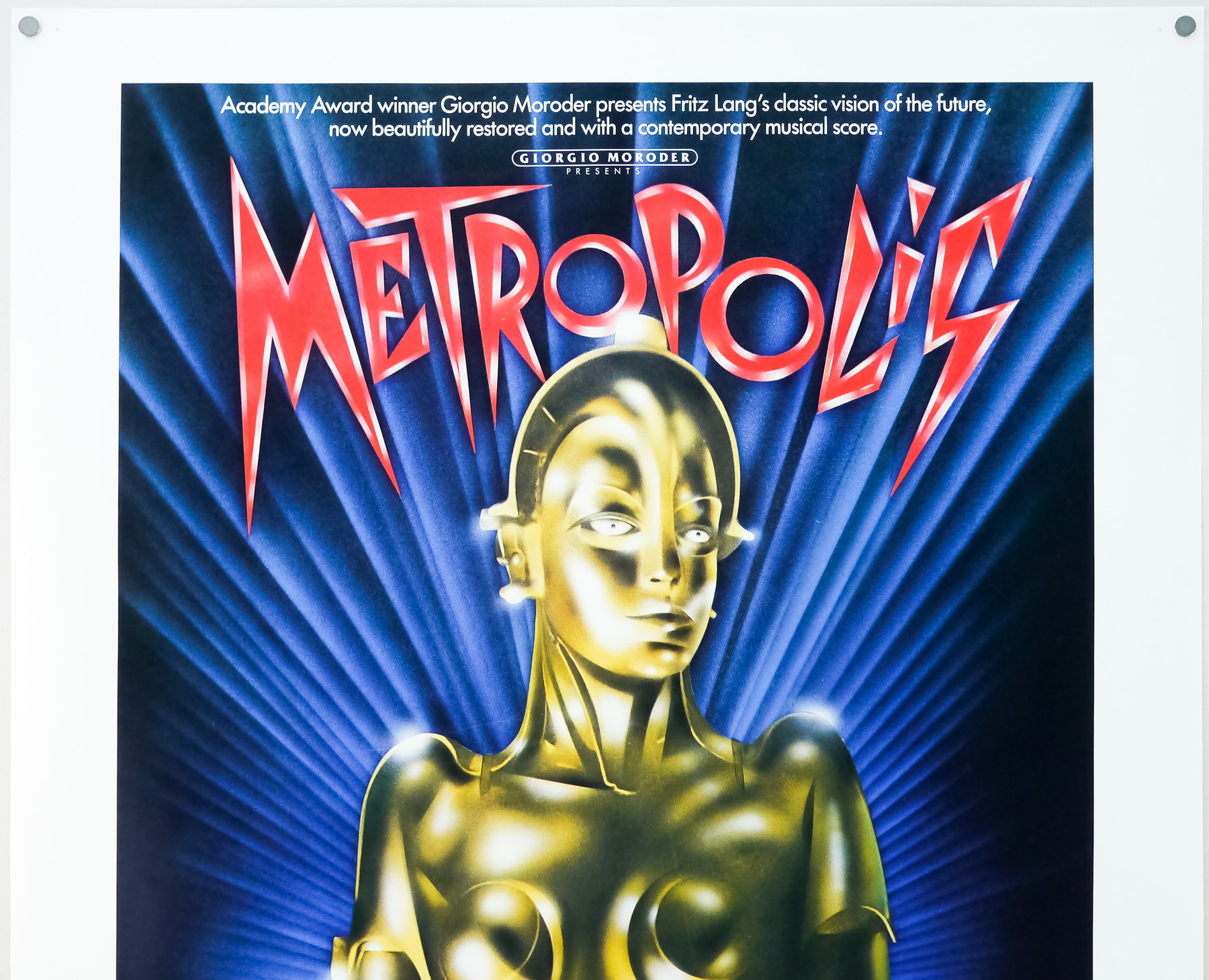
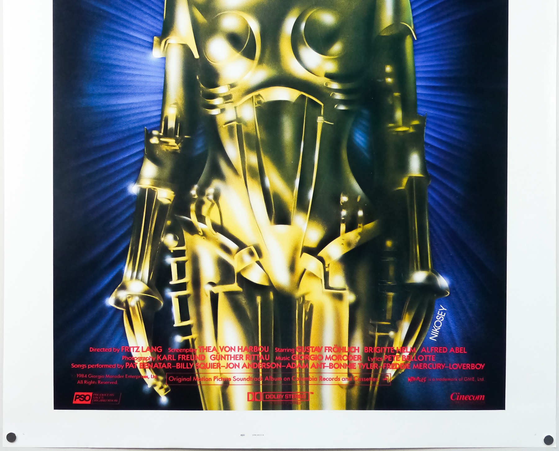
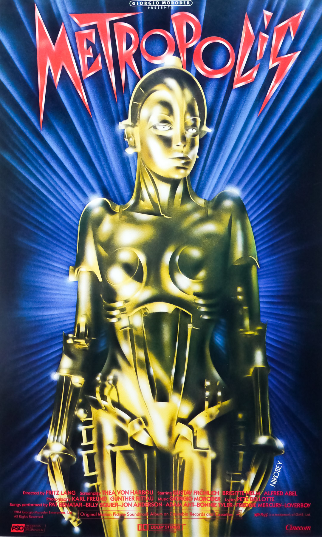
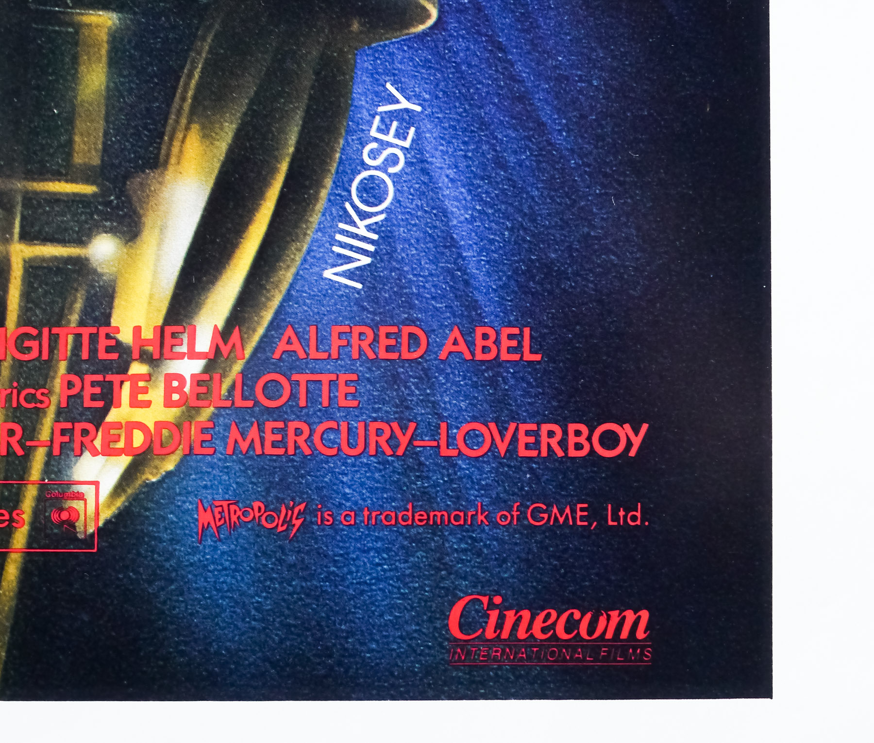
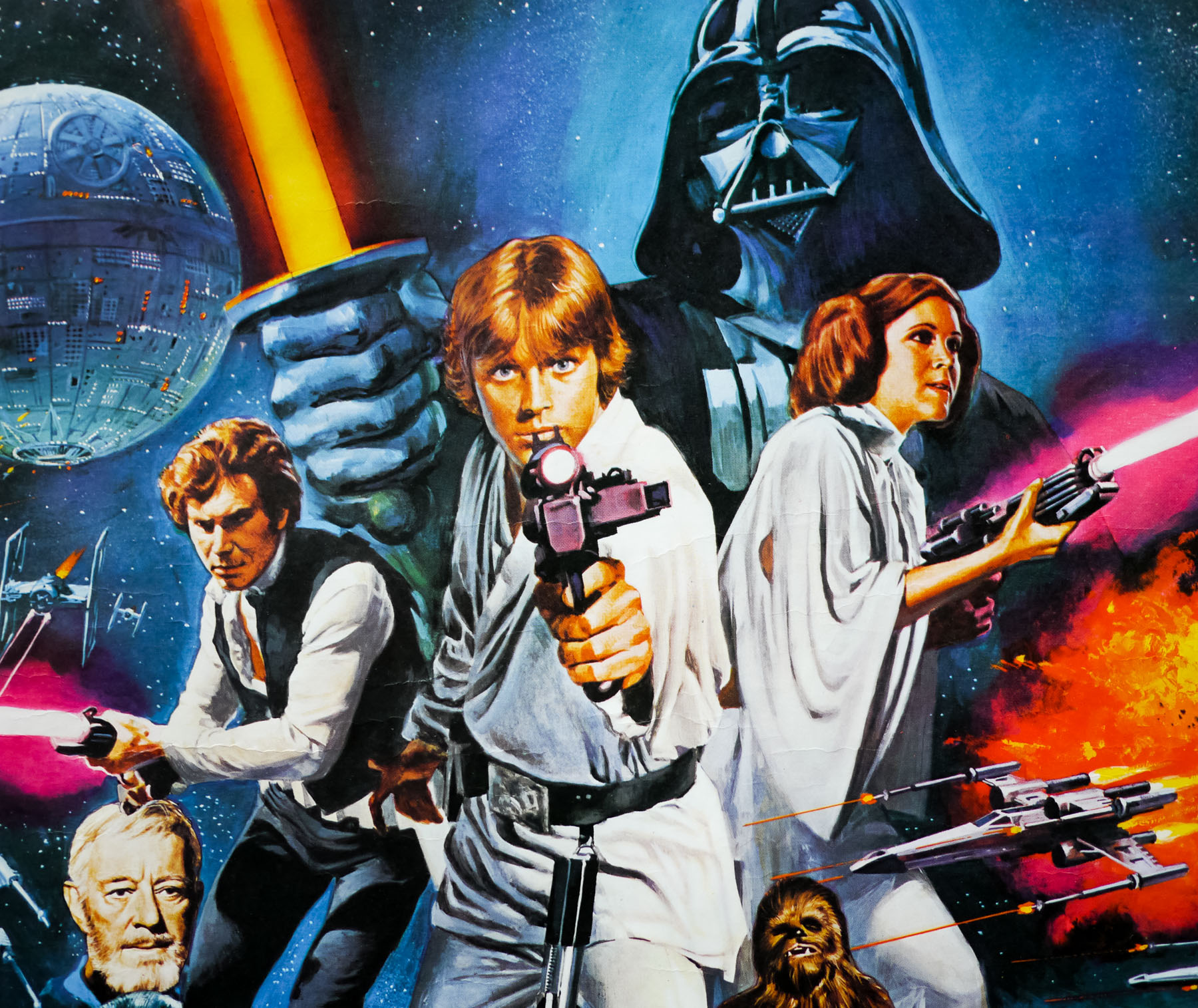
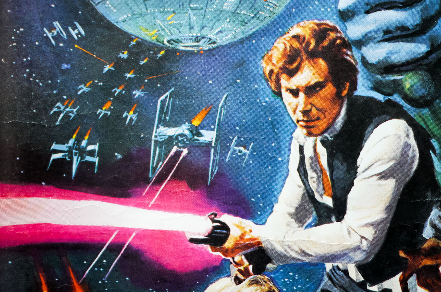
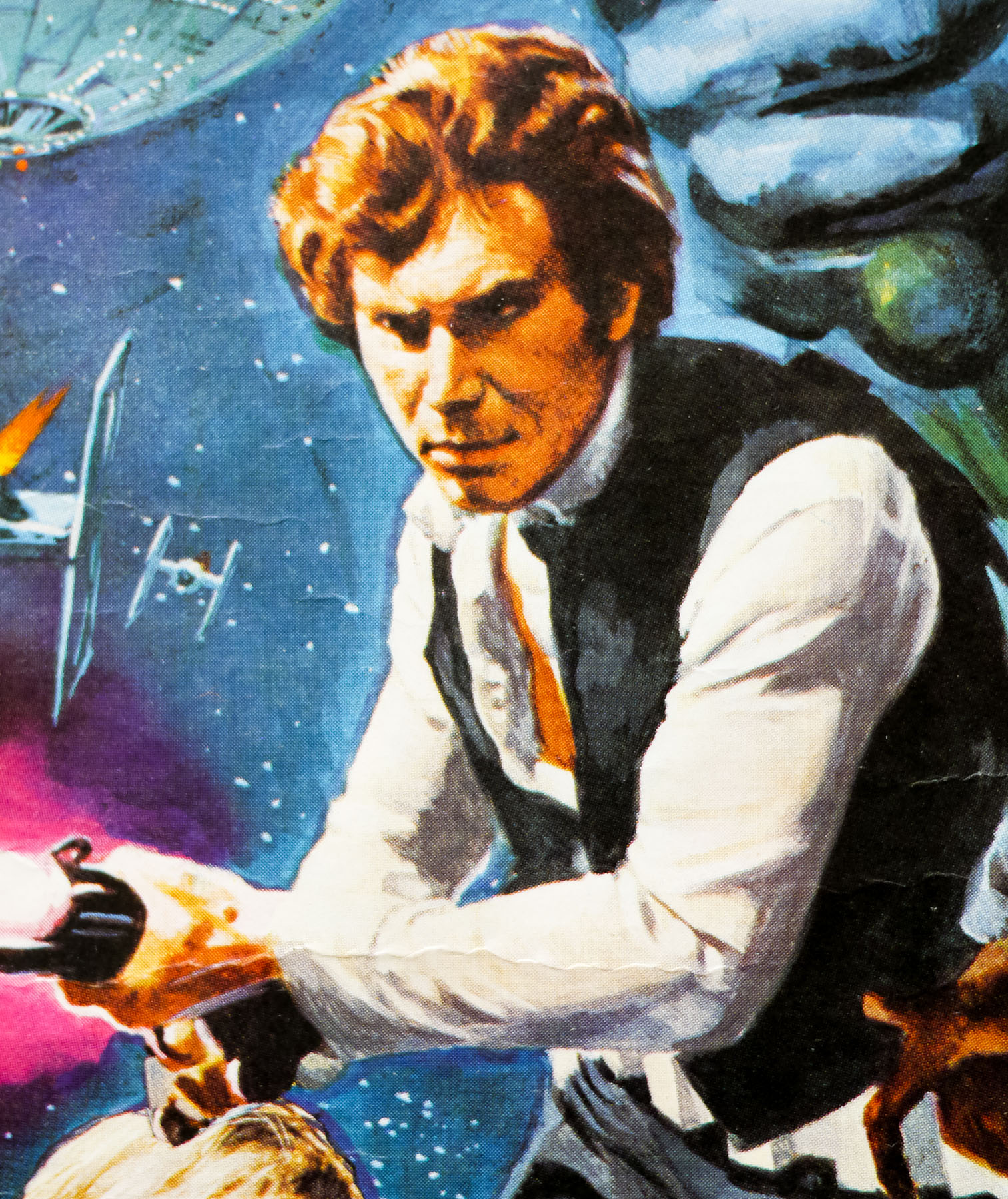
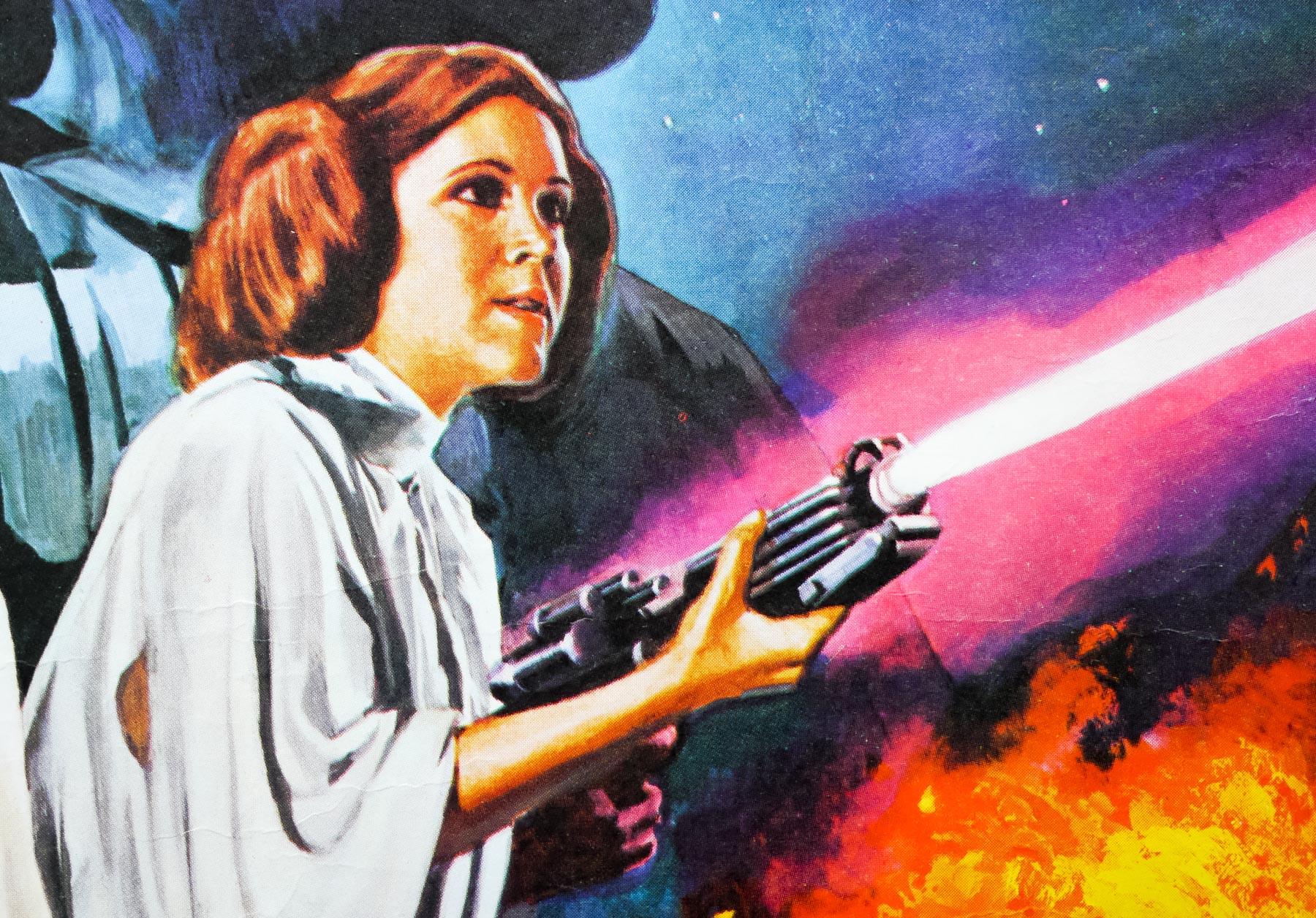
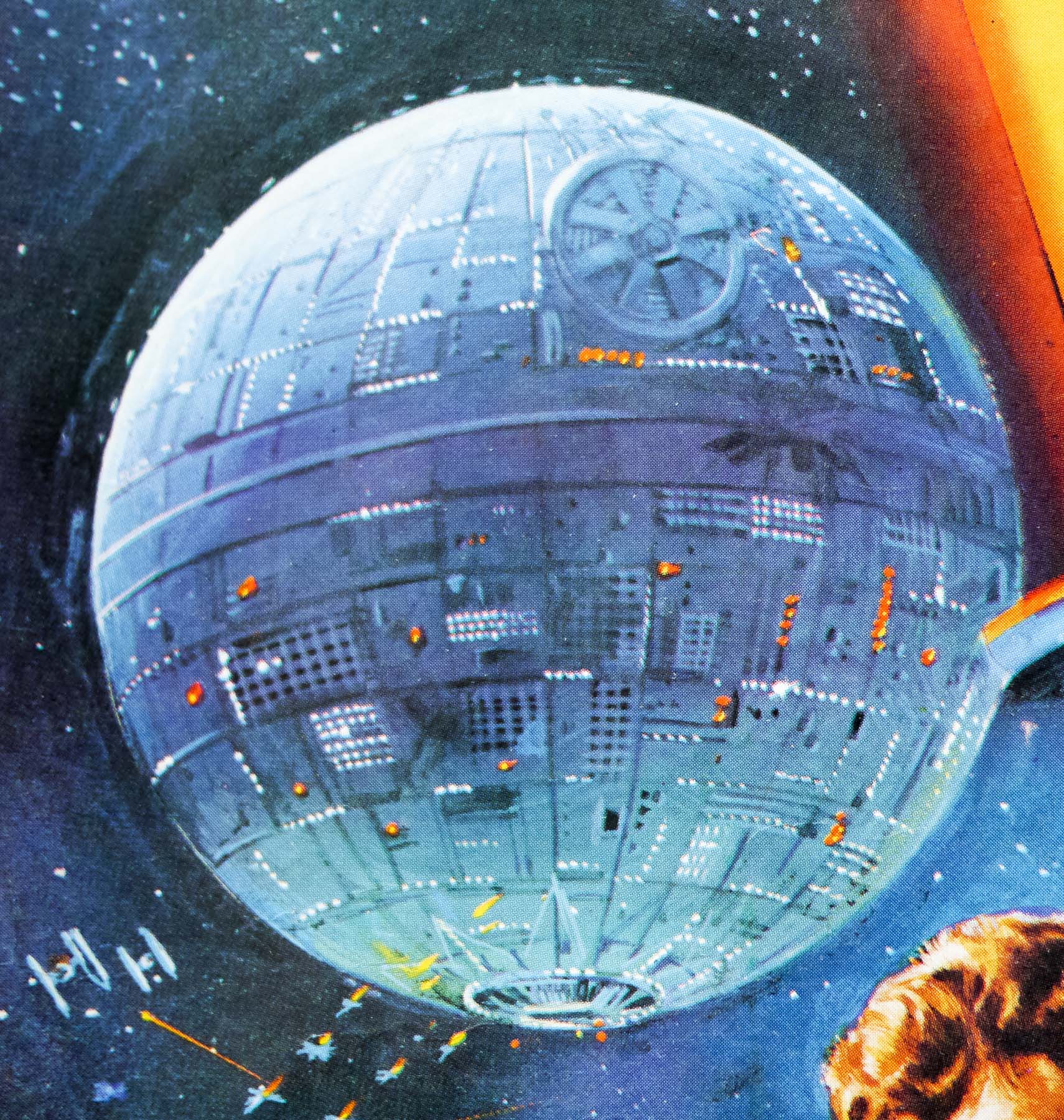
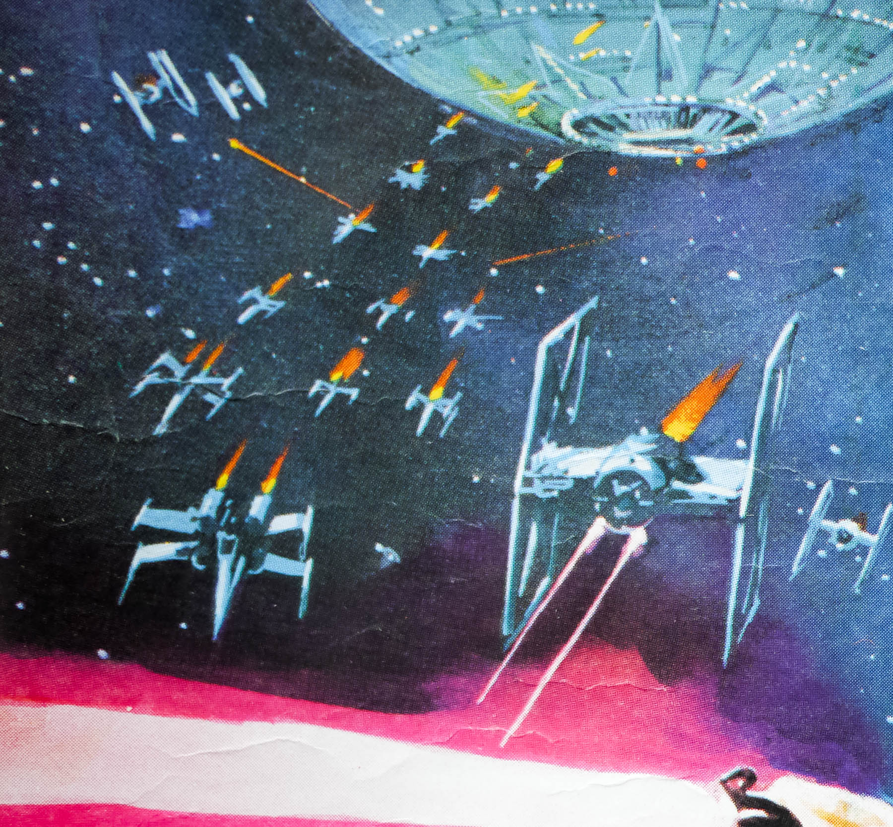
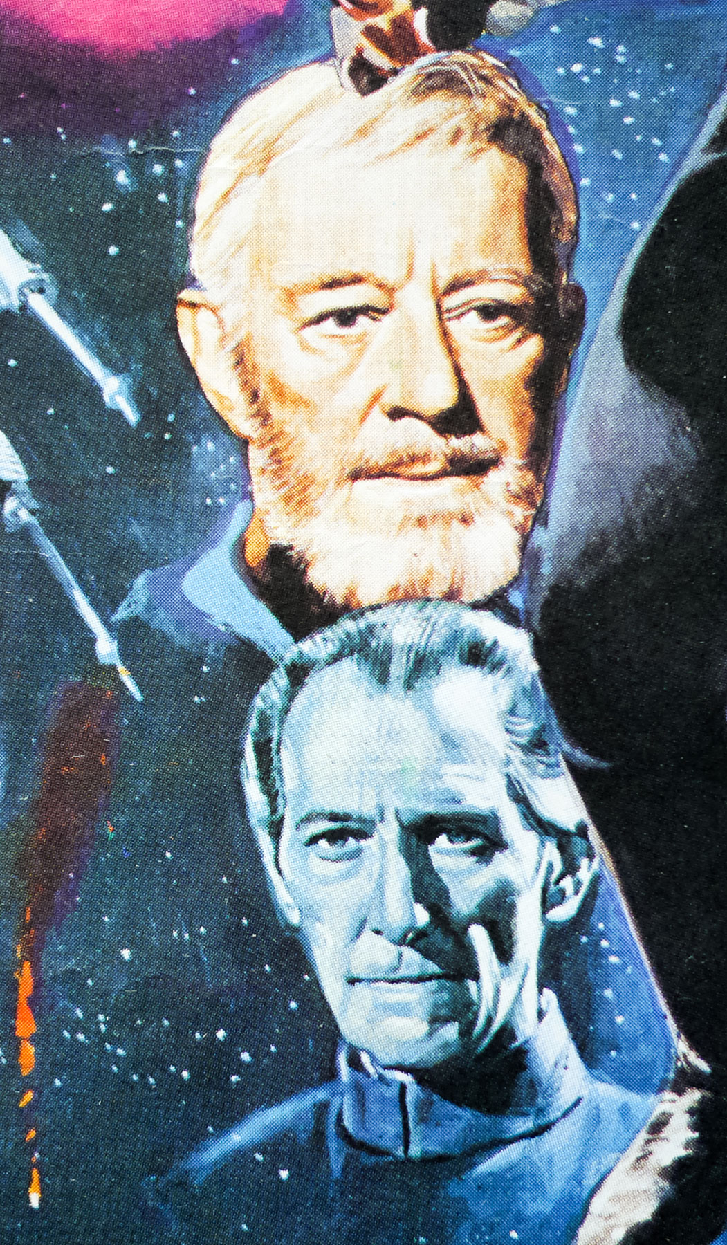
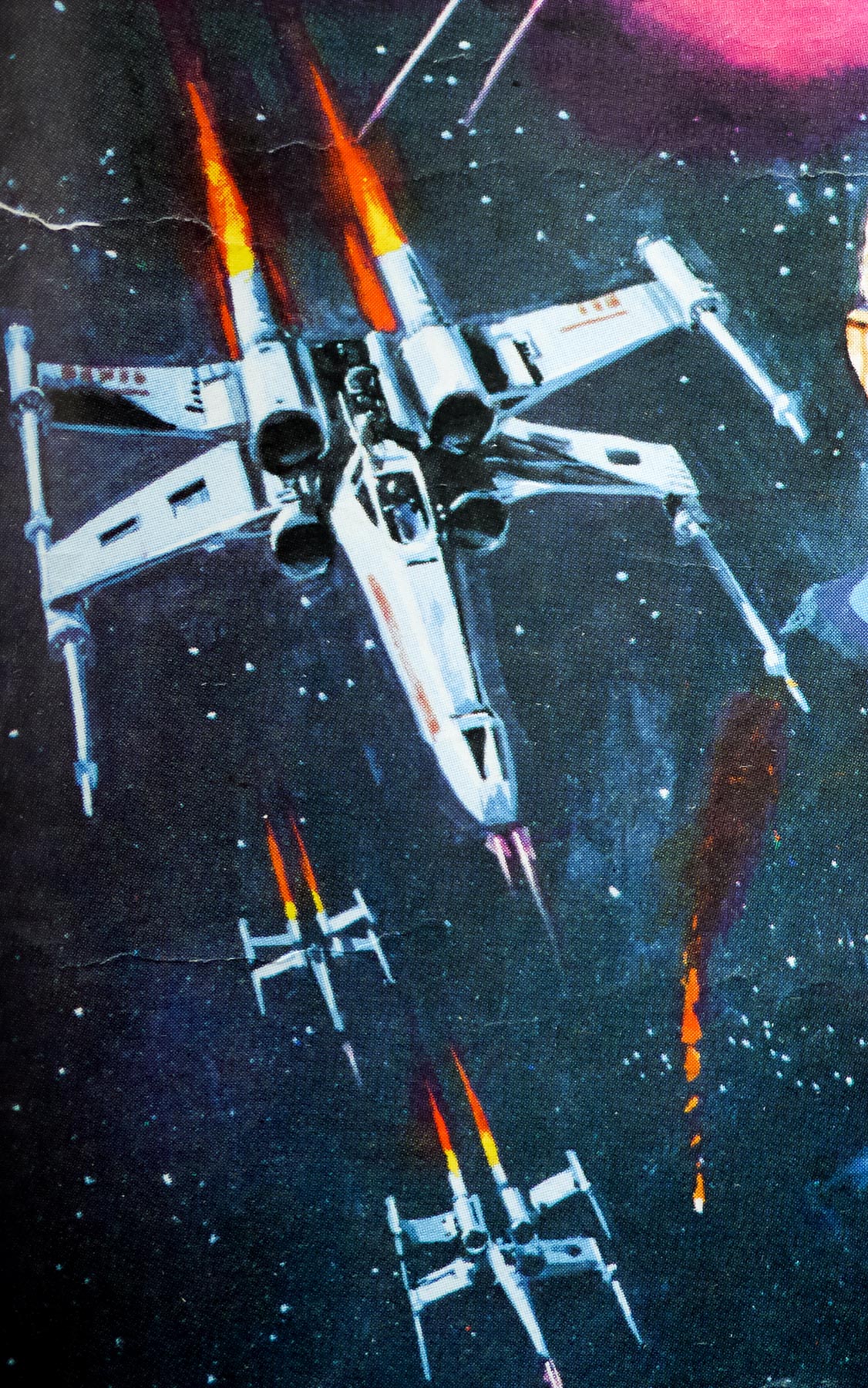
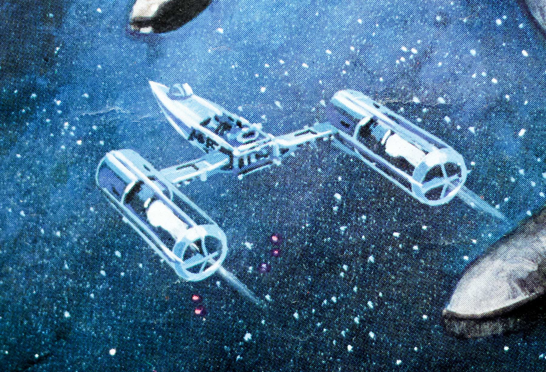
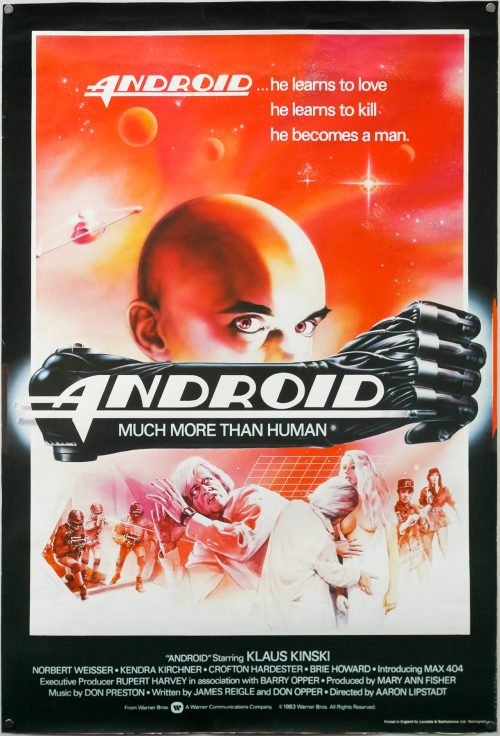
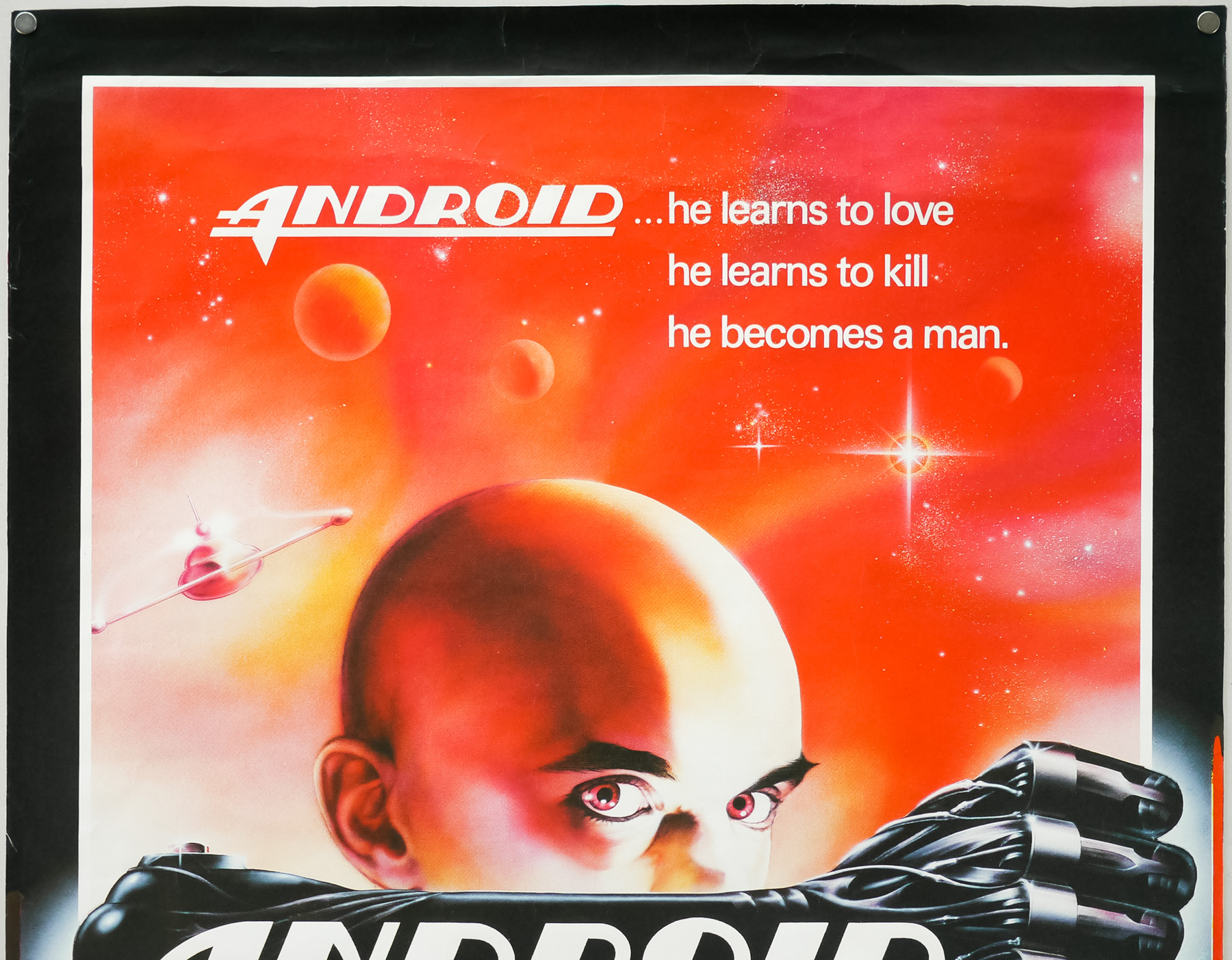
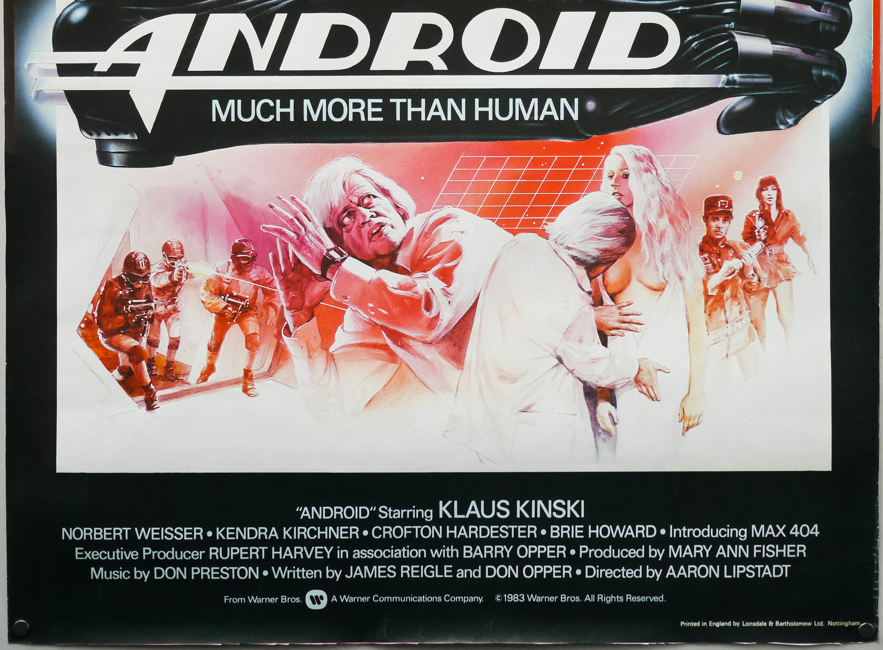
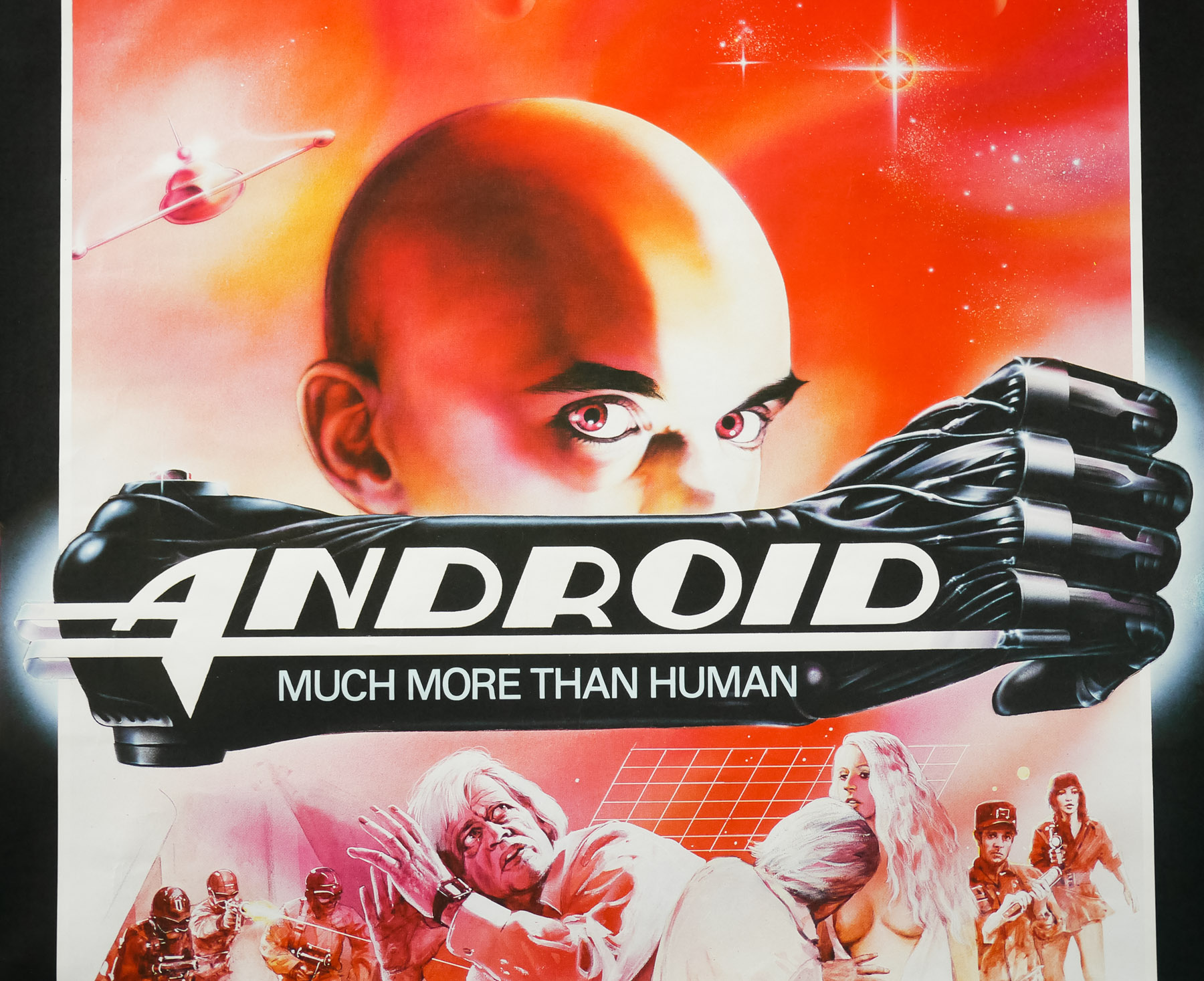
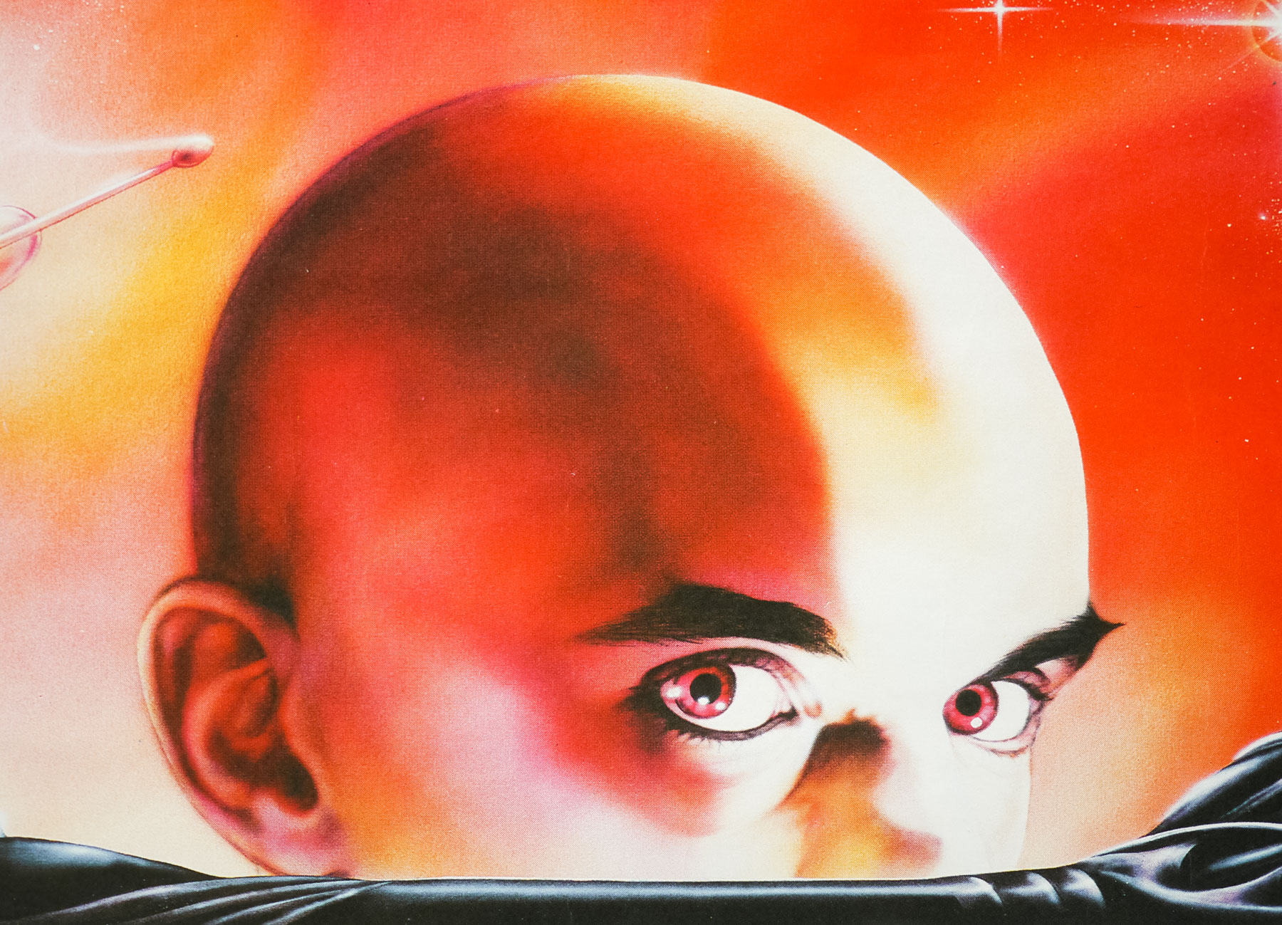
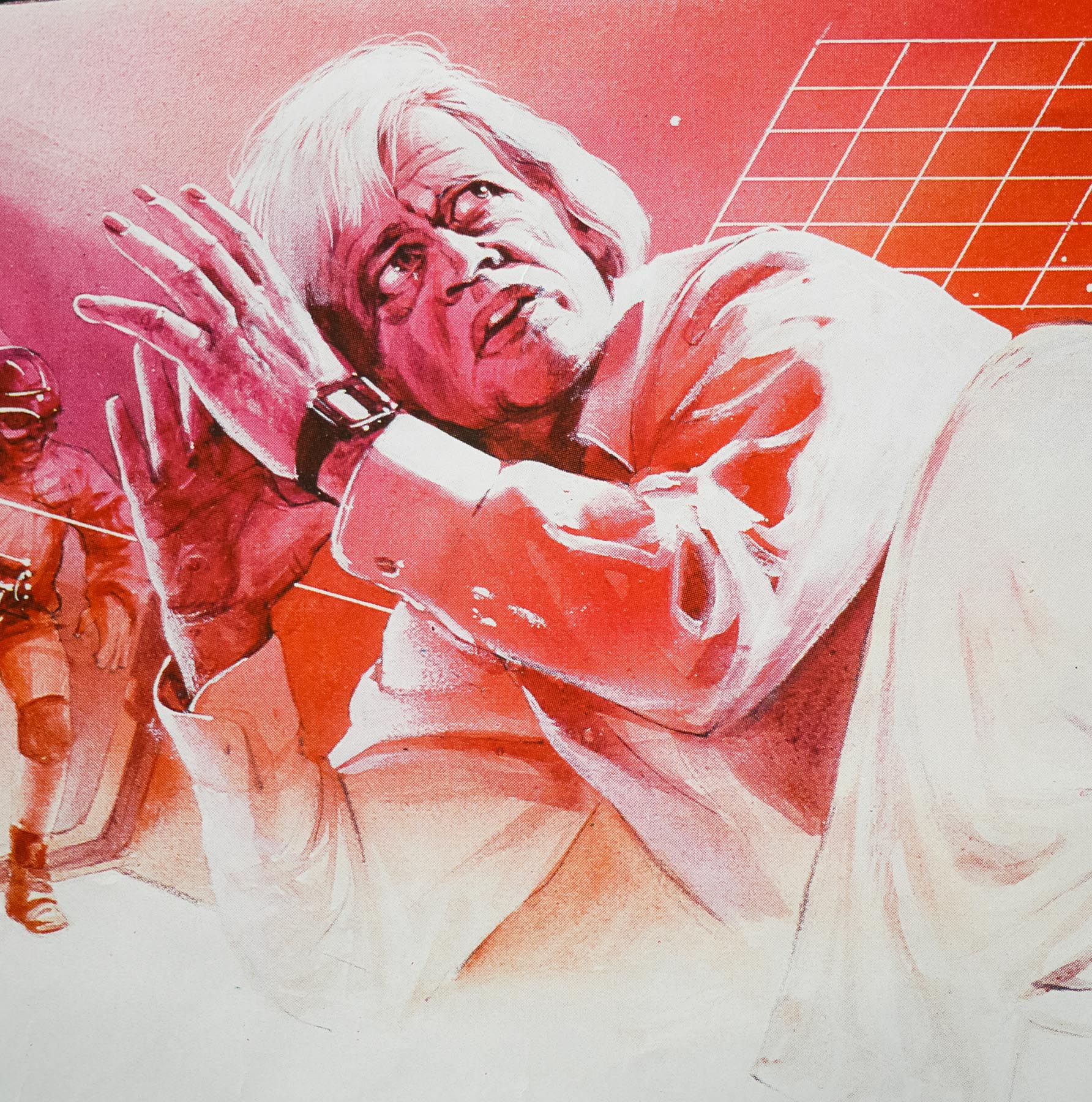
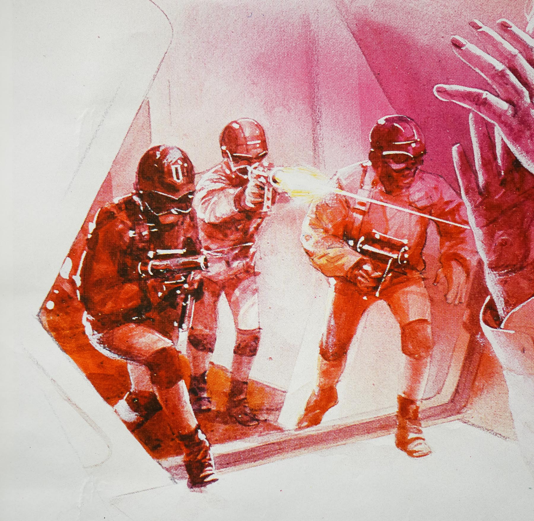
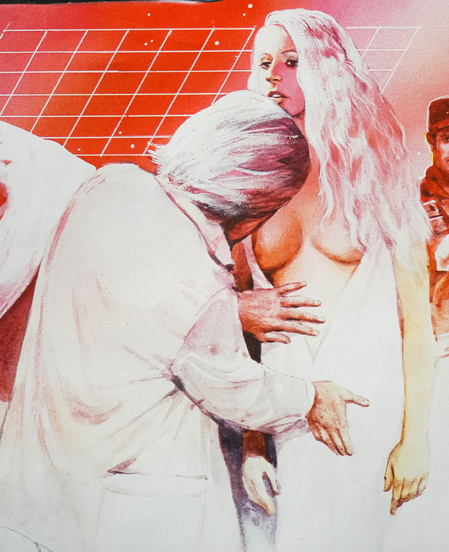
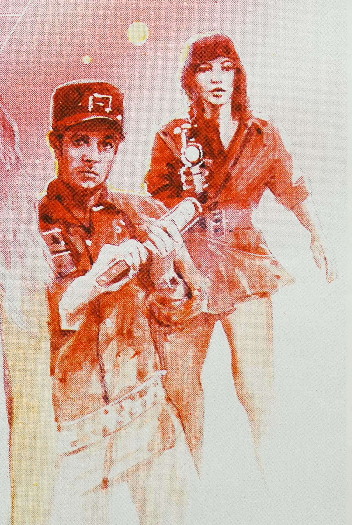
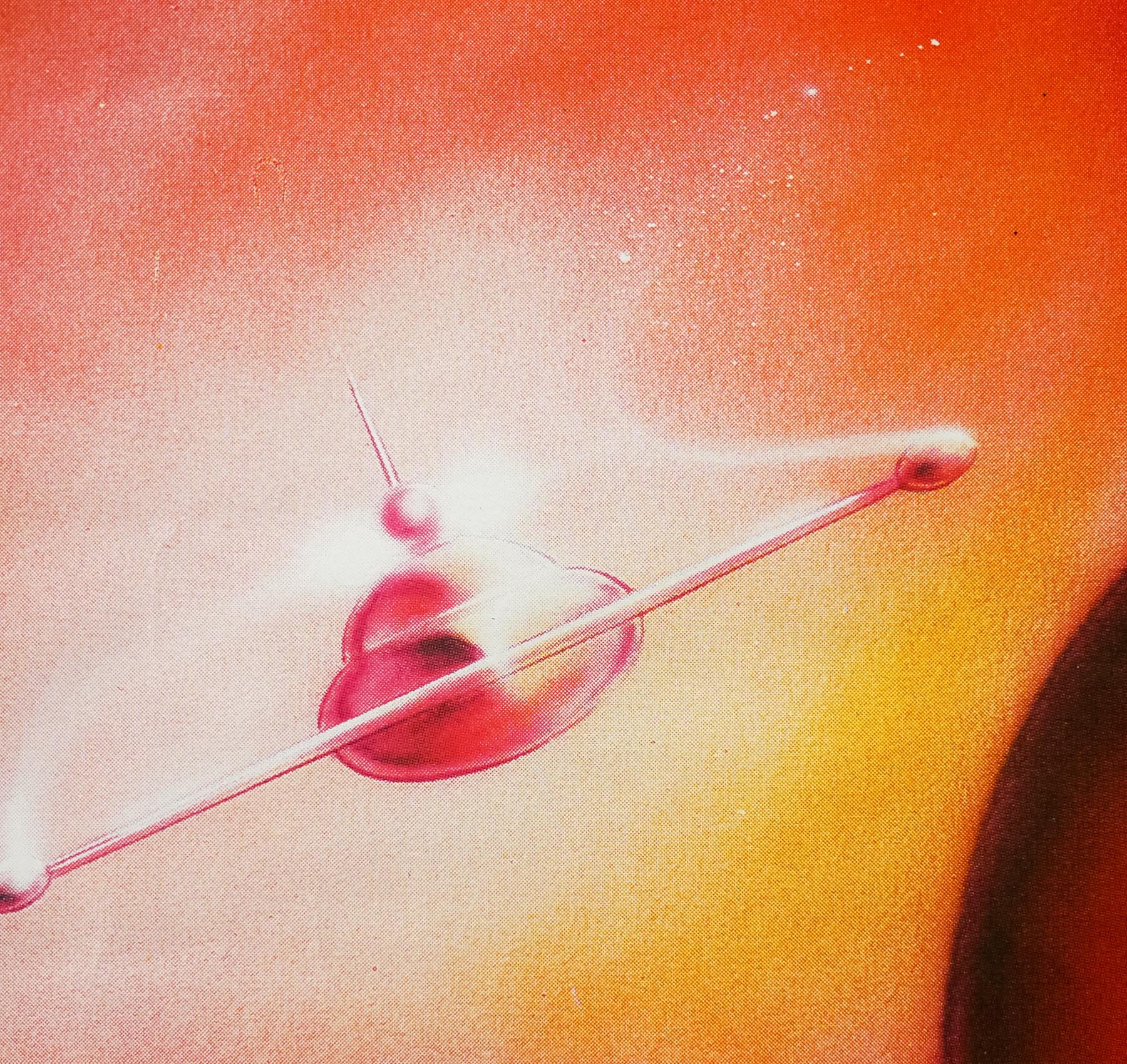
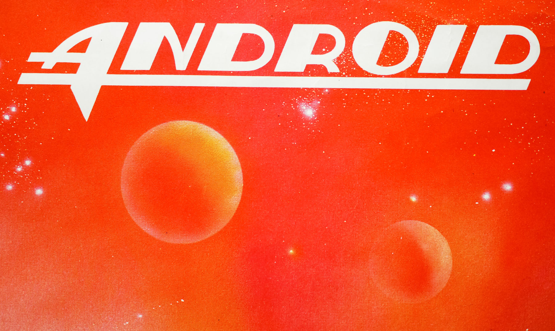
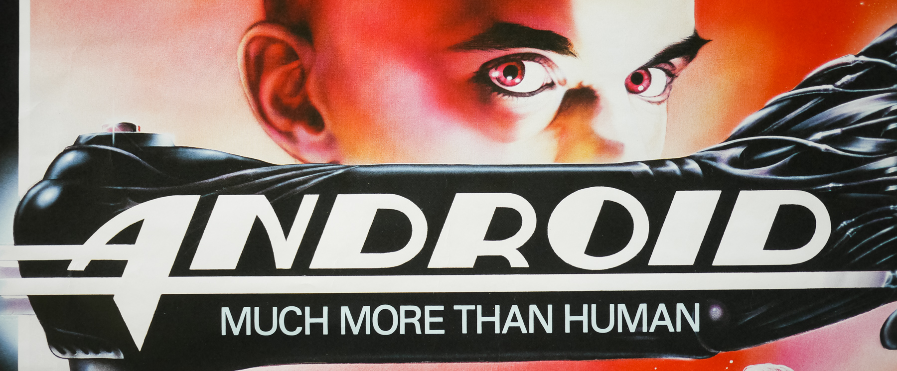
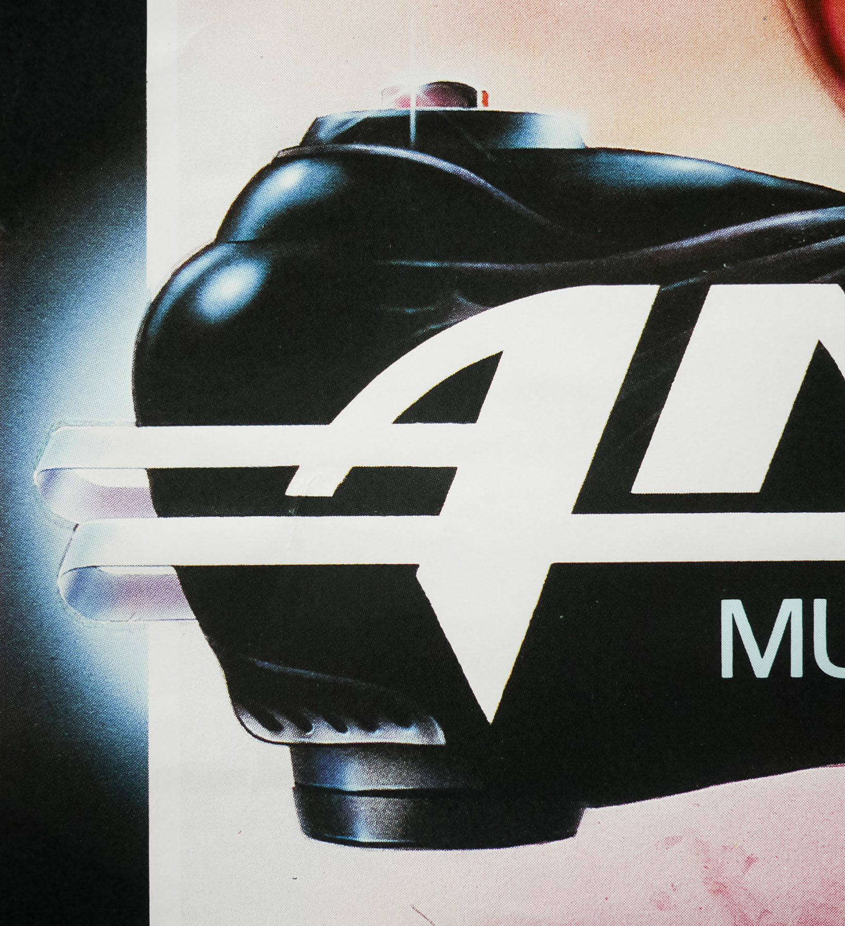
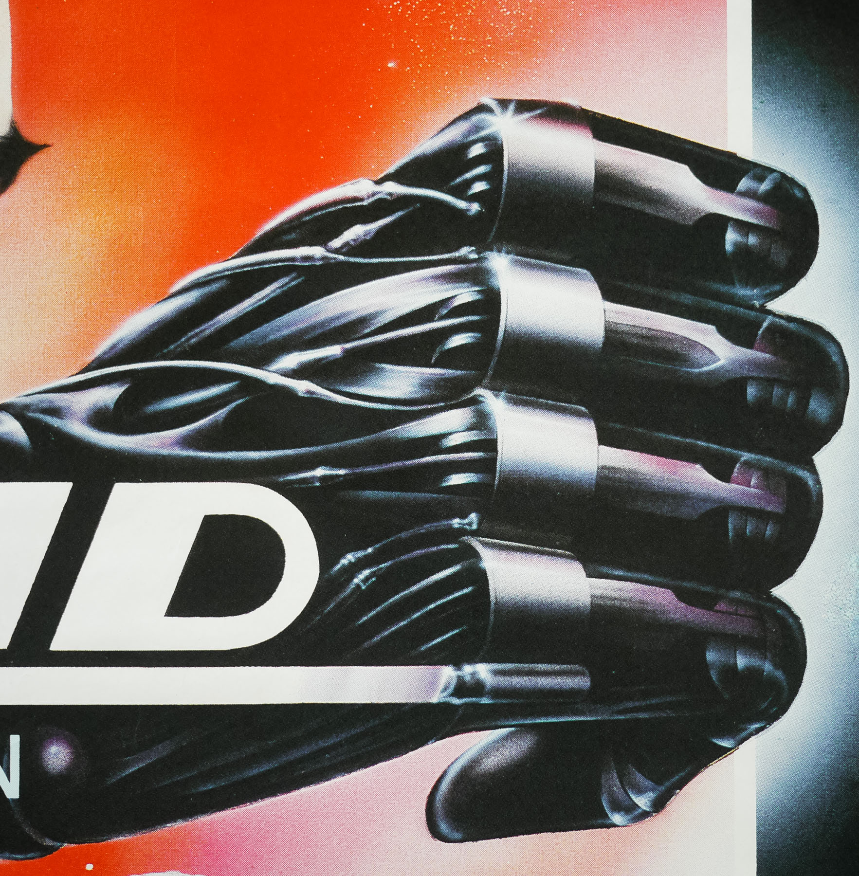
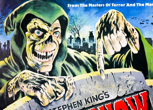
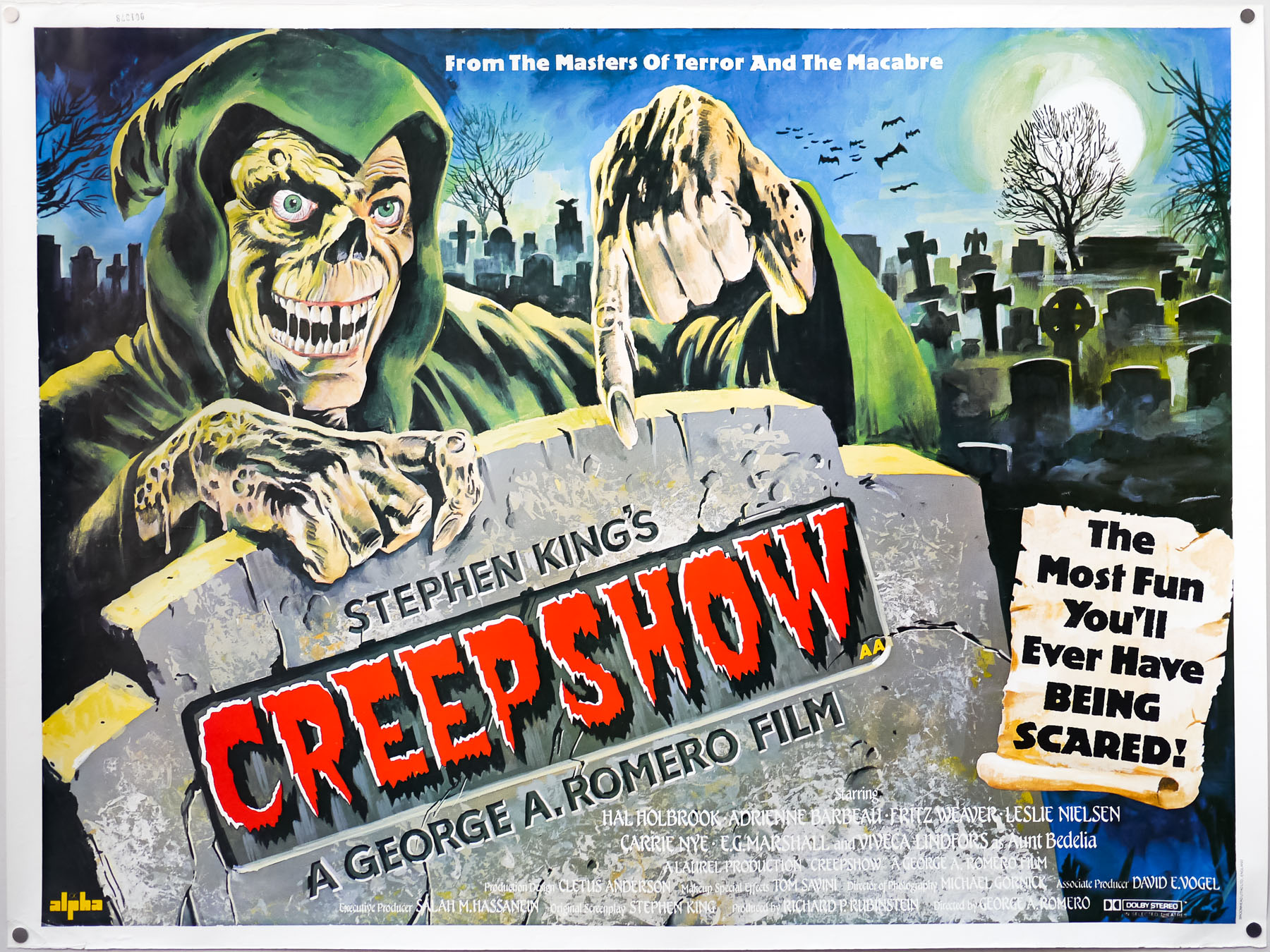
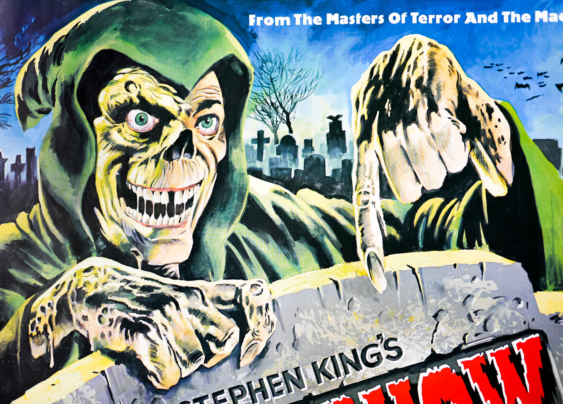
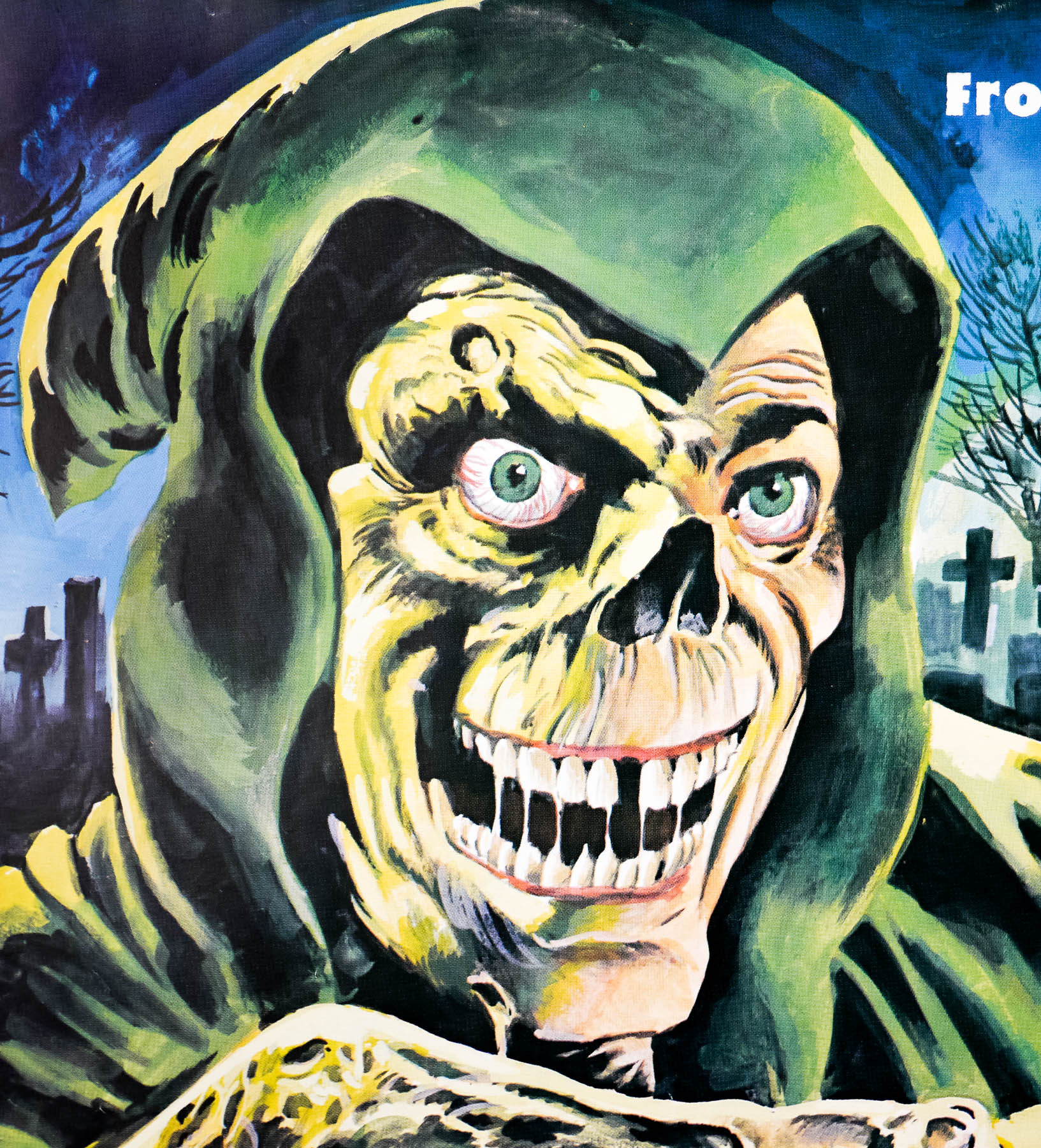
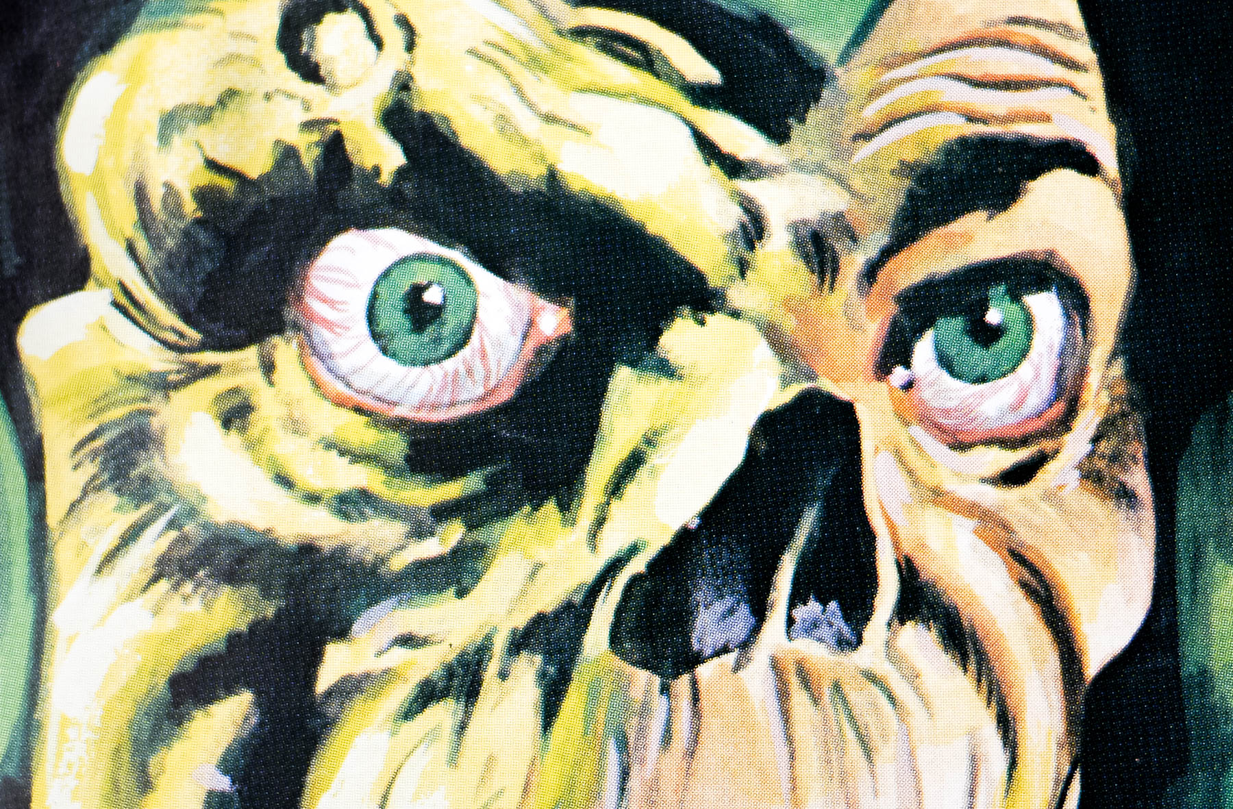
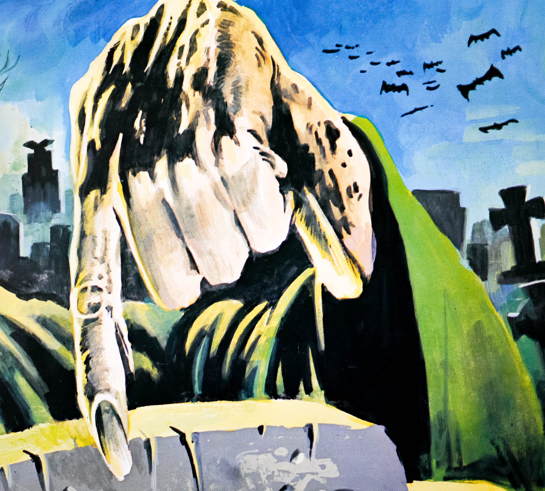
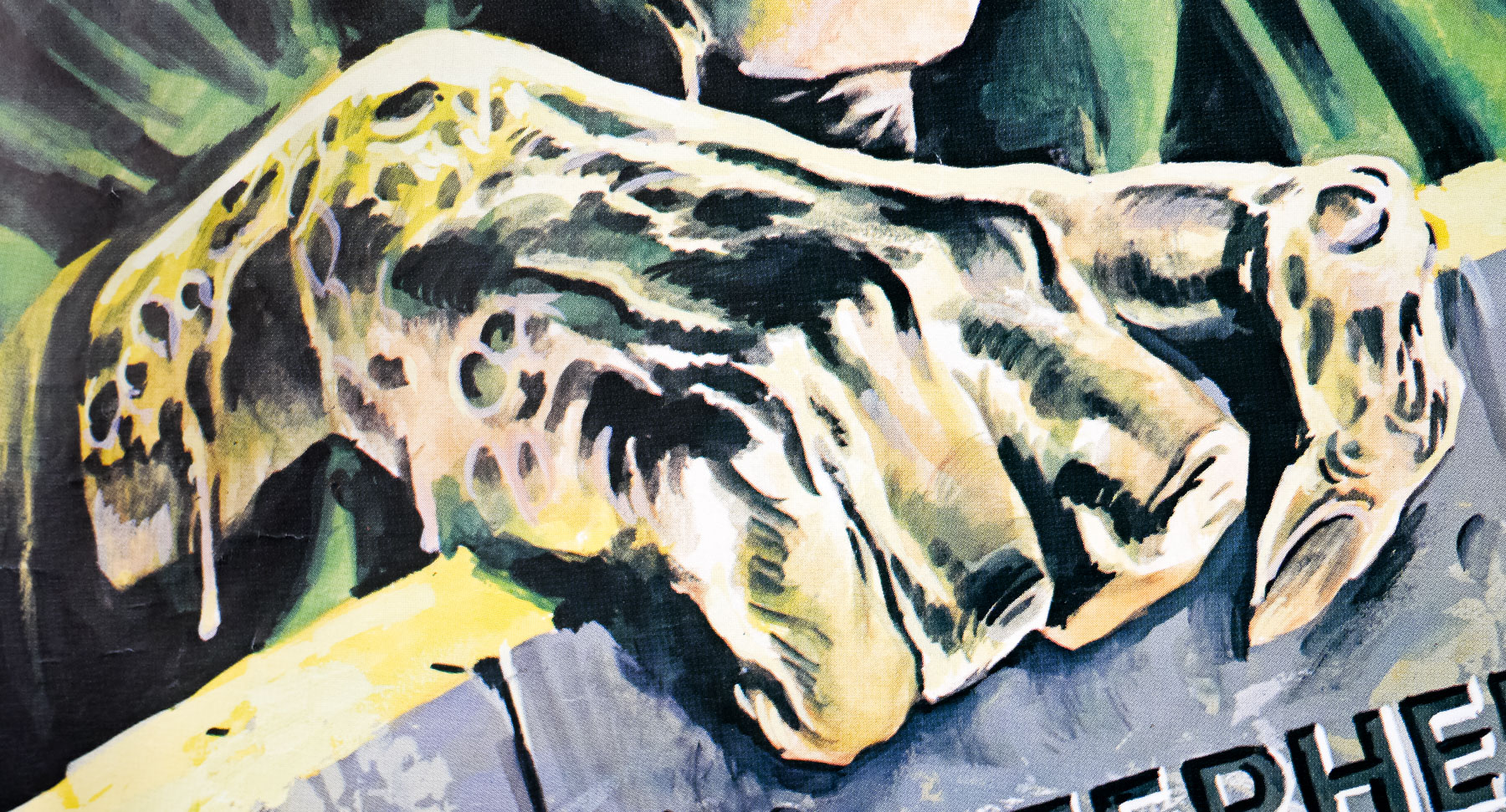
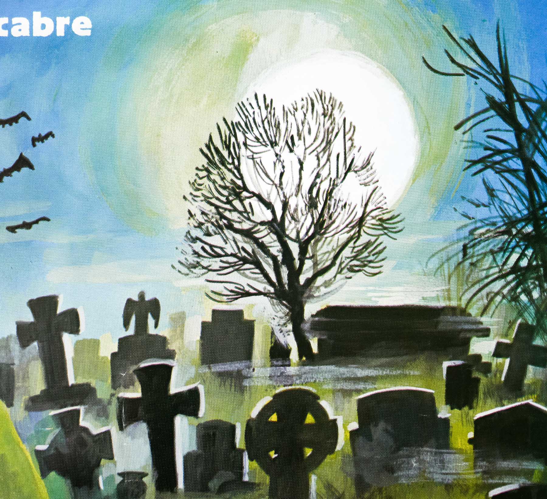
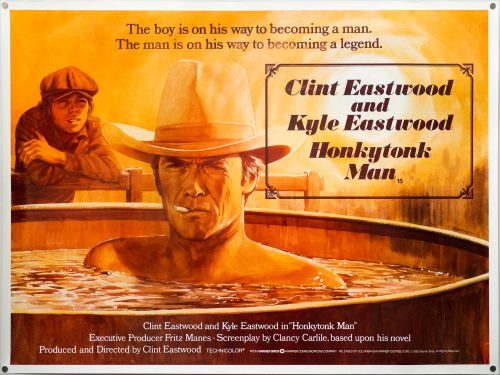
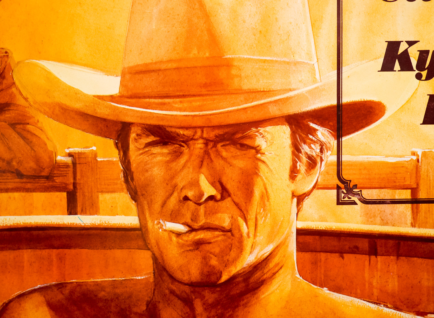
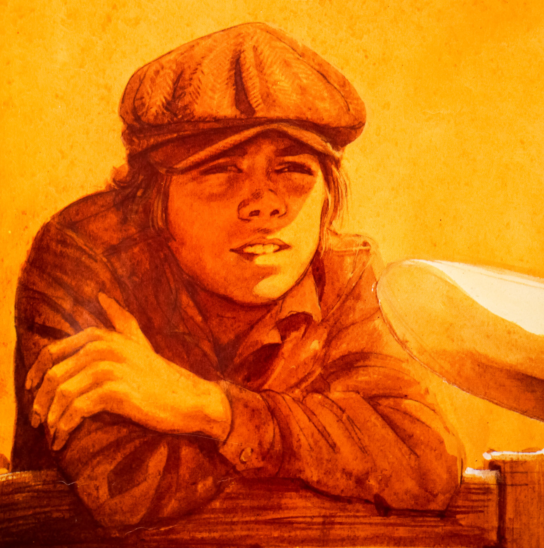
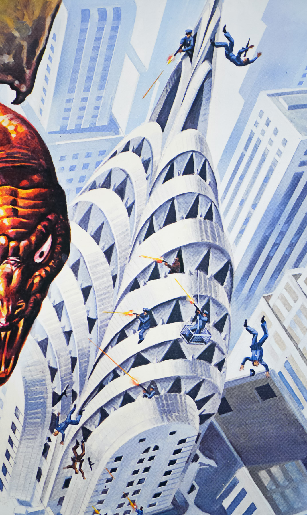
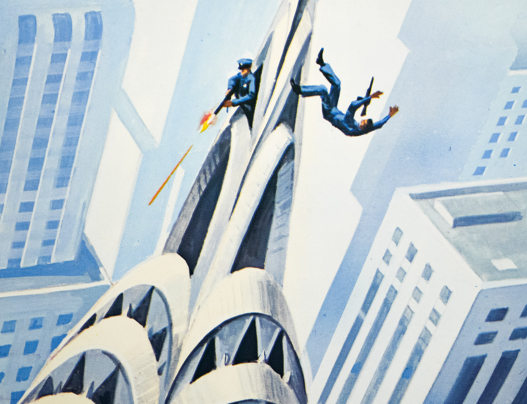
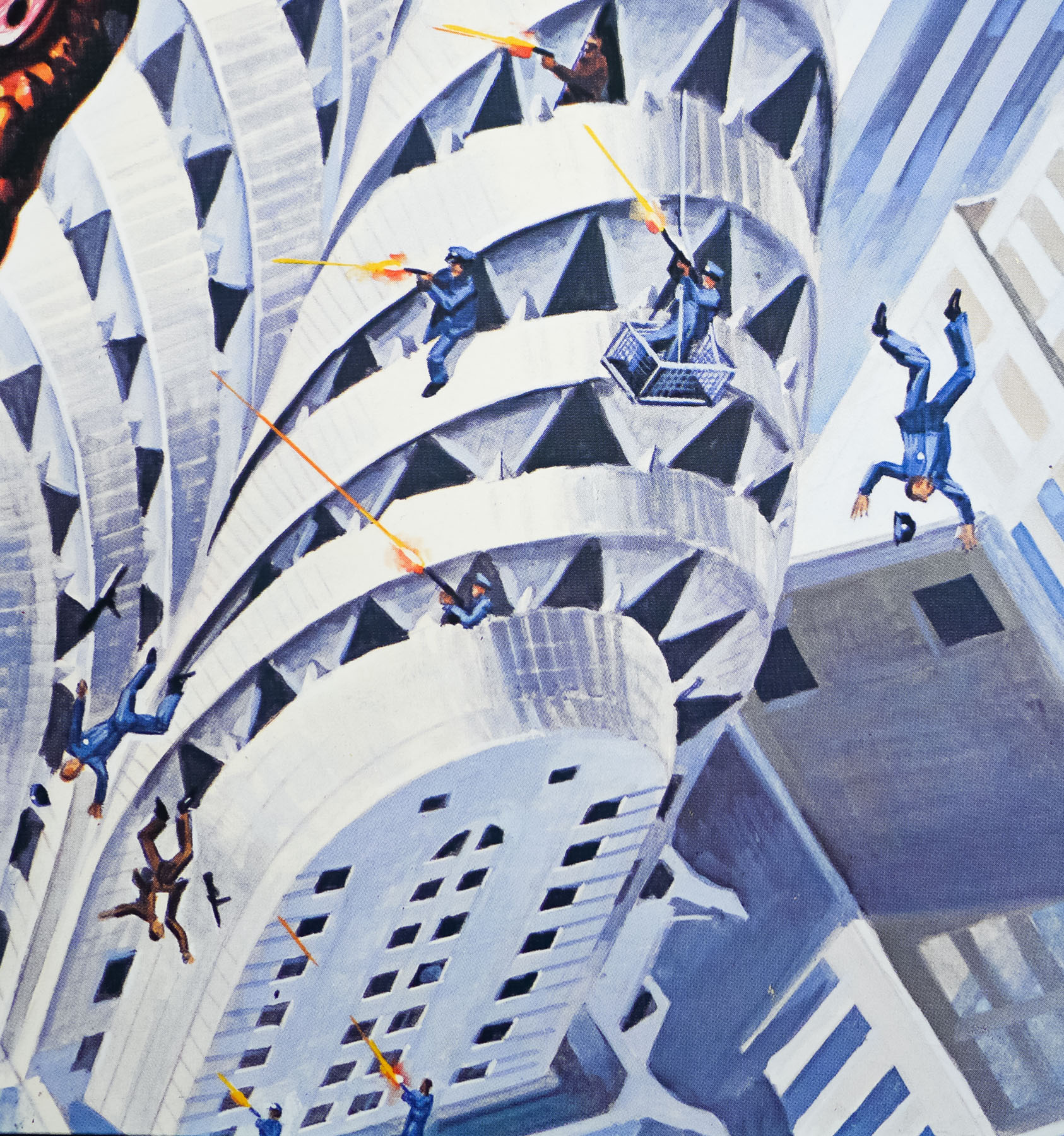
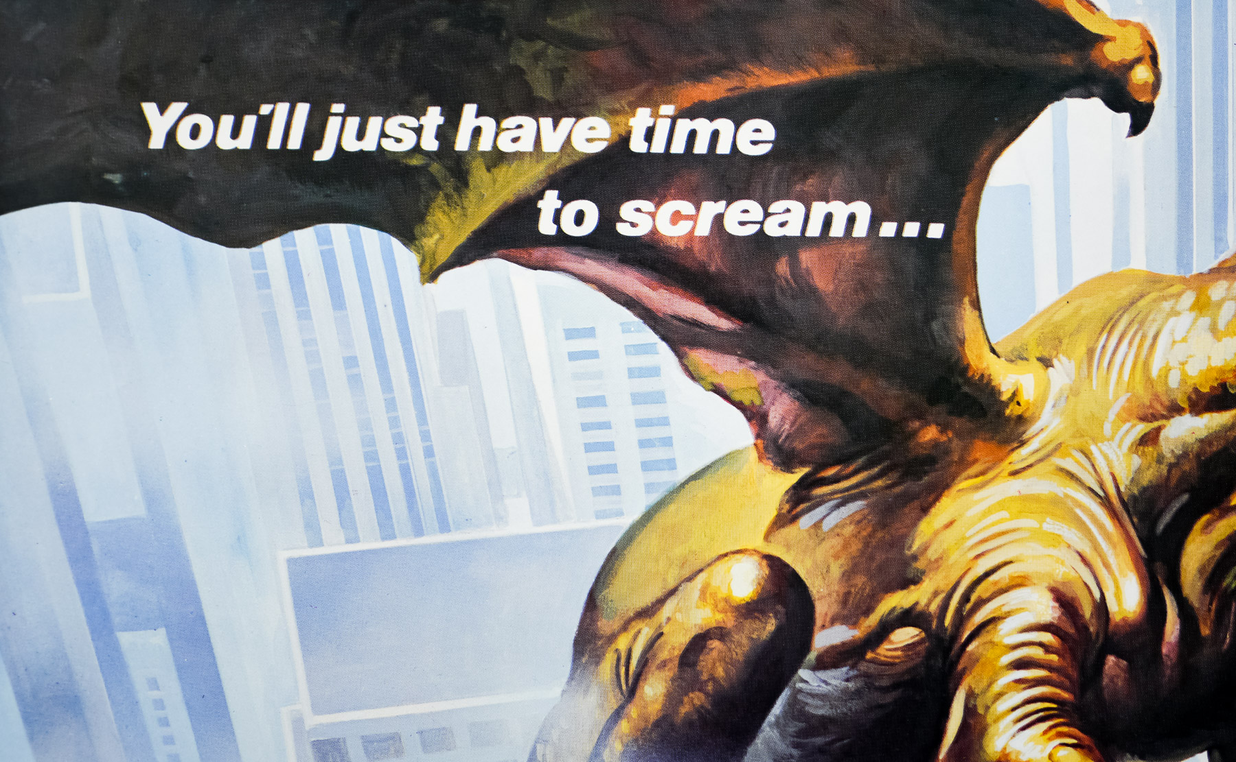
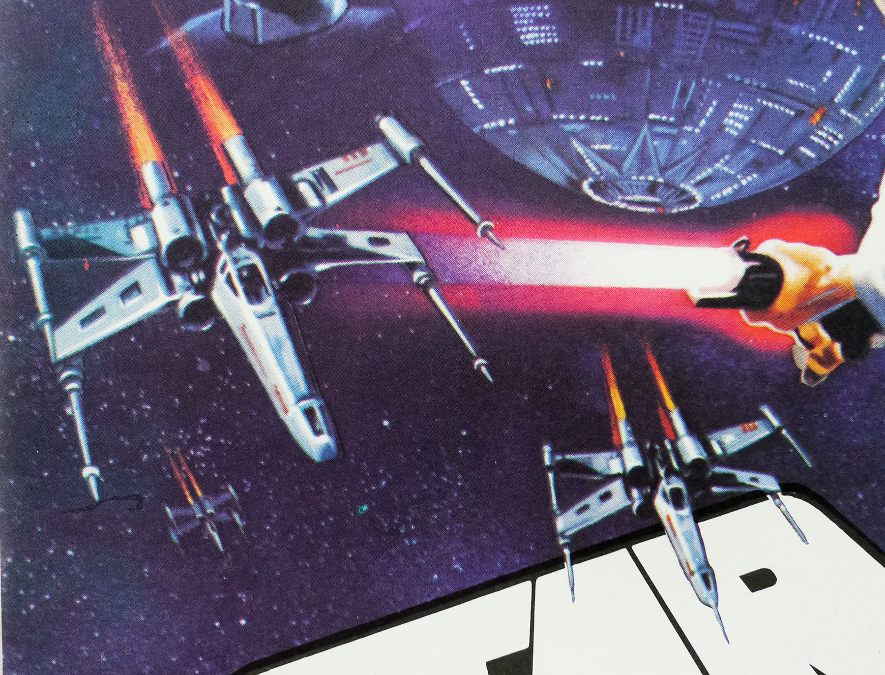
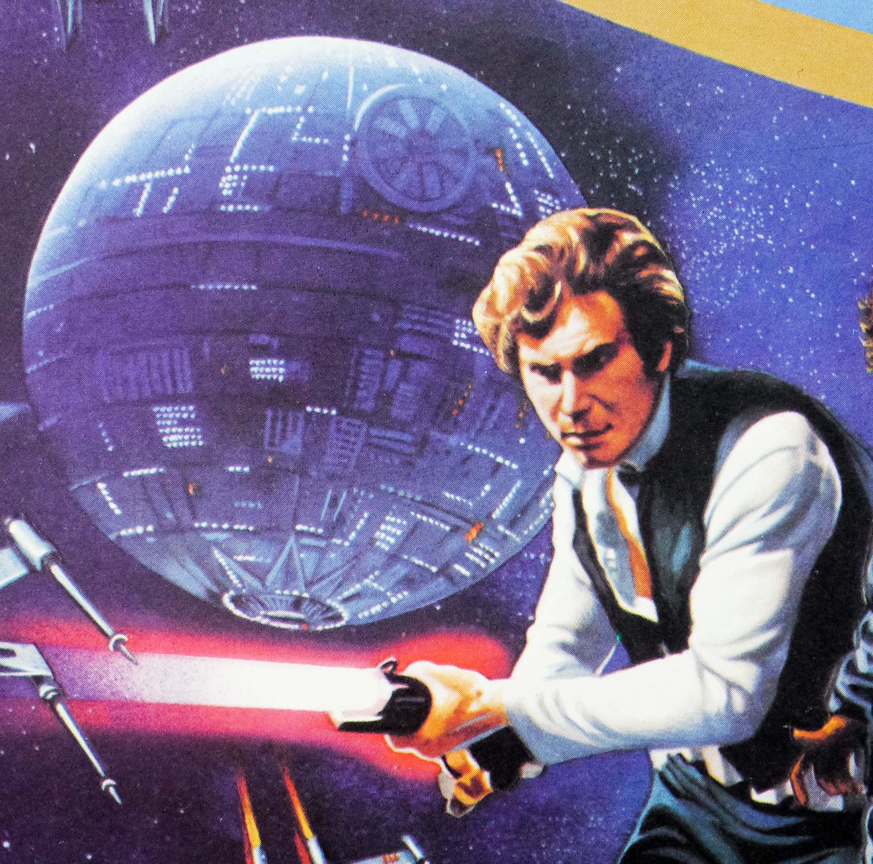
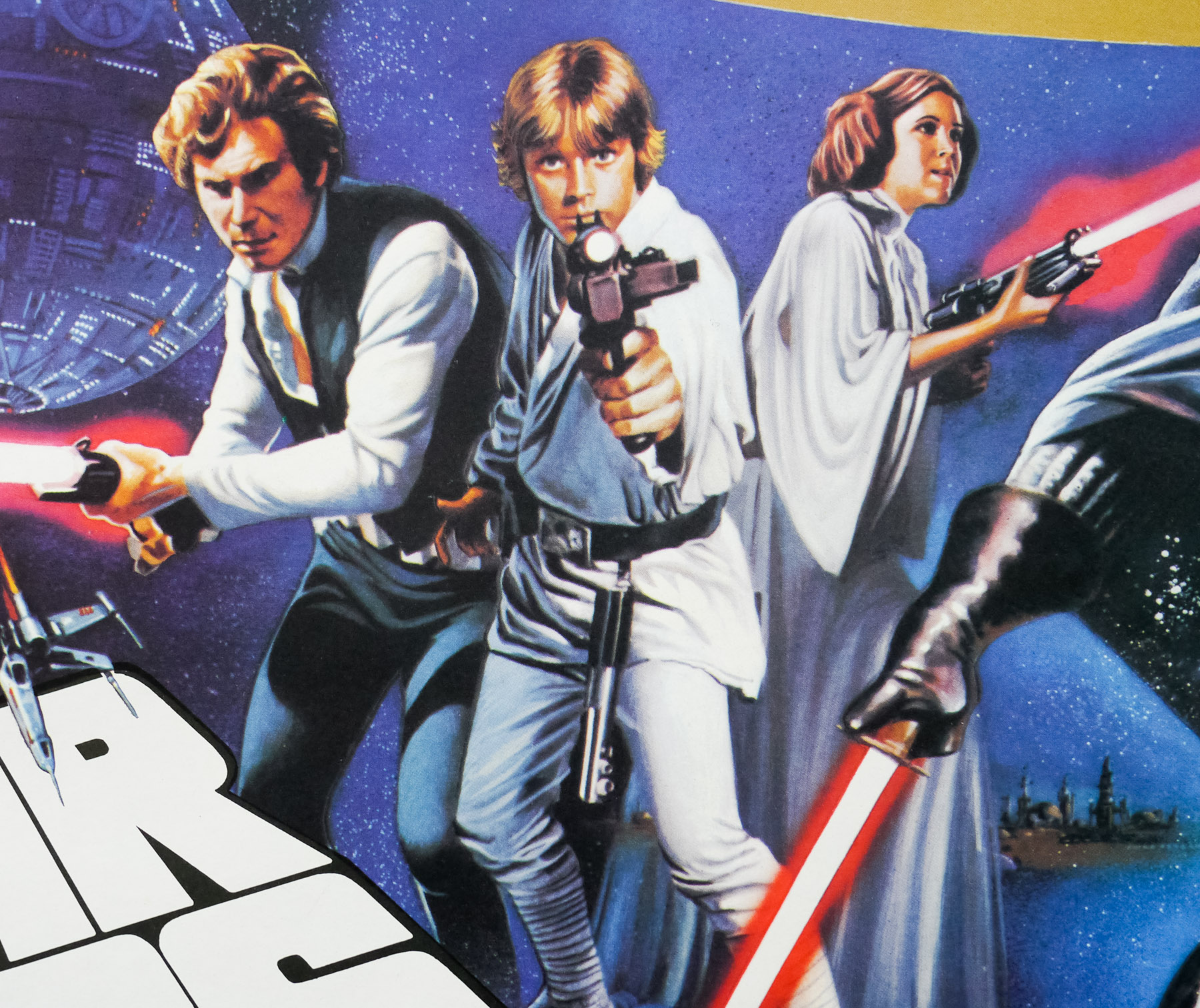
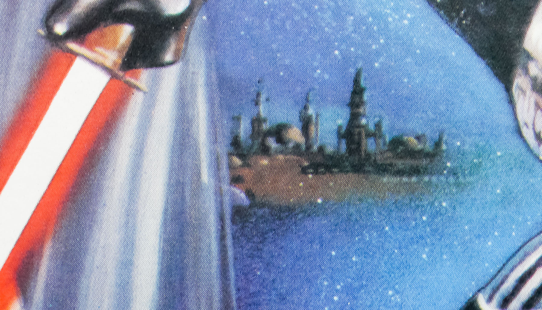
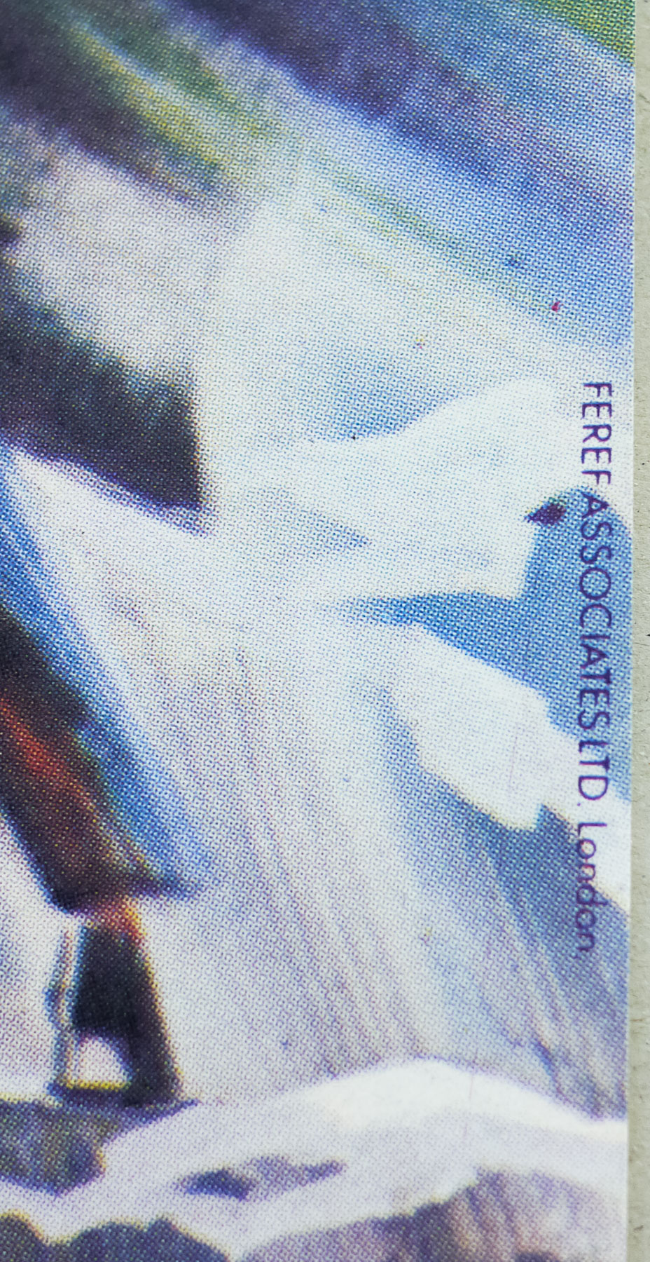
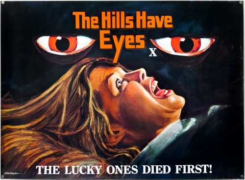
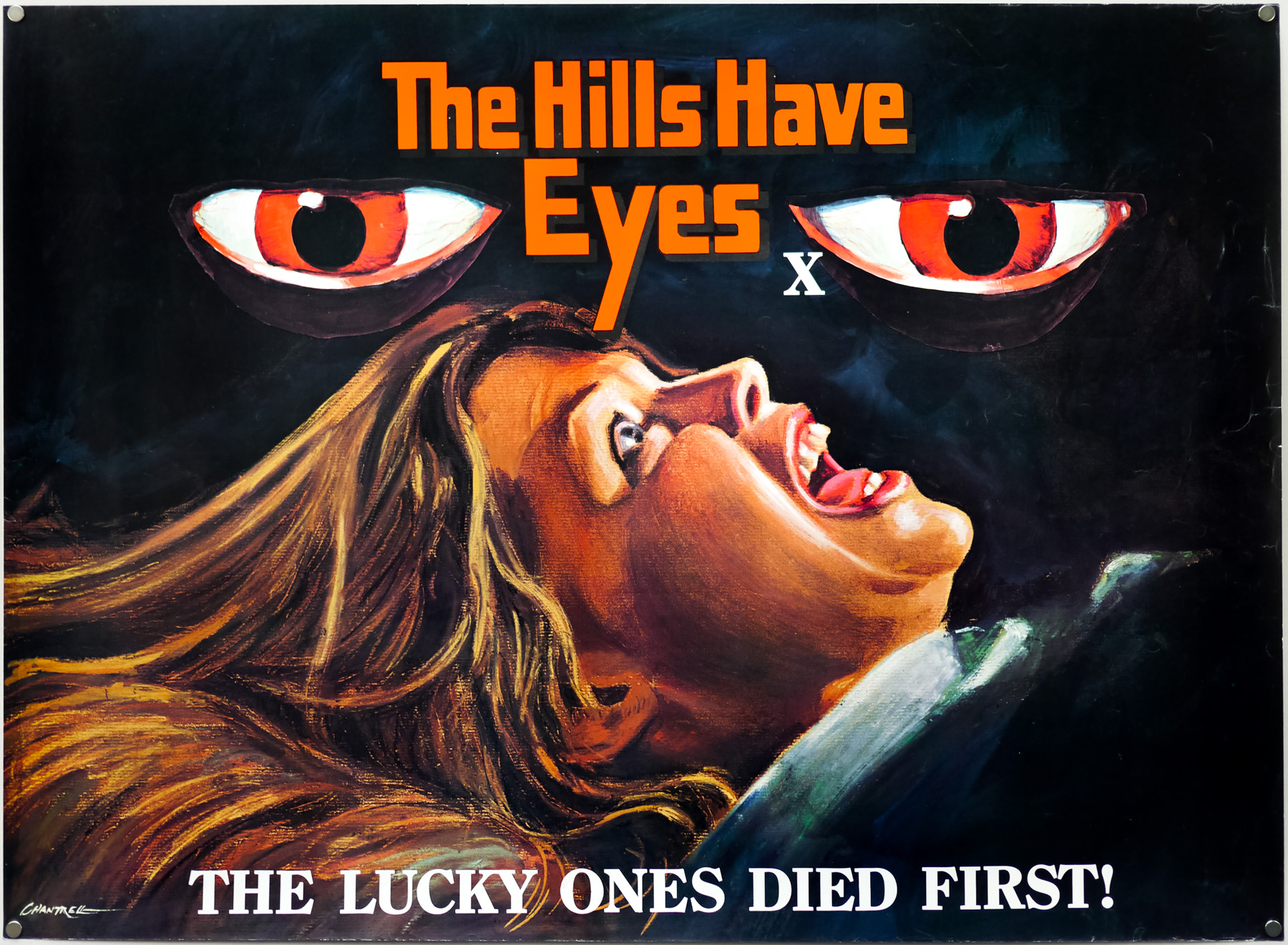
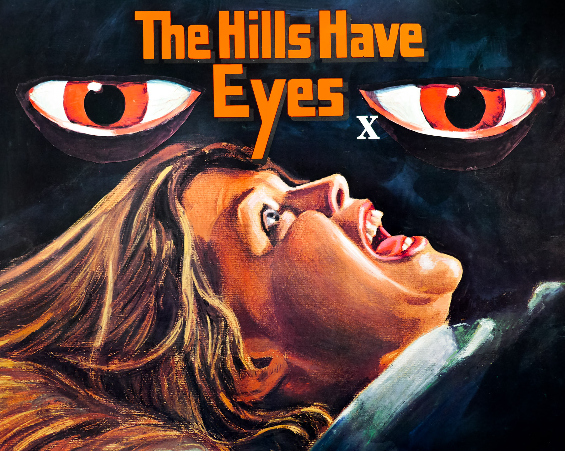
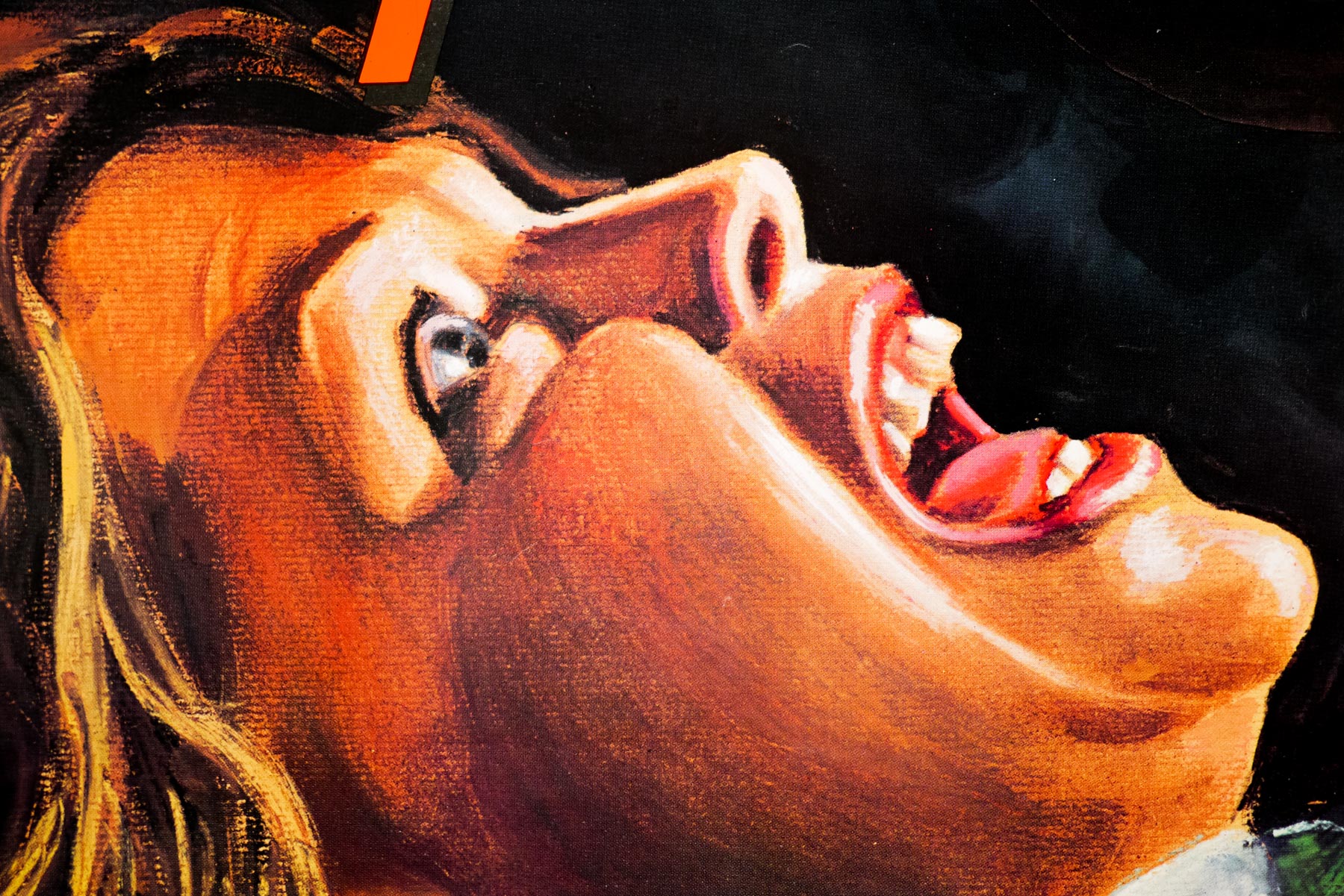
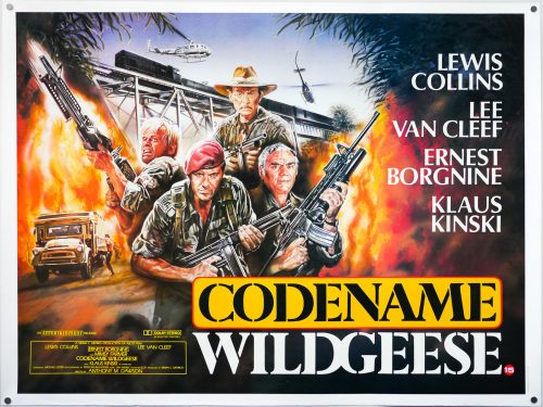
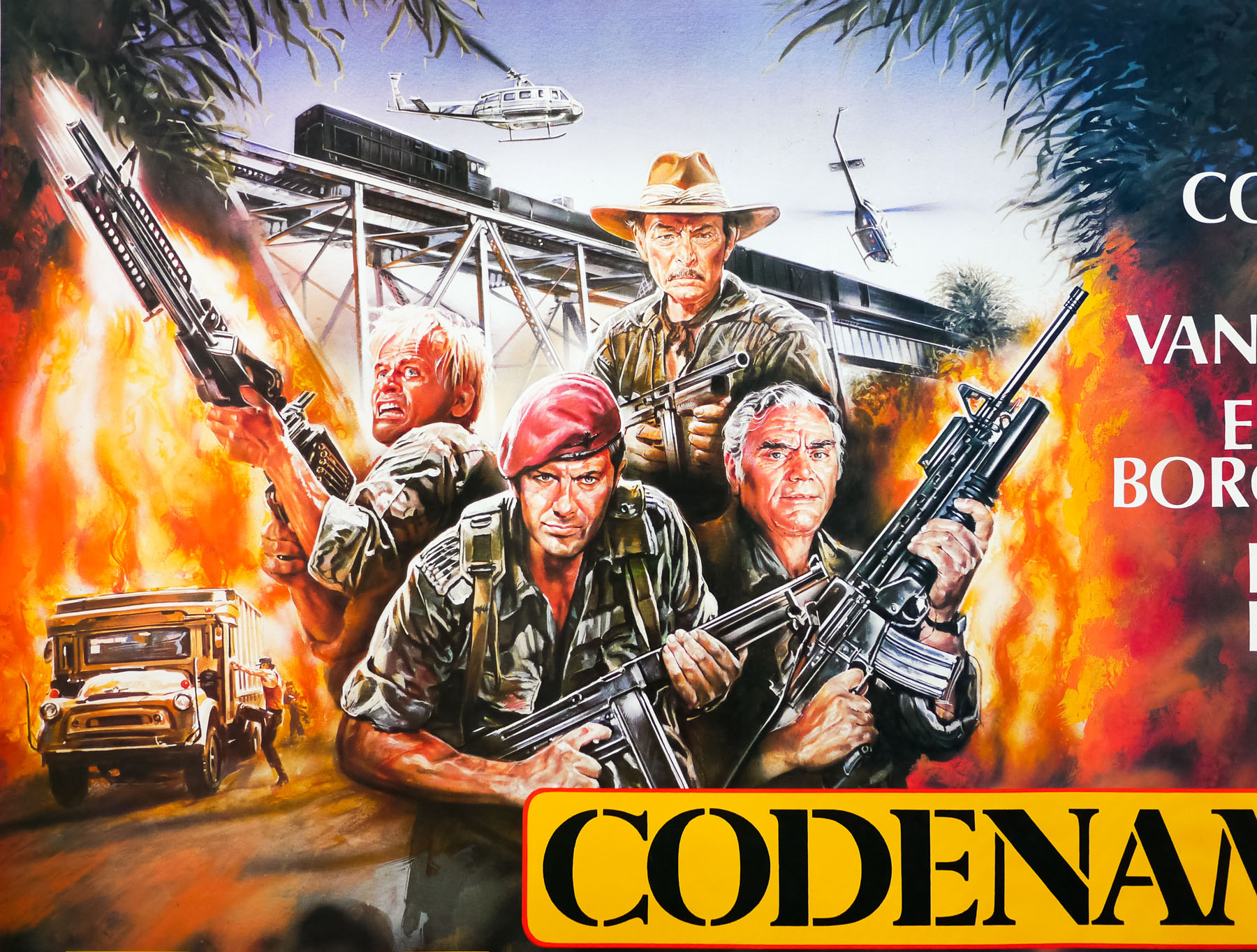
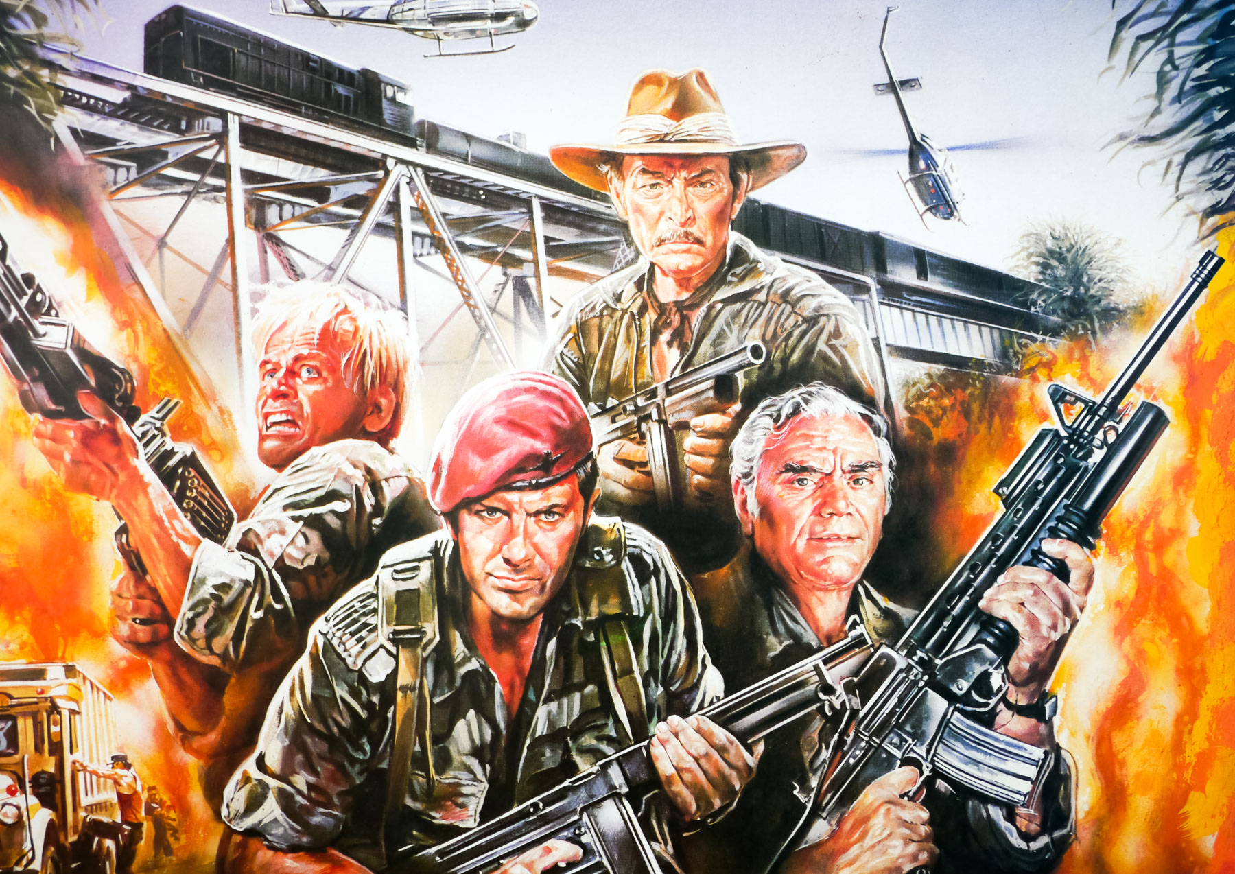
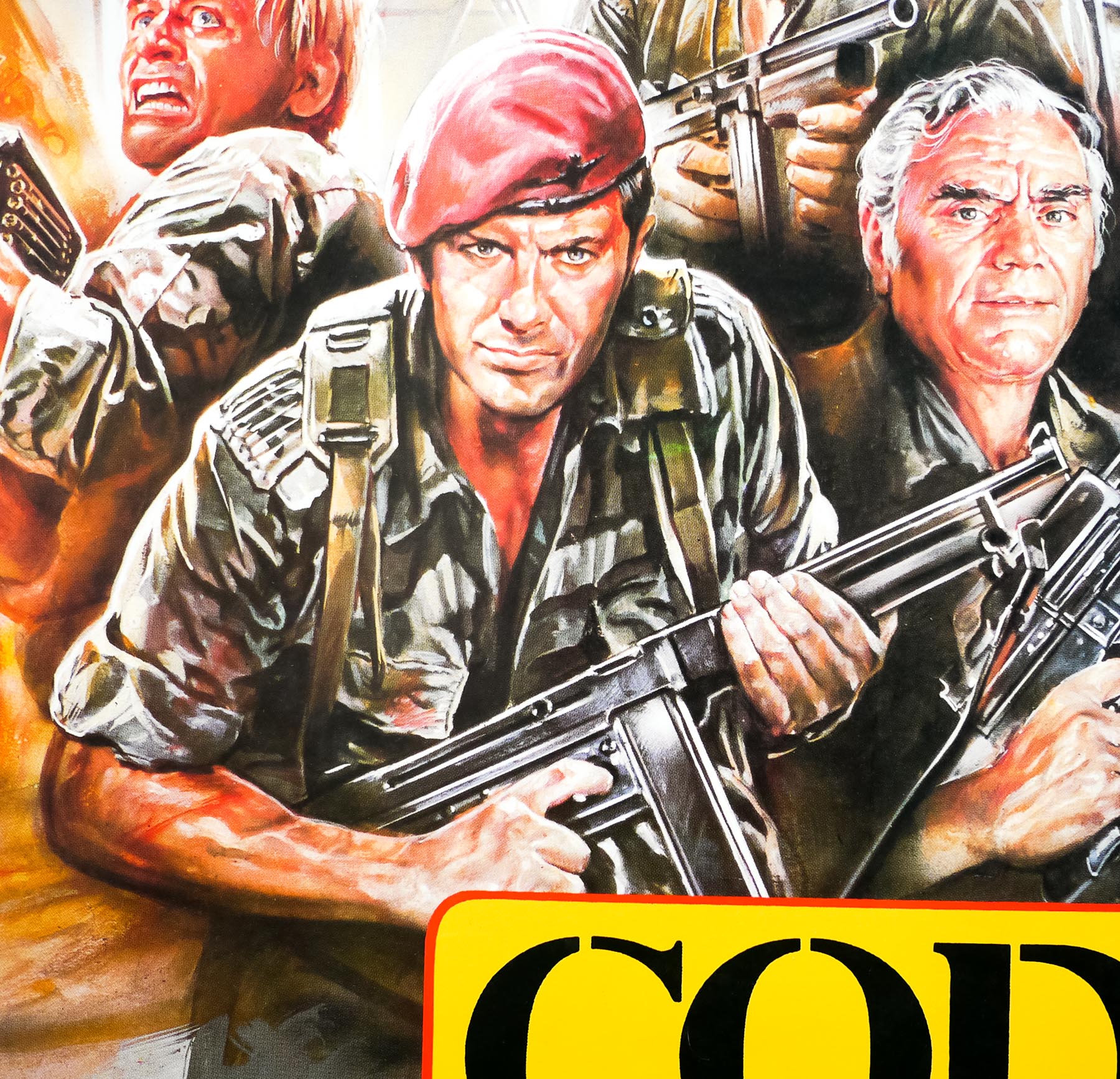
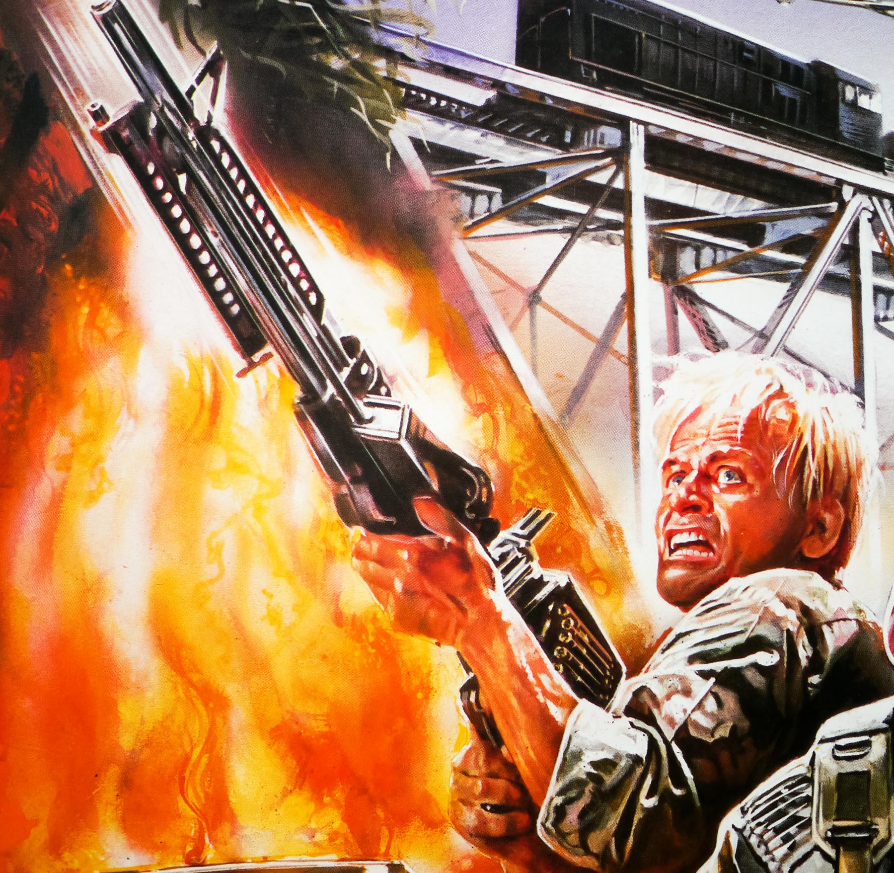
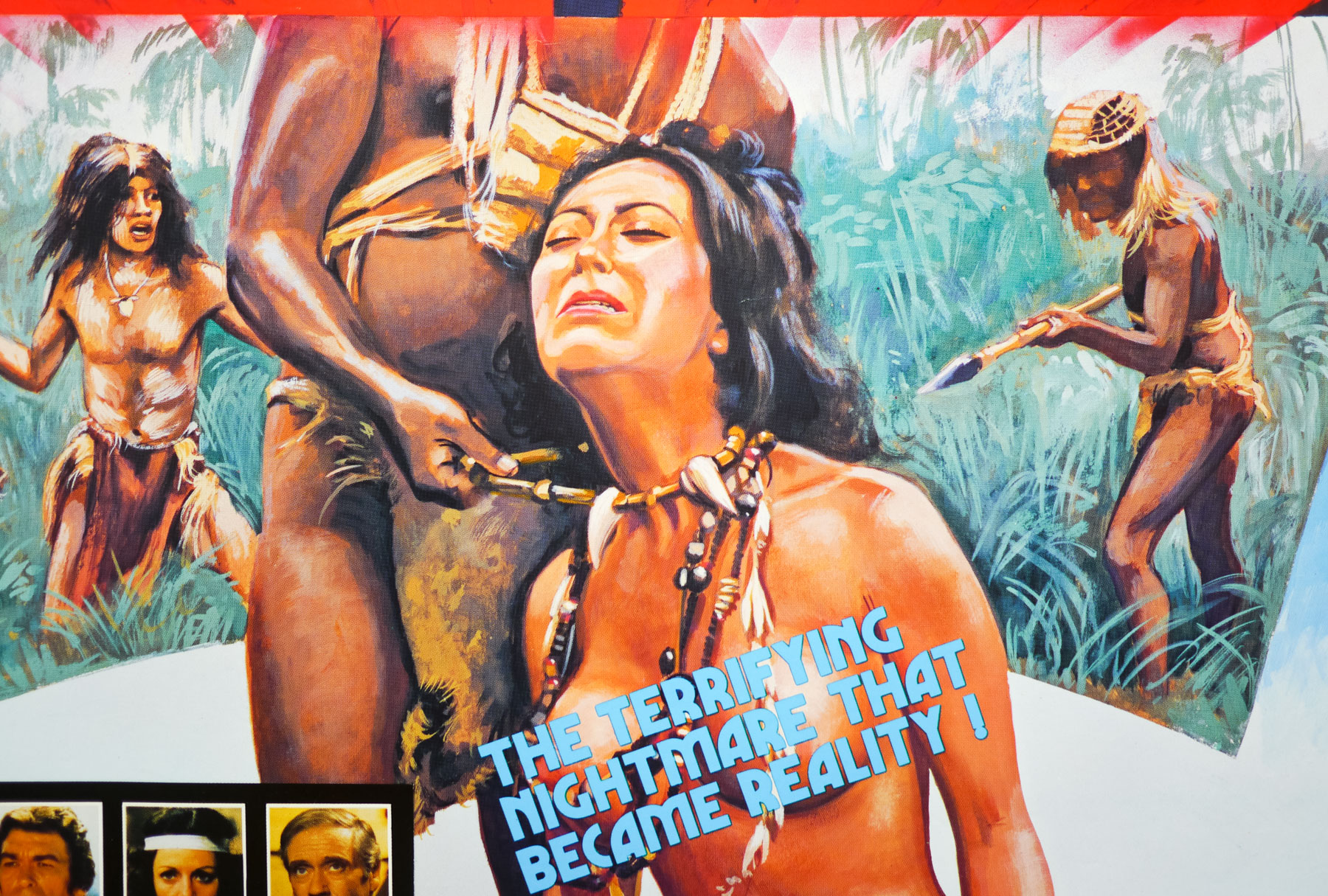
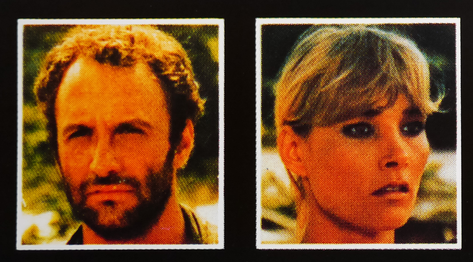
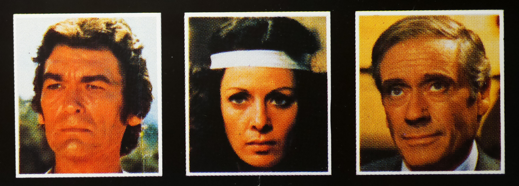
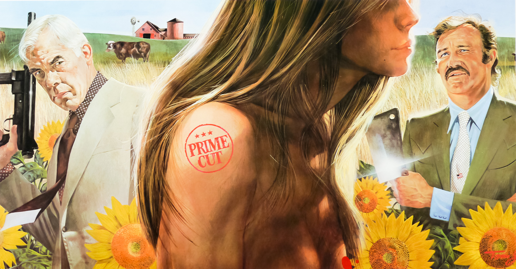
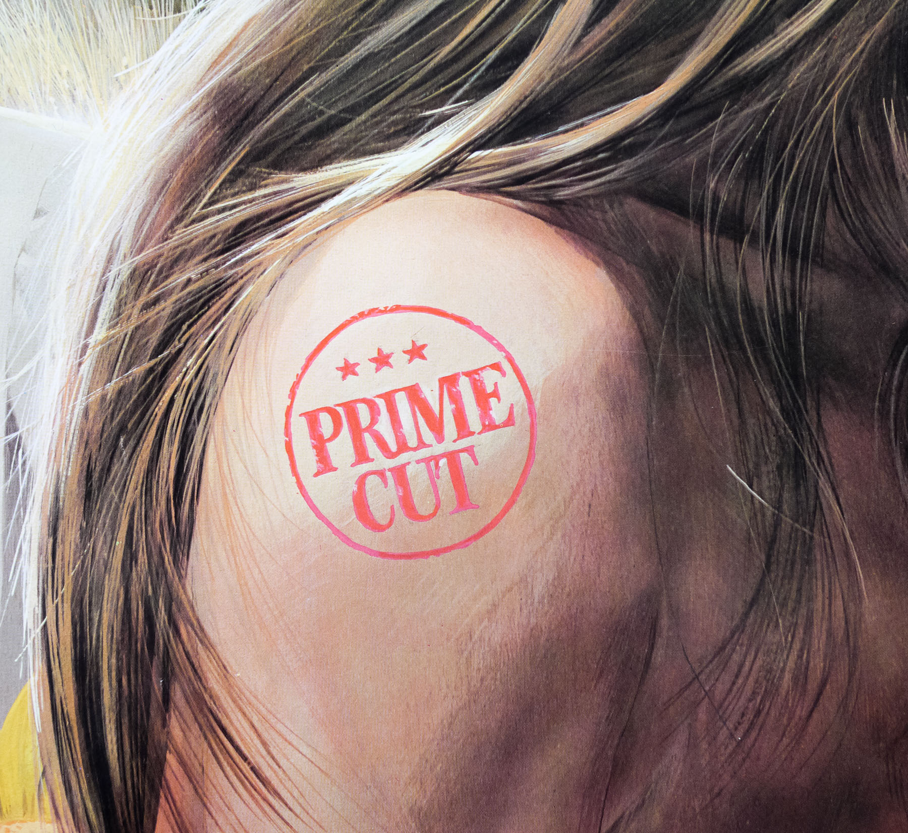
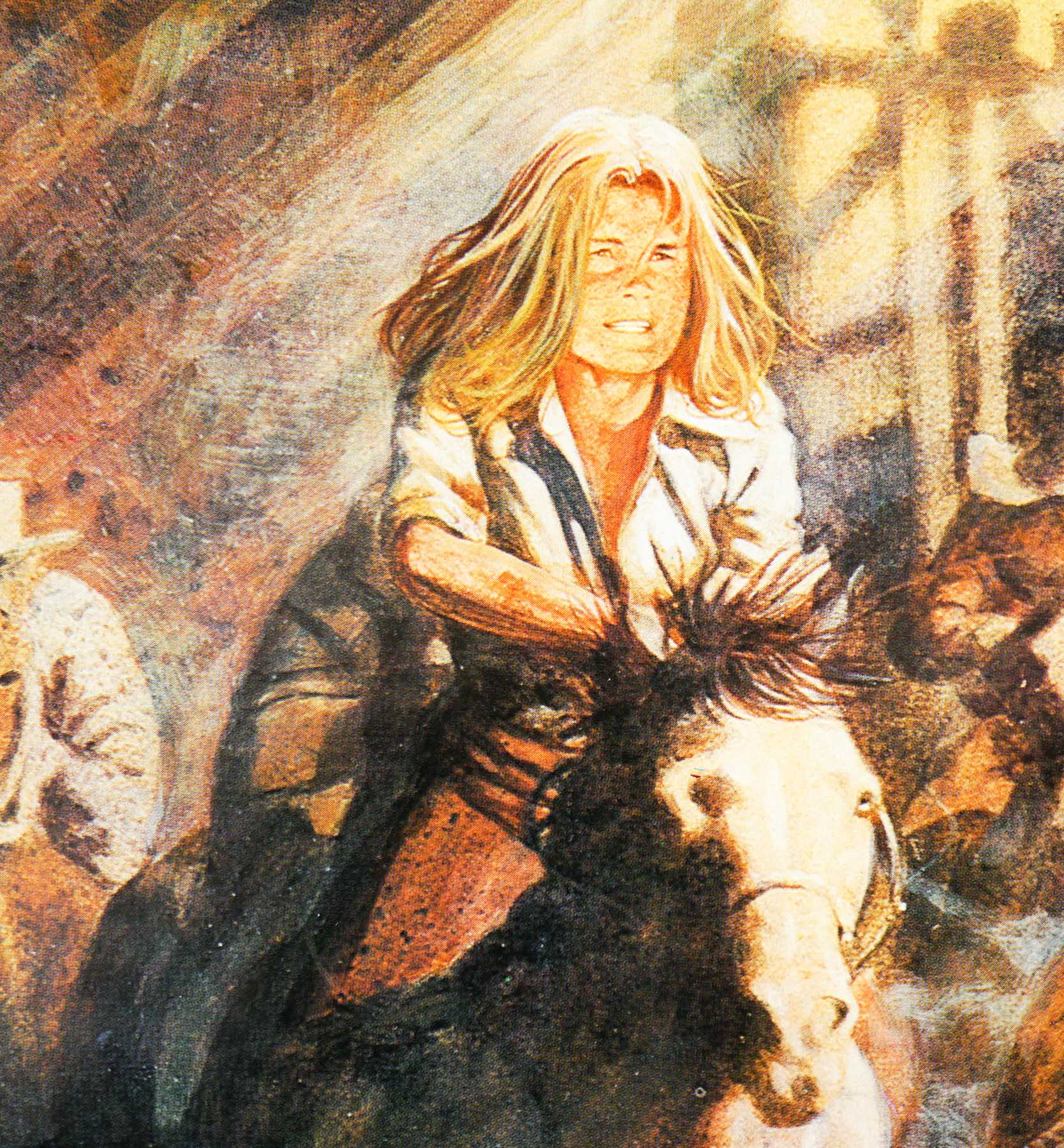
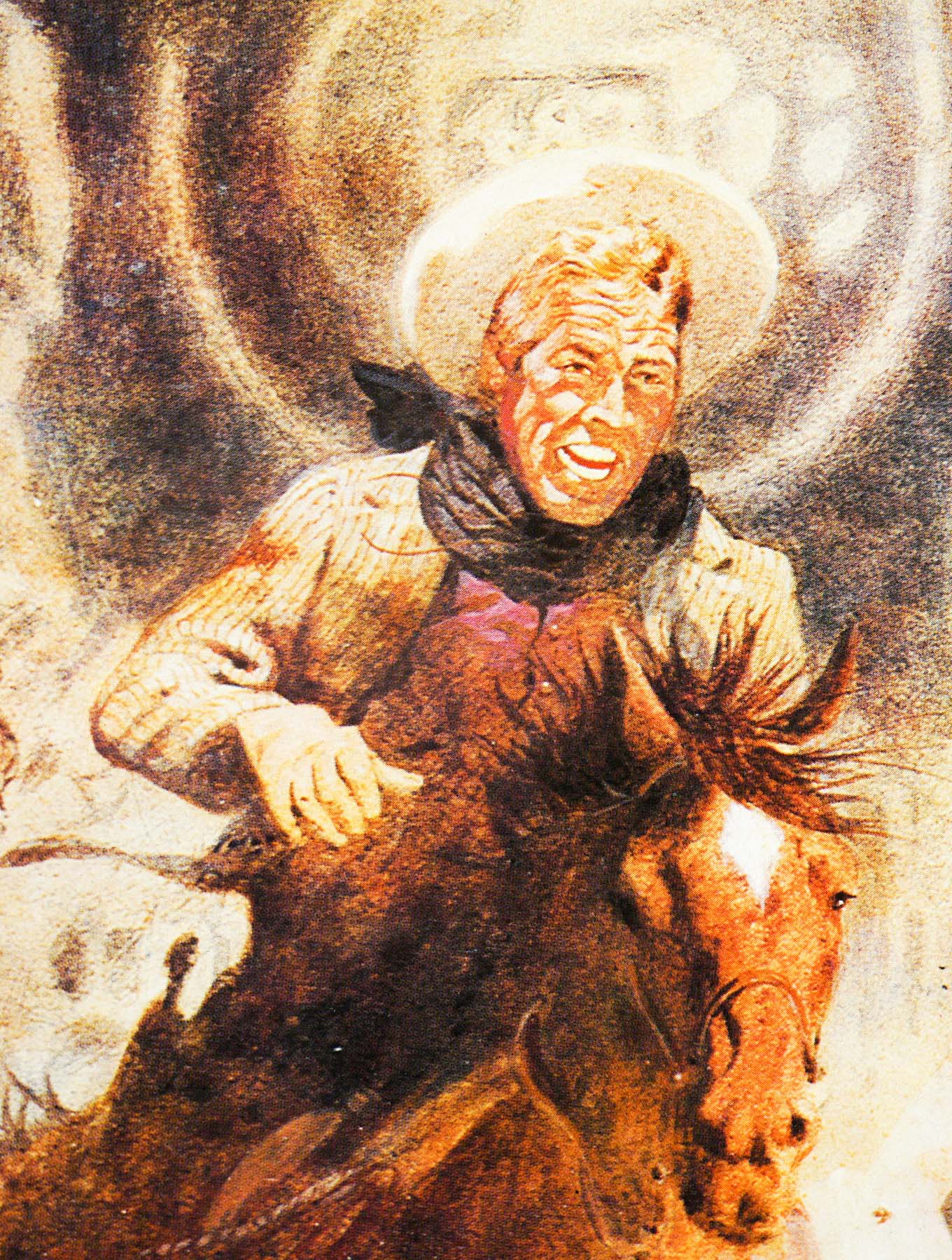
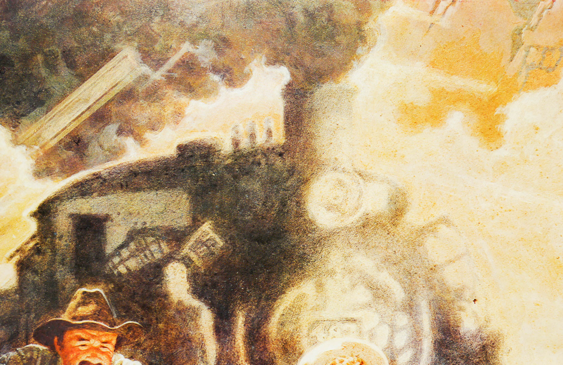
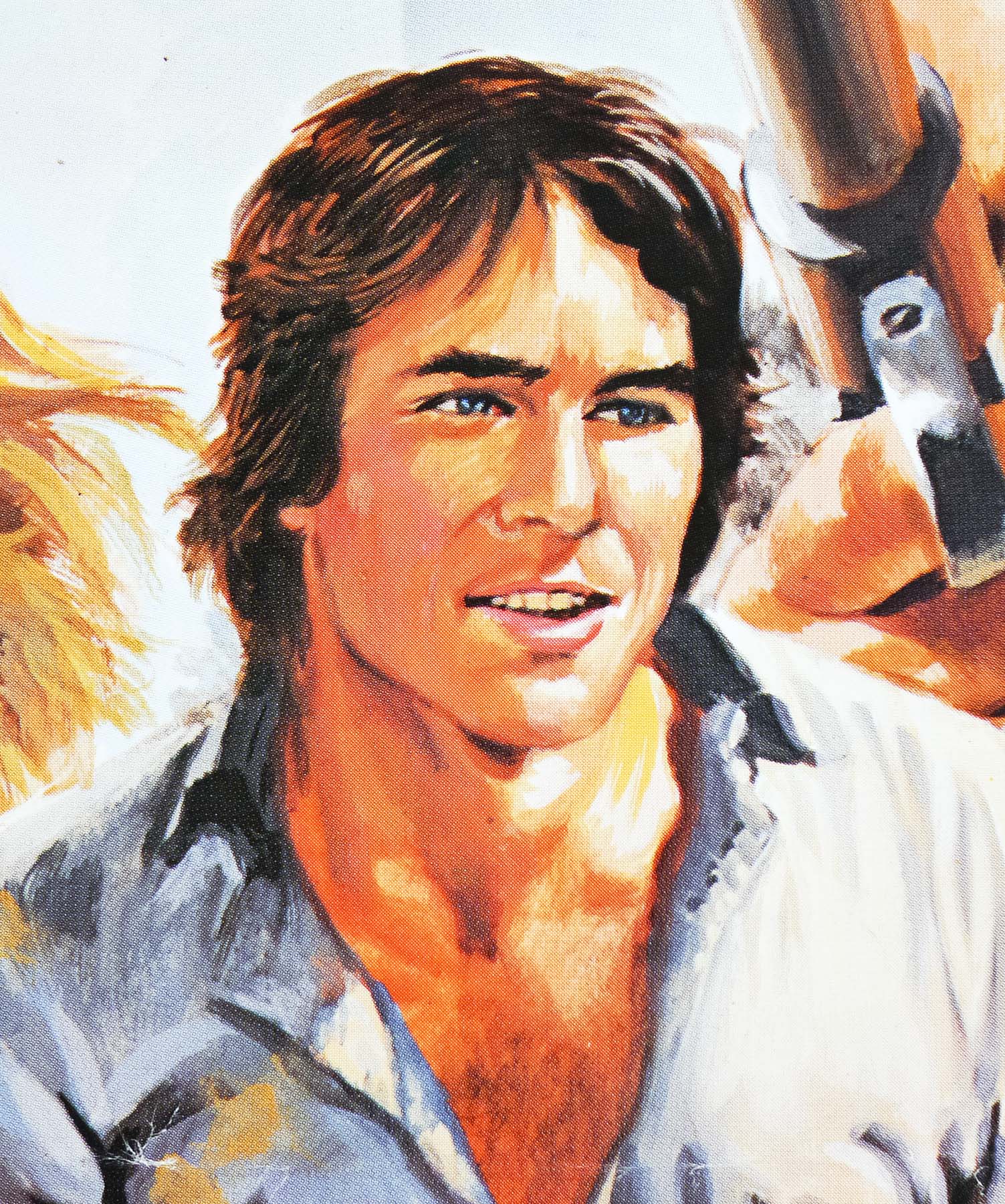
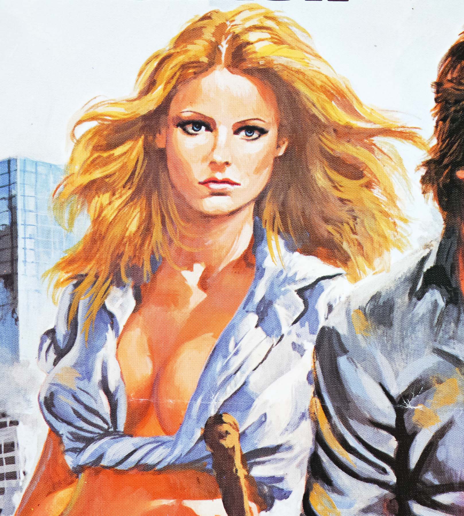
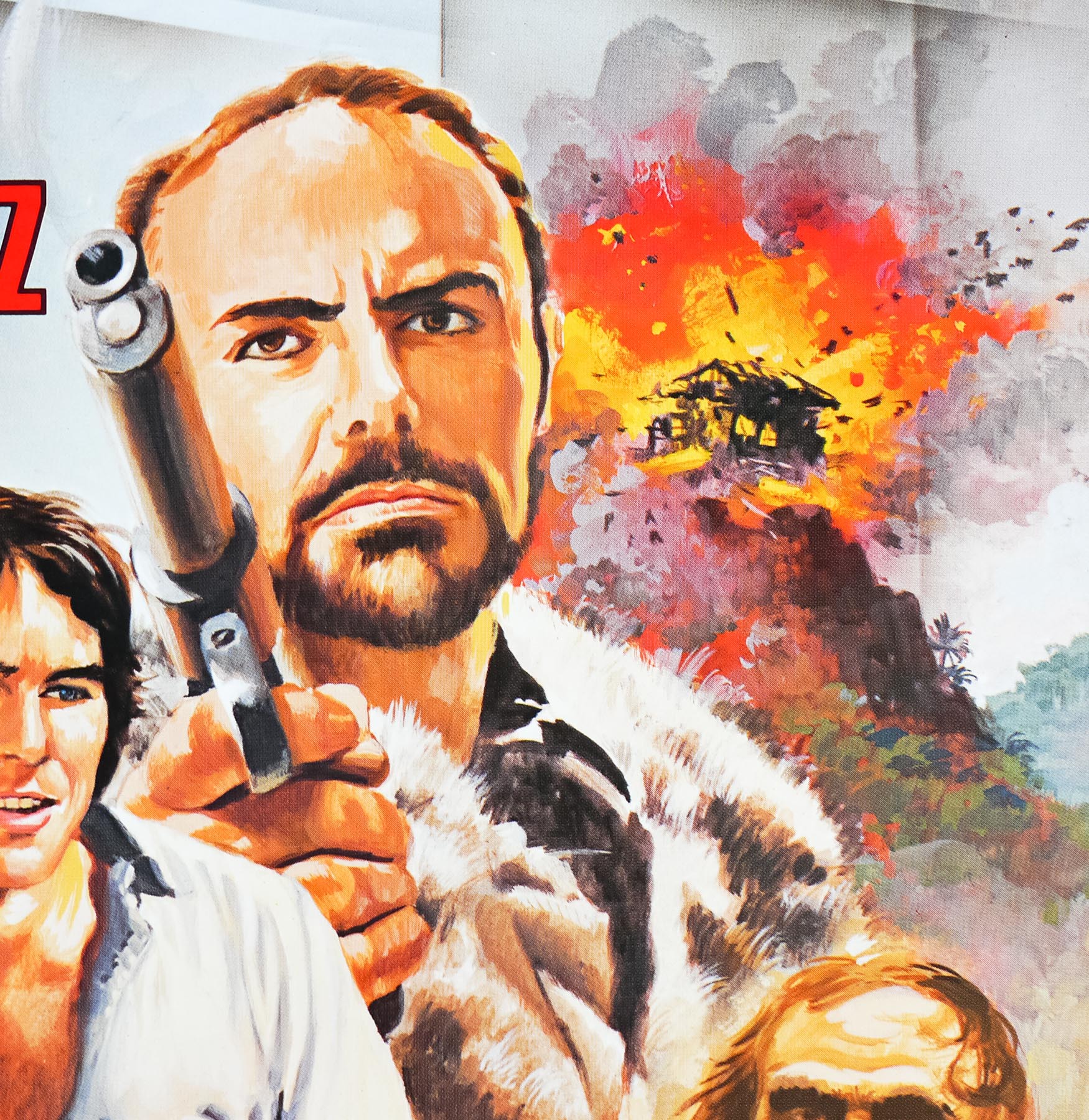
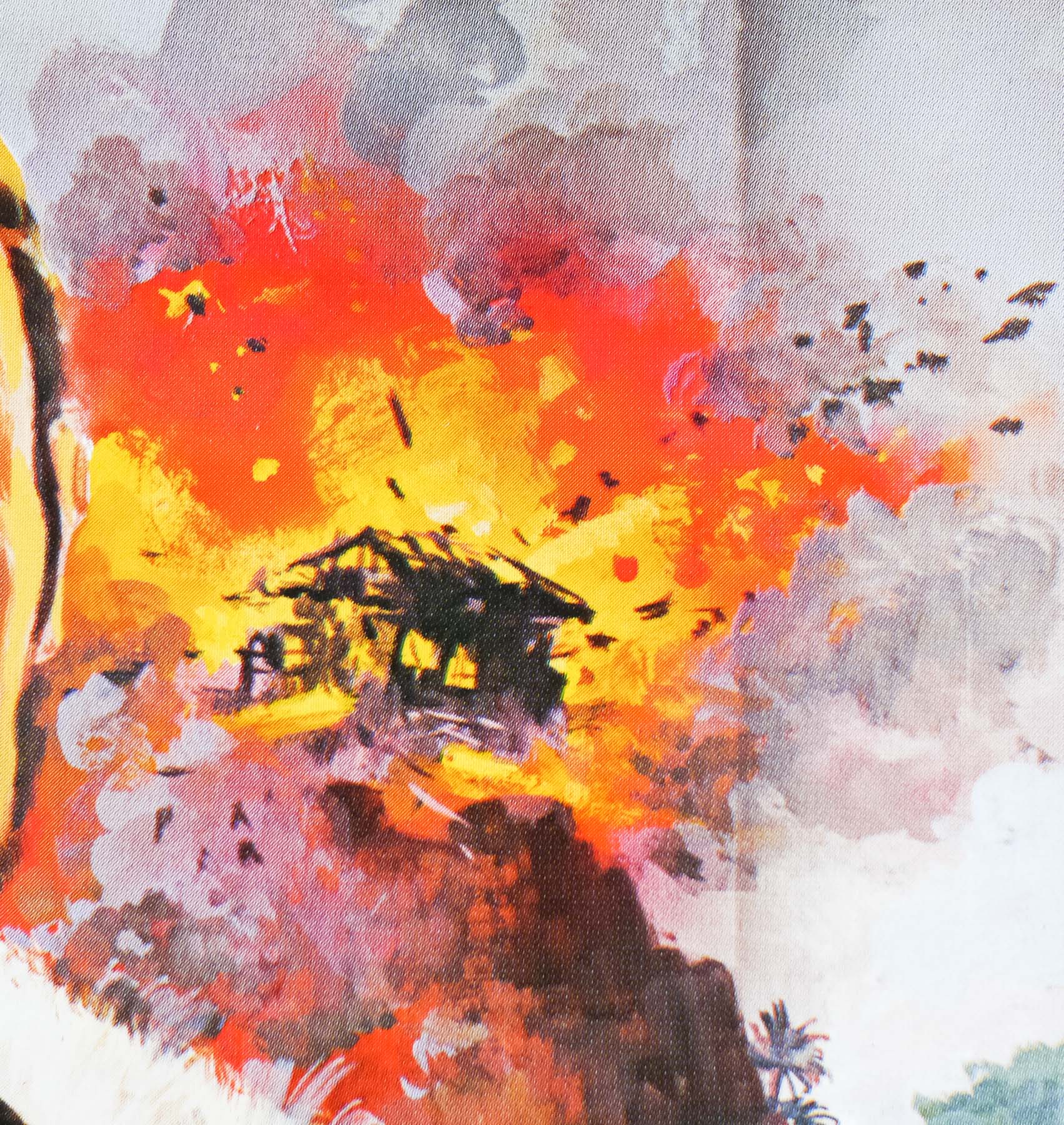
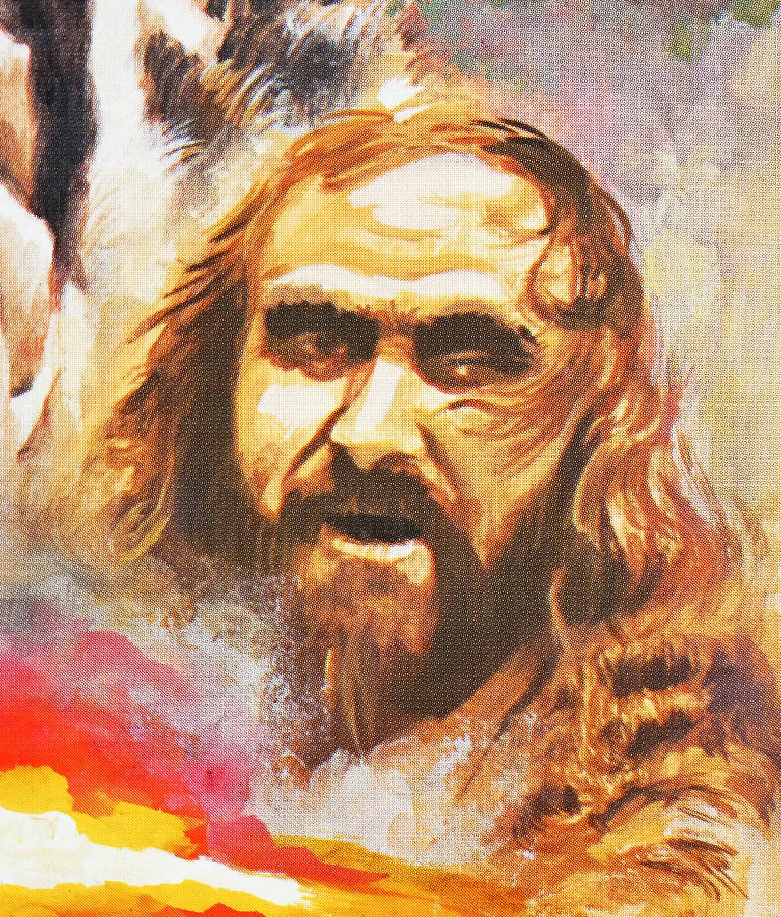
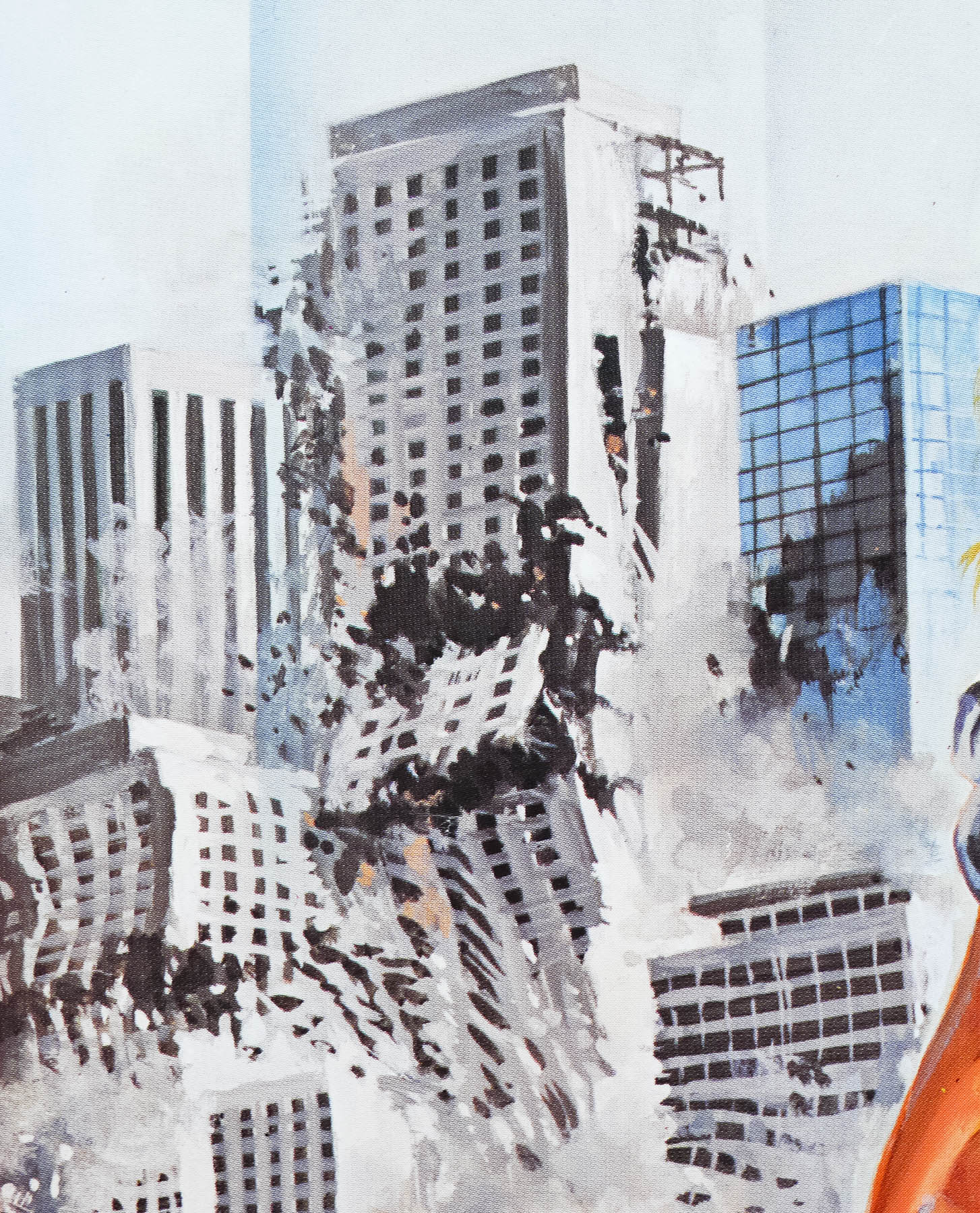
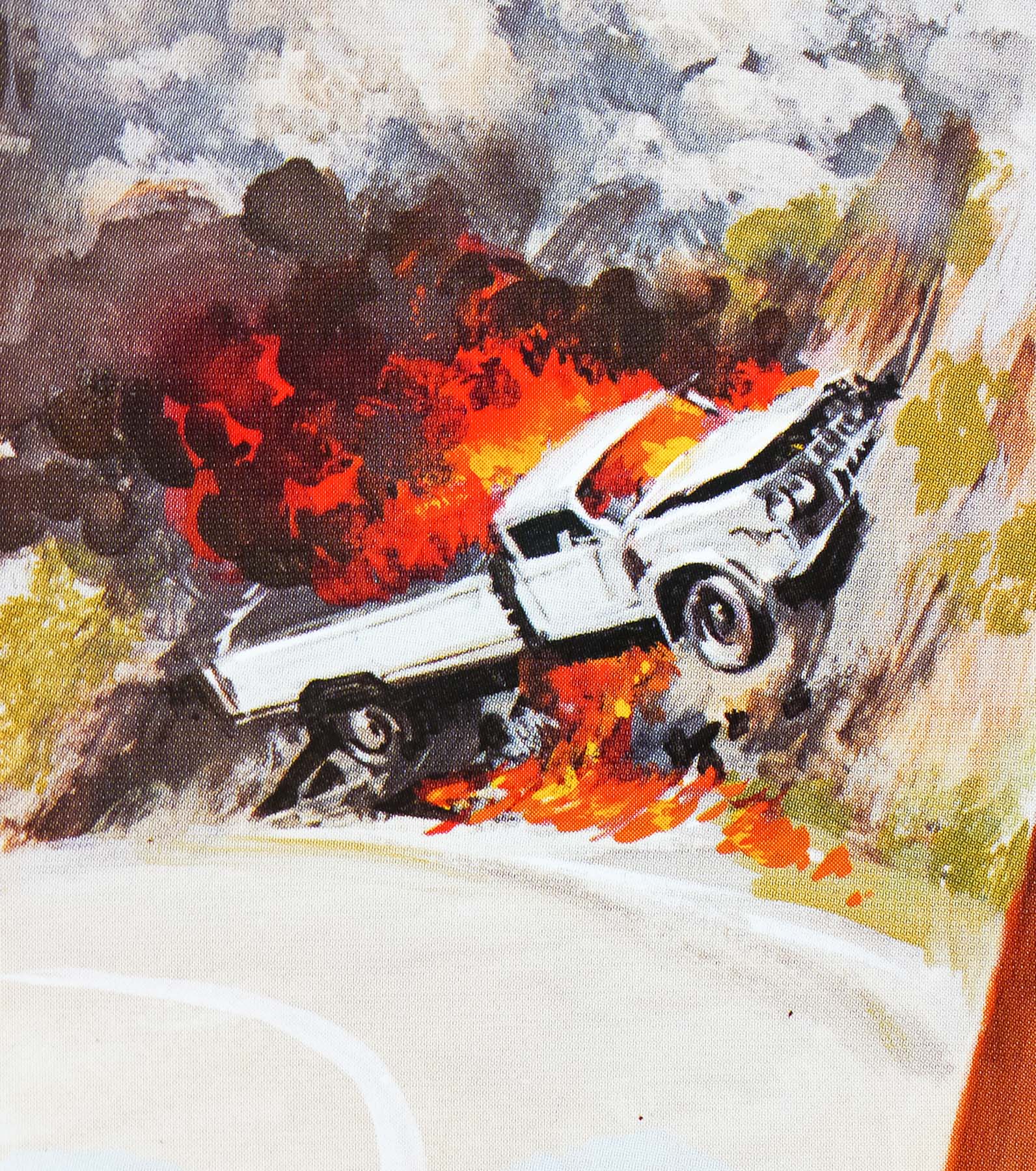
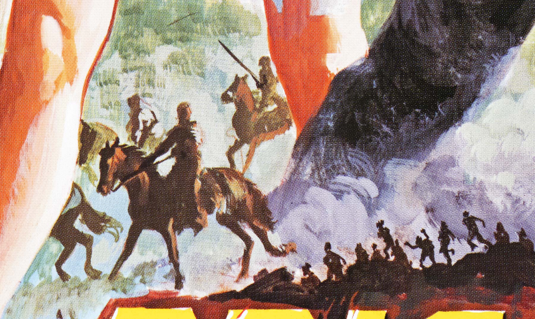
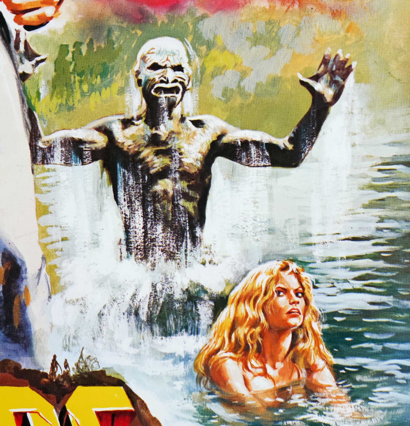
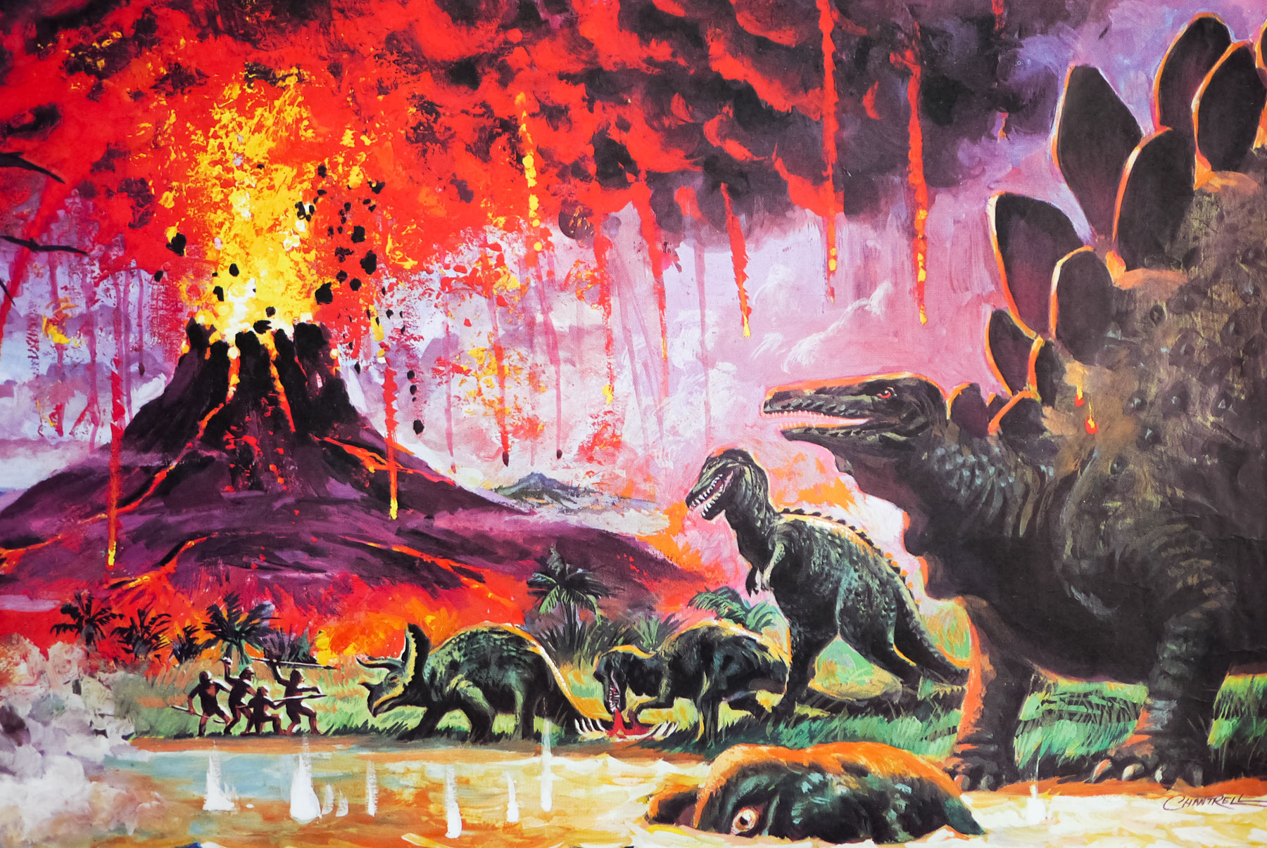
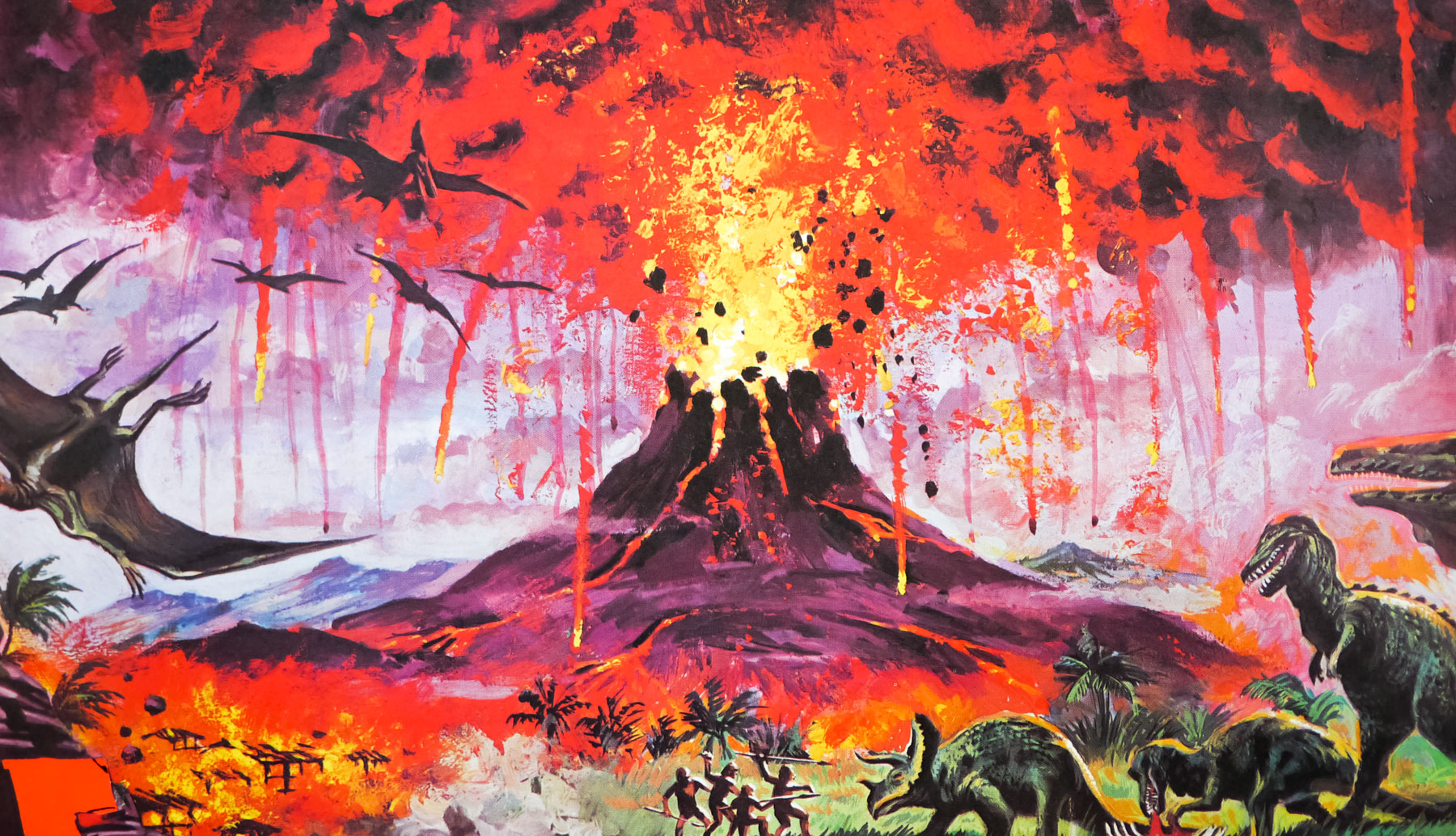
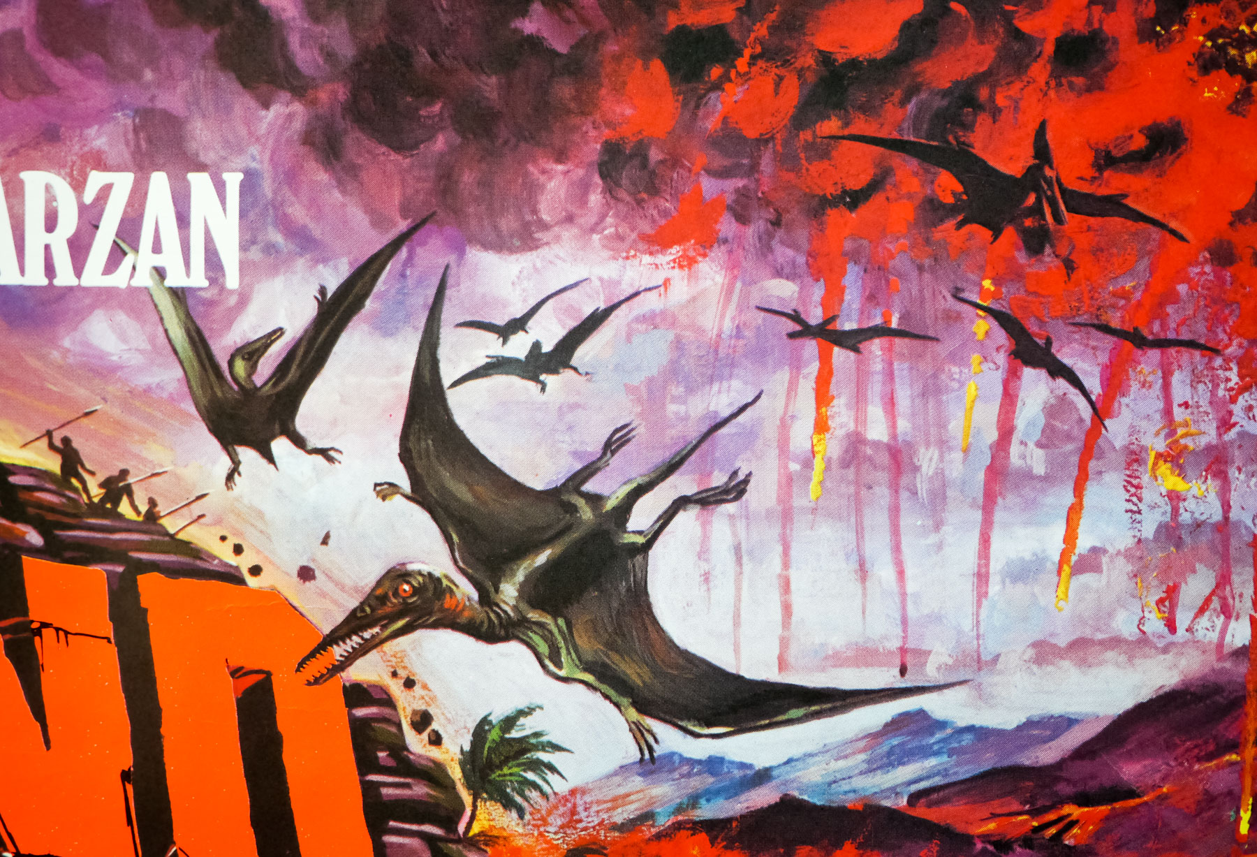
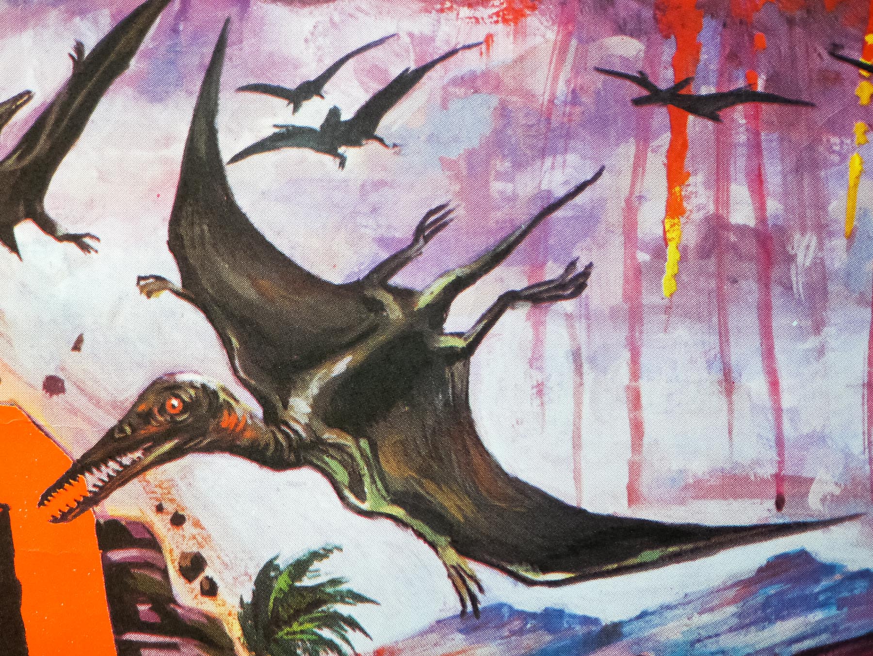
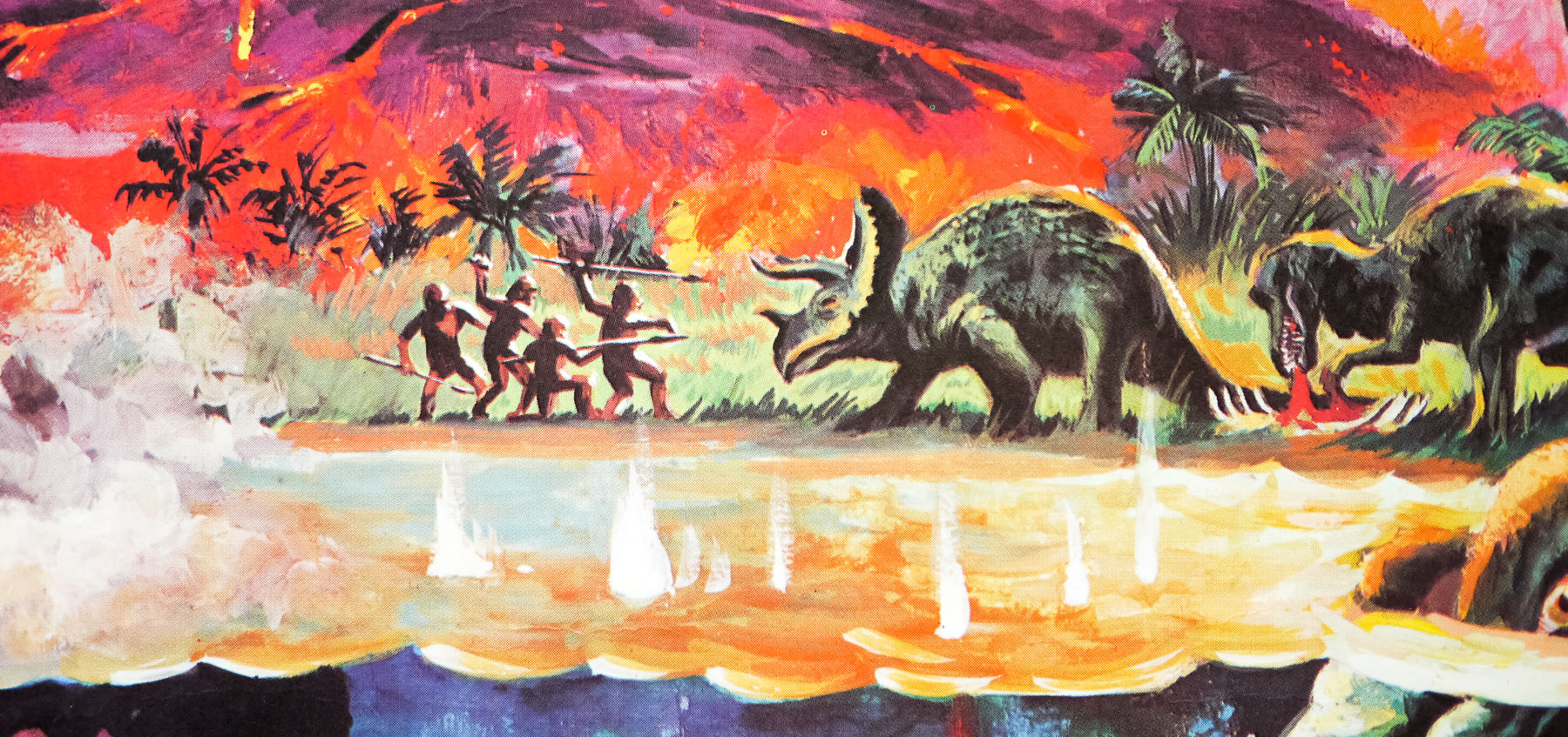
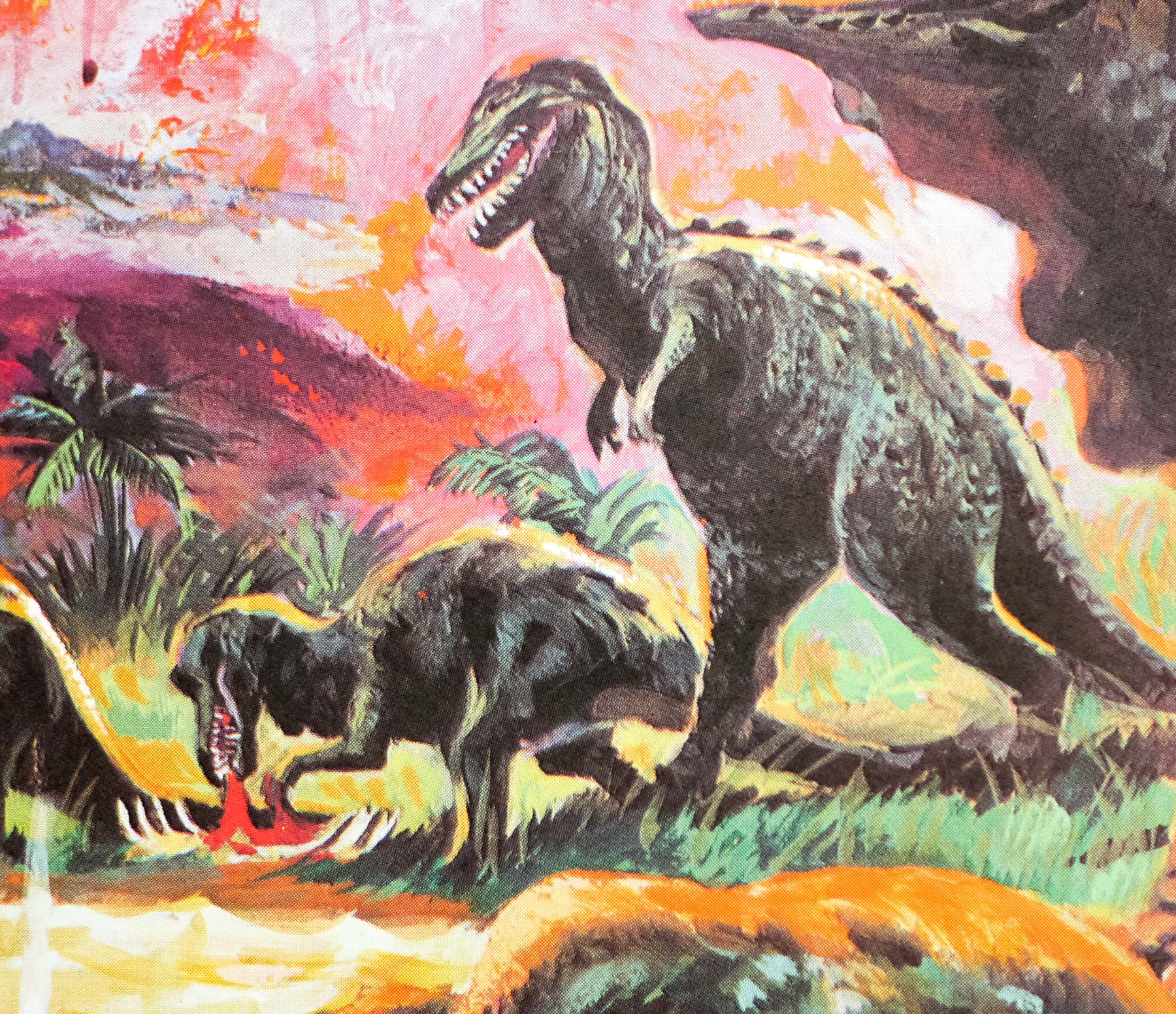
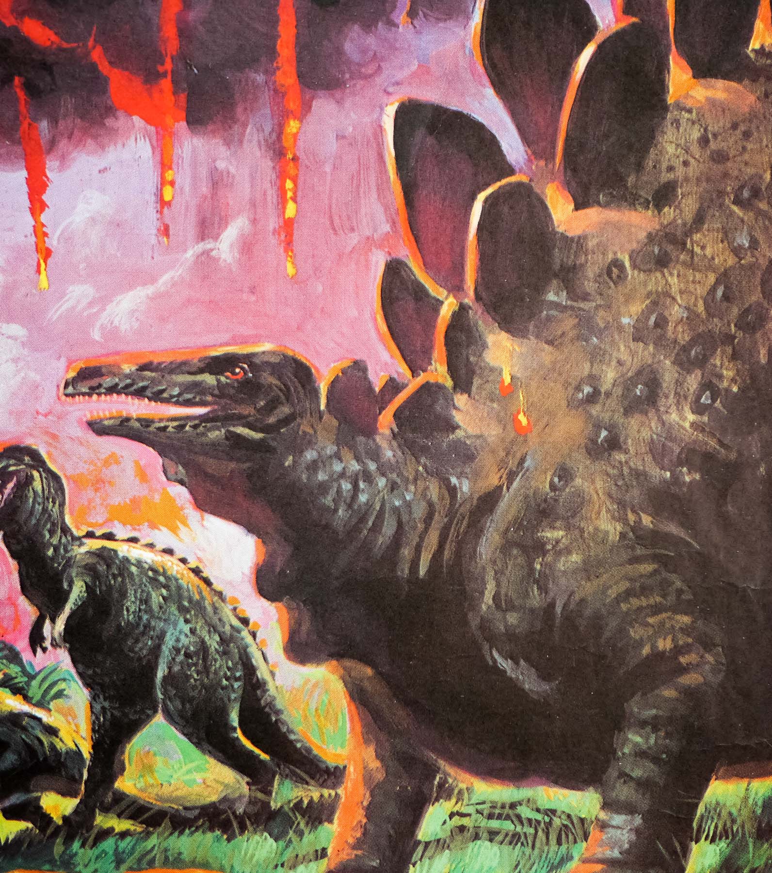
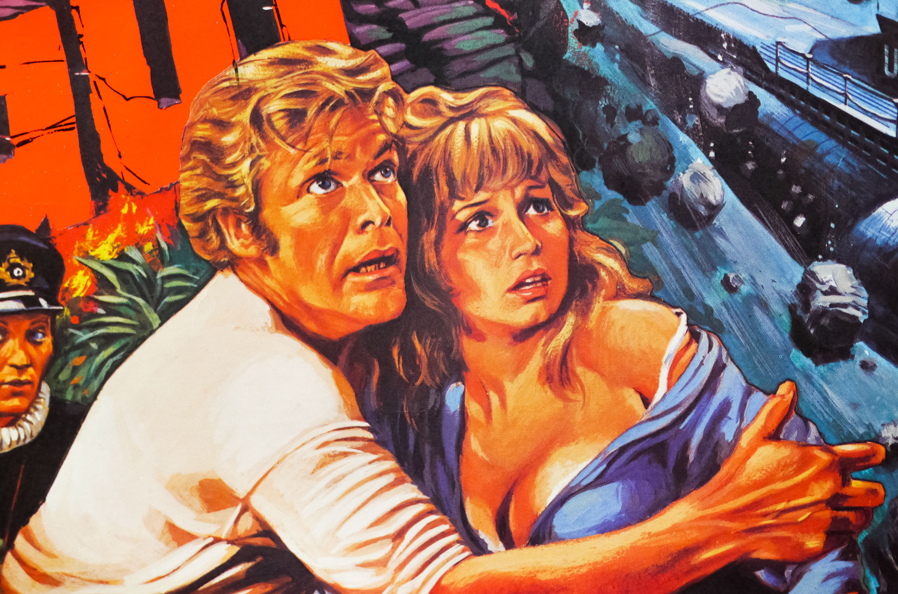
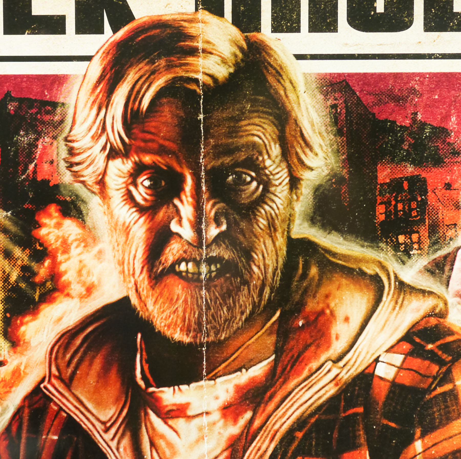
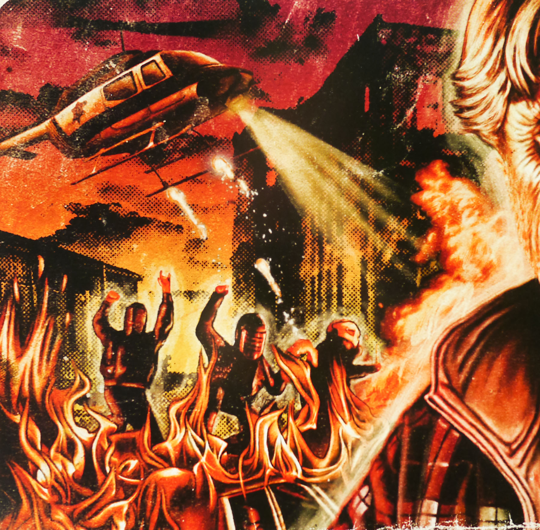
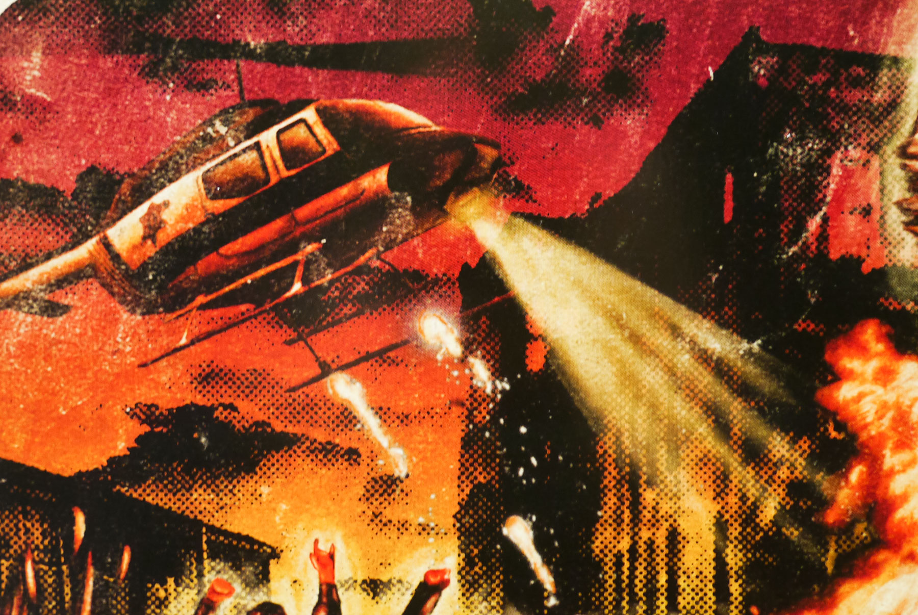
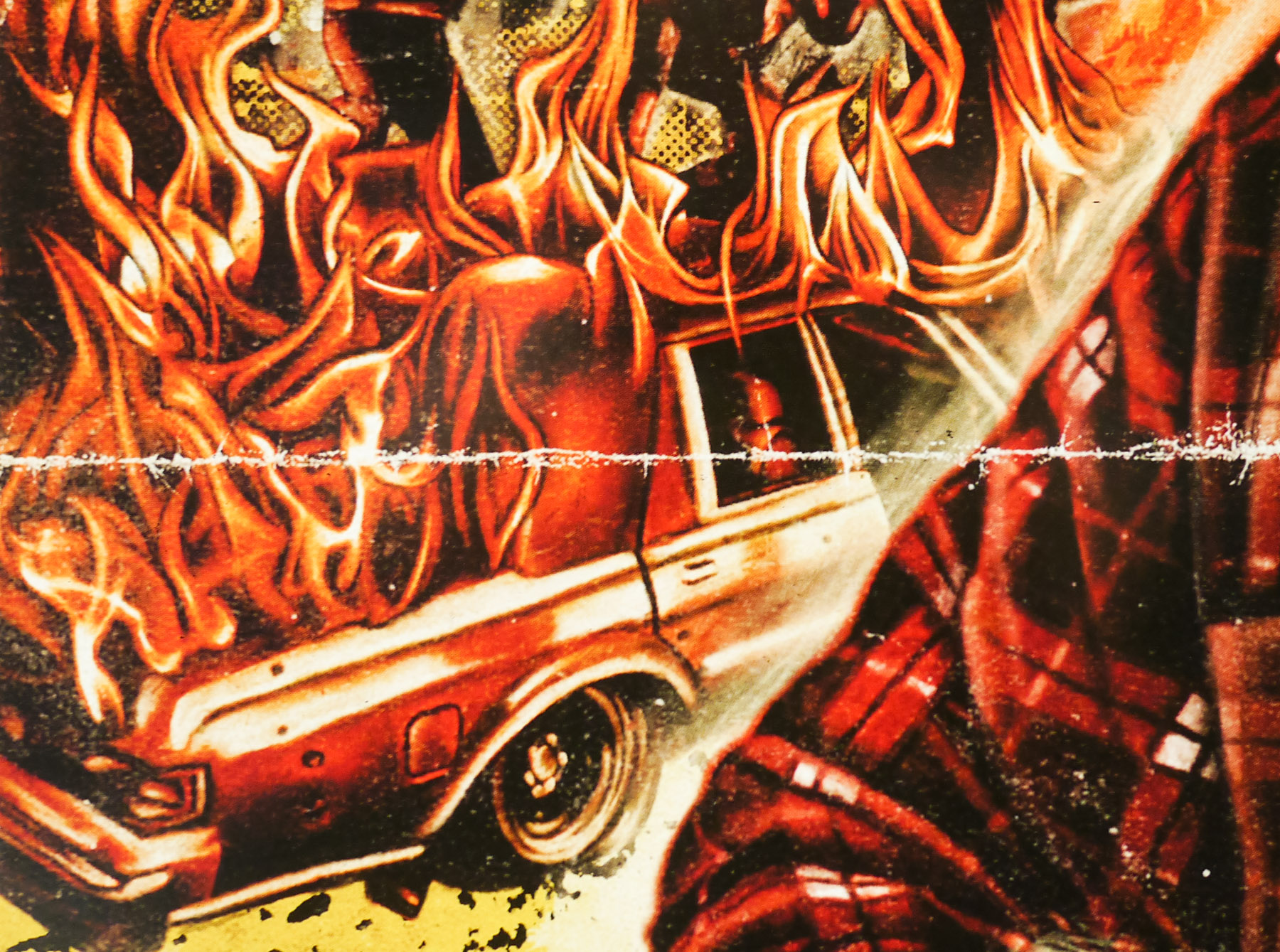
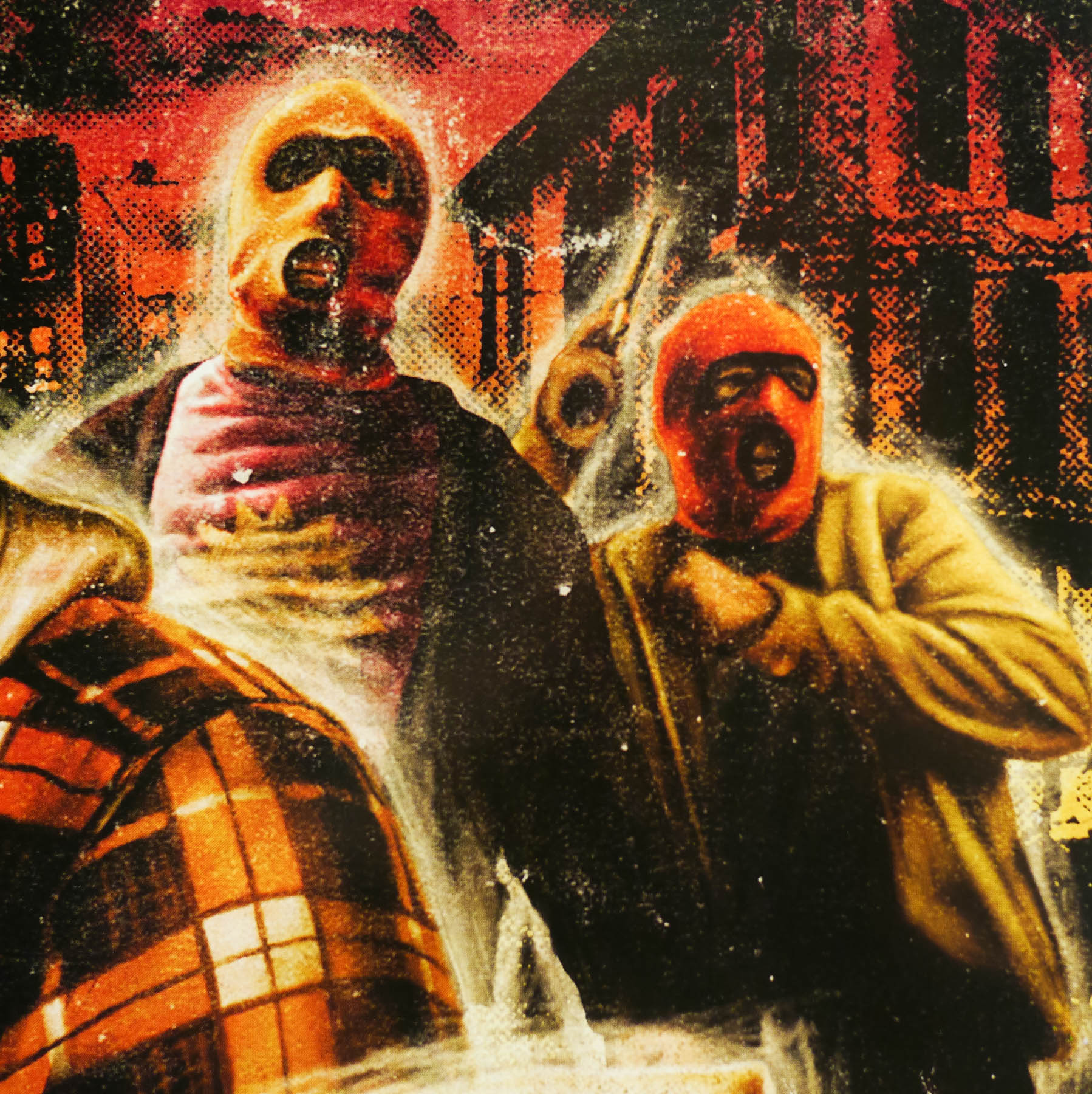
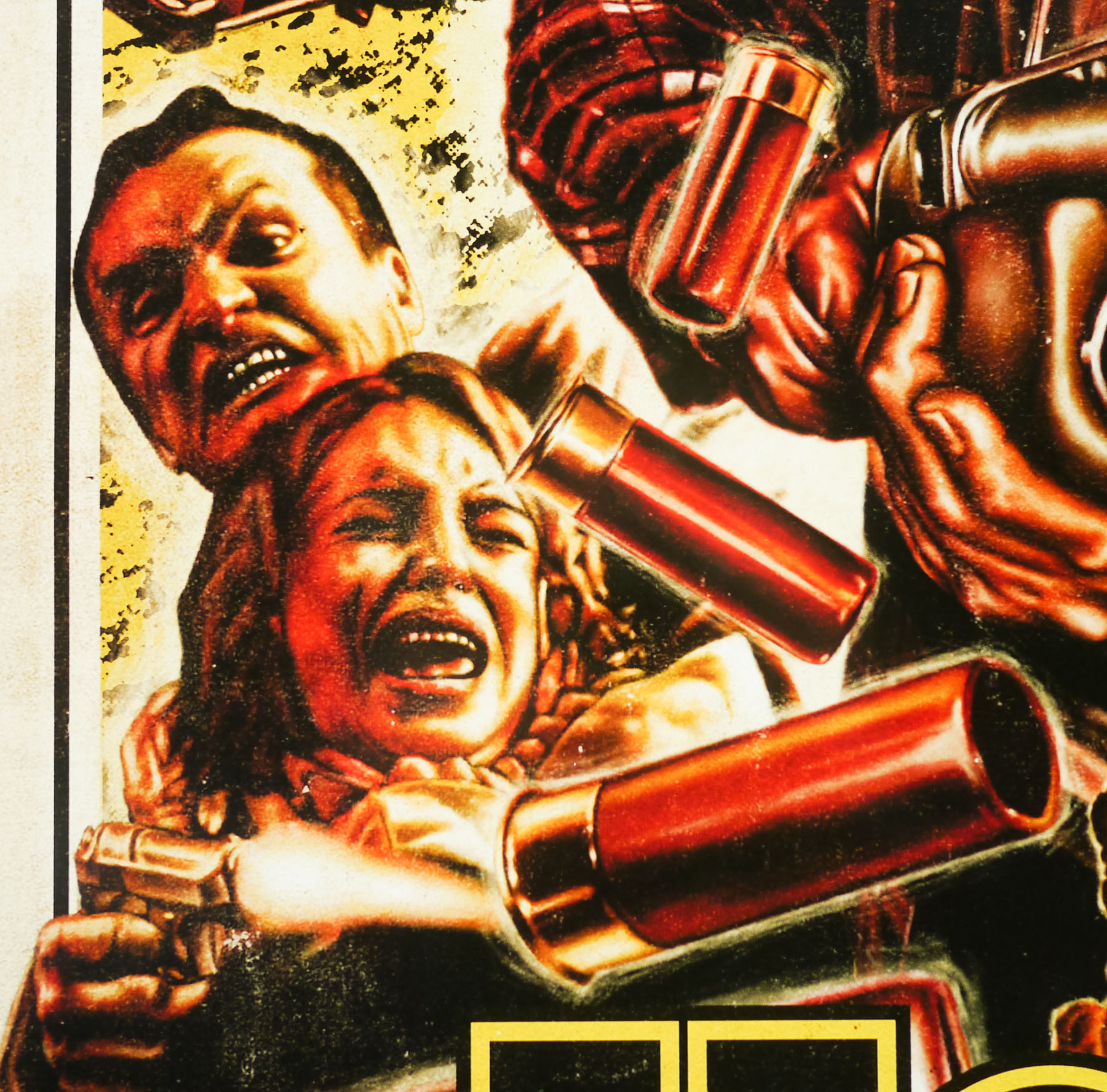
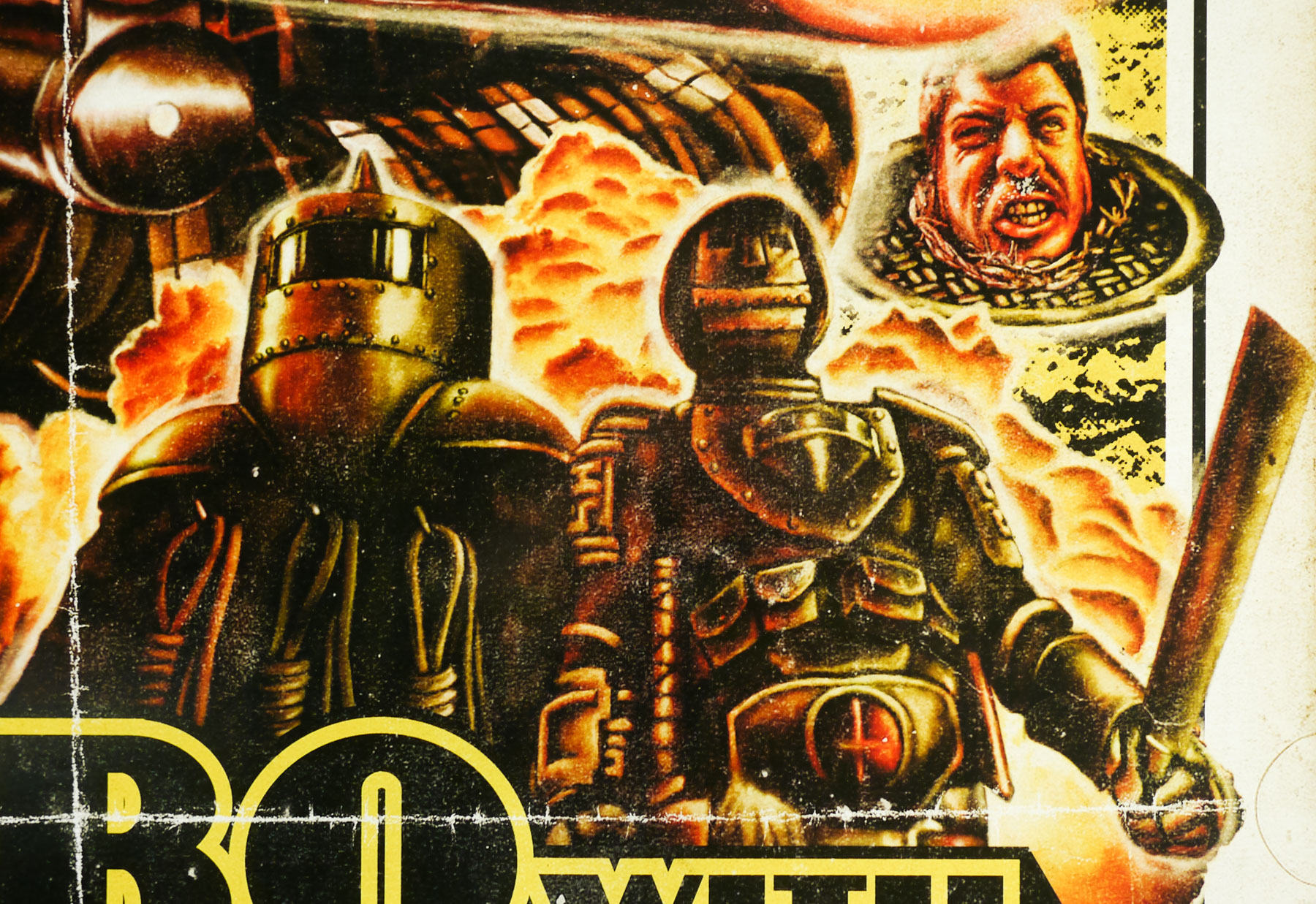
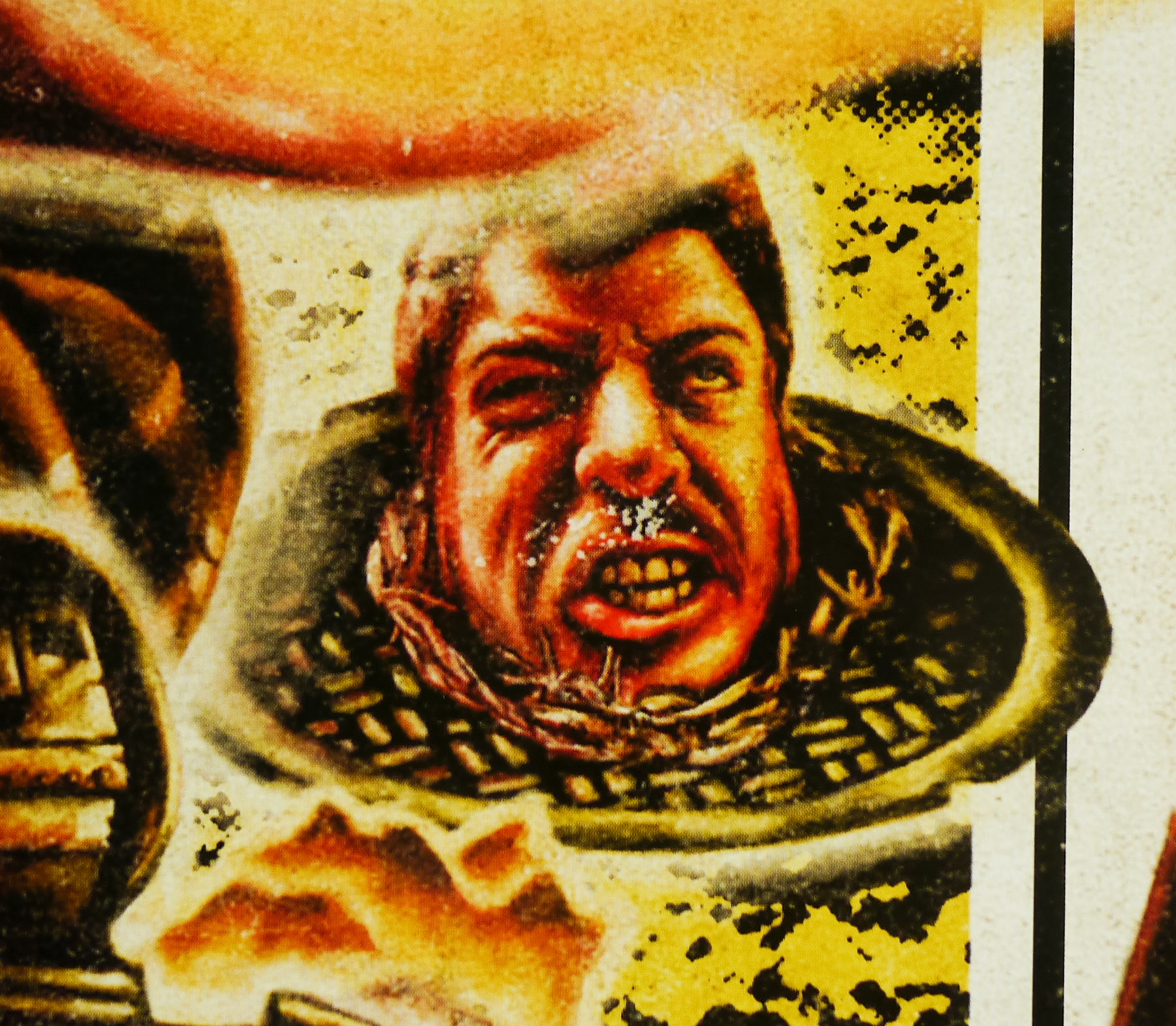
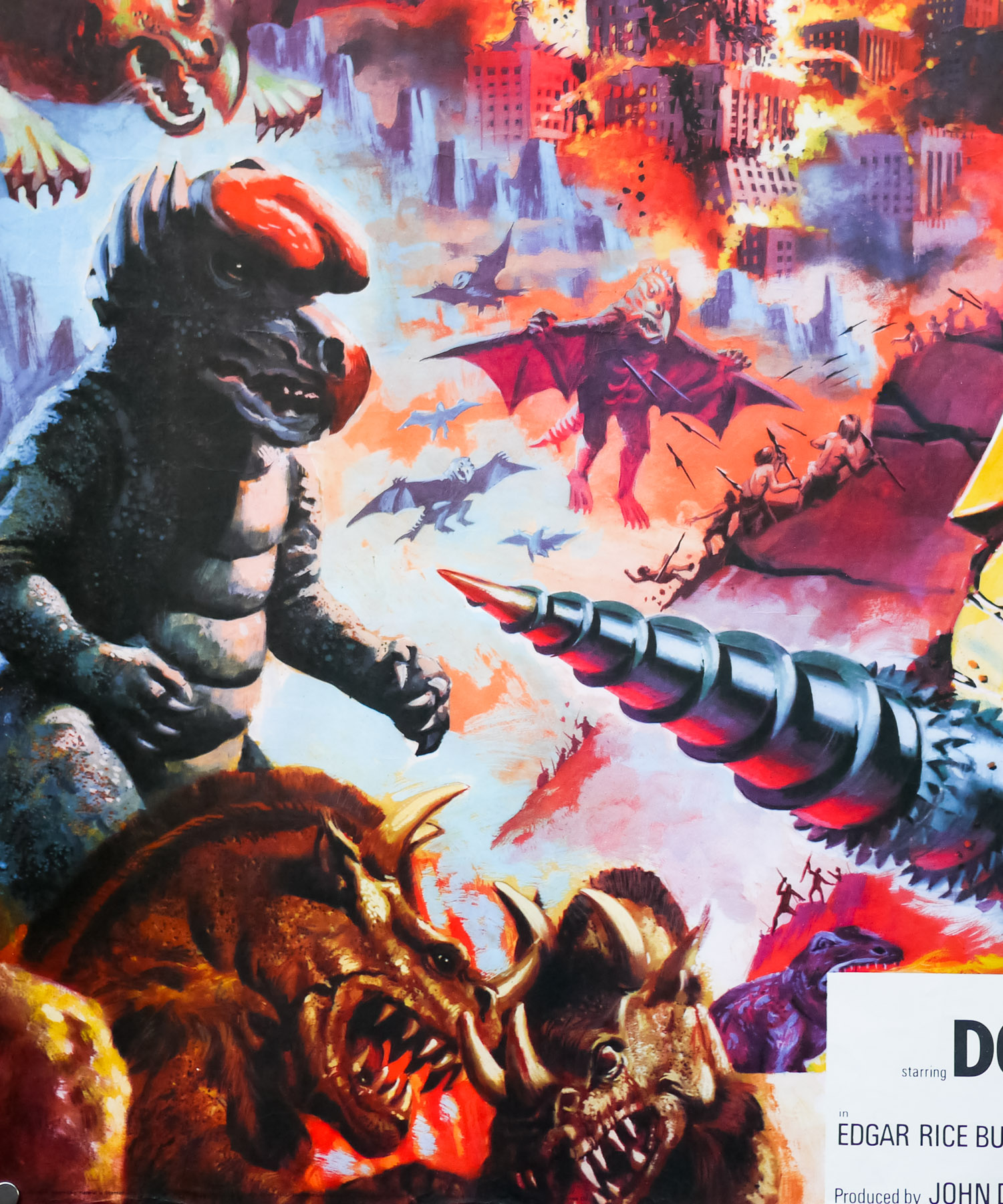
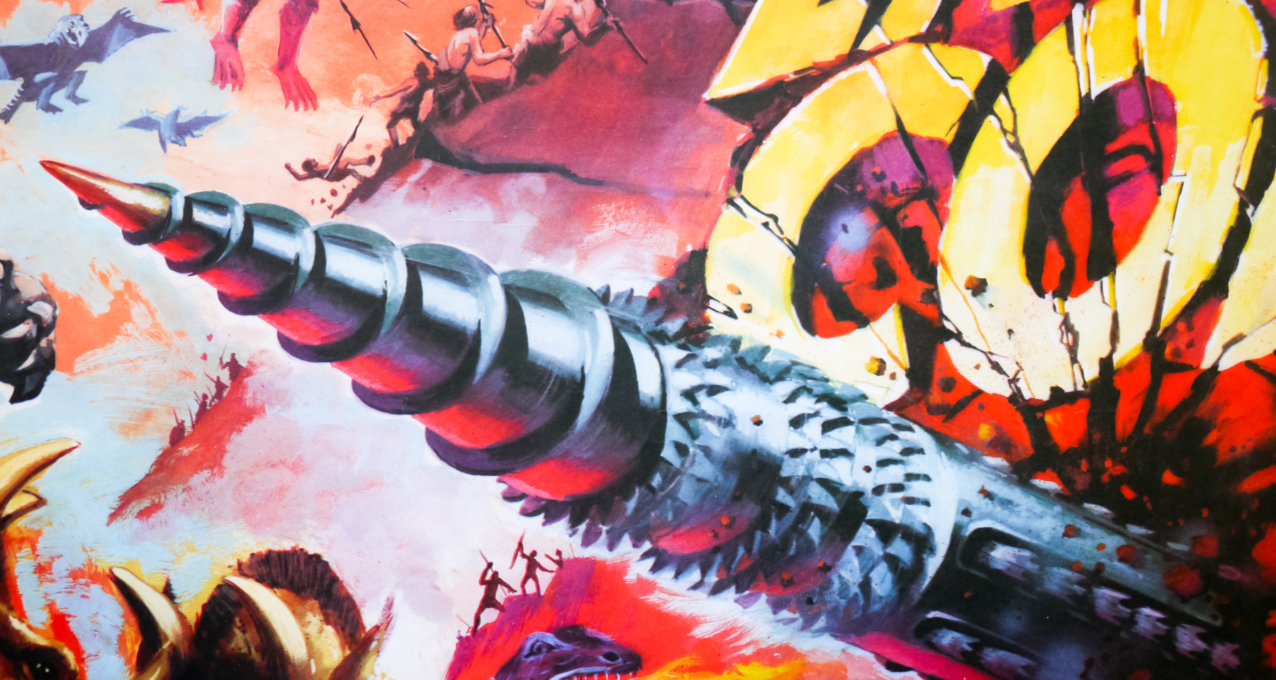
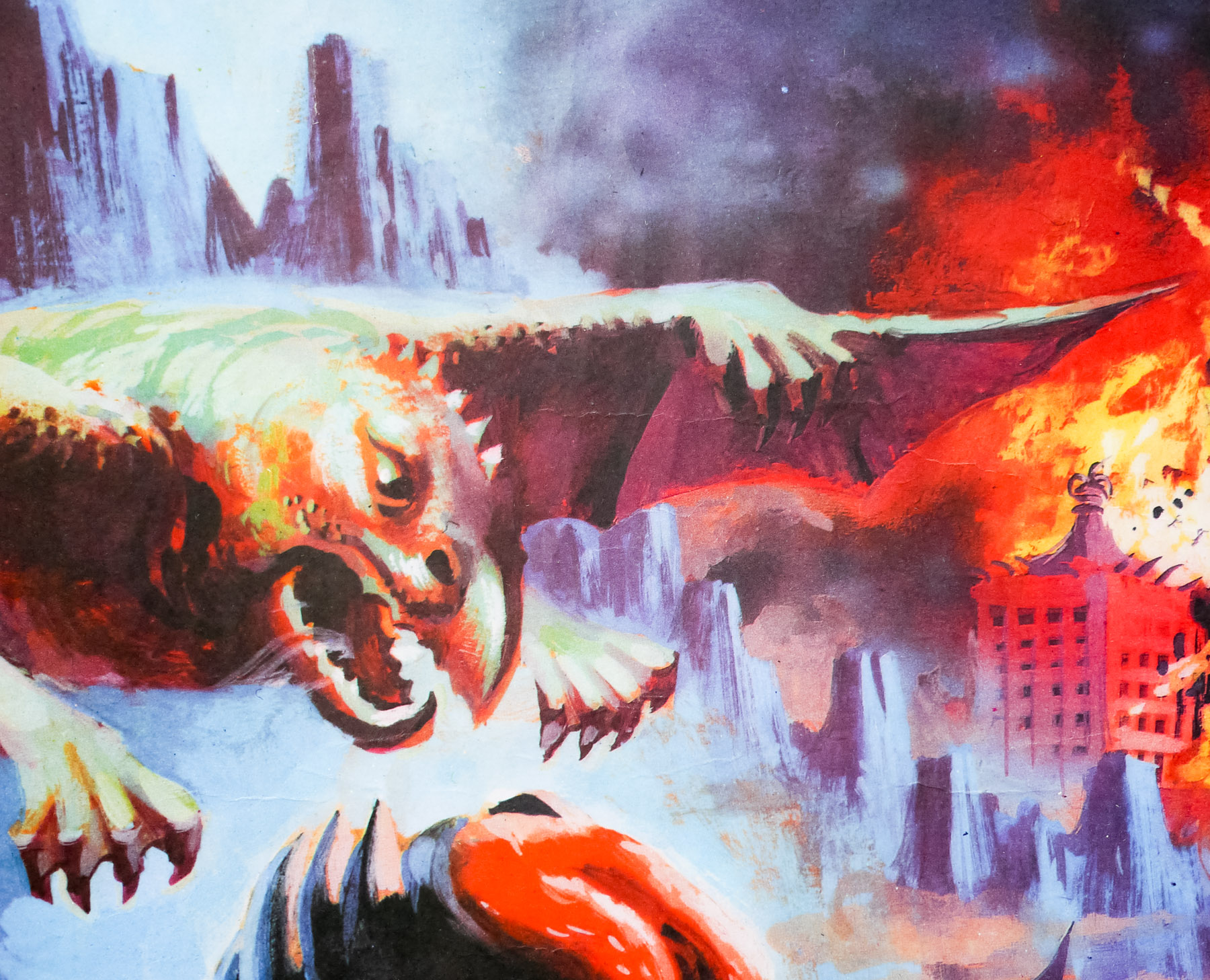
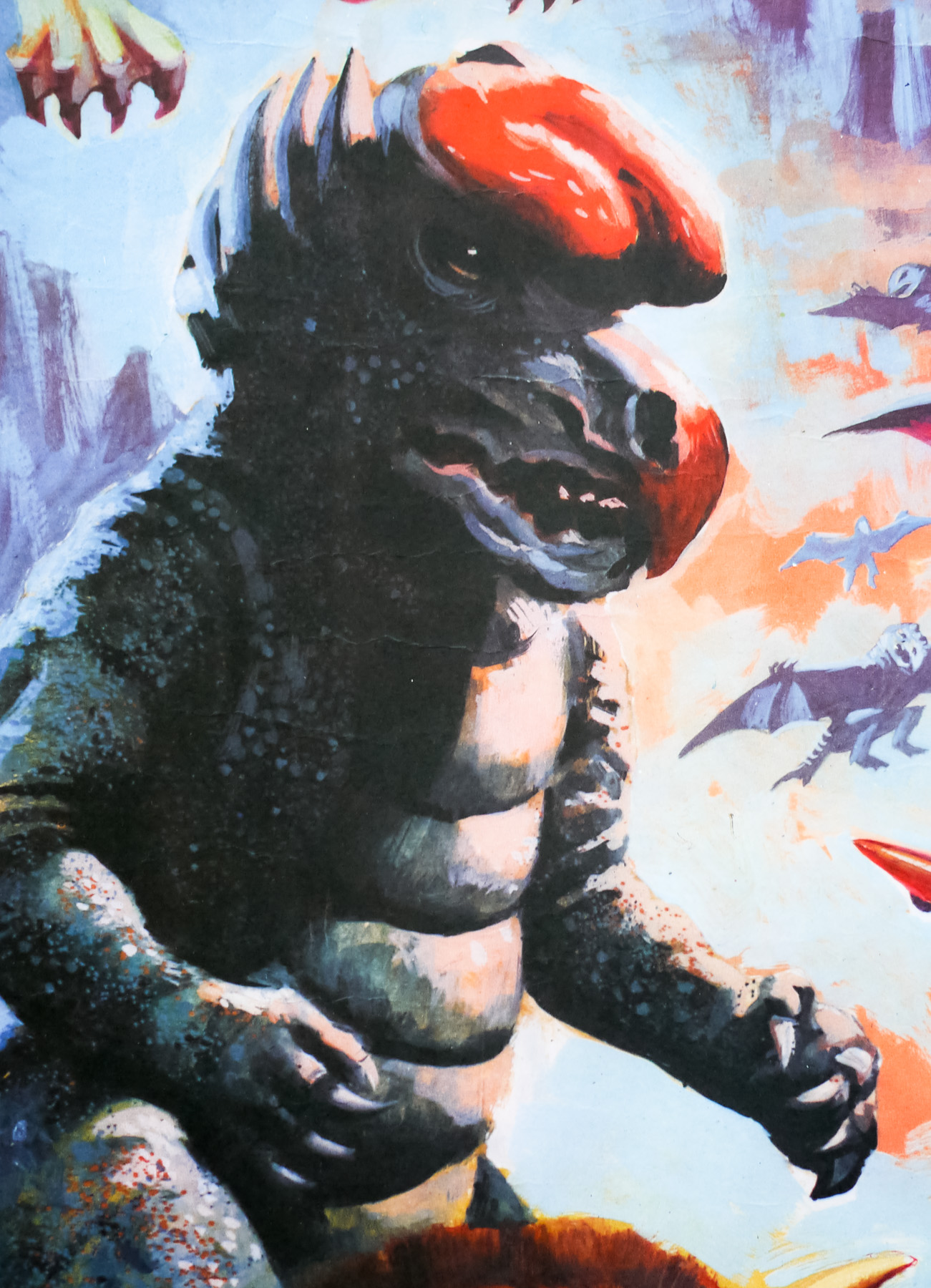
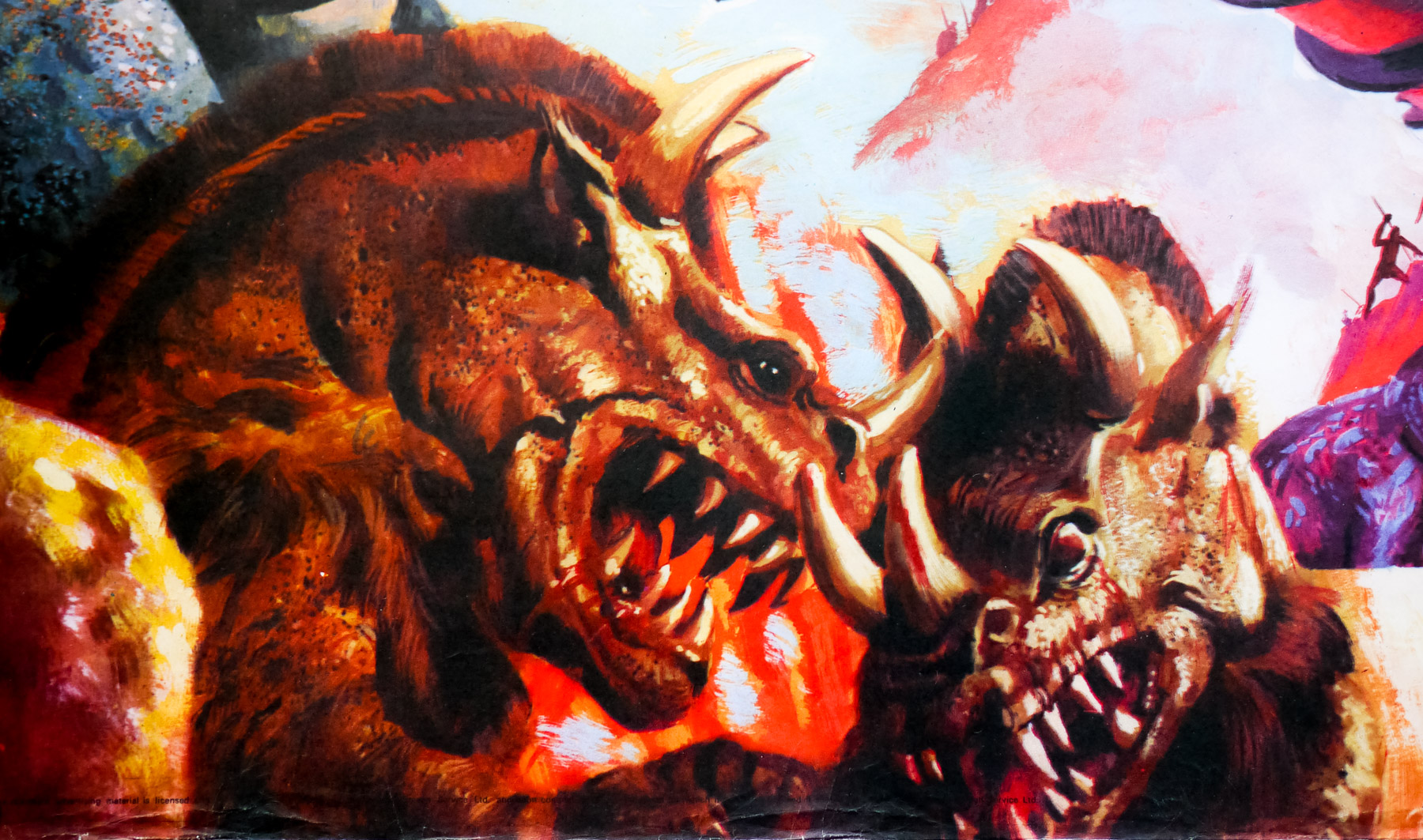
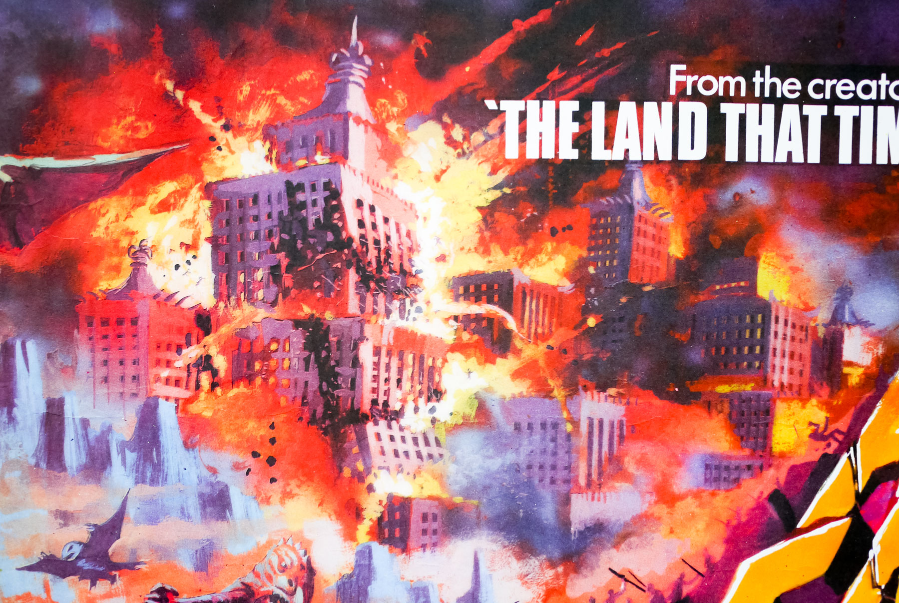
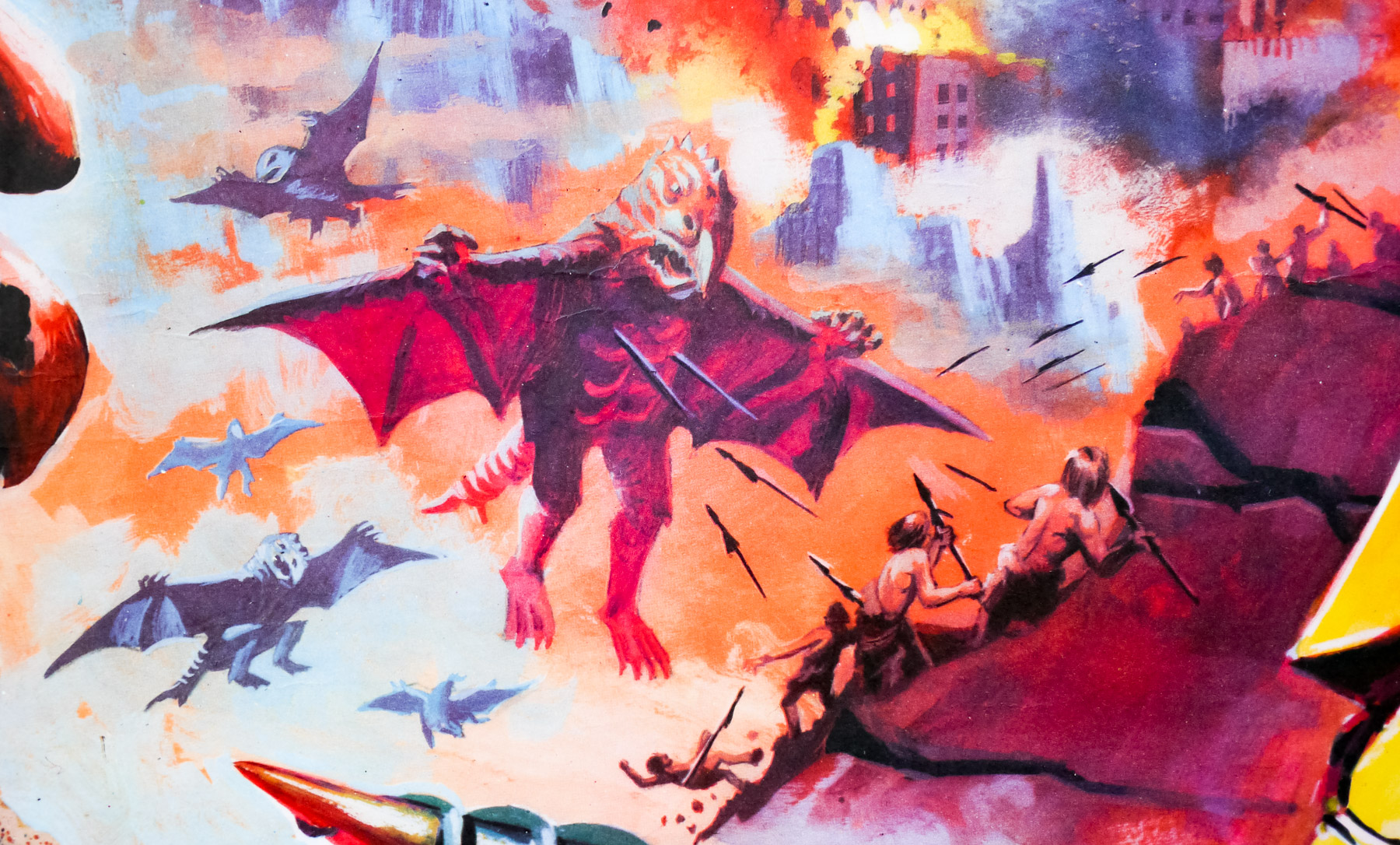
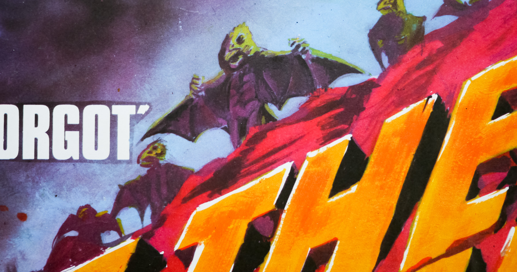
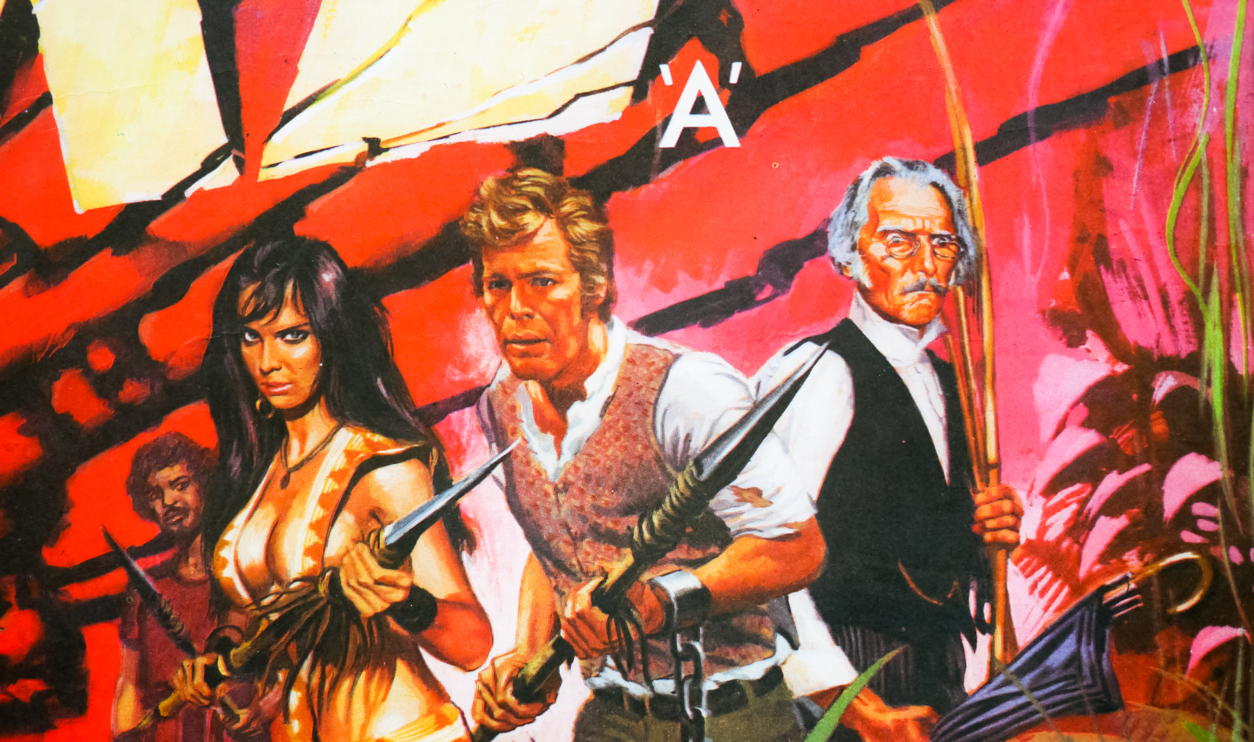
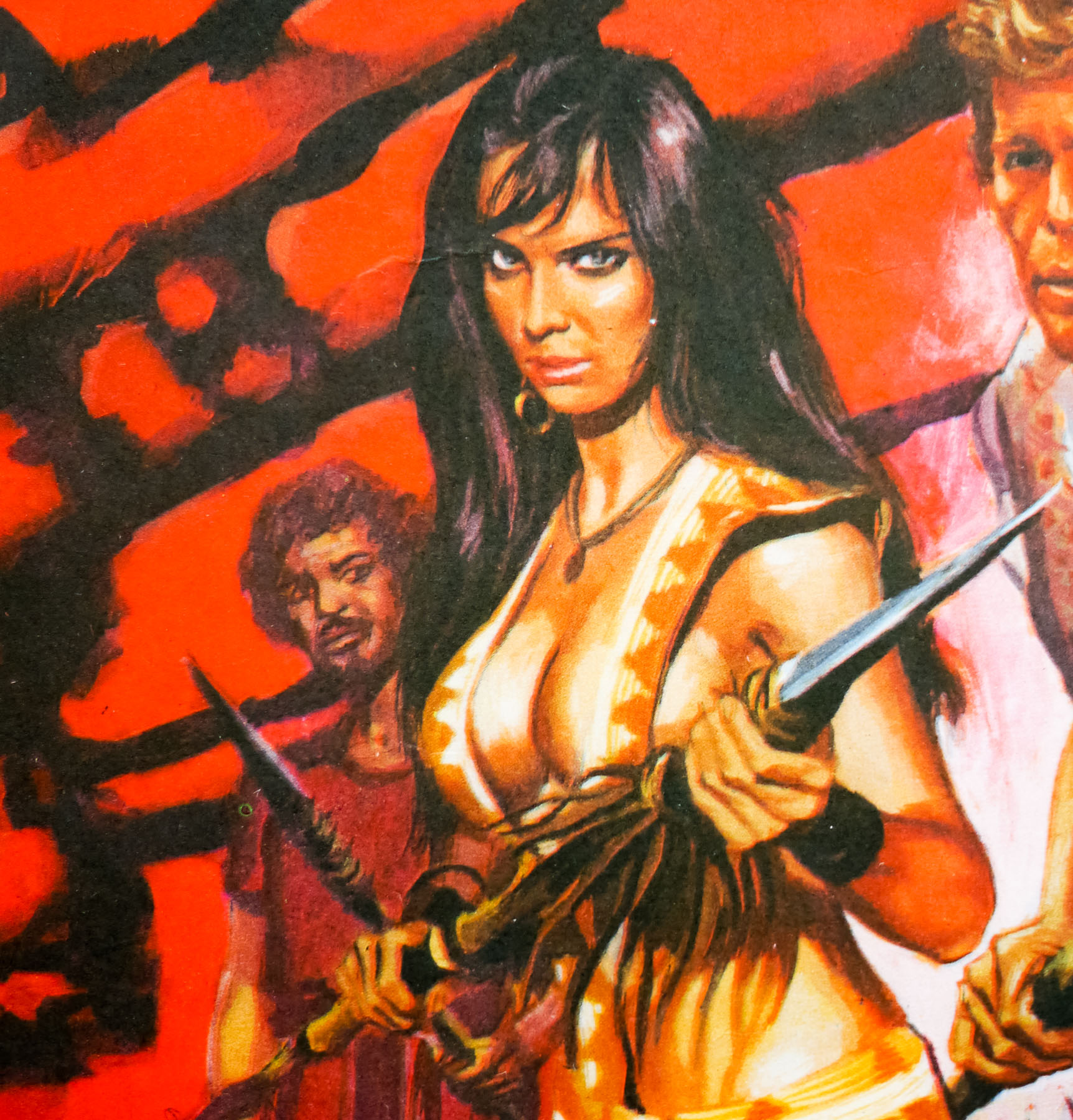
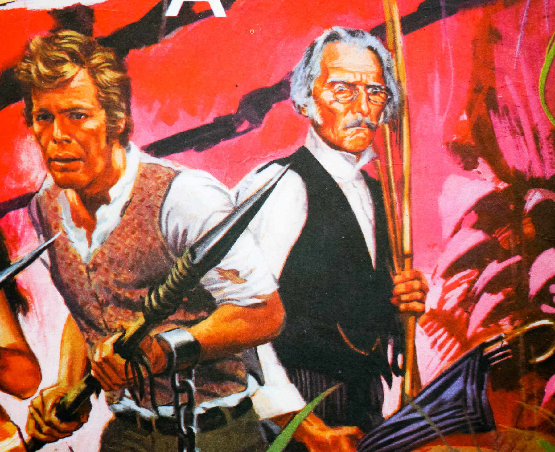
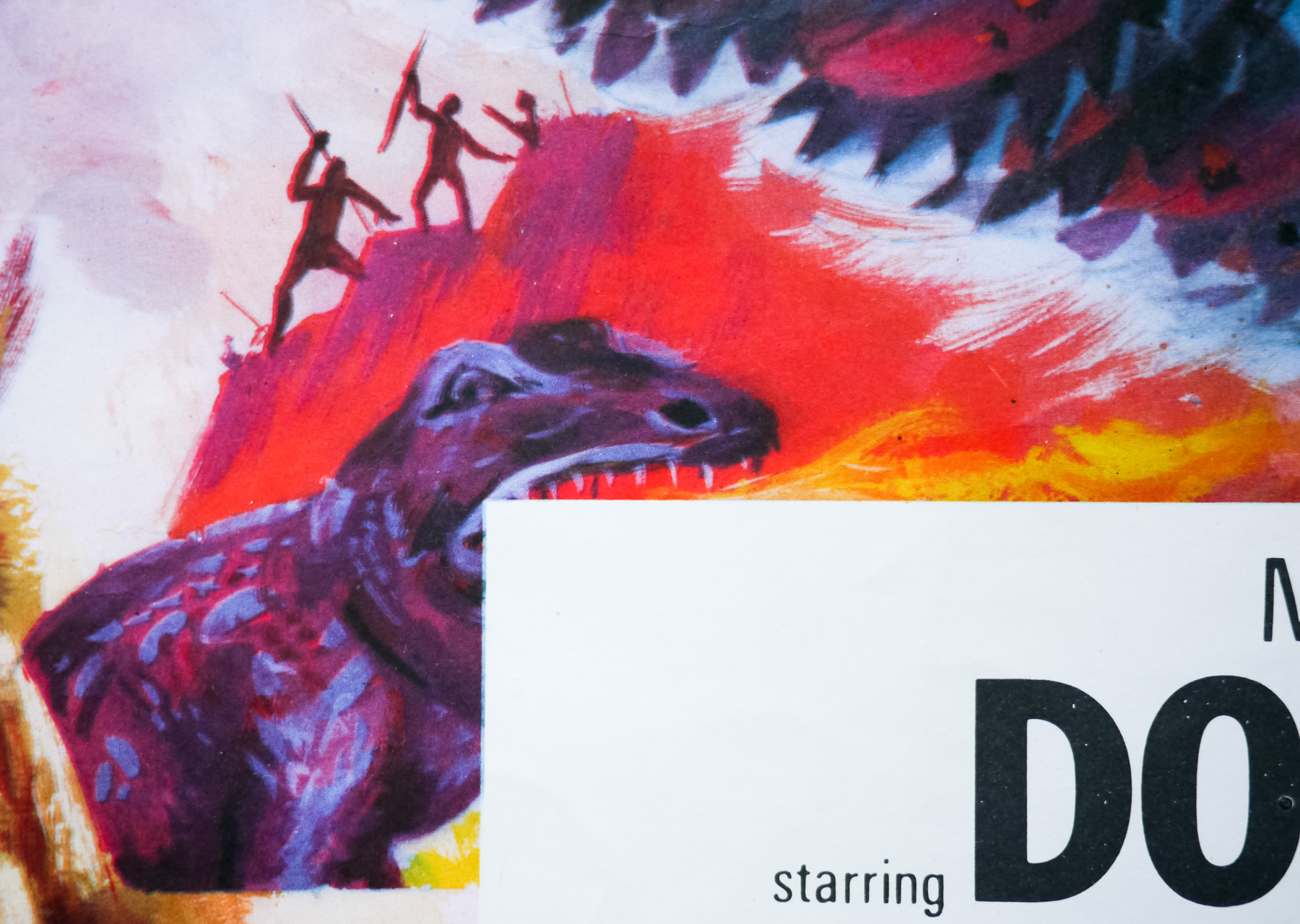
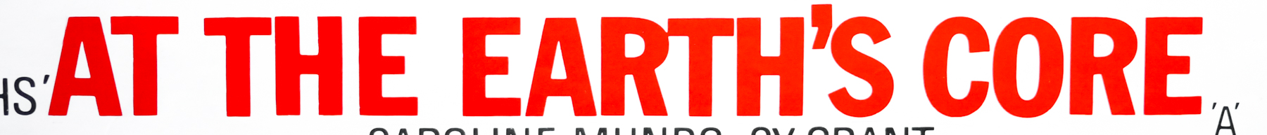
This one sheet was designed and illustrated by the American artist and designer Tom Nikosey who has been working since the 1970s and has created hundreds of iconic logos, posters and music album covers. Originally from Brooklyn, New York, Nikosey moved to Los Angeles in 1972 and began working heavily for the music industry, designing covers for artists such as Eric Clapton, Commodores and The Bee Gees. He’s also worked on hundreds of iconic logos, including ones for American sports teams, the NFL Super Bowl and multiple entertainment companies.

I was contacted by Tom in late 2018 and he was kind enough to answer some questions I had about his career and the creation of this poster. The questions and answers are below:

Thanks for agreeing to answer my questions. Can I ask how your career progressed once you settled on doing art and design for a living?
Very quickly in those days. After graduation from Art School in 1972 I ventured west to Los Angeles. I got my first job at a newspaper then a couple of advertising agencies as an assistant designer. After later being laid off work in 1974 I started freelancing and by 1975 I had started Tom Nikosey Design.

Had you done any work on film posters before Metropolis?
Not really as I’m mainly known as a lettering/logo artist. Over the years I did logos for ‘Prizzi’s Honor’, ‘Labyrinth’, ‘Flight of The Navigator’, ‘Adventures in Babysitting’, ‘Sgt.Pepper’s’ (the Bee Gees film), ‘Corvette Summer”, ‘Hooper’, ‘Pure Country’ but never the complete poster.

What was the sequence of events that saw you become involved in the Metropolis release? Was it an enjoyable project?
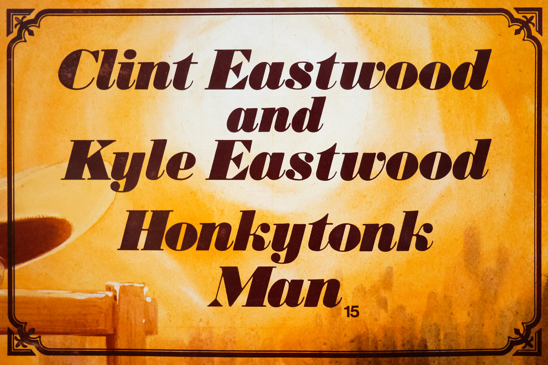
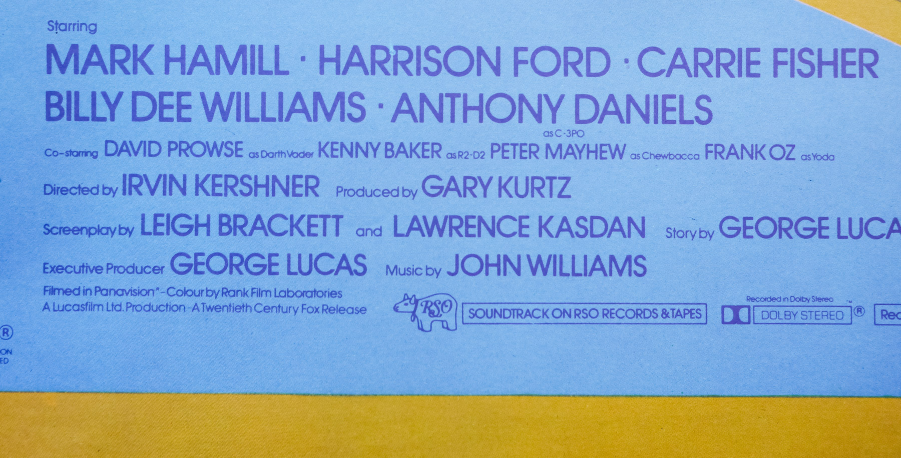
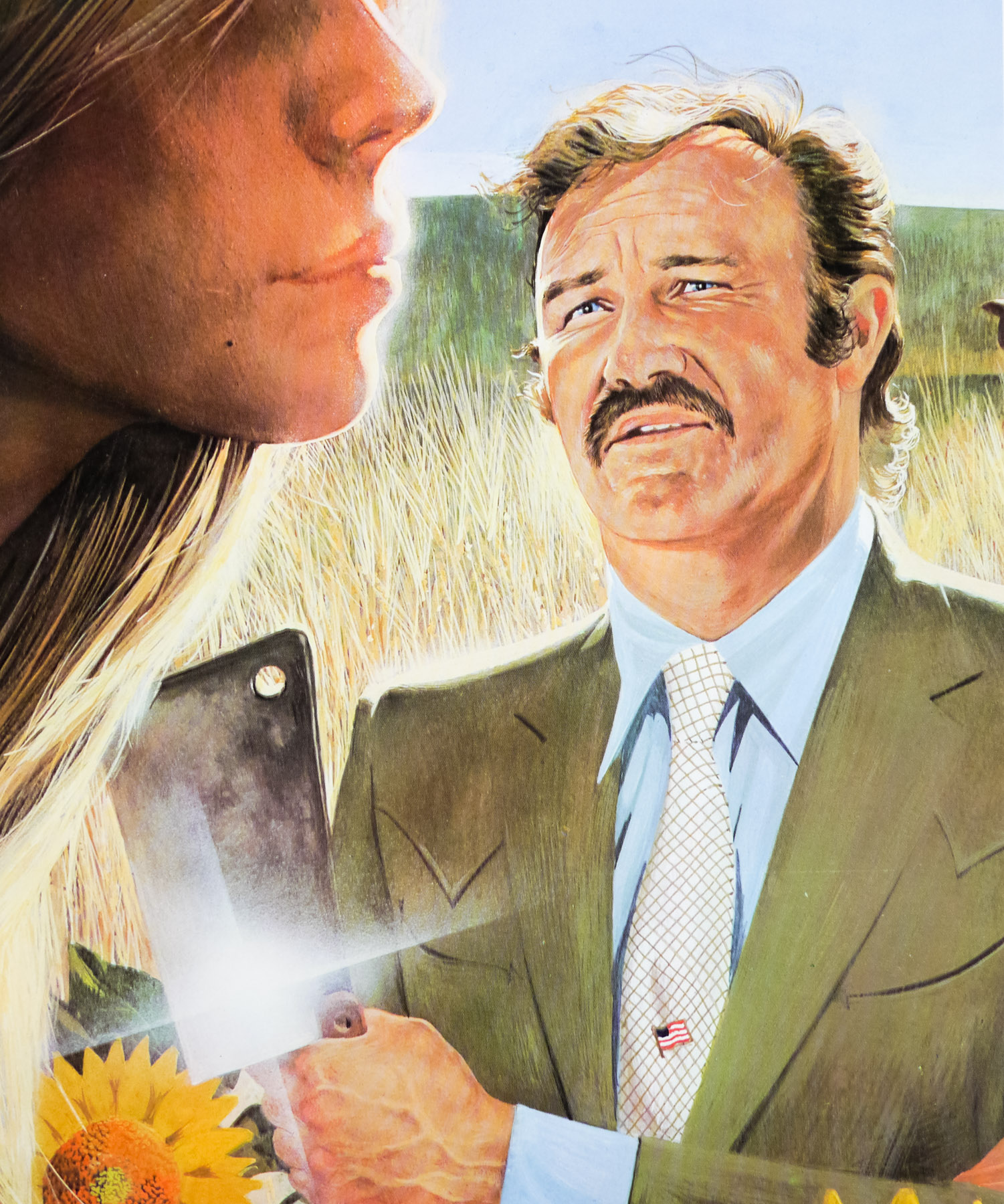
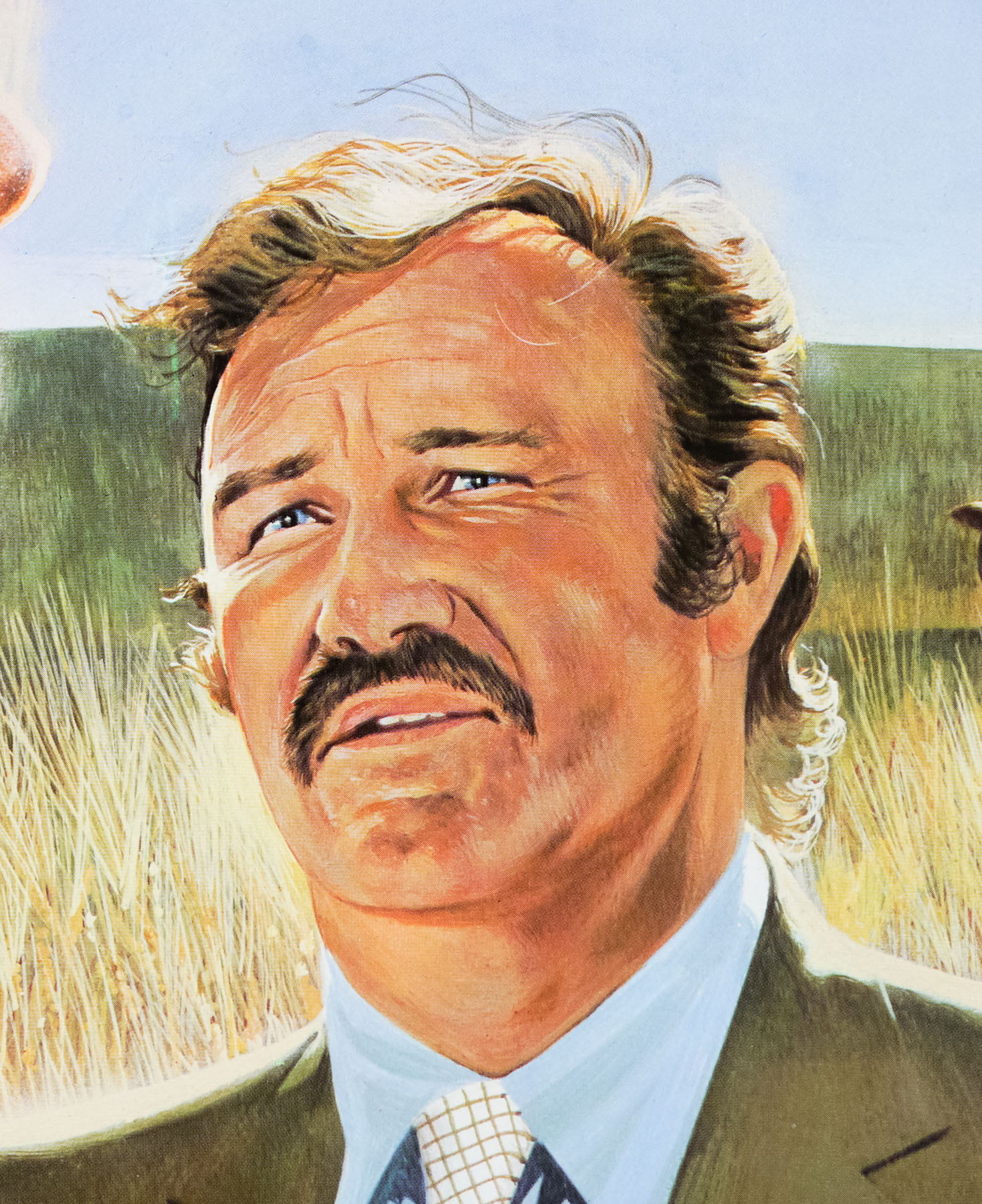
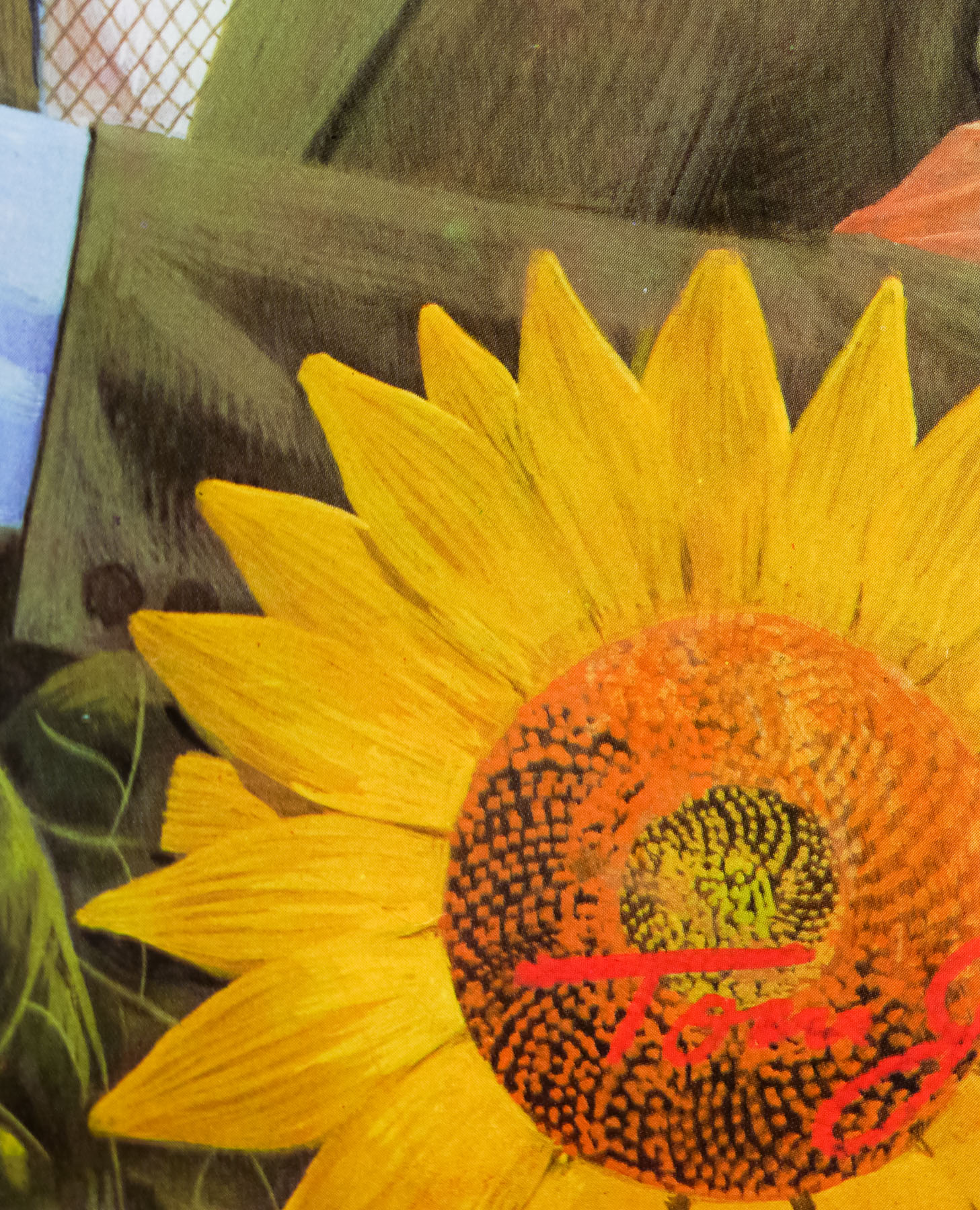
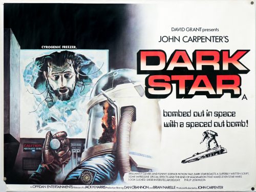
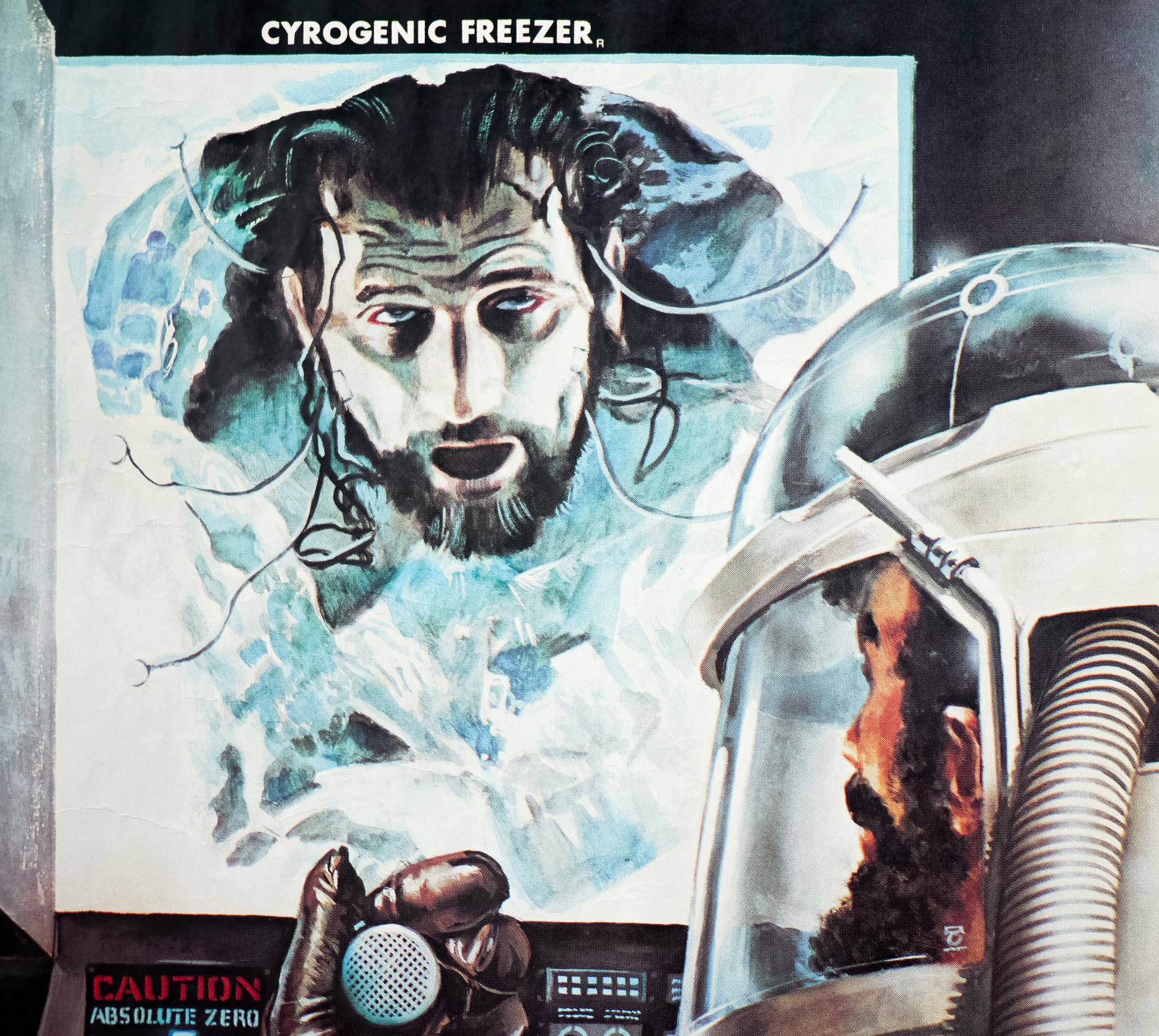
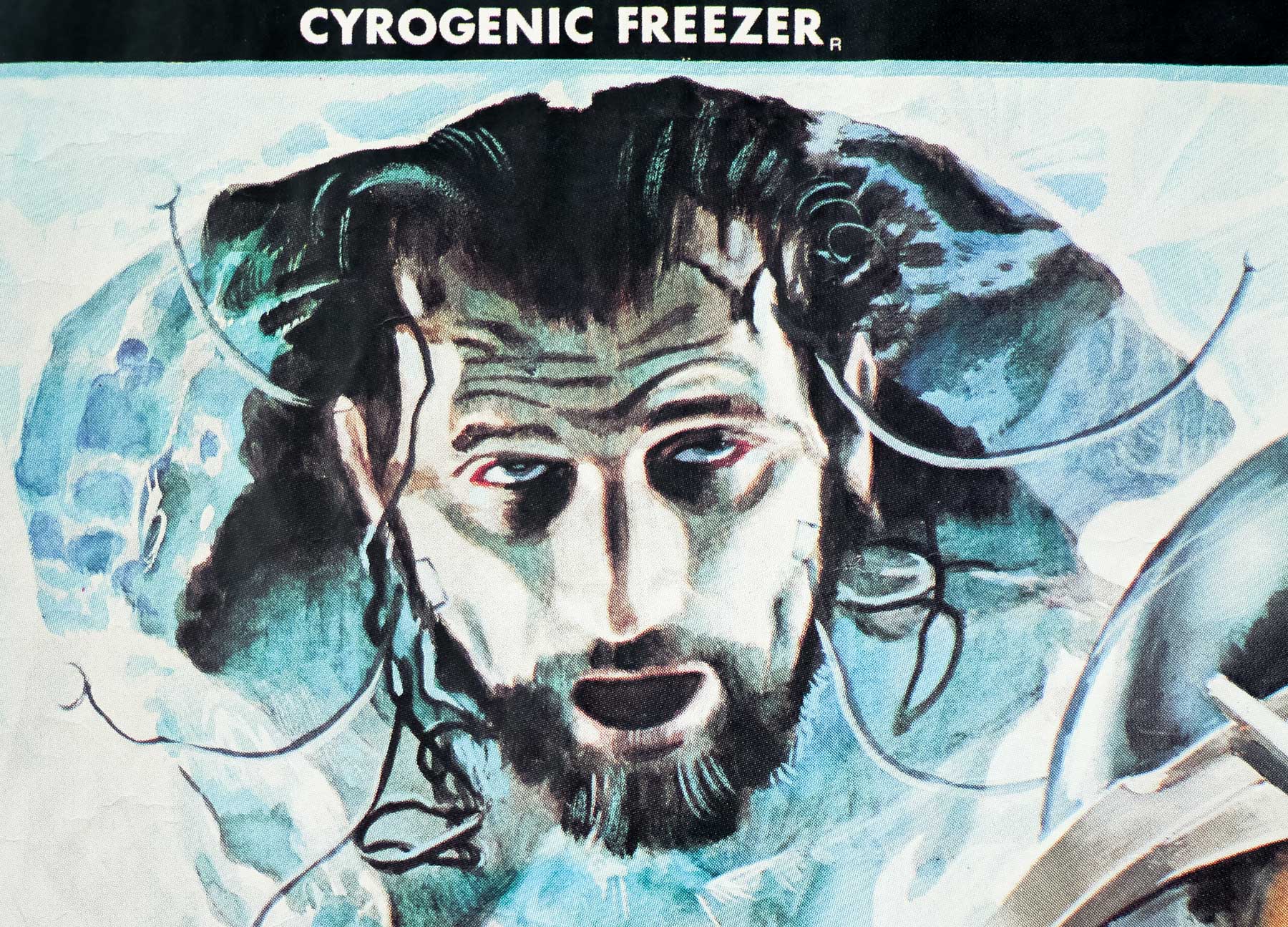
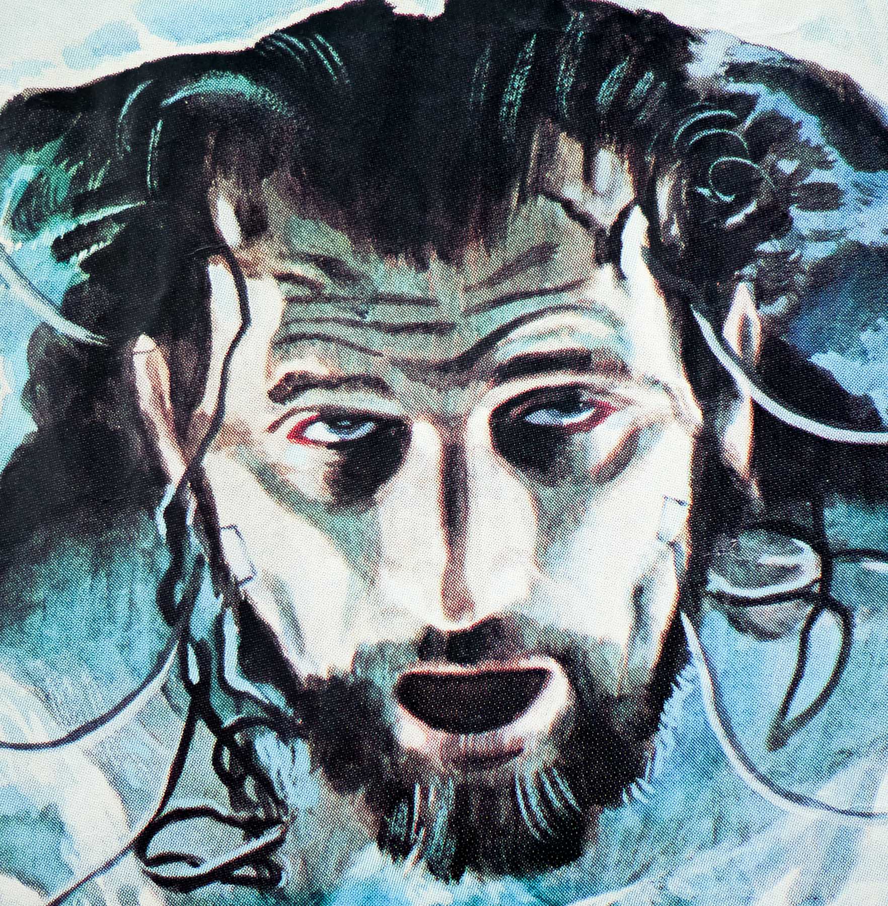
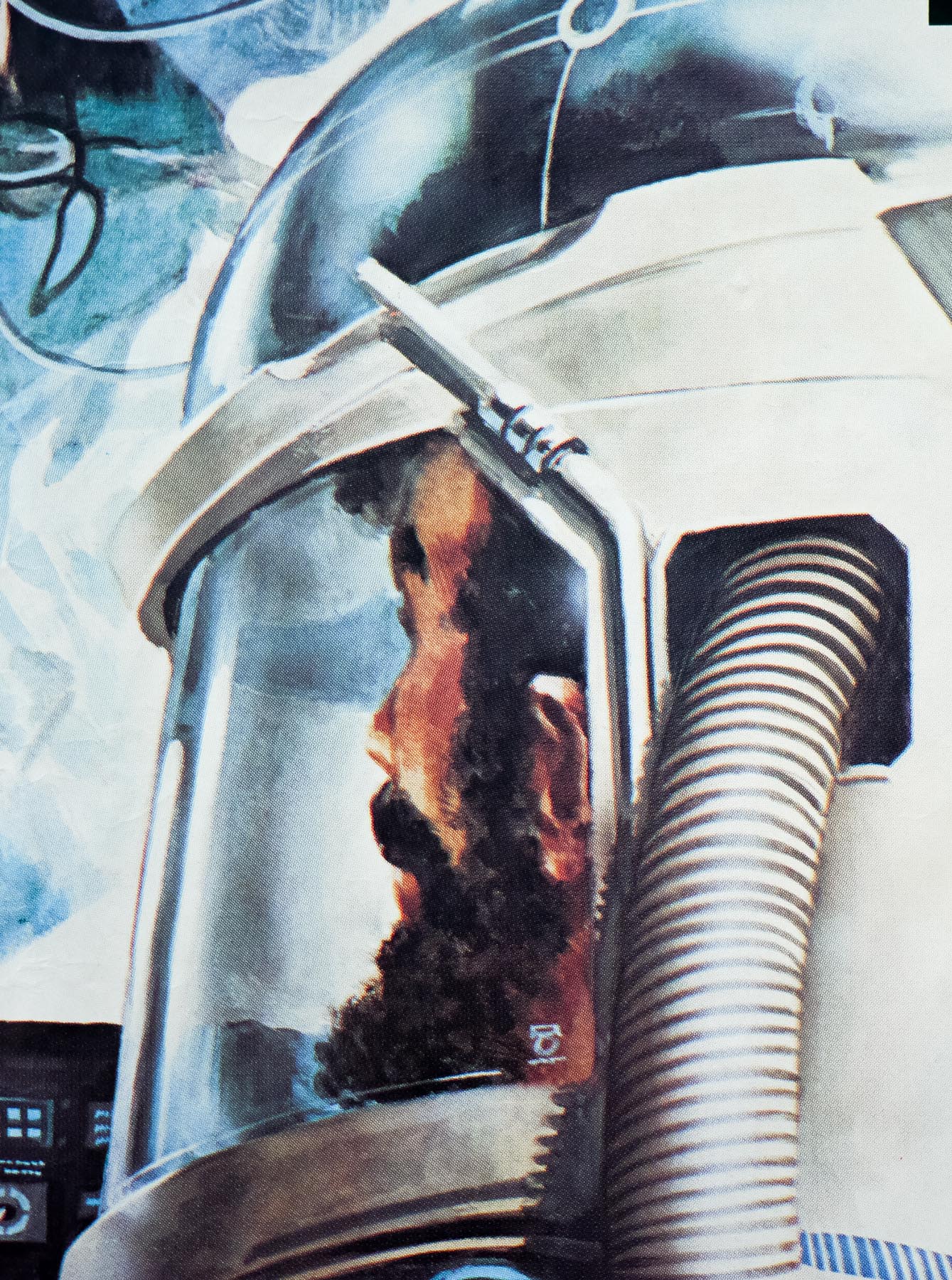
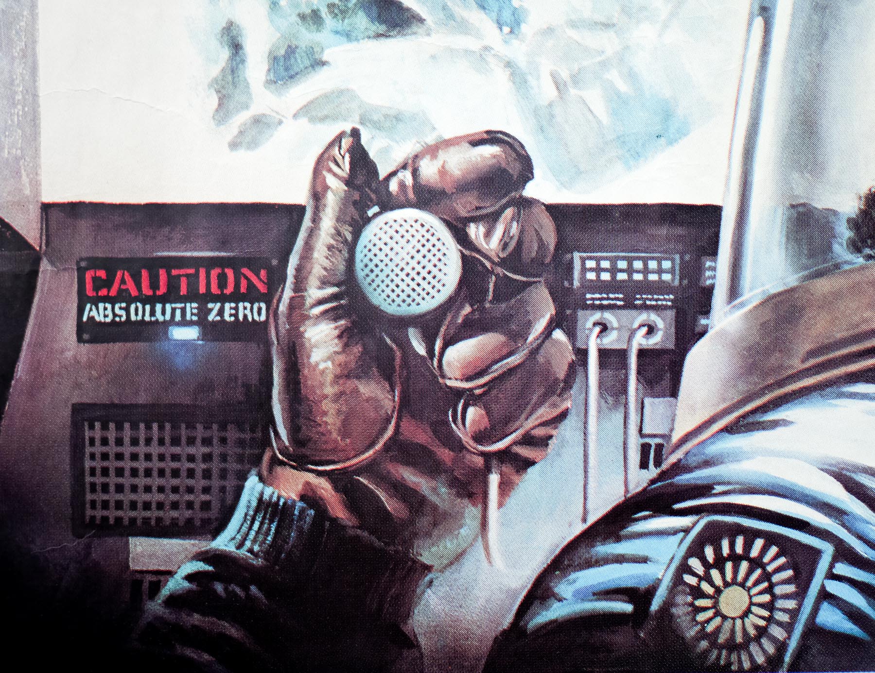
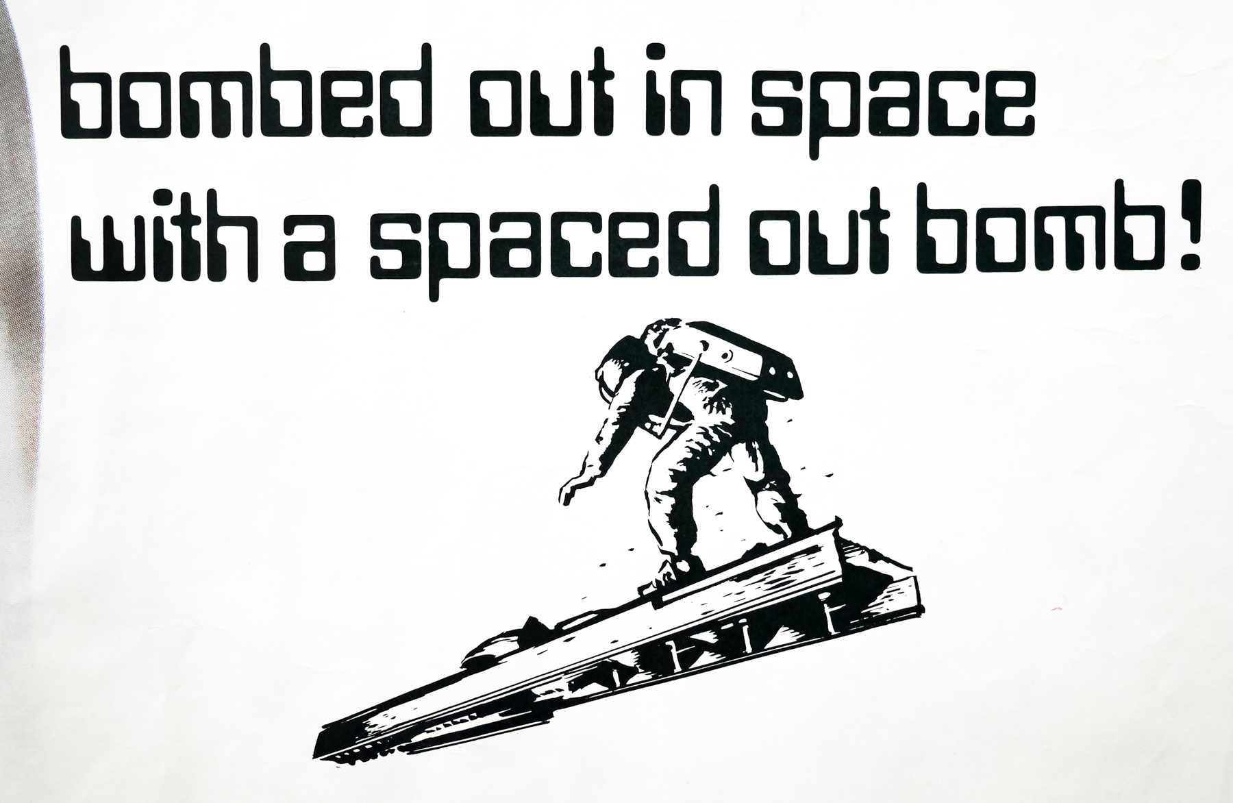
I met Giorgio through my friend Richie Zito the great music producer. I went on to create logos and graphics for all of Giorgio’s music projects and branded his recording studios in North Hollywood. When the project came together he asked me to create the posters for his re-release of Metropolis. There are actually two posters; the first one I created was for the international release of the film, then I did another version of the poster intended for the soundtrack double album cover fold out, which was what became the official one sheet.

Did you have many interactions with Giorgio Moroder himself?
Many and we’re still in touch.

Very cool! Were you given a specific brief for the poster? Was there another designer involved or were you working alone?
No, Giorgio gave me free reign creatively.

How long did it take for you to settle on the final artwork?
Actually rather quickly. After the teaser version which was used for the international release, I then created the soundtrack/one sheet version. The international poster won the Hollywood Reporter award that year for Best Foreign Film Poster.

What happened to the finished artwork after it had been copied for print?
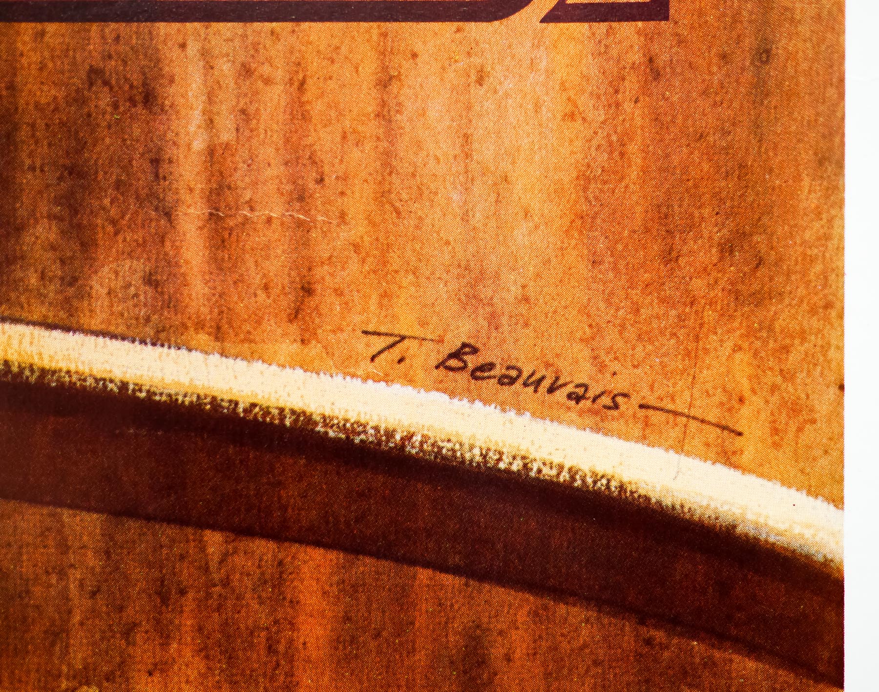
Someone stole it. It breaks my heart to this day. Probably from the color separator or printing shop back then. Giorgio doesn’t know what happened either.

Did your work on the poster result in more film-related commissions?
Not sure, probably not.

What have you done since then and are you still actively working?
I’m still working. Metropolis was in 1984 and I was 33 when I created that piece. That was 34 years ago and I’ve done many, many projects since then. 

By the way, I came across some images in my collection related to Metropolis. The first one (see here) is the info on the first ‘teaser’ poster that was used as the International release that American Film Magazine referenced. The second one (see here) has a very small thumbnail sketch that I did to show Giorgio how I was intending to create a ‘fold out’ album cover image for the Metropolis soundtrack LP. Along with this is the printer’s proof for the Soundtrack Cassette package. I thought these would interest you.

Thanks so much Tom, I really appreciate you taking the time to answer my questions.
You’re very welcome, thank you!

—————————-

Tom’s official website features galleries of his excellent work. The Album Cover Hall of Fame website also features a two-part interview with the artist that is well worth reading.

Queen’s music video for their song ‘Radio Ga Ga’ was released at the same time as Moroder’s version and featured footage for the film.

As well as the original restored film, the Moroder version was released on blu-ray in 2011.

The original trailer for this version of Metropolis is on YouTube.

Star Wars / quad / UK

25.11.14

Poster Poster
Title
Star Wars
AKA
Star Wars: Episode IV - A New Hope (full title) | La guerre des étoiles (Canada - French title / France)
Year of Film
1977
Director
George Lucas
Starring
Mark Hamill, Harrison Ford, Carrie Fisher, David Prowse, Peter Cushing, Alec Guinness, Anthony Daniels, Kenny Baker, Peter Mayhew
Origin of Film
USA
Genre(s) of Film
Mark Hamill, Harrison Ford, Carrie Fisher, David Prowse, Peter Cushing, Alec Guinness, Anthony Daniels, Kenny Baker, Peter Mayhew,
Type of Poster
Quad
Style of Poster
First printing
Origin of Poster
UK
Year of Poster
1977
Designer
Tom Chantrell
Artist
Tom Chantrell
Size (inches)
30" x 39 14/16"
SS or DS
SS
Tagline
May the force be with you

Not only is this probably the best poster artwork for the film that started the biggest sci-fi franchise of all, it’s also considered by many to be the greatest work by the late, great British artist Tom Chantrell. Declaring it so is not an easy decision to make since Chantrell illustrated thousands of posters during his long career and there are many classic designs to choose from, including several Hammer posters and a brilliant design for ‘One Million Years B.C.’. I have a number of other posters by him on this site for you to peruse.

In 2013 I interviewed Chantrell’s widow Shirley about their life together and she recalled how Tom would often ask her to pose so he could capture the correct stance for female characters appearing on his posters. Shirley recalls how the project came about for Tom:

Tom was given an invite to the premier showing and we all went along as a family. As soon as he’d seen the film he had the synopsis, the 10” x 8” press stills and then he started to think about how he was going to tackle the project. From beginning to end it took one month, which is a lot of work for one poster. He’d never taken that long before and I don’t think he did again.

Shirley once again posed for Tom and this time she was his Princess Leia. She not only still has the reference photos taken that day but also still has the same dress she wore.

This poster perfectly captures the excitement and adventure of the seminal sci-fi blockbuster and, although originally intended just to be used for the UK market, the art was liked so much by Lucasfilm that the decision was made to use it for a style C one sheet as well as for other posters around the world. George Lucas himself would later purchase the original artwork for his archives and I like to imagine it’s hanging on a wall in Skywalker Ranch.

This particular style of the poster is the first printing of the poster for the initial 1977 release in cinemas and this can be distinguished from the later printing known as the ‘Oscars version’, so called because it was printed once the film had won a handful of Academy Awards a few months after the original UK release. The ongoing success and phenomenon of the film meant that many more copies of the second version were printed as it was shown around the UK. The Oscars version is also in the Film on Paper collection and can be viewed here.

During the time I spent with Shirley we browsed through several boxes of the plentiful material she has kept from the days that Tom was working on film posters. I was amazed to see that he had retained the original invoice that he had sent to 20th Century Fox (Star Wars’ UK distributors) and some letters from Fox relating to the invoice, which confirmed that he had been paid the sum of £1000 for his original work on the art. These can be viewed by accessing picture thumbnails 28 and 29.

Sadly, Tom Chantrell passed away in 2001 and my friend, and author of the must own British Film Posters: An Illustrated History, Sim Branaghan wrote his obituary for the Guardian. He may no longer be with us but Tom Chantrell’s classic artworks have stood the test of time and continue to impress decades later.

Dracula Has Risen From the Grave / quad / UK

20.09.13

Poster Poster

A classic painting of an enraged Count Dracula dominates this quad for Hammer studios’ Dracula Has Risen From the Grave, the third film featuring the legendary British actor Christopher Lee as the titular bloodsucker. The story, which follows on from Dracula: Prince of Darkness (1966), sees a Catholic Monsignor (played by Rupert Davies) travel to the Eastern European village of Keinenburg where he discovers a populace too afraid to attend church mass because they live in the shadow of Count Dracula’s castle.

Despite the fact that the vampire was seemingly destroyed a year earlier, the Monsignor decides to hike up to the castle with a local priest to perform an exorcism and then seals the front door with a giant holy cross. An accident sees the priest falling onto a frozen river and the blood from his head wound seeps through the ice, resurrecting the Count who is trapped below. Dracula then follows the Monsignor’s trail back to the town and sets his sights on the holy man’s daughter-in-law Maria, played by the gorgeous Veronica Carlson.

Originally intended to be directed by Hammer stalwart Terence Fisher, the man at the helm of the original Dracula (1958), a freak road accident saw Fisher temporarily out of action and regular Hammer cinematographer (and director) Freddie Francis stepped in shortly before production began. This was the first of the studio’s pictures under their newly arranged co-production deal with Warner Bros-Seven Arts, following a split with previous partners Twentieth Century Fox.

As was typical at the time, a pre-sales marketing brochure had been prepared before the screenwriter Anthony Hinds had even finished the script and this was used to secure the required financing from the American partners. Unfortunately, no one had yet informed Christopher Lee that the deal was entirely dependent on him reprising his role as the Count, something the actor was more than a little reluctant to do at the time. There thus followed a sustained campaign of persuasion from Francis and studio boss James Carreras to entice the actor back into the cape. Lee eventually capitulated and the production was on, but it was not to be the last time that Lee would need to be harangued into stepping back onto a Hammer soundstage.

This British poster was designed and painted by arguably the UK’s most famous poster artist, the late, great Tom Chantrell. From 1965 to 1969 Chantrell effectively worked as Hammer’s ‘House Artist’ and produced artwork for the studio’s film posters as well as all of the aforementioned marketing material used to sell the film to potential investors and distribution partners. This particular poster holds particular significance in terms of the Chantrell/Hammer partnership since the depiction of Dracula is actually taken from a slightly modified portrait of the artist himself.

The official Chantrell website, launched last year by Tom’s widow Shirley and memorabilia dealer Michael Bloomfield, features a superb biography of the artist written by his friend and British poster expert Sim Branaghan (who I interviewed here). At the end of the must-read article there is Tom’s own account of the creation of this poster, which is as follows:

“With only a title to go on, I painted a poster with a head of Count Dracula, snarling away with extended teeth, surmounting a montage of characters warding off vampires with a cross, a lady vampire drooling over another, and a female victim with a decolletage having her neck bitten. I used models as there were no stills provided, and later photographed a colleague with suitable under-chin lighting, then similarly posed while he took photographs of me. Denis was too benevolent-looking, so I used one of the photographs of myself to paint from, and added a busted grave to the montage.

Later some stills arrived, and it was possible to start on a third version. This poster had the neck-biting scene with Christopher Lee, and retained the open grave and malevolent self-portrait of Tom Chantrell. Then the distributor Warner Pathe said the film was going on in two weeks, and they wanted a poster right away. No still of Christopher Lee was available, so (what the heck!) the design was printed as it was. Nobody ever questioned the poster. They all think it’s Christopher Lee, but it isn’t, it’s nasty ole’ Count Chantrell!”

The reference photograph of Chantrell as Dracula can be seen here and the two earlier versions can be seen here (both images courtesy of chantrellposter.com). It’s worth noting that this is a Hammer quad that was printed in greater numbers than others because it was used to give away to fans who wrote in to the studio, along with the ‘She/One Million Years BC’ quad (see the bottom of this page for more detail).

Mad Max / quad / UK

17.12.12

Poster Poster
Title
Mad Max
AKA
Interceptor (Italy)
Year of Film
1979
Director
George Miller
Starring
Mel Gibson, Steve Bisley, Joanne Samuel, Hugh Keays-Byrne, Tim Burns, Geoff Parry
Origin of Film
Australia
Genre(s) of Film
Mel Gibson, Steve Bisley, Joanne Samuel, Hugh Keays-Byrne, Tim Burns, Geoff Parry,
Type of Poster
Quad
Style of Poster
--
Origin of Poster
UK
Year of Poster
1979
Designer
Tom Beauvais
Artist
Tom Beauvais
Size (inches)
30" x 39 15/16"
SS or DS
SS
Tagline
The last law in a world gone out of control. Pray he's out there somewhere.

George Miller‘s brilliant vision of an apocalyptic future set in the Australian wastelands follows the battle between vicious outlaw gangs and a group of Main Force Patrol (MFP) pursuit cops who try to keep law and order on the roads. When officer Max Rockatansky (Mel Gibson in his breakout role) kills the ‘Nightrider’, the leader of a motorcycle gang, he sets in motion a chain of events that sees his wife and young son murdered and his partner burned alive. Driven mad by grief, Max commandeers a supercharged black Pursuit Special and sets out to avenge their deaths by whatever means necessary. The film was followed three years later by the superior Mad Max 2 (AKA The Road Warrior).

Because of Gibson’s anonymity to audiences outside Australia his face was not featured on many of the posters designed to sell the film in other territories. The American one sheet features a classic illustration of a leather-clad figure with his face covered by a futuristic visor. This British quad features an MFP figure pointing a shotgun directly at the viewer but it’s not obviously Mel Gibson’s character. The car below the figure is a hybrid between the colourful Interceptor cop vehicles and Max’s black Pursuit.

The poster was designed and illustrated by Tom Beauvais, a British artist with a lengthy career working in film marketing which saw him design and/or illustrate several notable posters, including the quad for Butch Cassidy and the Sundance Kid and the infamous ‘rotten hand bursting from the ground’ image for Lucio Fulci’s Zombie Flesh Eaters.

This UK quad was designed and illustrated by Tom Beauvais, a British artist with a lengthy career working in film marketing which saw him design and/or illustrate several notable posters, including the quad for Butch Cassidy and the Sundance Kid and the infamous ‘rotten hand bursting from the ground’ image for Lucio Fulci’s Zombie Flesh Eaters. In 2012 I was lucky enough to meet and interview Tom and the article can be read here. The Mad Max poster was discussed during the meeting:

———

You worked on one of my favourite film posters at the end of the 1970s, which is the one for Mad Max. Could you talk about designing that?
On that one we were working to a brief from Julian Senior at Warner Bros and he told us he wanted a policeman looking down the twin-barrels of a shotgun. I did an initial sketch of the figure with the car below and he responded really well to it. The praise was generous and I think it was probably because it had been his idea originally. I actually think that Mike Sparling, who I mentioned earlier, was used as a reference model for the policeman.

It’s a striking poster and made even more impressive by the fact that the illustration isn’t crowded out by too much text. It’s effective partly because it’s so minimal.

———

The poster is quite difficult to photograph well because it’s printed on a paper with a kind of silver metallic finish and so any reflections or bends in the paper are very obvious. It’s a difficult quad to find rolled and so I was very happy to track this pristine copy down earlier this year.

As well as this quad there was UK one sheet printed for the title that was designed by Beauvais and features the same artwork. The quad is also part of the Film on Paper collection and it can be viewed here.

Blood Beach / quad / UK

04.02.13

Poster Poster
Title
Blood Beach
AKA
--
Year of Film
1980
Director
Jeffrey Bloom
Starring
David Huffman, Marianna Hill, Burt Young, Otis Young, Lena Pousette, John Saxon, Darrell Fetty, Stefan Gierasch, Eleanor Zee, Pamela McMyler, Harriet Medin, Mickey Fox
Origin of Film
USA
Genre(s) of Film
David Huffman, Marianna Hill, Burt Young, Otis Young, Lena Pousette, John Saxon, Darrell Fetty, Stefan Gierasch, Eleanor Zee, Pamela McMyler, Harriet Medin, Mickey Fox,
Type of Poster
Quad
Style of Poster
--
Origin of Poster
UK
Year of Poster
1981
Designer
Tom Beauvais
Artist
Tom Beauvais
Size (inches)
30" x 40"
SS or DS
SS
Tagline
Just when it's safe to go back in the water... you can't get across the beach!

Something lurks beneath the surface of Santa Monica beach and it’s hungry for flesh – can it be stopped? That’s pretty much the elevator pitch for the 1980 horror film Blood Beach, which was directed by Jeffrey Bloom and features genre stalwart John Saxon and prolific character actor Burt Young (perhaps best known for his role as Paulie in Rocky) as two local policemen assigned to discover the truth behind a number of mysterious disappearances (and a dog with a missing head).

For a film with such a simple premise Blood Beach is surprisingly boring and features several limp sequences involving the other two names mentioned on this poster. David Huffman and Marianna Hill play two locals with a muddily explained backstory and any pretence of them being the film’s leads is abandoned halfway through. There are a handful of effective scenes featuring victims being dragged beneath the sand (I’d actually like to know how the effect was achieved) and one moment where an unlucky gentlemen (well, technically, would-be rapist) has his privates removed by the creature. When it is finally revealed, the beast is so terribly realised that any fear that might have built up immediately evaporates – perhaps the budget ran out by that point but the rubber monstrosity on show is beyond laughable.

Currently the film is very hard to track down if you do want to subject yourself to it, and I actually ended up watching it on a German DVD, which is the only digital release available worldwide and is the slightly modified R-rated version.

The poster was designed and illustrated by Tom Beauvais, a British artist with a lengthy career working in film marketing which saw him design and/or illustrate several notable posters, including the quad for Butch Cassidy and the Sundance Kid and Mad Max. He was also responsible for the infamous ‘rotten hand bursting from the ground’ image for Lucio Fulci’s Zombie Flesh Eaters, a device Tom was clearly happy reusing for this poster! In 2012 I was lucky enough to meet and interview Tom and the article can be read here.

Android / one sheet / UK

10.02.14

Poster Poster
Title
Android
AKA
--
Year of Film
1982
Director
Aaron Lipstadt
Starring
Klaus Kinski, Brie Howard, Norbert Weisser, Crofton Hardester, Kendra Kirchner
Origin of Film
USA
Genre(s) of Film
Klaus Kinski, Brie Howard, Norbert Weisser, Crofton Hardester, Kendra Kirchner,
Type of Poster
One sheet
Style of Poster
--
Origin of Poster
UK
Year of Poster
1982
Designer
Tom Beauvais
Artist
Keith Fowles (main figure and arm) | Tom Beauvais (figures at the bottom)
Size (inches)
27 10/16" x 40.5"
SS or DS
SS
Tagline
...he learns to love. he learns to kill. he becomes a man. | much more than human

This is the scarce UK one sheet for the release of the 1982 sci-fi film Android, starring the infamous German actor Klaus Kinski. Set in 2036 aboard a remote space station, Kinski stars as a scientist named Dr. Daniel who lives alone except for the company of a human-looking android assistant named Max 404 (Don Keith Opper). It is revealed that androids have become outlawed on earth thanks to an incident referred to as the ‘Munich Revolution’, and Dr Daniel and Max are performing illegal research into their development.

Max has started showing signs of insubordination and has developed an interest in sex and reproduction, which has worried Dr Daniel and triggered him to develop what he hopes will be a better android, and which just happens to be in the form of a beautiful blonde woman. Life onboard the space station is interrupted by the arrival of a hijacked prison ship with a trio of escaped convicts, including a female convict called Maggie (Brie Howard), who Max allows onboard much to the doctor’s consternation. Max quickly becomes infatuated with Maggie and a dangerous situation develops between the convicts and Dr Daniel, which becomes even more dangerous when galactic police trace the convicts back to the station. The ending has a neat twist which I won’t spoil here.

The artwork is unique to the UK campaign and also featured on the quad (centred with a crimson background to the left and right). It was put together by the British designer and artist Tom Beauvais whom I interviewed in 2012 and the resultant article can be read here. Beauvais designed the poster and illustrated the figures at the bottom, whilst one of his colleagues, an illustrator named Keith Fowles, used an airbrush to paint the head, background and arm.

Below is the excerpt from the interview with Tom Beauvais in which he mentions his work on this poster:

———————–

You also worked on a poster for the science-fiction film Android [1982]?
Yes, that was actually in conjunction with a chap called Keith Fowles who used to work with us. He was very skilled with an airbrush and he modelled up the head of the main character, as well as the arm and the background. I then painted in the figures along the bottom.

————————

To see the other posters designed and/or illustrated by Tom Beauvais that are in the Film on Paper collection click here.

The Revengers / 30×40 / style A / USA

06.05.12

Poster Poster
Title
The Revengers
AKA
--
Year of Film
1972
Director
Daniel Mann
Starring
William Holden, Ernest Borgnine, Woody Strode, Roger Hanin, Reinhard Kolldehoff, Jorge Luke, Jorge Martínez de Hoyos, Arthur Hunnicutt, Warren Vanders
Origin of Film
USA | Mexico
Genre(s) of Film
William Holden, Ernest Borgnine, Woody Strode, Roger Hanin, Reinhard Kolldehoff, Jorge Luke, Jorge Martínez de Hoyos, Arthur Hunnicutt, Warren Vanders,
Type of Poster
30x40
Style of Poster
Style A
Origin of Poster
USA
Year of Poster
1972
Designer
Tom Jung
Artist
Tom Jung
Size (inches)
30 2/16" x 40 1/16"
SS or DS
SS
NSS #
72/58
Tagline
He bought six men out of hell and they brought it with them. These are...

Design and artwork by Tom Jung, featuring an excellent portrait of Ernest Borgnine, on this US 30×40 for this largely forgotten Western directed by Daniel Mann and starring the brilliant William Holden. Mann had made his name in the 1950s with a string of successful dramas, including Come Back, Little Sheba (1952), The Rose Tattoo (1955) and had helped Elizabeth Taylor win her first oscar for Butterfield 8 (1960).

The Revengers was seemingly an attempt to cash in on the success of Sam Peckinpah’s landmark film The Wild Bunch (1969), which had pushed the boundaries of violence in the Western genre and featured a very similar storyline based around a ragtag bunch of criminals getting together to carry out a job. In this case it’s Holden’s rancher who enlists the help of a gang of lawless convicts to help him in his quest for revenge after his family is killed and his farmstead destroyed by outlaws. Holden and Borgnine had headlined Peckinpah’s earlier film so the studio were obviously hoping for a similar level of success.

Tom Jung is perhaps best known for his iconic ‘style A’ one sheet for Star Wars and the style B one sheet for The Empire Strikes Back. He was a prolific designer and illustrator for film campaigns from the 1950s through to the 1980s. IMPAwards features a gallery of his work and his Wikipedia article has a selected list of the posters he worked on. The other posters I’ve collected by him can be seen here.


Creepshow / quad / UK

25.01.13

Poster Poster

Director George A. Romero was hired to direct this horror anthology and was paired with legendary horror author Stephen King who was on screen-writing duties (hence the top tagline). The film is an homage to boys’ comics of the 1950s, including Tales from the Crypt and The Vault of Horror, and features five short stories that are bookended by scenes featuring a young boy (played Joe King, son of Stephen) who is berated by his abusive father for reading those ‘crap’ comics and who later takes deadly revenge on his father. As with any anthology some of the stories are stronger than others and arguably the best is the one called ‘The Crate’ that sees an ancient creature unleashed from its titular prison, whilst ‘Something to Tide You Over’ a seriously creepy tale of revenge starring Ted Danson and a villainous Leslie Nielsen.

Romero once again collaborated with the special effects guru Tom Savini whose work on Creepshow definitely stands up as amongst the finest of his career. His cockroach-wrangling during the final story ‘They’re Creeping Up On You’ deserves special mention. The director assembled a very impressive cast that includes the likes of Ed HarrisHal Holbrook and genre-favourite Adrienne Barbeau. Stephen King himself even makes an (overblown, hammy) appearance as an unlucky yokel who gets more than he bargained for after discovering a strange meteorite.

The artwork is unique to this British quad but is based on artwork (source) by the American artist Bernie Wrightson that was painted for the title page of the tie-in comic book adaptation. The artwork has recently (July 2013) been confirmed as having been painted by the British poster art stalwart Tom Chantrell. Confirmation was made after the job books of Alan Wheatley, the design agency account handler for the distributor Alpha Films Ltd, were checked and Chantrell’s name was assigned to it. The poster’s artist identity had previously been unknown, although Chantrell’s name had been put forward despite the lack of his usual signature.

Note that there is a printed code upside down on the top left edge of the poster (see last picture). I’m not sure why this was added but it’s possibly to do with it being part of a poster dealer’s inventory – someone cataloguing posters may stamp them with a number to keep track of them – but why stamp it on the front? I know of at least one other copy of the poster with the number on the top so it’s a bit of a mystery.

The character of The Creep depicted on the poster also features on both the excellent advance one sheet and the final version, as well as the Japanese B2.

Honkytonk Man / quad / UK

27.02.14

Poster Poster
Title
Honkytonk Man
AKA
--
Year of Film
1982
Director
Clint Eastwood
Starring
Clint Eastwood, Kyle Eastwood, John McIntire, Alexa Kenin, Verna Bloom, Matt Clark, Barry Corbin, Jerry Hardin, Tim Thomerson, Macon McCalman, Joe Regalbuto, Gary Grubbs
Origin of Film
USA
Genre(s) of Film
Clint Eastwood, Kyle Eastwood, John McIntire, Alexa Kenin, Verna Bloom, Matt Clark, Barry Corbin, Jerry Hardin, Tim Thomerson, Macon McCalman, Joe Regalbuto, Gary Grubbs,
Type of Poster
Quad
Style of Poster
--
Origin of Poster
UK
Year of Poster
1982
Designer
Tom Beauvais
Artist
Tom Beauvais
Size (inches)
30" x 39 13/16"
SS or DS
SS
Tagline
The boy is on his way to becoming a man. The man is on his way to becoming a legend.

This is the British quad for the release of Honkytonk Man, which was produced and directed by Clint Eastwood who also stars alongside his son Kyle Eastwood. Set during the Great Depression of the 1930s, the film follows the western singer Red Stovall (Eastwood snr.) who is suffering from tuberculosis and is living on a dust-ruined farm in Oklahoma. He decides to take a chance at making it big in Nashville and sets off in a vintage Lincoln convertible accompanied by his nephew Whit (Eastwood jr.).

The film follows the pair’s escapades along the way as they meet a whole host of unique characters and Red takes Whit to a whore house to ‘make him a man’. When they eventually make it to Nashville, Red manages to impress a record executive who gives him a chance to make a recording, but his illness is quickly catching up with him.

This poster artwork is unique to the UK poster and was painted by the British artist Tom Beauvais who I was lucky enough to interview for this site in 2013. This poster was discussed during the interview and the following is an excerpt:

I wondered if I could ask you about the two posters you painted featuring Clint Eastwood, Bronco Billy and The Honkytonk Man?
With Bronco Billy, the bit that was on the left of the giant circus advert was taken from the American poster but the British distributor felt that it wasn’t enough and they requested a close-up of Clint Eastwood holding guns. I painted the portrait from a still and then married it together with the American art.

The figure of the boy on the Honkytonk Man poster is actually based on a reference pose by my son Keith. There was a still of Clint in the bathtub and also a still of Kyle Eastwood, who played the son in the film, but it was only a headshot so I got Keith to pose with his elbows on the back of a chair.

To see the other posters in the collection that are designed and/or illustrated by Tom Beauvais click here.

Mad Max / one sheet / UK

03.04.13

Poster Poster
Title
Mad Max
AKA
Interceptor (Italy)
Year of Film
1979
Director
George Miller
Starring
Mel Gibson, Steve Bisley, Joanne Samuel, Hugh Keays-Byrne, Tim Burns, Geoff Parry
Origin of Film
Australia
Genre(s) of Film
Mel Gibson, Steve Bisley, Joanne Samuel, Hugh Keays-Byrne, Tim Burns, Geoff Parry,
Type of Poster
One sheet
Style of Poster
--
Origin of Poster
UK
Year of Poster
1979
Designer
Tom Beauvais
Artist
Tom Beauvais
Size (inches)
27" x 39 15/16"
SS or DS
SS
Tagline
The last law in a world gone out of control. Pray he's out there somewhere.

George Miller‘s brilliant vision of an apocalyptic future set in the Australian wastelands follows the battle between vicious outlaw gangs and a group of Main Force Patrol (MFP) pursuit cops who try to keep law and order on the roads. When officer Max Rockatansky (Mel Gibson in his breakout role) kills the ‘Nightrider’, the leader of a motorcycle gang, he sets in motion a chain of events that sees his wife and young son murdered and his partner burned alive. Driven mad by grief, Max commandeers a supercharged black Pursuit Special and sets out to avenge their deaths by whatever means necessary. The film was followed three years later by the superior Mad Max 2 (AKA The Road Warrior).

Because of Gibson’s anonymity to audiences outside Australia his face was not featured on many of the posters designed to sell the film in other territories. The American one sheet features a classic illustration of a leather-clad figure with his face covered by a futuristic visor. This British quad features an MFP figure pointing a shotgun directly at the viewer but it’s not obviously Mel Gibson’s character. The car below the figure is a hybrid between the colourful Interceptor cop vehicles and Max’s black Pursuit.

This UK one sheet was designed and illustrated by Tom Beauvais, a British artist with a lengthy career working in film marketing which saw him design and/or illustrate several notable posters, including the quad for Butch Cassidy and the Sundance Kid and the infamous ‘rotten hand bursting from the ground’ image for Lucio Fulci’s Zombie Flesh Eaters. In 2012 I was lucky enough to meet and interview Tom and the article can be read here. The Mad Max poster was discussed during the meeting:

———

You worked on one of my favourite film posters at the end of the 1970s, which is the one for Mad Max. Could you talk about designing that?
On that one we were working to a brief from Julian Senior at Warner Bros and he told us he wanted a policeman looking down the twin-barrels of a shotgun. I did an initial sketch of the figure with the car below and he responded really well to it. The praise was generous and I think it was probably because it had been his idea originally. I actually think that Mike Sparling, who I mentioned earlier, was used as a reference model for the policeman.

It’s a striking poster and made even more impressive by the fact that the illustration isn’t crowded out by too much text. It’s effective partly because it’s so minimal.

———

As well as this UK one sheet there was a British quad poster printed for the title that was designed by Beauvais and features the same artwork. The quad is also part of the Film on Paper collection and it can be viewed here.

Q the Winged Serpent / quad / UK

23.12.13

Poster Poster
Title
The Winged Serpent
AKA
Q (USA) | Q: The Winged Serpent (UK) | American Monster (West Germany)
Year of Film
1982
Director
Larry Cohen
Starring
Michael Moriarty, Candy Clark, David Carradine, Richard Roundtree, James Dixon, Ron Cey
Origin of Film
USA
Genre(s) of Film
Michael Moriarty, Candy Clark, David Carradine, Richard Roundtree, James Dixon, Ron Cey,
Type of Poster
Quad
Style of Poster
--
Origin of Poster
UK
Year of Poster
1982
Designer
Tom Chantrell
Artist
Tom Chantrell
Size (inches)
30" x 40"
SS or DS
SS
NSS #
--
Tagline
You'll just have time to scream... before it tears you apart!

Writer/director and B-movie legend Larry Cohen is responsible for this 1982 horror film that harks back to the popular ‘giant beast’ monster movies of the 1950s. Commonly known as ‘Q: The Winged Serpent‘, or simply ‘Q’, the story is set in New York City and follows two police detectives (played by David Carradine and Richard Roundtree) investigating a series of brutal sacrificial slayings in which victims’ hearts and skins have been removed. They are also struggling to explain the mysterious deaths of people snatched from high up on rooftops by what is reported to be a flying lizard.

At the same time, a luckless hoodlum called Jimmy Quinn (played with gusto by Michael Moriarty) is on the run from murderous mobsters and discovers a giant egg hidden in the crown of the famous Chrysler Building, which apparently belongs to the deadly creature. It becomes apparent that the cult behind the sacrificial murders has managed to resurrect an Aztec god known as Quetzalcoatl, a flying lizard with huge talons and a taste for human flesh, and the detectives must battle to stop both the cult members and defeat the beast before New York City is lost.

This quad was designed and illustrated by the late, great British artist Tom Chantrell whose dynamic and colourful work featured on hundreds of posters over a forty year period. It features the Chrysler Building, a famous New York landmark that also appears on the international one sheet, painted by Bob Gleason. Note that the lady in peril is wearing quite a bit less on this quad than she is on the one sheet – Chantrell always had an eye for adding extra bits of titillation to his artwork.

Tom Chantrell sadly passed away in 2001 but last year his widow Shirley launched his official website, which showcases his work and features a great biography written by Sim Branaghan, author of the must-own book British Film Posters. Chantrell illustrated many classic poster designs, including several Hammer posters such as the brilliant quad for ‘One Million Years B.C.’, and he was also responsible for the iconic Star Wars quad, the artwork of which ended up being used around the globe.

I have a number of other designs by Chantrell on this site and you can read an exclusive interview with Shirley by clicking here.

Star Wars and Empire Strikes Back / double bill / quad / UK

02.09.14

Poster Poster

Following the unprecedented success of the original Star Wars, released in 1977 to worldwide audience acclaim, expectations were high for the sequel which was put into production a few months after its release. Three years later, The Empire Strikes Back arrived in cinemas and was met with huge audience and critical acclaim, firmly cementing the series’ place in the hearts of millions of fans across the globe. A less well-received third part of the original trilogy, Return of the Jedi, and a lacklustre set of prequel films failed to dampen audience enthusiasm for the franchise and a new film adventure is set to be released at the end of 2015.

To capitalise on the successful release of the films, particularly before home video was a reality, distributor 20th Century Fox decided to release a double-bill of both Star Wars and Empire Strikes Back in to cinemas towards the end of 1980. This event was repeated across the world but this British quad is unique to this country and is the result of the amalgamation of the original quads for both films, plus an extra photographic element not included on either in the figure of Jedi master Yoda, which was probably added due to the characters’ popularity.

The original Star Wars quad was designed and illustrated by the late, great British artist Tom Chantrell whose dynamic and colourful work featured on hundreds of posters over a forty year period. The artist sadly passed away in 2001 but last year his widow Shirley launched his official website, which showcases his work and features a great biography written by Sim Branaghan, author of the must-own book British Film Posters. Chantrell illustrated many classic poster designs, including several Hammer posters such as the brilliant quad for ‘One Million Years B.C.’, and he was also responsible for many other pieces of iconic poster artwork. I have a number of other designs by Chantrell on this site and you can read an exclusive interview with Shirley by clicking here.

The Empire Strikes Back quad features the artwork painted for the US style B one sheetwhich was by the American artist Tom Jung, perhaps best known for his iconic ‘style A’ one sheet that he painted for the release of the original Star Wars. Jung was a prolific designer and illustrator for film campaigns from the 1950s through to the 1980s. IMPAwards features a gallery of his work and his Wikipedia article has a selected list of the posters he worked on. The other posters I’ve collected by him can be seen here.

Another special quad was put together for a triple-bill event after the release of Return of the Jedi, which again featured elements of the artwork from all three separate release quads. Note that this poster can be found undersized at around 28″ x 40″ and this was because several hundred copies were machine trimmed to be used in special frames on the London Underground, a fate which befell a number of posters around the end of the 1970s and early 1980s.


The Hills Have Eyes / quad / UK

03.10.14

Poster Poster

Striking artwork on this UK quad for the release of The Hills Have Eyes, which was director Wes Craven‘s third film, following his notorious breakout horror The Last House on the Left (1972) and the little seen adult drama The Fireworks Woman (1975). Written by Craven himself, the film is an exploitation horror that follows events when a family heading to California with a caravan crash in a remote part of the Nevada desert. Unluckily for them, the area used to be a nuclear testing site and there are a pack of feral, deformed cannibal freaks living in the nearby hills who subject the Carter family to a sustained series of brutal attacks.

The film was reasonably well received at the time of original release but went on to gain a cult following and is today regarded as one of the director’s best films. I watched it again recently and it retains its power to shock, with some of the attacks being particularly brutal. A remake was released in 2006 which was at least stylistically interesting, if nothing else.

This UK quad is unusual in that it has no credits block or distributor information and features only the signature of the artist, Tom Chantrell. The only other British poster for the film that I’ve seen is a double-bill quad and I don’t think this one could be considered a teaser or advance (despite featuring little detail).

Tom Chantrell’s dynamic and colourful work featured on hundreds of posters over a forty year period. His official website features a great biography written by Sim Branaghan, author of the must-own British Film Posters. Chantrell illustrated many classic poster designs, including several Hammer posters such as the brilliant quad for ‘One Million Years B.C.’, and was also responsible for the iconic Star Wars quad, the artwork of which ended up being used around the globe. I have a handful of other designs by him on this site.

Codename Wildgeese / quad / UK

05.01.15

Poster Poster
Title
Codename Wildgeese
AKA
Geheimcode: Wildgänse (Germany - original title) | Arcobaleno selvaggio [Wild Rainbow] (Italy) | Code name: Wild Geese (alt. spelling)
Year of Film
1984
Director
Antonio Margheriti
Starring
Lewis Collins, Lee Van Cleef, Ernest Borgnine, Klaus Kinski, Manfred Lehmann, Mimsy Farmer
Origin of Film
Italy | West Germany
Genre(s) of Film
Lewis Collins, Lee Van Cleef, Ernest Borgnine, Klaus Kinski, Manfred Lehmann, Mimsy Farmer,
Type of Poster
Quad
Style of Poster
--
Origin of Poster
UK
Year of Poster
1985
Designer
Tom Chantrell
Artist
Enzo Sciotti (original artwork) | Tom Chantrell (quad adaptations)
Size (inches)
30 2/16" x 40"
SS or DS
SS
Tagline
--

Codename Wildgeese is a 1984 entry in the ‘Macaroni Combat‘ genre of Italian-made action/war films that was helmed by the prolific director Antonio Margheriti (most often credited as Anthony M. Dawson) and is usually associated with the 1978 British film The Wild Geese. Both films are ensemble-cast action films in which Western mercenaries are sent into ‘wild’, lawless, dictator-ruled countries to carry out a mission and escape alive. Both films feature aging cast members who probably should have known better and I don’t doubt that Margheriti and his enterprising distributors chose the Wildgeese element of the title to capitalise on the success of the earlier film.

The late Lewis Collins, known for his leading man roles in action-fare such as TVs The Profressionals and the 1982 British action film Who Dares Wins, appears as the leader of a mercenary group which is employed covertly by the DEA (in the shape of Ernest Borgnine) and sent into the opium-producing area in Asia known as the Golden Triangle to attempt to stem the supply of illegal opium to the west. His team, which includes pilot China (Lee Van Cleef), make their way into the Triangle and engage an enemy base in a quarry before pushing onto the factories and a fiery showdown.

The film is largely a damp squib with very little in the way of memorable action sequences or an engaging script. The effects and gunplay are largely poor and the editing and soundtrack are notably bad. It’s certainly not a patch on The Wild Geese, which in itself was no masterpiece.

A reader of the site, Andrew Lamb, got in touch to confirm that the quad is an adaptation of artwork that was painted by the Italian artist Enzo Sciotti and originally intended for, I believe, the German poster. Andrew commented the following (the original can be seen at the bottom of the page):

It was later adapted for the UK quad using a photo duplicate of the original artwork, with paint applied around the edges to fill the quad size, then new titles applied over the top. This was done by Tom Chantrell. My guess is that he was commissioned to paint the artwork and liked Sciotti’s art so much that it was suggested by him and agreed upon to be used instead. I’m not 100% certain of this, however I own the original artwork layout for the UK quad and it came from a lot of Tom Chantrell’s work. So that’s my hunch.

Eaten Alive / quad / UK

19.02.16

Poster Poster
Title
Eaten Alive
AKA
Mangiati vivi! (Italy - original title) | Doomed to Die (USA) | The Emerald Jungle (USA - video)
Year of Film
1980
Director
Umberto Lenzi
Starring
Robert Kerman, Janet Agren, Ivan Rassimov, Paola Senatore, Me Me Lai, Fiamma Maglione, Franco Fantasia, Franco Coduti, Alfred Joseph Berry, Michele Schmiegelm, Mel Ferrer
Origin of Film
Italy
Genre(s) of Film
Robert Kerman, Janet Agren, Ivan Rassimov, Paola Senatore, Me Me Lai, Fiamma Maglione, Franco Fantasia, Franco Coduti, Alfred Joseph Berry, Michele Schmiegelm, Mel Ferrer,
Type of Poster
Quad
Style of Poster
--
Origin of Poster
UK
Year of Poster
1981
Designer
Tom Chantrell
Artist
Tom Chantrell
Size (inches)
30 5/16" x 39 11/16"
SS or DS
SS
Tagline
Trapped in a jungle of crazy flesh eaters! | The terrifying nightmare that became a reality!

Lurid artwork by the late, great Tom Chantrell on this UK quad for the release of Italian director Umberto Lenzi‘s 1980 entry into the then burgeoning cannibal subgenre of horror, Eaten Alive! (here just Eaten Alive). This is not to be confused with Tobe Hooper’s 1976 film of the same name about a redneck killer with a pet alligator. Eaten Alive wasn’t Lenzi’s first foray into the subgenre and the director is regularly credited with kickstarting it all with his film Deep River Savages (AKA Sacrifice!) in 1972. This film was released the same year as Cannibal Holocaust, directed by fellow countryman Ruggero Deodato, which is today considered to be the pinnacle of the genre and remains notorious to this day. Not to be outdone, Lenzi filmed one of the subgenre’s most unapologetically nasty entries, Cannibal Ferox, only a year after this film was released, but by that point the subgenre was beginning to fade and only a few more obscurities were made during the 1980s.

Unlike Ferox and Holocaust, Eaten Alive is more of a jungle adventure film and isn’t told in the pseudo-documentary, mondo style of the other films. Not only did Lenzi utilise stars from other cannibal films, including the American pornstar-turned-actor Robert Kerman (who appeared in Holocaust and Ferox) but he also borrowed footage from other films such as his own Deep River Savages and The Mountain of the Cannibal God. Like other entries it also depicts scenes of real animal torture and killings which have always proved controversial and are deeply uncomfortable to sit through today (at least for this viewer). Eaten Alive sees an American woman called Sheila (Swedish actress Janet Agren) who travels to remote New Guinea in search of her missing sister Diana (Paola Senatoreaccompanied by Vietnam veteran Mark (Kerman). They discover that Diana has joined a cult deep in the jungle which is being led by a Jim Jones-style guru called Jonas (cannibal flick regular Ivan Rassimov) who rules over his subjects and the local natives using physical and sexual abuse. Sheila, Mark and Diana attempt to escape from the cult’s clutches and there follows several scenes featuring all manner of barbarities.

Today Eaten Alive is considered one of the lesser cannibal films, certainly compared to Holocaust and Ferox, but it’s not without merit for gorehounds looking for a slice of sleazy entertainment. It’s arguably worth a watch as a curio of a film that would never be made today, not least because of the animal cruelty and breathtaking levels of misogyny on display.

Tom Chantrell was a celebrated British artist whose dynamic and colourful work featured on hundreds of posters over a forty year period. His official website features a great biography written by Sim Branaghan, author of the must-own British Film Posters. Chantrell illustrated many classic poster designs, including several Hammer posters such as the brilliant quad for ‘One Million Years B.C.’, and was also responsible for the iconic Star Wars quad, the artwork of which ended up being used around the globe. I have a number of other designs by him on this site. The chunky title treatment is one of the artist’s specialties and features on several of his posters, which can be seen on his official site.

Prime Cut / one sheet / style A / USA

27.06.17

Poster Poster
Title
Prime Cut
AKA
Carnage (France)
Year of Film
1972
Director
Michael Ritchie
Starring
Lee Marvin, Gene Hackman, Angel Tompkins, Gregory Walcott, Sissy Spacek, Janit Baldwin, William Morey, Clint Ellison, Howard Platt, Les Lannom
Origin of Film
USA
Genre(s) of Film
Lee Marvin, Gene Hackman, Angel Tompkins, Gregory Walcott, Sissy Spacek, Janit Baldwin, William Morey, Clint Ellison, Howard Platt, Les Lannom,
Type of Poster
One sheet
Style of Poster
Style B
Origin of Poster
USA
Year of Poster
1972
Designer
Tom Jung
Artist
Tom Jung
Size (inches)
27 3/16" x 41"
SS or DS
SS
NSS #
72/57
Tagline
Together They're Murder In...

A painting by the American artist Tom Jung, who is best known for his work on the style A poster for the release of the first Star Wars film, features on this one sheet for the 1972 crime-drama, Prime Cut. The film was directed by the late Michael Ritchie (Fletch, Downhill Racer) and stars two heavyweight actors of the time in Lee Marvin and Gene Hackman. The former had a string of box-office hits playing tough guys in films such as Point Blank and The Dirty Dozen, and the latter had just starred in the unforgettable The French Connection and was to appear in The Poseidon Adventure in the same year as Prime Cut. It also marked the acting debut of Sissy Spacek who would appear in her most famous role four years later in Brian De Palma’s Carrie.

The plot sees Nick Devlin (Marvin), a Chicago mob enforcer, sent with a crew of men to Kansas City to track down Mary Ann (Hackman) and recover a $500,000 debt. Previous men sent by the mob have disappeared and we witness one being ‘processed’ through Mary Ann’s meat factory, ending up as the filling in a string of sausages that are then sent to the mob boss as a taunt. After driving to Kansas, Devlin first attacks Mary Ann’s brother and warns him that the group are there to collect the debt. The following day they find Mary Ann in a barn where he is the ringleader of a white-slave auction in which young girls are being auctioned off to older men. The women are kept naked in pens like livestock and drugged up so they don’t try to escape. Devlin threatens Mary Ann and rescues one of the women called Poppy (Spacek) “on account”. The rest of the film sees him attempting to secure the missing money and avoiding Mary Ann’s gang of denim-wearing, shotgun-toting farm boys.

The film is fairly brisk at just under 90 minutes and both leads are entertaining to watch throughout. Spacek is also excellent as Poppy and it’s not hard to see why her career took off quickly following her appearance in Prime Cut. There are several memorable scenes in the film, including one faintly ridiculous one where Devlin and Poppy are chased through a wheatfield by a combine harvester, which then goes onto chew up an entire car!

As well as the iconic one sheet for Star Wars, Tom Jung is also known for the style B one sheet for The Empire Strikes Back. He was a prolific designer and illustrator for film campaigns from the 1950s through to the 1980s. IMPAwards features a gallery of his work and his Wikipedia article has a selected list of the many posters he worked on. Rather unusually, at least in comparison to other film poster artists, Jung was also a designer of his posters as well as the artist. The other posters I’ve collected by him can be seen here.

Note that this is the Style A one sheet and style B is photographic. Rather unusually, the decision was taken to insert ‘A’ in next to the title at the bottom of the poster which makes it look like the title is ‘A Prime Cut’.

Bite the Bullet / one sheet poster / USA

02.10.17

Poster Poster
Title
Bite the Bullet
AKA
--
Year of Film
1975
Director
Richard Brooks
Starring
Gene Hackman, Candice Bergen, James Coburn, Ben Johnson, Ian Bannen, Jan-Michael Vincent, Robert Donner, Jean Willes, Mario Arteaga, Dabney Coleman
Origin of Film
USA
Genre(s) of Film
Gene Hackman, Candice Bergen, James Coburn, Ben Johnson, Ian Bannen, Jan-Michael Vincent, Robert Donner, Jean Willes, Mario Arteaga, Dabney Coleman,
Type of Poster
One sheet
Style of Poster
--
Origin of Poster
USA
Year of Poster
1975
Designer
Tom Jung
Artist
Tom Jung
Size (inches)
27 2/16" x 41"
SS or DS
SS
NSS #
75/132
Tagline
In the tradition of Shane and High Noon, a new Western Classic is born! BITE THE BULLET!

A detailed piece of art by Tom Jung features on this US one sheet for the release of the 1975 Western Bite the Bullet. The film was written and directed by the late American director Richard Brooks who is best known for Blackboard Jungle (1955), Cat on a Hot Tin Roof (1958) and In Cold Blood (1967). The story was inspired by a 1908 horseback race that traveled 700 miles from Evanston, Wyoming to Denver, Colorado.

The nine contestants include a pair of former Rough Riders, Sam Clayton (Gene Hackman) and Luke Matthews (James Coburn) who are both out for the prize fund, despite their friendship. Also in the group is a former prostitute (Candice Bergen), a cocky kid (Jan-Michael Vincent) and an Englishman (Ian Bannen). A train containing the people from the newspaper who created the competition sets off along the route and meets up with the group at various points. We watch as they all suffer from various perilous situations, including attacks from bandits, large wildlife (bear!) and a group of dangerous prisoners. 

The film is a fairly lightweight but enjoyable watch and the main cast are all decent. Hackman and Coburn are, as usual, convincing in their parts and bring needed gravitas to their roles. A speech by Hackman recalling his time during the Spanish-American war is a particular highlight. Reviews were mixed, however, and I don’t believe the film was a great success as the box-office.

As well as the iconic one sheet for Star Wars, Tom Jung is also known for the style B one sheet for The Empire Strikes Back. He was a prolific designer and illustrator for film campaigns from the 1950s through to the 1980s. IMPAwards features a gallery of his work and his Wikipedia article has a selected list of the many posters he worked on. Rather unusually, at least in comparison to other film poster artists, Jung was also a designer of his posters as well as the artist. The other posters I’ve collected by him can be seen here.

Dark Star / quad / style B / UK

24.10.12

Poster Poster
Title
Dark Star
AKA
--
Year of Film
1974
Director
John Carpenter
Starring
Dan O'Bannon, Brian Narelle, Cal Kuniholm, Dre Pahich
Origin of Film
USA
Genre(s) of Film
Dan O'Bannon, Brian Narelle, Cal Kuniholm, Dre Pahich,
Type of Poster
Quad
Style of Poster
Style B
Origin of Poster
UK
Year of Poster
1978
Designer
Tom Chantrell | Mike Wheeler
Artist
Tom Chantrell
Size (inches)
30" x 40"
SS or DS
SS
Tagline
Bombed out in space with a spaced-out bomb!

This is the rarely seen alternative style UK quad for the release of ace director John Carpenter‘s first film, Dark Star. This sci-fi comedy was made over a period of several years whilst Carpenter was a student at the famous USC School of Cinematic Arts in California, which counts hundreds of well known directors, producers and screenwriters amongst its alumni. Made in collaboration with his friend and fellow student Dan O’Bannon, the shoestring budget (reportedly just $60,000) meant that the pair were multitasking throughout the shoot, with Carpenter co-writing the screenplay, directing, producing and writing the score, whilst O’Bannon shared the screenwriting duties as well as acting and working on the special effects.

The film follows the exploits of the spaceship Dark Star, an exploratory vessel traveling through space looking for unstable planets to blow up with giant bombs, clearing the way for space colonisation. The small crew has to deal with malfunctioning equipment (including the fact that their last supply of toilet paper was destroyed), a mischievous mascot alien, and a sentient bomb that must be persuaded not to destroy the ship by giving it a rudimentary lesson in phenomenology. As depicted on this poster the crew are also keeping the dead body of their captain in freezer storage and are able to speak directly with his conscious. The film is often credited as the first sci-fi to explore the mundanity of working in space.

After playing successfully in a series of short film festivals, the film was seen by the producer Jack H. Harris who was known for launching the careers of fledgling filmmakers, including John Landis whose first feature Schlock was shepherded onto the screen by the producer. Carpenter and O’Bannon were given budget to expand the short into a feature, and several new sequences were added before its eventual release in 1974. The film opened on a significant number of screens considering its origins but left audiences confused, particularly since it came out of nowhere with a brief marketing campaign that made the film seem like a dark and serious sci-fi. Despite being a box-office flop, the film would later gain a great cult following once it was released onto VHS in the 1980s.

Dan O’Bannon went on to work on the special effects for George Lucas’ Star Wars, as well as further exploring the idea of ‘workers in space’ in his script for Ridley Scott’s Alien. Carpenter would next direct the taught thriller Assault on Precinct 13 (1976), which saw international success and firmly established him as a director, paving the way for his milestone horror film, Halloween (1978).

The film was not actually released in the UK until 1978 and, for reasons unknown, it was given two quad designs; the more common ship version (what I’m calling style A) and this ‘freezer’ version (style B). As anyone who has seen Dark Star will know the situation depicted on this poster is slightly different in the film; the crew member speaking to the captain without wearing a spacesuit. Both quads were designed and illustrated by the late, great British artist Tom Chantrell whose dynamic and colourful designs featured on hundreds of posters over a forty year period. His official website features a great biography written by Sim Branaghan, author of the must-own British Film Posters.

This poster features in the book and Sim notes that this design was done by Chantrell on a freelance basis for the marketing agency Mike Wheeler Publicity, with the eponymous owner likely having had a certain amount of design input into it. The book features plenty of detail on the agency and its history. The fact that this was released in 1978 explains the reason it sports a press-quote that mentions the sci-fi classic Star Wars, released a year earlier, and with a poster also painted by Chantrell (arguably his most famous illustration).

Possession / quad / UK

22.03.13

Poster Poster
Title
Possession
AKA
The Night the Screaming Stops (USA - reissue title)
Year of Film
1981
Director
Andrzej Zulawski
Starring
Isabelle Adjani, Sam Neill, Margit Carstensen, Heinz Bennent, Johanna Hofer, Carl Duering, Shaun Lawton, Michael Hogben
Origin of Film
France | West Germany
Genre(s) of Film
Isabelle Adjani, Sam Neill, Margit Carstensen, Heinz Bennent, Johanna Hofer, Carl Duering, Shaun Lawton, Michael Hogben,
Type of Poster
Quad
Style of Poster
--
Origin of Poster
UK
Year of Poster
1981
Designer
Tom Chantrell
Artist
Tom Chantrell | Barbara Baranowska AKA 'Basha' (original French artwork)
Size (inches)
30 2/16" x 40 1/16"
SS or DS
SS
Tagline
She created a monster... as her secret lover!

Polish director Andrzej Zulawski‘s Possession is a definite marmite film; you’ll either love it or totally detest it. I’m firmly in the former camp but it’s not hard to see why it might rankle with certain viewers. A multinational production, the film was shot in West Berlin (whilst The Wall was still standing), financed largely by French money and stars Kiwi actor Sam Neill alongside the stunning French actress Isabelle Adjani. Possession begins as what seems like a straightforward relationship drama, depicting the breakdown of the marriage between husband and wife Mark (Neill) and Anna (Adjani) as it gets increasingly fraught. The audience witnesses several scenes of extreme shrieking, hysteria and mental breakdown from both parties as Mark comes to terms with his wife’s infidelity.

It’s when Mark decides to investigate who his wife has been seeing that the film takes a turn for the surreal and horrific. At first he discovers that she had been having an affair with a new-age sleaze-ball called Heinrich (Heinz Bennent) but after confronting him at his house they both realise that Anna has also been meeting a mysterious third party. Mark then hires a private detective to try and discover where his wife disappears to when she’s not at their apartment. As alluded to with this poster’s tagline, the audience soon discovers that what Anna is tending to in a dingy apartment in the Turkish district of Berlin is not altogether human. When the detective (and later his lover) go missing, both Heinrich and Mark uncover the horrifying truth. I won’t spoil the reveal except to say that Italian special effects maestro Carlo Rambaldi (of ‘Close Encounters…’ and ‘E.T.’ fame) was involved in the creation of several versions of a slimy, tentacled creature.

Isabelle Adjani won the best actress prize at Cannes for her dual performance as the hysterical, unhinged Anna and the ‘is she real-or-not?’ Helen, a kind and gentle teacher who works at the school where the couple’s son Bob is a pupil. As Anna, the actress turns everything up to 11 and at times the shrieking is almost unbearable. In perhaps the most infamous sequence in the film, the so-called ‘miscarriage’ scene, she has a full-on orgiastic meltdown in a dingy German subway that culminates with her oozing blood and a white liquid from her face and neck. Neill also gives an over-the-top performance throughout and it’s the level of hysteria that likely sees many viewers heading for the remote (or cinema exit if they were in attendance back in 1981).

For reasons which aren’t really clear, the film was embroiled in the Video Nasties debacle here in the UK and was banned outright in 1983, but not before having it’s cinema debut thanks to New Realm distributors two years earlier. It’s inclusion on the DPPs list is a complete mystery as it’s nowhere near as gruesome or brutal as some of the other titles on there and is unquestionably one of the best titles to fall foul of the whole thing.

This very scarce original UK quad was created by the brilliant British designer and artist Tom Chantrell whose dynamic and colourful designs featured on hundreds of posters over a forty year period. His official website features a great biography written by Sim Branaghan, author of the must-own British Film Posters. The artwork is unquestionably based on the French poster artwork that was painted by the Polish artist Barbara Baranowska (AKA ‘Basha’). I’ve been unable to discover much about the artist, other than a short biography on the Horse Hospital website. It seems that her work for Possession is the poster for which she is most well-known.

The original trailer is on YouTube.

Prisoners of the Lost Universe / one sheet / UK

05.08.13

Poster Poster

A classic case of the poster being significantly more exciting than the film it was attempting to sell to the cinema-going public, this is the UK one sheet for the release of the low-budget sci-fi adventure Prisoners of the Lost Universe. Produced by Marcel/Robertson Productions Ltd, the short-lived company who were also responsible for Hawk the Slayer (1980), filming took place in South Africa with a largely American cast and, despite seeing a cinema release in several countries, the film was given its debut on cable TV in the States.

Scientist Dr. Hartmann (Kenneth Hendel) is testing out his revolutionary matter transporter when an earthquake strikes and accidentally beams him to an alternative universe, followed shortly after by Carrie (Kay Lenz), a TV reporter sent to meet him, and Dan, a handyman who also happens to be a kendo champion (Richard Hatch). The duo must cope with the hostile, prehistoric-seeming environment of the new universe, and as they search for the scientist they meet a host of strange characters, including a mute giant, a green-skinned warrior and a cheeky thief. Before long, Carrie has been kidnapped by a warlord named Kleel (played by genre stalwart John Saxon) who has strangely modern technology compared to the rest of the people he rules over, and Dan must battle to save her from his clutches.

Low-budget and with a clunker of a script, awful production design and unsurprisingly sloppy special effects, the film has very little going for it other than a series of unintentionally hilarious moments, which might explain why it has featured on several TV shows that make fun of bad films, including This Movie Sucks! and Mystery Science Theater 3000. The film is apparently in the public domain and has been released on DVD multiple times, usually as part of a compilation of other public domain clunkers, but it can also be watched on YouTube, if you want.

This one sheet was designed and illustrated by the late, great British artist Tom Chantrell whose dynamic and colourful work featured on hundreds of posters over a forty year period. His official website features a great biography written by Sim Branaghan, author of the must-own British Film Posters. Chantrell illustrated many classic poster designs, including several Hammer posters such as the brilliant quad for ‘One Million Years B.C.’, and was also responsible for the iconic Star Wars quad, the artwork of which ended up being used around the globe. I have a handful of other designs by him on this site.


Top Gun / quad / UK

30.04.14

Poster Poster

Top Gun is one of the quintessential popcorn films of the 1980s and certainly the one that launched and boosted several Hollywood careers, including that of its director, the late Tony Scott, star Tom Cruise and producing partners Jerry Bruckheimer and the late Don Simpson who were responsible for some of the biggest box-office successes of the 80s and 1990s. The film’s script was based on a magazine article about a top Navy fighter pilot training school, Cruise plays pilot Maverick who is bumped up the ranks and sent to the Top Gun training school after he successfully aids a fellow pilot in distress. There his reckless flying draws the attention of the school’s instructors and disdain from fellow trainees, including top student Iceman (Val Kilmer) who considers his methods dangerous and unsafe. At the same time, Maverick chases after a civilian contractor called Charlie (Kelly McGilliswho is initially wary of his advances. The film features corny dialogue and cheesy acting but is never anything but entertaining and its soundtrack, by Harold Faltermeyer, is one of the most successful of all time in terms of sales.

This British quad was created by the British designer and artist Brian Bysouth who I interviewed for this site in 2012. In the mid-1980s the requests for painted artwork, of which Brian was a renowned specialist, were drying up so Brian realised it was time to learn how to use computers to create photographic posters, as detailed below. This Top Gun quad is likely to have been one of the first computer-generated posters that the designer worked on (see also the Predator quad)

——————————

Computers as an art tool came in during the time you were at FEREF. What was it like making that transition? Was it easy for the company?
Yes, luckily Steve Laws, the studio manager at the time and also a good designer, managed to persuade the upper management that desktop publishing was coming and that we had to embrace it. I can’t remember exactly when this was, but it was clear that the Apple Macintosh was the best computer. At that time they were very expensive but gradually the studio was equipped with the new technology.

Unfortunately, the computers replaced the jobs of paste up artists and it soon became apparent that unless they were capable of making the transition they were no longer needed. One machine and an operator could add all the text and details to an advert or illustration, ready for it to be sent to the printer. To keep their jobs our paste up artists had to learn how to use a Mac.

In the beginning the computers couldn’t handle very large files so things went very slowly, especially with complex designs. But when Macs started to get a lot faster the way forward was firmly established and we began to recruit skilled computer designers and operators.

I realised when my illustration work was drying up that I needed to become more of an art director. I was interested in helping out the Mac designers and I was able to use my experience to help them. I always found it easy to suggest ways to improve a design, which they came to appreciate; gradually it became usual for me to be asked to help if a design was proving troublesome.  I wasn’t as quick on the Macs as the operators but I realised that I had to learn Photoshop to enable me to art direct them properly. Learning the correct commands was essential, so I read the manual of Photoshop 3, (which I think was the version at that time), and learned the various key-commands and technical terms.

Eventually I asked for a Mac of my own and I was given use of one that had become surplus. When I wasn’t painting I was practicing. Looking back now, it was instrumental in helping me when I was asked to work on the Star Trek DVD covers.

——————————-

To see the other posters in the Film on Paper collection that were designed and/or painted by Brian Bysouth click here.


The Land That Time Forgot / quad / UK

24.10.14

Poster Poster
Title
The Land That Time Forgot
AKA
--
Year of Film
1975
Director
Kevin Connor
Starring
Doug McClure, John McEnery, Susan Penhaligon, Keith Barron, Anthony Ainley, Godfrey James, Bobby Parr
Origin of Film
UK | USA
Genre(s) of Film
Doug McClure, John McEnery, Susan Penhaligon, Keith Barron, Anthony Ainley, Godfrey James, Bobby Parr,
Type of Poster
Quad
Style of Poster
--
Origin of Poster
UK
Year of Poster
1975
Designer
Tom Chantrell
Artist
Tom Chantrell
Size (inches)
30" x 40"
SS or DS
SS
Tagline
From the author of Tarzan

The Land That Time Forgot was the first entry in a series of British sci-fi/fantasy b-movies that were directed by Kevin Connor and starred the prolific American actor Doug McClure, known for his hammy leading man performances (McClure was one of the inspirations for The Simpsons’ Troy ‘You may remember me from…’ McClure). The series continued with At the Earth’s Core (1976) and The People That Time Forgot (1977), and ended with Warlords of Atlantis (1978). The initial three were shepherded through production by Max Rosenberg and Milton Subotsky’s Amicus Productions, which was based at Shepperton studios and is perhaps best remembered for its series of portmanteau horror films. By the time Warlords of Atlantis was released the company was almost defunct and so EMI Films stepped in and produced it, utilising many of the same cast and crew as the previous films.

The Land That Time Forgot starts with the torpedoing of a passenger ship by a German U-boat crew. The few remaining survivors, including Bowen Tyler (McClure) and Lisa Clayton (Penhaligon), manage to overcome the U-boat’s crew when it surfaces and they force the captain to pilot the craft back to allied waters. The crew decide to sabotage their plans and the craft ends up completely lost in unknown waters. They happen across a strange island and find an underwater cave through which they pilot the U-boat. When they surface in the islands interior they are immediately set upon by a dinosaur-like creature that eats one of the crew before Tyler manages to decapitate it. The crew then venture through the strange land and come across more giant beasts and a tribe of primitive cavemen before discovering oil, which they hope will allow them to escape back to civilisation.

The film is never less than entertaining and McClure definitely gives it all he’s got. The creature effects have really dated badly, however, and are definitely not up to the standard set by Ray Harryhausen. There’s one excruciatingly bad sequence where the crew blast away at a pair of T-Rex like creatures and the second one takes an age to fall over unconvincingly (explained away by saying that the creature’s brains are slow to send signals). There are some decent special effects like the U-boat scenes underwater but it’s one film that hasn’t stood the test of time as well as some of its contemporaries.

The brilliant artwork on this quad, featuring a cheeky image of a T-Rex underwater (which is definitely not in the film itself), is by Tom Chantrell, the celebrated British artist whose dynamic and colourful work featured on hundreds of posters over a forty year period. His official website features a great biography written by Sim Branaghan, author of the must-own British Film Posters. Chantrell illustrated many classic poster designs, including several Hammer posters such as the brilliant quad for ‘One Million Years B.C.’, and was also responsible for the iconic Star Wars quad, the artwork of which ended up being used around the globe. I have a number of other designs by him on this site.

Hobo With A Shotgun / one sheet / USA

08.05.15

Poster Poster
Title
Hobo With a Shotgun
AKA
--
Year of Film
2011
Director
Jason Eisener
Starring
Rutger Hauer, Pasha Ebrahimi, Robb Wells, Brian Downey, Gregory Smith, Nick Bateman, Drew O'Hara, Molly Dunsworth, Jeremy Akerman
Origin of Film
Canada
Genre(s) of Film
Rutger Hauer, Pasha Ebrahimi, Robb Wells, Brian Downey, Gregory Smith, Nick Bateman, Drew O'Hara, Molly Dunsworth, Jeremy Akerman,
Type of Poster
One sheet
Style of Poster
--
Origin of Poster
USA
Year of Poster
2011
Designer
Tom Hodge AKA The Dude Designs
Artist
Tom Hodge AKA The Dude Designs
Size (inches)
27 1/16" x 39 13/16"
SS or DS
SS
Tagline
Delivering justice one shell at a time

Hobo With a Shotgun is a Canadian exploitation action film which started out as a fake trailer that was the winning entry in a competition held as part of the promotion of Quentin Tarantino and Robert Rodriguez’s Grindhouse. Prior to the 2007 South By Southwest festival (held annually in Austin, Texas) Rodriguez challenged budding filmmakers to create a trailer that celebrated exploitation and horror films, which would then be shown as part of a panel on Grindhouse cinema.

This CinemaBlend article describes the event and confirms that the trailer by Nova Scotians Jason Eisener, John Davies, and Rob Cotterill was the winner. When Grindhouse was shown in cinemas in the US there were several fake trailers shown around the two main features, shot by the likes of Edgar Wright and Rob Zombie, and the Hobo With a Shotgun was shown alongside them in several Canadian cinemas. In 2010 Rodriguez turned his fake Grindhouse trailer for a film called Machete, starring long-time collaborator Danny Trejo, into a feature-length release and Jason Eisener then followed suit with a full-length version of Hobo in 2011.

The film stars Rutger Hauer as the titular homeless man who arrives in the fictional Hope Town only to discover it is now known as Scum Town and is ruled over by crime boss Drake and his psychotic sons Ivan and Slick. The family have a stranglehold over the town and the hobo witnesses robberies, brutal violence and prostitution as he wanders the streets. Although he initially dreams of buying a lawnmower from a pawnshop to earn money through landscaping, an encounter with Slick and Ivan steels his resolve to do something about the injustice he’s seen. The same pawnshop has shotguns for sale and so the hobo sets out to clean up the streets, delivering justice one shell at a time!

The film absolutely nails the grindhouse aesthetic and has clearly been made by someone with genuine reverence for the films that defined the genre. The production design is top notch throughout with Dartmouth and Halifax in Nova Scotia turned convincingly into the crime-ridden Scum Town. It’s also filled with excellent performances from actors who are clearly enjoying delivering the outlandish lines that John Davies’ script contains, but Hauer steals the show with his enjoyment of playing the vengeful hobo clear to see. The soundtrack is also notably excellent and perfectly suits the action on screen.

This poster was designed and illustrated by Tom Hodge AKA The Dude Designs, a Brit who has worked for over 12 years creating advertising materials for films and games, and is a big proponent of continuing the use of painted artwork over computer-generated montages. The about page on his official site details several of the companies he’s provided illustrations for, which includes Mondo, Arrow Video and Death Waltz Records (he created their logo, amongst other projects). The site also includes galleries of his work, which includes this great cover for the Shout Factory release of John Carpenter’s They Live. It’s my belief that this poster for Hobo was the first one of his to be printed and used around the world to advertise the film.

At the Earth’s Core / quad / style B / UK

08.07.15

Poster Poster
Title
At the Earth's Core
AKA
--
Year of Film
1976
Director
Kevin Connor
Starring
Doug McClure, Peter Cushing, Caroline Munro, Cy Grant, Godfrey James, Sean Lynch, Keith Barron, Helen Gill, Anthony Verner
Origin of Film
UK | USA
Genre(s) of Film
Doug McClure, Peter Cushing, Caroline Munro, Cy Grant, Godfrey James, Sean Lynch, Keith Barron, Helen Gill, Anthony Verner,
Type of Poster
Quad
Style of Poster
Style B
Origin of Poster
UK
Year of Poster
1976
Designer
Tom Chantrell
Artist
Tom Chantrell
Size (inches)
30" x 38 14/16"
SS or DS
SS
Tagline
From the creator of 'The Land That Time Forgot'

At the Earth’s Core was the first entry in a series of British sci-fi/fantasy b-movies that were directed by Kevin Connor and starred the prolific American actor Doug McClure, known for his hammy leading man performances (McClure was one of the inspirations for The Simpsons’Troy ‘You may remember me from…’ McClure). The series began with The Land That Time Forgot (1975), was followed by The People That Time Forgot (1977) and ended with Warlords of Atlantis (1978). The initial three were shepherded through production by Max Rosenberg and Milton Subotsky’s Amicus Productions, which was based at Shepperton studios and is perhaps best remembered for its series of portmanteau horror films. By the time Warlords of Atlantis was released the company was almost defunct and so EMI Films stepped in and produced it, utilising many of the same cast and crew as the previous films.

Like the first three films in the series, At the Earth’s Core is based on a novel by the American author Edgar Rice Burroughs, creator of Tarzan and prolific creator of adventure and sci-fi tales. First published in 1914, the story introduced the author’s creation of Pellucidar, which is the idea that Earth is a hollow shell with another land 500 miles beneath the crust. Pellucidar featured in a number of other Burroughs stories and Tarzan even visited it in a 1929 story.

Set in Victorian Britain, the film features McClure playing David Innes, an American financier working with scientist Dr. Abner Perry (Peter Cushing) who has built a giant drilling machine nicknamed the Iron Mole. The idea of the machine is to make the creation of tunnels much easier and the pair have decided to first test it on a Welsh mountain. After launch, the Mole takes an unexpected turn and they find themselves in a strange land with a pink sky and giant unidentified fauna. Suddenly they are attacked by a giant dinosaur-like creature with a beak-like face, but are eventually rescued by an aggressive group of pig-faced cavemen who add them to a gang of primitive humans they have enslaved, including Dia (the stunning Caroline Munro). Soon they are taken to a city ruled over by the evil, pterodactyl-like creatures called The Mahar who, they are horrified to discover, eat human sacrifices. It’s up to David to find a way of escaping from their enslavement and put an end to the Mahar’s reign of terror.

The film has aged pretty badly, not least in the area of the special effects with the creatures looking particularly hokey. The production team decided not to use the stop-motion style of the previous film and instead went for stuntmen in suits for most of the creatures. It’s safe to say that, whilst it may have wowed audiences of the time, it now looks extremely hokey. The production design is otherwise excellent, with some superb sets and lots of effort put into props like the Iron Mole. McClure is his usual ebullient self and Cushing gives it plenty of gusto, although the strange high-pitched voice he affects gets very grating after a while. The score by Michael Vickers is notably decent.

The brilliant artwork on this quad, featuring a similarly chunky title treatment as seen on the quad for the first film in the series, is by Tom Chantrell, the celebrated British artist whose dynamic and colourful work featured on hundreds of posters over a forty year period. His official website features a great biography written by Sim Branaghan, author of the must-own British Film Posters. Chantrell illustrated many classic poster designs, including several Hammer posters such as the brilliant quad for ‘One Million Years B.C.’, and was also responsible for the iconic Star Wars quad, the artwork of which ended up being used around the globe. I have a number of other designs by him on this site.

Note that there are two styles of the UK quad and I’ve called this one style 2. The more common style 1 (see this picture) is fairly similar but features a bit more artwork at the bottom of the poster. Note the extra vegetation on style 1 and the alternate placement of the credits block, with style 2’s covering over part of the fire-breathing frog. I’m not sure why there are two versions of the poster and the answer is sadly likely to be lost to time, with Chantrell having passed away in 2001. This poster is also undersized widthways but I don’t believe it has been trimmed.