You searched for: Tyler%2520Stout

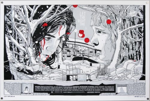
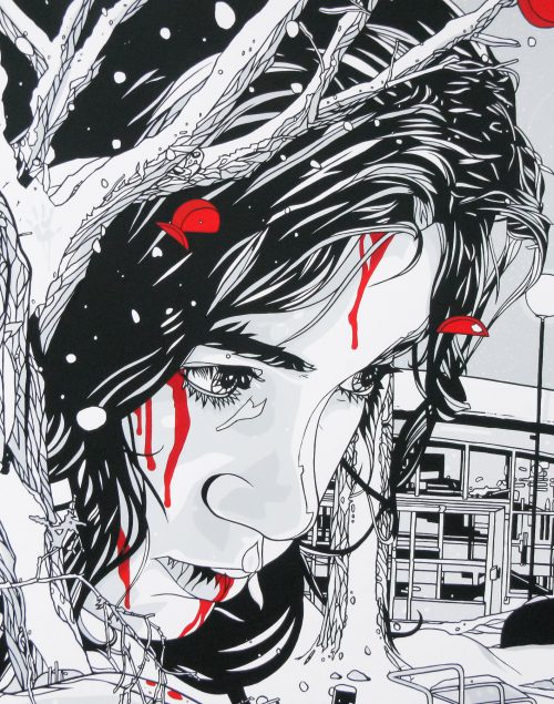
Let The Right One In / screen print / Tyler Stout / regular / USA

17.05.11

Poster Poster

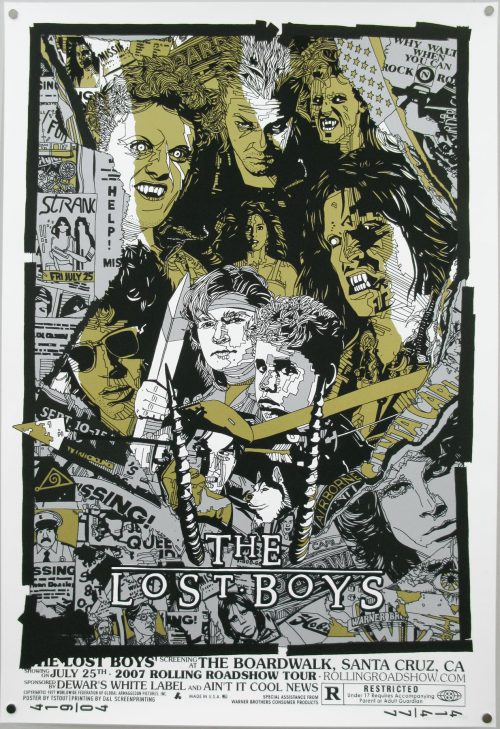
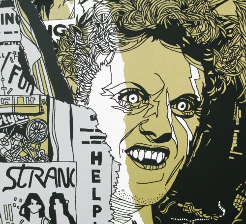
The Lost Boys / screen print / Tyler Stout / USA

17.05.11

Poster Poster
Title
The Lost Boys
AKA
--
Year of Film
1987
Director
Joel Schumacher
Starring
Corey Feldman, Jami Gertz, Corey Haim, Edward Herrmann, Barnard Hughes, Jason Patric, Kiefer Sutherland, Dianne Wiest
Origin of Film
USA
Genre(s) of Film
Corey Feldman, Jami Gertz, Corey Haim, Edward Herrmann, Barnard Hughes, Jason Patric, Kiefer Sutherland, Dianne Wiest,
Type of Poster
Screen print
Style of Poster
--
Origin of Poster
USA
Year of Poster
2007
Designer
Tyler Stout
Artist
Tyler Stout
Size (inches)
24 14/16" x 36 7/16"
SS or DS
SS
Tagline
--

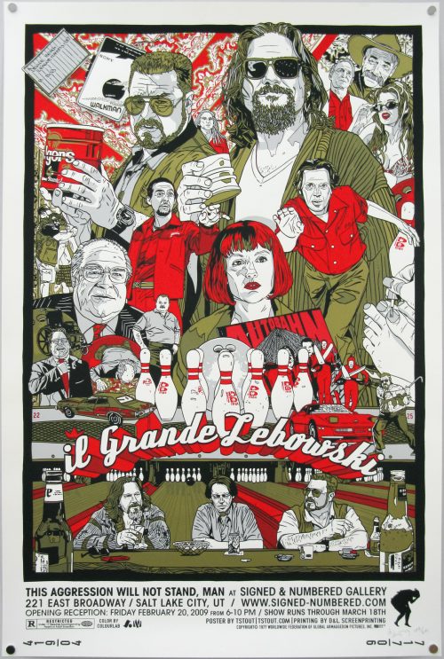
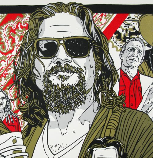
The Big Lebowski / screen print / Tyler Stout / regular / USA

17.05.11

Poster Poster

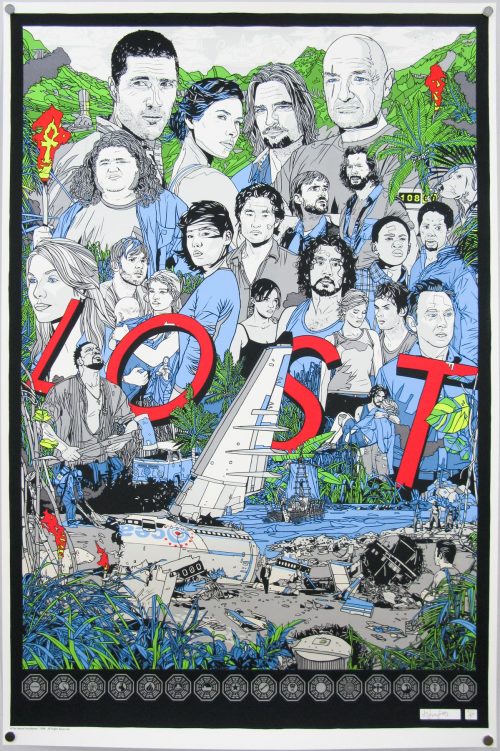
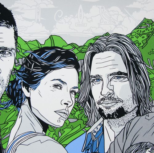
Lost / screen print / Tyler Stout / USA

17.05.11

Poster Poster

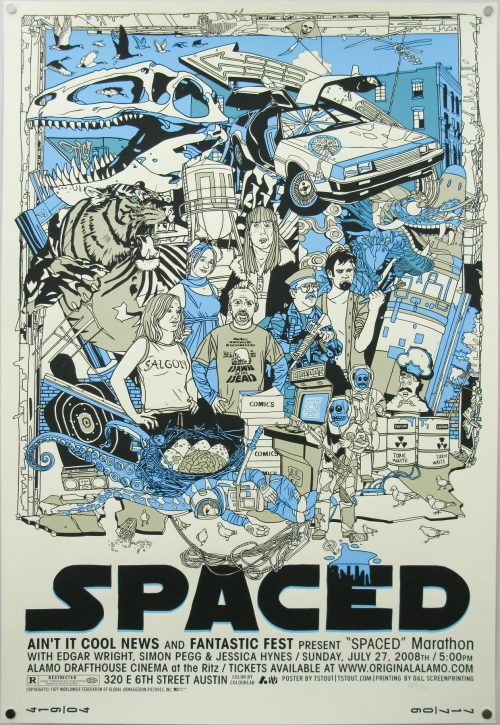
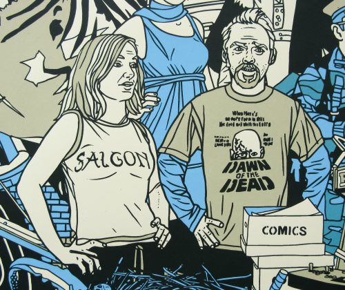
Spaced / screen print / Tyler Stout / USA

17.05.11

Poster Poster
Title
Spaced
AKA
--
Year of Film
1999
Director
Edgar Wright
Starring
Simon Pegg, Jessica Stevenson, Nick Frost, Mark Heap, Julia Deakin, Katy Carmichael
Origin of Film
UK
Genre(s) of Film
Simon Pegg, Jessica Stevenson, Nick Frost, Mark Heap, Julia Deakin, Katy Carmichael,
Type of Poster
Screen print
Style of Poster
--
Origin of Poster
USA
Year of Poster
2008
Designer
Tyler Stout
Artist
Tyler Stout
Size (inches)
24 10/16" x 36"
SS or DS
SS
Tagline
--

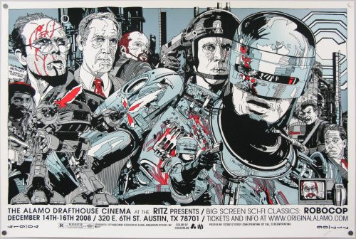
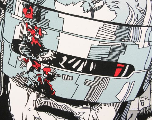
Robocop / Screen print / Tyler Stout / USA

17.05.11

Poster Poster
Title
Robocop
AKA
Robocop: O batsos robot (Greece)
Year of Film
1987
Director
Paul Verhoeven
Starring
Peter Weller, Nancy Allen, Dan O'Herlihy, Ronny Cox, Kurtwood Smith, Miguel Ferrer
Origin of Film
USA
Genre(s) of Film
Peter Weller, Nancy Allen, Dan O'Herlihy, Ronny Cox, Kurtwood Smith, Miguel Ferrer,
Type of Poster
Screen print
Style of Poster
--
Origin of Poster
USA
Year of Poster
2008
Designer
Tyler Stout
Artist
Tyler Stout
Size (inches)
24" x 35 14/16"
SS or DS
SS
Tagline
--

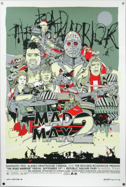
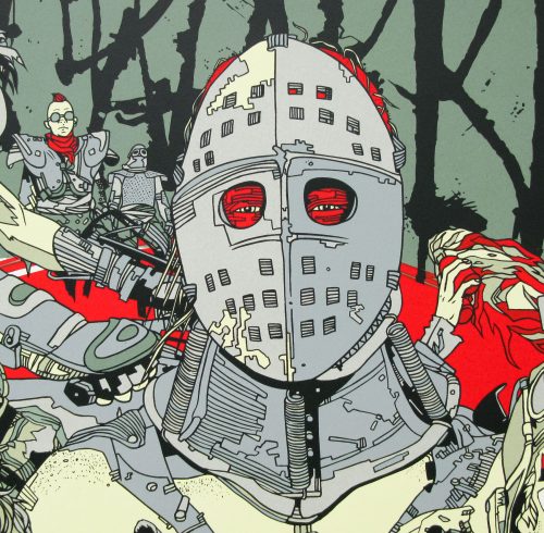
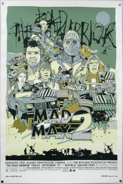
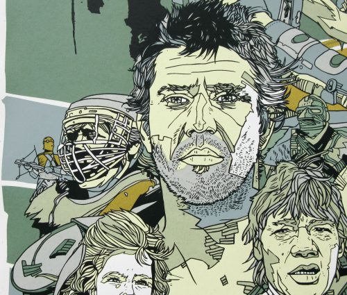
The Road Warrior / screen print / Tyler Stout / regular / USA

17.05.11

Poster Poster
Title
Mad Max 2
AKA
The Road Warrior (USA) | Interceptor, il guerriero della strada (Italy)
Year of Film
1981
Director
George Miller
Starring
Mel Gibson, Michael Preston, Bruce Spence, Vernon Wells, Kjell Nilsson, Virginia Hey, Emil Minty
Origin of Film
Australia
Genre(s) of Film
Mel Gibson, Michael Preston, Bruce Spence, Vernon Wells, Kjell Nilsson, Virginia Hey, Emil Minty,
Type of Poster
screen print
Style of Poster
regular
Origin of Poster
USA
Year of Poster
2008
Designer
Tyler Stout
Artist
Tyler Stout
Size (inches)
24" x 35 14/16"
SS or DS
SS
Tagline
--

The Road Warrior / screen print / Tyler Stout / variant / USA

17.05.11

Poster Poster
Title
Mad Max 2
AKA
The Road Warrior (USA) | Interceptor, il guerriero della strada (Italy)
Year of Film
1981
Director
George Miller
Starring
Mel Gibson, Michael Preston, Bruce Spence, Vernon Wells, Kjell Nilsson, Virginia Hey, Emil Minty
Origin of Film
Australia
Genre(s) of Film
Mel Gibson, Michael Preston, Bruce Spence, Vernon Wells, Kjell Nilsson, Virginia Hey, Emil Minty,
Type of Poster
Screen print
Style of Poster
Variant
Origin of Poster
USA
Year of Poster
2008
Designer
Tyler Stout
Artist
Tyler Stout
Size (inches)
23 14/16" x 35 15/16"
SS or DS
SS
Tagline
--

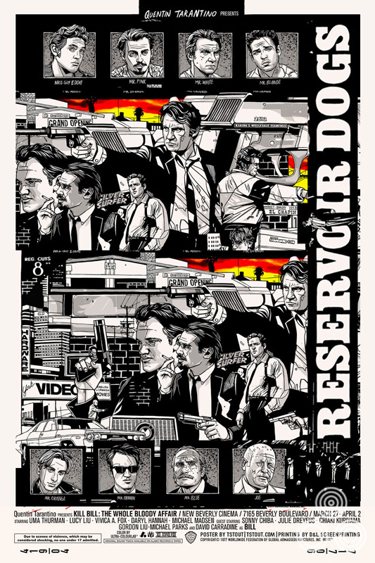
Tyler Stout on the making of his Reservoir Dogs screen print

14.02.17

This year marks the 25th anniversary of the release of Quentin Tarantino’s incredible debut feature, Reservoir Dogs. Often cited as one of the greatest independent films ever made, the depiction of the events leading up to, and the aftermath of, a botched diamond heist remains as powerful today as it was a quarter of a century ago. Back in 2012, Tarantino celebrated the 20th anniversary of the film by screening a 35mm print of the film at the New Beverly Cinema in Los Angeles, which he owns.

Held in late October, the screening was apparently attended by a ‘raucous and electrified crowd’. As the credits rolled, folks from the incomparable limited-edition geek culture outfit Mondo were there to unveil a special screen print created especially for the event. The print was designed and illustrated by Tyler Stout, the celebrated artist who had worked on the Mondo-released print for Tarantino’s event screening of Kill Bill: The Whole Bloody Affair (also at the New Beverley).

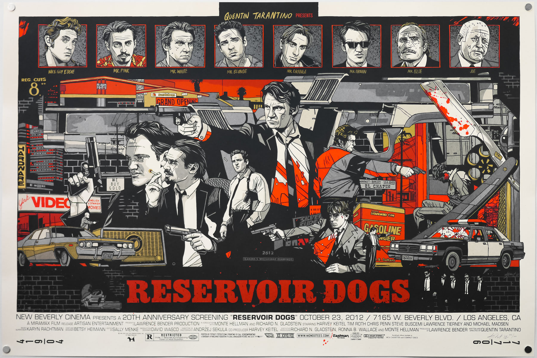
The regular style of Tyler Stout’s screen print for Reservoir Dogs, created in 2012

The regular style of Tyler Stout’s screen print for Reservoir Dogs, created in 2012

As is typical for Tyler’s work, the print came in both regular and variant versions and when Mondo put the remaining posters onto their online store they both sold out within seconds.

Whilst adding the regular version to the Film on Paper collection I wanted to interview the man himself about the creation of the print as I’ve done previously with his designs for AvengersAkira, Kill Bill and Star Trek II: The Wrath of Khan. The interview can be read in full below:

———————

Tyler, thanks for agreeing to talk about this excellent print. Am I right in thinking that Tarantino himself made a request for you to work on it?
I believe his people did. Its been a while so my memory is pretty spotty on the specifics, but it came after Kill Bill so we had a good relationship with his people.

Did you ever deal with him directly?
Nope, alas.

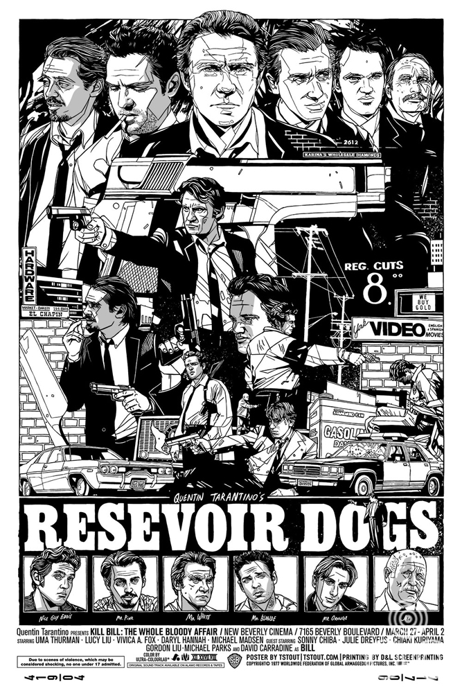
An early version of the design for Tyler’s Reservoir Dogs in a portrait format.

An early version of the design for Tyler’s Reservoir Dogs in a portrait format.


Is Reservoir Dogs one of your favourites of the director’s films?
For some reason early Tarantino films just have a special place in my heart. From Reservoir Dogs through to Jackie Brown, all captured an era of my life that I remember fondly; working at a video store, hanging with my high school friends.

How long were you given to work on the design before the screening date?
I recall it was no more than a month.

Were you given any specific directions before starting?
Nope, none at all. Make it fun, basically.

A later version of the portrait format featuring a sunset sky that Tyler tried before settling on another colour scheme.

A later version of the portrait format featuring a sunset sky that Tyler tried before settling on another colour scheme.


Can you talk about your initial design ideas for the print? Was the composition and landscape format something you arrived at quickly?
Interestingly enough, the poster started out as portrait instead of landscape, but it just wasn’t working, so I switched it to landscape to see if it would work better and luckily it did. As with a lot of my prints, I just start drawing elements I know I’ll want to include on the print, and sometimes leave the layout to kinda come together later. Sometimes it works, sometimes it doesn’t.

Continue reading

Tyler Stout on the creation of his Kill Bill: The Whole Bloody Affair screen print

21.03.12

Quentin Tarantino‘s Kill Bill was originally planned and filmed with the intention of releasing it as one long movie. At a certain point in post-production the decision was taken to release it as two separate films, which allowed Tarantino to include more material in each one rather than be forced to make cuts to shorten the running time at the studio’s request.

The longer cut, known as The Whole Bloody Affair, has long been on many film fans’ wish-lists of ‘unreleased alternative cuts of films they’d love to see’ and until last year it had only been screened once, at the Cannes Film Festival in 2006. In March 2011 the New Beverly Cinema in Los Angeles (check the billboard), which is owned by Tarantino, screened TWBA and allowed fans of the film to finally catch this elusive version. A report from that screening can be read here.

The first showing coincided with Tarantino’s birthday and people on his production team decided they’d put together a secret present for him in the form of a specially commissioned poster by the team at Mondo. Ace artist Tyler Stout was given the opportunity to illustrate his take on the film and the result is one of his best posters yet, in my opinion. As with his Akira print I wanted to interview Tyler about its production. He kindly agreed to answer my questions and also sent along a series of alternative images that were changed during production.
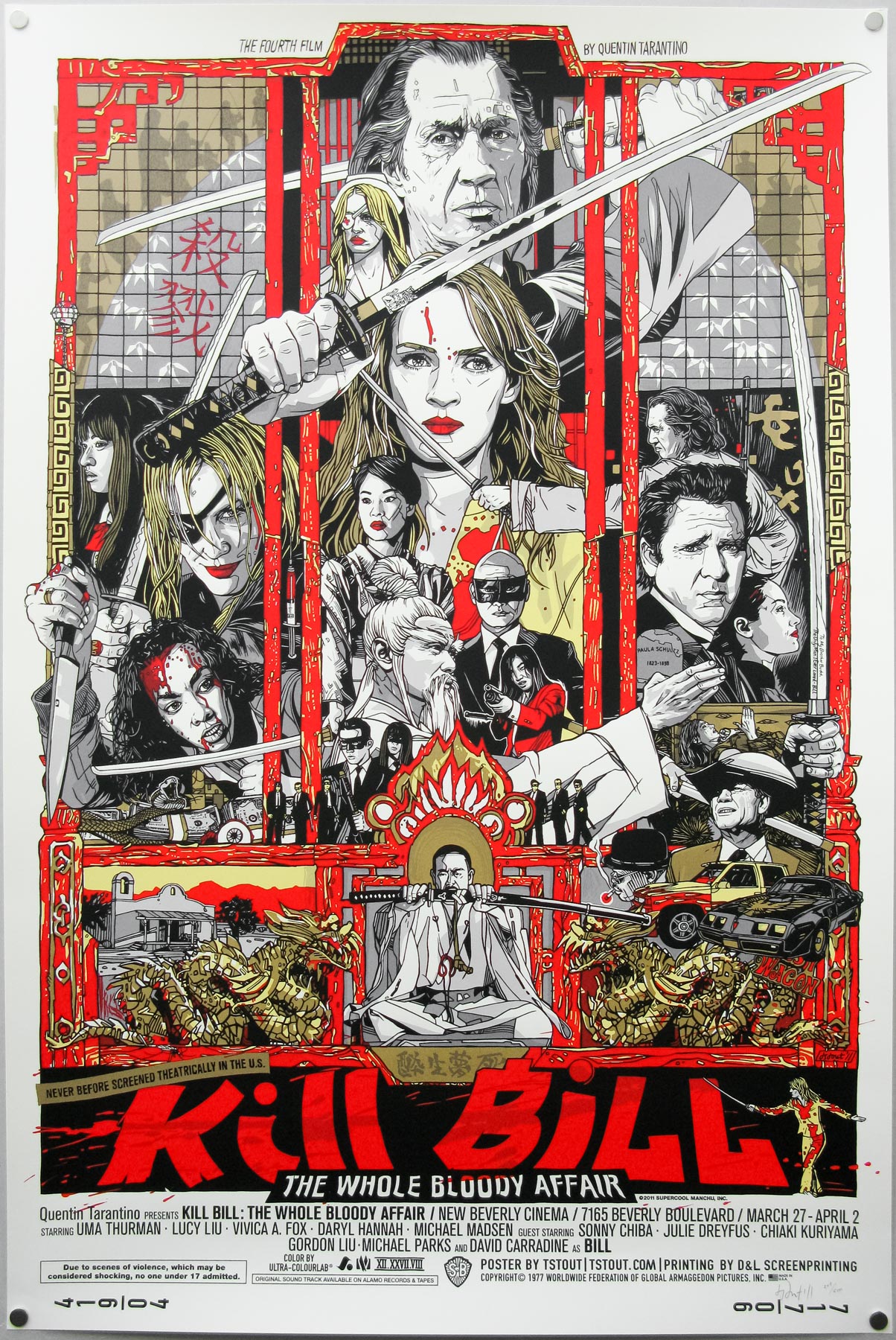
Tyler Stout’s screen print for Kill Bill: TWBA – this is a photograph of the regular version from my collection.

Tyler Stout’s screen print for Kill Bill: TWBA – this is a photograph of the regular version from my collection.

Hi Tyler, thanks for agreeing to talk about the print. Is it right that Mondo were approached by Tarantino’s people to do a poster for the screening of the full cut?
That is correct. His assistant [Julie McLean) asked Mondo if they would help to do a poster to commemorate the event, as well as kind of a birthday present to Quentin.

The screening was a surprise for Tarantino but I’ve heard he’s a huge fan of yours. Were you specifically requested when Mondo were approached?
I know he’s a huge Mondo fan, so I think he would have loved anything they would have done for the event, but mondo approached me about it and it worked out and that was awesome.

Like most folks, I’ve yet to see the two films as one. Were you able to see the new cut before starting work on the print or were you working from viewings of the two separate films?
I haven’t seen The Whole Bloody Affair cut yet, sadly, so I was just going off of what I’d heard etc.
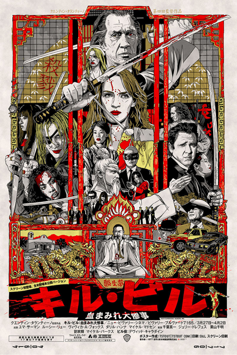
The variant version of the poster - aside from the obvious addition of the Japanese title there are several other differences to be found.

The variant version of the poster – aside from the obvious addition of the Japanese title there are several other differences to be found.

It must have been good knowing you had all the characters to choose from, as opposed to only doing one of the films and being limited in that way?
That was indeed awesome; two great films that feel like one film. It definitely would have been more limiting to just have one to deal with.

Is it true that you only had three weeks to put this poster together? Do you enjoy working under that kind of time pressure?
I wish we’d had three weeks to put this together! It was a bit shorter than that, but I do like working with time constraints and I seem to work best under them actually. Otherwise I’ll just keep revising and revising the poster.

Can you talk about your initial design ideas for the poster? Were there certain characters that you knew had to be given more prominence than others?
It was pretty organic, the way it kinda came together. I just gave prominence to the characters I felt strongest about and kinda went from there.

Was the composition something you arrived at quickly? Were there certain elements you knew had to sit next to each other?
The initial idea for the poster came pretty quickly after being asked to do it. Like anything, you start thinking about it and then come up with an idea and go from there,  but as for certain elements….not really.
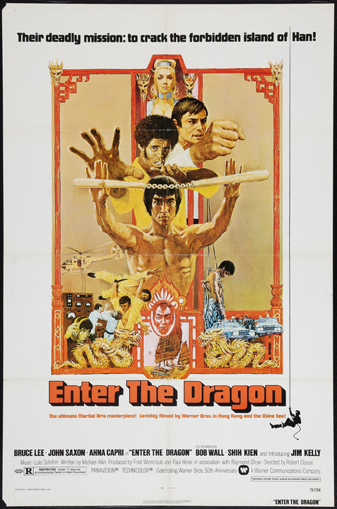
The US one sheet for Bruce Lee's Enter the Dragon

The US one sheet for Bruce Lee’s Enter the Dragon

Am I correct in thinking that you’re slightly homaging the original Enter the Dragon one sheet with the layout?
Ha! I wouldn’t say slightly, I’d say wholesale lift! It was definitely the starting and ending point of my original idea, which was referencing one of my favourite martial arts movie posters of all time. I tried to do it in an obvious way to avoid any confusion.

Are there any elements you illustrated but that didn’t make it into the final version?
There were actually quite a few things that didn’t make it. I’d drawn a bunch of Bucks but I just couldn’t find a way to make it work. We all made the call to drop him. I don’t think I had included him originally so the pieces I drew with him were all after the fact, and it can be hard to add stuff and make it look natural after the poster is more or less done.
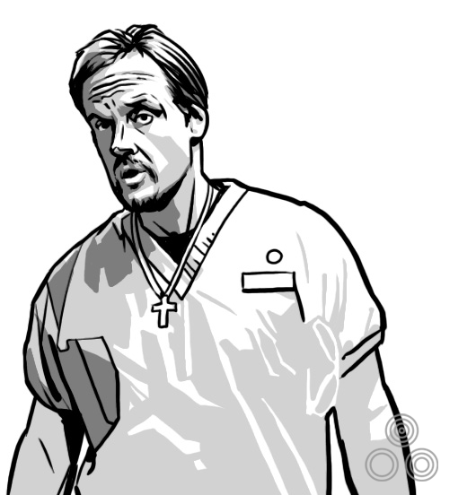
An illustration of the character Buck (Michael Bowen) that was dropped from the final poster

An illustration of the character Buck (Michael Bowen) that was dropped from the final poster

I’d also drawn a different pose for Gogo Yubari, but in the end I felt it worked better as you see it in the final version. A lot of the changes were me not feeling someting and trying to improve it.
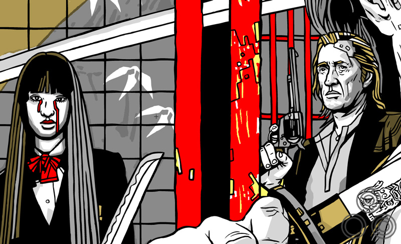
An alternative version of Gogo Yubari (Chiaki Kuriyama) that was dropped in favour of the portrait version seen on the final printing. Note the chain-ball weapon's placement versus the printed version.

An alternative version of Gogo Yubari (Chiaki Kuriyama) that was dropped in favour of the portrait version seen on the final printing. Note the chain-ball weapon’s placement versus the printed version.

There were drawings of Larry Bishop and Sid Haig that didn’t make the final cut and they were kind of corner portraits that you’d sometimes see in posters with ornate borders. They didn’t get much beyond the concept stage before they were nixed.

Small character portraits that were dropped from the poster, including Jay (Sid Haig) and Larry Gomez (Larry Bishop)

Small character portraits that were dropped from the poster, including Jay (Sid Haig) and Larry Gomez (Larry Bishop)

Finally, I had a couple different versions of Elle Driver but I much preferred the version we went with.
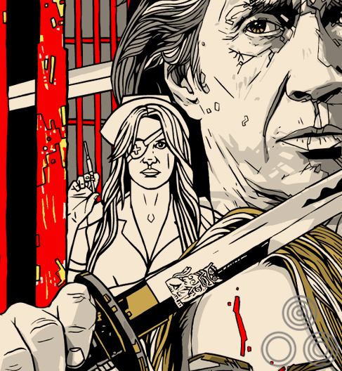
An alternative version of Elle Driver (Daryl Hannah) that was replaced with a different pose in the final version

An alternative version of Elle Driver (Daryl Hannah) that was replaced with a different pose in the final version

The variant has a few alterations beyond the colour palette swap, can you talk about the changes you made and why?
We presented the original version and Quentin’s assistant had some ideas to make it better, so we did those, and in the end we kinda had two different posters with unique elements. We liked both and we hated to lose some of the pieces that were changed from the original design, so we included those on the variants, which made everybody happy.

The addition of the coffin scene is probably the most significant one, aside from the Japanese text. What made you add that image to the variant?
That was a suggestion of Quentin’s assistant. She really liked that scene and wanted to add it, so we did. As I say, we also liked it without so left it off the variant. I like it both ways, but it certainly tells a bit more of the story.

Were there any challenges with designing the variant to be printed on rice paper in terms of colours etc?
The challenges were certainly faced by my printer, but not directly by me. Rice paper is more waxy so they have to make sure the ink doesn’t rub off. I actually had a stamp made for the back of all my copies, but I could only stamp the backs of the regulars since on the variants it would just smear all over the place, never quite drying. I lost a few variants before I figured that out!
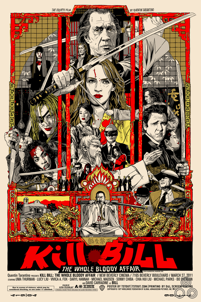
An alternative version of the poster, featuring several details that were eventually changed by the final printing.

An alternative version of the poster, featuring several details that were eventually changed by the final printing.

Once you’d submitted the poster were you given any directions by the Mondo guys for things to add or remove?
Again, most of them were from Quentin’s assistant and she had some suggestions that she thought he would appreciate. I know she wanted us to make a reference to Bruce Lee’s Game of Death instead of Enter the Dragon, but it was too late in the process to make that switch, plus Game of Death’s poster isn’t as iconic.

Were there ever any alternate colourways?
I think pretty early on Rob Jones [at Mondo] mentioned the rice paper type paper and we focused on that being the variant. There was a single one-off version on metal that was done especially for Quentin to take home as a birthday present.
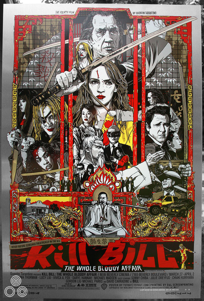
The special one of metal variant of the poster that was given to Quentin Tarantino as a birthday present.

The special one of metal variant of the poster that was given to Quentin Tarantino as a birthday present. There is a unique inscription in the bottom left which reads ‘Q HAPPY BIRTHDAY AND CONTINUED ADVENTURES. WITH LOVE, UNRULY JULIE.’ 01/01
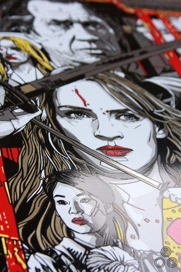
 

Close up detail of the metal variant
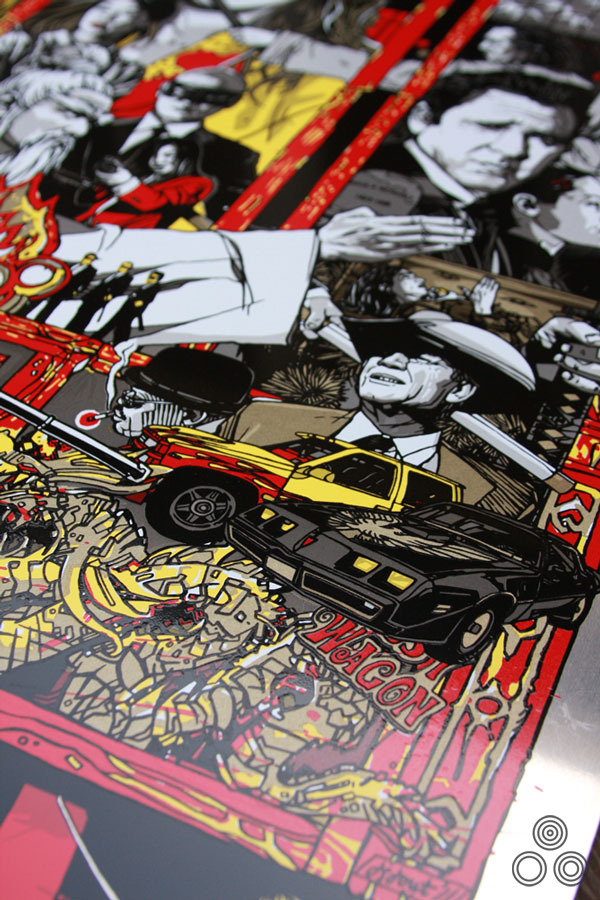
Close up detail of the metal variant


More details of the metal variant

More details of the metal variant

Were you given any feedback from Tarantino yourself?
Just that he was happy with the poster. He seems like a pretty easy going guy to deal with and doesn’t complain to Mondo much.

Are there other Tarantino films you’d like to do a poster for?
Sure, all of them.

I’m keeping my fingers crossed that you get to do a poster for Django Unchained.
That would be pretty sweet.

Finally, can you give us even a tiny hint as to what we might see from you in the coming months?
I think I’m working on something for the movie Drive, and possibly something involving aliens from outer space and the duality of man. I’ve probably given too much away.

Thanks so much Tyler. As always, I hugely appreciate the time you give to these interviews.
Thank you sir!

————————————————-

Check out Tyler’s website here.
The Mondo website is here and I’d advise following them on Twitter here.

The other posters I’ve collected by Tyler can be viewed here.
My interview with Tyler on the creation of his Akira print is here.
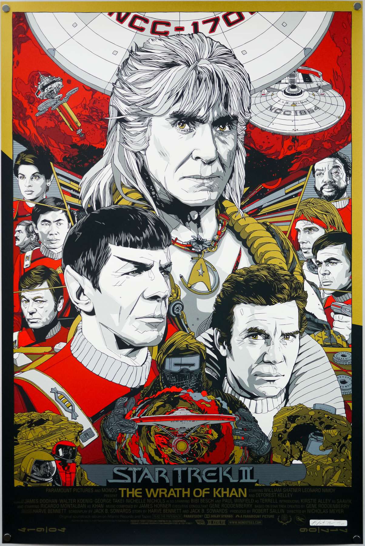
Tyler Stout on the making of his Star Trek II – The Wrath of Khan screen print

29.04.13

When Mondo, the incomparable limited-edition screen print outfit, announced they were opening a gallery in their hometown of Austin, anticipation quickly reached fever pitch, with fans desperate to see what artwork would be on the walls when the doors opened for the first time. The answer was kept secret until the evening of March the 10th, 2012 when the opening night was held and the theme of their first show was revealed to be that of classic sci-fi. Most of Mondo’s premier artists turned in some incredible pieces for the show, as can be seen on this recap blog post on their website and on this SlashFilm post.

One of the highlights of the show was fan-favourite artist Tyler Stout’s print for arguably the best Star Trek film of all time, 1982’s The Wrath of Khan. A brilliantly composed image featuring Ricardo Montalban‘s unforgettable, titular bad guy, the poster was printed in two flavours; a red and gold regular and a silver and gold variant. Whilst adding the regular version to the Film on Paper collection I wanted to interview the man himself about the creation of the poster.

Tyler Stout’s screen print for Star Trek II The Wrath of Khan (1982). This is the regular version.

Tyler Stout’s screen print for Star Trek II The Wrath of Khan (1982). This is the regular version.

Tyler, thanks for agreeing to talk about the creation of this fantastic print. Firstly, I wanted to ask if you were you given free rein to choose the film you wanted to work on for Mondo’s gallery opening show?
I’d actually had Wrath of Khan on my schedule for a while and it just takes me forever to do things sometimes. It ended up getting done around the time of that show I think. I could be completely mis-remembering it.

Is The Wrath of Khan your favourite Star Trek film?
I like many of them, including The Voyage Home with the whales and I really liked The Undiscovered Country with Christopher Plummer as a Klingon. I also enjoyed First Contact since I’m a big Next Generation fan.

Can you talk about your initial design ideas for the poster? Did you always intend to have Khan as the most prominent figure?
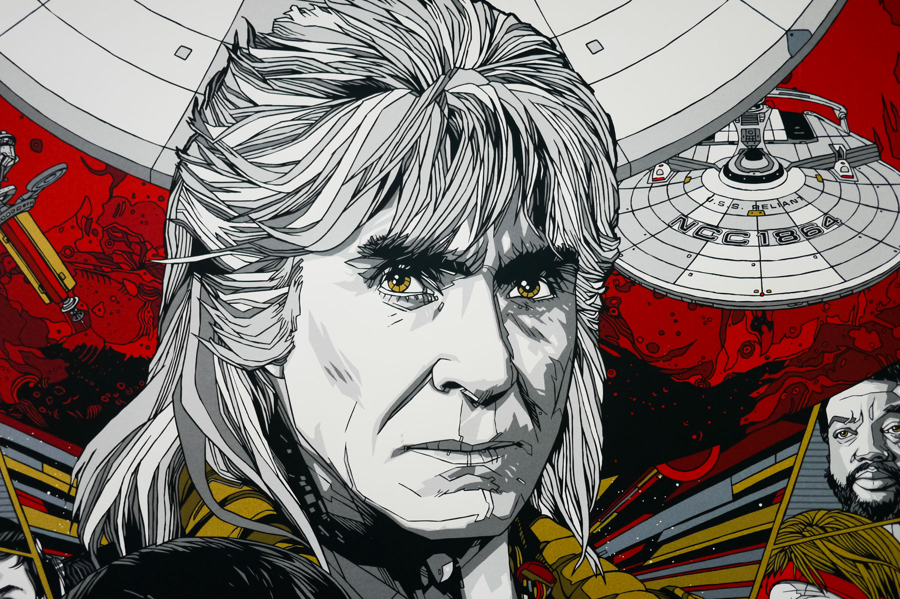
For me, and probably most people, Ricardo Montalban’s the standout of the film. I believe I started with him and then kinda designed the poster around his portrait.

A close-up view of Tyler Stout's portrait of Ricardo Montalban's bad guy Khan.

A close-up view of Tyler Stout’s portrait of Ricardo Montalban’s bad guy Khan.

Was the composition something you arrived at quickly? Were there certain elements or characters you knew had to sit next to each other?
It went through a couple versions, mainly the smaller side figure versions, but the overall look stayed pretty consistent.

Continue reading

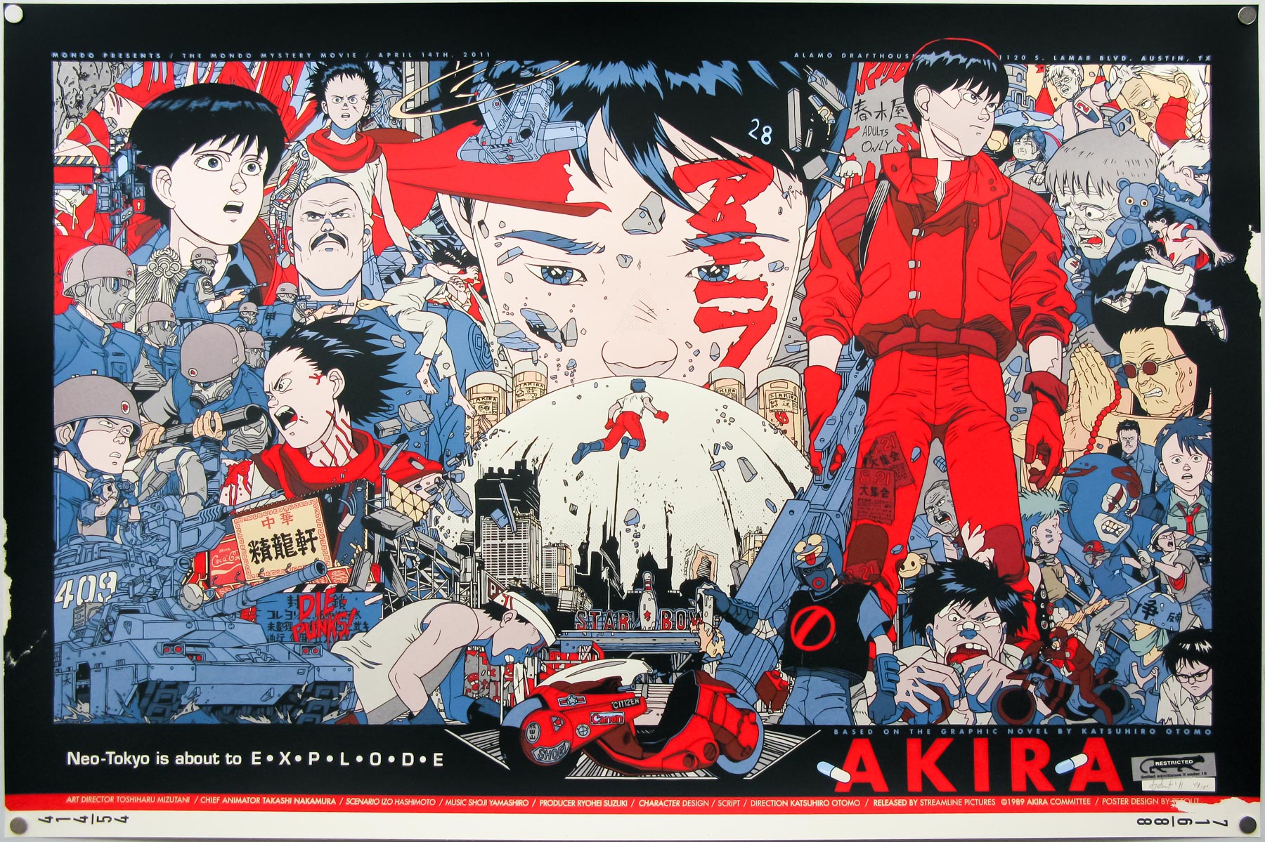
An interview with Tyler Stout on the creation of his Akira print

09.11.11

Having been lucky enough to acquire one of Tyler Stout’s fantastic Akira screen prints I wanted to hear a bit more from the man himself about the creation of the poster. Tyler was kind enough to not only answer my questions but also send through a handful of images showing the evolution of the poster.

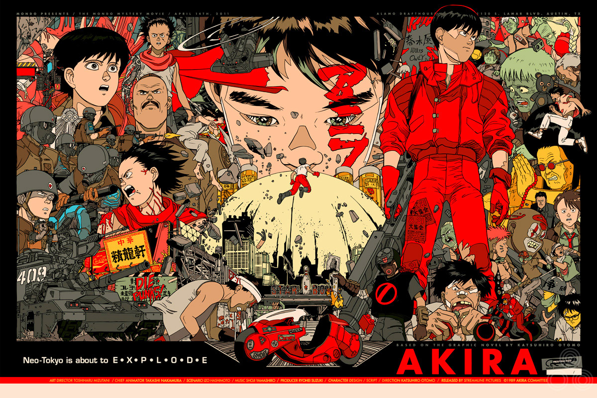
The regular style Akira screen print by Tyler Stout (2011)

The regular style Akira screen print by Tyler Stout (2011)

Tyler, Akira was the first Mondo Mystery Movie and was shown on your birthday at your request. Can you talk about why you chose it and what the film means to you?
It’s just one of those movies that I’ve loved since I was a kid. I remember seeing the dubbed version on TV many, many years ago and then seeking it out on VHS, then DVD etc. I had two Akira shirts in high school and I wore them until they fell apart. It just had such a unique voice and vision and at the time it was the greatest animated film I had ever seen. It’s still up there with the best of them.

The poster is one of my very favourite designs by you and you can really tell that a lot of love went into it. Having chosen the film did you feel the pressure to come up with something extra special?
Well…I felt pressure from myself, doing something that lived up to the greatness of the film and my own expectations, sure, but not from Mondo, they’re not very pressure-oriented. When you’re working with something as great as Akira you really have to try hard to screw it up, plus I stuck close to the illustrations by the creator Katsuhiro Otomo. In the end it felt more like I was the designer, just working with somone else’s artwork. All compliments are due to Mr. Otomo, not myself.

How long before the event were you given a choice of film? Did you set to work straight away?
I can’t really remember, probably 3 or 4 months, but I only started it about 2 weeks before the event due to procrastination on my part and other jobs.

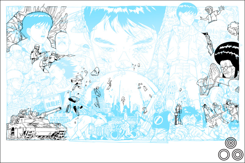
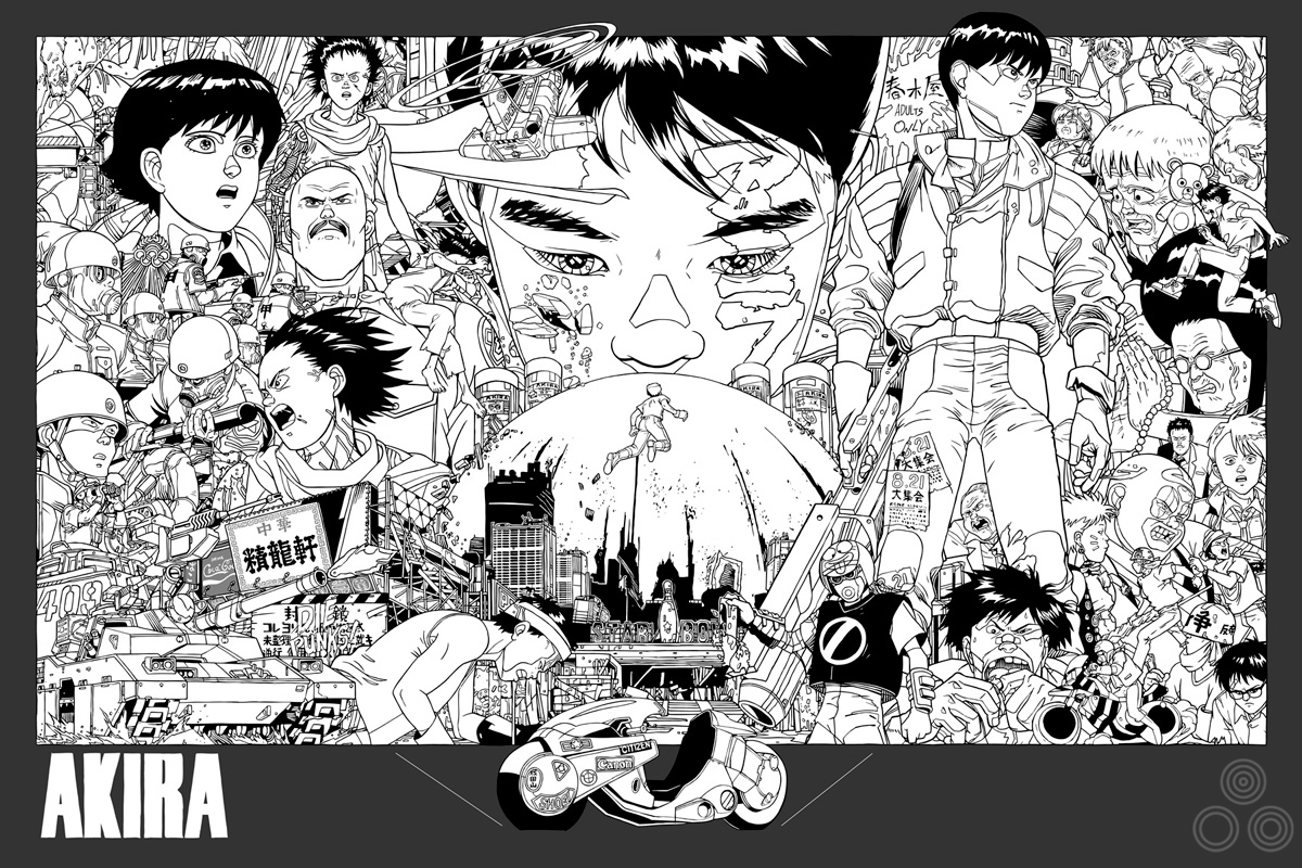
Tyler: ‘This is a work in progress shot where I’m trying out a layout option.’ – Image copyright © Tyler Stout, 2011

Tyler: ‘This is a work in progress shot where I’m trying out a layout option.’ – Image copyright © Tyler Stout, 2011


Can you talk about your initial design ideas for the poster? Were there certain scenes and characters that you knew had to be given more prominence than others?
The explosion always figured prominently in my vision, since the movie is kinda post-nuclear Tokyo, plus the bike is a big part of what I associate with Akira.

Yeah, Kaneda’s bike is almost given it’s own pedestal at the bottom – I’m guessing that’s an element of the film that means a lot to you?
Well, I’m sure it’s what a lot of people associate with Akira and its just such a strong, unique element. It plays a big part in the film as well.

As I understand it, from reading previous interviews with you, you’ll often create the elements separately and then work to combine them into the final design. Are there any elements you illustrated but that didn’t make it into the final version?
Not really, whilst I do draw them in pieces, they’re drawn more like a puzzle so that hopefully each piece clicks into its perfect place if I do my job right. In this case it pretty much worked out. There were probably a few things that didn’t look right so I switched them out, but nothing comes to mind. Again, visually, all the work was done by Katsuhiro Otomo in creating the world, so it took the stress off me to come up with a completely new creation.

Tyler: ‘Another layout test, further into the creation of the poster’ – Image copyright © Tyler Stout, 2011

Tyler: ‘Another layout test, further into the creation of the poster’ – Image copyright © Tyler Stout, 2011


How quickly did you arrive at the final layout? Were there certain elements you knew had to sit next to each other?

I had an idea but things change during execution so I’m usually not sure what the final piece will truly look like until I send it off to the printer. As for elements, I knew the bike had to have special placement.

Were there any elements that were altered before the poster was printed?
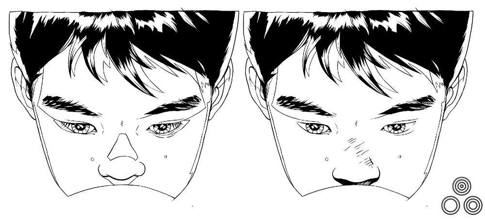
The boys face in the middle had some problems and I went back to that quite a few times. I kept revising the eyes and the nose. Plus, the colour scheme for the whole design took some figuring out.

Am I correct in thinking this poster has the highest number of print colours you’ve worked with for Mondo? What was it like to work with that many?
Yes, I believe so. It was fun and I tried to make all the colors count. I pride myself on working with as few colors as possible, or at least I used to, just for financial printing reasons. Now Mondo has given me the freedom to use as many colors as I want (within reason) so it’s definitely fun. The thing is, unless you really use them all you feel a bit wasteful, so I tried to get the most bang for my buck.

Tyler: 'Here you can see a couple of variations on the nose and eyes of the boy above the explosion' - Image copyright © Tyler Stout, 2011

Tyler: ‘Here you can see a couple of variations on the nose and eyes of the boy above the explosion’ – Image copyright © Tyler Stout, 2011


Once you’d submitted the poster were you given any directions by the Mondo guys for things to add or remove?
Not that i can think of. Justin [Ishmael] is a big Akira fan as well so I’m sure we talked about it, but I can’t remember anything major. I actually sent it to the printers the day before I left for Austin, so only 3 days before the event. It was down to the wire; the posters arrived by plane about 10 minutes before the movie started. It was nuts!

The screening also marked the first time you visited the Mondo crew in Austin. What was that experience like?
It was a lot of fun. I’ve talked to them on the phone so much over the years that I feel like I know them but seeing them in person was a pleasure and they went out of the their way to make it a very special event, which was pretty cool. It lived up to my expectations and I even got a Bigfoot costume out of the deal!

Tyler: 'This is one of the alternative color schemes I tried out' - Image copyright © Tyler Stout, 2011

Tyler: ‘This is one of the alternative color schemes I tried out’ – Image copyright © Tyler Stout, 2011


Finally, I know you’re often asked this, but what other films would you love to design a poster for if you were given another situation like this, where the choice was yours?
That’s a hard one. Since Justin envisioned these posters as ‘at the event only’, with none to be sold afterwards, we had to come up with a movie that people wouldn’t be devastated to miss (I’ve since found out there are more Akira fans than i realized). We talked about Jaws, Escape From New York and many others, but figured it would be kinda unfair to do such a big movie and not let people have a shot to pick it up. Sooo… I dunno, maybe Vampire Hunter D or Ninja Scroll or My Neighbour Totoro if we’re talking anime. If we’re talking live-action then maybe Deep Rising or Night of the Comet or Night of the Creeps.

Thanks so much for answering these questions for me, it’s very much appreciated.
Sure, I’m happy to help out.

Check out Tyler’s own website here.
A big thanks to the Mondo crew, without whom this poster (and interview) would not have happened.

Here are the other posters I have which were done by Tyler.

Tyler Stout on the making of his The Avengers screen print

31.07.14

To celebrate the release of 2012’s hugely anticipated superhero team-up The Avengers, Marvel, the studio behind what was unquestionably the biggest cinematic event of the year, once again worked with Austin-based Mondo to release a series of screen prints based on characters from the film. The incomparable Austin-based geek culture outfit has worked on prints for all of the standalone Marvel releases, starting with Iron Man in 2008 and only skipping the same year’s The Incredible Hulk.

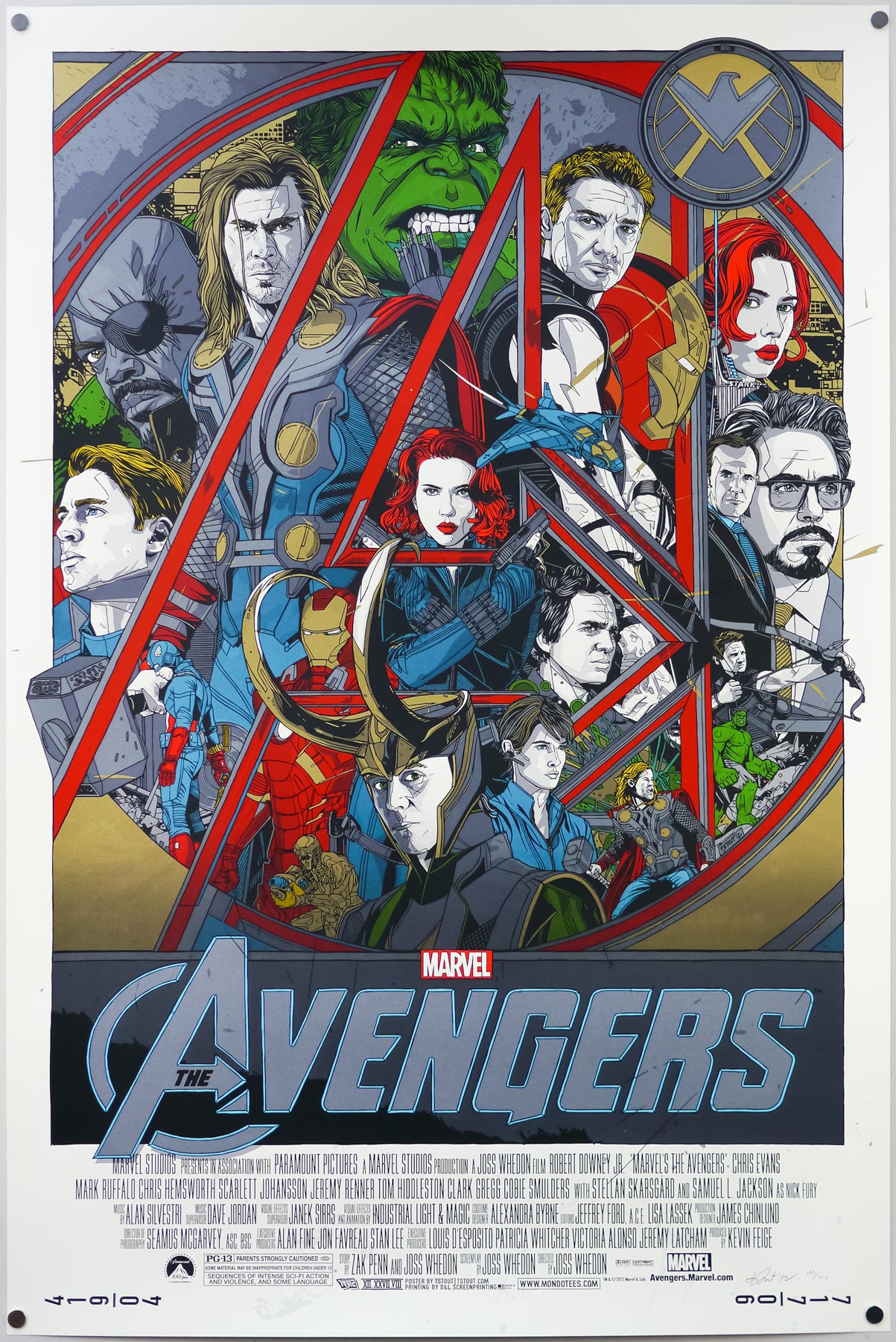
The team at Mondo assembled a roster of its most celebrated artists to work on prints for each of the main characters and these were released over the period of a week in April 2012, beginning with Olly Moss‘ portrait of Black Widow and ending with Thor by Martin Ansin and Iron Man by Kevin Tong. A few weeks later, on the eve of the film’s release, Mondo then revealed a print featuring all of the characters that was designed and illustrated by arguably their most popular artist, Tyler Stout.

The regular version of Tyler Stout’s screen print for The Avengers, 2012

The regular version of Tyler Stout’s screen print for The Avengers, 2012

As usual, the print came in both regular and variant versions and, despite each having relatively high print runs, the poster sold out within seconds of going on sale on Mondo’s site. I was lucky to snag a copy of the print via Tyler’s own lottery, which he now holds on his own site shortly after each print release sells out via Mondo.

Whilst adding the regular version to the Film on Paper collection I wanted to interview the man himself about the creation of the print as I’ve done previously with his work on Akira, Kill Bill and Star Trek II: The Wrath of Khan. The interview can be read in full below:

—————

Hey Tyler, can I start by asking if you were keen to work on a poster for The Avengers after the prints you’d done for Iron Man 2 and Captain America? Did you ask the guys at Mondo if you could get involved?
Well, bear in mind that I did this poster over two years ago so it’s hard for me to remember the exact conversation, but it probably was something similar to the Mondo guys asking me, “Hey do you want to do a poster for Avengers?” and me going “Sure”, and then several emails from them saying “Is it done yet?” then me finishing it at the last minute.


Did you get to see the film before you worked on the print? What did you think?
I didn’t. I don’t know if I’ve ever seen a film before it’s released officially. Actually, Best Worst Movie – I saw that one. For the rest though, if it’s a new film, I don’t usually get into screenings. I really liked The Avengers a lot and it’s my second favourite Marvel film, after the first Iron Man. Since then I would probably add Captain America 2 up there as I really enjoyed that, plus Iron Man 3.

How long were you given to work on the design?
I can’t really say for sure. I’m certain they gave me at least a month’s heads-up, probably more like three months heads-up. Not that it does much good as I’m a last minute man.

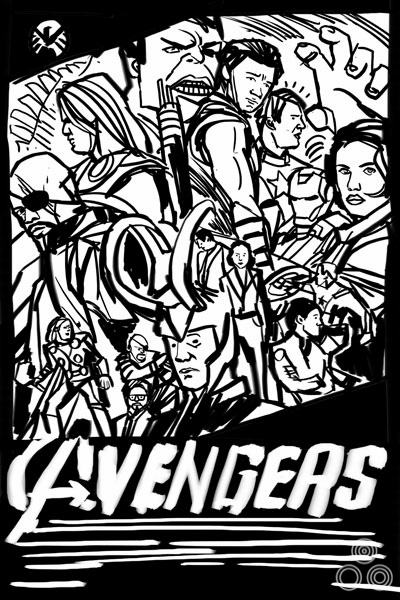
An early thumbnail sketch for the poster that Tyler submitted to Mondo for approval before beginning work.

An early thumbnail sketch for the poster that Tyler submitted to Mondo for approval before beginning work.

Can you talk about your initial design ideas for the poster?
We were required to submit a thumbnail sketch of our design ideas early on in the process. As you can see I stuck pretty close to mine and just had to tweak a few colors and voila. Done. It was in my head the entire time.

Were there certain elements or characters you knew had to sit next to each other?
My posters are the very definition of happy accidents. Looking at this one, I think I deliberately made Captain America and Iron Man/Tony Stark smaller and less central to the piece because I’d already done posters for their individual films, so those two characters had already had their day to shine. Having seen the film, I realise now that maybe Hawkeye isn’t as main of a character as Cap or Stark (who’s a huge part of the film), but thats life. I let personal bias get in the way.

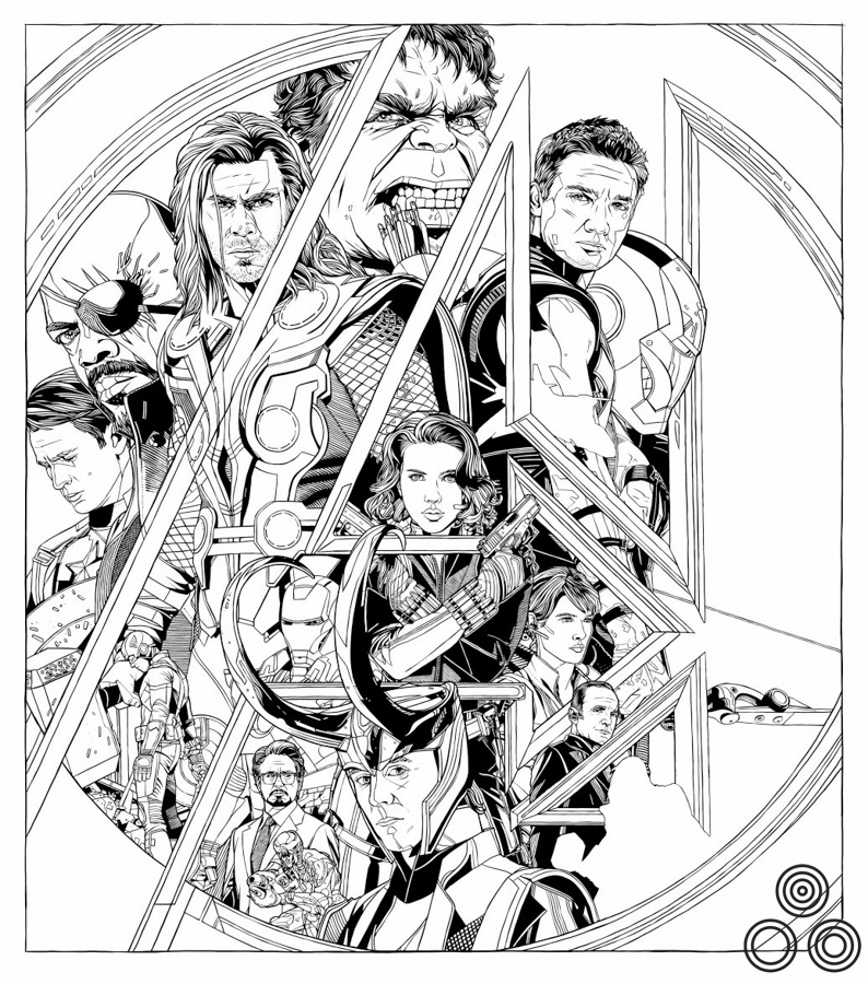
An early, colourless version of the print with a few notable differences.

An early, colourless version of the print with a few notable differences.

What about the idea of having each character with a portrait and an alternative pose?
I like drawing faces up close and I like kinda showing them in action. I just like repeating things for some reason. It gives it the feeling of movement, for me anyway.

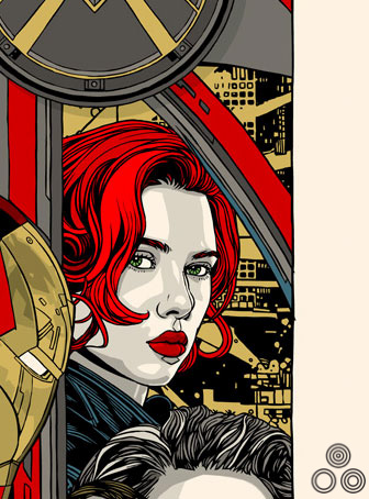
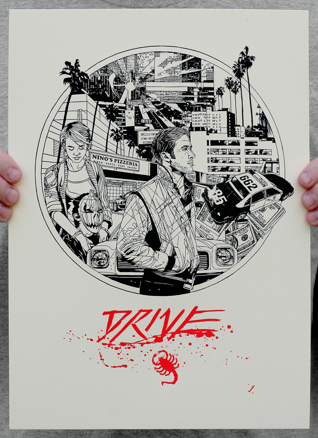
One small note of interest is that, due to a lack of time, I used the city portion of a discarded design for a Drive poster as the background for this print. Later we ended up doing a letterpress of that same Drive design. This is known in the TStout industry as ‘double-dipping’.

TheAvengers_screenprint_TylerStout_BlackWidowClose

A close-up of an earlier version of the poster, featuring Black Widow and a cityscape ‘borrowed’ from an unused poster for Drive (as detailed above and featured below).

A letterpress of an earlier, unused poster for Drive (2011) that was designed by Tyler and from which he 'borrowed' the background cityscape for the Avengers print.

A letterpress of an earlier, unused poster for Drive (2011) that was designed by Tyler and from which he ‘borrowed’ the background cityscape for the Avengers print.

Was the composition and framing using the ‘A’ something you arrived at rapidly?
Having looked back at earlier versions it seems like the A feature was always pretty central to the design, there wasn’t any layout that didn’t involve it actually. So that’s good that I stuck to my guns.

Continue reading